I spent a large chunk of Friday interviewing funds managers. In the course of our conversations, talk turned to the yields on government inflation-indexed bonds (a sensible asset for funds offering indexed pensions) relative to the yields on conventional government bonds. There are a lot more inflation-indexed government bonds on issue now than there used to be, and I was encouraged to learn that, as a result, bid-ask spreads are also tighter.
The gap between nominal and indexed bond yields is what is known as the “breakeven” inflation rate – the actual inflation rate that, over the life of the respective bonds, would generate the same return whether one was holding indexed or nominal bonds. It can be seen as a proxy for market inflation expectations.
As regular readers know, one of my favourite charts is this one, showing the gap between those yields in New Zealand for the last few years.

10 years from now is June 2028, so something nearer the average of the two series is at present a reasonable fix on a 10 year inflation breakeven for New Zealand. But whichever series you use, the numbers have been consistently well below 2 per cent for several years now. By contrast, at the start of the chart, it looks as though 10 year inflation breakevens were around 2 per cent (10 years ahead then was 2024, so the blue line was the more relevant comparator).
You might expect that a chart like this one would bother the Reserve Bank (paid to keep inflation around 2 per cent). Instead, they simply ignore it. Their statements repeatedly claim that inflation expectations are securely anchored at 2 per cent, relying on surveys of a handful of economists. They simply ignore the indications from market prices.
It isn’t as if what we see in New Zealand is normal. Here is the chart of US 10 year breakevens for the same period.
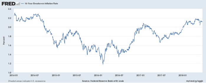
At something a little above 2 per cent, US breakevens are around the US inflation target (expressed in terms of the private consumption deflator, rather than the CPI- which the bonds are indexed to).
What about other countries? Courtesy of Fisher Funds, here are a couple of charts. First the 10 year breakevens for the last year or so.
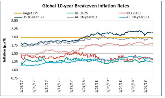
“DE” here is Germany. As Fisher noted to us, it seemed a little anomalous that New Zealand 10 year breakevens are lower than those in Germany (although the German economy is one of the stronger in Europe, and they have no domestic monetary policy).
And here are the 20 year breakevens

BEI 2035 and BEI 2040 are New Zealand. I’ve always tended to discount the UK numbers, because of the different tax treatment of indexed bonds there, but both the US and Australian breakevens look a lot closer to the respective inflation targets (2.5 per cent in the case of Australia) than is the case here.
One of the fund managers we talked to on Friday made a throwaway comment about people simply looking at the last headline CPI number. Maybe, but annual headline CPI inflation in New Zealand for the last six years has averaged 1.0 per cent. The Reserve Bank’s favoured core measure has averaged 1.4 per cent over the same period. And the Reserve Bank has never reached the limits of conventional monetary policy (the OCR hasn’t gone lower than 1.75 per cent) – inflation could have been higher had they chosen differently. It might not be irrational for investors to treat the track record of the last several years as a reasonable pointer to the period ahead. After all, the last six years has been a period with a strong terms of trade, and sustained (albeit moderate) growth. Even if, as all the fund managers we talked to suggested, we are now in a “late cycle” phase when inflation might be expected to pick up, “late cycle” phases tend to come just before the end of the cycle. There will be downturns in the next 10 or 20 years.
What of other possible explanations for these now persistently narrow New Zealand inflation breakevens? In years gone by there was almost no liquidity in the indexed-bond market (for a long time there was but a single indexed bond). All else equal, that might mean investors demanding a higher yield to hold the indexed bond (relative to a conventional bond), narrowing the observed breakevens relative to “true” market expectations of future inflation.
But if it was true once, it must be a less important story now. There are four indexed bonds on issue, each with principal of several billion dollars. As I noted earlier, if bid-ask spreads are still wider than those (a) on nominal bonds, and (b) on indexed bonds in say the US, they are tighter than they used to be. It isn’t an attractive instrument for high frequency trading, but these are multi-month, even multi-year, trends we are looking at.
The other possible story I heard a while ago was the suggestion that the government had glutted the market by issuing too many indexed bonds. It had an air of plausibility about it. It isn’t as if there are many natural holders of these instruments – there are no indexed bond mutual funds in New Zealand, they don’t count as a separate asset class in many mandates, and so on. Then again, in a low yield (and yield hungry) global environment, these instruments offer a pretty juicy yield (the government has a AAA or AA+ credit rating, and its 2040 indexed bonds are offering just over 2 per cent real – there isn’t much around to match that combination). Here is the 10 year indexed bond yield chart (again from Fishers – ignore the UK again).

Over the last few years, this is the proportion of New Zealand government bond sales that have been in the form of indexed bonds.
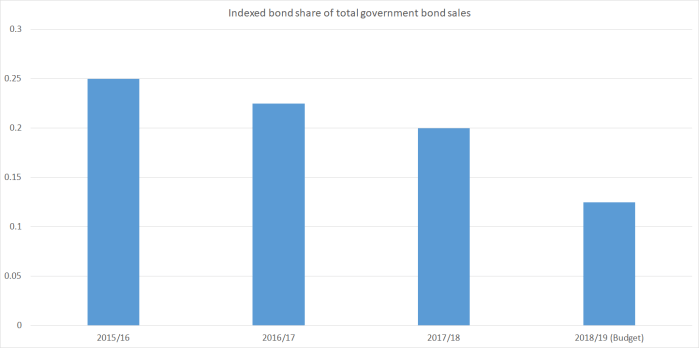
About 24 per cent of New Zealand government bonds on issue are currently inflation-indexed.
I’m not sure how that compares generally with other countries, but in the UK – long a keen issuer of inflation indexed government bonds – the share is also about a quarter. The British also appear to be winding back their issuance – to 21 per cent of new sales this year. According to a FT story from earlier this year
Robert Stheeman, chief executive of the UK’s Debt Management Office, said that “no other country regularly issues a quarter of its debt in inflation-linked bonds”, which “gives us pause for thought”. In contrast Italy — the continent’s largest issuer of inflation-linked bonds — raises just 13 per cent of its debt in this way, according to figures from the DMO.
It may well have been prudent then for our own government to have wound back its issuance plans for index-linked bonds. But that news has now been out since the Budget last month, and there is still no sign that 10 year breakevens are more than about 1.5 per cent – still well short of the 2 per cent inflation target, that was recently reaffirmed by the new government.
There is an OCR review announcement later this week. We don’t get much analysis in a one page press release, but as the Governor mulls his decision, and his communications, and looks towards the next full Monetary Policy Statement, it might be worth him inviting his staff to (a) produce, and (b) publish any analysis they have, as to why we should not take these indications from market prices as a sign that inflation expectations are not really anywhere close to the 2 per cent the Bank regularly claims. Perhaps there is a good compelling alternative story. If so, it would be nice of them to tell us. But given the actual track record of inflation, it would be a bit surprising if breakevens persistently below 2 per cent were not telling us something about market expectations (right or wrong) of inflation.

Interesting article, thank you. I would agree that NZ ILBs should berelatively more liquid compared to nominals than they used to be but in my view, still would command a materially liquidity premium than elsewhere and thus presents as a lower BEI/higher real yield for NZ. The one large, consistent buyer of the ILBs is ACC and I understand they’re really just buy and hold so offer no discernable liquidity to the market, and as you say, there are few fundies who take much interest. NZDMO has not done a great job of promoting liquidity in ILBs either, sometimes pulling issuance if the ACC isn’t happy etc. And of course, bond market liquidity overall has steadily declined since the GFC as Dodd-Frank and other regulations have crushed bank trading desk flows.
LikeLike