Think Big: where did all those agglomeration and immigration benefits get to?

Statistics New Zealand this morning released the annual regional GDP data.  My former colleagues at the Reserve Bank were never very keen on money being spent on producing this relatively new data –  it is nominal rather than real, and is only available with a fairly long lag.  The data are no use at all for short-term analysis of macroeconomic trends –  and of course it would be better if we had regional real GDP data, and real income data –  but there are plenty of other uses for even not-that-timely nominal data.   It has brought together the range of other regional data in a useful summary form, and provides us data back as far as the year to March 2000 (which conveniently coincides with the terms of last two governments).

To listen to much of the New Zealand debate in the last 20 years or so, you might suppose that Auckland has been the stellar economic performer.  After all, we often hear about the benefits of agglomeration, the importance of cities and so on (all of which are, in general, valid and important perspectives). Auckland is our one moderately large city, its population has continued to grow strongly, and central government –  in the form of an ACT Party minister – even created a single council to help realise all these benefits.   Population growth in Auckland in recent times has largely resulted from immigration (there has been a small outflow of New Zealanders from Auckland to the rest of the country).  And successive governments, advised by The Treasury and MBIE, tout the economic benefits of a high rate of immigration, under our skills-based immigration policy –  it is, we are told, a critical economic enabler.

Against that backdrop, the actual regional data look pretty disappointing, to say the least.

As a reminder, Auckland’s population (estimated at 1.55 million in the year to March 2015) is more than twice that of next largest region (Canterbury).

And its population has been growing much more rapidly (more than twice as fast) as the population in the rest of New Zealand.

population growth since 2000

As one would expect, nominal GDP per capita is higher in Auckland than in most other regions –  but it is only third highest, behind Taranaki, somewhat “artificially” boosted by oil and gas production at high prices in recent years, and Wellington.  In the most recent year, Canterbury’s GDP per capita is about the same as Auckland’s – but that is no doubt a temporary rebuild-related phenomenon.

And the trend has been going against Auckland, despite (?) all that rapid population growth.  Here is a chart of Auckland per capita GDP divided by the GDP per capita of the median region in New Zealand.  It is a bit noisy from year to year –  Auckland looks to have done quite badly during the 08/09 recession and regained a little ground since –  but the trend has clearly been modestly downwards (compare the latest observation with one from 10 years ago).

nom gdp pc akld vs rest

And which regions have done best?  Well, here is the percentage growth in nominal GDP per capita, by region, for the 15 years to the March 2015 year.  (The picture for just the last 10 years is pretty similar – although Wellington has done notably better in that subperiod.)

nom gdp pc by region

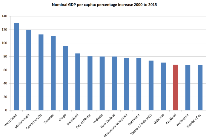
Of course, these are GDP per capita measures, and the age structures of regions do differ.  But it doesn’t look as thoough that helps much.   The labour force participation rates in Auckland and the rest of the country are almost identical (a higher labour force participation rate  helps boosts GDP per capita in Wellington).   Working age population as a share of total population is a little lower in Auckland than in the country as a whole, but over the 15 years for which we have data the working age population share has changed by much the same amount in Auckland as in the country as a whole.

Perhaps there are good answers to why Auckland appears to have underperformed –  not over a year or two, but over 10 or 15 years –  that would leave intact the story about the gains to New Zealanders from a large scale immigration programme, and the emphasis on the centrality of our largish city, Auckland, to New Zealand’s overall economic success.

But for now, it just seems to add to the increasing number of straws in the wind that suggest that the whole population and immigration-based approach to economic policy  –  and our immigration policy is one of the largest discretionary levers of government economic policy – is flawed.  Productivity growth has been consistently poor, tradables sector production per capita has recorded no growth in a decade, and our largest and fastest-growing city (in both cases, by some considerable margin) has been recording lower per capita growth than most of the rest of the country, and average incomes in Auckland have, if anything, slowly been converging towards the median.

An alternative narrative of New Zealand’s economic performance and policy, of the sort I have been running now for several years, would find little or none of this surprising.  Disappointing yes –  this is our country’s prosperity, and the future of our children –  but no more surprising than the failure of other flawed economic strategies in the past, here and abroad.  Our immigration programme for the last 25 to 30 years might better be reassigned the label once given to the ambitious, deeply flawed, energy projects of the early 1980s, Think Big.  Like that programme, it was put –  and kept – in place by well-intentioned people, genuinely seeking the best interests of their country.  But like the earlier Think Big, this one has failed, and goes on failing.  Outcomes matter a great deal more than good intentions.


Two unrelated comments

The New Zealand tourism industry has been having a good year.  One particular source of strong growth has been visitors from China, but I’d noticed reference to something similar in the Australian visitor data.  That got me curious about how the two countries’ industries had done in attracting Chinese visitors, not just over the last year or so, but over the decades.  This was the resulting chart.

china visitors

It simply takes rolling annual totals of short-term visitors from China to each country back to 1991, when the easily accessible Australian data start.

New Zealand has enjoyed a good year or two relative to Australia.  It is just a shame about the poor decade –  really the story of New Zealand’s tourism sector more generally.  Visitor numbers from China to both countries have been trending strongly upwards over the whole period (Chinese visitor numbers to New Zealand last year were more than 100 times those for 1991), but for at least the last 15 years New Zealand has done worse than Australia in attracting new Chinese visitors.  Yes, there has been quite a recovery in the last year or two, but that just takes New Zealand’s share of the market, relative to Australia’s, about back to where it was in 2007, and still a long way below our peak relative performance in 2003.

Tourism plays a larger share in New Zealand’s economy than it does in Australia’s, so success in tapping new markets looks like it should matter a bit more to us than to them.

On a totally unrelated matter, while I was playing around with the visitor data a reader kindly sent me a copy of, veteran political columnist and commentator, Colin James’s column yesterday from the Otago Daily Times.  Headed “Are English and Wheeler drifting out of date?”, it is another rehearsal of lines as to why the OCR should not be cut further.  It would bore me, and probably bore you, to go through all the weak points in the argument.  On the domestic side, suffice it to point out that per capita GDP growth has been weak not strong, a 5.3 per cent unemployment rate is disconcertingly low not a sign of an overheating labour market, and how 7.5 per cent credit growth qualifies as particularly “strong” in a economy that has 2 per cent population growth, a 2 per cent inflation target, and aspirations to some reasonable productivity growth is a bit beyond me.

But my main reason for commenting was that James also advances the line that somehow the world is a great deal better off than the statistics suggest, that technological revolutions are driving upwards our living standards and pushing prices inexorably downwards, and there really isn’t that much to worry about.

The problem with the story is that there just isn’t much evidence for it.  In the aggregate data, as I’ve highlighted before, it is clear that productivity growth has slowed, not accelerated, and that that slowdown was already underway before the ructions around the financial crises and international recessions of 2008/09.  This was a chart I showed a week or two back –  the blue line is the median TFP performance for the old advanced countries (in Europe, North America, and Oceania).

tfp conf board

And here was the data specifically for the US business sector

fernald

But don’t just take it from suggestive top-down charts. Various experts have been looking at whether any material mis-measurement issues, especially around the tech sector and tech products, can explain away the productivity slowdown.  The short answer is that they can’t.  Many readers will already have seen Tyler Cowen’s summary of these papers, and for those who haven’t I’d encourage you to check it out.   As he notes

…the countries with smaller tech sectors still have comparably sized productivity slowdowns, and that is not what we would expect if a lot of unmeasured productivity were hiding in the tech industry

John Fernald, at the San Francisco Fed, does the business sector TFP data in the chart above, and is one of the acknowledged experts in this area. In a new paper, out just a few days ago, Fernald and co-authors conclude

After 2004, measured growth in labor productivity and total-factor productivity (TFP) slowed. We find little evidence that the slowdown arises from growing mismeasurement of the gains from innovation in IT-related goods and services. First, mismeasurement of IT hardware is significant prior to the slowdown. Because the domestic production of these products has fallen, the quantitative effect on productivity was larger in the 1995-2004 period than since, despite mismeasurement worsening for some types of IT—so our adjustments make the slowdown in labor productivity worse. The effect on TFP is more muted.

It seems pretty clear that there has been a real and material slowdown in productivity growth, and hence in the rate of improvement in underlying living standards.  The Fernald paper suggest that may partly be a return to more normal growth patterns, after exceptional gains in the 1990s, but whether that is so or not, it is no reason for complacency about inflation that undershoots targets.  Weak population growth and weak productivity growth both argue for low interest rates….and as a reminder, in New Zealander real interest rates (already high by international standards) have been rising not falling over the last couple of years.

real ocr

When contemplating tomorrow’s Monetary Policy Statement  don’t fall for the lines Colin James runs, channelling Graeme Wheeler, that monetary policy is “very accommodative”