I stumbled on this chart yesterday.
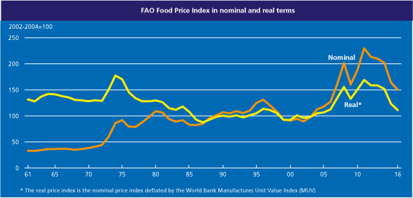
It shows the FAO’s food price index, all the way back to 1961, including a real series in which the nominal FAO index is deflated by the World Bank’s Manufactures Unit Value Index, “a composite index of prices for manufactured exports from the fifteen major developed and emerging economies to low- and middle-income economies”. The FAO index itself is a weighted average of the international prices for cereals, vegetable oil, dairy, meat, and sugar.
Never knowingly optimistic, I was still a little surprised by the picture. After all, a dominant story of the last 25 years has been one of falling prices of manufactures, driven in large part by the industrialisation of China, and reflected in (for example) sharp falls in the terms of trade for Japan and Taiwan. And optimists around New Zealand have told stories about the growing global scarcity of water, rising Asian demand for high quality protein, and so on. And yet on this measure real food prices – the amount of manufactures a given amount of food commodities would purchase – have been no better than flat. If anything, at present prices seem to be moving back towards the lows of the 20 years from the mid 80s to the mid 00s. And the dairy component doesn’t appear to have been behaving much differently than the other components of the index.
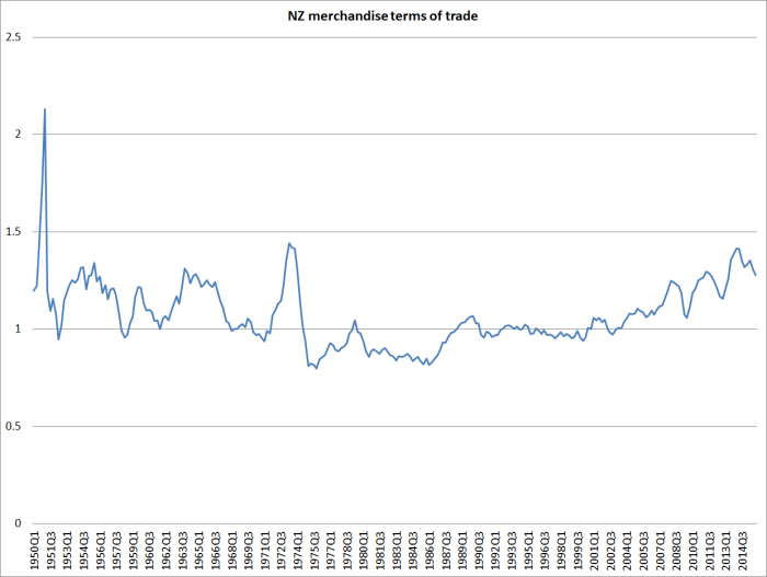
Of course New Zealand isn’t a low or middle income country, so perhaps this World Bank index isn’t representative of our purchases over time. The WTO also has an index for prices of imports and exports of manufactures: it has only been running since 2005, and over that period prices of manufactures have increased less than those of food (as reflected in the FAO index). Our own overall terms of trade – for a wider range of exports than food, and imports than manufactures – have still been quite good by historical standards (although even in the 1950s and 60s our incomes were drifting down relative to the rest of the advanced world).
There appears to plenty of scope for productivity growth in agriculture (although there hasn’t been much in New Zealand in recent years), but there isn’t any more land being made here, and environmental/water concerns are limiting just how much more intensively existing land can be used. For a country with a fairly rapidly growing population, that is still heavily dependent on its food exports, the prospects for sustained high incomes seems to rest on some combination of high productivity and high prices. Or, of course, the rapid growth in other exports – but over decades now that latter just hasn’t been happening.
On completely different topic, this is one of favourite housing charts.
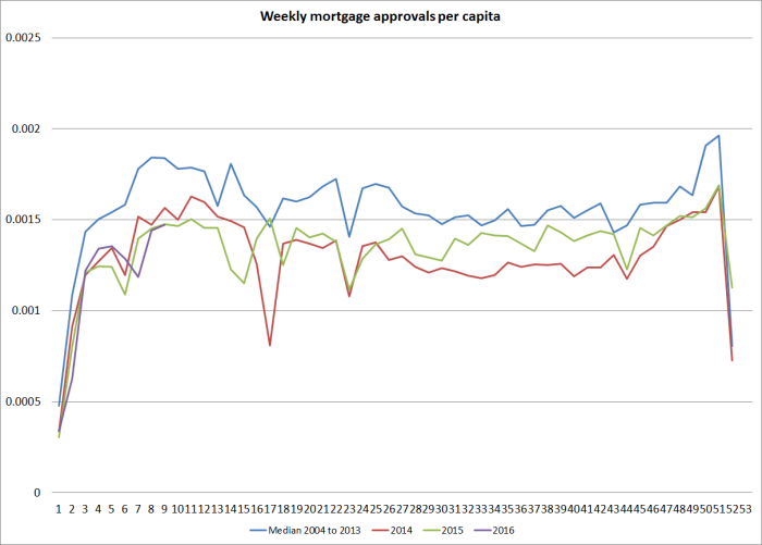
It shows the number of weekly mortgage approvals (with a rough adjustment to turn it into a per capita measure) for each week of the year, numbering 1 to 52/53. That deals with (a) the rising trend in the population over time (material over a decade), and (b) the fact that the data aren’t seasonally adjusted.
I haven’t shown a (hard to read) version with lines for each year for which the Reserve Bank has data. But you can see how much more active the mortgage market was on average over the first decade of the data than it has been over the last few. In fact, in 2007, the peak year of the previous boom the line was around .0025 at this time of year – in other words, more than 60 per cent more mortgages were being approved per capita at this time of year in 2007 than was happening this year (or last year).
The housing finance is now, unfortunately, quite badly distorted by the Reserve Bank’s increasing range of direct controls, but there is just nothing in this data to suggest a frenzied speculative boom. In such booms, volumes tend to be very strong – not just new loans, but turnover per capita too. There was a plausible story like that, backed by the data, in the previous boom from 2002 to 2007. There hasn’t been, and isn’t, in the last few years. Individual potential buyers have no doubt been very worried about missing out, perhaps permanently, but the main factors behind what strength there has been in house prices – considerable in Auckland- was the government. It encourages rapid population growth through a liberal immigration policy, and at the same time is responsible for the legislative framework that makes urban land scarce and impedes the physical expansion of the city. That seems that like a crazy policy mix to me, but it isn’t a frenzied credit boom – and isn’t obviously any sort of “bubble” either. The definition of a bubble is rather elusive, but suggests something completely detached from fundamentals. But government policy parameters are fundamentals. They could change, but there is little or no sign of them doing so.
Why harp on the point? In the lead-up to next week Monetary Policy Statement some of those opposing OCR cuts do so on the basis of house price concerns. House prices aren’t in the Reserve Bank’s monetary policy remit, but in any case there is no sign of irrational exuberance – whether by buyers or financiers – driving what is going on. Rising (and absurdly high) real house prices in some areas appears to be largely a relative price change, attributable to pretty easily identifiable structural factors. Orienting monetary policy around the price of a good, itself largely shaped by government structural policy choices, would be even odder than orienting it around, say, the price of gold – a product which, at least, governments did not directly influence the supply.
The other relevant consideration is the question of just how much difference monetary policy shocks, and adjustments to the OCR, actually make to house prices. In support of its LVR policies, the Reserve Bank used their model a couple of years ago to argue that achieving the same impact on house prices as they expected to achieve using LVR restrictions, they would have to lift interest rates (relative to baseline) by around 200 basis points. The LVR restrictions were expected to lower house price inflation by around 1-4 percentage points in the first year (the effect fading away thereafter). Modelling house prices well isn’t easy, but if this Reserve Bank analysis is even remotely right it seems unlikely that further cuts to the OCR over the next few quarters of even 50 to 100 basis points, offsetting falling external incomes, falling inflation expectations and rising offshore funding costs, would materially affect the level of national house prices.
