Two unrelated comments

The New Zealand tourism industry has been having a good year.  One particular source of strong growth has been visitors from China, but I’d noticed reference to something similar in the Australian visitor data.  That got me curious about how the two countries’ industries had done in attracting Chinese visitors, not just over the last year or so, but over the decades.  This was the resulting chart.

china visitors

It simply takes rolling annual totals of short-term visitors from China to each country back to 1991, when the easily accessible Australian data start.

New Zealand has enjoyed a good year or two relative to Australia.  It is just a shame about the poor decade –  really the story of New Zealand’s tourism sector more generally.  Visitor numbers from China to both countries have been trending strongly upwards over the whole period (Chinese visitor numbers to New Zealand last year were more than 100 times those for 1991), but for at least the last 15 years New Zealand has done worse than Australia in attracting new Chinese visitors.  Yes, there has been quite a recovery in the last year or two, but that just takes New Zealand’s share of the market, relative to Australia’s, about back to where it was in 2007, and still a long way below our peak relative performance in 2003.

Tourism plays a larger share in New Zealand’s economy than it does in Australia’s, so success in tapping new markets looks like it should matter a bit more to us than to them.

On a totally unrelated matter, while I was playing around with the visitor data a reader kindly sent me a copy of, veteran political columnist and commentator, Colin James’s column yesterday from the Otago Daily Times.  Headed “Are English and Wheeler drifting out of date?”, it is another rehearsal of lines as to why the OCR should not be cut further.  It would bore me, and probably bore you, to go through all the weak points in the argument.  On the domestic side, suffice it to point out that per capita GDP growth has been weak not strong, a 5.3 per cent unemployment rate is disconcertingly low not a sign of an overheating labour market, and how 7.5 per cent credit growth qualifies as particularly “strong” in a economy that has 2 per cent population growth, a 2 per cent inflation target, and aspirations to some reasonable productivity growth is a bit beyond me.

But my main reason for commenting was that James also advances the line that somehow the world is a great deal better off than the statistics suggest, that technological revolutions are driving upwards our living standards and pushing prices inexorably downwards, and there really isn’t that much to worry about.

The problem with the story is that there just isn’t much evidence for it.  In the aggregate data, as I’ve highlighted before, it is clear that productivity growth has slowed, not accelerated, and that that slowdown was already underway before the ructions around the financial crises and international recessions of 2008/09.  This was a chart I showed a week or two back –  the blue line is the median TFP performance for the old advanced countries (in Europe, North America, and Oceania).

tfp conf board

And here was the data specifically for the US business sector

fernald

But don’t just take it from suggestive top-down charts. Various experts have been looking at whether any material mis-measurement issues, especially around the tech sector and tech products, can explain away the productivity slowdown.  The short answer is that they can’t.  Many readers will already have seen Tyler Cowen’s summary of these papers, and for those who haven’t I’d encourage you to check it out.   As he notes

…the countries with smaller tech sectors still have comparably sized productivity slowdowns, and that is not what we would expect if a lot of unmeasured productivity were hiding in the tech industry

John Fernald, at the San Francisco Fed, does the business sector TFP data in the chart above, and is one of the acknowledged experts in this area. In a new paper, out just a few days ago, Fernald and co-authors conclude

After 2004, measured growth in labor productivity and total-factor productivity (TFP) slowed. We find little evidence that the slowdown arises from growing mismeasurement of the gains from innovation in IT-related goods and services. First, mismeasurement of IT hardware is significant prior to the slowdown. Because the domestic production of these products has fallen, the quantitative effect on productivity was larger in the 1995-2004 period than since, despite mismeasurement worsening for some types of IT—so our adjustments make the slowdown in labor productivity worse. The effect on TFP is more muted.

It seems pretty clear that there has been a real and material slowdown in productivity growth, and hence in the rate of improvement in underlying living standards.  The Fernald paper suggest that may partly be a return to more normal growth patterns, after exceptional gains in the 1990s, but whether that is so or not, it is no reason for complacency about inflation that undershoots targets.  Weak population growth and weak productivity growth both argue for low interest rates….and as a reminder, in New Zealander real interest rates (already high by international standards) have been rising not falling over the last couple of years.

real ocr

When contemplating tomorrow’s Monetary Policy Statement  don’t fall for the lines Colin James runs, channelling Graeme Wheeler, that monetary policy is “very accommodative”


Real food prices….and housing market activity

I stumbled on this chart yesterday.

fao chart

It shows the FAO’s food price index, all the way back to 1961, including a real series in which the nominal FAO index is deflated by the World Bank’s Manufactures Unit Value Index, “a composite index of prices for manufactured exports from the fifteen major developed and emerging economies to low- and middle-income economies”.   The FAO index itself is a weighted average of the international prices for cereals, vegetable oil, dairy, meat, and sugar.

Never knowingly optimistic, I was still a little surprised by the picture.  After all, a dominant story of the last 25 years has been one of falling prices of manufactures, driven in large part by the industrialisation of China, and reflected in (for example) sharp falls in the terms of trade for Japan and Taiwan.   And optimists around New Zealand have told stories about the growing global scarcity of water, rising Asian demand for high quality protein, and so on.   And yet on this measure real food prices –  the amount of manufactures a given amount of food commodities would purchase –  have been no better than flat.  If anything, at present prices seem to be moving back towards the lows of the 20 years from the mid 80s to the mid 00s.  And the dairy component doesn’t appear to have been behaving much differently than the other components of the index.

Of course New Zealand isn’t a low or middle income country, so perhaps this World Bank index isn’t representative of our purchases over time.  The WTO also has an index for prices of imports and exports of manufactures: it has only been running since 2005, and over that period prices of manufactures have increased less than those of food (as reflected in the FAO index).  Our own overall terms of trade  –  for a wider range of exports than food, and imports than manufactures – have still been quite good by historical standards (although even in the 1950s and 60s our incomes were drifting down relative to the rest of the advanced world).

merchandise tot

There appears to plenty of scope for productivity growth in agriculture (although there hasn’t been much in New Zealand in recent years), but there isn’t any more land being made here, and environmental/water concerns are limiting just how much more intensively existing land can be used.   For a country with a fairly rapidly growing population, that is still heavily dependent on its food exports, the prospects for sustained high incomes seems to rest on some combination of high productivity and high prices.  Or, of course, the rapid growth in other exports –  but over decades now that latter just hasn’t been happening.

On  completely different topic, this is one of favourite housing charts.

mortgage vols

It shows the number of weekly mortgage approvals (with a rough adjustment to turn it into a per capita measure) for each week of the year, numbering 1 to 52/53.  That deals with (a) the rising trend in the population over time (material over a decade), and (b) the fact that the data aren’t seasonally adjusted.

I haven’t shown a (hard to read) version with lines for each year for which the Reserve Bank has data.  But you can see how much more active the mortgage market was on average over the first decade of the data than it has been over the last few.  In fact, in 2007, the peak year of the previous boom the line was around .0025 at this time of year –  in other words, more than 60 per cent more mortgages were being approved per capita at this time of year in 2007 than was happening this year (or last year).

The housing finance is now, unfortunately, quite badly distorted by the Reserve Bank’s increasing range of direct controls, but there is just nothing in this data to suggest a frenzied speculative boom.  In such booms, volumes tend to be very strong –  not just new loans, but turnover per capita too.  There was a plausible story like that, backed by the data, in the previous boom from 2002 to 2007.  There hasn’t been, and isn’t, in the last few years.  Individual potential buyers have no doubt been very worried about missing out, perhaps permanently, but the main factors behind what strength there has been in house prices –  considerable in Auckland-  was the government.  It encourages rapid population growth through a liberal immigration policy, and at the same time is responsible for the legislative framework that makes urban land scarce and impedes the physical expansion of the city.  That seems that like a crazy policy  mix to me, but it isn’t a frenzied credit boom –  and isn’t obviously any sort of “bubble” either.  The definition of a bubble is rather elusive, but suggests something completely detached from fundamentals.  But government policy parameters are fundamentals.  They could change, but there is little or no sign of them doing so.

Why harp on the point?  In the lead-up to next week Monetary Policy Statement some of those opposing OCR cuts do so on the basis of house price concerns.  House prices aren’t in the Reserve Bank’s monetary policy remit, but in any case there is no sign of irrational exuberance –  whether by buyers or financiers –  driving what is going on.  Rising (and absurdly high) real house prices in some areas appears to be largely a relative price change, attributable to pretty easily identifiable structural factors.  Orienting monetary policy around the price of a good, itself largely shaped by government structural policy choices, would be even odder than orienting it around, say, the price of gold –  a product which, at least, governments did not directly influence the supply.

The other relevant consideration is the question of just how much difference monetary policy shocks, and adjustments to the OCR, actually make to house prices.  In support of its LVR policies, the Reserve Bank used their model a couple of years ago to argue that achieving the same impact on house prices as they expected to achieve using LVR restrictions, they would have to lift interest rates (relative to baseline) by around 200 basis points.   The LVR restrictions were expected to lower house price inflation by around 1-4 percentage points in the first year (the effect fading away thereafter).  Modelling house prices well isn’t easy, but if this Reserve Bank analysis is even remotely right it seems unlikely that further cuts to the OCR over the next few quarters of even 50 to 100 basis points, offsetting falling external incomes, falling inflation expectations and rising offshore funding costs, would materially affect the level of national house prices.


A non-New Zealander as Governor?

The Australian newspaper ran an article yesterday on the appointment of a new Governor to the Reserve Bank of Australia.  Glenn Stevens’ term expires in September.  As it now March, I was a little surprised to read that

A spokesman for current Treasurer Scott Morrison said ….that the specific process for choosing the new governor was still under consideration.

But perhaps that just reflects the overwhelming expectation that the highly-regarded Deputy Governor, Phil Lowe, will get the job.

The Reserve Bank of Australia has had a long history of Governors appointed from within –  in its (fairly short) history, only one Governor was appointed from outside (Bernie Fraser who moved from being Secretary to the Treasury).  But the article explored the possibility that the Treasurer could look outside the Bank, or even abroad, for a replacement for Stevens.

Even allowing for the recent appointment of an expatriate Australian banker as Secretary to the Treasury, it seems pretty unlikely that the Treasurer would do much more than take a cursory look at possible candidates other than Lowe.   If the Reserve Bank of Australia has perhaps been inclined to be excessively upbeat in recent years, it is not obvious that the Bank’s conduct of affairs has been so egregiously wrong –  or upsetting to the government – that it would make sense to reach beyond the pretty deep bench of senior officials that the RBA has maintained over the years.

As the article notes, the appointment of a foreigner to a role as central bank Governor is not unknown –  Mark Carney at the Bank of England at present, and Stan Fischer at the Bank of Israel are two I can think of – but it isn’t at all common in stable and advanced countries.  (New Zealand’s former Deputy Governor Peter Nicholl served as head as Bosnia’s central bank in the aftermath of the civil war in the 1990s).

When inflation targeting was young, and there was a strong belief that it would be easy to hold a Governor to account, there was a view in some circles that it might even be best to get a foreigner as Governor –  after all, the world labout market was so much deeper than that here in New Zealand, and since it was all very technical and the target was well-specified, the only thing that really mattered was technical expertise (perhaps even more than good judgement).

But no one looks at it quite that way now.  It is widely accepted that central banks excess a considerable degree of discretion.  That is so whether they are inflation targeting, nominal GDP targeting, wage targeting –  in fact, anything other than a fixed exchange rate, or Friedman’s fixed money base target rule.  There is considerable discretion, limited effective accountability, and the discretion is in areas of activity that matter to many people (ie the entire economy and financial system).  In that sort of climate it seems reasonable that people would prefer to be governed, or administered, by people from their own country.  No matter how capable other candidates might be, we don’t consider allowing people from abroad to become MPs or Cabinet ministers –  at least not until they have lived here for a few years and become citizens themselves.  It isn’t that all New Zealanders, or all Australians or all Americans, share the same values or views, simply a slightly inchoate but deep-seated sense that we should govern ourselves.  Part of it perhaps is that in any of those roles –  senior political ones, or powerful independent bureaucrats – the ability to explain oneself to the citizenry is a key aspect of the job, and that involves the ability to draw on common reference points, shared experiences etc.

In the Reserve Bank of Australia case, one could mount an argument that these issues are less compelling.  After all, the Governor is chief executive of the Bank and chair of the Board, but he doesn’t get to appoint the Board, and he isn’t a single decision-maker.  Interest rate decisions – the main decisions the Reserve Bank of Australia makes – are made by an outside Board appointed by the elected government.  Even the Deputy Governor is directly appointed by the Treasurer and sits, as of right, on the Board.

But what about New Zealand?

Here the formal process for appointing a Governor is laid out in the Act. The Reserve Bank Board nominates a candidate, whom the Minister of Finance can accept or reject.  If the Minister rejects that nomination, the Board must come up with another one.  The process can go as many rounds as it takes, but at no point can the Minister just impose his or her preferred candidate.  Personally, I think that is a weakness of our system –  it is unusual to give the Minister of Finance so little so in the appointment of such a powerful official.  Ours is a system where, formally, all the powers vest in the Governor personally, so the Minister of Finance also has no say in the appointment of any of the other senior officials of the Bank.

And compared to most central banks, the Reserve Bank of New Zealand exercises a large amount of discretionary powers in a wide range of areas.  In addition to monetary policy, the Governor has considerable autonomy in setting prudential regulatory policy (and the application of that policy), in foreign exchange rate intervention, in payment system operations, and in the physical currency.  On each individual limb, other central banks can be found that do what our Reserve Bank does, but take as a whole it would be difficult to find any central bank which (a) covers so many functions, (b) has so many powers formally delegated to the Bank, and (c) where all those functions vest with a single individual, the Governor.  It is a role at least as powerful as that of most Cabinet ministers – partly because of the actual powers the Governor wields, and partly because of how much more difficult it is to get rid of a person if they mess up (compare, say, Judith Collins and Nick Smith, as two senior ministers in the current government to have been dismissed when they erred).

As the Reserve Bank Board and the Minister approach the end of Graeme Wheeler’s term next September, there must be a temptation to consider overseas candidates.  After all, the current deputy chief executive will be in his mid 60s, a similar age to Wheeler, and was passed over when he sought to become Governor last time.  None of the other internal senior managers look like outstanding candidates –  and it was 1982 when an internal candidate was last appointed Governor (itself a pretty internationally unusual statistic).  Outside the Bank, the list of plausible contenders in New Zealand doesn’t seem overly deep either – and for almost all the names I’ve heard suggested I can think of material arguments against.

But I think it would still be a mistake to go global.  Some aspects of the role could be done by any able person –  revitalising, for example, the Bank’s research and analysis across the range of its policy functions.  That is partly just about good second and third tier appointments, and partly about being a voracious customer for the insights that analysis throws up .  But the role also needs someone who understand the New Zealand economy, the New Zealand system of governance, and someone who understands the New Zealand financial system.  And it needs someone who is comfortable, and credible, in telling the Bank’s story – and sometimes it will be a controversial or difficult story –  to New Zealand audiences.  Plenty of people criticized Don Brash over the years, but few doubted that his heart was in this country, and that its best interests were his priority.  In a small country, with a foreign-dominated financial sector, a very powerful central bank, and ongoing controversy about the role of monetary policy and New Zealand’s economic performance, it is hard to imagine any foreign appointee successfully filling the bill.

Of course, it might be a little easier if the governance of the Bank was reformed.  For example, in a system in which the Governor was chief executive, but had no more voting rights on monetary policy or financial regulation policy matters than others members of the respective committees, the stakes are a little lower.  But even then, I think such governance reform more appropriately opens the way to the appointment, from time to time, of a foreign expert as a member of one or other of the voting committees.  Since the Bank of England’s nine-person Monetary Policy Committee was established by legislation almost 20 years ago it has not been uncommon to have a foreigner sitting on that committee. In a New Zealand context, supplementing local expertise with outside perspectives in that way could have some appeal – if New Zealand government board fees were sufficient to attract quality candidates –  but we are still likely to be best, in all but the most exceptional circumstances, to look for a Governor from home –  as we do when we choose ministers, judges, (and these days Governors-General), military chiefs and so on.

As I’ve noted before, the next gubernatorial appointment is in any case complicated by the timing of next year’s election.  Graeme Wheeler’s term expires just beyond three years since the last election, and most of the opposition parties have been campaigning on changes to the monetary policy framework.  If they are serious about reforms, they are also likely to revisit the governance arrangements, to shift towards a model that is (a) more internationally conventional, and (b) more in line with how we govern other independent government agencies in New Zealand.  The current government would no doubt be within its legal rights to make an early appointment for the whole of a new five year term (having obtained a suitable recommendation from the Bank’s Board –  all of whom have been appointed, or reappointed, by the current Governor).  But given the timing it would seem an inappropriate use of power, that could materially complicate relations between the Bank and a future government.  Somewhat reluctantly, I think Graeme Wheeler should be asked to stay on for an additional year or so, allowing whichever party forms the next government to appoint a Governor to work with whatever model of monetary policy and central bank governance emerges from the electoral process.

Krugman on the case for more public investment

Paul Krugman had a piece on his blog a day or two ago making the case for increased (“much more”) public investment spending in the US.

There are three strands to his case.

The first is a proposition that the US is still “in or near” a liquidity trap. I’m not sure I’d use the term, but the general point is one I sympathise with.  Under current legislation and central bank practices (easy convertibility into banknotes on demand), few countries are very far from the effective lower bound on nominal interest rates.  And if a new downturn comes, that could make it very difficult for central banks to do much to help stabilize economies.   To me, that argues for action (legislative and administrative) to remove (or greatly ease) the lower bound constraint.

The second is a proposition that the last few years of disappointing real economic growth are helping to bring about a sustained reduction in future potential growth –  in his words,

demand-side weakness now breeds supply-side weakness later, so that there are big payoffs to boosting the economy through public spending

In principle, it might be a plausible idea. But there is no real evidence that things turned out that way during the Great Depression when, extremely weak as demand was, TFP growth remained strong.

The third –  actually first in Krugman’s list –  is that public spending as a share of GDP is now very low:

Government borrowing costs are at record lows; markets are in effect pleading with the government to borrow and spend. So why not do it? It’s completely crazy that public construction as a percentage of GDP has declined to record lows even as interest rates have done the same

And he includes this chart

krugman chart

That chart only goes back to the early 1990s.  But here, for the US, is general government gross fixed capital formation as a per cent of GDP since 1970.

us gen govt gfcf

It is at a record low, which might seem to support Krugman’s case.

But then here is the annual rate of growth in the US population, in this case going back as far as the FRED series went, to 1953.  And what do we find, but that population growth is also estimated to be at its lowest for decades –  quite possibly in the entire history of the US.

us popn 2

If the population growth rate slows, less investment (as a share of each year’s GDP) is needed to maintain a desired stock of capital per person.  That is a good thing, on the whole –  available resources can be used for other stuff.  These effects are quite large.  Much of the government capital stock is in the form of quite long-lived assets, which depreciate slowly (schools, hospitals, roads etc).  Depreciation is one –  quite substantial –  component of the gross fixed capital formation spending, but a large share of government capital spending is about supporting the needs of a growing population.

It isn’t just the US population growth rate that is slowing –  global population growth rates have been slowing markedly too.

world popn

A lower rate of population growth, and associated lower need for investment, is now pretty widely recognized as one of the factors that has been driving real interest rates down around the world.  One could argue, with Krugman, that markets are “begging governments to borrow and spend”, but it might be better to interpret is as markets as reflecting the twin declines, in population growth and in underlying multi-factor productivity growth.  There simply aren’t as many attractive projects around as there were.  It can take time for (desired) savings rates to adjust to that deterioration in investment prospects –  and that is usually where monetary policy has a part to play.  More government capital expenditure, if the remunerative projects aren’t there, doesn’t look like a particularly attractive way to boost the country’s longer-term economic fortunes. And as the US government is still running deficits, cuts in government savings don’t look particularly sensible either.

Perhaps the US is different, and the high-returning public projects (covering not just the low cost of debt but the overall cost of citizens’ equity) are there and able to be implemented effectively in a way that achieves those returns.  But the political process is such that even if, in principle, a large pool of such projects are there, there is no guarantee that those would be the projects that would be picked.

What of New Zealand?  Here is the chart of general government gross fixed capital formation as a per cent of GDP back to 1987.

gen govt gfcf

It hasn’t fallen, but then again our population growth –  while volatile –  has recently been higher than at any time since the 1970s.  There is an awful lot of wasteful public capital spending here, that fails to pass reasonable economic tests – Transmission Gully, the Auckland rail projects, the Dunedin stadium, and the fearful prospect of large amounts of ratepayer money extending Wellington Airport’s runway –  and we should be wary of the siren calls, even here, to increase government capital expenditure as a way of stimulating the overall economy.  Poor quality projects make us poorer.

Are there exceptions –  cases where demand might be so weak that perhaps even poor quality projects might help kickstart the economy (Keynes’s example of paying people to dig holes and fill them in again).  I’m not sufficiently doctrinaire as to say “never”, but equally it is difficult to think of any actual historical episodes where “sorting out monetary policy”, and complementing that with growth-oriented structural reforms, would not have been a better option.  It was in the Great Depression. It would have been in 1990s Japan.  It looks that way in most of the world, including New Zealand, now.


Immigration the source of Australia’s prosperity?

Late last year, veteran Australia journalist and author George Megalogenis’s new book Australia’s Second Chance was published.  Despite the single economic market, it is often hard to become aware of new Australian books, and not always easy to get hold of them either.  Somehow I stumbled on a reference to this book and read it a few weeks ago.

Megalogenis appears to be highly-regarded by the liberal-left in Australia, at least judging from the reviews of his previous book (which was launched by Prime Minister Julia Gillard) that are quoted on the inside cover of this one.   Wikipedia says he once was once married to the woman who is now Labour premier of Queensland and, whether because of that or despite it, he appears to have it in for Queensland –  not helped, it seems, by the large number of New Zealanders living there.

It is a well-written easily-read book, and for those who don’t know too many details of Australian history since 1788 it is full of interesting facts.  It is just a shame that the thesis that shapes the book is almost certainly almost totally wrong.

Megalogenis argues that immigration is what has made Australia rich, and is what will make it richer still in future –  if only the naysayers, sceptics, racists etc just get out of the way, and let Australia fulfil its manifest destiny.

You may think I am over-egging his story, but here are some lines from the last page of the book

Australia matters more than most nations because it remains a settlement with potential.  Our unique strengths…..come with a burden.  The rest of the world expects Australia to succeed, given our small population and resource endowment.  Our previous eras of poor performance were punished so severely because the world believed we had let it down.  This is the pragmatic argument for openness, because history tells us the alternative is an isolated belittled Australia.  A globally minded Australia will continue to thrive, because the world will project its best self on us.

and a page or two earlier, concludes that Australia’s

standard of living depends on the migrant

The test for Australia now, we are told, is “to keep them coming”.

It is really a very odd argument.

As one person I mentioned the book’s thesis to noted, in one sense it is clearly true.  Had there been no immigration to Australia since 1788, it seems most unlikely that per capita incomes of Australians would anything like as high as they are today.  They aren’t in, say, Botswana or Mongolia.

Then again, as far as we can tell from the historical estimates that are available, Australia’s per capita incomes were the highest in the world in about 1890.  Australia has not matched that performance in the 125 years since.

According to Megalogenis, Australia’s success has rested on repeated waves of immigrants, and when the flow slowed times were not typically good for Australians.  Mostly, it is a story that seems to reverse cause and effect.    Migrants are attracted to economic success and opportunities.  In the 19th  century it was hugely expensive to immigrate to Australia (or New Zealand) and people did so in large numbers either when someone else paid them to do (assisted migration) or when really good new opportunities (large expected income gains) opened up.

Early European Australia was a penal colony, hugely heavily subsidized by Britain, with few export opportunities and not particularly attractive as a place to relocate to (the total European population in 1820 was 33000).  The first big natural resource shock was the discovery of the natural pasturelands in western New South Wales in the 1820s.  In 1830, Australian wool accounted for 8 per cent of British wool imports (German states had been the dominant supplier), but by 1850 Australia accounted for more than half of a fast-growing market.  The associated income growth markedly boosted both the Australian colonies ability to support themselves, and to support a much larger population at the sort of living standards (or better) they might have been used to at home.

The gold rushes of the 1850s (and sustained high gold production for several subsequent decades) had a similar effect.   Whole new incomes could be generated in Australia, supporting high living standards (and associated imports) for a larger population.  Immigrants flooded in  –  as they did later to New Zealand in our gold rushes. Australian exports as a share of GDP rose to around 40 per cent –  a level never achieved since.  But there is nothing in the economic histories to suggest that the immigrants created the prosperity. Rather, the prosperity made Australia (and especially Victoria) attractive to immigrants.  Since the typical immigrants was a single male, content with a pretty rough standard of accommodation – so there weren’t huge initial capital stock requirements –  the standard result in Australian economic histories is that the huge inflow of immigrants dampened wages in Australia (relative to a counterfactual in which the gold discoveries had to be exploited only by people already there).

After a final gold rush in Western Australia in the 1890s, there were no great natural resource discoveries in Australia for decades.  Agricultural productivity gains continued to lift farm output –  and refrigerated shipping and new dairy technologies assisted Australia, although to a lesser extent than New Zealand –  but the best land was already taken.  Perhaps unsurprisingly, these weren’t great decades for remote Australia.  By global standards, it remained a rich and successful country, but no longer at the forefront-  indeed, on some of best measures around there wasn’t much per capita growth from 1890 until World War Two. Perhaps unsurprisingly, the rate of population growth wasn’t as rapid – European migrants weren’t quite so keen on coming as they had been (and, as in other settler countries, Asian migration was severely restricted).  For the first half of the 20th century, Australia was much like New Zealand –  an agricultural exporter, primarily to the United Kingdom.  Overall, the two countries generated rather similar living standards  –  and still had some of the faster rates of population increase anywhere in the advanced world.

Minerals began to come back to prominence in Australia from the 1960s.  Australia stopped doing stupid stuff to itself-  bans on iron ore exports were lifted, prospecting rights were improved etc –  and some combination of new discoveries and new opportunities (the rise of Asia) provided a whole new, increasingly large, income stream for Australia.  New foreign income opportunities support higher consumption demands from an existing population, and can sustain a higher population.  Mineral exports from Australia had been 1 per cent of total exports in 1951.  They were 18 per cent in 1974, 28 per cent in 1989, and 55 per cent in 2009.  And exports as a share of GDP were materially higher than they had been in the 1950s and 1960s.  New Zealand, of course, has had nothing similar (some argue that there is plenty of mineral potential, but if laws make it difficult or impossible to exploit, it doesn’t matter much whether the enthusiasts are right or wrong).

But, contrary to Megalogenis’s thesis, there is just nothing in the data to support the idea that the rapid (immigration-fuelled) population growth has been the basis for strong per capita income growth (over decades).  Rather it is the rapid total income growth –  particularly associated with mineral developments over the last 40 to 50 years –  that has enabled Australia to support pretty good incomes for a growing number of people.  Again, we in New Zealand had nothing similar on the income side, and so overall returns (eg GDP per hour worked) available to the growing number of people have continued to languish.

Now, to be clear, this is not some crude story in which physical resources inevitably make a country rich.  There are so many counter-examples I’m not going even going to attempt to list them.  But new physical resource discoveries, when combined with capable people, and strong institutions, have proved able to generate high per capita incomes for people in places where one might not otherwise have expected such good outcomes.  Norway is one example –  balancing all three components of that mix..  With more emphasis on the resources than the human capital or institutions, Brunei or Kuwait are other examples (or Equatorial Guinea and Gabon).   Australia is closer to the Norwegian end of the story –  the same North European combination of people and institutions, that have made for the most prosperous settled societies in history, augmented abundant natural resources (but spread over considerably more people than Norway).  Australia doesn’t seem like the sort of location that, natural resources apart, would easily generate top tier incomes –  never in its history has it looked like developing seriously internationally competitive manufacturing or services industries based in Australia.

Readers may be skeptical of the story I’ve been telling.  But don’t take my word for it.  Most of it (and most of the data I’ve quoted) is based on one of my favourite economics books Why Australia Prospered,  published in the prestigious Princeton Economic History of the Western World series, and written by the recently-retired leading Australian economic historian Ian McLean.  The value of the book is partly that he explicitly considers Australia through a comparative lens, looking at other settler economoies, including New Zealand.   I reread it after I’d read Megalogenis, and his story is essentially the one outlined in the previous paragraph.  There is no sense, anywhere in the entire book, that anytime in the entire modern history of Australia immigration has been an enabler –  allowing Australia to lift its per capita income above what it would otherwise have been.

And what of that bastion of careful economic analysis, the Australian Productivity Commission?  They produced a big report 10 years ago, that concluded that there were probably few or no benefits to Australians from modern immigration inflows.  And late last year, in response to another government request for a report on immigration, they produced another lengthy draft report.  I’d seen a few media reports suggesting that they had reached a positive conclusion on the benefits from immigration, but when I dug into the chapter on the economywide impacts of immigration (from p 263), I found that in their baseline scenario productivity growth and wages were lower in the scenario in which current immigration levels continued than in a scenario without immigration.  The differences are very small, and my only point here is that there is little or no support for the sort immigration-boosterism reflected in a book like Megalogenis’s.  The Productivity Commission do run an alternative more positive scenario – but essentially it amounts to “what if we just assume that skilled immigration materially boosts productivity growth”.  If one assumes gains going into the analysis, one gets gains out the other end.

Over the broad sweep of modern history Australia and New Zealand have had pretty similar approaches to immigration. And they’ve had similar institutions, and similar sorts of capable people.   In neither case is there any evidence that continued high rates of immigration have done anything to lift either country’s longer-term economic performance.  Rather successful economies successfully absorbed more people at little cost to their own people.  The big difference between the two countries in the last 100 years has been the discovery and exploitation of the vast mineral resources in Australia. That has enabled Australia to continue to offer fairly high incomes to a lot more people –  including many New Zealanders.  Without the new opportunities, products or markets, New Zealand has struggled to cope with its population growth, and continues to drift further behind the rest of the advanced world –  putting more people into a place with few natural advantages.

I described Australian incomes as “fairly high”.   And yet for all its huge natural resources, Australia’s real GDP per hour worked –  while a lot better than New Zealand’s – is no higher than the median of advanced countries.  For decades it fell relative to other advanced countries, and even over the last 20 years has done little better than hold its own.

aus real gdp phw relative

As a topic for another day,  might its people also have been better off without such rapid immigration-fuelled population growth?


New Zealand and Norway: a real exchange rate that hasn’t moved

On average, over time, one would expect the real exchange rate of a more poorly-performing country to depreciate against that of a better-performing country.

There is a whole variety of strands to a possible story about why one might expect to see such a relationship, and for why it would be helpful for the more poorly-performing country for such a depreciation to occur.  A less well-performing country will typically have found its firms less well able to compete in international markets (than those of the better performing country).  That, in turn might reflect a less attractive tax and regulatory environment, less real productivity growth, or changing demand patterns so that the world wants more of what the more successful country produces and less of what the less successful country produces.  Or it might even be about natural resource discoveries –  a country that discovers major new resources (eg oil and gas) just has more stuff that the rest of the world wants, and with good institutions such a country will tend to outperform other countries for a (perhaps quite prolonged) period.  And the citizens of a faster-growing country will rationally anticipate strong future income gains, increasing their consumption demand relative to the trajectory of consumption demand in the less well-performing economy.

I’ve illustrated previously that one of the striking stylized facts about New Zealand is that although our economic performance over the last 60 or even 100 years has been pretty disappointing by global standards, there has been no depreciation in our real exchange rate relative to those of other advanced economies.  No wonder our tradables sector has struggled.

This post is really just about illustrating the point by reference to one other particular small commodity exporting country, Norway.

For the first 100 years or more of modern New Zealand, no one doubted that per capita incomes in New Zealand were much higher than those in Norway.  New Zealand was one of the great economic success stories, while Norway struggled, and exported a lot of people, especially to the United States.  On the Maddison numbers, GDP per capita in New Zealand in 1870 was more than twice that in Norway.  By 1910, when New Zealand GDP per capita is estimated to have been the highest in the world, the margin was even more in our favour.

These days, GDP per capita in New Zealand is not much more than half that in Norway  (and the NNI per capita gap is even larger).  New Zealanders work long hours per capita, and our real GDP per hour worked is estimated to be only about 45 per cent of that in Norway.  Over the last few years, we’ve done a bit better than Norway, but the multi-decade trend has been strongly downwards.

Here, using the OECD database which has estimates back to 1970, is New Zealand GDP per capita relative to Norway’s (in current prices, using current PPP exchange rates).  These are really large declines.  Back in the early 1970s we had incomes about the same as those of Norwegians.

gdp pc nz and norway

Norway began to pull away from other OECD countries when its large oil and reserves began to move into production in the 1970s.  We, on the other hand, suffered in the 1970s from a deep decline in the terms of trade, and new access restrictions on our major export products.

And yet here is a chart showing New Zealand’s real exchange rate relative to that of Norway since 1970.  I’ve shown two, very similar, series –  one is the OECD’s relative consumer prices index, and the other is the BIS’s narrow real exchange rate measure.

rer nz norway

Our real exchange rate (in particular) has been quite variable –  Norway’s has mostly been materially more stable –   but over the whole period there has been no trend whatever in the ratio of our real exchange rate to theirs (and in the last few years, New Zealand’s real exchange rate has risen a lot relative to Norway’s).

Using the OECD’s relative unit labour cost measure produces a slightly more encouraging picture for New Zealand –  but if there has been a trend decline at all, it has been quite small, compared with the magnitude of the deterioration in New Zealand’s economic performance (productivity, GDP per capita, usuable natural resource endowments).

Why has it happened?  Well, it is Saturday and I’m not planning to write an extended essay.  But my thesis is that it is a combination of things Norway has done, and things we have done.

On the Norwegian side, wisely or otherwise, much of the oil and gas revenues –  mostly accruing to the Crown – were diverted into the Petroleum Fund, and saved for a later day.   Norway has net government financial assets of around 250 per cent of GDP –  a figure that was less than 50 per cent only 20 years ago.  And there hasn’t been a large private sector offset   Norway’s positive net international investment position is now some 200 per cent of GDP.

What that has meant is that quite a large proportion of the new income earned in recent decades has not been spent.  And income not spent does not put upward pressure on the prices of non-tradables goods and services relative to those of tradables (another definition of the real exchange rate).  Norway has experienced some of that pressure –  Oslo is an expensive city – but a lot less than they would have without the huge savings rates.

Since the early 1970s, our government debt position hasn’t changed much –  it has gone up and down –  but was pretty low at the start of the period, and is pretty low now.  Our NIIP position has gone in the opposite direction of Norway’s, even though they were earning lots of (initially unexpected) income, and we were experiencing repeated disappointment.  On best estimates, our NIIP position was around -10 per cent of GDP in the early 1970s, and has been fluctuating around -70 to -80 per cent of GDP for the last couple of decades.

The Norwegians haven’t spent a larger share of their income even as their growth prospects improved, and we haven’t saved a larger share of ours even as our growth prospects deteriorated.  Neither choice is necessarily better than the other, but their choice tended to weaken their real exchange rate (all else equal) keeping more non-oil tradables firms competitive, and our choices tended to strengthen our real exchange rate, making it hard for the tradables sector to grow much.  For us, it tends to reinforce our decline.

And then there are population choices.  When migration works well, it usually complements economic success that was already underway.  Rapid population growth, all else equal, tends to put upward pressure on a country’s real exchange rate –  it involves a high demand for non-tradables, putting upward pressure on non-tradables prices relative to those of tradables (set globally).  Norway’s population growth rate has increased quite a bit in the last decade, but over the full period since 1970, here is the chart showing the ratio of New Zealand’s population to that of Norway.

population nz norway

Our population –  in a country that has had one of the worst performances of any advanced country –  has grown materially faster than that of Norway, one of the most successful countries in the advanced world.  Not usually a recipe for success – in a family, or at a national level.

I don’t believe in population policy –  people should be free to have as many, or as few, kids as they can afford, and it should be no concern of governments –  but immigration policy is a different matter.  Our population has grown faster than that of Norway almost entirely because successive National and Labour governments have chosen to bring so many non-New Zealanders into the country (more than offsetting the upsurge in those leaving, mainly for Australia).  Doing so has helped impede the sort of the sustained downward adjustment in the real exchange rate one would have expected if governments had simply stayed out of the way.  It has made even harder for New Zealand to turn around the decades of economic decline.

It just looks like a wrongheaded policy, foisted on us –  at our expense, without seeking our endorsement –  by a succession of bureaucratic and political elites (different party labels or none, but similar ideologies and mindsets) who can offer barely a shred of evidence in support of the success of their strategy.

We can’t change the fact that Norway got oil or gas, and nor would we  wish to, or begrudge them their good fortune.  But it is pretty extraordinary that over 35 years when they’ve done so well and we’ve done so badly, there has been no change in our real exchange rate relative to theirs.  At our end of that relationship, it is as if governments have set out to stop the adjustment happening.   It wasn’t their conscious intent, but after this long lack of conscious intent makes them no less culpable.

Monetary policy is bust….

Or so Vernon Small, the Dominion-Post’s political columnist would have us believe.  His article appeared yesterday under the heading “Reserve Bank rules need major rethink”, and then online as “Monetary policy is bust, so why are we still banking on it”.

I reckon he has rather overstated his case.  “Reserve Bank ‘rules’ need following” might be a more accurate assessment.

Start with the odd line that Small got from the Minister of Finance, claiming that “no one ever thought it [the inflation targeting framework] would be used to try to lift inflation”.  I’m not sure where the Minister got that idea from, but as a reminder New Zealand is the classical case where it has been used, successfully, that way.  In 1996, the National-New Zealand First government raised the target midpoint from 1 per cent to 1.5 per cent.  And in 2002 the Labour government raised the target midpoint to 2 per cent (the then Prime Minister wanted to raise it further, to match Australia, and to Alan Bollard’s credit he resisted).  As I’ve noted previously, right through to the2008/09 recession the Reserve Bank delivered inflation rates averaging higher than the successive (and increased) target midpoints.

Small does have some nice lines that had me nodding in approval

….Governor Graeme Wheeler’s rejection of a “mechanistic” approach that would see low inflation immediately trigger a cut to interest rate, currently at 2.5 per cent. It is hard to find any sophisticated analysts in the area who has made such a “mechanistic” call, but hey! Straw men have no say over what goes into their stuffing.

But he can’t quite seem to make up his mind whether, as he says, “the prime tool of monetary policy, cuts to the official cash rate, cannot achieve the target”. [my emphasis added] or whether it is more a matter that “the Reserve Bank appears reluctant to try”.

No one has advanced any evidence that, or even a strong argument why, New Zealand’s inflation rate could not have been raised, or could not now be raised.  And I’m quite sure the Reserve Bank doesn’t believe such a story.  In my post the other day, I set out a list of factors that suggested that keeping inflation up around target should be less hard here than in most advanced countries.  And we know, for example, that another small advanced commodity exporter, Norway, has managed.

In a New Zealand context, no one seriously doubts that –  all else equal –  if the Reserve Bank were to come out with significant OCR cuts and a convincing statement of their determination to do whatever it takes to get and keep inflation near 2 per cent, that the exchange rate would fall.  Prices of tradables would rise to some extent, and returns to tradables production in New Zealand would also rise.  That combination of factors would lift the inflation rate –  and, over time, the latter would be the more important channel.

New Zealand isn’t a surplus country –  so we don’t find capital flooding home to our safe haven when international fears rise.  We are a small remote net-borrowing country, whose currency foreigners mostly hold because of the yield advantages it typically offers.  All else equal, when those yield advantages narrow or disappear so does a lot of the interest in holding New Zealand dollar assets.   Stories about what, on occasion, may have happened to exchange rates in Japan or Switzerland or the United States just aren’t particularly relevant here.

For a long time, I don’t even think it was a case of the Reserve Bank being “reluctant to try” to get inflation back to target. At least while I was still closely involved there was a quite genuine and quite widely-shared belief in the Bank that there would be sufficiently strong economic growth that the inflation rate would soon lift back to around 2 per cent, and would have gone beyond that midpoint if interest rates were not raised.  They were persistently wrong –  and, over time, that should involve some effective accountability for the relevant decisionmakers and advisers –  but it was a quite genuine belief. 

But over the last 18 months, it increasingly seems as though “reluctant to try” has been a more apt description of the Bank’s approach.   This has been exemplified in some of the rather shaky arguments they have begun to run.  Last year, for example, we were repeatedly told that headline inflation would rise because the exchange rate had fallen, but there was hardly any emphasis on the underlying or core inflation trends that they should have been focusing on.  More recently, we’ve had a convenient fixation on a single measure of core inflation, which just happens to be the highest around, when previously they had told us what most other central banks say –  there is no one ideal measure, and one needs the information from a range of series to interpret what is going on. Oh, and claims that it is “all about oil” when the data clearly don’t reflect that.  And attacking straw men  – claiming that those who advocate further OCR cuts are just inappropriately focused on headline inflation.

I don’t even think it is a case of the Bank looking for inflation under ever stone. Rather strangely, they have changed their view on the short-term demand effects of immigration –  in a way that supports the dovish side of the story –  and yet even though it was a major feature of the last MPS they can’t, or won’t, tell us why or show us their research or analysis in support of their story.

Perhaps the 2.5 per cent “barrier” has been a factor.  The OCR has never been taken lower than 2.5 per cent, and there might be a psychological/mental barrier for the Governor and his advisers to taking it lower.  If so, it shouldn’t be.  Prior to 2008 the OCR had never been lower than 4.5 per cent, but Alan Bollard rightly blasted through that floor, lowering the OCR to 2.5 per cent in late April 2009 (by when the worst of the financial crisis itself had passed).  There were debates in the Bank at the time as to whether it would be safe to go any lower –  at Treasury at the time we found that rather frustrating  –  but that was seven years ago.  Since then not only have we seen many countries with official interest rates near zero for long periods, but an increasing number tentatively experimenting with negative rates.  Historical reference points are an obstacle to good policy at present, rather than being a useful anchor. If anything, they make people doubt that central banks will do enough, soon enough.  In the end I’m sure the Bank will cut further, but once again they’ll have been behind the game, when they could have got ahead of it and helped recreate a climate in which people believe that, whatever was going on abroad, inflation would average around 2 per cent in New Zealand.

Were they reluctant to try?  Well, probably latterly.  Certainly the evidence is that they haven’t tried.  There has been a lot of focus on last year’s OCR cuts, but recall that they only reversed the previous year’s unnecessary increases.  Here is a chart of the real (inflation adjusted) OCR.

real ocr I’ve shown two versions.  One, which I prefer, deflating the OCR by the two year ahead inflation expectations from the Bank’s survey, and the second using the implied long-term expectations from the indexed bond market.  Whichever measures one uses, real interest rates have been rising not falling in New Zealand over the last few years.  In a climate of such persistently low inflation, that shouldn’t have happened.

It all adds up to a story of a central bank that has been poorly led and managed, and which has not managed monetary policy well.  It hasn’t been held to account well either.

But that doesn’t say the “rules” are wrong, it simply says they haven’t been followed well.  Perhaps we should try operating within the “rules” rather than rush to conclude that there is something wrong with the system itself.    There is no sign that delivering inflation near 2 per cent is impossible, or that it is undesirable, or that doing so would lead to otherwise weird outcomes. Protracted debates now about whether the framework is right is a distraction from the real, immediate, and easily remediable issues: even under the current framework, monetary policy has been, and is, simply too tight.

None of which is to say that we should not from time to time review the rules under which the Reserve Bank works.  I’ve been championing far-reaching governance reforms, to bring the Bank more into line with international best practice, and the way other government agencies in New Zealand are run.  And the Policy Targets Agreement itself expires with the Governor’s term in September next year (which creates timing problems I’ve noted earlier).  I’ve argued here previously that it would be a good idea to follow the lead of Canada, and announce now a joint (and open) work programme, involving the Reserve Bank and Treasury, and outside researchers and commentators, to review the issues around the best design and contents of the PTA.  The last PTA, and those before it, were done largely in secret –  even though the PTA is the main document governing short-term macroeconomic management in New Zealand –  and even now, three years on, the Bank refuses to release any material background papers relevant to that PTA.

We should advance work on both fronts –  governance reform, and open review of the PTA issues in advance of the next renegotiation.  I’m not convinced of the case for material change in the PTA –  or that eg nominal GDP targeting, or wage targeting, or adding an external balance consideration –  would make much practical difference anyway (points I’ve covered in earlier posts).  But the research should be done, and debated, openly, to test and explore the arguments and alternatives.

But the problem at present is not that inflation targeting is being followed too closely, let alone “mechanistically”, or that it is proving overly and inappropriately restrictive.  It is that isn’t being taken seriously by those – the Bank –  with a legal responsibility to do so.


Memo to the Minister: our low inflation is not a good thing

An interview with the Minister of Finance on inflation, monetary policy, and the Reserve Bank was reported in NBR (for those with subscriptions) yesterday.  The story is headed “English drops heavy hint to Reserve Bank” (to cut the OCR).  That may, or may not, have been the Minister’s intention – I suspect it was probably more about getting coverage on the right side of the issue, now that opinion among local economists has started to shift again.  The reporter, Rob Hosking, has appeared to be on the “hawkish” side of the argument until recently, and even in yesterday’s article seems to want to play down how well-established the fall in inflation expectations has become. (The breadth and extent of the falls are illustrated in this post of mine, and in a very good piece put out yesterday by the Westpac economics team.)

But my eye lit on some other comments by the Minister. Perhaps playing distraction, he observed

“While there are these discussions about Reserve Bank performance, you need to think through what the problems and the benefits of persistently low inflation are.  I think it would be worthwhile if the economists articulated those pluses and minuses a bit better.”

In between devoting too much of the last day or so to complying with new regulatory imposts of this supposedly red-tape cutting government (see the Financial Markets Conduct Act), I’ve been pondering the Minister’s question/suggestion and jotting down some notes.  I’m sure he has advisers in The Treasury who can articulate all these points for him, but in case not, here are my perspectives.

Why do we want low inflation?  Because economies work better that way, when (in Alan Greenspan’s words) people don’t have to think too much about inflation in the ordinary course of life and business.  And the tax system assumes inflation away, so high inflation can lead to some really nasty tax effects.

Why do we want stable inflation?  Again, as a predictable backdrop against which people can proceed, negotiating contracts, saving and investing etc.

Why don’t we set the target inflation rate at zero (or even half a per cent to allow for index number biases)?

Two main reasons. The first is a recognition that wages and some prices can be “sticky downwards” so that a modern economy might function less well if we insisted on targeting inflation near zero.  And the second is the lower bound on nominal interest rates.  It isn’t zero, but for the time being it isn’t far below.  With a very low target average inflation rate, average nominal interest rates will also be very low.  If so, when bad things happen (eg the next recession), the central bank might have limited leeway to do much about it.  This argument is less compelling when productivity growth is strong –  since equilibrium real interest rates will be higher –  and more so when productivity growth is weak.

There is a third “reason” in a New Zealand context.  We started out with a target centred on an annual inflation rate of 1 per cent per annum.  Under significant political pressure, successive governments  – including one of which Mr English was himself a junior minister – revised the target upwards in two stages.  It is now centred on 2 per cent –  very similar to the targets in most advanced countries.

All that is by way of prelude.  But it is also to remind the Minister that he has (now twice) signed Policy Targets Agreements in which the Reserve Bank’s target is centred on 2 per cent.  He has statutory responsibilities to assess the Governor’s performance in pursuing the target.  But he also has other powers.  If he so chose, he could invite the Governor to renegotiate the PTA and lower the target range.  Or he could use the section 12 powers of the Act to override the current target and temporarily impose a lower one.  Thus far, he has done neither of those.

When might one be comfortable with inflation being materially below 2 per cent?  One set of circumstances might be those the PTA itself talks of.

For a variety of reasons, the actual annual rate of CPI inflation will vary around the medium-term trend of inflation, which is the focus of the policy target. Amongst these reasons, there is a range of events whose impact would normally be temporary. Such events include, for example, shifts in the aggregate price level as a result of exceptional movements in the prices of commodities traded in world markets, changes in indirect taxes, significant government policy changes that directly affect prices, or a natural disaster affecting a major part of the economy.

When oil prices fall sharply that temporarily lowers the headline inflation rate.  When government taxes and charges are cut that temporarily lowers the headline inflation rate.  In both cases, good economic analysis and the PTA tell the Bank to be content to see headline inflation temporarily dropping away?  Why?  Because these aren’t persistent medium-term pressures, and it is those medium term pressures the PTA rightly focuses on (the stable environment for firms and households).    We deal with these sorts of one-offs with core inflation measures.  There is no one ideal measure but at present, when headline inflation in the most recent year was 0.1 per cent, the median of the various possible core measures is probably not much above 1 per cent.

No one is criticising the Reserve Bank for not reacting to those one-offs (even though the Governor has suggested otherwise).  The debate is about how the Bank should (or should have) responded to low core inflation.

Are there any benefits from having core inflation around 1 per cent at present?  I can’t think of any.

Could there be circumstances in which there would be benefits?  I can think of some.  If, for example, New Zealand (and perhaps the world) was experiencing a period of extremely rapid productivity growth then, all else equal, that would tend to drive down inflation rates everywhere.    Rapid productivity growth would underpin strong investment growth, and support a high level of neutral real interest rates (the marginal product of capital and the real interest rate should be related).  In such a climate one might also envisage a buoyant economy and a low unemployment rate –  plenty of jobs to take advantage of the newly productive opportunities.  In such a world, the Reserve Bank could adjust monetary policy to get inflation back up to around 2 per cent.   But society might reasonably say “why bother”, and consider changing the Bank’s target.    After all, there is no obvious excess capacity or unemployed resources lying round in this example –  the unemployment rate in this fortunate economy might already be below estimates of the NAIRU, and wage inflation would be likely to be strong, supported by the high productivity growth.   Turbo-charging a booming economy might seem rather risky and the arguments for a target centred on, say, 1 per cent rather than 2 per cent might seem reasonably good.  In the same vein, deflation driven by really fast productivity growth is a lot less concerning than deflation simply resulting from weak demand (the latter was the Great Depression story).

But the scenario I discussed in the previous paragraph bears not the slightest resemblance to New Zealand’s current situation (or, as far as I can tell, to that of the rest of the advanced world).

Do we have high, and stronger than normal, trend productivity growth?  No, like almost all advanced countries we’ve seen a marked slowing in productivity growth (labour productivity and TFP) in the last decade or so.

Do we have abnormally low unemployment rates?  Again no, even at 5.3 per cent –  which the respondents in the Reserve Bank’s recent survey don’t expect to be sustained –  the unemployment rate is well above most estimates of NAIRU.  Consistent with the excess capacity and low productivity growth, wage inflation is low and is expected to fall further.

We are also adjusting to a significant adverse terms of trade shock.  For all the talk of cheaper goods and services from abroad, the terms of trade have been falling.  When the terms of trade are falling we would normally expect to see the exchange rate falling, and domestic prices rising as a result. Core inflation measures never manage to capture all that effect, so that if anything in a weak terms of trade environment one might expect to see inflation running temporarily a bit higher than target.  Our exchange rate has not fallen very much (see the comparison with Norway), but that is partly because the Reserve Bank has presided over rising real interest rates over the last couple of years,  rather than cuts.

And, although it is becoming less of an issue now, the exogenous large boost to demand and activity resulting from the Canterbury earthquakes is yet another reason why one might have been more comfortable with inflation a bit above target, rather than well below, over the past few years.  Lots of resources needed to be diverted to the repair and rebuild process, and changes in relative prices are typically part of getting those resources in place.  Changes in relative prices need not boost the overall price level –  monetary policy can simply act to counteract them.  But, within limits, it generally isn’t sensible to do so.  We wanted the economy pushed as hard as was prudent, to get the repairs done and as much other stuff still  happening as possible. That probably implied a one-off lift in the price level –  of the sort suggested by the PTA itself (see references to natural disasters in the quote above).

Recall that the New Zealand recovery in the last few years has been the weakest and most anaemic in modern history.  Had it been the other way  – really unusually strong sustained growth –  again one might have been content to have monetary policy lean a little against the boom.  But it has been nothing of the sort –  instead we’ve had weak per capita growth, weak productivity, lingering unemployment, all in the face of a huge exogenous demand shock.

Those are sorts of combinations of circumstances in which discretionary monetary policy should be doing its utmost, not looking for excuses to justify repeat inflation outcomes well below the agreed target.

What about house prices?  I’m sure that in some minds, high house prices –  and the risk of them rising further –  is a consideration in opposing OCR cuts.  I might even sympathise with that logic if there had been broad-based large increases in real house prices and rapid supply-led growth in credit.  But again, that isn’t the story. In most of the country, real house prices are no higher, or materially lower, than those at the peak of the last boom.  Credit to GDP or credit to disposable income ratios have not risen in almost a decade, and most housing credit growth appears to be an endogenous response to higher house prices themselves.  There are real and substantial affordability problems in Auckland, but there is no real mystery about what has gone on there: the government runs an immigration policy that channels tens of thousands of people into a city, and then does not have a legislative framework in place the allows the physical size of the city to grow commensurately with the rapid population growth.  That just isn’t a consideration that monetary policy should be driven by – it is a relative price change, and the cost to the rest of the underperforming economy of using monetary policy is just too high.  Past Reserve Bank research has shown, quite plausibly, that it takes potentially hundreds of points of OCR changes to have any material impact on aggregate house prices.

We have a 2 per cent inflation target.  There is simply no good reason for us (or the Minister) to be content for the Reserve Bank not to meet that target (in core or underlying terms).   As I noted yesterday, the shocks and pre-conditions New Zealand faced should have made it easier to have meet the target here than other countries may have found it.  And none of the circumstances that might make one relaxed about a persistent undershooting of the target are present here now. We’ve simply been the victims of a poorly run monetary policy.  Under the New Zealand legislation, the Minister is the public’s agent who is supposed to sort out that underperformance.

Finally, in case anyone doubts the slow productivity growth story here is chart of TFP, based at the point when the Conference Board’s data start in 1989.  I’ve shown here the median of the West European, North American, and Oceania advanced economies (a group for which there is data all the way back), and the line for New Zealand.

tfp conf board

New Zealand’s performance has been pretty dire for a long time, but we’ve shared in the marked deterioration evident across the advanced world in recent years.  This is simply not a climate in which the wonders of human ingenuity are driving productivity strongly upward and driving prices more strongly down than usual. It is a climate in which monetary policy should do what it can, when it can. In New Zealand there are no material constraints, and neither we –  nor the Minister –  should be content with what has been being delivered.

Keeping inflation near target: easier here than for most

Some of the discussion around New Zealand’s low inflation rate, and the question of what the Reserve Bank should do (or have done) about it, has a strong element of “it has been awfully hard to keep inflation up near target, not just here but everywhere in the advanced world”.  In other words, we shouldn’t be too critical of the Reserve Bank because they have just been struggling with the same problems everyone else has faced.  Everyone, perhaps, except Norway?

Inflation is, ultimately, a monetary phenomenon.  But monetary policy works and responds within a wider economic climate, where there can be all sort of other pressures at any one time.  Sometimes those other pressures work in the same direction as monetary policy, and sometimes in the opposite direction –  in those cases we might say it is (respectively) a bit easier or a bit harder than usual to deliver on inflation goals.  People have advanced various stories about these sorts of pressures to help explain both the rise in inflation in the advanced world in the 1960s and 70s, and the subsequent sharp decline.  Changed attitudes of monetary policy decision-makers contributed in both cases, but those attitudes weren’t the only factors.

Today I don’t want to try to illustrate that point over history, but rather to look at the pressure/shocks/pre-conditions that might have made it a little easier, or a little harder, for monetary policymakers in OECD countries over the period since just prior to the 2008/09 recession.

What about the pre-conditions?

Many advanced countries have been, or felt they were, constrained in doing more with monetary policy by the near-zero lower bound on nominal interest rates.  Thus, going into a period with lots of downward pressure on the inflation rate it helped, all else equal, to have high nominal interest rates. High nominal interest rates leave plenty of room to cut.  Going into the 2008/09 recession and aftermath, New Zealand had the third highest interest rates in the OECD –  only Iceland and Turkey had rates higher than New Zealand.  That wasn’t just a reflection of some last minute RBNZ madness in driving interest rates sky high.  Our interest rates have been above those in most of the rest of the OECD for a long time.

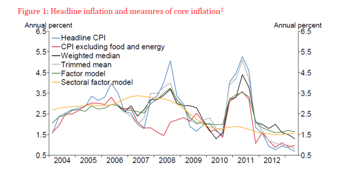
And going into the period of the recession and beyond, we had also had quite high inflation.  I’m not going to attempt to reconstruct the chart here, but work done at the Reserve Bank showed that among inflation targeting countries New Zealand was quite unusual in that our inflation outcomes had typically run above the midpoint of our (successive) target ranges.  Other countries had historically averaged nearer the midpoint.  Going into the recession, the Reserve Bank’s favoured measure of core inflation was actually above the 3 per cent top of the target range, and as this Reserve Bank chart I reproduced the other day illustrates, core measures had all typically been well above the target midpoint in the years leading up to 2008.

core inflation measures

So we had higher inflation to start with (and inflation expectations fairly consistent with that high inflation) and more room to cut policy rates should that be required.  Oh, and unlike half the OECD countries –  members of, or pegged to, the euro – we had a floating exchange rate.  Floating exchange rates increase a country’s ability to achieve its own inflation target whatever is going on elsewhere.

What about the fiscal pre-conditions?   If government finances are in such bad shape that there is little effective choice but to run severely contractionary fiscal policy, it can make it a little harder for monetary authorities if those authorities are trying to keep inflation up, especially if the near-zero lower bound is in view.

One way of looking at the fiscal situation is to look at the cyclically-adjusted balances prior to the recession.  Using the OECD’s measure, New Zealand’s average surplus over the years 2006 to 2008 was higher than those in almost every other OECD country.

fiscal surplus 06 ot 08Using data on the general government sector’s net debt, New Zealand’s position wasn’t quite as strong. But in 2007, we were one of the 12 countries where the government sector has less debt than financial assets, still one of the stronger positions among OECD countries.

So the pre-conditions looked pretty favourable for New Zealand to be able to keep inflation near target.  If anyone was going to be able to do so, in a strongly disinflationary environment, our high starting inflation, high starting interest rates, and strong fiscal position meant New Zealand was well-positioned to do so.

Pre-conditions are one thing.  But what about the shocks that each country faced?

Financial sector crises didn’t occur to same extent in all countries.  I’ve shown this table before, classifying advanced countries by the extent of the increase in non-performing loans since 2007. Real wealth losses –  whether borne by the government in bailouts, or by private creditors –  make it harder to keep inflation up, all else equal.   New Zealand is among the group of countries to the left of the table with the smallest increase in losses.

&Non-performing loans since 2007
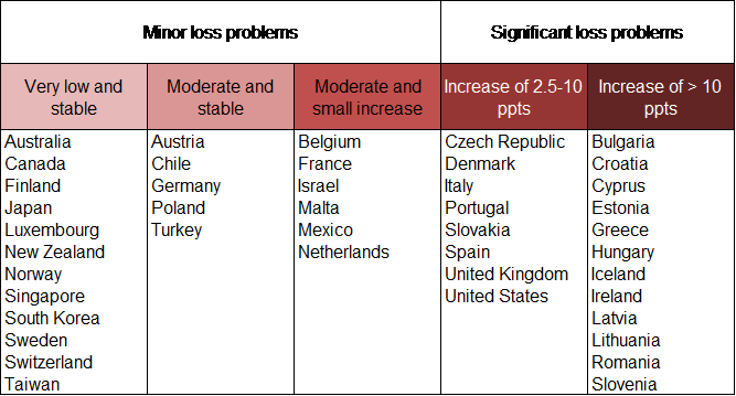
NPLs
Source: World Bank.

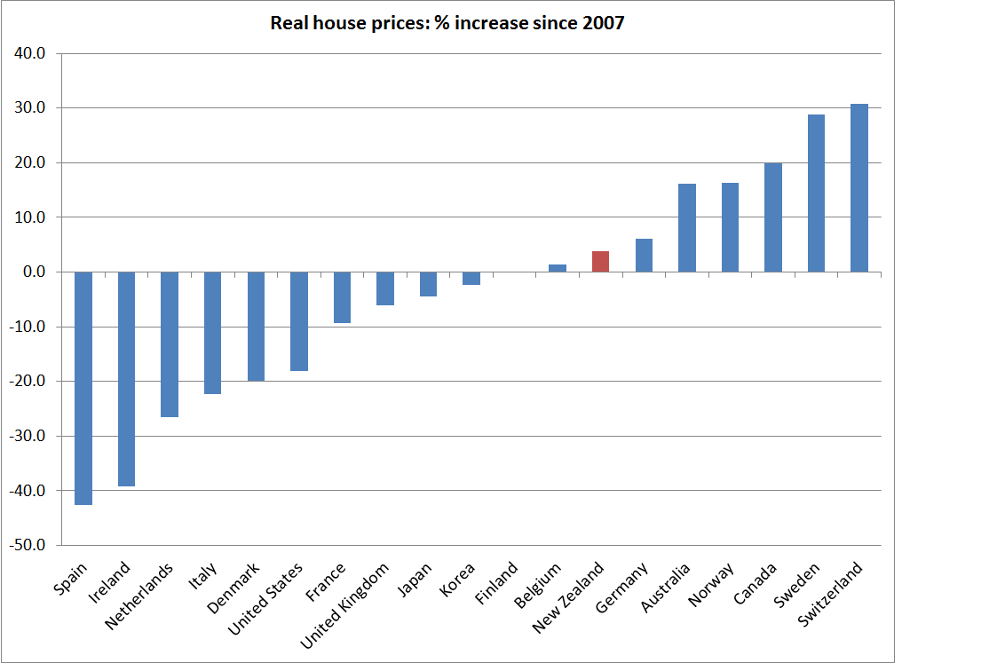
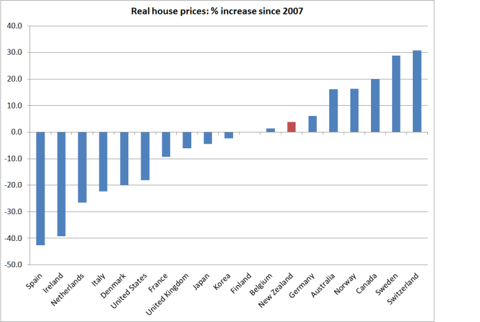
It is never clear how to think about the impact of house price falls  –   how much of it is a real wealth loss, given that we go on living in the same house and consuming the same flow of housing services?  New Zealand did experience falling house prices during the recession, but as this chart I ran a few months ago illustrates, those aggregate losses have been fully recovered and, if anything, real house prices here have been a little stronger than those in the median OECD country.

house prices since 2007

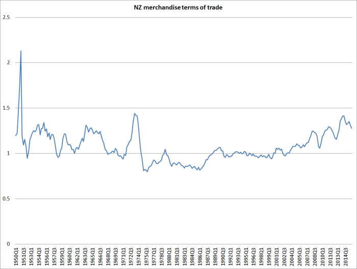
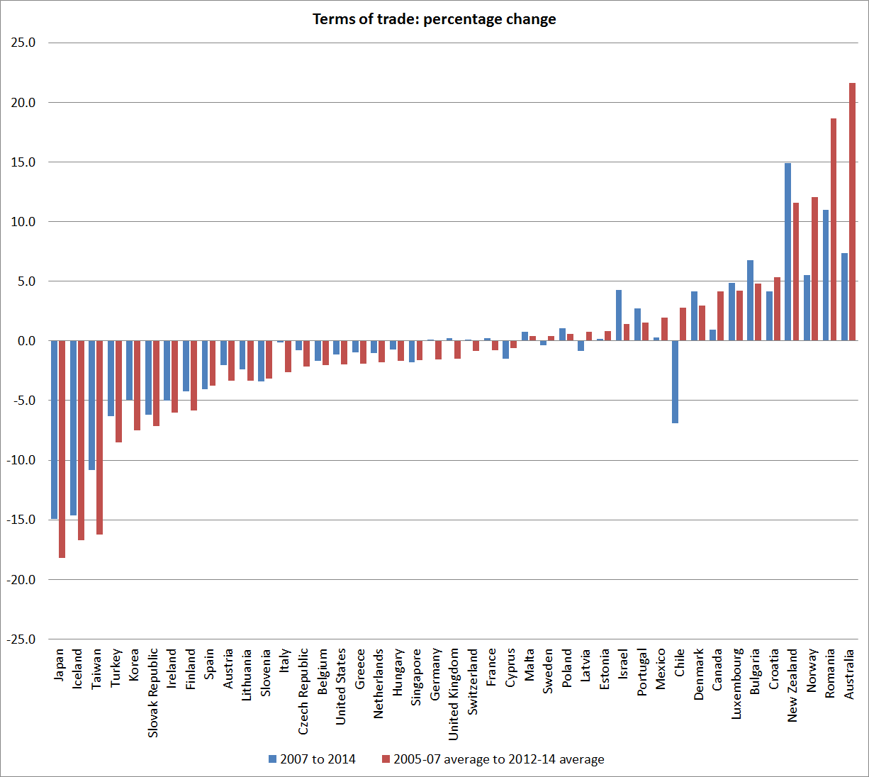
How about the terms of trade?  For a country like New Zealand, the terms of trade are largely exogenous.  A strong terms of trade boosts national incomes, supporting domestic demand (consumption and investment) whatever else is going on in the rest of the world. All else equal, if central banks are struggling to keep inflation up near target, they would prefer strong income gains, rather than the alternative, to support the efforts of monetary policy.

As this chart shows, New Zealand was among the handful of countries with the strongest terms of trade.  Even now the terms of trade are around 10 per cent higher than they were over the years prior to the recession.  That gave us an edge, all else equal, in keeping inflation up.

tot crosscountry

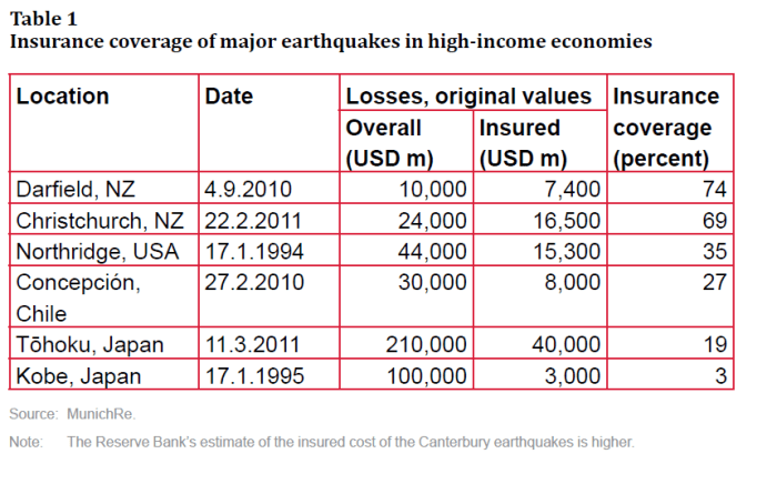
What about exogenous demand shocks?  It is often hard to think of examples of these, but the repair and rebuild process associated with the Canterbury earthquakes is one.  Other OECD countries have had to repair and rebuild after natural disasters – Chile and Japan both suffered from serious earthquakes.   But the damage in Japan, as a share of GDP, was much smaller than the damage in New Zealand and Chile (in both cases up towards 20 per cent of annual GDP).  And, as this table in recent Reserve Bank article highlighted again, what really marked New Zealand out was the extent of the insurance coverage of the losses –  most of that, in turn, covered by foreign reinsurers, rather than by domestic institutions.

insured losses

Earthquakes are awful, and often expensive, phenomena.   But the activity associated with the repair and rebuild processes can be a substantial near-term boost to demand and activity.  That is so even if all the losses are borne domestically – since people need a new house (or functioning water pipes) now, and might pay for it through higher savings over 40 years –  but it is much more obviously so when foreign reinsurers bear the bulk of the cost.  Activity needs to occur now, and someone external is paying for it.  That provides a lot of support for demand.  It could be quite troublesome if there was already a lot of inflation pressure, but –  much as one would wish the earthquakes never occurred –  it provides a lot of  potentially helpful support for demand (reinforcing monetary policy) when other inflation pressures are weak.

Looking through the list of OECD countries, I can’t see any countries that have had anything like that sort of large exogenous demand shock in the last decade or so.  Perhaps I’m missing some, and if so please feel to mention those case in the comments.

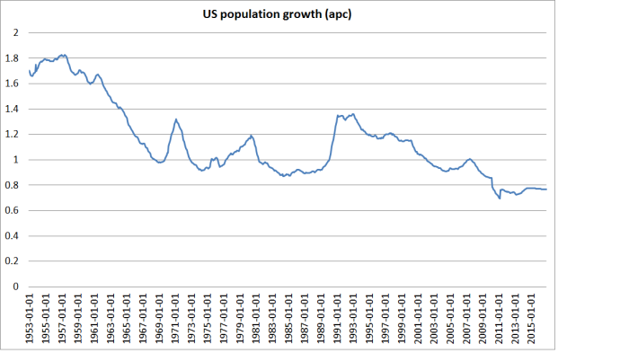
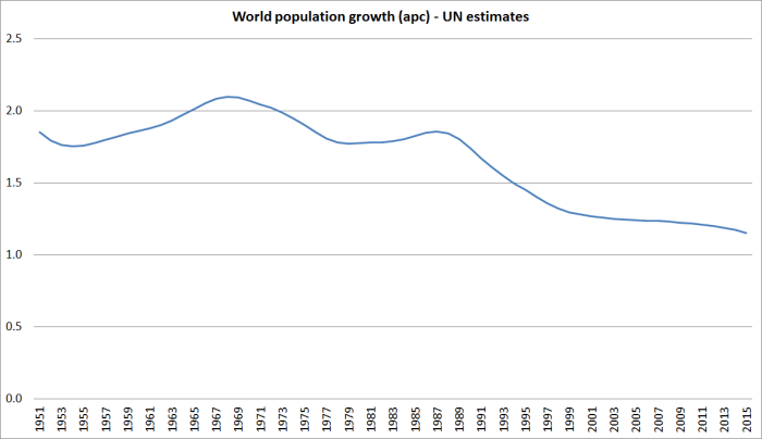
In general, declining population growth rates tend to be associated with relatively weak demand pressures.  That can be helpful when other demand and inflation pressures are strong, but more troublesome if other inflation pressures are weak –  as they have been, across the advanced world, in recent years.   But as it happens, New Zealand has had one of the faster population growth rates among OECD countries in the last decade or so, and in the last couple of years has had the fastest population growth we’ve experienced for 40 years.

Bringing it all together, thinking about things that have made it easier or harder for monetary policy to do its job and keep inflation up around target in recent years, relative to the situation in other advanced countries, we’ve had:

Favourable pre-conditions (things already in place in 2008):

  • high starting inflation (relative to target)
  • high starting interest rates
  • a floating exchange rate
  • low net public debt
  • a strong flow fiscal position

And favourable idiosyncratic shocks (or shocks avoided that others faced):

  • few direct financial crisis costs
  • no large sustained fall in house prices
  • a strong terms of trade
  • a large exogenous demand shock (earthquake repair process) largely externally-financed
  • continued strong population growth

None of this is to deny that the global environment  –  eg the declining productivity and population growth I highlighted yesterday, and global oversupply in various markets reflecting past excess investment associated with China –  might have made it more difficult, perhaps materially more difficult, generally for central banks to keep inflation up to around their respective targets.

But among advanced countries, it is difficult to think of any where it should have been easier to have kept inflation up near target than New Zealand.  Almost everything was going our way, and yet the Reserve Bank has consistently failed.

In any reasonable evaluation of the performance of an independent agency pursuing a target it does not control directly, one has to look at all the circumstances, not just at the bottom line, important as that bottom line often is.    One could easily envisage an alternative New Zealand in which many of the factors in the list above might have been reversed.  In such an environment, whatever else was going on in the rest of the world, one might not have been inclined to be very harsh in evaluating our own Governor had he persistently failed to keep inflation around the target.  But in the environment the Governor and his advisers have actually faced in the last few years, it is difficult to acquit the Reserve Bank of responsibility for failing to achieve its primary goal. It was easier for them than for almost all their overseas peers, and yet they’ve failed.  And no forecast I’ve seen suggests that situation is about to reverse rapidly.

The Reserve Bank published an article late last year on “Evaluating Monetary Policy”.  I discussed it here, and included a link to another earlier article they had published on a similar topic.  From the earlier article I highlighted a list of things the Reserve Bank’s Board (or the Minister) might want to take into account in evaluating the Governor’s performance, and perhaps considering any reappointment.

Some of the items the Reserve Bank’s Board might be expected to concern themselves with in fulfilling the monetary policy monitoring role include:

  • The processes the Governor uses to gather and interpret economic information.
  • The choices the Governor makes in allocating resources areas of the organisation relevant to monetary policy (including judgements he makes on whether to seek more, or fewer, resources, when the five-yearly funding agreement is negotiated)
  • The means the Governor uses to ensure that he is exposed to alternative perspectives.
  • The quality of the people the Governor appoints to advise him on policy choices.
  • The way in which the Governor applies section 3 and 4 of the PTA (dealing with deviations from the target range, and the avoidance of unnecessary instability).
  • The way in which the Governor thinks about and responds to the uncertainties around monetary policy.
  • The ability of the Governor to articulate the reasons for his policy choices, and his ability to convince others of his case.
  • The processes the Governor uses to assess past policy and learn from experience.
  • The stability through time in the Governor’s policy choices.

I’d now add to the list “the shocks and pre-conditions” the Governor faced over his or her term.  On this occasion, it doesn’t really seem to help his case.

Some Great Depression comparisons

Back in the early days of this blog, I illustrated how for advanced countries as a group cumulative growth in real GDP per capita in the period since the peak of the last cycle (2007) to 2014 had been no better than that in a comparable seven year period from 1929, during the Great Depression.

Here is an updated version of the chart I ran then for all the OECD countries

real pc gdp growth 07 to 14

The median growth rate –  o.22 per cent in total over seven years –  is so small as to be almost invisible on the chart.

And here is the comparable chart, using the Maddison database of historical estimates, for the years 1929 to 1936

1929 to 1936b

I wouldn’t want to make much of the differences in the median growth rates –  given the imprecision of many of the historical estimates, and the likelihood of revisions to the more recent ones.  I was more struck by the lack of any material real GDP growth per capita in either period.

The Great Depression is seared in historical memory –  and whole generations of politicians came afterwards telling themselves and voters “never again”.  It is too soon to know whether the most recent period achieves the same permanent imprint on historical memories.  Perhaps in part it will depend what comes next.    But I’ll be a bit surprised if this episode has quite the same impact.  The Great Depression hit popular consciousness particularly hard because unemployment rates in so many countries rose very high, and stayed high for a long time, and in an age when government income support for those unemployed was typically less generous than it is today.

There aren’t (at least that I’m aware of) any consistent cross-country estimates of the unemployment rates in the 1930s.  But in most countries, the increases in the unemployment rates were very substantial (in the US, the unemployment rate is estimated to have peaked well above 20 per cent, and remained high for years).

By contrast, here is what has happened to advanced country unemployment rates in the last decade or so.

oecd U since 04

Whether one takes the median OECD country or, say, the total for the G7 countries, there was an increase in the unemployment rate of around 2.5 percentage points, which has been substantially reversed over the subsequent years. Unemployment rates are typically around where they were in 2006.  There are still awful cases –  Spain and Greece still have unemployment rates in excess of 20 per cent –  but the defining character of the last few years has not been very stubbornly high unemployment rates.

What really marks out the last decade  –  and contrasts it with the 1930s – is how poor the productivity growth has been. Without productivity growth, one can still end up with plenty of jobs, but they tend not to offer much in way of wage increases.

I’ve drawn attention previously to the work of US economic historian Alexander Field, who devoted a book to illustrating the very strong productivity gains (TFP) that the US had achieved in the 1930s.  A few weeks ago, I saw a nice summary of a new study by some other economic historians.   On the basis of their new work, they no longer see the 1930s as the period of fastest TFP growth in US history, but it was still very strong –  reflecting rapid technological and managerial innovations.  Here is the key chart.

Figure 1. TFP growth in the private domestic economy, US, 1899-2007 (% per year)

crafts us productivity

By contrast, here is a picture that uses John Fernald’s (FRBSF) business sector TFP estimates for the US over the last 25 years.

fernald.png

Business sector TFP growth is typically faster than for the entire economy, but for the last 10 years Fernald estimates average annual growth of  just over 1 per cent, dramatically slower than the 7 per cent average growth over the previous 10 years.

The slowdown in productivity growth isn’t unique to the US –  indeed on some measures, the US has done better than most –  and was becoming apparent in the data (again, not just this dataset), if not in the public consciousness, before the great recession of 2008/09 and its aftermath.

The contrast with the 1930s is striking.  That was, overwhelmingly, a failure of demand and of the global monetary system, and as those constraints were removed, the underlying lift in productivity supported a recovery in investment.  For the US, for example, post-war per capita GDP is on the same growth path as it had been pre-1929: output wasn’t permanently lower.
1936

What about the current situation?  Taken together, falling rates of population growth and falling rates of TFP growth materially reduce the volume of investment that is likely to be required, and profitable, at any given interest rate.  Add in apparently high desired savings rates around the world, and it is hardly surprising that real interest rates have fallen away so much.  Add declines in inflation expectations to the mix, and it has reinforced the decline in nominal interest rates.  The problems are mostly structural in nature, but they have been amplified by the reluctance of central banks to do what is required to keep inflation (or other nominal measures) up around target, in turn driven by a constant focus on a desire for “normalization” and a focus on some sense of where real interest rates “must” (in some sense) be in the very long term.  The reality, and perceptions, of the near-zero lower bound haven’t helped in many countries.

I’m pretty confident that in the longer-term real interest rates around the advanced world will be positive –  land is still fertile, as is the human imagination (so there will be a flow of new innovations and opportunities.  But there is no guarantee of such positive real interest rates in any particular decade (any more, in a New Zealand context, than there is a guarantee that our real interest rates will converge with those of “the world” in any particular decade).  It seems likely that some mix of lower global savings rate, higher birth rates, and structural reforms that create a better climate for productivity growth and investment are likely to be required to put the world economy on a better path –  one that, inter alia, might put us back on a path that supported more “normal” levels of nominal and real interest rates.  But those interest rates will be an outcome of a successful overall policy mix, not an intermediate target in their own right.  Monetary policy –  here and abroad –  in recent years has come too close to treating them as an intermediate target, rather than focusing on, and responding to, the data flow.