Fiscals and elections

In his (paywalled) newsletter this morning Richard Harman compares the current fiscal situation, with yesterday’s last minute fiscal announcements, to the 1972 Budget and election campaign, when Robert Muldoon, then Minister of Finance, was reputed to have said that he’d spent it all and there wasn’t anything much left for the Opposition. Surpluses and deficits were measured differently in those days (cash-based and including capex but not depreciation) but the Treasury long-term fiscal tables tell us in 1972/73 the government accounts ended up with a (very) modest surplus, 0.1 per cent of GDP.

The outgoing Labour government’s fiscal policy around its 2008 Budget is also often heavily criticised. And there is plenty to criticise it for, but as I’ve documented here in several posts (here and here) at the time The Treasury was producing forecasts showing that the operating balance would remain in surplus over the entire forecast period (tiny surplus by the end of the period, but still). It wasn’t Treasury’s finest hour, but you can’t blame Cullen and Clark for Treasury’s forecasting problems. Now, by the time of the PREFU that year things had deteriorated quite a bit – the recession was recognised to be underway – and there were no longer surpluses in prospect. But even then for the fiscal year they were actually in – 2008/09 – the best Treasury projection was a balance of 0.0 per cent GDP. A couple of years beyond that date, a deficit of 1.5 per cent of GDP was projected.

In this year’s Budget the operating balance for 2023/24 – the year we are in, the one where the government makes actual specific tax and spending decisions – the operating deficit was forecast at 1.8 per cent of GDP. There is no good case for running operating deficits at all in an economy that is more or less fully employed (Treasury’s 2023 Budget forecasts for the unemployment rate were 3.7 per cent for June 2023 and 5 per cent for June 2024, suggesting an average roughly equal to many NAIRU estimates).

Fiscal numbers for years beyond the immediately current year are substantially vapourware, but never more so than just prior to an election. The Secretary to the Treasury is required to take as given what the Minister of Finance tells her is government policy. If the Minister of Finance decides to cut future operating allowances those new lower allowances will be what is used, regardless of how plausible the numbers are (it isn’t for Treasury to inquire into that in doing the PREFU numbers). But statements of future intentions don’t bind anyone – and this is true of any Minister of Finance, of any political stripe – and need have no regard to actual budgetary pressures. The vapourware character is perhaps especially so when the plausible political allies for the incumbent party, were it to form the next government, tend to be even less keen on fiscal/spending discipline. Something like the PREFU is a good idea in principle, but there are severe limitations to what it is useful for (a few years ago I posed some suggestions that might make it more useful and might come back to those another day).

It is also easy to forget that it was only 15 months ago – last year’s Budget – that the Minister of Finance was touting his new “fiscal rules“, that were to – he claimed – “ensure New Zealand continues to maintain a world-leading Government financial position”. Among them was this

Surpluses will be kept within a band of zero to two percent of GDP to ensure new day‑to‑day spending is not adding to debt

Just a shame there were, and are, no surpluses. St Augustine’s famous prayer (“Lord, give me chastity and continence, but not yet!”) has a certain resonance for current New Zealand fiscal discipline (or lack of it).

The focus of yesterday’s announcement – months after the expansionary Budget, weeks before the election- was on spending cuts. So I took a look at how this government’s spending plans for this year have evolved over the course of this electoral cycle.

Here is (nominal) core Crown expenses projections for 2023/24 for every EFU starting with the 2020 PREFU. The 2020 PREFU forecasts were done in August 2020, after the first and worst lockdown, but at a time when economic projections generally were pretty bleak (back then, for example, they thought the unemployment rate now would still be around 6 per cent).

The last observation takes account of yesterday’s announcement which may have knocked $1 billion or so off this year’s spending.

Even now the plan seems to be to spend $20 billion more this year than they said they intended at the end of 2020.

Now, no doubt the government would respond “ah, but inflation”. That is a pretty shaky argument, to say the least, when (a) you are the government and the central bank is one of your agencies, and (b) there has never been uttered, not once, by the PM or Minister of Finance, any sort of critical word about the central bank’s stewardship, and you went on to reappoint all the central bank decisionmakers when their terms expired, even (in the case of the Governor) when the main Opposition parties explicitly objected when (as the newly-passed law required) they were consulted. Inflation has been savage. (But of course, just the other day Robertson allowed the Bank a huge increase in its own spending with, as yet, no published rationale or justification.)

But set inflation to one side, and focus instead on projections as a share of GDP (again allowing for $1 billion off this year’s spending, per yesterday, but no reduction since this year’s Budget in expected nominal GDP)

In the first EFU of the majority Labour government (December 2020), they said that they planned to spend 30.1 per cent of GDP in 2023/24. In fact, their latest revised plans would involve spending about 32.75 per cent of GDP this year, and even with lots of fiscal drag to help them, still substantial operating deficits. Note that even after yesterday’s announcement, operational spending this year as a share of GDP is still likely to be a bit larger than they told us they’d planned even in the HYEFU late last year, a mere 9 months ago. (In HYEFU 2021 – less than two years ago now – they expected to spend just over 30 per cent of GDP this year and record a small operating surplus. Now, not so much.

It will be interesting to see the PREFU numbers (at least for this year) on 12 September, but it seems almost certain whereas in 1972 Muldoon actually delivered a tiny surplus in his final year, and whereas in 2008 Clark/Cullen went into PREFU thinking that at least the operating balance for their final year (2008/09) would be literally in balance, this year – and notwithstanding yesterday’s announcement – we will again see forecasts of a material operating deficit for 2023/24. That is all on Hipkins and Robertson.

(It will, of course, also be interesting to see National’s plan and numbers. I’m pretty sceptical based on what we’ve heard so far, but we’ll see. But when the operating balance is in material deficit, it is quite depressing to see both major parties competing on who has the best giveaways – be it GST carveouts, extra subsidies for this or that, and whatever tax plans National has – rather than on restoring promptly a record of fiscal balance. There is no good economic reason for running operating deficits this year – it is like a family overspending its income on consumption items in a year when it has been fully employed – but politics seems to say otherwise. Similarly, there isn’t a really good reason for cutting spending because of a cyclical slowdown – there are Keynesian bones in me – when the real point is that a substantial operating deficit shouldn’t have been budgeted this year in the first place.)

Finally, I remind you of last week’s post, in which the OECD numbers revealed that New Zealand has recently had one of the stimulatory of fiscal policies and now has among the largest general government (primary) deficits of any advanced country.

Misgovernment and other things

A while ago, after the post I wrote prompted by my return visit to Zambia, a reader suggested I might like to read Cobalt Blue: How the Blood of the Congo Powers Our Lives. The relevant bit of the Democratic Republic of Congo (DRC) is right next to Zambia, and the two countries share the geological Copperbelt, rich in copper (biggest export for both countries) and cobalt. There is now huge demand for cobalt as a component in lithium-ion batteries, and more than half the world’s fast-growing output currently comes from the DRC. It is no secret now (various reports in recent years) that, shall we say, labour conditions in cobalt-mining in the DRC are not the best. The focus of attention is around so-called artisanal mining, in which rocks with cobalt ore are gathered, broken, washed etc by hand (large scale industrial mining isn’t in focus at all). Wages (or earnings) are low, safety standards usually barely existent, injury and death rates apparently quite high,

The author of the book, Siddarth Kara is a professor in human trafficking and modern slavery at Nottingham University in the UK, and the book is based on several trips to the Katanga region of the DRC, with observations and interviews (often in some secrecy, and now with anonymity, given the very real risks that interviewees in particular often seemed to be running in talking to him.). Much in the book is pretty harrowing.

The author’s focus seems to be on big international companies that are keen to shield themselves from reputational risks and loudly proclaim their commitment that (for example) no child labour is being used in the mining of the cobalt that is so necessary to the batteries that power their products (be it phones, EVs, lawnmowers, or whatever). It is pretty demonstrably clear that any such claims are simply false, and are knowably false (any company board or executive that claims a child-labour free supply chain is almost certainly either consciously lying or consciously choosing not to look any more closely). The amounts of cobalt obtained from rocks collected, broken etc by “artisanal” labour are not marginal, peripheral or incidental. They seem to be a significant chunk of total Congolese production. As the book explains, it is often more economic to get some of the higher grade cobalt-rich rocks this way (lots are very near the surface) than through more traditional industrial processes. The conventional mining and processing companies are typically the buyers for these rocks.

If Kara is harsh, and probably fairly so, on the companies producing products that use cobalt, there are glimpses of recognition in the book that the responsibility runs more widely. He’d really like to be able to tell a relentless tale of the unremitting evils of global capitalism, destroying Congo since the first Portugese explorers arrived in the 15th century, on through the simply-evil phase of Leopold’s turn-of-the -20th-century Heart of Darkness immensely lucrative private estate. Colonialism and all that.

But he does recognise that a whole variety of interests are at work, and that successive Congolese governments and their factotums have scarcely shown (or show today) much sign of unremitting dedication to advancing the interests of the Congolese people. And while Patrice Lumumba is his hero, heroes who were killed before their own record in government was really able to be tested are handy rhetorical devices but not much more.

The DRC is staggeringly rich in natural resources. And yet (perhaps partly because of it?) it is one of the worst failures of modern post-colonial Africa. Here is real GDP per capita for the sub-Saharan African countries, from the IMF’s latest WEO database.

Africa is the world’s poorest and least productive continent, but there are poor performers, really bad performers, and then countries like the DRC – 4th lowest per capita incomes anywhere in sub-Saharan Africa. As it happens, the three poorest countries happen to border the DRC, but so do Angola, the Republic of Congo, Zambia, and Tanzania which are in the top half of countries in the chart.

Some will want to blame empire and colonialism for Africa’s overall performance, but it was a widespread story across Africa, and simply cannot credibly explain why the DRC has done so poorly. Independence came 63 years ago now, and actually – evil as earlier Leopold regime was – in the late 1950s what is now the DRC had fairly high rates of literacy and average GDP per capita is estimated to have been not much lower than Zambia or Zimbabwe or Kenya. South Korea wasn’t that much richer. Then.

For that longer-run of data we can turn to the Maddison Project database.

Barely two-thirds of the real GDP per capita of 1960. Only five countries seem to have gone backwards over that period, and not even Haiti has done as badly as the DRC. To the extent such long-term comparisons across countries make sense, real GDP per capita in the DRC now is about a fifth that of New Zealand 150 years ago.

It isn’t all bad. Life expectancy is about 50 per cent greater than it was for the hugely increased population

But the material living standards for ordinary people have gone backwards over 60+ years.

And this is a dimension that got not a mention in Kara’s book. I’m not really criticising him for not writing a different book – his real focus is companies in the West – but consider that the countries ranked 2-5 in cobalt production last year were Indonesia, Russia, Australia and Canada. You don’t hear alarming stories about artisanal cobalt mining in those countries – even in neighbouring, much richer, Zambia artisanal mining seems to be mostly for gemstones – not first and foremost because such activities would be regulated out of existence, but because they are priced out of existence. Workers in Australia or Canada have much more remunerative options than grubbing for cobalt-bearing rocks at, for many in the DRC, something like US$1 a day (a bit more if you take risk of tunnelling underground in tunnels with few/no supports for veins of cobalt). In the DRC they seem to not have such options. That is what long-term mismanagement, misgovernment, and productivity failure means (in extremis). Given the chaos and failure around them people do what they have to do, for themselves and for their children, even when that means children having to drop out of school very early, even when injury, illness, sexual assault, even death are foreseeable and realistic risks.

I’m not sure what Cobalt Red’s author would propose in response to the situation uncovered in his book. There are suggestions that the artisanal mining be properly regulated, regular wages paid, safety standard and equipment put in place and provided. Which sounds all well and good, but this is the deeply corrupt PRC where most often the financial interests of those around those in power, or able to pay them off, are really what matter. Kids are taken out of primary school mostly not because parents don’t want them to have schooling but because state revenue is used for other things (personal enrichment) – often never reaching the state coffers – rather than more-conventional basics. Rules already in place are blatantly circumvented, for just a few dollars. When your country has been gotten into such a deep mess by its own leaders, it is very hard to dig yourself out again, and quite impossible for other countries to do it for them (even more so, when as the DRC is, the rivalry between the West and China is very much in play, Chinese companies doing most of the cobalt processing). Heart-wrenchingly sad as it for ordinary people of the DRC.

I’m not one of those who ever runs the line about people being “lucky” to be born in particular places or times. Cultures are built and sustained, not just magicked into existence. We are heirs to what our ancestors built or adapted. But reading the book is a helpful occasional reminder that for all the faults, failings and frustrations of New Zealand, we shouldn’t take lightly, or dismiss readily, the cultures and cultural disciplines that still put us in top quartile of countries in terms of GDP per capita, that mean we can be pretty confident that losing parties will turn over the keys of office when they lose elections, that public officials mostly can’t be bought, and so on.

Prescriptions

It is the time of the cycle when plenty of groups are keen to have their policy ideas and prescriptions be heard. After all, parties may still be finalising policies and there seems to be a reasonable chance of a new government and different set of ministers before long.

Many are just self-interested (no doubt the authors mostly believe there might be wider benefits, but the fact remains that they are championing policies to help their firm/industry/sector). As an example I found a link in my email this morning to one called a “Blueprint for Growth”. It was this from the covering press release that made me rashly open the handful of slides:

“Today’s announcement is just the beginning, as we know that good, evidence-based, bipartisan policy leads to better outcomes for all New Zealanders. This is part of the key to unlocking the future prosperity and productivity in New Zealand. 

Instead it was a bunch of suggestions from the Financial Services Council, some probably worthy, others purely self-interested, that were primarily going to be good for member firms of the Financial Services Council and which, whatever their merits, were going to do nothing at all for productivity,

Yesterday the New Zealand Initiative released a rather more substantive effort, an 86 page collection of proposals and recommendations across a wide range of areas of government policy (nothing on foreign policy for example, and no references to China at all, except perhaps by allusion when discussing the proposed foreign investment regulatory regime, and no mention at all of company tax). (I wrote about their Manifesto 2017 here.)

In some parts of the left, the New Zealand Initiative is looked on as some sort of lobby group for big business, and anything they say is, accordingly, to be dismissed without further examination. The Initiative would sometimes have you believe that it was the opposite: simply public-spirited disinterested people, focused only the well-being of all New Zealanders, who put up their money (in some cases, although mostly their shareholders’ money) only to produce research and analysis without fear, favour, or predisposition. The truth is probably in the middle, but it really shouldn’t matter because the Initiative is transparent about (a) who their members are, (b) their staff and the views of those staff, and (c) their analysis and research. Their stuff should be taken on its merits, and critically scrutinised in the same way as any other contributions to debates. Topics chosen will presumably reflect, to some extent, members’ interests (in both senses of that word) but that is a different matter than what is said on those topics.

I probably agreed with half the proposals in the latest Prescription. I often find myself agreeing with them on second order issues, while profoundly disagreeing with them on the diagnosis and prescription for New Zealand’s long-running productivity failure. But it is a fairly serious collection of ideas and I was a bit surprised not to have seen any media coverage.

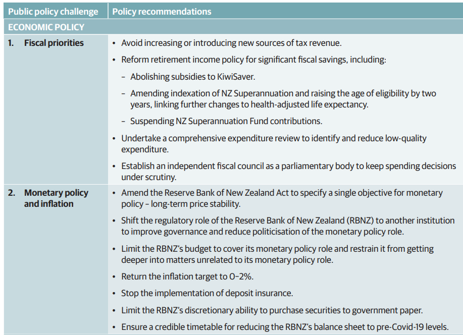
In this post I wanted to comment only on their fiscal and monetary policy recommendations, summarised here (and discussed in a bit more depth on page 20-22 of the PDF.

Take fiscal first.

While I generally agree with the first recommendation (no new or higher taxes) – since there is plenty of room to close the (large) deficit by cutting out low-value spending over several years – some of the arguments adduced in support don’t stand much scrutiny. Take, for example, this paragraph

It is certainly true that Singapore and Taiwan have markedly lower rates of tax to GDP than New Zealand (or other advanced countries). On the other hand, OECD data for taxes and social security contributions as a share of GDP show that these days both Japan and Korea have about the same or higher tax shares than New Zealand does. Switzerland, Australia and the US are certainly lower than New Zealand, but then Canada is higher. And “Europe aside” does tend to rather overlook the fact that most of the world’s advanced economies are in Europe. (The Ireland line was fairly disreputable, it being well-understood that Ireland’s GDP numbers are seriously distorted by international tax factors. Using as a denominator the one the Irish authorities recommend (modified GNI), Ireland’s tax share is much the same as New Zealand’s).

I largely agree with their proposals around retirement income, and was surprised to realise that Kiwisaver subsidies now cost about $1 billion per annum. The text suggests that they envisage a pretty slow increase in the age of NZS eligibility, which does fit with what National is promising but should not be necessary in a first-best set of recommendations. Lift the age of eligibility by one quarter a year and it would be at 67 in eight years’ time.

There is quite a difference between suspending contributions to the New Zealand Superannuation Fund (the headline recommendation) and the alternative they moot in the fuller text of simply winding up the Fund. Do the former and Labour is likely to simply resume contributions again. There is no natural place for the government taking your money and mine (or, worse, borrowing it) to punt in international markets at our risk. The NZSF was initially designed for two things: to keep Michael Cullen’s colleagues’ spending sticky fingers off his early large surpluses, and to help buttress an NZS age of 65. We’ve not now had regular surpluses for a long time, and there is no good reason – with improvements in life expectancy – why the eligibility age for the universal state pension should be the same now as it was set at, for the then means-tested age pension, in 1898. NZSF should be wound up and the government’s gross debt substantially reduced.

The third bullet – comprehensive expenditure review – is fine, even admirable. But specifics, and willingness to actually cut, will matter. I like the idea of getting rid of interest-free student loans (my kids look at me reproachfully) but…..what hope?

I have long favoured a (small) Fiscal Council, or perhaps a slightly wider Macroeconomic Policy Council. This is a quite different thing than the policy costings office National, Labour and the Greens are all keen on (as a public subsidy to political parties). That said, if one were serious about austerity in the next term of government – and for my money the NZI doesn’t give sufficient weight to the scale of the fiscal challenge – I’m not sure I’d be treating new nice-to-have agencies (even very small ones) as any sort of priority. I’d rather focus on replacing the Secretary to the Treasury (whose term is up next year) and revitalising the analytical and advisory capabilities of The Treasury.

What of the monetary policy and Reserve Bank proposals. In several places, they overlap with ideas I’ve pushed here over the years.

I was in favour of something like the change to the statutory monetary policy mandate to the Reserve Bank, and am actually on record (in my submission to FEC in 2018) as having favoured going further. The change to the way the mandate was expressed was never envisaged as materially altering how monetary policy was run (from Robertson’s perspective it mostly seemed to be political product differentiation), and I don’t think there is any evidence it has actually done so. The Reserve Bank has made big mistakes in recent years but they have been analytical and forecasting mistakes, not things that can be sheeted home to the change in the way the mandate was expressed (here I imagine the Governor and I would be at one, although of course he’d be reluctant to get anywhere near the world “mistake”). All that said, since making the change made no substantive difference and was mostly about product differentiation, so would undoing it. We need real change at the Bank (and in how it is held to account) so I won’t argue strongly about symbolic change, a least if it markets/headlines real underlying change.

On the other hand, I have long favoured splitting up the Bank, and leaving a monetary policy and broader macro stability focused central bank, and then a New Zealand Prudential Regulatory Agency (probably comprising the regulatory functions of the Bank and much of the FMA’s responsibilities). That such a model would parallel the Australian system is not a conclusive argument on its own, but it is a real benefit when the biggest banking and insurance players in New Zealand are Australian-based. The Initiative argues that

Separating the functions into two organisations would improve governance and reduce the risk of political interference in the RBNZ’s core mission of price stability.

I agree (strongly) with the former. The current (reformed) Reserve Bank has a dogs’-breakfast of a governance model. I’m (much) less persuaded by the latter argument. I have seen no sign – in my time at the Bank or in recent years – of political interference in the operation of monetary policy. The mistakes have been Orr’s, and if there are valid criticisms of Robertson they are that he has showed little interest in doing anything about holding the Bank (and its key personnel) to account. Monetary policy and financial institution regulation are just two quite different functions, and need different skill-sets in CEOs. It isn’t impossible to make the current combined model work – though it would need big changes, including some legislative overhaul – but it simply isn’t the best model for New Zealand. (Such a reform would, done the right way, also render the Governor’s position redundant, with two new chief executive positions to fill.)

Should the Bank’s budget be cut? Yes, of course (and that comprehensive spending review shouldn’t overlook opportunities there), and since the NZI document was finalised we’ve seen an egregious increase in approved Bank spending without even the courtesy (or statutory obligation) to provide any documentation in support. But the budget is only one lever. As important will be finding expert people to lead the institution and monetary policy function who are really only interested, in their day job, in thinking about macroeconomics and doing and communicating monetary policy excellently, without fear, favour, or suspicion of either partisan allegiance or using a public role for private ideological purposes.

I have written here previously that I favour returning the inflation target to 0 to 2 per cent. That said, I don’t find the Initiative’s reasoning very persuasive

A lower target range would encourage the RBNZ to pursue more prudent monetary policies,
minimising the risk of excessive inflation and promoting sustainable economic growth.

But there is no evidence for these claims. Adrian Orr and his minions would have made more or less exactly the same forecasting mistakes in recent years with a target centred on 1 per cent as with the actual target centred on 2 per cent.

Perhaps more importantly, I don’t think the New Zealand Initiative team has ever taken sufficiently seriously the current (regulatorily-induced) effective lower bound on nominal interest rates. That constraint can and should be fixed but unless it is fixed it would be irresponsible to recommend lowering the inflation target.

On deposit insurance, I have long favoured deposit insurance, as a second-best way of reducing the scale and risk of government bailouts of banks (if no one is protected a failing big bank will almost certainly be bailed out, whereas with (retail) deposit insurance it is more credible to think that wholesale funders might be allowed to lose their money in a failure. That said, my argument was primarily about the big banks, and the deposit insurance regime will not cover only them. I do worry about heightened moral hazard risks around the small institutions. One could, I suppose, argue that capital ratios are now high enough there is very little risk of a large bank failing, to a point where it is credible that depositors could face material losses, but that argument cuts both ways in that with high capital ratios moral hazard risks are much smaller even in the present of deposit insurance.

The second to last item on the monetary policy list is a curious one. The Reserve Bank has run up losses of about $11 billion dollars through an LSAP conducted almost entirely in government bonds. So while I agree with limiting what NZ assets the Bank can buy, I don’t think it gets near the heart of the issue. New Zealand legislation is generally for too lax in allowing huge risks to be assumed with no parliamentary approval (whether the Minister of Finance issuing guarantees, for which there is no limit, or the Reserve Bank – which cannot default on its debts – buying risky assets. While there is a need for some crisis flexibility, the scale of the intervention undertaken (over more than a year) should not again be possible without parliamentary approval. That, incidentally, does not impair monetary policy operational autonomy both because the LSAP is a very weak (just risky) instrument and because (see above) the effective lower bound on the nominal OCR itself can and should be fixed.

I have no particular problem with something like the final item on the list, but as regards the LSAP expansion it would seem to be already there. The Bank’s holdings of government bonds are being slowly but steadily sold back to The Treasury (and others are maturing in RB hands). One can argue that the mix of sales might have been different or that the pace should have been (much) faster, but the domestic monetary policy bit of the balance sheet will shrink a lot. There are debates to be had about how much of an “abundant reserves” approach is taken in future – I’d probably favour not – and there are issues that should have had more scrutiny around increases in foreign reserves that the Minister has approved this year, but they are probably second order in nature.

With only 86 pages and lots of policy areas to get through, the NZI document was never going to cover all the significant issues in any subject area. I have quite a list of others, both as regards fiscal policy and around monetary and financial regulatory policy, but this post was about engaging the debate on the ideas NZI has proposed, not tackling all the ones they didn’t or didn’t have space for. Overall, I’m mostly sympathetic to the direction they suggest, but any incoming government actually interested in change should subject the specifics to some serious critical scrutiny.

Fiscals: we used to keep good company

There are plenty of egregious examples of public sector waste (think lavish welcomes and farewells for senior public servants) or lack of discipline combined with questionable – well, really poor – process (think this morning’s post about the sly but huge increase in approved Reserve Bank spending).

But my core interests are macro in nature. There have been a series of posts in the last couple of weeks about aspects of the inflation and monetary policy story in the last few years, including yesterday’s on the external economy backdrop which should, if anything, have made New Zealand better placed than some to have kept core inflation near target (and that without even mentioning our lack of exposure to last year’s extreme European gas price shock).

It occurred to me that it might also be interesting to look at how fiscal balances and public debt levels had changed across the group of advanced countries (with their own monetary policies) that I’ve been using for comparison in these posts. I was less interested in the specific pressures put on monetary policy, since I’ve already written a couple of pieces dealing with the spin the Governor is (yet again) engaging in, trying to downplay fiscal impulse measures (developed for monetary policy purposes) in favour of ones that seem to have no macroeconomic foundation at all. I’ve asked the Bank for all/any analysis research in support of what looks to be a highly questionable alternative view, but am not holding my breath (if there were anything much they’d either have referred to it in the MPS, or they might even have been keen to send it to me by return of email to allay my doubts). So my focus was on fiscal developments in their own right.

Sometimes when one heads off to OECD databases to download lots of cross-country comparative data I already more or less knows the story and just want the hard numbers to illustrate it. Other times I’m taken by surprise. This trawl was one of those surprising ones, and not in a good way at all.

But first the good news. This is my preferred (since all-encompassing) measure of net debt. The OECD doesn’t have data on quite all the countries (and Norway data isn’t up to date, but at last read was about -350 per cent of GDP). These are the OECD’s mid-year estimates for 2023

We have lower debt than the median country. Many people (including me, but certainly not everyone) count this as a pretty good thing. But a debt stock is an accumulation of choices by successive governments over a long time. And I was more interested in looking at how things had changed over the Covid period, so since 2019. After all, every government faced some big spending in 2020, and when economies were temporarily closed down tax takes fell too.

So here is how net general government financial liabilities is estimated to have changed from 2019 to 2023 for this same group of countries.

And this is where the surprises started.

The median country in this chart – Sweden – saw basically no change in net debt to GDP over this period. New Zealand, on the other hand had the third largest increase. Australia had a slightly larger increase, but interestingly that was concentrated in the actual Covid period: from 2021 to 2023 net debt in Australia is expected to have risen by 1.5 percentage points while in New Zealand is estimated to have risen by 7.5 percentage points. Of course, for highly-indebted countries the unexpected surge of inflation typically lowers net debt to GDP – helping the US notably among these countries – although in the UK’s case having a large proportion of inflation-indexed debt on issue prevented that happening (as it was designed to do).

The OECD forecasts include 2024 as well, so we can see how they think net public debts levels will have changed across these countries from 2021 (the end of the big Covid spends) to 2024, which they base more or less on policy as at the time the forecasts are done (so mid 2023). Here’s that chart

No comment needed really.

That’s debt, but what about flow measures? Deficits and the like.

Here, we can’t look at the operating balance measures we in New Zealand usually focus on. And all the measures are for “general government” (all layers) rather than just central government (although of course in New Zealand central government absolutely dominates the numbers). There are two sensible metrics to look at:

  • the primary balance (ie excluding financing costs) as a per cent of GDP, and
  • net lending (so saving minus investment) as a per cent of GDP

Both are available either cyclically-adjusted or plain, and the OECD also identify idiosyncratic one-offs to go beyond the cyclically-adjusted measures to something more like structural balances.  Covid was a common shock, and there are very few identified one-offs for the years focused on here.

The primary balance is a deficit measure pure and simple.  Excluding finance costs makes sense for these purposes not because they aren’t real costs, but because a country with higher inflation will tend over time to have higher interest rates and much of those higher nominal interest rates aren’t a real burden, but just maintain the real purchasing power of the debt.  At present, 6 per cent inflation and 4 per cent bond rates gives you negative real financing costs, but still a significant line item of expenditure on interest.  The other reason for excluding them is that a basic maxim in public finance is that if you are running a primary balance or material surplus, your debt won’t be escalating as a share of GDP (precise definition depends on the relationship between the interest rate and the GDP growth rate).  Countries don’t need to run headline surpluses to see debt ratios stabilising or falling, but sustained primary deficits (especially in cyclically-adjusted terms) are typically a bit of concern –  the sort of thing the IMF might focus on in struggling countries.

Anyway, here are the OECD’s primary balance estimates for 2023 (Norway, as so often at present, runs off the scale)

So that would be the third largest primary deficit this year or any of these advanced economies. Japan is….well….Japan when it comes to public debt and deficits. Poland is dealing with a big influx of Ukrainians and a huge increase in defence spending, and then there is New Zealand. By far the largest primary deficit of any of the countries we are more prone to comparing ourselves to (Anglos and other north Europeans), in an economy where this calendar year the output gap will be about zero (in other words the deficit isn’t exaggerated by a deeply below-capacity economy). I did check the cyclically-adjusted picture and it looks very much the same, altho the Czech Republic just sneaks past us.

And while the median country in this grouping has seen its primary balance deteriorate (into small deficit – see above) over the Covid period since 2019, New Zealand has had the third largest widening (again, cyclically-adjusted numbers are similar, although we are second worst on that measure)

Adjusting the New Zealand numbers for the OECD’s series of estimated one-offs (mostly around the earthquakes) produces this time series chart.

From which I take two points:

  • We have never (outside Covid peak itself) run primary deficits anywhere near as large as those run last year and (estimated) this year.
  • In almost every year in the history of the chart we have a stronger (cyclically adjusted) primary balance than the median advanced country in this grouping.  Not only were our primary deficits materially larger in 2020 and 2021 (the Covid outlays years), they are still materially larger now.

The other set of measures is for net lending.  I haven’t used these data often here, but they are totally standard framework for analysing macro (im)balances (the Reserve Bank even had a nice chart of these sectoral balances, for firms, households, and general government in the latest MPS.  It is a measure of savings less investment, saving (in the public sector context) typically arising with operating surpluses.  It is set within a national accounts framework, unlike the primary balance (which is more of a pure fiscal thing, since OECD primary balances typically include capital spending).

Here are the OECD’s numbers for 2023

We are fifth from right here, with a rather large gap between government saving and the government deficit, but even that position flatters us because the saving numbers take finance costs into account, and (as discussed above) in the presence of high inflation the numbers for highly-indebted countries (think US and UK) show as worse than they really are. Simply paying out interest equal to the inflation rate is not a real burden (or hence real dis-saving), they just maintain the real purchasing power of the bondholders without worsening the real position of the government. (If you want to know more about this issue in a New Zealand context Google work Grant Scobie did at The Treasury.) Since economies are getting back towards balance this year, the cyclically-adjusted picture isn’t much different for New Zealand.

And here is the change since just prior to Covid

Third from the right when even the median country’s position has deteriorated – and remember almost all of these countries have been grappling with high inflation – is probably not the ideal place for New Zealand to be.

I could, but won’t, show you the time series chart for this measure cyclically-adjusted and with adjustment for earthquake one-offs. I won’t because the picture is so similar to the time series comparative chart for the cyclically-adjusted primary balance. We used to be better than the median, our government sector used to be net lender most years, while now we are a net borrower and quite a bit more so than the median of these advanced countries.

As I suggested towards the start of this post, I was genuinely surprised by these numbers for the last few years. I knew, of course, that New Zealand’s position had deteriorated, and have banged on here about the lack of any robust economic case for running operating deficits last year and this while the economy was overheated or (this year) getting back to balance, and the Reserve Bank was belatedly grappling with the inflation challenge. But if you’d asked me, I guess I’d have assumed that other countries had probably had similar deteriorations. Mostly, they haven’t.

None of this – except the initial debt charts – are materially influenced by the costs of Covid – lockdown support etc- themselves. Those costs were borne, and often were very heavy, in 2020 and 2021, while my charts have focused on the changes in balances from 2019 (pre Covid) to 2023 (post big Covid expenditures and with fully employed economies). They are pure political choices.

I can see an arguable case for a country that had rapid productivity growth and rapid population growth to be a net borrower (investment in anticipation of future income gains). But other than the central European countries, rapid productivity growth has been scarce among advanced countries, and although our population growth rate is now rapid again, so are those of Australia and Canada, neither of which is running anything like our net lending deficit.

And in a fully employed economy (as ours is this year) there is just no good case at all for running any sort of operating deficit (the New Zealand specific measure), let alone a material primary deficit.

In flow terms, our public finances now – fully employed economy, and terms of trade which have still been high by historical standards – just aren’t what they once were (under governments of either stripe) until quite recently. And the numbers are still flattered by that boost an unexpected surge of inflation gives to the public accounts – but which you never hear either government or Opposition parties engage with – in that public sector wages (with a considerable element of central control) tend to be slow to adjust. The government recently more or less forced secondary teachers to accept a material real wage cut. They are trying to do the same now with senior doctors. And it is probably the case, in a bigger way, for any moderately well paid public servant who hasn’t changed jobs in the last three years. None of those cuts is likely to prove sustainable (when private sector real wages are flat or rising) longer term if we care at all about the capability and quality of the services we expect governments to provide. Pressures like that really should, but won’t (given the way these things are done), be reflected in next month’s PREFU as part of the big fiscal challenge facing whoever takes office after the election.

There are lots of numbers and concepts in this post. Apologies for that but it is largely unavoidable in trying to do meaningful cross-country comparison. The bottom-line, through all the charts and numbers, is that first sentence of the previous paragraph.

Spending (lots) more….with no parliamentary authorisation

Late yesterday afternoon someone sent me the link to this

Almost two months into the Reserve Bank’s financial year it authorises a 41.7 per cent increase in spending for the current financial year and a 26.3 per cent increase the following year, both relative to the amounts approved in the current five-year Funding Agreement signed in June 2020.

The variation had, apparently, been slipped onto the Reserve Bank’s website the previous day (22nd).

I’m signed up to the Bank’s email notifications. These were the ones from the last week

There was no press release from the Bank, and none from the Minister of Finance either. For huge increases in the spending of an institution whose performance has been under a great deal of scrutiny in the last year or two, the institution actually charged with keeping domestic demand in check to keep inflation at/near target.

The Funding Agreement model, which governs how much of its income the Bank can spend, itself is very unusual. I wrote about it, and the background to it, in a post a few years ago, before Orr took office, when the Reserve Bank Act review was being kicked off. The Funding Agreement model was better than what had gone before – not hard, since previously there were no formal constraints at all on Reserve Bank spending – but not very good at all. The model was set up when the Bank was (overwhelmingly) conceived of as a monetary policy agency, with a few other peripheral functions. The five-year horizon, with nominal allocations fixed in advance, was seen as having the (modest) advantage of providing a bit of financial incentive for the Bank to meet its inflation target: if it didn’t its real spending constraint would be tighter than otherwise. These days, the bulk of the Bank’s staff are devoted to policy and regulatory functions. Most such government agencies are funded by annual appropriations, approved (and scrutinised) by Parliament through the annual Budget process. In that earlier post, I’d come round to thinking that model should be applied to the Reserve Bank too.

The variation slipped onto the website a couple of days ago exemplifies what is wrong with the current system (perhaps especially under the current players – Orr/Quigley and Robertson – but they are only egregious abusers of a poor system).

This is public spending on public functions. We have a Budget for that. There is no obvious reason why, if there really was a compelling case for more money for the Reserve Bank, it could not have been announced at the same time as the Budget. After all, governments have to prioritise, and voters have to make judgements about what they do and don’t choose to spend money on. Taxpayers are the poorer whether or not the spending is through some agency subject to parliamentary appropriation or the Reserve Bank. As it is, the Bank’s financial year began on 1 July, so why the delay in agreeing/announcing this big increase in approved spending?

But then note the specific timing. The Minister of Finance signed the variation on 31 July. Orr and Quigley only signed it, and then had it slipped onto the website, on 22 August. It doesn’t take more than five minutes to get a document across the road to the Reserve Bank, and even if they wanted Quigley’s signature on it (it just needs any two Board members), and they wanted a physical rather than electronic signature, a return courier to Hamilton could no doubt have been done in 24 hours. Most probably, they didn’t want the variation to be known any earlier because……last week was the Monetary Policy Statement, when the Bank was having to acknowledge it hadn’t yet made much progress in getting core inflation down and that interest rates might be higher for longer, when the Bank would face a press conference and an FEC hearing, and when they’d do the quarterly round of making some internal MPC members available for interviews. It came on the back of those stories a couple of weeks ago [UPDATE: the week MoF signed the variation] about the Minister and the Public Service Commissioner having meetings with government department chief executives urging upon them fiscal restraint. The last of those Bank media interviews appeared a couple of days ago. It was bureaucratic gamesmanship, presumably abetted/approved by the Minister, to minimise budgetary scrutiny and accountability on what is a huge increase in allowed spending.

By law, they had to publish the Funding Agreement variation on the Bank website as soon as possible after it was signed. They did that, even if you had to be eagle-eyed or lucky to spot it. The Minister must present a copy to Parliament within 12 sitting days. Had the agreement been signed on 31 July (when Robertson signed it, but not the others) that would have been this month. As it is, perhaps he’ll do it in the next few days, but it could be November/December, after the election.

Under the old Reserve Bank Act, Funding Agreements were subject to parliamentary ratification. In a way, it was a bit of a charade, as there were no consequences if it was voted down (it isn’t mandatory for there even to be a Funding Agreement) but it did establish a principle, and did allow a parliamentary debate and a spotlight on proposed Bank spending). In one of the very worst parts of the Reserve Bank Act reforms – that genuinely took things backwards, rather than just made botched or inadequate improvements – the government removed the provision from the Act requiring parliamentary ratification, and thus the platform for parliamentary debate (about a level of spending which in absolute terms is no longer small).

We also, at this point, have no real idea what the Minister has approved this spending increase, in straitened times, for, or why he approved it. There is, of course, no ministerial press statement, and there is no hint of a huge spending increase in the Minister’s latest letter of expectation (although this must have been underway for months, and I had a clearly well-informed email months ago encouraging me to ask questions and lodge OIAs then, which I didn’t get round to doing).

All we have at present is this

which is clearly designed to emphasise the new functions, but there is just no way they can be costing any significant part of the extra $48m. And in any case, we simply can’t take as trustworthy anything Orr and Quigley say any longer, abetted by Robertson, without explicit verification.

(One problem with the Funding Agreement model is that it includes capex so we don’t even know yet the split between ongoing operational spending and capex items).

There should, eventually, be some transparency. One positive aspects of the recent legislative reforms was a requirement that the Bank must publish a budget (previously I had pointed out the Bank’s funding was an untransparent as that of the SIS)

By law, the variation to the Funding Agreement slipped onto the website on Tuesday had to accompanied by an updated budget. But, so far, there is no sign of one. There are budget numbers in the 2023/24 Statement of Performance Expectations released a while ago, but they bear no relationship to the numbers in this variation (and there is no substantive mention of the Funding Agreement, or any variations to it, in that document). I’ve searched their website and can find nothing else.

We have no details, Parliament has no say, and the Minister and Governor and Board chair arranged to ensure the really big increase in funding was (a) kept just as low profile as possible, and (b) wasn’t disclosed at all until the quarterly round of scrutiny for the Bank had conveniently passed.

It is a travesty on multiple counts. The system is bad enough – spending should be occurring only with parliamentary approval, but the law doesn’t require that – and the application seems, if anything, to have been worse.

Since I assume that they will, after their fashion, eventually obey the law no doubt a “budget” will eventually appear. Even then it is unlikely to be very revealing, although might give a hint of a sense of the breakdown between bloat and actual increased statutory responsibilities. I’ve lodged Official Information Act requests with the Bank, The Treasury, and the Minister of Finance to understand better just what is going on, including how much (if any) pressure there was on the Bank to cut back on non-priority spending. One day, in a month or two, we should have some answers to that.

UPDATE (Friday)

This appeared in the comments last night

If I’m looking at the right page this detail now appears to have been removed. It was interesting that Quigley’s signature was affixed electronically, so that (of course) the long delay was not a matter of waiting for him to come to Wellington. Re the final point, there may well have been a Board meeting recently, but since the variation document itself reflected an agreement between the Bank and the Minister it would be (very) surprising indeed if the Board had not already approved the variation before MoF signed it on 31 July.

What did the RB have to deal with?

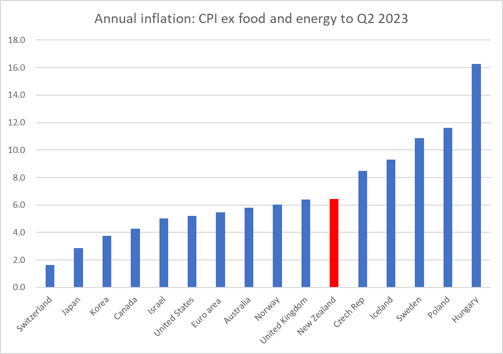
I’ve used this chart before to illustrate how diverse the (core) inflation experiences of advanced economies have been in this episode. It isn’t as if they’ve all ended up with similarly bad inflation rates, and the point of focusing on those countries with their own monetary policy and a floating exchange rate is that core inflation outcomes are a result of domestic (central bank) choices (passive or active) in each country.

Yesterday’s post focused on the rapid growth in domestic demand that the Reserve Bank had facilitated and overseen. But, it might have occurred to you to ask, what about foreign demand? It all adds up.

And if you look more broadly you might reasonably have thought New Zealand would be a good candidate for being towards the left-hand end of this chart.

The central banks in Australia, Canada, and Norway have faced big increases in the respective national terms of trade (export prices relative to import prices) over the last 3+ years. All else equal, a rising terms of trade – especially when, as in each of these cases, led by rising export prices – tends to increase domestic incomes and domestic consumption and investment spending and inflation. It isn’t mechanical or one for one (in Norway, for example, they have the oil fund into which state oil and gas revenues are sterilised) but the direction is clear: a rising terms of trade is a “good thing” and more spending, and pressure on real resources, will typically follow in its wake.

Here is the contrast between New Zealand and Australia over recent years.

In Australia a 25 per cent lift in the terms of trade is roughly equal to a 5 per cent lift in real purchasing power (over and above what is captured in real GDP). A 10 per cent fall here would be a roughly equivalent to a 2.5 per cent drop in real purchasing power. As it happens, over the last couple of years (since the tightening phases began) the terms of trade have been weaker than the Reserve Bank expected, all else equal a moderate deflationary surprise.

But the other big deflationary influence was the closed borders. I’m not here getting into debates about the merits of otherwise of such policies. Central banks simply have to take whatever else governments (and the private sector) do as given and adjust monetary policy accordingly to keep (core) inflation near target. The fact was that our borders were largely closed to human traffic for a long time, New Zealand has more exports of such services (tourism and export education) than imports, and exports of services are far from having fully recovered pre-Covid levels.

We don’t have easily comparable tourism and export education data across countries, but we can look at how exports of services changed as a share of GDP. From just prior to Covid to the trough, New Zealand exports of services fell by 5.7 percentage points of GDP, a shock exceeded only by Iceland (-12.7 percentage points) – the fall for Australia was just under half New Zealand’s, and for most advanced economies (of the sample in the chart above) the fall was 1-2 percentage points of GDP. In most countries, that trough was in mid 2020, while in New Zealand it was not until early 2022.

Some ground has been recovered (most starkly in Iceland) but New Zealand (and to a lesser extent Australia) are still living with a material deflationary shock from this side of the economy. Real services exports in 2023Q1 were 26 per cent (seasonally adjusted) lower than in 2019Q4, just prior to Covid.

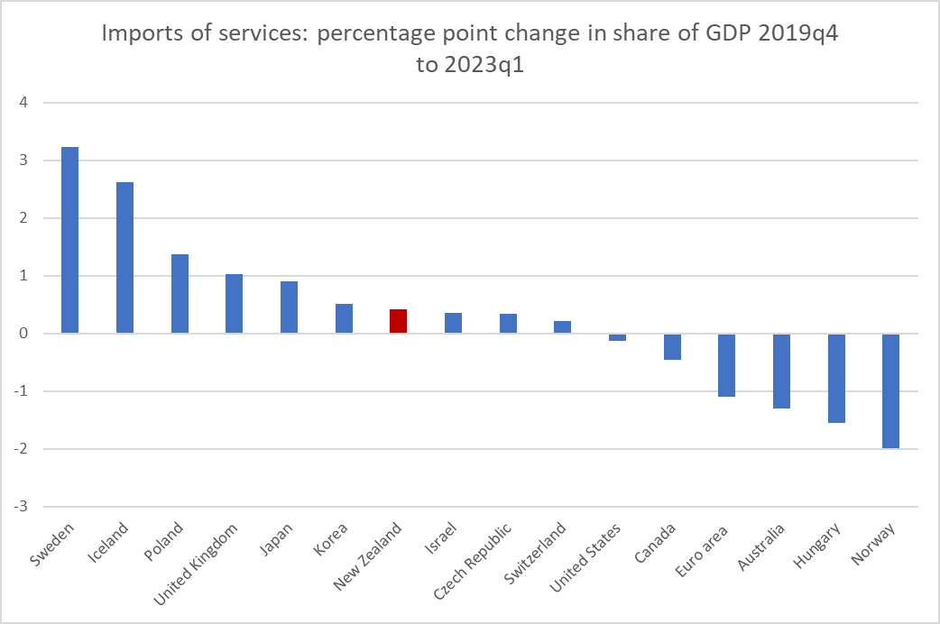
Now, again you will note that this isn’t the entire story. After all, New Zealanders couldn’t travel abroad easily for much of the time either, and money they would have spent abroad seemed to be substantially diverted to spending at home (probably more so than was initially expected). That reduction of imports of services was large (3 percentage points of GDP, with Australia 4th largest of this advanced country grouping) but early – the trough for New Zealand as for most of these advanced countries was as early as 2020Q3.

But that was then. This chart shows the change in imports of services as a share of GDP from just pre-Covid to our most recent data (2023Q1). That share has fully recovered here, with an increase very similar to that of the median country.

So, relative to pre-Covid (and pre-inflation surge), imports of services as a share of GDP are about where they were, and exports of services were still materially lower as at the last official data.

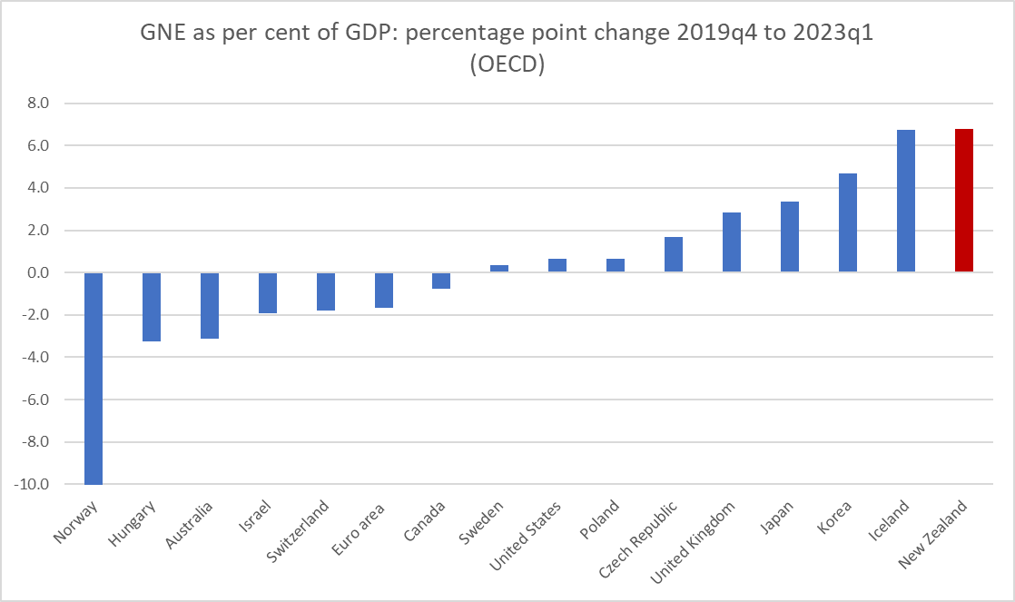
With a deflationary shock like this you might have reasonably thought that the Reserve Bank, if it was to keep inflation near target, would need to induce or ensure faster growth in domestic demand (than some other countries). Yesterday I showed this chart (remember, GNE is national accounts speak for domestic demand). New Zealand was at the far right side of the chart (strongest growth in domestic demand as a share of GDP).

But what if we treated the change in the services exports share of GDP as an exogenous shock that, all else equal, the central bank legitimately had to respond to? In this version of the chart I’ve subtracted the reduction in services exports as a share of GDP.

It makes a material difference to the New Zealand numbers, but even so we are still left with an increase in the share of GDP that is third highest on the chart, about the same as the UK which (as is well known) is really struggling with inflation. (In case you are wondering Korea has relatively modest core inflation now – so first chart – but still about 3.5 percentage points higher than it was just prior to Covid; for us the increase has been about 4 percentage points.)

There are lots of numbers and concepts in this post and it isn’t always easy to keep them straight. But the key points are probably:

  • echoing yesterday’s post, don’t be distracted by the Governor’s spin about Russia or the weather or whatever (they just don’t explain core inflation to any material extent) or spin (probably more from the Minister) that every advanced country is in the same boat (they aren’t, see first chart),
  • more than other advanced countries, we should have been predisposed to being able to have kept inflation in check a bit more easily, having had both a fall in the terms of trade (very much unlike Australia and Canada) and a sustained fall in exports of services that as a share of GDP is materially larger than any other advanced economy has seen.  To be clear, those are bad things, making us poorer, but all else equal they were disinflationary forces,
  • and yet, core inflation here is in the upper half of the group of advanced economies and (as the MPS acknowledged) is not yet really showing signs of having fallen (unlike some other advanced countries, notably Australia, the US, and Canada),
  • the difference is about Reserve Bank choices and forecasting errors.  The Reserve Bank can’t control the terms of trade or exports of services, but its tool – the OCR – is primarily about influencing domestic demand.    They ended up producing some of the strongest growth in domestic demand (absolutely or relative to nominal GDP) anywhere in the advanced world.  It wasn’t intentional, but it was their job, and their mistake resulted in high core inflation.

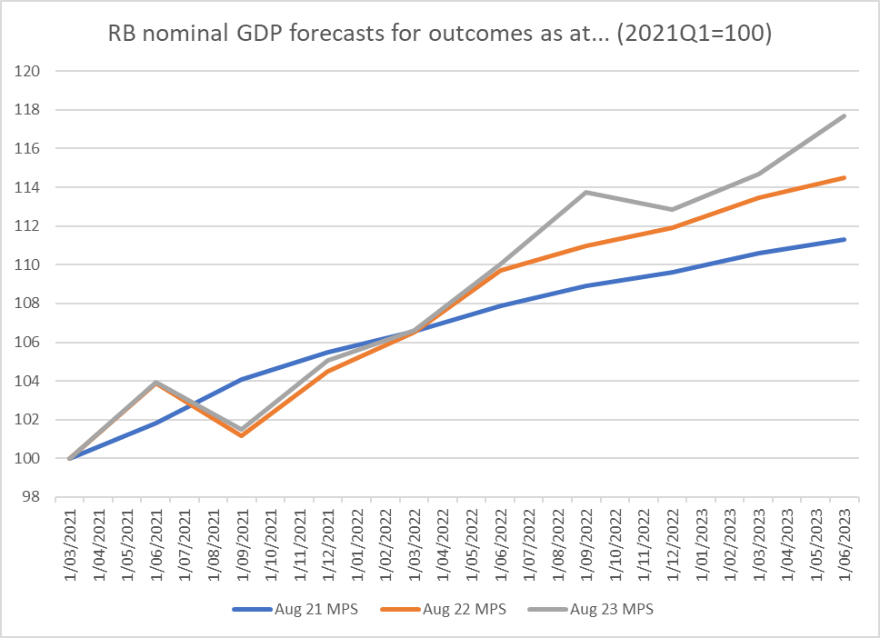
The Reserve Bank doesn’t publish forecasts of nominal GNE – and note that my charts have shown a big increase in GNE relative to GDP – but even their nominal GDP forecasts, even just starting from two years ago when they first thought it was time to start tightening, have materially understated domestic demand growth

and over this period they have actually over forecast real GDP growth.

Again, I’m going to end on a slightly emollient note. Macroeconomic forecasting is hard, and especially in times as unsettled as these. I heard an RB senior person the other day noting (fairly) that they couldn’t tell when the borders would fully reopen, or how quickly people flows would respond when they did. Personally, I’m less inclined to criticise them for getting their forecasts wrong (“let him who is without sin cast the first stone”) than for the sheer lack of honesty and straightforwardness, and the absence of either contrition (in respect of failures in a job they individually chose to accept – no one is compelled to be an MPC member) or hard critical comparative analysis. But…..relative to other countries they had advantages which should have given us a better chance of keeping inflation near target, and things ended up as bad or worse as in the median advanced country.

If forced to confront these arguments the Governor would no doubt burble on about “least regrets”. But the least regrets rhetoric a couple of years ago was really about – and they know this – the risk that inflation might, if things went a bit haywire, end up at 2.5 per cent or so for a year or two, rather than settling immediately around the target midpoint of 2 per cent. It wasn’t – was never even suggested as being – about the risk of two or three years of 6 per cent core inflation, and a wrenching adjustment to get it back under control.

They may still claim to have no regrets. They should have many. We certainly should. They took the job, did it poorly, and now won’t even openly accept (what they know internally) that it wasn’t the evil Russian or a cyclone or….or….or…it was them, Orr and the MPC. They made mistakes (they happen in life), with no apparent consequences for them, and not even the decency to front up, acknowledge the errors, and say sorry.

Excess demand

Particularly when he is let loose from the constraints of a published text, the Reserve Bank Governor (never openly countered by any of the other six MPC members, each of whom has personal responsibilities as a statutory appointee) likes to make up stuff suggesting that high inflation isn’t really the Reserve Bank’s fault, or responsibility, at all. It may be that Parliament’s Finance and Expenditure Committee is where he is particularly prone to this vice – deliberately misleading Parliament in the process, itself once regarded by MPs as a serious issue – or, more probably, it is just that those are the occasions we are given a glimpse of the Governor let loose.

I’ve written here about just a couple of the more egregious examples I happened to catch. Late last year there was the line he tried to run to FEC that for inflation to have been in the target range then (Nov 2022) the Bank would have to have been able to have forecast the Russian invasion of Ukraine in 2020. It took about five minutes to dig out the data (illustrated in the post at that link) to illustrate that core inflation was already at about 6 per cent BEFORE the invasion began on 24 February last year, or that the unemployment rate had already reached its decades-long low just prior to the invasion too. It was just made up, but of course there were no real consequences for the Governor.

And then there was last week’s effort in which Orr, apparently backed by his Chief Economist (who in addition to working for the Governor is a statutory officeholder with personal responsibilities), attempted to brush off the inflation as just one supply shock after the other, things the Bank couldn’t do much about, culminating in the outrageous attempt to mislead the Committee to believe that this year’s cyclone explained the big recent inflation forecasting error (only to have one of his staff pipe up and clarify that actually that effect was really rather small). See posts here and here. Consistent with this, in his interview late last week with the Herald‘s Madison Reidy, Orr again repeated his standard line that he has no regrets at all about the conduct of monetary policy in recent years. It is consistent I suppose: why regret what you could not control?

It is, of course, all nonsense.

But there is, you see, the good Orr and the bad Orr. The bad – really really bad, because so shamelessly dishonest – is on the display in the sorts of episodes I’ve mentioned in the previous two paragraphs.

The good Orr – some of you will doubt you are reading correctly, but you are – is a perfectly orthodox central banker informed by an entirely orthodox approach to inflation targeting. You see it, even at FEC, when for example he is asked about the role the “maximum sustainable employment” bit of the Remit plays. He has repeated, over and over again and quite correctly as far I can see, that there has not been any conflict between it and the inflation target in recent years. That is how demand shocks and pressures work. And whereas in 2020 the Bank thought inflation would undershoot target and unemployment be well above sustainable levels, in the last couple of years the picture has reversed. He told FEC again last week that when inflation was above target and the labour market was tighter than sustainable both pointed in the same direction for monetary policy: it needed to be restrictive. There was, for example, this very nice line in the MPS, which I put big ticks next to in my hard copy.

The Bank doesn’t do many speeches on monetary policy, and those few they do aren’t very insightful but this from the Chief Economist a few months ago captured the real story nicely

and this from the Governor, describing the Bank’s functions, was him at his entirely orthodox

We aim to slow (or accelerate) domestic spending and investment if it is outpacing (or falling
behind) the supply capacity of the economy

Demand management, to keep (core) inflation at or near target is the heart of the Reserve Bank’s monetary policy job, assigned to it by Parliament and made specific in the Remit given to them by the Minister of Finance.

Domestic demand is known, in national accounts parlance, as Gross National Expenditure (or GNE). It is the total of consumption (public and private), investment (public and private) and changes in inventories.

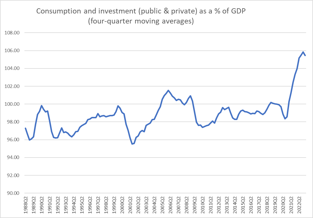
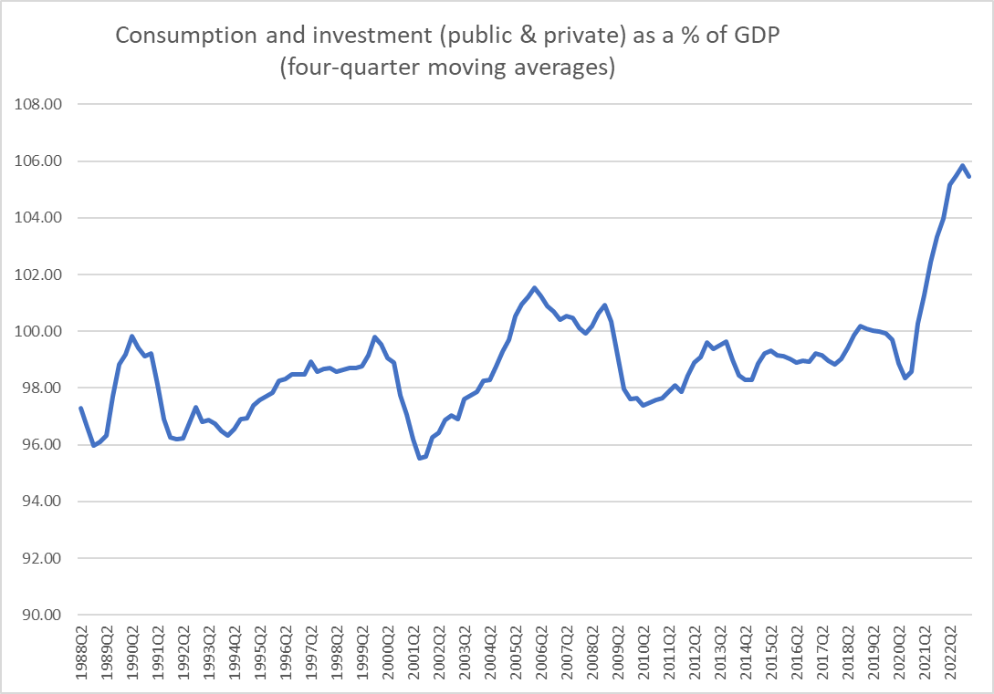
I’ve been pottering around in that data over the last few days, and put this chart (nominal GNE as a percentage of nominal GDP) in my post last Thursday.

This ratio has tended to be low in significant recessions and high around the peaks of booms – investment is highly cyclical -but for 30+ years it had fluctuated in a fairly tight range. The move in the last couple of years has been quite unprecedented, in the speed and size. There was huge surge in domestic demand relative to (nominal) GDP.

One of the points I’ve made a few times recently is that country experiences with (core) inflation have been quite divergent over the last couple of years. The Minister of Finance in particular is prone to handwaving about “everyone faces the same issue” around inflation, and the Bank isn’t a lot better (doing little serious cross-country comparative analysis). But the differences are large.

And so I wondered about how those domestic demand pressures had compared across countries.

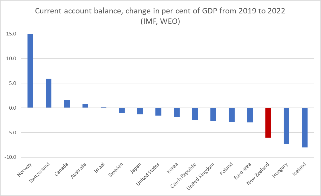
One place to look is to the change in current account deficits as a share of GDP. This chart, using annual data from the IMF WEO database, shows the change in countries’ current account balance from 2019 to 2022 (Norway is off this scale; what happens when you have oil and gas and another major supplier is being shunned)

There has been a fair amount of coverage of the absolute size of New Zealand’s current account deficit, and even a few mentions of the deficit being one of the largest in any advanced country. But for these purposes (thinking about monetary policy and demand management) it is the change in the deficit that matters more. Over this period, New Zealand’s experience has not just been normal or representative, instead we’ve had the third largest widening in the current account deficit of any of these advanced countries (those with their own monetary policy, and thus the euro-area is treated as one). Both Iceland and Hungary have slightly higher inflation targets than we do, but they have a lot higher core inflation (see chart one up).

The current account deficit is analytically equal to the difference between savings and investment. Over that 2019 to 2022 period investment as a share of (nominal) GDP increased in all but two of the advanced countries shown. Of the four countries where it increased more than in New Zealand, three are those with core inflation higher than New Zealand.

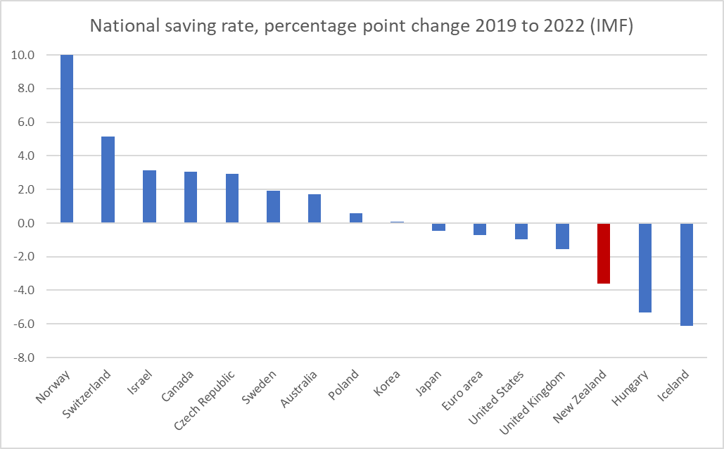
National savings rates (encompassing private and government saving) paint a starker picture. Somewhat to my surprise, of these advanced countries the median country experienced a slight increase in national savings over the Covid/inflation period.

Norway is off the scale again, because I really want to illustrate the other end of the picture. That is New Zealand with the third largest fall in its national savings rate of any advanced country.

What about that chart of nominal GNE as a share of nominal GDP? How have other countries gone with that ratio? There is a diverse range of experiences, but that sharp rise in the New Zealand share really is quite unusual, equal largest of any of these advanced countries.

(If you are a bit puzzled about Hungary – I am – all the action seems to have been in the last (March 2023) quarter’s data).

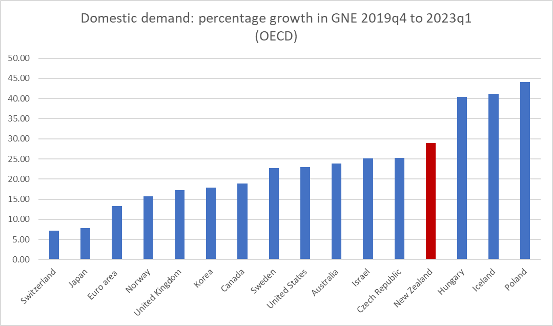
But lets get simpler again. Here is a chart showing the percentage change in nominal GNE (growth in domestic demand, the thing monetary poliy influences) from just prior to the start of Covid to our most recent data, March 2023.

It looks a lot like that earlier chart comparing core inflation rates across countries. In this case, New Zealand had the fourth fastest growth in domestic demand of any of these countries over this period (and those with higher growth are not countries with outcomes we’d like to emulate). And in case you are wondering, no this wasn’t just a reflection of super-strong GDP growth: over this period New Zealand’s nominal GDP growth was actually a little below the growth in the median of these advanced economies. The economy simply didn’t have the capacity to meet the nominal demand growth the Reserve Bank accommodated and the imbalance spilled into a sharp widening of the current account deficit and high core inflation. It wasn’t Putin’s fault, or that of nature (the storms), it was just bad management by the agency charged with managing domestic demand to keep core inflation in check.

I’ve also done all these chart etc using real variables. The deviations are often less marked, but no less substantive for that. Real GNE (real domestic demand) growth from 2019Q4 to the present in New Zealand was third highest among this group of advanced economies, and only Iceland (see inflation and BOP blowouts above) had a larger gap between growth in real domestic demand and real GDP.

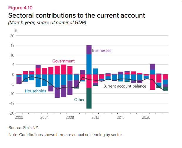
I don’t really want to divert this post into an argument about fiscal policy over recent years (monetary policy has to, as the Governor often notes, just take fiscal policy as it is, as just another demand/inflation pressure) but for those interested the government share of GDP has been high (which usually happens in recessions since government activity isn’t very cyclical) but private demand is what really stands out).

Bottom line: all those stories trying to distract people, including MPs, with tales of the evil Russian or the foul weather or whatever other supply shock he prefers to mention, really are just distractions (and intentionally misleading ones by the Bank). The Bank almost certainly knows they aren’t true, but they have served as convenient cover for the fact that the Bank simply failed to recognise the scale of the domestic demand (right here in New Zealand, firms, households, and government) and to act accordingly. We are now still living with the 6 per cent core inflation consequence. It is common – including in the rare Bank charts – in New Zealand to want to compare New Zealand with the other Anglo countries. But what the Bank has never acknowledged – and just possibly may not have recognised – is much larger the boost to domestic demand happened in New Zealand than in the US, UK, Canada or Australia. And domestic demand doesn’t just happen: it is facilitated by settings of monetary policy that were very badly wrong, perhaps more so here than in many of those countries.

Perhaps one could end on a slightly emollient note. Getting it right in the last few years has been very challenging, and it wouldn’t entirely surprise me if when all the post-mortems are done some of relative success and failure proves to have been down to luck (good or bad). But as in life, central banks help make their own luck, but digging deeper, posing and publishing analysis even when they don’t know all the answers, and by taking a coldly realistic view, not attempting to hide behind spin, misrepresentations, and what must come close to outright lies. Even by acknowledging errors, the basis for learning better, and being able to feel and display those most human of qualities, regret and contrition. We need a Governor and MPC members doing all this a lot more than has been on display here in the last year or two. Our lot show little sign of trying, or of even being interested in feigning seriousness.

Almost done…at least according to the Reserve Bank

I’m not a huge fan of central banks publishing medium-term economic forecasts (or projections as we were usually schooled to call them). As I understand it, decades ago the Reserve Bank of New Zealand only started publishing them because the Official Information Act was passed (and in those days the forecasts made little or no difference to policy so there wasn’t even an arguable ground for withholding). My scepticism only increased as the projections assumed an increasingly significant place in the policy communications, including the move to endogenous interest rate projections from 1997. It isn’t that a central bank’s forecasts are likely to be worse than anyone else’s, just that medium-term economic forecasting (cyclical stuff 2-3 years ahead) is really a mug’s game, and those medium-term forecasts rarely if ever have much impact on the accompanying OCR decision. OCR decisions are almost always, and necessarily (given the state of uncertainty, limited knowledge etc), driven by the latest data releases, which are at best real-time contemporaneous, and more often relating to periods a month or three back (the latest NZ GDP data are for the quarter that ended in March). And that is as it should be. And yet in my experience of the Reserve Bank forecasting and policy process, inordinate amounts of time (including time of the Governor) was spent on numbers for periods so far ahead they would, almost inevitably, be quickly invalidated; often more time (and more senior management smoothing, for messaging purposes) on where we thought things might be in 2 years than on where we think they are right now. I recall a speech some years ago now from a retiring senior European central banker who suggested that perhaps central banks shouldn’t bother publishing for horizons much more than six months, and that line still has some appeal to me. It isn’t about trying to withhold information, but about having nothing useful to say and no robust grounds on which to say it. None of that is a criticism of the Reserve Bank, or their peers abroad, it is just the state of (lack of) knowledge.

Of course, the international trend has been in the other direction, with more central banks publishing more forecast information, and for the time being we are where we are. The Reserve Bank of New Zealand was once considered a leader in forecast transparency, but there are some areas in which they really aren’t very transparent at all. Thus, despite the (quite appropriate) policy focus on core inflation, the Bank does not publish forecasts (even for the next few quarters) for any of the measures of core inflation, and despite the evident seasonality in the inflation data (sufficient for SNZ to publish seasonally adjusted series), the Bank’s inflation projections are not seasonally adjusted (in contrast to almost all quarterly quantity series). On core inflation, even the Reserve Bank of Australia, publishes projections (albeit at six-monthly rests rather than for each quarter) for annual trimmed mean inflation

But if I’m sceptical of the merits of published forecasts, that doesn’t mean those forecasts have no information about the central bank’s own thinking at the time of publication. In fact, the numbers can be – and often are – a significant part of the Bank’s storytelling and tactics, in support of a current policy stance. And how those numbers change over time can also be revealing.

You’ll recall – I highlighted it in my post last Thursday – that one of the good features of last week’s MPS was the upfront acknowledgement that core inflation was hanging up, and that if anything domestic inflation had been a little higher in the most recent quarter than the Bank had been expecting. For example, the minutes record that “measures of core inflation remain near their recent highs”, a point reiterated a couple of times in chapter 2 (the policy assessment). In case there is any doubt, they have a chart showing the core inflation measures grouped around 6 per cent (annual rate). The target, you will recall, is 2 per cent – the midpoint (that MPC is required to focus on) of the 1 to 3 per cent target band.

The Bank doesn’t use one of my favourite graphs, of quarterly core inflation

…but they don’t really need to. They seem to be in no doubt that core inflation has been hanging up, in ways that are at least a little troublesome.

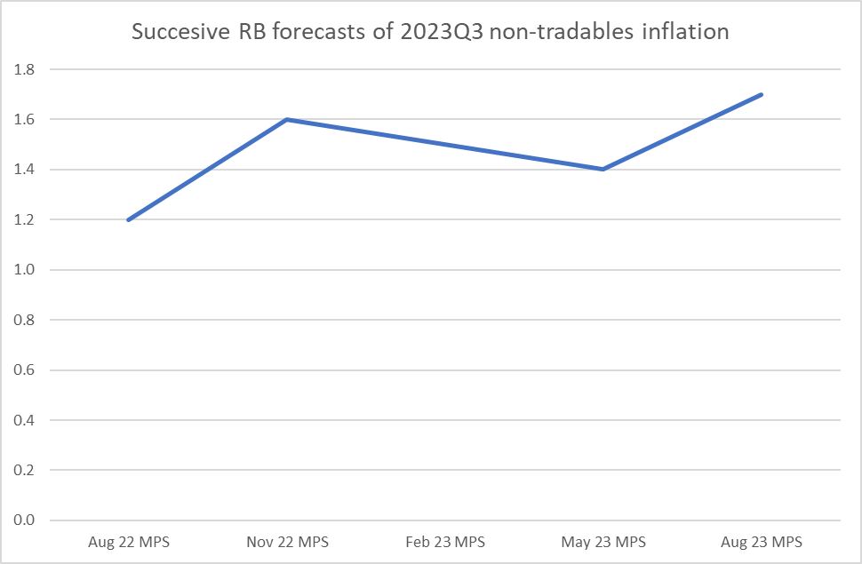
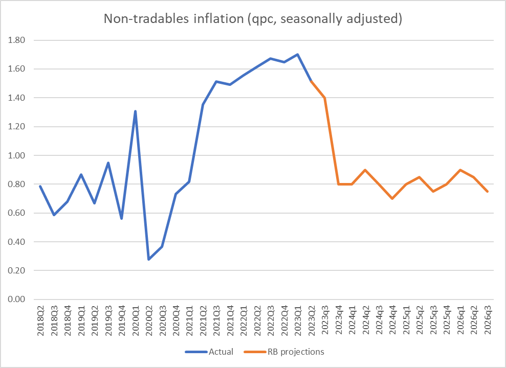
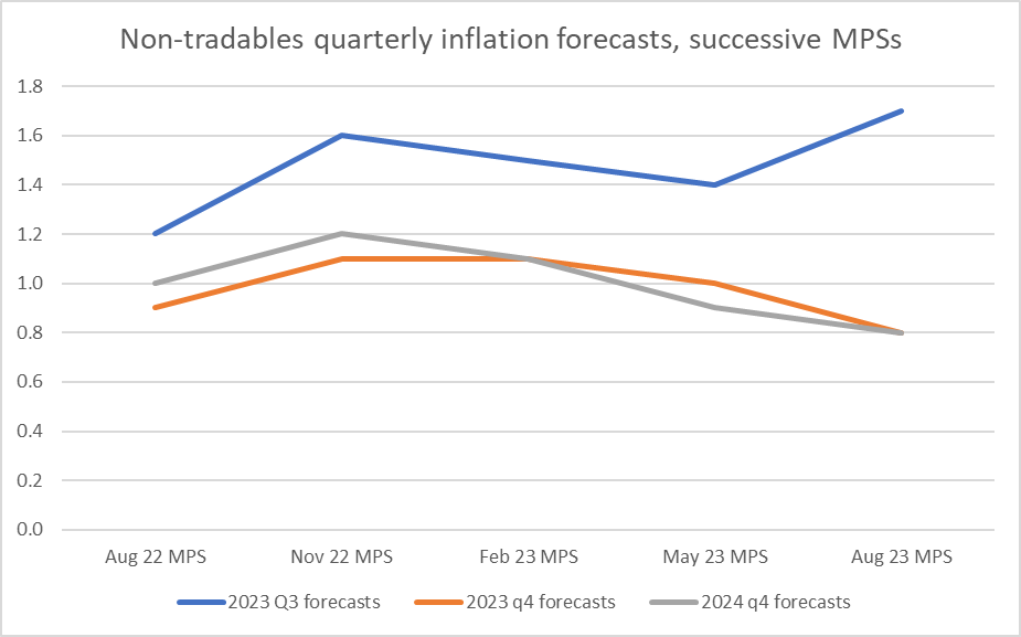
Of the published forecasts, the closest one to showing their hand on the outlook for core inflation is the forecasts for quarterly non-tradables inflation. Non-tradables inflation tends to run persistently higher than tradables inflation (for this century to date, annual non-tradables inflation has averaged 3.4 per cent while annual tradables inflation has averaged 1.4 per cent), and so even as tradables inflation has been abating, non-tradables inflation has been running at an annualised rate 6.6 per cent, a bit higher than core.

Looking out to the medium-term, the Bank seems to consider that non-tradables inflation of about 3.3 per cent will be consistent with inflation being at 2 per cent (for the final year of the projections, to September 2026, they show things being settled at those rates).

In the nearer-term they have generally been having to revise up their forecasts for non-tradables inflation. Here is how RB forecasts evolved over the last year towards the actuals for the two quarters in the first half of 2023.

And here is the SNZ series for non-tradables quarterly inflation on a seasonally adjusted basis.

That last observation is modestly encouraging although (a) per the previous chart, it was quite a bit higher than the Bank was expecting, and (b) there is no sign of anything similar in the analytical core inflation measures themselves. Better than the alternative I guess, but nothing to hang your hat on (and as I noted earlier, when writing about inflation outcomes to date the Bank does not do so in the MPS – it is appropriately uneasy about core and domestic inflation holding up).

As it happens, the Bank has also been revising up its forecasts of Q3 non-tradables inflation – its latest view for the current quarter is (a touch higher) than any of its projections for the quarter over the last year.

But….seasonality matters. The Bank doesn’t publish its inflation forecasts in seasonally adjusted terms. But if we compare the actual data, seasonally adjusted and not, we can back out some approximate seasonal factors, and convert the Bank’s projections into (approximately) seasonally adjusted terms (more technically oriented people could no doubt do it more formally).

This is the result

On these projections, non-tradables inflation (projections for which have been revised up to new highs) does fall a bit in in the September quarter, but then by the December quarter – measured centred on 15 November, now less than 3 months away, starting less than 6 weeks from now – suddenly the whole domestic inflation problem is solved. In (rough) seasonally adjusted terms, non-tradables inflation is back down to 0.8 per cent for the December quarter, a rate not seen since the start of 2021, and a rate consistent with all the inflation problems being solved. Annual rates take a while to come down to be sure, but any policy-setting agency would be firmly focused on quarterly tracks and…..within three months we are there (at least according to the Reserve Bank).

Quite the contrast: revising up the Q3 forecasts (a quarter we already know a bit about) and revising materially down the December 2023 and March 2024 forecasts, which we don’t yet know anything firm about.

I won’t bore you with the charts but it is not as if they are suddenly expecting a much sharper rise in the unemployment rate. Actually, unemployment rate projections for the next 6 months have been revised down quite a bit.

It all seems like a rather miraculous good news story. and yet one that the Bank left buried in the website tables and made no mention of at all, not in the MPS itself or at FEC.
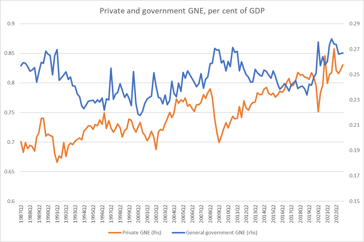
Suggesting they don’t really believe it themselves. How likely is that we’d go from an entrenched (core) inflation problem now (and in the most recent published quarter) back to something consistent with the target midpoint in a matter of weeks? Frankly, it doesn’t seem very likely.
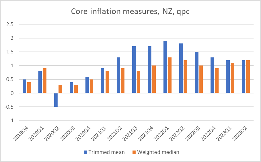
One possibility – and who knows if it is the explanation – is that they really don’t want to raise the OCR again. That might be for political reasons, or because they like this idea of being (one of the first) central banks to reach a peak rate (or some, conscious or unconscious, mix of the two), but had those quarters from 2023Q4 into next year been a bit higher – domestic inflation abating more gradually, consistent with the fairly modest recession forecasts – they would have been under a great deal more pressure to raise the OCR now or in early October. Neither explanation would be to the Bank’s credit. Perhaps neither is the correct story, but then we don’t have any explanation at all from the Bank. If they really believed inflation was collapsing as we speak, surely they’d have told us?
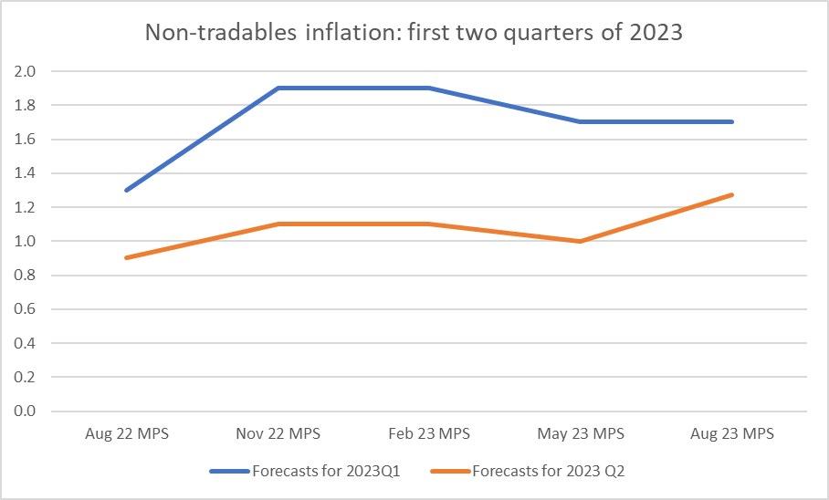
There are some other odd features in the numbers. Take the wage forecasts for example. The Bank doesn’t publish forecasts for the only data we have on wages rates themselves (that is the stratified LCI Analytical Unadjusted series). As I’ve shown previously, inflation in private sector wage rates seems to be levelling off (but not yet falling).

The Bank publishes forecasts for the LCI itself, for the private sector. The LCI is not a measure of wage rate but is designed to be a proxy for something like unit labour costs. Over the decades inflation in the headline private sector LCI has averaged somewhere not too far from the core rate of CPI inflation.

Eyeballing the chart might suggest that annual increases in this measure of the LCI of around 2 per cent might be roughly consistent with inflation at target.

Here are the Bank’s forecasts for LCI inflation

Note first that straight line. No model will have produced that, but rulers are a handy tool for forecast teams responding to gubernatorial whims. But more importantly, note that again they think the job is all but done – those quarterly rates of increases come down hardly any more (that apparently now being consistent with core inflation at the 2 per cent target, but again with no explanation). But then this measure of wage inflation holds up at a remarkably high levels even as the unemployment rate rises from the current 3.6 per cent to 5.3 per cent and only gets back to 5 per cent by the end of the projection period. It doesn’t make a lot of sense and simply isn’t very plausible.

None of it makes much sense. And these days, with a central bank whose Governor and Board chair just make up stuff when it suits, it is impossible to take anything they say or publish at face value. Which is a terrible place to be, when so much power is vested in the Bank, and so much havoc and loss wreaked, with no sign of any effective accountability at all.

Misleading Parliament

In my post on Thursday I commented briefly on the appearance by the Governor and his Chief Economist at Parliament’s Finance and Expenditure Committee. They tried to suggest to the Committee that to the extent there had been inflation forecast errors over the last year – responding to a question from Nicola Willis – that much of it was down the summer storms including Cyclone Gabrielle. But then a helpful staffer in the back row – who may not have been so popular with management after that – piped up and explained to FEC that the impact of the cyclone was perhaps 0.1 or 0.2 per cent. The forecasting error Willis had asked the Governor about was 1.9 percentage points (the Bank had last August forecast that inflation would be 4.1 per cent in the year to September 2023, but now think that inflation rate will be 6.0 per cent).

It was pleasing to see yesterday that veteran journalist Jenny Ruth has emerged from her restraint of trade purdah after leaving Business Desk to begin a new Substack newsletter (free for the first few weeks) and that one of her first columns was about the very same Reserve Bank appearance. Her piece is worth reading. She and at least one other journalist have commented on the Governor having “toned down his hostility” towards Nicola Willis in this appearance. The tone may have been less bad, but the substance was just as contemptuous as ever – and not just of Willis but of Parliament itself. That was, once upon a time, treated as a serious matter. This is from Parliament’s own website

My Thursday post was written from listening to the appearance live and scrawling a few notes as I went. Jenny Ruth’s column prompted me to go back and listen to the recording (you can find it here), being able to stop as needed and take fuller notes. I pick up that segment of the appearance with Orr closing his opening remarks declaring that he was very proud of the Monetary Policy Statement document.

Nicola Willis then asked “what is going on? Inflation has been out of the target range for 27 months. Why is it taking so long to get inflation out of our economy?

The Governor responded along the lines of “Good question. It is a global question. The drivers of inflation have been changing through time, but all biased up, There were lockdowns, supply constraints, the Ukraine war and pressure on commodity prices, and now supply shortages in New Zealand, with severe storms. The drivers have changed but we are confident, subject to the next shock, that inflation pressures are easing”.

Nicola Willis asked if the Bank had stimulated the economy too much, and the response was yes.

The Bank’s Chief Economist (and MPC member) Paul Conway added that “it had been one supply shock after another, citing Covid, the Ukraine War, the pressure moving from goods prices to services prices, and all in all a very unusual period.

He added that the Reserve Bank had however been one of the first central banks to tighten and one of the first to signal that they thought they had reached a peak.

Nicola Willis then asked about the contrast with the US, where inflation had come down faster and appeared to be doing better.

Conway responded that he had “been amazed at the performance of the US, that it was a very different economy, a very flexible one”. He noted that unemployment had rocketed upwards when Covid began and then had fallen very sharply with resources being reabsorbed. The US was “leading the globe when it comes to inflation coming down”, but that “without thinking about it too much” New Zealand had been somewhere in the middle of the pack over the last year.

Willis observed “it strikes me how inaccurate the Reserve Bank’s forecasts have been”, citing the August 2022 forecast that CPI inflation for the year to September 2023 had been 4.1 per cent, and that the latest forecast was for 6 per cent. “Have you looked at the inaccuracies and what is going on there?”

Orr responded that “yes, we do so constantly”, stressing that the great thing about monetary policy was that it as a repeat game, reviewed afresh every six weeks, when they could reflect on surprises relative to forecasts. He indicated that the Bank was working across a whole range of different issues on how to improve. Recent forecasts erros had been “very well explained” by supply shocks, noting that a year ago they had not known about cyclone Gabrielle.

Willis then asked “how much of the difference of 1.9 percentage points is down to Gabrielle?”

The Governor responded “I don’t have that”.

Willis responded that “it seemed a stretch” that cyclone Gabrielle could account for that much of it.

Conway responded that they could back the numbers out to look at exactly that question, and then launched into a bit of a defence of the Bank’s inflation forecasting more generally, argued that they were “pretty good” relative to other forecasters but that it was challenging even in normal times, but that these had not been normal times and that the supply shocks had been “incredibly disruptive”. He said that the Bank had an active programme underway to better understand economic dynamics.

Anna Lorck (a Labour backbench MP) then asked “just for clarity, how much lower would inflation be without Gabrielle?”

At this point the Bank’s forecasting manager, who was sitting at the back of the room, piped up. She was invited to come forward and grab a chair. Her response was that the cyclone effect on inflation had been less than initially expected and was probably 0.1 to 0.2 per cent, mostly in fruit and vegetable prices. Conway noted that the cyclone had been a negative supply shock (boosting those prices) but would also be a positive demand shock (rebuild activity), and either he or the forecasting manager noted that they did not have estimates for any eventual effects on construction costs more generally.

At this point discussion moved on to other topics.

There are several things worth noting just from that record:

  • not once did the Governor or the Chie Economist suggest that excess demand had had anything to do with inflation.  All the talk was about the sequence of supply shocks,
  • it was pretty clear from the answers that actually the Bank had done no serious analysis of the forecast errors over the last year or so,
  • it was also clear that the Bank had done no serious work on trying to understand lessons from other countries, whether those where core inflation has turned down (US, Canada, Australia) or those where it hasn’t,
  • the Governor wanted MPs to believe that the storms/cyclone were a big part of the story for why inflation had been so much higher than the Bank was forecasting just a year ago,
  • the Chief Economist seemed more interested in backing up the Governor rather than providing straight answers to the parliamentary committee, and
  • they might have gotten away with it (well, even more than they will anyway) if it weren’t for one of their capable staff in the back row giving the answer to the question from MPs, an answer very different from what her bosses had been trying to imply just minutes earlier.

There is no way any of this was simply the result of information not previously having been passed up the line.  As Orr had noted in his press conference the previous day, the OCR/MPS decision came as the culmination of “8-10 days” of meetings and deliberations, and paid tribute to staff and MPC members for the work that went in.   I’m sure in substance the meetings are little different than they ever were: lots of detailed papers, lots of presentations, lots of opportunity for questions, and lots of little snippets like “we think the direct effects of Gabrielle on the CPI have been about 0.1 to 0.2 per cent, a bit less than we’d initially expected.  The Governor and Chief Economist knew (that it was very small, relative to the difference Willis was asking about) and chose to mislead the Committee anyway).

But having listened to the FEC appearance again, I went back to the Monetary Policy Statement itself, dozens of pages of text, charts and tables.

First I searched the document for “storms”, “cyclone” or “Gabrielle”.  There were no mentions at all.  “storm” did appear once, but only to note some reduction in March quarter horticulture exports (fine and good to note, but…..the Governor was talking about (and being asked about) inflation.

But surely “supply shocks” would appear in the document. After all, the Governor (and chief economist) had just told MPs that the series of supply shocks were the inflation story.  Perhaps with pardonable license they only meant a big part of the story (remember that the question was about the last 12 months’ forecast error)?  But anyway, “supply shock(s)” doesn’t appear in the MPS either.  I did find two references to “supply constraints”, but they were both good news stories

rather than explanations for why the Bank’s forecasts had again so under-forecast inflation. A few references to “supply chains” (bottlenecks etc) were also all positive, with things having markedly improved (so all else equal lowering inflation) rather than explaining why inflation this quarter is now expected to be 6 per cent when a year ago they expected it to be 4.1 per cent.

The contrast is just staggering, and really pretty shameful when one reflects that these were senior public figures, appointed by the Minister of Finance, testifying to a parliamentary committee when inflation is far outside the target band the MPC had been given.

I’m not even sure why honesty and contrition – whatever their innate virtues – need have been so hard. Forecasting at times like these is really challenging: were it otherwise we (and a whole bunch of other countries) wouldn’t have 6% (eg) inflation in the first place. But for reasons known only to them Orr in particular, and Conway, chose just to make things up, rather than provide honest testimony to one of the bodies charged with holding them to account. (I guess they must take lessons from their Board chair, although his just-so story was “only” to The Treasury, another body charged with monitoring the Bank, not to Parliament itself.)

As I noted in the earlier post (and as Jenny Ruth reminded readers at more length) the deceptions and misrepresentations have become a disconcerting pattern under Orr’s watch. For a certain class of person, why wouldn’t one if there are no consequences to doing so. But down that path lies the further erosion of any sort of serious accountability – accountability supposedly being the quid pro quo for operational autonomy and all the power and status that goes with it,

As a reminder, from the earlier post, here were the inflation forecasts Willis had raised

and these were the parallel unemployment projections

It wasn’t mostly about “supply shocks”, but about misjudging the extent of capacity pressures and the speed at which they would ease. But that would have been to have focused attention on the demand side, and the big misjudgements there, by the Reserve Bank, which is charged with cyclical demand management to keep core inflation in check. All these numbers are part of the MPS suite of documents on the Bank’s website.

(There was quite a bit more spin and highly questionable claims in Orr’s soft interview with a Herald journalist, but we really should be able to expect better – straightforwardness, messages actually consistent with the document he was speaking to, serious transparency, and so on; little things lilke that – when the Governor of the central bank faces a parliamentary committee.)

(Oh, and although it is an old line, it is still not true: Conway claiming to FEC that the Reserve Bank had been one of the first central banks to raise rates. There are 21 central banks making their own monetary policy (20 countries and the ECB) in the OECD. Of them, 7 started tightening earlier than our central bank, and another moved on the same day. The Reserve Bank was scarcely a stellar outlier. They did move earlier than the central banks of Australia, Canada, the US, the UK and the euro area, but then it seems now that Australia, Canada and the US have seen core inflation begin to abate earlier and further than it has here. One of the virtues of the MPS itself is that it doesn’t shy away from that fact that New Zealand core inflation is still holding up. And that, surely, is the relevant accountability test.)

At it again

Senior figures at the Reserve Bank have an alarming record of just making stuff up (and getting away with it). Just last week, documents showed that the Board chair had told entirely made-up stories to Treasury, apparently trying to rewrite history, in turn leading an incurious Treasury to lie to the media. And on several occasions the Governor has been found actively misleading Parliament’s Finance and Expenditure Committee (eg here, here, and here).

He (and, sadly, his chief economist) were at it again this morning at FEC. Asked why it was taking so long for inflation to come down we got a long list of supply shocks (ie things they weren’t responsible for) and little or no acknowledgment at all that excess demand (reflected in things like the unsustainably tight labour market), the thing monetary policy influences, might have played even part of a role.

But then this conversation ensued (not word for word)

Nicola Willis: A year ago your forecasts said inflation by now [September quarter 2023] would be 4.1 per cent, and now you are picking it will be 6.0 per cent. What explains that magnitude of error?

Orr: [after some burble] supply shocks and in particular the storms and cyclone Gabrielle

Nicola Willis: How much difference did the cyclone make?

Orr: I don’t know.

[a minute or two later]

Anna Lorck (Labour backbencher): Governor, how much difference has the cyclone made to inflation?

At this point, the Bank’s forecasting manager, sitting in the back row, pipes up and is invited forward and she explains that they think the cyclone might explain 0.1 or 0.2 per cent, (the effect through fresh fruit and vegetable prices)….. [and it seems very unlikely that the Governor did not already know this, having just sat through days of MPC deliberations].

As I say, they just make stuff up. Here it is worth remembering that a) fruit and vegetable prices, and especially extreme moves in them, will be out of all/most core inflation measures, and b) that as the Bank’s own MPS yesterday noted, several times, core inflation – the bit shaped by excess demand and expectations pressures – was hanging up and had not yet shown signs of falling.

These are the RB inflation projections Willis was referring to

And here are their unemployment rate projections from the same two sets of forecasts

Slack simply has not re-emerged in the economy as early or to the extent the Reserve Bank expected a year ago. That isn’t about adverse supply shocks. It is just a(nother) forecasting error re excess demand from the well-paid committee (and their large supporting staff) charged with delivering annual inflation near 2 per cent.

Despite the chief economist’s claims (again, at FEC this morning) that the Bank is pretty good at forecasting, in this episode (last few years) they’ve been consistently worse than respondents to the Bank’s own expectations survey (who’ve been bad enough).

All that was just about a few minutes in the MPC hearing, where (as so often) that Bank treats parliamentary scrutiny and accountability as some sort of game where anything goes. The post was actually going to be about the MPS itself.

It was a pretty thin and disappointing document, even with the modest nudge in the direction of possible further OCR increases. I read it more slowly and carefully than I sometimes do, and came away if anything more convinced that the combination of their own persistent mistakes and their own read of the data support a higher OCR now, to be confident that we will really get inflation back to 2 per cent fairly promptly from the current still elevated core levels. And astonished that, with no supporting analysis for the claim, the MPC continues with the bold claim – not paralleled as far as I’m aware in any other advanced country central bank – that they are “confident” they have done enough. “Confident” here seems most likely to be empty bluster, with the risk that it is also intended to keep the natives quiet for the weeks remaining before the election.

I have been, and still am, hesitant about suggesting that the Governor and the MPC are operating in a deliberately partisan way. But it gets harder to believe such a pro-incumbent bias is playing no part (consciously or unconsciously) in their words and actions. I’ve documented previously the skewed, highly unconventional, and very favourable to Labour, way the Bank treated fiscal policy in May following the more expansionary Budget. In this MPS, the word “deficit” appears 44 times, but it appears that every single one of those references is to the current account deficit, and not one to the budget deficit (altho there is a single reference to “the Government’s plan to return the Budget to surplus”). The same weird framing of fiscal issues was there not only in the rest of the document but explicitly from the Governor this morning. He claimed that what mattered for the Bank from fiscal policy was only/mostly government consumption and investment spending, not taxes (or apparently transfers), let alone changes in structural deficits (the usual model). Having provided no supporting analysis or rationale whatever – speech, research paper, analytical note, just nothing – the Governor appears to have simply tossed the conventional fiscal impulse approach out the window, at just a time when doing so suits his political masters. Perhaps it is all coincidence, but either way it is troubling.

More generally, relevant supporting analysis was remarkably thin on the ground. There was no analysis at all of past reductions in inflation in New Zealand, no analysis of the forecasting mistakes of the last year (see above), no serious analysis of what has gone on in the US, Canada, or Australia where core inflation has turned down (and what, if any, comparative insights those experiences might offer). (At FEC this morning, they were asked about the US case, and it was clear they’d not even thought hard as the chief economist was reduced to lines like “it is a very different economy”, “very flexible”, and that was it…….) And there seemed to be considerably more discussion of the current account deficit – which the Bank has no direct responsibility for – than of inflation for which it does. Even with a four page special topic on the current account and a five page one on immigration it is hard to think of any useful analytical insight one comes away from the document with. And remember that this is it: there is no stream of thoughtful speeches likely to emerge from MPC members over the coming weeks elaborating on bits of research or analysis there was no space for in the MPS itself.

And, revealing the poor quality of the MPC itself, even though core inflation lingers high, miles above target, there is no sign in the minutes of any serious thoughtful alternative approaches. We are left to assume that in a highly uncertain environment all these senior public officials just went with the flow. They are “confident” we are told again, but with no hint of why, or no hint of anything like the normal degree of divergence one might reasonably expect if seven able people were debating such challenging issues at the best of times.

Even allowing for signs that things are slowing – and remember we had two negative quarters of GDP growth late last year and early this year already – there seems to be more wishful thinking and hopefulness than serious supporting analysis (and, of course, any contrition – these people wreaked this inflationary havoc and the expected rise in unemployment – is totally absent). Not even the MPC hides the fact that “domestically-generated inflation” is not only hanging up but is also “marginally higher” than they’d expected as recently as May.

Among the straws they attempt to clutch at is a claim that “private sector wage inflation appears to have peaked and has started to ease” and “most measures of annual wage inflation have begun to ease”. But of all the series they seek to draw on, the only one that actually attempts to measure wage rates (rather than hourly or weekly earnings, or something approximating unit labour costs) is the LCI Analytical Unadjusted series. As I showed earlier in the week, at best this series seems close to peaking, but there is no sign yet of any slowdown.

Perhaps as to the point, even when some series have started slowing – and neither core inflation nor wage rates yet have – there is a long way to go to get core inflation from 6 per cent to 2 per cent, and the Bank’s forecasts and policy have been repeatedly wrong in the same direction over recent years.

Then there is the fact that the Bank has revised up its view of the neutral nominal interest rate by 25 basis points. That may well be sensible (respondents to their expectations survey have raised their view of neutral by 60 basis points in the last 18 months), but what it means is that the Bank now thinks the current OCR is less contractionary, all else equal, than it has assumed previously. It is as simple and mechanical as that. With core inflation still holding up, the labour market still tight (in their words), the output gap still positive, and other excess demand indicators still pointing to imbalances, it might then have seemed natural to have moved to raise the OCR, or at least to move the near-term forward track up by 25 basis points, putting October and November firmly into view. Instead, the track is ever so slightly higher in the near-term and the 25 points increase only really becomes apparent in the far (and largely irrelevant) reaches of the years-ahead OCR projections. The MPC was keen on a so-called “least regrets” framework when they were (unintentionally) giving rise to the current mess, but seem to prefer just to punt and hope now.

One of the (many) disappointments around the Reserve Bank’s analysis in recent years – a period when not only do we have a shiny new MPC but the biggest monetary policy failures in decades – is the lack of any really systematic and overarching view of the excess demand pressures that have built up in the economy. They show up, of course, most evidently in the high inflation (which then the Bank too often – see above – tries to minimise with handwaving rhetoric about supply shocks), and it shows (more abstractly) in the Bank’s output gap estimates and (more concretely) in the unsustainably low unemployment rates. But it also shows up in the labour force participation rate, which has stepped up a long way in this boom, tends to be pro-cyclical, and yet the Bank assumes the increase is permanent. Is that likely, and if so why?

And then there is the sharp widening in the current account deficit, which does not get the attention it deserves as an indicator of macro imbalances and excess demand. As noted already, there is a four page special chapter (and I agree with the bottom line re the NIIP position), but it is rather light on macroeconomic analysis (a basic savings-investment lens) and longer, earlier, on accounting (the absence of Chinese students and tourists). There is a nice sectoral balances chart

and this is where even the Bank has to acknowledge the government contribution to the demand imbalances.

But in playing around with the data yesterday, I came up with this chart

The extent of the domestic pressure on available resources relative to domestic output is quite unprecedented in recent decades (both the consumption and investment lines individually are also around record highs, but it is the combination that is striking). Since GDP is what it is (already stretched beyond potential – that is what a positive output gap is) the excess demand pressures are reflected in a current account deficit. This is annual data. Using the quarterly seasonally adjusted data, the most recent quarterly observation was slightly higher than the last four quarter average. There is a lot of excess demand adjustment that seems likely to have to occur (if, for example, this ratio is to get back to the 98-100 per cent range observed most of the time in the last 35 years).

Central banks are well-positioned to make such points and present data in telling ways. Our mostly does not.

Any new government will face a lot of challenges, and a lot of areas of the public sector that really need sorting out. Given the great power handed to the Reserve Bank, their glaring failures in recent years, and their apparent indifference to matters of integrity, the combination of considerations mean they should be high on the priority list for a new Minister of Finance.