A visiting Australian politician

A fairly prominent Australian politician was in town last week.   Andrew Leigh was previously a professor of economics at ANU, and for the last eight years has been a Federal Labor MP.  He is the Shadow Assistant Treasurer, Shadow Minister for Competition and Productivity (and spokesman on various other minor portfolios), and so presumably fairly likely to become a Federal government minister if the next election result follows the polls and Labor is elected.

Leigh was here to give a couple of lectures in the series being sponsored by the NGO Presbyterian Support Northern on topics related to child poverty and wellbeing.  As it happens, next month I’m also giving one of the lectures in this series –  on the role productivity growth plays in ending poverty – and if anyone is interested you can book  one of the (free) sessions here   (there is one in Auckland and one in Wellington).

I didn’t get to hear Andrew Leigh while he was here, but both his Auckland text  and his Wellington text are available on line.   The substance of both addresses is well worth reading –  he is a widely-published researcher on inequality (the Auckland address) and has just published a book about the use of randomised control trials as a tool in better evaluating which policy interventions might work and which don’t (the focus of the Wellington address).   I don’t claim to be a fan of the Australian Labor Party, but politics is likely to be better for having at least a few people, preferably on both sides of politics, able to address serious issues this seriously.

Having said that, I was mildly amused by the introduction to his Wellington speech.   I guess it is standard advice to butter up, and flatter just a bit, your audience.

New Zealand has turned out to be a pretty good predictor of what’s likely to happen next in Australia.

New Zealand women won the right to vote nine years earlier than Australian women.

Your country enacted same sex marriage four years before we did.

You even gave Barnaby Joyce citizenship before we did.

So to be in New Zealand isn’t just a chance to see the sun rise a couple of hours earlier – it’s also an opportunity to get a sneak peak into some of the things that might shape Australia’s future.

And I have to say that as a member of the Labor opposition in Australia, I’m keenly hoping that this year or next will see Australia’s voters follow your lead in electing a progressive government.

I’m pretty sure that, even if it got a good laugh, he is wrong about Barnaby Joyce –  a citizen by birth of both countries, and there was only a single birth.

But no mention at all –  none, as far as I could see across two speeches –  of the most striking area of New Zealand/Australia comparisons where Leigh must surely hope that New Zealand doesn’t offer a “sneak peak” into Australia’s future.  And that is the, not trivial, matter of relative productivity and prosperity.

As I noted yesterday, for 100 years or so (from the time of our gold rushes onward) New Zealand and Australia are estimated to have had average real per capita incomes that were much the same.   Each country had specific idiosyncratic events and influences, so that at times we did better, and then for a time they did better.  Those differences were reflected in the trans-Tasman migration data –  at times the (significant) net flow was one way, and at times the other way.

The standard collection of such data is that by former OECD researcher Angus Maddison  Here is the chart of the data he judged best (no doubt far from ideal in both cases), starting from 1870 when he first reports annual numbers for New Zealand.  (Maddison died a few years ago so the data aren’t updated to the present.)

aus vs nz real gdp pc

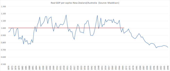
The red line is the average of the series for the full period 1870 to 1970: on average, on these measures, New Zealand had very very slightly higher average incomes than Australia.  On different measures you might get a slightly different picture, but the overall story won’t change much.  The performance of our two economies was pretty similar.  But it is no longer.   The IMF’s current estimate is that New Zealand real GDP per capita, converted at purchasing power parity exchange rates, is about 76 per cent of that of Australia.

We don’t have a time series of productivity data for the historical period, and although Australia has an official series of real GDP per hour worked back to 1959, here official data can only take us back to the late 1980s.    In this chart, I’ve shown the relative performance of labour productivity (real GDP per hour worked) in the two countries since 1989 (for New Zealand, using the average of production and expenditure GDP measures, and the average of the QES and HLFS hours series, as in earlier posts).

real GDp per hour aus vs nz

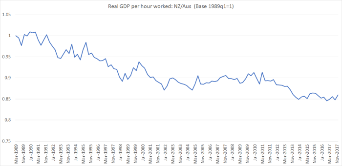
In 29 years, we’ve lost a lot more ground –  15 percentage points-  relative to Australia.  It isn’t a particularly steady process (at least as represented in these data) but the trend decline shows no sign of ending, let alone reversing.

And thus when, as in one of his speeches, Andrew Leigh notes that

It is not as though the child poverty rate is noticeably different in our two countries. According to the OECD, the child poverty rate – measured as the share of children living in households with disposable incomes of less than half the median – is 13 percent in Australia and 14 percent in New Zealand.

what he is omitting is that incomes in Australia are a lot higher, and thus so too is the relative poverty line measure he is using.  Australia’s poor should be less badly off than our poor, because Australia’s relative economic performance is so much better.

For Australia’s sake, I hope New Zealand’s path doesn’t foreshadow their own.  Then again, in some respects it already has.    On the Maddison numbers, back in 1870 both New Zealand and Australia were more prosperous than the United States.  As recently as 1938, we were about equal with the US.  And now, we do particularly poorly, but Australia’s relative performance is nothing to write home about.

rel to US

Interestingly, Leigh touches on one possible aspect of the story.

Third is to recognise the role that foreign investment plays in sustaining employment. As you know, the antipodes enjoyed among the highest wages in the world at the end of the nineteenth century. One reason for this was the high amount of land per person. While Europeans lived cheek-by-jowl, there was plenty of room to swing a sheep in Australia and New Zealand. In economic terms, one reason that wages were high was that the capital to labour ratio was high.

Today, both Australia and New Zealand have strong immigration programs. Migrants can fill skill gaps and start businesses, boost innovation and encourage exports. But they also have the inevitable impact of lowering the capital to labour ratio. To the extent that migrants are adding to the number of workers available to do a given job, this may put downward pressure on wages.

It was former Treasury Secretary Ken Henry who pointed out to me that foreign investment has the opposite effect. By increasing the available capital, it pushes up the capital to labour ratio. So by accepting foreign investment as well as migrants, a country can keep its capital to labour ratio constant, and therefore its wage rates.

I think that is partly true and partly not.  As he notes, in the 19th century what marked out both countries was abundant land – which in turn attracted both migrants and foreign investment.  These days, foreign direct investment can help improve prospects –  and I’m strongly supportive of us being open to FDI –  but FDI doesn’t add to the stock of land and natural resources (even if it can help exploit those resources more fully), and even when regulatory restrictions are out of the way, it flows in the direction of opportunity.  Neither country has been particularly successful in seeing internationally competitive industries not based on our natural resources develop.  Attractive opportunities in either location don’t seem thick on the ground,

It is, nonetheless, good to see a left-wing politician openly addressing these issues.  Would that it were happening here.

Leigh’s other speech was devoted to the merits of randomised trials of proposed or actual policy interventions or welfare programmes.  In many areas, they are the single best way of identifying what works and what doesn’t.  Here are a couple of examples from his text (in this case, of programmes that proved not to work).

In some cases, the Education Endowment Foundation trialled programs that sounded promising, but failed to deliver. The Chatterbooks program was created for chil­dren who were falling behind in English. Hosted by libraries on a Saturday morning and led by trained reading instructors the program gave primary school students a chance to read and discuss a new chil­dren’s book. Chatterbooks is the kind of program that warms the cockles of your heart. Alas, a randomised trial found that it produced zero improvement in reading abilities.

Another Education Endowment Foundation trial tested the claim that learning music makes you smarter. Students were randomly assigned either to music or drama classes, and then tested for literacy and numeracy. The researchers found no difference between the two groups; suggesting either that learning music isn’t as good for your brain as we’d thought, or that drama les­sons are equally beneficial.

In a similar vein, a recent randomised trial of free school breakfast programs in New Zealand schools found that it reduced hunger rates (by 8.6 units on the ‘Freddy satiety scale’, in case you’re curious). However, free breakfasts did not improve school attendance or academic achievement for low-income children.

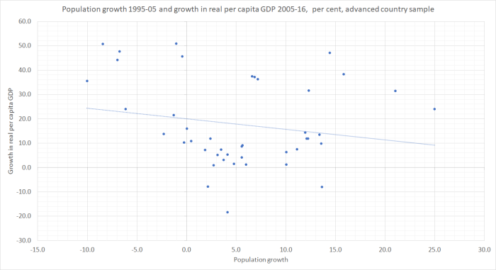
Unfortunately, attractive as this approach is, it isn’t really an option for most of the sorts of policy interventions I write about here, which are economywide by construction.  One can’t split the country into 100 different monetary regions, and apply different OCRs to each (chosen randomly) –  and nor, frankly, should one want to.   Even if some global dictator could do it across countries, there are far too few countries (and so many differences across them) for the results to be anything as valid as those from an evaluation of (say) a school music programme with (say) 500 kids split randomly into groups participating and not participating in the programme.  The same goes for aggregate fiscal policies, or immigration policies.  One might, perhaps, be able to do randomised trials around small aspects of, say, the Essential Skills visa programme, but not about overall approaches to immigration.  I

Instead, we are forced back onto looking what is really a small range of countries (say 40 advanced countries), over relatively short periods of history (the last couple of hundred years), and –  given that and all the other individually confounding factors –  it is perhaps less surprising that people of goodwill still differ on quite what role some of these policy interventions have to play, and what their overall effects are.  Of course, many other areas of policy are much the same –  think foreign affairs and defence –  and the difficulty of reaching of conclusive results doesn’t change the importance of ongoing analysis, research and debate, testing and evaluating the relevant comparisons and insights that history (our own and others), theory, and current experience appear to be offering.

Small size simply isn’t the issue

Just yesterday I wrote, in response to a comment, that

My point simply was that there is no obvious correlation, in the cross section, between population size and GDP per capita (or productivity). I’m not aware of any serious observer arguing otherwise

At the level of very simple correlations, I’d illustrated this lack of relationship –  whether for all countries, just advanced countries, excluding the handful of extremely large countries, or whatever.  Bigger countries (by population) don’t, on average, have higher per capita incomes than smaller countries.

But then I went to a seminar at the Productivity Commission yesterday afternoon, attended by various private and public sector people.  The substance of the seminar –  a new MBIE report on the manufacturing sector, and the discussion of it and of possible policy responses –  is embargoed until David Parker releases the report next week.   But I hope I’m not breaching any rules in simply reporting that I noted around the room an almost unquestioned acceptance that size (small) is one of New Zealand’s economic problems.  Normally I might barely have noticed it, but having been writing about the topic in the last few days, it niggled away at me.

The more I’ve thought about that issue over the years, the more I’ve concluded that those who hold it are simply wrong, and perhaps in the thrall of the political equivalent of Keynes’s “defunct economists”  –  the long tradition of political leaders, dating back at least to Vogel, who’ve wanted, as a matter of policy, a lot more people in New Zealand, believing (presumably) that New Zealanders would be better off as a result.  There doesn’t seem to be much –  any? –  evidence in support of any economywide economic benefits flowing from this preference.

One hears talk in such discussions of ideas like “markets work better in big economies”, or even talk of economies of scale –  or opportunities for specialisation – in government/regulation.  In principle, the arguments sound plausible enough.

But they rarely seem to confront the simplest stylised data.  For example, Australia and New Zealand are almost equally remote (on standard measures), but Australia’s population has been consistently much higher than ours, and yet for a century (say 1860 to 1960) material living standards (GDP per capita) were much the same on the two sides of the Tasman.

Or we could look at some advanced countries where distance/remoteness is much less of an issue.  In what follows I’ve looked at the OECD member countries in Europe (continental plus the UK and Ireland).  There are 24 of them, ranging in population from Germany’s 82 million to Luxembourg’s 0.6 million.  Five of these countries – New Zealand’s size or smaller – didn’t even exist as independent states thirty years ago.

In this chart –  for 2016 –  I’ve ordered those 24 countries by population size and shown the real GDP per capita for each.  I’ve also shown the median (so not distorted by Luxembourg, or issues around Irish tax) for the group of countries with a population less than 10 million, and also the median for the large European OECD countries.

europe real GDP and popn

If anything, the typical larger country has a lower per capita income than the typical smaller country.  Of course, these are small samples, so not much weight should be put on them, but there is nothing to suggest bigger countries are performing better than smaller countries.  And if one insisted on excluding the former communist countries – even though they are now 25 years on as market economies –  the gap (in favour of the smaller countries) – is larger.

In many respects,  real GDP per hour worked  (labour productivity) is a better metric of economic performance.  Here is the same chart, for 2016, using the OECD’s data on productivity.

europe real gdp phw and popn

I could exclude Ireland and Luxembourg, I could exclude the ex-communist countries, I could add to the “small” category the countries (Portugal to Belgium) with populations just over 10 million, and it won’t change the story.  There is nothing in the simple stylised facts of European OECD countries suggesting that bigger countries do better than smaller ones.  Even at the most prosperous core bit of Europe (London is the richest –  by income –  region in Europe), Belgium, Switzerland, Denmark and Austria do really well.  And so do France and Germany (the UK less so).

Of course, there are lots of other things that help explain any individual country’s performance. Norway, for example, wouldn’t rank so high without oil, or Ireland without the features of its corporate tax policy which see a lot more economic activity booked in Ireland than directly results from economic activity occurring in Ireland.  One issue, of course, is the quality of policy.  There are lots of different dimensions of that, and sometimes one sees a story in which small countries try harder, regulate less, or whatever to overcome the alleged disadvantages of size.   One widely-used indicator is the OECD’s index of product market regulation.  As it happens, the PMR score for the median small country in OECD Europe is less good (ie more less-liberal regulation exists) than in the median large country.

Smarter people with richer datasets and serious econometric skills can produce much more complex models, encapsulating a lot more information simultaneously.  But whatever the results of such models –  which often end up depending on the modellers’ embedded assumptions –  it is always worth bringing them back to check against the simplest stylised facts.  Even in a region where distance is much less of a differentiator among countries (it isn’t nothing –  Portugal and Greece would have it tougher than Belgium and the Netherlands even with great policy) population size doesn’t seem to be an advantage, and isn’t associated with either higher GDP per capita or higher productivity.

For decades, I’ve used the line that if only we could detach New Zealand from the ocean floor and relocate it –  land and all –  in the Bay of Biscay, just off the coast of France we’d be much better off materially, all else unchanged.  Perhaps the North Sea would be even more propitious.  But the point remains, the biggest handicap to economic success in New Zealand is our distance/physical remoteness –  in an age when, across the board (although with individual pockets otherwise) distance isn’t becoming less of an issue, but perhaps even more of one.    A modest number of people probably can do very well here, but not many.   And yet our policymakers –  aided and abetted by official advisers –  keep driving policy to locate ever more people in a really quite unpropitious –  even if beautiful and (now) peaceful –  location.

There is simply no evidence supporting the notion that our small size is “the problem” (or even a material part of it), and when the story continues to be invoked it simply serves as a distraction –  mostly unwittingly so –  from a focus on the real issue, responding realistically to the unchangeable (absent quite different technologies) constraints of our physical isolation.

Labour’s fiscal commitments

There has been plenty of talk in the last few days about the fiscal pressures the government finds itself facing.   There are echoes of the great “fiscal hole” controversy from last year’s election campaign.   And so it seemed like a good time to revisit a post I did back then on these issues.

In that post I first explained what Labour had done

Labour has laid out their numbers in a series of summary tables.  They have explicitly identified numbers for each of their (revenue and expenditure) major policy initiatives, and made explicit summary provision for the cost of a group of less expensive policies.  And they identified how much (or little) still unallocated money they would plan to have available.   The resulting operating surplus numbers are almost identical to those in PREFU, but where they do take on a bit more debt –  to fund NZSF contributions and the Kiwibuild programme – they also allow for additional financing costs.

And then they had BERL go through the numbers.    People on the right are inclined to scoff at BERL and note that they are ideologically inclined to the left.  No doubt.  But all they’ve done on this occasion is a fairly narrow technical exercise.  They haven’t taken a view on the merits of any specific policy promises or even (as far I can see) on the line item costings Labour uses.  And they haven’t taken a view on the ability of a Labour-led government to control spending more broadly.   They’ve taken the Labour numbers, and the PREFU economic assumptions and spending/revenue baselines, and checked that when Labour’s spending and revenue assumptions are added into that mix that the bottom line numbers are

“consistent with their stated Budget Responsibility Rules and, in particular

  • The OBEGAL remains in surplus throughout the period to 2022
  • Net Core Crown debt is reduced to 20% of GDP by June 2022
  • Core Crown expenses remain comfortably under 30% throughout the period to 2022.”

An economics consultancy with a right wing orientation would have happily signed off on the same conclusion.

But, so I argued, that wasn’t the real issue.   I won’t blockquote all this, but what follows is just lifted from the earlier post.

But where there is more of an issue is that Labour’s spending plans on the things they are [explicitly] promising mean that to meet these surplus and debt objectives, on these [PREFU] macro numbers, there is very little new money left over in the next few years.     That might not sound like a problem –  after all, why do they need much “new money” in the next few years when the things they want to do are already specifically identified and included in the allocated money in the Labour fiscal plan?      The answer to that reflects the specifics of how the fiscal numbers are laid out, and how fiscal management is done.   Government departments do not get routine adjustments to their future spending allowances to cope with, say, the rising demands for a rising population, or the increased costs from ongoing inflation (recall that the target is 2 per cent inflation annually).   Rather, they are given a number to manage to, and only when the pips really start squeaking might a discretionary adjustment to the department’s baseline spending be made.  Any such discretionary adjustments comes from the “operating allowance” –  which thus isn’t just available for new policies.

You can see in the PREFU numbers.   Health spending rose around $600 million last year, and is budgeted to rise by around $700 million this year (2017/18).  And then….

$m
2017/18 16432
2018/19 16449
2019/20 16481
2020/21 16396

No one expects health spending to remain constant in nominal terms for the next three fiscal years.  But there will need to be conscious decisions made in each successive Budget to allocate some of the operating allowance to health –  some presumably to cover new policies, and much to cover cost increases (wages, drugs, property etc, and more people), all offset by whatever productivity gains the sector can generate.

And here is why I think there are questions about Labour’s numbers.  By 2021, they expect to be spending $2361 million more on health than is reflected in these PREFU numbers.     About 10 per cent of that increase is described as “Paying back National’s underfunding” and the rest is labelled as “Delivering a Modern Health System”.

This is how they describe their first term health policies

Reverse National’s health cuts and begin the process of making up for the years of underfunding that have occurred. This extra funding will allow us to invest in mental health services, reduce the cost of going to the doctor, carry out more operations, provide the latest medicines, invest in Māori health initiatives including supporting Whānau Ora, and start the rebuild of Dunedin Hospital.

That sounds like an intention to deliver materially more health outputs/outcomes (ie volume gains, or reduced prices to users).

In response to Steven Joyce’s attack, Grant Robertson is reported as having told several journalists that Labour’s health (and education) numbers include allowances for increased costs (eg rising population and inflation  –  and inflation in the PREFU is forecast to pick up) as well as the costs of the new initiatives.   Perhaps, and if so perhaps a pardonable effort to put a favourable gloss on the proposed health (and education) spends –  ie sell as new initiatives what are in significant part really just keeping with cost and population pressures.  I say “pardonable” because governments do it all the time.

In this chart, I’ve shown core Crown health expenditure as a share of GDP since 2000, and including Labour’s plans for the next three budgets.  (Labour show total Crown numbers, but I’ve taken their policy initiative numbers –  ie changes from PREFU –  and applied them to the core Crown data, which Treasury has a readily accessible time series for.  The differences between core and total Crown in this sector are small.)

Labour health

In other words, on these numbers health as a share of GDP over the next three years would be less than it was for most of the current government’s term, and virtually identical to what it was in Labour’s last full year in government, 2007/08.    Some of the peaks a few years ago were understandable –  the economy was weak, and recessions don’t reduce health spending demands.  But even so, we know that there are strong pressures for the health share of GDP to increase, as a result of improving technology (more options) and an ageing population.  Treasury’s “historical spending patterns” analysis in their Long-term Fiscal Statement last year had health spending rising from 6.2 per cent of GDP in 2015 to 6.8 per cent in 2030.

Without seeing more detail than Labour has released there really only seem to be two possible interpretations.  Either Labour hasn’t allowed for the ongoing (ie from here) population and cost increases in their health sector spending numbers, or there must be much less in the way of increases in health outputs than the documents seem to want to have us believe (eg “reversing years of underfunding”).  One has potential fiscal implications.  The other perhaps political ones.    Glancing through Labour’s health policy, which seems quite specific, I’m more inclined to the former possibility (ie not allowing for population and cost pressures), but I’d be happy to shown otherwise.

Eyeballing that chart –  and as someone with no expertise in health –  it would look more reasonable to expect that health spending might be more like 6.5 per cent of GDP by the end of the decade, in a climate where a party is promising more stuff not less, and with no strategy to (say) shift more of the burden back onto upper income citizens.

2018 commentary resumes here:  in other words, despite all the talk in their own campaign documents and rhetoric about systematic underfunding of health, Labour’s proposed spending on health –  carefully laid out numbers – as a share of GDP just wasn’t consistent with the rhetoric.   They – and perhaps even the previous government –  may not have been specifically aware of, say, the Middlemore problems, and perhaps more generally things really are worse than they could have realised in Opposition.   But it seems implausible to think that a party talking up underfunding –  and well aware, for example, of the constant pressure on DHBs to produce surpluses come what may –  could have supposed that, on their proposed delivery models and views on entitlements, operating spending on health of only 6 per cent of GDP could have been enough.     That was stuff they should have recognised and acknowledged going into the election.

As I noted in last year’s post, one could do the same exercise for education.  This is another quote from that post:

One could do much the same exercise for education.  Labour has seven line items in its “new investments” table.  Most of them are very specific (including increased student allowances and the transitions towards zero-fees tertiary education).     There is a general (large) item labelled “Delivering a Modern Education System” but in the manifesto there are a lot of things that look like they are covered by that.    There isn’t any suggestion that general inflation and population cost increases are included, but perhaps they are.  But again, here is the chart of education spending as a share of GDP, including Labour’s numbers for the next three years.

labour education.png

I’m not altogether sure what some of those earlier spikes were (perhaps something to do with interest-free student loans), but again what is striking is that Labour’s plans appear to involve spending slightly less on education as a share of GDP than when they were last in government.  And that more or less flat track from here doesn’t suggest a party responding to this stuff

National has chosen to undermine quality as a cost-saving measure. After nine years of being under resourced and overstretched, our education sector is under immense pressure and the quality of education is suffering. The result is a narrowing of the curriculum, more burnt out teachers, and falling tertiary education participation.

and at the same time committing to flagship policies around things like student allowances and fee-free tertiary study.

Again, it begins to look as though Labour has included in its education numbers the ongoing multi-year costs of its own new policies, but not the ongoing cost increases resulting from wage and price inflation and population increases.  Again, I’d happily be shown otherwise.

Of course, there is some unallocated spending in Labour’s numbers, but the amounts are very small for the next few years, and some of these sectors are very large.  And although population growth pressures are forecast to ease a little in the next few years, inflation is forecast to pick up and settle around the middle of the target range, so there are likely to be increased general cost pressures (including, for example, wage pressures if as Labour state in the fiscal plan document “by the end of our first term, we expect to see unemployment in New Zealand among the lowest in the OECD, from the current position of 13th”).

How much does it matter?  After all, we don’t know many specifics on the policy initiatives National (and/or its support partners) might fund in the next term, and there was the strong suggestion the other night of a new “families package” in 2020 (which would come from any operating allowance).  Quite probably the next few years will be tough, in budget terms, for whoever forms the government.  After all, the terms of trade isn’t expected to increase further, and inflation is.  And there is a sense that in a number of areas of government spending things have been run a bit too tight in recent years.      On the other hand, Labour participated in this ritual exercise and it looks as though they may have implied rather more fiscal degrees of freedom than were actually there, if –  critical point –  they happened to want to produce a surplus track very like National’s.

2018 commentary resumes again. But all that led me to wonder quite why Labour had made the commitments it had.  Here is a final, slightly shorter, quote

……perhaps the bigger question one might reasonably put to both sides is why the focus on (almost identical) rising surpluses?   These are the numbers.

labour surplus
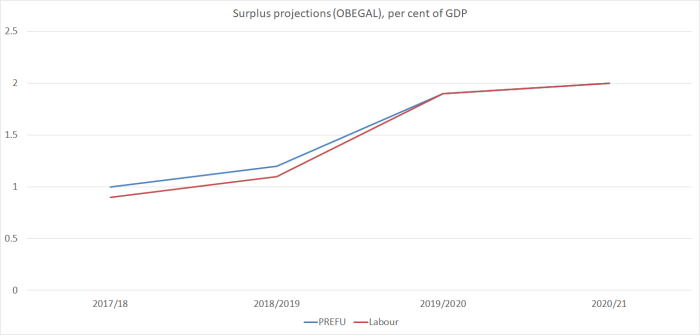
When net core Crown debt is already as low as 9.2 per cent of GDP –  not on the measure Treasury, the government and Labour all prefer, but the simple straightforward metric –  what is the economic case for material operating surpluses at all?   With the output gap around zero and unemployment above the NAIRU, it is not as if the economy is overheating (the other usual case for running surpluses).   Even just a balanced budget would slowly further lower the debt to GDP ratios.   One could mount quite a reasonable argument for somewhat lower taxes (if you were a party of the right) or somewhat higher targeted spending (if you were a party of the left, campaigning on structural underfunding of various key government spending areas).

Labour is promising to spend (and tax –  thus the surpluses are the same) more than National.  But their commitment (rule 4) was to keep core Crown expenditure “around 30% of GDP”, not “comfortably below 30 per cent”.

labour spending

28.5 per cent is quite a lot lower than 30 per cent (almost $5 billion in 2020/21 – not cumulatively, as GDP is forecast to to be about $323 billion). And 30 per cent wasn’t described as a ceiling. And in the last two years of the previous Labour government, core Crown spending was 30.6 per cent of GDP (06/07) and 30 per cent of GDP (07/08).

It is a curious spectacle to see a party campaigning on serious structural underfunding of various public services and yet proposing to cut government spending as a share of GDP.  It would be difficult to achieve –  given the various specific policy promises –  but you have to wonder, at least a little, why one would set out to try.     We simply aren’t in some highly-indebted extremely vulnerable place.

Here endeth the quotes from last year

I’m not one of those persuaded by the siren calls that the government should be borrowing heavily because interest rates are low.   For a start, our interest rates are still among the very highest in the OECD.   And interest rate outcomes aren’t the result of some random-number lottery: they are low for a reason (having to do in no small part with future expected rates of growth).   I’m also cautious about the lack of “policy space” to cope with the next serious recession.   But in the debate around this year’s Budget, or the next couple, most aren’t suggesting the government should rush out and adopt fiscal parameters that might deliver net debt of 50 or 70 per cent of GDP a decade hence.   Instead, Labour simply bound itself to the same, arbitrary, net debt target as National had run with, just achieved a couple of years later than National planned to do so.

I don’t agree with everything in this extract from Matthew Hooton’s Herald column the other day, but the gist seems about right.

Robertson has convinced himself that sticking to his commitment is essential to maintain the confidence of the business community and financial markets.

He remembers the Winter of Discontent of 2000 and is determined to avoid at all costs investors and business becoming actively hostile to the new regime.

But this just shows Robertson’s naivety about the business and finance communities and woeful ignorance of what drives confidence in either.

At a net 22 per cent of GDP, New Zealand’s debt is already low compared with the rest of the world. If carefully signalled and communicated by Robertson and his Treasury officials, it is implausible that a further extension of the 20 per cent debt target to, say, 2025, would provoke a materially adverse reaction from the business community or financial markets, especially if emphasis was placed on investments in infrastructure and human capital.

Moreover, the business and financial communities well understand and accept that the fundamental difference between Labour and National governments — at least theoretically — is that the former believes in bigger government than the latter.

And yet –  see the graph immediately above- Labour campaigned on continued reductions in government operating expenditure as a share of GDP, all the time claiming that core services were underfunded.   And in her press conference yesterday, the Prime Minister indicated that Labour would be sticking to its self-imposed Budget Responsibility Rules.  As I illustrated above, under the operating spending limb of those Rules there is plenty of slack, but the binding rule on this occasion is the net debt goal they have committed to.  And net debt isn’t just affected by any increase in operating spending, but also in any action the government takes to address claims of (previously unrecognised) backlogs in capital investment.

Labour seem to have first got themselves into this hole from (a) a desperate desire not to leave room to be painted as irresponsible potential economic managers, and (b) an inability to persuasively make an alternative case.  And all of this was laid down at a time when, perhaps, it seemed that the chances of having to actually deliver, in government, were slim.     But, in the old line, the first rule of holes is “stop digging”.  At present, Labour –  while claiming things are much worse than even they realised –  seem to be setting out to dig themselves even deeper in.   In a way, perhaps, it is admirable that they seem to want to follow through on a pre-election commitment.  But that narrative about fixing public services, and reversing what they regarded as severe underfunding in many areas (now worse, they claim, than they previously recognised) seemed quite like a pre-election commitment as well, even if it didn’t have precise numbers and dates on it.

(And yes, my natural inclinations are towards smaller government.  There are plenty of things I would cut back on, notably addressing NZS issues.  This post isn’t an unconditional advocacy for bigger government, or any sort of statement of faith in the likely quality of much government spending, just pointing to the tortured, almost indefensible, logic of the government’s own position.   And for those who worry about the interest rate consequences of higher net debt, I tackled that in another post last year.)


More on population and per capita GDP

My quick post on Saturday, in response to someone’s comment, was designed simply to illustrate what should have been quite an obvious point: looking across countries in any particular year, countries with large populations don’t tend to be richer (per capita GDP) than countries with small populations.  Just among the very big countries, the United States is towards the top of the GDP per capita rankings (beaten by a bunch of small countries), and China, India, Indonesia, Pakistan, and Brazil are not.   Since both the physical sizes of countries, and their populations, are the outcomes of all sorts of historical factors, it wasn’t an observation about immigration policy or (wince) “population policy”.    And, of course, GDP per capita isn’t everything: moderately well-off large countries are typically more powerful (defence or offence) than small rich ones.

But, continuing to play with the same data download from the IMF WEO database (190 or so countries and territories) for the period since 1995, is there any obvious relationship betweeen population growth rates, and growth in real per capita GDP?

Here is the chart

population 9 Aug 1 all countries

Actually, I’ve left out three extreme outliers –  all oil producers.  Equatorial Guinea had growth in real GDP per capita of about 2500 per cent over the period, and UAE and Qatar had population growth of 300-400 per cent (in one case, with falling real GDP per capita, and in the other with a moderate increase).

There is basically no relationship between the two series –  again, each dot is a country.  The simple linear regression line is downward-sloping but that probably wouldn’t be a statistically significant relationship.  Bear in mind though that simply charting population growth and per capita GDP growth for the same period could have shown an upward-sloping relationship even if there was no causal link from faster population growth to faster per capita economic growth: countries with rapid growth in real GDP per capita might be expected to attract more people (immigrants flow towards opportunity) and perhaps even induce higher birth rates.   But there is no sign of even that sort of relationship, across all countries, and over this period of 20 years or so (this sort of reverse causality is a big problem looking at annual data, but much less so looking at long periods).

The full sample of countries includes a huge range of types of countries –  from war-torn poverty stricken basket cases (Syria, Somalia, Afghanistan) to tiny remote islands (Tuvalu), as well as places with strong institutions, good connections, and an established record of economic performance.   How do this simple bivariate relationships look if we focus just on these latter countries?

In various posts over the years, I’ve used a sample of about 40 fairly advanced countries, encompassing the members of the OECD and the EU, as well as Taiwan and Singapore.   There is still a lot of difference among these countries: places that were non-market communist economies only 30 years ago, the odd place (eg Mexico) that is more like an honorary member of the group of advanced countries, as well as the places with very high productivity (France, Germany, United States, Ireland, Norway).  And there are countries as small as Malta or Luxembourg, and as large as the United States.  This group leaves out countries that appear to be rich only because of oil.

Here is the simplest plot: of the levels of population and GDP per capita in 2016.

popn advanced 1

This time, the simple regression line is very slightly upward sloping.  Remove the US and it changes sign.  Remove all the countries with more than 50 million population and it is still downward sloping.

But what about growth rates?  For quite a few of these countries, GDP per capita is pretty shaky before about 1995 (communist-era and immediate post-communist transition).  That’s why I’ve done all these charts for just the last 20 years or so.  But that also happens to be a period when there has been a lot more population movement between advanced countries (especially in Europe).

popn advanced 2

Recall that even if there was no causal relationship running from population growth to growth in real GDP per capita, there was a possibility that we might have seen an upward-sloping relationship simply from any link between successful economies drawing in more people (as happened in Ireland most obviously –  net immigration rising well after the boom in per capita GDP and productivity).  But, in fact, across these 40 or so advanced countries, any relationship is downward sloping.  Across these countries in this period, faster population growth has been associated with slower real per capita GDP growth. (For the eagle-eyed among you, New Zealand is the red dot.)

And in this final chart, I’ve broken the period in two.  I’ve charted, for each country, population growth in the first 10 years of the period (1995 to 2005) against real GDP per capita in the second half of the period (2005 to 2016).  In other words, none of the population growth variable is directly caused by the growth in the real per capita GDP variable.

popn advanced 3

The downward-sloping relationships is weaker this time –  less of the variance in GDP growth is explained simply by prior population growth –  but again it is downward-sloping, and not the upward-sloping line many of the immigration-policy boosters in New Zealand would like us to believe.   I forgot to mark New Zealand on this chart –  we are one of the dots a bit below the line with 12 per cent population growth –  but there is nothing unusual about New Zealand’s place on either chart.

If one wants to get more sophisticated, one could look at growth in labour productivity or total factor productivity, rather than just real GDP per capita.  Especially for TFP, one becomes dependent on the model used in estimating TFP and the available sample of countries drops away,  As for labour productivity, in earlier posts I’ve illustrated the lack of a positive relationship between population growth and productivity growth (and recall that New Zealand has managed better real per capita GDP growth than productivity growth, by working longer hours), and that –  for example –  if anything business investment as a share of GDP has been negatively correlated with population growth across advanced countries.  That is the opposite of what might been expected if population growth –  and immigration –  was typically boosting the productivity and per capita income prospects of recipient countries.

It is past time we started backing our own people, not looking to replace or augment them with a mythical group from across the water.  Part of that involves the government getting serious about facing up to the disappointing economic outcomes of our long-running Think Big economic and social experiment with large scale immigration.  As part of that, in turn, a serious review of immigration policy by the Productivity Commission –  there have been two in Australia in the last 15 years –  would be a good place to start.


Population and real GDP per capita

I noticed a few comments to another of my posts about possible links between population size and economic performance.  My working assumption is that, on average, across all countries, there isn’t any such relationship.   Apart from anything else, if there were a positive relationship –  that was more than chance –  it would suggest that two countries merging would increase their respective real incomes.  And yet for at least the last 70 years, we’ve had steadily more countries emerging.  No doubt economics isn’t the only thing at work in those choices –  people might be willing to pay a price to be “free” and self-governing –  but it isn’t likely to be an irrelevant consideration either.

But what do the data show?   Here I’ve just used the IMF World Economic Outlook database data for 2016.

The first chart shows the relationship –  for the 193 countries/territories the IMF reports data for –  between real GDP per capita (in purchasing power parity terms) and population (each dot is one country).   The population term is expressed in logs.

popn and real GDP pc

As (I would have) expected, there is basically no relationship at all.   The simple linear regression line is actually slightly downward sloping, but that won’t pass any test of statistical significance.  Perhaps one could craft a story in which the top 10 countries (in terms of per capita income) all have quite small populations –  the biggest is around 5 million people – but since oil plays a big part in most of those individual cases even then one shouldn’t make too much of the point.

And here is the chart if we look only at the countries with populations from 0.5 million (a tenth of New Zealand’s) to 50 million (ten times New Zealand’s).  Since that is a much more compressed scale –  not everything from Tuvalu to the People’s Republic of China –  this time the population variable isn’t expressed in logs.

popn and real GDP pc 0.5 to 50m For those with sharp eyesight, New Zealand is a dot coloured orange.

Again, there really isn’t any sort of relationship.  Again, the simple regression line is downward sloping, but there are lots of countries with very small populations and very low per capita incomes.   But even within this more-compressed range of populations, there is no sign at all of any sort of upward sloping relationship –  the idea that, on average, a higher population will be associated with higher per capita incomes.

Of course, within each of these dots there are complex historical relationships, as to how population in any particular country came to be what it was (some about conquest, making big countries out of small one; sometimes the historical carrying capacity of the land; in some the role of slavery (eg forced depopulation from Africa), in others the role of immigration policy.   Some locations offer better prospects than others and will, typically, have attracted or retained poeple accordingly.

But this post isn’t attempting to get into any of that. it is simply observing that at the most elementary level of numerical analysis there is no sign that countries with larger populations tend to be richer (whether as a matter of cause, or of effect).

A modern, high-value economy

That is what Regional Development minister Shane Jones says Taranaki is “transitioning to”.

And yet of the $20 million of government giveaways (your money and mine) designed

to help future-proof the Taranaki region by diversifying its economy, creating additional jobs and leveraging off the strong base the region has established through its oil, gas and agricultural sectors.

$5 million is going towards earthquake-strengthening a rather attractive provincial Anglican church, recently raised in status to a cathedral (more cathedrals as there are fewer Anglicans), and $13.3 million is going to build walking tracks on Mt Egmont.

It has more of a feel of a museum –  built, and natural –  than building or enhancing a “modern, high value economy” (such things rarely being built –  or enhanced –  by governments splashing cash around).

Perhaps there is a good case for more walking tracks in Taranaki.  I’m not, in principle, opposed.  It is crown land, and needs managing.  Nonetheless, it is hard to think of any country that has got to the global productivity or income frontiers with an emphasis on tourism.

As for the church building, I like it and I’ve worshipped there.   But what about it makes the earthquake strengthening of a private building a matter for national taxpayers to support?   Again, perhaps at least there is an element of consistency –  better perhaps than a government prohibiting demolition and yet not putting any money in.   But how it is consistent with lifting the longer-term economic performance of the economy –  regional or national –  is quite beyond me.

Then again, this seems to be a government that on the one hand isn’t keen on oil and gas, or dairy –  the two biggest outward-focused industries in Taranaki – and on the other isn’t interested in doing anything serious about getting the real exchange rate down.  So perhaps the hope isn’t really that today’s package will do anything much of substance –  certainly not to lift medium-term regional economic performance – but perhaps it might placate the natives for a month or two?


Inadequate Treasury advice

I wrote about the new –  and last ever –  Policy Targets Agreement when it was released by the incoming Governor and the Minister of Finance last week.  Mostly the changes were pretty small, and in some cases you had to wonder why they bothered (since the PTA system itself is to be scrapped when the planned amendments to the Reserve Bank Act are passsed later this year).

I lodged Official Information Act requests with the Reserve Bank and Treasury for background papers relevant to the new PTA.  I wasn’t very optimistic about what I might get from the Reserve Bank –  both because of a culture of secrecy, and because the incoming Governor probably wasn’t covered by the Official Information Act when he was negotiating this major instrument of public policy.   But The Treasury kindly pointed out that they had already pro-actively (if not very visibly) released several papers, including Treasury’s own advice to the Minister of Finance, and two Cabinet papers.

(I would link to those papers, but Treasury has been upgrading its website this week and the link they provided me with no longer works.  If I manage to trace one that does work I will update this.)  [UPDATE 9/4.   Here is the new link to those papers,]

Those papers help answer the question about why they bothered with the small changes.  The Treasury advice to the Minister of Finance was dated 7 February, well before Treasury had formulated its advice on Stage 1 of the Reserve Bank Act review, and before the Independent Expert Advisory Panel had reported. In other words, well before it was decided that PTAs would soon be done away with altogether.  Indeed, there are suggestions in the paper that most of the relevant work had been done 18 months ago –  they say they consulted “a number of economists and market participants over 2016” –  when they thought the Minister would be replacing Graeme Wheeler early last year (rather than falling back on the unlawful “acting Governor” route to deal with the election period).  Interestingly,  the advice suggests Treasury favoured, on balance, increasing the focus on the 2 per cent target midpoint and de-emphasising the 1 to 3 per cent target range, but the Minister appears to have rejected that option.

There are two Cabinet papers among the material that was released.  One was from 19 February, before the Minister had engaged with the Governor-designate on the possible wording of the PTA.  In that short document the Minister outlines for his colleagues the draft PTA he would be suggesting to Adrian Orr.  The other was from 19 March, advising his colleagues of the text he had agreed with Orr.

The differences in the two texts are small, but in my view the changes represent improvements relative to the Minister’s draft (for example, keeping the political waffle about climate change, inclusive economies etc, clear of the material dealing with the Reserve Bank’s own responsibilities).  Presumably Orr would have consulted senior Reserve Bank staff, but on the basis of what has been released so far, we don’t know.

The documents suggest that The Treasury has played the lead (official) role in reshaping the Policy Targets Agreement (the Treasury advice to the Minister refers to them having consulted the Bank, but there is no suggestion that the Bank staff had necessarily agreed with the recommendations, or any suggestion of a separate Reserve Bank paper).  In a way, the lead role for The Treasury makes sense –  macroeconomic policy parameters should be set primarily by the Minister, not the Governor-designate.  On the other hand, The Treasury will typically not have the degree of expertise, or depth, in issues around monetary policy that the Reserve Bank should have.   I welcome the Minister’s announcement that in future, when the Minister directly sets the operational goal for monetary policy, he will be required to do so after having regard to the advice (publicly disclosed) of both the Reserve Bank and The Treasury.

My main prompt for this post, however, was one element of The Treasury advice which seriously concerned me, and represented a grossly inadequate treatment of an important issue.

In Treasury’s advice to the Minister, they have an appendix dealing with a couple of aspects of the Policy Targets Agreement where they didn’t propose change.  The one I’m interested in was the question of the level of the inflation target itself.

Treasury note that “there have been a number of arguments advanced by commentators over recent years in favour of either a higher or lower inflation target”.

Treasury notes, correctly, that

The main argument in favour of increasing inflation targets is in order to ensure that central banks will have enough scope to lower interest rates in the face of a large contractionary economic shock that may result in monetary policy reaching the effective lower bound of [nominal] interest rates

Amazingly, this issue is dismissed in a mere two sentences.  As they note

a higher inflation target would lead to higher costs of inflation at all times, whereas the risks of a lower bound event occur infrequently

But instead of moving on to offer some numerical analysis, or even plausible scenarios, the government’s principal economic advisers simply observe that

Given this, the costs of a higher inflation target may outweigh the benefits

Or may not. But Treasury doesn’t seem to know, and doesn’t offer the Minister (or us) any substantive analysis.

Here is one scenario.  Recessions seem to come round about once a decade, and in typical recessions (admittedly a small sample) the Reserve Bank has needed to cut interest rates by around 500 basis points.  If it can only cut interest rates by, say, 250 basis points, and that difference meant even just 2 per cent additional lost output (eg the unemployment rate one percentage point higher than otherwise for two years, the annual costs of a higher –  but still low –  inflation rate would have to be quite large, for the costs of a higher target to outweigh the benefits.  Perhaps my scenario is wrong, but Treasury doesn’t offer one at all.

Treasury devotes more space to the possibility of lowering the inflation target.  They aren’t keen on that –  some of their arguments are fine, others flawed at best –  but even then they seem determined to play down the near-zero effective lower bound on nominal interest rates, noting that (emphasis added)

a lower inflation target marginally increases the risk that the ELB [effective lower bound] may be reached, thereby providing monetary policy marginally less space to respond to shocks

Those who have sometimes called for cutting the target probably have in mind cutting the target midpoint from 2 per cent to 1 per cent (where it was in the early days of inflation targeting).    When interest rates are 8 per cent, that might make only a marginal difference to the chances of the lower bound being reached –  indeed, that was standard Reserve Bank advice in years gone by, when the lower bound was treated as a curiosity of little or no relevance to New Zealand.   But when the OCR is at 1.75 per cent (and the central bank thinks the output gap and unemployment gaps are near zero) a 1 percentage point cut in the inflation target would hugely reduce the effective monetary policy space for dealing with serious adverse shocks.  The floor would be hit with relatively minor adverse shocks.

And they conclude this way

New Zealand’s inflation target has been changed a number of times in the past and frequent changes to the level of the target could undermine the credibility of the regime.

There were two changes in the level of the target inside six years, which was unfortunate.  But the most recent of those changes was 16 years ago.  At that time, the idea of running out of monetary policy room in New Zealand was little more than a theoretical possibility.  Now it seems quite likely whenever the next recession happens here, and has already happened to numerous other advanced countries.

As I hope readers recognise by now, I regard an increase in the inflation target as an undesirable outcome, a second-best option.  I would rather the authorities (Reserve Bank, Treasury, and the Minister of Finance) treated as a matter of urgency removing directly –  and with preannounced certainty and credibility –  the extent to which the near-zero lower bound on nominal interest rates bites, by reducing or removing the incentives in the face of negative interest rates for people (large holders of financial assets, rather than transactions balances) to shift to holding physical cash.   Even just ensuring that the Reserve Bank gets inflation up to around 2 per cent –  rather than the 1.4 per cent (core) inflation has averaged for the last five years –  would help.

But there is nothing about any of this in The Treasury’s advice on the main instrument of New Zealand macroeconomic policy.  It seems extraordinarily inadequate.  Perhaps they have provided some other, more in-depth, advice on these sorts of issues –  in which case it might be good to proactively release that –  but there is no hint of, or allusion to, any deeper thinking in the PTA advice.   “Wellbeing” is all the (content-lite) rage at The Treasury these days.  I’m not a fan, but perhaps they should reflect that one of the biggest things policymakers can do to avoid adverse hits to “wellbeing” is to avoid unnecessarily severe or protracted recessions (and spells of unemployment).     Indifference on this score is all the more inexcusable when the limitations arise wholly and solely from policymaker/legislator choices –  whether around the level of the inflation target or the system of physical currency issues (and the prohibitions on innovation in that sector).  Ordinary New Zealanders –  not Treasury officials –  risk having to live with the consequences of their malign apparent indifference.

As it happens, a reader last night sent me a link to a couple of new pieces on exactly these sorts of issues.  The first was the (brilliantly-titled) “Crisis, Rinse, Repeat” column by Berkeley economist and economic historian Brad Delong.  He concludes

It has now been 11 years since the start of the last crisis, and it is only a matter of time before we experience another one – as has been the rule for modern capitalist economies since at least 1825. When that happens, will we have the monetary- and fiscal-policy space to address it in such a way as to prevent long-term output shortfalls? The current political environment does not inspire much hope.

And his column took me on to recent work by his colleagues David and Christina Romer, and in particular to a recently-published lecture on macroeconomic policy and the aftermath of financial crises.

The authors focus on financial crises (and I have a few questions about which events are included and which are not), rather than recessions more generally, but it isn’t obvious to me why their results wouldn’t generalise.   Here is their abstract.

Analysis based on a new measure of financial distress for 24 advanced economies in the postwar period shows substantial variation in the aftermath of financial crises. This paper examines the role that macroeconomic policy plays in explaining this variation. We find that the degree of monetary and fiscal policy space prior to financial distress—that is, whether the policy interest rate is above the zero lower bound and whether the debt-to-GDP ratio is relatively low—greatly affects the aftermath of crises. The decline in output following a crisis is less than 1% when a country possesses both types of policy space, but almost 10% when it has neither. The difference is highly statistically significant and robust to the measures of policy space and the sample. We also consider the mechanisms by which policy space matters. We find that monetary and fiscal policy are used more aggressively when policy space is ample. Financial distress itself is also less persistent when there is policy space. The findings may have implications for policy during both normal times and periods of acute financial distress.

These are really huge differences.  And they reflect a combination (a) a substantive lack of capacity, and (b) a reluctance to use aggressively what capacity still exists when the bottom of the barrel is getting close.

Here is the chart they use for monetary policy space (and lack thereof).

romer chart

(the dotted lines are confidence bands)

The Romers offer some thoughts on the policy implications, including

Very low inflation means that nominal interest rates tend to be low, so monetary policy space is inherently limited. A somewhat higher target rate of inflation might actually be the more prudent course of action if policymakers want to be able to reduce interest rates when needed.

Our finding that policy space matters substantially through the degree to which policy is used during crises also implies difficult decisions. For example, it is not enough to have ample fiscal space at the start of a crisis. For the space to be useful in combating the crisis, policymakers have to actually enact aggressive fiscal expansion. However, countercyclical fiscal policy has become so politically controversial that policymakers might refuse to use it the next time a country faces a crisis.

What of New Zealand (included in their empirical sample)?      We have plenty of “fiscal space” –  both gross and net debt are pretty low (around the lower quartile of OECD countries).  In a technical sense that might substitute to some extent for a lack of monetary policy capacity (if a recession hit today, we start with an OCR at 1.75 per cent, while most countries were at 5 per cent or more going into the last recession).    But fiscal deficits blow out quite quickly in recessions anyway –  as the automatic stabilisers do their work –  and can anyone honestly assure New Zealanders that governments would be willing to engage in much larger than usual, more sustained than usual, active fiscal stimulus if a new and serious recession hits at some stage?  Of course they can’t.  Politicians can’t precommit (and even Treasury can’t precommit what its advice would be) and the political constraints on a willingness to actively choose to take on large deficits far into the future –  perhaps on projects of questionable merit –  would almost certainly be quite real (as they were in so many countries after 2008).  So we are better placed than some because of the fiscal capacity –  itself less than it was here in 2008 –  but we really should be taking steps to re-establish effective monetary policy capacity.  That might involve (my preference) dealing directly with the lower bound, it might involve changing the inflation target, it might involve putting more pressure on the Bank to get inflation up to 2 per cent, or it might even involve asking questions about whether inflation targeting (as distinct from levels targeting) offers more crisis resilience (senior US monetary policymakers have openly been discussing some of those latter issues).

There is no sign, for now, that The Treasury is taking the issue at all seriously, and there has been no sign –  in speeches, or Statements of Intent –  that the Reserve Bank has been doing so.  That needs to change.   Perhaps it is a good opportunity for the new Governor.  But the Minister –  rightly focused on employment issues –  should really be taking the lead, and insisting on getting better quality analysis and advice, engaging with the real risks and offering practical solutions, than what was on offer when the PTA was being reviewed.

Immigration policy: bus driver edition

Most of my discussion of New Zealand’s immigration policy centres on the residence approvals programme.  There is a good reason for that: it is where the numbers (of people) are.    In per capita terms, we grant about three times as many residence approvals as the Clinton/Bush/Obama United States did.

In the past 20 years, 864915 people have been approved for residence here.   MBIE data suggest that 80 to 90 per cent of those people are still here five years after approval (that proportion has been gradually trending upwards).   Assume that on average over the 20 years, 85 per cent have stayed on, and the residence approvals programme has boosted our population, all else equal, by about 735000 people.   That means a lot more houses are required –  and roads, schools, hospitals, shops etc –  and a lot more income-earning opportunities abroad need to be found (by the market –  it isn’t a central planning thing) to meet the appetite for stuff the rest of the world produces that each of us in a modern market economy has.

By comparison, as at 30 June last year, it is estimated that there were about 76000 people here on student visas, and 152000 holders of temporary work visas (some students have work rights, but they are still counted here as being student visa holders).

So if one has concerns about New Zealand’s immigration policy they should mostly centre on the residence approvals programme.   Mostly, but not exclusively.

In fact, over the last few years, changes in the stock of people here on short-term visas make up quite a large proportion of the overall net inflow of non-citizens.  Over the five years to June 2017, 225000 people were granted residence approvals.  Assume that the retention rate is around 90 per cent now, and in effect around 200000 of those people will still be here.

Over the same period:

  • the stock of people here on temporary work visas has increased by 62000 and
  • the number of people here on student visas has increased by 20000 (and student work rights were liberalised in that period).

In other words more than a quarter of the contribution of non-citizen immigration –  to things good, bad, or indifferent –  has come from the much-increased stock of people on temporary visas.  The individuals may change –  most temporary people go home again –  but the stock has increased sharply.   Changes in stocks (rather than specific individuals) matter for resource pressures, labour supply etc.

Student visas, in and of themselves, don’t bother me.  Education is an export industry, which just happens to be delivered to people here.  My unease is about the work rights, and preferential access to residency points –  which mean that immigration policy is, in effect, corporate welfare (implicit export subsidies) for universities, PTEs, etc competing in that market.

What prompted this post was the story this week about a bus company – Ritchies –  wanting immigration approval to recruit foreign bus drivers.  Bus drivers don’t make the list MBIE released of occupations for which there were more than 100 (so-called) Essential Skills visas issued last year, but these occupations were some that did.

Essential skills visa approvals 2016/17
Truck Driver (General) 400
Winery Cellar Hand 396
Waiter 345
Sales Assistant (General) 320
Personal Care Assistant 289
Massage Therapist 259
Baker 231
Painting Trades Worker 220
Builder’s Labourer 185
Kitchenhand 181
Fast Food Cook 118
Farm, Forestry and Garden Workers nec 116
Bar Attendant 102

On the face of it, such roles don’t seem notably more (or less) taxing than being a bus driver.  It is a responsible role, but not one requiring huge amounts of skills or training (according to the story I linked to above 6 to 8 weeks training suffices).    It isn’t the sort of role one naturally thinks of when officials and ministers talk about skills-focused immigration programmes.

The case Ritchies make is that they can’t find locals –  New Zealanders, or people already here –  to fill new roles.

Auckland Transport awarded Ritchies Coachlines the contract to run buses on the North Shore from September.

But the company said so far it had not been able to find enough drivers locally and had asked Immigration New Zealand if it could bring in 110 of them from overseas to plug the gap.

And I’m sure that is correct.  If you pay low enough wages, it is hardly surprising that people with other New Zealand options, aren’t lining up to work for you.

At least on the union’s telling

“The problem with Ritchies is that they pay over a dollar an hour less than the industry so their retention rates are minimal. People get trained up then they’ll go to other bus companies where the rates are better. Again Ritchies brings it upon themselves.

On the face of it, it looks like another case of a service contract won largely on the basis of (assumed) low labour costs.

The company more or less acknowledges the point

Mr Todd said the company would continue trying to recruit locally but only had until late June before it would need to look overseas for drivers including in Fiji, Samoa and the Philippines.

He admitted the $20.20 an hour it paid drivers would be difficult to get by on in Auckland but said this was the budget it had to work with.

“Lets face it, any job in the world, if you pay enough, you’ll get people to do it but…those costs will have to be passed on.”

Which is why I don’t really see the specific company as the bogey-man here.  They are operating in an environment –  bidding for public contracts –  where the overall level of funding seems to implicitly rely on access to very cheap labour (in this case, according to the company, from Fiji, Samoa, and the Philippines –  the jobs presumably not being attractive to bus drivers from the advanced world, since New Zealand is now a low income advanced country).

The same goes, more or less, for some other public-funded industries. Rest-homes, for example, rely heavily on immigrant labour from poorer countries: the existing level of rest-home subsidies constrain their options pretty severely.

No individual firm has a great deal of market power.  But the overall market is nonetheless skewed by policy choices successive governments have made about access to immigrant labour to fill what are mostly quite modestly-skilled roles.  Thus, rapid population growth, in a country with a modest savings rate, has pushed up the real exchange rate, meaning that at the margin individual farmers or individual tourism-service operators often genuinely can’t afford to pay higher wages  (and our overall tradables sector has shrunk too).    It is why we need not small tweaks at the margins –  should or shouldn’t bus drivers (waiters, kitchenhands, or whatever) be on the approved list – but an overhaul of the entire immigration system.

But as part of that we should:

  • establish a strong presumption against use of unskilled immigrant labour (which mostly –  although not entirely –  competes with and tends to drive down returns to domestic unskilled labour), and
  • get ministers and officials out of the game of determining which specific roles people can and can’t hire short-term immigrant workers for.

To that end, I’ve argued previously for a system in which Essential Skills visas are granted on these terms:

a. Capped in length of time (a single maximum term of three years, with at least a year overseas before any return on a subsequent work visa, with this provision to apply regardless of skill level).

b. Subject to a fee, of perhaps $20000 per annum.

If an employer really can’t find a local hire for a modestly-skilled (or unskilled) position, they’d be able to get someone from overseas, but only by paying (to the Crown) a minimum annual fee of $20000.  It is pretty powerful incentive then to train someone local, or increase the salary on offer to attract someone local who can already do the job. If you can’t get a local to do a job for $40000 per annum, there might well be plenty of people to do it for $50000 (and still cheaper than paying the ongoing annual fee for a work visa employee).

It isn’t, by any means, the full answer.   A much lower real exchange rate has to be an integral part of fixing the overall system, and that is only likely –  on a sustained basis –  if serious inroads are made on the residence programme.  But it would be a start.  It would increase the pressure to fix the residence programme, and it would also re-establish the presumption that one of the purposes of economic life and economic policy is to (sustainably) lift the wages of all New Zealand workers, and perhaps especially those at the bottom of the heap.    Economists might respond that there are gains from trade to be had by bringing in more unskilled people, and that (in principle) the domestic “losers” from such a policy can be compensated.  Of course, they never actually are compensated.  And it just isn’t the way most New Zealanders want their country to be.

By all means, lets welcome a small number of really able people migrants, and meet our international humanitarian obligations around refugees.  But lets drop the misguided belief, that has shaped policy now for too long, that bringing in lots of not-very-skilled people is somehow making us all better off.  It hasn’t, it isn’t, and it seems very unlikely to do so in the foreseeable future.


Reviewing the Board’s charter

In the recent report of the Independent Expert Advisory Panel, and subsequent Treasury advice, on the Reserve Bank Act, one of the things that surprised me was the way both groups (independent advisers and Treasury) simply seemed to take for granted the current role of the Board of the Reserve Bank and seemed to assume that the Board had done its role well and effectively.     The issue is simply not raised in the respective reports, even though the role of the Board is quite unusual – whether in a domestic public sector role, or in comparison with overseas central banks and financial regulatory agencies.  And so even though the government is proposing changes to the decisionmaking structure for monetary policy (and probably, later, for the financial regulatory functions) there is simply no serious analysis at all questioning whether, in light of experience, the role of the Board remains appropriate.   And that is even though few people I’ve ever discussed the matter with –  some ex-Board members apart perhaps –  thought that the Board was doing effectively a useful job on behalf of the Minister and the public.  At the Treasury-convened consultation meeting I attended, no one had a good word to say for the Board.

I’ve outlined the nature of my concerns previously (most recently here).   The Board has very little power –  other than in the appointment of the Governor –  and no resources of its own (that latter issue is touched on in the reports), and –  whatever the merits of the unusual model on paper –  it has ended up, over decades, serving mostly as providing cover for successive Governors. Even though their role is largely to review the Governor’s performance, in 15 years of publishing Annual Reports they have never once uttered even a modestly critical comment of the Bank or the Governor.  Since no one is perfect, that track record just reinforces the conclusion that the Board adds little or no value –  for the public, although no doubt it has proved useful to troubled Governors.   They provided no protection for Stephen Toplis or the BNZ when Graeme Wheeler deployed his entire senior management team to attempt to silence an independent critic.  And they egged on Graeme Wheeler when he used his official position, and public resources,  to attack me for drawing to his attention, and publicising, what proved to be a leak of the OCR.

With different people, perhaps it could do a better job, but the institutional incentives militate against that ever happening –  the Board is simply too close to management (the Governor himself is a member), and even the name (with suggestions of a corporate board) works against a proper conception of an arms-length body providing serious review, challenge, and scrutiny of a very powerful public agency.  Awkward individual members –  and there has often been at least one, sometimes with hobbyhorse issues –  aren’t much more than a nuisance with no outlet.  In my view, far more fundamental change is needed: either turn the Board into a proper decisionmaking body (as with a typical Crown entity),  abolish it, or if arms-length review and scrutiny is the goal, the relevant entity needs to be established outside the Reserve Bank, with independent resources and an independent mindset, and no sense that their role is to champion the Bank.

But in the Independent Expert Advisory Panel’s report there was a sentence  –  the very last one in the body of the report –  that caught my eye.

114. The Board has a code of conduct. The Panel recommends that this be reviewed in light of the legislative changes.

So I asked the Board for a copy of its code of conduct.   Apparently, there isn’t actually a document of that name, but the assumption is that the Panel was referring to a document rather grandly described as the “Charter for the Board”, which they released to me in full.

When I see the word “charter” I have in mind something that those who founded an entity might have issued, establishing and empowering the entity (dictionaries seem to back that interpretation).  Google tells me that, for example, there is a Radio New Zealand Charter, actually included in statute.  It is described thus

The Charter is an important document which sets out our operating principles.

It defines what we do so that everyone – staff, listeners and other stake-holders – can easily understand our objectives and what we are expected to provide for the New Zealand taxpayer.

and is readily available, for all to see, on the website.

The Reserve Bank Act sets out what the Reserve Bank Board is supposed to do.  The Minister of Finance’s letter of expectation to the Board can fill that out a bit.

The Reserve Bank Board’s “charter” doesn’t seem to have any status, except a set of agreed arrangements among the people who happen from time to time to find themselves serving together as the Board.  No wonder the independent panel loosely termed in a “code of conduct”.

Most of the document probably isn’t of much interest, but a few bits (and a few omissions) caught my eye.  First, there was the secrecy.  From the very first line

This Charter is confidential to RBNZ staff and directors. It must not be released to external parties without approval from the Chair of the Board or Governor.

Given that the Board exists solely to serve the interests of the Minister and the public, surely it would be normal, and natural, for a document of this sort to be routinely available on the website?   The Wellington City Council, for example – a notoriously OIA-averse body – manages to have its code of conduct for councillors readily accessible.   What, one wonders, is the Board trying to protect?  Probably nothing –  it is just the mindset.

There are questionable assertions (emphasis added)

The Board may advise the Governor on any matter relating to the performance of the Bank’s functions and the exercise of its powers. The Governor is not required to act on the Board’s advice, but is required to have regard to it.

Nowhere in the Act, that I can see, is there a requirement for the Governor to “have regard” for the Board’s advice –  a term that itself has legal meaning.  A Governor might be foolish to simply ignore advice from the Board, but the Board is set up primarily to review the Governor’s performance,  not to provide advice on policy or management issues.

The “Charter” goes on

Where advice relates to matters of significance, the Board may give that advice to the Governor in writing, having first discussed the matter with the Governor in a Board meeting.

The Board will maintain a record of any formal Board advice given to the Governor.

That is interesting. I have asked for copies of any such written advice.  I suspect there will have been none, but time will tell.

I’ve noted previously that the Board has no independent resources.  It doesn’t even appear to have a general right to whatever Bank information it considers it requires

The Governor will ensure that the Board has access to information, Bank staff and other resources that the Governor, in consultation with the Chair, considers the Board may require to perform its functions effectively.

In other words, the Governor determines what resources the Board has access to, even though the Board’s prime role is to scrutinise and hold to account the Governor.  Sure he is supposed to consult with the Chair –  and in practice can’t totally play hard-ball (since the Board could then conclude he wasn’t adequately doing his job), but the initiative and blocking veto rests with the Governor, not with the Board.

And they have a whole section on public communications, in which this is the most important clause.

The Governor has sole responsibility for the external communications of the Bank. The Chair and/or Deputy Chair, where required by statute or regulation such as by the Finance and Expenditure Committee of Parliament, may speak in those capacities. In no other circumstances shall a Non-Executive Director speak for the Bank or comment publicly on the conduct of the Bank’s functions.

In other words, no Board member –  chair, deputy chair or not –  will ever speak in public except when required by law to do so.  In this clause, the Board appears to be agreeing among themselves that, as a matter of principle, they will never speak –  even via the chair –  to any media in response to inquiries (whether about their processes, Annual Reports, OIA releases, or anything else or about their activities).   How can this possibly be consistent with open government?

The clause must be music to the ears of management.   Back when the current governance model was first set up, one of the big internal concerns was that the Board would become an independent source of commentary on monetary policy (it was why, at the time, the Governor still chaired the Board –  even though it existed to hold him to account).   And it seems quite right that Board members should operate under a policy of not offering running commentary on individual OCR – or LVR –  decisions, or the state of the economy.      But for the Board members to broaden that out and simply refuse to respond to, say, media inquiries on their own conduct, including their reviews of the Bank’s actions and performance, should be quite incredible.  It should be unacceptable.   These people are ministerial appointees, paid to serve the Minister and the public, and should be subject to scrutiny, and willing to make themselves (perhaps primarily through the chair) openly accountable –  not just when compelled to by law.

They might, for example, reasonably be challenged by a journalist over their apparent failure to comply with the basic provisions of the Public Records Act.     There are, it appears, no records of the process the Board undertook, over 15 months, leading to the appointment of the new Governor.    It is a pretty basic statutory requirement, which the Board is not exempt from.   (Curiously, in the Board’s charter there is no general commitment, or requirement, to keep proper records, or the comply with statutory provisions such as the Official Information Act or the Public Records Act.

But the omission that really did surprise me, at least a little, was that there was nothing in this “Charter” or code of conduct, about the handling of conflicts of interests.  Even the Act recognises that such conflicts are possible.

In considering the appointment or reappointment of a person to the office of non-executive director of the Bank, the Minister shall have regard, in relation to that office, to

  • that person’s knowledge, skill, and experience;
  • and the likelihood of any conflict between the interests of the Bank and any interests which that person has or represents.

The Act prohibits anyone who is “an employee of a registered bank or a licensed insurer’ from serving as a director, but there are few other restrictions.   For example, people who are Board members of regulated institutions are not prohibited from serving on the Reserve Bank Board, nor are people who serve as professional advisers (eg lawyers) to regulated institutions.  Someone who works for a payment system provider, or a clearing house –  or who is on their Board, or a consultant to such entities –  could have a clear conflict in respect of the Reserve Bank’s physical currency or NZClear operations.

These aren’t just hypotheticals.  One of the current Board members is also a member of the board of directors of a major insurer –  and the Reserve Bank, in addition to its ongoing supervisory and regulatory responsibilities in that sector, is now dealing with the recent failure of an insurance company, and the role of the Reserve Bank.

I suspect the Board does have some internal practices regarding the handling of all sort of potential conflicts of interests –  and they themselves can’t control who the Minister of Finance chooses to appoint.     But they look like the sort of thing that should be properly documented –  and disclosed – in any sort of code of conduct, or “Charter” for a major public agency.  The concerns are attentuated to some extent by the fact that the Board has few decisionmaking powers, but they have the right to offer advice on any of the Bank’s responsibilities and assert – see above – that the Governor is required to have regard to their advice.  And the members all have privileged access to information on both monetary policy and (probably particularly) regulatory policy.    I’m not sure what the appropriate boundaries are –  given the role of the Board as it stands –  but I hope the Board does, and can articulate their policies and practices.

The Board has not done, and is not doing, a good job.  It is set up by Parliament to serve our interests –  public, Parliament, and Minister –  but constantly seems to see itself mostly as a servant, and defender, of Bank management.  Those are two quite different roles.  The so-called Charter adds a little more to the list of concerns, and the reasons why the government, as part of the current review, should more seriously consider far-reaching structural change, reconfiguring the role of the Board and the way that public-funded review and assessment functions are undertaken.  The current model isn’t working, at least for anyone other than Bank management.

A “very, very healthy economy”?

In his press conference with the Minister of Finance, the day before taking office last week, the new Governor of the Reserve Bank offered some brief and gratuitous thoughts on the state of the New Zealand economy.

Orr said he was happy with where the economy was at the moment.

“I’d say that we are running a very, very healthy economy at the moment,” he said.

In one sense, it doesn’t greatly matter what the Governor of the Reserve Bank thinks.  His primary (monetary policy) job is to keep core inflation near 2 per cent (something Graeme Wheeler failed to do).  There isn’t much connection between whether or not an economy is doing well in some medium-term fundamental sense and the average inflation rate.

Then again, Orr is now the most prominent (and powerful) public sector economist, and was sharing a stage with the Minister of Finance.  Intended or not, his comments could reasonably be seen as an endorsement of economic management and performance by past and present governments. An endorsement of the status quo in fact.

Perhaps that wasn’t the Governor’s intention. Perhaps it was just the first thing that came to mind on his big day and he didn’t stop to think what he was saying? But perhaps he genuinely believes it, which in some ways would be even more concerning.   Especially as it is presented as an unconditional, absolute, statement, with two intensifiers.  If we take the Governor seriously, things must really be doing well here.

I’m not sure what the Governor had in mind.  But when I rack my brain and look for whatever positives I could find, this is what I came up with:

  • the terms of trade are near record levels,
  • government debt is pretty low, and the government operating accounts are in surplus,
  • the financial system appears to be sound,
  • after nine years above, the unemployment rate is now finally down to around the level the Reserve Bank thinks of as the NAIRU (the non-accelerating inflation rate of unemployment).

Try as I might, I couldn’t find anything more that suggested a “very very healthy” economy.  There were a few other indicators that perhaps a lay observer might try to cite, but economists probably shouldn’t:

  • employment rates are quite high.  We don’t put too many regulatory/tax obstacles in the path of employment (a good thing), but employment is a still cost –  foregone leisure –  not a particular achievement.  Unemployment and underemployment rates are typically the better indicators (when lots of people want work and can’t find it that is a problem),
  • interest rates are low.  As they are around the world, reflecting how difficult the advanced world has found it to achieve sustained growth since the last recession.  Ours remain well above those in most other advanced countries,
  • our balance of payments current account deficit is less than it was (and the external debt –  % of GDP –  is less than it was).  This is partly a reflection of unexpectedly low interest rates –  servicing costs are less than they were, and partly of pretty subdued investment,
  • headline annual GDP growth rates have not been high –  by standards of earlier growth phases –  but have sounded respectable enough (typically with a 3 in front of them).   But much of that simply reflects unusually rapid population growth rates.

And on the other hand, and in no particular order

  • how could we go past house prices?  How can the Governor –  of all people –  consider our economy to be “very very healthy” when house and urban land prices are so far out of whack that few young can any longer afford to buy a basic first home?
  • even if, on some metrics, we’ve done less badly than some countries in the last decade, almost the whole advanced world has done absolutely poorly.  Investment and productivity growth have typically been weak, and interest rates have needed to be astonishingly low for prolonged periods (not yet over) simply to support demand and activity.
  • real per capita GDP growth, even at peak, has been weaker than in previous recoveries,
  • if most of the advanced world has done quite poorly, New Zealand started so far behind that we needn’t have been badly affected.  Simply catching up some way towards the frontier would have been a considerable achievement.  But we haven’t. There has now been almost no labour productivity growth here for the last five or six years, and that shows no sign of changing yet.
  • inflation has been (is still) persistently below target (and thus below the level successive governments and Governors have considered desirable for the best possible economic outcomes),
  • although interest rates are low in absolute terms, they remain above those in most other advanced countries, for reasons that have nothing to do (see above) with superior productivity performance.
  • rates of business investment remain very subdued (despite, for example, the strong terms of trade, or rapid rates of population growth).
  • the growth in the economy has continued to be concentrated in the non-tradables sectors, rather than the bits in which New Zealand firms successfully compete against international competition here or abroad.   I haven’t shown this (indicative) chart for a while
  • T and NT to Dec 17
  • relatedly, the export share of GDP has been shrinking, when a typical aspect of any successful economic catch-up has involved a rising share of exports, as the success of domestic policy and domestic firms translates into more firms and more products beating the world (in turn, enabling more of what the world produces to be imported).
  • the real exchange rate remains very high, well out of line with developments in relative productivity and terms of trade trends.
  • meanwhile, among the other relatively poor OECD members many that did far more wrenching economic reforms than we did 25 or 30 years ago (and they needed to do more) really are making progress to catch the OECD leaders. In some cases, their average productivity levels are already at New Zealand levels, and almost all are growing faster than New Zealand.

And all that without even getting to the risks and costs that seem set to flow from grappling with things like improving water quality, and with successive government’s commitments to reducing carbon emissions, in a country with some of the highest marginal abatement costs anywhere.

Quite how the Governor can seriously think –  if he really does –  that this is a “very very healthy” economy is a bit beyond me.  It has the feel of ill-considered quasi-political rhetoric.  In a post a few weeks ago (with charts illustrating some of the points above) I called it a rather moribund economy, and that still seems right to me.

My young daughter asked me “what boring stuff are you writing about this morning”.  I told her it was about the health, or otherwise, of New Zealand’s economy.  “Does the economy have cancer?” she asked.  It isn’t like that I said, more like some chronic condition that won’t kill us, probably won’t even end in a crisis, but constantly holds us back from achieving what we might, from delivering better material living standards for New Zealanders.   The Governor of the Reserve Bank has a defined and limited job to do, which he can do whether or not the chronic ailment is fixed.  But he shouldn’t use his office and bully pulpit it provides to help politicians evade responsibility for the decades of disappointment.  The status quo has failed, is failing, and seems set to go on failing.