A questionable indicator of the labour market (geeky)

The Reserve Bank has long been averse to too much focus on the unemployment rate.  Some of that was political.  Opposition MPs back in the 1990s would try gotcha games, trying to extract estimates of a non-accelerating -inflation rate of unemployment (NAIRU) with the aim of then being able to tar us with lines like “Reserve Bank insists full employment is x per cent unemployment” [at the time x might have been 7 per cent or more] or “Reserve Bank insists on keeping x per cent of New Zealanders unemployed”.   So there was an aversion to using the concept, and most certainly to writing it down.  If you don’t write things down, it is hard to have them OIAed.

But for decades there has been something a lot like a NAIRU embedded in successive versions of the models the Bank uses as a key input to the forecasting process.   But there was still an unease.  Some of it was those old political concerns.  Some of it was the aversion to being pressured into any sort of dual objective model –  even though discretionary monetary policy was only ever introduced to allow short-term macro stabilisation together with medium price stability.

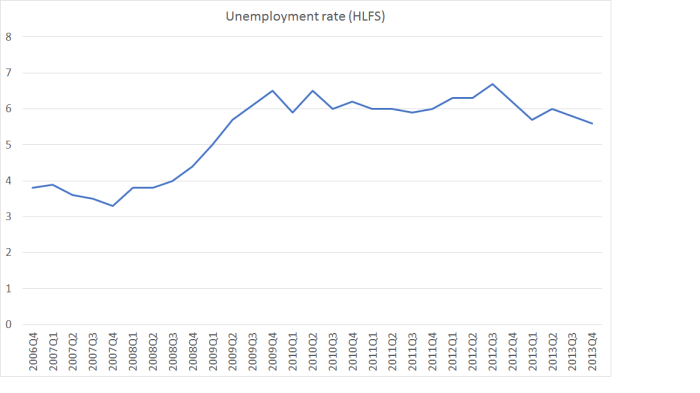
In the last decade or so, it seemed to be some mix of things.   In 2007, the unemployment rate was down at around 3.5 per cent, but the official view at the time was that the overall economy was more or less in balance (as I noted yesterday the output gap estimates then were positive but quite small).  So, the unemployment rate tended to be discounted.   To the extent there were NAIRU estimates implicit in the thinking, they had been trending down for 15 years.  Perhaps, some felt, 3.5 per cent unemployment wasn’t much below a NAIRU at all.

In the years after the 2008/09 recession, there seemed to be two problems.  The first was a quite genuine one.  The HLFS unemployment rate numbers were quite volatile for a while, and while it was clear that the unemployment rate was still quite high, it was hard to have much confidence in each new quarterly observation.    The rise in the unemployment rate in 2012 only further undermined confidence among some of my then colleagues.  The economy seemed to be recovering.

U 2006 to 13

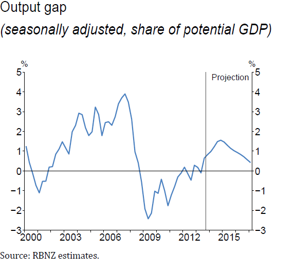
So there had always been a tendency to discount the unemployment rate.  Odd short term developments in the series itself reinforced that, and then as the recovery began to develop the Bank kept convincing itself that the output gap had all but closed.  If the output gap  –  which tended to be central focus for much of the analysis, even though it was something of a black-box, and prone to significant revisions –  had really closed, then surely the labour market must also be more or less in balance?  If the unemployment rate appeared to suggest otherwise, so much the worse for that particular indicator, which many at the Bank had never much liked.    When the Bank started the ill-fated tightening cycle in March 2014, they thought then that excess capacity had already been used up for a couple of years.  This is the output gap chart they ran then.

output gap mar 14 mps

At the time, the unemployment rate was still 5.6 per cent

(Contrast that output gap chart with the one from yesterday’s MPS, which I included in yesterday’s post.  At first glance, they look quite similar, but whereas in 2014 they thought excess capacity had been exhausted in 2011/12, now they think it was only exhausted in 2013/14.)

Various people had various ideas for how best to look at labour market data.  But mostly the unemployment rate was just ignored.

A year or two back, some US researchers had done an interesting exercise, trying to combine formally the information in a whole variety of labour market indicators, to distill an overall picture.  And somewhere along the line, someone got the idea of doing something similar for New Zealand.  And thus was born the Reserve Bank’s Labour Utilisation Composite Index, with the pleasing acronym of LUCI.

One day last April, Reserve Bank Deputy Governor Geoff Bascand gave a major address on monetary policy matters, Inflation pressures through the lens of the labour marketAs I noted at the time, it was little odd for him to be giving the speech –  as his day job was mostly responsibility for notes and coins, and the Bank’s corporate functions.  Then again, his ambition for higher office was pretty apparent, and earlier in his career he had led the Department of Labour’s Labour Market Policy Group.   Geoff on labour market matters should have been worth listening to.

The broad thrust of the speech was that high immigration wasn’t going to put much pressure on demand (contrary to the usual experience, and past Bank research), and that the labour market was pretty much operating at full capacity.  In support of these propositions, the Bank simultaneously released not just the speech, but three new Analytical Notes.    Since I had been harrying the Bank about its change of view of immigration, I focused then on the two immigration research papers, and identified a number of issues with them.     At the end of a long post I noted

There is a more material on other topics in Bascand’s speech, and another whole Analytical Note on other labour market issues which I haven’t read yet. I might come back to them next week.

But I never did.  Other things presumably distracted me, and thus I never got round to reading the Analytical Note introducing LUCI.   I didn’t until yesterday afternoon – I’d heard the Governor, or the Chief Economist, mention it at the press conference, and it was a wet afternoon, so I went and downloaded the paper.

The Reserve Bank has given quite a lot of attention to this brand new indicator.  In the Deputy Governor’s speech, it gets three whole paragraphs

Over the business cycle, a key driver of wage growth is the balance of supply and demand, or labour market ‘slack’. However, the unemployment rate is an inadequate indicator of labour market slack, particularly when the participation rate fluctuates. Researchers at the Bank have recently constructed a labour utilisation composite index, or LUCI, to help address this problem. Such indices combine the information in a large number of labour market variables into a single series of labour market tightness, and are used internationally to help gauge labour market pressures. The New Zealand index uses official statistics such as the HLFS and survey measures of the difficulty of finding labour, such as the QSBO.

By construction, the LUCI has an average value of zero. A LUCI value above zero indicates greater labour market tightness than usual – a value below zero indicates greater labour market slack than usual. Our research shows that, historically, a higher LUCI has been associated with stronger wage growth.

The LUCI suggests there was a large degree of slack in the labour market at the trough of the 2008-09 recession. The LUCI then gradually returned to zero, and has been around that level since early 2014 (figure 7). This movement is consistent with the range of the Bank’s suite of output gap indicators.

This wasn’t just some speculative new tool dreamed up down in the engine room by smart researchers, but still needing road-testing.  The Deputy Governor (presumably with the approval of the Governor and the Chief Economist) seemed sure it was action-ready.

Consistent with that approach, a chart of LUCI has appeared in all but one of the five MPSs since that speech.    Here was LUCI as she appeared yesterday

LUCI may 2017

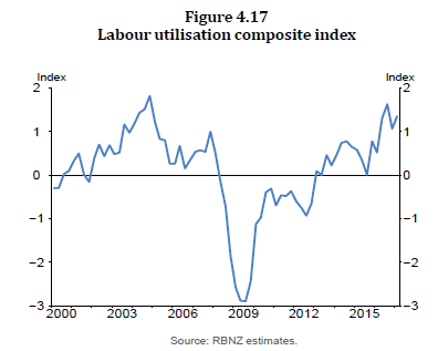
On the Deputy Governor’s telling

A LUCI value above zero indicates greater labour market tightness than usual – a value below zero indicates greater labour market slack than usual.

In other words, on that particular interpretation, labour market tightness was now more severe than it had been in 2007 (just prior to the recession), and almost as severe as at the peak of the series in around 2004.

And, of course, Geoff Bascand didn’t just make up that interpretation.  It was what the researchers had said in their Analytical Note, almost word for word.   It was also what the footnotes on the LUCI charts in the MPSs said.  At least until yesterday.     In yesterday’s MPS, slipped in so quietly, the interpretation of LUCI had changed rather materially.   The chart was still there, it still looked the same as ever.  But below it, it has these words written

Note: a positive value indicates a tightening in labour market conditions

Lay readers may not immediately notice the difference, but it is substantial.  When the indicator was launched, with some fanfare (there are many clever new indicators, and not many get three paragraphs in a Deputy Governor speech), a positive value was interpreted as the labour market being tighter than usual (thus the pesky single indicator, the unemployment rate could keep on being largely ignored).   But now a positive value simply means that the labour market is a bit tighter than it was last quarter.    If there was lots of slack last quarter, it simply doesn’t matter to the indicator –  all that matters is the direction of change.

The Bank didn’t draw this to readers’ attention at all.  They didn’t change the heading on the chart either.  It was a bit naughty really.       What it means is that whereas we once had an indicator –  using 16 different variables –  that might have suggested the unemployment was completely misleading as a measure of slack, what we actually have now in LUCI saying similar things to the unemployment rate.  The unemployment has been edging down, and LUCI has been positive.   But that LUCI number is now felt to tell us nothing at all about the absolute level of labour market slack (or even the level relative to a long run of history).

I don’t quite know how the Bank fell into this –  except, perhaps, for the wish (for a labour market measure suggesting the market was at full capacity –  in line with the output gap estimates) getting the better of hard-headed challenge and scrutiny.

The approach they used to construct LUCI was very much the same used to construct the sectoral factor model of core inflation.  In essence (there), get the rates of price increases for all the CPI components, and look for a common theme (or “factor”) that runs through them all.    It seems to work quite well there.  All the variables are expressed the same way (percentage changes).      But LUCI is a bit different.     Here is the list of all the variables used.

LUCI components

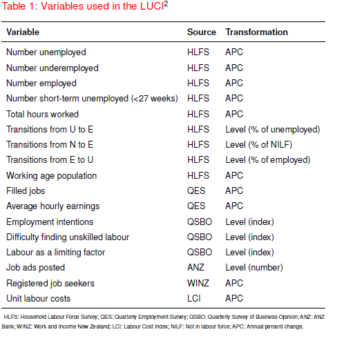
They take each variable and standardise it relative to its own mean.

But it is an odd mix of variables.   There are annual percentage changes mixed in with levels.  And some of those levels measures (eg the QSBO ones) are the outcome of questions that are actually technically expressed in change terms.  It is also a mix of quantity measures and price (wage) measures.   When I looked through the list, the first real oddity that struck me was that unemployment itself is not expressed as a percentage rate.  Rather, they take the number of people unemployed and calculate the percentage change.   If, then, every single person was fully employed –  so the labour market was very tight –  this component  (used in calculating LUCI)  would be showing a zero percentage change.  They’ve done the same thing to all the quantity variables, so it should have been obvious from the start that what they were doing (at least for that half of the inputs) was looking at variables that would produce a change indicator, not a levels one.

I understand why they did it.  The unemployment rate trended down for 15 years or so.   The gap between the actual unemployment rate and the average unemployment rate wouldn’t be a very meaningful indicator.   But it meant, almost inevitably, that the new indicator couldn’t be an indicator of absolute labour market tightness, only (at best) an indicator of changes in tightness.

But there are other problems.  Think about what would happen if (to be deliberately extreme) the population doubled, and yet there was no change in “true” labour market tightness.    That isn’t far from the Reserve Bank’s story about the recent immigration shock –  they told us again yesterday that, contrary to past common experience, they think the demand and supply effects have more or less offset each other.

But if the population doubled, and there was no change in “true” labour market slack,  we would still expect to see employment, numbers unemployed, the number of short-term unemployed, numbers underemployed, the number of filled jobs, hours worked, the working age population, the number of job ads, and the number of registered job seekers all increase (that is roughly half the variables in LUCI).   The unemployment rate (%), for example, might stay the same, but both the numerator and the denominator would increase a lot.  Since LUCI uses annual percentage changes, it seems highly likely that such a shock would show up as a big increase in LUCI in the year the population shock happened  (in my extreme examples, the APCs would go to 100 per cent that year), even if there had been little or no actual change in labour market tightness.

It seems astonishing that, for a variable launched by a Deputy Governor in a speech playing down the net demand effects on a large immigration shock, this issue never seems to have occurred to them.

There are other, probably more minor and mundane, problems too.  These ones  probably weren’t foreseeable in April last year, but probably still should have been highlighted as they became apparent.  The revised HLFS was introduced in June last year.  It is pretty clear that the modifications to the questions have led to material step changes in the HLFS measure of hours worked and of employment (you can see the anomalies in the charts in this post from earlier in the week).   (For some reason, they don’t even use the QES measure of hours in LUCI).     Perhaps a distortion of this sort to only two of the component variables won’t have affected the common factor that the model is trying to identify.  But we don’t know.  I hope the Reserve Bank does.   This particular problem will wash out of the data in the next HLFS release (since a year will have passed, and LUCI uses annual percentage changes), but for now it is another reason not to have much confidence in LUCI as any sort of indicator of labour market tightness (level or changes).

I did put some of these points to the Reserve Bank yesterday, mostly just to check that my understanding of the technical points was correct. I had a helpful response this afternoon which essentially establishes that they are (obviously I’m not associating the Bank with the interpretations I’ve put on those technical points).

Overall, it isn’t a case of the Reserve Bank at its best.  I have no problem at all with them doing the research in the first place.  We should always be looking for new or better ways to understand what is going on, and how best to combine sometimes conflicting bits of data.      But it doesn’t have the feel of something that was at all well road-tested before being launched as a major indicator variable.  And then, when they did finally realise that it was much more like an indicator of changes in labour market pressure rather than the level of pressure, that recognition was sneaked through without even an explanatory note, leaving anyone who had taken the earlier use of LUCI at face value none the wiser unless they were a particularly assiduous reader (and I’m usually not, when it comes to changes in footnotes on charts).

We now have a recognition that LUCI isn’t a measure of overall pressure on the labour market.  It may be, loosely speaking, an indicator of changes in labour market pressure, but even then that reading is made more difficult when you get large population shocks (of the sort that NZ is prone to, with quite variable large immigration flows, in a way that many other countries are not), and when the Reserve Bank repeatedly assures us that its overall interpretation is that this particular population shock isn’t putting additional net pressure on demand, and may even be easing capacity pressure in the labour market.

We really should expect better from our central bank.  Speeches like Bascand’s, and documents like the MPS, will have had heavy involvement from all the members of the Governing Committee –  the Governor himself, the incoming acting Governor, the incoming Deputy Chief Executive, and the long-serving Chief Economist.   One can’t help thinking that they’d have been better served taking the unemployment rate –  actually designed directly as a measure of excesss capacity –  and wage developments rather more at face value.   And of recognising that, contrary to LUCI, no serious observer thought that the labour market was at its tightest in 2004.   It isn’t much harder than that.

Some puzzles about the Monetary Policy Statement

After the last OCR review I noted that if I was going to go on agreeing with the Governor, there might not be much point in writing about the OCR decisions.  I agree with him again today.

Writing earlier in the week about what the Bank should do I concluded

So where does it all leave me?  Mostly content that an OCR around 1.75 per cent now is broadly consistent with core inflation not falling further, and perhaps continuing to settle back where it should be –  around 2 per cent.   Of course, there is a huge range of imponderables, domestic and foreign, so no one should be very confident of anything much beyond that.

And I was pleased to see how much emphasis the Governor placed today on the inevitable uncertainties around the (any) forecasts and projections.   Trying to project where the OCR might appropriately be a year or two from now is mostly a mug’s game.  Getting the current decision roughly right is towards the limit of what the Bank can actually usefully do.  I think they have today, although only time will tell.

I also liked the continuing emphasis on how low core inflation is globally.  This is my chart making that point, taking the median of the core inflation rates of the places in the OECD with their own monetary policy (so that the euro-area counts as one observation, and individual euro-area countries don’t count at all).

OECD core inflation

But there were some puzzles and some unsatisfactory aspects in both the statement itself and in the press conference the Governor and his chief economist just hosted.

First, it is quite remarkable that there is no mention at all in the document of the forthcoming hiatus.  After 25 September, we’ll only have an acting Governor for six months (itself a questionably lawful appointment), and we won’t have a permanent Governor until next March.   The Policy Targets Agreement expires with the Governor, and there won’t be a formal Policy Targets Agreement in place during the interregnum.   The Reserve Bank Act requires that the Monetary Policy Statement address how the Bank will conduct monetary policy over the following five years.  Given that we also have an election approaching in which most of the opposition parties are promising some changes to monetary policy, there is more than usual uncertainty about the path ahead –  the people and the law/PTA to which they will be working.    It isn’t the Bank’s place to take partisan stances, but it would be only reasonable –  in a genuinely transparent organisation, complying with the law –  to touch on these issues, if only briefly.     At a trivial level, the PTA has been reproduced in the MPS for decades, reflecting the central role PTAs have in New Zealand short-term macroeconomic management.  What will be done in the November and February MPSs?   

Rather more importantly, although I agree with the Governor’s current stance, I’m not sure I’d be taking the same view as him about the outlook for monetary policy if I shared his economic forecasts.

Here is my puzzle.   This is the Reserve Bank’s chart of their estimate of the output gap.

output gap may 2017

They now reckon it has been pretty flat around zero for the last two to three years.  I’d be surprised if there has been quite so little excess capacity –  and in fairness, they do explicitly highlight the quite wide range of estimates they have  –  but it is their current central view.   But then look what happens starting now.  They expect quite a material positive output gap to emerge.     And they think that will translate into quite a lift in wage inflation.

wage inflation may 17

Now, it is quite true that they need to see a lift in wage inflation if core inflation, across the economy, is to settle near 2 per cent, the target the Governor has committed to.    But if I really believed that things in the wage-setting markets were likely to turn around that much that quickly, I’m not sure I’d be running with such an “aggressively neutral” (ANZ’s words) stance right now.  Perhaps it doesn’t really matter to the Governor –  the sole decisionmaker –  because he won’t be there?

I’m a bit puzzled as to why they expect such a material increase in capacity, and wage, pressures.   They expect to see real GDP growth accelerate a bit.  Over the 18 months to the middle of next year, they expect quarterly growth to average 0.9 per cent.  By contrast, in the last couple of years, on their preferred production measure, real GDP has grown by only 0.6 per cent a quarter on average.

It isn’t that clear why they expect such an acceleration (which we’ve seen forecast before).  Perhaps it is partly the lagged effect of last year’s fall in the OCR?  But then, as they note, bank lending standards appear to have tightening, and funding margins risen, which will offset some of the effects of the OCR cut.   Dairy prices have certainly increased, which will provide some support to spending.  The exchange rate has come down a bit recently (more so this morning) but the level the Bank assumes –  a TWI above 75 for the next year or so – isn’t much below the average for the last couple of years.

And then there is immigration.    Here are the Bank’s projections.

immigration may 17

They expect the net immigration numbers to start falling over very sharply, starting now.    As the Governor noted, they (and other people) always get their immigration forecasts wrong.   But any significant reduction in immigration –  and this is a halving in the next couple of years –  is a material reduction in both demand and supply for the whole economy.   It is more than a little surprising that the Bank believes we will see both an acceleration in total real GDP growth and a sharp slowdown in net immigration.

The Bank appears to still believe the story that, at least this time round, high net immigration has eased overall capacity pressures.  If they are sticking to that story –  and they appeared to in the press conference –  then perhaps that is why they think we should be expecting a sharp pick-up in wage inflation starting now.    It doesn’t ring true to me –  and it has never been how New Zealand immigration cycles have worked in the past –  but if that is part of their story, something they genuinely believe, then –  as I already noted – I’m a bit surprised by the “aggressively neutral” policy stance.  On my own reading of course, any material slowdown in net immigration (unless it is accompanied by a big Australian economic rebound) will weaken near-term demand more than supply, as it has typically done in the past.

Two other points that came up in the press conference seemed worth commenting on.

Bernard Hickey asked the Governor what the Bank’s definition of full employment was.  The Governor was quite open, if a little tentative, in suggesting something around 4.5 per cent.  That is lower than the actual unemployment rate has been since the first quarter of 2009 –  eight years ago.     But, as Hickey noted, it is still above the Treasury’s published estimate of near 4 per cent.     The actual unemployment rate now still stands at 4.9 per cent.

The Bank’s chief economist and Assistant Governor, John McDermott, then picked up the question.   The gist of his response was that it was a silly question.   At some length he tried to explain how the Bank relies on the output gap for its assessment of overall capacity pressures in the economy.  He went to argue that labour market variables were so slow to respond that if one waited to evidence from them before moving it would almost certainly be “too late”.    Doubling down, he argued that in a New Zealand context it was “almost impossible” to estimate any sort of NAIRU, and that any attempt to do so was just ‘guessing”.

In a way, I wasn’t surprised by these arguments.  He used to run the same lines to me when I worked for him.   But familiarity doesn’t make the arguments any more convincing.  For a start, everyone recognises that inflation targeting is supposed to work by focusing on the forecast outlook, perhaps 12-24 months ahead.  Monetary policy works with a lag.  In principle, waiting to see actual outcomes –  on whatever measures –  will typically mean acting too late.

But, on the one hand, this is the very same central bank which set a new world record this cycle, by twice beginning to increase interest rates (in 2010 and 2014) only to have to quickly reverse themselves.  It is quite a while since they were too late to tighten (and McDermott was the Bank’s chief economist in both instances).

And what of the output gap the Bank wants us to put our faith in?  Here was one of the leading international experts  (and a former practitioner) on inflation targeting, Prof Lars Svensson writing on measures of excess capacity (LSRU is the long-term sustainable rate of unemployment, the bit not influenced by monetary policy)

What does economic analysis say about the output gap as a measure of resource utilization? Estimates of potential output actually have severe problems. Estimates of potential output requires estimates or assumptions not only of the potential labor force but also of potential worked hours, potential total factor productivity, and the potential capital stock. Furthermore, potential output is not stationary but grows over time, whereas the LSRU is stationary and changes slowly. Output data is measured less frequently, is subject to substantial revisions, and has larger measurement errors compared to employment and unemployment data. This makes estimates of potential output not only very uncertain and unreliable but more or less impossible to verify and also possible to manipulate for various purposes, for instance, to give better target achievement and rationalizing a particular policy choice. This problem is clearly larger for potential output than for the LSRU.

He summed it up recently even more succinctly

My experience of practical policymaking made me very suspicious of potential output, essentially an unverifiable black box, and consequently of output gaps. Instead, it made me emphasize the (minimum) long-run sustainable unemployment rate and consequently the unemployment gap.

And it is not even as if McDermott’s point about lagging labour market data has much obvious validity relative to measures of the output gap.  I had a look at the peak of the last (pre 2008) boom.

The unemployment rate troughed in the September and December quarters of 2007.

The output gap –  as estimated today – peaked in the September quarter of 2007.

But that caveat (“as estimated today”) matters hugely.  At the time, there was huge uncertainty about, and significant revisions to, estimates of the level of the output gap.   In the December 2007 MPS, for example, there isn’t a chart of the quarterly estimated output gap.  But the estimate for the average output gap for the year to March 2008 was 0.6 per cent.  At the time, they (we) thought the output gap had peaked in 2005.    The Bank’s current estimate is that the output gap in late 2007 was around 2.5 per cent.    Those aren’t small differences.   And they are pretty inevitable.      By contrast, there has never been any doubt that the labour market was at its tightest in late 2007.

No one is going to disagree that it is hard to estimate a NAIRU –  or Svensson’s LSRU – with hugely great confidence.  But much the same –  typically only more so –  can be said of almost any of the concepts the Bank uses in its modelling, forecasting and policy assessments (eg neutral interest rates, potential output, and equilibrium exchange rate).  And, relative to output gap measures, the unemployment rate is a directly observable measure of excess capacity, easily comprehended and prone to few revisions.   And unemployment is something that citizens care directly about.

In McDermott’s shoes, I’d have said something like “we really don’t know, but we are pretty confident it is lower than the current 4.9 per cent unemployment rate.  Treasury’s estimate of around 4 per cent might not be far from the mark, but we won’t really know until we get nearer.  The fact that the unemployment rate is, with quite a high degree of confidence, above the NAIRU is consistent with wage and price inflation having been pretty subdued for a long time, and is consistent with the Bank’s stance, of keeping interest rates below our estimates of neutral for the time being”.    It wouldn’t have been hard to have run that line.

Perhaps people (eg FEC) might like to ask the Bank why it appears to put so much less weight on direct measures of unemployment than, say, their peers in the United States (or most other central banks) appear to.  None takes a mechanical approach, none assumes the NAIRU never changes, none assumes they know it with certainty.  But they seem to think it matters –  and might matter to citizens and politicians to whom they are responsible –  in a way that simply eludes the Reserve Bank.  It is partly why I’ve come to the conclusion that some form of what the Labour Party is promising –  a more explicit statutory focus on unemployment in the documents governing the Reserve Bank and monetary policy –  is the right way ahead for New Zealand.   Concretely, I’ve suggested that the Bank be required by law to publish periodic answers to Bernard Hickey’s question –  what is full employment, what is the (estimate) NAIRU?

Finally, I was interested in the Governor’s evasiveness when asked about possible statutory changes to the provisions in the Reserve Bank Act that currently make the Governor the sole legal decisionmaker.    It is fine to emphasise that in practice monetary policy decisions have always been made in a collective environment –  whether the Official Cash Rate Advisory Group in the past, or the current mix of the Governing Committee and the Monetary Policy Committee.   But we don’t have rules and laws for good times and when things are working well.   And, as it happens the Bank and Governor haven’t covered themselves with glory in the last seven or eight years.

The Governor simply avoided answering the question of whether the law should be changed, even if only to cement in the collegial practice.  Since (a) the Governor is leaving shortly, and (b) the Minister of Finance has commissioned advice on the issue and Labour (and the Greens) are campaigning for change in this area, it is hardly as if letting us know his views would tread on taboo territory.   Perhaps to do so would have been to acknowledge that in no other central bank does one unelected person –  a person selected other unelected people –  have so much power, not just in monetary policy but in financial regulatory matters.  It is something where change is well overdue.

Challenged as to whether legislative reform in this area might not enhance transparency (eg publication of minutes, or even the airing of alternative views), the Governor fell back on his old claim that the Reserve Bank is one of the most transparent central banks in the world.  That simply isn’t so. It scores well, as I’ve put it previously, when it publishes material on stuff which it knows little or nothing about (the outlook for the next few years, where its guess is as good as mine, and none of the guesses are very good).  But it is highly non-transparent when it comes to the stuff they do know about.  Thus, we don’t see any of the background papers that go into the OCR deliberations (although I did once use the OIA to get them to release 10 year old papers), we see no minutes of the deliberations, no record of the balance of the advice the Governor receives.  And competing views (on the inevitably uncertain outlook, and the right policy stance) are not aired at all.    That is a quite different situation from what prevails in many other advanced country central banks (although of course there is a spectrum, but we are at one end of it).

As another telling example of how untransparent thiings are in New Zealand, I was reading the other day a piece by John Williams, the very able head of the San Francisco Fed, and a member of the FOMC.    In the US system he is a pretty senior guy –  not Janet Yellen, but not just a Reserve Bank chief economist ever.   His widely-distributed article was devoted to advocate a material change in how US monetary policy is done –  abandoning inflation targeting in favour of price-level targeting –  to provide greater policy resilience in the next serious downturn.   I’m not persuaded by Williams’ case, but what struck me is how open the system is when such a senior figure can openly make such a case.  The markets didn’t melt down. The political system didn’t grind to a halt.  Rather an able senior official made his case, and people individually assessed the argument on its merits.

The other bit of the paper that struck me was this

Now that we’ve gotten the monkey of the recession off our backs, we have the luxury of being able to look to the future. This presents us with the opportunity to ask ourselves whether the monetary policy framework and strategy that worked well in the past remains well suited for the road ahead.

Such introspection is healthy and constitutes best practice for any organization. In fact, the Bank of Canada has already shown us the way. Every five years, they conduct a thorough review of whether their policy framework remains most appropriate in a changing world. This is an exercise all central banks should undertake, including the Fed.

I’ve made this point myself previously.  The Bank of Canada is very open about these reviews they conduct.   By contrast, in New Zealand, it is still a struggle to get from the Reserve Bank and Treasury papers relating to the lead-up to the 2012 PTA, and all the (limited) deliberations then took place behind closed doors.   We will have a new PTA early next year, and we know –  from other documents Treasury has released –  that Treasury had some sort of review underway and almost completed before the Minister decided to delay the appointment of a permanent Governor. But given that PTA is the guide to the management of the key instrument in New Zealand short to medium term macro policy, it would be both appropriate, and more truly transparent, for much of the background thinking and research to occur openly.  It is too near the election now, but a jointly hosted conference every five years reviewing the experience with the PTA and looking at alternative options (even if none ends up adopted) would be one feature, in our system, of meaningful transparency.  We have very little of that at present.

(And, sadly, we’ve never seen anything from our Reserve Bank on the possible challenges if the practical limits of conventional monetary policy are exhausted in a future severe downturn).

It will be a challenge for the new government to lift the performance of the Reserve Bank in future.  It would be easier to make a strong start in that direction by legislating first to make the appointment of the Governor a matter for the Minister of Finance (and Cabinet)  –  as it is in most other places –  not something largely in the hands of the unelected faceless Reserve Bank Board (which doesn’t even seem to manage well basic record keeping).

The IMF opines on the economy

The International Monetary Fund (IMF) was out yesterday with two major reports on New Zealand.    One was the Financial System Stability Assessment, the conclusion of the quite infrequent (the last one for New Zealand was in 2004) FSAP programme of reviews of the regulation of countries’ financial systems.  I haven’t read that document yet, but from media accounts there are some recommendation I’d agree with (eg deposit insurance, as second-best) and a great deal (mostly derived from the “nanny knows best” starting point) that I’ll have more problems with.

But this post is about the Article IV report –  the (typically) annual review and assessment of a member country’s macro economy.

Once upon a time, these reports were simply confidential advice to the government.  These days, at least for countries like ours, it is all out in the open.  And, partly in consequence, there often isn’t that much to see.  The IMF might be a prestigious organisation full of rather highly-paid economists, but it is striking how weak their surveillance reports often are.   Perhaps there just isn’t a gap in the market that can usefully be filled by a handful of Washington-based economists looking at our economy for a couple of months a year.

The challenge is compounded by the fact that no one much cares about New Zealand.  We are small, in an age when the IMF is heavily-focused on systemic risk, global spillovers etc.    We aren’t in Europe –  still over-represented at the Fund –  or from one of those Asian countries where governments are hyper-sensitive about anything the Fund says.    It is decades since we had an IMF (borrowing) programme ourselves.  And, whether this is cause or effect I’m not sure, but for decades no one here has paid much attention to the Fund.  As an example, our capital city newspaper this morning has some coverage of the FSSA, but really nothing at all about the Article IV report.  If a tree falls in the forest, and no one is around to hear it, does it make a sound?    (By contrast, when I was at the Board of the IMF, my Australian boss was very exercised about each year’s Australian Article IV report.  He’d get phone calls direct from the Treasurer about it, and the serious Australian media gave the reports a lot of coverage.)

Oh, and of course, the other challenge for those reviewing New Zealand is the features that stand out, and which haven’t readily and convincingly been explained.  Thus, we have a lot of reasonably good micro policies, we have pretty good government finances, a floating exchange rate, low and stable inflation, sound banks, high levels of transparency, and low levels of corruption.     And yet……having once been among the very highest income countries in the world, we now languish.  International agencies find Venezuela’s decline easy to explain.  New Zealand’s not so much.

But with all the resources at their command, including the benefit of being an organisation with data and perspectives on all the countries in the world, none of it really excuses the mediocre quality of what gets dished up each year.  Or the inconsistency from one year to the next.   Last year, for example, we were told that raising national savings rates was “critical” –  and it was reported that the NZ authorities agreed –  but this year there is barely even any mention of the issue.

This year we are served up some mix of regurgitated PR spin about how well New Zealand is doing, and when it comes to policy suggestions we get a grab-bag of bits of conventional wisdom, or favoured centre-left policy positions, without any discernible sign that the authors (or their reviewers in Washington, or the Fund’s Board) had any sort of robust framework (or ‘model’) for thinking about the New Zealand economy.

It isn’t easy to excerpt a fairly lengthy report, and often it is the omissions that are more striking than what is in the report itself.      Thus, the release opens with this

Since early 2011, New Zealand has enjoyed an economic expansion that has gained further broad-based momentum in 2016, with GDP growth accelerating to 4 percent, and the output gap roughly closing. Reconstruction spending after the 2011 Canterbury earthquake was an important catalyst, but the expansion has also been supported by accommodative monetary policy, a net migration wave, improving services exports, and strong terms of trade.

On its face, that all sounds quite good.  But countries don’t get rich by rebuilding themselves after disasters –  that reconstruction process mostly displaces resources from other, typically more productive and prosperous uses.   They don’t get rich through monetary policy either, valuable a role as it has in short-term stabilisation.  And although services exports grew quite strongly for a while (a) little or none of it was high value products (lots of tourism, and students pursuing immigration access at PTEs), and (b) in a world in which services exports are becoming steadily more important (as illustrated in eg this recent IMF working paper), for New Zealand services exports as a share of GDP are materially lower than they were 15 years ago.

In fact, you could read the entire Article IV report and not find any mention of the fact that, with total population growing at around 2 per cent annum and working age population growing at around 2.7 per cent annum, per capita income growth in the last few years has been pretty unimpressive.  And you’d find no mention –  explicit or by allusion – to the almost five years that have now passed since we saw any labour productivity growth in New Zealand.   I guess that would have undermined the relentless good news story the Fund staff seemed determined to tell.

Perhaps more surprising is the treatment of the external sector of the economy, typically a subject of considerable interest to the IMF.  Readers of the Article IV report in isolation would have no idea that exports (and imports) as a share of GDP have been falling –  not just this year, but for some time on average.  Nor would they appreciate that per capita real GDP of the tradables sector has shown no growth at all for more than 15 years.     The report does note that an overvalued real exchange rate is probably an obstacle to faster growth in the tradables sector, but again there is no hint of any sort of integrated understanding of what is going on with the real exchange rate, and what might make some difference in future.

The complacency, and weak analysis, carries over to the labour market.

The unemployment rate fluctuated around the natural rate of unemployment of 5 percent in 2016

But there is not a shred of analysis presented to suggest that the NAIRU for New Zealand is now anywhere near as high as 5 per cent.  It would be very surprising if it were that high, whether in view of continuing very weak wage inflation, the history of the last cycle (in which unemployment got to 5 per cent fairly early in the recovery), and changing demographics which are appearing to lower the NAIRU.  Oh, and not forgetting that our Treasury has published its own estimate of the NAIRU, at something close to 4 per cent.

The Fund isn’t really much better on the housing market.   They are all very interested in the various tweaky tools the government and its agencies have applied in the last couple of years (LVR limits, tax changes etc) and – contrary to many of the pro-immigration people in New Zealand –  they are at least quite clear that rapid increases in population are contributing directly to high house price inflation.    But there is no simple and straightforward observation that, at heart, the house price issue is a matter of regulatory failure, and that the current government (like its predecessors) has done little or nothing to fix the problems. Instead, we get banalities along these lines

Tighter macroprudential policies, higher interest rates, lower rates of net
migration, and increasing housing supply should help moderate house price inflation and stabilize household debt vulnerabilities in the medium term.

If you don’t change the fundamental structural distortions that gave rise to the problem in the first place, it is a little hard to take seriously the idea that things will come right even “in the medium term”.  You would not know, reading this report, that almost nothing substantive has been done to free up the market in urban land.    An organisation with the benefit of cross-country perspectives and databases might usefully have pointed out that this is an obstacle not just in New Zealand but in Australia, the UK, much of the east and west coasts of the US, and other places besides.  The silence might suit the current government, but it also makes the Fund complicit in the failure.  The Fund’s Board considered the material in the Article IV report on housing. They observed, in conclusion, that

Recognizing the steps being taken by the authorities to address the demand-supply imbalance in housing markets, Directors generally highlighted that further tax measures related to housing could be considered to reduce incentives for leveraged real estate investments by households. Such measures could help redirect savings to other, potentially more productive, investments and, thereby, support deeper capital markets.

Except that very little has actually been done on the supply side, and not much has been done to change the medium-term “demand-supply imbalances”.      Perhaps there is a place for tax changes (I’m sceptical, including that any changes would make much difference –  where else have they?) but the Board didn’t even seem to recognise that inconsistency in their own advice.  Do we have too many houses in New Zealand or too few?  Most people, rightly, would say “too few”  (a good indicator of that is the ridiculously high prices).    And yet the Fund Board thinks that a greater share of investment should go into other things, and a smaller share into housing?????   (As it happens, I agree with that, but only on the basis that we have much slower population growth, something there is no hint of in this report).

Buried deep in the report, is a recognition of some of the longer-term challenges facing New Zealand.

New Zealand’s structural policy settings are close to or mark best practice among
OECD economies, but persistent per capita income and productivity gaps remain. Income is lower than predicted by these policy settings, by an estimated 20 percent. Growth in labor productivity has declined, with multifactor productivity growth slowing from the early 2000s, and capital intensity has stagnated recently.

One could question even those details.  I wrote a bit about our structural policies a few weeks ago, as illustrated by the OECD’s Going for Growth publication.  There are plenty of areas in which we are well away from best practice, and overall at best you could probably say that our structural policies aren’t bad by OECD standards.  But there is no doubt that productivity levels are far lower than most would have expected based on those policies.

What does the IMF propose in response?   They reckon remoteness is a problem and for some reason, despite that, still seem very keen on lots of immigration.  But here is the rest of their list:

  • Targeting housing supply bottlenecks more broadly would safeguard the
    attractiveness for high-skilled immigration and business.
  • More central government property taxes, the proceeds of which would be distributed to local authorities.
  • Trade liberalization could help to strengthen competition and productivity, including in the services sectors.
  • Tax incentives for private R&D spending
  • As discussed during the last Article IV mission, there is also scope for tax reform to raise incentives for private saving and discourage real estate investment as a saving vehicle

And that is it.

I’d certainly support fixing up the land supply market and foreign trade liberalisation.  I’m a lot more sceptical of the other items.  And what about, for example, our high compayn tax rates?  But my real challenge to them is twofold:

  • first, where is the model or framework that explains how the absence of these policies is at the heart of New Zealand’s disappointing long-term economic performance (because it feels more like a grab bag of ideas they picked from one person or another), and
  • second, how large a difference do they really believe these measures, even if they were all implemented flawlessly, would make?     Without much more supporting analysis, they have the feel of playing at the margins, as if they felt obliged to offer up some suggestions, any suggestions.

A year ago, the Fund seemed quite taken with the idea that the persistent gap between our interest rates and those abroad was an important issue (they even cited approving my own paper on this issue), but that flavour seems to have disappeared this year.  And when they allude briefly to our high interest rates it is to fall back on the discredited risk premium hypothesis.

Of course, the government is just as much at sea.   The NZ authorities get to include some responses in the Article IV report.  In this section, they begin thus

The government’s ongoing Business Growth Agenda (BGA) aims to help overcome the disadvantages of distance and small market size, in particular by deepening international connections, with a focus on increasing the share of exports in GDP to 40 percent by 2025, and diversifying the export base.

Just a shame that, if anything, things have been going backwards on that count, and show no signs still of progress.

And, finally, from the final paragraph of the Executive Board’s assessment

Directors agreed that measures to lift potential growth should focus on leveraging the benefits from high net migration and interconnectedness.

But there is nothing in the report to show what these benefits might be (recall that the focus here is on potential growth, not the short-run demand effects), let alone what “leveraging the benefits” might involve (generally, I thought the IMF was uneasy about leverage).   I guess it is just an article of faith.

It is pretty depressing all round.  Supposed international experts fall for the spin, and can offer nothing very profound on even the longer-term challenges.  Our own government agencies seem to be at sea, or just happy to go along.   Our representative on the Board of the IMF  – no longer a public servant, but now the (able) former chief (political) policy adviser to John Key – was happy to go along.  In his statement to the Board, published as part of the package of papers, he observed

As staff observe, New Zealand’s structural policy settings are close to, or mark, best practice. Lifting productivity, in the face of New Zealand’s small size and isolation, therefore requires incremental reforms across a broad range of areas. Recognizing this, the Government has established the Business Growth Agenda as an ongoing program of work to build a more productive and competitive economy,

When various major OECD countries have productivity levels 60 per cent above ours, who are they trying to fool in pretending that we have policy broadly right, and just need to keep tinkering (“incremental reform”) at the margin?

As part of the package of material released with the Article IV report, there is an interesting empirical annex on immigration.  It isn’t well-integrated with the report itself, and I will cover it in a separate post.  The annex probably should have had some publicity in the local media, given the salience of the issue in New Zealand debate at present.

The backdoor to Australia – again

After my post last week on the apparent Australian concern that somehow New Zealand was providing a back door entry to Australia, for migrants who could not get into Australia directly, a commenter included a link to the text of a fascinating National Library lecture (itself drawn from a journal article) by Victoria University researcher Paul Hamer.   That made it clear both how longstanding these concerns have been  – going back 100 years or so –  and how focused they are on Pacific Island immigration to New Zealand.    Some of it looks like out-and-out racial biases.  But these days it is a bit different.

In their report on New Zealand out today, the IMF described our immigration policy as “fully merit-based”.   In fact, while that is more or less, and mostly, true, it isn’t fully so.  Within the annual target (“planning range”) of around 45000 residence approvals, we have Pacific quotas, for Samoa and for a group of other fairly small Pacific countries.    People from those countries can get in, to a certain extent, even though they do not have the skills, qualifications or whatever to get in through the standard nationality-blind policy.  In the year to March 2017, just over 1600 people were granted residence under these quotas.  In time, presumably, most will become New Zealand citizens.  They, like other New Zealand citizens, would then be free to move to Australia if they chose.   Australia, I gather, has no such nationality-specific immigration quotas.

In the past Australia’s concerns apparently extended to people from the Cook Island and Niue.  They are New Zealand citizens as of right, and don’t have to move here to be able to move to Australia.

What do the data show about this?    We do have PLT data on the departures of New Zealand citizens to Australia, broken down by birth country.  In my post the other day I just looked at the aggregate of the non-NZ (and non-Australian) born.  But one can dig deeper, using data that cover each year back to 2002.

Taking the Cook Islands born people first (since they aren’t covered by our immigration policy), there were total PLT departures to Australia from New Zealand of 3776 such people in the 16 years for which we have data.   That isn’t perhaps large  by Australian population standards, but it is equivalent to quite a large chunk of the small Cooks-born population.  Presumably, some other Cooks-born people might have gone directly to Australia (if there are direct flights).   The Cooks-born population of New Zealand in the 2013 Census was just under 13000.      However, a lot of those Cooks-born people came back again.  Over the same 16 years, the net outflow to Australia of Cooks-born people was a relatively modest 1248.

What about NZ citizens born in other countries, who mostly gain entry only through our immigration policy?

Here are the top half dozen or so birth countries of NZ citizens who left (net) for Australia

Net outflow to Australia of NZ citizens born in these countries  (Total, March years 2002 to 2017)
UK -8878
Samoa -8523
South Africa -7930
India -7086
Philippines -3983
Fiji -3552
China -3197

The UK tops the list.     Then again, there are many more British-born people in New Zealand than there are people born in any other country  (about 256000 at the 2013 Census).

So here are the net outflows over the sixteen March years (2002 to 2017) to Australia of foreign-born New Zealand citizens, as a percentage of the 2013 NZ resident population of people born in that country.

net outflow to Aus by birthplace

If the Australian government really is concerned about those Pacific Island inflows, the Samoa figures might appear to give them some support.   Then again, the South African and Sri Lankan born outflows, as a share of the respective populations, are almost as large –  and presumably those people got into New Zealand by meeting our nationality-blind tests.    For some of those birthplaces, the proportions seem quite remarkably high.

As it happens, the Cook Islands numbers are quite a way down the list, and Tonga further still.  SNZ don’t publish the data at a sufficiently disaggregated level to know what the proportions look like for New Zealand citizens born in Niue, Tokelau or Kiribati.

I don’t have  any great or specific interest in this apparent concern of Australia’s –  and frankly the absolute numbers seem pretty small relative to the size of Australia’s population (and overall migration inflows).  But, the subject having come up again, I was interested in what light the published data could shed on the issue.

Reflecting on the macro data

The Reserve Bank’s Monetary Policy Statement (Graeme Wheeler’s second to last) will be out on Thursday.  I’m not in the market economists’ game of trying to tell you what the Bank will do and say (although no one expects they will do anything concrete with the OCR this time).  I’m more interested in questions around what they should do.  In time, what they should do, they usually will do.  But sometimes not until they’ve tried the alternatives.

I wrote about last month’s CPI data a few weeks ago, concluding that there had been a welcome, and expected, increase in core inflation (it is what typically happens if inflation is below target and the OCR is cut fairly substantially) but that

With the unemployment rate still above estimates of the NAIRU, and most indicators of inflation suggesting that core is probably (a) still below target, and (b) not picking up very rapidly, it certainly isn’t time for hawkish talk about near-term OCR increases.

Not everyone agrees of course.  I noticed the BNZ’s economic commentary yesterday which opened with this confident assertion

There is no excuse for the cash rate to be just 1.75% in New Zealand.

I don’t think I’m unduly caricaturing their record to say that, for at least the last decade, the BNZ economics team has never seen an OCR increase they didn’t like, even –  or perhaps especially –  those which had to be quickly reversed.  But mindful that in the story of the boy who cried wolf, the wolf eventually did come, I thought it was worth having a look at the latest wave of data.  Last week, we got the full quarterly set of labour market data (HLFS, QES, and LCI), and the Reserve Bank’s quarterly expectations survey.  To cut a long story short, it doesn’t alter my view.

Take the expectations survey first.   The headline story was one in which the two year ahead expectations of the inflation rate (of a sample of moderately informed observers –  including me) rose quite materially, and now stand at 2.17 per cent (up from around 1.65 per cent in each quarter last year).

infl and expecs

This measure of expectations isn’t typically very volatile, but it is typically somewhat responsive to changes in headline CPI inflation.  We’ve just had quite a large change in headline inflation, so some increase in the expectations measure shouldn’t be surprising. It certainly shouldn’t be concerning.  After all, ideally, the Reserve Bank wants people to believe, and act as if they believe, that on average over time CPI inflation will average around 2 per cent –  the mid-point of the target range, and the explicit focus of the current (but about to expire) PTA.

In fact, no one really knows whether this survey measure captures how people actually think and behave in real transactions in the goods, labour and financial markets.   It might be as good a proxy as we have, but (a) we don’t know, and (b) it still might not be good at all.  Glancing at the time series, there is a tendency for falls and rise to be at least partly reversed quite quickly.

But if inflation expectations are really in some sort of 2 to 2.2 per cent range, I’d welcome that.  With repeated increase in tobacco excises –  not some underlying economic process –  there is a reasonable case, in terms of the PTA, that headline inflation should average a little higher than the mid-point, and than “true” core inflation.  Only if inflation expectations were to rise further from here might I start to get a little disquieted.

In trying to make sense of the inflation expectations numbers, one thing I haven’t seen mentioned is the Labour Party’s monetary policy release.   There was a quite a bit of focus last month on their pledge to add some sort of employment objective to the Reserve Bank Act, and concerned expressed in some quarters that that could lead to higher inflation over time.   If it was a factor, you’d presumably have to take the probability of Labour leading a new government (call it a coin toss at present?) and multiply that by the probability that the change in regime (and perhaps the sort of people a new government might appoint) would make a material difference over time.  I have no evidence one way or the other, but it wouldn’t surprise me if there was a small effect of this sort.   (My own two year ahead expectation in the survey was 1.5 per cent –  around the current rate of inflation in the Bank’s preferred sectoral factor model).

Not many commentators seem to pay much attention to the rest of the expectations survey, even though its strength is partly the range of macro questions that are asked (although I’ve suggested some modifications to the Bank in their review of the survey).

Take GDP for example. There is no sign of respondents expecting real growth to accelerate.  Two years out they expect annual real GDP growth of 2.6 per cent – down on the previous quarter, but not far from the average response over the last couple of years.    But the survey also asks for quarterly GDP predictions for the next couple of quarters, and year-ahead predictions.   That enables one to derive an implied six monthly growth rate for the second half of the coming year.  Here is the gap between the expected growth rates for the first six months and the second six months, going back to just prior to the 2008/09 recession.

expec GDP growthAs we headed into the recession there was a lot of expectation of a strong rebound.  Even up to around 2012, respondents expected growth to accelerate.   For the last few years they haven’t expected any acceleration, and now the expect it to slow.  To be specific, respondents expect 1.6 per cent total growth in the first half of this year, slowing to 1.2 per cent in the second half of this year.     We don’t know quite why –  perhaps they expect immigration numbers to slow –  but it doesn’t speak of a sense that things are getting away on the Reserve Bank.   Similarly, two years out respondents expected that the unemployment rate would still be 4.9 per cent.

Perhaps these respondents will be proved wrong –  they often are, forecasting is like that –  but at the moment it doesn’t look like an imminent risk of core inflation rising much further, or to levels that might prove problematic for a flexible inflation targeter focused on medium-term inflation outcomes around 2 per cent.

What of the actual labour market data?   We have some problems at present because of the breaks in various HLFS series that occurred when the revised survey questions were put in place last year.  I’m still staggered they could have made these changes without running the two sets of questions in parallel for perhaps a year, to allow robust adjustments to be made for the discontinuities.   HLFS hours worked measures, employment measures, and probably participation rate measures all seem to have been affected to some extent.   We are pretty safe in saying that the number of people employed in New Zealand did not grow by 5.7 per cent last year (as the HLFS suggests).

What of the simplest headline number, the unemployment rate?   There isn’t much doubt that the unemployment rate has been falling over the last few years.  It is what one should expect after a serious recession, and with the stimulus to demand provided by low interest rates and large migration inflows (given that immigration typically adds more to demand in the short-term than it does to supply, thus tending to lower unemployment and use up spare resources in the whole economy).

But what should be somewhat disconcerting is that the unemployment rate has (a) gone largely nowhere in the last year, and (b) is still well above pre-recession levels (unlike the situation in many other advanced countries with their own monetary policies).   In the prevous boom, the unemployment rate got down to around 4.9 per cent as early as the start of 2003.     The picture isn’t much different if one looks at the broader (not seasonally adjusted) SNZ underutilisation measure.

U and under U

There still appears to be some progress in using up spare capacity in the labour market, but not very much at all.

What about the rate of job growth.  Fortunately, we have two measures: the (currently hard-to-read) HLFS household survey measure of numbers of people employed, and the QES (partial) survey of employers asking how many jobs are filled.   Unsurprisingly, the trend in the two series are usually pretty similar, even if there is a fair bit of quarter to quarter volatility.

employment

Since we know there are problems in the HLFS, and the QES doesn’t look to be doing something odd, perhaps we are safest in assuming that the number of jobs has been growing at an annual rate of around 2.5 to 3 per cent.   That isn’t bad at all. But SNZ also estimates that the working age population has been growing at around 2.7 per cent per annum.  No wonder the unemployment rate is only inching down.

One can do a similar picture for the annual growth rates in the two (HLFS and QES) hours worked series.

hours qes and hlfs

It was pretty clear that there was around a 2 per cent lift in HLFS hours worked from last June, just on account of the new survey questions.  It seems safer to assume that total hours worked across the economy might have grown by around 3 per cent in the last year.   That is faster than the growth in the working age population, pointing to some increase in effective utilisation, but not a dramatic one.  For what it is worth, in the latest releases, the two hours measures were both quite weak in the March quarter.

(And remember that nothing in the expectations survey data suggested pressures were likely to intensify from here.)

And what of wages?    There is a variety of measures.  The QES measure is quite volatile –  there are issues of changing composition –  and I don’t put much weight on it.  But for what it is worth, average hourly earnings rose 1.6 per cent in the last year on this measure, around the lowest rate of increase seen for decades.    The Labour Cost Index measures should get more focus (but have some challenges of their own).

lci inflation 2Perhaps there is some sign of a possible pick-up in the analytical unadjusted series (which doesn’t try to correct – inadequately –  for productivity changes) but it is a moderately volatile series, and the most recent rate of increase is still below the peak in the last little apparent pick-up a year or two back.

A common response is “ah, but what about the lags?”.  But as we’ve shown, there is little sign of any material tightening occurring in the overall labour market, no sign of expectations that that is about to change, and so little reason to expect much different wage inflation outcomes over the next couple of years from what we’ve seen in the last couple.  At best, there might be some slight pick-up in wage inflation (especially if the increase in inflation expectations is real), but any pick-up is going to be from rates of increase that have, over the last couple of years, been consistent with disconcertingly low rates of core inflation.

So where does it all leave me?  Mostly content that an OCR around 1.75 per cent now is broadly consistent with core inflation not falling further, and perhaps continuing to settle back where it should be –  around 2 per cent.   Of course, there is a huge range of imponderables, domestic and foreign, so no one should be very confident of anything much beyond that.   But it is worth bearing in mind that the unexpectedly strong net migration over the last few years has been a significant source of stimulus to overall domestic demand (including demand for labour).  In the face of typically too-tight monetary policy, it is part of why the unemployment rate finally started gradually coming down again after 2012.

Whatever happens to the cyclical state of the Australian economy, the National government is already putting in place immigration policy changes that should be expected to lead to some reduction in the net inflow of non-citizens, and two of the main opposition parties are campaigning on promises of much sharper reductions than that.   If such policy changes come to pass then, all else equal, the OCR will need to be set lower than otherwise.  It isn’t something that Graeme Wheeler can or should actively factor into this week’s OCR decision, but it may well be something the acting Governor needs to think hard about (if any decisions he makes are in fact lawful) after the election.

Is there a Singaporean idyll?

Winston Peters was interviewed on the weekend TV current affairs shows.  Any sense of specifics on his party’s immigration policy seemed lacking – perhaps apart from something on work rights for foreign students.  But I rather liked his line that while ministers and officials have been telling us for years that we have a highly-skilled immigration policy, all we hear now is all manner of industries employing mostly quite low-skilled people telling us how difficult any cut back in non-citizen immigration would be.

But what really caught my attention was when, in his TVNZ interview, Peters reiterated his view that what New Zealand really needs, in reforming monetary policy and the Reserve Bank, is a Singapore-style system of exchange rate management.    It was also highlighted in his speech on economic policy last week.  It is clear, specific, unmistakeable….and deeply flawed.   It seems to be a response to an intuition that there is something wrong about the New Zealand exchange rate.    In that, he is in good company.   The IMF and OECD have raised concerns over the years.  And so have successive Reserve Bank Governors.   I share the concern, and I devoted an entire paper to the issue at a conference on exchange rate issues that was hosted by the Reserve Bank and Treasury a few years ago, and which was pitched at the level of the intelligent layperson interested in these issues.   Another paper looked at a variety of alternative possible regimes, including (briefly, from p 45) that of Singapore.

What is the Singaporean system?  In addition to the brief summary in the RBNZ paper I linked to in the previous paragraph, there is a good and quite recent summary of the system in a paper published by the BIS written by the Deputy Managing Director of the Monetary Authority of Singapore MAS).

The key feature of the system is the MAS does not set an official interest rate (something like the OCR).  Rather, they set a target path (with bands) for the trade-weighted value of the Singaporean dollar, and intervene directly in the foreign exchange market to manage fluctuations around that path.   There is a degree of ambiguity about the precise parameters, but the system is pretty well understood by market participants.    Interest rates of Singapore dollar instruments are then set in the market, in response to domestic demand and supply forces, and market expectations of the future path of the Singapore dollar.    It has some loose similarities with the sort of approach to monetary policy operations the Reserve Bank of New Zealand adopted for almost 10 years in the late 1980s and early 1990s, and which we finally abandoned in 1997 (actually while Winston Peters was Treasurer).   It is also not dissimilar to the approach –  the crawling peg –  used in New Zealand from 1979 to 1982 (at a time when international capital flows were much more restricted).

There is no particular reason why a country cannot peg its exchange rate, provided it is willing to subordinate all other instruments of macro policy (and short-term outcomes) to the maintenance of the peg.  It is what Denmark does, pegging to the euro.  Singapore’s isn’t a fixed peg, but the macroeconomics around the choice are much the same.

It is a model that can work just fine when the economies whose currencies one is pegging to are very similar to one’s own.  Denmark probably qualifies. In fact, Denmark could usually be thought of as, in effect, having the euro, but without a seat around the decisionmakers’ table.

It doesn’t work well at all when the interest rates you own economy needs are materially higher than those needed in the economies one is pegging too.    Ireland and Spain, in the years up to 2007, are my favourite example.  Both countries probably needed interest rates more like those New Zealand had.  In fact, what they got was the much lower German interest rates.  That had some advantages for some firms.  But the bigger story was a massive asset and credit boom, materially higher inflation than in the core countries, and eventually a very very nasty and costly bust.  Oh, in the process of the boom the real exchange rates of Spain and Ireland rose substantially anyway.    Because although nominal exchange rate choices –  the things that involve central banks –  can affect the real exchange rate in the short-term, the real exchange rate is normally much more heavily influenced by things that central banks have no control over at all.

One can, in part, understand the allure of Singapore. It is, in many respects, one of the most successful economic development stories of the post-war era.   Productivity levels (real GDP per hour worked) are now similar to those of the United States, and places like France, Germany and the Netherlands, and real GDP per capita is higher still.   You might value democracy and freedom of speech (I certainly do), but if Singapore’s achievement is a flawed one, it is still a quite considerable one.  And if Singapore is todaya big lender to the rest of the world, it wasn’t always so. Like New Zealand (or Australia or the US) net foreign capital inflows played a big part for a long time.  As recently as the early 1980s, Singapore was running annual current account deficits of around 10 per cent of GDP.

And the Singaporean model is not one of an absolutely fixed exchange rate.  It is a managed regime (historically, “managed” in all sorts of ways, including direct controls and strong moral suasion).  It produces a fairly high degree of short-term stability in the basket measure of the Singapore dollar.      But it works, to the extent it does, mostly because the SGD interest rates consistent with domestic medium-term price stability in Singapore are typically a bit lower than those in other advanced countries (in turn a reflection of the large current account surpluses Singapore now runs –  national savings rates far outstripping desired domestic investment).  As the Reserve Bank paper I linked to earlier noted

From 1990 to 2011, the average short term Singapore government borrowing rate was 1.8 percent p.a. below returns on the US Treasury bill.

Those are big differences (materially larger than the difference between the two countries’ average inflation rates).  And they mean that Singapore dollar fixed income assets are not particularly attractive to foreign investment funds.  By contrast, New Zealand’s short-term real and nominal interest rates are almost always materially higher than those in other advanced countries.   Partly as a result, even though Singapore’s economy is now materially larger than New Zealand’s, there is less international trade in the Singapore dollar than in the New Zealand dollar.

Winston Peters has talked about wanting a lower and less volatile exchange rate.  He has given no numbers, but lets do a thought experiment with some illustrative numbers.  The Reserve Bank’s TWI this afternoon is just above 75.  Suppose one thought that was, in some sense, 20 per cent too high, and so wanted to target the TWI in a band centred on 60, allowing fluctuations perhaps 5 per cent either side of the midpoint (so a range of 57 to 63).    What would happen?

The Minister of Finance might instruct the Reserve Bank to stand in the market to cap the exchange rate (TWI) at 63.   If our interest rates didn’t change, the Reserve Bank would be overwhelmed with sellers (of foreign exchange) wanting to buy the cheap New Zealand dollar.  After all, you could now earn New Zealand interest rates –  much higher than those abroad –  with very little downside risk (certainly much less than there is now).  In the jargon, people talk about “cheap entry levels”.   There is no technical obstacle to all this.  The Reserve Bank has a limitless supply of New Zealand dollars, but in exchange would receive a huge pool of foreign exchange reserves (it is quite conceivable that that pool could be several multiples of the size of New Zealand’s GDP, so large are the markets and so small is New Zealand).

Ah, but the Singaporean option doesn’t involve interest rates remaining at current levels.  Rather, they are now set in the market.  And so, presumably, our interest rates would fall, probably very considerably.  In the current environment, they might even go a little negative.   That would deal with the short-term funding cost problem associated with the huge pool of reserves.  But what would happen in New Zealand with (a) a much lower exchange rate, (b) much lower interest rates, and (c) all other characteristics of the economy unchanged?   The answer isn’t that different to what we saw in Spain and Ireland.  Asset prices would soar, credit growth would soar, general goods and services inflation would pick up quite considerably.  Of course, there would be more real business investment and more exports, at least in the short term.  And that would look appealing, but as time went by –  and it wouldn’t take many years –  the real exchange rate would be rising quite quickly and substantially (as domestic inflation exceeded that abroad).  Export firms would be squeezed again.   If anything, the higher domestic inflation would lower domestic real interest rates even more, so the credit and asset boom would continue.  And before too long it would end very badly.

That might sound over-dramatic.  And if the ambition was simply to stabilise the exchange rate around current levels, things probably wouldn’t go too badly for a while.  But Peters has been pretty clear that his aim is a lower exchange rate, not just a less volatile one.

The lesson?  You simply cannot ignore the structural features of the economy that give rise to persistently high real interest rates, and a high real exchange rate.  And those features have nothing whatever to do with the Reserve Bank or monetary policy.    They are about forces, incentives etc that influence the supply of national savings, and the demand for domestic investment (at any given interest rate).   All that ground is covered in my earlier paper linked to above.

Of course, the Singaporeans also increasingly can’t ignore those forces.  Decades ago, global financial markets weren’t that well-integrated, and the Singaporean web of controls was pretty extensive.  For some decades, even as Singaporean productivity growth far-outstripped that of other advanced countries, Singapore’s real exchange rate was not only pretty stable, it was falling.  Here is a chart of the BIS measure of Singapore’s real exchange rate all the way back to 1964.   The current system of exchange rate management didn’t start until about 1980.

Sing RER

It was, in many ways, an extraordinary transfer from Singaporean consumers to Singapore-operating exporters.  The international purchasing power the economic success should have afforded consumers and citizens kept getting pushed into the future.

But even in Singapore, these things don’t last forever.  Look at that last 10 years or so, when the real exchange rate has appreciated by around 35 per cent.   The real value of the SGD is still miles lower than where long-term economic fundamentals suggest they should be –  consistent that, the current surplus is still around 18 per cent of GDP –  but there has been a lot of change in its value over that time.  For many firms even in Singapore that must have been a challenge.  With US interest rates near-zero for much of that time, historically low Singaporean rates will have afforded the authorites fewer degrees of freedom than they had had previously.

(The Singapore authorities impose all sorts of other controls, including their compulsory private savings scheme and increasingly onerous direct controls on private credit.  I’m not going there in this post, partly because it will already be long enough, and partly because what I’ve heard from NZ First is about the exchange rate system in isolation).

Singapore is a (hugely-distorted) economic success story in many respects.  Some mix of the people, the policies and institutions, and the favourable geographical location all helped.   Nonetheless, it some ways it is an odd example for New Zealand First to favour.

For example, Singapore has had an extremely rapid population growth, mostly immigration-fuelled, in recent decades.  Here is a chart of Singapore’s population growth and that of Australia and New Zealand.

sing popn

(On my telling, Singapore has had opportunities, and lots of savings, and thus rapid population growth made sense, enabling more of those opportunities to be captured, even while real interest rates stayed lower than elsewhere –  although not, presumably, as low as they would otherwise have been.)

And Singapore’s economy is pretty volatile.  Sadly, the IMF doesn’t publish output gap estimates for Singapore, but the MAS estimates (in that document I linked to earlier) suggest much more volatility than we see in New Zealand or most other advanced economies.  And here is annual growth in real per capita GDP for New Zealand, Australia and Singapore.

sing real gdp

Hugely more volatile than anything we are accustomed to (and in recent years, interestingly, not even materially higher).

And for all that the MAS likes to emphasise the close connection between the exchange rate and inflation, here are the inflation rates of the three countries.

sing inflation

On average, the differences aren’t that large, but even in the last 15 years or so Singapore’s inflation rate has been more volatile than those of Australia and New Zealand.

It isn’t really clear that Singapore’s system is even serving them that well these days.

But what of exchange rate comparisons?  You might have supposed that Singapore’s exchange rate was a lot less volatile than New Zealand’s.  But here, from the RB website, is the monthly data for the SGD and the NZD, in terms of the USD since 1999.

SGD

And, yes, the New Zealand dollar is more volatile in the short-term, but even there over the last seven years or so the differences are pretty small.   And if hedging isn’t always easy, particularly for firms without large physical assets, it is a lot easier to hedge those sorts of short-term fluctuations than it is the longer-term real exchange rate uncertainty.  (And, of course, given Singapore’s faster productivity growth, you might still be troubled that our exchange rate has more or less kept pace with theirs, but that is a real and structural issues, not one that can be fixed by fiddling with the exchange rate system.)

As it happens, Australia is our largest trade and investment partner.   Here is how our exchange rate, relative to the Australian dollar, compares with the Singapore dollar relative to the US dollar.

SGD and NZDAUD

It is an impressive degree of stability.  Again, in the very short term the New Zealand exchange rate is a bit more volatile, but it isn’t obvious that for longer-term planning purposes New Zealand exporters have had it tougher –  on the volatility front at least –  than those operating from Singapore.

And, as a final chart, this one uses the BIS’s broad real exchange rate indices to illustrate movements in the real exchange rates of Singapore, New Zealand, and (another export-oriented development success story) Korea.

SGD NZD and KRW

Singapore’s real exchange rate has certainly been the most stable of the three, but if anything Korea’s has been more volatile than New Zealand’s.   It would clutter the gaph to have added it, but Japan’s real exchange rate has also been more volatile than New Zealand’s.

There are real exchange rate issues for New Zealand.  The fact that our real exchange rate hasn’t fallen, even as relative productivity performance has fallen away badly, is a crucial symptom in our overall long-term disappointing economic performance.  It has meant we’ve been less open to the world (lower exports, lower imports) than one would have expected, or hoped.   But the issue isn’t primarily one of volatility –  which is mostly what the Singaporean system now tries to address –  but of longer-term average levels.   This real exchange rate symptom appears to be linked to whatever pressures (NB, not superior economic performance) have given us persistently higher real interest rates than the rest of the world.   New Zealand First, and other parties, would be much better advised to focus their analysis, and proposed policy solutions, on measures that might directly address these real (as distinct from monetary) issues.    As it happens, a much lower trend rate of immigration seems likely to be a strong contender for such a policy –  taking pressure off domestic demand for resources, and freeing up resources to compete internationally.     Singapore simply isn’t the answer.


The sort of productivity growth we once achieved

Over the weekend I was (as you do) dipping into the 1968 edition of the New Zealand Official Yearbook, in pursuit of some material I might write about later in the week.

As I flicked through the pages, I stumbled on a table showing labour productivity for the previous 12 years.  It wasn’t an ideal measure.  There wasn’t a good series of hours worked nationwide in those days, so this series was a measure of real GDP per person employed.  But what really caught my eye was the numbers.  Over only 12 years, labour productivity was estimated to have increased by 28.9 per cent.  And this was in an era when experts, and official agencies, were starting to worry about New Zealand’s productivity growth, and to produce data showing that we were beginning to fall behind other advanced economies.

Here is the chart showing both the old data (for 1954/55 to 1967/68) and the same measure (real GDP per person employed) for the 12 years from 2004 to 2016.  For the more recent period I have (a) used an average of the production and expenditure GDP measures, and (b) adjusted for a lift in measured employment of around 2 per cent in June last year, solely because of the change in the HLFS itself.

real gdp per person employed

Over 12 years, they managed 28.9 per cent productivity growth in the 50s and 60s (with a fairly inward looking economy, with high levels of trade protection), and in our generation  in the same period we’ve seen only about 7.9 per cent growth.

Of course, much of the slowdown is a common phenomenon seen across the advanced world, so this isn’t intended mainly as a stick with which to beat New Zealand governments specifically.    But is a sobering reflection on how little material progress we, and other countries, are now making, relative to the astonishing progress seen in those post-war decades.

And, of course, we do have better data now.   A rising share of part-time workers tends to dampen GDP per person employed.  Here is real GDP per hour worked for the same modern period – ie 2004 to 2016.

real gdp per hour worked 04 to 16

Overall growth has been a bit stronger (12.1 per cent in total) on this better measure.  But this measure also puts the New Zealand specific problems into sharper relief.  We’ve had no productivity growth at all, on this measure, for four or five years.  And that isn’t a global phenomenon, just a New Zealand one.

Could we manage 28.9 per cent productivity growth over 12 years again?  It is only an average annual growth rate of a touch over 2 per cent, and the gaps now between New Zealand average productivity and that in the leading OECD economies are so large (they are more than 60 per cent higher than us) that it really should be achievable.   But it would probably require, as a first step, giving up the rhetoric suggesting that really everything is just fine in New Zealand, and starting to focus on measures that might make a real difference.


Full, accurate, and accessible records

That is what the Public Records Act 2005 requires of all “public offices”.    Specifically

Every public office and local authority must create and maintain full and accurate records of its affairs, in accordance with normal, prudent business practice, including the records of any matter that is contracted out to an independent contractor.

and

Every public office must maintain in an accessible form, so as to be able to be used for subsequent reference, all public records that are in its control,

Under the Act “public office”

a) means the legislative, executive, and judicial branches of the Government of New Zealand; and

(b) means the agencies or instruments of those branches of government;

I don’t think there would be any doubt that the Reserve Bank, and its Board, would qualify as “public offices”.  And yet the Board, in particular, appears to have, at best, a shaky grasp on its statutory responsibilities in this area.

As regular readers know, I’ve been trying to understand the process that led to the appointment in February of an acting Governor of the Reserve Bank, including understanding how, if at all, officials and ministers convinced themselves that the appointment is lawful.

As I noted in a recent post

Section 48 of the Act covers a vacancy in the office of Governor.    The key bits read as follows

If the office of Governor becomes vacant, the Minister shall, on the recommendation of the Board, appoint….[a person] to act as Governor for a period not exceeding 6 months or for the remainder of the Governor’s term, whichever is less.

The critical phrase here appears to be “whichever is less”.      When Don Brash resigned as Governor in April 2002, there was about sixteen months to run on his term.  The then Minister appointed Rod Carr to act as Governor.    He could be appointed for as long as six months, because there was still sixteen months to run on “the Governor’s term”.  By contrast, on 26 September this year there will be no days left on the Governor’s term.  Graeme Wheeler’s term will have expired at midnight the previous day.   So an acting Governor can only be appointed for…….. zero days, since there are no days left on “the Governor’s term”.  In other words, the Act simply does not appear to allow an acting Governor appointment along the lines of the (purported) Spencer appointment.

In an earlier post, I covered the extensive material The Treasury had released on the period leading up to the acting Governor appointment.

By contrast, the Reserve Bank Board released almost nothing.    I had lodged a pretty comprehensive request seeking

copies of all papers of the Reserve Bank Board relating to the end of Graeme Wheeler’s term as Governor, the process for appointing a permanent replacement, and the appointment of Grant Spencer as acting Governor.   This request includes papers on the Board’s agenda, minutes of relevant discussions, papers/letters sent to the Minister of Finance or Treasury, and filenotes of any relevant meetings.

I got back a copy of a single very brief letter from the chair of the Board to the Minister of Finance recommending the acting Governor appointment (with no supporting analysis or advice).    The only material they told me they were withholding was some Human Resources advice and some in-house legal advice.  The latter apparently covers the questions around the relevant provisions of the Reserve Bank Act, and I have appealed the Ombudsman the decision to withhold.   There was, if the Board was to be believed, nothing else at all.

But that seemed odd.  I knew that Board meetings had minutes, and if those minutes were often quite loosely written (in another context, I’m dealing with legal uncertainty created by loose Board minutes from 25 years ago), at least the minutes seemed likely to exist.  In fact, the letter from the Board chair to the Minister of Finance explicitly referred to an agreement by the Board on 30 January to make the acting Governor recommendation.  Surely there were minutes of that meeting (and the Bank’s Act explicitly covers both physical meetings and teleconference ones)?    They should have been captured in my earlier request, but perhaps there had been an adminstrative oversight?

I also knew from the papers Treasury had released that by late last year the Board had already been well-underway in getting going a process for appointing a new permanent Governor once Graeme Wheeler’s term expires in September, and had been told as late as the end of November by the then Minister of Finance to keep on with that process, apparently regardless of the election issue.  In fact, the Treasury papers referred to the Board already having appointed a search firm.  So out of curiousity, I lodged a new request, not just for the minutes of the 30 January meeting, but also for minutes of any Board meeting in the December quarter last year.

I got a response to that request yesterday.  They released in full the minutes of the half hour (teleconference) Board meeting held on 30 January.  They were brief, but of some interest.

The Board received advice from the Minister of Finance that, on advice the Cabinet Office and after consultation with Cabinet, he had decided to appoint an acting Governor for a six month period to cover the post-election caretaker period, allowing the next Government time to make a decision on the appointment of a permanent Governor for the next five-year term. The Minister asked the Board to recommend a candidate for acting Governor.

The Board agreed unanimously to recommend Grant Spencer, currently Deputy Governor and Head of Financial Stability, for the role of acting Governor. The Chair would forward this advice to the Minister.

The Board chair’s letter to the Minister, dated 31 January, had sought to imply that the initiative for the acting appointment recommendation had come from the Board itself (the Act certainly envisages the Board taking the lead).  That never seemed likely, given the material Treasury and the Minister of Finance had released.  These minutes confirm that the Board was simply told what to do, and complied.  It is a poor reflection on the Board  that they had simply seemed unbothered about moving ahead to make a long-term appointment, which would take effect around the time of the election, in a climate in which there was little cross-party consensus on Reserve Bank matters.  Fortunately they were stopped in their tracks by the Minister of Finance.

It is another illustration of the weakness of the Board (not necessarily the current individuals, but the structure).  It reinforces my call to remove the recommendation/appointment powers from them back to the (normal international) model in which the Minister of Finance simply appoints a Governor.   These people simply don’t have the background, or any legitimacy, to be making an appointment of one of the most powerful people in New Zealand.   If there is a change of government (in particular), amending this provision of the Reserve Bank Act should be an early legislative priority.

But what also caught my interest is that although the Board released the minutes of its three meetings held in the December quarter (I will post a link when the Bank puts the material on its website), there is no record at all of any of their deliberations or decisions around the process they had underway of moving towards appointing a new Governor.  We know a lot about it from the Treasury documents, but if these releases are to believed, the Reserve Bank’s Board simply kept no records.

There was plenty of material omitted from the minutes that were released, but all the headings of the individual items were released.  Some of the decisions to withhold look questionable, but since I wasn’t really interested in that other material, I won’t take that any further.

In the October 2016 meeting there is an item 8.3 “Director’s-only discussion”.    That may well have been an occasion on which they dealt with the coming gubernatorial appointment.  But, if so, we’ll never know.    The minutes of this discussion weren’t withheld (in which case that withholding could be challenged to the Ombudsman, and future historical researchers would probably get access anyway) but simply don’t exist at all.    Minutes are typically taken by the Board secretary, who is a Bank staff member, but there is no reason why one of the Board members themselves could not have minuted this discussion, and recorded them in a version of the minutes not given general circulation.  But there appears to be no record at all.

In the November 2016 meeting there was nothing similar at all, and no (apparent) discussion of these issues.   In the December 2016 meeting, despite coming only a couple of weeks after Bill English had told the Board chair he was comfortable with them moving ahead with selecting a Governor recommendation, there is also nothing recorded.  Again, there is an item 8.3 “Non-executive directors only Session”, but there are no minutes at all (again, to stress, the minutes aren’t withheld; they simply don’t seem to exist).

It is quite extraordinary, given that we know from the Treasury material that there had been interactions with the Minister of Finance, the directors had appointed a search firm, and were planning to start advertising in January, only a month later.  But where are records of any of this?  It is possible that some of the decisions had been made earlier, but it is simply inconceivable that there was no substantive discussion, and no decisions taken, in the last three months of last year.   But none of it appears to be recorded.

Now perhaps there are some secret records –  file notes, email exchanges among directors – that the Bank staff who handled my request were not aware of. But any such material would have been covered under one or both of my OIA requests, and when I lodged the OIA requests I was quite explicit that they were requests to the Board, not to the staff of the Bank.

We seem to be in the sad state of affairs where either the  powerful Board of a major government agency is denying the existence of records that do actually exist about the process they had underway, and had to call to a halt, to appoint a new Governor.   That would be in breach of the Official Information Act.    Or the same Board is so shoddy in its record-keeping that it would seem almost certain to be in breach of the Public Records Act.    I’m not quite sure which to believe (although I suspect it is mostly the latter explanation).  Neither seem remotely satisfactory.  Neither option seems like what one should expect from a government-appointed Board responsible for recommending the next Governor of the Reserve Bank, holder of the most powerful unelected role in New Zealand.

It is not even as though this is material about something under active consideration.    The search process they were working on late last year, apparently oblivious to the significance of the election, was called to a halt.    In fact, as the Bank told us last week

The Reserve Bank Board of Directors’ recruitment process to identify a successor to Mr Wheeler is to commence later in the year.

We have record-keeping requirements on public agencies, and disclosure requirements such as the OIA, in significant part to enhance accountability and

thereby to enhance respect for the law and to promote the good government of New Zealand

If records simply aren’t kept, we have no way of knowing whether public appointees have done their job adequately,  That doesn’t enhance respect for the law, or promote good government.  Specifically, we still have no basis for knowing how the Board of the Bank concluded, or whether they advised the Minister, that the appointment of an acting Governor in these circumstances was lawful.

Full, accurate, and accessible records are a statutory obligation.  The Reserve Bank’s Board doesn’t appear to have been complying, even though the appointment of a new Governor is one of the few areas in which the Act gives them explicit decisionmaking powers.   It simply isn’t good enough.

UPDATE: The Bank appears to have decided not to put this material on its website, contrary to their usual OIA practice.  Here are the minutes of the three December quarter meetings.

1.3 Board Minutes – 20 October 2016 – for release

1.3 Board Minutes – 17 November 2016 – for release

1.3 Board Minutes – 15 December 2016- for release

Backdoor entry to Australia?

In the various articles in the last few days on Australia’s decision to increase university fees for, among others, New Zealanders studying at Australian universities, there have been a few references to the fear sometimes expressed by Australian officials and politicians that New Zealand’s relatively liberal immigration policy might be being used by some material number of our migrants as a backdoor entry to Australia. Come to New Zealand, stay a few years and get citizenship, and then move on to Australia and the better-paid jobs that a more productive economy can offer.

It had some plausibility as an argument 20 years or so ago, when New Zealand’s immigration policy was much more open than Australia’s.  Any difference between the two countries’ immigration policies is much less marked now (they liberalised late in the Howard years).

It also hasn’t been an issue that I’ve paid much attention to –  it is, after all, mostly a matter for Australian policymakers.   But I thought I would take a quick look at the data SNZ has available on Infoshare.

Using the PLT data (with all its limitations) one can find numbers on the gross and net flows of New Zealand citizens between New Zealand and Australia, and also on the birthplaces (by country) of those making the move.  So one can easily work out what share of the New Zealand citizens moving to Australia (and coming back) were born in Australia and New Zealand, and what share were born elsewhere.  The data seem to be available only for the last 15 years.

Note that birthplaces don’t necessarily tie up closely with migration status.   I suspect that the bulk of Australian-born New Zealand citizens in these charts are the kids of New Zealanders who went to Australia for a few years, had a family there, and then came home.   And some portion of those born outside Australia and New Zealand will also be the children of New Zealanders, with citizenship by descent.   But the bulk of the movement of New Zealand citizens who were born outside Australia and New Zealand is likely to be people who were first given entry to New Zealand under our immigration policy.   Of course, some of the New Zealand born might be children born shortly after their parents arrived as immigrants, and thus in some sense also a phenomenon of the immigration policy.

Here is the chart for the net flow.

net flow to Aus

The Australia-born flow is small, and pretty stable, but has increased a bit in the last few years.   But the bulk of the action is in the New Zealand born line.

What of the non-Australasian born (our proxy for people who were policy-permitted immigrants to New Zealand?   That line looks like a very muted version of the NZ-born line –  many of the same fluctuations but on a much less pronounced scale.  Curiously, right at the moment more non-Australasian born New Zealanders are (net) leaving for Australia than NZ born NZ citizens.    Perhaps that might suggest there was something to the reported Australian concern.  But these are small net numbers of two quite large sets of gross flows.   So lets go directly to the gross flows.

This chart show PLT arrivals of NZ citizens from Australia (the much-vaunted people “coming home”).

arrivals from Aus

All three lines have increased in the last few years, with the largest percentage increase in the (small number) of Australian-born NZ citizens.   Non-Australasian NZ citizens coming back from Australia make up around 11 per cent of the total, and have done throughout the period we have data for.

non aus share

Of course, 11 per cent is a lot less than the foreign-born share of the population (around 25 per cent),  but that foreign-born population share has been increasing quite a lot in the last 15 years or so.

There is probably a lot more interest in the outflows to Australia.  Here is the same breakdown of NZ citizens by birthplace for departures.

departures to Aus

The numbers of Australian-born NZ citizens leaving for Australia has increased, but the numbers are very small.   And by far the largest absolute change has been in the NZ-born series –  outflows in the latest year to March are the lowest for any year in the data set.  But what of the non-Australasian born (the people who mostly initially came to New Zealand as immigrants?)

non aus share of departures

Somewhat to my surprise,  there has been quite a step up in the share of that group in the total outflows to Australia of NZ citizens.  In the most recent year, that share was 24 per cent, up from the around 17 per cent it had fluctuated around for some time.

Of course, as I noted foreign-born people make up around 25 per cent of the total population (that share may be higher again by next year’s Census).  So it shouldn’t surprise us that in the normal course of life, quite a few non-New Zealand born citizens will move to the better opportunities in Australia.  Some will be, for example, people who came as 2 year olds 40 years ago, and whose behaviour and motives are likely to be very similar to those of the NZ born.  The cold truth is that, typically, economic opportunities are better in Australia than they are in New Zealand.

And on the other hand, it is also likely that anyone who was sufficiently motivated to leave some foreign home and come to the ends of the earth (New Zealand) might, on average, be less settled, and more ready to move again,  than someone who had spent their whole life here.  That is an almost inescapable feature (not bug) of immigration, and doesn’t suggest any deliberate gaming of the system.

It is also worth pointing out that even if there is some gaming going on, the lags aren’t short.  The outflow of non-NZ born citizens in the last few years has nothing to do with NZ immigration policy in the last few years, because you have to have been here for five years to become a New Zealand citizen in the first place.  And, as I understand, when you apply for citizenship you have to sign a declaration stating that you intend to stay.  So, if there is the sort of issue Australians apparently worry about, it is quite a slow-burning story.

I don’t want to reach any strong conclusions (and I keep reminding people of the limitations of the self-reported intentions PLT data), but the twin facts:

(a) the foreign-born share of NZ citizens coming back from Australia is so much less than the share going to Australia, and

(b) the significant increase in the foreign-born share of NZ citizen departures in recent years

might suggest there is a little more of that sort of “backdoor entry” going on than I might previously have supposed.

If so, of course, it is totally rational behaviour on the part of the immigrants.  As I’ve repeatedly noted, and as I’ve even heard pro-immigration academics acknowledge, New Zealand isn’t a first choice for lots of migrants.  If they could get into Australia most would probably choose it over New Zealand (a bigger, higher income, country/market).  And they’d probably prefer the US, the UK, Ireland, and probably even Canada over New Zealand.   You take what you can get, and make the most of the opportunities that arise.  For those who become New Zealand citizens, access to the Australian labour market is one of those opportunities.

If we were genuinely attracting really highly-skilled migrants, that would be our loss and Australia’s gain, when they do move on.  But of course MBIE’s own data confirms that all too many aren’t that highly-skilled at all.  We don’t know what the skill mix looks like for those who later move on to Australia, but since the overall NZ outflow to Australia is often described as “looking like NZ” (in terms of skills/qualifications), perhaps it isn’t very different for once-immigrants who also move on.

I was planning to go on and write about how we should think about the option to move to Australia, and gradual changes that have made things tougher for New Zealanders doing so, but perhaps I’ll save that for another day.

And I won’t devote a post to the latest PR on Stuff from the MBIE-funded Professor Paul Spoonley.  Suffice to say that, relative to his piece in the Herald earlier in the week, he appears to have doubled down.    In that piece, even he thought some reforms were needed. But now…

Record immigration levels are not a bad thing for New Zealand, provided the current high standards for entry remain, an immigration expert says.

It was MBIE’s own data that showed that more than half of skilled migrant applicants couldn’t command more than $49000 per annum in the New Zealand labour market.

And while this time he avoids direct use of  the “xenophobia” slur, his case still seems to rest mostly on slurs and assertions.

But heading into elections, Spoonley said, it is important to call out prejudice in our leaders to avoid anti-immigration policies similar to the US.

“Let’s continue to debate immigration,” he said. “But let’s not stereotype or see one group or another as a problem.”

Instead of “xenophobia” now it is “prejudice” he claims to worry about.  Of course, he adduces no evidence, or examples, of such “prejudices”, or of how they are somehow driving the debate.  And as for US immigration policy, the immigration policy run under Barack Obama’s administration had its pros and cons (it wasn’t very skills focused), but the overall number of green cards issued per capita was around one third of the number of residence approvals we currently grant.

And, of course, the issue is hardly ever the migrants.  They are just people trying to make the best for themselves and their families.  The issue is, and should be, immigration policy choices made by our politicians, and by us as a society.


Winston Peters on the economy

Winston Peters gave a speech on the economy yesterday to a Wellington business audience.   Going by Alex Tarrant’s report, the delivered version must have been quite a bit different than the prepared and published text, but here I’m going to focus on the published text.

When I first started thinking about the possible role of immigration policy in explaining New Zealand’s dismal long-term economic performance, the immediate response from the person I sat next to at Treasury was “careful, or you’ll be sounding like Winston Peters”.  In a similar vein (although I stress that it wasn’t the representative reaction –  most people were simply puzzled and didn’t know what to make of it) one manager  thumped the table and with the emotion very evident in his voice declared that it was disgraceful that we were even having such a discussion at The Treasury.

Peters has long been a polarising figure, and particularly so for the denizens of economic orthodoxy (of whom I generally counted myself as one).  And, of course, he has been around for a long time –  first becoming a Cabinet minister the same day in 1990 as Murray McCully, and presumably with aspirations to again becoming a senior minister after  this year’s election.  He has been Minister of Maori Affairs, Minister of Foreign Affairs, Treasurer, and Deputy Prime Minister.  Very few ministerial careers will have spanned a longer period –  Sir Keith Holyoake at 28 years is the longest I could think of.

And yet there has always been the question of what he has actually achieved, or delivered.  At present, the list of concrete New Zealand First achievements includes the Super Gold Card, some stuff about cheaper doctor’s visits for children, and……..well, not that much else.  That isn’t to say the presence of New Zealand First has had no other influence on policy over the years (quite possibly some of the government’s immigration policy changes last year and this have been partly pre-emptive measures).  But in office, Peters just has not accomplished much.

That is true of monetary policy –  long one of his bugbears.   He negotiated a new Policy Targets Agreement when he became Treasurer in 1996.  That agreement slightly increased the inflation target –  mostly reflecting actual outcomes which had been in the upper half of the previous range.  But even that agreement was a very long way short of the pre-election rhetoric.    And once the agreement was signed he never gave the Bank any subsequent trouble.   We managed to do some really daft stuff under his watch –  the infamous MCI experiment –  but he never called us out on it.  He served as Foreign Minister under Helen Clark, and while he seemed to be a safe pair of hands in that role, his biggest achievement seemed to be securing a much bigger budget for MFAT.  Somehow, I suspect that was not one of the priorities of his voter base.

And, of course, it is true of immigration policy.  As I wrote about here, despite all the rhetoric –  much of which I think was touching on, or prompted by, legitimate issues and concerns – there was nothing material in the detailed coalition agreement in 1996, and also nothing in the arrangement with Labour over 2005 to 2008.    Throw into the mix his opposition to asset sales, his unease about foreign investment, his opposition to raising the NZS age and so on, and I’ve long been pretty sceptical of Peters.

And so I turned to an election year speech on economic policy with wary interest.

I liked some of his lines (even recognised some of them).    He is totally right to call out the government for the way they make up lines to try to (a) pretend all is well (or even better) in the economy, and (b) to mask evident points of vulnerability (eg housing problems are “quality problems”).  In his words, from the title of the speech, “the facade of prosperity”.    Productivity is poor and per capita real GDP growth is pretty weak.

And while I wouldn’t word things quite this way

The fact is, massive immigration is neo-liberal, globalist voodoo.
It is an attack on those who believe in the nation state.

As a general proposition, I think the ideology of large-scale immigration in much of the advanced world isn’t far from that description.  Based on faith rather than sight.  Our politicians typically aren’t ideologues and like to think of themselves as practical people, but they’ve supped from the same streams of thought, and seem indifferent to the lack of hard New Zealand specific evidence on the benefits to New Zealanders of their preferred approach.  For many, as Peters put it,

In their make-believe world immigration is a free good – a gift.

I’ve been pretty critical of the ex post government “spin”, that attempts to suggest that all is rosy.   But Peters portrays it as the fruit of some deliberate and different economic strategy adopted by the current government.

Every country could flatter its economic growth by turning on the immigration tap.

But only NZ has seen governments reckless and irresponsible enough to try it.

In fact, to a considerable extent the current government has been running much the same immigration policy as its predecessors, including governments of which Peters was a part.

One can see it in the centrepiece of our immigration policy, the residence approvals target.  It hadn’t changed for years, until a modest cut was announced last year by the current government.  And what of actual approvals?

residence approvals 2017

For the 12 months to March 2017, the number of approvals is a bit lower than the last June year.   Overall approvals fluctuate from year to year, but average approvals under the current government are pretty similar to those under the previous government.

And here, using the MBIE data, is the numbers of people getting a first work visa in each year (excluding for the moment working holiday scheme people).

work visas granted

Not surprisingly, numbers dipped during the recession, but even with the increase in the last couple of years, the total number of people granted first-time work visas was still barely higher than in the last year of the previous government.

There are big differences in two areas.   The first is working holiday scheme arrivals.

WHS

Even The Treasury has raised concern about the labour market impact of these visitors, but looking at the chart, it is a pretty strong and steady trend increase going back almost 20 years now.  It certainly doesn’t look like a whole new strategy by the current government.

Students are another matter.  There has been a recent big increase in student visa numbers, although still only back to around the 2002/03 peak.

student visas 17.png

Here, of course, there has been a deliberate policy change by the current government, in allowing many or most students significant work rights while they are in New Zealand.    It looked like, and was, an “export subsidy”, and has probably had adverse implications for New Zealanders at the lower end of the labour market (with commensurate gains to the students and their employers).   But this looks like the only significant liberalisation by the current government.  Otherwise, they’ve largely been running the same (misguided) immigration policy as their predecessors

The student issue aside, I suspect that most of what has happened isn’t strategy –  has there been any sign of a serious economic strategy? –  but of being overwhelmed by unexpected events (while the large scale mediocre New Zealand immigration policy ran on in the background).  In particular, the weakness of the Australian labour market (perhaps reinforced by the increasing recognition of the limited entitlements most New Zealanders have in Australia) means that the net outflow of New Zealanders has slowed markedly, and for longer than most had expected.   The escape valve for New Zealanders for the last 40 years or so isn’t working at present, and New Zealand has to cope somehow.

It is a bit like the larger influxes of settlers back to France, after Algeria gained independence, and to Portugal in the 1970s when Mozambique and Angola gained independence.  Opportunities that once existed abroad were no longer there, and a huge reflux of people put pressure on the home economy.  It boosted aggregate GDP quite a bit –  all these new people needed roofs over their heads –  but it didn’t do anything very evident for productivity or the per capita things that matter.

So I don’t buy the line that the current government set out to supercharge population growth.  It just happened.  Perhaps the protracted weakness of the Australian labour market was foreseeable, but it wasn’t widely foreseen.  If it had been the government could have wound back our non-citizen immigration programmes.   It probably wouldn’t have, because ministers still seem to believe the twin gospels of “productivity spillovers” and never-sated “skill shortages”, oblivious to the way that in aggregate immigration increases aggregate pressure on resources, not eases it. But they could have done something.

As it is, they seem mostly overwhelmed by events, without any real strategy other than a desperate hope that it will all come right, in the meantime all the “made up stuff” serves mostly to try to distract attention from the unbalanced, not very productive, mess the New Zealand economy is in.

The government might well be without a strategy, but you have to wonder if any other party has a serious alternative on offer.  Because in the Peters speech yesterday there was a lot of rhetoric about the past, and talk of how

New Zealand First has comprehensive, common sense economic policies designed to build a strong and resilient economy.

But there wasn’t a single word about they would actually do about immigration policy, in any of its dimensions.

I’ve heard Peters in the past talk of reducing the net PLT inflow to around 10000 to 15000 per annum.   But not even that was repeated in yesterday’s speech –  which, in a way, is welcome, because there is no meaningful way the net PLT inflow can be successfully targeted from year to year.  And there was nothing else, at all.  Even though it is only 4.5 months until the election.

Perhaps Peters thinks he can ride high simply on rhetoric.  And perhaps he can.  Perhaps he is concerned not to be outflanked by the Labour Party, which has also yet to release its immigration policy.  But there was nothing at all in the speech.   I’ve seen references to Peters wanting to set something around Pike River as some sort of “bottom line”, but (with due respect to the families of the victims) there are many more important issues in New Zealand.  Judging from his rhetoric, you might suppose Peters thinks immigration is one of those things.

And so I can’t help wondering if we are being set up for a repeat of the last two times Peters went into government: lots of talk in advance, and no action on immigration policy at all.   If it happens, of course, the establishment will be quietly content.  But nothing fundamental will have changed.

Of course, one can only hope that is true of another area of policy that he did discuss in some detail.

Since the Global Financial Crisis we have been in a new economic era that makes reform of the Reserve Bank Act urgent.

Updating the obsolete Reserve Bank Act is critical to take account of the realities of 2017 rather than using a tool that is now decades out of date.

While we cannot slavishly copy from others, in the area of monetary policy we can certainly learn from the experience of countries like Singapore.

The city-state of Singapore has a population of around 5.7 milllion people in a country hardly larger than Lake Taupo.

They don’t have our advantages but they have achieved an enviable record of growth and stayed competitive through using an exchange-rate based monetary policy.

Singapore has a managed float and has a good record in moderating short-term currency fluctuations to ensure that the Singaporean dollar reflects their economy’s fundamentals.

There is no magic wand to get the dollar down to an appropriate and competitive level – and we have never pretended that there is.

But in today’s environment of historically unprecedented low interest rates, failure to reform the Reserve Bank’s Act to make it fit for purpose is inexcusable.

Reduced exchange rate volatility might be helpful, but it simply isn’t the main game.  And Peters offers no thoughts at all on how the average level of the real exchange rate –  one of the critical symptoms of our economic problems –  might be lowered.    And even if you were after materially reduced exchange rate volatility, a Singapore style policy simply isn’t feasible in a country as dependent on foreign capital as New Zealand is.

All in all, it was pretty disappointing stuff –  the more so, because he isn’t far wrong in calling out the unreality of so much of emerges from the government on economic matters at present.