Since the Governor’s speech a couple of weeks ago (building on the January OCR review announcement), I’ve been reflecting again on how best to think about what is going on with inflation in New Zealand.
The Governor cited a single measure of core inflation, the sectoral factor model measure of core inflation, to assert his comfort with the current headline inflation rate. As I noted at the time, it is very rare for any specific measure of core inflation to be cited in official Bank announcements. The typical story has been along these lines
There is no agreed upon ‘best’ approach to measuring core inflation, and each approach has various advantages and limitations. Some work best in some circumstances; some in others.
That line is taken from the abstract to a nice Reserve Bank Bulletin article reviewing core inflation issues and measure, published a little earlier in the current Governor’s term).
The same year they published a nice Analytical Note on the sectoral core measure itself. The non-technical summary at the start of that paper notes
There are many ways to measure core inflation. Statistics New Zealand publishes a range of measures that involve removing volatile price movements before inflation is calculated, or excluding certain groups of items from the calculation. As well, the Reserve Bank of New Zealand has a set of models that produce core inflation estimates. Every model is different, and the Reserve Bank uses the full suite of measures when forming an assessment of what is going on with inflation.
(For the record, I edited both these publications, but both were widely circulated in draft, and were approved by the Assistant Governor – Chief Economist – and the Bank’s Communications Committee, on which all four governors sit and actively participate. I don’t recall such lines ever being contentious.)
The Analytical Note went as far as to publish this chart, illustrating the variety of measures the Bank looked at.
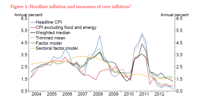
Incidentally, note the nice longer-term time series for the weighted median and trimmed mean series. The Bank no longer publishes these (linked) series on its website, just reporting the very short official series published by Statistics New Zealand. This is something that should be remedied – as, for example, the Reserve Bank of Australia does.
But now, apparently, the Governor favours the sectoral factor model to the exclusion of all other core inflation indicators. It is certainly convenient that it is, at present, the highest of any of the range of core inflation measures, and that the inflation rate, on this measure, has increased over the last year.
Here is a table I ran a couple of weeks ago:
|
Annual inflation, year to Dec 2015 |
| Trimmed mean |
0.4 |
| Weighted median |
1.5 |
| Factor model |
1.3 |
| Sectoral factor model |
1.6 |
|
|
| CPI ex petrol |
0.5 |
| CPI ex food and vehicle fuel |
0.9 |
| CPI ex food, household energy and vehicle fuel |
0.9 |
| CPI ex cigarettes and tobacco |
-0.3 |
|
|
| Non-tradables ex govt charges and alcohol and tobacco |
1.8 |
But neither the Governor, nor his officials, have given us any reasoning as to why they think that on this occasion this indicator is the single best representation of what is going on – so much so that the other measures aren’t even worth mentioning. I suppose one could lodge a request but (a) I doubt there would be anything to support the Governor’s preference, and (b) no doubt, we’d be told it was none of our business and that information had to remain secret to, for example, “prevent damaging the economy of New Zealand“. For an institution that likes to hold itself out as being transparent about its economic reasoning and analysis – and which has more (taxpayer-funded) macro analysts and researchers than any other agency – it really isn’t good enough.
Relatedly, if the sectoral core model is really providing much the best steer, what has changed since the start of 2014? Recall that sectoral core inflation then had been almost dead-flat at around 1.4 per cent for a couple of years – and yet the Governor began an aggressive tightening cycle. Perhaps it was a misleading measure then, but the best measure now? It is possible, but surely we are owed an explanation?
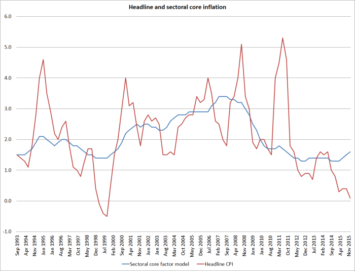
Why might we be a little sceptical that some “true” notion of core inflation is (a) rising, and (b) as high as 1.6 per cent (itself still materially below the midpoint)?
First, the sectoral factor measure is the product of a model, and that model has error bands around it. Even the historical period numbers are midpoint estimates of a range which the Bank tells us is around 0.6 percentage points wide.
 And, as with all of these sorts of models, the problems are particularly acute for the most recent observations. The model is, in effect, trying to discern the common trends in the various component price series, but it can do that increasingly reliably with the benefit of more time and more data. That makes tools like this most valuable for identifying the underlying inflation processes in periods of history (eg looking back now on the pre 2008 boom) and relatively less useful for “spot” reads on what is happening right now. In that sense, it is a little like filter-based estimates of the output gap, and it is similarly unwise to put too much weight on real-time estimates of any one model of the output gap.
Second, there is no sign of any pick-up in wage inflation, or in measure of inflation expectations.
Third, the measures that are easier to disentangle mostly aren’t suggesting core inflation is rising, or that it is as high as 1.6 per cent. Take, for example, the internationally quite commonly used approach: CPI inflation rate excluding food, household energy and vehicle fuels is only 0.9 per cent. It isn’t always reliable – in 2007 it ran below most other measures of core inflation because of some large changes in government charges (childcare subsidies). But we know (SNZ tells us) this time round that taxes and government charges are not, overall, affecting the inflation rate. It is a good example of why one needs to look at all the measures, and use them to develop an overall story. Focusing on a single indicator is often likely to be quite dangerous – especially when it is something of a black-box, prone to endpoint problems.
And here is a concrete illustration of something that bothers me about the sectoral factor model results at present.
We know that the repeated increases in tobacco excise has been having a big impact of overall non-tradables inflation in recent years (and the overall CPI). More recently, cuts to ACC motor vehicle registration charges have worked the other way. Statistics New Zealand do not give us a series of overall CPI inflation excluding tobacco and government charges, but they do provide one for non-tradables inflation (at least from 2007). And the Reserve Bank helpfully publishes separately the non-tradables component of the sectoral factor model. The chart shows overall non-tradables inflation as well. (The 2010 surge is the increase in GST, administratively excluded from the sectoral factor measures.)

Over the period since 2007, the combined effects of tobacco tax increases and central and local government charges have substantially boosted non-tradables inflation (the red line has been well above the blue line). So it is troubling that the non-tradables sectoral factor model component looks so like the overall non-tradables series over the period since 2009, even though it is substantially boosted by factors that no one would regard as core inflation – they are administered (by governments) prices. I’m less bothered by the idea that sectoral core inflation in the non-tradables sector might have been flat – a lot of the inflation in recent years looks to have been in the construction sector (think Christchurch) and the model will tend to look past that as not representative of the whole economy.
But if the Bank is going to drive policy – its assessment of the current inflation situation relative to target – off a measure that has looked more like a series that includes lots of administered taxes and prices, than it does the series that excludes those effects, they need to give us a lot more explanation than they have done to date. It is possible that there is a good and convincing story, and that the sectoral factor model is really capturing something important that has been going on in non-tradables inflation that simply isn’t visible to the naked eye (or in other price series), but we need to see that story. and the other supporting evidence for it. What is it, for example, that is leading to the sectoral measure holding up, and even rising, just as the overall non-tradables inflation rate converges (downwards) on the series excluding those government-determined prices?
Personally, I think it would be safer for the Bank to work on provisional basis that core inflation is around 1 per cent at present. That is around where the exclusion measures would suggest, and well above the trimmed mean – the approach to core inflation approach that, for example, tends to get most coverage among analysts in Australia.
[UPDATE: And don’t lose sight of the fact that the average of the blue line – excluding the GST spike – has been below 2 per cent since 2009. No one I know of would expect non-tradables inflation to be at or below 2 per cent if core or underlying inflation in total were anywhere near the 2 per cent target midpoint.]
This whole episode is pretty unsatisfactory, and a poor reflection on the Bank. Reasonable people might differ on the appropriate stance of monetary policy. But the attempt to justify the stance on a single (complex) core measure, without substantive elaboration or explanation, when that same core measure would appear to have warranted policy easings when the Bank began aggressively tightening two years ago, looks disconcertingly like a Governor fixing for a time on the highest convenient measure of inflation. That isn’t good policy or good governance. And I suspect it makes many of the Bank’s own economists quite uncomfortable.
As a reminder of the Deputy Governor’s 2013 report of the Bank’s aspirations
The Reserve Bank is deeply committed to transparency – of policy objectives, policy proposals, economic reasoning, and of our understanding of the economy, and of course of our policy actions and intent. Clear communication and strong public understanding make our policy actions more effective.
We are working to enhance the openness and effectiveness of our communications
It just isn’t happening.
And note that all these quotes are from 2013, early in the Governor’s term, before things started going really wrong. And before they responded to those mistakes – which any humans will at times make – by turning inward, pretending that nothing is wrong, and avoiding serious scrutiny and debate. Digging deeper holes doesn’t usually solve such problems.
It was wryly amusing to note the other day that the Governor of the People’s Bank of China – central bank of a brutal repressive state not know for any sort of transparency – had given an extensive interview (not necessarily revealing a great deal) to a publication not historically known as a party mouthpiece. Our Governor has, I’m told, not given a single substantive interview in his three and half years in the job.