Late last year, in a series of posts on the quarterly national accounts I showed this chart of export volumes per capita (for New Zealand and Australia).
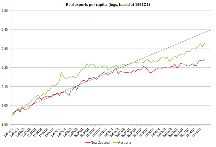
Exports (per capita) had carried on growing over the last decade or so, although at a materially slower rate than they had been growing previously.
Exports matter, but they are only one outcome of the international competitiveness of the New Zealand economy. Another way of looking at things is to think of the economy as divided between tradable and non-tradable sectors. It is a useful analytical device, but (like many useful economic concepts) doesn’t map 100 per cent easily onto the official data we have available.
My proposition (not, I think, overly controversial) is that a high-performing economy will be one in which the tradables sector – the bits selling to, and directly exposed to competition from, the rest of the world – is growing strongly, absolutely and certainly in per capita terms. Such growth in the tradables sector in a mark of the success of companies operating here in being able to meet, and succeed in, the global market. There is, of course, nothing wrong with non-tradables activity: we want phone services, cafes, theatre, and holidays at the beach. But it is exceedingly rare that a strong sustainable economic performance, especially in a small economy, is led from production in the sectors that aren’t exposed to international competition.
In an IMF Article report from perhaps 10 years ago the Fund staff had the clever idea of representing the tradables and non-tradables sectors in a single chart. It was rather rough and ready, and the Fund knew it, but it helped illustrate something of how the New Zealand economy had been unfolding. They started with the production measure of real GDP, and allocated the primary and manufacturing sectors to tradables. Our exports and imports are typically either primary or manufactured goods, or they are services. To proxy the contribution of services to tradables production, they took the services exports component (from real expenditure GDP) and also assigned that to the tradables sector. Everything left over was non-tradables. The resulting chart was reproduced in various fora around Wellington over the years, even used by the Minister of Finance – much to the distaste of purists.
I hadn’t seen the resulting chart for a while, and was curious how things had been going. In particular, given the rapid growth in the population over the last decade, I was curious about how tradables sector activity had been doing per capita. After all, both National and Labour governments have constantly talked of strengthening New Zealand’s international competitiveness, international connections etc.
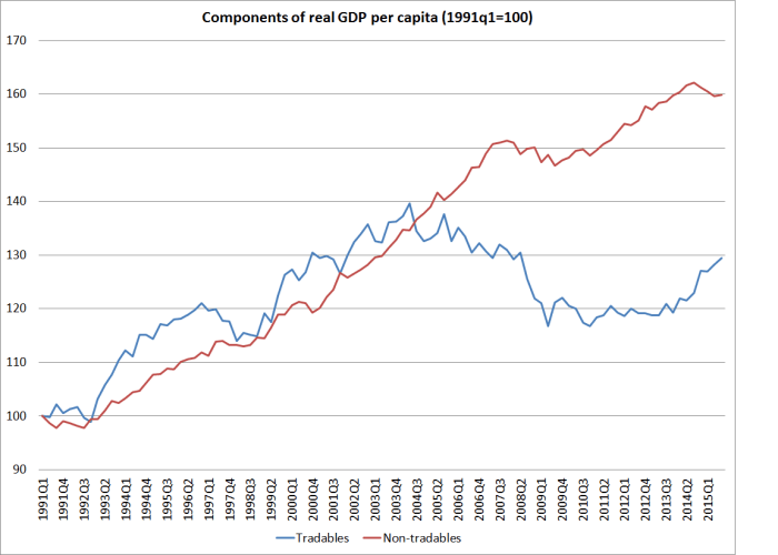
In this chart, I’ve shown primary and manufacturing real value-added per capita, and real services exports per capita, back to when the quarterly population series began in 1991. Each component here is indexed to 100 in 1991. At the end of the period, these three components of tradables production are of broadly similar size.

If your eye is drawn to the services line, as it probably is, bear in mind that not one of these series is now at its historic peak. One peak was in 2004, one in 2005, and one (primary) in 1997. By contrast, real per capita GDP is at its historic peak – growth hasn’t been strong over the last decade, but has been around 8 per cent over the last decade. Per capita export volumes haven’t been doing that well (see first chart above) – but they have clearly done a whole lot better than the domestic (import-competing) component of tradables production.
So here are the aggregate tradables and non-tradables components, as proxied by this particular approach.
I found it a rather bleak picture, to say the very least. Tradables sector production, per capita, is now nowhere near as high as it was as much as 12 or 13 years ago. It is most unlikely that New Zealand will make any progress at all in sustainably closing income and productivity gaps to the rest of the advanced world if it can achieve no growth in per capita tradables sector production over a period that long.
Why has it happened? What has so strongly skewed production towards non-tradables? I’d argue that it has, primarily, been rapid population growth, which had to be accommodated through a much higher exchange rate (the big step in the exchange rate dates back to 2003). For many of our tradable product sectors, raising our own population does nothing to materially boost output – land and sea and mineral resources are given, and the (real and significant) productivity possibilities in those sectors are independent of population. And the higher exchange rate just made it that much harder for other firms in the tradables sector to survive or thrive. The exchange rate has been so high for so long that we don’t hear many squeals any more – those who can thrive at these exchange rates do, and dead firms and unborn (ie never launched) firms utter no cries. Loosely speaking, it is a fully-employed economy (no 5.3% isn’t full employment, but 4.5% might be – and that difference is swamped by the scale of the divergences evident in this chart), but it isn’t a path to sustained prosperity. Non-tradables firms, especially in Auckland, do well – as they do in every population-fuelled boom anywhere (in history or now) – but it isn’t a path to sustained national prosperity.
Are there some caveats to the story? Yes, sure. The Christchurch repair and rebuild process exacerbated the skew to non-tradables, and there wasn’t anything much we could do about that. And high terms of trade, in principle, made it less necessary to produce tradables volumes (price substitutes for volume)….but, in the longer term, higher terms of trade tend to induce strong investment and volume growth in the sectors that are benefiting. There was no sign of that in New Zealand.
As I noted, purists don’t like the tradables/non-tradables chart, for a variety of reasons (some good, others less so). A couple of SNZ staff made an effort a couple of years ago to do a slightly more refined version. It was a worthwhile exercise, but I wasn’t persuaded that the more complex version materially altered the results, while making it a bit harder to explain just what had been done. Bottom line: this has been quite an unbalanced, more inward-focused, economy for more than a decade now, and there is little real sign of that sustainably changing.


