Eastern and central Europe, and us

Eastern and central Europe don’t get much coverage in the New Zealand media, or in New Zealand economic analysis.   But I’m intrigued by the region.    There are multiple levels to that –  religion, other dimensions of culture, battles in two world wars, decades of Soviet repression, and so on.   But what really plays on my mind is that these countries regained their freedom, and the hope that came with that, at much the same time that many senior and influential people here (and young economists like me) were convincing themselves that New Zealand had passed a turning point and our economic prospects really would be looking up.

Here there had been the famous jibe from David Lange, comparing New Zealand’s economy pre-1984 to a Polish shipyard.  At one level of course, it was a ridiculous claim, which trivialised the evils –  and rank inefficiency – of Communism.    But it had also captured something about the mood for change, partly in reaction to the plethora of controls the New Zealand economy had laboured under for decades.   Actually, New Zealand had been been liberalising for decades, but (generally) rather slowly and inconsistently.   And our living standards relative to those in other advanced countries had been dropping for several decades; the inefficiencies the heavy protectionism etc created were compounded by our worst terms of trade for a very long time.  Daft interventions like the Think Big energy projects just reinforced the sense of something having gone very wrong.

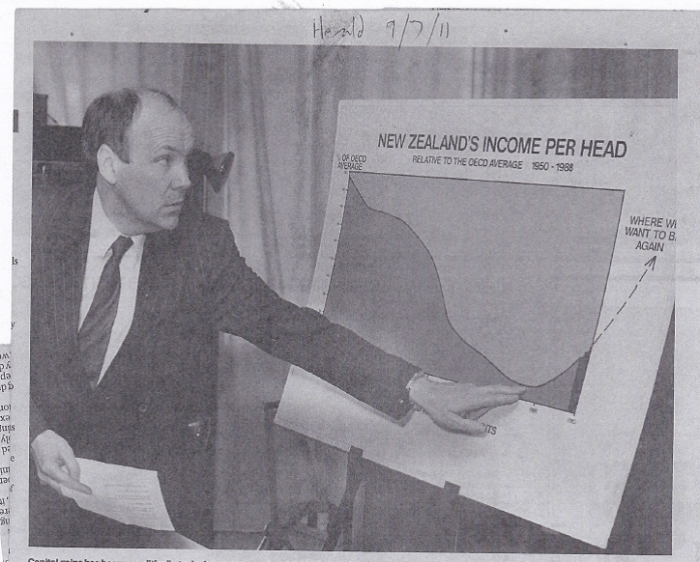
And so, over 10 years or so, there was a dramatic –  at times almost frenzied – period of far-reaching economic and institutional reform.  Much of it was admired –  even envied –  abroad, at least among the like-minded.   Outfits like the OECD and IMF praised the reforms, and typically had a few more to suggest, and there really was a belief that nothing much now stood in the way of reversing the decades of relative economic decline.  Productivity growth would, it was assumed, follow smart economic reforms much as night follows day.    There are some people from that era who will now dispute that anyone seriously expected that sort of improvement, but David Caygill was the (very capable) Minister of Finance, and here is how he illustrated the story.

caygill 1989 expectations

No sense there that the reforms –  which were extended further by his successors –  would simply slow our relative decline.

At the time, I was heavily involved in the Reserve Bank’s (small)  part in all this –  achieving and maintaining low and stable inflation.   Medium-term growth and productivity issues weren’t our focus, but a couple of colleagues –  including then deputy chief economist Arthur Grimes –  had been doing some work on exactly those issues.  Their findings were published in mid-1990.    Having established the nature of New Zealand’s relative decline, and identified some of the possible causes (including, in their view, past rapid population growth) they ended their article this way.

grimes smith text

And at around the same time, eastern and central Europe was regaining its freedom.  The Berlin Wall fell, democratic governments were elected in Poland and Czechoslovakia, the Baltic states regained independence, a place like Slovenia emerged peacefully from what was left of hitherto communist Yugoslavia and so on.    They were great days for the cause of human freedom.  But also of economic opportunity.   The former eastern bloc countries didn’t have identical economies, and it isn’t as if there hadn’t been economic progress even during the Communist years.  Some –  notably Hungary –  had started reform and economic liberalisation earlier than others.    But each of them had highly distorted economies, typically insecure property rights, and little in the way of a proper financial system.    Data from this period are pretty patchy – especially for the countries that had been part of other countries up until then – but these countries weren’t dirt-poor: the better of them probably had GDP per hour worked in 1990 similar to, say, that in Korea.    They were middle income countries.   Then again, as far as we can tell, in say the 80 years prior to World War Two none of them had ever been much better than middle income countries either.  Certainly, they’d nothing like the productivity, GDP per capita, or material living standards of New Zealand.

So if we go back 25 years or so, both in New Zealand and in eastern Europe those leading the economic reforms, and those running governments, had serious aspirations of catching up with the richer and more productive advanced countries.    Of course, the mess in eastern Europe was a whole lot bigger than the mess here.  In both countries, unwinding controls and protectionist structures involved short-term losses of output.  Those were moderate here, but savage in some of the eastern European countries.  But in both places there seemed to be great opportunities for catch-up and convergence.

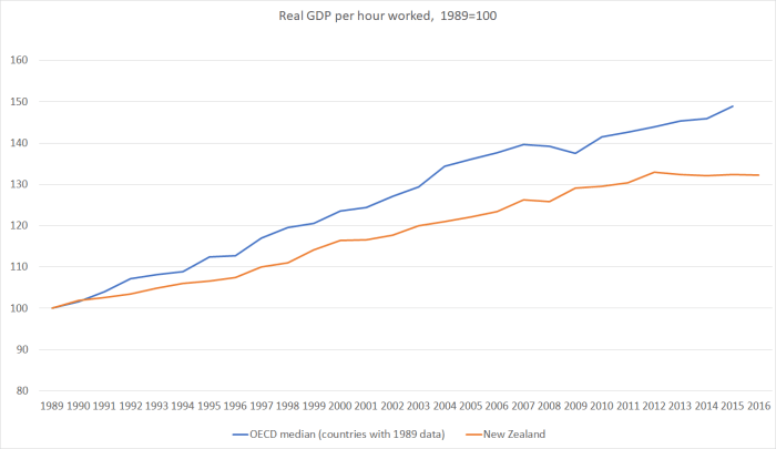
I illustrated the other day how poor our productivity performance has been relative to the other advanced OECD countries over that period.  From a starting point in 1989, productivity levels have slipped another 12 per cent further behind the median advanced OECD country.  In other words, no convergence has happened at all.  That has been so even over the last decade or so when productivity growth in the the “frontier” countries has itself slowed, which might have been an opportunity for some catch-up when we were starting so far behind.

But how do we compare with the eastern European countries?  Seven of them –  the Czech Republic, Estonia, Hungary, Latvia, Poland, Slovakia, and Slovenia –  are now in the OECD, and thus in the OECD statistical databases.  One other –  Lithuania –  isn’t in the OECD but has apparently reached data standards that mean the OECD is reporting their productivity data.   There are other countries not covered –  from Belarus or Moldova at the bleak extreme, to EU countries such as Bulgaria, Romania (which I wrote about here), and Croatia at the other.    There is good data for some of them in other databases, but for today I just wanted to use the same OECD database Steven Joyce was using the other day in talking up New Zealand’s performance.

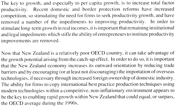
The OECD data on real GDP per hour worked for these countries starts in various years during the 1990s.  2000 is the first year for which there is data on all eight eastern European countries.  In a way, it is a shame not to be able to start from the late 1980s, as I did in comparing us with the more advanced OECD countries.  On the other hand, by 2000 the worst of the immediate post-communist disruption was well behind these countries (as the initial output losses in our own structural reforms were behind us).    Sixteen years since 2000 (annual data is available to 2016) is a reasonable run of time to see how we’ve done relative to them –  and neither the initial year nor the most recent year is muddied by recessions or financial crises.   Each country has had a recession during this period, and in some cases they were pretty wrenching adjustments, involving IMF support.

Here is the cumulative real productivity growth for each of those countries, and New Zealand, since 2000.

eastern europe 1

The country with the slowest growth – Slovenia –  managed twice the productivity growth of New Zealand over this period, and the OECD estimates suggest that the level of productivity in Slovenia –  30 years ago a province of a communist non-market country –  is now approximately equal to that in New Zealand.

And here is the time series: the level of productivity in each country is indexed to 100 in 2000 and then I’ve taken a median of the eight eastern European countries.

easetern europe 6

You can see that the downturn in 2008/09 was much more severe for many of these countries (especially the ones running semi-fixed or hard-fixed exchange rates).

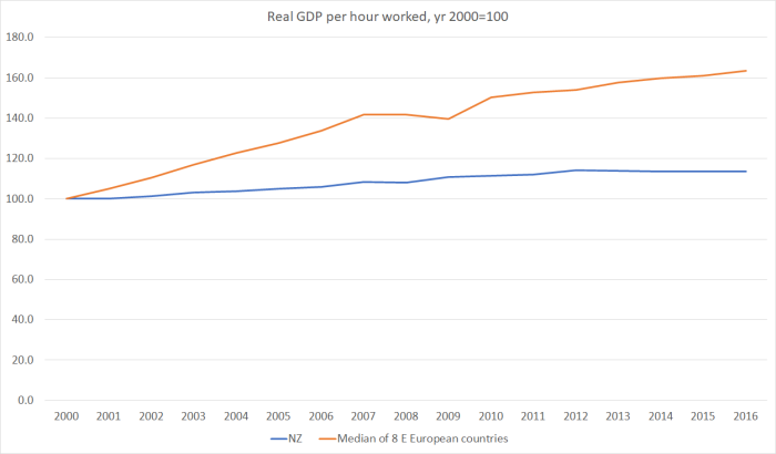
And here is the ratio of those two series.

eastern europe 3.png

Our rate of decline, relative to the eastern European countries, might slowed a little in the last decade, but there is no sign of things levelling out.

And if defenders of New Zealand’s performance want to argue something along the lines of ‘well, they are still poorer and less productive than New Zealand, so they should be achieving faster productivity growth than we are’,   well we are a great deal less productive than the median advanced OECD country, and yet we’ve not managed to achieve faster productivity growth than them.

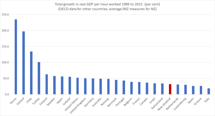
In fact, here is a chart showing OECD estimates of the 2015 level of real GDP per hour worked, converted at PPP exchange rates, for the eight eastern and central European countries,  for New Zealand, and for four of the big higher-productivity OECD countries.

eastern europe 4

These days, our productivity levels look a lot more like those of the eastern and central European countries than of the OECD leaders (and Norway and Luxembourg and –  questionably –  Ireland are well above even those countries’ numbers).

At about this point, people often start saying “well, of course…those eastern European countries are close to the industrial centres of western Europe, and have been able to be attract foreign investment in manufacturing and become extensively integrated into the value chains associated with modern manufacturing”.

To which my response is along the lines of “well, yes, that is my point about New Zealand”.  We are poorly located –  for anything other than not being overrun by German or Soviet armies – and not many firms seem to have been able to develop substantial (unsubsidised) businesses selling internationally competitive products and services from here, based on anything other than our (fixed) natural resources.

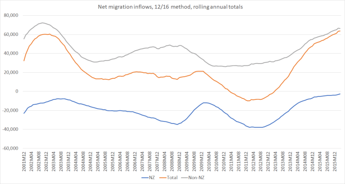
Which is why it has come to seem so odd that we, as a matter of public policy, are aggressively trying to grow our population –  issuing 45000 residence approvals a year, three times the per capita rate of the US.  In doing so, we simply make it harder for ourselves to prosper here.

In fact, here are the population growth rates of the eastern European countries and of New Zealand since 2000.

eastern europe 5

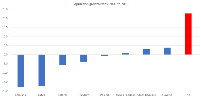
I don’t think I’d be too keen on living next door to revanchist Russia.  But the five non-Baltic states here are firmly ensconced in central Europe, and over the last 16 years they’ve had an average of zero population growth, while our population has grown by almost 23 per cent.

Countries like that don’t have to devote huge shares of available resources (capital and labour) simply to keeping with the infrastructure needs of a rapidly rising population.    That, in turn, keeps pressure off domestic costs, and keeps the real exchange rate lower than otherwise. Combined with more favourable locations, lower company tax rates (in most cases) and (the perhaps mixed blessing of) EU membership, they’ve been able to lift productivity and living standards for their people in a way that has had no parallel in recent decades in New Zealand.     On typical institutional metrics like ease of doing business and corruption perceptions we score well ahead of any of those countries.  We don’t need marches in the street to protect the independence of the judiciary (as in Poland).  And our people do well on international skills comparisons.  But it isn’t enough if one draws too many people into an unpropitious location.

Until we face up to the evident limitations of our location, and the absurdity of actively importing so many people from abroad into such a difficult location, it is difficult to believe that our underperformance, that has now stretched out over almost 70 years, will even begin to be reversed.    For most of modern New Zealand history, France and Germany and the Netherlands had lower labour productivity than New Zealand did.  Now they are far ahead. Slovakia is already passing us, and it seems reasonable to think that if we and they keep doing the same things we’ve been doing for the last 20 years,  Slovenia and the Czech Republic will also go past us in the next decade.    That’s good for them.  I don’t begrudge their success –  the fruits of freedom and decent policy, in the context of a good location – but what about us?

Here we have one main party that wants to pretend that productivity growth is just fine –  simply ignoring the data.   And another which recognises and is now highlighting the problem –  I was seriously encouraged to see Jacinda Ardern making the “flat-lining at best” point about productivity in last night’s debate –  but doesn’t seem to have seriously engaged with what might produce significantly better and different outcomes in the future.   The scary thing is that if their roles were reversed, Labour might well be pretending there wasn’t a problem, while National still wouldn’t be offering much of a serious solution.   And so, from the apparent refusal of either main party to really confront the presenting symptoms and attempt a serious diagnosis of what has been going on, we seem doomed to slip slowly ever further down the league tables.    There are always many useful reforms to be considered.  But, foremost, we need to markedly cut back that 45000 residence approvals target, and then back our own able people to make the most of the natural resources we have, in the face of the real and –  on curent technology ineradicable – severe disadvantages of our location.


Tougher than Ruth Richardson?: implausible spending numbers

An overnight commenter on yesterday’s fiscal post made this suggestion

I wonder if some improvement in the PREFU could help. As you say, the Health budget has been increasing by $6-700m for the last couple of years, but is forecast to change by only minor amounts in future years. No one seriously believes that do they? Why not have assumptions for GDP, population, inflation, interest rates, demographics etc included in the PREFU numbers (maybe they are), and adjust the future years costs/incomes accordingly. So rather than having flat-lining health numbers, adjust for population, (health) inflation, demographics etc. I would hope that this would allow us to get a better sense of how promises stack up relative to a ‘normal’ expectation of what might happen. If someone wants to ‘deliver a modern health system’, but they aren’t going to increase the health budget, at least it would hopefully be apparent.

It may be far from perfect, but should at least be a bit more realistic?

I have a lot of sympathy with what the commenter suggests.  It is, more or less, what Treasury already do for the medium-term fiscal projections (beyond the four year budget window), and it wouldn’t be hard for them –  or an independent Fiscal Council –  to do something similar for the four years of the PREFU numbers (in addition to what is done now, rather than in substitution).   The numbers would be illustrative, and one might need to provide some ready reckoners to allow for different assumptions, but illustrative scenarios can still help to illuminate debate.

In that spirit, how would one look at the Health budget?   As I noted yesterday, in Labour’s fiscal plan they expect to spend $2361 million more on health in 2020/21 than the (basically flat) PREFU numbers.  To be clear, those PREFU numbers do not reflect what a re-elected National government would expect to spend; they just reflect what has already been allocated.

The Labour Party has claimed that their numbers allow for cost increases that would result from continuing inflation and population growth, as well as making provision for the various policy measures they have promised.    In the plan document they summarise this as

Reverse National’s health cuts and begin the process of making up for the years of underfunding that have occurred. This extra funding will allow us to invest in mental health services, reduce the cost of going to the doctor, carry out more operations, provide the latest medicines, invest in Māori health initiatives including supporting Whānau Ora, and start the rebuild of Dunedin Hospital.

The language suggests quite a lot more of an increase in spending than would be implied simply by inflation and population increases from here.

As it happens, we do have some insight as to how they think those inflation and population pressures should be allowed for.  After yesterday’s post a commenter sent me a link to a June 2017 press release from then-leader Andrew Little, which in turn linked to some work Infometrics had been commissioned to do for Labour on whether health spending had kept up with inflation and population pressures over the term of the current government.    In the tables in that short piece of work, Infometrics use CPI inflation and they allow for demographics pressures (ie the combination of an ageing population and a growing population) using (a) actual population growth and (b) some Treasury numbers that weight the population by its demand for health services.  With an ageing population that seems to lead to a demographic increase in demand for health services about half a percentage point higher than the population growth rate  (a bit more in years of low immigration – migrants on average are younger and have less short-term demand for health services).

If we take the Treasury projections for CPI inflation and population increase (from the PREFU), and apply the same sort of ageing population factor that Treasury and Infometrics have previously used, this is what we get.

CPI Inflation – Tsy forecast Population % increase –  Tsy forecast Total demographic % increase Implied % increase in health budget to keep pace $m increase
2018/19 1.7 1.5 2 3.7 608
2019/20 2.1 1.3 1.8 3.9 665
2020/21 2.1 1.1 1.6 3.7 655

If this approach is roughly right, the health budget (total Crown basis) would have to increase from the PREFU estimate for 2017/18 of $16432 million to $18360 million by 2020/21 just to keep pace with inflation and demographic pressures that are expected/forecast but haven’t yet happened.  In Labour’s fiscal plan, they expect to spent $18757 million on health in 2020/21.

On this basis – a methodology we know they used quite recently –  there is some margin between the expected (fiscal plan) numbers and those required simply to keep pace with future cost pressures.  That margin is $397 million in 2020/21.    But they argue –  the numbers are in the tables – that the health budget has been underfunded just for cost and demographic pressures during the term of this government to the tune now of almost $300 million per annum, and if one goes to their Health policy the first additional specific policy promise –  around GP fees – is itself estimated to cost $259 million a year, starting next year.  (Of course, National has made a similar promise in this area.)   It looks likely to be very difficult to deliver all those promises, and cover the basic inflation and demographic cost pressures, within that $18757 million.      That isn’t really surprising because, as I illustrated yesterday, the numbers suggest that health spending as a share of GDP won’t be changing –  and will be lower than it has been for most of the last decade.

Labour health

My actual interest in health policy and the health budget is quite limited (although my wife tells me I’m getting old and so should be more interested), but it is worth noting that Infometrics (and Labour apparently) used CPI inflation as a measure of the cost pressures. Ideally, one would want to use a specific index relating to health system costs.  I’m not aware that we have one in New Zealand –  certainly not one widely available –  but I did have a quick look at the CPI components data.

% increase since 08/09
CPI 13.2
Dental services 27.9
Paramedical services 29.1
Hospital services 32.3

Perhaps there might be some reason to worry that the CPI understates health inflation pressures (although it is true that the item “therapeutic appliances and equipment” –  one of those low inflation tradables – increased by only 2.6 per cent).    Even 1 percentage point more health inflation in total over three years would make considerable inroads into the margin Labour seems to have to deliver more medical services (or the same ones at cheaper prices to users).

In a sense, my larger point in yesterday’s post was about how plausible it is to expect to see government operating expenditure falling further as a share of GDP.  That is what both parties are promising.     Here is a chart of core Crown spending as a share of GDP, stripping out finance costs, and simply looking at the things governments are purchasing and the transfers they are making.

core crown spending 17 election

The data only go back, in this form, to around 1994.  But government spending as a share of GDP –  again excluding finance costs – hadn’t been any lower than shown in this chart (and was mostly higher) in the previous 20 years.

So the National Party’s proposed spending numbers would be smaller as a share of GDP than at any time in the last 40 years, and Labour’s would be smaller than at any time except for two years in the last Labour government that were (a) only very slightly lower, and (b) proved unsustainable, with big increases in spending over the following few years.  Grant Robertson and Steven Joyce: both tougher than Ruth Richardson.

A small government person might well look at these numbers with pleasure, and assume that the government was getting out of whole areas and handing responsibility back to citizens. I recall discussions with the late Roger Kerr who talked of how an advanced economy could have a basic safety net welfare state and still keep spending perhaps 10 percentage points lower than shown in this chart.     But he didn’t have in mind, for example, relentless increases in the share of GDP devoted to NZS (as both parties promise for the next two decades).    Or moves towards fee-free tertiary education.  Or real increases in welfare benefit rates.  Or……

If we compare what the state was spending on things 10 or 12 years ago and what either main party wants to spend on things over the next few years (Labour more than National of course, but in historical perspective the differences are small), how credible is it that the spending share of GDP will be able to be held so low?  Yes, the burden of some spending programmes has been wound back, but it isn’t easy to think of things the state has simply decided to stop doing, and it easy to see areas (in the current electoral auction) where there is pressure to do more.     And it is not as if, in recent years, productivity gains (non-existent for five years now) have been giving us “free lunches”.

I’m not taking a view here on what the appropriate level of spending (or taxes) should be.  My own biases would be to lower both selectively (but also run smaller surpluses).  It is simply a point about the realism of the numbers both parties are campaigning on, given what they say they want to be able to deliver.

But I am still a bit perplexed, as I said yesterday, about why an opposition party campaigning against serious sustained underfunding in various key areas of government spending, and wanting to do some big new things, would also be campaigning on cutting government spending as a share of GDP –  just smaller cuts than the current governing party is promising.   Perhaps it would make some sense (economically) if we were in some sort of fiscal or debt crisis –  all those debates in the UK about the appropriate pace of “austerity” –  but we aren’t.    Net core Crown debt (properly measured) in the last financial year was 9.2 per cent of GDP.    Quite what the political imperative, or the economic narrative, is for further reductions from there is a bit beyond me.

A depressing debate

Watching last night’s party leaders’ debate had its entertaining moments, but mostly if it  was clarifying it was so in a pretty depressing way.    And one of these two will be Prime Minister for the next three years.

There was the sight of both party leaders falling over themselves to disavow any notion that house prices should fall.  Apparently, a $1 million average house price (or the less headline-grabbing but still obscene median price of $800000+) in Auckland is just fine.  I suppose we should be grateful that on the one hand the National Party has moved on from the nauseating talk of how these house prices were a “sign of success” or a “quality problem”, and on the other hand that Labour’s housing spokesman will openly talk of an aspiration to having house prices averaging perhaps 3 to 4 times income.    Perhaps both party leaders really would prefer that Auckland house prices hadn’t increased very substantially in the last five years, but now they both seem content to simply treat it as a bygone –  as if we should simply live with $1 million house prices indefinitely until, some decades hence, a combination of inflation (mostly) and real income growth, might render home-owning in our largest city once again affordable to new entrants.

A couple of weeks ago I showed this chart.  Starting from a price to income ratio of 10 –  roughly that in Auckland now –  it traces out how house price to income ratios would evolve if nominal house prices were unchanged from here on (something both party leaders now appear regard as a good outcome).

house price to income ratio with flat nominal house prices

Just focus on the green line.  If we have inflation averaging two per cent, and productivity growth matching the performance of the last 30 years (quite a step up from where we are now) it would take almost 25 years to get price to income ratios down to even around five times income.     The Prime Minister talked of this being an issue for his kids.  The solution, to the extent there is one, seems to be aimed at his grandchildren.

Ardern seemed to try to have it both ways with the talk of “we just need to build more affordable houses”.   Lay members of my household responded “well, wouldn’t building more houses lower prices, which she just said she didn’t want?”.     Actually, it is unlikely to make very much difference, unless she is serious about freeing up land supply.  Without that, the overall affordability of the housing stock won’t change much, and any new houses built by or for the state will largely displace others that would have been built by the private sector.  And yet, although on paper Labour’s policy on improving land supply looks promising, the current Leader of the Opposition continues in path trod by her predecessor and simply never mentions the land issue –  even though everyone recognises that in Auckland in particular, the price of land is the largest component of a house+land.   Relative to that, further extending capital gains taxes is just a third order distraction.   At any plausible rate  –  in today’s low interest rate environment –  so is a land tax.

Sadly, I suspect there is an element of dishonesty about both party leaders’ responses.  If their housing policies really worked, I can’t imagine that either one would have a problem if house prices fell by, say, 20 per cent all else equal.  That alone would lower price to income ratios in Auckland to eight times.    It seems unlikely that that sort of fall would put anyone much in severe financial difficulty –   not that many people recently have been able to borrow at LVRs over 80 per cent anyway, and servicing capacity mostly depends on continued employment.     Continuing to talk of stable nominal house prices perhaps avoids (a) scaring the many people whose equity would be wiped out if house prices fell by 50 per cent, and (b) leaving themselves open to scare stories about how falling houses inevitably mean terrible economic times.   But it also makes a hard to develop a constituency for the sort of changes that might, in time, make a real difference, and enable this generation of young people  –  ordinary working families – to afford a decent home.

If that was bad enough, Jacinda Ardern’s superannuation pledge was worse.    John Key’s  pledge to resign rather than increase the NZS eligibility age was cynical –  he was quite open to Treasury that the age would rise, just not under his watch – but perhaps almost understandable in the context of the 2008 campaign.   Helen Clark would have run the “secret agenda to raise the age” line, at a time when Labour itself had no intention of raising the age, and had established the NZSF to buttress the political messaging.   But in this election, the incumbent Prime Minister leads a party which intends to legislate to increase the NZS age –  by a little, and some decades down the track.  It could hardly attack Labour for leaving open the possibility.   Even if Labour didn’t want to increase the NZS age itself now, what would have been wrong with a simple pledge that “no, we don’t see a need to raise the NZS age at present.  I don’t envisage it happening, but if at some point that judgement changes, I pledge that we won’t change the age without taking it to the public first as an election campaign promise”?

When the Prime Minister announced his NZS policy back in March, I ran this chart

Here is a chart showing life expectancy at 20, and the NZS eligibility age.  The final two dots are what might have happened by 2040 if the life expectancy gains continue at the same rate as since 1950, and the NZS eligibility age if yesterday’s National Party policy proposal comes to pass.

life and NZS age

Over that full period, 90 years, the NZS eligibility age would have risen by two years, and adult life expectancy (those getting to 20) would have increased by about 13.5 years.  By 2040 it will be amost 40 years since the NZS age got back to 65.  In that time, adult life expectancy is likely to have risen by 5 to 6 years, and yet the NZS age will have risen only by two years, if the new National Party policy is implemented.

How has a New Zealand politics got so febrile that parties that claim they want to use scarce fiscal resources to solve child poverty are reduced to this?   We can be pretty sure Bill English won’t be Prime Minister in 2037, so the NZS age won’t actually increase on his watch –  he’ll just foreshadow change decades down the track –  so in effect both candidates to be Prime Minister are refusing to increase the age while they are PM.   Old people vote of course, but this isn’t an issue about today’s old people –  it is about today’s middle-aged and younger people.   Even among today’s older people, almost half of those aged 65 to 69 are still in the labour force.

partic rate 65 to 69

Personally, I support a modest universal age-pension, but not one that cuts in at an age when a huge proportion of the recipients are still working, and are physically capable of doing so.    And how come we can scarcely even have that political debate even though all manner of other advanced countries have been willing to take steps to increase the eligibility age?  In Australia, for example, the age pension eligibility age will be 67 by 2024 –  and technically, all those Australians, and (a more plausible possibility) the New Zealanders living in Australia, would be eligible to relocate to New Zealand and claim our NZS, with no prior residence requirement, at age 65.

I found the “debate” around child poverty almost as depressing.    Neither party is actually willing to campaign for lower house prices –  even though housing costs have been a big factor in the material and financial challenges some face.  And all the talk was of how much money (other people’s money) the government could throw at the problem, with no mention at all of the possibility that improved economic performance might be the best way to lift living standards for everyone.  But then neither party seems to have  a serious idea as to how to lift our economic performance –  or even to care much about doing so (the Prime Minister just makes up stuff about the current performance of the economy).   And the Prime Minister was very keen to talk up how he, lots of data, and some public servants, are going to solve all manner of social problems.  Which, on the one hand, displays a touching faith in the capability of politicians and bureaucrats –  usually shared only by politicians and bureaucrats, and with little in past experience to support it –  and on the other simply refuses to address the likelihood that cultural factors are part of the story in dysfunction and deprivation.    I don’t really expect it from today’s Labour Party, but the Prime Minister is a self-described social conservative.

And then there was the wages debate.  On that one, I reckon the Prime Minister is right on the facts –  real wages have been rising, and faster than productivity has –  and I was disappointed to see the Leader of the Opposition still running here “its how people feel that matters”.   It might be uncomfortable to face it but wage inflation running ahead of productivity (and even than terms of trade gains) is one of the symptoms of an overvalued real exchange rate.  Plenty of observers –  including the outgoing Governor –  have highlighted that as a serious challenge for New Zealand.  It is part of the reason why Treasury forecast that exports will be shrinking as a share of GDP on current policies.   (If this whole point is obscure, it is partly a teaser for a forthcoming post.)

UPDATE:  On further reflection I’ve deleted the final paragraph.  I wrote it based on reading various commentaries, but before digging into the numbers myself (a salutary lesson that I shouldn’t need).   Understanding better both the Labour numbers and the National claims, I’d now take a more nuanced stance.

And, of course, there was the $11 billion fiscal hole that wasn’t.   Perhaps the National Party really believed their story when they put it out yesterday morning. By debate time, it was pretty clear to anyone without an axe to grind that there was little or nothing there.     Wouldn’t an honourable Prime Minister have simply quietly let the issue slide, and addressed the real challenges New Zealand faces, including real and legitimate questions about his own government’s performance over nine years, and about the aspirations and specific proposals the Labour Party is now outlining.

Consistently dismal relative productivity growth

Having done Saturday’s post unpicking some of Steven Joyce’s claims about New Zealand’s productivity performance, I thought it might be worth using the data for a few more charts illustrating something of our performance relative to other advanced countries going back a few decades.

Of the official SNZ data I used in my nine measures of real GDP per hour worked:

  • real GDP measures go back to 1987,
  • the HLFS goes back to 1986, and
  • the Quarterly Employment Survey goes back to the start of 1989.

Thus, using official SNZ data, we can really only do the international comparisons back to full year 1989.   The OECD and the Conference Board produce numbers of New Zealand going rather further back (using earlier SNZ data for much of that), and those estimates usefully illustrate our longer-term relative decline.  But in these particular posts, I just want to use the official New Zealand sources for New Zealand (and the OECD-reported data for other advanced countries).

Many of the current OECD countries (largely the former eastern bloc ones) don’t have useable data going that far back.  So in these charts I’m comparing New Zealand against the 25 OECD countries that have such data all the way back to 1989.    That includes all the more “traditional” advanced OECD countries except Austria.  But the OECD only has data for all these countries to 2015, so this chart compares total productivity growth across countries from 1989 to 2015.

productivity joyce 3

“Pretty dismal” would be my summary of New Zealand’s performance over that entire period.  There is a handful of countries that have done even worse.  Two are much richer and more productive than us anyway; the others some of the basket cases of the euro-area.  And recall that at the start of the period we were in the midst of an economic restructuring programme sold, in part, as designed to reverse the decades-long deterioriation in New Zealand’s economic performance.    As a comparisons, in 1989 Ireland is estimated to have had around the same level of real GDP per hour worked as New Zealand.

As I noted in Saturday’s post, there are nine simple ways to combine the various GDP and hours series to produce estimates of GDP per hour worked. In the chart above, I used the average of those nine measures –  a 32.4 per cent increase.   The range of the nine measures was from 29.0 per cent to 35.7 per cent.   At best, we also beat out Switzerland and Israel.  At worst, Netherlands and Luxembourg beat us.  Over that long period, data uncertainty just doesn’t change the picture much.

In the next chart, I’ve shown the annual path of real GDP per hour worked for New Zealand (again using the average measure) and for the median OECD country for which there is data throughout the period.  In all cases, countries were indexed to 100 in 1989, and so the chart is showing cumulative growth over the period in the two series.  The OECD does not yet have data for all countries for 2016.

productivity joyce 2

And here is the same data transformed into a ratio: the New Zealand line divided by the median OECD line, again indexed to equal 100 in 1989.

productivity joyce 1

On this chart, I have included an estimate for 2016, by taking the median productivity growth rate for those OECD countries (most of them) that have 2016 data.  I’ve also marked the final year of each of the three governments that changed during this period (1990, when Labour lost office; 1999 when National lost office; and 2008 when Labout lost office).

Over the course of these 27 years,  the trend has been downwards –  we’ve done (cumulatively) a lot worse than these other advanced countries (and the decline relative to those former eastern bloc countries is materially worse).

I don’t regard the dates around changes of government as being particularly meaningful for these economic comparisons: structural policy changes affect outcomes with a lag, and anyway, at least for the last two changes of government (1999 and 2008) there has been a lot more continuity than differences between the economic policies of the outgoing and incoming governments.  But in each of the different governments’ terms there have been years when our productivity growth was faster than that of the median OECD country.  Under the current government that year was 2009.  And so, as I noted the other day, in their first few years in office we actually made up a little ground relative to these other advanced countries.   But since then, the picture has been downhill again. Over the last four to five years all those gains have been lost, and more.

It is what happens when your country manages no productivity growth at all for five years or more (illustrated here using the average of the nine measures).

productivity joyce 4

I chose 1989 for the cross-country comparisons for the practical reason that 1989 is when the consistently-compiled New Zealand data go back to. But it was also David Caygill’s first year in office as Minister of Finance.     I’ve shown previously this photo in which he was illustrating his aspirations.

caygill 1989 expectations

But like his predecessors for several decades before him, and all his successors – including those in the last Labour government and the current National government – he failed. Terms of trade windfalls have help our incomes, but over the longer-term improved living standards – catching up with other countries – depends on improved productivity performance.  Our governments have consistently failed that test, and I can’t see anything in the current electoral offerings that seems likely to change the picture in, say, the next decade.

What’s happening to immigration data?

Back in May when Statistics New Zealand released the first results of their new 12/16 method of calculating net migration, based not on surveyed intentions, but on what travellers subsequently actually did, I was free with my praise.    The new data would provide a very useful, if lagged by at least 16 months, additional insight on what migrants were doing.  In particular, it offered richer insights on the activities of New Zealand citizens (we have administrative data on visa approvals etc for non-New Zealanders, but of course New Zealanders don’t need approval from our government to come and go).

But it seems that I should have been more suspicious.  This morning SNZ released the second wave of the data, bringing the data forward to March 2016 (for which they needed to be able to look at subsequent movements up to the end of July 2017).    That’s good, and the data are even available in a more user-friendly format than when they put the first release out.

But then there was this in the SNZ release

“With the pending removal of departure cards, developing the ‘12/16-month rule’ is a part of our work towards ensuring we can measure migration without depending on traveller cards,” population statistics senior manager Peter Dolan said.

“In the near future, the outcomes-based ‘12/16-month rule’ is expected to become a key component in how we determine the number of migrants in New Zealand.”

This is just astonishing.  Or perhaps not, but appalling anyway.  For a long time there has been a push  –  presumably from airlines and perhaps bureaucrats –  to get rid of arrival and departure cards.  I was involved from the Reserve Bank side in pushing back against an earlier initiative to dump them more years ago than I can now remember.     We pointed out the value of timely high frequency data on movements of people across the border ((tourists and migrants) for those doing macroeconomic policy and associated forecasting and analysis.    Bear in mind that New Zealand not only has some of the largest migration flows (in, out, and net) of any advanced economy, we also have among the most variable migration flows.  And cyclical fluctuations matter a lot when your job is cyclical stabilisation (ie monetary policy) –  let alone making sense of short-term developments in the housing market.   So you’d think it might be a high priority to have and keep high quality high frequency data.

And, as it is, we have some of the very best migration data in the world.   Being an island country, we have secure borders.  Being a remote set of islands, almost everyone arrives by air, at a handful of secure locations.  So it is easy to collect accurate data, and a pretty rich set of data, and to get it out pretty quickly  for forecasters, analysts, and even politicians to use.

I’ve explained here previously why the resulting PLT data has its limitations.   It isn’t a good basis to use to look at immigration policy itself.  Approvals data from MBIE is better for those purposes –  and would be better still if they made the information available in an accessible format on a more timely basis.     And the PLT data are based on self-reported intentions, and intentions aren’t always what people end up doing.  Some people think they are leaving permanently, and are back six months later, and vice versa..   But intentions data isn’t nothing either  (just as business surveys capture intentions/expectations and things don’t always turn out as they expect).    The patterns –  and especially the cyclical patterns, the turning points –  in the PLT data tend to match those in the (lagged) 12/16 data quite closely.

There are quite enough gaps (and long lags) in New Zealand economic data as it is –  monthly CPIs, monthly manufacturing data, quarterly income measure of GDP just for starters –  that I’m just stagggered that key economic agencies are apparently willing to let SNZ/Customs go ahead and consider dropping departure (and arrival?) cards.  Where are Treasury and the Reserve Bank on this?

How, specifically, does it matter?   Without departure or arrival cards we would, of course, still have immigration approvals data for most non-citizens (other than Australians).  In principle, they could be published weekly or monthly with just a day or two’s lag, and be available in quite accessible formats.  Since approvals lead actual arrivals, there is certainly useful information in those approvals numbers (it is just that they aren’t made easily available now).

We could presumably also have data on the total number of people crossing the border (gross and net) from passport scanning.   I’m not aware that those numbers are published at present, but they could be.  And presumably they could be broken down by nationality (or at least by the passport the person happened to be travelling on).    That would be useful –  relative to having no arrivals or departures data –  but not very.   If you look at total net arrivals or departures (or net) data it is enormously volatile, and thrown around things like Lions tours –  in other words, holidaymaker and other short-term visitor numbers swamp movements of migrants.   Using that data alone, we’d have no ability to pick turning points for some considerable time after the turn had already happened.

The gaps would be particularly serious for the movement of New Zealanders, and more than half the variability in the 12/16 measure of net migration has arisen from fluctuations in the movements of New Zealanders.  We would have no secure way of knowing if someone leaving was planning to be off for a week’s holiday, or intending to stay away for ever.  The 12/16 method would eventually tell us what they did –  but there is a lag of almost 18 months on the availability of that information.    And even if the new plan involves keeping arrival cards and only getting rid of departure cards, most of the variability in New Zealanders’ migration movements is in the numbers leaving, not the numbers arriving.

Less importantly, without the departure cards we would seem likely to lose the ability to analyse migration (including reflows outwards by migrants who become NZ citizens) by the birthplace of the migrant.

Perhaps someone has done a robust cost-benefit analysis on getting rid of departure (and arrival?) cards.  If so, I would be keen to see it, and particularly keen to see how the relevant officials have factored in the loss of some of world’s best migration data to macroeconomic monitoring and forecasting, in a country with some of the most volatile immigration flows in the advanced world (and not a great track record of getting monetary policy, or housing markets, right as it is).  And even if one sets aside the macroeconomic analysts interests, it is not as if net migration numbers are one of those issues of no political salience at all.  Put an 18 month lag on decent data, and you risk not silencing debate – which some might wish for – but allowing all sorts of misconceptions and concerns to flourish, which no one will be in a position to allay.  It would, frankly, seem crazy.    Immigration has a economic and political salience here which it might not have in a country with land borders and small permanent inflows/outflows.

In the report they released this morning, SNZ recognise that 17 month lags aren’t exactly ideal.   They say they have plans to try to come up with something better, but frankly they don’t seem that confident.

The analysis in this report shows the outcomes-based measure is better suited to estimating migration levels when accuracy is the primary concern. However, a 17-month wait for migration measures is not always appropriate. Stats NZ is prioritising work to address this.

Improving the timeliness of outcomes-based migration measures

The 12/16-month methodology of the outcomes-based migration measure will always carry a minimum associated lag of 17 months.

For this reason, Stats NZ is investigating methods and data sources for a more-accurate estimate of migration than the current PLT measure, but one that is also suitably timely.

These estimates will be generated through a probabilistic predictive model of traveller type (ie short-term traveller, or long-term migrant), based on available characteristics of travellers. Such a model will provide a provisional estimate of migration, which we can then revise (if required) as sufficient time passes for us to apply the outcomes-based measure. The migration statistics series will be extended to include both provisional and final estimates of migrant arrivals and departures.

What we are trying to model

A modelling approach needs to extract the small number of migrant movements from the very large number of overall border movements. For example in the year ending June 2017 there were:

  • 131,400 migrant arrivals, of 6.53 million arrivals (2.0 percent of all arrivals)
  • 59,100 migrant departures, of 6.46 million departures (0.9 percent of all departures).

This shows the imbalance of the traveller type present in the border movements. This highlights the considerable challenges that exist in achieving the required level of precision when estimating migration through a modelling approach.

In a country where migration flows matter, and fluctuate, as much as they do here, you might hope that they could show that they have techniques that would actually work before talk of eliminating departure cards got going.

Anyway, what do the latest wave of data actually show?    In these charts, I’m showing the 12/16 method and the PLT estimates for the various citizenship classes.

New Zealanders

nz citizens

The patterns are very similar (although the cumulative net outflow has been about 10 per cent smaller than the PLT numbers had suggested).  But, to reinforce the point above, the PLT data are an excellent indicator of cyclical fluctations in NZ citizen movements.  That is greatly jeopardised if departure cards are lost.

And here are non-citizen net migrant numbers.

non NZ citizens

There are, at times, big differences in the two series, but –  and this matters for macroeconomists –  the turning points are very much the same.  There is information in the PLT numbers relevant to, for example, the number of non-citizens likely to need a roof over their heads, and thus to housing market pressures.

The other thing I would note about this chart (and it is a point I’ve made previously) is that the net inflow of non-New Zealanders in the latest year for which we have this data (year to March 2016) is still less than the peak inflow in 2002.  And New Zealand’s population today is about 20 per cent larger than it was then.  In per capita terms, there are no record inflows (large certainly, but not record).

And here are the total net flows on the two measures

overall

They don’t match up perfectly –  one wouldn’t expect them to, and there is information even in the differences (eg what led people to change their plans) –  but no analyst would happily give up a series that provided a 17 month lead this (relatively) good on the 12/16 series.    (And, as above, in per capita terms the peak inflows look as though they will struggle to reach 2002 peaks-  albeit those peaks were shorter-lived).

And finally, here is just the 12/16 data.  Behold what SNZ would like you to consider as the official series.

12-16 method

It is good to have this data.  But, even together with the administrative approvals data, it can’t replace the PLT data.  If that goes –  if departure cards are dropped –  we risk a new, big, hole, in the New Zealand stock of statistics.


Productivity, wages, and other debate thoughts

Like many, I watched the major party leaders’ debate last night.   It was civil and courteous, playing the issues rather than the person.  So far, so good.  But sadly neither leader seemed to offer anything very substantial on fixing our pressing economic challenges, or even show any real sign of understanding the issues.     At a time when the unemployment is still well above what it was a decade ago, when the underutilisation rate for women is still almost 15 per cent…..

underutilisation

…when there has been no productivity growth for five years, and when the export share of GDP has been shrinking, the Leader of the Opposition seemed content to concede that the economy was in good shape.  “Relentlessly positive”  I suppose.

Not that the Prime Minister was having a bar of any concerns about productivity.   As Newsroom put it

English dismissed outright a report from sharebroker J B Were which concluded the country had a productivity recession. They were wrong. “They are way over-stating the case. Productivity in New Zealand has been growing pretty well….

Well, you can read the J B Were piece for yourself.  I did when it came out, and did again this morning.   It made many of the points I’ve been making here for some time.    There isn’t anything in the economic side of the report I’d materially disagree with.  The data –  as officially reported by Statistics New Zealand –  speak for themselves on the productivity underperformance, particularly over the last five years.

I’ve run this chart numerous times before.

real GDP phw july 17 
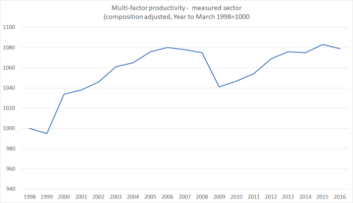
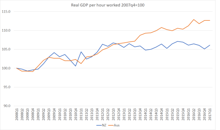
Not only have we had no labour productivity growth for five years, but our near-neighbour Australia –  which the government was once willing to talk about catching up to – has gone on generating continuing labour productivity gains.    Yes, there has been a productivity growth slowdown in much of the advanced world, dating back to around 2005.    But our additional and more recent slowdown –  well, dead stop really – looks like something different, and probably directly attributable to New Zealand specific factors.   Things New Zealand governments have responsibility for responding to.

I’ve also shown this chart before –  labour productivity for the better-measured parts of the economy, with SNZ’s attempt to adjust for changing labour quality. It is annual data, and only available with a bit of lag.

market sector LP

Again, no labour productivity growth at all in the last few years.

And what about multi-factor productivity growth?  It doesn’t get as much attention, partly because the data are only annual, and the construction of these estimates involves quite a few assumptions.   Nonetheless, here is the SNZ estimate for the (better) measured bulk of the economy.

mfp to 2016

The series is cyclical –  if machines are idle in a recesson estimated MFP falls and then recovers as utilisation picks up –  but looking through the recession, the estimated index level of MFP is the same now as it was 10 years previously.  No growth.

But somehow the Prime Minister thinks “productivity in New Zealand has been growing pretty well”.    One for the Tui billboards I’d have thought.

And all that is without even getting into the lamentable failure of governments led by both main parties to do anything about reversing the precipitous decline in levels of productivity in New Zealand relative to those in other advanced economies.    Lifts in the terms of trade –  experienced under both this government and its predecessor –  are of course welcome, but they can’t be a credible medium-term substitute for productivity growth.

From the other side, the Leader of the Opposition’s suggestion that data on real wage growth didn’t matter, and what really mattered was how people felt, seemed almost equally risible.  In terms of attracting votes, perhaps she is right.   But when the Prime Minister pointed out that real wages have been rising, he was of course correct.  I’m not sure why people put so much weight on the QES measure of hourly wage inflation.  It has well-known problems (for these purposes) and is hugely volatile.   Here is a chart showing wage inflation for the private sector according to (a) the QES, and (b) the Labour Cost Index, analytical unadjusted series.

wages debate  
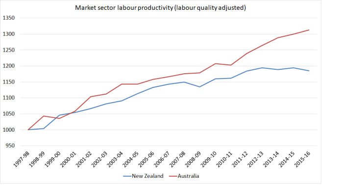
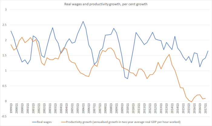
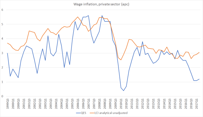
No economic analyst thinks wage inflation is anything like as volatile as the blue line –  in fact, wage stickiness, and persistence in wage-setting patterns is one of the features of modern market economies.

And here is the chart I ran last week, comparing real private sector wage inflation (the orange line above, adjusted for the sectoral core measure of CPI inflation) with productivity growth.

Real wage inflation now is lower than it was in the pre-2008 boom years, but it is running well ahead of productivity growth (however one lags or transforms it).    From here, lifting productivity growth is the only way real wage inflation is going to increase, and such increases in economywide productivity really should be recognised for what they are –  a well overdue imperative.

Sadly, the Prime Minister seems to want to bluff his way through, simply pretending there isn’t an issue, with no real answers as to how to  (for example) lift the outward-orientation (exports and imports) of the New Zealand economy, and refusing to face the fact that productivity growth has vanished since the latest new large net migration inflow began in 2013.  It won’t be the only reason why productivity growth has been vanished, but it is unlikely that there is no connection at all (and certainly the much-vaunted official and political claims that high non-citizen immigration flows are helping lift productivity look emptier than ever).

And the Opposition leader is no better.    When Ardern was asked last night who was going to build the houses if immigration was cut back, my 14 year old son turned to me and asked “why doesn’t she just say that if there are fewer migrants fewer houses would need to be built”.   Sadly, I could only point out that Labour’s approach to immigration actually isn’t materially different to the National Party’s.  The net inflow might be a lower in the first year, but in the essentials they are two sides of the same coin.  Here is what I wrote when Labour released their policy in June.

Overall, some interesting steps, some of which are genuinely in the right direction.  But, like the government, Labour is still in the thrall of the “big New Zealand” mentality, and its immigration policy –  like the government’s – remain this generation’s version of Think Big.  And it is just as damaging.    The policy doesn’t face up to the symptoms of our longer-term economic underperformance –  the feeble productivity growth, the persistently high real interest and exchange rates, the failure to see market-led exports growing as a share of GDP, and the constraints of extreme distance.  None of those suggest it makes any sense to keep running one here of the large non-citizen immigration programmes anywhere in the world, pulling in lots of new people year after year, even as decade after decade we drift slowly further behind other advanced countries, and se the opportunities for our own very able people deteriorate.

And what is Labour’s solution to the economic challenges?   There is lots of talk about more skills training, even though the OECD surveys suggest that our people are already among the most skilled in any OECD country.       Beyond that, Jacinda Ardern was invoking the OECD –  “they’ve told us what we need to do” to lift productivity and economic performance.

Well, this table is from the latest OECD Economic Survey of New Zealand, released a few months ago.  On the left hand side are the “main findings” and on the right the “key recommendations”

OECD recs

I don’t wildly disagree with most of those recommendations –  sceptical as I am of R&D subsidies.     But (a) with the exception of R&D subsidies, does this look at all like Labour Party economic policy  (has there been talk of the tax working group possibly proposing lower capital taxes?), and (b) more importantly, does anyone really think that these items, even taken together, are remotely enough to materially reverse the decades long decline in our relative productivity performance, that the OECD themselves highlighted?

Sadly, there was all too much of “let’s pretend” to the debate, and nothing to suggest that either side is really serious about engaging with, and delivering solutions to, the decades of underperformance, presenting now in five years of no productivity growth at all, and an economy increasingly skewed inwards rather than outwards.


On Graeme Wheeler’s farewell speech

Checking back over my notes from the last Monetary Policy Statement press conference, I see that Graeme Wheeler told the assembled journalists that he would shortly be doing a speech that would answer many of their questions.   He was, for example, asked whether he thought his critics had been fair and whether he had ever allowed his judgement to be clouded by those criticisms. Perhaps unsurprisingly, there was nothing on any of those sorts of points  –  or any of the others he suggested he would cover –  in the speech he delivered yesterday to the Northern Club, safe from any further journalistic scrutiny.

In his term as Governor, Graeme Wheeler has given about 20 on-the-record speeches.  The first one was to a private Auckland club, and so was the last one.    And all the ones in between were given either to bureuacratic/academic audiences, or to business and finance ones.   It will have been very much the same for the off-the-record addresses the Governor gives to commercial bank business clients the morning after each MPS.    And unlike the practice of his RBA peers (who mostly put Q&A sessions up on the website), people not at these functions –  generally accessible only to invited guests –  don’t have access to his responses to questions.   When his preferred audiences skew strongly towards one set of economic interests –  so the questions and comments reflect their perspectives – that should leave us rather uncomfortable.  Perhaps union groups or community groups, for example, wouldn’t have had any interest in the Governor speaking?   But across the whole country, across five years, that seems unlikely.    It should be something for the new Governor –  whoever he or she is –  to reflect on.

But this post is mainly about some of the points of substance of yesterday’s speech.

When, three weeks out from a general election, a press release turns up extolling New Zealand’s economic performance, one might have supposed it was a party political message on behalf of the incumbent government, or at least from one of their lobby group supporters.  But this was from the outgoing –  supposedly apolitical – central bank Governor.

His press release was headed “Reserve Bank policy a key driver in economic performance” and the opening sentence read

The Reserve Bank’s monetary policy has been an important driver in the last five years behind above-trend growth in the economy and employment,

Which is quite a curious claim –  even without digging into the data –  because generally the Reserve Bank shouldn’t be having that much influence on the performance of the economy.  And the Bank’s main job is to keep inflation near target –  and on that count it has repeatedly undershot throughout Wheeler’s term.   Prima facie, that might suggest that, on average, monetary policy hasn’t done enough.

Wheeler’s claim seems to rest on the proposition that “during this time [the last five years] monetary policy has been stimulatory, with the Official Cash Rate averaging 2-3 percentage points below the neutral interest rate”.    Since the OCR has averaged 2.55 per cent over his term, he seems now to be saying that the neutral OCR was between 4.5 and 5.5 per cent on average over the course of his term.   I doubt there would now be many takers for that view, and if anything views on what a neutral interest rate might be have been being revised downwards.  They have further to go.

But, let’s suppose that Wheeler is right on that count.  If so, surely we should have expected a supercharged performance of the New Zealand economy.   After all:

  • although it is never mentioned in the speech, the terms of trade have been 10 per cent higher on average than they were during the Bollard decade,
  • we’ve had a huge boost to demand from the repair and rebuild process in Canterbury (the initial disruptions and losses of output were all in his predecessors’ term),
  • we’ve had another big population surge, and
  • there have been no serious recessions or financial crises abroad.

Throw in highly stimulatory monetary policy, and we should surely have seen something pretty impressive.  At very least we might have expected inflation to be at, or perhaps a bit above, target.

I don’t like to hold central banks to account for medium-term real economic outcomes.  Central banks just don’t have that much power.   So I don’t blame Graeme Wheeler or the Bank for, say, five years of zero productivity growth, while I do hold him responsible (solely responsible) for five years of undershooting (core) inflation.

But it is the Governor in his speech, only three weeks out from an election, who is actively trying to suggest not only that the New Zealand economy has done well in the last five years, but that he and the Bank deserve credit for that.    Neither is true.

He includes a table which I’ve reproduced part of here, showing annual average growth rates

wheeler table

Inflation targeting began in New Zealand formally in early 1990.  So Wheeler’s story is that while the world economy has done a little worse during his term that it was doing in the previous 20 years, the New Zealand economy has actually grown faster than it managed in the previous 20 or so years.   Put that way, New Zealand’s performance looks good, and Wheeler appears to want to claim a considerable portion of the credit.

But this is the same nonsense that we get from the government, boasting about headline GDP numbers, and keeping very quiet indeed about the per capita performance.    Over the Wheeler term  –  not directly influenced by him at all –  New Zealand’s population is estimated to have increased by 8.5 per cent.     Advanced countries in total have had a population increase of less than 2 per cent.   Not surprising, headline GDP numbers here look moderately respectable.

But how does per capita growth in real GDP compare?  In this chart, I’ve shown the average annual growth rate in real per capita GDP for, on the one hand, the 22 years from when inflation targeting began to the end of Alan Bollard’s term as Governor, and on the other for the Wheeler term.   Remember that in the first period there were three recessions, two quite severe ones, and in the more recent period there have been none.

real GDP  pc wheeler.png

The only other gubernatorial term in which there wasn’t a recession was Alan Bollard’s first term (to September 2007).  Over that five year period real per capita GDP growth averaged 2.3 per cent per annum.

What about productivity?  Wheeler does acknowledge that “labour productivity has been disappointing”, suggesting that this is a problem most other advanced countries have but consigning to a footnote the recognition that New Zealand has had no labour productivity growth at all in recent years (unlike, say, Australia or the United States).

Here is how New Zealand’s labour productivty growth has been over (a) the whole pre-Wheeler inflation targeting period, (b) the last gubernatorial term without a recession (which also featured a housing boom and material lift in the terms of trade) and (c) the Wheeler term.

real GDP phw wheeler

To repeat, productivity is not something the Governor has much influence on, but…..it was him that was claiming credit for the “strong” performance of the New Zealand economy.

How about the labour market?     The Governor highlights that employment growth has been faster in his term than in the earlier inflation targeting period, but doesn’t mention that working age population growth has also been much faster during that period.   Actually, the rate of job creation relative to population growth hasn’t been at all bad in recent years – surprise increases in population create big increases in labour demand  –  but it is worth remembering that the quarter Wheeler took office saw unemployment at 6.7 per cent, the highest rate in the previous 13 years.  So we’d have hoped to see employment rising strongly and unemployment falling.  As it is, the unemployment rate averaged 4.8 per cent in the Bollard decade (boom and bust) and has averaged 5.4 per cent in the Wheeler term –  and all this as reasonable estimates suggest that the non-inflationary unemployment rate (the NAIRU) has probably been falling.

Even on the labour side of things, here is hours worked per person of working age.

hours worked per wap

Yes, the series has been recovering during the Wheeler term, from recessionary troughs, but is still not to the average levels prevailing for the four or five years prior to the recession.      Perhaps those levels might have amounted to “over-full” employment, but the unemployment numbers don’t suggest we are at that sort of point now.

I’m really not quite sure what Graeme Wheeler thought he was doing in making these claims. I don’t really suppose that he intended to be party political –  although the timing is such that he should have been more circumspect  – and actually in a way his claims, if valid, would actually suggest some serious problems in the economy –  if we could only manage such feeble outcomes even with highly stimulatory monetary policy.   But I guess it was mostly an attempt at distraction, to keep the focus away from what might otherwise have been.

Wheeler couldn’t do anything about (a) the aftermath of Canterbury earthquakes or (b) the migration influx (in any case only a touch larger than his predecessor had had to deal with), both of which have skewed the economy away from the non-tradables sector, probably helping to explain the distinctively poor New Zealand productivity performance.  He can’t do much about the neutral interest rate –  whatever it really is –  or about the troubling medium-term level of the real exchange rate.   But he could have done quite a lot about inflation.  Had he taken the steps that would have had core inflation averaging around 2 per cent –  instead of 1.4 per cent –  we’d have had a lower unemployment rate sooner, faster growth in per capita GDP (not indefinitely, but over this period), and stronger growth in employment and working hours.    He’d have delivered on his primary statutory mandate, and most New Zealanders would have been better off.

Humans make mistakes, and institutional structures that put lots of power in the hands of one person are particularly prone to mistakes.    The Reserve Bank of New Zealand is a good example of that, over the terms of successive Governors.   There are some things to be said for Wheeler’s stewardship –  as I’ve noted previously, core inflation has been quite remarkably stable during his term –  but he seems determined to never acknowledge a mistake, even with the benefit of several years hindsight. Individuals and institutions that don’t even recognise mistakes struggle to learn from them.   The Governor can repeat as often as he likes that local market economists and the relevant desk officer at the IMF thought the Reserve Bank was doing the right thing in 2014 (while ignoring the alternative minority voices).  The fact remains that they weren’t doing the right thing, when judged against their own mandate.  They remain the only advanced country central bank to have had two tightening phases since the last recession, and to have had to unwind them both.    Some acknowledgement of, and regret for, those mistakes might have been a gracious way for the Governor to have left office.  But I guess it is hard for leopards to change their spots.

I don’t want to spend any material time on the Governor’s treatment of housing market issues.  There is still no sign that they really understand the issues that have driven house prices to such unaffordable levels.  And I’m not going to bore you by running through the issues around LVRs again except to note that (a) there is no attempt to evaluate the Bank’s interventions against the only criteria the matter, the statutory responsibility to promote both the soundness and the efficiency of the financial system, and (b) my jaw almost dropped when I found no reference to any adverse effects on anyone of the LVR restrictions, except the rather self-pitying observation that “we were conscious that the introduction of LVR restrictions would make life difficult for the Bank”.   Not nearly as difficult as it makes things for willing lenders and willing borrowers to put in place credit facilities……

The final point I wanted to touch on was the Governor’s disconcerting complacency about the next recession.     The Govenor notes

If growth in the global economy slows because of debt-related or other issues, our economy will be affected. However, there is scope to help buffer against such shocks. We have greater room for monetary policy manoeuvre than central banks in many advanced economies.  Our Official Cash Rate is 1.75 percent – above the zero and negative policy rates of several advanced country central banks – and the Bank has not grossed up its balance sheet by buying domestic assets.  Similarly, with budget surpluses and low net Government debt relative to GDP, the Government has flexibility on the fiscal policy side.

Frankly, the issue that should be concerning the Bank isn’t some modest “slowing” in the global economy, it is the next serious global recession, the seriousness of which is likely to be accentuated by the fact that monetary authorities in most of the advanced world have very little scope to cut interest rates much.  And there is about as little scope in most of those countries to do much with fiscal policy.    In a typical US recession, for example, policy rates have been cut by around 7 percentage points.  At present, the Fed funds target is around 1 per cent.

In a typical New Zealand recession, the OCR (or equivalent) has fallen by perhaps 5 to 6 percentage points (our exchange rate tends to fall too, unlike in the US).  But our OCR is now 1.75 per cent, and inflation is well below target (the Bank thinks things are heading back to target, but their own official stance at present is neutral).    And while it is fine to note that our fiscal accounts aren’t in bad shape, in any serious recession they will look a great worse quite quickly (in flow terms).  There is some technical room for additional discretionary fiscal stimulus in a downturn, but the practical political room for additional discretionary stimulus has never been that large anywhere –  see, for example, the battles in the US in early 2009 around the stimulus package.

So while it is better to be in our position than that of some other countries, our position isn’t very good either –  and our Reserve Bank is responsible for our position, not that of other countries.   Going into the 2008/09 recession the Bank could say with confidence that we would cut as far as was needed –  and starting from 8.25 per cent, no one doubted our capacity.  Going into the next serious recession, if starting from around the current level of the OCR, no one will believe the Bank can do, or the government will do, that much.

Throughout his term, Graeme Wheeler appears to have done precisely nothing to position the Bank to cope with the next serious downturn  – despite all the advance warning, and experiences of other countries running out of conventional capacity.  The issue has never appeared in his Statement of Intent, or in past speeches.   He hasn’t got inflation back up to target, which would have led to nominal interest rates stabilising at a higher level than they are now.  He hasn’t done anything about addressing the institutional issues that make the near-zero interest rate bound a practical problem.  And, despite all that, he objects to any suggestion of raising the inflation target

It is not clear that central banks could readily increase inflation to these levels and attempting to do so would further stimulate asset markets, at least in the short run.  Raising an inflation target when productivity growth is weak makes little economic sense.

Perhaps it is too late in some countries –  although the largest of them, the US, has been raising interest rates, suggesting that a lower track of rates would produce somewhat higher inflation –  but it clearly isn’t here.  And as for the productivity argument, he has that quite back to front.  In a climate of weak productivity growth, and weakening global population growth, the case for a higher inflation target is stronger than otherwise –  precisely because there is more chance than otherwise that the near-zero bound would prove binding.

I guess the Governor has got to the end of his term and these particular risks haven’t crystallised.  Now it will be someone else’s problem, and I don’t suppose the Governor will have to worry about being one of those caught unemployed for a prolonged period in the next recession.   Forecasting is hard, and anyone can make mistakes. But failing to actively address this sort of foreseeable risk –  timing unknown of course –  is close to derelicition of duty in someone entrusted personally with all the powers of Governor of the Reserve Bank.    Getting on with some serious work in this area should be a priority for the new Governor, and for the Treasury/Minister of Finance.

(And I suspect that the key clue to Wheeler is the “asset markets” reference in that last quote.  There and throughout the speech his concerns about asset markets are pervasive.  And yet there is little sign of analysis that offers insights into those markets, and no sign of any Reserve Bank statutory responsiblity for such markets.)

Finally, it was interesting that in his reflections the Governor chose not to touch on the governance issues.  We know that he has favoured change (making he and the deputies he appointed collectively responsible under law).  And we know that the Opposition parties favour change.  And we know that Steven Joyce is sitting on (and refusing to release) a report to The Treasury commissioned from former State Services Commissioner, Iain Rennie on possible governance reforms.  It would, nonetheless, have been interesting and timely to have heard the Governor’s reflection on the issue, in light of his five years’ experience.

I keep wondering why the Rennie report is being kept secret –  months after it was completed.  One possibility is that Rennie is recommending reasonably substantial changes, going further than the Minister of Finance might have envisaged when he asked for the work to be done.  Whether that is so or not, there doesn’t seem to be any legitimate (OIA) reasons for the report (from a consultant to a ministry) to be kept secret.

And reform is overdue –  we shouldn’t be running a system where when the outgoing Governor opines on what will happen to LVR limits everyone knows that a month from now his views will mean nothing and there will be a different single decisionmaker in place.  Well-governed institutions are typically built around greater continuity and resilience to the preferences of single individuals.


Labour share of income

The other day I ran this chart showing how the labour share of income (“compensation of employees” in national-accounts-speak) had changed in New Zealand over recent decades.    COE

It isn’t data I usually pay any attention to, and I was somewhat surprised by the trend increase since around 2002.

And then I was reading a Financial Times article about last weekend’s Jackson Hole retreat for central bankers (perhaps including Graeme Wheeler) and assorted other eminent people.   The journalist mentioned that one prominent Asian central banker had warned that a declining labour share of income around the world could make problems for central bankers (the idea being that workers  –  especially low income ones – tend to spend most of their income, and demand shortfalls are a potentially serious issue, especially when the next recession happens).    And that left me wondering just how unusual New Zealand’s experience –  a rising labour share –  had been.

So I downloaded the OECD data back to 1970.    They have data for 25 advanced countries for the entire period (the exceptions are mostly the former eastern bloc countries).  Here is the share of GDP accounted for by compensation of employees for the median of those countries.

COE OECD

Slightly higher at the end of the period than at the start, and not very much change overall for the last thirty years.

And here is how the labour share has changed in the individual countries since 1970.

lab share since 1970

The median change is basically zero, but what is striking is how diverse the experiences of these advanced countries have been.  There are easy explanations for some of them –  Ireland’s change, for example, will reflect the company tax structure, which has encouraged (a) a lot of foreign investment, but (b) a lot of effort by multinationals to book profits in Ireland.  For Ireland, the labour share of GNI would be more enlightenning.  But for most of these countries the GNI/GDP gap is small, and yet there are still huge differences in the experience.

New Zealand –  like all the Anglo countries –  is towards the left of that chart.  But what about the experience since 2001, when the labour share of income troughed in New Zealand?  For that period, there is data for almost all OECD countries, not just the 25 in the earlier charts.

lab share since 2001

Over this period, not only is New Zealand near the right of the chart, but our experience has been quite different from that of the other Anglo countries.

This just isn’t my field, and I’m not pushing any particular interpretation of these data.  I simply found them interesting, and a little surprising.  But if they data are broadly correct, they do suggest that whether over 45 years or over the last 15, the overall labour share of income in advanced countries hasn’t changed much.  Of course, in most countries, productivity growth has been a lot slower than it was in the glory days of the post WW2 decades, and thus real wage growth will have been slower.  But the overall labour share hasn’t changed much –  and the differences across countries are much larger than the differences across (this period of) time for the advanced world as a whole.

These data also don’t shed any light on the inequality narrative.   Labour as a whole may have held its share of overall income, and yet differences in pre-tax market labour incomes may have become more pronounced (eg increases in chief executive salaries in the US or UK relative to median wages, or the rise of an extremely highly-remunerated subset of financial markets employees).     But if there are trends there, they haven’t been mirrored in a shrinking share of the cake going to labour as a whole.  Indeed, in New Zealand the labour share of income has increased quite a bit in the last 15 years or so (concentrated in the boom years of the 2000s, but not reversed since then).

And finally, another curiosity I stumbled on.   There is quite a sense that New Zealand’s labour market functions reasonably well and  –  in conjunction with counter-cyclical macro policy – delivers us unemployment rates that have been relatively low by OECD standards.    And I think that is probably not a totally inaccurate story –  who’d trade our labour market for that of Spain or Italy?

But here is a comparison of unemployment rates of Mexico and New Zealand

mexico U

Over the 25 years for which there is data for both countries, in only one –  at the height of the Mexican financial crisis –  did Mexico have an unemployment rate even slightly higher than that of New Zealand.   And if people suspect (as I do) that our long-run sustainable unemployment rate is getting down to around 4 per cent now, experience suggests that in Mexico it has been that low for decades.

Why mention Mexico?  Mostly because, despite its advantages –  oil, proximity to the United States, coasts on two oceans –  Mexico is a  relatively poor and (absolutely) not very productive OECD country.  Data are a bit patchy, but best indications are that Mexico’s productivity performance over the last 50 years has been even worse than that of New Zealand.    And yet, whatever the reasons, they’ve managed a system with consistently less unemployment than New Zealand has had (and, actually, even their prime age male participation rate is higher than that in New Zealand –  as perhaps one might expect in a materially poorer country).

Wages and profits

There was a story buried deep in the Dominion-Post this morning that caught my eye.   The heading was “Profits up as wages stand still“,  and the article was prompted by the release yesterday by Statistics New Zealand of some summary results from the Annual Enterprise Survey.

In their media release yesterday, SNZ –  true to their apparent policy of accentuating the positive – was at pains to highlight the increase in profits over the 2015/16 year.   Overall, operating profits in the business sector had risen by 8.6 per cent –  rather faster than the increase in nominal GDP.

But it was this chart in the SNZ release that caught my eye

profits AES

Profits had certainly increased quite a bit  in 2015/16, but look at that top line.  Total profits in 2015/16 were no higher ($bn) than they had been in 2011/12, and yet over that period nominal GDP had increased by just over 17 per cent.  On this measure, profits as a share of GDP would have fallen quite a bit over those four years.

In the Dom-Post article,  the journalist had juxtaposed the increase in profits over the last year with the very weak increase in wages, at least according to the Quarterly Employment survey.  Lobby group representatives were quoted in a fairly predictable way.

Council of Trade Unions economist Bill Rosenberg said the statistics were more evidence that the share of income going to wages and salaries was falling.
“That indicates wages are not keeping up with what the economy’s income could actually afford.”
The share of income going to wages in New Zealand was low internationally, he said. “To see it fall further is very disturbing. It is an indication we are a low-wage economy.”

and

Kirk Hope, chief executive of BusinessNZ, said the increase in company profits meant jobs were more secure.
It was also positive for “the many thousands of New Zealanders”, including Kiwisaver investors, who now owned shares and who would be receiving increased dividends, he said.
“Wage growth is not the only responsibility companies must address.
“A proportion of company profits must be reinvested to safeguard the future existence of the company; without that investment there will be no ability to maintain or grow jobs.”
Business profits can jump around significantly from year to year, but even taking a longer-term view, Statistics NZ figures show they appear to be greatly outstripping pay rises.

And when the journalist did take a long-term perspective, he looked at profit increases since 2009, and compared them to wage increases since then, even though 2009 was the worst of the severe recession, and profits are typically much more cyclically variable than wages.

But, as I noted in a post the other day, if one uses the more-stable and better-constructed Labour Cost Index measures, it looks as though real wages in recent years have been materially outstripping the (non-existent) productivity growth.    Real wage inflation hasn’t been high in absolute terms, but it has been a lot faster than any gains in productivity.

real wages and productivity growth

In the wake of that post, I’d also gone back and dug out from the national accounts the data on the wages and salaries (“compensation of employees”) share of GDP.    The data go all the way back to 1972.

COE

Broadly speaking, the national accounts suggest that the labour share of GDP has been increasing for almost 15 years now (the latest data are the year to March 2016).    Even from the peak of the last boom (year to March 2008) to now, the labour share of GDP has increased a bit further.

And it isn’t because more people are working more hours.   Here is a chart of hours worked per capita.

hours per capita

Total hours worked per capita are still slightly below the previous cyclical peak.   To the extent that the labour share of GDP has been increasing, it looks to have been a result of relatively good (relative to productivity) increases in wages.

As for profits, they are (more or less) the inverse of the labour share of income: they’ve been falling over the last 15 years.

Overall economic performance remains dismal, redeemed only by the strength of the terms of trade.  But relative to that disappointing performance –  weak productivity growth, growth skewed to the non-tradables sector –  labour (as a whole) doesn’t seem to have been missing out.

Land prices on the developable fringe of Auckland

It is now pretty well-recognised that local authority zoning decisions can materially affect land values, creating an artificial scarcity in developable land and driving up the price of such land relative to the price land would otherwise command for alternative uses.    The best-known empirical study on this effect around Auckland (and the metropolitan urban limit in particular) was by Grimes and Aitken, summarised as follows:

We capture the impact of the MUL boundary on land prices by separately allowing for land which is: (i) well inside the MUL boundary,(ii) just within the boundary, (iii) sitting astride the boundary, (iv) sitting just outside the boundary, (v) sitting just a little further beyond the boundary, and (vi) sitting well beyond the boundary. We find a boundary land value ratio of between 7.9 and 13.2 (i.e. land just inside the MUL is worth around ten times more per hectare than land just outside it)

In a well-functioning liberal market, one might normally suppose that developable land on the periphery of an urban area would trade for around the value of that land in its best alternative use – typically agriculture.   If it went for much more than the agricultural use value, most farmers would be well-advised to sell, and they would do so until the prices in the alternative uses were more or less equalised.   The median sale price of dairy land is around $50000 per hectare.

Everyone knows that that is not remotely how things are in our highly distorted market.  But sometimes concrete examples bring home the point more starkly.

The other day a reader who knows something about property sent me a copy of a real estate agent’s newsletter on recent land sales in Dairy Flat, an –  as yet –  largely undeveloped area between Albany and Whangaparoa/Orewa, which is apparently classified as a “future urban zone”.    As my reader noted, the area does not yet have wastewater connections, so in his words “it is ages from development”.     Here were the sales in  July.

Total price ($) Parcel size (hectares)
1950000 1.557
1478000 1
2450000 2.493
2976000 3.189
1250000 0.303
1950000 0.9809

The average price of this land was $1.266m per hectare.

In our subsequent exchange, my reader noted that the value of this land for agricultural purposes might not be much more than $30000 per hectare.  He went on to point out that not that long ago 3800 hectares of forest land –  a little further inland than Dairy Flat, but similar terrain and a similar distance from central Auckland – had sold for $1700 per hectare.    In other words, the preferentially-zoned Dairy Flat land was selling as 750 times the price of the forest land.

Perhaps $1.266m per hectare doesn’t sound too bad.   But this is the unimproved value of the land –  none of any relevant earthworks have been done, no suburban streeets been formed, no development levies incorporated.  Even the holding costs for the few years until development actually occurs won’t be trivial (at, say, a low end estimate of a 10 per cent per annum cost of capital).  By the time tiny suburban sections are being sold to potential residents, they will have to be very expensive to cover the costs of someone now paying $1.266m per hectare.

And most of this “value” is simply added by politicians and bureaucrats drawing lines on a map.  It is obscene, and unnecessary.  It continues to skew the game against the young and those on relatively low incomes and/or limited access to credit, in favour of those who already have, or who can lobby councils to draw the lines in suitably limited places.

And, although I don’t have a time series of this sort of data, it doesn’t speak of any confidence among those actually buying and selling land right now that the next government –  of whatever political stripe – will make much difference in sorting out the shameful disgrace that is the New Zealand housing and urban land market.    I’ve long been sceptical, but these people are putting real money on such a call.  Perhaps they’ll be wrong and lose the lot.   But what reason is there to believe that is likely, when not one of our major political figures will even suggest that much lower house and land prices would be a desirable outcome towards which their party would be working?