Is there a plausible economic strategy?

In the new government, sworn in this morning, David Parker will take up the renamed role of Minister for Trade and Export Growth.

Early in their term of office, the outgoing government adopted a numerical target for lifting exports (as a share of GDP).  It was, no doubt, well-intentioned, but has provided the basis for quite a few posts here pointing out that no progress was actually being made towards that target, if anything trade shares of GDP were falling, and the pre-election advice from The Treasury was that, all else equal, the trade shares would continue to shrink.  The focus on exports, in turn, seemed to prompt a willingness to use actual or implicit subsidies –  be it in the film industry, export education, irrigation, convention centres, or firms like Rocket Lab –  or unpriced externalities (eg around water) rather than focusing on the fundamentals in a way that might have seen firms themselves increasing taking up new foreign trade oppportunities, responding to improvements in opportunities, markets and incomes.

I stress “foreign trade” rather than just “exports”.   We don’t want policy to be guided by some sort of mercantilist vision in which the purpose of economic life is to sell us much as we can to others, only to store up treasure at home.   Firms export because they can, and because doing so enables owners and employees to earn incomes, which enable them to consume (including from among the abundance the wider world has to offer).  Successful firms invest more heavily too, and many of the investment goods will typically be sourced from abroad.    Trade is good, and generally mutually beneficial.  Ideally, we would see quite a bit more of it: New Zealand firms successfully competing in wider world markets, enabling them and us to purchase more of stuff firms in other countries specialise in producing.    And if New Zealand is ever to catch up again with the rest of the OECD –  whether in productivity or incomes – the process of getting there is likely to involve a materially larger share of local production being exported but –  especially in the transition (which could last decades) –  a lot more investment.  Current account deficits aren’t even problematic when they rest on firm foundations of rising productivity and market-led business investment.  It was the story of 19th century New Zealand (or Australia or the United States).  It was the story of emerging Singapore and South Korea.

So I really hope that the new Minister of Trade and Export Growth (who is also the Minister for Economic Development) sees his role as being at least as much about putting in place the pre-conditions for sustained stronger import growth, as about export growth.  In successful economies, the two go hand in hand.

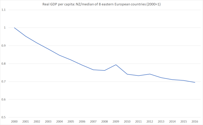
Here is how we’ve been doing over the 45 years for which we have official data.

trade shares

The last few years’ data are still open for revision, but there is no credible prospect that trade shares of GDP will have been rising.

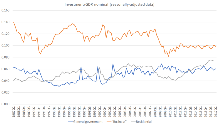
In interpreting the graph it is worth noting a few things.  The first is that the peaks in the 1985, 2001, and 2009 years simply relate to unexpectedly weak exchange rates.  Most of our imports and exports are priced in foreign currency terms, so when the exchange rate falls sharply there is an immediate translation effects –  both imports and exports rise in NZD terms, even if the volumes haven’t changed at all.   In each of those three cases –  the 1984 devaluation, the slump in the NZD (and AUD) at the end of the dot-com boom, and the sharp fall in the 2008/09 recession –  the exchange rate falls were pretty shortlived.

The second is to note that external trade as a share of GDP was trending up for some time.  The economic policies New Zealand adopted after 1938 had tended to reduce our external trade.  There was a focus on increasing local manufacturing to supply domestic markets in consumer goods (directly reducing imports), and the increased costs of that domestic protectionism undermined the competitiveness of our (actual and potential) export producers (thus, shrinking exports as a share of GDP).

But in the 1970s and early 1980s there were signs of progress, lifting both export and import shares of GDP, even though the terms of trade for New Zealand were pretty dreadful during that period.  There will have been a mix of factors at work: the real exchange rate was trending lower, import protection was being reduced and, less encouragingly, there was a substantial use of export subsidies, both for non-traditional exports and (latterly) support for farmers too.  One argument made at the time for that export support was to counter the adverse competitiveness effects of import protection.  Better, of course, to remove both sets of interventions.  And that is largely what happened over the following decade.    Trade shares of GDP didn’t fall back.

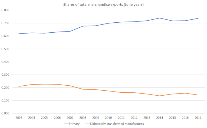
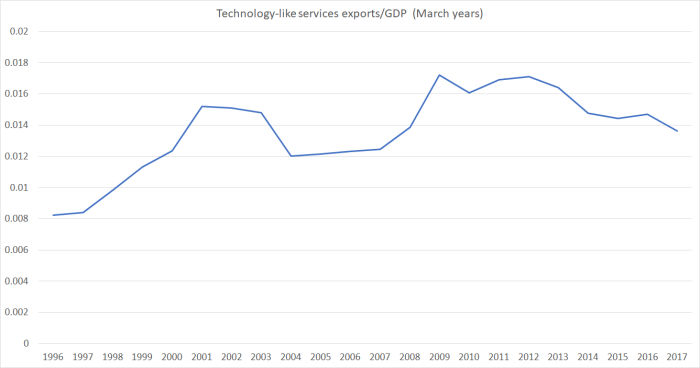
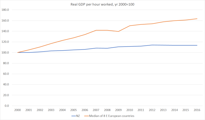
It is perhaps tempting to look at the chart and conclude that taking the last few decades together there is quite a lot of variability in the series, and overall nothing very much has changed since at least the early 1980s.  That’s largely true, but it is also largely the problem.  Successful economies have typically experienced quite material increases in their foreign trade shares (imports and exports) in recent decades.  New Zealand hasn’t.  New Zealand –  or foreign – firms simply haven’t found the profitable opportunities here to take advantage of.    Even services exports are now only around the same share of GDP that they first reached in 1995.   Amazingly (I hadn’t previously looked at this number), services imports as a share of GDP have been lower in the last year than at any time in the past thirty years.

services trade

Not exactly a picture of a successfully internationalising economy.

I don’t find these outcomes –  worrying as they should be, as symptoms of our economic failure –  that surprising.  It is very difficult for firms to compete successfully internationally from such a remote location, based on anything other than location-specific natural resources.  Not impossible, but very difficult.  And so it shouldn’t surprise us that there aren’t many of them.   For whatever reason, in the global economy personal connections on the one hand and integrated value/supply chains on the other have become increasingly important.  The last bus stop before Antarctica –  a long way even from the next to last bus stop – just isn’t a propitious place, no matter how skilled New Zealand workers might be, and how innovative and entrepreneurial New Zealand firms might be.

It is also difficult to successfully compete internationally from here when (a) real interest rates and, in turn, the real cost of capital, for New Zealand investors have averaged so much higher than those in the rest of the advanced world.  Those real interest rate gaps have shown no sign at all of closing  (and they have little or nothing to do with monetary policy).  People push back sometimes arguing that interest rates can’t make that much difference.   They do, through two channels.  First, the standard approach to identifying an appropriate discount rate for project evaluation starts from a risk-free interest rates.  Ours are, and consistently have been, well above those in other advanced countries (something like a 150 basis point margin is a reasonable approximation of the average difference).  And, second, high real interest rates here have been accompanied, causally, by a persistently high real exchange rate, out of line with our deteriorating relative productivity.   In combination, that mix makes investment here harder to justify, and particularly makes investment in the tradables sector harder to justify.  Combine that with the disadvantages of distance and it is no real surprise the foreign trade shares of GDP haven’t increased.  Successful economies have an abundance of new profitable opportunities in which their firms, or foreign firms investing there, take on the world.  It has happened to only a very limited extent here.

But what concerns me is that the new government appears, at this stage, to have no more of a strategy than the outgoing government did for turning around the dismal productivity performance, or the static (or shrinking) foreign trade shares.      There have been encouraging hints of a recognition of the issue: in her speech to the CTU yesterday, the incoming Prime Minister referred both to a need to “boost our productivity”  and to the need to gear the economy more towards “value-added exports”.     But it isn’t clear that they have any real idea of how to get from here to there.   There was nothing any more encouraging in James Shaw’s speech to the same audience.   Or looking through the areas prioritised in the agreements Labour has signed with New Zealand First and the Greens.   If anything, the risk looks to be that the tradables sector will shrink further.

  • The new government plans to adopt measures that will reduce the size of the export education sector.  To the extent that involves a removal of implicit subsidies I think (as I noted yesterday) that is a step in the right direction.
  • The new government plans to phase out government subsidies for irrigation schemes.  From what I’ve seen, that is welcome too.
  • The new government is clearly heading in the direction of reducing exploration for oil and gas in New Zealand and its territorial waters.
  • The new government is clearly intending to take a more aggressive stance around emissions reductions, including moving towards the inclusion of agriculture in the ETS.
  • The new government seems likely to move more aggressively on increasing water quality standards faster,
  • And the new government is planning to increase minimum wages –  already high, by international standards, relative to median wages –  quite considerably over the next few years.
  • The new government is planning (or hoping for) a major acceleration in housebuilding activity.

You might agree or disagree with some or all of those measures individually. But every single one will put the tradables sector under more pressure, to some extent or other.

Take minimum wages for instance.  I recommend you read Eric Crampton’s piece (which I largely agree with).   Here is the Prime Minister’s take.

I know most businesses want a fair set of employment policies.  They know that we need decent wages if they are going to have customers for their products. They know that we need to boost our productivity, and low wages are a barrier to that because they discourage investment in training and capital. They know that we need a government that invests in skills and education.

I simply don’t buy into baseless claims that paying people well means there will be fewer jobs. In fact, the overwhelming weight of evidence is that strong wages for all working people help to boost growth and create jobs.

Wishful thinking at best.  We all, I imagine, want a country in which strong economic performance and strong wage growth goes hand in hand, but there is little or no credible evidence that, at an economywide level, one can get that sort of lift in performance by, say, mandating higher minimum wages.  It is putting the cart before the horse.  And if it worked anywhere, surely New Zealand should be the prime example, given that we already have high minimum wages relative to median wages (a policy maintained and extended by the previous National government).

And here is Shaw

And our whole intent will be to flip climate policy from being seen as a threat and a cost, to being seen as an opportunity and an investment in the future.

And, as I say, that means we’ll be creating tens-of-thousands of new jobs, paying decent wages, for workers and families all over New Zealand.

Not just high-tech city jobs, but out in the regions as well.

Here’s one example: trees.

We are going to plant hundreds of millions of trees to soak up New Zealand’s greenhouse gas emissions.

These trees, we’re going to plant them in the cities. We’re going to plant them in the towns. We’re going to plant them in in the National Parks. We’re going to plant them in the regions.

That’s going to be tens of thousands of jobs. That means lower unemployment. Lower poverty. Lower crime. Cleaner rivers. More native species.

It would be worth doing even if we weren’t saving the world.

One pictures the seas parting and New Zealanders walking together across the Red Sea to the promised land.

Whatever the merits of mass tree-planting –  which until now firms have not regarded as economic –  it doesn’t exactly seem like a high productivity industry.    And in the short-term (trees take decades to come to maturity) resources that are used planting trees can’t be used for anything else.

Lower unemployment is a worthwhile goal, and I really liked the new PM’s line

we have unemployment stuck stubbornly at 5% when it should be below 4%

but (a) deviations of unemployment from long-term sustainable levels are mostly a matter of monetary policy (so find the right Governor/commitee, and specify the mandate well) and (b) however many trees you plant, higher minimum wages will almost certainly come at some cost –  perhaps not that large –  in higher long-term sustainable unemployment rates.    And for all the complacency there has been in New Zealand about our unemployment rate, when I checked there were already 12 OECD countries with unemployment rates lower than New Zealand.  We simply should be doing better.

Of course, the usual economist’s response when (eg) proposing stripping away subsidies is “the market will provide”.  For example, a lower real exchange rate will allow some firms to expand, and other firms not yet visible to economists to emerge.  But how likely is it that that provides the answer this time?

Of course, the exchange rate has fallen perhaps 3 per cent in the last few weeks since the election (against the AUD, the best guide to idiosnycratic New Zealand effects).  It isn’t a large move, and may not be sustained.  And even at these levels isn’t outside the range it has fluctuated within over recent years.     Between a somewhat more expansionary fiscal policy (than the previous government was running), the aspiration to a big increase in housebuilding, and a continuation of the high target rate of immigration, it is difficult to see why we should expect any near-term material narrowing in the margin between New Zealand interest rates and those in the rest of the world.

Thirty years ago, Grant Spencer –  then Reserve Bank chief economist, now “acting Governor” –  published a book chapter in which he described pre-1984 New Zealand economic management this way

“In particular, the maintenance of high levels of aggregate demand supported a buoyant non-tradables goods sector while exporters faced more depressed market prospects”

When I re-read that chapter last week, it was hauntingly reminiscent of the last few years.  But it isn’t clear why the next few will be any better, unless there is sort of near-term cyclical downturn Winston Peters was warning about last week.  As I’ve highlighted previously, in real per capita terms, the tradable sector of our economy is now no larger than it was 2000 – two whole governments ago.  The risk, at present, is of further shrinkage.

So I do hope that the new Minister of Finance and Minister of Economic Development (and Trade and Export Growth) are turning their minds pretty quickly to how they might achieve the sort of reorientation in the economy that is generally recognised as needed, and which they – and the Prime Minister –  have themselves highlighted as a matter of concern.  (And, hint, regional development funds aren’t likely to be the answer either.   And over the last 15 years, “the regions” have been doing better than “the cities”)


(On matters of the new government, I was interested to see Andrew Little, new Minister of Justice, observe – on Twitter and Facebook – yesterday that “As Minister of Justice-designate I want to state from that outset that “pretty legal” is no longer the standard this country operates to!”.     Admirable sentiments, and I have no idea what specifics he had in mind [oh –  Steven Joyce no doubt], but might I suggest that he and the Minister of Finance review how we came to have a pretty clearly unlawful appointment of a Reserve Bank “acting Governor” by the outgoing Minister of Finance. )

The tech sector…and ongoing economic underperformance

The 13th annual TIN (“Technology Investment Network”) report was released a couple of days ago.  I’ve largely managed to ignore the previous twelve –  breathless hype and all –  but for some reason I got interested yesterday, and started digging around in the material that was accessible to the public (despite lots of taxpayer subsidies the full report is expensive) and then in some of the New Zealand economic data.   Perhaps it was the seeming disconnect between the rhetoric from the sector, and its public sector backers, and the reality of an economy that has had no productivity growth at all for five years, and where exports as a share of GDP have been falling (and are projected by The Treasury to keep on falling).

The centrepiece of the report is an analysis of “New Zealand’s top 200 technology companies” (by revenue) where, as far I can tell, “New Zealand’s” here means something about the base of the company being in New Zealand, whether it is owned here or not.  I’m not quite sure either what the definition of a “technology” company is, and it is worth remembering that almost every type of economic activity uses technology in ways that were inconceivable even 50 years ago.  Often new technologies are developed and adopted inside companies that wouldn’t think of themselves primarily as “technology companies”.   No one doubts the important pervasive role that technology plays, in New Zealand and in any moderately-advanced economy.   But the TIN Report appears to focus on a pretty broadly-defined group of companies in biotech, ICT, and (more than half) in “high-tech manufacturing”.

Here are the top 10 companies from the list

Date founded Total revenue ($m)
Datacom 1965 1157
Fisher & Paykel Appliances 1934 1146
Fisher & Paykel Healthcare 1934 894
Xero 2006 295
Gallagher Group ca. 1938 232
Orion Health 1993 199
Douglas Pharmceuticals 1967 190
Tait Communications 1969 175
NDA Group 1894 175
Temperzone 1956 175

Perhaps most immediately striking was the gap between the first three companies on the list and the rest of them.   But I also realised that I’d visited quite a few of these companies (the Reserve Bank’s business visits programme), in some cases a long time ago.  Tait was one of the good news stories we used to tell in the 1980s –  economic times were tough, and we had a selection of (sometimes rather desperate) anecdotes of economic transformation.  So I dug out –  as best I could –  the dates each of these firms was founded.    Of the top 10, as many (one each) had been founded in the 19th century as in the 21st century, and only one more had been founded in the last three decades of the 20th century, even as the New Zealand economy was being liberalised.      It isn’t exactly the image one has of really top-tier technology companies.  Sure IBM and Hewlett-Packard have been round for a while now, but Google, Facebook, and Amazon all date from the last 25 years  –  and they’ve managed to dominate world markets, not just been big in New Zealand.

Actually, a somewhat similar point even found its way into the TIN press release

Companies with over $20 million revenue grew at twice the rate of companies below NZ$20 million.  The 90 companies with revenues NZ$20 million and over grew at 8.4%, compared to just 3.8% revenue growth for the 110 companies with under $20 million in revenue.

Nominal GDP in New Zealand grew by 5.9 per cent in the year to June, and yet the second tier of New Zealand based technology companies could only manage sales growth of 3.8 per cent in the last year (and even that number is subject to a form of survivor bias –  some firms that did worse will have dropped out of the list).  I was, frankly, astonished at quite how weak the revenue growth seemed to have been.

The headline TIN were keen to highlight was that the annual worldwide sales of the TIN 200 companies had now passed $10 billion (just a bit more than Foodstuffs supermarkets).   $10 billion isn’t a trivial sum of course, but New Zealand GDP last year was $268 billion dollars (and gross sales are higher than GDP) –  so worldwide sales of these 200 companies were just under 4 per cent of New Zealand’s GDP.    They were also keen to highlight 43000 people employed around the world.  Again, not a small number but just over 2.5 million people are employed in New Zealand at present.    In many of these companies, overseas employment –  an important part of making the businesses successful –  is quite a large share of the total.  For many of the companies, data aren’t easily accessible, but from Fisher and Paykel Healthcare’s latest annual report I learned that of its 4100 employees, 1800 are overseas.

Writing of the $10 billion revenue number, the TIN Managing Director noted

It is not just a number but a marker that indicates that our technology exporters are well and truly entrenched as a critical part of New Zealand’s economic growth

Perhaps he isn’t aware that there has been no productivity growth for five years?

But what of “exports”?  We are told that these 200 firms have “more than NZ$7.3 billion sourced through exports”.   They carefully describe that in their headline as “the equivalent of 10 per cent of all New Zealand’s exports”, but some media rather loosely translated this into a story that these tech companies now account of 10 per cent of New Zealand’s exports.

Without access to the full report, it is difficult to know quite how they calculate the number.  But almost certainly, a lot of that $7.3 billion –  perhaps total overseas sales –  will in fact be counted as other countries’ exports.  Chinese-owned Fisher & Paykel Appliances, for examples, manufactures in Thailand, Mexico, China and Italy.    Fisher and Paykel Healthcare manufactures in Mexico, and presumably most of that production goes to the United States.   And if, say, Datacom has big operations in Australia, much of the value-added from that operation will accrue to Australian employees.

I don’t have a problem with any of that.  It is how successful international businesses work.  In most cases, the relevant intellectual property is probably being generated in New Zealand, and the value of that should be captured by those doing the work, and the owners of the relevant businesses (in many, perhaps most, cases, New Zealanders).

But how does all this fit with the overall economic performance story.  One of the public sector funders of the TIN report was quoted in a Newsroom story yesterday

Victoria Crone, chief executive of one of the sponsors of the report, Callaghan Innovation, said technology was a key for growth in New Zealand’s economy. “Every dollar invested in the tech sector creates three dollars of growth in the New Zealand economy. Doubling or tripling the contribution of dairy or tourism by simply expanding these sectors is simply not practical given their respective demands on land, water and infrastructure.

“By contrast all the tech sector needs to expand is more brains, more ideas and more capital to bring them to market.”

Which might all sounds fine, but how have those tech sectors actually been doing?  Getting too deeply into the line items of our export data isn’t really my thing but (for example) SNZ publish a summary breakdown of merchandise exports, with a category of “elaborately-transformed manufactures” (not all of which would typically be thought of as anything like “technology exports”).    Here is how elaborately-transformed manufactures on the one hand, and primary products on the other, have done as shares of total merchandise exports, going back to 2003  (just before the first TIN Report was published).

share of merch exports

And over that period, total merchandise exports have fallen from 21.4 per cent of GDP to 18.6 per cent of GDP.

What about services exports –  the weightless economy and all that?

Again, it is a challenge to break out the things that most people will think of as “technology exports”, so I’ve erred on the side of including more items rather than less.   There is greater detail for the last few years, but to go back further the data are less disaggregated.    From the annual services exports data I summed four categories

Services; Exports; Charges for the use of intellectual property nei
Services; Exports; Telecommunications, computer, and information services
Services; Exports; Other business services
Services; Exports; Personal, cultural, and recreational services

The latter because the largest component of it appears to be film and TV exports (Weta workshops, Peter Jackson etc).

These components of services exports are, as one would perhaps hope, a larger share of total services exports than was the case 15 or 20 years ago.    Unfortunately –  and unusually for advanced economies –  services exports in total have not been growing as a share of GDP.    This chart shows these four components of services exports as a share of GDP.

tech services exports

It looks quite sensitive to the exchange rate (as one might expect), but whatever the reason the share in the most recent year is still around where it was in 2000 or 2001.  Even with, for example, those amped-up film subsidies.

Still on the trail of (overall) success stories, I thought I’d check out the investment income account of the balance of payments.  New Zealand shareholders will still be better off –  as I noted earlier –  even if there aren’t exports directly from New Zealand if their offshore operations are generating profits.  Whether those profits are remitted to New Zealand or reinvested in the business abroad, it is a gain for New Zealanders (and captured in the Gross National Income numbers, although not in GDP –  the latter is about production in New Zealand).   The published data in the investment income account isn’t broken down by economic sector, but there is data on different types of income.    I focused on two columns

Primary Income; Inv. income; NZ inv. abroad; Direct inv.; Income on equity etc; Dividends and distributed branch profits
Primary Income; Inv. income; NZ inv. abroad; Direct inv.; Income on equity etc; Reinvested earnings

Unfortunately, the data are patchy to say the least so I can’t show a time series chart.  And bear in mind that these profits are from direct overseas investment by New Zealand firms in all economic sectors.    But here are the total returns under these two headings for the five years to 2000 and for the last five years, both expressed as a percentage of GDP (over those five year periods).

profits on NZ inv abroad

Remember that these are profits from firms in all sectors, but if there are big transformative tech sector profits they must be pretty well hidden.

When, many years ago now, I read Brian Easton’s economic history of New Zealand since World War Two, one of the things I noted then was the evidence Easton had gathered for how the composition of New Zealand’s exports had changed rapidly in the past.

Back in the 1960s, in the Official Yearbook Statistics New Zealand reported a high-level table of the composition of our exports.  The traditional products were these

Meat
Dairy
Wool
Fruit and vegetables
Animal by-products

In 1962, these products made up 85 per cent of (estimated) total goods and services exports.  Just a decade later in 1972, those same products made up only 67 per cent of total goods and services exports.  Subsidies probably played a part –  counteracting the additional cost imposed by our own tariffs and import quotas.  Then again, film subsidies (or Rocket Lab subsidies) anyone?

In earlier decades, new technology  –  it was all technology that made it possible –  meant that dairy products went from being only for the domestic market to being our second largest exports in 30 years.

By contrast, the performance of today’s New Zealand based tech sector seems pretty distinctly underwhelming.  I’m sure there are plenty of good firms, and plenty of able people trying to build them –  New Zealand isn’t short of able people, or of a regulatory environment that makes it easy to start new businesses –  but in aggregate the results should really be seen as rather disappointing.  Vic Crone talks of how, in her view, “all the tech sector needs is more brains, more ideas, and more capital to bring them to market”.    New Zealand has never had a problem with any of those three.  It looks rather more as though the opportunities just aren’t here – in a location so remote –  to any great extent, and the challenges of remoteness are just compounded by a real exchange rate that has got persistently out of line with the deteriorating relative competitiveness of the New Zealand economy.

The taxpayer –  through Callaghan and NZTE – has been helping pay for this report, and the associated puff pieces made available to the public.  One can only hope that a new government (of whatever stripe) might start by asking some hard questions, of those agencies and of MBIE and Treasury, that look behind the hype.  I’m not optimistic –  all sides seem to have a stronger interest in believing the spin than in confronting the real and persistent underperformance.  Then again, the good thing about being a pessimist is that just occasionally one can be pleasantly surprised.


Poor returns to tertiary education

Tertiary education was quite a theme in the recent election campaign. In my household – with three kids likely to go to university in the next decade – promises to reduce the direct costs of tertiary education were tempting.  But resisting temptation remains a virtue.

A few days ago I noticed (thanks to Jim Rose) this chart

lifetime benefit of a degree

It isn’t a new result. These OECD data have shown for some time that the economic returns in New Zealand to getting a degree are pretty low relative to those in other advanced countries.   Such results even prompted Treasury to commission some external research on the gap in private returns.

In the chart – from a few years ago – whoever put it together has highlighted two groups of countries: the Nordic and Benelux countries on the one hand, where there are already lots of skilled people, and high income taxes, and former eastern-bloc countries which are now catching up to the rest of the advanced world, and where skills are in high demand, and able to command high returns. I’m, of course, more interested in the contrast between New Zealand and those central European countries.  As I’ve written recently, 25 years ago both we and they were looking to reverse decades of poor performance and catch-up with the other advanced countries. They’ve made progress in that direction. We haven’t.

Since the net benefits are shown in dollar terms (rather than, say, as a per cent of GDP per capita or of lifetime earnings), it is probably reasonable to expect that poorer countries will be bunched towards the left of the chart. And there one finds Turkey, Greece, New Zealand and Italy. But that clearly isn’t the bulk of the story. After all, even though they are now catching up, all six of the former eastern bloc countries shown still have levels of GDP per hour worked and/or GDP per capita similar to or (generally) below, those of New Zealand.

I had a look at a few background documents from the OECD. If anything, as we shall see, the New Zealand numbers may be even worse than what is shown in this chart.

It is important to recognise the distinction the OECD draws between private and public costs and benefits. Some of these things can be easily measured (eg upfront private fees, or direct public grants to institutions or individuals). Others are more approximate. (The other aspect, which I’m not sure any of these particular indicators attempts to account for is the selection bias, in which the typical person who undertakes tertiary study has other traits – eg intelligence – that mean that they would probably earn more in the labour force than the average person who does not undertake tertiary study.)

This chart is from a few years ago, and tries to break down the costs of tertiary education (in this case for a man). In New Zealand, as in most countries, the largest private cost by a considerable margin, is the foregone earnings of the student themselves.

tertiary costs

These OECD indicators assume that students do not work while studying.  In the latest OECD Education at a Glance they show estimates for 15 countries as to how much difference it would make to include reasonable estimates of actual student earnings. For New Zealand, doing so would lift the estimated returns to tertiary education by around 15 per cent, more than for most of the other countries shown. However, as you can see from the first chart above, a 15 per cent lift in returns to tertiary study in New Zealand would not alter our relative position on the chart.

The other aspect of the calculations which often doesn’t get much attention is the appropriate discount rate to use in making these calculations. It matters a lot – the costs are mostly incurred between, say, ages 18 and 22, and the economic benefits accrue over decades. A decision by an individual is a very long-lasting investment project, with significant irreversibilities (the years spent on education can’t be reclaimed).

The OECD at present adopts a very low discount rate.

The NPV results presented in the tables and figures of this indicator are calculated using a discount rate of 2%, based on the average real interest on government bonds across OECD countries. However, it can be argued that education is not a risk-free investment, and that therefore a higher discount rate should be used.

I’d say there was no ‘it can be argued” about it. No sensible government would do a cost-benefit analysis of building more schools or universities using a discount rate of 2 per cent. The New Zealand Treasury, for example, uses a default discount rate of 6 per cent real. And as an economic proposition, an individual’s tertiary education is a pretty risky proposition, with few effective diversification options for most people.

As it happens, in the latest Education at a Glance the OECD presents a table illustrating, to some extent, what difference it makes to use a higher discount rate.

discount rates.png

Using a discount rate of 5 per cent (real) reduces the estimated benefits by around 60 per cent (relative to the 2 per cent baseline) – and these numbers are for a man, and in most countries the net benefits to tertiary education for a woman are (on average) lower than for a man.

This issue matters particularly for New Zealand which has a higher risk-free interest rate on average than any of the other countries in the table. The gap is large. On Friday, the real interest rate on the New Zealand government’s longest (23 year) inflation-indexed bond was 2.39 per cent, while that for the US government’s 20 year indexed bond was 0.77 per cent (and US yields are far from the lowest in the world). A margin of 1.5 percentage points above “world” rates hasn’t been a bad guide for New Zealand interest rates over recent decades.

Even a 5 per cent real discount rate appears too low to evaluate a personal decision to invest in a tertiary education in New Zealand. But if one takes the results for New Zealand in the table above when evaluated at a 5 per cent discount rate, and then compares them against the results evaluated at 3.5 per cent for other countries (to capture that persistent difference in real interest rates), only Latvia would offer lower returns to tertiary education than New Zealand does.

And bump up the discount rate a little more and the estimated net returns to tertiary study will soon be approaching zero or going negative.  And, remember, those estimates are for a man. The average female returns are even lower.

People will have a range of reactions to these sorts of numbers. Some will take them as supporting proposals to reduce tertiary fees or increase student allowances. Such changes might increase the net private returns to tertiary education, but they won’t (of course) change the all-up net returns (someone still has to pay).  Others seem to see tertiary education as some sort of “merit good” that people should have the opportunity to undertake, at moderate expense, whether there is an economic return – to them, or the public more generally – or not.  And, of course, for some people and some courses, a tertiary education is more akin to consumption than investment (which is not intended as a criticism).

For me, I see them as yet another marker of the failure of the economic strategy pursued by successive governments over recent decades.  Our remoteness means it is very difficult to generate consistently high returns to anything much in New Zealand for very many people. The determination of our governments to quite rapidly increase the population here, despite those apparently limited opportunities, just compounds the problem. It does so directly – the limited natural resources (our one distinctive advantage) are spread over ever more people – and indirectly, through a persistently overvalued real exchange rate and high real interest rates.

Returns to tertiary education in New Zealand are probably quite reasonable for those New Zealanders who get an education here, and then leave (but that is probably a poor investment for the taxpayer). For many of those who stay, it looks like a distinctly marginal proposition. Attempting to bring in lots more skilled people from abroad – most of whom aren’t that skilled anyway – just compounds the economic problem, even if the New Zealand taxpayer doesn’t have to pay anything for their tertiary education. There just aren’t the good economic opportunities here for a rapidly growing population, and increasing subsidies to tertiary education would seem likely to further exaggerate the evident imbalances.

In an economy that was making progress towards reversing decades of relative economic decline, there is good reason to expect that returns to investment in tertiary education (like other prospective investment returns) should be consistently high relative to those in other countries. Sadly, those returns appear to be consistently low in New Zealand – especially when evaluated at an appropriate discount rate. And, of course, we are making no progress at all in closing those productivity gaps.

Productivity and employment

With 30 seconds thought it is pretty obvious that if the least productive 10 per cent of our workforce simply dropped out and stayed home, then across the whole economy average GDP per hour worked would increase, all else equal.   All else equal, the productivity of any particular individual still employed wouldn’t change –  in practice it might well, as someone would still have to do the filing or the cleaning –  but the average would.

So far, so uncontroversial.  No one thinks it would be a sensible policy approach to lifting productivity to, say, bar such low productivity people from working.  Doing so would not only be inhumane, but it would make us, on average, poorer (output is still output, even if productivity of the marginal worker is below average).    In practice, of course, high minimum wages (relative to the market median), as in New Zealand, have exactly that effect –  pricing some low-productivity people (who couldn’t, at present, command a wage in the market at least equal to the statutory minimum.

But every so often in the last 20 years, as people have tried to grapple with New Zealand’s continuing poor average levels of GDP per hour worked, and the failure to achieve any convergence to the (now) richer members of the OECD, someone pops up with line “ah, but we are more effective than most in drawing in the low productivity members of our community, which will bias our measured average productivity (and productivity growth) downwards.

The latest example was in the Sunday Star-Times business section yesterday.

New Zealand’s track record on labour productivity may look worse than it is because a growing number of Kiwis are in work, the Productivity Commission says.

In fact, this wasn’t reporting any new Productivity Commission work.  Rather, one of the Productivity Commission’s senior staff had pointed the journalist in the direction of some interesting work done by able researchers at Motu a couple of years ago.  And, despite the implication readers (like me) may have taken from the headlines and the lead sentence (above), the research work related to a period 2000 to 2012, not to the period of nil productivity growth over the last five years.

It suggested annual productivity growth would have been about 70 per cent higher, averaging 0.24 per cent, between 2001 and 2012, instead of 0.14 per cent, were it not for a decline in skills associated with higher employment.   Motu estimated last year that the skill level of the average Kiwi worker fell by 1.8 per cent over the period as more people joined the workforce.

Again, despite the hyped lead-in (“70 per cent higher”) do note that the difference in these two (multi-factor) productivity growth rates cumulates over 11 years to a total difference of around 1.1 per cent.  Welcome, but not exactly game-changing.

Motu provided a nice non-technical summary  (page 3f) on what they’d actually done, using detailed data from the Longitudinal Business Database (LBD).

Productivity estimates are typically based on the quantity of labour used by firms to produce output. However, the characteristics of a firm’s workers also have an important influence on productivity, with different types of labour impacting differently on the technologies that firms adopt and their performance more generally. Because data on individual workers are linked to the data on firms in the LBD, it is possible to construct a measure of the quality of a firm’s labour force and measure the impact of this on productivity.

The measure of worker quality – which is derived from earnings data – reflects the bundle of skills, qualifications and experience of individual workers. As such, it picks up a broader range of worker attributes beyond qualifications.

Based on this measure, the average quality of the New Zealand work force declined slightly by 1.8% from 2001-2012…..

This somewhat surprising decline in the average quality of New Zealand workers reflects the net result of two opposing forces. First, average skills increased due to ageing (ie, greater experience) and rising qualifications. For example, the share of tertiary qualified workers grew from 15% to 25% while the share of workers with no qualifications fell from 19% to 14% between 2001 and 2013. At the same time, full-time equivalent employment increased strongly by around 15% (Figure 1). The large number of new workers who came into the labour market had, on average, lower skills than existing workers. This lead to a dilution in worker quality that more than offset the improvement in qualifications and experience.

They look like nice results.

But since many of the concerns around productivity growth in New Zealand relate to cross-country comparisons –  how have we done relative to the rest of the advanced world, and relative to common underyling global trends –  it might be worth looking at what has happened in other countries.    It would take a pretty big study to replicate the Motu project across, say, the OECD.   But we do have readily accessible data on employment to population ratios across the OECD, and we have that data for a longer period of time than just 2001 to 2012.

Our HLFS goes back to 1986.  Here is how New Zealand’s employment to population ratio has behaved since 1986.

employment to popn 25 Sep

Over the entire 30 year period, our employment to population ratio increased by 2.4 percentage points, which isn’t a lot.  It seems quite plausible that the effect Motu identified was present in the data as the employment to population ratio increases, from the trough in 1992 through to 2007.  But most of that effect will have been reversing the opposite effects resulting from the really sharp fall in the employment to population ratio (disproportionately low productivity workers, almost by construction) from 1986 to 1992.

And what about the international comparison?  Here is the gap between New Zealand’s employment to population rate and that in the median of the 22 OECD countries for which there is data for the whole period (almost all the “old” advanced OECD countries, and not the former Soviet bloc countries).

employment 2

In all but one year, our employment to population ratio has been above that of the median OECD country.    That doesn’t automatically mean we have been employing more low productivity people –  some systems make labour force participation of both parents of small children easier than others, and some systems penalise older people staying in workforce less than others –  but lets grant that some part of the difference may be that we manage to employ more of the less productive groups.   At the margin, that might explain a small part of the levels difference between our average productivity and that of these, mostly richer, OECD countries.

But two things to note:

  • the gap is smaller now than it was thirty years ago.  In other words, even if this “employing the less productive classes” story is some part of the levels explanation, it is almost certainly less of an explanation than it was 30 years ago.  And yet the real puzzle people have been grappling with is why, after all the reforms, we haven’t made any progress in closing the gaps over the last 30 years.   These compositioneffects don’t look as though they can help over the post-1984 period as a whole (useful as they might be for interpreting data for some individual sub-periods).
  • there has been no material change in the gap at all over the last decade, suggesting that this compositional story doesn’t offer any explanation for why from 2008 to 2015 we did no better than middling relative to other OECD countries (not closing the gaps), and since 2012 we’ve been among the very worst productivity performers, with no labour productivity growth at all.

As I’ve pointed out in several posts recently, average real GDP per hour worked in Germany, Netherlands and France is now around 60 per cent higher than that in New Zealand (even though historically all were poorer and less productive than New Zealand).  In 2016, employment to population ratios in New Zealand and Germany were identical (while those in Netherlands and France were lower).  But here is the chart showing New Zealand’s employment to population ratio less the average of the ratios of each of those three countries.

employment 3.png

Over the period for which observers have been struggling for an explanation of our poor productivity growth, our employment to population ratios have been falling relative to those in several of the leading, and most productive, European economies.

Compositional effects (around the skill levels of the labour force) just don’t look like a credible part of an explanation for why the level of productivity here is now so much below that in the leading OECD economies, or why no progress has been made in closing the gap, over the last 30 years or the last five.


Investment data again highlight fundamental weaknesses

After an early morning with some boisterous visiting nieces and nephews, there is a certain calm retreat in getting back to some of the details of yesterday’s national accounts release.

I’ve written previously here about the investment numbers.  The state of investment spending is a useful, if never foolproof, indicator of the state of the economy.  Not so much in a mechanical adding-up sense –  a quarter of weak investment probably translates into a weaker quarter for GDP – as in the questions the data can pose about just what is going on more broadly, and the viable opportunities that businesses are finding, and taking up (or not), in New Zealand.

My typical starting point is a chart like this, breaking out investment spending into residential, government, and “business”.  (I put “business” in quote marks because, as the OECD does, it is calculated residually –  subtracting the other two components from total fixed capital formation.)

I shares of GDP june 17

Using quarterly data means living with a bit of “noise”, but not that much, and doing so enables us to see if there are any material changes emerging at the very end of the series.

I don’t want to say much about general government investment spending.   In recent years, that share has been averaging a bit higher than what we saw in, say, the five years before the last recession.  Then again, government (central and local) has faced significant post-earthquakes repair and rebuild expenditure, and the population growth on average over recent years has been a bit faster than that in the previous decade.  If anything, one might have expected the government investment share would have needed to be a bit higher still, at least given the range of functions governments currently take on,

What of residential?   In nominal terms, residential investment spending (new builds and renovations etc) as a share of GDP is now just below the highest levels seen in the history of this series (and actually in the annual series which goes all the way back to the year to March 1972, thus capturing the peak of the building boom in the early 1970s).    Given the rapid rate of population growth –  a little higher, but lasting longer, than the growth rates 15 years ago –  one would expect to see a pretty high share of GDP being devoted to housebuilding and associated activities.   But you will notice that the residential line has fallen a bit in recent quarters, and consistent with that the volume of residential investment spending undertaken in the June quarter this year was about 1.4 per cent lower than such spending in the June quarter of last year.

popn growth apc

In this post, my main interest is in the business investment component (the orange line in the chart).  Strip out the modest quarter-to-quarter fluctuations up and down, and there has been no real change in the share of (nominal) GDP devoted to business investment for almost six years now.   Over the six years, business investment as a share of GDP has been materially lower (around 2 percentage points of GDP) than the average for the 15 years or so prior to the 2008/09 recession.    That is a big change.    And doubly so because of the sustained acceleration in the population growth rate in the last few years (and with it growth in the number of jobs).  Workers typically need capital equipment, even if it is nothing more than a laptop (and associated software) and a place to work.

Ratios of nominal investment spending to nominal GDP aren’t the only sensible way to look at things. In particular, in New Zealand a lot of capital equipment is imported (eg vehicles and most machinery, but not buildings themselves).  A high exchange rate –  such as we’ve had in recent years, but also had to a lesser extent in the last few years of the 2000s boom –  tends to lower the price (in NZD terms) of capital equipment.  The volume of business investment might still be growing quite rapidly, even if the nominal investment spending share of GDP is pretty weak  (of course, for tradables sector firms the high exchange rate is no gain –  capital equipment might be cheap, but the expected returns to any investment are also dampened).

So here is a chart of the annual percentage change in real business investment.

bus i 2

The volume of business investment has been growing, but at a quite modest rate.  In the last five years of the previous previous boom, the annual growth rate was around 10 per cent per annum.  Over the last five years, the annual growth rate in the volume of busines investment has averaged only about 4 per cent (which also happens to have been the growth rate for the last year).

These pictures don’t really surprise me.  They are what one would have expected once one knew of (a) the magnitude of the damage caused by the earthquakes (from day one  at the Reserve Bank we knew this was a large non-tradables shock, which would skew activity away from business investment, especially in the tradables sector, for several years), and (b) the scale of the population increase.   Those pressures have helped hold our real exchange rate up so much and for so long, and reinforced the persistent large margin between our real interest rates and those abroad.  In that sort of environment, total business investment (share of GDP) is less than it otherwise would be, and –  although it isn’t able to be illustrated here –  what business investment does occur will be skewed away from tradables sectors.   Not even very high terms of trade levels were enough to counter-act the downward pressure on business investment growth, and monetary policy held tighter than it needed to be didn’t help either.

Looking back at that first chart, the weak and almost dead-flat business investment line was reminiscent of the productivity chart I showed yesterday.  It is also consistent with the weak export performance I wrote about last week.  The three indicators are causally related: business operating in, or which might have contemplated entering, the tradables sector, and thus taking on the world, simply haven’t been able to find sufficient attractive and remunerative opportunities.

The pressures associated with post-earthquake rebuild expenditure will wane, and probably already are.  But meanwhile, policy continues, year in and year out, to supercharge our rate of population growth, bringing in huge numbers of modestly skilled people, to a location where the successful opportunities for firms to take on the world with great products and services seem to be growing much more slowly than the number of people living here.  The flawed policy –  shared across both main parties and several of the minor ones –  just keeps making it harder than it needs to be for New Zealanders as a whole to get ahead.   Our immigration policy was crazy when lots of New Zealanders were leaving each year, but it is even more deeply problematic when the travails of Australia’s labour market mean that the outflow has (probably temporarily) largely ceased.


Productivity growth still missing in action

It was Paul Krugman, winner of the economics pseudo-Nobel Prize who famously captured one of the fairly basic insights of economics.  When it comes to material living standards in the medium to longer-term, if productivity isn’t everything, it is almost everything.   The terms of trade bob around, but probably won’t do much (harm or good) over the longer term, as they haven’t in New Zealand over 100 years.  But productivity growth –  managing to produce more per unit of inputs – is the basis for improved material living standards.   The best timely and accessible measure of productivity, widely used in international comparisons, is real GDP per hour worked.

Productivity growth in New Zealand has been pretty lousy in New Zealand for many decades, really since around the end of World War Two. We’ve had the odd decent run, but over the decades we’ve had one of the lowest rates of productivity growth of any advanced country.  We’ve slipped down the OECD league tables, and now part of the way we maintain reasonable living standards is by putting many more hours, over a lifetime, than the typical person in an advanced country.

Across the advanced world, productivity growth seems to have slowed from around 2005 (before the financial crisis).  We didn’t need to share in that slowdown, because productivity levels in New Zealand were so far below those of the OECD leaders.  Countries like the Netherlands, France, and Germany –  which historically we were richer and more productive than – now have labour productivity levels around 60 per cent higher than those of New Zealand.  We should have been able to close some of the gap in the last decade or so, utilising existing technologies, even if advances at the technological and managerial frontiers were slowing.  Various other poorer OECD countries –  notably the former Soviet bloc countries that are now part of the OECD – have done so.  We haven’t.

Several weeks ago the Prime Minister and the Minister of Finance were repeatedly claiming that New Zealand’s productivity performance in recent years had really been pretty good.  In fact, they suggested that under their watch we’d managed faster productivity growth than in other advanced economies and that the gaps were beginning to close.

I went to some lengths to unpick those claims.    New Zealand doesn’t have an official measure of real GDP per hour worked (unlike Australia, where the ABS routinely reports numbers as part of their national accounts release).  Instead, we have two measures of real GDP (expenditure and production), and two measures of hours (HLFS and QES).  Instead of just picking on one combination, I calculated all the possible methods, and looked at them individually and on average (nine in total).

For broad-ranging international comparisons, it often makes sense to use annual data, because not all countries have easily accessible quarterly data.  Unfortunately, the annual data are often only available with a lag, and the OECD doesn’t yet have annual data on real GDP per hour worked for all countries for calendar 2016.   But in the years from 2008 to 2015, on not one of the possible New Zealand productivity measures did New Zealand quite manage productivity growth as fast as that of the median OECD country.

This morning Statistics New Zealand released the latest quarterly national accounts, which enabled me to update the various quarterly productivity series.   In this chart I’ve shown the average of the various possible measures, and compared the performance of New Zealand relative to that of Australia (using the official Australian data).  I’ve started the chart in the last quarter of 2007, just before the 2008/09 recession began.

aus vs nz ral gdp phw 2

Over the first few years, through the recession period and in the year or two beyond, productivity growth in New Zealand and Australia was modest, but we more or less kept pace.   But what is striking is how increasingly large and persistent the deviation has been since around the start of 2012.  Over the five years, we’ve had no productivity growth at all, and Australia has managed quite reasonable growth.   And over the last five years, using the average measure for New Zealand doesn’t mask anything: from the second quarter of 2012 to the second quarter of 2017, the strongest of the nine series recorded productivity growth of 0.8 per cent (that is, in total over five years) and on the weakest, the level of productivity fell by 0.6 per cent (in total over five years).  Best guess: zero.

Recall that at the start of the period the average of level of productivity in Australia was already well above that in New Zealand.  That gap has widened still further.  In the early days of this government readers will recall that there was a goal to close those gaps to Australia by 2025, only eight years away now.

It has been a dismal performance.  Productivity isn’t mostly about how hard people work, but is much more about the ability of firms to find opportunities here that generate high incomes, and in particular high wages.  That is very difficult when the real exchange rate is as persistently high as it has been here.  Particularly over the last few years, very rapid population growth has underpinned the strength of the real exchange rate, driving up the prices of non-tradables relative to those of tradables.

And what of the comparison I mentioned earlier with the former Soviet-bloc central and eastern European countries (Slovenia and Slovakia, Poland and Hungary, the Czech Republic, and Latvia, Lithuania and Estonia)?  Thirty years ago, all of them were in a much worse state than New Zealand, but like New Zealand they had an aspiration to reverse decades of economic underperformance and catch-up with the richer countries in the OECD –   in their case, particularly those in western Europe.     But here is how we have done relative to them over the period since 2000, when there is consistent data available for all the countries (and by then all the other countries had got well through the nasty shakeouts immediately after the fall of communism).

eastern europe 3.png

It is a steady and substantial decline in our productivity levels relative to those of these central and east European countries.   The data are only annual, of course, but as you can see in earlier chart, we’ve had no productivity growth at all recently so not incorporating the last couple of quarters won’t help the picture.   Some of these countries –  communist-era basket cases 30 years ago –  now have levels of productivity very similar to New Zealand’s.  Most are on a path that may well take them past us in the next decade or so.  Most, as it happens, have little or no population growth.  They make the most of their opportunities –  which are considerable, being close to western Europe –  with their own people.

To sum up, New Zealand has lagged a bit behind the median advanced country since 2007/08, and has had no productivity growth at all for the last five years.  We continue to drift further behind our closest neighbour, Australia, and now face the likelihood that before too long we’ll be overtaken by countries that, throughout modern history, were never previously as productive as New Zealand was, and which 30 years ago we’d have looked on as pretty hopeless cases.   We could do much better, but there is absolutely nothing to suggest that we will manage to do so pursuing current economic policies.  Sadly, there isn’t much sign that any of the parties competing for your vote on Saturday are offering anything materially different, that might finally begin to reverse almost 70 years of continuing relative decline.   The apparent refusal of our leaders to face the reality, and make steps to change, won’t alter the fact of our continuing relative economic decline.


Working more, not getting more productive

Over on Kiwiblog I noticed a chart showing that average real GDP growth in New Zealand over the three years 2014, 2015 and 2016 had been faster (quite a bit faster) than any of the selected small group of other countries shown.  In fairness, the chart shows some of the larger OECD economies –  all of whom are richer than us already.

But, of course, it makes no allowance for the fact that our population growth rate has been far higher than those of almost all other OECD countries.   Per capita income is what counts –  for almost any serious purpose.  Here is how we have done over those three years (I’ve taken total growth from  the level in 2013 to the level in 2016, thus capturing the three years the Kiwiblog chart does).

real GDP pc last 3 years

You can discount the Irish number (which goes off the chart –  they’ve had a strong recovery, but some tax-driven factors have also distorted their national accounts numbers).  We and the Netherlands have been the median countries.   Nothing spectacular.  Nothing disastrous either.  Just middling.  And so making no progess at all in closing the gaps to the rest of the OECD.

And then, of course, how one grows matters.  One can work longer hours, or one can capture the benefits of productivity gains (doing things smarter, doing things with more capital).    Regular readers here know the New Zealand story.  We’ve had no productivity growth at all –  not just for three years, but for five years.  Let it sink in…….none at all for five years.

real GDP phw farrar

Even the Minister of Finance seemed prepared to concede the other day that, just possibly, it might be a bit of an issue.

UPDATE:  Take this chart with a pinch of salt.  The OECD doesn’t have productivity numbers for all its member countries for 2016 yet, and revisions are always possible.  And three years is, any case, only just getting long enough to look through some of the noise in the data.  But for what it is worth here is labour productivity growth for the same period as the GDP per capita chart above, for the countries for whom the OECD reports the data.

growth in real GDP pc

We don’t score well –  absolutely (previous chart of NZ data only) or relative to our advanced country peers.


Eastern and central Europe, and us

Eastern and central Europe don’t get much coverage in the New Zealand media, or in New Zealand economic analysis.   But I’m intrigued by the region.    There are multiple levels to that –  religion, other dimensions of culture, battles in two world wars, decades of Soviet repression, and so on.   But what really plays on my mind is that these countries regained their freedom, and the hope that came with that, at much the same time that many senior and influential people here (and young economists like me) were convincing themselves that New Zealand had passed a turning point and our economic prospects really would be looking up.

Here there had been the famous jibe from David Lange, comparing New Zealand’s economy pre-1984 to a Polish shipyard.  At one level of course, it was a ridiculous claim, which trivialised the evils –  and rank inefficiency – of Communism.    But it had also captured something about the mood for change, partly in reaction to the plethora of controls the New Zealand economy had laboured under for decades.   Actually, New Zealand had been been liberalising for decades, but (generally) rather slowly and inconsistently.   And our living standards relative to those in other advanced countries had been dropping for several decades; the inefficiencies the heavy protectionism etc created were compounded by our worst terms of trade for a very long time.  Daft interventions like the Think Big energy projects just reinforced the sense of something having gone very wrong.

And so, over 10 years or so, there was a dramatic –  at times almost frenzied – period of far-reaching economic and institutional reform.  Much of it was admired –  even envied –  abroad, at least among the like-minded.   Outfits like the OECD and IMF praised the reforms, and typically had a few more to suggest, and there really was a belief that nothing much now stood in the way of reversing the decades of relative economic decline.  Productivity growth would, it was assumed, follow smart economic reforms much as night follows day.    There are some people from that era who will now dispute that anyone seriously expected that sort of improvement, but David Caygill was the (very capable) Minister of Finance, and here is how he illustrated the story.

caygill 1989 expectations

No sense there that the reforms –  which were extended further by his successors –  would simply slow our relative decline.

At the time, I was heavily involved in the Reserve Bank’s (small)  part in all this –  achieving and maintaining low and stable inflation.   Medium-term growth and productivity issues weren’t our focus, but a couple of colleagues –  including then deputy chief economist Arthur Grimes –  had been doing some work on exactly those issues.  Their findings were published in mid-1990.    Having established the nature of New Zealand’s relative decline, and identified some of the possible causes (including, in their view, past rapid population growth) they ended their article this way.

grimes smith text

And at around the same time, eastern and central Europe was regaining its freedom.  The Berlin Wall fell, democratic governments were elected in Poland and Czechoslovakia, the Baltic states regained independence, a place like Slovenia emerged peacefully from what was left of hitherto communist Yugoslavia and so on.    They were great days for the cause of human freedom.  But also of economic opportunity.   The former eastern bloc countries didn’t have identical economies, and it isn’t as if there hadn’t been economic progress even during the Communist years.  Some –  notably Hungary –  had started reform and economic liberalisation earlier than others.    But each of them had highly distorted economies, typically insecure property rights, and little in the way of a proper financial system.    Data from this period are pretty patchy – especially for the countries that had been part of other countries up until then – but these countries weren’t dirt-poor: the better of them probably had GDP per hour worked in 1990 similar to, say, that in Korea.    They were middle income countries.   Then again, as far as we can tell, in say the 80 years prior to World War Two none of them had ever been much better than middle income countries either.  Certainly, they’d nothing like the productivity, GDP per capita, or material living standards of New Zealand.

So if we go back 25 years or so, both in New Zealand and in eastern Europe those leading the economic reforms, and those running governments, had serious aspirations of catching up with the richer and more productive advanced countries.    Of course, the mess in eastern Europe was a whole lot bigger than the mess here.  In both countries, unwinding controls and protectionist structures involved short-term losses of output.  Those were moderate here, but savage in some of the eastern European countries.  But in both places there seemed to be great opportunities for catch-up and convergence.

I illustrated the other day how poor our productivity performance has been relative to the other advanced OECD countries over that period.  From a starting point in 1989, productivity levels have slipped another 12 per cent further behind the median advanced OECD country.  In other words, no convergence has happened at all.  That has been so even over the last decade or so when productivity growth in the the “frontier” countries has itself slowed, which might have been an opportunity for some catch-up when we were starting so far behind.

But how do we compare with the eastern European countries?  Seven of them –  the Czech Republic, Estonia, Hungary, Latvia, Poland, Slovakia, and Slovenia –  are now in the OECD, and thus in the OECD statistical databases.  One other –  Lithuania –  isn’t in the OECD but has apparently reached data standards that mean the OECD is reporting their productivity data.   There are other countries not covered –  from Belarus or Moldova at the bleak extreme, to EU countries such as Bulgaria, Romania (which I wrote about here), and Croatia at the other.    There is good data for some of them in other databases, but for today I just wanted to use the same OECD database Steven Joyce was using the other day in talking up New Zealand’s performance.

The OECD data on real GDP per hour worked for these countries starts in various years during the 1990s.  2000 is the first year for which there is data on all eight eastern European countries.  In a way, it is a shame not to be able to start from the late 1980s, as I did in comparing us with the more advanced OECD countries.  On the other hand, by 2000 the worst of the immediate post-communist disruption was well behind these countries (as the initial output losses in our own structural reforms were behind us).    Sixteen years since 2000 (annual data is available to 2016) is a reasonable run of time to see how we’ve done relative to them –  and neither the initial year nor the most recent year is muddied by recessions or financial crises.   Each country has had a recession during this period, and in some cases they were pretty wrenching adjustments, involving IMF support.

Here is the cumulative real productivity growth for each of those countries, and New Zealand, since 2000.

eastern europe 1

The country with the slowest growth – Slovenia –  managed twice the productivity growth of New Zealand over this period, and the OECD estimates suggest that the level of productivity in Slovenia –  30 years ago a province of a communist non-market country –  is now approximately equal to that in New Zealand.

And here is the time series: the level of productivity in each country is indexed to 100 in 2000 and then I’ve taken a median of the eight eastern European countries.

easetern europe 6

You can see that the downturn in 2008/09 was much more severe for many of these countries (especially the ones running semi-fixed or hard-fixed exchange rates).

And here is the ratio of those two series.

eastern europe 3.png

Our rate of decline, relative to the eastern European countries, might slowed a little in the last decade, but there is no sign of things levelling out.

And if defenders of New Zealand’s performance want to argue something along the lines of ‘well, they are still poorer and less productive than New Zealand, so they should be achieving faster productivity growth than we are’,   well we are a great deal less productive than the median advanced OECD country, and yet we’ve not managed to achieve faster productivity growth than them.

In fact, here is a chart showing OECD estimates of the 2015 level of real GDP per hour worked, converted at PPP exchange rates, for the eight eastern and central European countries,  for New Zealand, and for four of the big higher-productivity OECD countries.

eastern europe 4

These days, our productivity levels look a lot more like those of the eastern and central European countries than of the OECD leaders (and Norway and Luxembourg and –  questionably –  Ireland are well above even those countries’ numbers).

At about this point, people often start saying “well, of course…those eastern European countries are close to the industrial centres of western Europe, and have been able to be attract foreign investment in manufacturing and become extensively integrated into the value chains associated with modern manufacturing”.

To which my response is along the lines of “well, yes, that is my point about New Zealand”.  We are poorly located –  for anything other than not being overrun by German or Soviet armies – and not many firms seem to have been able to develop substantial (unsubsidised) businesses selling internationally competitive products and services from here, based on anything other than our (fixed) natural resources.

Which is why it has come to seem so odd that we, as a matter of public policy, are aggressively trying to grow our population –  issuing 45000 residence approvals a year, three times the per capita rate of the US.  In doing so, we simply make it harder for ourselves to prosper here.

In fact, here are the population growth rates of the eastern European countries and of New Zealand since 2000.

eastern europe 5

I don’t think I’d be too keen on living next door to revanchist Russia.  But the five non-Baltic states here are firmly ensconced in central Europe, and over the last 16 years they’ve had an average of zero population growth, while our population has grown by almost 23 per cent.

Countries like that don’t have to devote huge shares of available resources (capital and labour) simply to keeping with the infrastructure needs of a rapidly rising population.    That, in turn, keeps pressure off domestic costs, and keeps the real exchange rate lower than otherwise. Combined with more favourable locations, lower company tax rates (in most cases) and (the perhaps mixed blessing of) EU membership, they’ve been able to lift productivity and living standards for their people in a way that has had no parallel in recent decades in New Zealand.     On typical institutional metrics like ease of doing business and corruption perceptions we score well ahead of any of those countries.  We don’t need marches in the street to protect the independence of the judiciary (as in Poland).  And our people do well on international skills comparisons.  But it isn’t enough if one draws too many people into an unpropitious location.

Until we face up to the evident limitations of our location, and the absurdity of actively importing so many people from abroad into such a difficult location, it is difficult to believe that our underperformance, that has now stretched out over almost 70 years, will even begin to be reversed.    For most of modern New Zealand history, France and Germany and the Netherlands had lower labour productivity than New Zealand did.  Now they are far ahead. Slovakia is already passing us, and it seems reasonable to think that if we and they keep doing the same things we’ve been doing for the last 20 years,  Slovenia and the Czech Republic will also go past us in the next decade.    That’s good for them.  I don’t begrudge their success –  the fruits of freedom and decent policy, in the context of a good location – but what about us?

Here we have one main party that wants to pretend that productivity growth is just fine –  simply ignoring the data.   And another which recognises and is now highlighting the problem –  I was seriously encouraged to see Jacinda Ardern making the “flat-lining at best” point about productivity in last night’s debate –  but doesn’t seem to have seriously engaged with what might produce significantly better and different outcomes in the future.   The scary thing is that if their roles were reversed, Labour might well be pretending there wasn’t a problem, while National still wouldn’t be offering much of a serious solution.   And so, from the apparent refusal of either main party to really confront the presenting symptoms and attempt a serious diagnosis of what has been going on, we seem doomed to slip slowly ever further down the league tables.    There are always many useful reforms to be considered.  But, foremost, we need to markedly cut back that 45000 residence approvals target, and then back our own able people to make the most of the natural resources we have, in the face of the real and –  on curent technology ineradicable – severe disadvantages of our location.


Consistently dismal relative productivity growth

Having done Saturday’s post unpicking some of Steven Joyce’s claims about New Zealand’s productivity performance, I thought it might be worth using the data for a few more charts illustrating something of our performance relative to other advanced countries going back a few decades.

Of the official SNZ data I used in my nine measures of real GDP per hour worked:

  • real GDP measures go back to 1987,
  • the HLFS goes back to 1986, and
  • the Quarterly Employment Survey goes back to the start of 1989.

Thus, using official SNZ data, we can really only do the international comparisons back to full year 1989.   The OECD and the Conference Board produce numbers of New Zealand going rather further back (using earlier SNZ data for much of that), and those estimates usefully illustrate our longer-term relative decline.  But in these particular posts, I just want to use the official New Zealand sources for New Zealand (and the OECD-reported data for other advanced countries).

Many of the current OECD countries (largely the former eastern bloc ones) don’t have useable data going that far back.  So in these charts I’m comparing New Zealand against the 25 OECD countries that have such data all the way back to 1989.    That includes all the more “traditional” advanced OECD countries except Austria.  But the OECD only has data for all these countries to 2015, so this chart compares total productivity growth across countries from 1989 to 2015.

productivity joyce 3

“Pretty dismal” would be my summary of New Zealand’s performance over that entire period.  There is a handful of countries that have done even worse.  Two are much richer and more productive than us anyway; the others some of the basket cases of the euro-area.  And recall that at the start of the period we were in the midst of an economic restructuring programme sold, in part, as designed to reverse the decades-long deterioriation in New Zealand’s economic performance.    As a comparisons, in 1989 Ireland is estimated to have had around the same level of real GDP per hour worked as New Zealand.

As I noted in Saturday’s post, there are nine simple ways to combine the various GDP and hours series to produce estimates of GDP per hour worked. In the chart above, I used the average of those nine measures –  a 32.4 per cent increase.   The range of the nine measures was from 29.0 per cent to 35.7 per cent.   At best, we also beat out Switzerland and Israel.  At worst, Netherlands and Luxembourg beat us.  Over that long period, data uncertainty just doesn’t change the picture much.

In the next chart, I’ve shown the annual path of real GDP per hour worked for New Zealand (again using the average measure) and for the median OECD country for which there is data throughout the period.  In all cases, countries were indexed to 100 in 1989, and so the chart is showing cumulative growth over the period in the two series.  The OECD does not yet have data for all countries for 2016.

productivity joyce 2

And here is the same data transformed into a ratio: the New Zealand line divided by the median OECD line, again indexed to equal 100 in 1989.

productivity joyce 1

On this chart, I have included an estimate for 2016, by taking the median productivity growth rate for those OECD countries (most of them) that have 2016 data.  I’ve also marked the final year of each of the three governments that changed during this period (1990, when Labour lost office; 1999 when National lost office; and 2008 when Labout lost office).

Over the course of these 27 years,  the trend has been downwards –  we’ve done (cumulatively) a lot worse than these other advanced countries (and the decline relative to those former eastern bloc countries is materially worse).

I don’t regard the dates around changes of government as being particularly meaningful for these economic comparisons: structural policy changes affect outcomes with a lag, and anyway, at least for the last two changes of government (1999 and 2008) there has been a lot more continuity than differences between the economic policies of the outgoing and incoming governments.  But in each of the different governments’ terms there have been years when our productivity growth was faster than that of the median OECD country.  Under the current government that year was 2009.  And so, as I noted the other day, in their first few years in office we actually made up a little ground relative to these other advanced countries.   But since then, the picture has been downhill again. Over the last four to five years all those gains have been lost, and more.

It is what happens when your country manages no productivity growth at all for five years or more (illustrated here using the average of the nine measures).

productivity joyce 4

I chose 1989 for the cross-country comparisons for the practical reason that 1989 is when the consistently-compiled New Zealand data go back to. But it was also David Caygill’s first year in office as Minister of Finance.     I’ve shown previously this photo in which he was illustrating his aspirations.

caygill 1989 expectations

But like his predecessors for several decades before him, and all his successors – including those in the last Labour government and the current National government – he failed. Terms of trade windfalls have help our incomes, but over the longer-term improved living standards – catching up with other countries – depends on improved productivity performance.  Our governments have consistently failed that test, and I can’t see anything in the current electoral offerings that seems likely to change the picture in, say, the next decade.

Unpicking Steven Joyce’s press release

As I noted yesterday afternoon, Steven Joyce had put out a press release on productivity.  The press release was a mix of policy-based digs at the Labour Party (which weren’t of any particular interest to me) and some statistical claims, some of which seemed more or less reasonable and others not.   My post yesterday afternoon briefly responded to some of those points.

The press release made these claims

On one of the key measures of productivity, GDP per hours worked, New Zealand’s productivity has lifted nearly 10 per cent since National came into office. That’s a faster rate than the UK, Canada, the US, the EU, the G7 and the average across the whole OECD.

“The last time Labour was in office, it was the reverse. Our productivity growth was 5.5 per cent over eight years and much slower than all those other economies.

I wasn’t quite sure where the Minister had got his numbers from, but was going to just let the matter lie.  After all, the point that people like me have been making for some time, and which the Labour Party had picked up on, was that there has been no productivity growth in New Zealand for the last five years or so.  And over the longer run of history, everyone knows our performance has been relatively poor, although for some sub-periods we’ve done better than others –  at times more or less matching the growth rates of other advanced economies.    And since no one thinks that economies suddenly change, for better or worse, immediately on changes of government –  and in recent decades, the policy changes from one government to another hadn’t been large anyway –  I wasn’t overly interested in the narrow partisan point as to whether average productivity growth had been better under this government or its predecessor.

But I couldn’t help myself.   And a story by Bernard Hickey alerted me to the fact that the Minister had used these numbers, or ones very like them, in answer to a parliamentary question a few weeks ago.    With less rounding, the Minister then said that “another measure used by the OECD is GDP per hour worked, which has increased 9.6 percent since 2008”.    The answer to the PQ suggested Treasury had probably supplied the numbers, so I was curious as to whether I could work out what had been done.

The most likely source was OECD data, which are only reported on an annual basis.   So I found the OECD’s table showing the level of real GDP per hour worked, in real (“constant price”) national currency terms.    And, sure enough, on that measure the OECD reports real GDP per hour worked having increased by 9.6 per cent from 2008 to 2016.   For quite a few countries (about a third of the total) the OECD doesn’t yet have full year 2016 data for this variable.   So the Minister’s observations about how New Zealand has done relative to other countries seem to use comparisons between 2008 and 2015.

And here is a chart of that data.

joyce 1

I wouldn’t put much weight on the Irish number (which goes off the chart, having to do with tax-related anomalies in their national accounts), but on this particular OECD-reported measure, over this particular period, only 10 OECD countries did better than New Zealand.  Hence Mr Joyce’s claims.

But there are some pretty serious problems with the comparison (even setting aside the fact that it is now mid-late 2017).  There is an old line about OECD data –  you trust (or at least use) every country’s data except your own.  Typically, that is because you know the pitfalls in your own country’s data and not always the pitfalls in data from other countries.   But here the problem is a bit different.  Specifically, the OECD’s data for productivity growth in New Zealand doesn’t bear much relationship to the New Zealand data itself.   From memory, when I’ve tried to do these comparisons before I’ve just replaced the OECD New Zealand data with SNZ data.     The OECD don’t have data of their own, and they must do some transformations of the data they get from here, but not ones that are readily open to scrutiny.

As I’ve explained previously, when I do charts of New Zealand productivity performance over recent years I average the expenditure and production measure of GDP, and divide by HLFS hours worked (corrected for the series break last year).    But I remembered last night that the OECD prefers to focus on the expenditure measure of GDP.  Many New Zealand analysts focus on the production measure  (which, a long time ago, was less volatile).  And although I use the HLFS, there is also a QES measure of hours.   That gives one quite a range of ways to calculate GDP per hour worked, even on an annual basis.

Percentage growth
2008 to 2015 2008 to 2016
Expenditure GDP/HLFS hours 8 7.6
Expenditure GDP/QES hours 4.8 5.3
Production GDP/HLFS hours 5.6 4.8
Production GDP/QES hours 2.4 2.5
Expenditure GDP/average of the two hours series 6.4 6.5
Production GDP/average of the two hours series 4 3.7
Average of the GDP measures/HLFS hours 6.7 6.2
Average of the GDP measures/QES hours 3.6 3.9
Average GDP measures/Average hours measures 5.2 5.1
Average of all these measures 5.2 5.1

Replacing the OECD’s questionable New Zealand numbers in the chart above with our own data –  highest, lowest, and average from this table –  makes the chart look like this.

joyce 2

On none of these measures did we quite match the performance of the median OECD country over this period.    It is fair to note that over the first half of the period –  2008 to 2012 – we did match, or even modestly exceed, the productivity growth of the typical OECD country.

But here’s the thing: across those nine possible New Zealand annual measures (see table above), not one has shown any growth in productivity at all over the (most recent) four complete years from 2012 to 2016.  The estimates are tightly bunched –  between a cumulative fall of 0.6 per cent, and a cumulative fall of 1.2 per cent.    All those numbers are prone to revisions, mainly as the GDP numbers themselves are revised, but for now they simply reinforce the point I and others have been making for some time: there seems to have been no productivity growth at all in New Zealand for some years now.

But what about the comparisons the Minister of Finance was making with productivity growth performance during the term of the previous government?   He asserted that

The last time Labour was in office, it was the reverse. Our productivity growth was 5.5 per cent over eight years and much slower than all those other economies.

So I went to the same OECD spreadsheet he seemed to have taken his productivity growth number from in talking about the current government’s term.   On that OECD measure, productivity had grown by 10.6 per cent over the whole period 1999 to 2008, or by 7.4 per cent over the eight years the Minister appears to focus on (2000 to 2008).

But what did the New Zealand data itself show?  I went back to the nine different measures (see above).  For the full period 1999 to 2008, across the nine measures there was a range from 7.3 per cent to 13.0 per cent growth in real GDP per hour worked.  The average of those measures was a 10.2 per cent increase.   I couldn’t quite replicate the 5.5 per cent number the Minister quotes for 2000 to 2008, but on one of the nine measures productivty growth in that period had been 5.8 per cent  (close enough I guess).

And how did other advanced countries do over the term of the previous New Zealand government?  Between 1999 and 2008 the median OECD country had productivity growth of 15.7 per cent.   So, as the Minister pointed out, productivity growth lagged that in other advanced countries during the term of the previous government.

The data go back far enough to also look at the experience under the 1990 to 1999 National government.  As ever, a reminder that comparisons between the experience in different terms of office have little or no economic meaning.  But, for what it is worth, here are the summary results.  Because the OECD doesn’t have annual data for quite a few countries past 2015.  I haven’t included numbers for the median OECD country for the last two lines.

Total growth in real GDP per hour
Range of NZ measures Average of measures Median OECD country
National 90 to 99 10.7 to 13.4 12 19.5
Labour 99 to 08 7.3 to 13.0 10.2 15.7
National 08 to 15 2.4 to 8.0 5.2 7.0
National 08 to 16 2.5 to 7.6 5.1
Last four years -1.2 to -0.6 -0.9

I’ll leave you to draw your own conclusion.  My overarching one remains that for 70 years or so our productivity growth has underperformed that of other advanced countries, and there has been no extended period in that time, under any government, when any progress has been made in closing the large (levels) gaps that have opened up between productivty here and that in much of the rest of the advanced world.

To facilitate the cross-country comparisons all the numbers and charts in this post so far have used annual data only.

For shorter-term, and more timely, analysis, one can use quarterly seasonally adjusted data  (that is what I usually do when, for example, I’ve shown the chart of how productivity growth performances in New Zealand and Australia have diverged in recent years).   I usually use just one of the measures (average of the GDP measures divided by HLFS hours).  But again there are nine potential measures, as per the first table above.   This chart shows the average growth rate across those measures in each of the periods shown.

quarterly

There are no direct comparisons possible to a big group of other advanced countries.  But in each of these four periods productivity growth, on this summary measure, has been less than that in Australia.

In this chart, I’ve shown all nine measures indexed to 2007q4.  That doesn’t align neatly with political terms, but I find it a more useful dating for economic analysis, starting just prior to the start of the recession (here and abroad).

real GDP phw qtrly

You can see that there is quite a big difference in what the various measures show for productivity growth over the first few years (and in particular from around 2010 to 2012 –  by 2012 the lines are a fair way apart).  There are some puzzles for people to work through about just how New Zealand did during that period,   But, again, there isn’t much difference in the growth rates (or lack) of them over the last five years.  That is even more stark if we look just at the last five years, indexing each of the series to 100 in 2012q1 (and noting the compressed scale of the chart).

real GDP phw 2012q1 base

Not one of the measures shows any material productivity growth over the last five years taken together.  And although there are some divergences in the last couple of years –  while we wait for SNZ to revise, and increasingly reconcile, the two GDP measures –  there isn’t any sign of the trend changing even in that very recent period.

Global productivity growth has been pretty weak since around 2005 –  ie before the recession and (domestically) the change of government.   But having no productivity growth at all here for five years now doesn’t look to be just an international phenomenon.  In fact, from the same table the Minister quoted from, productivity growth in the median OECD country in the last four years appears to have been around 0.8 to 0.9 per cent per annum.

So as I suggested yesterday when the Prime Minister claims that “productivity in New Zealand has been growing pretty well”,  a response along the lines of “yeah right”  seems quite appropriate.  The last five years look particularly bad.


(Non-economist readers might well be surprised, or disillusioned, by the wide range of possible estimates of productivity growth in some particular periods.   Unfortunately that is the way things are.  Measurement is a real challenge, not helped in New Zealand by persistent underfunding of official statistics.)