At last year’s Annual Review hearing at the Finance and Expenditure Committee the Reserve Bank Governor was shown to have misled (presumably deliberately) Parliament twice. Last month he was at it again with the preposterous claim to FEC that the Bank would have to have been able to forecast back in 2020 the Ukraine invasion for inflation now to have been in the target range. It was just made up – quite probably on the spur of the moment – and of course they’ve never produced any later analysis to support the claim (despite an MPS and the five-yearly review of monetary policy in the following weeks).
On Wednesday afternoon the Bank was back for this year’s Annual Review hearing. It was the last day of term for Parliament, and there was quite a feel to it in the rather desultory scatter-gun approach to the questioning from the Opposition. You wouldn’t know that the two Opposition parties had just openly objected to the Governor’s reappointment to a new five year term.
But MPs – and the viewing public – were still subject to more of Orr being anything other than straightforward, open, and accountable. More spin, usually irrelevant and sometimes simply dishonest.
The meeting opened with Orr apologising that the Board chairman was absent. Apparently he had some function to attend in his fulltime executive job, but you might have thought that when you were the chair of the Board through a year when inflation went so badly off the rails, and still chair now when the Bank is averring that a recession will be needed to get things back under control, you might have made it a priority to turn up for Parliament’s annual scrutiny of the Bank’s performance. And if your day job commitment was really that pressing you might have sent along a deputy. Whether prior to 1 July (the year actually under review) or since the Board was explicitly charged with holding the Governor and MPC to account. and the Board controls all the nominations for (re)appointments. The Board was, after all, complicit in barring people with actual relevant expertise from serving as external MPC members.
No doubt the failure of anyone from the Board to show up just speaks to how – whatever it says on paper – the Bank is still a totally management (Orr) dominated place.
Then there was Orr’s transparent attempt to talk out the clock, reducing available question time with a long opening statement (with not even a hint of contrition over the Bank’s monetary policy failures). Mercifully, the committee chair eventually told him to cut it short.
If the Opposition’s questioning was never very focused or sustained, to his credit National’s Andrew Bayly did attempt a question about the appointment of Rodger Finlay – then chair of NZ Post, majority owner of Kiwibank, subject to Reserve Bank prudential regulation – to the “transition board” as part of the move to the new governance model from 1 July this year. As regular readers will know, the Reserve Bank has been doing everything possible to avoid giving straight answers on the Finlay matter, and Orr was at it again on Wednesday. First, he attempted to deflect responsibility to the Minister of Finance as the person who finally makes Board appointments (even though documents the Minister and The Treasury have already released make it clear that management and the previous Board were actively involved in the selection of people to recommend for the new Board) and then he fell back on the twin claim that there was no conflict of interest as regards the “transition board” (which had no formal powers) and that if there were any conflicts they had been removed by the time Finlay was on the Board itself.
There was no follow-up from Bayly, who could and should have made the point that when Finlay was appointed to the “transition board”, in October 2021, he was also appointed to the full Reserve Bank Board from 1 July 2022, and at that time – indeed right up to mid-June this year when Cabinet was considering his reappointment to the NZ Post role – there had been no suggestion that Finlay would not remain in his NZ Post role while serving on the Reserve Bank Board which would be directly responsible for prudential regulation. Indeed, documents already released reveal that the Bank had told The Treasury and the Minister that they had no concerns about this. It was an egregious appointment, inconceivable in any well-governed country, and yet the Opposition did not pursue the matter and the Governor – the one who likes to boast of his “open and transparent” institution – makes no effort to honestly account for his part in this highly dubious appointment.
If Orr was put under no pressure on the Finlay matter, on monetary policy and related issues he had a clear field. There were no questions at all – nothing for example about the Annual Report (the basis for the hearing) in which climate change featured dozens of times and the inflation outcomes – well outside the target range, on core metrics – got hardly any attention. No suggestion that a simple apology from the Governor and MPC might be in order – not one of those faux ones regretting the shocks the New Zealand economy was now exposed to. It was after all these people who voluntarily took on the role (and pay and prestige) of macro stabilisation and, on this occasion and perhaps with the best will in the world, failed. Just nothing.
And so the field was left to Orr. In his opening remarks we had this
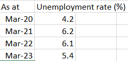
Which is just spin. He seems to want to claim credit for New Zealand’s low unemployment rate even though (a) as he often and rightly points out the Reserve Bank has no influence on the average rate of unemployment or the NAIRU (which are functions of structural policy), and (b) the extremely overheated labour market and unsustainably low unemployment rate are a big part of our current excessively high core inflation problem. In the end, aggregate excess demand is the fault of the Reserve Bank. not something they should be claiming as a “good thing”, let alone seeking credit for. (In their better moments – eg the MPS – they know this, talking about the labour market being unsustainably overheated, but then Orr’s spin inclinations take hold). At the peaks of booms, unemployment is always cyclically low (or very low). But often what matters is what needs to be done to get inflation back in check.
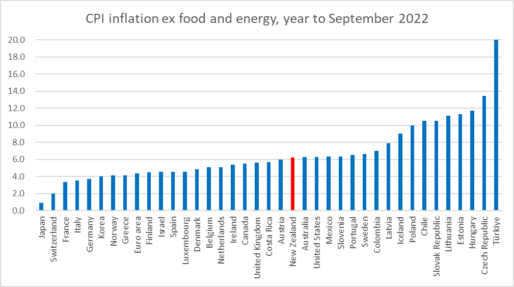
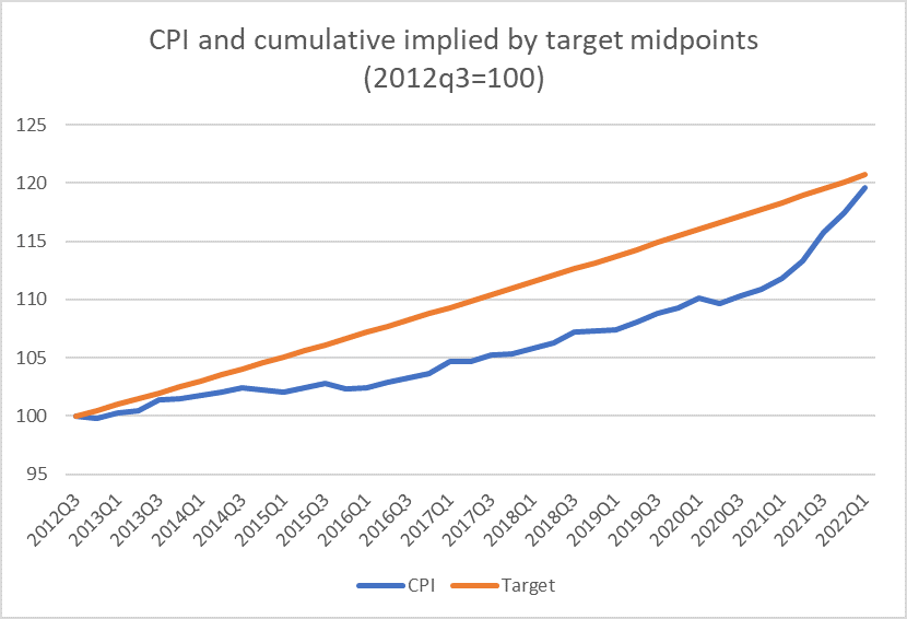
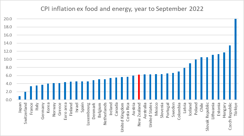
And what about that claim on inflation? Well, if he wants to simply say the New Zealand is fortunate not to be integrated to the global gas and LNG market that is fine, but it is a complete distraction from a central bank that is responsible primarily for core inflation in New Zealand. On core inflation – in this case, because it is available and comparable, CPI inflation ex food and energy – for the year to September (latest NZ data) we are no better than the middle of the pack.
An honest central bank Governor, committed to serious scrutiny, might better say that we are in a quite unfortunate situation, for which the Reserve Bank itself has to take much of the responsibility. Instead we get more spin
“Even with the expected slowdown in the period ahead, it is anticipated that the level of employment will remain high.”
which is no doubt true, but the Bank’s own forecast is for a sharp rise in the rate of unemployment.
But Orr is more in the realm of minimising (his) responsibility. In recent months we’ve had the absurd and unsupported claim that without the war inflation would have been in the target range. We’ve also had the suggestion – heard a couple of times from his chief economist – that perhaps half the inflation is overseas-sourced. This claim also appears to be undocumented, and simply doesn’t stack up: core inflation is the Bank’s responsibility, the New Zealand domestic economy is badly overheated, and the whole point of floating the exchange rate decades ago was so that even if other countries had increases in their core inflation rates, New Zealand did not need to suffer that inflation. We had our own independent monetary policy, and a central bank responsible for New Zealand core inflation outcomes.
To FEC, Orr ran this claim

It is certainly true that if the Bank had begun to raise the OCR a little earlier in 2021, it would not have made that much difference to inflation (core or headline) now. 25 basis points in each of May and July 2021 might together have lowered headline inflation by September 2022 by half a percent at most. But in this framing – also in their recent Review – there are two elements that are little better than dishonest. Purely with the benefit of hindsight (their own criterion) it is now clear that monetary policy should not have been eased at all in 2020, and that monetary policy should have been run much tighter over the period since then. Had that been done, core inflation would have stayed inside the target range. Now that might be an impossible standard, but that is simply to point out what I noted in my post on the Review was the major weakness: there was just no sign the Bank or MPC had devoted any serious thought or research to trying to understand what they (and everyone else) missed in 2020 and 2021. But they were responsible.
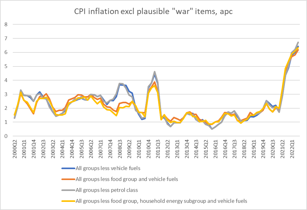
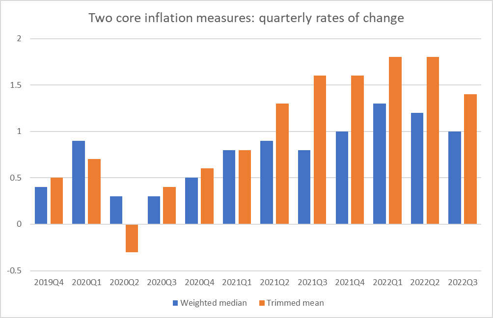
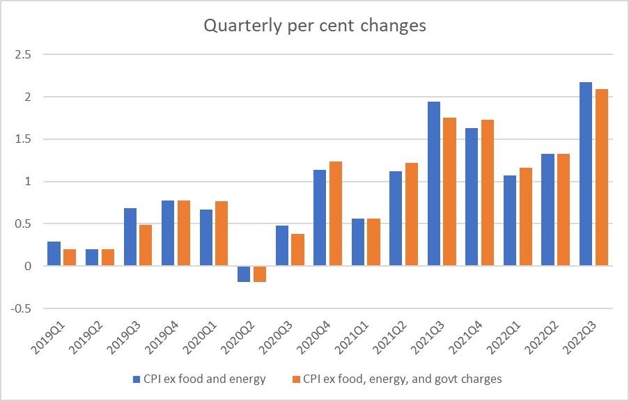
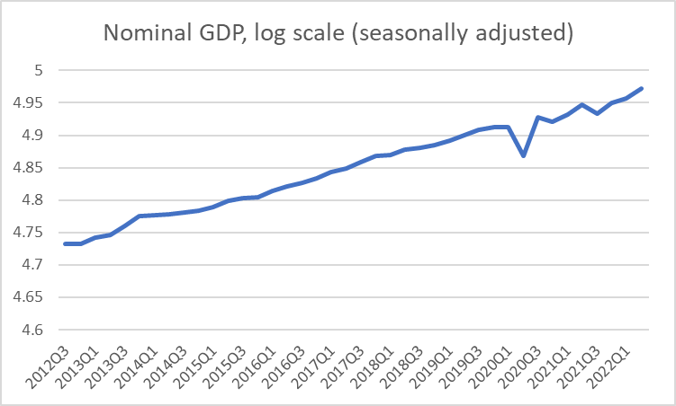
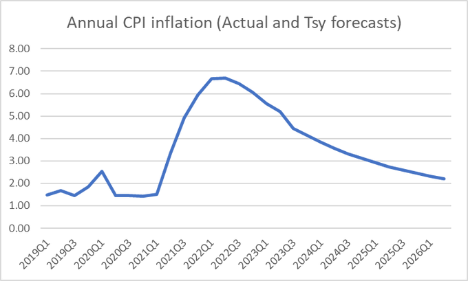
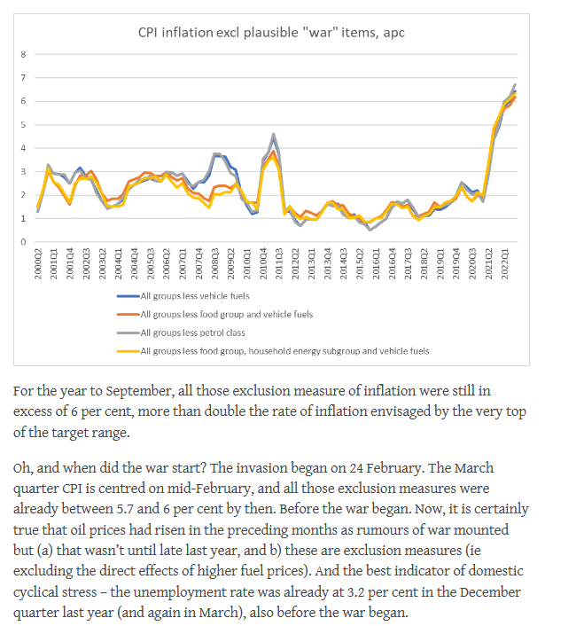
And then there is the continual effort to blame food and energy price shocks, in a way that simply flies in the face of the data. Headline inflation is the year to September was 7.2 per cent. Excluding food and energy, it was 6.2 per cent. 6.2 per cent is a long long way above the top of the Bank’s target rage – more than 4 percentage points above the target midpoint the Minister of Finace requires them to focus on.
And as I pointed out in a post debunking the “war is to blame” claim, core inflation was very high, the labour market well overheated, before the war.
Oh, and Orr was at it again with his claim – apparently intended as a defence – that

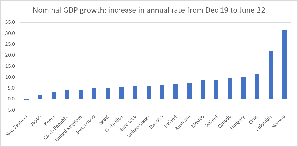
I’ve shown before that 7 OECD central banks (out of 20 or so) had started raising their policy interest rates before the Reserve Bank of New Zealand (Orr seems to want to claim credit for stopping the LSAP but (a) he has claimed that by 2021 it wasn’t having much effect anyway and b) the Funding for Lending programme carried on all the way to this month). And since each central bank is responsible for its own country’s (core) inflation, a simple ranking of who moved when reveals precisely nothing. As early as the end of 2020, only 8 OECD central banks were experiencing annual core inflation (ex food and energy) higher than New Zealand (quite a few with higher inflation targets than New Zealand, including chaotic Turkey). By mid 2021, there were only 7 central banks with higher core inflation than New Zealand (mostly the countries that began raising policy interest rates earlier than New Zealand). New Zealand’s core inflation then was already materially higher than that in Australia, Canada, the UK, and the euro area (but behind the US, and I find the Fed’s approach to monetary policy last year quite impossible to defend).
Overall it is hard to find any OECD central banks that have done a good job over the last couple of years (the central bank of Korea looks like one candidate for a fairly good rating). It is quite possible – current core inflation might suggest it – that the Reserve Bank of New Zealand has done no worse than average. But that isn’t ever the spin we get from the Governor, for whom responsibility let alone contrition seem like words from a foreign language for which no dictionary was available. No one is suggesting the last 3 years have been other than hard and challenging for central banks, but that is nothing to what they are proving for the people who have suffered – and will suffer over the next year or two – from their misjudgments, well-intentioned as they may well have been.
Orr’s behaviour has been given licence by the Minister of Finance – reappointing him despite his poor record on multiple counts. But it would have been nice if Parliament’s Finance and Expenditure Committee had ever shown a bit more vigour and focus in holding the feet of the Governor and his colleagues to the fire, instead of all wishing each other Merry Christmas and heading off for the holidays.