The New Zealand Initiative starts their discussion of the implications of immigration for house prices in a quite reasonable manner.
Rising house prices is an increasingly discussed topic. Fast growing populations, particularly in urban areas, have increased the mean demand for housing. Migration is a major contributor to urban population growth. In an ideal world, the underlying market systems would automatically adjust, such that as demand for accommodation rose and prices increased, developers built more houses. Likewise, cities would invest in infrastructure to accommodate more people.
However, that house prices have not stopped rising for a number of years means New Zealand has not reached this ideal place, and the system is not geared to cope with demographic shifts. The effect is most acute in Auckland, where about a third of the country’s population lives.
Thus far, I imagine everyone is on much the same page. It was consistent enough with the lines from the Introduction that I quoted earlier in the week
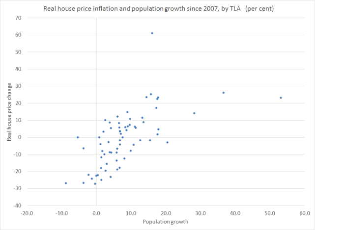
Economists consider housing to be affordable when the median multiple is 3 or lower. In 2013, Auckland’s median multiple was 6.4, and in 2016 Demographia put it at 9.7. The Initiative’s housing research blames restrictive planning policy and resistance to urban development. However, against a policy-induced, near-fixed supply, additional demand for housing must contribute to rising prices.
It is pretty much ECON101: if the supply of something is largely fixed, at least in the near-term, and there is an increase in demand (especially an unforecast increase in demand), the price will increase. Quite how much will depend on the elasticity of demand. And the immigration contribution to population growth (and demand for accommodation) has been really large over the last 25 years, just as the land-use restrictions enabled by things like the Resource Management Act appear to have become more constraining. The Initiative regularly, and rightly in my view, inveighs against those restrictions. Without them, higher demand wouldn’t result in higher (real) prices for houses and urban land.
I also get that the Initiative favours large scale non-citizen immigration, but what I don’t get is why they won’t just be straightforward and say something like, “in the presence of land use restrictions, we recognise that high rates of immigration have been markedly increasing house and land prices, especially in Auckland. But our best professional judgement is that the longer-term gains to New Zealanders from high immigration are sufficiently large, that we should overlook the distortions and arbitrary wealth redistributions that the high house prices, associated with high immigration have resulted in”
Perhaps there is a case to be made along those lines. It is, mostly, implicitly what the Initiative is saying. But they won’t come out and say it directly, and instead have tried to shelter behind a short piece from a couple of MBIE-funded academics, Cochrane and Poot, who attempt to interpret the existing evidence to suggest that really immigration isn’t much of a factor in (Auckland) house prices at all.
MBIE is responsible to the ministers for immigration and housing (and, of course, has institutional bureaucratic incentives to maintain a large scale immigration programme). Both ministers were presumably coming under pressure a year or so ago, and so MBIE commissioned Bill Cochrane and Jacques Poot to do a short review of the existing literature on immigration and house prices, and to draw some conclusions about what might have been going on in the last few years (as distinct, say, from the last 25). That report was released in April 2016. Some of it also appears to have been motivated by political concerns around non-resident purchases of New Zealand residential property, but as Cochrane and Poot note, the existing data don’t shed much light on that issue at all.
The New Zealand Initiative summarise the conclusions of the Cochrane and Poot report, with no sign of any caveats or concerns, as follows
Economists Bill Cochrane and Jacques Poot surveyed available evidence on the impact of net migration in New Zealand, and suggest migrants are not to blame for Auckland’s housing woes, rather New Zealanders are.
Personally, I hope no one wants to blame individuals at all – migrants or New Zealanders. The issues are about policy and big picture forces, not about individuals acting in their best interests given those policies.
What is important to bear in mind is that there is a handful of formal studies that everyone tries to make sense of. The Reserve Bank – which historically has no dog in the fight about whether or not immigration is “a good thing”; they just want “the facts” – has produced several studies over the years, each of which suggested really quite large impacts on house prices as a result of unexpected changes in migration. And, on the other hand, Stillman and Mare produced a paper suggesting, using quite different techniques, that the effects are quite small. That is the formal relevant New Zealand literature. There is also a variety of results across these papers on which flows might have matter more (eg NZ citizens vs foreigners, arrivals vs departures etc). On my reading the studies aren’t very conclusive: many people who’ve thought the issues through probably think the various RB estimates seem a bit large (up to 10 per cent increases in national house prices for a one per cent change in population) and the Stillman and Mare ones are a bit small.
In her Treasury working paper on macroeconomic performance in 2014, Julie Fry summarised her take as follows:
On balance, the available evidence suggests that migration, in conjunction with sluggish supply of new housing and associated land use restrictions, may have had a significant effect on house prices in New Zealand.
Cochrane and Poot read, or report, things a bit differently. But it is important to remember that their mandate was to focus on the “last few years” – whereas the New Zealand Initiative generalise it to apply to our longer-term house price issues. And it is certainly true, that if we look at the big swing in overall PLT immigration in the last few years, a substantial chunk of that was about New Zealanders (net) not leaving at such a great rate, rather than about a change in immigration policy (ie the bit that governs foreign arrivals). Their summary is as follows (emphasis added):
Overall we find that the literature and the available data on population change suggest that visa-controlled immigration into New Zealand, and specifically into Auckland, in the recent past has had a relatively small impact on house prices compared to other demand factors, such as the strongly cyclical changes in the emigration of New Zealanders, low interest rates, investor demand and capital gains expectations. Consequently, changes in immigration policy, which can impact only on visa-controlled immigration, are unlikely to have much impact on the housing market.
There is quite a lot to unpick there.
First, it is a specific observation about the “recent past” – when immigration policy (affecting foreigners) didn’t change much, and New Zealanders’ behaviour did.
Second, to talk of “investor demand and capital gains expectations” as distinctive factors is rather disingenuous. Presumably, investor demand was partly a response to increased underlying demand for accommodation, and capital gains expectations partly a response to the actual interaction of increased demand pressures in the face of restricted supply?
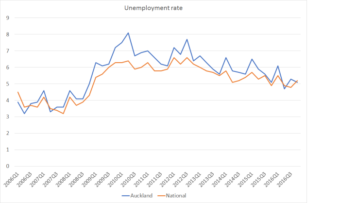
Third, if interest rates – which aren’t some random variable, but have been low for a reason – were a major independent factor, we wouldn’t have seen Auckland house prices rising so much more rapidly than those in most of the rest of the country (bits that mostly haven’t seen the same population pressures).
Fourth, the policy sentence is, literally, a non sequitur. It simply doesn’t follow from what went before. If immigration policy hadn’t been changed in the period they looked at – and it mostly hadn’t – it gives you no empirical basis for concluding that a future change in immigration policy would have no effect on house and land prices. In fairness to the authors, in their text they elaborate, and highlight the lags in the process, and that short-term variations in immigration policy aren’t a very reliable means of managing overall net PLT flows. I totally agree with them on that, and oppose such short-term immigration management, but it is a quite different issue.
But even over Cochrane and Poot’s own period, it isn’t clear that they have the emphasis right. Here are net PLT flows with New Zealanders and non New Zealanders shown separately.
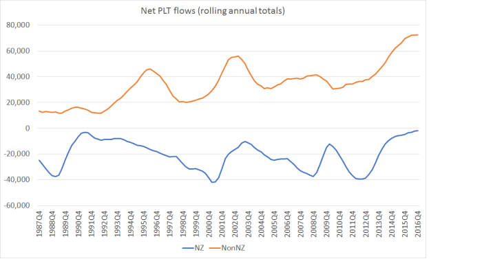
Over the period from around 2006 to around 2013 most of the variability was in the New Zealand citizen net flows. And specifically, from around 2012 to 2014 much of the pickup in PLT inflows was the change in New Zealanders’ behaviour – nothing about immigration policy – but over the last couple of years, there has also a huge increase in the net inflow of non-citizens, almost all of which is visa-controlled. It all represents additional demand for accommodation.
Cochrane and Poot note that much of the increase in non-citizen net arrivals has been from people without approval to stay permanently (ie students, and people on work visas).
the growth in inward migration has been particularly in temporary visa-controlled immigration (e.g. international students, temporary workers – including working holiday makers), as could be seen in Figure 9. The latter types of international migration flows are likely to have had a quantitatively smaller impact on house prices and to have contributed little to house price increases observed recently. The lesser demand on the housing market of temporary migrants has been shown with respect to students by BERL (2008). Generally, research on the differential impact on housing markets between those arriving and staying on temporary visas, compared with those arriving on, or subsequently obtaining, permanent visas still needs to be undertaken.
Most students probably aren’t buying a house. Most work visa arrivals aren’t either. But they all need a roof over their head, and add to the overall demand for accommodation, especially in Auckland. The authors play down this effect, noting that rents have increased much less than house prices have, but as I’ve illustrated previously, this divergence can be explained by the substantial fall in interest rates. When long-term interest rates fall, rental yields should be expected to fall. Absent population pressure, and in the presence of a well-functioning housing supply market, nominal yields should probably have fallen. Presumably expected demand for accommodation from students and short-term workers influences the willingness of investors to bid for properties, in turn pushing house price upwards. Population pressures don’t affect prices simply dependent on whether or not the new arrivals (or non-departures) choose to buy rather than rent.
One of the big challenges in modelling house prices is the so-called endogenity issue. A thriving city might see rising wages, and new people being drawn to that city. In the context, is it the immigration or the general prosperity that is raising house prices (given supply restrictions – real house prices tend not to rise for long without them)? It is an important in the short-term, but I’m less convinced that it is over longer-term horizons – eg the sort of 25 year period over which our immigration inflows and land-use restrictions have been interacting. Perhaps prosperity draws additional migrants in, but it simply isn’t likely that house prices would have risen much and for long on prosperity alone, without the additional people.
An ideal test – for economists anyway – would probably involve repeated surprise changes in long-term immigration policy. We could do a clean test if, say, every few years a random number generator decided how many residence approvals to grant to non-citizens each year. This year it might be 45000 (the actual target), another years 75000, another year 10000, and so on. We could then study the response of house prices in the wake of that clearly exogenous change in policy.
When it comes to New Zealand immigration policy, there simply haven’t been those sorts of changes researchers could study – other perhaps than the gradual opening up from the late 1980s to the mid 1990s, a one-time event. Here is the chart of residence approvals each year that MBIE provides the data for, back to 1997/98.
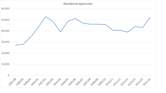
There hadn’t been a change in the target for 15 years until the very small cut announced late last year. And the actual variability in the approvals granted from year to year is mostly cyclical, and endogenous – dipping a bit when our unemployment rate was high, and then recovering lately. Econometricians use various clever tricks to try to deal with endogeneity, but the fact remains that at a policy level there have been hardly any exogenous changes at all. Just a very large net inward flow, varying a little from year to year, as a result of substantially unchanged policies. Trying to correct for endogeneity using recent data in particular might be a fool’s errand
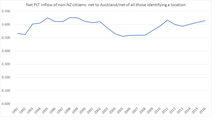
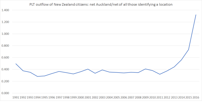
Those residence approvals over 19 years added up to 817231 people. As I showed yesterday, the data suggest that perhaps 60 per cent of foreign arrivals settle in Auckland – that would be around 490000 people. Not all of them stay, of course, but even if only 80 per cent stay in the long term that is still almost 400000 people, adding to the demand for accommodation in Auckland in 19 years, as a direct result of immigration policy. Yes, there is lots of variability in the NZ citizen flow – Cochrane and Poot’s point – but over that 19 years, around 160000 New Zealand citizens (net) left Auckland for overseas. Again, as Cochrane and Poot point out, there has been considerable natural increase in Auckland’s population too. But immigration policy – visa-controlled almost all of it – will have boosted Auckland’s population in that time by almost 400000 people. And in a country – and city – which as they acknowledge does not have very responsive housing/land supply, that simply cannot have done other than put considerable pressure on Auckland house and land prices.
I’m still not sure why the New Zealand Initiative wants to avoid simply acknowledging that.
It is not as if this view is some contrarian Reddell-ite view held by no respectable or serious person. Read the speeches and reports of the Governor of the Reserve Bank and his staff, or those of the Treasury. Look at the analysis and reports of the IMF and the OECD – both generally supporters of immigration. It isn’t even treated as contentious that immigration has played a material role in house price inflation, in places where land use restrictions are in place. Go across the Tasman, and listen to the Reserve Bank of Australia for example – a nice recent example is here – or look at the IMF/OECD reports on Australia too (with a similar mix of rapid population growth and land use restrictions). When supply is substantially restricted and demand for housing increases, house/land prices will rise. Population growth is a key source of additional demand, and immigration – whether exogenously influenced, or endogenous to the economic cycle – is a huge component of population growth, especially in Auckland.
Flows of New Zealanders matter just as much as those of foreigners, and are often much more variable in the short-term (because less controlled by policy). Immigration policy – affecting foreigners – can’t sensibly attempt to stabilise housing market pressures in the short-term, but it can – and does – make a huge difference to housing demand over the medium-term. In a system with quite tight land use controls, that affect over the last couple of decades has been almost entirely deleterious – driving up house and land prices, and skewing wealth from the young to the old, the have-nots to the haves, and so on. Yes, we should fix land use regulations, but don’t pretend – as the Initiative tries to in this report – that knowing continuation of high rates of non-citizen immigration, in the presence of those land use restrictions, isn’t knowingly allowing urban house and land prices to be driven progressively further upwards, in Auckland especially, but not of course exclusively.
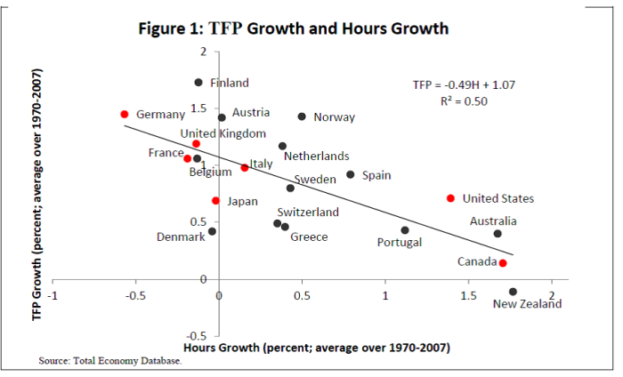
 Over this period on this measure, we weren’t the worst, but we weren’t far off the worst. A lot of the former eastern-bloc countries, now given the opportunity to catch-up with the West, are bunched towards the left of the chart.
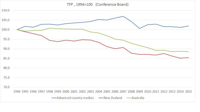 And New Zealand relative to the median of the G7 countries, and to the median of the former eastern-bloc countries. Recall, after all, that the narrative of economic reform in New Zealand had also been to allow us to catch up again with the richer advanced countries.
 Not an altogether pretty picture.
 The gap between New Zealand’s cumulative TFP growth and that of the other advanced economies isn’t as large as that shown on the Conference Board data (second chart above). Then again, since the OECD data doesn’t include the catching-up eastern Europeans that shouldn’t be a surprise. But what is more striking is that until 2003 we were more or less matching the other OECD countries in this sample.
 In the end, perhaps the pictures aren’t really that dissimilar after all. We’ve done badly relative to other traditional advanced countries and, if anything, on this measure too, the last decade or so is looking relatively worse. In other words, if there was some convergence of growth rates, it looks to have been mostly only because TFP growth in the east European countries (in the TED sample but not in the OECD’s) slowed up so very markedly (as you can see in the third chart above). That might be unfortunate for them – and some combination of policy limitations, and substantial convergence already having occurred in some countries – but doesn’t put New Zealand’s underperformance in any better light.