The Conference Board’s Total Economy Database is my favourite source for cross-country comparisons of productivity growth. I’m not close enough to the respective methodologies to know whether and where to prefer their methodology to that of the OECD, but the Conference Board has data for a lot more countries, and typically has estimates that go back a bit further in history.
Yesterday, I dug out their estimates of total factor productivity (TFP) growth. They’ve recently revised their methodology, although for the time being that means they only currently go back 20 years. I was curious to see how New Zealand had performed, on this metric, relative to other advanced countries.
Some readers will recall this IMF chart which I’ve run a few times previously.
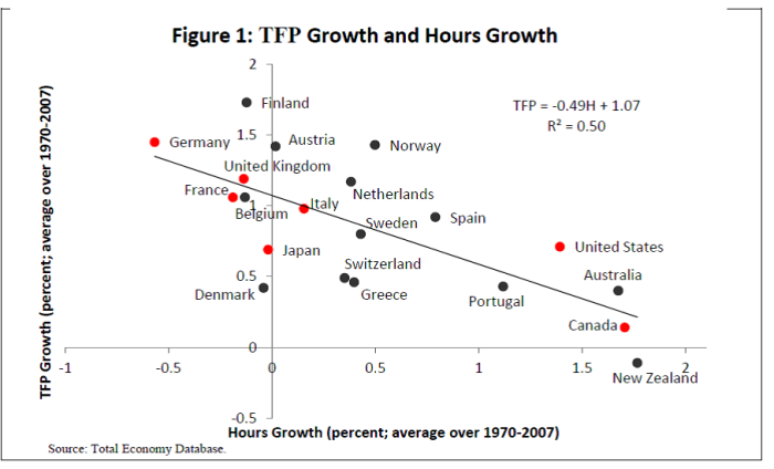
It uses an earlier vintage of Conference Board estimates, and on that basis, New Zealand had had the lowest TFP growth of any of these OECD countries for the full period 1970 to 2007.
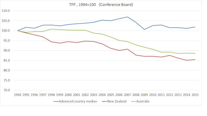
How about the more recent period, since 1994? Here I’ve used a larger group of countries – all the OECD countries, all the EU countries, plus Singapore, Hong Kong, and Taiwan – very similar to the set of countries I used for a range of posts back in 2015 about New Zealand’s relative performance.
 Over this period on this measure, we weren’t the worst, but we weren’t far off the worst. A lot of the former eastern-bloc countries, now given the opportunity to catch-up with the West, are bunched towards the left of the chart.
And here are New Zealand and Australia shown relative to the median of these advanced countries.
 And New Zealand relative to the median of the G7 countries, and to the median of the former eastern-bloc countries. Recall, after all, that the narrative of economic reform in New Zealand had also been to allow us to catch up again with the richer advanced countries.
 Not an altogether pretty picture.
Of course, observant readers have probably noticed that there doesn’t seem to have been much TFP growth anywhere for the last decade or so, and that while New Zealand doesn’t look to have done particularly well during that period, we also don’t look much worse than usual. But here is how we have done relative to various other countries/sub-groups over that period.

Plenty of countries did worse than us, but among those that were quite similar to New Zealand and Australia over this period were Italy, Spain and Portugal (Greece was materially worse).
For these purposes, I’m mostly interested in how New Zealand has done relative to other countries. There is a reasonable question as to how the level of TFP can have fallen so badly in 20 years (almost 15 per cent in New Zealand if one believes this measure). TFP growth is a residual, after decomposing GDP growth into growth in the capital and labour stocks and – done properly – measuring both of those isn’t straightforward (eg it is one thing to measure total hours worked, another to get a good measure of the quality of the labour, or thus total human capital applied to production, especially in an era when tertiary education has become a lot more common). Different methodologies will produce different estimates, but so long as similar methodologies are applied for all countries we can still use the datasets for cross-country comparative purposes
All of which is a lead in to a perhaps slightly less discouraging picture for New Zealand. The OECD also produces TFP growth estimates, but for a much smaller range of countries – only 20 of their 34 member states, including none of the east European convergence economies. And there aren’t yet estimates for all the countries for 2015.
But here is the comparison for 1994 to 2014 between New Zealand and this sample of the really advanced OECD countries.
 The gap between New Zealand’s cumulative TFP growth and that of the other advanced economies isn’t as large as that shown on the Conference Board data (second chart above). Then again, since the OECD data doesn’t include the catching-up eastern Europeans that shouldn’t be a surprise. But what is more striking is that until 2003 we were more or less matching the other OECD countries in this sample.
Here, for comparison, is the Conference Board data for New Zealand and the OECD’s sample of (20) countries.
 In the end, perhaps the pictures aren’t really that dissimilar after all. We’ve done badly relative to other traditional advanced countries and, if anything, on this measure too, the last decade or so is looking relatively worse. In other words, if there was some convergence of growth rates, it looks to have been mostly only because TFP growth in the east European countries (in the TED sample but not in the OECD’s) slowed up so very markedly (as you can see in the third chart above). That might be unfortunate for them – and some combination of policy limitations, and substantial convergence already having occurred in some countries – but doesn’t put New Zealand’s underperformance in any better light.
It is the sort of underperformance that should be leading to hard questions about the overall direction of economic policy in New Zealand. After all, if TFP growth isn’t everything about economic performance and sustained prospects for prosperity, it is typically seen as quite a large part of the picture. And we’ve just kept on doing badly.
