Long-term bond yield differences

I wrote the other day about the way that New Zealand’s real exchange rate had become (not just recently, but in the last 20-30 years) out of line with changes in our terms of trade and in our relative productivity performance. In that post I suggested that the large gap between New Zealand’s real  interest rates and those in other advanced countries was a big part of the explanation.  Not, of course, that interest rates are an independent factor just imposed on us, but that if we could understand what had driven such a wedge between our interest rates and those of the rest of the advanced world, we would be on the way to understanding what was resulting in such a persistent (albeit rational) misalignment of the real exchange rate.  In that post, I simply noted the current very large gap between the real yields on inflation-indexed bonds issued by the New Zealand and US governments respectively.  That gap is around 1.5 percentage points.  Over 20 years, that looks like a huge difference in expected returns.

Interest rate differentials can move around quite a lot.  Even for long-term bonds, cyclical differences in the health of the respective economies can make quite a difference[1].  Risk factors can matter too –  at times of heightened global risk, for example, US Treasury bonds still tend to be an asset of choice. My focus is not really on short-term movements in those differentials, but on what has happened on average over time, and that is the focus of this post.

The OECD publishes data on long-term bond yields for each of its member countries.  “Long-term” here generally means something close to 10 years, the usual benchmark for such comparisons.  The data are nominal, and of course over time differences in inflation rates should explain quite a lot about differences in nominal interest rates across countries.  So I restricted myself to the period from the end of 1991.  For New Zealand, that was the first quarter in which inflation had fallen inside the new inflation target range, and  most other of the older advanced countries had also broken the back of the high inflation of the 1970s and 1980s by then.  But I’ll come back and look at trends in inflation a bit later.

In this first chart, I’ve shown long-term bond yields for New Zealand, for the US and for the medians of several groups of countries.  I’ve looked at the median of all OECD countries (but at the start of the period there is no data for many of the former communist countries, and by the end of the period, half of all the countries were in the euro), of the G7 countries individually, and of a grouping of G7 currency areas (Canada, the US, the UK, Japan, and the euro-area).  Most of the time it does not much make difference which measure one looks at.  I’ve included them all so that you can see that I haven’t been cherry-picking.  My preferred series to compare New Zealand against is probably the G7 currency areas one.

interest1

Of course, the dominant story of the last 25 years is the dramatic fall in the level of interest rates everywhere.   Part of that is the fall in actual and expected inflation –  even in the G7 countries, inflation still averaged 4 per cent at the end of 1991 – but real interest rates have also fallen markedly.

But my main interest is in the differentials: how have New Zealand bond yields behaved relative to those of these other advanced countries.  It was notable in the first chart how the gap between New Zealand and other countries emerged over time.

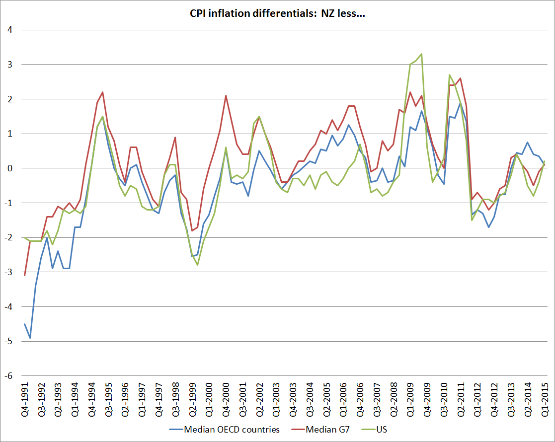
Well, here is the chart of the differentials.  This time, to make the chart easier to read, I’ve shown only two series: New Zealand less the median of all OECD countries, and NZ less the median of the G7 currency areas.   It is easy to forget how low New Zealand interest rates were at the start of the period, relative to those abroad  (I was running teams at the Reserve Bank advising on monetary policy and doing the Bank’s macro forecasts, and I had forgotten).  At the start of the period, we were just emerging from two decades of very high inflation, and were only a few months on from the much-publicised threat by rating agencies of a double-downgrade to New Zealand’s sovereign credit rating.  We did, however, at the time have a very low inflation target –  even if political support for that target was fragile at best.

But I’m really interested in more recent periods.  Again, I partly started back in 1991 just to provide context.

interest2

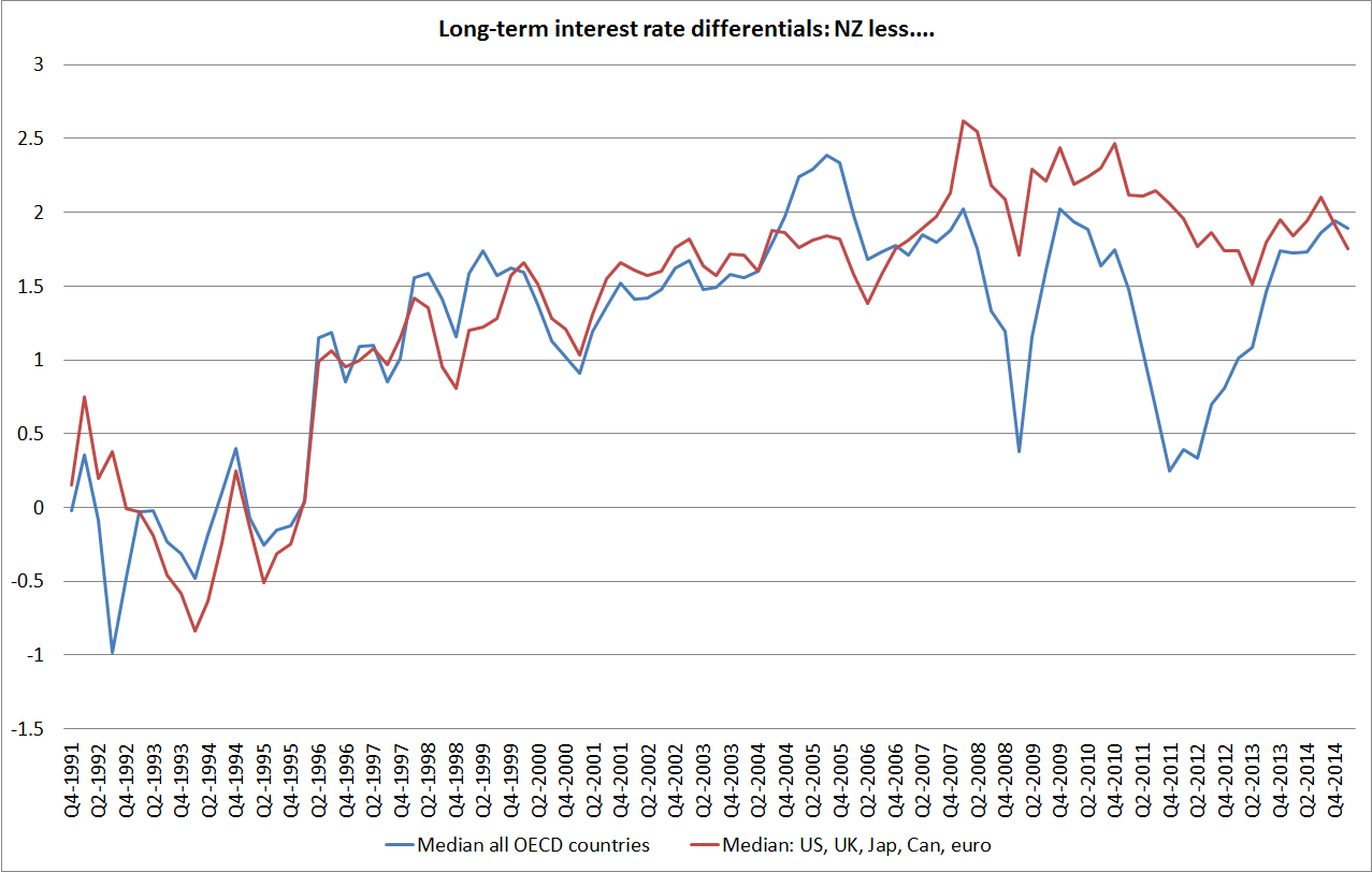
Throughout the 1990s, there was a very strong expectation that New Zealand short-term and long-term interest rates would converge to those of the rest of the world[2]  Once we had low and stable inflation, much stronger fiscal accounts, and people were confident those things would last, then having become  integrated with global capital markets, it seemed a reasonable story.  Sure, there might be small differences – small New Zealand markets might always be less liquid –  but the differences weren’t thought likely to amount to much, especially when comparing us against other small advanced economies.

But that convergence has just never happened, and the fact that it has not happened –  that the interest gaps have been so large, through booms and busts – is one of the most striking features of what has happened in New Zealand in the last 20-25 years.  Day-to-day what happens internationally is a key influence on changes in New Zealand bond yields, and there is clearly a common factor at work in the long-term decline in real yields, but the levels remain completely different.

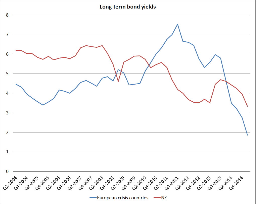
It is interesting to note where the two lines diverge materially, both in the period since 2007.  Nothing very interesting happens in the differential between New Zealand and G7 bond yields since 2007, but both during the 2008/09 recession, and again –  more starkly –  at the height of the 2011/12 euro-crisis, New Zealand bond yield differentials fall sharply relative to the median OECD country.   It is easy to see that effect in this chart, simply comparing New Zealand against a group of eight crisis countries (Iceland, Ireland, Greece, Spain, Portugal, Italy, Slovenia and Hungary).

interest3

As I noted earlier, differences in actual and expected inflation can affect the interpretation of nominal bond yield differentials.  We don’t have consistently-compiled cross-country measures of inflation expectations (and in most countries, indexed bonds are too recent or too patchy  –  the NZ story –  to provide much of a time series).  And so people tend to fall back on comparing actual inflation rates over time.  It has to do, since it is all we have, but it is worth remembering that even CPIs are compiled differently across countries, and across time even within individual countries.  In New Zealand, for example, until 1999 CPI inflation rates included the direct effects of interest rates, and section prices.

interest4

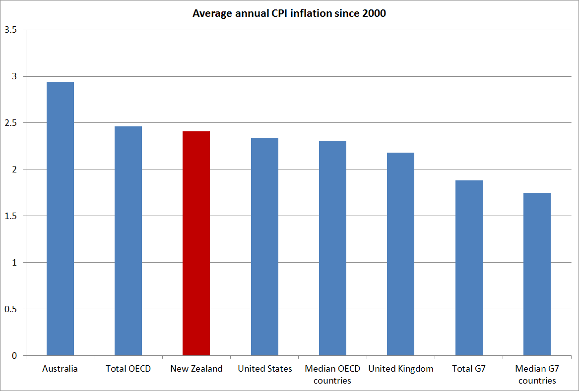
This chart just shows the average inflation rates for New Zealand, for a couple of individual countries, and for various country groupings since 2000.  New Zealand’s inflation rate has averaged a bit higher than inflation in the G7 countries, by around 0.6 percentage points, but has been very similar to that among OECD countries as a whole, and that in the United States.  At least since the mid 1990s, it doesn’t look as if there has been any particular change in the relativities, and at present New Zealand’s inflation rate is almost identical to that in the rest of the advanced world.

interest5

Historical differences in inflation outcomes might be thought to have warranted nominal bond yields in New Zealand perhaps 0.5 percentage points higher than those in the rest of the advanced world.  Looking ahead, however, New Zealand’s inflation target is very similar to those in the rest of the advanced world: our target is centred on 2 per cent, and while Australia’s in a touch higher, and the euro-area’s is a touch lower, taken as a group there isn’t much difference.  And yet our nominal bond yields have still been averaging 2 percentage points higher than those abroad.

What does explain it?  A common story is risk around the high level of net international indebtedness of New Zealand entities.  I don’t find that story persuasive at all, and will explain why in my next post.

[1] Using implied forward rates (the yield implicit in the second five years of a ten year bond) is a good way around this, but such data are less readily accessible).

[2] I documented this in a paper I wrote a few years ago for a Reserve Bank and Treasury workshop.  I would quite like to post it, but it would no doubt take at least 20 working days to extract it from the Bank.

The Reserve Bank and the Official Information Act

(for anyone who is bored with this subject, feel free to read no further).

I have mentioned various Official Information Act requests I have lodged with the Reserve Bank, and the difficulty the Bank seems to have with the proposition that its information is public information and that, unless there is good statutory reasons for withholding the information, it should be released as soon as reasonably practicable, and in any event no later than 20 working days after the request was lodged    Agencies are funded to cover their statutory responsibilities, including those under the OIA.

It would be tedious to readers to run through all the responses I have had, so I will highlight three.

In this post, I discussed a request I had made for a limited range of papers that fed into the March 2005 Monetary Policy Statement (ie 10 year old papers).  On the last working day of the originally available 20, the Bank extended the request for up to another 20 working days,  I’m still waiting, and will no doubt hear something next week.  As a reminder to that Bank, that “as soon as reasonably practicable” is the law of the land.

I also asked the Bank for papers around the 2012 PTA.  As I noted earlier, they came back wanting to charge me for it.  I asked how I could usefully narrow the request to expedite the matter, and (as they are required by law to assist requesters) we had a helpful conversation in which it was agreed that I would revise my request to those (five or six apparently) documents held in the relevant folder in the Bank’s document management system.  I had hoped that might be a matter of only a few days.  I’m looking forward to the final response.

As I was winding up my time at the Bank I lodged an OIA request, asking for clearance to quote historical papers that I had written while I was at the Bank.  In the last decade, those have mostly been opinion pieces.  As I noted to the Bank, I had looked through most of them recently, in the course of clearing my desk, and couldn’t see anything particularly sensitive or likely to cause trouble under statutory OIA grounds.  I suggested that perhaps for older papers they could consider a blanket waiver, and then could have someone look through things I had written in the last three years or so. (I knew that there was one 2012 paper that the Governor had already persuaded the Ombudsman to withhold, and I indicated that I would not be unduly bothered if the Bank still wanted to withhold it, even though the paper was now several years old).

I got a response, again near the end of the 20 working days, saying that the Bank could not give any blanket waivers, and suggesting that if they had to go through the papers it would cost $100000.

Accordingly, I revised my request.   A month ago, I asked only for the papers I had written in a single year, and was very specific that I only wanted papers lodged in the Bank’s document management system, not emails or the like.  As it happened, in the year concerned –  2010 –  I was only working at the Bank for six months.  I don’t know how many papers there are, but I was simply not that productive (and had other things to do).  And these are five-year-old pieces of opinion or analysis[1].

Yesterday, again almost right to the end of the 20 days on this request, I had a response from  the Bank.

Meeting the original 20-day time limit would unreasonably interfere with the operations of the Reserve Bank. Accordingly, and under the provisions of section 15A(1)(a) of the Official information Act, the Reserve Bank is extending by 20 working days the timeframe for a response to your request.
 

It would be almost laughable, if it were not serious.  The Reserve Bank is a very powerful public agency, and the Official Information Act is a key element in open government.  The Reserve Bank seems not to regard obeying the law as a matter of importance.  It is a good example of why, on the other hand, the Ombudsman’s review of the Official Information Act, currently underway, is so important.

If it is of any relevance, which it should not be, I can assure the Bank that my only agenda, in each of these requests, has been transparency.  There is no single document that I desperately want to get hold of and post to make a point, to embarrass the Governor, or anything of the sort.    But if there was, the law is still the law, and information must be provided as soon as reasonably practicable.

[1] Although it occurs to me that the Bank might have interpreted the request as including any advice to the Governor on specific OCR decisions.  I never lodged those pieces in the document management system (the committee secretary did), and am not after those.

100 years of the New Zealand/Australia exchange rate

Yesterday I looked briefly at some of the recent indicators of relative economic performance for New Zealand and Australia over the last few years.  New Zealand hasn’t done that well.

One item I didn’t mention was the exchange rate.  The fevered talk of parity parties has, fortunately, receded once again, although who knows for how long.  It will probably happen eventually –  after all, New Zealand’s inflation rate averages a little lower than Australia.

We’ve been at parity before of course.  Indeed, for all our history until 1972 a New Zealand dollar (or pound) had been worth as much (or more) as an Australian dollar (pound).  Until 1914 that was all about common gold convertibility, and neither country had a central bank.  This chart starts in 1911.

exchrate1

In the long long run, changes in the exchange rates of similarly wealthy countries should broadly reflect differences in the inflation rates of the two countries (relative purchasing power parity). My reading of the literature suggests that empirical support for this long-term proposition has been growing.    But here is what the chart looks like for New Zealand and Australia  (my data source for Australia, Measuring Worth, has a missing observation in 1922).  When I first did the chart a few years ago I was pleasantly surprised by the way the two lines moved broadly together.  When our nominal exchange rate appreciated against Australia’s –  as it did most enduringly in 1948 – it was associated with a rise in Australia’s price level relative to ours.  And, of course, as our high inflation (relative to theirs) became an increasing issue from the mid-late 1960s, our nominal exchange rate fell substantially relative to theirs.  The troughs were in the mid 1980s.

exchrate2

What if we combine the two lines into a real exchange rate series?   Two things strike me?  The first is just how relatively tight a range that bilateral real exchange rate has fluctuated with in over a century.  And second is the way the real exchange rate appeared to be falling in the 1970s and early 1980s, only to step up and subsequently fluctuate around a new materially higher level.  The last observation is for 2014 (annual averages), but the current level would not be much different.

exchrate3

At one level, that higher real exchange rate might look like a good thing.  After all, it means we can buy stuff abroad more cheaply, lifting the purchasing power of our incomes.    The problem is that we have to earn an income before we can spend it.  And there our performance relative to Australia has not been good.

People often point out that the higher terms of trade has lifted the ability of New Zealand firms to compete profitably internationally.  All else equal that should be consistent with a higher real exchange rate.  The problem with that story here is that we are doing a NZ vs Australia comparison and New Zealand’s terms of trade have done less well than Australia’s.

We only have consistently national acccounts deflator for both countries back to 1987, but actually all the differences in the two terms of trade are in that recent period.  This chart shows merchandise terms of trade for the two countries back to the 1920s.  They are remarkably similar until the last decade or so.

2025 TOT

And this chart is the SNA terms of trade for the two countries, drawing from the national accounts export and import price deflators.  Despite the difficulties of the last couple of years, Australia has still experienced the much larger increase in the terms of trade than New Zealand.  All else equal, we might have expected our real exchange rate to have fallen relative to Australia’s.  It hasn’t of course.

TOT since 87

There is also good reason, and some cross-country supporting evidence, for the idea that real exchange rates tend to move to reflect longer-term trends in relative productivity.  That makes sense.  A country with poor productivity growth is likely to need to see its real exchange rate fall, to “compensate” for the impact of poor productivity –  enabling its tradables sector firms to remain competitive, and increasing the relative cost of imported consumption items.

And what is the New Zealand vs Australia story.  We don’t have productivity data back to 1911, but we do have estimates of per capita real GDP, and over the long haul differences in growth rates will mostly reflects changes in relative productivity.  Using Angus Maddison’s estimates, spliced with Conference Board estimates for more recent years, this is the relative GDP per capita picture.  There is quite a lot of year-to-year noise in the earlier period, but painting with broad brushstrokes one could characterise the last century as one of a first half where New Zealand and Australian real per capita GDP growth were very similar (and levels, on these estimates, were pretty similar too).  But since the mid 1960s, the traffic has been almost all one way: New Zealand real GDP per capita has fallen very substantially, and pretty steadily, against Australia’s.  Maybe the worst of the falls are now behind us, but there is no sign of any sustained reversal.

nz vs au since 1911

The Conference Board estimates GDP per hour worked for the two countries since 1956.  No doubt there are some heroic assumptions behind the New Zealand estimates in particular (Australia has official quarterly national accounts data back to 1959) but they are the best we have for now.  And the picture is much the same: a sharp decline over the full period, which continues more recently (I showed yesterday the quarterly chart of real GDP per hour worked for the period since 2007).  And the decline in much the same whether one uses the measures calculated on 1990 prices (also the basis for the Maddison GDP estimates) or 2013 prices.

nz vs au since 56

And so we have this somewhat paradoxical position of quite a high real exchange rate (last 20-30 years) relative to Australia, even though our terms of trade have done much less well than Australia’s, and our labour productivity and growth performance have been materially less than Australia’s.  Consumption of tradables is made relatively cheap, while producing for the international market – a key element in longer-term prosperity –  is expensive.  It is perhaps not that surprising that our export share of GDP has remained so weak, and our aspirations to close the income gaps to the rest of the advanced world have shown no sign of being met.

After spending years reflecting on the issues, I’m convinced there is nothing much wrong with New Zealand’s economy that a real exchange rate averaging 20-30 per cent lower for a few decades could not resolve.  Perhaps issues around size, distance, and agglomeration mean we will never again be the richest country in the world, but we can do a great deal better than we have done in recent decades.

Views differ on why the real exchange rate might have been, on average, so strong over the last few decades.  My story emphasises the high average real interest rates that have been needed to balance demand and supply (keep inflation near target) in New Zealand relative to those abroad.  As just one example, the yield on a 20 year New Zealand government inflation-indexed bond has been around 2.2 per cent this month.  The yield on 20 year US government inflation indexed bond has been around 0.7 per cent.  Persistent differences in returns like that, which don’t appear to reflect differences in riskiness, have really big (and quite rational) implications for the exchange rate.

But, to be clear, this is not a monetary policy story.  Long-term real interest rates reflect the pressures on real resources that result from government and private choices.    They are real phenomena, not monetary ones.

For those who haven’t come across my story in this area before, much of it is elaborated in this paper. I included there some charts suggesting that the strength of the real exchange rate, relative to underlying economic performance, is not just an issue for comparisons against Australia.

A transformed country. Really?

I suppose Ministers of Finance don’t always get to approve the promotional material for their speaking engagements.

Yesterday, I got to the end of last week’s Spectator.  I don’t usually notice the back cover, but this time I couldn’t really miss the half page photo of Bill English, with the caption “This man runs harder than Sonny Bill”.  It was a promo for a Menzies Research Centre function next month: for A$220 a ticket our Minister of Finance, “co-architect of their resurgent economy” will “offer some insider tips on their game plan, because rugby isn’t the only thing the Kiwis are good at.  Tips that transformed the country”.

I’ve noted previously my puzzlement at this line from the right wing of the Australian commentator/think-tank community, who talk up New Zealand’s economic reforms, and policies.   I presume it is designed to exert some sort of leverage in Australia (“if even the Kiwis can do it, surely we can”).

Perhaps the rhetorical strategy works.  Perhaps it has a “feel-good” aspect to it.  Perhaps it just enables people to vent some frustration at their Senate. There was something a bit similar in late 80s and early 90s, when policy reform here was more extensive, and perhaps better-grounded in economic principles, than that in Australia.  I well remember that I was to pass through Sydney the Monday after the 1993 federal election.  The Liberals were widely expected to win, and I was lined up to do a lecture at the RBA about the Reserve Bank of New Zealand reforms in anticipation that John Hewson would soon do something similar.  Journalists were even invited.  And so it was all a bit awkward when Keating pulled off a late victory.

Back then perhaps there was a plausible story that we were doing reform better than they were.  Fans of compulsory savings would no doubt disagree.  There are still plenty of areas where I’d rate quality of regulation here better than there –  taxis are my favourite.   But the numbers favour them.  But to anyone looking into the numbers, all this talk now of New Zealand as a “transformed country” over recent years must seem almost completely wrongheaded.

There is one, non-trivial, dimension on which New Zealand might reasonably be judged to be doing better than Australia: our budget deficit is smaller than theirs.   But bear in mind that general government net debt, as a percentage of GDP, is still higher in New Zealand than in Australia (gross debt is identical).  The differences aren’t large, and neither country looks either that great or that bad by international standards.
nzau govt debt
If Australian deficits are still larger than ours, that partly reflects the timing of the respective terms of trade cycles.  Australia had a big boom over recent years that we did not really share in.  The terms of trade went sky high, as did business investment (which also means lots more depreciation expenses to offset against taxable incomes).  Their unemployment rate undershot ours for a while (that doesn’t usually happen) and their policy interest rates went above ours for a while (again, that is pretty rare).   Their terms of trade peaked in 2011, and now are almost back where they were in late 2007 (2007q4 is the conventional date for the last quarter prior to the recession).  New Zealand’s terms of trade didn’t go up so much (but exports are a larger share of GDP in NZ than they are in Australia), and peaked only last year.  Current revenue has until very recently been reflecting those peaks.  There are plenty of optimists around suggesting NZ commodity prices are just about to rebound.  Perhaps they’ll be right, but optimists were taken by surprise in Australia too

tot

I’ve shown before the chart of productivity (real GDP per hour worked) for the two countries.  New Zealand has done really quite badly in the years since 2007 (absolutely and relative to Australia).
ausnzgdp

Neither country’s government has much influence over the respective terms of trade (I’d say none) but for what it is worth, here is the chart showing the real per capita real income measures (that capture the direct effects of the terms of trade) published by the ABS and SNZ.  Each country measures a slightly different thing, but for these purposes they are close enough.

rgndi

Sure enough, using a base of 2007q4, New Zealand is now just a little higher than Australia.  That reflects the way our terms of trade, as at the end of last year, had not yet fallen very much in comparison to the fall in Australia.  But the end-point difference is trivial, and even if the two countries’ terms of trade level peg from here it would take a lot of years for NZ to make up for the loss of income relative to Australia in the previous 5-6 years.  And there is plenty of reason to expect our terms of trade to fall further.

In the end, as I’ve said, before I don’t really understand this Australian meme that somehow New Zealand has been managing itself much better than Australia.  The dominant story of the last 50 or more years is of how New Zealand has fallen behind Australia.  Nothing this government (or its predecessor for that matter) has done so far seems to have made much difference to that picture.  Some Australian commentators laud the 2010 tax package, but even then it is worth remembering that that package raised the effective tax rate on capital income (don’t take my word for it, it was in the Treasury numbers).  If anything, our productivity performance looks to have been drifting even further behind.

The net outflow of New Zealanders to Australia seems, at least temporarily, to have almost ended.  In itself that is encouraging, except that it probably reflects the fact that the unemployment rates in both countries are now quite high – historical relativities have been more or less restored.  And recall that post-1999 New Zealanders in Australia can’t now get welfare benefits when the Australian labour market turns down.

I don’t understand the meme, but perhaps it sells tickets.

How much should we rely on stress tests?

A commenter, Kelly, writes as follows:

Michael – is it necessarily true that the failure ( or lack thereof) of a bank stress test is the benchmark for assessing the worth and more specifically the legality ( in terms of consistency with the RBNZ’s act) of regulatory action? The relevant section of the Act says if I remember correctly that the Bank must use these powers for the purpose of ensuring the soundness and efficiency of the financial system. While the stress test results are one potential indicator they are not a necessary condition to justify regulatory action. Indeed I suspect that very little prudential regulation might be justified if this were the case. Stress tests are indicators of what might happen given a number of important assumptions any of which may not be true in real life. Also stress tests almost always are calibrated to ensure banks pass them ( or else additional capital should be added by failed institutions). History shows that stress tests have a poor record at predicting financial crisis. I think many reasonable people would consider a large fall in Auckland house prices might challenge the stability of the financial system in NZ. It’s true that in some circumstances it might not but would you expect the Bank to bank on being that lucky? The spillovers to the rest of the country would potentially be great.

The Bank’s actions in this area are in step with the generally successful international experience with regional LVR type measures. I think that this alone makes it difficult to argue the Bank is acting in an ultra vires manner. The IMF’s advice in this area is that macro prudential measures can be employed assuming key macro policy settings are also supportive. Your stance on monetary policy settings thus seem further supportive of the Bank’s stance. Although I am sure that the government could be doing more to help as you point out.

I’ve always enjoyed debates with Kelly, and I thought it might be worth addressing a few of the points he makes:

  • The Reserve Bank Act (sec 68) requires that the regulatory powers in Part V of the Act be used (by the Governor General, the Minister, and the Bank, but here the Bank’s discretionary action is in focus) “for promoting the maintenance of a sound and efficient financial system”.  Note that it is not about “ensuring” such an outcome, and neither has a “sound” financial system ever been regarded as one in which no bank failed.
  • Kelly suggests that very little prudential regulation might be justified if stress tests were to be used a key indicator.  I don’t think that is right.  After all, the risks that the Reserve Bank and APRA assessed last year were those that existed given the current panoply of regulatory controls, including the earlier LVR restrictions.  In other words, some mix of market disciplines and regulatory measures had produced loan books which appeared to be pretty robust to some pretty severe shocks.  The issue here now is whether a case can be made, in terms of the Reserve Bank Act, for further, quite intrusive and quite unconventional, controls.   That case would have seemed much easier to make if the stress tests had produced results which appeared more threatening to the soundness of the financial system.
  • Kelly alludes to widespread scepticism about the use of stress tests by some regulatory and supervisory agencies.  It is certainly true that one would not expect a regulator to publish stress test results, particularly those undertaken in the midst of a financial crisis, suggesting that the financial system was in great danger without having first taken remedial action.    But context matters.  Clearly New Zealand and Australian banks are not in crisis now.  Moreover, the timing of the recent NZ stress test was determined by APRA, not by the Reserve Bank of New Zealand, and occurred at a time last year when, if anything, the Reserve Bank seemed to be looking at the possibility of winding back, or lifting, the avowedly “temporary” LVR restrictions.  When the results of the stress tests were published in the November 2014 FSR there was no hint of any undue concern about risky lending practices or region-specific controls.  In other words, even from outside, I think we can acquit the Reserve Bank of any suggestion that it undertook the stress tests with a particular end in mind.  Instead, they really wanted to assess the health of the New Zealand system, posed some deliberately searching test scenarios, and were pleasantly surprised by the results.
  • Stress tests aren’t the only possible measure of financial strength.  Indeed, in the day-to-day activity of prudential supervision they play a much less important role than regulatory capital requirements.  In fact, it is unease about the use of not-very-transparent, hard to evaluate, internal ratings-based models for calculating capital requirements that has encouraged many to put more weight on stress tests in recent years.   But in any case recall that New Zealand banks have high capital ratios by international standards, and that is so even when higher risk weights are applied to housing exposures than in is done by banks in many other advanced countries.
  • Kelly notes that “many reasonable people would consider a large fall in Auckland house prices might challenge the stability of the financial system in NZ”.  As a matter of description that is certainly true, but that is why, for example, stress tests are done and why, for example, Parliament mandated the publication of Financial Stability Reports. Those reports are supposed to enable us to better understand, and to assess, the risks and the Bank’s regulatory activities.   And I’m certainly not suggesting that New Zealand should rely on luck to get through an eventual house price adjustment (rather, high capital ratios, and slow growing balance sheets are what suggest pretty moderate risks)   Indeed, I was one of those who was a bit surprised when we saw the first stress test results.  I pushed and prodded, and wondered if they were missing something important.  Sunny optimism is not in my nature, but in the end I was persuaded.  There are no doubt some things the stress tests don’t fully capture –  the possibility of sustained deflation is one of those risks, but that can’t be the concern the Bank is relying on (since the word does not even appear in the FSR).  And frankly nor would I expect it to be at this stage.    It seems likely that the Governor does not really believe the stress tests, or the capital ratios.  There might well be a good reason for his doubts, but he owes it to us, and to Parliament (through FEC), to explain the nature of those doubts, and allow them to be scrutinised and challenged.  It isn’t enough –  given his Act –  simply to worry that Auckland prices are too high and might come down one day.   We particularly need to be able to scrutinise the Bank’s analysis given that it is a unelected single individual  –  with, frankly, not that much experience or background in these policy areas –  who is making these regulatory calls.
  • Finally, Kelly notes that “the Bank’s actions in this area are in step with the generally successful international experience with regional LVR type measures. I think that this alone makes it difficult to argue the Bank is acting in an ultra vires manner.”   There are at least two separate points here.  First, as a matter of law I’m not arguing that the Bank’s proposed new controls would necessarily be ultra vires.  Some others might.  I would argue simply that they are using the legislation for purposes Parliament never envisaged, which is not good for the legitimacy of policymaking, and that – at present – they have not met any sort of burden of proof regarding why such arbitrary restrictions on investment property lending (of the sort never before used in New Zealand, even under the Nash to Muldoon years) are either necessary or desirable to further enhance the soundness of the financial system, especially in face of the inevitable efficiency costs.  It is important to remember that whatever the preferences of the Governor, the Reserve Bank has been given powers by Parliament for the promotion of the “soundness and efficiency of the financial system”.  That is different from the mandates regulatory agencies in many other countries have.    Whatever other countries have done, the Reserve Bank must look primarily to its own legislation.   Second, Kelly suggests that Auckland-specific restrictions are in step with “generally successful international experience”.  I think that is wrong, at least in the sort of countries, market-based economies, and systems of government we typically like to compare ourselves with.  I’m not aware of regional-based banking regulatory controls in any of the other Anglo countries for example, or in the Nordic countries.

Perhaps all will become clear when the Reserve Bank releases its consultative document on the proposed new controls.  I certainly hope so.     But there is a lot to clarify.

The Reserve Bank stands by its stress tests

Last Saturday I highlighted the Reserve Bank’s response, via Herald columnist Mary Holm, to a reader’s concern about the possible impact of a 50% fall in house prices.  A Bank spokeswoman, speaking prior to the release of the Financial Stability Report and of the Bank’s proposed restriction on banks lending to investor property borrowers in Auckland, had expressed confidence in the ability of the financial system to withstand such a shock.

While I was happy to highlight those comments, I had wondered (and had mentioned the possibility to a couple of people) if it was just a case of the left hand not knowing what the right hand was doing –  perhaps the Governor had not been aware of what someone in his PR department had been saying.   That doubt was reinforced after I was told that at the Finance and Expenditure Committee hearing on the FSR the Governor had refused to engage on, or respond directly to, a question about the stress tests.

However, in today’s Mary Holm column another Reserve Bank spokesman was commenting. He is quoted as saying:

“We repeat our comments from last week that the Reserve Bank was generally satisfied with how banks managed their way through the impacts of two adverse economic scenarios in the 2014 bank stress tests, which included a scenario similar to what your reader describes.

“We are comfortable that the New Zealand financial system is capable of withstanding a major adverse event, such as a collapse by up to 50 per cent of the Auckland housing market.”

That is good to know.  It is not just a statement about last year, when the stress tests were done, but about the risks banks have on their books now.

But it just reinforces the question as to what possible basis, under its Act, the Reserve Bank can have for proposing to ban banks from lending a singe cent to anyone, secured on an Auckland investment property, above 70 per cent of the value of that property.    The Bank is required to use its regulatory powers to promote the soundness and efficiency of the financial system.  Efficiency will inevitably be impaired by the proposed restriction, and the Reserve Bank has just told us today that the system can cope with a fall in house prices as large as has been seen anywhere.

The Reserve Bank told us its consultation document would be published later this month.  That now leaves only the coming week.  We should look forward, with considerable interest and some scepticism, to the case they will make.

More housing risks….in the US

Last month I wrote about Peter Wallinson’s book Hidden in Plain Sight, about the role that Federal government interventions, and mandates, in the US housing finance market had played in the US housing credit boom of the late 90s and early 2000s.  Wallison argued, pretty persuasively to me, that it was these interventions that drove down credit quality and which meant that when house prices in the US fell, the losses to lenders were large – much larger than has typically been seen when house prices have fallen sharply in other countries.  Those losses in turn –  and the uncertainty around them –  was the catalyst for the US-centred financial crisis of 2007-09.

The US government has had a very large role in the housing finance market for decades now.  That has become quite unusual by the standards of advanced market economies.  Take New Zealand, by comparison.  In the early post-war decades, most first home buyers got a mortgage from the State Advances Corporation.  Indeed, the Monetary and Economic Council in their 1972 report on Monetary Policy and the Financial System reported that in 1965 just over 50 per cent of all outstanding mortgage debt advanced by financial institutions was held by the State Advances Corporation.

sac

That lending didn’t go bad for a variety of reasons –  overall debt levels were low (relative to GDP or household income), inflation increased, and credit rationing was pervasive (SAC dominated the market, but government policy was focused on administrative measures to restrain excess demand and so even SAC lending standards were not overly liberal).  By contrast, any government-provided or government-guaranteed mortgages in New Zealand now make up a derisory share of the market.  That has been the trend in most advanced economies in recent decades.  Housing debt is now initiated by private lenders, and while those lenders have at times made mistakes, or got over-exuberant, the losses on housing loans have not typically been large enough to threaten the health of the system.

The United States was different.  Not only did the government stay actively involved, but possibly in the worst possible way: mandating greater access to credit in a system where the private rewards from complying (and private costs from failing to comply) were very high.  State Advances Corporation managers did not have the sorts of bonuses and options at stake –  let alone the potential for merger approvals to be withheld –  that characterised the US.

But I’m not writing about this today simply to rake over history, but because in some respects the US government involvement in the housing finance market has just got worse since last decade’s crisis.  Around 80 per cent of all new residential mortgages initiated in the US now have a federal government guarantee.

This new short piece from Stephen Oliner, a former senior Fed official and now a fellow at the UCLA Ziman Center for Real Estate, outlines some of the facts and some of the risks.  (The FHA is the Federal Housing Administration, which accounts for a quarter of all government guaranteed mortgages.)   Oliner writes:

A few statistics about FHA loans are sufficient to dispel the myth that only pristine borrowers can get a mortgage. In recent months, the median credit score for borrowers who took out an FHA-guaranteed home purchase loan was 673. About two-thirds of all individuals in the U.S. have a higher credit score than that. FHA’s credit standards are loose as well for two other primary determinants of loan risk: the size of the down payment and the monthly payment burden. The median FHA borrower makes a down payment of less than five percent. If the borrower were to turn around and sell the home, the agent’s commission and other costs would exceed five percent. Hence, the median borrower is effectively underwater on day one. Second, many FHA-guaranteed loans have onerous monthly payments relative to the borrowers’ income. In fact, the payment-to-income ratio for more than four in ten FHA borrowers exceeds the ability-to-repay limit that was set in the recent Qualified Mortgage rule. This is a not a picture of tight credit.

The default rate on these FHA loans, while relatively low in today’s benign environment of solid job growth and rising home prices, would increase substantially in an ordinary recession and would skyrocket if we have another financial meltdown. To gauge the vulnerability of recently originated mortgage loans, AEI’s International Center on Housing Risk publishes every month the results of a rigorous stress test, the National Mortgage Risk Index (NMRI). The NMRI uses the default experience of loans originated in 2007 to estimate how recent loans would perform if hit with a shock akin to the 2008-09 financial crisis. The index shows that nearly 25 percent of recent FHA loan borrowers would default in that scenario. This would be exceptionally harmful, not just to the borrowers, but also to the neighborhoods in which they live and to the taxpayers who would have to make good on the FHA’s loan guarantees.

Note that well: the median FHA borrower –  and typical FHA borrowers have low credit scores –  has a down payment of less than 5 per cent.

The US systemic risks are not nearly as great as those in 2007.  The total stock of mortgage debt is growing much less rapidly, and so far most US housing markets seem less overheated.  But it is a reminder both of how hugely distorted the US housing finance market is, and a contrast to the sorts of housing finance markets we see in New Zealand, Australia, or the UK.  In those latter countries, private lenders make their own assessment of the riskiness of the loans they are making, and of the wider market.  And those private lenders have their own shareholders’ money primarily at stake.  The risks here are simply very different from those in the United States –  both pre-crisis, and now.  For that, we should be very grateful.  But we also need to recognise that it is not primarily a matter of grace, but of superior policy.  When governments stay out of markets things are  – generally – much less likely to go spectacularly wrong.

Some bigger picture thoughts prompted by Budget day

Some further, slightly scattered, thoughts prompted by the Budget.

I can’t get excited about the question of which year a surplus is finally recorded.  Apart from anything else, the government’s interest costs include an inflation-adjustment component (medium-term inflation expectations are still around 1.85 per cent per annum).  That is effectively a repayment of principal, not an operating cost.  A modest deficit is consistent with inflation-adjusted balance or surplus.  And if one is content to have a positive target level of debt –  as those on both sides of politics seem to be –  then a small deficit each year is still consistent with a stable or falling ratio of debt to GDP.  We probably should be a little more worried about the continuing structural deficits, especially once an adjustment is made for the above-average terms of trade New Zealand has been experiencing.  High terms of trade should have made it easier than otherwise to get back to balance.   Then again, the Treasury appears to be quite optimistic about the future path of the terms of trade – let’s hope they are right.

When I went to Treasury for a couple of years, one of their more sage observers counselled me to focus on the core Crown residual cash balance (just like analysing a set of corporate accounts – look for the cash). That measure includes all the gains from the buoyant terms of trade, and the cycle peaks, and still doesn’t get to balance for another three years.

residual cash

Perhaps the more important question is how much debt should governments aim to have.  We like to think of New Zealand government debt as quite low.  Debt is often quoted as a ratio to GDP, but if we take government gross debt as a percentage of government revenue, that ratio is now around 130 per cent – not so different from the ratio of household debt to disposable incomes that often seems to trouble observers.  Net debt is certainly lower, but a considerable chunk of the financial assets are in the highly volatile New Zealand Superannuation Fund (which I have been meaning to write about).

gross debt

Looking at the tables in the last OECD Economic Outlook, six OECD countries currently have positive net government financial liabilities (Estonia, Finland, Korea, Luxembourg, Norway and Sweden).  Some argue for the government to run net assets, to counter the effects of the welfare system in deterring private savings.  Others could construct a case for a positive net debt, because of the significant real assets governments own (some of which are, arguably, productive).  Those effects go in opposite directions.  Personally, I’m not convinced there is a case for governments holding large net assets, but perhaps we should be looking at reframing the local debate, and aiming to see net government debt at least fluctuate around zero.    Shakespeare’s “neither a borrower nor a lender be” has some appeal as a medium fiscal strategy.  It won’t be a textbook public finance strategy, but those particular textbooks don’t give much weight to the failures, and weaknesses, of governments.  Aiming for something around zero would also mean citizens just didn’t have to worry about government debt, one way or the other.

As a strategy for normal times, I also quite like the longstanding Swedish fiscal rule, of aiming for a 1 per cent of GDP structural surplus (although I see that the current Swedish government is looking at scrapping it).  No one can do structural adjustments particularly accurately in real time, but a 1 per cent structural surplus target is a cautious pragmatic second best approach.  If you get it right, debt will be low when crises hit – and they eventually will.  But often enough you will misjudge your how structural your surplus is.  But if you think you are running a 1 per cent surplus, and it later turns out that it was in fact a structural deficit (if, say, potential GDP turns out to have been lower than was thought) you are most unlikely to be in major fiscal problems.  Getting back to balance from a 2 per cent structural deficit isn’t likely to be that hard, or that urgent.

And, on the other hand, aiming for no more than a 1 per cent structural surplus deliberately foreswears the over-optimism of those who believe that very large swings in structural fiscal balances can act as effective macro-stabilisers in boom times (ZLB periods might be different).  In fact, running up large surpluses in boom times – when no one knows how long booms will last –  just tends to set up an electoral auction.

The previous government in many ways deserves a lot of credit for keeping spending in check for their first six years, but the structural surplus in 2006 peaked at 4.7 per cent of GDP (OECD estimate). Those huge surpluses just set up an electoral auction in the 2005 election campaign.  No political party will ever want to be in the position of allowing their opposition to spend the surplus their way –  those choices, about priorities, are a large part of what politics is about.  And the large surpluses built up in the early 2000s didn’t even do much to ease pressure on monetary policy, because they were run up well before the peak pressures on resources (2005 to 2008).  Quite possibly, overall macroeconomic management in New Zealand over the last 15 years would have been a little better if piecemeal adjustments had been made throughout.  We’d never have got into a position where we had highly stimulatory discretionary fiscal policy in the period (2005-2007) of greatest pressure on resources (and on the exchange rate).  And it would also have avoided a situation where Treasury, applying its best professional judgement, finally determined only just before the great recession of 2008/09 that the revenue increases looked permanent.  A high stakes judgement that turned out to be quite wrong.  Fiscal institutions, and ambitions, need to take more serious account of the severe limits of anyone’s knowledge.  A Fiscal Council, as the New Zealand Initiative and the former director of the IMF’s Fiscal Affairs Department have recently called for, might explore some of these issues.  Or a Macroeconomic Council might?  Then again, our academics and think tanks might lead such debates,

In passing, it is worth noting that the Reserve Bank is always curiously reluctant to analyse sovereign debt risk in their FSRs, even though the New Zealand government would be by far the largest single-name credit exposure of any of the banks.  And the New Zealand government last defaulted on its debts some decades more recently than the last time a New Zealand bank defaulted on any of its debts.  In a through the cycle sense, how robust are the risk weights on domestic sovereign debt exposures?  I’m not suggesting that the New Zealand government is in any near-term danger of defaulting, but then neither are the banks – apart from anything else, the Bank’s stress tests told us so.  The Reserve Bank tends to assume that governments can always just increase taxes to pay their debts, or inflate it away, but the historical track record is that they don’t always do so.  Sovereign debt defaults are simply not that uncommon.  We’ve done it.  The US and UK have, and Reinhart and Rogoff reminded us of the rather long list of others.

But to return to the Budget, perhaps the saddest aspect is that there is no sign of any serious effort to turn around New Zealand’s decades of relative economic decline, or indeed to materially alter the state of affairs that sees 10 per cent of the working age population on welfare benefits.  Another year, another wasted opportunity.  There is a line in the Bible, “to whom much is given, from much shall be required”.  I doubt history will look that kindly on Key, Joyce and English, or Clark, Anderton, and Cullen –  stewards of our country’s affairs for the last 16 years between them. .  It is not that the macroeconomic stewardship has been that bad, under either government, but both seem to have been content to preside over whatever direction the ship is taking, rather than exercising effective and persuasive leadership to make of this country what it once was, and again could be.  The common line is ‘ah, but at least we avoided a financial crisis”, but to what advantage when our overall economic performance in recent years has been as bad as that of the United States, the country at the heart of the crisis, despite having had the best terms of trade in decades.

nz vs us

Jordan Williams does this better, but…

The government’s Budget was delivered yesterday.  I’ll post a few more analytical thoughts later, but this post is just a few scattered observations on individual measures:

  • Another $10m for the SuperGold card public transport subsidies.  Really?
  • A new tax on international travel.  I wonder if the government looked at the possibility of levying these costs on, for example, the apple and kiwifruit industries, for whose benefit most of the biosecurity apparatus seems to exist?  Are those industries really economic?
  • Scrapping the $1000 sign-on bonus for Kiwisaver is a good move, and perhaps next year they could scrap the $500 tax credit, and then abolish the scheme altogether (as a statutory provision).  At present, there is no evidence that Kiwisaver has raised the national savings rate at all and for people with both Kiwisaver accounts and mortgages the effective after-tax returns on funds held in Kiwisaver accounts must be pretty low (mortgages are repaid out of after-tax earnings, and tax is paid on earnings on Kiwisaver funds).   A more thoroughgoing review of capital income taxation, with a view to lowering it, would be a better step.
  • Radio New Zealand often doesn’t find very sympathetic people for its interviews.  As I was making lunches for my children this morning, I heard a benefit recipient complaining that the $25 benefit increase would only pay for buying a couple of school lunches for his kids.  That didn’t sound quite right:  On the one hand, if he really isn’t giving his kids lunches now, the increase must surely make a considerable difference.  And on the other hand, I’m pretty sure that the total cost of my three kids’ school lunches for a week, home baking included, is less than $25.  Incidentally, the Dom-Post reports that the benefit increases are around 8 per cent.  That is not small – real GDP per capita has increased by only that much since June 2005.
  • And does the government really have its priorities right when we still fritter money away on a Retirement Commissioner, a Children’s Commissioner, a Ministry for Women, a Ministry of Tourism, and a Ministry of Pacific Island Affairs.  I could go on: why are we funding a Reserve Bank museum (in what would be prime Wellington café space) or a “state of the nation” report answering the question “Who are NZ’s ethnic communities?”  And that is before we ask more serious questions about $400 million more to Kiwirail, and lots more to UFB (to which I have a jaundiced view after asking a senior minister at a forum some years ago why there had been no cost-benefit analysis of government spending in this area, to which he responded that one was not necessary because he knew the answer).
  • One hopes (surely?) that the reference in a press release to “up to $52 million” to replace a wharf on the Chatham Islands was a typo.  Then again, we are giving away money to a spa operator in Rotorua, so perhaps not.

Dairy debt

I’ve had a couple of questions about risks around the dairy debt, and since the sector intrigues me – and my wife’s family has quite a few present or former dairy farmers – I dug around a little more.

The Reserve Bank publishes agricultural debt data monthly, but debt by agricultural sub-sector is only available annually, as at the end of each June.  Last June there was $34.5 billion of dairy farm debt.  In the year to the end of March 2015, agricultural debt grew by 6 per cent.  If that was representative of dairy, there will be around $36.5 billion of dairy farm debt by the end of this June.

As I noted last week, the rate at which new dairy debt has been taken on (and made available by lenders) has slowed markedly since around 2009.  Dairy debt grew at an average annual rate of 17 per cent from 2003 to 2009, and by around 4 per cent per annum in the six years since then.   Last week I showed the chart of dairy debt to total nominal GDP –  it rose sharply until 2009/10, and since then has fallen back a bit.

A commenter reasonably pointed out that nominal GDP (incomes of everyone in the country) doesn’t service dairy debt.  That is quite true –  although any aggregate debt ratios (except perhaps those involving government debt) have somewhat similar problems.  My household’s income isn’t servicing any mortgage debt either, and yet charts of household debt to GDP or to disposable income are quite common. And people who have debt are different, in a variety of ways, from people who don’t have debt.  For some purposes, these sorts of ratios are useful, but sometimes they can mislead.   Micro data are great when they are available –  and I commend the work the Reserve Bank has done in using the data that are available for dairy.  As everyone recognises, dairy debt is very unevenly distributed: plenty of farmers have no material debt at all, while others –  often the most aggressive and optimistic industry participants –  have huge amounts of debt.  A net $25 billion has been taken on in only 12 years.  Unsurprisingly, there were some nasty loan losses in the 2008/09 recesssion.

But sticking with aggregate measures, what about some other denominators?  This chart shows dairy debt as a percentage of annual dairy export receipts.

dairy2

The last observation is an estimate –  using the 6 per cent debt growth for the year to 2015, and assuming that the June quarter’s dairy export receipts bear the same relationship to the June quarter of 2014, as the March quarter of 2015 bore to the March quarter of 2014.  It will be wrong, but any error won’t materially affect the picture.  The stock of dairy debt this year will be just under 2.5 times the latest year’s dairy export receipts (industry sales, if you like).  Note that that is less than the average for the 12 years for which we have data.  That just reflects the fact that the fall in global commodity prices takes a while to feed into actual dairy export receipts.  On present trends –  including another fall in the GDT price yesterday – dairy receipts will fall a lot in the coming year, unless the exchange rate were to fall sharply.  But it is hard to envisage, at this stage, that the fall in dairy receipts will be enough to take the ratio of dairy debt to exports above the previous peak.  At a time when there was a lot of very new debt, reflecting exuberant attitudes among lenders and borrowers alike, that previous peak generated a nasty fall in rural land values, and some material losses for lenders, but no systemic threat.

Statistics New Zealand produces annual data on the GDP and gross output of the dairy sector.  Unfortunately, it is only available with a considerable lag.  Fortunately, dairy export data and dairy sector gross output data line up quite well.

dairy3

When the data are available, we will no doubt see that dairy sector gross output and GDP rose quite sharply over the last couple of years.  The year to March 2015 will no doubt be a record high (in as much as record levels of nominal variables mean very much).  And then it is likely to fall back.  But again, on international dairy prices as they stand now, and the exchange rate as it is, it seems unlikely that nominal gross output or GDP for the dairy sector will fall much below the previous peaks – $10 billion gross output, and $6 billion of GDP.  If so, again it is difficult to see where material banking system stresses could arise from –  even though it will no doubt see some more exits, and quite a bit of nervous hand-holding by the banks.

It is worth briefly reflecting on the $6 billion of dairy GDP.  That does mean that dairy farmers on average have $6 of debt for every $1 of GDP they generate –  and among the indebted farmers that ratio will be much much higher.   That would be much higher than the ratio of household sector debt to household sector income, but then much of the household debt is supporting consumption not production.

So what could go really wrong?  The usual story around dairy debt is that if New Zealand’s export commodity prices collapse then the exchange rate should also be expected to fall sharply, mitigating the adverse impact on New Zealand dollar prices, and probably on local rural land values too.  That hasn’t happened so far.  There are some obvious reasons, including the  Reserve Bank choice to hold policy interest rates above the level that was required to have kept inflation on target.  And weak as dairy prices are now, our overall terms of trade still don’t look likely to fall to any sort of historically low level this year.   But if global dairy prices don’t fall much further, and the exchange rate hangs around current levels, or falls, there isn’t likely to be any systemic threat arising from the dairy debt.  The nightmare scenario is one in which, for some reason, the exchange rate rises sharply from here, even as commodity prices stay weak.   One possible scenario we toyed with a couple of years ago was a very disruptive new euro-area crisis, in which somehow currencies like the NZD and AUD became seen as some sort of refuge in the storm.    It isn’t likely, but then tail risks matter.  The experience of 2008/09 also argues against it: then both the NZD and AUD fell very sharply as speculative risk appetite unwound, even though the crisis had nothing directly to do with our two economies. It would seem likely that, eg, a disorderly break-up of the euro would be at least as large a trigger for hunkering down, and a  quick flight to safety, that didn’t involve a surging NZD TWI.

I noted last week that deflation remained the biggest (if remote) medium-term threat to the stability of the New Zealand financial system, as its loan books are structured currently (debt ratios pretty flat, debt stocks growing slowly).   But the dairy sector debt should be relatively immune to that threat.  I think it is pretty common ground that if the OCR were ever cut to zero, or slightly negative, the NZD TWI would fall sharply,  The main attraction in holding NZD assets over the years has been yield pick-up, and when that vanished-  as it did in 2000, when the Fed funds rate briefly matched the OCR –  so does any strength in the NZ exchange rate.  Of course, during the Great Depression deflation did pose huge problems for New Zealand’s farm debt, but getting a downward adjustment in the exchange rate then was a much more difficult and political process.  The then Minister of Finance resigned in protest when the government finally imposed a devaluation –  these days if things went badly a sharp fall in the exchange rate would seem much more likely to be welcomed.

And, finally, one of the more sobering graphs I’ve seen in recent years ( there are many to choose from).  This is real agricultural sector GDP, which is available quarterly (albeit prone to considerable revisions), shown alongside total real GDP.

ag gdp

There is quite a bit of variability of course  – droughts etc  – and this is the whole agricultural sector, not just dairy, but over the 10 years or so that the terms of trade have been strong there has been almost no growth at all in real agricultural sector GDP.  Representatives of the manufacturing sector are prone to lament how manufacturing activity has been squeezed out, but actually even farm sector GDP has been tracking well below growth in total real GDP.   In some respects, things might be a little better than the picture suggests.  High dairy prices have encouraged greater use of more intensive production systems –  more irrigation and more supplementary feed.  Those inputs allow the production of more outputs, and the outputs can be sold for a higher price than previously.  In other words, more money might be being made in dairying, even if the real (constant price) value-added in the diary sector hasn’t changed much.  Ultimately it reflects the fact that there has not been much business investment taking place in recent years in response to the higher terms of trade – a very different picture from what was seen in Australia.  If commodity prices settle back at pre-boom levels that may be no bad thing[1] –  fewer wasted resources –  but if, as the optimists believe, the long-term prospects for global agriculture, and the sorts of products New Zealand produces in particular, are very good then it might end up looking like something of a last opportunity.   Daan Steenkamp wrote up some of this material at more length in a Reserve Bank Analytical Note last year.

Nasty financial crises usually follow fairly hard on the heels of periods of exuberance –  surging asset prices, surging credit stocks, downward revisions in credit standards, and so on.  In respect of dairy, all of those things were present in 2008, but they haven’t been in the last couple of years.  That suggests that the systemic risks associated with the high level of dairy debt are low.  Yes, an overhang of high debt stocks could still cause severe problems if a particularly unusual set of circumstances were to arise –  there is always a hypothetical shock which could, in the extreme, prove too much for an indebted industry – but that is simply to say that all business, in a competitive market economy, involves taking risk.  As consumers, we should not want it any other way.

[1] And the dairy component of the ANZ Commodity Price Index (expressed in USD terms) is now only around 10% higher in real terms than it was when the series began in 1986.