GDP and GDP pc: where does NZ rank in the IMF numbers?

It was one too many mentions of Equatorial Guinea that prompted me to pull together this very quick follow-up to my post yesterday showing some snippets from the newly-released IMF WEO.

For my tastes, these comparisons of forecast growth in real GDP per capita for New Zealand and the group of advanced countries are most useful and enlightening

But it was easy enough to download the data for both GDP and GDP per capita (both in constant price – “real” – terms) for all the countries and territories in the Fund’s database (roughly 190 of them, depending on the precise variable and year). I did it for both variables and for the three years, 2022, 2023, and 2024. The forecasts are annual not quarterly, so (for example) the growth rate for 2023 is GDP generated in the whole of this year relative to that in the whole of last year.

Take real GDP growth first:

In 2022, New Zealand is shown as having 2.2 per cent growth. That put us 130th of 192 countries (in case you are wondering, and to no one’s surprise surely, Ukraine did worst).

In 2023, the Fund expects real GDP growth here of 1.1 per cent. That would put us 152nd of 190 countries (Sudan doing worst).

In 2024 – and for these forecasts the Fund basically assumes constant policy – the Fund forecasts that New Zealand’s real GDP growth will be 1.0 per cent, 180th of 190 countries (and here Equatorial Guinea really is last).

As context, here are the five countries either side of New Zealand for 2024

But headline GDP isn’t even close to a measure of economic wellbeing. Some countries have rising populations and some falling populations. New Zealand’s population has tended to rise faster than most advanced countries, particularly so right now. Real GDP per capita data/forecasts are typically more useful, as being a bit closer to the average experience of an individual in a country.

How does the IMF see New Zealand doing on that count?

In 2022 the IMF shows us as having had growth in real per capita GDP of 2.2 per cent, 98th of 192 countries/territories (Macao did worst)

In 2023 the IMF expects that New Zealand will have had real per capita GDP growth of -0.1 per cent, ranking us 156th of 190 countries (Timor-Leste did worst).

And in 2024 the IMF forecasts that New Zealand will have real per capita GDP growth of 0.0 per cent, ranking us 177th of 190 countries (and there Equatorial Guinea is projected to be worst).

Here are the five countries/territories either side of us this year (an eclectic mix it would be fair to say)

and here is the same snippet for the 2024 forecasts

To repeat, macroeconomic forecasters aren’t very good, and the IMF is no better than most of the others. But these are consistently compiled numbers, and for 2022 the numbers are reasonably firm and for 2023 almost three-quarters of the year had gone when the numbers were finalised.

A few snippets from the IMF WEO

The IMF released its latest World Economic Outlook and associated forecast tables overnight. There is no reason to think the IMF is any better as a forecaster than anyone else (ie not very good at all) but they do look at a bunch of advanced countries all at the same time, against a common global backdrop, so it is still worth looking at how they see things here relative to those other advanced countries. A few charts follow.

(Here, as in various recent posts, I remove from the IMF advanced countries Andorra and San Marino (as too small to matter) and Hong Kong, Macao, and Puerto Rico (as not countries at all), and add in Poland and Hungary, both of which are OECD member countries and performing similarly economically to various central and eastern European countries the IMF includes in their advanced country grouping. That leaves a group of 38 countries, including New Zealand.)

First, we look at the Fund’s forecasts for real per capita GDP growth.

In calendar 2023

and calendar 2024 (I can’t highlight New Zealand – zero growth – but we are fifth from the right)

What about fiscal policy? The IMF has actuals and forecasts for the general government structural balance. We used to be better than most advanced countries. But that was then.

For calendar 2024 alone (for 2023 we are a couple of places less bad). These numbers seem very consistent with the IMF cyclically-adjusted primary deficit estimates in their recent Article IV review of New Zealand.

What of net general government debt?

We do still have government debt as a share of GDP less than the median advanced country, but that gap is closing fast. You’ve heard a lot in this election campaign about the pandemic: other countries had one too.

And what of the current account deficit? There is no right or wrong number for a current account deficit. Huge surpluses or huge deficits can both be symptoms of things going right or wrong. Context matters. In a country with rapid productivity growth and lots of business investment, catching up with the rest of world, really large deficits make sense. That was Singapore and South Korea in their earlier development phases, or 19th century New Zealand.

In 2023, New Zealand doesn’t have the largest deficit as a share of GDP, but it is close. (We had the third largest deficit last year and are still forecast to be second largest next year.)

All in all, it didn’t really make encouraging reading.

Some charts on our underperforming economy

It is election season, and since the performance of the economy enables (or disables) so much of what political parties want to do, or to spend, it is worth having a look at a few charts. There have been plenty on inflation this year, and plenty of fiscal policy in just the last few weeks.

I had an op-ed in The Post and The Press the other day, which touched on some of the old and new economic challenges, the greatest of which – and longest running of which – is the dismal productivity performance of the economy.

I had in mind this, from a post a few weeks ago

I’d wondered how New Zealand had done over just the last 10 years – half spent under National governments and half under Labour governments.

We’ve dropped six ranking places in a club of only 37 members in just a decade. It took me a little bit by surprise, and I think partly because the New Zealand debate (such as it is) rarely focuses on the countries that are now most similar to us in productivity terms.

And for those wanting to play crude National vs Labour partisan games on this one, probably best not. Here is our quarterly data up to Q2 this year, with a simple linear trend through the data. The last few years have been a lot noisier, as you might expect, between (a) Covid disruptions, and (b) the fact that recent data are somewhat provisional and will keep getting revised for the next few years. Note that whatever influence political parties’ policies and practices have on economywide productivity, outcomes don’t just change the day a different party takes office.

A line I’ve banged on about quite a bit over the years is the unbalanced nature of the New Zealand economy, in which growth in production in the tradables sectors has tended to lag behind that in the non-tradables sectors, going back at least 20 years, and the opposite to what one might expect to see in a successful economy gaining ground on other countries it had dropped behind.

Here is the latest version of the summary chart I’ve used for that purpose.

Tradables sector output, per capita, is about where it was 30 years ago. Even if tourism magically quickly recovered to pre-Covid levels, the pre-Covid picture wasn’t really much more encouraging.

In last week’s column I noted

Productivity isn’t primarily about individuals working harder.  It is mostly about having an economy where more firms find it attractive to invest in producing new and better products, to produce old products in better ways, tapping new markets, and by doing so supporting higher incomes across the board.    But business investment here has been weak, as a share of GDP, for a long time.  Nowhere near enough firms are finding anywhere near enough opportunities to enable New Zealand to reverse its sustained relative economic decline. 

I hadn’t checked the comparative business investment numbers for a while but I did this morning

Sure enough, in a country which has had much faster population growth than most OECD countries – and high labour force participation – business investment has been lower as a share of GDP than in most advanced economies. That isn’t what you’d expect to see in a country making any progress at all in reversing the decades of decline. It is, however, consistent with New Zealand’s own dismal record.

And while for a decade or so we managed to support growth in living standards on the back of a rising terms of trade, that was almost a decade ago now. The terms of trade haven’t gone consistently backwards, but they aren’t supporting any further growth in material purchasing power (or the tax base)

I also touched on house prices in that op-ed, observing

House prices are rising again, from levels that are still punishingly high.  In real terms they are materially higher now than when the current government took office, a pattern we’ve seen with successive governments for decades.  Political parties talk about improving housing affordability, but market prices speak louder than politicians’ words. 

What I had in mind was this chart, drawn from the BIS cross-country database of real house prices, going back many decades (in our case to 1970). Assuming Labour loses office this month we won’t have the final data for their term for a while yet, but I’ve allowed another 2.5 per cent real drop from the last published value for the March quarter this year.

Terms of government differ (3, 6, and 9 years) and of course background economic circumstances differ a lot. Often within terms of government there have been both periods of flat or falling real prices and ones of quite material increases. But for more than 30 years, real prices have been rising……really for no other reason than the combination of regulatory and structural policy choices successive governments have made. Parties approaching office like to suggest they have some sort of answers, but they haven’t delivered…..and current market prices (remember, houses are asset prices, trading on all information about the expected future) don’t suggest the likely next government is likely to be much different. Land prices in peripheral areas around our cities certainly aren’t collapsing. (And all this latterly after the steepest quick increase in interest rates for many decades – probably since 1984/85.)

Which brings us back to productivity. Neither main party – one of which will lead the next government – seems to have any serious idea or policies (not even an underlying narrative) that might turn things around and offer a much better (relative to the other countries we increasingly lag behind) tomorrow for our children. Judging by how little the words (“productivity”) or ideas have appeared in debates, manifestos, campaign appearances, it isn’t obvious they really care much. Squabbling over which baubles to offer the voters, and how to pay for them (at a time when the budget is deep in deficit) seems to be where the game is at.

Our poor next generations……

Does any political party care?

I had to check up a specific productivity number this morning and noticed that it had got to the time of year when the OECD finally has a complete set of real GDP per hour worked (labour productivity) data for 2022. Data for 2020 and 2021 had been messed around by Covid disruptions, and measurement challenges around them, but if the illness was still around in 2022 the direct disruptions mostly weren’t.

Anyway, here is how the chart of labour productivity levels looks across countries

If you want, you could ignore the countries at the very top (notably Ireland, where the data are badly messed up by international tax distortions) and the Latin American OECD diversity hires at the very bottom. But it is not an encouraging picture for New Zealand.

Last year, the Secretary to the Treasury commented on some measurement work that Treasury and SNZ had been doing that suggested, on plausible grounds, that our hours worked numbers may overstating how they would look on a properly internationally comparable basis. She suggested that if such an adjustment was made – and it was for a variety of other countries last decade – it could lift GDP per hour worked by up to perhaps 10 per cent (wouldn’t change GDP per capita or wage rates of course). If we were to add 10 per cent to the New Zealand number in the chart above we’d be around where Slovakia, Slovenia, Japan and Israel are now.

But if there is something to that point – and there appears to be – any such adjustment would affect all the historical data as well, so that the growth rates over time won’t be materially affected, or (thus) comparisons of how New Zealand has or has not dropped down the OECD league tables.

A little arbitrarily, I wondered how New Zealand had done on that count over the last 10 years. Ten years is a nice round number, but it also happens to encompass a period half governed by Labour and half by National

Here I’ve shown the (ranked top to bottom) levels of real GDP for 2012 and 2022, and in the final column I’ve identified where a country has changed by more than two rankings over that decade.

Most of the material movements are in the bottom half of the table. There are some stellar performers, most notably Turkey and Poland. And there are some really really mediocre ones: Portugal and our own New Zealand. We’ve dropped six ranking places in a club of only 37 members in just a decade. It took me a little bit by surprise, and I think partly because the New Zealand debate (such as it is) rarely focuses on the countries that are now most similar to us in productivity terms.

Just as context, I then dug out the numbers for 2000. As it happens, the New Zealand ranking in 2012 was exactly the same as it had been in 2000. It is over the last decade that the decline down the OECD league tables has resumed.

Productivity growth is, ultimately, the basis for so much that people want for themselves and from their governments. “Productivity” isn’t the language of the focus groups or polls that seem to drive our politicians these days, but it is a critical New Zealand failing. We aren’t getting poorer in absolute terms, but we drift behind more and more advanced countries in the wages we can support, in the public services we can offer our citizens, in the private goods people can afford to purchase and enjoy.

But there is no sign that either of our major parties (well, or the minor parties) care, or have any ideas, any credible narrative, to reverse our economic decline. It is followership at its worst: competing in the race of “I am [aspire to be] their leader; I must see where they are going and follow them”. Real leadership would be something quite different than just rearranging the deck chairs, competing as to who can offer the best handouts.

I’m occasionally inclined to defend our politicians on the basis that our economic agencies don’t have much to offer them, but (a) those agencies have been degraded by much the same sort of politicians (in some cases, one lot did it, and the other lot keep quiet), and (b) real leadership seeks out, draws out, invites, examines, tests, scrutinises ideas and evidence, drawing around him or her advisers who could inform a better way, that a leader might champion, persuade and so on.

But neither Hipkins nor Luxon – or most of either’s predecessors – seem cut from that sort of cloth, perhaps not even interested or aware of what they don’t do or offer. Both seem content to preside over drift, just so long as they and their mates get to hold office rather than the other lot.

Revisiting a couple of old charts

The recent quarterly national accounts data prompted me to update a couple of charts that I used to run here regularly, one of which I hadn’t bothered updating since the start of Covid.

The first is for labour productivity. In New Zealand, we don’t have an official series (level or index) of economywide labour productivity (real GDP per hour worked) but it is easy enough to construct one (or several) using the two quarterly measures of real GDP (production and expenditure) and one or both of the HLFS hours worked and QES hours paid data. I used to simply turn all the series into indexes and divide the average of the two GDP series by the average of the two hours series.

Covid messed up those estimates. For example, under the wage subsidy scheme a lot of people were being paid (as a matter of policy) for hours they were forbidden to, or were otherwise unable to, work. And on a more enduring basis, we now have a higher baseline level of sickness, which comes and goes with waves of Covid, and so for the time being I’m just using the HLFS measure of hours (since it is measuring the hours people tell SNZ they were actually working for). It also then allows for a more-direct comparison with the official ABS real GDP per hour worked series for Australia.

With series for both countries indexed to 100 in 2019Q4, the last pre-Covid quarter, this is how the productivity indicators have done over the last few years.

There is quite a lot of “noise” in the New Zealand numbers, and I still have very little confidence in the any of the numbers for lockdown quarters themselves (in early 2020 and late 2021), but taken over the entire 13 quarters (from before Covid was on any horizons in either country, to now where there are few/no regulatory disruptions) both countries end up with – on current estimates – next to no productivity growh at all over the full Covid period.

I don’t find that particularly surprising (although who knows what the numbers will eventually be revised to) – Covid was a really big disruption and costly dislocation in all sorts of ways – and was much more puzzled by the earlier indications that a reasonable level of productivity growth had been maintained (even allowing for compositional points – eg low productivity motel cleaners and cafe waiters were some of the disproportionately most likely to have lost their jobs in 2020). Perhaps too there is now some cyclical and compositional effects at work: both labour markets have recently been substantially overheated and almost anyone who wanted a job could get one, probably averaged labour productivity a bit downwards.

But they are hardly numbers to be complacent about. For what it is worth, UK official numbers on growth in economywide real GDP per hour worked are (a bit) less bad than these Australian and New Zealand numbers, and US non-farm labour productivity (thus not strictly comparable) while weak in recent quarters still looks to be not far from a pre-Covid trend line.

My second chart has, over time, raised more hackles. Almost 20 years ago a visiting IMF mission team were looking at how the (then newly) rising exchange rate was affecting the economy, and one of their people put together a chart crudely illustrating the relative performance of the tradables and non-tradables sectors of the economy. Tradables here was represented by the production GDP components for the primary and manufacturing sectors, to which was added (in a way that makes statisticians wince, but which isn’t without meaning) exports of services from the expenditure GDP accounts. They were, loosely, the bits of the economy either producing for exports or facing direct international competition. The non-tradables component was the rest. I think I later hit on the idea of expressing the series in per capita terms, to cope with longer runs of time.

This is roughly what the chart looked like around the time it was devised.

If anything, the tradables sector had been growing faster than the non-tradables sector in the 1990s and early 00s, which was sort of what the opening-up narratives had led people to expect. But after about 2002, activity in (this proxy for) the tradables sector seemed to be going sideways. All else equal that might not have been too surprising for a cyclical rise in the exchange rate (back then, the New Zealand real exchange rate experienced really big cyclical swings).

This is what the chart looked like the last time I bothered updating it, just prior to Covid

The non-tradables sector had continued to grow quite strongly (in per capita terms), while this proxy for per capita tradables sector output had had its ups and downs but was by the end of 2019 no higher than it had been in 2002. A common narrative on this blog through its first few years was that the economy had become increasingly inward-focused, even though sustainably successful economies tend to be ones with rapidly growing tradables sectors (not, to repeat myself for the umpteenth time, because exports are special, but because there is a big global market out there and successful competitive firms will tend to find global customers).

I stopped looking at the data for several years because when the government says people can’t travel then of course services exports (notably tourism, but also export education) were going to dip quite sharply, and all it was doing was reflecting the priority placed on Covid control, nothing about underlying competitiveness issues.

But now things are returning to normal. We don’t have restrictions on people coming, and nor do most countries, and even China is opening up (for outbound travel) again. So it seemed worth coming back to my indicator chart.

I was quite surprised by what I found.

Non-tradables real per capita output has still been running well above trend, consistent with an overheated economy (high inflation, large current account deficit), as we’d seen on a smaller scale in the mid 00s. But the proxy for the real per capita output of the tradables sector hasn’t yet recovered much at all, and is only about 10 per cent higher than it was 32 years ago.

Something didn’t seem right. After all, there were a lot more tourists around.

And sure enough the data (seasonally adjusted but not per capita here) show that services exports have recovered a lot as the Covid restrictions were lifted. But notice the blue line, the GDP components of the primary and manufacturing sectors. It has its ups and downs but the level of the latest observation was first reached in 2004Q1 (when the population has only just passed four million).

It is an increasingly inward-focused economy, where policy (such as it is) is only tending to reinforce such developments. It doesn’t have the feel of the foundations for a prosperous and highly productive economy for New Zealanders – this generations, or our children and grandchildren.

But while the big political parties fight over the keys to the Beehive offices and cars, it would be most surprising if one sees any serious or sustained engagement with data like these (or the policy choices that have given them rise) in the election campaign over the next few months.

NZ and Australia

In a couple of weeks it will be 2023. And then in a couple of years it will be 2025.

Those with longish geeky memories may recall that there was once talk of closing the gap between New Zealand and Australian incomes/productivity by 2025. Without any great enthusiasm no doubt, the incoming National government led by John Key agreed to ACT’s request for a (time and resource-limited) official 2025 Taskforce that would offer some analysis and advice on what it would take to achieve such a goal. The Taskforce’s first report had been dismissed by the Prime Minister before it was even released and after the second report the Taskforce was quietly disbanded. I held the pen on the first report and had some input on the second one (itself written by the current chair of the Reserve Bank Board), and since the reports were written when my kids were very young and I still held some vague hope that they might grow up into a first world country that goal of catching Australia has stayed with me, as has the disillusionment with our political and bureaucratic classes who, no doubt comfortable themselves, seem to have lost all interest. It need hardly be repeated – I’ve made the point often enough – that, despite all its mineral riches, Australia is not a stellar productivity performer, so aiming to catch them was hardly reaching for the stars.

My preferred summary metric for such comparisons is real GDP per hour worked. It isn’t the only meaningful national accounts measure but (for example) it isn’t thrown around by the vagaries of commodity price (terms of trade) fluctuations which, especially in economies like ours, are exogenous variables our governments can’t do a lot about. In 2007, just prior to the last recession, OECD estimates have Australian real GDP per hour worked about 23 per cent higher than that in New Zealand.

What has happened since? On that same (annual) OECD metric the gap last year was about 31 per cent.

The ABS produces an official quarterly series of real GDP per hour worked. SNZ does not, but it does publish two measures of real GDP (production and expenditure) and both the HLFS hours worked series and the QES hours paid series. Over time the various possible New Zealand productivity growth measures tend to converge (as they should), but at any point in time the estimates for the most recent few years can and often do diverge quite substantially. Here is a chart with the most recent data.

Covid has probably only compounded the situation, both because measuring what actually happened to GDP over the disrupted last three years is more than usually challenging and because hours worked and hours paid series will have diverged in ways that make sense but hadn’t really been anticipated. In doing charts like this I used to simply work on the basis that the two were just roughly the same thing, each measured noisily and so averages would usually be the least bad way to go. But then governments compelled people to stay at home (often not able to work) and yet funded employers to enable them to be paid. Hours paid held up in lockdowns even as hours worked fell away. More recently of course there is a lot more sickness than usual – for much of which people will have been paid, but may not have worked.

I still don’t have any particular reason to favour one GDP measure over the other, but the HLFS hours actually worked (self-reported) seems a better denominator for labour productivity estimates at present. Here is that line, together with the official Australian series.

And here is the same chart just for the Covid period

The New Zealand series is much more volatile, but count me a bit sceptical for both countries. Go back one chart and it looks as if productivity growth in both countries has been faster during the Covid period than in the previous half-dozen years, and that doesn’t make a lot of sense. There are plenty of puzzles about how the economy has performed over the last three years – starting with what everyone missed and got wrong on inflation – but if “true” labour productivity growth really accelerated over the Covid period that should spark a lot of future research papers.

I remember back in 2020 people suggesting that (eg) that lift in reported productivity in Australia in June 2020 might have been because (eg) the shock to tourism saw a lot of very low wage workers not working, so simply averaging up productivity for the rest. But a couple of years on both countries have very high labour force participation rates and very low unemployment rates (relative to history Australia even more so than New Zealand). And we’ve had huge (probably largely inevitable) policy and virus uncertainty, and it isn’t many years since economics commentary used to full of talk of the damage that increased (policy) uncertainty would cause. And when supply chains have been disrupted, and people haven’t been able to foster face-to-face connections globally, it isn’t usually a climate considered most conducive to productivity growth. It isn’t as if productivity growth in these estimates has been stellar, but it is a bit puzzling. Perhaps where we are now the numbers are just flattered by overheated economies. Perhaps it will all end revised a way anyway, but for now at least (a) both countries have had a bit more productivity growth in the data that might have been expected, and (b) over the Covid period, the gap between New Zealand and Australia does not appear to have gotten any wider.

As I noted earlier, for commodity exporting countries, fluctuations in the terms of trade are largely exogenous. But, unfortunately for New Zealanders, whether one starts one’s comparison 15 years ago just before the last big recession or focuses just on the last couple of years, Australia’s terms of trade has performed better than New Zealand’s.

Indications from the Australian government that it is going to make it easier for New Zealanders to move to Australia is great for young New Zealanders, opening up higher income opportunities that have been harder to access in recent years. It isn’t so good for a community of people who choose to dwell in these islands. But there is no sign either main political party actually cares enough to think hard about overhauling policy here in a way that might one day mean New Zealand might offer the world-matching living standards it did not that many decades ago.

Half a million a head

In yesterday’s post I drew attention – yet again – to New Zealand’s continued drop down the international productivity league tables. There are all sorts of caveats to the details – PPP comparisons are inevitably imprecise, and the data are subject to revisions – but few seriously doubt that we do much worse now relative to other advanced countries than we did just a few decades ago.

But it is easy to lose sight of what the numbers actually mean for ordinary New Zealanders, so I thought today I might do just a short stylised illustration.

In yesterday’s post – as on various occasions in the past – I’ve contrasted our outcomes with those of a group of highly successful OECD countries (but excluding Norway (oil), Ireland (even their own authorities don’t use GDP as a measure of Ireland’s outcomes) and Luxembourg): Switzerland, Denmark, Belgium, the United States, Sweden, Austria, France, Netherlands and Germany. They can be thought of these days as some sort of “leading bunch”, at least as regards labour productivity.

In 1970, when the OECD data start, our real GDP per hour worked was about 82.5 per cent of the median for this group of countries. By 1990 that proportion was about 64.5 per cent.

In 1990 the confident hope – among officials and ministers, and more than a few outsiders – was that we were on the brink of turning things around. I’ve shown before this photo of then Finance Minister David Caygill’s aspirations/expectations.

caygill 1989 expectations

Let’s suppose it had worked.

The fall in our performance relative to that OECD leading bunch had taken 20 years, so suppose that over the following 20 years we had steadily improved such that by 2010 our real GDP per hour worked was again about 82.5 per cent of that of the leading bunch, and then held at that ratio subsequently. That wouldn’t have made us a stellar performer, but at least on the OECD’s numbers we’d be doing about as well as Canada and a little better than Australia. Since we’d more or less tracked Australia for many decades earlier it wouldn’t have been an unrealistic aspiration at all.

How much difference would it have made?

There are lots of possible moving parts, but I did this little exercise by taking as my starting point actual real GDP per capita for New Zealand each year over the last 30 years and scaling it up by the ratio of the assumed productivity performance to our actual. Fortunately the official GDP per capita series starts in 1991.

This is what the chart looks like.

scenario productivity 1

By the end of the period, the annual difference – per man, woman, and child – is about $20000.

But what does it add up to? After all, every year since 1991 our incomes could have been higher than they were. And $1000 extra from 1991 invested even just at a real government bond rate adds to quite a lot by now (especially given New Zealand’s interest rates over that period). Applying a (stylised) series of real interest rates – falling over time – and applying them to each year’s difference in real GDP per capita, the total difference came – in today’s dollar terms – to a bit over $500000 per man, woman, and child. For almost everyone in New Zealand that would be serious money.

You could produce a different number with different scenarios. Slower convergence would, of course, produce a lower number. On the other hand, using the sort of discount rate The Treasury requires government agencies to use – rather than just a long-term real interest rate – would value past gains more highly and produce a materially bigger number.

The point also is not to suggest that if somehow economic policy had been run better and produced these stronger productivity outcomes that everyone would have banked all the proceeds and be sitting today on an extra nest-egg of $0.5 million. That wouldn’t have happened at all. In a more productive economy, people would have been able to – and no doubt would have- consumed more. Government revenues would have been stronger, and better public services might have followed even at the same tax rates. Some might have chosen to work less (a real gain to them too). The half million is a way of putting a number to the options that much better performance would have created. And the gains would be mounting further every single year. Another way of putting that is that every single year, the failure of successive governments means a median family of five is missing out on another $100000.

To repeat, this exercise is entirely stylised. Depending on one’s view of which set of policies might have delivered these better outcomes. some other things might have been very different. Perhaps our terms of trade would have been different (since probably a somewhat different mix of products). Perhaps our real interest rates would have been closer to world levels. Perhaps…perhaps. The point is simply that decades of economic failure adds up to really large amounts of income (and potential consumption) just lost. In New Zealand’s case, half a million per capita will do to be going on with, mounting at $20000 per capita with each year we languish so far behind the bunch.

And just think of how much better off our country would be – avoiding all the systematic and deeply unjust redistributions – if over the same period successive governments also had not so badly messed up the land market, in a way that has delivered us such extraordinary house prices.

What might have been……

But what still could be if there were to be a government of courage and vision.

Pushing down the league tables

Next Monday morning in Paris, the OECD’s Economic and Development Review Committee will be gathering to discuss the draft of the latest Economic Survey of New Zealand. These mid-level public servants will pose some questions, offer some observations (some insightful, most probably not), and their French and Hungarian members will lead the questioning and – if the past is any guide – get to enjoy a very nice lunch at the New Zealand Embassy. Some weeks later, after the text has been haggled over line by line, we will get to see what the OECD has to say about our economic performance and policies.

But in many respects, the numbers speak for themselves, and the OECD does a pretty good job – one of the useful things it does – of collating and making accessible a wide range of data for its member countries.

The OECD’s series of labour productivity data (real GDP per hour worked (in PPP terms)) starts from 1970. New Zealand joined the OECD in 1973 when it was a club of 24 countries. For all but two (Austria and Greece) of those countries there are labour productivity estimates back to 1970. By 1970, New Zealand had already dropped a bit below the median OECD country, but the countries either side of us were France and the United Kingdom, and we were just slightly behind Germany.

In relative terms, New Zealand’s economic performance was particularly bad in the 1970s. Of those 22 OECD countries for which there was a consistent series of data, over the course of the 1970s New Zealand’s real GDP per hour worked fell from about 95 per cent of that of the median country to about 75 per cent. By 1980 only four of those countries had lower labour productivity than we did, and we were no longer between the UK and France but between Ireland and Finland. To younger readers, Ireland may not sound too bad, but Ireland in those days was still an underperforming economic backwater.

Things didn’t look too different in 1990. The number of countries for which there is data had increased a bit and of the 1973 membership we now stood between Japan and Greece.

The 1990s was an era of opening-up. A variety of countries re-emerged from the ashes of the Soviet Union and Yugoslavia, other countries formerly under the thumb of the Soviet Union began turning themselves into market economies. And the OECD itself started to broaden its membership, looking to Asia and Latin America for new members. That process has continued and there are now 38 OECD countries, and (more importantly for this post) labour productivity data for all of them since at least 2000.

In 2000, 17 of those 38 countries had average labour productivity lower than New Zealand’s. We were still between Greece and Japan.

By 2010, 16 of those 38 countries were below New Zealand. By then we stood between Greece and Slovenia, the first of the former eastern-bloc states to match us.

So far, so mediocre.

But what about the more recent period? 2020 marked the end of another decade.

It takes many many months to get a complete set of annual data (and, of course, many of those numbers – including our own – are still subject to revision). But the full set of 2020 estimates is now available.

I have been quite hesitant about using 2020 data for anything other than Covid purposes. Countries had quite diverse Covid experiences – some good (bad) luck, some good (bad) policies etc but most of any differences probably not telling us much about the longer-term economic performance story. And measurement was a real challenge – both GDP and hours worked. Bear those caveats in mind in what follows, but looking at the data (and checking against trends to 2019) the distortions seem less than I might have thought/feared.

Here is how things looked in this snapshot.

OECD GDP phw 2020

Only 9 countries now do less well than us, and we are bracketed between Korea and Poland (for all the hype around Korea’s economic performance – and it is impressive over several decades – only now has their average labour productivity matched that of underperforming New Zealand). Former laggards Turkey, Slovakia, Slovenia, Lithuania, the Czech Republic and Estonia have now moved past us – some well past us – and mostly just in this last decade.

And if you think this is just a story about other countries doing really well – which we shouldn’t begrudge for a moment, it is something to celebrate – bear in mind that on these estimates New Zealand’s productivity growth rate in the 2010s was less than it was in the 1970s. That’s the New Zealand of Key, English and Ardern – oh, and record terms of trade – managing to underperform the New Zealand of Kirk, Rowling and Muldoon.

If that chart is bleak enough about New Zealand’s standing in the OECD league tables, just think where it might be a few years from now. It is good of the OECD to have welcomed in the four Latin American members – the diversity hires – who will keep New Zealand off the very bottom of the league table for a long time. If Chile is managing pretty good productivity growth. Mexico in 2020 had real GDP per hour worked no higher than it had been in 2000.

But of the five countries below us last year, three are likely to go past us in the next few years.

the next three

Portugal could pass us too, but they’ve been just slightly behind us for 30 years now.

2025 was once – briefly – the year when we were supposed to have caught up with Australia by. Instead, most likely, on this metric the only OECD countries that will be doing worse than us will be Portugal, Greece, and the four Latin American members that don’t even make most lists of advanced economies.

What a woefully bad set of outcomes successive waves of politicians and officials have delivered for New Zealanders. (All while they’ve delivered us some of the most expensive housing anywhere.) And what is perhaps most depressing is that none of this seems to bother either side of politics, and neither political parties nor (so far as we can tell) officials seem to have any real interest in reversing decades of underperformance. These outcomes aren’t some exogenous given, but the outcome of repeated sets of policy choices. And if the policy choices of the previous government in this area were bad (and they were) those of the current lot seem materially worse (exemplified in recent days by the tens of billions of taxpayers’ money they want to spend on glorified trams, as if money were no object).

Incidentally, lest anyone be under the illusion that Australia itself is some sort of success story, Australia (7th in the OECD in 1970) is now close to the middle of the league table – much better than New Zealand, but not exactly a multi-decade success story.

There is a group of countries near the left hand side of the first chart – from Switzerland to Germany – that I’ve often contrasted us with. Even in 1970 we were behind all of them on this measure (basically level-pegging with France). But now, to catch up with the median of those countries it would require a 69 per cent lift in New Zealand average labour productivity.

It could be done – it would take productivity growth averaging 1.3 per cent per annum faster than in those countries for 40 years – but it isn’t going to happen by simply ignoring the issue, hoping for different outcomes, or by adopting sets of policies that are only likely to continue our decades of relative decline.

Illusions of History

That is the title of a new New Zealand Initiative report out yesterday, with the subtitle “How misunderstanding the past jeopardises our future”.

I’m no fan of this government, including its economic policies, and often lament how little New Zealand economic history is taught (none at all for example in our capital city university), so I should have been favourably predisposed towards such a report, which appears to have been prompted (specifically) by a couple of recent quotes from the Minister of Finance. This is how the report starts

And here is how it ends

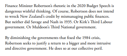
You’ll get the drift.

I’m very sympathetic to the story that both Robertson and his boss are keen on a “bigger and more intrusive and directive government”, and it is clear that they have no serious ideas about (and demonstrate little interest in) reversing the decades of relative productivity decline. Most likely, their approach will see New Zealand outcomes worsen relative to those in the rest of the world. I’ve also been quite critical of this year’s Budget and the huge cyclically-adjusted deficits the government was choosing to run at a time when their forecasts suggested the economy was running at pretty much full capacity.

And yet, and yet.

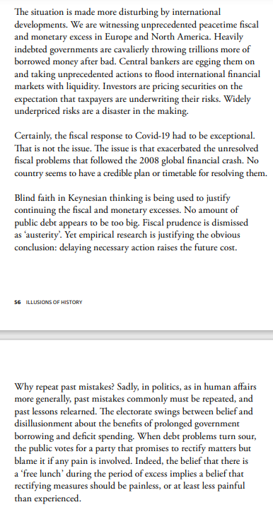
There seem to be two themes or driving concerns to the report. The first is to re-present aspects of New Zealand’s economic (policy) history in ways less sympathetic to Grant Robertson’s rhetoric, and the second is alarm – I would probably call it alarmism – about the current and prospective global situation. On that latter, these paragraphs also come from the last couple of pages of the report.

I’m probably not much more keen on big debt and big deficits than the report’s author – Bryce Wilkinson – is, but this sort of broad-brush rhetoric seems set to discredit useful and important points that could be made, especially in the New Zealand context.

Are there “unresolved fiscal problems that followed the 2008 global financial crisis”? Most probably there are, in some countries anyway, although even in the United States – exemplar of chaotic fiscal policy surely – the problems were evident before 2008, were worsened again by the Trump tax package, and are now being worsened again by what the Democrats are now trying to push through. It is a sorry picture – and the US is still a consequential country – but it isn’t the New Zealand story. We ran into big deficits for a time after 2008 – some mix of a late spend-up by the previous government, poor macro forecasts, the recession itself, and the earthquakes – but we pulled ourselves out of that hole, with (in the main) bipartisan support for doing so. On the OECD’s net general government financial liabilities measure (the broadest and most internationally comparable) we were at zero net debt just prior to Covid (and almost a quarter of OECD countries had positive net general government financial assets).

As Bryce acknowledges, the New Zealand government’s own fiscal projections have debt stablising and then slowly falling as a per cent of GDP. And if the level the socialists are happy to see it stabilise at might be higher than either Bryce or I would prefer…it is hard to get very excited about that level. Whichever measure you prefer, on none of them is there any risk of New Zealand running into a public debt crisis. Of the government’s range of debt indicators, I like the net debt one that includes NZSF assets: Treasury see that being 25 per cent of GDP in 2025.

And what about “monetary excesses”? Well, I’m not fan of QE-type programmes, but mostly because they make little sustained macroeconomic difference, but provide central banks some feeling of “doing something”. And perhaps the world really is about to see a sustained break-out of inflation, but……nowhere in the advanced world, not even in the US, are financial markets (with money at stake) suggesting that is the most likely outcome. Our own central bank, having presided over 10 years of undershooting the inflation target, was actually on the brink of tightening just last month, and may yet do so next month. At the moment, markets think governments will allow central banks to (and central banks will act to) keep any sustained lift in core inflation pressures in check. Markets may be wrong – it has been known – but I’m not sure our Minister of Finance has a strong ground for thinking they are.

And what about the history, the central part of the report’s title?

There is a rather weird reverence in some circles for the first Labour government, at least the period under M J Savage in the late 1930s. Labour seem particularly prone to it, which I suppose is somewhat understandable, but it even infects the other side of politics at times (In this post I unpicked some Todd Muller rhetoric on similar lines, during his brief stint as Leader of the Opposition). It seems to be sentimental rather than rigorous, and the NZ Initiative report is a useful quick canter (albeit with a historical error or two) through material on the macroeconomic mess that Labour government ran us into by 1938/39. At a macro level, we were simply saved by the war, but then lived with the panoply of microeconomic restrictions and controls in one form or another for the next 45 years. But it is rather light on some significant differences from the present: not only was the New Zealand government very highly indebted in the late 1930s (well over 100 per cent of GDP, not primarily the fault of the Labour government), but we were also running a system of fixed exchange rates. And we did not have a monetary policy run consistent with the demands of the exchange rate system

There is more (also with some arguable interpretations/emphases) on the macroeconomic mess New Zealand was in by 1984. That mess can be overstated – partly because inflation itself overstated the severity of (notably) fiscal deficits – but the truth was messy enough. But it wasn’t primarily a fiscal crisis – there was no question of default, no question of lenders being unwilling to lend to us – but a productivity underperformance one and (in the immediate) a monetary policy crisis. We had a fixed exchange rate regime, and we did not have a monetary policy run consistent with the demands of the exchange rate system.

By contrast, at present we have a long-running woeful productivity performance – basically the enduring theme of New Zealand economic history at least since World War Two – but we know (including because we experienced it for the last 25 years) that that isn’t inconsistent with macroeconomic stability.

We have large fiscal deficits for this year and next (on the Treasury’s best interpretation of government policy as communicated to them) but public debt ratios that are low by any standards (cross country or historical) at a time when servicing costs, while not as low as in some countries, are very low by historical standards. The effective duration of the government’s debt portfolio is shorter than desirable – and the LSAP programme is responsible for that – but crisis material it isn’t (and it wouldn’t be even if we had another bad earthquake in the next few years).

And, we do have a central bank that – for all its many weaknesses (mostly the key people) – still operates, by law (and it seems in practice) at arms-length from the government, and (for all its florid rhetoric about other stuff) shows every sign of easing policy when core inflation falls away and tightening policy when core inflation looks like rising. And which has a target, set by the government, that is totally conventional internationally. And if nothing else, having a monetary policy that runs that way – consistent with our exchange rate regime and with the inflation target – makes things utterly different, in macroeconomic stability terms, than in 1938/39 or in 1984.

Having said that, I suspect the real thing that drove the report was the opportunity to litigate Grant Robertson’s take on the 4th Labour government. Personally I tend to take that sort of Robertson rhetoric with a considerable pinch of salt, since a great deal of his style seems to involve the appearance of product differentation from the 4th Labour government even when the substance barely changes (the Reserve Bank Act amendments are a classic examples). Feelings around the late 1980s are clearly still raw, especially in the Labour Party, and it seems to be good politics to pander to that.

But Bryce Wilkinson frames six “myths” about the 1984-93 reforms. He summarises them thus

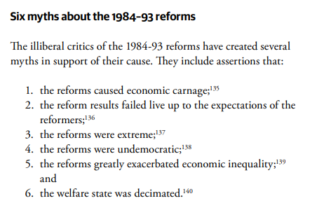
Personally, I think the truth is probably somewhere in the middle. Take for example, the first one. The Robertson quote emphasises the damage to communities, and even Wilkinson in the report acknowledges the pain of the reforms for many. He might argue it was unavoidable by then, and Robertson would have been better not to have talked about “economic carnage” (especially when the basic economic model now isn’t that different).

Were the reforms “extreme”? I don’t think so, but they were unusually far-reaching, and in places went where few other countries had yet gone. For better or worse (I think mostly better) they positioned us very well in many international policy/institutional comparisons by the 1990s having started well behind. And I recall the time we spent in one OECD review of New Zealand urging them to take out language (which they intended as a compliment) suggesting that our reforms were unusually ambitious.

Were the reforms “undemocratic”? At one level, clearly note. They were undertaken by democratically-elected governments. But Wilkinson’s specific rebuttals risk inviting derision. He suggests that the snap election “gave no time” to Labour to articulate its ideas…..which more or less concedes the platform was never campaigned on. I have a bit more sympathy for the 1987 re-election argument, except…..that Labour’s manifesto that election, with talk of further significant reforms, was published after the election. And the 1990-93 Bolger government story was also a mixed bag – labour market reform was a significant part of their campaign but (for example) benefit cuts were not, let alone the amped-up superannuation surcharge. Call it democratic or undemocratic as you like, perhaps even call it unavoidable, but it wasn’t very transparent ex ante.

Call my overly literal, but “decimated” probably roughly accurately describes the welfare system effect – it was still there and, rightly or wrongly, just quite a bit less generous than it had been before.

And then there is myth 2. Bryce and I have debated this point on many occasions over the years, and I’ve written about it here before. I can’t prove that he, or Roger Kerr, have not been surprised at how poorly the New Zealand economy has performed over the last 30 years, or by the failure to even begin to close the gaps with the OECD leaders, or by the widening productivity gaps to, notably, Australia. But I’m pretty sure most people who supported the reforms don’t think outcomes have lived up to their expectations and hopes. I recall the very first time I ever appeared before a select committee it was with the Bank’s then chief economist to tell MPs our story about how as we emerged from the reforms we would expect multiple years of above-average growth, consistent with closing the gaps to the rest of the world.

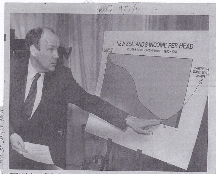
But to me the single best illustration of the point was this photo, from 1989 but rerun in the Herald a decade ago

For the younger among you, that is David Caygill, then Minister of Finance and one of the foremost reformers. It is pretty clear he expected the reform programme – which was extended after his time – to pay off in closed productivity/GDP gaps. It is also clear that it didn’t.

Bryce Wilkinson thinks more should have been done, and could have been done. He was a member of the 2025 Taskforce a decade ago on closing the gaps to Australia. But even if he is right on that – and on some specifics I agree with him – I’m not sure what is gained by continuing to run the line that the economic outcomes really weren’t disappointing or unexpected at all.

To close, the New Zealand Initiative’s report ends up being a funny beast. For better or worse, most people probably won’t care about the pre-84 history, and it isn’t clear how much relevance the specifics have to today anyway. And if there is a lot wrong with this government’s economic policy (and there is) this report is too once-over-lightly (and a little florid in places, given our relative macro stability) to add much value or get much traction. Perhaps there is still a place for debates about the 1984-93 period – in fact there definitely is, even granting that to many younger people it is (my daughter’s phrase) “ancient history” – but to do so usefully probably needs more space, more nuance, and more data than is in the relevant section of this report.

Puzzling over the New Zealand macro data

I have no doubt that our labour market has been tight and that core inflation has been rising (finally above the target midpoint). It won’t make that much difference in the long-run, but it is a shame the “Level 4 lockdown” didn’t come a day or two later because if it had the Reserve Bank would, appropriately enough, have raised the OCR. I also don’t have any reason to doubt that there was a lot of GDP growth in the June quarter.

But that doesn’t mean there aren’t some puzzles.

According to the official data the New Zealand economy is quite a lot bigger than it was pre-Covid, Of the two quarterly measures of real GDP, one was 5.3 per cent higher in the June quarter than it had been in the December 2019 quarter and the other was 4.3 per cent higher. Average the two and the best guess is a lift of 4.8 per cent. That’s a lot, especially for a country that has (a) had at best mediocre productivity growth in normal times, and (b) has had the borders largely closed to new migrants (and quite difficult even for returning New Zealanders) for almost all of that period.

Ah well, perhaps it is all the cyclical stimulus, with fiscal and monetary policy “finally” (as some might put it) coming to the party and giving the economy a well-overdue boost. But……according to SNZ, the unemployment rate in the June quarter was exactly the same as it had been in the December 2019 quarter, and so was the employment rate, so there was no sign that suddenly we’d been able to get hitherto-unutilised resources producing.

So where might the reported growth have come from? Statistics New Zealand does not publish an official quarterly series for labour productivity, but we can derive one ourselves. In this chart I’ve shown growth in labour productivity, using a measure in which the two measures of real GDP and the two hours measures (HLFS and QES) are all set to equal 100 at the start of the chart, and the resulting real GDP per hours worked indicator is calculated and shown.

New Zealand’s productivity growth has been mediocre for a long time – little over 10 per cent in total in almost 15 years – and yet according to this indicator, calculated entirely with official statistics, closing the border (with all its ramifications), and for that matter diverting material resources into testing, MIQ, enforcement etc) has resulted in no deterioration in productivity growth. If anything, productivity growth over the last 18 months has been a bit higher than usual (but such is the noise, and routine potential for revisions we probably should not make too much of that lift).

How can this be? In the depths of lockdowns there was some sign of “averaging up” – low productivity workers (notably in tourism and hospitality) will have been disproportionately likely to have lost jobs/hours, and even if everyone else was only as productive as ever, the economywide average would have risen. But if, as there probably was, there was something to that story 18 months ago (and perhaps right now), it can’t really have been the story in June when – as a already noted – employment and unemployment rates were right back to pre-Covid levels.

So if less than half the reported real GDP growth came from labour productivity, and none came from a reduction in the unemployment rate or increase in the employment rate, where did it come from? The only other possibility is more labour inputs. And (unusually) the HLFS and the QES happen to agree: whether hours worked (HLFS) or hours paid (QES), hours in the June quarter were about 3 per cent higher than they’d been in December 2019 (all data seasonally adjusted). And that isn’t (mainly) individuals working longer hours, as both the HLFS (people employed) and the QES (filled jobs) suggest quite a significant increase in the number of people working.

And why is that? Because SNZ tells us that the population has been growing still quite rapidly: the “working age population” for example is estimated to have been 2.5 per cent higher in June 2021 than in December 2019. The official total population is estimated to have risen by 1.9 per cent over the same period.

How come? Well, this is the story SNZ currently tells.

The orange line represents natural increase (births less deaths), which will be measured accurately. Natural increase is quite stable, and quite modest, at just over 0.5 percentage points contribution per annum. The variability – and the huge measurement uncertainty – comes with the net migration numbers.

According to SNZ we had the three biggest quarterly net migration inflows in the 30 year history of the population series in the September and December quarters of 2019 and the March quarter of 2020 (something not showing in their contemporaneous estimates). And on their reckoning, net migration has been positive throughout the entire Covid period, dipping very slightly negative for a single quarter.

Perhaps it is all true. But here, on the other hand, is the monthly series of net arrivals and departures from New Zealand (all citizenships, all purposes) since the start of last year.

As one might have expected, there were really big net outflows over the three months to April (Covid having first become a significant issue near the peak of the tourist season), but there has also been a steady outflow ever since. In the year to June, for example, a net outflow (all purposes) of 35226 people, with only a single month seeing a net inflow. (The net outflow continued in July and August). SNZ, by contrast, estimate – and it is an estimate, not a full count unlike the air traffic numbers – net migration inflow of about 5000 over that year.

You wouldn’t expect the two series to match exactly. There will have been people (New Zealanders and foreigners) going and coming who were not away for long, but in any sort of net sense those numbers must have gotten very small as the months went on – hardly any holidaymakers for example. Whatever the precise composition we know that there were few people in New Zealand in June 2021 than there had been either in June 2020 or in December 2019, even if SNZ claims that the official resident population has kept on increasing.

If so, it is a bit of a mystery where all those extra hours/jobs are, given that the employment and unemployment rates haven’t changed. One might reasonably suggest that the GDP (and hours/jobs) numbers themselves build on estimates of the population that are more than usually uncertain.

One other way of looking at things is to see how Australia is reported to have done. It helps that the ABS reckons that by the June quarter of this year, Australia’s unemployment rate was also back to pre-Covid levels. As it happens, labour productivity is also estimated to have risen quite a bit in Australia – up by 2.1 per cent over the 18 months to June 2021. Of course, Australian productivity growth has typically outstripped New Zealand’s, but it still seems surprisingly high given that their borders were also closed.

But the ABS also reckons that real GDP in Australia in the June 2021 quarter was only 1.6 per cent higher than it had been in December 2019. And before anyone mentions Victorian lockdowns, NSW Delta, or whatever…..this was June, when things were looking good across Australia and New Zealand (remember the “bubble”).

And if GDP growth was less than productivity growth then….hours worked are estimated to have fallen. by about 0.5 per cent.

So what explains the difference?

Here is the ABS version of the population growth components chart.

Again, natural increase has been low but stable, but (a) Australia doesn’t show anything like the NZ net migration spike pre-Covid (the Australian 2019 numbers looked much as they had for the previous few years), and (b) net migration since the middle of last year has been consistently negative. These data are only to March 2020, but the population number implicit in Australia’s June GDP and GDP per capita numbers is consistent with a small quarterly net inflow in the June quarter.

I don’t have answers, only questions. But recall that (a) over the 18 months from December 2019 to June 2020 Australia had much the same experience of Covid as we did, (b) in both countries, unemployment was back to pre-Covid levels in June 2020, and (c) Australia had very stringent restrictions on its nationals leaving Australia (unlike New Zealand) so it seems a little hard to believe that Australia (the much richer country) has had material net migration outflows while we have had modest inflows. The total arrivals and departures data for Australia also show big net outflows, except in the June quarter of this year.

Perhaps it is true. Perhaps too productivity growth (in both countries) really held up rather strongly through the uncertainty and disruption of Covid. Or perhaps – perhaps especially in the New Zealand case – much will just end up getting revised away. The biggest annual revisions are due over the next three months, and often they have been big indeed. There are other challenges, such as the 3 per cent levels gap between the production and expenditure measures of GDP.

On the productivity front, it would defy almost all conventional economic models if productivity growth was really no worse than usual amid closed borders, rampant uncertainty etc etc (with no discernible cyclical effects either). Those firms in today’s media sending staff abroad uncertain when they can come home clearly don’t believe travel and face to face contact don’t matter.

And then, of course, we have all the uncertainties about SNZ measurement of the latest lockdown to look forward to. As I recall last year, their estimates for last June treated school inputs and outputs as having continued largely unchanged, a story that probably won’t have rung true to most parents, and doesn’t now seemed backed by literature on loss of learning in lockdowns.