I have no doubt that our labour market has been tight and that core inflation has been rising (finally above the target midpoint). It won’t make that much difference in the long-run, but it is a shame the “Level 4 lockdown” didn’t come a day or two later because if it had the Reserve Bank would, appropriately enough, have raised the OCR. I also don’t have any reason to doubt that there was a lot of GDP growth in the June quarter.
But that doesn’t mean there aren’t some puzzles.
According to the official data the New Zealand economy is quite a lot bigger than it was pre-Covid, Of the two quarterly measures of real GDP, one was 5.3 per cent higher in the June quarter than it had been in the December 2019 quarter and the other was 4.3 per cent higher. Average the two and the best guess is a lift of 4.8 per cent. That’s a lot, especially for a country that has (a) had at best mediocre productivity growth in normal times, and (b) has had the borders largely closed to new migrants (and quite difficult even for returning New Zealanders) for almost all of that period.
Ah well, perhaps it is all the cyclical stimulus, with fiscal and monetary policy “finally” (as some might put it) coming to the party and giving the economy a well-overdue boost. But……according to SNZ, the unemployment rate in the June quarter was exactly the same as it had been in the December 2019 quarter, and so was the employment rate, so there was no sign that suddenly we’d been able to get hitherto-unutilised resources producing.
So where might the reported growth have come from? Statistics New Zealand does not publish an official quarterly series for labour productivity, but we can derive one ourselves. In this chart I’ve shown growth in labour productivity, using a measure in which the two measures of real GDP and the two hours measures (HLFS and QES) are all set to equal 100 at the start of the chart, and the resulting real GDP per hours worked indicator is calculated and shown.
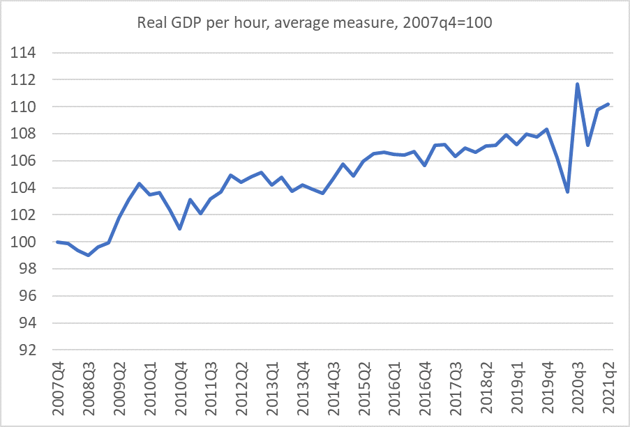
New Zealand’s productivity growth has been mediocre for a long time – little over 10 per cent in total in almost 15 years – and yet according to this indicator, calculated entirely with official statistics, closing the border (with all its ramifications), and for that matter diverting material resources into testing, MIQ, enforcement etc) has resulted in no deterioration in productivity growth. If anything, productivity growth over the last 18 months has been a bit higher than usual (but such is the noise, and routine potential for revisions we probably should not make too much of that lift).
How can this be? In the depths of lockdowns there was some sign of “averaging up” – low productivity workers (notably in tourism and hospitality) will have been disproportionately likely to have lost jobs/hours, and even if everyone else was only as productive as ever, the economywide average would have risen. But if, as there probably was, there was something to that story 18 months ago (and perhaps right now), it can’t really have been the story in June when – as a already noted – employment and unemployment rates were right back to pre-Covid levels.
So if less than half the reported real GDP growth came from labour productivity, and none came from a reduction in the unemployment rate or increase in the employment rate, where did it come from? The only other possibility is more labour inputs. And (unusually) the HLFS and the QES happen to agree: whether hours worked (HLFS) or hours paid (QES), hours in the June quarter were about 3 per cent higher than they’d been in December 2019 (all data seasonally adjusted). And that isn’t (mainly) individuals working longer hours, as both the HLFS (people employed) and the QES (filled jobs) suggest quite a significant increase in the number of people working.
And why is that? Because SNZ tells us that the population has been growing still quite rapidly: the “working age population” for example is estimated to have been 2.5 per cent higher in June 2021 than in December 2019. The official total population is estimated to have risen by 1.9 per cent over the same period.
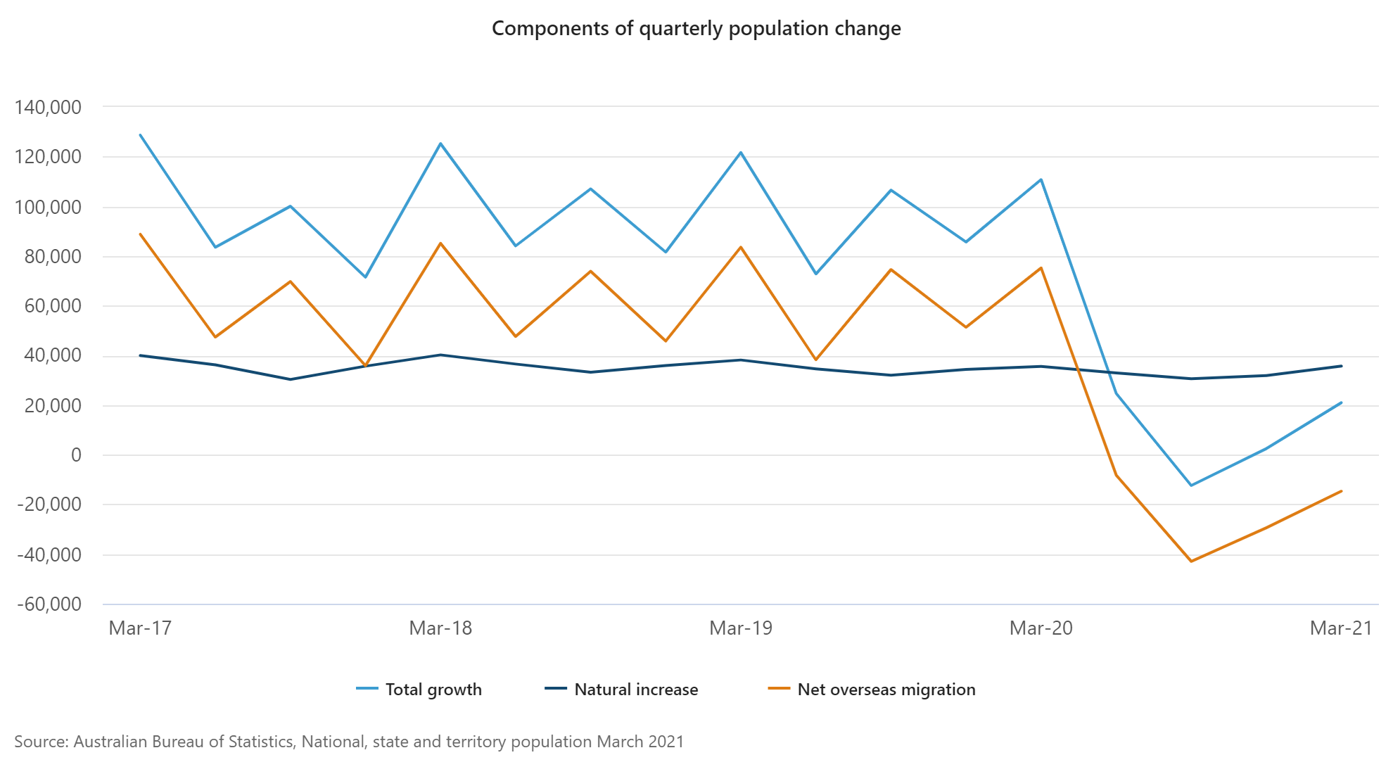
How come? Well, this is the story SNZ currently tells.

The orange line represents natural increase (births less deaths), which will be measured accurately. Natural increase is quite stable, and quite modest, at just over 0.5 percentage points contribution per annum. The variability – and the huge measurement uncertainty – comes with the net migration numbers.
According to SNZ we had the three biggest quarterly net migration inflows in the 30 year history of the population series in the September and December quarters of 2019 and the March quarter of 2020 (something not showing in their contemporaneous estimates). And on their reckoning, net migration has been positive throughout the entire Covid period, dipping very slightly negative for a single quarter.
Perhaps it is all true. But here, on the other hand, is the monthly series of net arrivals and departures from New Zealand (all citizenships, all purposes) since the start of last year.

As one might have expected, there were really big net outflows over the three months to April (Covid having first become a significant issue near the peak of the tourist season), but there has also been a steady outflow ever since. In the year to June, for example, a net outflow (all purposes) of 35226 people, with only a single month seeing a net inflow. (The net outflow continued in July and August). SNZ, by contrast, estimate – and it is an estimate, not a full count unlike the air traffic numbers – net migration inflow of about 5000 over that year.
You wouldn’t expect the two series to match exactly. There will have been people (New Zealanders and foreigners) going and coming who were not away for long, but in any sort of net sense those numbers must have gotten very small as the months went on – hardly any holidaymakers for example. Whatever the precise composition we know that there were few people in New Zealand in June 2021 than there had been either in June 2020 or in December 2019, even if SNZ claims that the official resident population has kept on increasing.
If so, it is a bit of a mystery where all those extra hours/jobs are, given that the employment and unemployment rates haven’t changed. One might reasonably suggest that the GDP (and hours/jobs) numbers themselves build on estimates of the population that are more than usually uncertain.
One other way of looking at things is to see how Australia is reported to have done. It helps that the ABS reckons that by the June quarter of this year, Australia’s unemployment rate was also back to pre-Covid levels. As it happens, labour productivity is also estimated to have risen quite a bit in Australia – up by 2.1 per cent over the 18 months to June 2021. Of course, Australian productivity growth has typically outstripped New Zealand’s, but it still seems surprisingly high given that their borders were also closed.
But the ABS also reckons that real GDP in Australia in the June 2021 quarter was only 1.6 per cent higher than it had been in December 2019. And before anyone mentions Victorian lockdowns, NSW Delta, or whatever…..this was June, when things were looking good across Australia and New Zealand (remember the “bubble”).
And if GDP growth was less than productivity growth then….hours worked are estimated to have fallen. by about 0.5 per cent.
So what explains the difference?
Here is the ABS version of the population growth components chart.
Again, natural increase has been low but stable, but (a) Australia doesn’t show anything like the NZ net migration spike pre-Covid (the Australian 2019 numbers looked much as they had for the previous few years), and (b) net migration since the middle of last year has been consistently negative. These data are only to March 2020, but the population number implicit in Australia’s June GDP and GDP per capita numbers is consistent with a small quarterly net inflow in the June quarter.
I don’t have answers, only questions. But recall that (a) over the 18 months from December 2019 to June 2020 Australia had much the same experience of Covid as we did, (b) in both countries, unemployment was back to pre-Covid levels in June 2020, and (c) Australia had very stringent restrictions on its nationals leaving Australia (unlike New Zealand) so it seems a little hard to believe that Australia (the much richer country) has had material net migration outflows while we have had modest inflows. The total arrivals and departures data for Australia also show big net outflows, except in the June quarter of this year.
Perhaps it is true. Perhaps too productivity growth (in both countries) really held up rather strongly through the uncertainty and disruption of Covid. Or perhaps – perhaps especially in the New Zealand case – much will just end up getting revised away. The biggest annual revisions are due over the next three months, and often they have been big indeed. There are other challenges, such as the 3 per cent levels gap between the production and expenditure measures of GDP.
On the productivity front, it would defy almost all conventional economic models if productivity growth was really no worse than usual amid closed borders, rampant uncertainty etc etc (with no discernible cyclical effects either). Those firms in today’s media sending staff abroad uncertain when they can come home clearly don’t believe travel and face to face contact don’t matter.
And then, of course, we have all the uncertainties about SNZ measurement of the latest lockdown to look forward to. As I recall last year, their estimates for last June treated school inputs and outputs as having continued largely unchanged, a story that probably won’t have rung true to most parents, and doesn’t now seemed backed by literature on loss of learning in lockdowns.

“On the productivity front, it would defy almost all conventional economic models if productivity growth was really no worse than usual amid closed borders, rampant uncertainty etc etc (with no discernible cyclical effects either).”
Any chance the large shift to work-from-home improved productivity?
LikeLike
It isn’t impossible there is some effect (I’ve seen papers/articles with quite different estimates of how positive or negative working from home is), but at an economywide level it seems unlikely it would have been that large by June (when only a minority were working from home, all while the border was still closed). If there is a positive effect – and I’m sceptical, but I’m not working – it is more likely to mitigate other damage than outweigh the overall losses from closed borders and distorted patterns of econ activity.
LikeLike
Reminds me of Exxon Valdez,
This Alaskan disaster actually lifted their GDP .i it looks as if disasters are desirable economically.
Team NZ seem to be making the most of it recently.
What are likely to be the consequences?
LikeLike
Reblogged this on Utopia, you are standing in it!.
LikeLike
GDP a meaningless piece of fluff to give the impression of growth of ????
It is the sum of household spending, investment in production , net exports and government spending.
The last input being without any qualitative certainty is almost guaranteed to be unproductive and contributes little growth other than to increase the burden that the competitive economy must bear to survive.
The sooner we eliminate the Reserve Bank the better . It survives only as the governments lackey in the game of funny money and to play a role in the shell game of money created as debt.
Oh yes ,it produces reports.
LikeLike
How do the business and wage subsidies get counted?? People were still employed (kept their jobs so employment stable) got paid as if they were working (increasing GDP) but worked no hours (so GDP/hour worked rises)??
LikeLike
Companies had a legal obligation to pay the wage subsidies received through to their employees.
I suspect that most payroll administrators would have paid salaries as normal (based on hourly rate and normal hours) and kept track of the subsidy with some sort of administrative code.
When reporting salary data to StatsNZ, most payroll administrators would have run a report and submitted the data without considering the impact of the wage subsidy.
I don’t see any way in which statsNZ could reliably distinguish whether the employees worked, or simply sat on their asses and collected the subsidy regardless.
LikeLike
And thus in the QES hours paid held up, even as in the HLFS – surveying households not firms – hours actually worked fell.
LikeLike
That is an issue in lockdown periods: the HLFS measures hours worked, and the QES hours paid, so during lockdowns the QES measure holds up a lot more than the HLFS. But of course there were no lockdowns in June.
GDP itself is a measure of value-added across the economy as a whole, so govt transfers don’t directly add to it, but they do enable people to spend more than the otherwise would, and the spending (and associated production) is counted in GDP.
LikeLike
Inflation is understated, so real GDP is overstated.
LikeLike
always something to check, but note the labour market indicators (notably unemployment) which are measured independently and face no issues around price/volume splits.
LikeLike
Another factor could be cash economy distortions ebbing and flowing with lockdowns.
Welfare payments would be almost impossible to live from, but in small NZ provincial towns, it is very common for beneficiaries to supplement their welfare with cash jobs. Obviously tradies also often work partially in the black economy.
The cash economy gets wiped out at L4, so perhaps the impact of L4 lockdowns are much worse for output than expected. The bounce back when L4 is lifted should see a higher improvement to output than was anticipated, because of the proliferation of cash jobs in the economy.
LikeLike