Over the last few days I’ve noticed a few political partisans on Twitter squabbling about health spending under various governments. I’m not exactly sure what triggered it, although perhaps it had something to do with John Key’s op-ed at the weekend.
Not being a political partisan myself – let alone a recent supporter of either National or Labour – I decided to have a quick look at the data myself. The Treasury publishes a quite useful long-term set of annual fiscal data, including a breakdown of spending. It is all in nominal dollars, but they also show those numbers as a percentage of nominal GDP. Here is how health spending has changed, as a per cent of GDP, since 1972 (bearing in mind that the years shifted from March to June years about 30 years ago). The data for the year to June 2021 should be out shortly (one would hope).

The trend over time is upwards. That shouldn’t surprise anyone. There is a lot more medical technology can now do for us, expectations are higher, and a larger proportion of the population is now relatively old. Oh, and as far as we can tell productivity growth in the government health sector has been pretty unimpressive.
And if the trend is upwards, there are quite material fluctuations around the trend. But note that they won’t always tell you much about health policy. After all, the ratio has a numerator (health spending) and a denominator (GDP), and nominal GDP growth can be quite variable, even in the low inflation era of the last 30 years.

The state of the economy influences what can be spent on health (and other things) but you wouldn’t expect this year’s health spend to be affected much (if at all) if the terms of trade happened to fall sharply this year, perhaps after the Budget was set.
And thus, to revert to the first chart, you may already have noticed the two big increases in health spending as a share of GDP – neither of which were sustained – happened in the 1970s (when our economy badly underperformed after 1973 for several years), and over the first few years of the last National government, when we went through a severe recession (not caused by that government) that took quite a few years to recover from. Note that part (but not all) of the reason health spending rose as a percentage of GDP in the year to June 2020 is that GDP plummeted in the first half of 2020.
Now, of course, recessions should be expected to slow the growth of health spending – even if not necessarily the volume of health services delivered. After all, a big chunk of the health budget, directly and indirectly, is salaries, and real wage inflation tends to slow (often quite sharply) in significant economic slowdowns. But it isn’t a mechanical or immediate connection, especially as much of the health workforce is unionised and sometimes on multi-year collective contracts. Equally, of course, in relatively good times, the government may be willing to settle more generously with the health workforce, boosting spending (if not necessarily the volume of health services delivered).
Comparisons across governments aren’t just affected by denominator issues. There is also the facts that (a) government fiscal years don’t line up with the dates of changes of governments, and (b) even if they were, it is hard to change spending immediately (at least if purchasing more/less health services is the aim). But, for what it is worth, here is my best effort – using annual data only – at average health spending as a percentage of GDP for each government since 1972

To be clear, it is not some gotcha effort at the current government. You can see from the first chart that health spending as a share of GDP has been rising under this government from the levels they inherited, although are still below – for good or ill, for whatever reason – the percentages run during the previous recession and immediate aftermath.
That chart involved multi-year averages and (at least for the three nine-year governments the numbers aren’t so sensitive to the choice of first or last years). The same can’t be said for crude changes from the beginning to the end of the government. But for what they are worth:
Labour 72-75: Fiscal years were March, governments changed in December. In the March 1973 year, health spending was 4.2 per cent of GDP, and in the March 1976 year it was 5.3 per cent.
National 75-84: March years. National took office in Dec, and left office in July (hot having delivered a Budget). In the March 1976 year, health spending was 5.3 per cent, and in the March 1984 year it was 4.8 per cent.
Labour 84-90: Data change to June years in 1990. Labour left office in November 1990. Health spending was 4.8 per cent of GDP in the March 1984 year, and 5.0% in the June 1990 year and 5.2% on the June 1991 year.
from here on June fiscal years, and government changes in the Dec quarter. I assume outgoing government is responsible for health spending in the June year it leaves office (Budget having been passed etc)
National 90-99: 5.2% in June 1991 year and 5.4% in the June 2000 year.
Labour 99-08: 5.4% June 2000 year, 6.5% for June 2009 year
National 08 to 17: 6.5% for June 2009 year, 5.9 per cent for June 2018 year
Labour 17 to present: 5.9 per cent for June 2018 year, 6.5 per cent for June 202 year
Here is one more chart, this time showing health spending by the government as a percentage of total primary (ie non-interest) spending.
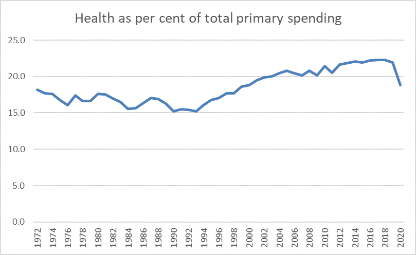
The two big trends seem to be about welfare spending. Up to the early 1990s not only were numbers unemployed rising (latterly sharply) but NZS eligibility at age 60 was becoming a heavier fiscal burden. Both trends were reversed from the early 1990s. The sharp drop in the 2020 year is, of course, mostly a reflection of the huge wage subsidy spending in the first half of last year. For those wanting to play gotcha about the previous government, health spending increased as a share of total (primary) government spending over the entire course of that government.
What do I take from all this? Not a great deal. Economic fluctuations happen, and there are limits to what governments can do about them quickly. Productivity slowdowns occur, and if there is more governments can do about them, they make it harder to manage health demands. And raw spending on its own doesn’t necessarily mean a great deal anyway, at least in terms of the health outcomes the wider public probably care about – and that is especially so if the changes in spending substantially reflect (say) a few years of being stingy or generous with the public sector health workforce.
Still on health, this post might be a good opportunity to introduce a couple of cross-country charts I showed on Twitter a couple of weeks ago. The OECD gathers data on total health spending (public and private) as a percentage of GDP, mostly for OECD countries.
This was the OECD’s chart, useful because it shows the splits across countries between government (or compulsory private) and voluntary private spending on health. I was interested in it partly because there seems to be much more difference across countries in the public/compulsory spend (per cent of GDP) than there does in the voluntary spend, and there is no sign (for example) that countries with a high government/compulsory spend (per cent of GDP) spend less voluntarily.

You’ll notice it is labelled “2020 or latest available”. Usually that might be fine, but of course 2020 not only saw big increases in health spending in many countries, but also saw significant drops in GDP in many, so comparisons that involve 2020 for some of the countries and 2019 for others aren’t going to be reliable.
Here is total health spending for 2019 for the OECD countries from the earlier chart.

The US is, of course, something of an outlier. But, focusing on New Zealand, mostly the countries that spend more on health (public and private) as a percentage of GDP are richer and more productive than we are (Chile is the exception), and countries that spend less of health (percentage of GDP) are similar productivity/income to us, or poorer (Luxembourg is the exception, but much of Luxembourg’s GDP is generated by people who work there but live in neighbouring countries). We look to spend about as much of health – public and private – as you might expect if you knew our productivity/income performance.
FInally in that group of charts, I lined up total (public and private) spending on health with total primary government spending (both as a percentage of GDP) for the OECD countries (most) that have data for both series. I’ve marked New Zealand in red. You can see that government spending as a share of GDP is well towards the lower end of the range for these OECD countries (as people on the left often bemoan) but also that there is no cross-country relationship between the two series. Countries – all in Europe – in which the government spends a great deal more of GDP (15-20 percentage points more than New Zealand) don’t spend greatly more (public and private) on health as a percentage of GDP. To the extent they do, it appears to be mostly because they are richer and more productive than New Zealand, and richer and more productive countries choose (public and private) to devote a larger share of that higher income to health.

I’m much more interested in productivity (under)performance than health spending per se. As far as I can see, we devote about what one might expect to health in a country of our productivity/income. A much better productivity performance – something that seems to seriously interest neither side of politics – would open up lots more opportunities (public and private), including the likelihood that we would choose to devote a larger share of our higher incomes to health.
Economic underperformance – over many decades now – has real consequences.
