(Not much) investment in New Zealand

A few days ago I ran a post on the cross-country relationships between population growth on the one hand, and residential, government, and business investment on the other.   Using OECD data, averaged for each country over a couple of decades, it was apparent that (a) as one would expect, residential investment makes up a larger share of GDP in countries with faster population growth (people want a roof over their head, but (b) business investment as a share of GDP was smaller the faster the population growth a country had experienced.   New Zealand’s experience was quite consistent with these relationships.  That should prompt some introspection on the part of those –  bureaucrats, politicians, and other lobby groups –  who champion our large-scale non-citizen immigration programme, the largest such active migration programme (at least for economic reasons) in per capita terms anywhere in the world.

But today, I justed wanted to look at New Zealand’s own data on investment, and particularly the experience in the current cycle.    My starting point is this chart, using the components of gross fixed capital formation (“fixed investment” in the national accounts), as a share of GDP, going back to the 1987 when the official quarterly national accounts begin.

GFCF components to Mar 17

As I noted the other day, “business investment” isn’t an official SNZ category –  it would be great if they actually started publishing one –  but instead follows the OECD practice of subtracting general government investment (schools, roads etc) and residential investment from total investment.     It isn’t fully accurate, to the extent that some residential investment is done directly for the government (so there is some double-counting) but (a) the effect should be small, and (b) it is a consistent treatment through time.

And in case anyone is wondering what the spikes in 1997 and 1999 are, they are navy frigates.

Three things struck me from this chart.

  • First, total investment as a share of GDP (the grey line) has been rising quite strongly from the trough in 2009 and 2010, but
  • Second, total investment ex residential investment (the orange line) has barely recovered at all, and
  • Third, business investment (as proxied by the blue line) has not only barely recovered, but is now smaller as a share of GDP than in every single quarter from 1992 to 2008.   And this even though our population growth rate has accelerated strongly, to the fastest rate experienced since the early 1970s

The difference between the orange and grey line is residential investment.   It has picked up a lot as a share of GDP, but then it would have been extremely worrying if that were not the case.  After all, we had a series of destructive earthquakes in Canterbury, and huge volume of resources had to be devoted to simply restoring the existing housing stock.  And we’ve had a big acceleration in population growth.    Residential investment as a share of GDP is now higher than at any time in thirty years, although house and land price developments suggest that residential land is still being held artificially scarce.

Businesses invest when they see opportunities and can raise the finance (internally or externally to take advantage of the opportunities).     There will always be some financing constraints –  firms that don’t have the retained earnings or can’t persuade someone else to provide additional debt or equity –  but it is a little hard to believe that, as this stage of the cycle, those financing constraints are much different than usual.  It suggests that firms just don’t see the investment opportunities in New Zealand to anything like the extent they once did, even though the population is growing as fast as it ever has in modern times.     It is at least suggestive that the persistently high real exchange rate might be an important part of the explanation.

New Zealand’s quarterly national accounts data go back only to 1987, but the annual national accounts data go back to the year to March 1972.    Here is business investment as a share of GDP right up to the year to March 2017.

business investment to mar 17

Not much above recessionary levels (1991 or 2009), and showing no sign whatever of picking up.   And that is even though the population (and employment) are now much higher than would have been foreseen just a few years ago.    Investment goods do appear to have got (relatively) cheaper over time, but that seems unlikely to adequately explain how firms saw investment opportunities of around 12 per cent of GDP in the two growth phases, but only around 10 per cent now  (especially as we know we’ve now had no productivity growth for five years).

Statistics New Zealand also produces annual estimates of the capital stock.  The latest observation is for the end of March 2016, but the earlier charts suggest there is little reason to think the story for the most recent year will be any more encouraging when the March 2017 data are released later this year.  This chart shows the annual growth rate is the estimated per capita real net capital stock (excluding residential dwellings).

cap stock growth

This indicator uses all the non-residential capital stock (ie including that belonging to the government sector).  As government investment has held up more strongly than business investment (see the first chart above) and as employment has been rising faster than population, the picture for business investment per employee would probably look even more disconcerting.

And, of course, all the official capital stock numbers use reproducible capital only.  In New Zealand, in particular, land is a major input to significant parts of business production.   The quantity of land is fixed (improvements to the land are included in the investment numbers above), and that fixed quantity is spread over ever more people.

Given our very serious housing situation, with house price to income ratios among the highest anywhere in the advanced world, it should be a bit troubling when really the least poor bit in the investment data is residential investment.   But lest I inadvertently comes across sounding upbeat on that score, here is annual growth in the SNZ real residential capital stock per capita.

res cap stcok

But perhaps this too is some sort of “sign of sucess” or “quality problem”?    Most people, I suspect, would settle for signs that if we are going to have rapid policy-driven population growth, that businesses would then find it remunerative to invest much more heavily, whether in building houses or producing other stuff to sell here or abroad.


Squeezing out business investment

I was up early this morning to talk to the breakfast meeting of a Rotary club about immigration and economic performance in a New Zealand context (similar points to my LEANZ address last week, but shorter and a bit simpler).  I hadn’t been to a Rotary meeting for decades, since going to the odd one as a teenager as my father’s guest, and somewhat alien as it was (altogether too extrovert for me, especially at 7am), it was also rather inspiring –  people working together to make a difference in their community; some of George H W Bush’s “thousand points of light”.

In the course of my talk, I’d made my standard point that in New Zealand rapid population growth seems to have contributed to crowding out business investment.   Whatever the reason, over the decades business investment as a share of GDP in New Zealand has averaged around the lower quartile of what has happened in OECD countries as a group.  Driving home I remembered that a couple of months ago I’d downloaded all the data to help illustrate some of the stylised facts that bothered me, but had never gotten round to using the resulting charts.

All else equal –  and it never is –  a country that has faster population growth would normally be expected to devote a higher share of current output to investment than countries with slower population growth.  That observation isn’t exactly rocket science.  More people need more houses, and roads, and shops, and offices, and schools, and hospital, and factories.   A country with no population growth at all could simply maintain its capital stock per person by devoting enough of current output to capital expenditure to cover depreciation.  (To be clear, in all this I am using national accounts measure of investment (“gross fixed capital formation”), which (largely) measures resources devoting to building new stuff.)

Houses make up the largest single component of the reproducible capital stock (and almost half the total in New Zealand at present –  note that this is houses, not the land under them).    And since everyone needs a roof over their head, and almost everyone does, you would expect to find a materially larger share of current output devoted to house-building in countries with faster population growth rates.   There is lots of short-term cyclical volatility in house-building activity, so it makes sense to look at average over a long enough period to look through cycles.

In this chart, I’m looking at the period from 1995 to 2014 and looking across OECD countries.  I chose the period because quite a few OECD countries –  especially former eastern bloc ones –  don’t have data before then, and when I downloaded the data a couple of months ago a few countries didn’t yet have 2015 data.    One year won’t materially alter the picture.

res I % of GDP

New Zealand is the red dot close to the line (above population growth of about 27 per cent).

The slope has the direction you’d expect –  faster population growth has meant a larger share of current GDP devoted to housebuilding –  and New Zealand’s experience, given our population growth, is about average.     But note how relatively flat the slope is.  On average, a country with zero population growth devoted about 4.2 per cent of GDP to housebuilding over this period, and one averaging 1.5 per cent population growth per annum would have devoted about 6 per cent GDP to housebuilding.    But building a typical house costs a lot more than a year’s average GDP (for the 2.7 people in an average dwelling).     In well-functioning house and urban land markets you’d expect a more steeply upward-sloping line –  and less upward pressure on house/land prices.    But that isn’t today’s point, which was simply that more people has indeed meant more residential investment.

But what about the business investment picture?  In the data, business investment is a residual –  calculated by taking total investment and subtracting housing investment and general government investment.  Again, all else equal, you would expect a country with a faster population growth rate to have devoted a larger share of current output to business investment.  Workers need “tools”, and if economies are going to maintain their trajectory of growth in income per capita, then the growth in the capital stock needs to at least keep pace with the number of workers.

(You might wonder why I look across countries, rather than just across time within individual countries.  There are two reasons.  First, in many countries there isn’t much variation in population growth rates.  And second, to the extent there is, reverse causation may well be at work –  a booming economy will tend to draw in more people. )

But here is what the cross-country chart looks like.

Bus I % of GDP

Again, New Zealand is the red dot near the line.

There is plenty of variation –  not every observation is close to the line –  but there is no sign at all of the expected upward slope.  If anything, the regression line is downwards –  the faster population growth was across these countries in this period, the smaller the average share of current output devoted to business investment.  The (non-housing) capital stock per person will have been growing materially more slowly in the average high populaton growth country than in the low population growth countries.    The countries with material falls in population were all former eastern-bloc countries, who might be thought to have lots of convergence (and investment) opportunities anyway.  But even if one deleted them from the chart entirely –  and recall that we too were supposed to have lots of convergence opportunities –  the regression line is still very slightly downward sloping (basically dead flat).

It is a chart that should be pretty troubling.    Even a modestly upward-sloping line would still be weaker than ones prior might lead one to expect.

Some readers with more of a background in formal economic research don’t like these scatter plots at all.  They rightly note that it captures just a relationship between two variables, and there is a lot of other stuff inevitably missing.  The relationship may be causal, but it might not be.    One protection against that risk is the use of long period averages for 30+ countries.    But, as importantly, scatter plots of this sort have to be taken together with the wider context –  other stuff we know.

For example, is there a plausible mechanism that might account for such a relationship?  Well, the notion of “crowding out” is a pretty well-established one in the economics literature.  When the government increases its expenditure, the typical result (in a reasonably fully employed economy) is for private sector spending to fall.  Higher interest rates and a higher exchange rate are part of the mechanism by which that happens.   Whether or not there is a full offset is debated, but no one seriously doubts the mechanism or the direction of the effect.    Investment spending tends to be more sensitive than consumption spending, with the exchange rate channel making tradables sector activity (sales and investment) particularly likely to respond.

Increased demands associated with faster population growth may well work in much the same way.   The summary, scatter plot, data certainly isn’t inconsistent with such a story.   In the New Zealand context, one of the stylised facts we have to grapple with is that our real interest rates have been persistently higher than those in other advanced countries, and our real exchange rate has fluctuated around persistently high levels.  (And when I restrict the business investment chart only to countries with floating exchange rates, the downward slope is still apparent.)

So I don’t find the scatter plot in isolation conclusive, but it is troubling nonetheless –  and should be for those who like to invoke the empirical estimates of large per capita income gains from immigration, again in a cross-country context.  How likely are such gains, if countries with relative fast population growth rates (almost all, on account of high immigration inflows) are also the countries that, on average, have relatively modest levels of business investment?  Firms invest to take advantage of the new opportunities that arise.

I’ve asserted that high levels of planned immigration have a disproportionate effect on investment in the tradables sector.  These aggregate data don’t shed any light on that split –  they are just total business investment.   But, at least in a New Zealand context, it makes sense that things will have worked that way.   Higher real interest rates than in other countries –  unmatched by faster productivity growth – will deter all long-lived investment here, regardless of sector.  But when the exchange rate is also boosted, firms considering new investment in the tradables sector are exposed to a double-whammy: highest cost of capital, and a less competitive position relative to foreign firms.   Domestic demand tends to be strong in countries with fast population growth, while international demand is something New Zealand firms just have to take as given.   As our export share of GDP hasn’t been growing –  if anything shrinking –  while those in most other OECD countries have, it seems reasonably likely that investment in theNew Zealand tradables sector has been much weaker than otherwise, and weaker than that in the non-tradables sectors.  That weakness in tradables investment is likely to affect both our natural resource based industries (deterring more capital intensive modes of production) and in the struggling (where unsubsidised) other parts of the tradables sector.

For many countries, population growth isn’t that materially influenced by national policy.   In the former eastern bloc countries, the fall in population is about natives leaving.  In some other countries, illegal immigration can be a big issue.  But in New Zealand –  and Australia –  policy makes a big difference.   We have full control over our borders, and let in lots of legal non-citizen migrants.   In New Zealand, in particular, it looks as though discretionary policy choices have worsened the business environment, and in particular skewing things against the prospects for strong investment by firms that could successfully take on the rest of the world.

(In case anyone is interested, somewhat to my surprise I discovered that there is also a downward-sloping regression line when one plots general government investment and population growth.   I’d expected to find that the government investment just happened anyway –  governments not being subject to market tests.  But over these countries in this period it didn’t.  If, optimistically, you think that government investment is a complement to private investment in improving economic performance, that should be particularly worrying.  Even if the lagging government investment is just about keeping up with the numbers of schools and hospitals (say) a higher population requires, it doesn’t exactly look like a mark of success –  whether in New Zealand, or across the OECD.)


Switzerland as our example – again

A month or two back, the New Zealand Initiative arranged a study tour (Go Swiss) for members (and a friendly journalist), “to learn more about their success story”.

I’ve written about this a few times, mostly because I’m genuinely perplexed that the smart people who run the Initiative really seem to think that Switzerland is much of an example for us, or even these days that much of a “success story”.

Sure, Switzerland is richer and more productive than we are.  Most advanced countries are.  But productivity levels in Switzerland now lag behind those of the leading OECD countries.  And over the last 45 years or so, Switzerland has had the lowest rate of productivity growth of any of the OECD countries for which there is a full run of data.  Just a little worse even than New Zealand.

switz 70 to 15

If I were sponsoring a study tour to places that had put in really strong performances in recent times, the Czech Republic, Slovenia or Slovakia look like they might be rather stronger contenders.     They’ve been catching up quite rapidly, not drifting back in the pack.       The Slovakia picture looks particularly impressive.  Here is the Conference Board data on real GDP per hour worked for each of New Zealand, Switzerland and Slovakia, relative to the average for France, Germany, Netherlands, and the United States (four of the higher productivity large OECD countries).

slovakia

Of course, New Zealand Initiative members are free to take their holidays wherever they like.   But it becomes of somewhat wider interest when they return trying to proselytise.

A few weeks ago the Herald’s Fran O’Sullivan provided a vehicle for some of that, relaying some rather questionable stories about the Swiss labour market (which does, among other things, feature a low youth unemployment rate), while ignoring such potentially relevant features as the absence of a generalised minimum wage in Switzerland.   Somewhat surprisingly, from a bunch of leading business people, Switzerland’s much lower company tax rate also wasn’t mentioned.  Then again, neither was its poor long-term productivity growth performance.

Sometimes the Initiative has been directly purveying the material.  Their chairman, Roger Partridge, had a piece in the Initiative’s newsletter recently extolling the contrasts between Italy and the Ticino, the Italian region of Switzerland.  “The secret to Swiss success”, so we are told, is down to “can solve”, reputedly the approach adopted by Swiss officials and politicians.    Now doing better than Italy isn’t such a great boast these days, but actually as the chart above shows, over the last 45 years Switzerland has done worse than Italy –  at least on productivity.  And then there are some of the summary indicators: on the World Bank’s ease of doing business index (not, of course, a perfect indicator of the state of regulation), Switzerland beats Italy by a substantial margin.  But Switzerland comes in at number 31.  New Zealand is number 1.

But what prompted this post was the editorial in the business section of this week’s Sunday Star-Times.   It doesn’t appear to be on the Stuff website, but if you go to this link to one of Initiative director Oliver Hartwich’s tweets, you can read an image of the whole piece.

Do you fancy living your lives more like the Swiss?…..It means entering into a radical experiment which could turn this country into another Switzerland.  A country with a high wage economy that manufactures and exports quality products, welcomes thousands of immigrants without any problems and has a fast and efficient public transport system

And, once again, we are told that

the ‘big picture” answer, according to the NZI, is in Switzerland’s decentralisation, where more than 2000 local councils have their own tax-raising powers.  Their argument is that it leads to greater pro-activity in devising strategies to attract business investment and power growth.

So, again, that would be the OECD country with the worst long-term productivity growth record?

And the other strand of the answer is, it is claimed, the education system.

Education is a dual system, which sees 80 per cent of young people enter vocational training, with only the remainder going to university.  But there is no stigma in that,

Then again, this is the OECD country with the worst productivity growth record over the last 45 years.  And, as OECD data I highlighted in the earlier post showed, actually a larger proportion of Swss 25-34 year olds have completed tertiary qualifications than in (a) most OECD countries, and (b) New Zealand.

One business leader is quoting waxing lyrical

As Fraser Whineray, boss of Mercury, said:  “an aluminium welder can be earning $150000 a year and living in a village like Queenstown”

I had no idea how much aluminium welders earn here, but this website suggests about $22.75 an hour.  That’s a bit under $50000 a year and given that Swiss GDP per capita is not even double New Zealand’s you’d have to be a little sceptical about that $150000 number (and this site offers some Swiss numbers).

But, picturesque as Switzerland is, what about the housing situation?

According to the New Zealand Initiative, as channelled by the Sunday Star-Times

Swiss house prices haven’t changed for three decades (inflation included) –  houses are still affordable compared to salaries.

The first part of that sentence is quite correct.    Real house prices (having had various ups and downs) haven’t changed much in 30 years.    But they were eye-wateringly expensive 30 years ago, and they still are today.   At the level of anecdote, I recall doing a course at the Swiss National Bank in 1990 and being told by our guides that prices in the capital Berne were so high that only senior managers at the central bank owned their own houses.

Good statistical data appears to be harder to come by: Switzerland is not, for example, in Demographia’s annual collection of house prices to median income data.   I stumbled across one website that offers data (of what quality I”m not sure) on rents and house prices in all sorts of cities.   Here is what they suggested for price to income ratios in various Swiss cities.

Zurich                                         9.5

Basle                                            9.2

Geneva                                       10.5

Lucerne                                      9.0

Berne                                        12.3

Whole country                       10.4

From what I could see, actual house prices don’t look any more “affordable” than those here (although, of course, interest rates are lower).  And, consistent with that, residential mortgage debt as a share of GDP is materially higher than that in New Zealand, in fact one of the highest ratios anywhere.

Oh, and how about home ownership rates?  Ours have been slipping, something that makes a lot of people uncomfortable (except a few –  economists mostly? –  who seem to have a vision that we’d be somehow better off if even more of us rented).  This chart is a subset of a table I found.  I’m sure not all the numbers are strictly comparable, and they are all for slightly different years, but I think most people will take New Zealand’s poor outcome over Switzerland’s any day.

home ownership

And, of course, none of this New Zealand Initiative material ever mentions the rather considerable advantages of location Switzerland enjoys –  at the heart of one of the wealthiest and most productive regions on earth, in an age when proximity and location seem to matter more than ever.    Or that, when international agencies look at Switzerland, one of the things they highlight most is the need for reforms to lift productivity growth.  The latest OECD report on Switzerland highlighted how relatively poor Switzerland’s productivity growth had been.  The press release for that report was headed “Focus on lifting productivity to guarantee future prosperity”, and part of the text read

The main objective has to be raising productivity, which will remain the key to boosting growth and maintaining a high quality of life and well-being.  The Survey suggests that Switzerland launch a new reform agenda to boost productivity, including renewed efforts to add flexibility to labour and product markets, improve public-sector efficiency, education and the business environment, and boost competition.  Increasing competition in the telecoms and energy sectors, including the privatisation of Swisscom, will be critical.

As I’ve said repeatedly, in many respects it would be nice to enjoy the material living standards the Swiss do, but……they are slipping backwards, and there is little sign that there is anything very systematic about how Switzerland does things that offers positive lessons for us, whether in beginning to reverse our dreadful productivity performance, or reverse our housing market disaster.

The mystery is why the New Zealand Initiative thinks otherwise.

But on a lighter note, I did find something from Switzerland that New Zealand could emulate.    I know Eric Crampton was one of those a bit upset about the loss of the rugby sevens tournament from Wellington.  Well, how about replacing it with office chair racing?  We spotted this on the BBC news the other night, and there is video footage here.  As the New Zealand capital of office workers, what better place than Wellington for a New Zealand leg of this sport.   Bowen Street looks as though it would offer a nice gradient, ending right in front of Parliament perhaps.  Think of the promotional opportunities.   It probably wouldn’t even take $5m of public money to get it going.


Donald Trump & lessons from NZ’s economic boom of 1996-2001

Late last week I was scrolling through a story about the IMF’s latest comments on the US economic outlook, short-term and more medium-term.   As the story reminded readers

The Trump administration says its economic platform — including cutting corporate and ­income taxes, boosting infrastructure spending and reducing regulations — will push growth up to a sustained rate of 3-4 per cent a year and cut unhealthy government debt levels.

At present, the Federal Reserve’s FOMC members collectively think potential GDP growth rates in the US are a touch under 2 per cent per annum.

The IMF has just finished its Article IV “mission” to the US (the US Treasury and the Fed being each a few blocks’ walk from the IMF), and released the team’s Concluding Remarks.   The Fund is, understandably, (more than) a bit sceptical about prospects for such an acceleration in the rate of growth of potential output.  But they are international public servants, and the US has a lot of clout on the Fund’s Board –  and, what is more, the Administration is currently looking to cut back US funding of various international organisations.

So the IMF can’t just come out and talk about the unlikelihood of any sort of large-scale acceleration of potential economic growth because of (a) a fundamentally unserious President, with little interest in policy and no apparent ability to deliver on an agenda anyway, or (b) a US Congress which has, if anything, (and on a bipartisan basis) lower approval ratings than the President, or (c) the corrupting influence of vested interests.  Instead, the Fund has to fall back on fairly bloodless technocratic arguments and illustrations.   But one thing they should be able to bring to the table is authoritative use of perspectives from other countries –  the Fund, after all, undertakes monitoring and surveillance of virtually every country’s economy, other than North Korea.

And whereas I’ve never seen a chart in the IMF’s Concluding Remarks for New Zealand, there were five in last week’s US document, four of which looked quite useful.  A couple even found their way into the Wall St Journal, and given how little attention the IMF’s view on the US usually get in the US, that probably counts as success.

Little old New Zealand was even singled out in one of the charts.

IMF growth accelerations

Looking at advanced countries since 1980, the IMF found this smallish sample of cases where countries had achieved at least a one percentage point lift in potential output growth (per working age adult) that lasted at least five years.    On this chart, New Zealand’s experience over 1996 to 2001 looked pretty impressive –  fourth best seen among IMF advanced countries in the last 35 years.

But it was a bit puzzling.   I sat around the Reserve Bank’s Monetary Policy Committee table right through that period, and “startingly impressive economic performance” wasn’t one of the descriptions that came easily to mind.     Even though the Fund’s asterisk describes us as “coming from recession” during that period, it was actually one that began at the end of a (pretty strong) four or five year recovery, encompassed another mild recession, as well as some chaotic monetary policy, an odd mix of fiscal policy, and towards the end of the period, increased marginal tax rates and a considerable slump in business confidence.    Through quite a bit of volatility, interest rates and the exchange rate fell a long way.

But perhaps I’d missed something, through getting too close to the short-term ups and downs.  So I dug out the data and had a look.

Perhaps if the IMF had had a quick look at this chart first, they’d just have left New Zealand off the chart (I’ve used the average of our two GDP measures, and the official HLFS working age population data).

Real GDP per WAP

Nothing stands out about that 1996-2001 period (average growth for which is highlighted in orange).  By our standards. it wasn’t a bad period, but it wasn’t obviously one I’d be wanting to send other countries’ officials and ministers to learn from.  There was no acceleration in real growth, let alone a sustained one.

But I had read carefully the labels on the IMF chart, and they were using “potential output growth” (per working age adult).  The problem with “potential output” growth is that it isn’t directly observable, and even years later it often hard to get a reliable handle on.

The OECD publishes estimates of potential output growth for its member countries including New Zealand.  And one can back out IMF estimates of potential output growth because they publish output gap estimates (actual growth adjusted for the change in the output gap is potential output growth).   Adjusting both for growth in the working age population produced this chart.

potential growthThere isn’t anything startling about 1996 itself, but at least on these measures potential output growth in the late 1990s was estimated to have been stronger than before or since.

So over the period the IMF highlights, actual real GDP growth (per working age person)wasn’t anything out of the ordinary, but the international agencies think that potential growth (per working age adult)  was pretty impressive  –  more of an acceleration than seen almost anywhere in the advanced world in modern times.

One possible reconciliation could be that New Zealand went into a severe recession during this period, leaving lots of excess capacity (but lots of underlying potential growth, as trend productivity grows rapidly).  It does happen –  it was part of the story of the US in the 1930s for example.

But that certainly doesn’t look to have been the story here.

Labour util

The unemployment rate was a bit lower in 2001 than it had been in 2006, and the labour force participation rate was a bit higher.

Another way to try to make sense of what was going on is to look at:

  • growth in the capital stock (per working age person)
  • growth in multi-factor productivity,
  • growth in hours worked per working age person, and
  • growth in labour productivity (real GDP per hour worked).

Here is the growth of the real capital stock per working age person, shown in two different ways –  the total capital stock, and the capital stock excluding residential dwellings.

cap stock

The period from 1996 to 2001 certainly saw stronger growth in the capital stock (per person) than in the previous period, and thus there is something to the IMF point about growth in potential during this period being somewhat influenced by the previous recession.    But even on this measure, nothing really stood out about the period.  Growth in the capital stock was no faster than it had been at the end of the previous boom, and was lower than we experienced in the last few years prior to the 2008/09 recession.

What about multi-factor productivity growth?   Measured properly, this is stuff everyone is after –  more outputs for the same inputs.    This is annual growth in the OECD’s measure of MFP.

MFP growth

Nothing stands out about the 1996 to 2001 period (consistent with the IMF chart itself, in which the contribution of MFP growth is all but invisible).

Here is (HLFS) hours worked per working age person.

hours worked

Again, nothing stands out about the 1996 to 2001 period.  There had been a big contribution in the previous few years, as demand recovered, drawing more labour back into employment, but by the period the IMF is focusing on there is nothing notable.

And, finally, what about labour productivity (growth in real GDP per hour worked)?    Here, at last, perhaps there is something to the IMF story.

IMF GDP phw

Using the average of the two real GDP measures, labour productivity growth actually was a bit faster in this period than in, say, the five year windows either side.     Even by New Zealand standards (among the weakest productivity growth in the OECD over 45 years) it is not that strong a performance, but the recovery in investment growth (see capital stock chart above) must have made a helpful difference for a time.

I got to the end of all this reassured that I hadn’t in fact missed any great lift in New Zealand’s economic performance over 1996 to 2001.  People are simply better to look at our actual experience, rather than the IMF or OECD estimates of unobserved “potential”.  Perhaps the other country examples the IMF cited work better?

I don’t suppose Donald Trump will be taking any notice of the IMF’s analysis or advice,  but if any minions do pay some attention to the IMF piece, the Fund’s use of the New Zealand case won’t do anything to lift anyone’s confidence that the IMF really has anything very compelling to offer.   Sadly, they didn’t have much useful to offer us either (here and here).


Immigration and New Zealand’s economic performance

That was the subject of last night’s Law and Economics Association seminar.    Eric Crampton (from the New Zealand Initiative) and I each spoke, and a good discussion followed.    The LEANZ flyer captured the essence of our own different approaches

Our speakers have differing views on the subject:

According to Michael Reddell, for most of the last 70 years successive governments have promoted large scale inflows of non-New Zealand citizens. Through various channels, this helps explain why New Zealand has been the worst performing advanced country economy in the world over that time – before and after the 1980s economic reforms. Located on remote islands, in an age when personal connections are more important than ever, that performance is unlikely to improve much, whatever else we do, until the government gets out of the business of trying to drive up our population, against the revealed preferences and insights of New Zealanders. We can provide top-notch incomes here – as we did in the decades up to World War Two – but probably only for a modest number of people.

Eric Crampton on the other hand says: It’s easy to scapegoat immigrants for all of the world’s problems – and many do. Proving immigrants do any harm at all is substantially more difficult. The New Zealand Initiative’s 2017 report on immigration looked to the data on immigration and found it difficult to reconcile popular fears about immigration with the data. As best we are able to tell, immigrants have lower crime rates than native-born New Zealanders; the children of immigrants are more likely than Kiwis to pursue higher education; and, immigrants integrate remarkably well into New Zealand society. Arguments that immigrants are to blame for slow productivity growth in New Zealand are inconsistent with either the international evidence of the effects of immigration on wages, and with what New Zealand evidence exists. And where the benefits of agglomeration seem to be increasing, restricting immigration against the revealed preferences of migrants, of those selling or renting them houses, and of those employing them, is likely to do rather more harm than good.

Eric’s presentation (here) was largely based around the Initiative’s advocacy piece on immigration published earlier in the year, which I responded to in a series of posts (collected here).    The text that I spoke from was under the title Distance still matters hugely: an economist’s case for much-reduced non-citizen immigration to New Zealand.  We engage pretty amicably, and I’m still grateful for Eric’s post about this blog in its early days, in which he noted

Michael believes that too high[a rate] of immigration has been substantially detrimental for New Zealand, where I’m rather pro-immigration. But his is the anti-immigration case worth taking seriously.

But in many respects, we were probably talking about different aspects of the issues.   When he focused on New Zealand, the points Eric made mostly weren’t ones I disagreed with.  We have been relatively successful in integrating large numbers of migrants, and migrants to New Zealand have been more skilled than those to most other advanced OECD countries.  Migrants don’t commit crimes at higher rates than natives: if anything, given the prior screening, probably at lower rates.   We both agree that housing supply and land use laws need fixing – although I’m more pessimistic than he is, because I’ve not been able to find a single example of a place that has successfully unwound such a regulatory morass.  But much of his story seemed to be on the one hand an acknowledgement that there isn’t much specific New Zealand research on the economic impact of our immigration, and on the other an empassioned call for us therefore to simply follow the “international consensus” and international evidence on the issue, because he could see no reason why our situation would be different than that of other advanced countries.

By contrast, my presentation was really devoted to making the case –  grounded in New Zealand’s economic history and experience – that New Zealand’s situation (and Australia’s for that matter) really is different than that of most advanced countries.    Along the way, I suggested that the overseas evidence is less persuasive than it is often made out to be.   After discussing the 19th century migration experiences, where the economic literature is pretty clear that migration contributed to “factor price equalisation”  –  lowering wage growth in the land-rich settlement countries, and raising it in the European countries the migrants left –  I turned to the literature on the more recent experience.

There are two broad classes of empirical literature on the more-recent experience (in addition to the model-based papers in which the models in practice generate the results researchers calibrate them to produce):

  • Studies of how wages behave in different places within a country depending on the differing migration experiences of those places, and
  • Studies that attempt to estimate real GDP per capita (or productivity) effects from a multi-country sample.

There are lots of studies in the first category, and not many in the second.   And almost all are bedevilled by problems including the difficulty of attempting to identify genuinely independent changes in immigration (if a region is booming and that attracts lots of migrants, higher wages may be associated with higher immigration without being caused by it, and vice versa).

I’ve never found the wage studies very useful for the sorts of overall economic performance questions I’m mainly interested in.  Precisely because they are focused on different regions within a country, they take as given wider economic conditions in that country (including its interest rates and real exchange rates).  They can’t shed any very direct light on what happens at the level of an entire country – the level at which immigration policy is typically set –  at least if a country has its own interest rates.  I’ve argued, in a New Zealand context, that repeated large migration inflows tend to drive up real interest rates and exchange rates, crowding out business investment especially that in tradables sectors.    In the short-term, it is quite plausible that immigration will boost wages –  the short-term demand effects (building etc) exceed the supply effects –  but in the longer-term that same immigration may well hold back the overall rate of productivity growth for the country as a whole.

There really aren’t many cross-country empirical studies looking at the effects on real GDP per capita (let alone attempting to break out the effects on natives vs those on the immigrants themselves, or looking at superior measures such as NNI per capita).   Those that exist tend to produce what look like large positive effects.  So large in fact that they simply aren’t very plausible, at least if you come from a country that has actually experienced large scale migration.   In one recent IMF paper, discussed in their flagship World Economic Outlook last year, an increase in the migrant share of the population of around 1 percentage point appeared to boost per capita GDP by around 2 percentage points.   As I noted, if that were so it suggested that if 10 per cent of the French and British populations swapped countries – in which case the migrant share in each country would still be lower than those in NZ and Australia –  both countries could expect a huge lift in per capita GDP (perhaps 20 per cent).   Nordic countries could catch up with Norway in GDP per capita simply by swapping populations between, say, Denmark and Sweden.

And countries that were seeking to reverse decades of relative economic decline could reverse that performance by bringing in lots of migrants.  Except, of course, that that more or less described New Zealand.  Over the last 25 years we’ve had lots of policy-induced non-citizen immigration (and many of the migrants aren’t that lowly-skilled by international standards).  And we’ve made no progress catching up with the other advanced countries; in fact we’ve gone on having some of the lowest productivity growth anywhere.  As it happens, Israel –  with more migrants again than we had –  had similarly dismal productivity growth.

I could go on.  For example, a country like Ireland certainly experienced a huge surge in productivity, but it was half a decade before the real surge in immigration started.    And, the way the model is specified, the per capita GDP gains are sustained only if the migrant share of the population remains permanently high –  if the migrant share dropped back so would the level of GDP per capita.  None of it rings true.  It speaks of models that, with the best will in the world, are simply mis-specified, and haven’t at all captured the role of exogenous policy choices around immigration.

But the thrust of my story was that New Zealand (and Australia) were different because their prosperity has, since first settlement, rested substantially on the ability of smart people, with good institutions, to make the most of fixed natural resources.   And our prosperity still rests on those fixed natural resources –  whereas that is no longer the case in most advanced economies – because it seems to still be very hard for many successful international businesses to develop and mature based in New Zealand (or Australia) when based on other than location-specific natural resources.  Our services exports, for example, are still lower as a share of GDP than they were 15 years ago, and represent a small share of GDP by advanced country standards (even with subsidies to the film industry (direct) or the export education industry (indirect)).

Of course, really energetic and smart people –  NZers and immigrants –  will start businesses here that seek to tap global markets (often going straight to the world, not starting with the domestic market).  But experience suggests that for all those talents and ideas, it is (a) harder to base and build such businesses here than in many other places, and (b) even among those that succeed, in time most will be even more valuable and more successful based somewhere nearer the markets, supplier, knowledge networks etc.   Mostly, it looks as though remote places will successfully specialise in production of things that are location-specific.   Gold or oil are where they are.  They aren’t in London or San Francisco.  Or Auckland.   Much the same could no doubt be said for hydro power, or good dairy or sheep land.

Heavy reliance on fixed factors (land and associated resources) doesn’t doom a country to underperformance.  But it does mean that if your country’s population is going to grow faster than that in other countries that are much less reliant on fixed natural resources, one needs a faster rate of underlying productivity growth just to keep up with the income growth in other countries.  Either that, or new mineral discoveries (always there but not previously recognised).   We’ve managed neither.

Against this backdrop, I concluded

Specifically, now we need deep sustained cuts in our immigration programme.  I’ve argued for 10000 to 15000 residence approvals a year.  Doing that wouldn’t be terribly radical – we’d actually be putting ourselves more in the mainstream of international experience with immigration policy.  Doing so would allow a rebalancing of our economy, and help us to meet pressing environmental challenges,  in ways that would offer a credible promise of materially higher living standards for, say, 4.5 million New Zealanders.     After 25 years –  perhaps even 70  –  when things have just gotten worse for New Zealanders relative to their peers in other advanced countries,  it is past time to abandon the failed experiment  –  and radical experiment, not mainstream orthodoxy, it is –  of large scale non-citizen immigration.     A population growing as fast as ours is, driven up by government fiat when private choices are mostly running the other way (birth rates below replacements, net outflows of New Zealanders), in a location so remote, just doesn’t make a lot of sense.

In the discussion that followed, there was quite a lot of what seemed to me like wishful thinking, and a reluctance to accept the apparent limitations of our location.  I can understand that reluctance.  In the past I’ve been there myself – I’ve just this morning re-read the text I wrote some years ago for the 2025 Taskforce’s report on why distance was overstated as a constraint.   I think Eric and I both accept that, if anything, personal connections are becoming ever more important (certainly than say 100 years ago, and perhaps even than 30 years ago).  Perhaps one day, technology really will markedly ease those constraints  –  eg the possibilities that might arise from mooted six hour flights to San Francisco instead of twelve.   As I responded to a questioner, if those ideas about the death of distance were being articulated in 1990, when New Zealand was just opening up, I’d probably have found them plausible.  But we’ve seen no evidence of it being enough –  no acceleration in (relative) productivity growth, no surge in city-based exports, really no nothing.

Eric also suggested that reliance on natural resources was a dangerous strategy, because of the potential over future decades for things like meat-substitutes to develop.  They may well.  And perhaps Ukraine (say) will get its act together, and a remote agricultural producer will be at even more of a disadvantage.  I don’t have any expertise in those areas, but even if they are a possibility that we may have to face, so what?  If the advantages/industries that have made New Zealand relatively prosperous were to go into further decline, it would be even more worrisome (for future living standards) if our policymakers had gone out on a limb and imported even more people.    Because there is simply no evidence, despite all the hopes, and all the high-flown bureaucratic words, that an Auckland-based alternative economic future is coming to anything very promising.  Auckland’s GDP per capita isn’t much above the New Zealand average –  unlike the situation in places (think London or New York) where service-based international industries now predominate –  and that margin has been shrinking further.   When the economic opportunities in places go into relative decline people rationally leave those places.  It is the way things work within countries.  There is no particular reason for it to be any different between countries (see for example, the huge outflow of New Zealanders to Australia in the last 40 years or so).

I have sought to advance a narrative to explain as many as possible of the stylised facts of New Zealand’s underperformance, including

·        There is still no sign of any labour productivity convergence (if anything, on average, real GDP per hour worked is falling slowly further behind),

·        Total factor productivity is hard to measure, but on the measure there are we’ve kept on doing very badly there too,

·        We’ve had 25 years of the highest average real interest rates in the OECD  (which could be a good thing if we had lots of productivity growth, but we haven’t)

·        Not unrelatedly, even though our productivity has slipped behind over decades, our real exchange rate hasn’t adjusted downwards in the way that standard theory would teach,

·        We’ve had weak business investment (bottom quartile of OECD countries, even though population growth has been in the top quartile), even though we started with low levels of capital, and

·        We are still experiencing weak growth in exports (unlike most countries, we’ve seen no growth in exports/GDP for 25 years or more) and weak growth in the tradables sector of the economy (in per capita terms, no growth at all this century.

·        Among those exports, there is little sign of any sustained move beyond reliance on natural resource based exports.

·        Oh, and our one half-decent sized city, Auckland, has experienced declining GDP per capita, relative to the national average, over the 16 years for which we have the data.

Eric’s response last night was that there were many alternative narratives to explain our dismal long-term productivity performance.  But, in fact, whether in their full report earlier in the year, or in discussion last night, the Initiative hasn’t really sought to outline a credible alternative story.   In practice, any alternative seems to amount to “well, it would, or could well have been, worse without the large-scale immigration”.  Perhaps it could have been. but surely it would be helpful to offer a story about the channels through which those worse outcomes could have come about, and how those channels are consistent with the indicators we’ve actually seen?

I ended the text I spoke from with an appendix setting out the key elements of how I’d change our immigration policy.  Much of it will be more or less familiar to regular readers, but for the record here is the list.

Appendix

Some specifics of how I would overhaul New Zealand’s immigration policy:

  1. Cut the residence approvals planning range to an annual 10000 to 15000, perhaps phased in over two or three years
  2. Discontinue the various Pacific access categories that provide preferential access to residence approvals to people who would not otherwise qualify.
  3. Allow residence approvals for parents only where the New Zealand citizen children have purchased an insurance policy from a robust insurance company that will cover future superannuation, health and rest home costs.
  4. Amend the points system to:
    • Remove the additional points offered for jobs outside Auckland
    • Remove the additional points allowed for New Zealand academic qualifications
  5. Remove the existing rights of foreign students to work in New Zealand while studying here. An exception might be made for Masters or PhD students doing tutoring.
  6. Institute work visa provisions that are:
    • Capped in length of time (a single maximum term of three years, with at least a year overseas before any return on a subsequent work visa).
    • Subject to a fee, of perhaps $20000 per annum or 20 per cent of the employee’s annual income (whichever is greater).

I argue that this sort of approach would take more seriously the constraints of location, and offer much better prospects for lifting the productivity and living standards of something like the existing population of New Zealanders.  Much of modern economics doesn’t pay much attention to fixed natural resources, and economics of location (at least in a cross-country sense).  That is understandable –  they aren’t the big issues for most other advanced countries (UK, USA, Belgium, Switzerland and so on).  What is less readily pardonable is the willingness of our own political leaders, and supporting bureaucrats, to give so little attention to those factors and what they mean for our prospects.  Firms, families, and societies all manage within constraints.  Our governments do so when it comes to managing their own financial accounts.  But otherwise, they seem free to just pretend that we are in a different situation than we are actually are, to persist with a modern Think Big that, decades on, still shows no sign of working out well for New Zealanders as a whole.   Quite why New Zealanders allow ourselves to be carried along, when the evidence is against it, is something of a mystery.

Emissions policy and immigration policy

A month or so ago I ran a couple of posts on New Zealand’s greenhouse gas emissions in international context.  Readers may recall that New Zealand now has the second highest emissions per unit of GDP of any OECD country, having moved up from sixth in 1990.

emissions per GDP

As part of the Paris climate change accord process, New Zealand has made ambitious promises to reduce its total emissions substantially.   This was the wording from the terms of reference for the new Productivity Commission inquiry into how best the economy might adjust given the climate targets

New Zealand has recently formalised its first Nationally Determined Contribution under the Paris Agreement to reduce its emissions by 30 percent below 2005 levels by 2030. The Paris Agreement envisages all countries taking progressively ambitious emissions reduction targets beyond 2030. Countries are invited to formulate and communicate long-term low emission development strategies before 2020. The Government has previously notified a target for a 50 per cent reduction in New Zealand greenhouse gas emissions from 1990 levels by 2050.

At present, total emissions are still above 1990 levels, not a common outcome for OECD countries.

One of the reasons for that is that we have had much faster population growth than most advanced countries.    Indeed, in their recent report on emissions etc, the Ministry for the Environment even listed population growth as first among the various constraints or challenges New Zealand faces.

Some of the challenges New Zealand faces when reducing emissions include:

  • a growing population
  • almost half our emissions are from agriculture where there are fewer economically viable options currently available to reduce emissions
  • an electricity sector that is already 80.8 per cent renewable (meaning that we have fewer ‘easy wins’ available to us compared to other countries who can more easily make significant emissions reductions  by switching to renewable sources of electricity).

As I noted in my earlier post, I was pleasantly surprised to find the population issue listed so prominently.

It is hard to disagree with them  But it does leave one wondering what advice or research/analysis they have done, and provided to Ministers –  including when the target was being adopted –  about the implications of New Zealand’s immigration policy.  Our non-citizen immigration policy pushes up the population by almost 1 per cent per annum (against an, admittedly unrealistic, benchmark of zero inward migration of non-citizens).  Have they analysed the potential costs and benefits from lowering the non-citizen immigration target relative to other possible abatement (or compensation) mechanisms?  Perhaps there is credible modelling that suggests the overall abatement costs to New Zealanders would be lower through other plausible mechanisms.  But given that population increases appear first, and without further commentary, on their lists of “challenges” it would be good to know if they have done the work.

On reflection, I think I will lodge an Official Information Act request to find out.

And so I did, writing thus to the Ministry for the Environment

I was interested to read in the snapshot emissions document released this morning that the Ministry regards increasing population as one of the top challenges New Zealand faces in meeting its emissions reductions target.

Accordingly, I request copies of all advice to the Minister for the Environment or ministers responsible for climate change policy, any and all internal research or analysis documents, and any advice to MBIE or the Mnister of Immigration, on the implications of New Zealand’s immigration policy for (a) the setting of, or (b) the successful pursuit of, or (c) costs of pursuing New Zealand’s emissions reduction target.   Among my interests is in any material on the relative costs of various options for achieving the target, including whether any research and modelling has been done on the costs of cutting the immigration targets relative to other abatement methods/policies.

This request covers all material since the start of 2014.

I deliberately went back to the start of 2014 to encompass both the period leading up to the adoption of New Zealand’s emissions reductions commitments, and the period since then, when presumably officials had to think hard about how policy might assist in minimising the costs to the economy of meeting the target the government had committed us to.

A short time ago, I received a full and comprehensive reply from the Ministry for the Environment, the ministry which has the lead responsibility for official advice on climate change and emissions related issues.

After quoting my request back to me, Roger Lincoln, Director Climate Change, replied

“No documents were found within the scope of your request. For this reason, your request is being refused under the grounds of 18(e) – the document that contains the information requested does not exist or can’t be found.”

I wasn’t really expecting there would be much.  But nothing at all, not a shred, whether before the government entered into these commitments, or subsequently, or even just before they openly listed the growing population first in the list of challenges New Zealand faces in reducing emissions?   That did take me by surprise.   So complete is the absence of material, that it is almost as if they were determined not to consider the issue, or (say) point it out to MBIE, the government’s leading immigration policy advisors.  Whether that was because senior officials internally discouraged them looking at the issue, or whether one or other of their ministers issued such guidance, we don’t know.

But MfE is clearly aware enough of the issue to put it top of their recently-published list of challenges.  And yet has done no research, no analysis, and provided no advice on the interaction between immigration policy and the costs of meeting our climate change commitments.

Not long enough, Stephen Toplis incurred the wrath of a senior public official for suggesting that, in his view, if the Reserve Bank did not adopt a particular line, it could be considered “negligent” –  ie not doing its job properly.   And that was just a conditional statement about something that hadn’t happened yet.      When the Ministry for the Enviroment has done nothing at all on immigration policy and the additional costs it appears to impose to meet the emissions targets –  not even simply pointing out the possible connection to MBIE –  whether in providing advice on formulating commitments, or on how the country might best meet those government commitments – that looks quite a lot like actual negligence, with the potential for real economic costs to New Zealanders.

I do hope that when their Issues Paper for the emissions reduction inquiry emerges, the Productivity Commission will prove to have taken the issue rather more seriously.

The Secretary to the Treasury on productivity

A speech appeared on The Treasury’s website the other day.   It was, we were told, by Gabs Makhlouf, Secretary to the Treasury, and given as the closing address at a Productivity Hub Workshop last Friday.  The Productivity Hub is a grouping of government agencies, hosted at the Productivity Commission

which aims to improve how policy can contribute to the productivity performance of the New Zealand economy and the wellbeing of New Zealanders

It is a laudable aim.  I’ve been to a few of their events, and at times they’ve had some interesting and stimulating speakers.   Whatever the event was that Makhlouf was speaking at, it has a very low profile  –  there is nothing about it on the Hub’s homepage, or anywhere else I can see.  I’ve lodged a request for the papers and presentations.

I’m all in favour of pro-active release of material by government agencies, but I was a little curious why The Treasury chose to make this speech something on-the-record.  Closing addresses usually seek to summarise and draw lessons from what has been heard at the conference/workshop.   But in Makhlouf’s speech there is no reference to any of the papers that had been presented, or any of the material discussed at the workshop.    Perhaps he just wanted to signal that he, Secretary to the Treasury, treats productivity as something important (on checking, I found that Treasury had also published his brief remarks to a couple of previous Productivity Hub events)?

Whatever the reason, when the Secretary to the Treasury  –  head of the government’s main economic advisory agency –  talks about productivity, it should be worth taking note of.   After all, presumably even now Treasury is in the process of pulling together the analysis and advice that will form the basis for their Briefing to the Incoming Minister (BIM) after the election.     We might hope they will be (a) pointing out to the Minister of Finance that New Zealand’s productivity performance is woeful, and (b) offering a compelling narrative and set of recommendations for what might reverse that performance and enable New Zealand to deliver for its citizens the sort of standard of living they should reasonably expect.     But on the basis of the Secretary’s latest speech, I wouldn’t be holding your breath.

Of course, one can’t expect any sort of fully-developed story in a few pages closing a workshop.  But if there is (a) a sense of urgency, and (b) a well-developed set of policy proposals being worked-up, that should be clear in a speech of this sort. Neither is there.

Makhouf recognises that our productivity performance leaves something to be desired, but how is this for minimising the issue?

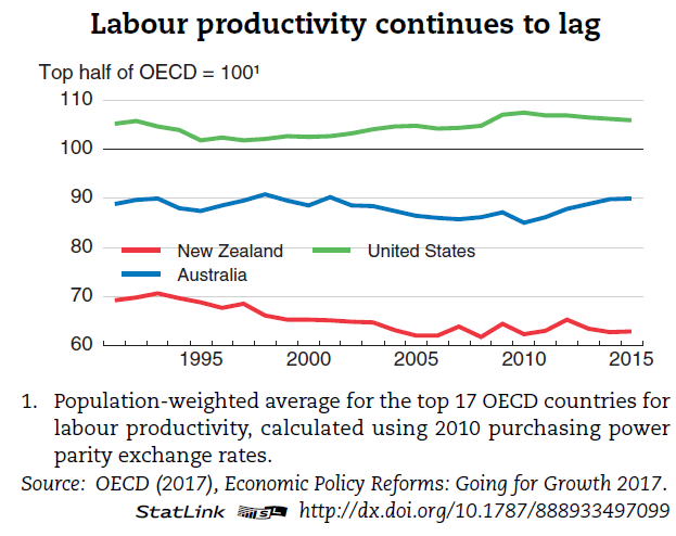
We are middle of the OECD pack at best in the amount of income we derive per hour worked, and we have made little or no headway on lifting our productivity performance rankings over the past 15 years.

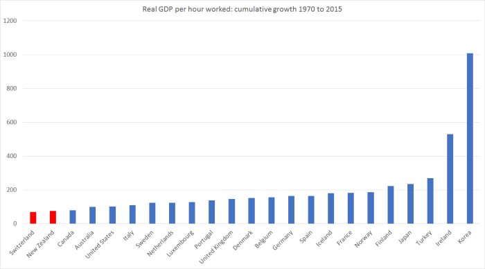
There are 35 OECD countries now, and only 13 had real GDP per hour worked less than New Zealand’s in 2015 (most recent comprehensive data).   And the only reason we are even near the middle of the OECD pack is because so many poorer countries have been allowed into the OECD.    Every single one of the 11 new members in recent decades was poorer, and less productive than us, when they joined.

When we joined the OECD in 1973, it was a club of 24 countries.  OECD data go back to 1970.  And in 1970, our real GDP per hour worked was similar to that in France and Germany.     These days, they have productivity 60 per cent higher than ours, and of those 24 countries only Portugal, Turkey, and Greece now have lower real GDP per hour worked than we do.   In 1970, Turkey had GDP per hour worked less than half ours, while on the latest estimates it is now almost equal to us.

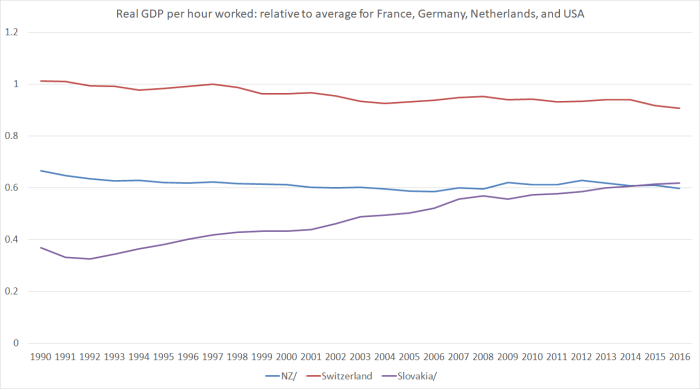
And while it is certainly true that “we have made little or no headway on lifting our productivity performance rankings over the past 15 years”, the story is much worse than that, as even the OECD highlighted last week.    Here is their chart

OECD productivity

And this is mine, from a post a couple of weeks ago

douglas 3

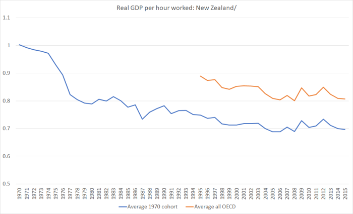
In 47 years now there has never been a time when New Zealand has succeeded in narrowing the productivity gaps that have opened up between us and other advanced countries.  At best, we’ve gone sideways in some periods.

And if Makhouf understates the severity of the problem, he overstates any signs of progress

Our understanding of New Zealand’s productivity performance is improving, thanks to a wealth of information that has recently been released including as a result of the Productivity Commission’s report Achieving New Zealand’s Productivity Potential, the OECD’s New Zealand Country Study and Going for Growth, and the Treasury’s He Tirohanga Mokopuna.  (That last one is a cracking read, by the way.)

Really?   The Treasury report he refers to was their long-term fiscal report, and I’m genuinely puzzled as to how he thinks that (useful) report advances our understanding of the productivity underperformance.    The Productivity Commission piece, which I wrote about here, was an interesting effort, and did represent a step forward in some areas (including the treatment of immigration policy) but it has hardly galvanised the nation –  or even, as far as I can tell, official Wellington.  As for the OECD’s report, surely Makhlouf was just being diplomatic  –  the OECD chief economist was at the workshop –  rather than seriously suggesting that they have a compelling narrative to explain New Zealand’s underperformance and, thus, a solid model to use in proposing remedies?

Makhlouf goes on

Our challenge now is to keep building the momentum of progress and turning our growing understanding into action that lifts our productivity performance.

But where is the progress at all?   Where, specifically, is the evidence that Treasury –  or other government agencies –  are any closer to credible answers?

Makhlouf set out what might have been an interesting marker

As I mentioned, we have seen little improvement on where we rank among OECD countries for productivity, yet we have been told that we have world-leading settings.
This raises a few questions for me.  ….. Or could it in fact be that New Zealand’s world leading economic and policy settings aren’t so world-leading anymore?

I’m not sure who really thinks of New Zealand policies are being “world-leading” these days.  In some areas, perhaps they are.  In other areas, we score quite badly.  But I’d have thought a fair overall description would probably be ‘no worse than the typical OECD country’.

Sadly, Makhouf doesn’t really do much to develop his tantalising question.

‘World-leading’ is always evolving.  Looking back through history, Rome, China, India and the United Kingdom have all at times been world leading economies, just as the United States is today.  So while some things will continue to hold for productivity and incomes, we need to make sure we are not working towards something that used to be world-leading, but is no longer so.  It’s also likely that what’s world-leading will vary by country so it’s not a recipe that we can simply copy.

Surely all this confuses great power status –  not unrelated to economic strength typically  –  with world-leading (economic) policy settings?   After all, he could have noted that 100 years ago, New Zealand looked pretty world-leading –  not as a “great power” but as one of the very richest and most productive nations on earth.   Nor am I really quite sure how “what’s world-leading will vary by country” makes much sense, unless he is saying –  in which case I agree –  that in thinking about diagnosing New Zealand’s problems and offering remedies to policymakers we need to think hard about the specifics of New Zealand’s situation.  It isn’t clear that the OECD (at least) has really done that.

But it isn’t clear that Treasury is really doing so either.  Because Makhlouf devotes the rest of his remarks to

five factors that the Treasury believes always matter: skills, connections, markets, resources and rules.

Any micro-focused policy agency almost anywhere in world could trot out that list

Of skills

The Treasury believes that opportunities remain to lift skills and resilience in the workforce, and it’s important that those opportunities are pursued.

No doubt, but it doesn’t seem particularly persuasive that gaps here are big part of the 45 year story of underperformance, when the OECD adult skills data suggests New Zealand workers already have among the highest skills of any in the OECD.

Of connections

Connections matter, in particular people-to-people connections.  And as Asia continues to dominate economic activity, perhaps those types of connections – ie, relationships – matter more than ever.  Improving connections can help to improve the flow of people, capital, trade and ideas that contribute to productivity.  Strong people-to-people relationships build confidence and understanding and promote learning.  They help our businesses to identify capabilities that will help them improve their productivity and ultimately compete and succeed in both domestic and global markets.

I suspect this is some sort of code for “keep on having lots of immigration”, but it isn’t terribly specific.    And as a reminder, with rare exceptions, Asia isn’t the home to the richest or most productive economies.  But again, with hugely high (by international standards) rates of non-citizen immigration, did Makhlouf and Treasury have anything remotely specific in mind?

He gets a little more specific on “markets”

In the Treasury’s view we need to continue to lift the competitive intensity of the New Zealand economy.  The pressure of competition pushes firms to be more productive, for example by innovation to improve quality or cut costs.  We need to ensure our markets are as competitive as possible by reducing the barriers to entry, including for imports (whether in goods or services), or by regulating the price and quality of goods and services in markets where there is little or no competition, such as in our telecommunications and electricity markets.  And we need to maintain the effectiveness of competition laws and institutions.  If we want competitive markets and the productivity gains they bring, we have to ask ourselves: what are the regulatory barriers preventing competition and what can we do about them?  How bold do we want to be to invite competition?

It isn’t really my area, but if there is useful stuff to be done in this area how plausible is it that it can materially explain 45 years of relative economic decline?  Say what you like about competition in New Zealand now, but in almost all areas there is a great deal more than there used to be.

Then he moves onto natural and physical resources.  Here he includes housing.

Our natural and physical resources are next.  One of the most high profile issues we’re examining in New Zealand – housing – illustrates how these resources are a significant factor in productivity.  We are all aware of issues in house price growth in Auckland and the inefficiencies in our use of land which are proving to be a bottleneck in New Zealand’s growth and productivity.

I’m not sure there is really any evidence for this proposition.  If there is, in a New Zealand context, perhaps The Treasury could publish it.    Dreadful as our housing policies are, when the city that is worst affected by them has (a) had very rapid population growth, and (b) has a very small margin by which productivity exceeds that in the rest of country, it suggests that overseas studies –  on places like San Francisco and New York (which have had little population growth, and very high productivity margins) –  may not be of much direct relevance here.

Still on housing

the degree of its affordability or unaffordability is a product of our entire urban development chain and of multiple interacting areas of policy. We’re considering these issues holistically, as well as particularly how land owners capture the economic rents and potentially magnify the problems. We see the concept of competitive land markets as an important part of the way forward.

Surely if there is something there, it could have been written a great deal more simply?  And portentous words about “the concept of competitive land markets as an important part of the way forward” almost make a mockery of people priced out of home ownership right now.

In some areas, I’m not sure Makhlouf really knows what he is saying

At the moment, it can be argued that too much of our natural resource use is determined by incumbency rather than most efficient use.

Does inumbency here mean “the person who owns it”?   But, surely, land is our greatest natural resource.  Mostly, it is pretty freely tradable.    Anyone with a better, more profitable use, in mind can surely make an offer?  Or (but surely not) is the Secretary perhaps a bit worried about private land ownership?

Actually, despite what he said, he seemed to be mostly talking about water rights and pollution.  What he says on water sounds sensible

To use water as an example, the ‘first-in first-served’ approach to water allocation means it may not always be allocated to the highest value use, and the current system lacks sufficient incentives for use to move to a higher value one. The Freshwater Allocation Work Programme is considering options that could be more appropriate to ensure that we are getting the best use of our water resources.

And I’m sure there are some real issues around pollution too.  But when he says

Better rules around use and around pricing externalities such as pollution are critical to making best use of resources and are likely to be key to promoting significant diversification of the economy and contributing to an improvement in productivity.

I think he makes it sound all too easy.  For example, it is all very well to talk of water pollution arising from more intensive dairying, or indeed of the implications for carbon emissions, but without a great supporting analysis it sounds a lot like feel-good rhetoric to suggest that restricting such industries is likely to be significant in lifting overall productivity in the economy.  What channels, one wonders, does the Secretary have in mind?

His final category was rules

The making of rules and regulations – whether by central or local government or even by self-regulated occupational groups – has an impact on productivity.  All rule-makers help shape the environment in which investment, enterprise, and job creation is either promoted or limited.  Rule-makers in the public sphere have a double responsibility: to ensure effectiveness in public spending and decision-making, and to provide the best possible regulatory and policy settings.

Hard to disagree really.  But is this really the best the Secretary to the Treasury –  an agency with key responsibility for regulatory review policy – can do on the contribution of New Zealand regulation to productivity?       There isn’t even an attempt to draw some of his points together, and note that (for example) well-intentioned but flawed rules help explain the absence of a well-functioning market in urban and peripheral land.

Overall, there is no sense of urgency, and no hint of any fresh insights either.

Makhlouf ended his speech this way

We need to continue to test our assumptions about what does and doesn’t work, and to apply new things where they make sense.  I know there’s a lot of willpower and brain power here to ask questions, find solutions and take actions to raise New Zealand’s productivity.

Of course, it is elected politicians, not officials, who would get to “take actions to raise New Zealand’s productivity”.  Sadly, despite the approaching election, there is little sign among any of them –  or those competing to take their place –  of much will to change, or much interest in attempts at serious answers to decades of decline.

Should there be more urgency?  I’d have thought so.    There has been plenty of talk in the last few years of New Zealand and Australia relative economic performance.  Australia is our biggest trade and investment partner, and of course historically an outlet for New Zealanders pursuing the far higher incomes typically on offer there.       It is certainly true that the Australian labour market has been cyclically weak in recent years, even more so than ours.   But here is the latest update of labour productivity in the two countries (in NZ, using an average of the two GDP measures, and an adjustment to hours worked for the break in the series last June).   The chart is indexed to 2007q4, just prior to the recession, but remember that even then we were well behind Australia (incomes and productivity levels)

GDP phw NZ vs Aus June 17

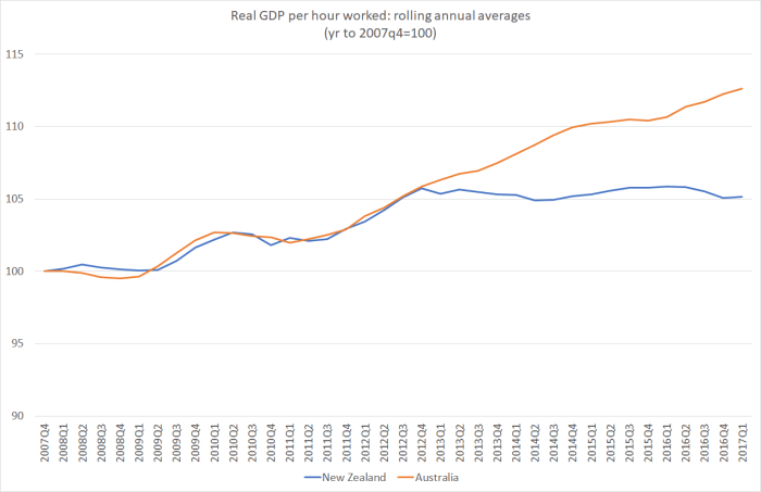
As it happens, Makhlouf’s appointment as Secretary to the Treasury was announced on 28 June 2011.   We’ve had barely any productivity growth since then (none for the last five years).    That, of course, isn’t directly his fault, but one does have to ask whether The Treasury under his stewardship has even once put forward a compelling set of policy proposals to end even this multi-year drought, let alone to reverse the 45 years and more or relative decline.  On the basis of this latest speech, we shouldn’t be very hopeful of what they might have to offer a government formed later this year.
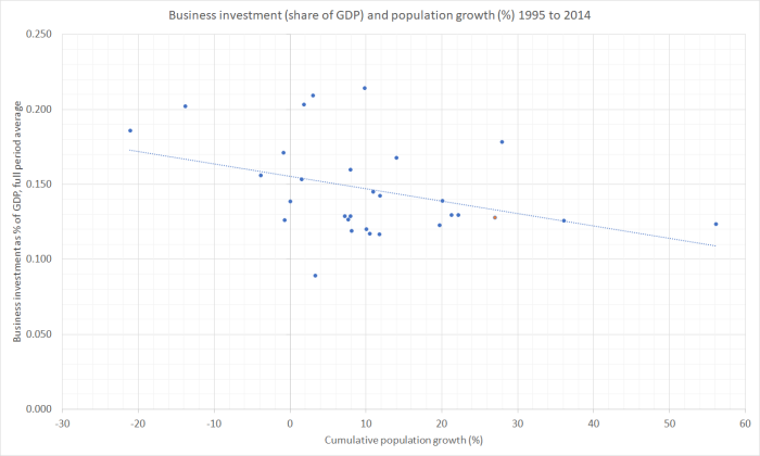
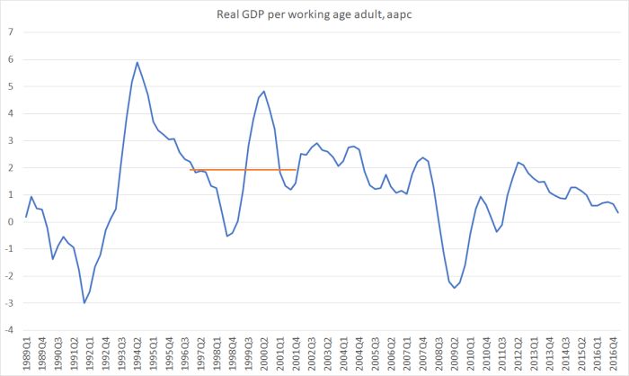
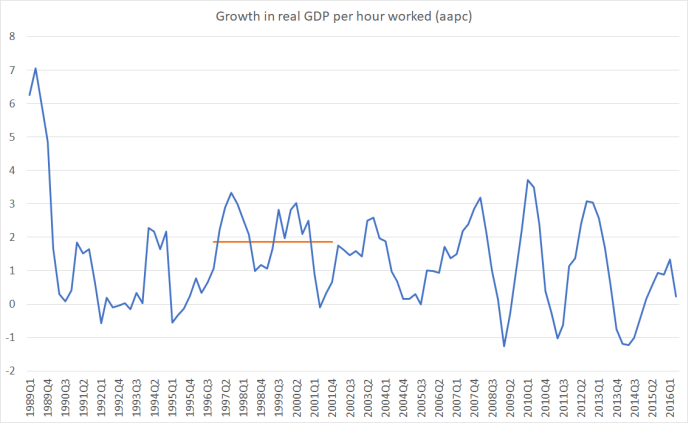


Answers from Switzerland?

A month or so ago, prompted by a Herald news article talking up a New Zealand Initiative study tour to Switzerland to learn “the secrets of their success”,  I pointed out that Switzerland wasn’t such an obvious place to look for lessons on lifting New Zealand’s continuing disappointing economic performance.  After all, since 1970 they were the only OECD country to have had slower productivity growth than New Zealand

switz 70 to 15

and although the average productivity level in Switzerland is still much higher than that in New Zealand, it is no longer among the very best in the OECD.   Denmark, Belgium, and the United States are among the countries doing much better than Switzerland, and even they don’t top the rankings.

A few days later it turned out that the author of the article, veteran journalist Fran O’Sullivan, was actually participating in the study tour, not just talking it up.  At the time, I noted that it would be interesting to hear, in due course, what she learned from Switzerland, while being a little sceptical as to how detached from a New Zealand Initiative perspective she would prove able to be.

In Saturday’s Herald, O’Sullivan devoted a substantial article to reporting back on what was learned on the tour (this time with all the appropriate disclosures, including her partial sponsorship from one of the Initiative’s member companies).   Much of the article is quotes from New Zealand Initiative people.  And the answer it seems, at least on O’Sullivan’s summary take, is in the headline: Education key to Swiss success.

Near the start she observes of her own past trips to Switzerland

Other times I have been to Switzerland, it has been straight to Geneva to the World Trade Organisation’s HQ for trade discussions, or to observe the World Economic Forum in Davos. Not to look at what underpins Switzerland’s own resounding economic success.

I’m still quite genuinely puzzled at where she –  or the Initiative –  get this idea of “resounding economic success”.  I’m sure there are many things to like about  Switzerland but –  despite a very strong starting point a few decades ago –  it just isn’t one of the great economic success stories of modern times.  Productivity growth has been underwhelming –  to say the least –  and although GDP per capita in Switzerland is higher than in, say, France or Germany, it is so mostly because the Swiss put in a lot of hours.  Average productivity is higher in France and Germany, while Switzerland is like New Zealand in that total bours worked per capita are very high in both countries.

I quite like the sound of the Swiss political system –  highly decentralised, lots of quite small, and competitive local authorities.  It is the antithesis of something like the Auckland “supercity” put in place a few years ago by our government.     But one has to wonder quite what economic gains it might have produced.    The New Zealand Initiative seems dead keen on the highly decentralised system

“Private and central bankers, economists and journalists, federal and local politicians alike – in fact everyone we talked to – agreed that this was the most crucial component to the Swiss success formula,” says NZ Initiative executive director Oliver Hartwich.

But when your country has had the weakest productivity growth in the OECD over 45 years, you have to wonder whether the alleged contribution to “economic success” is not mostly one of those myths that all countries have, that don’t necessarily line up that well with the evidence.  I’m sure the decentralised system is cherished, but in modern times it has seen (although not necessarily caused) Switzerland drifting backwards.

But the political system isn’t the thrust of O’Sullivan’s article.  Rather, the education and vocational training systems seem to be.  In fact, even Hartwich seems to agree

Concludes Hartwich: “The most important insight was the fact that a solid vocational apprenticeship is just as respected as a university degree (and sometimes leads to better salaries, too). New Zealand businesses should not only co-operate with institutions but lead the debate on the required reforms.”

And a couple of quotes to give you the flavour of the rest

It may seem ruthless to stream students at an early level into academic and vocational education training (VET) streams. But Switzerland does just that.

About 20 per cent go into the university stream and the rest into the upper secondary school vocational education training stream, where students combine school learning with skills developed in the workplace.

This system serves 70 to 80 per cent of Swiss young people, preparing them for careers ranging from high-tech jobs to health sector roles and traditional trades. Both white collar and blue collar roles are appreciated. There are about 230 vocational categories.

and

The upshot is that Switzerland enjoys virtually full employment, the youth unemployment rate is among the lowest in developed countries and the Swiss enjoy a very high standard of living. Those doing the VET stream are not locked out from university education, which they can do at a later stage.

….

Asked if they could import one feature of Switzerland to New Zealand, the consensus of the visiting business leaders was that it would be the vocational training system.

ASB chief executive Chapman says any growing economy relies on a pipeline of skilled and motivated workers for momentum, and “in that context I think there is a lot to learn from the Swiss”.

“The Swiss have an enviable record of high youth employment.

I don’t know anything specific about the Swiss vocational training programmes, so there may well be some specific aspects that New Zealand firms, or New Zealand governments, could learn from.     But as I reflected on O’Sullivan’s article, the story about education etc didn’t seem terribly convincing as an explanation of Swiss “economic success”.

Overall employment rates in New Zealand and Switzerland are very similar (on OECD data 66.2 per cent in both countries last year).  But on youth employment, Switzerland does appear to have had a consistently higher employment rate.  Among those aged 15 to 24,  62 per cent of Swiss were employed last year, and 54 per cent of New Zealanders.

Employment among young people is a bit of an ambiguous indicator.  After all, if young people are in full-time study (school or tertiary) they often won’t be in employment at all.  Youth employment rates were probably higher in both countries 100 years ago.

But what about youth unemployment: people who want a job, are looking for a job, but can’t find a job?   Here, Switzerland seems unambiguously to do better than New Zealand.

U rates Switz and NZ

And what are some of the things that affects the ability of young people to get into work?  Minimum wage laws are likely to be one of them.  I recall the New Zealand Initiative’s Eric Crampton, when he was at Canterbury University, making some very useful contributions  (eg here) to the debate about the impact of the much more stringent minimum wage provisions, especially as they affect young people, that were put in place here about 10 years ago.

Readers may recall that, relatively low as New Zealand wages are, our minimum wage relative to median wages –  the sort of metric relevant when thinking about whether minimum wage provisions exclude some people from employment –  are very high by OECD standards (fourth highest in fact).

And what about Switzerland?   Well, in Switzerland there is no minimum wage law at all.   And not that long ago, Swiss voters overwhelmingly rejected an attempt to establish one.     Perhaps in the course of the Initiative’s study tour no one thought to ask the question about minimum wages.  But whatever the reason, it looks as though it could be a rather important omission.  It isn’t the really skilled young people who typically have difficulty getting jobs, but the less skilled and more troubled ones.  Our systems works against them getting established in the labour force, while the Swiss one seems not to.   As the ASB chief executive put it:

“You can’t underestimate the power this has on the optimism and confidence of their youth as they look to their own future.”

But I was also a little puzzled about the story that seemed to downplay the role of universities in Switzerland.  I’m as willing as next person (including New Zealand Initiative members) to think that perhaps New Zealand went through a phase where too many people went to university.   And a good builder or plumber will certainly earn more than many of the occupations our more-marginal university students end up in.

But what did the data show?  As it happens, the OECD Economic Survey on New Zealand came out on Thursday, and they had a whole chapter on the labour market, skills etc.   So I flicked through it looking for relevant charts.  Like this one.

skills young

Switzerland is “CHE”.   Relative to New Zealand –  and to the OECD as a whole –  Swiss young workers (25 to 34 year olds) now have a far higher rate of completed tertiary qualifications than New Zealand ones do.

And there was also this chart

skills swiss

Whether for younger people or older ones, Switzerland is ahead of New Zealand, particularly in the proportions with masters or doctorates.

And yet

Tertiary Education Commissioner Sir Christopher Mace says, “to be highly qualified technically rather than academically was totally acceptable in Switzerland.”

No doubt that is true –  or rather I have no reason to doubt it.  But a huge proportion of Swiss young people are getting strong academic qualifications.

Oh, and the OECD also makes much in their reports of the adult skills data I’ve written about here previously. Switzerland didn’t participate in that survey, but New Zealand workers came up with some of the very highest skills (notably problem-solving skills) of any of the many countries that did participate.

Still flicking through the OECD chapter, I found another interesting chart on employment.  Ideally it would be a chart of all sole parents, not just mothers, but it was part of another chart focused on maternal employment.

Swiss sole parents

Switzerland is at the far right end of the chart.

Which is by way of leading into another difference between Switzerland and New Zealand –  the overall size of government is a bit smaller there.  Here is the OECD data on current government receipts (mostly taxes) as a per cent of GDP.

govt size nz and swiss

The Swiss tax take is smaller than ours, as a share of GDP, but (a) the gap seems to have been closing, and (b) at least as much of that is coming from the Swiss raising average taxes as from us lowering them.   Again, if one is concerned about productivity, it isn’t obvious that the Swiss experience has a great deal that is positive to teach us, even if the reasons for their weak productivity growth might well be different from the reasons for our own.

The Swiss track record with weak productivity growth isn’t something new that no one had noticed before  –  the OECD, for example, has been offering thoughts on it for some time (eg here).  So it is still a bit of a mystery why the New Zealand Initiative is touting Switzerland as a success story to emulate, or why a senior journalist is channelling those lines.   Perhaps it would have offended New Zealand business leaders’ sense of amour propre to have gone further east, but if there are many lesssons to be learned for us in Europe about lifting overall economic performance, it seems more likely they might be found in countries like Slovakia or Slovenia, Estonia or Latvia (all now fellow members of the OECD) where productivity is fast catching up (in some cases already has) average levels in New Zealand –  and that in countries that for the whole of modern New Zealand history (ie since say 1840) have been much much poorer and less productive than New Zealand.

Travel generally broadens the mind, and almost any country can probably offers some experiences (good and bad) that visitors could learn from.  I’ve no doubt Switzerland does too (eg about minimum wages and company tax rates perhaps) .    But Switzerland’s overall economic growth performance has been poor for decades, and that even with the advantages that come from being a relatively-small government place in the heart of one of the most prosperous places on the planet (northern Europe).  It seems unlikely there is very much to learn from them, at least in a positive sense, about how to markedly lift the performance of another struggling country almost as far from anywhere (and from suppliers, markets, clusters of knowledge)  as it is possible to be.

One could wonder whether this group of leading business people, (having gone off to learn from Switzerland, where they would have found a system with no minimum wages and much lower company tax rates, but nonetheless want to tell a story about training and education as the secrets of what they see as Swiss success) are not perhaps preparing against the chance of a change of government later in the year.   All that talk in the article would, no doubt, have seemed like music to Grant Robertson’s ears.  Perhaps not, but I’m struggling to formulate a better hypothesis.   Because the data don’t really seem to fit their story.


Rebalancing: not so much

Rebalancing the economy was a big theme when the current government came to office.

In a brief post on Friday afternoon, I looked back to Bill English’s 2009 Budget speech, shortly after the current government had taken office, and compared his complaints then about the weak export performance in recent years, with the record over the term of the current government.

Of course, exports weren’t the only indicator the then Minister made quite a bit of in his early speeches. I found three such speeches, the 2009 Budget speech, a speech in October 2009 to the Institute of Chartered Accountants (the link to which was working on Friday but not this morning), and the 2010 Budget speech.

There was also a concern about productivity.  In the 2009 Budget

Further, New Zealand’s productivity performance has been poor over the past decade. Ultimately, better productivity growth is the only way to create jobs and sustain high living standards.

And in the NZICA speech

“since 2003, our productivity has sunk to a 25-year low”

and the 2010 Budget referred to

“negative productivity growth between 2000 and 2009”

And there was concern about a lagging tradables sector.  In the 2009 Budget

The common elements to each of these imbalances are excessive growth of the domestic and consumption sectors of the economy. Meanwhile there has been insufficient growth and investment in those parts of the economy that either export or compete with foreign producers.

To NZICA a few months later

…the tradables sector –  that’s exporters or industries competing with imports –  has actually been in recession for five years, contracting by about 10 per cent in that time.

Even more staggering, there have been almost no net jobs created in the tradeables side of the economy for the past 10 years.  By contrast, the non-tradeables sector –  domestic industries not competing with exports, including the Government –  has grown by 15 per cent in the past five years.

And in the 2010 Budget

By contrast, output from exporters and import-competing industries had been in decline since 2005.  These include sectors such as agriculture, horticulture, mining and resources, forestry, fishing, food manufacturing and tourism, all areas where New Zealand should be benefiting from its natural advantages.

And, of course, there was a lot about the shift from fiscal surpluses to fiscal deficits, and about the large current account deficits in the years immediately prior to the recession.

How then have things gone under the watch of the current government?

Before bombarding you with numbers and charts, I would stress that while most of these variables are influenced by government policy choices few are under the direct control of governments, almost all government policies work with a lag, many comparisons also ideally need to take account of what is going on elsewhere in the world, and so on.   So while I will show various comparisons of how some of these economic indicators have done under the National government in the 1990s, the Labour-led government from 1999 to 2008, and the National-led government since then, using averages over the specific terms in office, no one is going to seriously claim that, say, Helen Clark or John  Key coming to office in late 1999 or late 2008 materially altered economic performance in the subsequent quarter or two.   The recession of 2008/09 would have happened, and been more or less as severe as it was, whenever in 2008 or 2009 a New Zealand election had been held.  Fortunately, all three governments held office for prolonged periods, and the use of annual average growth rates also makes comparative growth rates at least a starting point for an informed comparison of the various governments.   Events, good and ill, outside government control all complicate the matter.  To take the current government’s terms as an example, earthquakes were a severe adverse shock, and on the other hand the terms of trade have averaged higher than for many decades.  Neither was, in the slightest, something governments controlled.

What about exports?  Here I’m using annual totals (so the first number is the average growth rate in total per capita annual export volumes from the year to December 1990 to the year to December 1999).

Export volumes (per capita) – annual average growth rate (%)
Bolger-Shipley government term 4.7
Clark government term 2.1
Key-English government term 1.5
2007q4 to now 1.1

I’d probably focus most on the final line –  the growth rate since just before the recession –  even though it doesn’t cleanly line up with one government or the other.

What about the relative performance of the tradables and non-tradables sector.  I’ve used this indicator a lot, but, as I’ve noted previously, the then Minister had been quite keen on it.    This was more or less the chart the Minister would have had in mind in mid 2009 (there have been subsequent data revisions, but they don’t affect the story much).

t and nt to dec 08

The dip in the blue line right at the end was the recession, but tradables sector output appeared to have been stagnating for some years.

And here is how the same chart appears now.

t and nt to dec 16

If you were worried about this indicator in mid 2009 (and not everyone was), things don’t look any better now (this is particularly apparent in the per capita version of this chart here ).

Here are the average annual per capita growth rates for the tradables and non-tradables GDP components.

Tradables Non-tradables
Annual average per capita growth rate
Bolger-Shipley 2.3 1.7
Clark -0.1 2.5
Key-English 1.4 1.1
2007q4 to now -0.6 0.9

An impartial observer would suggest not much change under the current government.  Tradables output appears to have grown faster, but that appears to be only because the government changed at the very bottom of the recession.     Date the comparison from just prior to the recession, and performance on this indicator –  which new Minister of Finance Bill English seemed to quite like –  hasn’t been particularly encouraging.In those quotes I cited earlier, there was reference to employment growth in the tradables and non-tradables sector.  There is no easy way I’m aware of to make that calculation, in a way that lines up with the split in the GDP numbers.  I recall being involved in some discussions at the time about a possible tradables vs non-tradables employment indicator, but can’t now shed any further light.What about productivity?I’m not sure where the Minister got his numbers in 2009 supporting the claim that productivity growth had been negative in the previous few years.  It may have been SNZ’s multi-factor productivity indicator (for the “measured sector”.MFP to 16 
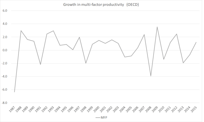
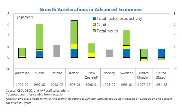
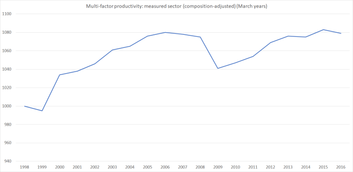
MFP measures are quite cyclical –  if plant lies idle in a recession measured MFP will fall –  but unfortunately the latest observations are only around the same levels reached a decade ago.  There was no MFP growth late in the previous boom.  There has been none since.

Labour productivity measures are more widely cited.  I tend to use (and do so here) GDP per hour worked calculated by averaging the two real GDP measures and dividing them by HLFS hours worked.  Treasury uses a production GDP based measure.  It doesn’t materially affect these comparisons (if anything, my measure is slightly more favourable over the last eight years).It would be remiss of me not to remind readers that global productivity growth has also been weak over the last decade, but as I’ve illustrated in various posts, New Zealand has continued do worse than the typical advanced country average over recent years, and our sharp productivity slowdown really seems to date from around 2012.Of course, there is another side of the picture.  There is no doubt credit due for the effort that has gone in to close the fiscal deficit.  In the course of that period, the government accounts have been buffeted, on the one hand by the impact of the earthquakes, and on the other by the record high average terms of trade New Zealand has been enjoying.Interestingly, for those who do want to emphasise the role of fiscal policy in exacerbating or easing pressure on the real exchange rate, here is a chart of government consumption spending (on actual goods and services, not just cash transfers) as a share of GDP.Govt C

Real GDP per hour worked
Annual average growth rate
Bolger-Shipley 1.1
Clark 1.3
Key-English 0.6
2007q4 to now 0.5

It is a certainly a smaller share of the economy than it was during the recession –  that peak was a combination of rising government spending and the way that relatively stable government spending tends to rise as a share of GDP in every recession (you can see it even in the early 1990s).   As of now, government consumption spending as a share of GDP is still almost two full percentage points higher than the share it averaged –  under two different governments – from the mid 1990s to the mid 2000s.   Whatever the merits of such spending, it won’t have facilitated any sort of rebalancing of the economy.

We now expect New Zealand governments to run balanced budgets, or even surpluses.  All three governments since 1990 have.  That is no small achievement, but there isn’t much to differentiate one government from the others.

What about the current account deficit?    It certainly is smaller than we had experienced in the years running up to the recession –  but those years look exceptional.

CAD

In fact, the current account deficit at present (2.7 per cent of GDP) isn’t much different from the average over the period 1988 to 2004 (3.1 per cent).   And that despite two things largely outside New Zealand’s control:

  • the interest rate on our quite large accumulated stock of foreign debt is much lower than it was (most of the debt is hedged back to NZD, and New Zealand short-term interest rates in the last four years of the boom averaged 6 per cent or more (the OCR peaked at 8.25 per cent).  The OCR now is 1.75 per cent.    The gap is smaller at longer maturities, but there was a quite unexpected windfall in the reduction in interest rates,
  • the very high average level of the terms of trade (almost 10 per cent higher in the last three years than in the last years of the previous boom).

Another way of expressing the current account balance is the difference between savings and investment.    Government investment as a share of GDP is now much as it was during the pre-recession boom years.  Other investment –  despite all the construction activiity –  is not.

investment to dec 16

Despite all the population growth the non-government sector as a whole appears not to have been finding the scale of remunerative investment opportunities that they were voluntarily undertaking –  wisely or not –  in the pre-recession period.   Not quite the sort of rebalancing that the 2009 Minister of Finance appeared to have in mind.

Perhaps the subdued investment isn’t too surprising given that, on Treasury’s estimates, New Zealand has had a negative output gap –  unemployed excess resources –  for getting on for 10 years now.

And what of saving?  We don’t have a quarterly national savings series, but the other side of savings is spending –  consumption.     An earlier chart showed that government consumption was still running higher than we’d seen previously.   Here is total consumption as a share of GDP.

total consumption

The latest observation is just a little below the average of the history of the series (consistent with the annual national saving rate data, which is just slightly above the average of the history of the series).

What to make of all this?   New Zealand’s productivity performance has been pretty poor, as has the overall performance of its tradable sector.  Consistent with the continuing excess capacity, and perhaps with the weak productivity performance, non-housing private investment has remained pretty subdued, and that is  reflected in the smaller current account deficit than we’d seen for some time.   Economic outcomes are never fully the result of government choices.  But as the current incumbents approach the voters a few months from now, on the sorts of indicators they incumbents were citing, with legitiimate concern, when they came to office, the story doesn’t look like a particularly favourable one, of corners turned, new and better trajectories set out on.   And that without even mentioning house prices.

A tale of two economies

I’ve never known much about Romania.  There was Olivia Manning’s Balkan TrilogyRichard Wurmbrand was one of the Christian heroes of my youth, and there were the bleak last years of Ceaucescu culminating in a firing squad on Christmas Day 1989.  But that was about it. I had occasionally used it as an example of a rare country that had managed less growth in per capita income than New Zealand over the 20th century.   The rule of law, private property, strong institutions and freedom have quite a lot to be said for them.

And then the other day, an eastern European immigrant to New Zealand was commenting here.  I was curious why an east European had chosen New Zealand, as several of the eastern European economies seemed to have pretty good prospects, perhaps even better than those of New Zealand.  I had in mind especially the Czech Republic, Slovenia and Slovakia (each now with GDP per hour worked very similar to that in New Zealand).  In our subsequent exchange, it turned out that he was Romanian.

And that prompted me to go and check out some data on Romania.  It was a pretty sobering story, for a New Zealander.

Romania had its ups and downs in the 20th century.   Just prior to World War One (when we were one of handful of richest countries in the world) Romania was doing well.   GDP per capita is estimated to have been 75 per cent of that of, say, Norway.   They did really badly for the following 30 years, and then –  on these measures –  quite well economically for the first few communist decades (large scale industrialisation etc).  As with many of the eastern bloc countries, things worsened again for them in the 1980s. Older readers may remember accounts of the “austerity policy” in which everything –  particularly citizen living standards –  was subordinated to repaying the government’s foreign debt.

Things actually got quite a lot worse for Romania (at least in bottom line economic numbers, even if they were free), as for many of the former eastern bloc countries, in the years immediately after end of communist rule (so many distortions to unwind, so many governance problems etc).  In Romania’s case things finally bottomed out –  at least relative to New Zealand – in 2000.

Absolute levels comparisons between Romania and New Zealand are a bit fraught.  Romania isn’t in the OECD, and while they are in the EU we aren’t.  Here are ratios of Romania’s GDP per capita, in purchasing power parity terms, relative to New Zealand since 1990 from (a) the IMF World Economic Outlook database, and (b) the Conference Board Total Economy database.

Romania 2

Those of you who want to be relatively more upbeat on the New Zealand story might choose to emphasise the Conference Board number, and to note that – even after ending decades of communism – on that measure Romania now isn’t much higher relative to New Zealand than it was in 1990.  Personally from all the accounts I’ve seen, I’m more than a little sceptical that Romania’s real living standards in 1990 were in fact half those of New Zealand.   Things are better measured now.

But here is the Conference Board’s real GDP per hour worked series (Romania relative to New Zealand).  The Romanian data only go back to 1995, and these days Romanian statistics are part of Eurostat (ie they won’t be perfect, but I’m not sure there is more reason to doubt statistics for them than for us).

romania 3

In absolute terms it isn’t such a stunning achievement –  since New Zealand productivity growth has lagged that of most other advanced countries over this period –  but………..one of the once-richest countries of the world is on course for having Romania, almost a byword in instability, repression etc for so many decades, catch us up.  It would take a while if current trends continue.  But not that long.  Simply extrapolating the relative performance of just the last decade (and they had a very nasty recession in 2008/09 during that time) about another 20 years.

So how we do maintain a big lead in GDP per capita?  Simply by having more people work more hours.  Here is hours worked per capita (ie per man, woman, and child of all ages).

romania 4

The next time you hear Steven Joyce, or some other minister or business cheerleader, boast that we have more people working than most countries, do try to remember that labour is a cost (to individuals, who would often do other stuff instead if they could) and that the Stakhanovite cult –  extolling the virtues of tireless labour –  was a feature of the communist system, not ours.

Of course, if people do want to work and can’t, then there is a problem.  We measure that through the unemployment statistics.  Romania’s unemployment rate is a bit higher than New Zealand, but at 5.5 per cent the difference is pretty small.  We still do a lot things better than Romania:  we score top of the Transparency International rankings, while Romania is 57th.  We top the World Bank’s ease of doing business index, and they are 36th (not bad at all given where they came from, but a long way off us).   But look at the bottom line growth and productivity performances.

Of course, sometimes what you find in countries with a run of impressive-looking fast growth is that:

  • it is built on big government deficits, or
  • big ill-founded private credit booms, reflected in
  • big current account deficits, and
  • appreciating real exchange rates, with an economy increasingly skewed towards construction and domestic demand.

Our government finances are in better shape than theirs.  The Romanian government (on IMF numbers) has a deficit of about 2 per cent of GDP, while we have a small surplus.  Gross government debt in New Zealand is about 30 per cent of GDP, and in Romania it is about 40 per cent.  But even that is pretty low by advanced country standards.   And for my friends who like to emphasise size of government, (still on IMF numbers) both revenue and expenditure as a share of GDP are a bit smaller in Romania than in New Zealand.

Romanian private credit was very rapid, and looked rather risky, in the years leading up to 2008.  But not now.  There is a chart at the link, and overall domestic credit growth has been running at under 5 per cent per annum for the last few years.

Reflecting the pre-crisis boom in private credit, the Romanian current account deficit widened sharply.    But these days, deficits in Romania are similar to the modest ones we currently have in New Zealand.

romania 5

Romanian investment has fallen back from what they experienced in the credit boom period.  Then again, it is still higher, as a share of GDP, than that in New Zealand.

romania 6

In fact, they had exactly the sort of worrying real exchange rate appreciation one might have expected in the credit-boom years.

romania 7

But after that credit boom ended, the real exchange rate fell back.

Perhaps consistent with that, firms based in Romania seem to have been doing rather well in international markets.  Exports look as though they were squeezed out during the credit boom, but the subsequent recovery and trend growth is pretty impressive.  For a country with a population of about 20 million people, it is a reasonably high foreign trade share (this is exports, but imports are equally important).  Australia, for example, is around 20 per cent of GDP.

romania 8
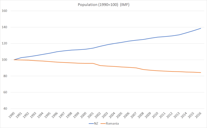
(You will recall that New Zealand has been going backwards on this metric.)

And there was one other interesting comparison.

romania 9

Since 1990, Romania’s population has fallen by 16 per cent, and ours has risen by 40 per cent.   There are several differences.  As I showed a few weeks ago, New Zealand’s total fertility rate over recent decades has been averaging below replacement.  Romania’s has been materially lower still, currently around 1.4.   And both countries have had material outflows of their own citizens: we had a net outflow of New Zealand citizens of around half a million people since 1990.    Romania has also had big outflows but (as far as I can tell) smaller cumulatively than those from New Zealand (there is a reference here to about 2.3 million Romanians living abroad long-term).

But, of course, the other difference is non-citizen immigration.  We’ve for a long time aimed to grant residence approvals equal to around 1 per cent of the population each year.  Since 1990, those policies have given us a net inflow of around one million non-citizens.

The OECD’s International Migration Outlook recorded in 2015 that

Romania sets annual quotas for work authorisations to be issued, although historically demand has been lower than the quotas.  For both 2014 and 2015, the quotas were set at 5500, including 900 intra-corporate transfers and 900 highly-skilled migrants.

In a country of 20 million people.   Not necessarily a policy I’d recommend, but……

Subdued population growth (well, falling population actually) doesn’t seem to have been inconsistent with a pretty impressive period of productivity growth, export growth, strong investment etc etc, all in a country still with its share of governance and regulatory problems.  And that investment isn’t largely having to keep up with a rapidly rising population, it is presumably responding the incentives and opportunities firms are finding).  Perhaps the Romanians, in aggregate and in some sense, wish their population wasn’t falling –  there is still anguishing about the outflow of skilled people – but probably their best hope of reversing that (perhaps slim given the low birth rate) is to keep right on with what they’ve been doing for the last 10 years.  In time, perhaps many of the diaspora might even return –  as they started to in Ireland after they finally got their act together.

30 years ago, Bob Jones toured the country lamenting that the New Zealand economy had come to resemble a Polish shipyard, a byword for inefficiency and industrial disruption.  I do hope in 30 years time there aren’t reforming Romanian politicians campaigning, warning their fellow citizens to avoid the decline and fall of New Zealand.  Yes, for now they are still poorer and, on average, less productive than we are. But those gaps have started closing fast, and the foundations of the growth don’t look that bad at all.

UPDATE: I forgot to mention Romania’s 16 per cent company tax rate.  Not sure (whether as Baptist or economist) I quite approve of the separate regime for nightclubs and gambling operations.

(On another topic, I discovered that my name was being bandied around in Parliament’s question time the other day   –  question 2 here. Winston Peters was quoting me, and Steven Joyce was batting him away.  All good fun no doubt.     But I did notice this comment from the Minister “I appreciate that the member has been talking to Mr Reddell a bit”.  In fact, I have never met Mr Peters, I have never talked to him, never emailed him or had any contact with him whatsoever.  If he or his office appear to read my stuff at times well, of course, I welcome that, as I welcome any readers.   Specific policy proposals, that might actually make a difference, would be even more welcome.)