New Zealand interest rates: persistently higher than those abroad (Part One)

New Zealand’s interest rates have been higher than those in the rest of the advanced world for decades.  Making sense of why is one element –  I argue an important one –  in getting to the bottom of why New Zealand’s relative economic performance has been so poor, and in particular why we’ve made up no ground relative to most other advanced countries in the last 25 years or so.  Our productivity growth has been slower than that of most other advanced countries, and after a disastrous few decades we entered the 1990s already less well off than the typical advanced country.

If we had good comparable data for the earlier decades (say 1950s to 1970s), and market prices had been free to reflect underlying pressures, our interest rates would have been higher than those in the rest of the advanced world then too.  Instead, we made much greater use of direct controls (on imports, credit, foreign exchange flows) than most advanced countries did.  We don’t really get comparable interest data again until the mid 1980s.

When I say that our interest rates have been higher than those in other advanced countries, I really mean “real” interest rates.  Differences in inflation rates really complicate the picture at times in the past –  in the 1970s and 1980s for example, New Zealand had some of the highest inflation rates in the advanced world.   But over the last couple of decades, inflation rates have been much lower and much more stable, across time and across countries. I could spend a great deal of time constructing estimates of “real” interest rates, but none of them would be ideal (eg there are no consistent cross-country measures of inflation expectations) .   And so the charts I’m showing in this post, will use nominal interest rates.  Where relevant, I will mention changes in inflation targets, actual or implicit.

And when I say that our interest rates have been higher than those in other advanced countries, I don’t necessarily mean “in every single quarter, against every single country”, but on average over time (actually, in the overwhelming majority of quarters, against the overwhelming majority of countries).   New Zealand’s OCR actually got as low as the US federal funds rate target in 2000 (both were 6.5 per cent), but it didn’t last more than a few months.  Changes in inflation targets do make a bit of a difference: in the early 1990s for example, we were targeting 1 per cent inflation.  Australia didn’t have an explicit target at all for a while, and when they adopted one it was centred on 2.5 per cent.  So our nominal short-term rates were somewhat relative to theirs in the early 1990s.   Adjusting for (say) differences in inflation target, our policy rates have been higher than theirs throughout the last 20 years, with the exception of the peak of mining investment boom.

The point of this series of posts isn’t really to establish that our interest rates are, and have been, higher than those in other advanced countries.  No one seriously contests that.  But just to illustrate the point briefly, here are a couple of view ofs the long-term bond yield gap.

long-term-bond-yields-0ct-16

One line shows the gap between New Zealand and the median of the all the OECD countries for which there is data since 1990 (ie mostly excluding the eastern European countries), and the other is the gap between New Zealand and the median of Australia, Canada, Sweden and Norway, four not-large countries that control their own monetary policy.

The gap is larger than it was in the early 1990s –  when we had an unusually low inflation target –  and even if you take just the last 20 years (or even the last 10) there is no sign of the gap narrowing.  There are cyclical fluctuations, of course, but our long-term interest rates are well above those in other advanced countries (with mostly quite similar inflation targets).

And here is the same chart for short-term interest rates (again, OECD data).

short-term-int-rates-oct-16

Again, no sign of any convergence occurring.  Even the latest observations (on which almost no weight should be put –  rates fluctuate) aren’t much different from the averages for the last 20 years.

And since commenters sometimes highlight small countries, here is the short-term interest rate gap between New Zealand and the median of the seven smallest OECD countries that have their own monetary policy for the last 20 years (a period for which the OECD has data for all of them).

short-term-rates-small-oecd-oct-16

So our interest rates (a) are and have been higher than those abroad, (b) this is so for short and long term interest rates, (c) is true even if we look just at small countries, and (d) is true in nominal or real interest rate terms.  And the gap(s) shows no sign of closing.

But the really interesting question isn’t whether our interest rates are higher, but why.  That will be the focus of the next post.


Setting interest rates: no need to change the system

Andrew Little has moved on from wanting to “stiff-arm” banks over dairy foreclosures, to talking of the possibility of legislating to force banks (and other lenders?) to pass on in full any OCR changes.

It isn’t the oddest idea in the world – and personally I find the new talk of a Universal Basic Income, much as it has also been propounded by some  on the right, including Milton Friedman, rather more consequential, and worrying.  Many quite sensible countries set fixed exchange rates.

For 15 years in New Zealand –  1984 to 1999 –  we didn’t have a government agency setting interest rates at all.  For much of that time, many of us at the Reserve Bank thought that was only right and proper.  And when we first proposed an OCR-like system, many of the leading economics commentators and bank economists were pretty dismissive.  But in 1999 we simply concluded that –  like most of the rest of the advanced world –  it made more sense to set, or manage directly, an official interest rate.  And now that model is just taken for granted.

Of course, setting the OCR isn’t the same as setting the individual interest rates for each borrower, but I’m sure that if he gave it any thought that isn’t what Little means either.  Perhaps he just means that the Reserve Bank should be able to direct set some commercial bank base lending rate against which all other lending rates have to be calculated? It seems administratively cumbersome, and perhaps prone to being circumvented –  not unlike much other government regulation, including (for example) direct restrictions on mortgage lending of the sort once unknown in New Zealand but now imposed by the Reserve Bank and accommodated by the current government.  And it is not as if governments universally eschew price-setting in other markets either –  the government recently proudly announced an increase in the regulated minimum price for labour, talking of wanting to push that price (once just a market price) up as fast as possible.

One of the attractions of an OCR-type arrangement is that it is a fairly indirect instrument.  The Reserve Bank can put the OCR pretty much wherever it needs to to deliver on an inflation target.  That is an imprecise linkage, but it works pretty well (at least if the Reserve Bank is reading underlying inflation pressures correctly) and it does so without needing lots of direct controls or impinging very directly on anyone’s business or financial affairs.  The OCR is simply the rate the Reserve Bank pays on deposits banks (and any other settlement account holders) have at the Reserve Bank, and the rate at which the Reserve Bank will lend to banks on demand (against good quality collateral) is pegged to the OCR.   The amounts banks borrow from and deposit with the Reserve Bank aren’t that large : bank balance sheets total almost $500 billion, and bank deposits with the Reserve Bank are fairly stable, currently around $9 billion.  And yet changes in the rate paid on these balances, which don’t move around much, provide substantial and sufficient leverage (partly signaling, partly a change in pricing on one component of the balance sheet) for macroeconomic stabilization purposes.    It isn’t a mechanical connection, but it works.

A variety of other models might too, but the judgement has been –  not just here, but in other similar countries – that an indirect approach like the OCR is less intrusive and has fewer efficiency costs than the alternatives.

And it is not as if there is some obvious problem.  Here is a chart, drawn from data on the Reserve Bank website, showing floating residential mortgage interest rates and six month term deposit rates since 1965.  (It is an ugly chart because the mortgage rate data are monthly throughout, but the term deposit rates are quarterly until 1987).

retail interest rates

Largely, lending rates reflect deposit rates (and to some extent vice versa).   These aren’t perfectly representative indicators, just what we have.  But for the almost 30 years for which we have the full monthly data are available, the average spread between these two series was 2.45 percentage points, with a standard deviation of 0.6 percentage points.  The latest data are for February, and the spread was 2.49 percentage points.  One would expect spreads to move around a bit –  demand for individual products ebbs and flows, and the links between foreign funding markets and domestic term deposit markets aren’t instant or mechanical –  and they do, but there is no obvious or disconcerting trend.

Through the period since 1965 we have had all manner of regimes.  Direct controls on lending rates, direct controls on deposit rates, indirect controls on one, other or both, no controls at all, and then for the last 17 years direct control of the interest rates on one small component of bank balance sheets.  Go back far enough, and during the 1930s a conservative government legislated to lower all lending rates.  But it just isn’t obvious that there is any need to change the operating system now.

To a mere economist, it is a bit of a puzzle what Little is up to.  No doubt the Opposition needs to be seen to be offering alternative policies, but these issues (bank lending rates and dairy foreclosures) don’t seem like an area where there is a substantive policy issue (while there are many other areas of policy where the same could not be said, such as New Zealand’s continuing slow relative decline).  But there does seem to be quite a strain of anti-bank sentiment in New Zealand –  perhaps especially anti foreign banks, the same sentiment that gave us state-owned Kiwibank under the previous Labour-Alliance government.  Perhaps people on the left here are looking to the US and the striking degree of response Bernie Sanders is achieving for his populist message, much of which is centred on an anti Wall St message?


Retail interest rates and the OCR

Various media outlets over the last day or so have asked for my views on whether banks will, or should, pass through yesterday’s 25 basis point cut in the OCR into lower retail rates.

My bottom line was

“I think there will be political pressure on the banks to cut to some extent, but I’d be surprised if it [any cut in floating mortgage rates] was anything like 25 basis points.”

It didn’t even seem a terribly controversial point.

After all, the Reserve Bank had included this chart in the MPS yesterday

funding costs

And they could have included one of credit default swap spreads for Australasian banks (as per this one at interest.co.nz).

The Bank even commented in the MPS that:

the cost of funding through longer-term wholesale borrowing has risen with the pick-up in financial market volatility (figure 4.3). The increase in longer-term wholesale costs this year adds to the increasing trend since mid-2014, which reflects a mix of global regulatory changes, concerns about commodity markets and emerging economies, and broader financial sector risks. To date, strong domestic deposit growth has limited the need for New Zealand banks to borrow at these higher rates. However, acceleration in credit growth over the past year might increase banks’ reliance on higher-cost long-term wholesale funding, leading to higher New Zealand mortgage rates.

It has been a commonplace in the recent Australian discussion that unless the Australian cash rate is lowered higher mortgage rates seem quite likely because of the rising funding spreads.

And so I was slightly taken aback to see the Governor, and his offsiders, quoted as having told Parliament’s Finance and Expenditure Committee that

“I’d expect the floating rates to come down by 25 basis points,” Wheeler told the select committee.

and that

“Banks are only raising a relatively small share of their funding from overseas at this point in time. They’re continuing to see very strong deposit growth. Most of the credit expansion that’s going on has been funded through deposits,” Hodgetts said.

Central bank governors aren’t there to provide defensive cover for banks’ pricing choices, but neither should they be winning cheap popularity points in front of committees of politicians by calling for specific cuts in retail interest rates that don’t even look that well-warranted based on their own analysis (eg the MPS quote above).

Bernard Hodgetts, head of the Bank’s macro-financial stability group, argues that rising offshore funding costs aren’t really relevant because banks haven’t raised much money in those markets recently.  But surely he recognizes the distinction between average costs and marginal costs?    For the banking system as a whole, the place where they can raise additional funding –   much of which has to be for term, to satisfy core funding ratio (and internal management) requirements  – is the international wholesale markets.  And what banks would have to pay on those markets in turn affects what they are each willing to pay for domestic term deposits.

There isn’t a one-to-one mapping between rises in indicative offshore funding spreads and spreads of domestic terms deposits, but hereis a chart showing the gap between term deposit rates (the indicative six month rate on the RB website) and the OCR.

6mth TD less ocr

Unsurprisingly, it looks a lot like the indicative offshore funding spreads chart above.

And what about the relationship between floating mortgage rates and the OCR?  Here I’ve shown the gap between the floating first mortgage new customer housing rate and the OCR.  I’ve included yesterday’s OCR cut and assumed that banks eventually cut their floating mortgage rates by the 10 basis points the ANZ, the biggest bank, announced yesterday.

mortgage rates less ocr

The resulting gap doesn’t look particularly surprising.  The gap between mortgage rates and the OCR blew out during the 08/09 crisis when funding spreads and term deposit margins blew out. It came back from those peaks and has been fairly stable since –  narrowing a bit further a couple of years ago, when it looked as though funding spreads might continue to narrow (and when banks were trying to get loans on their books in face of the new LVR controls).  And now, perhaps, those spreads are widening out again –  as one might expect given the persistence of the rise in the offshore funding spreads.

All these points are really illustrative only.  I don’t have access to more precise data.  But as in any business, pricing involves some judgements.  Perhaps the political and customer pressures will mount and banks will find themselves having to pass more of yesterday’s OCR cut into lower retail lending rates than they would really like. But this is a repeated game.  Even the Reserve Bank expects one more OCR cut before too long, and many of the banks now expect at least one beyond that.  Over the course of the rest of the year, it seems likely that unless those international funding spreads start sustainably falling again, that retail interest rates will fall by less than the fall in the OCR.  It has happened before –  most notably in 2008/09 –  and will happen again.  And it works both ways: if funding spreads ever go back to pre-2008 levels, retail rates will fall further than (or rise less than) the OCR.  The Reserve Bank takes those factors into account when it sets and reviews the OCR every few weeks.

From my perspective, the prospect that retail rates might fall less than the OCR is neither good nor bad, it just is.  As in any business, costs are an important consideration in pricing, but retail mortgage banking is also a pretty competitive business.  Banks don’t need our sympathy, but we also don’t need populist anti-bank cheap shots.

The right answer for the Governor, asked by MPs whether banks would pass on the lower OCR, would surely have been something along the lines of  “That is up to them.  They operate in a competitive market, and they face a variety of cost pressures.  We’ll be keeping an eye on each stage of transmission mechanism –  between OCR changes and eventual changes in medium-term inflation –  and will adjust the OCR as required to deliver on the target set for us in the PTA”.

Some Great Depression comparisons

Back in the early days of this blog, I illustrated how for advanced countries as a group cumulative growth in real GDP per capita in the period since the peak of the last cycle (2007) to 2014 had been no better than that in a comparable seven year period from 1929, during the Great Depression.

Here is an updated version of the chart I ran then for all the OECD countries

real pc gdp growth 07 to 14

The median growth rate –  o.22 per cent in total over seven years –  is so small as to be almost invisible on the chart.

And here is the comparable chart, using the Maddison database of historical estimates, for the years 1929 to 1936

1929 to 1936b

I wouldn’t want to make much of the differences in the median growth rates –  given the imprecision of many of the historical estimates, and the likelihood of revisions to the more recent ones.  I was more struck by the lack of any material real GDP growth per capita in either period.

The Great Depression is seared in historical memory –  and whole generations of politicians came afterwards telling themselves and voters “never again”.  It is too soon to know whether the most recent period achieves the same permanent imprint on historical memories.  Perhaps in part it will depend what comes next.    But I’ll be a bit surprised if this episode has quite the same impact.  The Great Depression hit popular consciousness particularly hard because unemployment rates in so many countries rose very high, and stayed high for a long time, and in an age when government income support for those unemployed was typically less generous than it is today.

There aren’t (at least that I’m aware of) any consistent cross-country estimates of the unemployment rates in the 1930s.  But in most countries, the increases in the unemployment rates were very substantial (in the US, the unemployment rate is estimated to have peaked well above 20 per cent, and remained high for years).

By contrast, here is what has happened to advanced country unemployment rates in the last decade or so.

oecd U since 04

Whether one takes the median OECD country or, say, the total for the G7 countries, there was an increase in the unemployment rate of around 2.5 percentage points, which has been substantially reversed over the subsequent years. Unemployment rates are typically around where they were in 2006.  There are still awful cases –  Spain and Greece still have unemployment rates in excess of 20 per cent –  but the defining character of the last few years has not been very stubbornly high unemployment rates.

What really marks out the last decade  –  and contrasts it with the 1930s – is how poor the productivity growth has been. Without productivity growth, one can still end up with plenty of jobs, but they tend not to offer much in way of wage increases.

I’ve drawn attention previously to the work of US economic historian Alexander Field, who devoted a book to illustrating the very strong productivity gains (TFP) that the US had achieved in the 1930s.  A few weeks ago, I saw a nice summary of a new study by some other economic historians.   On the basis of their new work, they no longer see the 1930s as the period of fastest TFP growth in US history, but it was still very strong –  reflecting rapid technological and managerial innovations.  Here is the key chart.

Figure 1. TFP growth in the private domestic economy, US, 1899-2007 (% per year)

crafts us productivity

By contrast, here is a picture that uses John Fernald’s (FRBSF) business sector TFP estimates for the US over the last 25 years.

fernald.png

Business sector TFP growth is typically faster than for the entire economy, but for the last 10 years Fernald estimates average annual growth of  just over 1 per cent, dramatically slower than the 7 per cent average growth over the previous 10 years.

The slowdown in productivity growth isn’t unique to the US –  indeed on some measures, the US has done better than most –  and was becoming apparent in the data (again, not just this dataset), if not in the public consciousness, before the great recession of 2008/09 and its aftermath.

The contrast with the 1930s is striking.  That was, overwhelmingly, a failure of demand and of the global monetary system, and as those constraints were removed, the underlying lift in productivity supported a recovery in investment.  For the US, for example, post-war per capita GDP is on the same growth path as it had been pre-1929: output wasn’t permanently lower.
1936

What about the current situation?  Taken together, falling rates of population growth and falling rates of TFP growth materially reduce the volume of investment that is likely to be required, and profitable, at any given interest rate.  Add in apparently high desired savings rates around the world, and it is hardly surprising that real interest rates have fallen away so much.  Add declines in inflation expectations to the mix, and it has reinforced the decline in nominal interest rates.  The problems are mostly structural in nature, but they have been amplified by the reluctance of central banks to do what is required to keep inflation (or other nominal measures) up around target, in turn driven by a constant focus on a desire for “normalization” and a focus on some sense of where real interest rates “must” (in some sense) be in the very long term.  The reality, and perceptions, of the near-zero lower bound haven’t helped in many countries.

I’m pretty confident that in the longer-term real interest rates around the advanced world will be positive –  land is still fertile, as is the human imagination (so there will be a flow of new innovations and opportunities.  But there is no guarantee of such positive real interest rates in any particular decade (any more, in a New Zealand context, than there is a guarantee that our real interest rates will converge with those of “the world” in any particular decade).  It seems likely that some mix of lower global savings rate, higher birth rates, and structural reforms that create a better climate for productivity growth and investment are likely to be required to put the world economy on a better path –  one that, inter alia, might put us back on a path that supported more “normal” levels of nominal and real interest rates.  But those interest rates will be an outcome of a successful overall policy mix, not an intermediate target in their own right.  Monetary policy –  here and abroad –  in recent years has come too close to treating them as an intermediate target, rather than focusing on, and responding to, the data flow.


Fallow: the case for a lower OCR is compelling

Brian Fallow’s weekly column in the Herald yesterday  was fairly pointed.

Some further easing in the official cash rate seems likely, Reserve Bank governor Graeme Wheeler reiterated last week.

Well, good.

Because the case for more easing is compelling.

I agree with him.  Whatever measure of inflation one uses –  headline, exclusion measures, filtered measures  –  inflation has been persistently below where the Governor agreed to keep it, and shows no sign of rising (much or for long) any time soon.  On the Reserve Bank’s own numbers, the output gap is still modestly negative, and the unemployment rate has risen and is above any sort of NAIRU estimate.

But that wasn’t my reason for writing.  Instead, Brian notes a few considerations, including those mentioned in the Governor’s recent speech,  that might hold the Governor back

Housing is the first.  The Governor appears to have reversed himself, and gone back to thinking that (Auckland) house prices should be a factor in setting monetary policy.  But the Minister of Finance mandated him to target the medium trend in consumer price inflation, and New Zealand’s measure of consumer price inflation does not  –  rightly in my view (and that of most others) –  include existing house  prices or land prices.   House price inflation in Auckland is certainly scandalous, but the responsibility for that outcome is directly attributable to the choices of elected central and local governments.  The Reserve Bank’s role should simply be –  and in statute is –  to ensure that banks are sufficiently resilient to cope if nominal house prices ever fall sharply.

The second issue related to investment.  The Governor had suggested that the Bank needed to ask “whether borrowing costs are constraining investment”.   It isn’t clear why the Governor regards that as a relevant consideration –  absent some wild investment excess (1987 perhaps?), more private sector investment is generally a good thing.   Brian Fallow suggests that investment is sufficiently strong that there is no issue on that score anyway.  I’m not sure I agree.  Excluding residential investment, investment as a share of GDP remains pretty subdued. Historically, business investment as a share of GDP has been surprisingly low  in New Zealand relative to that in other advanced countries, given our faster trend rate of population growth, and now investment is low even relative to that history.  And that despite the rapid rate of population growth in the last couple of years.

investment to gdp

Not that the government’s ambitious export growth target is any concern of the Reserve Bank’s, but it is difficult to see anything like the targeted transformation in export performance occurring with these sorts of investment rates.  Of course, the big issue there is likely to be the real exchange rate –  still sufficiently high that even the Governor seems to comment on it whenever he can.

I touched last week on how odd it is to think of holding back on cuts now to save ammunition in case things get really bad again.  But Brian comes back to this issue by another angle.

But we can’t forget that New Zealand remains abjectly reliant on importing the savings of foreigners. The risk premium they demand to keep on doing that puts a floor under banks’ funding costs and the interest rates borrowers see, regardless of how low the OCR might go.

Here I think he is wrong.  I’ve dealt previously with the question of whether foreign lenders typically demand a “risk premium” for lending to New Zealanders (in NZ dollars).  The evidence strongly suggests that they don’t – and haven’t.    But if they were particularly concerned about New Zealand risk, there are two ways to get compensated for that risk.  The first would be to seek a higher interest rate.  They couldn’t typically get it at the short end, since the Reserve Bank itself directly sets the OCR based on domestic conditions.  They might perhaps get it on longer-dated assets (bonds), but expectations of the future OCR typically play the most important role in influencing the level of longer-term interest rates.

A much more plausible place to see any risk premium, in a floating exchange rate country, would be in the level of the exchange rate –  in other words, a surprisingly weak exchange rate.  Nervous foreign investors would be reluctant to buy NZD instruments at the interest rate set on those assets by domestic economic conditions.  But they might be happier to do so if the exchange rate were lower.  A lower exchange rate today, all else equal, means more prospect of some appreciation (and extra returns) in future.  It is a bit like the share market –  if concerns about a company, or the whole market rise, investors get compensation for the additional risk through a lower share price.  The lower exchange rate, in turn, helps rebalance the economy and reduces, over time, perceptions of risk.

But in thirty years of a floating exchange rate, I can think of only a handful of occasions when New Zealand’s exchange rate has been surprisingly weak (relative to New Zealand cyclical fundamentals)  –  most obviously at the height of the global crisis in 2008/09.  Global risk aversion was then at its height, and the NZD was caught in the backwash.  It isn’t a remotely typical story, and there is no sign that it is relevant now.  As the Governor keeps noting, the exchange rate is still rather high.

A materially lower OCR would lower domestic borrowing rates, which would provide a little support to lift investment.  But even if it did nothing at all on the score, it would work by lowering the exchange rate, in turn boosting returns to actual and prospective exporters.  Yes, it would increase the cost of domestic consumption a little, but the trade-off would be a stronger recovery, more resilient against any new wave of adverse shocks, lower unemployment, and –  not at all incidentally –  measures of medium-term inflation which would be rather nearer the rate the Minister of Finance asked the Governor to achieve.

The Reserve Bank apparently agonised for a while in 2008/09 about this idea that a too-low OCR might somehow create troubles with foreign investors.    Given the pace of the fall in the exchange rate during the international crisis, and the novelty of such low interest rates, they were perhaps understandable questions then.   But I doubt it is a factor that weighs much in the Governor’s deliberations now.  We shouldn’t welcome foreign investor concerns or heightened perceptions of risk –  they are a real cost –  but if those concerns exist, we are likely to be much better off absorbing them in a depreciated exchange rate, than trying to lean against them with unnecessarily high interest rates.  The alternative (‘lean against”) approach has usually been damaging, or disastrous, wherever it has been tried (think of all too many emerging market crises).

In the end, I think Brian agrees.

Even so, rather than keeping powder dry, the better way of mitigating the effects of another negative shock from the rest of the world might be for the bank to impart as much momentum as it can to the economy before the headwinds turn gale force.

It isn’t always and everywhere good advice, but given our continuing anaemic economic performance, it seems like very good advice right now, whether or not the headwinds ever gain further strength.  The debate probably shouldn’t be around whether the OCR should be 2.75 or 2.5, but why it should not quickly be cut to something more like 1.75 per cent.

Why have interest rates fallen so much?

When the Bank of England launched its new blog a while ago I suggested that, despite the promotional material suggesting it would publish materially challenging current orthodoxies, that seemed unlikely – unless, that is, it was to be a vehicle for challenging orthodoxies that senior management themselves wanted to challenge.

I haven’t seen any sign of orthodoxies challenged so far. But, on the other hand, the blog has proved an excellent vehicle for Bank of England staff to give greater visibility to work on a range of interesting, mostly empirical, economics and finance issues. And to do so in bite-sized, not overly technical, chunks.

A while ago I ran a series of posts (eg here and here) on why New Zealand’s real interest rates had been so persistently high relative to those in other advanced countries. Our real interest rates are much lower than they were 20 years ago, but so are those pretty much everywhere.

interest1

Over the last few days, two Bank of England blog posts (here and here) have looked at what lay behind that global trend decline – of around 450 basis points since 1980.   They use as a framework the idea that observed real interest rates, at least at a global level, reflect the interaction of desired savings rates and desired investment rates. At the global level, actual savings and actual investment are equal ,and the real interest rates adjust to reconcile any ex ante differences.

The authors identify a number of factors which they estimate can explain perhaps 90 per cent of the fall. These includes slowing global population growth, falls in desired public investment spending, the falling price of capital goods, an emerging markets “savings glut”, rising income inequality, slower growth rates, and so on. Here is their summary picture.

BOE world real rates

And here is how they apply the framework to thinking about the next few years.

Our framework allows us to speculate what will happen next (Figure 6, above). The big picture message is that the trends we have analysed are likely to persist: we do not predict a big further drag, or a rapid unwind of any of these forces. Some are likely to drag a little further (global growth is set to decline further out; the relative price of capital is likely to continue to fall; and inequality may continue to rise); but this will be broadly offset by a rebound in other forces (particularly demographics).  What happens to the unexplained component depends on what’s driving it. In Chart 6 we illustrate the implications of assuming it is largely cyclical. Despite that, this would still imply global neutral rates will stay low, perhaps around 1% in real terms over the next 5 years.

I don’t find every detail persuasive, but the broad story rings true. Interest rates (short or long term) are not low because of central banks, but because of rather more fundamental forces. And few of those seem likely to reverse any time soon.

Perhaps it would be helpful if the authors had been able to interpret their results for the last 35 years in a much longer historical context. Even if we can explain the fall in real interest rates since 1980, it is much harder (I suspect) to provide a compelling reason for why interest rates are now so much lower (in most countries) than at any time for hundreds of years.  Rapid population growth, for example, was substantially a post-WWII story.  But perhaps that reconciliation is one for another author.

In a New Zealand context, I remain fairly convinced that demographics have played a material role in explaining interest rate pressures here.   In particular, the policy-driven component, of our immigration policies over the decades.   As one small component of a world economy, the argument is not as straightforward as for the world economy as a whole. But with one of the faster population growth rates in the advanced world, it should not be any great surprise that we have seen persistent pressure on our real interest rates (and, hence, on the real exchange rate). We’ve shared in most of the fall in global interest rates, but there has been no sign of any closing in the large trend gap. In the 1950s and 1960s those pressures showed up in tight credit controls and import controls etc (to suppress demand by fiat).  Since liberalisation they have shown up as persistently higher average interest rates than those in the rest of the advanced world. As a result, business investment has been quite subdued, and what business investment there has been has been concentrated more heavily in the non-tradables sector than one might have otherwise expected in an economy that had undergone the sort of liberalising reforms New Zealand undertook in the 1980s and early 1990s.

More on why our interest rates have been so high

Last week I illustrated how much higher our long-term interest rates have been (and are) than those in other advanced countries, and set out my argument that investor concerns about the large New Zealand negative NIIP position (loosely, “the large external debt”) don’t look to have been the culprit.

In this post, I’m going to show another couple of charts, and then briefly respond to a commenter’s question.

One possible reason why New Zealand’s interest rates might sensibly have been higher than those abroad would have been if New Zealand’s rate of productivity growth had been so strong that returns to large amounts of new investment in New Zealand were very high.  Profitable business opportunities might have abounded, and businesses had been rushing to invest to take advantage of those opportunities, while households might have been rationally anticipating future much higher incomes.

That doesn’t sound like New Zealand over the last 25 years.  In fact, our rate of business investment (as a share of GDP) has been one of the lower among OECD countries.   In recent days, I’ve shown a couple of charts drawn from the Conference Board’s TFP data.   Here is another.  For the advanced countries for which the Conference Board has estimates all the way back, it shows total estimated growth in TFP since 1989 (when the public data start). New Zealand hasn’t been the worst of these countries, but the record is pretty underwhelming.   And Greece, Spain and Portugal each look a bit worse than they deserve because there is so much excess capacity in those economies right now.

tfp since 89

My other chart this morning is about the slope of the interest rate yield curve.  Very broadly speaking, yield curves are generally upward sloping.  That is, short-term interest rates tend to average a bit lower than long-term interest rates.  But New Zealand has been different.

As I showed the other day, long-term interest rates in New Zealand have been higher than those in other advanced countries.  But short-term interest rates have been even higher.   That is what this chart captures.  It uses OECD interest rate data,  The data aren’t ideal: the long-term interest rates are government bond rates, and the short-term rates are those on private sector securities.  But as that is so for each of the countries it shouldn’t materially complicate cross-country comparisons.

I’ve deliberately only drawn the chart to the end of 2008.  Since the near-zero lower bound on short-term nominal interest rates became an issue for an increasing range of countries, looking at the slope of the yield curve has not had the same meaning (since short-term rates can’t be cut as low as they otherwise would).

yield curve

Over that 17 year period –  in which each country had several interest rate cycles – New Zealand stood out.  If foreign investor concerns were at the heart of why interest rates were so high, long-term rates would be high relative to short-term rates (relative to what is seen in other countries).  That is the situation in Greece now.  But as the chart illustrates, in New Zealand it the other way round.  Our short-term interest rates averaged much higher relative to long-term interest rates than was the case in the other countries shown.  It suggests that we should be looking for things that drive short-term rates for our explanation as to why New Zealand interest rates have been persistently so high (again, relative to other countries’ rates).  It also nicely illustrates my observation the other day that New Zealand interest rates have long been regarded as unsustainably high, and not just by government officials and other pointy-headed analysts.  The slope of the yield curve is set in the market.   Private investors have expected our short-term interest rates to fall relative to long-term interest rates (whereas in these other countries there was no such expectation).  But those expectations have been wrong.  Persistent surprises in how long our interest rates have stayed up relative to those abroad can help explain why the exchange rate has been so persistently strong.  My former colleague, Anella Munro, covered some of this ground, in rather more technical terms, here.

And finally, some brief answers to a commenter’s question.  On Friday a commenter asked:

Michael, your analysis seems to make sense – that it’s more pressure on resources than risk premium that explains persistently high NZD interest rates
But it also raises, for me, some further questions.

My understanding is that when the NZ Government used to borrow in USD, back in the 1970s and 1980s,(when NZ was probably a worse credit risk than it is today), it did so at a rate only a small margin above the rate at which the US government borrowed. And I imagine that, today, NZ banks borrow USD at much the same rate as that at which US banks borrow. So if the only difference is in the currency of denomination (ie, the counterparties and the countries are the same) doesn’t that suggest that the explanation for the persistently high NZ interest rate has to have something to do with the currency?

Second, if there has been persistent pressure on resources, why would that not have been been closed by net imports?

Grateful for any responses you may be able to offer.

On the first question,  yes New Zealand credits borrow internationally in USD at much the same interest rates as similarly-rated borrowers from other countries do.  A AA-rated New Zealand bank is likely to pay much the same US interest rate on a bond issue as, say, a AA-rated Swedish bank might.  That certainly helps make the point that, whatever, is accounting for the differences between, say, New Zealand dollar and Swedish krone interest rates it is not the credit quality of the borrowers.    The credit ratings of our banks are as good as those anywhere.

But does that mean that it is all to do with the exchange rate?  Well, yes and no.  I would argue that it is the ability of the exchange rate to move that makes the material cross-country differences in interest rates possible[1].  Since expected risk-adjusted returns should be roughly equal across advanced countries, interest rates on New Zealand dollar assets  can only be higher than those on assets denominated in another currency (for similar quality borrowes) for any length of time, if the New Zealand dollar is expected to depreciate against that currency over time.  When the interest rate gap opens up, the New Zealand dollar tends to rise until it reaches a level that is not regarded as sustainable. At that point, the expected future deprecation more or less offsets the yield advantages.  There is an alternative story, in which the NZD is such a volatile currency that we have to pay premium interest rates to attract the foreign capital we need.  But again, if such  premia exist, and are material, they should result in a surprisingly weak exchange rate.  That hasn’t been the New Zealand story –  indeed, the only sustained period of weakness in the New Zealand exchange rate was around the turn of the century when our policy rate was quite low relative to those abroad (our OCR briefly matched the Fed funds target rate in 2000).   Such premia –  whether to do with the NIIP or a volatile exchange rate –  should tend to encourage resource-switching towards the tradables sector, in a (self-stabilising) manner that reduces future perceived vulnerability and any risk premia.   I scarcely need to point out that we’ve seen nothing of that sort over 25 years.

And just briefly, the second question was whether, if there has been persistent pressure on resources, why that would not have been closed by (net) imports.  The simple answer to that is because the economy can be thought of as made up of tradable bits and non-tradable bits.  If everything in the economy were fully tradable, then any excess demand in New Zealand could be expected to be fully met through imports.  Since tradables prices are set largely in world markets,  there would be no sustained domestic pressures on the inflation rate (and no real need for a domestic monetary policy, or our own currency).  Most of the interesting stuff arises from the fact that much of the economy is not freely tradable across borders, and tradables and non-tradables aren’t fully substitutable (I need a haircut, my mother needs rest-home care, and so on).  So when we see persistent incipient excess demand pressures, some of the pressure shows up in the current account, and some in interest rates.  As a result, despite a pretty strong government balance sheet, New Zealanders’ have run large current account deficits over the last 25 years, and we have had high interest rates relative to those in other advanced countries.  Excess demand pressures, arising domestically, largely explain both phenomena.

[1] As I illustrated in one of my very early posts, back in the 1890s, when the New Zealand government was very heavily indebted, but the exchange rate was fixed, the gaps between New Zealand and UK government bond yields were much smaller than those in recent decades.

Can the foreign debt explain New Zealand interest rates?

(This is a long post.  The short answer is “no”.)

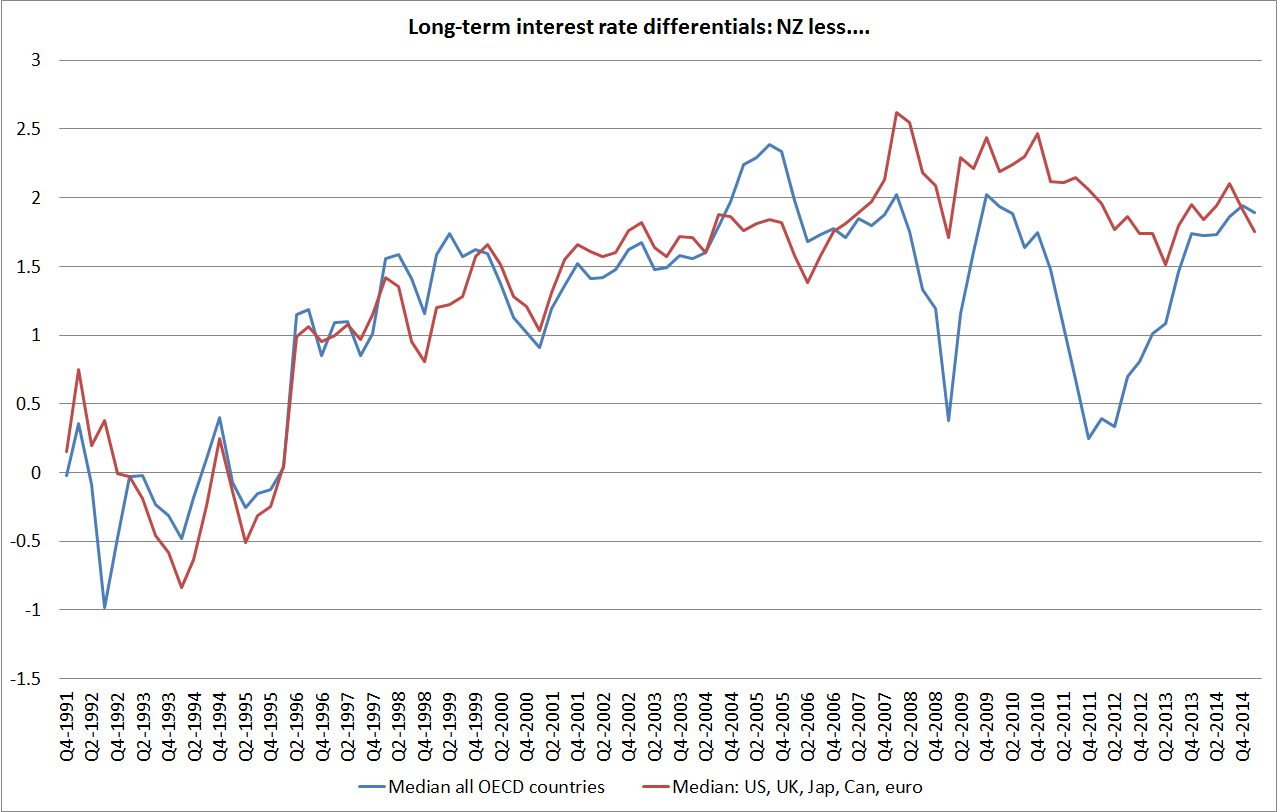
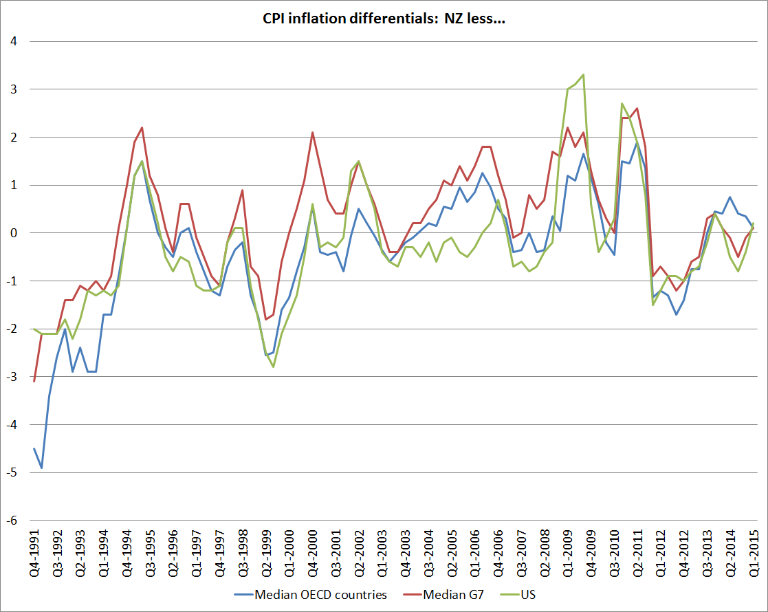
Yesterday I showed  that the gap between  New Zealand real and nominal interest rates and those in other advanced economies has been large for a long time..

There is quite a bit of debate about why.  I want to deal quite quickly with several stories that have been run at times:

  • Some argued that high interest rates are mostly down to monetary policy.   But even if monetary policy is a bit tight right now, over the last 25 years as a whole inflation has averaged a bit above the midpoint of the successive inflation target ranges.  And if the early inflation target was low by international standards, at least since 2002 a target centred on 2 per cent has been very internationally conventional.  Monetary policy isn’t the answer. .
  • Some have argued that a small country would almost inevitably have higher interest rates (all else equal) than countries with lots of public debt on issue (eg the US, Germany, Japan, or Italy).  Perhaps, but in the data any effect of this sort looks to be very small –  Sweden has borrowed at much the same rates as the United States, and New Zealand’s bond yields have also been well above those of the typical small, floating exchange rate, advanced country.
  • For a while it was suggested that our nominal bond yields were higher than those abroad because people were less confident that low inflation would last than they were in other countries.   But there is no external evidence to support the idea.  And although we don’t have long time series of inflation indexed bond yields, what data there are suggest that real interest rates here have been well above those in other advanced economies.

These days the main debate is between a story (which I think the Reserve Bank generally agrees with) in which domestic resource pressures explain our interest rates, and one in which high New Zealand interest rates reflect the high level of net international liabilities owed by New Zealand resident entities.  Today I want to explain why I find the latter story unpersuasive.

The story goes that international investors look at the stock of debt, worry about the risk that it poses, and charge New Zealand (dollar) borrowers higher interest rates accordingly.  There are number of possible lines of argument:

  • The direct one just mentioned: high debt means high risk, and lenders charge a premium (just as a bank might charge more to a highly leveraged borrower)
  • A story based on incomplete mobility of capital.  According to this story, we can borrow a great deal of money at “the world interest rate”, but our high NIIP means we run up against the limits of the number of investors who might be interested in having New Zealand exposures, and the net effect is a higher cost of credit at the margin.
  • A story based around exchange rate crisis risk.  In this story, it isn’t the debt itself that is necessarily risky (and the evidence is that highly rated NZ USD borrowers haven’t typically paid much more for debt than similar US USD borrowers) but rather NZD-denominated debt,  because of the exchange rate risk.  Specifically, even if the New Zealand dollar trades pretty normally in normal times, a country with lots of foreign debt is exposed to considerable rollover risk.  In times of crisis, the exchange rate could fall a very long way.  To compensate themselves for this risk of a NZD foreign exchange crisis, investors demand a higher return on NZD assets than they would on comparable assets issued in the currency of a less indebted country.

In the abstract, these can sound like plausible stories.  And there certainly have been cases of countries with very high levels of debt where yields have sky-rocketed, or who have even been cut out of funding markets altogether.  The risk of being cut off by funding markets played on the minds of New Zealand policymakers for decades, dating back to the 19th century.

But I don’t think these risk premia stories (which is how I will collectively describe them) can really explain what has gone on in New Zealand in recent decades.

Is there, for example, any sign that investors and offshore lenders have been particularly concerned about New Zealand’s international investment position?

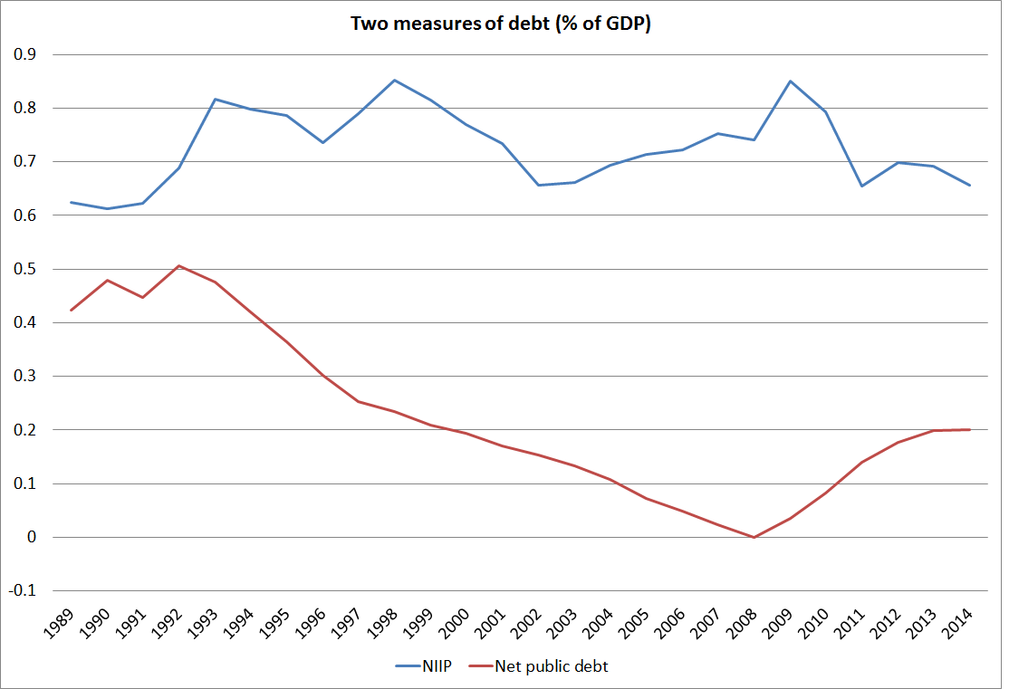
The short answer is “not really”.  And that shouldn’t really be surprising.  By international standards, the net international investment position of New Zealand is quite large, at around 70 per cent of annual GDP.  Historically, it has swung through huge ranges – probably nearer 200 per cent at peak in the late 19th century, and perhaps only around 5-10 per cent of GDP in the early 1970s. The net external liabilities ran up rapidly in the late 1970s and early-mid 1980s.   That mostly reflected the very substantial increase in public debt that occurred at the same time.  New Zealand’s historical statistics aren’t good, but the points in the previous two sentences aren’t really contentious.

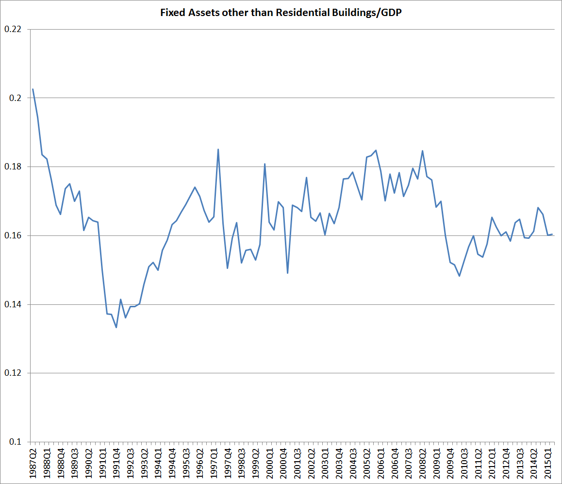
But what is sometimes forgotten is that the net international investment position (as a share of GDP) has now been basically flat for 25 years.  Here is the chart, with data as far back as the official SNZ series goes.  The NIIP wobbles around a bit, and is a bit lower than usual at present on account of all the reinsurance claims that crystallised following the Canterbury earthquakes, but has not gone anywhere for 25 years.

niip

In itself, that is interesting, because public debt has changed  a lot. In the late 1980s, net public debt was large, and one could think of the NIIP position as being largely accounted for by the government’s debt (large operating deficits over too many years, and the Think Big debacle).  Foreign lenders might have been a bit worried, and there were some signs of that: the threat of a double downgrade, and Ruth Richardson’s hasty trip to New York to fend off that threat.

But government debt subsequently fell steadily for 15 years, and one year the government even had slightly positive net assets (this is data from the Treasury’s long-term tables).  Debt has certainly increased a little over the last few years, but there is no sign from anyone (investors, rating agencies etc) that our public debt is a concern.  It isn’t the lowest in the advanced world, but it is towards the lower end of the range.

But as government debt shrank, private borrowing moved in to take its place.  By contrast, in Canada when the government got on top of its fiscal problems –  impelled in part by a crisis of investor concerns around Quebec –  in the mid 1990s, the reduction in public debt was matched by a significant reduction in Canada’s (then) large net international investment liabilities.

The fact that our net international investment position has stayed large and negative, even as the government finances have been put into pretty good shape is one straw in the wind suggest that our interest rates aren’t high because of worried foreign investors.    When lenders got worried about the financial health of borrowers, and increase the cost of finance accordingly, rational borrowers tend to wind back their debt.  Corporates do it.  Households do it.  Governments do it.  New Zealand didn’t.

The other straw in the wind is that the exchange rate has stayed persistently high. To be sure, it has gone through quite large cycles, and people can debate whether it is “overvalued” or not, but I’m pretty sure I’ve not heard anyone argue that the NZD has been consistently undervalued over the last 25 years.    The much more common line has been to note how high the exchange rate has been, and to think that it really needs to go down.  That has been a line from the IMF and from domestic officials.  And it shows up in things like Cline and Williamson’s fundamental exchange rate estimates, which have consistently suggested that the NZD has been one of the most overvalued currencies in the world.

Academic papers often model the effect of investor concerns by adding a term (a “risk premium”)to the interest rate. They do so largely for reasons for analytical tractability.  In fact, overseas investors have no way of adding a premium to New Zealand’s short-term interest rates.  The Reserve Bank sets the OCR, based on domestic pressures on local resources.  Foreign lenders  getting concerned about the level of debt New Zealand entities have doesn’t increase resource pressures.  If anything, such concerns might diminish resource pressures a little (eg a bit less greenfields foreign investment).

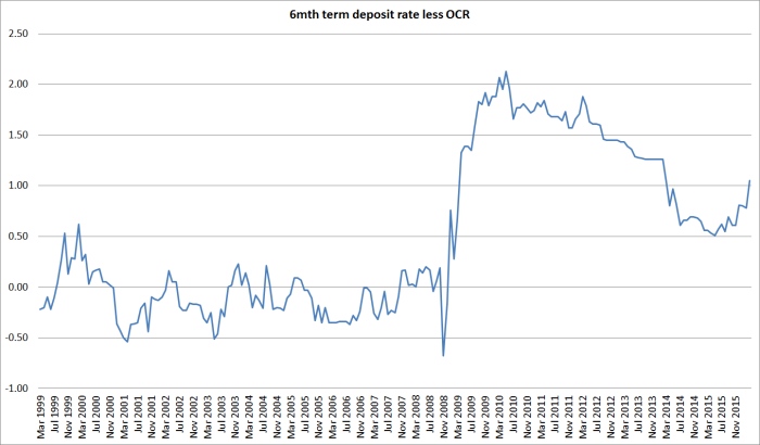
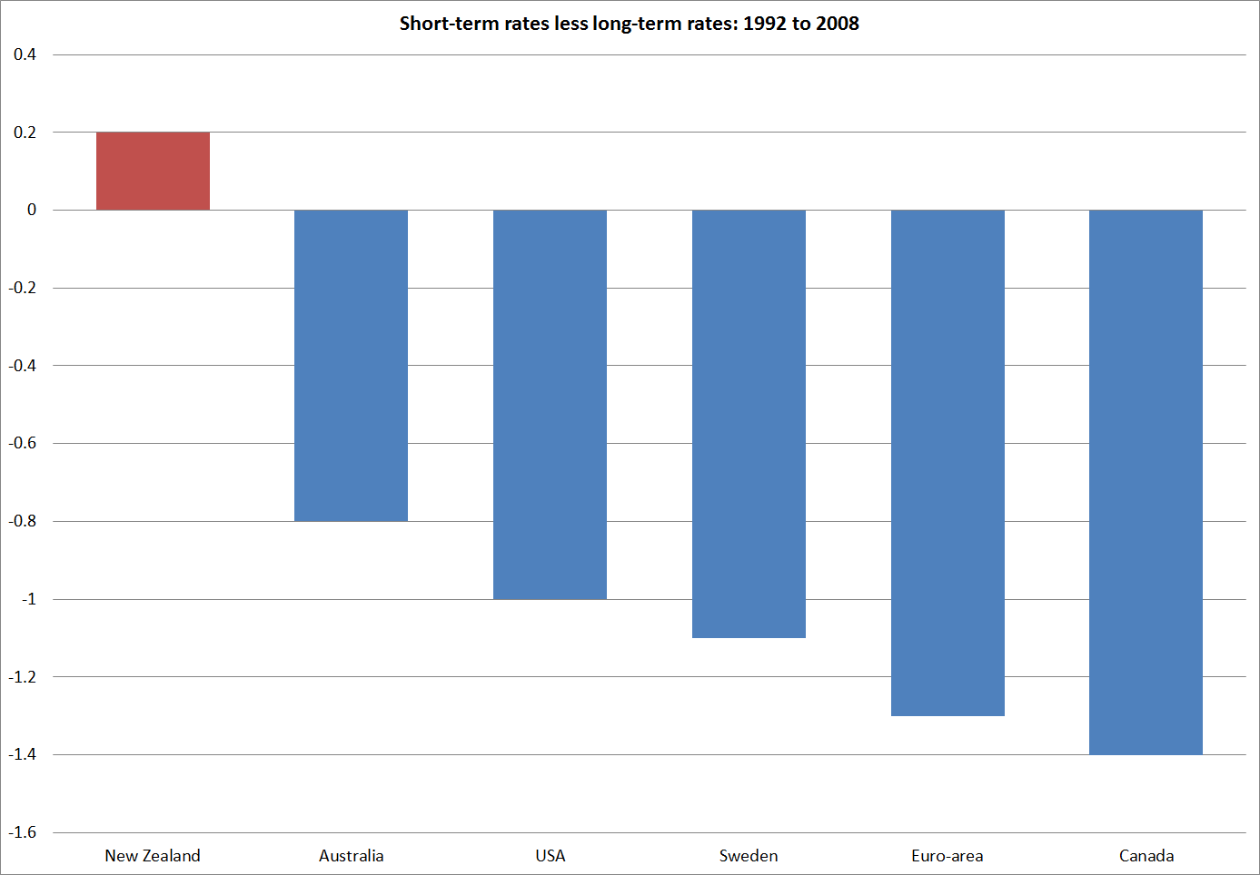
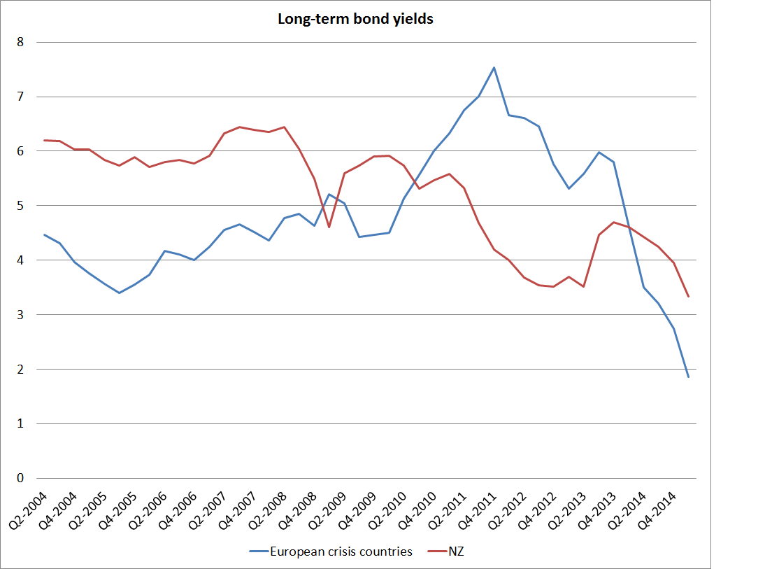
Long-term bond yields are freely traded.   We saw that yesterday in the spike in the yields some of the European crisis countries faced in 2011 and 2012.   But over 25 years, the gap between New Zealand and foreign long-term interest rates has been less than gap between New Zealand and foreign short-term rates.  Again, it doesn’t suggest some unusual risk premium related to the high level of NZ’s external debt.

Of course, the interest rate is not the whole of the foreign investor’s return.  A foreign lender buying a New Zealand government bond outright has to think about two factors:  the interest rate on the bond, but also the change in the exchange rate between when he purchases the bond and when he finally sells it and repatriates his money.  The investor doesn’t know how much the exchange rate will change,  but he needs to form an expectation (actual or implicit).

Long-term interest rates are largely determined by expected short-term interest rates, and short-term interest rates are largely determined by domestic pressures on resources.    But nothing of that sort anchors the level of the spot exchange rate.  Foreign lenders don’t need to purchase, or hold, New Zealand dollar bonds.  If they were ever to become particularly concerned  about New Zealand they might look to sell, or reduce their purchases, of New Zealand dollar assets.    That selling might raise domestic bond yields a little, but it would certainly be expected to lower the exchange rate.  In an economy with heightened investor concerns and a floating exchange rate, the exchange rate would be expected to fall to the point where the combination of the interest rate on the domestic bond and the expected future appreciation in the exchange rate together provide sufficient return to cover the investor’s perception of risk[1].

If this all seems a little odd to readers, think of a parallel with equity markets.  If investors become concerned about the risks on an individual share or on the market as a whole, they will want a higher return to compensate themselves for that risk.  The typical response is not to demand higher dividends (which could be thought of as parallel to a higher interest rate on a debt instrument).   Even if corporate boards agreed, higher dividends would be only likely to further weaken the companies’ financial positions.  The operating businesses can’t readily usually quickly generate more cash-flow – indeed, if they could the concerns probably would not have arisen in the first place.  Instead, what typically happens is that the share price falls (the “equity risk premium” is said to rise).  How far do share prices fall?  Well ,they need to  fall far enough that in combination the dividends and the expected future increase in the share price together provide enough return to investors for them to be comfortable continuing to own the shares.

In a similar way, a country which lenders regarded as having too much debt for comfort, and from which they wanted a higher return, would tend to be a country with a weak exchange rate not a strong one.

As I put it in a paper a couple of years ago:

If sustained heightened external investor concerns about the New Zealand NIIP position had ever developed they would, most probably, have been reflected in a sustained period of exchange rate weakness. And an adjustment of this sort would have been an example of self-stabilising properties of the economy at work. A fall in the exchange rate provides the signal that shifts resources away from meeting domestic demand, towards (net) production for exports. That shift of resources in turn and over time reduces the build-up of net external liabilities, lowering the NIIP/GDP ratio back towards some more comfortable/sustainable/normal level. As the NIIP ratio returns to a more comfortable level, foreign investor concerns should ease expected required returns would fall, and the exchange rate might be expected to recover some ground.

We have seen no sign of that sort of pressure on any sustained basis at any time since at least the early 1990s. If anything, the concern at times was around over-exuberant capital inflows.   There is no sign that external investor concerns have driven our interest rate differentials.  Instead, it is the domestic pressures on resources, generated by  firms, households and governments savings and investment choices that explain most of it.

Of course, persistently high New Zealand interest rates don’t mean there is a free lunch on offer to foreign investors.  Recall that an investor’s total return is the interest rate on the New Zealand dollar asset, and the change  in the exchange rate.  When interest rates here look particularly attractive to foreign investors, the exchange rate tends to rise to the point where the expected future depreciation just offsets the additional returns on the NZD security.  The critical word in that sentence is “expected”.  Expectations drive behaviour.  In New Zealand’s case, a lot of expectations have been consistently misplaced.  Over a long period, investors have expected the gap between New Zealand and foreign yields to close.  And it hasn’t –  not on any sustained basis anyway.  And when our interest rates got particularly high, investors have usually expected the exchange rate to depreciate before too long, and invested accordingly.   Ex post, people buying and holding New Zealand dollar assets look to received windfall high returns, but in fact they took a great deal of risk to secure them.  Had the market’s expectations about interest rate convergence  come right, they would have ended up not consistently better off than if they had kept their money at home.

So my argument is that New Zealand interest rates have averaged so much higher than those abroad because of domestic resource pressures.  Those on-going pressures have helped keep the NIIP position large (unlike Canada). The nature of those pressures is not that well understood (probably why markets have been persistently surprised).   Before too long, I’ll do a post or two looking at some of the factors that might lie behind those surprisingly strong pressures.

In the meantime, I covered this material on pages 42 and 43 of this paper (which also has the references to various papers that make the risk premium case).  The paper itself outlines the resource pressure arguments more fully.

But the key point to take away is that stories about investor concerns imply a low exchange rate, perhaps puzzlingly low from a New Zealand perspective, not a high one.  Don’t take my word for it –  as Charles Engel, one of the leading scholars in the field. put it “a currency whose assets are perceived to be risky….should be weaker ceteris paribus”.

Perhaps we would have seen that sort of pressure in the late 1970s and early 1980s if we had had an open capital account and a floating exchange rate.  But we’ve seen nothing of the sort, for any prolonged period, in the last 25 years.

[1] It is different in a fixed exchange rate country (such as the eurozone countries in the 2011/12 crisis) where the pressure must go into domestic interest rates.  But New Zealand has long had a floating exchange rate.

Long-term bond yield differences

I wrote the other day about the way that New Zealand’s real exchange rate had become (not just recently, but in the last 20-30 years) out of line with changes in our terms of trade and in our relative productivity performance. In that post I suggested that the large gap between New Zealand’s real  interest rates and those in other advanced countries was a big part of the explanation.  Not, of course, that interest rates are an independent factor just imposed on us, but that if we could understand what had driven such a wedge between our interest rates and those of the rest of the advanced world, we would be on the way to understanding what was resulting in such a persistent (albeit rational) misalignment of the real exchange rate.  In that post, I simply noted the current very large gap between the real yields on inflation-indexed bonds issued by the New Zealand and US governments respectively.  That gap is around 1.5 percentage points.  Over 20 years, that looks like a huge difference in expected returns.

Interest rate differentials can move around quite a lot.  Even for long-term bonds, cyclical differences in the health of the respective economies can make quite a difference[1].  Risk factors can matter too –  at times of heightened global risk, for example, US Treasury bonds still tend to be an asset of choice. My focus is not really on short-term movements in those differentials, but on what has happened on average over time, and that is the focus of this post.

The OECD publishes data on long-term bond yields for each of its member countries.  “Long-term” here generally means something close to 10 years, the usual benchmark for such comparisons.  The data are nominal, and of course over time differences in inflation rates should explain quite a lot about differences in nominal interest rates across countries.  So I restricted myself to the period from the end of 1991.  For New Zealand, that was the first quarter in which inflation had fallen inside the new inflation target range, and  most other of the older advanced countries had also broken the back of the high inflation of the 1970s and 1980s by then.  But I’ll come back and look at trends in inflation a bit later.

In this first chart, I’ve shown long-term bond yields for New Zealand, for the US and for the medians of several groups of countries.  I’ve looked at the median of all OECD countries (but at the start of the period there is no data for many of the former communist countries, and by the end of the period, half of all the countries were in the euro), of the G7 countries individually, and of a grouping of G7 currency areas (Canada, the US, the UK, Japan, and the euro-area).  Most of the time it does not much make difference which measure one looks at.  I’ve included them all so that you can see that I haven’t been cherry-picking.  My preferred series to compare New Zealand against is probably the G7 currency areas one.

interest1

Of course, the dominant story of the last 25 years is the dramatic fall in the level of interest rates everywhere.   Part of that is the fall in actual and expected inflation –  even in the G7 countries, inflation still averaged 4 per cent at the end of 1991 – but real interest rates have also fallen markedly.

But my main interest is in the differentials: how have New Zealand bond yields behaved relative to those of these other advanced countries.  It was notable in the first chart how the gap between New Zealand and other countries emerged over time.

Well, here is the chart of the differentials.  This time, to make the chart easier to read, I’ve shown only two series: New Zealand less the median of all OECD countries, and NZ less the median of the G7 currency areas.   It is easy to forget how low New Zealand interest rates were at the start of the period, relative to those abroad  (I was running teams at the Reserve Bank advising on monetary policy and doing the Bank’s macro forecasts, and I had forgotten).  At the start of the period, we were just emerging from two decades of very high inflation, and were only a few months on from the much-publicised threat by rating agencies of a double-downgrade to New Zealand’s sovereign credit rating.  We did, however, at the time have a very low inflation target –  even if political support for that target was fragile at best.

But I’m really interested in more recent periods.  Again, I partly started back in 1991 just to provide context.

interest2

Throughout the 1990s, there was a very strong expectation that New Zealand short-term and long-term interest rates would converge to those of the rest of the world[2]  Once we had low and stable inflation, much stronger fiscal accounts, and people were confident those things would last, then having become  integrated with global capital markets, it seemed a reasonable story.  Sure, there might be small differences – small New Zealand markets might always be less liquid –  but the differences weren’t thought likely to amount to much, especially when comparing us against other small advanced economies.

But that convergence has just never happened, and the fact that it has not happened –  that the interest gaps have been so large, through booms and busts – is one of the most striking features of what has happened in New Zealand in the last 20-25 years.  Day-to-day what happens internationally is a key influence on changes in New Zealand bond yields, and there is clearly a common factor at work in the long-term decline in real yields, but the levels remain completely different.

It is interesting to note where the two lines diverge materially, both in the period since 2007.  Nothing very interesting happens in the differential between New Zealand and G7 bond yields since 2007, but both during the 2008/09 recession, and again –  more starkly –  at the height of the 2011/12 euro-crisis, New Zealand bond yield differentials fall sharply relative to the median OECD country.   It is easy to see that effect in this chart, simply comparing New Zealand against a group of eight crisis countries (Iceland, Ireland, Greece, Spain, Portugal, Italy, Slovenia and Hungary).

interest3

As I noted earlier, differences in actual and expected inflation can affect the interpretation of nominal bond yield differentials.  We don’t have consistently-compiled cross-country measures of inflation expectations (and in most countries, indexed bonds are too recent or too patchy  –  the NZ story –  to provide much of a time series).  And so people tend to fall back on comparing actual inflation rates over time.  It has to do, since it is all we have, but it is worth remembering that even CPIs are compiled differently across countries, and across time even within individual countries.  In New Zealand, for example, until 1999 CPI inflation rates included the direct effects of interest rates, and section prices.

interest4

This chart just shows the average inflation rates for New Zealand, for a couple of individual countries, and for various country groupings since 2000.  New Zealand’s inflation rate has averaged a bit higher than inflation in the G7 countries, by around 0.6 percentage points, but has been very similar to that among OECD countries as a whole, and that in the United States.  At least since the mid 1990s, it doesn’t look as if there has been any particular change in the relativities, and at present New Zealand’s inflation rate is almost identical to that in the rest of the advanced world.

interest5

Historical differences in inflation outcomes might be thought to have warranted nominal bond yields in New Zealand perhaps 0.5 percentage points higher than those in the rest of the advanced world.  Looking ahead, however, New Zealand’s inflation target is very similar to those in the rest of the advanced world: our target is centred on 2 per cent, and while Australia’s in a touch higher, and the euro-area’s is a touch lower, taken as a group there isn’t much difference.  And yet our nominal bond yields have still been averaging 2 percentage points higher than those abroad.

What does explain it?  A common story is risk around the high level of net international indebtedness of New Zealand entities.  I don’t find that story persuasive at all, and will explain why in my next post.

[1] Using implied forward rates (the yield implicit in the second five years of a ten year bond) is a good way around this, but such data are less readily accessible).

[2] I documented this in a paper I wrote a few years ago for a Reserve Bank and Treasury workshop.  I would quite like to post it, but it would no doubt take at least 20 working days to extract it from the Bank.