Perhaps 20 more terms in office will be enough?

The ever-ebullient Minister of Economic Development (and a great deal else beside) Steven Joyce was interviewed on TVNZ’s Q&A programme yesterday, defending the government’s economic record.  Despite the efforts of the interviewer to pin him down –  including on the rising degree of unease even among some of those one might think of as “elites” about immigration policy –  Joyce put up a pretty forceful defence, often citing the Prime Minister’s mantra that if New Zealand has challenges they are ‘quality problems” or “side-effects of success”.  If one didn’t have access to the facts, it might even have sounded persuasive.

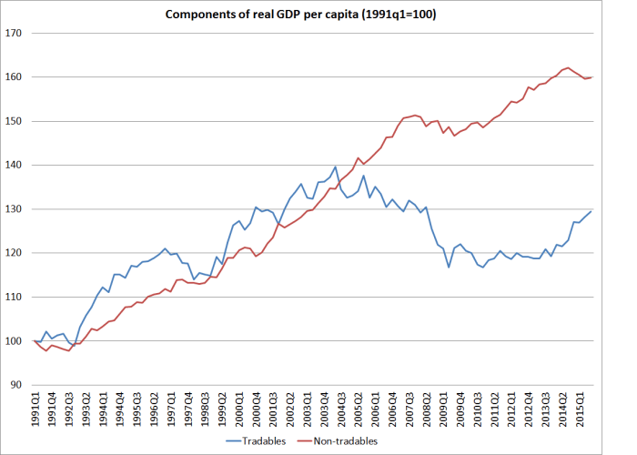
I was tempted to devote a lengthy post to the Minister’s claims, but I have other stuff I really have to finish today.  So apart from noting in passing New Zealand’s continuing lousy productivity performance (see the chart in this post), I wanted to focus on just two of the areas the Minister covered.

The first was around the skills of immigrants.  In June the OECD released the results of a fascinating multi-country study of the skills level of workers.  It suggested that the skill levels of New Zealand workers –  over several dimensions – were pretty high.  I wrote about it at the time, and summarized the high-level findings this way

Looking across the three measures, by my reckoning only Finland, Japan, and perhaps Sweden do better than New Zealand.    Perhaps there is something very wrong with the way the survey is done, and it is badly mis-measuring things, but those aren’t usually the OECD’s vices.  For the time being, I think we can take it as reasonably solid data.

As I also noted, the survey also looked at the skill levels of non-native born workers.  In almost every country, including New Zealand, the skill levels of immigrants were below that of natives.  Of course, in every country there will be many very able immigrants, but these are averages across the full samples of native born workers and immigrants.  As I pointed out, if your country (New Zealand) already had among the very highest skill levels in the world, and immigrants had less good skills, it didn’t lend much support to the idea that we needed lots and lots of immigration to lift the productivity of New Zealand workers, and make up for deficient skill levels at home.

But none of that stopped Steven Joyce introducing this same report in support of the government’s immigration policy.  How did he manage that?  Well, he correctly pointed out that New Zealand’s immigration policy is more skills-focused than those of most countries.  Unlike most countries, we have almost complete control over who we let in –  there isn’t a material illegal immigration problem –  and unlike, say, the United States (where legal immigration is mostly family-focused) we have an explicit economic/skills focus.  We may not do it well –  my argument –  but we are less bad, on that score, than most.

One might reasonably expect literacy skills of immigrant workers to lag behind those of natives –  after all, for many/most English isn’t their native language.  But the OECD survey also reports results for “problem solving proficiency in a technology-rich environment” (Figure 3.15 of the OECD report).  There are 28 countries/regions in the OECD study, but there is only data on the skill levels of immigrant workers for 17 of them (many of the other simply don’t have much immigration).

Here is the proportion of foreign-born workers with what the OECD calls relatively high level skills in this (problem-solving) area.

skills technology

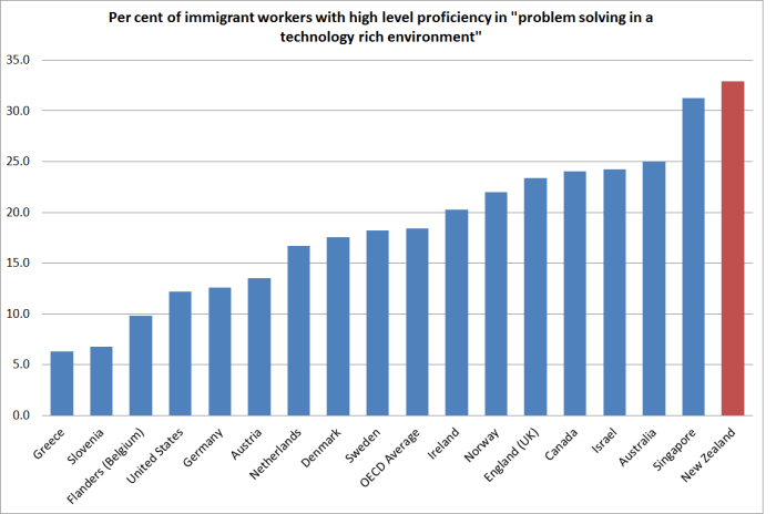
New Zealand scores well here.  Our (really large scale) immigration programme seems to have done better in attracting people with these sorts of skills (and keeping out others) than most other countries have.

But remember that our overall workforce –  mostly native-born –  also has among the very highest level of skills of any of these countries. On this particular measure, we were top equal with Sweden.

So here is the gap between the skill level of natives and the skill levels of immigrants (again, on this problem solving proficiency measure).

skills gap

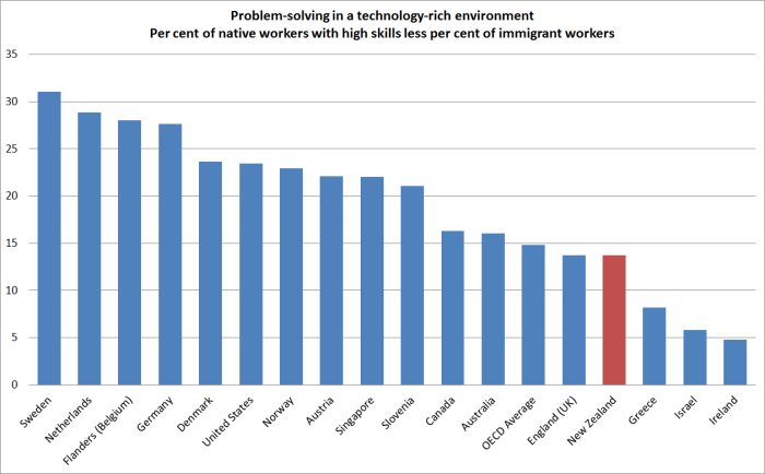
New Zealand doesn’t do too badly –  although Israel and Ireland stand out as clearly better –  but in every single one of these countries the skill levels of the average immigrant worker are less than those of the average native worker.  And this in an area –  the use of technology –  where the Minister often likes to stress the importance of immigration.  We don’t have the problems of Sweden or the Netherlands, but these OECD data –  which the Minister himself quoted in support of his policy –  just do not support the claim that our immigration programmes have been boosting overall skill levels in New Zealand.  If anything, those programmes have been a net drag.  As I’ve repeated many times, I’m not suggesting immigration never could boost skill levels –  or that there are not many highly-skilled individual immigrants (as there are many highly skilled natives) –  but our skills-focused programme, on the scale the government continues to stick to, just isn’t achieving that goal.  Perhaps with annual target of 10000 to 15000 non-citizen migrants (per capita, the same sort of rate as the US has) we might do so.

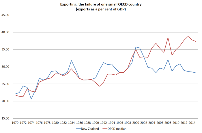
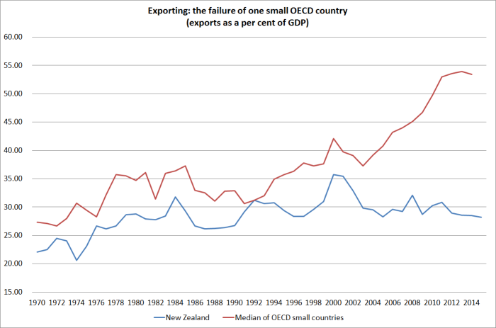
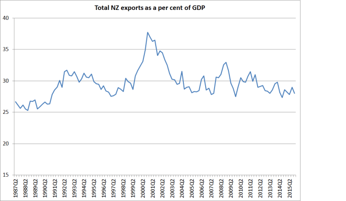
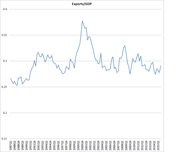
The interviewer also attempted to push the Minister onto the back foot over the government’s target for the share of exports in GDP.  The goal, announced several years ago, was to lift exports as a share of GDP from around 30 per cent to around 40 per cent by 2025.  I thought the formal target was daft and dangerous, even while sympathizing with the intuition that motivated it – small countries get and stay successful by selling lots of stuff, competitively, in the rest of the world.

As the Minister fairly noted, the base level of exports got revised in one of SNZ’s long-term national accounts revisions.  But that does not change the fact that exports as a share of GDP have been going nowhere.  It is all very well to blame low dairy prices –  as Mr Joyce sought to –  but on other occasions he’d be telling us just how well tourism and export education sectors were doing right now.

Here is chart of exports to GDP, going back to the start of the quarterly national accounts data in 1987. This time, I’ve also shown the average export share for each of the last three governments.

exports to gdp by govt

Plenty of things cause fluctuations in the series, and not many of them are under the direct control of governments.  Nonetheless, the average export share of GDP is materially lower under this government than it was under the previous government, and the latest observations are below even that average. Since the start of 2009, exports have averaged 27.7 per cent of GDP.  Under the previous National government –  one that first took office more than 25 years ago, that average was 27.5 per cent.  The government’s goal was to lift the export share by 10 full percentage points, and there is now only nine years left until the target date.  On performance to date –  and policy to date – we might be waiting several more centuries to achieve that sort of goal.

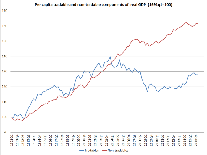
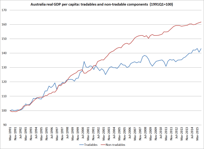
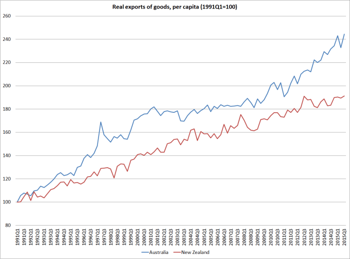
It is time Mr Joyce and his colleagues faced the fact that they are simply failing on this count.  A rather different approach is needed –  one which permits/facilitates a sustainably lower real exchange rate, orienting the economy more strongly towards investment in the tradables sector, and enabling more able firms to grow (and locate here doing so) by successfully selling to the rest of the world.  As I’ve noted before, per capita output in that vital outward-oriented part of the economy hasn’t increased at all for 15 years now.  It seems unlikely that that sort of reorientation will occur, all else equal, while we continue to bring in, as a matter of policy, so many not-overly-highly-skilled non-citizen migrants each year.

And finally, the interviewer introduced my name to the discussion as one of those skeptical of some of the government’s claims.  Mr Joyce suggested that I was among those who had predicted a large balance of payments blowout, thus apparently undermining the credibility of my arguments.  Of course, economists are pretty hopeless forecasters, so when an economist offers a prediction about the future one should (a) always take it with a considerable pinch of salt, and (b) wonder if the economist recognizes his/her own unwarranted over-confidence.  But in this particular case, I didn’t even recognize the forecast.  Since I’ve spent the last four years –  both inside and outside the Reserve Bank –  arguing against interest rate increases and for interest rate cuts, it would be surprising if I had been worrying about the current account deficit blowing out.  Demand has been consistently weaker than it should have been –  inflation has been below target, and unemployment has lingered above the NAIRU.  Whatever I’ve warned about, I’m pretty sure it hasn’t been the current account of the balance of payments.

(UPDATE: And, as a reader notes, as banks’ dairy losses mount there will be an almost one-for-one temporary reduction in (mostly foreign-owned) banks’ profits, and thus in the current account deficit.   That won’t be a sign  of economic success either.)

Exporting: the failure of one small OECD country

The current government has a published target for increasing the share of exports in GDP.  I’ve argued previously that that was unwise, for a bunch of reasons, including the risk that it can encourage measures that might boost exports (to meet the target) but which don’t pass standard tests of good economic policies. I’d probably put enhanced film subsidies in that category –  the export incentives of the current generation.  But, equally, setting targets without any supporting economic strategy to deliver sensible results that meet the target has its own problems.

Despite all that, I suspect no one who cares about improving New Zealand’s medium to long-term economic performance is indifferent to the export performance of New Zealand firms, and the  New Zealand economy as a whole.  After all, the wider world is where most of the potential markets are –  especially for firms from smaller countries.  Perhaps there are examples, but I’m not aware of cases of countries that have markedly improved their economic performance on a sustainable long-term without a robust export sector (and tradables sector more generally) being part of that success.

I showed a chart the other day with a snapshot comparison of export shares in Australia and New Zealand in 1980 and 2014.  New Zealand hadn’t done well.  But how have we done over the decades not just by comparison with Australia, but compared with the wider group of advanced countries?

The OECD has data on exports as a share of GDP going back to 1970 for 27 countries, including New Zealand.  Here is the chart, comparing New Zealand with the median of those OECD countries.

exports as a share of GDP

For an individual country, in particular, there is quite some variability.  Thus, the combination of the sharp fall in our exchange rate in 2000 with high dairy prices temporarily boosted New Zealand’s exports to around 35 per cent of GDP.  But if one focuses on the trends, one could say that broadly speaking we had kept pace with the growth of exports in other OECD countries until around 2002/03.  But over the last 15 years, even though world trade growth slowed sharply late in the 2000s and has never really recovered, New Zealand has fallen well behind.

Only rarely is all the information in a single chart.   This isn’t one of those times.  Part of what has gone on, especially in Europe, is the growth of “global value chains”: whereas previously a car might have been designed and built entirely in Germany, and then exported, now often enough there is a lot of gross cross-border trade in the design and manufacturing phase, before the finished product is sold.  That inflates gross exports (and imports) and overstates the growth in economic value-added associated with exporting.  We don’t have up-to-date value-added data, nor a good long time series.  On the other hand, this didn’t suddenly start becoming an issue in 2003.

We also know that:

  • small countries tend to export and import larger shares of their GDP
  • far-away countries tend to export and import smaller shares of their GDP

Both these points need to be kept in mind. The first doesn’t have any very obvious implications: were Belgium to split in two, exports and imports as a share of the respective  GDPs of Flanders and Wallonia would rise even if no transactions were done differently after the split than before it.    But the distance point does have implications.  For whatever reason, distance is an obstacle to foreign trade, even that in services (it is probably not typically the dollar transport costs, but something about time taken to ship goods, and the physical proximity of people –  customers, potential staff, even competitors), and makes it harder –  all else equal –  for distant places to prosper.  Not surprisingly then, one doesn’t find too many people in very distant places.

But reverting to size, here is how the chart above looks if we focus only on the small countries the OECD has data for.  In 1970 only two OECD countries –  Iceland and Luxembourg –  had smaller populations than New Zealand.  We had just under 3 million people, and at the time Norway, Ireland, Denmark, Finland and Israel had fewer than 5 million people.

exports small countries

The recent divergence is, if anything, even more stark.  Our export share of GDP in 1970 was already low by small advanced country standards –  and had shrunk, as one would expect, during the years of heavy protectionism.  But the gap has materially widened only in the last 15 years.  Some of that will be the (profitable) growth in Europe in cross-border trade as part of the production process. But it certainly isn’t the whole story.

What makes me fairly confident of that claim?  Two things really.  The first is this chart (which I’ve run before), the indicative breakdown of New Zealand’s per capita GDP into tradables and non-tradables sectors.  Something here changed, quite materially, in the early 2000s.

pc gdp components

And the second is our exchange rate.  Here is the real TWI, using Reserve Bank data updated to capture the last few months.

real exch rate

Our real exchange rate has always been quite variable.  But if anything over the last decade or so there has been a bit less variability than in the preceding decades.  And probably more importantly, the average real exchange rate since the start of 2004 has been 20 per cent higher than the average over the previous 20 years (the period for which the Reserve Bank has the data).

That would be great if it had reflected a marked improvement in our relative productivity performance. But, of course, it hasn’t.  And perhaps unsurprisingly our tradables and export sectors have really struggled.

Of course, the real exchange rate isn’t simply a policy lever governments pull.  It is an outcome of other factors –  some policy, some market.  And quite what those factors were is a topic for other days.  For today, I simply encourage to reflect on how poorly New Zealand continues to do, and especially in building and expanding sales to the rest of the world, drawing on the high level of skills of our people, and the talents of our firms.


China and New Zealand

The Prime Minister, a large flock of New Zealand business people, and various media representatives are in China.  It is not a particularly attractive sight, perhaps one of many reminders of why bilateral or regional preferential trade agreements are such an unfortunate policy option (as leading trade experts, and entities like the Australia Productivity Commission often remind us).  Allow for some trade diversion risks, and the ever-more-entangled rules of origin, and such deals are often bad enough.  And then there is the matter of making repeated obeisance before the leaders of a tyrannical regime, begging for their favour; the crumbs off their table.   Perhaps worst of all, our elected leaders don’t even seem to find it distasteful.

New Zealand firms do a fair amount of trade with Chinese firms, and that trade has increased considerably in the last decade. Despite some breathless commentary, China was never our largest “trading partner”,  but New Zealand firms do more trade with the Chinese than with firms and individuals in any other country than Australia.  But then our trade is quite widely spread across many countries, and much of it is in products which are pretty homogeneous (it isn’t clear that it much matters whether New Zealand firms export dairy products to Venezuela, Saudi Arabia, or China: New Zealand producers sell somewhere whatever is produced, and what matters most is the global prices for dairy products).  There is a great deal of talk about the benefits (or risks) of being concentrated on whole milk powder (WMP), but the prices of the various different dairy products all seem to cycle together, and idiosyncratic patterns for individual products don’t seem to last for long.   (GDT only has a long run of data for these three, but over the last five years one can also see it in a chart from a wider range of dairy products).

dairy prices components

Here are our merchandise (goods) exports to China as a share of GDP.

exports to china % of GDP

Services exports data by country is only available annually.  Here are total New Zealand exports to China for the last four (June) years.

total exports to china

But how much difference has it all made?  The government has made much of trying to lift the export share of GDP, but here is a chart of that series.

total exports as % of GDP

Which has, as I’ve noted previously, been going nowhere for 25 years now.

Of course, New Zealand firms import a lot from China as well.  Here is the merchandise trade balance between New Zealand and China since 1981.

merch trade balance with china

But once services trade is included, for the last three years New Zealand has run a goods and services surplus with China.

It was a little surprising to hear the Prime Minister in pursuit of investment from China

“But we in New Zealand will take that view from a Government perspective, that we’re a fast-growing economy, we want to to develop great international relationship and we also want to have a higher standard of living. We fundamentally don’t have enough private-sector capital of our own to fund that growth.”

Set aside the “fast-growing” economy claim for now – I guess the total economy has been growing quite a bit by OECD standards, even as per capita growth has been pretty dismal –  but what really struck me was the observation that “we fundamentally don’t have enough private-sector capital of our own to fund that growth”.  If the Prime Minister simply means that we run current account deficits (in which total domestic investment exceeds total national savings) that is, of course, true.    But it is not as if we have any trouble financing that current account deficit on world markets –  apart from any other indicators, that is evident in the persistently high level of the exchange rate.  Countries that have trouble financing themselves tend to have persistently weak real exchange rates.  We don’t.

To be clear, I have no particular problem with foreign direct investment, and in general I think we should have fewer restrictions on it.   China is a slightly different issue, but mostly because all major businesses are ultimately state-controlled. I’m not suggesting any specific restrictions on Chinese FDI (except perhaps where national security considerations warrant it) but we need to remember just how badly distorted and underperforming China’s economy is.  It isn’t exactly one of the success stories of market capitalism, unlike say Taiwan.  New Zealand hasn’t done well in recent decades, but for all its fast growth (much real, some probably illusory), China’s overall levels of productivity are still astonishingly poor.

gdp phw nz china taiwan

The better of China’s firms may be very good at managing the twisted eddys of Chinese politics.  That is very different from thriving in a proper market economy, where the rule of law prevails, and connections to the powerful don’t (or are not meant to) matter much.  If FDI from China happens, so be it and some it may add wider value, but it isn’t the most obvious place to be pursuing FDI from (if politicians should be doing such marketing at all).  The real gains from FDI aren’t dollars of foreign capital but rather the ideas, technologies etc that really successful global firms can bring with them, with spillovers into the New Zealand business sector and the wider New Zealand economy.

And all this is without devoting space to our apparent studied indifference on the South China Sea issue (“we aren’t taking sides, we just want a resolution”, as if there is no difference between tyrannies and democracies –  Philippines and Japan for example), or talk of extradition treaties with China.  If people can be shown to have lied on their immigration applications, no doubt we should revoke their approval to be here, but are we seriously comparing the so-called “justice” system of China to that of countries like our own?   For all the talk of “fugitives” in New Zealand, we need to remember that much of the so-called anti-corruption programme of the last few years has been about purging those who got offside with the winners in the latest Party realignments.  Some of those now abroad might well be “bad guys”, but it isn’t clear that any people who matter in China’s government are, in any sense, “good guys”.

Finally, in all our enthusiasm for trade with emerging China, I amused myself yesterday by downloading the 1939 New Zealand Official Yearbook to see what trade we were doing with Germany and Japan in the 1930s.  Not much with Germany, but I’m imagining there must have been some breathless enthusiasm, at least in some circles, about our rising trade with large and emerging Japan, by then our third largest export market.

japan exports

,


Australia’s tradables sector….and Eaqub on the RB

In a post on Thursday I showed this chart, a rough and ready decomposition (pioneered by the IMF) of real GDP per capita into that produced by tradables sectors (bits exposed to competition from the rest of the world) and non-tradables sectors.  My proposition was that successful high-performing economies will usually be led by strong tradables sector growth.
tradables and non-tradables gdp

I was curious about how the comparable chart would look for Australia.

aus t and nt

Total growth in non-tradables per capita has been almost identical in the two countries over these 25 years (around a 60 per cent increase).

But look at the differences in recent years in (this proxy for) tradables sector output, per capita.

aus and nz T sector

In New Zealand, (this proxy for) tradables sector output per capita hasn’t increased over 15 years (notwithstanding the strong last few quarters).  In Australia –  which certainly isn’t a stellar economy –  the picture is much less negative.

At a sub-sectoral level, manufacturing output in Australia (per capita) has been even weaker than in New Zealand over the full quarter century.  The big difference, of course,  is simply the rapid growth in mining output.

Changing tack, just briefly…

Some readers perhaps find this blog a fairly unremitting critique of the Reserve Bank of New Zealand.  But today I’m sticking up for them.

Independent economist Shamubeel Eaqub has a column in today’s Dominion-Post, which in the hard copy version runs under the heading “Gorging a warm-up act for debt horror show”.   And “gorging” is Eaqub’s word, not just some sub-editors hype.   According to Eaqub, all New Zealand’s debt chickens are about to come home to roost –  notwithstanding, apparently, the fact that debt/GDP ratios are little changed over the last eght or nine years, and that no one has any good sense of what a sustainable, optimal, or equilibrium level of such ratios might be.

But according to Eaqub

The Reserve Bank is complicit, as they regulate banks. They say that the banking sector is not at risk. Their modelling shows sufficient capital buffers – which influence banks’ risk appetite to lend and vulnerability in a recession.

Their modelling has also shown higher inflation and interest rates for the last seven years – mistakenly.

It’s time the Reserve Bank better regulated banks to stop the repeating cycle of debt gorging and economic vulnerability.

This is really just a “guilt by association” slur.  Yes, the Reserve Bank has got its inflation and interest rate forecasts badly and repeatedly wrong, but what possible connection does that have to the question of whether banks hold adequate capital (whether risk weights, or required capital ratios)?    Or whether the stress test results are plausible?  Eaqub produces precisely no evidence to support his insinuations.  It is a short column to be sure, but surely he could at least offer readers a hint.

Lets recall that the stress tests involved a 40 per cent fall in house prices across the country, and something like a 50 per cent fall in Auckland.  And they involved an increase in the unemployment rate larger than any seen in any advanced economy with a floating exchange rate since World War Two.  And the banks still looked pretty resilient.

And as the IMF has previously noted, when they looked at a variety of other countries, risk weights on housing lending in New Zealand were materially higher than those in other countries.

I suspect there are tough times ahead for the New Zealand and world economy.  One can always argue for more capital, but to do so from the current situation  –  where New Zealand banks are better-capitalized than most –  one really needs more than simply the claim that “they got monetary policy wrong, so we shouldn’t give them credence on any other score”.


Unborn firms utter no cries

Late last year, in a series of posts on the quarterly national accounts I showed this chart of export volumes per capita (for New Zealand and Australia).

exports real pc

Exports (per capita) had carried on growing over the last decade or so, although at a materially slower rate than they had been growing previously.

Exports matter, but they are only one outcome of the international competitiveness of the New Zealand economy.  Another way of looking at things is to think of the economy as divided between tradable and non-tradable sectors.  It is a useful analytical device, but (like many useful economic concepts) doesn’t map 100 per cent easily onto the official data we have available.

My proposition (not, I think, overly controversial) is that a high-performing economy will be one in which the tradables sector –  the bits selling to, and directly exposed to competition from, the rest of the world –  is growing strongly, absolutely and certainly in per capita terms.   Such growth in the tradables sector in a mark of the success of companies operating here in being able to meet, and succeed in, the global market.  There is, of course, nothing wrong with non-tradables activity: we want phone services, cafes, theatre, and holidays at the beach.  But it is exceedingly rare that a strong sustainable economic performance, especially in a small economy, is led from production in the sectors that aren’t exposed to international competition.

In an IMF Article report from perhaps 10 years ago the Fund staff had the clever idea of representing the tradables and non-tradables sectors in a single chart.  It was rather rough and ready, and the Fund knew it, but it helped illustrate something of how the New Zealand economy had been unfolding.   They started with the production measure of real GDP, and allocated the primary and manufacturing sectors to tradables.    Our exports and imports are typically either primary or manufactured goods, or they are services.  To proxy the contribution of services to tradables production, they took the services exports component (from real expenditure GDP) and also assigned that to the tradables sector.  Everything left over was non-tradables.   The resulting chart was reproduced in various fora around Wellington over the years, even used by the Minister of Finance  –  much to the distaste of purists.

I hadn’t seen the resulting chart for a while, and was curious how things had been going.  In particular, given the rapid growth in the population over the last decade, I was curious about how tradables sector activity had been doing per capita.  After all, both National and Labour governments have constantly talked of strengthening New Zealand’s international competitiveness, international connections etc.

In this chart, I’ve shown primary and manufacturing real value-added per capita, and real services exports per capita, back to when the quarterly population series began in 1991.  Each component here is indexed to 100 in 1991.  At the end of the period, these three components of tradables production are of broadly similar size.

tradables components

If your eye is drawn to the services line, as it probably is, bear in mind that not one of these series is now at its historic peak.  One peak was in 2004, one in 2005, and one (primary) in 1997.     By contrast, real per capita GDP is at its historic peak –  growth hasn’t been strong over the last decade, but has been around 8 per cent over the last decade.  Per capita export volumes haven’t been doing that well (see first chart above) –  but they have clearly done a whole lot better than the domestic (import-competing) component of tradables production.

So here are the aggregate tradables and non-tradables components, as proxied by this particular approach.

tradables and non-tradables gdp

I found it a rather bleak picture, to say the very least.  Tradables sector production, per capita, is now nowhere near as high as it was as much as 12 or 13 years ago.  It is most unlikely that New Zealand will make any progress at all in sustainably closing income and productivity gaps to the rest of the advanced world if it can achieve no growth in per capita tradables sector production over a period that long.

Why has it happened?  What has so strongly skewed production towards non-tradables?  I’d argue that it has, primarily, been rapid population growth, which had to be accommodated through a much higher exchange rate (the big step in the exchange rate dates back to 2003). For many of our tradable product sectors, raising our own population does nothing to materially boost output –  land and sea and mineral resources are given, and the (real and significant) productivity possibilities in those sectors are independent of population.  And the higher exchange rate just made it that much harder for other firms in the tradables sector to survive or thrive.  The exchange rate has been so high for so long that we don’t hear many squeals any more –  those who can thrive at these exchange rates do, and dead firms and unborn (ie never launched) firms utter no cries.  Loosely speaking, it is a fully-employed economy (no 5.3% isn’t full employment, but 4.5% might be –  and that difference is swamped by the scale of the divergences evident in this chart), but it isn’t a path to sustained prosperity.   Non-tradables firms, especially in Auckland, do well –  as they do in every population-fuelled boom anywhere (in history or now) –  but it isn’t a path to sustained national prosperity.

Are there some caveats to the story?  Yes, sure. The Christchurch repair and rebuild process exacerbated the skew to non-tradables, and there wasn’t anything much we could do about that.  And high terms of trade, in principle, made it less necessary to produce tradables volumes (price substitutes for volume)….but, in the longer term, higher terms of trade tend to induce strong investment and volume growth in the sectors that are benefiting.  There was no sign of that in New Zealand.

As I noted, purists don’t like the tradables/non-tradables chart, for a variety of reasons (some good, others less so).  A couple of SNZ staff made an effort a couple of years ago to do a slightly more refined version. It was a worthwhile exercise, but I wasn’t persuaded that the more complex version materially altered the results, while making it a bit harder to explain just what had been done.  Bottom line: this has been quite an unbalanced, more inward-focused, economy for more than a decade now, and there is little real sign of that sustainably changing.


Which countries have been seeing export growth?

No one really doubts that over the longer term a better performing New Zealand economy –  absolutely or relative to the rest of the advanced world  –  would be likely to involve faster growth in exports.  It isn’t that exports are a special or unique type of product, or that tax breaks or other regulatory distortions should be put in place specifically to target exports.  It is simply that the rest of the world is a big place, and New Zealand is a small one.  The best prospects for high living standards here, at least for any given size of population, involves successfully selling more stuff to the rest of the world (which enables us to consume lots of stuff produced efficiently in other places).  The idea is implicit in the government’s own target to see exports as a share of GDP rise from around 30 per cent to around 40 per cent over the next decade or so.  But the general notion isn’t original to this government –  it has been a feature of New Zealand economic debate, and aspirations, for decades.

New Zealand hasn’t done particularly well on that score – nominal exports as a share of nominal share have barely changed over the last 25 years.

exports to gdp

Nominal export values are, of course, thrown around by fluctuations in export prices –  a particularly important consideration for a commodity exporting country.

But what about export volumes?  I dug out the OECD’s quarterly data on real export volumes.  I had a look at what had happened to export volumes for OECD countries (plus Latvia and Lithuania) since the end of 2007.    There is no ideal starting date, but the end of 2007 is just prior to the widespread recession of 2008/09, and in many countries export volumes slumped during the recession and subsequently recovered and I wanted to avoid those short-term fluctuations..

If we look at total export volume growth since the end of 2007, New Zealand doesn’t look too bad.  Total export volume growth was a little faster than for the G7 countries taken together, although a little slower than the EU countries or the euro area.  When one allows for the rising role of global value chains, which have boosted gross cross-border trade in many European countries (and which aren’t a feature of commodity trade), perhaps New Zealand’s performance doesn’t look too bad.

real exporrt vol growth

But, of course, New Zealand has had much faster population growth than most OECD countries – in some sense then we’ve needed more export growth than, say, a country with no population growth might have needed.  The OECD doesn’t have quarterly per capita data, and tracking down quarterly population estimates for many countries would take more effort than I have time for at present.

Instead, this chart simply subtracts the growth rate of real GDP since 2007 from the growth rate of real exports over the same period.   On this indicator, we are right back towards the bottom of the OECD.

gap between X and GDP growth

It isn’t necessarily a surprising result.  On the one hand, we’ve had to divert real resources from other activities to undertake the repairs and rebuilding in Christchurch. And on the other hand we have chosen –  as a matter of active policy –  to increase the population quite rapidly, which meant that resources that might otherwise have been able to be used to grow export businesses (at a probable lower real exchange rate) have had to be used to build the domestic capital stock (public and private) a higher population needs.

But if it shouldn’t be a surprising result –  just a logical outcome of shocks and choices –   it certainly isn’t one suggesting we’ve made any progress towards positioning New Zealand to begin to close the gap between our productivity and material living standards and those in the rest of the advanced world.

One last post for the year

I wasn’t planning to write anything of substance today, but after my post yesterday an Australian reader pointed me in the direction of the Australian volume data on exports of services.

So here are two charts: one showing per capita exports of goods for New Zealand and Australia since 1991 (when the New Zealand quarterly population series begins) and the other showing services exports.

services x

In both countries, services export volumes have been fairly moribund for at least the last decade.  Tourism and education exports are the largest components of services exports, and both appear to be quite sensitive to the exchange rate.  But it is interesting that over the full period, real per capita services exports have grown at about the same rate in the two countries (a slightly different picture than in the nominal chart I showed yesterday).

goods x

The goods export picture is very different.  As I pointed out yesterday, total exports per capita have grown materially faster in Australia than in New Zealand. The difference is concentrated in goods exports.  Since 1991, real goods exports per capita from New Zealand have risen by 91 per cent, but those from Australia have risen by 144 per cent.

I’m not about to launch into a lengthy discussion of why, or what it means, but it is hard to get ahead –  or in New Zealand’s case to catch-up or even end the relative decline – when a country’s firms appear to have found it so difficult, and unremunerative, to increase their sales to the rest of the world.

This is my last post for the year.  Writing this blog has been a fascinating and rewarding experience, and I’m grateful to all those who have visited and read my stuff this year, and to those who have taken the time to comment.   Writing things down sharpens one’s own thinking, and I’ve enjoyed engaging with the ideas and people.   I’ll resume blogging at some stage in mid-January.

In the meantime, enjoy the summer break and Christmas celebrations.  For Christians, it is the festival celebration of a stunning truth: that God become man, in the form of a vulnerable child, to reconcile mankind to God.

In the beginning was the Word, and the Word was with God, and the Word was God.

And the Word was made flesh, and dwelt among us, (and we beheld his glory, the glory as of the only begotten of the Father,) full of grace and truth.


Exports: some trans-Tasman comparisons

One last post prompted  by the quarterly national accounts release last week.

I’ve shown charts highlighting how weak our per capita income growth has been, and how the volume of business investment per capita has only just got back to near pre-recessionary levels.

But what about exports?  In many respects they are the longer-term life blood of our economy –  the success New Zealand firms have in selling in the rest of the world shapes, over time, what we can afford to buy from the rest of the world.  And for a very small country, the rest of the world is most of the potential market.   I highlighted last week how little growth there has been in New Zealand’s export share of GDP over decades.

Real per capita exports in the September 2015 quarter were 8.5 per cent higher than they had been in December 2007, just prior to the recession.  In some ways, that doesn’t seem too bad –  plenty of components of GDP have been weaker.

But here are real per capita exports for both New Zealand and Australia since the start of 1991.  The starting point is determined simply by when the SNZ quarterly population series for New Zealand begins.

exports real pc

The trend line shows the trend in New Zealand per capita exports from the start of the series to the end of 2003.  There is a visible fall in the trend rate of growth of exports after that point, but it also coincides with the sharp rise in New Zealand’s real exchange rate which has not been sustainably reversed since then.

What about the comparison to Australia?  Australia achieved faster growth in real per capita exports in the first decade (around 1 per cent per annum faster).    Australia’s real exports per capita then went sideways for a number of years (and more or less moved parallel to ours over perhaps 2002 to 2012) before once again growing materially faster than New Zealand’s exports over the last few years.  Over the whole period since 1991, Australia’s exports per capita have risen 21.8 per cent faster than New Zealand’s.

One story sometimes told is that if the terms of trade rises then a country doesn’t need to export as much (by volume) –  if prices do the work, real resources can be used for other purposes (economic life is about consumption, not exports –  which are just a means to an end).  A higher exchange rate, on the back of the stronger terms of trade, redistributes resources away from the export sector.

Even if there is something to this point in principle, in practice it doesn’t look as though it explains much of the difference between the New Zealand and Australian performance.    After all, Australia had a much bigger terms of trade surge than New Zealand did.  Even now,  whether we count from 1991 or from when the terms of trade started moving up strongly (around 2003/04) Australia has had a stronger terms of trade than we have.

tot nz and aus

Of course, Australia is still in the midst of an adjustment:  exports are growing quite strongly on the back of the huge investment boom in the resources sector.   But, on the other hand, the global prices of the commodities Australia exports are still falling, taking the terms of trade with it.  If the terms of trade continue to fall much further, and stay low, some (much?) of that Australian investment might yet be regretted by the firms that undertook it –  and might not, with hindsight, have helped Australia much.   Only time will tell.

But lest anyone think Australia’s strong export performance is just about the resources sector, I found the chart comparing services exports in the two countries sobering (this reverts to nominal ratios to GDP because I couldn’t quickly find volume data for Australian services exports).  New Zealand –  the smaller country –  still has a higher foreign trade share of GDP.  But despite the way the terms of trade boosted the exchange rates in both countries (making for tough conditions for exporters of non commodity goods and services), services exports in Australia are now around the historic peak.  But in New Zealand –  despite the impressive surge in the last few quarters – services exports as a share of GDP are now barely 80 per cent of the previous peak.

services exports nz and aus

Not a particularly cheery note for the approaching Christmas season, but then in the church’s year it is still Advent, a solemn season of reflection, preparation, and self-examination.  So perhaps not so inappropriate after all.

Thoughts prompted by an old book

It is a good rule after reading a new book, never to allow yourself another new one till you have read an old one in between.”       C S Lewis

Over the weekend I was reading the 2nd edition of Portrait of a Modern Mixed Economy: New Zealand, published in 1966.  The original Portrait, by Professor (at Canterbury) C  Westrate had been published in 1959, and the second edition was a simpler, shorter, updated version completed by Westrate’s son after his father’s early death.  I’m fascinated by anything on New Zealand and its economy from this period, because it was a time when New Zealand was widely regarded as still having some of the highest material living standards anywhere in the world.  There were already intimations of uncomfortably slow productivity growth (relative to other advanced economies) appearing in official and quasi-official reports, but no real hint of the deep decline in our relative living standards that was to follow.

To read such a book is also to be reminded just how remarkable the unemployment record was.    For all the distortions that went with it, there was something impressive about sustaining an unemployment rate at around 1 per cent or less for decades (on the Census measure, which approximates the current HLFS approach).  And they weren’t, mostly, make-work public enterprise jobs.

Of course, the distortions were numerous.  Westrate quotes data that in 1964 government consumer subsidies were equivalent to 35 per cent of the retail price for butter, 40 per cent for milk, 55 per cent for bread and  65 per cent for flour.  The subsidies were a bit lower than they’d been a decade earlier, but it was to be another couple of decades before they were completely removed.  And while I’d come across the (statutory) raspberry marketing body previously, I hadn’t known that we had a monopolistic Citrus Marketing Authority, which controlled all imports and the sale of all local production.  Odd as those measures now seem, I wonder what of the current regulatory state people in 2066 will look back on in puzzlement?  How could they, our grandchildren may wonder.

In the 1960s, the Reserve Bank –  and monetary policy –  was firmly under the control of the government of the day.  But I was reminded of the way that wage-setting was then officially delegated to unelected bureaucrats – in this case, the Arbitration Court where employer and employee representatives usually neutralised each other, leaving key decisions on basic wage structures to a single judge.  As Westrate notes, it is debatable quite how much sustained impact the Court had, since labour market fundamentals matter and the Court only set minima.  But in some respects the same could be said for the Reserve Bank: interest rates are ultimately set by fundamental forces shaping savings and investment preferences, but the administrative choices of officials matter in the shorter-term.

But what I really wanted to comment on today was the discussion of New Zealand’s external trade.

Westrate notes that exports accounted for a higher share of national income than in most trading countries –  “consistently near the top of the list”.  So far, so conventional –  I wrote a while ago about Condliffe’s observation a few years earlier that New Zealand in the 1950s had had among the highest per capita exports in the world.  But what caught my eye was that Westrate introduced a explicit discussion of how external trade might be even more important in New Zealand than it appeared, because of the high share of domestic value-added in New Zealand exports, mostly “agrarian commodities”.  Westrate was Dutch and had previously been a professor at one of the Dutch universities, and he notes that although the Netherlands, for example, has a higher export share of its economy than New Zealand “it is known that  exports from the Netherlands contain a good deal of foreign value.”  As he notes, the data didn’t exist to do the calculations, and indeed it is only in the last few years that the OECD and WTO have started producing good cross-country data in this area.  The story about the high domestic value-added share in New Zealand’s gross exports is now conventional wisdom, but probably wasn’t in the 1960s.

Having said that, if the story that New Zealand was one of the countries with the highest trade share in the world had once been true –  and quite possibly it was in the 1920s –  it doesn’t look as though it was in fact true by the time Westrate was writing –  which should not be too surprising given the heavy cloak of industrial protection New Zealand had put in place, that tended to reduce both the import and export shares of our economy.  Books and official reports from the period often compare New Zealand with the US, UK, Australia, Canada, France and Germany.  And for many purposes, comparisons with those countries might have been quite enlightening.  But when it comes to foreign trade, it is now well-recognised that large countries typically do less external trade as a share of GDP than the small ones do.  There are more markets, and more suppliers, at home than is likely to be the case for a small country.  When a large country has a very large trade share –  China pre 2009 and Germany now – it is often a sign of other imbalances.

Finding comparable long-term historical data is always a bit of a challenge.  But I had on my shelves a 1990 OECD compilation volume of historical statistics, with data on a wider range of variables (including exports of goods and services as a share of GDP) for 1960 for the “old” OECD countries.

For New Zealand exports as a share of GDP in 1960 were 22 per cent.

For the smaller Europeans (Netherlands and smaller), the proportions were:

Exports (good and services) as a % of GDP, 1960
Austria 24.3
Belgium 38.4
Denmark 32.2
Finland 22.5
Greece 9.1
Iceland 44.3
Ireland 31.8
Luxembourg 86.7
Netherlands 47.7
Norway 41.3
Portugal 17.5
Sweden 22.9
Switzerland 29.3

With a median of 31.8 per cent. (By contrast, for the G7 countries, the median was 14.5 per cent.)

As Westrate noted, we don’t have the data to know what the share of domestic value-added was in exports in 1960.  The first OECD date are for 1995.  But even by then, when domestic value-added of New Zealand’s exports was 83.2 per cent, the median for those smaller European countries was 76.4 per cent – lower than New Zealand, but not an order of magnitude different.  If –  heroically, and really only illustratively –  the same value-added shares had prevailed in 1960s, New Zealand’s export value-added would have been around 18 per cent of GDP in 1960, while the median European country would have been around 23 per cent of GDP

What of the present?  The latest OECD-WTO value-added data are for 2011 (I wrote about them here).  Over the intervening 16 years, the domestic value-added share of New Zealand’s exports barely changed, while the median of that same sample of smaller European countries had fallen sharply, to 67.3 per cent, as the importance of global value chains (especially within continental Europe) has increased sharply.

For the more recent period, we have much larger set of OECD countries to look at (many of them also quite small).  The data for exports as a share of GDP is available for 2014.  If we apply the 2011 domestic value-added share of exports, to the 2014 data on total exports, we get this pattern of domestic value-added in exports as a share of GDP.

domestic value add all oecd

But what about “small” countries?  If we rank the OECD countries, there is a natural break between Belgium with 11 million people and the Netherlands with 17 million.  Here is the chart for the 19 OECD countries with populations of 11 million people or fewer (nothing would be altered by including the two countries with around 17 million).

domestic value added small oecd

New Zealand isn’t the lowest ranking country on the chart, but those that are worse aren’t generally ones we would want to emulate.  Greece and Portugal speak for themselves –  and, indeed, the export shares for those countries are flattered by the weakness of the domestic economy at present.  Israel has had as poor a productivity record (and as modest per capita GDP) as New Zealand.  Finland had been performing well until 2008, but since then it has been one of the worst-performing economies in Europe, and its exports as a share of GDP have fallen sharply.

A customary response to the New Zealand data is to point out that remote countries tend to do less international trade that less remote ones.  By almost any measure, New Zealand is among the most remote of these countries.    But if trade with the rest of the world is a significant part of how smaller countries get and stay rich –  maximising the opportunities created by their ideas, institutions and natural resources –  shouldn’t we be more bothered about the implications of our remoteness?   New Zealand just isn’t a natural place to build lots of strong businesses, unlike – say – Belgium, Denmark, Austria or Slovakia.  That doesn’t mean such businesses can’t be built at all here, but it is an uphill battle.

And it has probably become more of an uphill battle in the last 20 to 25 years.  Gross exports have risen hugely among many of the European countries since 1995, but so has domestic value-added from exports (all as shares of GDP).  And it isn’t just the former communist countries emerging –  in Denmark export value-added as a share of GDP has risen by 7 percentage points,  and in Austria the increase has been 12 percentage goods.  In New Zealand, by contrast, there has been almost no change.  This isn’t some mercantilist story in which exports are good for their own sake –  but finding more markets for more stuff, enables people at home to import and consume more of other stuff.

As I’ve noted before, it looks as though New Zealanders have been responding – for decades now –  by moving to other countries, especially Australia, where the income prospects have been perceived as stronger.  But our governments have wrong-headedly sought to bring in lots more people, to more than replace those who are leaving.  Somewhat to my surprise, the quality of many of those people now seems questionable at best –  recall the most popular occupations for skilled migrants.  But the real issue should probably be whether continuing to aggressively pursue a larger population, as matter of policy, makes sense in a country that is so remote, and where not even the soil is that naturally fertile.  It is, in many respects, a nice place to live, but the ability to generate top-notch advanced country incomes for even the current population must be seriously questioned.  To do so, a small country needs to be able sell a lot more of it makes to the rest of the world than has New Zealand has been managing –  in the 1960s or now.

The government’s exports target rather crudely recognises the issue, but they have no credible economic strategy that might bring about such a transformation.

(And while climate change is not an issue that I pay much attention to, less rapid population growth through reduced immigration targets might also be a rather cheaper way of meeting somewhat arbitrary emissions targets.)

How much foreign stuff do we use in our exports?

In my post this morning, I mentioned the way that, for many countries, exports now contain a larger share of imported inputs than they did in earlier decades, as the cross-border trade in componentry has grown (facilitated by, inter alia, reduction in regulatory barriers).  Each imported input represents value-added (returns to labour, land, and capital) in the country where those inputs were produced.

Here is the OECD-WTO data on the estimated percentage shares of foreign value-added in each country’s gross exports in 2011.  They have data for 60 countries, which makes for a long chart.  Keep going and you will eventually find New Zealand.  59 per cent of Luxembourg’s gross exports actually reflected value-added generated in other countries, but for New Zealand the comparable number was just under 17 per cent.

foreign value added

Only 10 countries had a lower foreign value-added share than New Zealand.  And of the bottom thirteen countries, eleven would be considered as primarily commodity exporters (whether raw or processed).  Commodity production doesn’t lend itself to cross-border trade in componentry.    The exceptions are the United States and Japan.    The US number probably shouldn’t be too surprising – there is after all an enormous domestic supplier base. On a smaller scale, I guess the same goes for Japan, but the Japanese number was a bit of a surprise.  At the other end of the scale is a mix of Asian and EU countries.

Occasionally, it is suggested that the low share of imported inputs in our exports is itself a sign of New Zealand’s underperformance.  Perhaps, but China and Mexico stand out as large countries with a large foreign value-added share of their exports, and rather low levels of per capita incomes.  Assembly businesses are presumably economic if labour is relatively cheap.

The first snapshot of these data are for 1995.  Back then, 18 countries has a smaller foreign value-added share of exports than New Zealand did.  And only a handful of countries had more than 40 per cent of their gross exports accounted for by foreign value-added.  From 1995 to 2011 the median country’s share rose from 21.5 to 26.5 per cent, but the median wasn’t very representative: lots of countries saw little change, or the foreign share even shrank (for both China and New Zealand that share fell slightly), while for a large group of countries that foreign value-added share of their exports rose by 10 percentage points or more.

On their own, these numbers are interesting, but don’t necessarily lead anywhere.  They tell us more  about economic geography and the type of goods that are exported than anything about performance.  But, of course, Denmark was once largely an agricultural exporter as well (two thirds of all Denmark’s exports were agricultural in the 1930s), and had it stayed that way it would (a) be poorer today than it is, and (b) would probably have a much lower foreign value-added share of its exports.  What would the export mix of a New Zealand that generated top tier OECD incomes gain look like?  I don’t know, and nor does anyone else.  If we got there by uncovering and utilising huge mineral resources, we’d probably stay towards the bottom of the chart (like much richer Australia).  But there might be other paths –  a swathe of home-grown high tech industries – that might push our foreign share of exports further up.  But our geography –  last bus stop before Antarctica  – means that we are never likely to be found near the top of this particular chart.  Israel, small and with a large high-tech sector caught my eye as one possible comparison.