There was a curious line in the Labour-New Zealand First agreement, under “Economy”.
Review the official measures for unemployment to ensure they accurately reflect the workforce of the 21st century.
I wasn’t (and still am not) clear what the two parties had in mind. It got some people rather hot and bothered, with suggestions of political interference to get numbers that happened to suit the government of the day. That interpretation seemed pretty far-fetched. Plenty of people – politicians included – have views on what Statistics New Zealand should collect and report data on. And governments have to decide what to fund Statistics New Zealand for – regional nominal GDP data got added to the mix a while ago, there are now weird (and intrusive) things like the General Social Survey, and on the other hand we still don’t have monthly CPI data, monthly industrial production data (in both cases, unlike almost every other advanced country) or quarterly income-based measures of GDP. Rather rashly, governments and SNZ appear on course to degrade our travel and immigration data.
So I don’t have a problem if parties to a government want to have a look again at some or other area of our official statistics, and perhaps even get Treasury and MBIE to commission some expert or other to have a fresh look at indicators of unemployment etc. I’d be even more pleased if such a review led to the allocation of a bit more money to Statistics New Zealand. But I’m not sure there is much of a problem with the HLFS as it is, even if my confidence in the data have taken a bit of a dip since my household has been in the survey (over the last few quarters). Oh, and when they made changes to the HLFS last year, and made no attempt to backdate the new employment and hours series, simply leaving a level shift in the official series that was a bit trying too (one always has to remember to make a rough and ready adjustment for the break – I almost forgot to in the charts below).
Is it a bit odd and arbitrary that the headline measure of unemployment doesn’t count you as unemployed if you managed one hour’s paid work in the survey week, even if that was the only hour you managed to get all quarter and you’d really like a 40 hour a week job? Absolutely it is. But so long as the headline unemployment measures are used either for cross-country comparisons, or for comparisons within New Zealand over time, precisely where one draws that (inevitably) arbitrary line won’t matter very much. Other countries also calculate headline unemployment rates that way, and we’ve been using the HLFS since 1986.
It is more of a problem when complacent commentators misuse the measure to go on about how “unemployment” is “only” 4.6 per cent, as if all is rosy. Of course, even a 5 per cent “true” unemployment rate would mean that over a 40 year working life, the typical person would be unemployed – on the quite narrow definition – for two years. That is a large chunk of time, and (like me) probably few of those commentators ever spent any time unemployed on this measure.
But SNZ does now do quite a reasonable job of providing a richer array of data that enables users – and media and other commentators – to get a fuller picture of overall supply/demand imbalances in the labour market. We have data on the people in part-time work who would like to work more hours. And data on people who would like a job but have become discouraged by repeated failure, and have given up searching (to the definitions of the HLFS). Outside the HLFS we have data on those on welfare benefits. Now there is even an official underutilisation rate, which can also be compared across time and (with more difficulty) across countries. At 11.8 per cent that is a pretty high number, and probably one that – were it more widely known – would trouble many people (as it does me). These numbers tend not to matter much to macroeconomic commentators, focused mostly on cyclical fluctuations, since the various different series tend to move together and a demand for long-term time series drives people quickly back to the headline measure. But it doesn’t make the other measures less valuable or important for other purposes.
It is meaningless to say that “the” unemployment rate is 4.6 per cent, but that would have been as true in 1997 as it is 2017. Then again, it probably isn’t meaningless to say that all the measures of excess labor supply are higher than they were 10 years ago, a period over which demographic trends have probably been working to lower the long-run sustainable rate of unemployment (on whichever measure you choose).
Statistics New Zealand don’t seem any better informed about the review
[Labour market manager] Ramsay said Statistics NZ had no more information about the review apart from what was in the coalition agreement.
“Nothing at this point. No content at all.”
But if there are resources to spend on reviewing and improving labour market statistics, I’d be making a bid for something around wages data.
A repeated theme from the Labour Party during the election campaign was that wage growth has been slow, and that this needed to change. When the Labour Party leader was, at times, challenged about this claim, her response was that people didn’t “feel” better off. Now, I’m sure perceptions matter a lot in politics, but ideally perceptions – and the policies of governments – will be informed and shaped by the data, rather than the other way round.
In a post a few months ago I illustrated, using national accounts data, that the labour share of income has been trending up in New Zealand over the last 15 years or so. 
Over that period, on official data, New Zealand’s experience has been quite different from that of the other Anglo countries (and much of the commentary we read is British or American). Across the OECD as a whole, the labour share in the median country hasn’t changed in the last 15 years, and New Zealand has had one of the larger increases. [UPDATE: An interesting illustration of how different the Australian experience has been.]
One of the problems in making sense of what is going on is that (a) we don’t have a quarterly income-based measure of GDP, so we fall back on the published wages data, and (b) the published wages data are all over the place.
Still most widely quoted is the very-volatile Quarterly Employment Survey measure of average hourly wage rates, a measure that (by construction) is subject to compositional changes (if, this quarter, lots more low-skilled get jobs, even at good wage rates for those jobs, average hourly wage rates will fall even though no one is earning less per hour than they were).
Then there is the Labour Cost Index (LCI) which doesn’t purport to be a series of wage rates, but rather a proxy for unit labour costs. In other words, it is an attempt to measure wages adjusted for changes in productivity etc. It is a smooth series, and is given prominence by SNZ, but it tells us nothing at all about the growth in the hourly earnings of the people who are in employment (adjusted for changes in composition).
And then there is the Analytical Unadjusted Index. Even the name would deter most casual users. It is found buried among the Labour Cost Index series, and – at least on paper – looks like the best series we have. It is constructed from the raw wages data SNZ collects to generate the headline LCI series, and is constructed in a stratifed way, to eliminate (or minimise) distortions arising from compositional changes.
This is what inflation in the Analytical Unadjusted series looks like

It is relatively smooth – conforming to economists’ priors about how labour markets work – and, of course, (nominal) wage inflation is much lower it was a decade ago. (Remember that the tick up in the most recent quarter is the impact of the pay-equity settlement.) Of course, CPI inflation is also a lot lower than it was then.
A couple of months ago, I did a post using the Analytical Unadjusted data, deflating it by core inflation and comparing it with growth in real GDP per hour worked. Real wage inflation appeared to have been running well ahead of productivity growth (the latter, non-existent, in aggregate, for the last five years).
But in that chart, I didn’t take account of the terms of trade. A higher terms of trade – and New Zealand’s have done quite well in the last 15 years or so – lifts the incomes the economy can afford to pay. A better way to look at things might be to compare nominal wage growth with growth in nominal GDP per hour worked. There is a lot of short-term variability in nominal GDP growth – as dairy and oil prices ebb and flow – but if we look at cumulative growth over fairly long periods we might hope to find something interesting. Over very long periods of time we might expect hourly wage rates to increase at around the rate of growth in nominal GDP per hour worked.
The Analytical Unadjusted data go back to mid 1990s for the whole economy, and to the late 1990s for the private sector. Here is what the resulting chart looks like. Both series – wage rates and nominal GDP per hour worked – are indexed to 100 when the Analytical Unadjusted data start. (Recall that we still only have q2 GDP data). I’m showing the ratio of the two series: when the line is rising, wage rates are rising faster than nominal GDP per hour worked.

For the first seven or eight years, the chart looks much as you’d expect. There is quarter to quarter volatility in GDP, which is reflected in the ratio, but broadly wages were rising at around the rate of growth of nominal GDP per hour worked. Wages outstripped nominal GDP growth in the late boom years – even as the terms of trade were rising – and have done so again, in the last five years. Over the last 15 years, private sector wage rates – on this measure – have risen perhaps 12 per cent faster than growth in the value of nominal GDP per hour worked. (And the tax switch in 2010 will have boosted nominal GDP, without any reason to expect it would change pre-tax wage rates. so the “true” increases in wages relative to underlying GDP is even larger than the chart suggests).
I find this picture plausible, and I think I can tell a sensible story about what might have been going on. But before I tell that story, here’s an alternative chart. The QES wages data go back further, to 1989. And here is what the chart of QES ordinary time wages rates looks like relative to growth in nominal GDP per hour worked back to 1989.
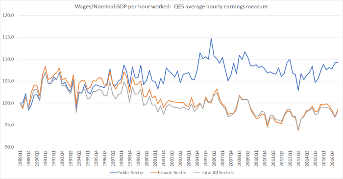
It is on exactly the same scale as the previous chart. But on this measure, private sector wages have barely kept pace with nominal GDP per hour worked growth over almost 30 years now (and have been losing ground since end of the 1990s), while public sector wage rates have outperformed (but almost all the out-performance was in the 1990s, under those spendthrifts, Ruth Richardson and Jenny Shipley.
I just don’t believe that the QES picture is portraying an accurate picture of what has been going on in the labour market. For a start, it is inconsistent with the national accounts (the labour income share chart, which suggests that something turned in labour’s favour 15 years or so ago). And the labour income share chart looks more consistent with the stratifed Analytical Unadjusted based measure.
To be clear, I’m not suggesting that labour has done particularly well. The productivity performance of the New Zealand economy has been pretty lousy – especially in the last five years – and the unexpected (and outside our control) improvement in the terms of trade only offsets a bit of that gap. Absolute levels of nominal GDP per hour worked in New Zealand remain very low by advanced country standards and, thus, so do wage rates. But given the relatively poor performance of the economy as a whole, labour hasn’t done badly at all. If people have feelings about these things it doesn’t look as though they should be about evil capitalists (or evil governments) rapaciously transferring money to themselves or their rich mates. Simply that poorly performing economies – with little or no productivity growth – shouldn’t expect much wage inflation. If there is rage, it should be about successive governments of both parties that have done nothing to redress that failure.
There might still be some serious problems with the statistics. But if the Analytical Unadjusted series is roughly right (even if not many commentators cite it), how might one explain what it shows? My explanation is pretty simple: the (real) exchange rate, which stepped up sharply about 15 years ago and has never sustainably come down since. When the exchange rate is high, firms in the tradables sectors make less money than they otherwise would have done. The usual counter to that is that the terms of trade have risen. But the increase in the real exchange rate has been considerably more than the higher terms of trade would warrant, and in any case much of the gains in the terms of trade have come in the form of lower real import prices, rather than higher real export prices.
And why has the exchange rate been so high? Because the economy has been strongly skewed towards the non-tradables sector which – by definition – does not face the test of international competition. Demand for labour in that sector has been strong, on average, over the last 15 years, and it is the non-tradables sector that has, in effect, set the marginal price for labour. For those firms, in aggregate, the lack of productivity growth doesn’t matter much – they pass costs on to customers. But it matters a lot for tradables sector producers, who have to pay the market price for labour, with no ability to pass those costs on (while the exchange rate puts downward pressure on their overall returns). Another definition of the real exchange rate is the price of non-tradables relative to those of tradables. Consistent with this sort of story, in per capita terms real tradables sector GDP peaked back in 2004 (levels that is, not growth rates).
Perhaps it isn’t the correct story. Perhaps there is some serious problem with the data. But if the government is serious about the words in the Speech from the Throne
A shift is required to create a more productive economy
one (small) step towards getting there might be set out to resolve the puzzles, and apparent inconsistencies, in our labour market (wages) data. At present though, the best-constructed series suggests a badly-unbalanced economy. Workers haven’t done badly given the poor performance of the overall economy, but the foundations haven’t been laid for durable real income growth – if anything, they’ve been progressively whittled away as the foreign trade share of the economy has eroded.
