The other day I ran this chart showing how the labour share of income (“compensation of employees” in national-accounts-speak) had changed in New Zealand over recent decades. 
It isn’t data I usually pay any attention to, and I was somewhat surprised by the trend increase since around 2002.
And then I was reading a Financial Times article about last weekend’s Jackson Hole retreat for central bankers (perhaps including Graeme Wheeler) and assorted other eminent people. The journalist mentioned that one prominent Asian central banker had warned that a declining labour share of income around the world could make problems for central bankers (the idea being that workers – especially low income ones – tend to spend most of their income, and demand shortfalls are a potentially serious issue, especially when the next recession happens). And that left me wondering just how unusual New Zealand’s experience – a rising labour share – had been.
So I downloaded the OECD data back to 1970. They have data for 25 advanced countries for the entire period (the exceptions are mostly the former eastern bloc countries). Here is the share of GDP accounted for by compensation of employees for the median of those countries.

Slightly higher at the end of the period than at the start, and not very much change overall for the last thirty years.
And here is how the labour share has changed in the individual countries since 1970.

The median change is basically zero, but what is striking is how diverse the experiences of these advanced countries have been. There are easy explanations for some of them – Ireland’s change, for example, will reflect the company tax structure, which has encouraged (a) a lot of foreign investment, but (b) a lot of effort by multinationals to book profits in Ireland. For Ireland, the labour share of GNI would be more enlightenning. But for most of these countries the GNI/GDP gap is small, and yet there are still huge differences in the experience.
New Zealand – like all the Anglo countries – is towards the left of that chart. But what about the experience since 2001, when the labour share of income troughed in New Zealand? For that period, there is data for almost all OECD countries, not just the 25 in the earlier charts.

Over this period, not only is New Zealand near the right of the chart, but our experience has been quite different from that of the other Anglo countries.
This just isn’t my field, and I’m not pushing any particular interpretation of these data. I simply found them interesting, and a little surprising. But if they data are broadly correct, they do suggest that whether over 45 years or over the last 15, the overall labour share of income in advanced countries hasn’t changed much. Of course, in most countries, productivity growth has been a lot slower than it was in the glory days of the post WW2 decades, and thus real wage growth will have been slower. But the overall labour share hasn’t changed much – and the differences across countries are much larger than the differences across (this period of) time for the advanced world as a whole.
These data also don’t shed any light on the inequality narrative. Labour as a whole may have held its share of overall income, and yet differences in pre-tax market labour incomes may have become more pronounced (eg increases in chief executive salaries in the US or UK relative to median wages, or the rise of an extremely highly-remunerated subset of financial markets employees). But if there are trends there, they haven’t been mirrored in a shrinking share of the cake going to labour as a whole. Indeed, in New Zealand the labour share of income has increased quite a bit in the last 15 years or so (concentrated in the boom years of the 2000s, but not reversed since then).
And finally, another curiosity I stumbled on. There is quite a sense that New Zealand’s labour market functions reasonably well and – in conjunction with counter-cyclical macro policy – delivers us unemployment rates that have been relatively low by OECD standards. And I think that is probably not a totally inaccurate story – who’d trade our labour market for that of Spain or Italy?
But here is a comparison of unemployment rates of Mexico and New Zealand
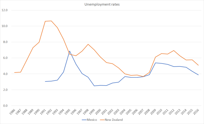
Over the 25 years for which there is data for both countries, in only one – at the height of the Mexican financial crisis – did Mexico have an unemployment rate even slightly higher than that of New Zealand. And if people suspect (as I do) that our long-run sustainable unemployment rate is getting down to around 4 per cent now, experience suggests that in Mexico it has been that low for decades.
Why mention Mexico? Mostly because, despite its advantages – oil, proximity to the United States, coasts on two oceans – Mexico is a relatively poor and (absolutely) not very productive OECD country. Data are a bit patchy, but best indications are that Mexico’s productivity performance over the last 50 years has been even worse than that of New Zealand. And yet, whatever the reasons, they’ve managed a system with consistently less unemployment than New Zealand has had (and, actually, even their prime age male participation rate is higher than that in New Zealand – as perhaps one might expect in a materially poorer country).
