Looking through the various comments posted here yesterday, I noticed there had been a bit of an exchange about this chart.
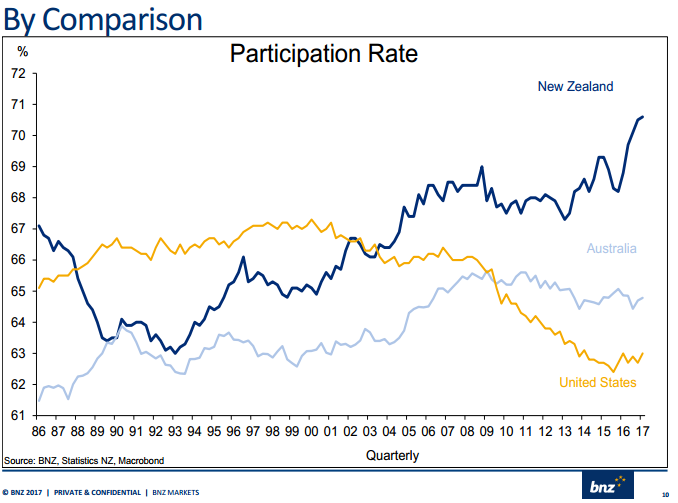
It had, apparently, been used in a presentation by BNZ economist Stephen Toplis, and was reproduced at Kiwiblog. A commenter here pointed me and others to it, with the observation
just shows what a world class economy we are running, world record immigration and look at the participation rate..amazing. That is an economy running probably as one of the best…productivity measure is meaningless
I’d have been inclined to ignore it, but others didn’t. So I thought I’d offer a few thoughts on what to make of the labour force participation rate data. As a reminder, the participation rate is the sum of all the people in paid work (at least an hour a week) and those actively looking (a reasonably demanding definition) for work, as a share of the working age population. The definitions are pretty similar across countries.
To get one thing out of the way quickly, I’ve been consistently running the line that immigration boosts demand (including demand for labour) more than it does supply, at least in the first few years. And since the participation rate itself varies procyclically it isn’t remotely surprising that extraordinarily rapid, and unexpected, population growth has gone hand in hand with a pick-up in the labour force participation rate. There are more jobs around, and so more people actively participate in the labour market.
But a more important point, and a trickier one, is that there is no good way of determining what a “good” participation rate is. Unemployment rates are different: in general, the lower the better, because it is a measure of those whose wishes are frustrated (people actively looking for work and not – yet – able to find it).
And enthusiasts for citing high labour force participation rates often risk sounding a bit like Soviet-era Stakhanovites, for whom the greater glory of the state is advanced by unrelenting labour. But labour is a cost. People do it for a whole variety of reasons – sense of fulfilment, something to do, the company – but for most people the main reason they engage in paid work is to earn the money to live, and to purchase the things they and their families wish to consume. Higher earnings rates mean people can work less (and do other stuff), or work as much (or even more ) and consume more on-market goods and services. Over history, it looks as though the income effect has dominated. Thus:
- labour force participation rates for 14 year olds were once very high (not many went to secondary school). They are now pretty low, and most people probably count that as “a good thing”.
- as recently as thirty years ago, the participation rate for 15 to 19 year old was around 65 per cent, and now it is around 45 per cent, as more young people are staying at school longer, and then doing tertiary study.
- go back a couple of hundred years and most people worked until they physically couldn’t work any longer. These days, we have widespread “retirement”.
All of these changes – reduced labour force participation – have been made possible by advances in productivity and incomes. The same goes for shorter worker hours for those in work. All else equal – which is never is – then one might expect countries with lower productivity (and thus lower real wages) to have higher hours of work per capita and higher participation rates.
Social customs also change in ways that increase labour force participation. For a long time it was customary for one parent (most often the mother) to stay out of the paid labour force for some years when children were young (or even at school age). These days it is a more uncommon choice. There is no easy way to assess whether that is “a good thing” or not. Individuals and families make choices, in the light of their own opportunities and constraints – in some families only one parent is in the paid workforce because they can afford that, and prioritise certain things for their children; in other families, they might wish to operate that way but nevertheless be more engaged in the paid workforce than they’d prefer just because of extreme housing unaffordabilty.
There is a tendency is laud the rising labour force participation among the over 65s. To some extent, I share that enthusiasm, because I favour an increase in the eligibility age for NZS (and because, to some extent, the increasing labour force participation rate is probably a reflection of improving health over time at, say, age 65). But choices about state pension ages are somewhat arbitrary, and someone who favoured keeping the NZS age at 65 could quite readily suggest that the rising participation rate was a reflection of financial stresses (including, eg, declining rates of home ownership).
Where we might be on safer ground is in looking at things that deter people from participating in the labour force when they might otherwise be quite happy to. Thus, I like our NZS scheme partly because it does not penalise people from staying in the workforce after 65 if they want to. Neither, typically, do private pension or savings arrangements, but many other state schemes do. But even when we look at things like these provisions, almost every one is value-laden. Do we, for example, have any basis for evaluating whether in a two-parent family, one parent doing paid work fulltime and the other being at home is better than both parents working 20 hours a week? In the latter case, the participation rate will be higher, but total hours worked might be much the same.
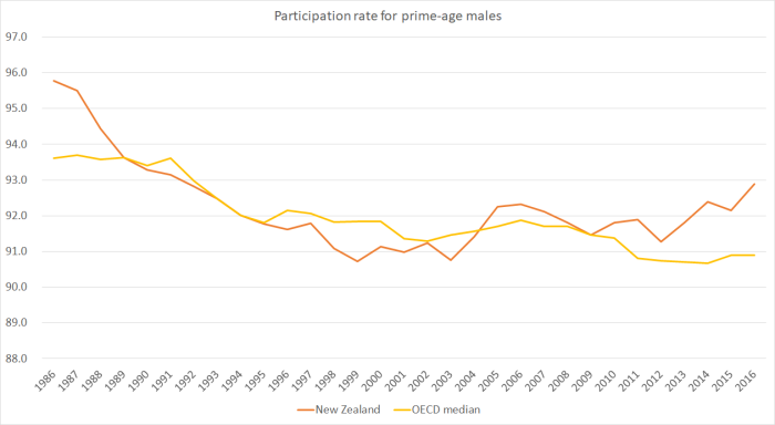
So when people do these comparisons across advanced countries, they often focus on the subgroup of prime-age (25 to 54) males. Not because prime age males are any more important than anyone else, but because there has been a strong cultural expectation that these people would be in the labour force, and there haven’t been big social changes (such as those affecting the young, the old, and woman) that have very systematically affected those expectations in recent decades. Here is how the participation rate for that group has changed since 1986 (when our HLFS began) for the OECD countries that have data for the entire period.
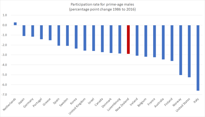
New Zealand’s prime age male participation rate is still a little above that of the median OECD country, but over the past 30 years the fall has been just a little more than that for the median country. The gap comes and goes, and in the last few years the participation rate for New Zealand prime age males has been rising relative to that in other OECD countries.
I’m still not sure one can make very much of cross-country comparisons of participation rates. There are both demographic and cultural features one needs to take account of. Perhaps one is better to be looking at the various government interventions that affect the choices people make about participating, and evaluate the costs and benefits of their own merits (individually and collectively). Thus, as examples,
- a high minimum wage relative to median wage is likely to price some people out of jobs, and discourage some from searching, lowering employment and participation rates (although this is likely to be a less important issue for prime age people than for young people starting out),
- really expensive tertiary education might at some point discourage people from studying and see them go straight into the labour force,
- generous working-age welfare systems will discourage some from working, and from actively seeking, work,
- tight restrictions on lay-offs may make it harder for new people to be hired, discouraging some from searching,
- a universal NZS system may, at the margin, discourage some prime age participation (since basic retirement income doesn’t depend on participation),
- income-splitting for tax purposes (once proposed by Peter Dunne) might not much affect total hours worked, but might lead to more specialisation within households and lower measured labour force participation.
Some of these policies/proposals seem good and sensible to me, while others seem quite damaging. But they are probably best assessed on their own merits, and overall comparisons of participation rates probably aren’t very enlightening unless your country is quite an outlier. The only time our prime-age male participation rate has been more than one standard deviation from the OECD median was right back at the start of the series in the mid 1980s (at a time when, by conventional reckoning, our labour market was over-regulated, and our economy still rather inefficient).
To match the initial chart, here are the unemployment rates for the three countries over the full thirty years.
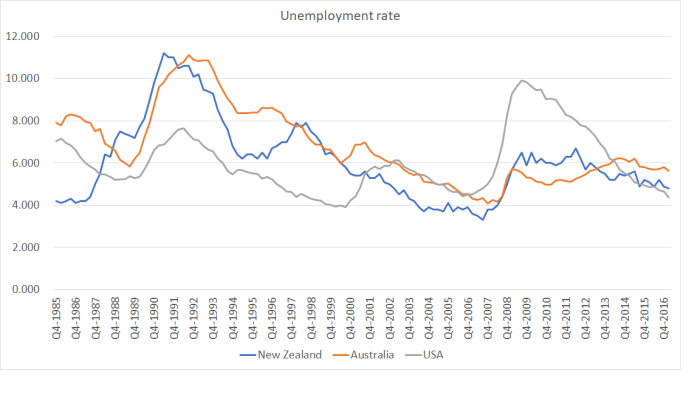
Over the full thirty years, the average unemployment rates for the three countries aren’t very much different, although Australia’s has averaged a bit higher than ours, suggesting their labour market institutions are less good at facilitating people’s desire to work than either ours or those of the US have been.
I don’t have a strong conclusion to draw, except to make the point that overall participation rates (in particular) really don’t tell one much, either across time or across countries. Those in New Zealand have been picking up in the last few years, and that is probably (broadly speaking) a good thing – a cyclical reflection of an improving state of the labour market. That is a useful counter to those who want to argue that immigration systematically takes away jobs from natives. But if one is wanting to make an overall assessment of how the economy is doing, productivity growth is typically a much more important and meaningful indicator. And for five years now, we’ve had none. For five decades now we’ve had less than almost any other advanced economy.
