Despite the reaction of the foreign exchange market, there didn’t seem to be much new in the suite of labour market data the other day. Sure, employment was down a touch, and the participation rate fell back. Then again, it had been hard to take entirely seriously the reported strength of the participation rate over the last year or so. And the unemployment rate did keep edging downwards (although at this rate it will take another two years until the unemployment rate is back to where it was when the current government took office) and hours worked, in both the HLFS and QES, grew quite strongly. And there wasn’t much sign of any pick-up in wage inflation. So unless you had been determined to believe the data was just about to confirm an overheating economy, probably not too many surprises. We’ll see next week what the Governor of the Reserve Bank makes of it.
But, largely prompted by a question in Parliament yesterday, I downloaded the age breakdowns in the HLFS. Unemployment rates are very very different by age cohort.
Here are official unemployment rates for the latest year, by age.
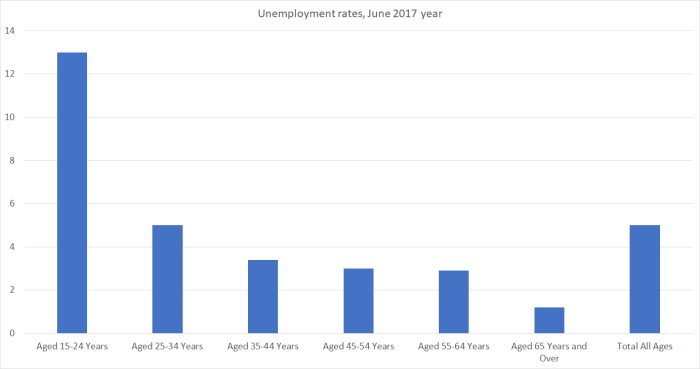
People aged 15-24 and people aged 65 and over make up roughly the same share of the total working age population (about 18 per cent each). But people in the young cohort make up 45 per cent of the total number of people unemployed, while over 65s make up 1.5 per cent of the unemployed.
And that difference isn’t something new. Here are the average shares of the total number of people unemployed, by age cohort, for the entire history of the HLFS.

The age patterns shouldn’t be terribly surprising. At one end of the spectrum, young people are often in part-time work, dropping in and out of jobs (voluntarily or not), in transition between school, work, and further study, even in the course of a single year. And, of course, they are just starting out – finding out what they might be good at, or might enjoy, and proving themselves (or not) to employers. High minimum wages (relative to median wages) hit younger people harder than other age groups.
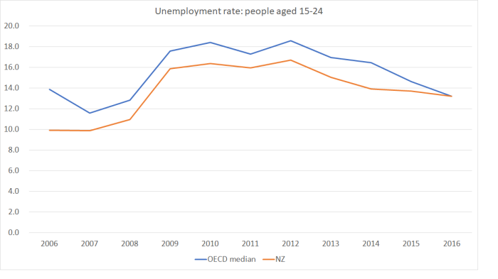
Every OECD country has an unemployment rate for 15-24 year olds materially higher than the overall unemployment rate – although as I was confirming that I was a little surprised to discover that although our overall unemployment rate has been consistently below that of the median OECD country, our unemployment rate for young people is now as high as that in the median OECD country.
At the other end of the age spectrum, by contrast, work is typically much more of a choice. Almost everyone living here aged 65 or over is entitled to NZS, the state pension. If old people are working, they probably aren’t changing jobs very often – their circumstances are rarely changing as rapidly – and if for some reason they lose their job, they may not be particularly aggressive in looking for a new job. Recall that the official definition of unemployment involves actively searching for work and being available to start right away. With a stable income buffer, that search of active search is likely to be less imperative for most than it will be for young people just starting out.
It is relatively easy to understand why there are quite high unemployment rates for young people and quite low ones for old people. But these differences can matter for how we think about the overall unemployment rate if the importance of different age cohorts in the labour market has been changing over time. It has.
 In the early 90s 5 per cent of old people were in the labour force (working or actively seeking), and now that figure is almost 25 per cent. By contrast, the labour force participation rate for 15-24 year olds is now only around 63 per cent (it was 74 per cent when the HLFS began). (Frankly, the drop in youth participation rates surprises me a bit given that (eg) university fees are much much higher than they used to be, and that one has to work only an hour a week to be counted as employed so, for example, after school jobs should be captured.)
The change in the age structure of the work force does then affect how we think about any particular rate of unemployment. The natural rate of unemployment for young people – normal frictional stuff – is materially higher than that for old people, so that a 5 per cent aggregate unemployment rate means something different than a 5 per cent unemployment rate does today.
One way of illustrating the point is shown in this chart. It shows the actual reported unemployment rate, and also an artificial unemployment on the assumption that each age cohort had the same unemployment rate is actually had, but that the relative size of the various age cohorts was the same as it was in 1987 (the first year for which there is data).
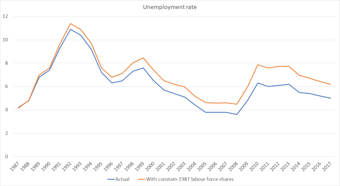
For the last year, the actual unemployment rate was 5 per cent. With constant age chort shares, it would have been 6.2 per cent. It isn’t an effect that makes much difference from year to year, but over time it can materially affect how we look at any particular unemployment rate. In effect, and all else, the change in composition of the labour force – more old people, fewer young people, – appears to have lowered the NAIRU.
As one final chart, here is the change in the unemployment rate (in percentage points) for each age cohort, from the year to June 2008 (the previous cyclical low point) to now (year to June 2017).

The overall unemployment rate is still 1.4 percentage points higher than it was then. There has been almost no change in the unemployment rate for the over 65s – which isn’t surprising as, for reasons outlined above, there is very little cyclicality in that series. On the other hand, it is quite sobering how large an increase in the unemployment rate for 15 to 24 year olds there has still been. Some of that is cyclical, and some will likely reflects the effects of higher minimum wages, but whatever the cause it should be cause for disquiet, given how important it is to get a start in the labour market and to stay connected.
