In my post this morning, I mentioned the way that, for many countries, exports now contain a larger share of imported inputs than they did in earlier decades, as the cross-border trade in componentry has grown (facilitated by, inter alia, reduction in regulatory barriers). Each imported input represents value-added (returns to labour, land, and capital) in the country where those inputs were produced.
Here is the OECD-WTO data on the estimated percentage shares of foreign value-added in each country’s gross exports in 2011. They have data for 60 countries, which makes for a long chart. Keep going and you will eventually find New Zealand. 59 per cent of Luxembourg’s gross exports actually reflected value-added generated in other countries, but for New Zealand the comparable number was just under 17 per cent.
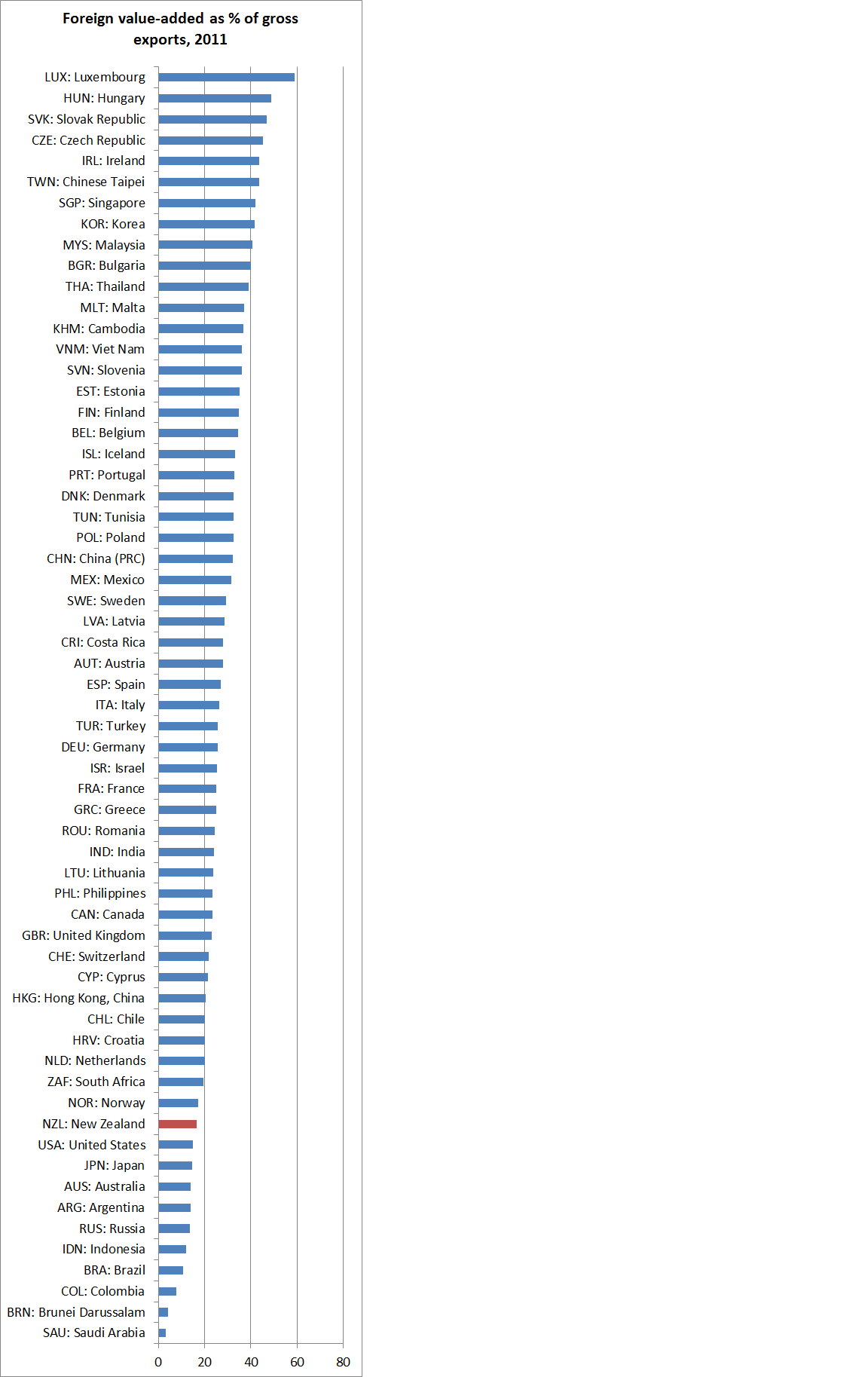
Only 10 countries had a lower foreign value-added share than New Zealand. And of the bottom thirteen countries, eleven would be considered as primarily commodity exporters (whether raw or processed). Commodity production doesn’t lend itself to cross-border trade in componentry. The exceptions are the United States and Japan. The US number probably shouldn’t be too surprising – there is after all an enormous domestic supplier base. On a smaller scale, I guess the same goes for Japan, but the Japanese number was a bit of a surprise. At the other end of the scale is a mix of Asian and EU countries.
Occasionally, it is suggested that the low share of imported inputs in our exports is itself a sign of New Zealand’s underperformance. Perhaps, but China and Mexico stand out as large countries with a large foreign value-added share of their exports, and rather low levels of per capita incomes. Assembly businesses are presumably economic if labour is relatively cheap.
The first snapshot of these data are for 1995. Back then, 18 countries has a smaller foreign value-added share of exports than New Zealand did. And only a handful of countries had more than 40 per cent of their gross exports accounted for by foreign value-added. From 1995 to 2011 the median country’s share rose from 21.5 to 26.5 per cent, but the median wasn’t very representative: lots of countries saw little change, or the foreign share even shrank (for both China and New Zealand that share fell slightly), while for a large group of countries that foreign value-added share of their exports rose by 10 percentage points or more.
On their own, these numbers are interesting, but don’t necessarily lead anywhere. They tell us more about economic geography and the type of goods that are exported than anything about performance. But, of course, Denmark was once largely an agricultural exporter as well (two thirds of all Denmark’s exports were agricultural in the 1930s), and had it stayed that way it would (a) be poorer today than it is, and (b) would probably have a much lower foreign value-added share of its exports. What would the export mix of a New Zealand that generated top tier OECD incomes gain look like? I don’t know, and nor does anyone else. If we got there by uncovering and utilising huge mineral resources, we’d probably stay towards the bottom of the chart (like much richer Australia). But there might be other paths – a swathe of home-grown high tech industries – that might push our foreign share of exports further up. But our geography – last bus stop before Antarctica – means that we are never likely to be found near the top of this particular chart. Israel, small and with a large high-tech sector caught my eye as one possible comparison.