One line sometimes heard in the current New Zealand economic discussion is a suggestion that New Zealand has. or has had, a “robust” recovery. I reckon “robust” is generally a good word to avoid, since it has connotations of something well-founded and sustainable which, in a sense, only time will tell. But just how strong has our recovery been?
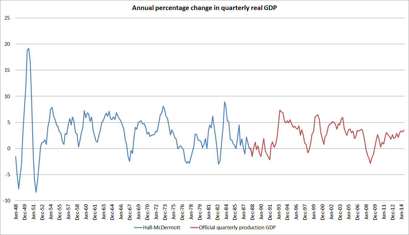
Official quarterly GDP data go back only to 1987 [surely, surely, we need rather better funding for core official economic statistics] but Viv Hall and John McDermott have generated a series, using earlier annual estimates by SNZ and other authors, all the way back to 1947.
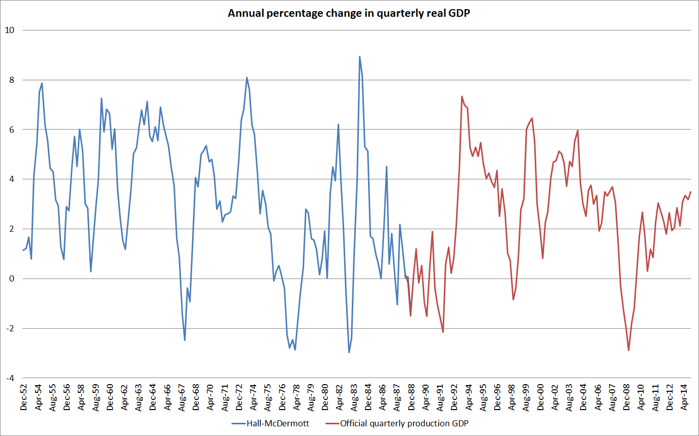
The chart below shows the annual percentage change in real quarterly GDP (seasonally adjusted, since that is how Hall and McDermott present their estimates). There are some oddities around the estimates for the first few years (if I recall rightly, having to do with the level of aggregation in export prices used in generating the original annual real series) so here I’ve shown the data only from the year to December 1952 (a version showing the data all the way back to 1948 is shown at the end of the post). It is a long time series by New Zealand standards.
On these estimates, real GDP has been quite volatile over the years. We’ve had five episodes in which GDP has fallen by 2 per cent or more between one quarter and the same quarter the following year. The recession in 2008/09 was almost as deep as the deepest of these five contractions. But what is noteworthy is just how subdued the recent recovery has been. Annual growth has inched up to around 3.5 per cent, and few, if any, forecasters seems to be picking it to go any higher. In past cycles, growth peaks in excess of 6 per cent have not been uncommon and periods of growth in excess of 4 per cent per annum have been the norm.
Of course, there is no doubt something to be said for some stability to growth rates. But there is probably more to be said – perhaps especially for those who became unemployed – for a quick rebound from a serious recession. We haven’t had that sort of rebound. Of course, most other advanced economies have not either but many of them have policy interest rates around zero and have largely exhausted the limits of conventional monetary policy. Sometimes inflation doesn’t provide any leeway for an inflation targeting central bank to accommodate a strong recovery, but that hasn’t been a problem here.
One could mount an argument – reasonable people would differ on the point – that faced with a location-specific demand shock such as the Christchurch repair and rebuild process, it might have been quite reasonable to have expected a particularly strong rebound in GDP for a time, and perhaps even some overshooting in headline CPI inflation (since medium-term trends are what the Bank is instructed to focus on).
But whatever your view on that particular point, given the depth of the recession, how far below pre-recession trends GDP still is, and how low core inflation has drifted, peak GDP growth of 3.5 per cent should be counted more as a failure than as a success. An economy firing on two, faltering, cylinders might be a better description than “strong” or “robust”.
One other argument I have heard against cutting the OCR now is the risk of a repeat of what is loosely characterised by my old colleague Rodney Dickens as “Alan Bollard’s go-for-growth experiment” of 2003/04. That there was such an “experiment” is hard to disagree with – the government had given Alan a higher inflation target, and he (and the then government) seemed to have a sense that the old-school Reserve Bank hardliners had been holding back New Zealand’s growth potential. I think the characterisation is a little unfair on Alan, but even he later admitted that the policy approach in 2003 had been a mistake.
I could discuss the similarities and differences between 2003 and the current situation at some length (and I don’t feel defensive about 2003, as I working overseas that year), but the stark and simple contrast is captured in this chart, which I’ve run already this week.
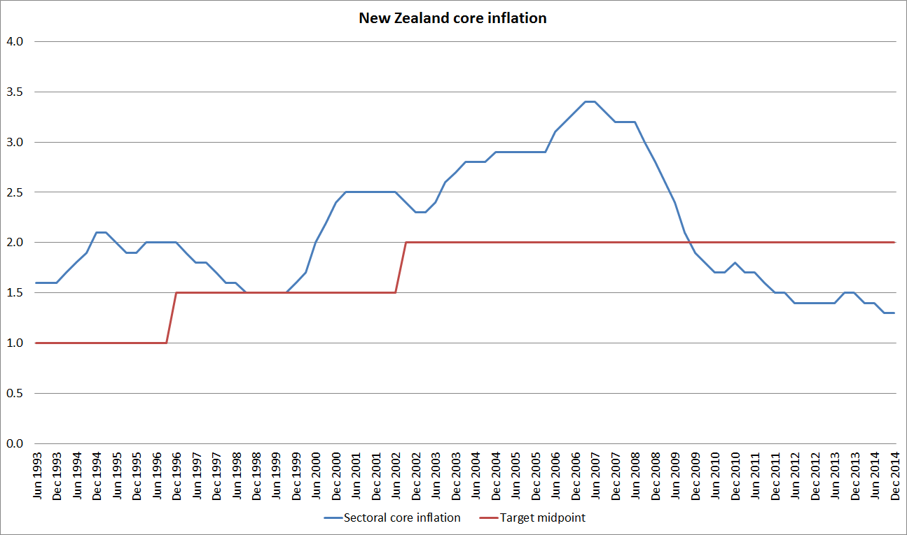
In 2003 and 2004, core inflation was well above the target midpoint, had increased materally over the previous year or so, and was increasing further. Of course, the PTA at the time made no mention of the midpoint, but no one ever thought the top part of the target range was something to actively aim for. This particular analytical series did not exist then, but it captures trends that were apparent in other ways of slicing and dicing the CPI. Even allowing for the uncertainties (SARS etc), to have cut the OCR then and to have been so slow to move it back up when the initial scare passed, is hard to defend. As Alan later said, it was a mistake.
What is the situation now? The Bank has, as much by accident as by good planning, achieved something worthwhile in the last few years in finally demonstrating that core inflation will not always be in the top half of the target range. But this is not a price level target regime, and the PTA is clear that the focus now needs to be on keeping future inflation near the 2 per cent midpoint. Actual measures of core inflation have been falling for years, and are now well below the target midpoint. A material increase in the (core) inflation rate would be highly desirable, given the target the Minister and the Governor have agreed. It has been forecast for several years, but it has simply not arrived. Perhaps it is just a “not yet”, but the case for OCR cuts now is very very different from the case in 2003.
Appendix:
The first chart above for the full period since 1948.