A favourite troubling chart

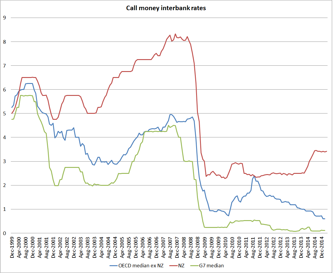
This is one of my favourite troubling charts of the last year or two.  It uses OECD data to proxy policy interest rates (they describe them as “call money interbank rates”.    I’ve shown three lines: New Zealand, a median for the G7 countries (in this case the US, the UK, the euro area (for Germany, Italy, and France), Japan, and Canada) and a median for all 20 countries/regions in the OECD with the ability to set their own policy rates.  I’ve gone back 15 years, to the end of 1999 –  a point where the gap between NZ and foreign rates was unusually low.

call rates

Two things have troubled me about the chart:

  • the growing divergence between New Zealand and foreign rates over the last couple of years.  New Zealand and foreign short-term interest rates won’t always move together, but when they diverge we should be able to identify specific developments in inflation (as almost all these countries are now inflation targeters) to warrant the divergence.  Forecasts of inflation may have diverged in ways that suggested higher New Zealand interest rates, but actual inflation (headline or core) has been at least as weak, relative to target, as we’ve seen in the typical advanced economy.
  • perhaps more important, is that near-flat line for the G7 countries (and one could add several others to that list of countries) for now six years or so.  It would be some sort of miracle if appropriate interest rates had been so stable for so long.  In fact, what we have seen is countries reacting to the perception of a lower bound on nominal interest rates at or very near zero.

The idea of the zero lower bound has been around for a long time,  When Japan got there most of us still treated it as an idiosyncratic curiosity.  And no country has yet taken policy interest rates as low as they can effectively go.  We know this because in no country has there been a large scale switch into physical cash holdings (the option that makes the near-zero bound troublesome).    But when policy rates have been at or very near the practical bound for so long, it suggests they would appropriately have gone materially lower had that been possible.  Combined with lingering high unemployment (or low participation in the US case) and weak inflation, they continue to point to a shortage of demand as a problem in most advanced countries.

As concerning is that, six years on, it appears that no central bank (of finance ministry) has taken a lead to reduce the risk that the zero bound will be an even more major problem in the next recession.  We don’t know when that will be, and hope it will be years away, but that can’t be guaranteed, especially as emerging market growth slows and recessionary risks rise in those countries.  And next time, most advanced countries might go into a recession from a cyclical high in policy rates of perhaps 0.25 per cent.  And New Zealand, which cut by 575 points last time, could well peak this cycle at a 3.5 per cent OCR.

One problem has been the constant belief –  in markets and central banks – that a sustained upturn is just around the corner, and with it the basis for higher policy rates.    Both markets and central banks have been repeatedly wrong.  But we should hope that in the backrooms of major central banks serious practical work is underway to alleviate the (actual or felt) constraint of the ZLB before the next significant downturn.

I have a few ideas, and will discuss some of them in a future post.

Government spending: a trans-Tasman comparison

I’ve noted a couple of times how the notion keeps popping up that somehow New Zealand, and the New Zealand government, has been doing better than Australia in recent years.

Real per capita GDP growth in New Zealand has lagged behind that in Australia since 2007, and productivity growth has also been weaker.  Our unemployment rate is now a bit lower than Australia’s, but that was normal prior to the recession – it is good, but hardly a reflection of post-crisis policy reforms.

But what about something that is more directly under the control of governments?   Good timely comparable data on total government spending is not easy to come by.  But in the quarterly national accounts both countries have data on public consumption spending.  Government consumption here is goods and services directly purchased by governments, whether the government itself “consumes” them –  eg core administration functions – or delivers them to households (eg public provision of health and education services)).

The chart below shows public consumption as a share of GDP for the two countries.   These are general government numbers, not central government, but in New Zealand local government spending is quite a small share of the total (less than 20 per cent).  The two series are slightly different – Australia reports seasonally adjusted data, and NZ doesn’t so the NZ numbers are rolling four-quarter totals – but that shouldn’t materially affect comparisons.

govt c nz au

The chart highlights again the huge increase in public consumption as a share of GDP that occurred in the last few years of the previous government.  Many of those initiatives continued to boost spending into the early years of the current government.    Government consumption spending as a share of GDP tends to rise in recessions, not generally because of discretionary fiscal stimulus but simply because GDP falls.  Both New Zealand and Australia had significant recessions in 1991, and it is easy to see how the government spending share of GDP rose then.  So some of the New Zealand increase to the peak in mid-2009 was simply the change in the denominator.  But then again, so must some of the fall in the ratio since then.  There has been a considerable squeeze on some bits of government spending, but the overall picture is hardly one of austerity.

The contrast with Australia is quite striking.  For all the talk about Australia’s fiscal deficits, government consumption spending now is barely higher (% of GDP) than it was in the 20 years pre 2008.  By contrast, New Zealand’s government consumption is still barely below the early 1990s peaks.

Don’t get me wrong.  Government spending as a share of GDP is quite low, by OECD standards anyway, in both Australia and New Zealand.  And reasonable people, and differing political ideologies, will have different perspectives on the role of government.  But two thoughts:

  • For anyone at all concerned about the exchange rate, the increase in the government spending share should be worrying.  Increased government consumption spending adds directly to pressure on the real exchange rate, bidding up the cost/price of non-tradables relative to (internationally set) tradables prices.
  • In the last 25 years Australia has been remarkably successful in limiting variability in government spending as a share of GDP (both on this measure, and on broader OECD measures of total government outlays).  That has been so through various changes of government.  Stable government spending shares provide a better basis for stable tax rates, and stable tax rates help provide a climate in which businesses and households can make best choices about investment and labour supply.  New Zealand has not done that badly by international standards, but is a long way from matching Australia.

govt c oecd

Add in the failure to achieve an operating surplus yet, despite the best terms of trade in 40 years, and the very low quality of a lot of the government capital expenditure (those unattractive benefit-cost ratios for Transmission Gully, Kiwirail, and ultra-fast broadband for example) , and once again we have a picture in which New Zealand has not helped itself.