I’ve noted a couple of times how the notion keeps popping up that somehow New Zealand, and the New Zealand government, has been doing better than Australia in recent years.
Real per capita GDP growth in New Zealand has lagged behind that in Australia since 2007, and productivity growth has also been weaker. Our unemployment rate is now a bit lower than Australia’s, but that was normal prior to the recession – it is good, but hardly a reflection of post-crisis policy reforms.
But what about something that is more directly under the control of governments? Good timely comparable data on total government spending is not easy to come by. But in the quarterly national accounts both countries have data on public consumption spending. Government consumption here is goods and services directly purchased by governments, whether the government itself “consumes” them – eg core administration functions – or delivers them to households (eg public provision of health and education services)).
The chart below shows public consumption as a share of GDP for the two countries. These are general government numbers, not central government, but in New Zealand local government spending is quite a small share of the total (less than 20 per cent). The two series are slightly different – Australia reports seasonally adjusted data, and NZ doesn’t so the NZ numbers are rolling four-quarter totals – but that shouldn’t materially affect comparisons.

The chart highlights again the huge increase in public consumption as a share of GDP that occurred in the last few years of the previous government. Many of those initiatives continued to boost spending into the early years of the current government. Government consumption spending as a share of GDP tends to rise in recessions, not generally because of discretionary fiscal stimulus but simply because GDP falls. Both New Zealand and Australia had significant recessions in 1991, and it is easy to see how the government spending share of GDP rose then. So some of the New Zealand increase to the peak in mid-2009 was simply the change in the denominator. But then again, so must some of the fall in the ratio since then. There has been a considerable squeeze on some bits of government spending, but the overall picture is hardly one of austerity.
The contrast with Australia is quite striking. For all the talk about Australia’s fiscal deficits, government consumption spending now is barely higher (% of GDP) than it was in the 20 years pre 2008. By contrast, New Zealand’s government consumption is still barely below the early 1990s peaks.
Don’t get me wrong. Government spending as a share of GDP is quite low, by OECD standards anyway, in both Australia and New Zealand. And reasonable people, and differing political ideologies, will have different perspectives on the role of government. But two thoughts:
- For anyone at all concerned about the exchange rate, the increase in the government spending share should be worrying. Increased government consumption spending adds directly to pressure on the real exchange rate, bidding up the cost/price of non-tradables relative to (internationally set) tradables prices.
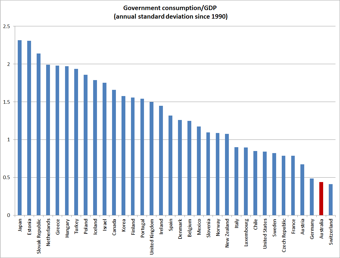
- In the last 25 years Australia has been remarkably successful in limiting variability in government spending as a share of GDP (both on this measure, and on broader OECD measures of total government outlays). That has been so through various changes of government. Stable government spending shares provide a better basis for stable tax rates, and stable tax rates help provide a climate in which businesses and households can make best choices about investment and labour supply. New Zealand has not done that badly by international standards, but is a long way from matching Australia.
Add in the failure to achieve an operating surplus yet, despite the best terms of trade in 40 years, and the very low quality of a lot of the government capital expenditure (those unattractive benefit-cost ratios for Transmission Gully, Kiwirail, and ultra-fast broadband for example) , and once again we have a picture in which New Zealand has not helped itself.

First a very minor point – the first graph is a bit misleading. If you put it on a 0 to 100% scale — or even a 0 to the top OECD rate scale the differences would have been minor.
Then a major one – whether the government spends too much depends entirely on what the government is providing for its money. In other words it is not just the costs, it is also what the benefits are.
If (as in Australia) you spend that much but don’t get healthcare that is good enough for you forgo private insurance, and you don’t get schools good enough that you have to pay a second time to send your kids to a private school, then yes it is spending too much.
On the other hand if you get a lot for your money — and that is something that could be debated, (but the fact that most people in NZ don’t take out separate health care and private schools are an tiny part of the market and that we live longer than we should given our GDP per head, and are about 6th in the world on PISA all suggests we might be) then using the government to provide the services may in fact be the efficient thing to do
LikeLike
Agree that the level differences between NZ and Aus are small – but the first chart was about changes over relatively short periods of time.
On your major point, yes I wouldn’t disagree with the general point, but again I wasn’t arguing that NZ is generally spending too much, just that our spending has increased a lot, at a time when there is a lot of concern about competitiveness and pressure on resources. As I noted, different political perspectives will have different views on the appropriate role of govt, and appropriate delivery mechanisms, but the stability of government spending in Australia (despite several changes of government) is a striking contrast to most of the rest of the OECD.
LikeLike
[…] So the deadweight costs of a 38 or 39 percent top marginal tax rate are much higher than those of a 33 percent top marginal tax rate. That does not necessarily mean that any future Labour government should not raise the top marginal tax rate. But it does mean that the programmes that would be funded at higher tax rates have to pass a higher benefit hurdle – and especially where government consumption spending, as a fraction of GDP, is now no lower than it was …. […]
LikeLike