Just how large a contribution has net migration made to population growth?

One of the challenges in discussing the impact of immigration in New Zealand is making sense of the data.  I’m running a story that says two (largely unrelated) things:

  • Given the severe land use restrictions in place, the high target level of non-citizen immigration (the bit directly amenable to New Zealand policy) is a major explanation for the upward pressure on house and urban land prices.  I’ve shown that, on one measure, all of New Zealand’s trend population growth is now resulting from immigration policy.
  • Given the modest rate of national savings, the high target level of non-citizen immigration is a major contributing factor to New Zealand’s persistently high (relative to other countries) real interest rates, the high average real exchange rate, and –  hence –  to the weak growth in productivity and the failure to reverse any of the decades-long decline in New Zealand incomes relative to those in other advanced countries.

We know the key policy parameters.  Specifically, there is a currently a government target of 135000 to 150000 permanent residence approvals on a rolling three year basis.  That isn’t all the non-citizen migration but it is the overwhelming bulk of trends in it.  There are lots of short-term flows, but my real interest is not in year to year fluctuations but in the contribution of immigration policy to the trend growth in New Zealand’s population.

When people turn to Statistics New Zealand data to analyse migration they most often look at the data on permanent and long-term (PLT) migration.  For any analysis about what is happening over short periods of time, it is the only sensible series to use.  The alternative is to use SNZ’s total migration data but (even when seasonally adjusted) it is hugely volatile in the short-term.  The noise swamps any signal.  Major sporting events –  eg Lions tours, or the rugby world cup – are an example of what muddies the water.

But the PLT data have their own limitations.  The total migration data are volatile, but they do count every person arriving in and departing from New Zealand, and so provide a highly accurate count of the cross-border contribution to the number of people in New Zealand at any one time.  By contrast, the PLT numbers are less volatile, but they rely on the self-reported intentions of travellers.  When someone arrives, or leaves, they fill in the arrival/departure card stating whether they intend to go/come for less or more than 12 months.  Those stating “more than 12 months” are treated as permanent or long-term movements.

But even if everyone answers the question honestly, plans change.  Some New Zealanders go to Australia in search of a better life, perhaps planning never to live here again.  But Australia doesn’t always live up to expectations, and some will come back to New Zealand a few months later.  Those people will have been PLT departures when they left, but returning short-term travellers when they come home.  Similarly, some foreigners come to New Zealanders planning to stay forever, but leave again a few months later.  Some New Zealanders go to Australia for a few months, but find a good job, settle, and don’t come back.  And some foreigners might arrive initially on short-term visas, but then end up staying permanently (most permanent residence visas these days are issued to people already in New Zealand).

You might suppose that the differences would be small, and would wash out over time.  To the extent that I had ever given the issue any thought, I suppose that was what I used to assume too.  In fact, there are large and persistent differences between the two series.  The difference was at its starkest in the 2002/03 migration boom, when the annual PLT inflow peaked at around 40000 and the total inflow peaked at almost 80000.  The differences didn’t just wash out the following year.

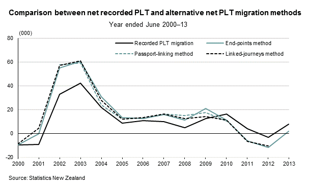
Statistics New Zealand has recognised the issue.  Late last year, partly prompted by my focus on the issue, they published a paper (which unfortunately got little or no coverage), reporting some experimental work they had done on trying to improve estimates of actual permanent and long-term migration (as opposed to self-reported intentions).  As one example of what they did, passport numbers were matched to check how many of those who (for example) said they were coming for less than 12 months were still here 12 months later.  Over the 2000s it was pretty clear that estimates of actual permanent and long-term migration could be materially improved.  Over 2002/03 “true” PLT flows appear to have been materially larger than self-reported PLT flows, and over 2010-12, true PLT flows were materially weaker than the self-reported flows.  In each case, trends in the total migration series were more reflective of what was going on than the self-reported PLT numbers.  This chart is from the SNZ paper.

plt-methods

SNZ has not backdated its experimental estimates prior to 2000, and apparently (and unfortunately) does not have funding to produce these estimates on an ongoing basis.  But over much longer periods of time these differences also appear to matter.   Infoshare has data that distinguishes PLT and total migration since 1921.  Here are the cumulative net inflows in the two series.
cumulative migration since 1921
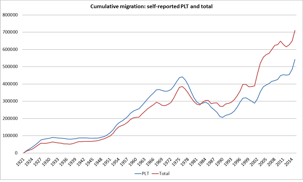
The cumulative difference is 170000 people (total net migration is much larger than self-reported PLT) –  quite material in terms of thinking about changes in New Zealand’s population which, even now, totals only 4.6 million people.  And the difference is not just down to, say, the growth of tourism: SNZ report that at any one time there are around 150000 foreign visitors in New Zealand, and around 115000 New Zealand visitors in other countries.

The divergence since 1921 is large, but note the crossover point in the early 1980s.  Until the end of the 1960s, self-reported PLT immigration had been consistently larger than total net immigration.  In earlier decades, there wasn’t much short-term tourism or many foreign students in our universities.  Since the outflows of New Zealanders also weren’t large until late in the period, much of the difference was probably down to people getting here and deciding New Zealand wasn’t really for them and going home again.

Self-reported net PLT outflows from the mid 1970s were large.  The flow of non-New Zealanders was quite small in this period (policy having been tightened materially in 1974), while the big change was the upsurge in the outflow of New Zealanders.  But since the (accurate) measure of total inflows and outflows shows nothing as large as the recorded self-reported PLT outflows, my hypothesis is that many New Zealanders set out to go to Australia for the long-term but quickly came home again.  The differences are huge: PLT data suggest a net 250000 outflow from 1976 to 1990. But the total migration data suggest a net outflow of only a little over 100000.

What about the more recent period?  Immigration policy was reformed and materially liberalised from around 1990 (in a succession of changes).    Here is the chart for total migration and self-reported PLT migration since 1990.

cumulative plt since 1990b

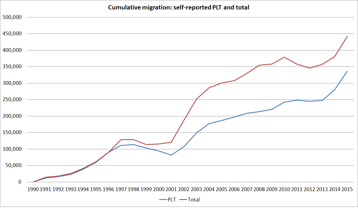
There isn’t much difference in the first few years, but from the late 1990s there has been a material difference between the two series.  Even the direction of change isn’t the same each year in the two series.  If one takes the total migration series as a better representation of the migration flows contribution to population changes (and demand for accommodation) than the self-reported PLT series, there was little or no net migration over 2008 to 2013 taken together (the red line goes sideways for that period), before the population pressures resumed strongly from 2013.  That coincides with the resurgence of very high house price inflation in Auckland.  Quite what is accounting for the divergences in the two series recently isn’t clear.  The SNZ paper I linked to earlier does not distinguish between NZ passport holders and other passport holders (although presumably they have the data).  Plausibly, some part of the difference will be down to New Zealanders finding Australia tougher than they expected and returning to New Zealand within 12 months of leaving, and some part will be down to foreigners arriving short-term and finding legal ways to stay for a longer term.

Finally, a chart showing just how large the total migration net inflows have been.  SNZ reports total migration data since 1875.  Here is the chart showing rolling 15 year totals (which should largely abstract from purely cyclical effects).

total net migration

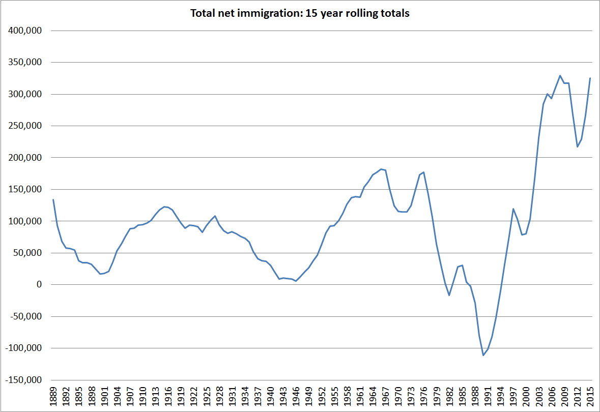
These aren’t scaled for population, but New Zealand’s population in 1960 was about half what it is now, and the net migration inflows recently have been about twice as large as they were in those early post-war decades.  In those post-war decades,New Zealand experienced persistent pretty extreme excess demand pressures.  They didn’t show up in high interest rates (which were controlled) or in the foreign debt (the private sector largely couldn’t borrow, and the government didn’t). Instead, it showed up in the extensive network of controls  – on credit, on building activity, on imports, on holidays abroad etc – that was needed to keep excess demand in check.  Economic historians writing about New Zealand’s post-war experience seem to have been pretty well agreed that immigration policy exacerbated those demand pressures, rather than alleviated them (as I documented in this file note  Economic effects of immigration and the New Zealand economic historians ).

My story is that much the same pressures have been apparent since the resurgence of immigration in the 1990s –  but this time they show up in real interest rates and in a large negative NIIP position (which would otherwise probably have shrunk considerably as the fiscal accounts moved strongly into surplus).

Greece: fourth weakest export growth among OECD countries since 2007

I was reading this morning Robert Waldmann’s critique of Olivier Blanchard’s defence of the IMF’s involvement with Greece since 2010. I agreed with much of what Waldmann had to say, and remain fairly unpersuaded by Blanchard’s case.
But one of Waldmann’s comments caught my eye. It was the suggestion that Greece has achieved a massive internal devaluation over the last few years.

I’ve pointed out previously that that doesn’t seem right. The measure of a successful internal devaluation is surely in the degree of resource-switching that has gone on.

Those wanting to put an optimistic gloss on the data can certainly produce real exchange rate measures that seem to show some gains in competitiveness. Perhaps, but it is difficult to adjust for compositional effects (the least productive people will have lost their jobs, but presumably want to be employed again one day).

These two charts just look at some of the key aggregates, drawing from the OECD’s quarterly national accounts database.

greece1

Exports have been recovering somewhat since the trough after the global recession of 2008/09, but the volume of exports is only now back to 2007 levels. In an economy with unemployment in excess of 25 per cent, there is no crowding out of the export sector.

Import volumes have certainly fallen, very substantially. That might reflect competitiveness gains, and greater opportunities for domestic import-competing tradables producers. But it looks a lot more likely to mostly reflect a severe compression in demand. The collapse in real investment is particularly telling.

Out of curiosity I also dug out from the OECD data on export volumes for all the OECD countries since 2007. This chart shows export volume growth from the 2007 annual level to the most recent quarter (mostly the March quarter of 2015).

oecd exports since 2007

Of the 35 individual countries shown (OECD members, plus Latvia), Greece has had the fourth weakest export volume performance over that period. The result isn’t particularly sensitive to the starting point: I also looked at growth since the 2007-2008 quarterly peak, and Greece was second worst on that. With so much spare capacity, and no room to use domestic macroeconomic policy tools to stimulate demand, Greece needed export growth more than any other country in the group. But it has simply not achieved it –  and not even really begun to achieve it.

Who knows what the outcome of the weekend’s meetings in Europe will be. But it looks as if Greece still desperately needs a substantial real exchange rate devaluation. For Greece, resource-switching has not occurred within the euro, despite years of extraordinarily high unemployment. It is hard to see how any of the recent “austerity plans” will materially alter that situation any time soon. Flexible exchange rates tend to make the adjustment easier.  They provide no guarantee, but what does staying with the status quo offer economically?

In passing, the New Zealand export performance has not been that impressive – around the median of this group of countries, and not much different from the euro-area countries as a whole (and these aren’t per capita data, and we’ve had stronger population growth than most).

Investor finance restrictions

The Reserve Bank is consulting on the Governor’s proposal to ban loans with an LVR in excess of 70 per cent for residential investment property businesses in Auckland.  I have written quite a bit on this proposal since it was first revealed when the FSR was published in mid-May, and was hesitant about spending more time on the issue (my kids would have preferred another board game or two). But I did decide to write something.

Submission to RBNZ investor finance restrictions July 2015

Submissions close on Monday.

Here are a few extracts from the introduction and conclusion of my (not overly long) submission.

As I have noted in various pieces of public commentary on this proposal, in such matters the Governor effectively acts as prosecutor, judge and jury in his own case.  As such it is difficult to have any confidence in the consultative process –  it is simply implausible that the  single person actively and publicly proposing such restrictions can take a properly dispassionate and impartial approach to assessing submissions on the proposal.    The proposed turnaround time, from the closing date for submissions to the release of the final policy position (“early August”), casts further doubt on the seriousness, and open-mindedness, with which the Bank (the Governor, as sole decision-maker) is approaching the consultative process on the substantive proposal (as distinct perhaps from the fine operational details).   Confidence in the process is further undermined by the fact that no cost-benefit analysis has been provided for the proposal.   We all know that cost-benefit analysis, in the right hands, can be generated to support any proposal, no matter how egregious, but proper cost-benefit analysis at least force the preparers to write down their assumptions, which enables them to be scrutinised, debated, and challenged.

My concerns about the substance of the proposal fall under five headings:

  • The failure to demonstrate that the soundness of the financial system is jeopardised (this includes the failure to substantively engage with the results of the Bank’s stress tests).
  • The failure of the consultative document to deal remotely adequately, with the Bank’s statutory obligation to use its powers to promote the efficiency of the financial system.
  • The failure to demonstrate that the statutory goals the Bank is required to use its power to pursue can only, or are best, pursued with such a direct restriction.
  • The lack of any sustained analysis (here or elsewhere in published Bank material) on the similarities and differences between New Zealand’s situation and the situations of those advanced countries that have experienced financial crises primarily related to their domestic housing markets.
  • The failure to engage with the uncertainty that the Bank (and all of us) inevitably face in making judgements around the housing market and associated financial risks, and the costs and consequences of being wrong.

The absence of any substantive discussion of the likely distributional consequences of such measures is also disconcerting.  Distributional consequences are not something the Reserve Bank has ever been good at analysing.  In many respects they were unimportant when the Bank’s prudential powers were being exercised largely through indirect instruments (in particular, capital requirements) but they are much more important when the Bank is considering deploying direct controls.  In particular, the combination of tight investor finance restrictions in Auckland and the continuing overall residential mortgage “speed limit” is likely to skew house purchases in Auckland to cashed-up buyers.  In effect, to the extent that the restrictions “work” they will provide cheap entry levels.  New Zealand first home buyers and prospective small business owners will be disadvantaged, in favour of (for example) non-resident foreign owners.    At very least, it should be incumbent on the Bank to spell out the likely nature of these distributional effects.

Conclusion 

The restrictions proposed by the Reserve Bank do not pass the test of good policy.  The problem definition is inadequate, the supporting analysis is weak, and the alignment between the measures proposed and the statutory provisions that govern the use of the Bank’s regulatory powers is poor.

Reasonable people might differ on when policy tools should be deployed, but we should be able to disagree on the basis of much more extensive, robust, and well-documented background material than has been presented in this consultative document.   At present, the evidence that we do have suggests that the New Zealand banking system is strong and highly resilient, with no sign that there has been any serious or disconcerting deterioration in lending standards.  The Reserve Bank appears to be mistaking high house prices that result from real structural factors (land use restrictions and immigration policy), with those that results from a credit-led process.  The latter might argue for much tougher prudential controls, though probably still less distortionary indirect ones.     But there is simply no evidence at present of such a credit-led process.  Yes, house purchases need to be financed, but that appears to be a largely passive facilitative process, which poses no materially enlarged threat to the soundness of the financial system.

A brickbat and a bouquet for Treasury

A brickbat and a bouquet for Treasury this morning, following from the pro-active release yesterday (albeit with many deletions) of papers related to this year’s Budget.  Pro-active release is a welcome practice that should be more widely adopted.  Indeed, in some form it is a practice that should generally be made mandatory.

First the brickbat.  Very late in the Budget process, as the government continued to flail around with an apparent sense that “something must be done” about the housing market, but a reluctance to expend political capital to actually address the underlying issues (land use restrictions and the active policy-driven programme of inward non-citizen immigration), Treasury was asked for some advice on several tax options.  None involved serious or thoroughgoing reform of the overall tax system  (eg land tax, taxing imputed rents, shifting the basis of local authority rates back to land values, inflation-indexing the tax system (which reduces the value of interest deductibility), or even less desirable measures such as a comprehensive capital gains tax, or ring-fencing the ability to offset losses on rental properties).  Instead, they were patches, or worse.  Treasury compounded the problem by throwing in its own proposal –  an Auckland Investor Levy.

By this point, Treasury was probably under quite unreasonable pressure.  As they bluntly note in their 24 April Treasury Report, “because of the very short timeframe, this is a longer and less considered report than we would normally provide”.  That is not a good basis for making policy.  But public servants must respond to the demands of their Ministers.

The Auckland Investor Levy –  a 1 per cent annual levy on the value of residential rental property –  appears not to have been the Minister’s idea, but a proposal of officials.  Perhaps they saw it as something less bad than other possibilities canvassed in the paper (such as an interest levy).    But this is not just an idea that Treasury is reluctantly providing pros and cons on.  They recommend to the Minister to “consider progressing” such a tax.  Much of the discussion of the proposed Auckland Investor Levy has been withheld in the document that is released, but the summary table at the back of the paper makes it clear that Treasury is pretty sympathetic to this option.

And yet:

  • There is no analysis in the paper to explain why Treasury believes that investors, as opposed to (say) owner-occupiers are a  particular “problem” in the housing market.
  • There is no discussion of how the “tax advantages” of housing are distributed among owner-occupiers and investors.  Previous analysis has suggested that unleveraged owner occupiers are at the greatest advantage.
  • There is no apparent attempt to reconcile this proposal with the more general point that there appear to be too few houses (or at least too little effective land supply) not too many.
  • There is no analysis in the paper to justify why such a wealth tax should be so partial.  Why impose a levy on investor residential properties, and not on owner-occupier ones?  Why houses and not commercial buildings?  Why rental houses and not farms or equities?
  • Treasury proposes hypothecating the revenue from this (supposedly temporary) levy to the Auckland Council, and yet there is no discussion (released) of the difficulty of lifting the levy in future (and thus depriving the Council of a major revenue line).
  • There is no discussion of the efficiency costs (or the equity) of having one tax system for Auckland, and one for the rest of the country.

In a rushed paper, I’m not suggesting that Treasury could have fully adequately dealt with each of these issues, but it is pretty inexcusable that these issues are not even mentioned.

And the bouquet.  Media reports indicate that Treasury proposed ending public funding of Kiiwrail and either markedly reducing the size of the operation, or closing the company altogether.  Given the amount of money that has already been sunk into Kiwirail, in one sense it would be a shame if it were to come to that.  But sunk costs are sunk costs, and unfortunately it does not appear that the analysis underpinning the earlier injections was particularly robust.  I don’t suppose Treasury expected that Ministers would agree to their proposal, but it is good that it was made.

It is particularly encouraging that the recommendation was presumably endorsed by the Secretary to the Treasury.  I spent a couple of years on secondment to the Treasury, which overlapped with the early days in Treasury of Gabs Makhlouf, fresh from the UK.    A major discussion was held one day to try to gravitate towards an agreed “narrative” on the reasons for New Zealand’s disappointing long-term economic performance.  Gabs’s contribution was to observe that New Zealand’s problem was that it had underinvested in rail.  Britain developed railways and exported the technology around the world, and New Zealand never really took advantage of it.    Fortunately, it did not seem to be a widely held view.  I guess Gabs has learned.  A while ago I asked for a copy of an “economic narrative” document Treasury did in 2013.  If and when it arrives, it will be interesting to see how the Makhlouf Treasury now accounts for New Zealand’s disappointing longer-term performance.

Fiscal policy and how NZ and Australia did in 2008/09

My post the other day about fiscal policy (and why it shouldn’t be eased in New Zealand now), together with a throwaway line about Kevin Rudd’s fiscal policy in the 2008/09 crisis, prompted me to spend a bit of time digging around in the data for the 2008/09 period for both New Zealand and Australia.  This relates to the question “why did New Zealand have a recession and Australia didn’t”

Of course, even that statement is not as simple or uncontentious as it looks.  The shorthand people are using here is the “two consecutive quarterly falls in real (seasonally adjusted) GDP”.  On that measure, New Zealand actually had two recessions (from a peak in 2007q4 to a trough in 2009q2, and not having regained the previous peak, real GDP again fell for a couple of quarters from mid 2010).  By contrast, real GDP in Australia fell in only a single quarter, in 2008q4.

But Australia did not just sail through unscathed:

  • In per capita terms, it took two years for real GDP in Australia to recover to 2008q3 levels.
  • When Australia’s terms of trade fell, real net national disposable income per capita (a measure that captures the direct effects of the terms of trade) fell by around 9 per cent.   The similar measure in New Zealand only fell by around 5.5 per cent.
  • Australia’s unemployment rate rose by around 1.5 percentage points in 2008/09, the scale of increase that might be expected in a mild recession (similar, for example, to the increase in unemployment rate in the New Zealand recession of 1997/98)

So, I don’t want to get hung up on the question of whether Australia had a recession or not.  But it is pretty generally accepted that Australia was less hard-hit than New Zealand (and many other countries).

Some people reckon that the difference is fiscal policy.  No doubt senior figures in the then Australian Labor government (if they could agree on anything) would like people to think so.  The government, egged on by the Australian Treasury, announced two significant fiscal packages in the middle of the global crisis, one in October 2008 and another (much larger) one in February 2009.  By contrast, neither New Zealand government (either side of the November 2008 election) did any material amount of discretionary fiscal stimulus in response to the crisis.

But what I find striking is how similar New Zealand and Australian fiscal policy was, in bottom line terms, during the second half of the 2000s.  If we did not have a crisis-response package in late 2008, we had had a very expansionary Budget earlier that year.  And both countries had been running down structural surpluses for several years.

Here are some charts from the IMF WEO database:

For revenue

revenue

For expenditure

expenditure

For the fiscal balance

net lending

And for the (estimated) structural balance

structural balance

And, perhaps most starkly, here are direct real government purchases (consumption and investment) for the two countries (indexed to 10o in 2007q4).  It is not until the start of 2010 that one can see any material difference between the two lines.  New Zealand’s recession (like those of most other OECD countries, ended in mid 2009).

C+I

Of course, these are highly aggregated numbers, and it may be that there was something in the specific make-ups of the fiscal programmes that meant fiscal policy was much more effective in Australia.  But it isn’t obvious, and it probably shouldn’t be that surprising since in both countries the central banks will have been taking fiscal developments into account in deciding how much to cut their respective policy interest rates.  As it happened (and unsurprisingly) the Reserve Bank of New Zealand cut the OCR by much more (575 basis points) than the RBA (which cut by 400 basis points from the end of 2007 to the trough in April 2009 – having raised the cash rate in early 2008).

So if fiscal policy differences don’t appear to explain why Australia did less badly through this period, what does?  In the New Zealand story, the drought at the start of 2008 didn’t help.

More generally, the terms of trade are very important to both countries, and in both countries they are quite volatile.  In New Zealand, changes in the terms of trade flow more directly into changes in household incomes, since most of the tradables sector is domestically owned (FDI in New Zealand is heavily concentrated in the non-tradables sector).  By contrast, most of the Australian minerals sector (where the terms of trade volatility arises) is foreign-owned, so that Australian residents’ incomes are not so directly affected.  But the Australian minerals sector is very capital intensive, and huge investment programmes drive off actual and expected minerals prices.

What happened to the terms of trade in the two countries?  New Zealand’s increased by around 10 per cent in 2007, and then started gradually falling away again.  But Australia’s terms of trade rose by around 20 per cent in 2008.  The terms of trade then fell away almost equally sharply  before the effects of the Chinese rebound drove hard commodity prices on to their 2011 peak.    But what that timing difference meant was a quite different environment for the Australian economy in 2008 than was the case in New Zealand (or most other OECD countries).

tot 08 and 09

One important place where the difference shows up is in business investment.  Australia’s business investment peaked the same quarter as the terms of trade and – no doubt reflecting long lags on minerals investment projects, and perhaps the sharp fall in the exchange rate – never fell as far as New Zealand business investment did.  As has been pointed out previously, New Zealand’s business investment boom in the 2000s appears to have been concentrated in the non-tradables sector.

business investment

A similar timing difference is apparent in respect of residential investment. New Zealand’s peaked in 2007q3 and Australia’s peaked in 2008q3.  It looks as though timing differences (both domestically and particularly in the terms of trade) were enough to provide just enough momentum for Australia to avoid the two quarters of falling real GDP.

In closing, here is the chart of RGNDI (for NZ) and RNNDI (for Australia), both indexed to 2007q4 (the peak of the last cycle for NZ, the US, and a number of other OECD countries).  It helps highlights just how important that 2008 terms of trade surge was in limiting the slowdown in economic activity in Australia through 2008.

rgndi rnndi

Greece: only the third worst performing euro-area country

Amid the focus in the last few days on Greece, I was reading an interesting New Yorker profile of Matteo Renzi, the Prime Minister of Italy   It is a very upbeat piece, so upbeat that the authors seemed not to have bothered to look at just how badly Italy has been doing.

From the IMF WEO database, I extracted the data on growth in real per capita GDP from 1998 (just prior to the 1 January 1999 start of the euro) to 2014. Not all the countries have been in the euro for the whole period, and there is no data for 1998 for Malta.

euro 98 to 14

The results were mostly unsurprising. The four countries formerly in the communist bloc have done best of all over that period, followed by Ireland. But at the other end of the chart, I was surprised. Greece has a 27 per cent unemployment rate, and has had one of the deepest declines in GDP in any advanced country in modern times. And yet over the sixteen years taken together, Italy has done slightly worse than Greece. It wouldn’t have surprised me if this had been a measure of real GDP per hour worked – Greek labour productivity has held up reasonably well through the recession – but this is GDP per capita.

Italy has had a less rocky ride than Greece: even now its unemployment rate is “only” 12.4 per cent. But it is not as if the economy is now rebounding either. In the last eight quarters, cumulative real GDP growth has been zero. No wonder people think that Italy might be the next link in the chain to break, if and when Greece leaves the euro.

Out of interest, here is how the euro area countries have done since 2007, just prior to the recession and initial crisis of 2008/09.

euro 07 to 14

It isn’t time to shift the fiscal stance

The media have been reporting a suggestion from the ANZ Economics team that New Zealand’s fiscal policy might be made more stimulatory in response to the actual and expected slowdown in growth that is underway.  When I heard this story reported this morning, I wondered if ANZ had been misreported, but on checking their weekly Market Focus document, it appeared not.

In a piece headed “Time to shift the fiscal stance” here is what they argue

Monetary policy is generally expected to do theheavy lifting when growth slows. However, fiscal policy and local authorities have stabilising roles to play too. Both the government and local authorities have large balance sheets, which allow them to absorb swings in the business cycle more easily than SME’s. It goes against human nature for fiscal policy to be run in a counter-cyclical sense (i.e. crank things up in bad times and wind things back in the good times), but it is sound economics. Of course there are relatively long lags involved, which can make the pursuit of such an approach difficult. But that shouldn’t stifle the concept altogether. 

Fiscal policy could move to a more neutral stance – or even an expansionary one – next year if thinking-caps were put on now. The sacrificial lamb would be nascent operating surpluses. But with net debt sitting around 27% of GDP, delaying or deferring the achievement of surpluses for a year or two is trivial – and as discussed below, the accounts are still running ahead of expectation anyway. Local authorities in rural (dairy) aligned regions could also be pulling forward investment projects. And there is room for rates relief, or at least limiting the magnitude of increase. There shouldn’t be a fear from officials to use the balance sheets at their disposal. The Government sector has a role to play just as monetary policy does, particularly when growth is below trend.

Frankly, I’m still puzzled by the case they are making.  Here’s why:

  • If the OCR were at zero, or very close to it, I would probably endorse their call.  Discretionary fiscal policy can play a useful stabilisation role when monetary policy is reaching its limits.  But the OCR is at 3.25 per cent.  ANZ expect it to be cut to 2.5 per cent, and I think there is a pretty good chance of even deeper cuts.  But even if the OCR gets to 2 per cent (probably not until early next year) there is still a material buffer above zero.  When buffers like that exist, looser fiscal policy tends to be approximately fully offset by tighter monetary policy (in the jargon, the multiplier is basically zero).  That is what happened in the years leading up to 2008, and would no doubt happen here again, given that, on the evidence of its comments and actions, the Reserve Bank would probably prefer to avoid plumbing new lows on the OCR if at all possible.
  • We have the highest real interest rates in the advanced world.  Of course, they are low by historical standards, but higher than other advanced country governments are paying.  Why would I want the government to take on even more debt, at my (future) expense at such relatively high interest rates?
  • Sometimes overseas enthusiasts for more fiscal stimulus argue for more infrastructure spending, citing the allegedly poor state of infrastructure in, say, the United States or Germany.  But the New Zealand government has been spending very heavily on infrastructure for the last decade. Indeed, at the last election I went to a session with David Parker, then Opposition spokesman on Finance, who declared his view that quite enough had now been spent on public infrastructure.  He may have had a variety of reasons for saying so, but when the finance spokesman for a left-wing party makes the case for not increasing public infrastructure spending we should probably listen.
  • How comfortable are we about the likely quality of any new government spending?  Do I need to go much beyond mentioning the economics of Transmission Gully, Kiwirail, and cycle-ways programmes?  Many of the projects governments actually spend money on simply fail to cover their costs.
  • I was left open-mouthed in astonishment at the suggestion that local government could play a part in securing a fiscal stimulus.  I’m sure many councillors would be delighted, but what sort of return do voters and the country get?  The talk of is “pulling forward investment projects”, but the investment project wishlist in often pretty questionable.   Another Dunedin Stadium for some other city?  Or a Wellington Airport runway extension?   Or even more spent on cycle-ways (I live in Island Bay where the Wellington City Council is just pouring money down the drain in a particular pointless (and controversial) “cycleway to nowhere”).
  • It is always easier to increase spending than to cut it later.  We are still living with the aftermath of the 2005 to 2008 fiscal easing.  Why put ourselves through that again if we don’t (yet?) need to?   (And did I mention Australia under Kevin Rudd?)

I can envisage a scenario in which fiscal stimulus could be useful (although if our OCR gets to zero the exchange rate will be much much lower than it is now, with a TWI still above 70) but let’s keep the powder dry for that time.  General government debt in New Zealand is not extraordinarily low (as a per cent of GDP), and even if it turns out that a modest operating surplus was recorded in 2014/15 –  made possible by record terms of trade – the prospects for the coming year are probably worse than they were when the Budget forecasts were done.  There are distinct political limits to how much fiscal stimulus any government can do, even in a crisis, so why fritter away the capacity now?  By all means, have Treasury working up some options, but don’t lose sight of monetary policy as the primary cyclical stabilisation tool.  It works.  And it probably needs to be used more aggressively now,  after being  headed in the wrong direction last year.

ANZ don’t mention it as a reason, but perhaps they are uneasy that further cuts in the OCR will fuel the house market. Perhaps, but if the outlook really is as  gloomy as they suggest it might become, then  income growth will be taking a hit as well (wage expectations are already falling), and New Zealand will be increasingly less attractive to migrants.  Real interest rates are hundreds of basis points lower than they were in 2008, and in most of the country real house prices are still lower than they were then.  The OCR is generally cut for a reason – that demand is weakening at any given interest rate.

China matters to New Zealand, and to the world

Not infrequently one hears our political leaders sagely warning against the risks of over-dependence on trade with China.  From those of a more historical bent, one sometimes hear talk of parallels with our historical dependence on UK export markets.

My impression is that those warnings and comparisons are mostly misplaced.  In practice, comments often centre on the dairy industry –  a sector in which the overwhelming bulk of domestic production is exported.    New Zealand’s dairy industry is the eighth largest in the world, but New Zealand is the largest dairy exporting country.   Decades ago, almost all our dairy exports went to the UK.  But perhaps more importantly, there were then very few other possible export markets at all. There wasn’t much global trade in dairy products.   People sometimes worry that our exports are concentrated in whole market powder, a product which New Zealand produces more of than any other country, and China consumes (and  currently imports) far more than any other country.  But even this seems overstated as a vulnerability, since the world dairy market seems (in aggregate) to be able to do quite a lot of substitution between products.  One way of seeing this is simply to look at how closely the prices of skim milk powder and whole milk powder move together.  Skim milk powder is a much less important product for New Zealand (and China).

powder prices

China matters to New Zealand, as it matters to the rest of the world, largely because it is now a large economy.  In PPP terms, China’s economy is estimated to now be around the same size as that of the United States.  That is a somewhat misleading comparison, overstating the absolute economic importance of China (since most of China’s GDP occurs domestically at its –  much lower –  domestic prices).   But equally comparisons of GDP at market prices tend to understate the importance of China, and are complicated by year-to-year exchange rate fluctuations.  Another way of seeing the importance of China is to look at the contribution to total global growth.

This chart is drawn from the IMF WEO database, using PPP-based nominal GDP data.
contributions to world gdp growth
On this measure, in the decade to 2004, China, the US, and the euro-area countries accounted for similar shares of global growth.  In the last five years, the euro area has accounted for very little of the growth in the world economy while China has accounted for more than twice the US’s share of global growth.   Again, it probably overstates the importance of China’s growth, but even if one could get some “true” numbers as the basis for comparisons, the stark change in the share of where world growth is occurring would remain.

And, if anything, simply using the make-up of world GDP as the basis for comparison probably understates the importance of China’s demand in the last few years.  In addition to showing strong growth in GDP (domestic value-added), China also recorded a very sharp reduction in its current account surpluses (while those in the euro-area have increased).  As recently as 2007, China was recording current account surpluses of 10 per cent of GDP.  China will have accounted for a larger share of the growth in world demand since 2009 than its share in the growth of world production.  Much of it was credit-fuelled, driven by policy choices that appear to have actively worsened credit standards across the economy   –  but as far as the rest of the world was concerned, it was still demand at a time when that was what the West was short of.

Of course, these data are only to 2014, and China’s growth now appears to be slowing quite rapidly.  If growth slows to, say, 3 per cent, China will still be contributing as much to the growth in real global GDP as the United States this year.  But the impulse effect of such a slowdown in growth might be quite large.

In absolute terms, China is still probably not quite as important to the world economy and financial system as either the United States or the euro-area.  In part, that reflects the less developed financial system, and the weaker connections between the Chinese financial system and those of the rest of the world.  For good or ill –  mostly probably the latter – the Chinese government has the ability to mask more problems for longer, and even to use policy more aggressively to actively counter the effects of a slowdown (at what might prove to be a considerable longer-term cost to the efficiency of its own underperforming economy).    If one is looking for risks of an economic explosion in the next few years, one would have to focus on the euro-area.  But what is happening in China is both hard for outsiders to interpret, and likely to be very important to the state of global demand.

Developments in global dairy prices matter enormously to New Zealand.  Developments in China matter a lot.  But they are (largely) two separate issues.  China matters to us (and other countries) primarily because, like Europe and the US, it is a very large economy, not because of the volume of direct trade with New Zealand.  China also looks like a rather rickety economy, and one which continues to fail to deliver living standards for its people that match those generated by market economies, whether in East Asia or the West.

Real economic costs of financial crises – Part 2

I did a post a couple of weeks ago suggesting that some of the talk about the long-term real economic costs of financial crises had been exaggerated.  My example was US growth over 150 years or so, in which the trends seemed largely undisturbed by the numerous financial crises.  It makes a lot of sense that, disruptive as severe recessions can be in the short-term, the long-term economic prosperity of nations is not much affected by financial crises.  Growing prosperity is primarily about innovation, in all its dimensions (new technologies, new ways of using them etc), and it isn’t overly plausible that a financial crisis could make that much difference in the medium-term.

The previous Reserve Bank of New Zealand Governor Alan Bollard made this point in a speech he gave in 2012, just before the end of his term (He graciously listed me as co-author, but it was his speech).

dealing with debt

Prior to 2008, the classic post-war systemic financial crises in advanced countries were in Spain, Japan, and the three Nordics (Norway, Finland, and Sweden).  Reinhart and Rogoff label them the “big 5”.   Since it was close to home, I’ve also had a look at New Zealand’s experience with the crisis of the late 1980s (for offshore readers, this saw – inter alia  –  a collapse in the share market, numerous major corporate collapses, the failure of a major investment bank, and the near-collapse (twice recapitalised) of the government-owned largest commercial bank) and at the Korean crisis of 1997/98.

Ideally, one might look at TFP data, but it is not available, consistently compiled, for most of these countries in these periods around crises.  So I had a look at labour productivity –  real GDP per hour worked, drawing from the Conference Board’s database.  I was curious how growth in the years after a crisis compared with that in the years leading up to the crisis.  In this case, I looked at data for seven years each side of the crisis date.

Crisis dating is itself an imprecise business.  For the big 5, I’ve used Reinhart and Rogoff’s dating, and for Korea I’ve used 1997.  Dating the New Zealand crisis isn’t easy.  I’ve used 1989, which was the year in which several major failures occurred.  I could have used 1987, which is when the share market collapsed, never really recovering.   I’m not suggesting anything very definitive can be drawn from the comparisons, and there is always a great deal else going on in any economy (at times, structural reforms might be an endogenous response to the crisis, or –  as in New Zealand –  structural reforms had been going on in parallel.

Here are the results for the big 5 financial crises.  In three of the five countries, productivity growth was faster in the years following the crises than in the years prior to the crisis.

big 5

And here is what the picture looks like if we add in New Zealand (with 2 possible datings –  1989 is my preference) and Korea.  These examples balance up the illustrative sample, but they hardly provide a clear-cut illustration of the idea that financial crises cause permanent costs.

big 5 +

What of the most recent period?  If we date financial crises to 2008 (which seems reasonable), there is only six years of annual data since the crisis, and those data are still likely to be subject to considerable revision.  But for what it is worth, if we multiply productivity growth since 2008 by 7/6, here is what a chart of pre and post 2008 productivity growth looks like for the US, Ireland, the UK, and for New Zealand, Australia, Canada.  No one would dispute the US and Ireland had systemic financial crises rooted in problems in their own countries.  My reading of the UK is somewhere in the middle –  several of its major banks failed and were bailed out, but in considerable part based on offshore exposures.  New Zealand, Australia, and Canada did not experience systemic financial crises.

post 2008

Across advanced countries as a group, labour productivity growth in recent years has been slower than it was in previous years.  But as I’ve discussed previously, this isn’t restricted to (or focused among) countries that have had financial crises.  Indeed, the Irish crisis was probably the most severe of any of those in OECD countries, and yet Ireland has reported faster labour productivity growth since 2008 than in the seven years prior to it.

Misallocation of resources that leads to eventual recessions and financial crises come at a cost.  With the exception of Japan, each of the crisis countries (pre 2008 and 2008) had nasty recessions associated with their crisis.  But to what extent the severity of the recessions was caused by the crises, as distinct from the severe initial misallocation of credit and possibly of real resources, is an open question.  And in Japan, and in the post 2008 experience, the role of demand shortfalls (resulting from combination of the near-zero lower bound, and fiscal constraints) is also likely to be very relevant in many countries.

We should be hesitant about concluding the financial crises have material long-term economic costs.  If they don’t, the case –  embraced by regulators, whose incentives might be somewhat skewed – for more extensive and intrusive financial regulation is materially weakened.  Indeed, if the crises might have been caused in large part by policy choices, we want to be even more wary of handing additional powers to regulatory agencies of the same state whose actions/choices caused the problems in the first place.  The role of active or passive policy choices in creating conditions that drove down lending standards in the recent Irish and US cases is pretty clear, but policy also played a key part in many of the 1980s crises (fixed exchange rates in the Nordic countries, and the difficult transition from hitherto excessively regulated banks and financial markets in the Nordics and in New Zealand).

Never send to know not for whom the bell tolls

A remarkably decisive vote coming in now from Greece.  I’m school holiday bonding with my son, watching CNBC’s coverage (Steve Keen and all).  No one can say with any confidence how things unfold from here.  No doubt, establishment leaders in other vulnerable countries  desperately don’t want the Greeks to leave the euro, but those in other countries might be glad to be rid of them.  No doubt, the ECB won’t want to find itself as the agent who finally determines whether or not the first brick is removed from the wall.  No doubt, Greek opinion is still reluctant to face up to leaving.  But further default is surely coming very soon.  And the banks must re-open eventually and even if there is more ELA support, who would sensibly leave more than transactions balances in a Greek bank account.  It is very hard not to see Grexit happening some time very soon.  And that is unlikely to be the end of it.  Yes, the ECB and national authorities can ensure adequate liquidity buffers for banks in other countries for the time being.  But central banks can do nothing about the tide of public opinion, which –  in the north and the south –  seems increasingly unsure about just what good the euro is doing.

In reflecting on Greece and the wider edifice of the euro, John Donne’s 17th century words spring to mind.

No man is an island,
Entire of itself,
Every man is a piece of the continent,
A part of the main.
If a clod be washed away by the sea,
Europe is the less.
As well as if a promontory were.
As well as if a manor of thy friend’s
Or of thine own were:
Any man’s death diminishes me,
Because I am involved in mankind,
And therefore never send to know for whom the bell tolls;
It tolls for thee.