Are we really better off than everyone but the US and Canada?

Yesterday I wrote that

the single economic issue that I care about most is reversing the decline in New Zealand’s relative economic performance that has been going on, in fits and starts, since at least the middle of the twentieth century, if not longer.

A few minutes after posting that I noticed a story about some new work by Arthur Grimes and Sean Hyland of Motu, in which they suggest that perhaps there isn’t a problem at all.   One of the authors was also nice enough to get in touch and alert me to it.   As they put it

“…New Zealand households have amongst the highest material living standards in the world”

They have quite a long technical working paper, which I have dipped into to answer some specific questions but have not read in full. But the seven page Motu Note, “The Material Wellbeing of New Zealand Households” tells, and illustrates, the story in a very accessible way. It also covers some consumption inequality results which I’m not going to touch on here at all.

Grimes and Hyland attempt to develop a measure of material wellbeing, using as their basis the durable goods held by households that have a fifteen year old in them.

This framework is applied to household level data from the OECD’s Programme for International Student Assessment (PISA) surveys, which include questions regarding the presence of household durables in the 15-year-old respondents’ homes, covering 16 consumer goods which range from the inexpensive (books), to expensive consumer durables (cars), whiteware (a dishwasher), utilities (an internet connection), and housing characteristics (the number of bedrooms and bathrooms in the house). This allows us to construct a dataset of household possessions for almost 800,000 households, covering 40 countries in the years 2000, 2009 and 2012.

And here is the picture with the headline-grabbing results. Having had below-average growth for the previous 12 years, these New Zealand households had, on this measure, material living standards in 2012 higher than the PISA-15 year olds households in all the other countries, except Canada and the United States.

grimes hyland

I found the exercise (which has been funded by a Marsden Fund grant) an interesting one, and yet I wasn’t really convinced. Here are some of the reasons:

  • How confident are the authors that PISA sample schools have been selected on the same basis in each country they look at?  PISA isn’t mainly designed to generate wellbeing measures, and any differences there will immediately flow into these durable consumption results.  I have read stories previously of strategic national selection of PISA sample schools
  • The general thrust of recent literature has been towards measuring some concept of wellbeing broader than GDP (or GNI, or –  better still – NNI, the gross income of New Zealanders, less depreciation).  It wasn’t clear to me why this particular subset of types of households, and types of consumption, should be thought superior to even traditional measures of consumption.
  • It wasn’t clear to me why durables consumption should be considered particularly important (except perhaps that the data are available in this sample).
  • Since the authors only look at the possession of these durables, not at the cost of them, they don’t factor in how much the cost of these items might squeeze out other consumption.  As a simple example, Amazon books are much more expensive here than in the United States (on account of transport costs).  We have a lot of them in our house, and less of other stuff than we otherwise would.
  • Perhaps these results might be relevant to child poverty debates, but we are typically more interested in how a country’s economy supports the consumption of all types of households within it.
  • Since the birth rate in, say, New Zealand, is much higher than that in, say, Italy, a typical Italian household with a 15 year old probably has 0-1 sibling, while a New Zealand household has 1-2.  In what sense are the consumption results then comparable?
  • And what about the many other consumption items.  For example, clothes, or restaurant meals, or foreign holidays (the latter more costly here than in, say, Belgium).  Perhaps access to beaches and mountains is a plus here, but access to good newspapers, and great museums and art galleries certainly weighs in favour of people of most of these countries over New Zealand.  And what of health or education spending –  actual individual consumption, but often provided by the state?
  • While it is reasonable to prioritise consumption over production, we know that savings rate vary quite widely across advanced economies.  Today’s savings support tomorrow’s consumption.  GNI (or NNI) measures provide a better sense of the consumption possibilities an economy generates than a particular subset of current consumption.

In wrapping up this post, I’m going to leave you with two charts.

The first is from the 2011 World Bank International Comparisons Programme. They have developed a measure of actual individual consumption, across almost all countries, at purchasing power parity values (ie adjusting for the differences in what things cost across countries). Here are the per capita results for the subset of OECD-Eurostat countries (a slightly larger group than Grimes and Hyland use).

aic

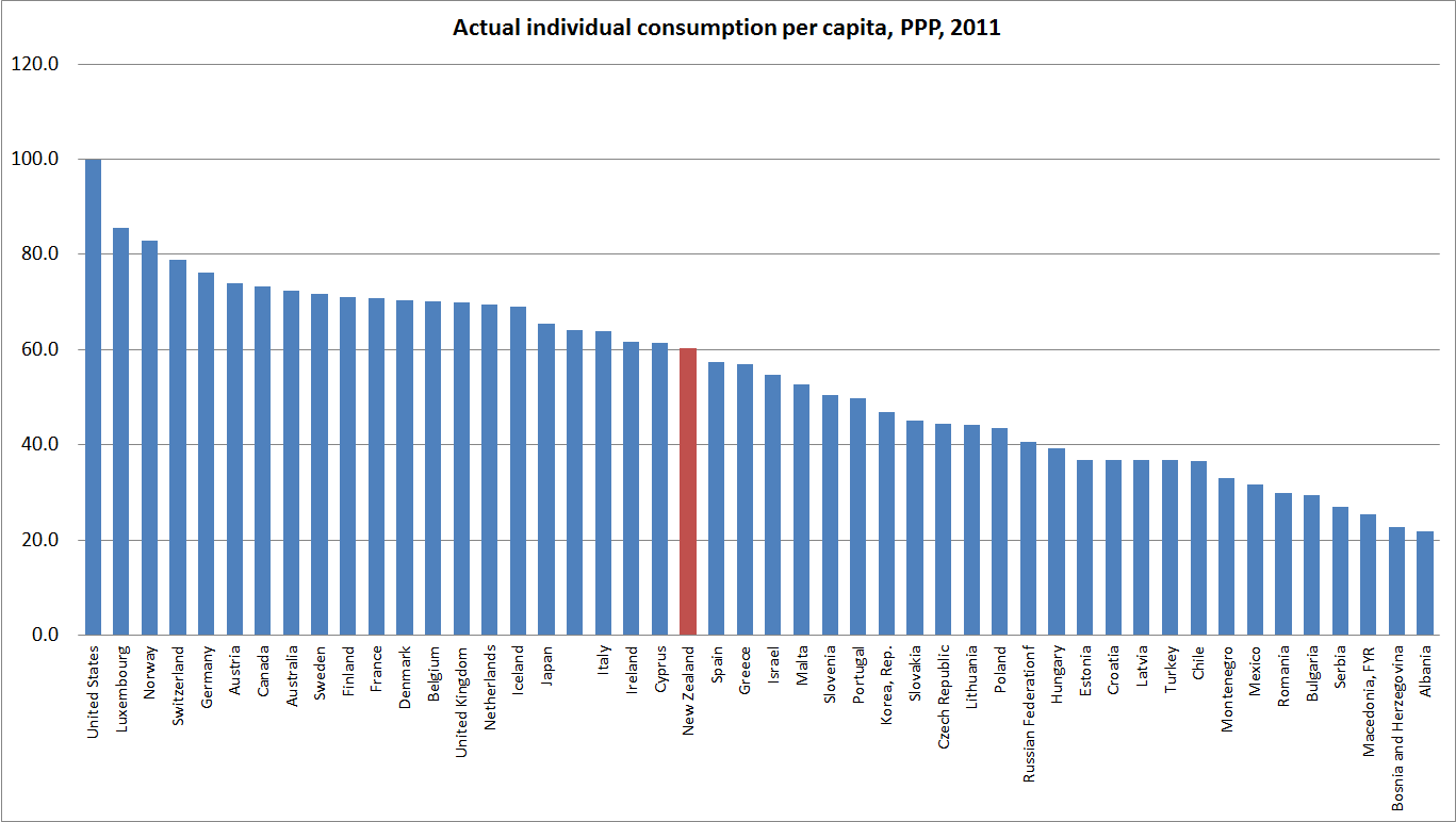
Of these 46 countries, New Zealanders’ average consumption – across types of people – falls squarely in the middle of the pack, well behind most of the older OECD countries. Our ranking here looks quite similar to the rankings people are familiar with from GDP per capita, or even NNI per capita, charts. It isn’t a perfect measure, but it is much more comprehensive that the Grimes-Hyland one, and it isn’t obvious why it is misleading us about the material aspects of life in New Zealand relative to other advanced countries.

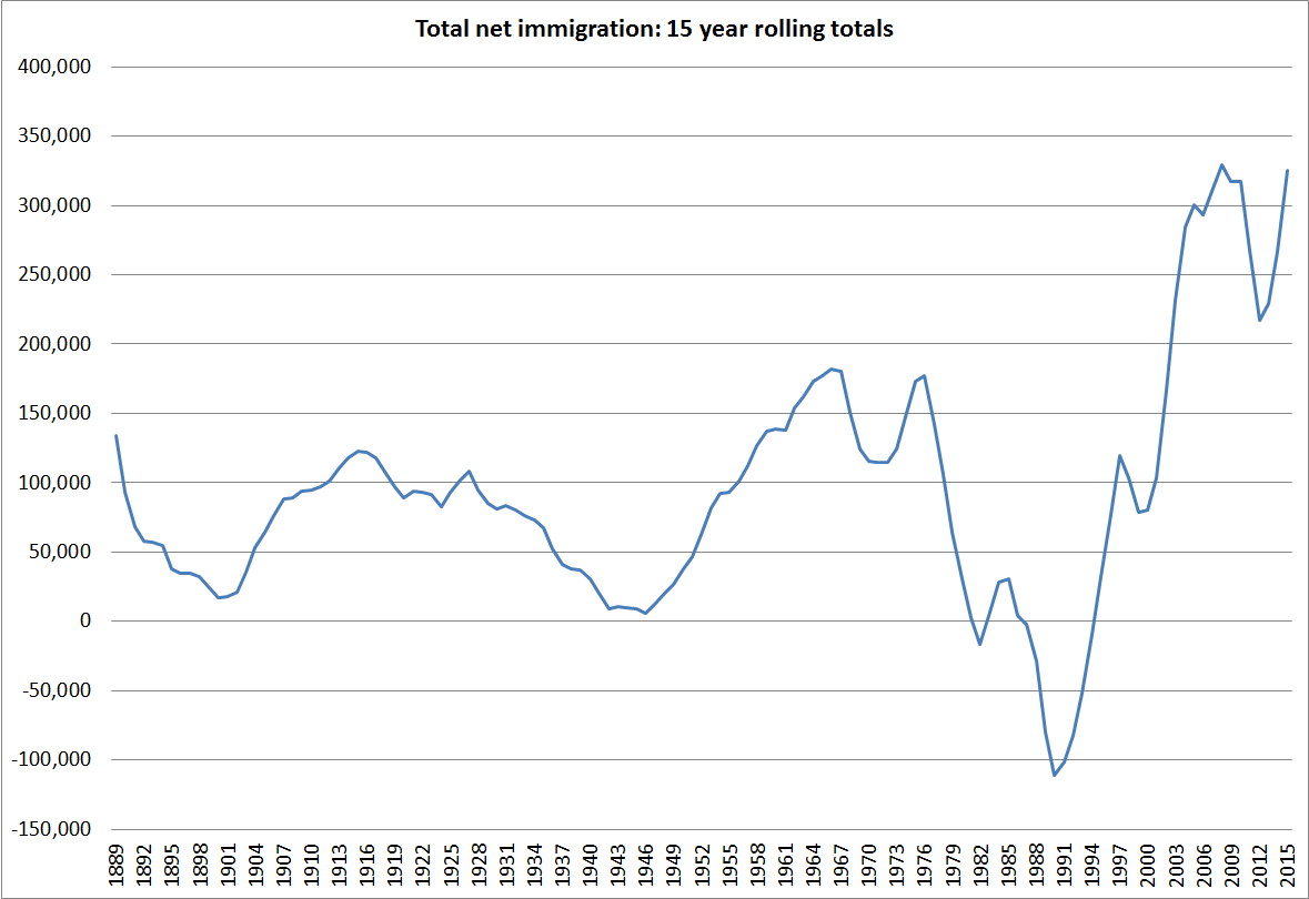
The final chart is just relevant to the New Zealand vs Australia comparison. On the Grimes-Hyland measure we score very similarly to Australia. Frankly that seems implausible as a representation of relative material living standards. Why? Because for fifty years large numbers of New Zealanders (net) have been leaving New Zealand, overwhelmingly for Australia.  Very few Australians have come the other way. There is quite a lot of cyclicality in the flow, but the trend is very clearly in one direction only.

cumulative plt since 1960

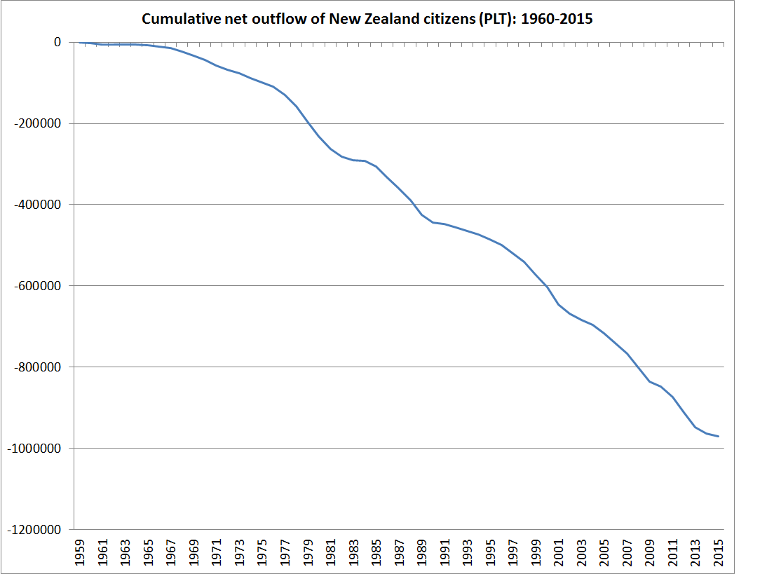
It wasn’t that way when more traditional GDP per capita estimates suggested that New Zealand and Australian economies were level-pegging. I entirely agree with authors who say that GDP per capita (or even NNI per capita) are not the be-all and end-all. People don’t change countries based on national accounts aggregates, or other international agency wellbeing measures. They are presumably changing countries because they believe the new country offers sufficient better material living standards, for them or their children, to offset the loss of the intangibles of home, extended family, and a culture and institutions one knows.   The choices people make reveal their preferences, and it is unlikely that over decades they’ve got it systematically wrong (after all, they could have come home again, as many did). None of us knows how much poorer material living standards are here than in Australia, but we can be pretty confident they are now, and have been for some decades, worse.

(Real researchers can stop reading here, but..) I helped the 2025 Taskforce put together their first report, on closing the gap with Australia. The report focused on policy, and as the primary underpinning for the analysis used national accounts measures, but at their request I put together this – purely illustrative – box. I stress the words “purely illustrative”- it was a matter of what I could find quickly. It isn’t comprehensive, but – as the box concludes – that is why we have, and try to improve, national income and expenditure accounts. 


Box 1: What do Australians get with their higher incomes?

Digging down to look at what people in the two countries actually consume can give a more tangible sense of the differences between New Zealand and Australian material living standards. Again, what is important in different climates varies, and tastes differ. But comparing living standards in New Zealand and Australia is easier than in most pairs of countries because the tastes and expectations are broadly similar.

These data are sometimes less reliable than the national accounts. Sometimes they are not compiled by national statistical agencies but by industry bodies. Even when statistical agencies are involved, things aren’t always measured exactly the same way in different countries. There is no single decisive fact. This box simply illustrates that across a very wide range of things that different people value or like to consume, the typical New Zealander has less than the typical Australian. Starting with where we live: the average size of a new Australian house or apartment built in 2007 was 212 square metres. In New Zealand, the comparable average was 193 square metres. Or what we drive: Australians have 619 cars per 1000 people, while New Zealanders have 560.

New Zealanders work more to earn our lower incomes: 887 hours a year are worked per head of population, as compared with 864 hours per head in Australia. Australians live longer: 81.1 years, compared with 80.2 years in New Zealand. Fewer people in Australia (111 per 100,000 people) die of heart disease each year than do in

New Zealand (127 per 100,000 people). Many fewer people die on the roads there: 7.8 each year per 100,000 people in Australia, 10.1 each year in New Zealand.  Australians have more televisions (505 per 1000 people) than New Zealanders do (477 per 1000 people). And there are more broadband subscribers (10.3 per 100 people, compared with 8.1 per 100 in New Zealand).

There are more cinemas per million people in Australia (92.4) than in New Zealand (82.2). And more mobile phones too (906 per thousand people versus New Zealand’s 861 per thousand). Australians drink more than New Zealanders: both alcohol (9.8 litres per capita versus 8.9 litres) and fruit juice (34.4 litres per capita versus 24.8).

This isn’t comprehensive by any means – that is why we have national income accounts. And there are some measures on which New Zealanders have more than Australians. Australia has 34.9 McDonalds outlets per million people, but New Zealand has 36.9 per million.

The Productivity Commission looks into immigration

The Australian Productivity Commission that is.

The Australian Productivity Commission has underway an interesting inquiry, initiated by the Federal Treasurer, into immigration to Australia. Here is the scope of the inquiry, taken from the Treasurer’s Terms of Reference.

aus pc1
aus pc2

It is interesting that the Australian government has chosen to initiate another Productivity Commission inquiry only 9 years after the previous large report into the economic impact of immigration. That bulky report concluded that in Australia, the gains from immigration mostly accrued to the immigrants, with little evidence of any material gains to native Australians. Despite the size of that earlier report, there was some aspects of the economic issues (possible benefits, as well as possible costs) that were not covered at all, and the modelling work that was done looked at the medium-term rather than the long term.

The new inquiry has two areas of focus. The first is helping to answer the questions about the costs and benefits of immigration, both to Australian citizens more generally and to the fiscal position of Australian governments more specifically. The second is around the intriguing idea of charging for entry. The idea of rationing entry by price turns up in immigration debates from time to time. “Intriguing” here is my code word for something like “this idea appeals to the economist in me, but yet there is something about it – which I can’t quite put my finger on – that is distasteful, and it seems unlikely to fly”. I can’t see it happening, and yet I’m not entirely sure why it shouldn’t. If we set aside the refugee quota, countries like New Zealand and Australia allow and promote immigration largely for economic reasons, and a price should tell something useful about who could get most value out of permission to live in our country. Perhaps willingness to pay is not overly well aligned to ability to help generate domestic productivity benefits?   But is there good reason not to use price to ration demand for places among those who meet certain basic criteria (age, English language, lack of criminal history etc)? It will be interesting to see what the Commission comes up with in this area.

To their credit, the team working on this immigration inquiry sent a couple of senior people to Wellington this week. New Zealand has quite similar immigration policies to Australia, and for Australia in particular, the largely-free trans-Tasman immigration area also complicates things (as it does for us, in the possibility of people returning home late in life to claim New Zealand welfare benefits). I was among the various groups of public and private sector people they met while they were here, and we had a good wide-ranging discussion.

I noted that I had increasingly come to think that good immigration policy – in countries like ours, with no treaty obligations to allow open access, and (unlike Israel) no national identity/security reasons to promote immigration – is best thought of as an optional complement to economic success. The alternative, which seems to be at the heart of the arguments of immigration advocates in New Zealand, is to see immigration policy as an engine (perhaps large, perhaps small) helping generate economic success.  I can’t think of a country – going back centuries – where immigration has materially improved the economic fortunes of the recipient country. In the last great age of immigration – the decades prior to World War One – migrants flowed to countries that were already economically successful (be it New Zealand, Australia, Canada, Argentina, the United States or even within Europe itself). Economic success allows a country, if it chooses, to support more people at high incomes. And emigration eases the pressures in the source country, lifting living standards among those who remain.

There is, of course, an exception to my story. Immigration has transformed the economic prospects of some physical territories, but only by totally taking over and largely replacing the indigenous population, and the economic institutions of that culture.   New Zealand – like each of the colonies of settlement – is an example of that. And it is an uncomfortable example. My assessment (backed, for example, by the work of people like Easterly, looking at long-term global economic performance) is that Maori average incomes are higher now than they would have been without extensive European settlement, but was the trade worthwhile – across all its dimensions – for the indigenous population? There are huge discontinuities between 21st century New Zealand and 18th century “New Zealand” that don’t exist for, say, the United Kingdom or France.

By advanced economy standards, New Zealand is a classic example of an underperforming country that people should be leaving. And, of course, for decades New Zealanders have been doing so, mostly to more successful Australia.   Of course, we can always attract plenty of people from other (even poorer) countries if we want to. But why would we?     There is no obvious area of the world where the culture and economic institutions are so obviously superior to our own Northern European-sourced ones that we can get the sort of transformative gains (at whatever costs) that Maori may have achieved by allowing extensive European settlement in the 19th century. There is no sign in the data that slightly larger countries grow faster (per capita) than slightly smaller ones.  And there is no reason to think we can somehow attract the very best of possible migrants to a small, remote, underperforming, but pleasant, country.   And if current migration patterns were repeated at scale, or for long enough, we would face the risk of factor price equalisation occurring, but not in the way we want – the typical migrant to New Zealand comes from countries, and economic cultures, that generate materially lower living standards and levels of productivity than New Zealand (or Australia) does.

The draft report of the Australian inquiry is due out in mid-November. I’ll be keeping an eye out for it. Perhaps it might be time for a similar inquiry in New Zealand. I think I’ve mentioned that when I first started raising my arguments about the possible link between immigration policy and New Zealand economic underperformance, there was a lot of discomfort at Treasury. Senior people then talked of the new Productivity Commission as a good place for such issues to be explored. That remains true today, and Treasury has a key role in advising ministers which inquiries to request from our Productivity Commission.

I have had Official Information Act requests in for some time with Treasury and MBIE for copies of advice to ministers on the economic impacts of immigration, and on the target level of permanent residence approvals. As is customary with government agencies, the responses to the requests have both been extended/delayed.   These aren’t particularly time-sensitive requests, but I will be interested to see what the departments have had to say. MBIE is well-known to be strongly pro-immigration, and I have heard reported that current Secretary to the Treasury (himself a temporary migrant) recently reiterated in private a view that “immigration is good; it is as simple as that” (repeating the tenor of comments in a speech earlier this year). Perhaps, but let’s see the argumentation, in the specific context of New Zealand, and in the light of cross-country economic history and experience.

Richer than Australia by 2025? Really……

I opened the Dominion-Post this morning to find this story, reporting the aspiration of the new Wellington Regional Economic Development Agency (WREDA, mostly a Wellington City Council agency) that Wellington should be, by 2025, “the most prosperous, liveable and vibrant region in Australasia”.

Memories of an earlier 2025 goal flooded back.  I helped the government’s 2025 Taskforce with their reports, which outlined policy proposals for how New Zealand might catch up with Australia economically by 2025.  But that was 2008/09, and for a whole country.  At the time, the Taskforce concluded that New Zealand could catch up with Australia over 16 years, with the right set of policies, but it required a fairly major reorientation of policy, across numerous fronts, pretty quickly.

But now there is only 10 years until 2025, and the Wellington City Council (with a bit of help from the Regional Council) wants to make Wellington not just as prosperous as the average Australian city, but more prosperous than any of them.  The Tui billboards spring to mind.  Even one of the more sensible regional councillors agrees the timeframe is unachievable.

In search of any substance behind this ambition, I dug out WREDA’s Statement of Intent.  But there was no substance.  There was:

  • No quantification of any of these goals, or any attempt to illustrate how large the gaps are now.
  • No analysis of the economics of cities.
  • No analysis of the sorts of policy tools that are, and are not, available to local councils, and how much difference they have ever made to regional per capita growth.
  • No analysis (or links to other analysis) of the costs and benefits of the grab-bag of policy ideas they do list.
  • No analysis of what has been done in the past, and what has worked and what has not.

At one level it is just a bureaucractic/political feel-good document.  But these sorts of agendas, together with an ambitious new CEO, tend to become the basis for new council spending proposals –  the commitment of real resources that belong to citizens, with little effective accountability.

I’m all for ambition.  Sadly, I think many of New Zealand’s elites have been too willing to settle for the mediocre economic performance New Zealand has achieved over the last 25 years.  But to the extent that governments can change medium-term economic outcomes, it is mostly central government that matters.  If Wellington is ever the most prosperous city in Australasia, it will be because of choices central government has made, and how the private sector has responded to that improved environment.  Central government controls taxes, most regulation, immigration, education, and so on.  Relative to that list, the difference any council can make is very small – and the track record (sports stadia, street car races, application of land use restrictions, and so on) seems pretty poor.  Of course, central government does lots of crazy stuff too (in a Wellington context, film subsidies), but at least they have the potential to make a lot of difference for the good.

This story, small in itself, is just another reason to be wary of seeing local councils as the solution to problems.  In discussions around housing, for example, some, including the Productivity Commission, have argued that a big part of the problem is councils held back from doing “the right thing” by the lobbying and votes of citizens.  Personally, I reckon that the problem is more likely to be one in which councils pursue their own interests and ideologies with little effective check on those activities by citizens.  Strengthening the property rights of citizens, and reducing what damage councils can do, seems a more promising, and economically efficient, way forward.

In the meantime, perhaps the Wellington City Council could get on with stuff we must actually look to councils to do.  The seawall at Island Bay was badly damaged (photos here) in a storm more than two years ago.  Since then, we’ve had a long consultative process, but there has been no progress in actually fixing it up.  Simple really.  They can do it. It will make a material difference to people living here now.  But instead we get this pie-in-the-sky aspirational stuff, with little or nothing behind it.

Just how large a contribution has net migration made to population growth?

One of the challenges in discussing the impact of immigration in New Zealand is making sense of the data.  I’m running a story that says two (largely unrelated) things:

  • Given the severe land use restrictions in place, the high target level of non-citizen immigration (the bit directly amenable to New Zealand policy) is a major explanation for the upward pressure on house and urban land prices.  I’ve shown that, on one measure, all of New Zealand’s trend population growth is now resulting from immigration policy.
  • Given the modest rate of national savings, the high target level of non-citizen immigration is a major contributing factor to New Zealand’s persistently high (relative to other countries) real interest rates, the high average real exchange rate, and –  hence –  to the weak growth in productivity and the failure to reverse any of the decades-long decline in New Zealand incomes relative to those in other advanced countries.

We know the key policy parameters.  Specifically, there is a currently a government target of 135000 to 150000 permanent residence approvals on a rolling three year basis.  That isn’t all the non-citizen migration but it is the overwhelming bulk of trends in it.  There are lots of short-term flows, but my real interest is not in year to year fluctuations but in the contribution of immigration policy to the trend growth in New Zealand’s population.

When people turn to Statistics New Zealand data to analyse migration they most often look at the data on permanent and long-term (PLT) migration.  For any analysis about what is happening over short periods of time, it is the only sensible series to use.  The alternative is to use SNZ’s total migration data but (even when seasonally adjusted) it is hugely volatile in the short-term.  The noise swamps any signal.  Major sporting events –  eg Lions tours, or the rugby world cup – are an example of what muddies the water.

But the PLT data have their own limitations.  The total migration data are volatile, but they do count every person arriving in and departing from New Zealand, and so provide a highly accurate count of the cross-border contribution to the number of people in New Zealand at any one time.  By contrast, the PLT numbers are less volatile, but they rely on the self-reported intentions of travellers.  When someone arrives, or leaves, they fill in the arrival/departure card stating whether they intend to go/come for less or more than 12 months.  Those stating “more than 12 months” are treated as permanent or long-term movements.

But even if everyone answers the question honestly, plans change.  Some New Zealanders go to Australia in search of a better life, perhaps planning never to live here again.  But Australia doesn’t always live up to expectations, and some will come back to New Zealand a few months later.  Those people will have been PLT departures when they left, but returning short-term travellers when they come home.  Similarly, some foreigners come to New Zealanders planning to stay forever, but leave again a few months later.  Some New Zealanders go to Australia for a few months, but find a good job, settle, and don’t come back.  And some foreigners might arrive initially on short-term visas, but then end up staying permanently (most permanent residence visas these days are issued to people already in New Zealand).

You might suppose that the differences would be small, and would wash out over time.  To the extent that I had ever given the issue any thought, I suppose that was what I used to assume too.  In fact, there are large and persistent differences between the two series.  The difference was at its starkest in the 2002/03 migration boom, when the annual PLT inflow peaked at around 40000 and the total inflow peaked at almost 80000.  The differences didn’t just wash out the following year.

Statistics New Zealand has recognised the issue.  Late last year, partly prompted by my focus on the issue, they published a paper (which unfortunately got little or no coverage), reporting some experimental work they had done on trying to improve estimates of actual permanent and long-term migration (as opposed to self-reported intentions).  As one example of what they did, passport numbers were matched to check how many of those who (for example) said they were coming for less than 12 months were still here 12 months later.  Over the 2000s it was pretty clear that estimates of actual permanent and long-term migration could be materially improved.  Over 2002/03 “true” PLT flows appear to have been materially larger than self-reported PLT flows, and over 2010-12, true PLT flows were materially weaker than the self-reported flows.  In each case, trends in the total migration series were more reflective of what was going on than the self-reported PLT numbers.  This chart is from the SNZ paper.

plt-methods

SNZ has not backdated its experimental estimates prior to 2000, and apparently (and unfortunately) does not have funding to produce these estimates on an ongoing basis.  But over much longer periods of time these differences also appear to matter.   Infoshare has data that distinguishes PLT and total migration since 1921.  Here are the cumulative net inflows in the two series.
cumulative migration since 1921
The cumulative difference is 170000 people (total net migration is much larger than self-reported PLT) –  quite material in terms of thinking about changes in New Zealand’s population which, even now, totals only 4.6 million people.  And the difference is not just down to, say, the growth of tourism: SNZ report that at any one time there are around 150000 foreign visitors in New Zealand, and around 115000 New Zealand visitors in other countries.

The divergence since 1921 is large, but note the crossover point in the early 1980s.  Until the end of the 1960s, self-reported PLT immigration had been consistently larger than total net immigration.  In earlier decades, there wasn’t much short-term tourism or many foreign students in our universities.  Since the outflows of New Zealanders also weren’t large until late in the period, much of the difference was probably down to people getting here and deciding New Zealand wasn’t really for them and going home again.

Self-reported net PLT outflows from the mid 1970s were large.  The flow of non-New Zealanders was quite small in this period (policy having been tightened materially in 1974), while the big change was the upsurge in the outflow of New Zealanders.  But since the (accurate) measure of total inflows and outflows shows nothing as large as the recorded self-reported PLT outflows, my hypothesis is that many New Zealanders set out to go to Australia for the long-term but quickly came home again.  The differences are huge: PLT data suggest a net 250000 outflow from 1976 to 1990. But the total migration data suggest a net outflow of only a little over 100000.

What about the more recent period?  Immigration policy was reformed and materially liberalised from around 1990 (in a succession of changes).    Here is the chart for total migration and self-reported PLT migration since 1990.

cumulative plt since 1990b

There isn’t much difference in the first few years, but from the late 1990s there has been a material difference between the two series.  Even the direction of change isn’t the same each year in the two series.  If one takes the total migration series as a better representation of the migration flows contribution to population changes (and demand for accommodation) than the self-reported PLT series, there was little or no net migration over 2008 to 2013 taken together (the red line goes sideways for that period), before the population pressures resumed strongly from 2013.  That coincides with the resurgence of very high house price inflation in Auckland.  Quite what is accounting for the divergences in the two series recently isn’t clear.  The SNZ paper I linked to earlier does not distinguish between NZ passport holders and other passport holders (although presumably they have the data).  Plausibly, some part of the difference will be down to New Zealanders finding Australia tougher than they expected and returning to New Zealand within 12 months of leaving, and some part will be down to foreigners arriving short-term and finding legal ways to stay for a longer term.

Finally, a chart showing just how large the total migration net inflows have been.  SNZ reports total migration data since 1875.  Here is the chart showing rolling 15 year totals (which should largely abstract from purely cyclical effects).

total net migration

These aren’t scaled for population, but New Zealand’s population in 1960 was about half what it is now, and the net migration inflows recently have been about twice as large as they were in those early post-war decades.  In those post-war decades,New Zealand experienced persistent pretty extreme excess demand pressures.  They didn’t show up in high interest rates (which were controlled) or in the foreign debt (the private sector largely couldn’t borrow, and the government didn’t). Instead, it showed up in the extensive network of controls  – on credit, on building activity, on imports, on holidays abroad etc – that was needed to keep excess demand in check.  Economic historians writing about New Zealand’s post-war experience seem to have been pretty well agreed that immigration policy exacerbated those demand pressures, rather than alleviated them (as I documented in this file note  Economic effects of immigration and the New Zealand economic historians ).

My story is that much the same pressures have been apparent since the resurgence of immigration in the 1990s –  but this time they show up in real interest rates and in a large negative NIIP position (which would otherwise probably have shrunk considerably as the fiscal accounts moved strongly into surplus).

A brickbat and a bouquet for Treasury

A brickbat and a bouquet for Treasury this morning, following from the pro-active release yesterday (albeit with many deletions) of papers related to this year’s Budget.  Pro-active release is a welcome practice that should be more widely adopted.  Indeed, in some form it is a practice that should generally be made mandatory.

First the brickbat.  Very late in the Budget process, as the government continued to flail around with an apparent sense that “something must be done” about the housing market, but a reluctance to expend political capital to actually address the underlying issues (land use restrictions and the active policy-driven programme of inward non-citizen immigration), Treasury was asked for some advice on several tax options.  None involved serious or thoroughgoing reform of the overall tax system  (eg land tax, taxing imputed rents, shifting the basis of local authority rates back to land values, inflation-indexing the tax system (which reduces the value of interest deductibility), or even less desirable measures such as a comprehensive capital gains tax, or ring-fencing the ability to offset losses on rental properties).  Instead, they were patches, or worse.  Treasury compounded the problem by throwing in its own proposal –  an Auckland Investor Levy.

By this point, Treasury was probably under quite unreasonable pressure.  As they bluntly note in their 24 April Treasury Report, “because of the very short timeframe, this is a longer and less considered report than we would normally provide”.  That is not a good basis for making policy.  But public servants must respond to the demands of their Ministers.

The Auckland Investor Levy –  a 1 per cent annual levy on the value of residential rental property –  appears not to have been the Minister’s idea, but a proposal of officials.  Perhaps they saw it as something less bad than other possibilities canvassed in the paper (such as an interest levy).    But this is not just an idea that Treasury is reluctantly providing pros and cons on.  They recommend to the Minister to “consider progressing” such a tax.  Much of the discussion of the proposed Auckland Investor Levy has been withheld in the document that is released, but the summary table at the back of the paper makes it clear that Treasury is pretty sympathetic to this option.

And yet:

  • There is no analysis in the paper to explain why Treasury believes that investors, as opposed to (say) owner-occupiers are a  particular “problem” in the housing market.
  • There is no discussion of how the “tax advantages” of housing are distributed among owner-occupiers and investors.  Previous analysis has suggested that unleveraged owner occupiers are at the greatest advantage.
  • There is no apparent attempt to reconcile this proposal with the more general point that there appear to be too few houses (or at least too little effective land supply) not too many.
  • There is no analysis in the paper to justify why such a wealth tax should be so partial.  Why impose a levy on investor residential properties, and not on owner-occupier ones?  Why houses and not commercial buildings?  Why rental houses and not farms or equities?
  • Treasury proposes hypothecating the revenue from this (supposedly temporary) levy to the Auckland Council, and yet there is no discussion (released) of the difficulty of lifting the levy in future (and thus depriving the Council of a major revenue line).
  • There is no discussion of the efficiency costs (or the equity) of having one tax system for Auckland, and one for the rest of the country.

In a rushed paper, I’m not suggesting that Treasury could have fully adequately dealt with each of these issues, but it is pretty inexcusable that these issues are not even mentioned.

And the bouquet.  Media reports indicate that Treasury proposed ending public funding of Kiiwrail and either markedly reducing the size of the operation, or closing the company altogether.  Given the amount of money that has already been sunk into Kiwirail, in one sense it would be a shame if it were to come to that.  But sunk costs are sunk costs, and unfortunately it does not appear that the analysis underpinning the earlier injections was particularly robust.  I don’t suppose Treasury expected that Ministers would agree to their proposal, but it is good that it was made.

It is particularly encouraging that the recommendation was presumably endorsed by the Secretary to the Treasury.  I spent a couple of years on secondment to the Treasury, which overlapped with the early days in Treasury of Gabs Makhlouf, fresh from the UK.    A major discussion was held one day to try to gravitate towards an agreed “narrative” on the reasons for New Zealand’s disappointing long-term economic performance.  Gabs’s contribution was to observe that New Zealand’s problem was that it had underinvested in rail.  Britain developed railways and exported the technology around the world, and New Zealand never really took advantage of it.    Fortunately, it did not seem to be a widely held view.  I guess Gabs has learned.  A while ago I asked for a copy of an “economic narrative” document Treasury did in 2013.  If and when it arrives, it will be interesting to see how the Makhlouf Treasury now accounts for New Zealand’s disappointing longer-term performance.

Fiscal policy and how NZ and Australia did in 2008/09

My post the other day about fiscal policy (and why it shouldn’t be eased in New Zealand now), together with a throwaway line about Kevin Rudd’s fiscal policy in the 2008/09 crisis, prompted me to spend a bit of time digging around in the data for the 2008/09 period for both New Zealand and Australia.  This relates to the question “why did New Zealand have a recession and Australia didn’t”

Of course, even that statement is not as simple or uncontentious as it looks.  The shorthand people are using here is the “two consecutive quarterly falls in real (seasonally adjusted) GDP”.  On that measure, New Zealand actually had two recessions (from a peak in 2007q4 to a trough in 2009q2, and not having regained the previous peak, real GDP again fell for a couple of quarters from mid 2010).  By contrast, real GDP in Australia fell in only a single quarter, in 2008q4.

But Australia did not just sail through unscathed:

  • In per capita terms, it took two years for real GDP in Australia to recover to 2008q3 levels.
  • When Australia’s terms of trade fell, real net national disposable income per capita (a measure that captures the direct effects of the terms of trade) fell by around 9 per cent.   The similar measure in New Zealand only fell by around 5.5 per cent.
  • Australia’s unemployment rate rose by around 1.5 percentage points in 2008/09, the scale of increase that might be expected in a mild recession (similar, for example, to the increase in unemployment rate in the New Zealand recession of 1997/98)

So, I don’t want to get hung up on the question of whether Australia had a recession or not.  But it is pretty generally accepted that Australia was less hard-hit than New Zealand (and many other countries).

Some people reckon that the difference is fiscal policy.  No doubt senior figures in the then Australian Labor government (if they could agree on anything) would like people to think so.  The government, egged on by the Australian Treasury, announced two significant fiscal packages in the middle of the global crisis, one in October 2008 and another (much larger) one in February 2009.  By contrast, neither New Zealand government (either side of the November 2008 election) did any material amount of discretionary fiscal stimulus in response to the crisis.

But what I find striking is how similar New Zealand and Australian fiscal policy was, in bottom line terms, during the second half of the 2000s.  If we did not have a crisis-response package in late 2008, we had had a very expansionary Budget earlier that year.  And both countries had been running down structural surpluses for several years.

Here are some charts from the IMF WEO database:

For revenue

revenue

For expenditure

expenditure

For the fiscal balance

net lending

And for the (estimated) structural balance

structural balance

And, perhaps most starkly, here are direct real government purchases (consumption and investment) for the two countries (indexed to 10o in 2007q4).  It is not until the start of 2010 that one can see any material difference between the two lines.  New Zealand’s recession (like those of most other OECD countries, ended in mid 2009).

C+I

Of course, these are highly aggregated numbers, and it may be that there was something in the specific make-ups of the fiscal programmes that meant fiscal policy was much more effective in Australia.  But it isn’t obvious, and it probably shouldn’t be that surprising since in both countries the central banks will have been taking fiscal developments into account in deciding how much to cut their respective policy interest rates.  As it happened (and unsurprisingly) the Reserve Bank of New Zealand cut the OCR by much more (575 basis points) than the RBA (which cut by 400 basis points from the end of 2007 to the trough in April 2009 – having raised the cash rate in early 2008).

So if fiscal policy differences don’t appear to explain why Australia did less badly through this period, what does?  In the New Zealand story, the drought at the start of 2008 didn’t help.

More generally, the terms of trade are very important to both countries, and in both countries they are quite volatile.  In New Zealand, changes in the terms of trade flow more directly into changes in household incomes, since most of the tradables sector is domestically owned (FDI in New Zealand is heavily concentrated in the non-tradables sector).  By contrast, most of the Australian minerals sector (where the terms of trade volatility arises) is foreign-owned, so that Australian residents’ incomes are not so directly affected.  But the Australian minerals sector is very capital intensive, and huge investment programmes drive off actual and expected minerals prices.

What happened to the terms of trade in the two countries?  New Zealand’s increased by around 10 per cent in 2007, and then started gradually falling away again.  But Australia’s terms of trade rose by around 20 per cent in 2008.  The terms of trade then fell away almost equally sharply  before the effects of the Chinese rebound drove hard commodity prices on to their 2011 peak.    But what that timing difference meant was a quite different environment for the Australian economy in 2008 than was the case in New Zealand (or most other OECD countries).

tot 08 and 09

One important place where the difference shows up is in business investment.  Australia’s business investment peaked the same quarter as the terms of trade and – no doubt reflecting long lags on minerals investment projects, and perhaps the sharp fall in the exchange rate – never fell as far as New Zealand business investment did.  As has been pointed out previously, New Zealand’s business investment boom in the 2000s appears to have been concentrated in the non-tradables sector.

business investment

A similar timing difference is apparent in respect of residential investment. New Zealand’s peaked in 2007q3 and Australia’s peaked in 2008q3.  It looks as though timing differences (both domestically and particularly in the terms of trade) were enough to provide just enough momentum for Australia to avoid the two quarters of falling real GDP.

In closing, here is the chart of RGNDI (for NZ) and RNNDI (for Australia), both indexed to 2007q4 (the peak of the last cycle for NZ, the US, and a number of other OECD countries).  It helps highlights just how important that 2008 terms of trade surge was in limiting the slowdown in economic activity in Australia through 2008.

rgndi rnndi

Reflecting on Puerto Rico

For those not totally absorbed in the hour by hour machinations of Greek politics, another highly indebted area that has been getting attention this week is  the US territory of Puerto Rico.  The focus is on the debt, and Gillian Tett has a nice column in today’s FT on the complexities of trying to deal with that.

But the piece that got me more interested was a short post by Paul Krugman on the economic challenges of Puerto Rico.  Many probably disagree with Krugman on macro issues, and on politics, but issues around trade and economic geography are where he made his name.  He concludes:

But I’d argue for paying a lot of attention to the non-specific forces affecting the island, and in particular the economic geography side. Puerto Rico may to an important extent just suffer from being a slightly hard to reach island in a time when corporations place a high premium on easy, just-in-time shipments.

It got me thinking again about New Zealand and Australia.  Now, to be clear, I’m not suggesting that most of the parallels are close:

  • We have our own exchange rate, currency (and minimum wage).  Puerto Rico doesn’t.
  • And our public debt, while not low, is at pretty comfortable levels.  Issues of public debt unsustainability just don’t arise here.

But, on the other hand, we are a fairly small country, quite distant even from Australia.  We have a lot more land than Puerto Rico (but no warm winters) –  and have historically have had a land-based economy,  And no more land is being made.  We used to have a big manufacturing sector, but only when we built up huge and costly protective barriers that meant manufacturing here was the only way into the market.   If we had 10 million people we would still be small and remote.

For decades, tens of thousands of our fellow citizens have been leaving for what they perceive to be a better life, and better economic returns, in Australia.  The annual outflow fluctuates a lot, but over time the numbers mount up.  935000 New Zealand citizens (net) have left since 1970, mostly to Australia.  Even though I use these numbers often, every time I calculate totals like that the scale of the cumulative outflow still takes me aback.

Puerto Rico has been seeing outflows too, and the pace has stepped up in recent years. The most recent census was the first ever in which Puerto Rico’s population has fallen.  As Krugman notes, this is not necessarily a bad thing

Put it this way: if a region of the United States turns out to be a relatively bad location for production, we don’t expect the population to maintain itself by competing via ultra-low wages; we expect working-age residents to leave for more favorable places. That’s what you see in poor mainland states like West Virginia, which actually looks a fair bit like Puerto Rico in terms of low labor force participation, albeit not quite so much so. (Mississippi and Alabama also have low participation.)

And outmigration need not be such a terrible thing. There is much discussion of what’s wrong with Puerto Rico, but maybe we should, at least some of the time, just think of Puerto Rico as an ordinary region of the U.S.; at any given time, we expect some regions to be in relative and maybe even absolute decline, as the winds of technology and global trade shift. I wonder, in particular, whether Puerto Rico is suffering from the forces that seem to be leading to a general shortening of logistical chains and the “reshoring” of manufacturing to advanced economies.

We’ve had plenty of  towns/regions in New Zealand in which the population has fallen.  My usual examples are Taihape and Invercargill.  In one sense, emigration from those places is difficult for those left behind but, given the changes in relative economic opportunities, the departures are better (even for those left behind) than the alternative.  If everyone had just stayed in Invercargill or Taihape, even though the opportunities had moved away, the social and economic outcomes would almost certainly have been worse.  No one argues that as a matter of public policy we should aim to replace those who’ve left such towns.

But at a national level that is exactly what we have been doing in New Zealand for the last 25 years.  Rational economic agents –  our fellow New Zealanders –  respond to changing economic opportunities by moving to Australia.  Basic economics –  and plenty of formal literature on the great migrations of the 19th century –  suggests that those outflows will not only have benefited those who left, but will have contributed towards factor price equalisation – closing the gaps (but only somewhat ) between returns in New Zealand and Australia.  But central government, endued  with (or rather implicitly asserting) a superior sense of what is wise or right, stands in the way of that process of  factor price equalisation by bringing in yet even more people than the number who are leaving.  Having just come from one hubristic disaster –  Think Big –  we stumbled into thinking big on foreign immigration too.

They don’t do it in other countries.   Plenty of fast-growing successful countries have attracted large number of migrants, to take advantage of the opportunities (Singapore is a recent example, and Ireland –  after it had already become successful –  was another).    But countries that are aiming to catch-up with the rest of the advanced world don’t use inward migration as a means to that end.    It doesn’t work.  Ireland didn’t, the eastern European countries didn’t, and Korea and Taiwan didn’t.

Advocates of agglomerationist arguments will be spluttering by this point.  But there isn’t a lot of evidence for such effects in comparisons between countries.  Over 100 years big countries haven’t grown faster than small countries.  Indeed, many of the countries with the highest per capita incomes are resource-based economies with small populations.  I occasionally run  the line that perhaps the optimal population of New Zealand (if there such a thing) is either 2 million or 200 million.  At 200 million perhaps we’d be like Japan, albeit still facing a “distance tax”.  At 2 million we might be maximising the per capita value of our natural resources.  Would, for example, any fewer cows be being milked?

We aren’t going to have a population of 2 million or 200 million in my lifetime.  But if we pulled inward migration of non-New Zealanders back to around 1980s levels, we’d now have a slightly falling population.  We’d have a much better chance then of beginning to close the income and productivity gaps, of sustainably slowing the outflow of New Zealanders, and perhaps even in  time of attracting home again some of those 935000 New Zealanders who’ve already gone.    We’ll do that when, and if, we succeed.  We won’t help the prospects of success by simply importing more other people.

Productivity growth worse than in Greece

In the interview with Richard Harman I noted that one of my main interests and (rather more importantly) one of the bigger challenges for New Zealand was its disappointing economic performance over the last 25 years.    The liberalisation of the economy in the 1980s and early 1990s was generally expected to have reversed the earlier decades of relative decline.  Not everyone shared that optimism, but among the advocates of reform within government and the public service, and among most international observers (for example, the IMF and OECD, and financial markets), that sort of re-convergence was generally expected.

But it didn’t happen.  For a while there was a “the cheque is in the mail” hypothesis doing the rounds –  it hadn’t happened yet, but it surely wasn’t far away.   But 25 years is a long time, and it just has not happened.  Around 1990, the former eastern-bloc countries started serious liberalisation.  Their economies had been much more heavily distorted than New Zealand’s (notwithstanding the Bob Jones crack in 1984 about the New Zealand economy resembling a Polish shipyard), but they have subsequently seen considerable convergence.

Here is my favourite summary chart of our underperformance over that period.  Using the Conference Board data, it is total growth in real GDP per hour worked for 42 advanced countries (OECD, EU, and Singapore and Taiwan) since 1990.  Only five countries had had slower growth over that period than New Zealand –  and two of them (Switzerland and the Netherlands) had had among the highest levels of labour productivity in any of these countries in 1990 (so one might have expected unspectacular growth subsequently).  No cross-country comparative measure is perfect, but I don’t this one is particularly unrepresentative of New Zealand’s relative performance  On this measure, Greece and Portugal have done less badly than us  (but recall that this is GDP per hour worked, and in the current Greek Depression total hours worked have dropped away precipitously).

GDPphw since 1990

I’ve been running a story about the role of immigration policy in explaining that failure to converge –  total GDP has grown a lot, even if GDP per hour worked hasn’t.  In this wider sample of countries, New Zealand has had among the faster rates of population growth, despite the huge outflow of New Zealanders (around 525,000)  over that period.   Singapore (86%) and Israel (77%) have had much faster rates of population growth than New Zealand (30%) over this period.

My argument has been that in a country with a low savings rate, rapid population growth has put considerable sustained upward pressure on real interest rates and the real exchange rate, squeezing the share of GDP devoted to business investment and preventing the emergence of new tradables sector firms/products at the rate that (a) convergence would have required, and (b) the rest of NZ’s microeconomic policy framework might have suggested/warranted.  A few weeks ago, I showed how our real exchange rate against Australia had failed to decline despite the deterioration in our relative economic performance over decades.

Here is another way of looking at the same point.  The two countries with the fastest growth in the chart above were Taiwan and Korea.  Singapore has also done impressively well.  In 1990, Taiwan and Korea were well behind New Zealand, and Singapore had about the same level of real GDP per hour worked as New Zealand  (precise comparisons depend on which set of relative prices are used, but on any measure all three countries have had growth outstripping that of New Zealand).

And here is the picture over 50 years, again using the Conference Board data
gdpphw asia
All three Asian countries have had some of the more dramatic catch-ups in productivity levels seen anywhere.  New Zealand, by contrast, in 1965 was among the advanced countries with the highest levels of labour productivity, and has been in relative decline since.

But what has happened to the countries’ real exchange rates since?  As ever, there is no unambiguous way to measure that, but the BIS have real exchange rate indexes for each of the four countries going back to the 1960s.  Of course, real exchange rates can move around a lot from year to year, so in this chart I’ve shown the percentage change in the real exchange rate from the average for 1966-70[1] to the average for the 10 years to May 2015.

bis rer asia

The countries that have had such dramatic productivity improvements have all recorded modest falls in their real exchange rates, and by contrast New Zealand has had an increase in its real exchange rate.  That is opposite of what one might initially have expected.  One might have expected a strong real appreciation in the Asian currencies (as has happened in Japan), as much higher incomes supported more and cheaper consumption in these countries.  Fewer resources now needed to be devoted to the tradables sectors in those countries.   And in New Zealand one might have expected the deteriorating productivity performance, and hence declining (relative) future consumption opportunities, to have been met by a declining real exchange rate. That would have increased the returns to productive investment in New Zealand –  helping to reverse the decline – and raised the relative price of consumption.

How does my story explain what went on?

In last 25 years, Korea and Taiwan have had materially slower population growth rates than New Zealand has, and much higher savings rates.  That meant both less pressure on resources simply to maintain the capital stock per person, and more domestic resources available to meet investment demand.  The net result: little upward pressure on real interest rates and the real exchange rate, despite the continuing productivity gains.

Singapore is at the extreme.  The national savings rate has averaged 46 per cent in Singapore over the last 25 years, roughly double the rate for advanced countries as a whole.  With so many resources available (earned but not consumed) even the investment needs of an average population growth rate of 2.5 per cent puts no pressure on domestic resources, or hence on real interest rates and the real exchange rate, despite the continuing productivity gains.

And that is my story in a nutshell: with very high saving rates your country might need lots more people to make the most of the savings.  But in a country with only a rather modest savings rate (for whatever reason) then having lots more people –  and especially bringing them in as a matter of policy – simply looks wrongheaded.  It undermines what policy is setting out to achieve.

It isn’t that migrants somehow “take away jobs”, but rather that rapid population growth (whether migrants or high birth rates) tends to divert resources (jobs) away from growing the bits of the economy that sell to the rest of world (a huge and diverse market, and probably where our future prosperity is to be found) to ensuring that the physical infrastructure (houses, roads, shops, factories, schools) keeps pace with the needs of the growing population. It makes it very hard to catch up with the richer countries.   Israel has found something much the same.

No comparison of any pairs of countries, in any particular period, is ever going to be conclusive.  I use the examples in this post simply to illustrate the story.

[1] Starting the comparison from the start of the BIS series in 1964 would result in an even larger fall for Korea

SNZ’s productivity growth estimates

Statistics New Zealand released a swathe of annual productivity data yesterday.

These annual productivity data focus on the so-called “measured sector”, whereas most often (for data availability reasons) productivity comparisons are done for the whole economy.  The measured sector currently covers 77.3 per cent of the economy.  It excludes ownership of owner-occupied dwellings, public administration and safety, education and training , and health care and social assistance –  all sub-sectors where market price information is difficult or non-existent.  The measured sector data are good quality but (a) are only available with a considerable lag (data released yesterday are up to the year ended March 2014), and (b) are mostly only useful for looking at New Zealand’s own performance over time (and only limited amounts of time, since the data on this measure go back only to the mid 1990s).  Other databases, typically using whole economy measures, are more useful for timely cross-country comparisons.

The chart below shows measured sector labour productivity and total factor productivity growth since the  year-ended March 1998.  These measures don’t just use a volume measure of labour inputs (eg hours worked) but adjust for the changing composition (improving quality of the workforce).  Simple measures based on hours worked in effect understate the role of inputs and, thus, overstate productivity growth.
measured sector
On this measure, labour productivity growth does not look too too bad.  In particular, although growth since 2007/08 has been slower than it was previously, the slowdown is less marked than many other series show for other countries.  But bear in mind that over the 16 years shown, total growth in labour productivity was only 20.3 per cent –  just under 1.2 per cent per annum.

By contrast, the TFP picture is sobering.  In the 11 years since 2003, total TFP growth has been around 1.5 per cent (little more than 0.1 per cent per annum).  As I’ve suggested previously, perhaps there is something in the notion that the higher terms of trade (since 2004) have undermined TFP growth, changing production patterns to take advantage of the higher output prices but in ways that reduced measured productivity.  Perhaps, but I doubt if the effect can have been quite that large.  And the sectoral TFP data back up those doubts.  Here is the chart for agricultural sector TFP (only available to March 2013).  It is a noisy series (droughts do that), but it looks as though there has been some TFP growth in the sector since 2003, unlike the picture in the aggregate TFP series.

agriculture

Finally, a quick comparison with the Conference Board estimates for New Zealand, which I used in my series on cross-country comparisons since 2007.    Here is the chart.

conference

The Conference Board uses a model to estimate TFP which ascribes more of New Zealand’s growth to the growth in capital services (than SNZ do).  (Like SNZ they make a correction for changing labour quality).   There is no point directly comparing the number from the SNZ measured sector TFP series with the Conference Board TFP series – different models produce different results.  But what is perhaps useful is to note that in both models New Zealand’s TFP growth has tailed-off markedly since 2003.  That should be pretty disconcerting.

And here is the international context for TFP growth, with a focus on the post-2007 period.

Real economic costs of financial crises – part 1

A couple of days ago I looked at how one might best classify countries, as to whether or not they had experienced a “financial crisis” since 2007.  But this chart is one reason why I’ve become increasingly sceptical that “financial crises”, however one defines them, have large or enduring adverse real economic effects.  I think I first saw it in a sets of slides by Nobel laureate Robert Lucas, and every so often I would use it to try to stir up a bit of debate at the Reserve Bank.

maddisonUS

It is a quite simple chart of real per capita GDP for the United States, back as far as 1870.  These are Angus Maddison’s estimates, the most widely used set of (estimated) historical data, and as Maddison died a few years ago they only come as far forward as 2008.  The simple observation is that a linear trend drawn through this series captures almost all of what is going on.  More than perhaps any other country for which there are reasonable estimates, the United States has managed pretty steady long-term average growth rates over almost 140 years.  And yet, this was a country that experienced numerous financial crises in the first half the period.  Lists differ a little, but a reasonable list for the US would show crises in 1873, 1884, 1893, 1896, 1901, 1907, perhaps 1914, and 1929-33.  There were far more crises than any other advanced countries experienced.

And yet, there is no sign that they permanently impaired growth, or income.  One never knows the counterfactual, but right through this period the US kept on towards establishing the dominant position it was to hold in the decades after World War Two.  Even the Great Depression, awful as it was (costly as it was to many people) does not look to have had permanent adverse effects.  Another source I’ve bored people with over the past few years is Alexander Field’s excellent relatively recent book on US economic growth, productivity, and the Great Depression, A Great Leap Forward.  Field reports the best estimates for TFP growth in the US over the last century, and growth was faster from 1929 to 1941 than in any of the other periods he presents.  One might quibble about when to start and end these sub-periods, but 1929 was before the downturn became well-established, and 1941 is around when GDP per capita got back to pre-crisis trend (before temporarily going well above it in World War Two).

fieldtfp

The United States in the Great Depression had almost all the factors that are often cited to explain why financial crises might have permanent or very long-lasting adverse effects:

  • Lots of bank failures, and in a system without nationwide banks, disrupting the intermediation process.
  • Lots of corporate failures
  • Big changes in the price level (steep deflation)
  • Huge regulatory uncertainty (including around the robustness of the judicial system –  see, eg Roosevelt’s attempt to stack the Supreme Court)
  • Significant fiscal costs (in this case, not bank bailouts, but the defaults by other Western countries on the huge US World War One loans).

And yet the underlying rate of innovation is estimated to have gone on just as strongly as before.

This is not, remotely, to trivialise the Great Depression.  But it still looks a lot more like an event that became as severe as it was because of inadequate demand, and was resolved when sufficient strong aggregate demand returned (in the US case not until World War 2).  Output lost in the interim is a real and substantial cost to the people involved, but the numbers get really big if something changes the long-term future path of growth.  And there is no sign of that having happened in the many financial crises the US experienced from the 1870s to the 1930s.

A few years ago, Andy Haldane of the Bank of England got a lot coverage for a speech in which he presented this table, suggesting that the cost of the 2008 financial crisis could be huge –  100 per cent or more of annual GDP.

haldane

If so, it could be argued that everything should be done, all resources of the state thrown at, avoiding such events, which –  as Haldane put it –  our children and probably our grandchildren might be paying for.  But if there is little or no permanent reduction in the future path of per capita income, as a result of the financial crisis itself, the real economic costs of crises are much much smaller.  And the benefits of any regulatory measures to reduce the risk of crises are commensurately smaller –  all the more so when we allow for how little any of us know about the long-term costs and benefits of such regulatory restrictions.  Even recessions occurring at the time of a financial crisis can’t all (or perhaps even mostly) automatically be ascribed to the crisis itself.

I’ll have a few more posts on related issues in the next few days or weeks.  But recall where I started on this, and where I will loop back to. Per capita income GDP growth in New Zealand and the United States since 2008 has been very similar, even though New Zealand had only a minor domestic financial crisis, while the US was at the epicentre of a major global liquidity event,  and many significant US institutions failed or came close to failing, and US lenders experienced very large losses.   Sadly, as earlier posts have illustrated the relative productivity performance in New Zealand (relative to the US)  has been even weaker.

us vs nz 2