Tightening conditions impede inflation getting back to target

Five years ago, the then incoming Governor, Graeme Wheeler, signed a Policy Targets Agreement with the then Minister of Finance.  In that document, he committed to run monetary policy with a

focus on keeping future average inflation near the 2 per cent target midpoint.

Earlier this week the CPI  was published.  It was the last such release that will appear while the Governor is still in office.

On a chart showing the 2 per cent focal point the Governor willingly committed himself and the Bank to, here are (a) the actual CPI inflation rates and (b) the Governor’s preferred measure of core inflation (the sectoral factor model measure) for the last five years.

Wheeler inflation 17

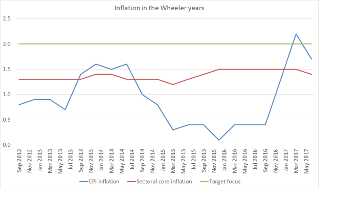
Not once in five years has core inflation (on this measure) even come close to 2 per cent.  In only a single quarter –  one of 20 – did headline CPI inflation get to 2 per cent.

Of course, the Governor can’t really be held to account for inflation outcomes in the first year or so of his term –  those outcomes were determined by choices made by Alan Bollard.  And for the next year or so, it will be Graeme Wheeler’s policy choices that have the biggest policy influence.  Nonetheless, to be so consistently far away from the newly-adopted target isn’t a great legacy.  Perhaps (but probably not) the Bank’s Board will reflect on those outcomes in their forthcoming Annual Report?

The sectoral factor model is only one measure of core inflation, albeit the most stable of them (and so the dip down in the latest release should be a bit disconcerting).  Here is the table I’ve run previously, of six measures of core inflation.

Core inflation: year to June 2017
CPI ex petrol 1.7
Trimmed mean 1.8
Weighted median 2.0
Factor model 1.7
Sectoral factor model 1.4
CPI ex food and energy 1.6
Median 1.70

The poor track record on inflation might have been more tolerable if:

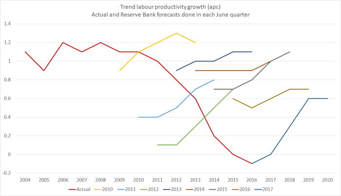
  • productivity growth was really strong, driving down costs and prices.  But it hasn’t been.  In fact, there has been no labour productivity growth at all in the Wheeler years (not the Bank’s fault), or
  • if the unemployment rate was exceptionally low.   But it hasn’t been.   The current unemployment rate (4.9 per cent) is still materially above most estimates of the NAIRU, and well above pre-recessionary levels.  For what it is worth, it is also now above the unemployment rates in a couple of Anglo countries with pretty flexible labour markets (the US and the UK), which had to grapple with having reached the limits of conventional monetary policy during the post-recessionary years.
  • core inflation was still rising now (mistakes happen, but fixing them promptly makes up for quite a lot).  But, for example, the sectoral core measure is back to the same level it was in September 2015, when the Bank was just beginning to unwind its ill-judged 2014 tightenings.

Mostly, monetary policy in the Wheeler years hasn’t been well run.    When Graeme Wheeler took office core inflation had fallen quite a bit over the previous year.  A sensible response would have been to have cut the OCR.   The OCR increases in 2014 were never necessary (I choose the word advisedly –  there was plenty of time to wait and see if core inflation was in fact just about to pick up strongly).  Those increases were then unwound only rather grudgingly.

Of course, in fairness to the Bank, it did rather less badly for most of the period than most of the market economists whose views are covered in the local media.    For most of the time, most (almost all) of them were forecasting higher inflation, and a higher OCR, than the Reserve Bank was delivering.   But it isn’t much consolation, since (a) the Reserve Bank has far more analytical resources at its disposal than the private banks, and (b) the Reserve Bank is paid to conduct monetary policy, and market economists aren’t.

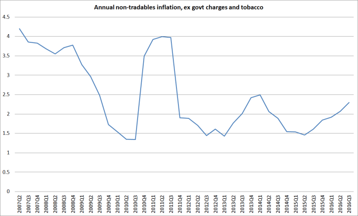
We’ll see next month what the Reserve Bank makes of the latest inflation outcomes.   But the data must be quite disconcerting.     There are some specific pockets of inflationary pressure –  building costs notably (and not that surprisingly, given the population pressures).   But here is non-tradables inflation (quarterly) for the June quarters of the last nine years.  Non-tradables inflation is what the Reserve Bank has most influence over in the medium-term.

NT june quarters

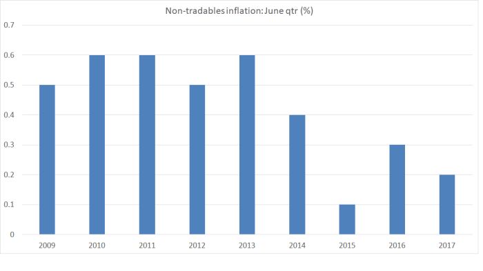
Only in 2015 was June quarter non-tradables inflation lower than it has been this year. Annual non-tradables inflation has dipped slightly to 2.4 per cent.  That might not seem too bad –  after all the target midpoint is 2 per cent – but as even the typically-hawkish BNZ noted in their commentary the other day one would really expect non-tradables inflation to be quite a lot higher to be consistent with delivering overall CPI inflation near the target midpoint.    A simple approach to a core non-tradables inflation rate is the SNZ series that excludes government charges and the cigarettes and tobacco subgroup (where taxes are being raised substantially each year).

NT ex jun 17

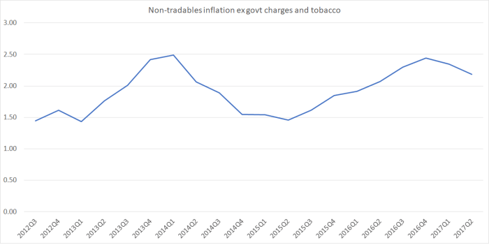
An annual inflation rate in this series nearer 3 per cent would be more consistent with core CPI inflation settling around 2 per cent.  At present, it is nowhere near 3 per cent, and moving in the wrong direction.

So why is inflation still (a) quite a way from target, and (b) looking to be falling again?  Broadly speaking, I reckon the answer is about (a) an economy that continues to run below capacity, and (b) tightening monetary and financial conditions.   The Reserve Bank’s latest published estimate was that the output gap is around zero (roughly, a fully-employed economy).   I noticed one local bank published an estimate the other day suggesting they thought the output gap was more like +1 per cent of GDP.     With the unemployment hovering around 5 per cent –  and best estimates of the NAIRU somewhere around 4 per cent, and demographic reasons to think the NAIRU might be falling, that simply seems unlikely.  It is much more likely there is still some excess capacity in the system, and demand growth simply hasn’t been strong enough.     The job of monetary policy is to manage interest rates in ways that deliver enough demand to keep inflation near target.

The current state of excess capacity is a long-running difference of opinion.  But what isn’t really in much doubt is that monetary and financial conditions have been tightening quite substantially in the last few quarters.

The OCR was cut to the current level of 1.75 per cent last November.   We might have expected inflation to pick up a little further since.    But retail interest rates have been rising:

  • the Bank’s measure of SME overdraft rates troughed in January 2017, and had risen by 19 basis points by June,
  • the Bank’s measure of floating mortgage rates for new borrowers troughed in October 2016, and has risen 25 basis points since then,
  • the Bank’s six month term deposit rate measure troughed in July last year and has risen 15 basis points since then,
  • one and two year fixed mortgage interest rates are also up by around 20 basis points

These aren’t large moves, but with inflation having been consistently below target (and the Bank having been repeatedly surprised) there was no good reason for the Reserve Bank to have accommodated such tightenings.

It isn’t just retail interest rates.   Here is the trade-weighted exchange rate measure

TWI july 17

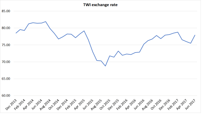
The exchange rate fell quite a long way in 2015, as dairy prices fell, and the Reserve Bank began cutting the OCR.  At the time, the Governor spun tales about how this would help get inflation back to 2 per cent.  Exchange rates are somewhat variable, but broadly speaking the trend has been upwards since then.    Yes, dairy prices and the terms of trade have improved, but it all adds up to another tightening of monetary conditions when inflation has been persistently below target.

And, of course, credit conditions have also tightened.  Some of that is the Reserve Bank’s own doing –  last year’s latest iteration of the LVR controls –  but much of it isn’t: it is lenders reassessing their own willingness to lend.  We don’t have good statistical indicators of credit conditions, but there is little doubt they’ve been tightening.

It all adds up to a picture in which shouldn’t really be very surprising at all: inflation isn’t rising and may well have begun falling again.  Of course, some surprises reinforce the more systematic elements.  Weaker oil prices (for example) probably will spill over to some extent into core measures of inflation.  And unlike the situation in 2010 and 2014, this isn’t a case where the Reserve Bank has gone out actively seeking to tighten monetary conditions –  indeed, the Governor has been commendably moderate, especially relative to most local market commentators.  But it does look a lot like another case where the Bank (and the Governor personally, as single legal decisionmaker) has been too invested in a story that the economy was strong, inflation was picking up, and would continue to pick up, that it missed the way in which monetary conditions were tightening, and continued to largely (and deliberately) ignore the signals coming from the labour market.  Instead of repeatedly talking –  as the Governor does –  about how accommodative (or even “highly accommodative”) monetary policy is, the Bank would be much better advised to treat the low level of interest rates as normal, for the time being (it has after all been more than 8 years now since they were sustainably higher), and put much more weight on seeing hard evidence that (a) inflation is settling back at around 2 per cent, and (b) unemployment is nearer credible estimates of the NAIRU, before acquiescing in any material tightening in monetary conditions.   After getting it so wrong for so long, they should be willing to run the risk of core inflation heading a bit above 2 per cent for a time –  after so many years of undershoots, no one is suddenly going to think the Bank is soft on inflation if core inflation is 2.2 or 2.3 per cent for a couple of years.

Looser monetary conditions now would, most likely, be more consistent with the Bank’s mandate.  I’m not sure it is good form for the Governor to take the market by surprise with a cut from the blue as he heads out the door. But the case for establishing an easing bias in next month’s Monetary Policy Statement is beginning to strengthen.    Hawks will, of course, cite the various business and consumer confidence measures.  None is any stronger now than they’ve been over the last couple of years, and over that period inflation simply failed to pick up anything like enough to get back to target.   Expecting something different now, when the background conditions haven’t changed, is either just wishful thinking, or something worse –  including an inexcusable indifference to the lingering high number of people unemployed.


Some Reserve Bank forecast surprises

The Reserve Bank of Australia had an interesting Bulletin article out recently, offering some insights on this chart

rba wage inflation surprises

The RBA’s wage inflation forecasts have been persistently too strong.  Mostly, they’ve forecast an acceleration of wage inflation, and yet actual wage inflation has continued to fall.

I was curious what a comparable New Zealand picture might look like.  The way wage inflation series are calculated differs from country to country.  In our Labour Cost Index, we have two measures of private sector wage inflation –  the headline one, and what is labelled the Analytical Unadjusted series.  The latter seems to be more comparable to the Australian measure in the RBA chart, while the headline LCI series attempts to adjust for changes in productivity (ie capturing only wage increases in excess of  what firms identify as productivity growth).    Here is what the two series look like.

LCI series

The fall in New Zealand wage inflation (between 2 and 2.5 percentage points since 2008) is pretty similar to the fall in Australian wage inflation in the first chart.

The Reserve Bank of New Zealand publishes forecasts of annual wage inflation for the LCI private sector wages and salaries series (the orange line).  I dug out their forecasts published in the June quarter of each year and this is the chart I came up with.

Reserve Bank wage forecasts

It isn’t quite the same picture as in Australia –  they had a genuine business investment boom which had taken wage inflation almost back up to pre-downturn levels –  but the broad picture is much the same.  Each year since 2010, the Reserve Bank has forecast an increase in this measure of wages (notionally at least productivity-corrected) and each year it hasn’t happened.   Perhaps this year’s forecast will prove more accurate?

What I found interesting is that the errors seem not to have been related to productivity surprises (I’ll come back to those), but simply to misreading overall inflation pressures.

Why do I say that?  Well, here is a chart showing the Bank’s furthest ahead forecasts for wage and price inflation.   They forecast three years ahead, so the forecasts associated with June 2017 (and published in that quarter) relate to inflation in the year to March 2020.   Inflation forecasts that far ahead aren’t thrown around by things like unexpected petrol prices changes or weather shocks to fruit and vegetable prices.  They are closely akin to forecasts of core inflation.

rb wages 2

The wage inflation and price inflation forecasts are so close together that it is quite clear that for some years the Bank has simply been forecasting this measure of wage inflation on the basis of an assumption of unchanged real unit labour costs.    Whatever happens to productivity growth, the Bank assumes that over the medium-term, this measure of wages (notionally productivity-adjusted) will rise at around the same rate as CPI inflation.     (That in itself is interesting as throughout this period the unemployment rate has been above Bank estimates of the NAIRU.  I can’t really show you a meaningful chart of their unemployment forecast surprises, because of the historical revisions to the HLFS).

The grey line shows actual inflation outcomes for the period that lines up with those medium-term forecasts.  I’ve used the Bank’s preferred sectoral core inflation measure, not because it is ideal but because (a) it is available, and (b) it is their own preference.   The last observation is sectoral core inflation for the year to March 2017, which is compared to forecasts for that period published in the June quarter of 2014.

What about the Bank’s productivity forecasts?  In many ways, their view on future medium-term productivity growth doesn’t greatly affect their view of inflation pressures (higher assumed productivity growth will tend to raise both potential and actual output).  So the productivity surprises chart is mostly about simply charting the declining performance of the New Zealand economy.

The Reserve Bank publishes forecasts for growth in a trend measure of productivity, and the trend estimates are revised as new data are added.   But here are the forecasts, lined up against their most recent estimates of trend productivity growth (again using the forecasts published in each June quarter).

rb productivity forecasts

The Bank has, again, consistently forecast a pick-up in productivity growth (the first observation on each line is the Bank’s then-current estimate of the most recent actual).  And for some of the earlier years (2009 to 2011) their latest estimates of actual trend productivity growth are higher than they thought at the time (it happens, as new revisions to GDP data come out).    But as their estimates of actual trend productivity growth rates have continued to fall  –  near zero for the last couple of years –  they’ve continued to forecast a rebound.  Indeed, the rebound in the latest set of forecasts –  out just a couple of weeks ago –  is as steep as any of those in recent years.   Perhaps in their shoes I’d also forecast a rebound –  it seems excessively pessimistic to assume zero productivity growth for ever –  but you do have to wonder what they think is about to change that means we’ll see the rebound beginning strongly in 2017/18 –  ie, right now.

This post is probably already excessively geeky for many readers.   But, as I do, the further I got into the data the more fascinated I got.  I could show you a similar chart for output gap estimates and forecasts, but it is hard to read and fairly predictable –  the Bank has fairly consistently over-estimated how much resource pressure would build up over successive forecast periods.  That shouldn’t be a surprise, given the weak inflation outcomes.

But they did get some things pretty much right over this period.    This chart shows two lines.  One –  the orange line –  is their latest (June 2017) estimate for the average output gap for the year ending March of each year.  And the others shows the contemporaneous forecasst done in each June quarter for the year ending March of that year.  Thus, the 2017 observation is the June 2017 MPS estimate of the average output gap for the year to March 2017.  When those estimates are done, the GDP numbers for March 2017 still aren’t known (but the first three quarters of the year are).  Potential output is always an estimate.

contemporaneous output gap forecasts

With one (important) exception, the contemporaneous estimates and the current ones are astonishingly close.   That isn’t so surprising for the last couple of years, and additional data could yet lead to material revisions in the estimates for the output gaps for 2015 and 2016.      But for the earlier years, despite all the revisions to the data, and all the new information, the Bank’s contemporaneous estimates for the then-current output gap hold up very well against today’s estimates.  These are annual averages, not estimates for the output gap in the March quarter itself, but….still…..I was pleasantly surprised.     The forecasts might be pretty hopeless (as I noted last week, and as is typically true of other forecasters too) but the contemporaneous estimates aren’t bad at all.   Simple monetary rules, such as the Taylor rule, encourage central banks to not put much emphasis on medium-term forecasts, but to adjust policy based on how they assess the current situation (output or unemployment gaps, and inflation gaps).

Of course, one observation in that chart does stand out.  In 2014, the Bank thought there was a reasonably materially positive output gap.  They now recognise that there wasn’t.  And that was the time when they made the policy mistake, of raising the OCR by 100 basis points (and talking up even further increases beyond that), only to have to reverse those increases quite quickly.    In any serious post-mortems of that episode (such as they suggest will be coming out shortly), they should be looking hard at how they got that output gap assessment so wrong –  much more wrong than in any of the other post-recession years illustrated on the chart.

Getting the read on the current situation right is hard enough, and medium-term forecasting is typically adding no value, whether in understanding the actual future, or in understanding how the Bank itself might react to its own mistakes.  The Bank would be better advised to focus its energies –  analysis, communications, and policy deliberations –  on what it knows at least something about, rather than on what it (and the rest of us) know little or nothing about.

Reflecting on the macro data

The Reserve Bank’s Monetary Policy Statement (Graeme Wheeler’s second to last) will be out on Thursday.  I’m not in the market economists’ game of trying to tell you what the Bank will do and say (although no one expects they will do anything concrete with the OCR this time).  I’m more interested in questions around what they should do.  In time, what they should do, they usually will do.  But sometimes not until they’ve tried the alternatives.

I wrote about last month’s CPI data a few weeks ago, concluding that there had been a welcome, and expected, increase in core inflation (it is what typically happens if inflation is below target and the OCR is cut fairly substantially) but that

With the unemployment rate still above estimates of the NAIRU, and most indicators of inflation suggesting that core is probably (a) still below target, and (b) not picking up very rapidly, it certainly isn’t time for hawkish talk about near-term OCR increases.

Not everyone agrees of course.  I noticed the BNZ’s economic commentary yesterday which opened with this confident assertion

There is no excuse for the cash rate to be just 1.75% in New Zealand.

I don’t think I’m unduly caricaturing their record to say that, for at least the last decade, the BNZ economics team has never seen an OCR increase they didn’t like, even –  or perhaps especially –  those which had to be quickly reversed.  But mindful that in the story of the boy who cried wolf, the wolf eventually did come, I thought it was worth having a look at the latest wave of data.  Last week, we got the full quarterly set of labour market data (HLFS, QES, and LCI), and the Reserve Bank’s quarterly expectations survey.  To cut a long story short, it doesn’t alter my view.

Take the expectations survey first.   The headline story was one in which the two year ahead expectations of the inflation rate (of a sample of moderately informed observers –  including me) rose quite materially, and now stand at 2.17 per cent (up from around 1.65 per cent in each quarter last year).

infl and expecs

This measure of expectations isn’t typically very volatile, but it is typically somewhat responsive to changes in headline CPI inflation.  We’ve just had quite a large change in headline inflation, so some increase in the expectations measure shouldn’t be surprising. It certainly shouldn’t be concerning.  After all, ideally, the Reserve Bank wants people to believe, and act as if they believe, that on average over time CPI inflation will average around 2 per cent –  the mid-point of the target range, and the explicit focus of the current (but about to expire) PTA.

In fact, no one really knows whether this survey measure captures how people actually think and behave in real transactions in the goods, labour and financial markets.   It might be as good a proxy as we have, but (a) we don’t know, and (b) it still might not be good at all.  Glancing at the time series, there is a tendency for falls and rise to be at least partly reversed quite quickly.

But if inflation expectations are really in some sort of 2 to 2.2 per cent range, I’d welcome that.  With repeated increase in tobacco excises –  not some underlying economic process –  there is a reasonable case, in terms of the PTA, that headline inflation should average a little higher than the mid-point, and than “true” core inflation.  Only if inflation expectations were to rise further from here might I start to get a little disquieted.

In trying to make sense of the inflation expectations numbers, one thing I haven’t seen mentioned is the Labour Party’s monetary policy release.   There was a quite a bit of focus last month on their pledge to add some sort of employment objective to the Reserve Bank Act, and concerned expressed in some quarters that that could lead to higher inflation over time.   If it was a factor, you’d presumably have to take the probability of Labour leading a new government (call it a coin toss at present?) and multiply that by the probability that the change in regime (and perhaps the sort of people a new government might appoint) would make a material difference over time.  I have no evidence one way or the other, but it wouldn’t surprise me if there was a small effect of this sort.   (My own two year ahead expectation in the survey was 1.5 per cent –  around the current rate of inflation in the Bank’s preferred sectoral factor model).

Not many commentators seem to pay much attention to the rest of the expectations survey, even though its strength is partly the range of macro questions that are asked (although I’ve suggested some modifications to the Bank in their review of the survey).

Take GDP for example. There is no sign of respondents expecting real growth to accelerate.  Two years out they expect annual real GDP growth of 2.6 per cent – down on the previous quarter, but not far from the average response over the last couple of years.    But the survey also asks for quarterly GDP predictions for the next couple of quarters, and year-ahead predictions.   That enables one to derive an implied six monthly growth rate for the second half of the coming year.  Here is the gap between the expected growth rates for the first six months and the second six months, going back to just prior to the 2008/09 recession.

expec GDP growthAs we headed into the recession there was a lot of expectation of a strong rebound.  Even up to around 2012, respondents expected growth to accelerate.   For the last few years they haven’t expected any acceleration, and now the expect it to slow.  To be specific, respondents expect 1.6 per cent total growth in the first half of this year, slowing to 1.2 per cent in the second half of this year.     We don’t know quite why –  perhaps they expect immigration numbers to slow –  but it doesn’t speak of a sense that things are getting away on the Reserve Bank.   Similarly, two years out respondents expected that the unemployment rate would still be 4.9 per cent.

Perhaps these respondents will be proved wrong –  they often are, forecasting is like that –  but at the moment it doesn’t look like an imminent risk of core inflation rising much further, or to levels that might prove problematic for a flexible inflation targeter focused on medium-term inflation outcomes around 2 per cent.

What of the actual labour market data?   We have some problems at present because of the breaks in various HLFS series that occurred when the revised survey questions were put in place last year.  I’m still staggered they could have made these changes without running the two sets of questions in parallel for perhaps a year, to allow robust adjustments to be made for the discontinuities.   HLFS hours worked measures, employment measures, and probably participation rate measures all seem to have been affected to some extent.   We are pretty safe in saying that the number of people employed in New Zealand did not grow by 5.7 per cent last year (as the HLFS suggests).

What of the simplest headline number, the unemployment rate?   There isn’t much doubt that the unemployment rate has been falling over the last few years.  It is what one should expect after a serious recession, and with the stimulus to demand provided by low interest rates and large migration inflows (given that immigration typically adds more to demand in the short-term than it does to supply, thus tending to lower unemployment and use up spare resources in the whole economy).

But what should be somewhat disconcerting is that the unemployment rate has (a) gone largely nowhere in the last year, and (b) is still well above pre-recession levels (unlike the situation in many other advanced countries with their own monetary policies).   In the prevous boom, the unemployment rate got down to around 4.9 per cent as early as the start of 2003.     The picture isn’t much different if one looks at the broader (not seasonally adjusted) SNZ underutilisation measure.

U and under U

There still appears to be some progress in using up spare capacity in the labour market, but not very much at all.

What about the rate of job growth.  Fortunately, we have two measures: the (currently hard-to-read) HLFS household survey measure of numbers of people employed, and the QES (partial) survey of employers asking how many jobs are filled.   Unsurprisingly, the trend in the two series are usually pretty similar, even if there is a fair bit of quarter to quarter volatility.

employment

Since we know there are problems in the HLFS, and the QES doesn’t look to be doing something odd, perhaps we are safest in assuming that the number of jobs has been growing at an annual rate of around 2.5 to 3 per cent.   That isn’t bad at all. But SNZ also estimates that the working age population has been growing at around 2.7 per cent per annum.  No wonder the unemployment rate is only inching down.

One can do a similar picture for the annual growth rates in the two (HLFS and QES) hours worked series.

hours qes and hlfs

It was pretty clear that there was around a 2 per cent lift in HLFS hours worked from last June, just on account of the new survey questions.  It seems safer to assume that total hours worked across the economy might have grown by around 3 per cent in the last year.   That is faster than the growth in the working age population, pointing to some increase in effective utilisation, but not a dramatic one.  For what it is worth, in the latest releases, the two hours measures were both quite weak in the March quarter.

(And remember that nothing in the expectations survey data suggested pressures were likely to intensify from here.)

And what of wages?    There is a variety of measures.  The QES measure is quite volatile –  there are issues of changing composition –  and I don’t put much weight on it.  But for what it is worth, average hourly earnings rose 1.6 per cent in the last year on this measure, around the lowest rate of increase seen for decades.    The Labour Cost Index measures should get more focus (but have some challenges of their own).

lci inflation 2Perhaps there is some sign of a possible pick-up in the analytical unadjusted series (which doesn’t try to correct – inadequately –  for productivity changes) but it is a moderately volatile series, and the most recent rate of increase is still below the peak in the last little apparent pick-up a year or two back.

A common response is “ah, but what about the lags?”.  But as we’ve shown, there is little sign of any material tightening occurring in the overall labour market, no sign of expectations that that is about to change, and so little reason to expect much different wage inflation outcomes over the next couple of years from what we’ve seen in the last couple.  At best, there might be some slight pick-up in wage inflation (especially if the increase in inflation expectations is real), but any pick-up is going to be from rates of increase that have, over the last couple of years, been consistent with disconcertingly low rates of core inflation.

So where does it all leave me?  Mostly content that an OCR around 1.75 per cent now is broadly consistent with core inflation not falling further, and perhaps continuing to settle back where it should be –  around 2 per cent.   Of course, there is a huge range of imponderables, domestic and foreign, so no one should be very confident of anything much beyond that.   But it is worth bearing in mind that the unexpectedly strong net migration over the last few years has been a significant source of stimulus to overall domestic demand (including demand for labour).  In the face of typically too-tight monetary policy, it is part of why the unemployment rate finally started gradually coming down again after 2012.

Whatever happens to the cyclical state of the Australian economy, the National government is already putting in place immigration policy changes that should be expected to lead to some reduction in the net inflow of non-citizens, and two of the main opposition parties are campaigning on promises of much sharper reductions than that.   If such policy changes come to pass then, all else equal, the OCR will need to be set lower than otherwise.  It isn’t something that Graeme Wheeler can or should actively factor into this week’s OCR decision, but it may well be something the acting Governor needs to think hard about (if any decisions he makes are in fact lawful) after the election.

What to make of the CPI?

The media headlines make a lot of the fact that yesterday’s CPI puts annual headline inflation above the 2 per cent target midpoint (and contractural focal point) for the first time since 2011.  The Governor has almost completed his five year term, so it is a first sight for him.

Of course, current headline inflation isn’t the focus of monetary policy.  The almost-expired Policy Targets Agreement (PTA) explicitly tells the Governor to focus on “future” inflation, and the “medium-term”.  In longstanding words:

For a variety of reasons, the actual annual rate of CPI inflation will vary around the medium-term trend of inflation, which is the focus of the policy target. Amongst these reasons, there is a range of events whose impact would normally be temporary.

There are almost always plenty of those.  There are genuine market prices that are quite volatile – oil/petrol prices and fresh fruit and vegetables are the two most obvious examples.  There are discretionary government charges –  eg ACC levies –  developments in which have very little to do with underlying pressures in the economy.  And there are straight out consumption taxes that appear directly in the CPI, but again have little or nothing to do with real resource pressures (or even rates of money and credit creation).   GST changes – we’ve had them about once a decade –  are the best example, but the repeated large increases in tobacco excises this decade are another.  Exchange rate changes can also muddy the waters.

As I noted in a post a few months ago, monetary policy works –  which shouldn’t surprise anyone, but apparently does –  and we’ve seen this as part of the explanation for an increase in inflation over the last year or so.   Some increase should be very welcome, since the various core measures had been dropping further below the target midpoint, and people appeared to becoming more used to treating as normal inflation outcomes well below 2 per cent.  Reversing the ill-judged OCR increases of 2014 seems to have dealt with that problem/risk for now –  although we (like most other advanced countries) remain quite exposed when the next recession hits.

Quite how much core inflation has really increased is a bit of an open question.   In various previous posts I’ve highlighted a selection of six possible measures.  Here they are again for the year to March 2017.

Annual inflation rate
Yr to March 2017
CPI ex petrol 1.7
Weighted median 2.2
Trimmed mean 2.2
Factor model 1.8
Sectoral factor model 1.5
CPI ex food and energy 1.6
Median 1.75

The sectoral factor model measure was the Governor’s avowed favourite measure.  A year or so ago, it was the highest of the six measures of core inflation.  Right now, it is the lowest.     Historically, it tends to be the most stable of all the measures, and although prone to revisions as new data are added, it probably does deserve more weight than the other measures.  That measure of core inflation picked up about 18 months ago, but has been steady at 1.5 per cent for the last year or so.

I am sensitive to the suggestion of cherry-picking data.  From memory, I was inclined to de-emphasise the core inflation number a year ago, so I don’t want to suggest now that it is the only variable that matters.  But in many countries, quite a bit of attention is paid to CPI ex food and energy measures as a proxy for core inflation, and the picture isn’t much different there.    It would be interesting to understand quite why the trimmed mean measure – one given quite a lot of attention in Australia – has moved around so much.  It was as low as 0.4 per cent (annual inflation) as recently as the end of 2015.

But if core inflation has picked up a bit, there is little in the data that suggests it is, or is about to, race away.    When I opened up the SNZ CPI tables, a few things caught my eye:

  • on the first page, I noticed that quarterly non-tradables inflation (and non-tradables tends to be more persistent, and hence attract more policy focus) had been 1.0 per cent.  That was exactly the same rate as in the March quarter of 2016, and a little lower than in the three previous March quarters.  (Non-tradables inflation is high in the March quarter because of the succession of tobacco tax increases.)
  • one of my favourite series is non-tradables inflation excluding central and local government charges and tobacco taxes.  March quarter inflation there was 0.6 per cent, lower than in the March 2016 quarter (and also lower than in the September and December quarters).
  • construction costs look like a potential pinch-point in the economy, and yet the seasonally adjusted data on construction cost inflation (and, in fact, property maintenance costs) both showed quarterly inflation rates for March quite a lot lower than we were seeing for much of last year.

Wage inflation measures are probably also relevant here, not so much through some sort of “cost plus” model of inflation, but because developments in the labour market will also be a good reflection of overall resource pressure (and the wage aggregates aren’t so affected by tax changes, government charges and similar one-offs –  although they will be affected, in future, by arbitrary policy interventions like “pay equity” settlements).   In some ways, wage measures might be a better (if politically infeasible) policy target for monetary policy.

Here is a chart of the Labour Cost Index (LCI) inflation, using the raw “analytical unadjusted” series.

LCI analytical

There isn’t evidence of much, if any, pick-up there, and perhaps especially not for the private sector.   The headline LCI numbers aren’t much different and the (volatile) QES data are even weaker.

We’ll get another round of labour market data in early May.  Perhaps there will be more signs of an acceleration in wage inflation, or even a material drop in the unemployment rate (suggesting that excess capacity is dissipating and, hence, future inflation risks may be rising) but for now probably the best one can say is that macro outcomes are suggesting that the OCR set at current levels might have been about right.   With the unemployment rate still above estimates of the NAIRU, and most indicators of inflation suggesting that core is probably (a) still below target, and (b) not picking up very rapidly, it certainly isn’t time for hawkish talk about near-term OCR increases.

I’ve noticed some market economists talking of altering the timing for their first expected OCR increases.  I guess it is an occupational hazard for them having to make such calls, still mostly about the far future.  But such are the uncertainties –  about the global environment, the domestic economy, the inflation process, let alone about who will be Governor (or MPC) and what the PTA will look like –  that it seems something of a fool’s errand.  It would, in many ways, be good if the next warranted OCR move were to be an increase, but such are the limitations of our knowledge that probably the best we can say at present is that the current OCR is probably the best prediction of the OCR for the next year or two, with reasonably wide confidence intervals around even that prediction.

Finally, Paul Walker at the University of Canterbury had an interesting and useful post yesterday on his blog highlighting the way that relative price changes muddy reported headline measures of “inflation”.   As he notes, and I have already noted here, getting at the “pure” inflation rate is both important but not necessarily that easy.

Walker links to an old paper by a couple of US academics highlighting the possibilities of factor analysis to distill the underlying trends, the “pure inflation”.  That is much the same approach used in the Reserve Bank’s preferred sectoral core factor model.  Here is Walker.

Using US data Reis and Watson found that

… most of the movements in conventional measures of inflation like the Consumer Price Index (CPI), its core version, or the GDP deflator are due to relative-price changes. Only around 15-20% of the movements in these measures of inflation correspond to pure inflation.

Given that they had measures of relative price changes and pure inflation Reis and Watson could look for evidence of money illusion in their data. They found that once they controlled for relative price changes, the correlation between (pure) inflation and real activity is essentially zero. So,

… when we see that high inflation typically comes with low unemployment or high output, this is indeed driven by the change in relative prices hidden within the inflation measure. When there is pure inflation, that is when all prices increase in the same proportion independently from any relative price changes, nothing happens to quantities.

Which would be fine (and it is a while since I looked at that paper), but here is a chart for New Zealand showing the Reserve Bank’s sectoral factor model measure of core inflation, and the unemployment rate.

U and P

Of course, there are other things going on in both series (including changes in inflation targets and inflation expectations).   And the sectoral core measure probably isn’t a perfect representation of core inflation.  But it is pretty clear that, in New Zealand, there is a (expected) short to medium term relationship between real activity measures (indicators of excess capacity) and developments in inflation even when many (if not all) of the “pure” relative price changes are stripped out.

Agreeing with the Governor

If I go on finding myself agreeing with Graeme Wheeler, there won’t be much point writing about OCR announcements.  But, as it happens, he has only three more to deliver.

I could quibble about a few details in this morning’s announcement, but the only one I wanted to highlight briefly was this proposition

Monetary policy will remain accommodative for a considerable period.

In six months and a few days, the Governor will have moved on.  We’ll then have an acting Governor, with no Policy Targets Agreement, for six months.  And not until this time next year will we have in place a monetary policy decisionmaker, with an agreed target, who can make moderately credible statements about possible monetary policy decisions over the medium-term.    So to be strictly accurate,  that sentence should probably have read something like

“If the forecasts underpinning today’s decision are roughly right, and if my successors have (a) the same target I do, and (b) the same interpretation of that target, and the same reaction function, then monetary policy will remain accommodative for a considerable period.”

But in this post, I’m backing the Governor, and one line I was particularly pleased to see was this one (emphasis added)

Global headline inflation has increased, partly due to a rise in commodity prices, although oil prices have fallen more recently. Core inflation has been low and stable.

I made that point here a while ago, so I was pleased to see the Reserve Bank also highlight the  point.    Here is what I mean, using the OECD’s data on CPI inflation ex food and energy –  the one readily available and consistently compiled core inflation measure.

OECD inflation ex food and energy

I’m using monthly data, to be as up-to-date as possible, and New Zealand and Australia don’t have monthly CPI data.  But the comparable quarterly chart doesn’t look materially different.

I’ve shown two lines.  The first is the median core inflation rate for all individual OECD countries (with monthly data).  But that includes 19 euro countries (plus Denmark) that have only one monetary policy.  So the second line is the median core inflation rate for the distinct monetary policy countries/areas –  ie delete the individual euro area countries, and replace them with an inflation rate for the euro area as a whole.  I’d probably tend to emphasise that measure.

But on neither measure is there any sign that core inflation has been picking up at all.  And although the US has been raising its policy interest rate to some extent, there have been more cuts in policy interest rates in the last 18 months or so (the sort of time it takes policy to work) than increases.

Of course, that is only actual inflation outcomes.  Perhaps there is more inflation just ahead of us –  a story markets seem to have taken a fancy to.

For what it is worth, international agencies still thought there was a negative output gap across the advanced world last time they looked (the OECD thought it was -1.4 per cent last time they updated their published forecasts).

The unemployment picture –  another read on excess capacity and resource pressures -is a bit different.    For the G7 countries as a whole, the unemployment rate is now a touch below the troughs reached at the peak of the last boom.    For the OECD group as whole – even including places like Greece –  it is only around 0.7 percentage points higher than at the peak of the last boom.  For the median OECD country, the unemployment rate now only about half a percentage points above the average for the last boom year (2007).

Here are the unemployment rates for the largest OECD economies

U rates big countries

The unemployment rates have been falling for some considerable time, and there has been no pick up in inflation yet.  For each fall, of course, the respective NAIRUs must be getting closer, but it is probably safer to wait and see that core inflation has actually begun to rise –  especially in view of the low starting level –  than to simply assume that it must happen soon.

Of course, when one looks at unemployment rates what does tend to stand out is how little the unemployment rates in New Zealand and Australia have come down.

U rates NZ and AusIn both countries the current unemployment rate is around 1.5 to 1.7 percentage points higher than it was in the year or so prior to the global downturn.  And neither country was troubled by a domestic financial crisis, nor did they run out of room to use conventional monetary policy.  The monetary policy authorities should have been able to do better.   If I look across the monetary areas in the OECD (again replacing individual euro area countries with the region as a whole), the only places with a worse record on this score –  unemployment rates now compared to the pre-recession levels – are:

  • the euro area as a whole (visible in the first chart above) where they did run out of conventional monetary policy options,
  • Norway, and
  • Turkey, not a paragon of economic management or political stability.

Core inflation measures have been picking up a little here, as they should have after the sharp cuts in the OCR the Reserve Bank had to implement.    But our unemployment record –  at a time when much of the rest of the advanced world has been able to run unemployment rates back near pre-recessionary levels without (yet) seeing signs of core inflation rising –  is one reason why I think the Governor is quite right not to express any bias about the direction of the next change in interest rates, however far away (and delivered by a person yet unknown) that might be.

Getting back to monetary policy

Sometimes ill health does strange things. I’ve been quite unwell for the last couple of months (slowly getting back to normal now) and in that time my interest in current monetary policy and the monetary policy words/actions of the Reserve Bank dropped right away (displaced, according to my book list,  by copious Trollope novels and books of early 20th century history). I didn’t write a post about the last OCR review, and it is more than eight weeks since I last wrote a post about current monetary policy issues at all.

In the grand scheme of things, monetary policy just isn’t that important.  Bad monetary policy won’t impoverish us, and the best monetary policy possible won’t make any material difference in reversing our decades of economic underperformance.  But the same is true of lots of things, and monetary policy is one of the things I know.  And over shorter-term horizons it makes more difference to the fortunes of individuals (and firms) than many other things government agencies do.

The Reserve Bank is charged with keeping annual CPI inflation “near” 2 per cent on average.  Monetary policy takes time to work, and there are all sorts of “one-offs” that muddy the water, so no one would ever expect out-turns averaging bang on 2 per cent, except by chance.  The Policy Targets Agreement talks about “near”, and outlines various reasons why actual inflation might appropriate deviate from the target.  One of the salient ones is the direct impact of government taxes and charges: when the government raises tobacco taxes or cuts ACC levies, those aren’t things you hold monetary policy to account for, or expect monetary policy to try to offset.  Any other approach would deliver daft results.

So how do things stand on inflation now, four years into the Governor’s term?

Here is headline CPI inflation, the focus of the Policy Targets Agreement.

inflation-target-and-outcomes

The 2 per cent focal point has only featured in the Policy Targets Agreement since the end of September 2012  (although prior to that 2 per cent was also the (unstated and unfocused on) midpoint of the target range).

The Governor has often rightly called our attention to the role falling global oil prices have played in dampening headline inflation.  The CPI ex petrol series somewhat overstates the contribution of falling oil prices, because exchange rate pass-through into domestic prices is pretty full and immediate for oil/petrol, and the Governor’s monetary policy choices are one of the things that has held up the exchange rate.  But setting that caveat to one side for the moment, here is the CPI ex petrol series.

cpi-ex-petrol

Inflation on that measure is not only well away from the 2 per cent focus, but it is below the bottom of the 1 to 3 per cent target range.  And doesn’t really look to be picking up much, unless perhaps you put a great deal of weight on the one particularly low annual number at the end of last year.

What of the various other core measures?  At times, the Governor has put a very heavy weight on the Bank’s sectoral core factor model measure of inflation.  It has shown some signs of having turned a corner, and started picking up.  Unfortunately, the way that measure is calculated leaves it prone to quite significant revisions as new data are added (if I recall rightly, back in 2011, the real-time estimates suggested core inflation was above 2 per cent).

sectoral-core-revisions

In this chart, I’ve just shown the estimates for the sectoral core measure a year ago, and those now.  In that time, new data have led to past estimates of the sectoral core inflation rate being revised further down (ie the trough was worse than the Bank realized).  And the current estimate of 1.5 per cent is slightly lower than the 1.6 per cent being reported only a few months ago.

There is no perfect measure of core inflation –  empirically, or perhaps even conceptually.   And the measures the Bank and SNZ report show quite a range of numbers.

Annual inflation year to September 2016
Weighted median 1.7
Sectoral factor model 1.5
Factor model 1.3
CPI ex food and energy 1.1
CPI ex petrol 0.8
Trimmed mean 0.7

The median of those estimates is 1.2 per cent.

We are approaching the next Reserve Bank Monetary Policy Statement.  As everyone is aware the Reserve Bank has cut the OCR quite a long way over the last 16 months, and has indicated that its projections suggest further cuts will be needed to ensure that inflation settles back near 2 per cent.

Only two years ago, in its December 2014 Monetary Policy Statement, the Governor indicated that he expected further increases in the OCR, from the then level of 3.5 per cent.  They soon realized that was a mistake.  But here are those core measures for the year to September 2014 (the latest CPI data in December 2014) and for the most recent year.

Annual inflation year to September
2014 2016
Weighted median 1.7 1.7
Sectoral factor model 1.3 1.5
Factor model 1.4 1.3
CPI ex food and energy 1.4 1.1
CPI ex petrol 1.2 0.8
Trimmed mean 1 0.7

On only one of those six measures is core inflation any higher now than it was then, although in all cases there were lower numbers at some point between then and now.   The cuts in the OCR –  reversing the unwarranted 2014 increases – may have helped stem the decline in core inflation, but haven’t yet done much to get it back to near 2 per cent.

Perhaps there are still further increases in core inflation in the pipeline?  But recall that the largest cuts in the OCR were concentrated in 2015 –  100 basis points of cuts between the June and December 2015 MPSs.  Not all the effects of those cuts will yet have been felt, but the effects are likely to start waning fairly soon.   This year so far we’ve had 50 basis points of OCR cuts, some of which simply offset the impact of falling inflation expectations.  And the exchange rate has been rising this year.

As I noted earlier, when governments raise indirect taxes (eg on tobacco) or cut government levies (eg the ACC component of vehicle registration fees) one really wants to look through such effects.  Unfortunately, SNZ does not publish a series for the CPI excluding taxes and government charges –  and I would urge them to consider doing so – but they do publish a series of non-tradable inflation excluding government charges and the cigarette and tobacco subgroup.  At present, those two exclusions capture the tobacco tax and ACC effects.  Non-tradables inflation typically averages well above tradables inflation (for various reasons) and so can’t meaningfully be compared with the CPI inflation target midpoint, although some people –  including some who should know better –  do so.  Here is the chart of that inflation series.

nt-ex-govt-charges-and-tobacco-oct-2016

To be consistent with overall CPI inflation of around 2 per cent, this series would have to be inflating at somewhere nearer 3 per cent per annum.  But this inflation rate has picked up quite a bit, and quite steadily over the last year or so.  That should be a slight cautionary note when considering what should be done with the OCR from here, but it is worth noting that this series also picked up quite a bit in 2013 and that proved to be a false signal.

Like the Reserve Bank, I do think the OCR should be cut further, and I expect it will be cut.  But I might be a little more cautious now than perhaps I would have been at the start of the year about just how large future cuts might desirably be.

Of course, in part that depends on one’s sense of the strength of the economy.   The global picture looks no rosier, and although dairy prices have picked up somewhat, other impulses must be waning.  Growth in tourist arrivals seems to be slowing, as does the sharp growth in foreign student numbers (and the residence approvals programme numbers have been cut a bit).  The Christchurch rebuild impulse is well past its peak, and I don’t see much reason for optimism about a renewed surge in other private domestic construction.  Then again, interest rates work with a lag, and although real interest rates are still higher than they were say three years ago, they are lower than they were 12 to 18 months ago.  And between new prisons (another non-tradables shock tending to boost the real exchange rate) and other government capital expenditure to catch up with the unexpectedly rapid growth in the population, there probably isn’t much reason to expect the modest per capita growth over the last couple of years to slow that much in the next year.

As I’ve said before, however, forecasting is a bit of a mug’s game.  For me, two considerations still tilt me to favouring at least another 50 basis points of cuts:

  1. The unemployment rate is still lingering well above official estimates of the NAIRU, and that is something monetary policy can do something about, and
  2. Because we will go into the next recession (whenever it is, although history would suggest some time in the next five years) with much less ability to cut the OCR than we have had in past recessions, in the current climate if monetary policy errs at all it should be erring towards delivering inflation outcomes perhaps a little above target (even if still “near 2 per cent”) rather than quite a way below target as in recent years.  Inflation expectations for the next few years quite a bit higher than we have now would be a positively desirable outcome.    The Bank doesn’t really have a mandate to target expectations much above 2 per cent, but if it is going to err –  as it has, quite materially, in recent years – better now to err on the high side.

And for all the rhetoric from the government and their cheerleaders, it is not as if the economy has been doing that well.  Non-existent productivity growth and no better than middling per capita GDP growth aren’t signs suggesting we should just ignore low inflation and bask in our “economic success”.


Should the PTA be changed? Business leaders seem to think so

A couple of weeks ago, the Herald ran their annual Mood of the Boardroom survey, capturing the views of 101 (mostly) chief executives on a wide range of business, political and policy issues.  It is a slightly frustrating survey because, despite the heavy coverage the Herald gives it, they don’t report the exact questions, and as everyone surely recognizes, how one frames a question influences –  intentionally or otherwise –  the answers one gets.

Often enough the answers are pretty predictable.  Sometimes predictably depressing.  Daft and detached from reality as I’ve argued that the Prime Minister’s line about New Zealand as a haven for the rich, the “Switzerland of the South Pacific” is, the CEOs (79 per cent of them) seem to like it.

But the question that caught my eye was one about monetary policy.  Asked whether the government should “rewrite its agreement with the Reserve Bank”, so as to “consider wider economic factors beyond inflation” the answers reported were:

Yes                                    48 per cent

No                                      38 per cent

Unsure                              14 per cent

It is now less than 12 months until a new Policy Targets Agreement is required, and the Minister of Finance has poured cold water on the idea of major changes in the PTA.  But on this occasion, business leaders –  often important defenders of the status quo around monetary policy – seem to be calling for change.  As the Herald notes, it is “a marked change from previous surveys”.

It would be interesting to know quite what these CEOs had in mind, as there isn’t much hint in the supporting article.  One CEO is quoted as suggesting that the Reserve Bank needs to think about economic growth too, and that is about all.  There is no reference in the article to the exchange rate, unemployment, asset prices, credit or any of the considerations that people sometimes argue that the Bank should pay more attention to.  But since these respondents aren’t monetary policy experts, we can assume they don’t just have in mind minor technical rephrasing on some clause or other in the PTA.  There must be some genuine angst in CEO-land about how monetary policy is being run.

Without more follow-up questions, it is hard to know what the balance of thinking among respondents was.  Some will probably will favouring lowering the inflation target, to bring the target into closer alignment with actual inflation outcomes in recent years.  Perhaps some favour linking monetary policy and the Bank’s regulatory powers more closely.  Some might be channeling stuff they read from abroad suggesting a new approach to monetary policy is needed, with little real sense of what a different approach might look like (no other country having changed its framework).  But others might be reflecting more of a Labour/New Zealand First unease about the framework, emphasizing perhaps international competitiveness, or more of a focus on full employment.  Perhaps some are just reacting to the failings of the current Governor in conducting policy?

We don’t know what the balance is, but the survey result does feel rather like a straw in the wind, something for the powers that be to focus on as the negotiation of the new PTA next year approaches.  The latent unease among business leaders –  whatever motivates it –  reinforces the argument I’ve made here several times in the past that the process leading to negotiating a Policy Targets  Agreement really should be a much more open one.  The PTA is the principal guide to short-term macroeconomic management in New Zealand, for five years at a time, and yet it is a process shrouded in secrecy from beginning to (well after the) end.   There was no public consultation on the changes to the PTA in 2012 (or those in 2002), and even after the event the Reserve Bank has refused to release background papers relating to the PTA negotiation.

Perhaps none of this matters very much if there is a strong consensus in favour of the status quo –  although even then it is as well to have to articulate the case from time to time, and deal with the challenges, even if they come from only a small minority of voices.  But this time, according to this survey, a plurality of business leaders favours changing the PTA.  Regulatory agencies have to publish consultative documents on proposed changes. New legislation has to be worked through a select committee. The government publishes a Budget Policy Statement setting out in advance the key considerations that will shape its subsequent Budget.  But there is nothing remotely similar around the key policy guide to short-term macroeconomic management, the PTA.  Democratic deficits abound in matters relating to the Reserve Bank, but this is one that could be quite easily fixed.    As part of the lead-up to next year’s PTA, the Minister of Finance should announce that the Treasury will be hosting a workshop/conference, perhaps around six months from now, to consider papers on the appropriate content and structure of the Policy Targets Agreement.  Several background papers could be commissioned, the Reserve Bank and Treasury themselves might submit papers (with some caution about those from the Reserve Bank, given that it is the institution whose conduct the PTA is supposed to shape, and hold to account), and outside experts (academic and otherwise) and interested parties could be invited to contribute.

No doubt some would worry about “upsetting the markets” but (a) this is a democracy, and one that often espouses the importance of open government and (b), as importantly, markets can read too.  The Mood of the Boardroom results are no secret, and nor is the unease that most Opposition parties feel about the New Zealand monetary policy framework.  Nor, for that matter, is the ongoing international debate about how best ot run monetary policy in future a secret.

To be clear, I am not myself advocating material change.  If I were starting from scratch, I would rewrite the PTA at about half its current length, but would not change any of the central features of the current document.  That isn’t because the current system is perfect, or likely to be the end of monetary history (the system we still have 100 years hence), but because the case for any real-world alternative has not yet been made compellingly.  And because I think getting the forecasts more accurate, and reforming the governance of the Reserve Bank –  including getting the right people running the place – are more important than tweaking the target.

I was, however, interested in one of the Herald survey’s advocates of changing the PTA.  Don Brash, former Governor of the Reserve Bank, was included in the survey as chair of ICBC, one of the Chinese banks operating in New Zealand.  Don is quite clear in his view that

over the longer term monetary policy can’t significantly effect an improvement in real economic growth or employment.

But, he argues,

And the Government should probably either reduce or widen the inflation target band. It’s not obvious to me that an average movement in the price of goods and services (as measured by the CPI) of say 0.5 per cent a year should be regarded as a serious problem to be solved.

“There’s not much evidence of people holding off spending because the CPI is at current levels,” said Brash

I think Don Brash is just wrong on this one.

First, he ignores the extent to which the unemployment rate (just over 5 per cent) is still above the natural or sustainable rate in New Zealand –  estimated by Treasury at around 4 per cent.  Very low inflation is not necessarily a problem in itself, but it can point to an extent of unused capacity in the economy.  That is most obvious in the unemployment numbers, but is also reflected in just how weak per capita GDP growth has been in the current upswing.  We simply could have done better.

But my bigger concern is about what lowering the inflation target would do to our capacity to cope with future severe economic downturns.  I’d be happy, in an ideal world, to lower the inflation target, back to perhaps 0 to 2 per cent per annum (there are some modest upwards biases in the CPI measure of inflation).  Apart from anything else, the closer to price stability the economy averages the less distortionary the tax system is.

But…the rest of the advanced world has spent the last decade discovering the limitations of conventional monetary policy.  With current technologies, laws, and central bank practices, no one thinks that nominal policy interest rates can be cut much below zero (something around -0.75 per cent seems to be accepted as near a practical floor).  Fortunately, New Zealand hasn’t faced those constraints yet.  We had to cut the OCR as much as almost anyone in the advanced world, but since our interest rates have averaged so much higher than those in other countries, the OCR hasn’t yet fallen below 2 per cent (and even the doves don’t think it needs to go below 1 per cent).

As the Reserve Bank has noted, weak inflation over recent years has been accompanied by falling inflation expectations.  But those inflation expectations have typically fallen quite sluggishly, partly because people still seem to think that eventually inflation will get back to something around 2 per cent.  If the target was changed, to say 0 to 2 per cent, they would have no reason to expect inflation to average anywhere near 2 per cent, and their expectations (explicit and subconscious) would be revised down towards 1 per cent.  All else equal, that would amount to an increase in real interest rates –  and to prevent inflation falling further, nominal interest rates would have to be cut even more.

In typical downturns in New Zealand, the OCR (or the 90 day bill rate pre 1999) have been cut by hundreds of basis points (500 basis point falls haven’t been unusual).  Even with an inflation target centred on 2 per cent, we don’t have anything like that sort of leeway when next a recession hits New Zealand.  We would simply be foolish to give away any of the capacity we do have by cutting the inflation target now.  Of course, if the government, the Treasury and the Reserve Bank were finally going to get serious about taking the sort of steps that would largely remove the near-zero bound on nominal interest rates it would be a quite different matter.  But this issue need to be taken seriously in any discussion of future PTA options.


It is quite possible to get inflation back up: Norway did

Six months or so ago I was getting a little frustrated by talk suggesting that low inflation was just one of those things. No one else, it was implied, was succeeding in meeting their inflation targets, and so we shouldn’t really be expecting the Reserve Bank of New Zealand to meet the target the Minister of Finance had set for them.

And so I wrote a short post about Norway.  It was a small advanced economy, which has had substantial issues around rising house prices and high household debt, and which had been hit by an even nastier terms of trade shock (falling oil prices) than New Zealand had faced.  Oh, and Norway has typically had lower policy interest rates than New Zealand (so perhaps less room for manoeuvre), and has a higher inflation target (2.5 per cent rather than 2 per cent).     Like New Zealand, they started raising policy rates again quite soon after the 2008/09 recession (and crisis conditions) ended, but they realized that wasn’t necessary and reversed themselves.  Unlike our Reserve Bank, they didn’t make same mistake twice.

Norway also saw its inflation rate fall away quite sharply in the aftermath of the recession.  Here is the suite of core inflation measures that the Norges Bank itself highlights –  recall that the target is 2.5 per cent inflation.

norway core inflation

Inflation –  even core inflation – seems to be more variable in Norway than in New Zealand.  It was very low in 2011 and 2012, but has been trending back upwards for several years now.  When I wrote about Norway last in February, these core measures averaged 2.5 per cent.  Core inflation has increased further since then, now averaging 3.5 per cent (although the Norges Bank observes that they expect it to settle back nearer 2.5 per cent).

It isn’t as if Norway’s economy has been booming.  Indeed, Norway’s unemployment rate –  while still below New Zealand’s –  has risen quite markedly in the last few years.

No doubt there are lots of other detailed differences between the two countries’ experiences, but it seems to me that the biggest of them has been the New Zealand policy mistake –  promising to raise the OCR aggressively, then doing so, and only reluctantly reversing that mistake.   Here are two countries’ policy interest rates.

policy int rates nz and norway

Here are the BIS index measures of the two countries’ exchange rates.

nz and norway exch rates

In Norway, the central bank doesn’t anguish about tradables inflation being negative for years and outside their control.  Here is the chart from a recent Norges Bank MPS that I reproduced in February.
norway inflation
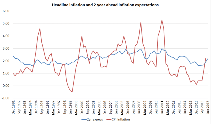
And here are two-year ahead inflation expectations in the two countries –  the Reserve Bank survey for New Zealand, and a survey measure for Norway that I’ve taken from their MPS.

infl expecs nz and norway

It looks a lot like a story in which

(a) the Reserve Bank of New Zealand badly misread (actual and prospective) inflation pressures,

(b) leading them to raise the OCR when they should have been holding or cutting it,

(c) which drove the exchange rate up (the juicy prospects of high and rising NZ yields)

(d) and drove tradables inflation more persistently negative than it should have been

(e) all while the Reserve Bank only very slowly realized its error, never explicitly acknowledged it, and only very reluctant reversed the rate hike cycle,

(f) all of which understandably dampened expectations of future inflation  quite a long way, while still suggesting to people looking at NZD assets that if there was ever yield to be found anywhere in the OECD the RB woiuld do its utmost to make sure that place was New Zealand.

As a result, the exchange rate (while quite variable) stays high, inflation stays low, and inflation expectations are at constant risk of falling further.  All because the Governor (and his advisers) got things wrong, and refuse to convincingly change tack.  As I noted yesterday –  and as several others have now pointed out –  the Governor was given an easy opportunity to affirm that he’d do whatever it takes to get inflation back to target.  For whatever reason, he simply passed up the opportunity. People, probably quite rationally, think he will in fact be very reluctant to do what is needed.

Frankly, if Norway can get inflation back to (and even beyond) target, so can we. It is mostly a matter of (a) reading inflation pressures roughly correctly, and (b) really wanting to.  The Governor –  and his advisers –  have failed on both counts.

It isn’t always true, but sadly over the last few years it wouldn’t be wildly wrong to suggest that New Zealand outcomes would have been better over the Wheeler years if the Governor and his senior team had simply taken a holiday, and done nothing at all to the OCR for four years.  We’d have avoided the badly misjudged tightening cycle, and although the OCR would still be a bit higher now –  it was 2.5 per cent when Wheeler took office –  inflation expectations would almost certainly be higher, and so real interest rates would, most likely, be no higher at all.  That would have had the incidental benefit of leaving New Zealand more headroom against the risk of hitting the near-zero lower bound at some point.

Perhaps spurred on by criticism in various quarters that the Governor doesn’t make himself available for searching interviews, he seems to have established a pattern of talking to the Herald after the release of the MPS.  The latest sets of questions and answers is here.  It is all pretty soft-soap stuff, with no follow-ups or challenges, allowing the Governor to get away without even answering the question (as here, where he –  in customary style – injects a variety of interesting but not very relevant detail, while not dealing with central issue.)

Rate cuts are supposed to bring the currency down, this didn’t. What’s happened?

Since the June statement we’ve seen the Bank of Japan ease, Bank of England ease, we’ve seen the Reserve Bank of Australia ease. If you combine that with quantitative easing that is larger than at any other time – and it was pretty large in 2009 – and with negative interest rates in countries that account for a quarter of world output, you’re just in a phenomenal situation.

There is no doubt the world is in a puzzling situation, but the Bank –  and the Governor –  are paid to do a competent job, not to end up sounding as if it is all too hard and is someone else’s fault.  I’m sure his markets staff had advised him that the probability of the exchange rate rising yesterday was quite high –  if they didn’t, they certainly weren’t doing their job.  The Governor simply made a choice –  he is a reluctant cutter, and that became clear once again yesterday.

It is a shame that the Herald, given the privileged access, didn’t ask a few more questions such as:

  • Why didn’t you cut by 50 basis points, given that your own forecasts suggests further OCR cuts will be needed, and that on those forecasts it is still another two years until inflation gets back to target?
  • Why are you so apparently indifferent to an unemployment rate that has now been above any NAIRU estimate for seven years?
  • What plans and preparations are you putting in place to cope with the possibility that New Zealand finds itself exhausting the limits of conventional monetary policy?
  • Inflation was below 2 per cent when you took office, has not been near 2 per cent since then, and on your own forecasts won’t be back to 2 per cent until a year after your term ends.  You and the Minister put the 2 per cent midpoint explicitly in the PTA.  How would you assess your performance in respect of the Bank’s primary responsibility, monetary policy?

Even Treasury has lost hope?

Pottering around the web, and working my way through my emails, on my return from holiday, I found a couple of things from The Treasury that caught my eye.

The first was the release of new risk-free rates and CPI inflation assumptions –  inputs that are required to be used in preparing the government financial statements.  Treasury releases these every few months.  They don’t get much attention –  presumably outside government agency accounting departments –  but out of curiosity I opened the latest one.  And as I dug into the history of these assumptions what I found was really quite startling.

When I was at the Reserve Bank we often used to bemoan the fact that Treasury’s published inflation forecasts never seemed to settle anywhere near the midpoint of the target range.  In fact, for a long time the Treasury approach seemed quite reasonable –  after all, in the first 15 years or so of inflation targeting, the average annual inflation outcomes had been around 0.5 percentage points higher than the (successively revised) target midpoints.  Reasonable people can debate why that happened, but it did.  It was unusual –  in most inflation-targeting countries, out-turns had averaged nearer the midpoint of the respective targets  – but as the midpoint wasn’t mentioned in the PTA it wasn’t a major accountability issue.  Don Brash took the midpoint quite seriously, while Alan Bollard wasn’t too bothered by it, but under both Governors inflation had averaged higher than the midpoint.

The Treasury’s continued assumption/forecast that inflation would settle back to around 2.5 per cent had become more frustrating, and questionable, in the years since the 2008/09 recession.  Actual inflation outcomes had begun to persistently undershoot the midpoint of the target, and the midpoint of the target range had been explicitly added to the Policy Targets Agreement in 2012.  The Bank, the Treasury, and the Minister of Finance all agreed that the focus of monetary policy should be the midpoint.

These are the assumptions Treasury published two year ago.

tsy inflation 1

At the time, it seemed like the ultimate in very slowly adapting, backward-looking, expectations.  By this time last year, they had markedly revised down their assumptions for the next few years (it wasn’t until 2030 that they assumed that inflation got back above even 1.75 per cent), but still assumed that in the very long-term inflation would eventually revert to 2.5 per cent.    If the Reserve Bank was, as it said, concerned to see long-term expectations centre on 2 per cent, there was still some (rather limited) cover in the Treasury assumptions for a moderately “hawkish” stance.  “Not even Treasury yet takes the 2 per cent midpoint that seriously” they might have argued.

But not any more.  Here are latest CPI inflation assumptions from The Treasury.

tsy inflation 2

They have had to dramatically extend the horizon they provide numbers for to encompass the eventual return to their long-run assumptions.  But it is 30 years from now before they assume inflation gets back even to 1.75 per cent, and almost 40 years to get back to 2 per cent.

I’m not sure quite what is going on here.  On the one hand, Treasury is the chief adviser to the Minister of Finance, who has signed a Policy Targets Agreement with the Governor of the Reserve Bank requiring him to focus on a 2 per cent midpoint.  And on the other hand, it is pretty much common ground that monetary policy works with a lag of perhaps a couple of years.  Anything beyond, say, 2018 is definitely an outcome monetary policy can control.  The PTA needs to be renegotiated next year, but not long ago the Secretary to the Treasury was quoted saying that he didn’t think Treasury would be suggesting major PTA changes. And yet Treasury thinks the best guess for inflation for the next 25 to 30 years is something well below the target they and the Minister are asking the Reserve Bank to achieve.

Of course, with yet another surprisingly weak CPI outcome just released, building on years of undershooting the target, Treasury might yet be right (between Reserve Bank policy (mis)judgements and the global deflationary environment).  But whether they are or not, what should disconcert the Governor –  and the Board, and those monitoring the Bank, such as Parliament’s Finance and Expenditure Committee –  is that not even Treasury believes him any longer.  They might say otherwise in their official advice – which we haven’t seen –  but these are the numbers they consciously chose to publish.

And, of course, it is not as if Treasury is alone in its doubts.  For all that the Reserve Bank likes to quote surveys of a handful of local bank economists, the market has its own approximate “price” for implied future inflation.  This chart takes the 10 year nominal government bond yield, and subtracts the yields on inflation-indexed bonds.  It isn’t a precise measure for various reasons, including the changing maturity dates on the various bonds, but the picture is pretty clear and persistent.

iibs july 16

As late as two years ago, the implied inflation expectations for the next 10 years were very close to 2 per cent.  Now they are around 0.65 per cent.

A persistently easier stance of monetary policy is much overdue.  Not even Treasury seems to take the 2 per cent midpoint very seriously now.

(UPDATE: Someone at Treasury pointed me to their relatively recent –  and useful – methodology note, which explains the relatively mechanical approach they currently take to updating the CPI inflation asumptions.  I don’t think it really changes my story, since the considered judgement has gone into the decision as to how best to represent a reasonable future path for inflation.  The Treasury has consciously chosen to put a considerable weight on indexed bond pricing, while the Reserve Bank excludes that information completely from the inflation expectations curve it regularly cites in its updates.)

On another matter, I have lauded the Treasury’s approach to the Official Information Act issues. They seem to take seriously their obligation under the Act, and although they receive a lot of requests (about 350 in the last year) have not sought to charge anyone.  They withhold material from time to time, but I’ve had enough confidence that they were playing by the rules that I have never sought to challenge those decisions, asking the Ombudsman for a review.  That changed this morning.

A while ago I asked for

Copies of any material prepared by The Treasury this year on regional economic performance, particularly in New Zealand. I am particularly interested in any analysis or advice –  whether supplied to the Minister or his office, or for use internally – on the economic performance of Auckland relative to the rest of the country (whether cyclically or structurally).

I wasn’t expecting much; perhaps some anodyne comments on some or other aspect of recent data, including perhaps the regional GDP data released in March.  But while I was away, I got this reply

oia akld 2

It is all very well and good for Treasury to be updating its analysis and advice.  But I asked for what they have already provided, not what they might (or might not) include in future “strategic documents”, such as the next Long-Term Fiscal Statement, which does not have to be published until July next year.

Given that they are not even willing to publish the titles or dates of any documents (whether internal or provided to the Minister) it does raise the question as to what Treasury has to hide.  Given the woeful underperformance of Auckland –  considered in per capita GDP terms – perhaps Treasury is finally awakening to the fact that something is wrong with the Think Big Auckland strategy?  That might be awkward for the government, but isn’t a good basis –  under the OIA –  for withholding material, especially in such a blanket way.

As a reminder, here is how badly Auckland has done

Over time

akld rel to nz gdp pc

And in comparison to the largest cities in other advanced countries

gdp pc cross EU city margins

I’m not sure what Treasury is hiding, or why. Perhaps the Secretary is reacting defensively to my criticisms of his recent speech?  But it was that speech that prompted my original request, to see what analysis lay behind his upbeat claims about Auckland.

As an organization Treasury is better than the standard being displayed here: we see the good side of Treasury again in the recent pro-active release of Budget background papers. It is time for them to reconsider, and to release any analysis or advice they have prepared on the Auckland’s economic performance.  I’ve asked the Ombudsman to review the decision.

Inflation expectations according to the RB

The Reserve Bank yesterday released some material explaining how it sees the role of inflation expectations, and measures of inflation expectations, in monetary policy.  There was a background Analytical Note on some of the technical modelling (putting a smooth curve through the selected expectations series), and I won’t say any more about it.  But then there was an issue of the Bulletin, headed “Inflation expectations and the conduct of monetary policy in New Zealand” and an accompanying substantive press release.

Recall that articles in the Bulletin carry the imprimatur of the Governor – they speak for the Bank, and aren’t just the views of the authors.  But this short one must do even more than most given that (a) it is directly about the conduct of monetary policy, the Bank’s primary function, and (b) that John McDermott, head of the Economics Department, is himself one of the co-authors.

Frankly, I found the article a little disconcerting.  I don’t often agree with the BNZ economics team these days but they came away from the article commenting “It all feels very mechanistic” and that captured part of my reaction as well.  I’m pretty sure that the Governor isn’t as mechanical in his approach as the article might imply, but it was a little disconcerting nonetheless.

There is also a slightly eerie detachment from the real world about the article.

The authors don’t take the opportunity to illustrate whether inflation expectations matter at all, or (more specifically) whether the measures of inflation expectations they use actually affect economic behaviour of firms or households.  There are many confident statements throughout the article about how inflation expectations “will” or “do” affect various things, and they are all true within a particular model, but the authors don’t show that they reflect real-life economic behavior.    For example, the notion that expectations of future inflation might affect wage-setting sounds plausible, but it is no more plausible than the notion that employers and employees mostly have in mind the most recent trend in past inflation.  If you pushed them on it, they might well respond “well, specialist economic forecasters can’t forecast inflation remotely well, so a rule of thumb based on past trends seems better for everyone in normal circumstances”.   The same logic could easily be applied to implicit calculations of real interest rates.  Perhaps further empirical work from the Bank will shed light on all this?

I made the point last week that in relatively stable economic times, survey measures of inflation expectations may be little more than a lagged report of something people already have to hand –  data on recent trends in inflation itself.  If so, all this work on measures of inflation expectations may be largely devoid of substance –  and, if anything, simply lead the Bank to reacting more slowly to deviations of inflation from the target than it should do.

Strangely, in the entire article there was also no discussion of the length of nominal contracts.  As I’ve pointed out previously, expectations of inflation 20 years hence are very unlikely to affect much economic behavior today, and are certainly unlikely to influence inflation outcomes today.  There are simply very few nominal contracts fixed for that length of time, or indeed for anything much beyond one to two years.  So if the Bank believes that some concept of inflation expectations is affecting demand and pricing now, surely it has to be expectations about the horizons over which people are entering nominal contracts?  Most wages and prices are reviewed at least annually, and not many interest rates are fixed for much longer than two years.  These details matter.

And yet in the Bank’s material they are glided over.  Here is some text from early in the article

 One important aspect is the influence that inflation expectations will have on wage- and price-setting behaviour at horizons relevant for forecasting inflation and setting monetary policy.

A further important aspect is if inflation expectations are well anchored. In the New Zealand context, ‘well anchored’ implies long-term inflation expectations that are a) relatively stable, and b) close to the mid-point  of the current policy target range. Well-anchored inflation expectations are an important component of inflation targeting. However, determining whether inflation expectations are well-anchored is not a clear-cut decision. In practice, inflation expectations are unlikely to be continually anchored to a fixed point.  Instead, the Bank must judge whether the level and any volatility of inflation expectations are influencing wage- and price-setting behaviour in a way that is consistent with medium-term price stability.

The first paragraph on its own is fine –  although note the “will”, where “might” or “can” might better capture the uncertainty.  It is focused, it appears, on the one to two ahead horizon, which both captures the sorts of horizons over which nominal contracts are made, and the horizon over which monetary policy influences things.

But then things start getting muddled.  They introduce this concept of inflation expectations being “well anchored” –  which got a lot of attention in the MPS last week – but here they aren’t talking about expectations over the horizons of price-setters, and monetary policymakers, but out into the far future –  “long-term expectations”.   Not content with drawing the distinction, they then seek to loop back later in the paragraph to the potential disruption to current wage and price-setting behavior.  But surely if there were problems affect the current situation they would show up in the measures of expectations over a one to two year horizon?

But how much content is there to this focus on long-term expectations, as anything of relevance to current monetary policy?  My answer: not a lot.    The Reserve Bank focuses on survey-based measures.  There are quite a few longer-term survey questions, but (a) the Bank simply ignores surveys of households in its modelling, (b) there are no longer-term surveys of businesses, which (c) means that the survey measures of inflation expectations they use are all those of the same small group of economists.

As I’ve noted previously, if forced to write down my expectation for inflation in 10 years time I might well write down 2 per cent.  Why?  Well, it would have nothing whatever to do with my confidence, or otherwise, in Graeme Wheeler or John McDermott. They are unlikely to be in the same job 10 years hence, and we will have had several PTA renewals and elections before then.  I’d write down 2 per cent –  with quite wide confidence bands, and relief that nothing depended on the answer –  just because the wider world has not yet confidently settled on a target any different than 2 per cent.  If instead I wrote down 3 per cent it still wouldn’t reflect badly on Wheeler and McDermott who have to operate with the current PTA –  it might simply be a prediction that eventually central banks and governments might decide that higher targets are safer, in the presence of the near-zero lower bound.  The Bank uses these long-term measures,(and the average of them, the “perceived target focus”) as follows:

 If this measure is close to the official inflation target mid-point, this suggests the public see the Bank’s projections as credible

But this seems hard to take seriously.  The Bank’s projections cover the next couple of years. The long-term measures are about periods five or ten years hence. And they don’t even get information from “the public” –  just from a handful of economists.  The current PTA won’t be in place five to ten years hence –  indeed, most of the Opposition political parties want to have changed the framework by then –  and most probably neither will the current monetary policy decision makers.

I like lots of data, and the more surveys the better tended to be my mantra.  But there is, essentially, nothing in the long-term survey-based measures that is of any relevance to day-to-day monetary policy setting or to assessments of how well, or otherwise, the Bank is doing its job.   Expectations that far ahead, even if they were real expectations of firms and households transacting, simply don’t affect inflation today, and nor –  except perhaps in extremis –  do they provide any useful information about whether current monetary policymakers are doing their job.  The Bank really shouldn’t be taking any comfort from those surveys –  perhaps especially given that the same economists have over-predicted inflation in recent years even more than the Reserve Bank itself did.

Market-based measures are a little different.  We have limited information of this sort in New Zealand, but the gap between indexed and conventional government bonds is an implicit (if imprecise) measure of expectations.  These implicit expectations are an average expectation for the next 10 years –  different, say, than expectations for inflation 10 years hence.  At present, the implicit expectation is about 1 per cent.  Such long-term implicit expectations don’t much affect day-to-day price or wage-setting now, but at least they involve people putting their own money at stake.   They tell us something about which longer-term risks markets are currently more worried about  –  and not just in New Zealand but in various other countries, at present that is about the risk of longer-term inflation persistently undershooting targets.

The Reserve Bank really should be much more concerned about the outlook over the next one to two years, the period its decisions today are affecting.  And here the article becomes much more sobering

There is also evidence that inflation expectations have become more adaptive recently. The public is placing greater weight on past inflation outcomes rather than the inflation target when forming expectations about inflation. A shift towards more adaptive inflation expectations can help explain some of the unusual weakness in non-tradable inflation seen in recent years. This means the cost of re-anchoring inflation expectations could be higher than in the past.

And

There has been a material decline in inflation expectations recently, and the time that inflation expectations take to reach the target mid-point has increased significantly. This is likely having a dampening impact on prices, and risks becoming embedded in future wage and price decisions.

Remember that these are the shorter-term expectations, over the one to two year horizon, they are now talking about.

We shouldn’t be surprised that expectations measures have become more adaptive (backward looking) recently.  Inflation has been persistently below target for several years now.  The Reserve Bank, and private forecasters, have persistently told us that inflation would soon be back to target, but it just hasn’t happened.  The Reserve Bank seems to slowly be waking up to the fact that these persistent forecast errors might matter.

But it is striking how the explain it

The time to target has increased recently (figure 4). Low actual inflation outturns have likely driven this decline. Low inflation outturns reflect a number of factors, including global spare capacity, an elevated exchange rate, a sharp drop in oil prices, and a significant fall in dairy prices

Notice the striking omission from the list.  There is no sense in that list that monetary policy errors, even if only with the benefit of hindsight, might have played any part in the repeated undershoot of the target, and the way it now appears to be affecting inflation expectations measures.  Inflation outcomes, over time, in countries where the central bank has full policy flexibility, are the result of monetary policy choices.  It is really as simple as that.  Sometimes central banks face pressures that are hard to recognize and take account of soon enough, but their claim to autonomy is that they are the technical experts. Over the last few years our technical experts have let us down.

As the BNZ points out in its commentary, headline inflation is likely to stay low over at least the next few quarters,  It seems highly likely that survey measures of short-term (1 to 2 year ahead) inflation expectations will fall further, even if there is no further decline in core inflation (however defined).   BNZ worries that that will lead to the Bank over-easing, driven (in effect) by the impact of oil prices on headline inflation.  My worry is different.  The Bank has been continually behind the game, probably for at least the last 2.5 years.  To deliver future inflation near 2 per cent in a reasonably timely manner, the OCR should still be materially lower than it is now.  If drops in inflation expectations surveys are finally what get them over the line, then I’m thankful for small mercies –  that they eventually get there –  but by hanging so much on survey-based inflation expectations measures, especially longer-term ones, without any evidence that these measures are playing an independent role in the inflation process, they simply postpone to the last possible date responding to the evidence of low core inflation that they already have.

Here  is the chart of the Bank’s six core inflation measures from the MPS last week

core inflation chart

And here is the median of those six series the Bank has identified.

core infation median

Add in the market-based measure of inflation expectations, also currently around 1 per cent (and not having risen since the Bank began cutting the OCR), and it is a pretty clear basis for material further reductions in the OCR.

If the Bank is really worried as they seem in the article about this whole de-anchoring risk, perhaps they should treat it as the basis for a more pro-active use of policy now, to minimize the risk of further inflation undershoots and having to face a higher cost of re-anchoring expectations than in the past.

The Bank rightly points out that

Finally, real, rather than nominal, interest rates are what influence economic behaviour. A shift in inflation expectations can change real interest rates and this can influence the overall stance of monetary policy. All else equal, if inflation expectations shift down, real interest rates are likely to be higher and the Bank would need to take account of the subsequently tighter stance of monetary policy.

And yet it seems oblivious to the facts that:

  • the real OCR has risen over the last couple of years, as inflation expectations –  or the trend in core inflation –  have fallen
  • the latest reduction in the Bank’s inflation forecasts is enough that the latest OCR cut is no cut in real interest rates at all.

And, of course, the Governor apparently expected the full OCR cut to be passed into lower retail rates. Unsurprisingly that hasn’t happened, so that real retail rates –  the rates firms and households face – are providing even less relief, and less support for a pick-up in inflation.