Emissions again

After my post the other day, I pricked up my ears when I heard on the radio this morning that new data on greenhouse gas emissions had been released, and at the same time heard various industry lobby groups calling for more government support (money or regulation”) for this, that or the other mitigating measure.  It is the costs of meeting the New Zealand government’s emissions reduction target that worries me.

(As it happens, I was emitting carbon at the time, driving home from the supermarket in a petrol-fuelled car.  But I had already walked up the (rather steep) hill carrying several kilos of groceries home earlier in the morning.)

Today’s release consists primarily of a 542 page report from the Ministry for the Environment (MfE).  But they also had a convenient eight page summary document.

In my post the other day, I included this chart of GDP per capita for OECD countries, in the most recent year for which there is data, 2014.

emissions per GDP

New Zealand was second only to Estonia in the level of emissions per unit of GDP.

I was interested to see that MfE made reference to this measure in their snapshot report.  Under the heading “New Zealand’s economy is growing faster than our emissions”, they included this chart.

MFE emissions

That looks quite good on first glance.

But how, I wondered, did New Zealand compare to other OECD countries?  You’ll notice that on that chart emissions per unit of GDP fell in 2015.  Since the OECD databases aren’t yet updated for 2015, and we don’t know what happened to other countries in 2015, the following charts use the data only for 1990 to 2014.    (MfE also report a rebasing of the entire series, slightly lowering New Zealand’s estimated emissions over the whole 25 year period.  But relative to the charts below this rebasing would worsen  New Zealand’s relative performance, since the revision downwards for 1990 was a little greater than the revision downwards for the more recent years.)

Here is emissions per unit of GDP for those OECD countries (all but one) for which there is 1990 data.

emissions 1990

In 1990 we were only sixth highest in the OECD.   And by 2014 we were second highest.  I guess the Ministry for the Environment (and their Minister) weren’t too keen on highlighting that point.

Here is the percentage changes in emissions per unit of GDP to 2014 (for a small number of countries only 2013 data is available).  MfE highlighted that New Zealand’s emissions fell by 35.9 per cent from 1990 to 2015.

change in emissions

Only 10 OECD countries had smaller reductions in emissions per unit of GDP than New Zealand over this period.  Of them, one might reasonably think that severe economic stresses (falls in GDP) in recent years might help explain Italy, Spain, Greece and Portugal.  And as Japan’s emissions rose a lot in 2011,  the year of the earthquake/tsunami, the enforced shift away from nuclear power at the time probably explains what is going on there.

Of the five countries that were to the right of New Zealand in 1990, four had among the largest percentage reductions among OECD countries.  Even Australia’s reduction was around the median.  It does leave New Zealand rather standing out.

(Perhaps some of this is covered in more depth the 542 page report.  I went through the Executive Summary and the table of contents and couldn’t see any likely references, but I may have missed them.)

In the snapshot document, straight after the emissions per unit of GDP chart, MfE does have a brief section on

Some of the challenges New Zealand faces when reducing emissions include:

  • a growing population
  • almost half our emissions are from agriculture where there are fewer economically viable options currently available to reduce emissions
  • an electricity sector that is already 80.8 per cent renewable (meaning that we have fewer ‘easy wins’ available to us compared to other countries who can more easily make significant emissions reductions  by switching to renewable sources of electricity).

I was very pleasantly surprised to find the “growing population” as the first item on the list (it isn’t particularly relevant to emissions per unit of GDP, but is very relevant to total emissions –  the variable in terms of which our government’s target is expressed).

It is hard to disagree with them  But it does leave one wondering what advice or research/analysis they have done, and provided to Ministers –  including when the target was being adopted –  about the implications of New Zealand’s immigration policy.  Our non-citizen immigration policy pushes up the population by almost 1 per cent per annum (against an, admittedly unrealistic, benchmark of zero inward migration of non-citizens).  Have they analysed the potential costs and benefits from lowering the non-citizen immigration target relative to other possible abatement (or compensation) mechanisms?  Perhaps there is credible modelling that suggests the overall abatement costs to New Zealanders would be lower through other plausible mechanisms.  But given that population increases appear first, and without further commentary, on their lists of “challenges” it would be good to know if they have done the work.

On reflection, I think I will lodge an Official Information Act request to find out.

(And it still leave me mystified why, when even the government’s own Ministry for the Environment is citing continuing population increases as a constraint on meeting the emissions reduction target, the Green Party continues to support large non-citizen migration inflows.  Migration might only transfer people from one country to another but given (a) the issues around agriculture, and (b) the reasonable notion that New Zealand members of Parliament should be looking out first for the interests of New Zealanders, it shouldn’t be a consideration they can simply ignore in thinking about New Zealand’s ability (and at what cost) to meet the emissions reduction target.)

Another Budget in an underwhelming economy

If people had wanted a centre-left government, one might suppose that they would have voted for the real thing.  Despite the additional redistribution announced in yesterday’s Budget, perhaps they still will.

Still, for all the headlines about money being put (back) in people’s pockets, it is worth keeping the overall numbers in perspective.  Core Crown tax revenue as a share of GDP was 27.8 per cent last year, is estimated at 27.7 per cent of GDP this year, is forecast at 27.5 per cent in 2017/18, and in the final forecast period it is predicted to be 27.7 per cent.  The government isn’t yet shrinking its pre-emptive claim on overall economic resources.  Expenditure as a share of GDP is forecast is gradually shrink, and if that was sustained –  which will be a challenge, including because of the reluctance to act soon on NZS –  it could open the way to future real reductions in the tax burden.

It is sad to reflect that much of the increased spending announced yesterday was simply a palliative for the failures of the government.   The cost of housing is, pure and simple, the fault of successive governments’ land-use regulation.  In a country with plenty of land, and the lowest real interest rates for decades, housing should be more affordable than ever.  That it isn’t, should be something governments are held accountable for (and although governments of both parties have had much the same flawed policies, the current government has now been in power for almost nine years).    And the lack of productivity  growth –  recall that we have had none at all for five years now –  is the biggest single thing that holds back the income growth of working people.    With a well-functioning housing market, and an economy with robust productivity growth, many of the pressures that led to increased spending yesterday would simply have been unnecessary.

As for tax, how many more decades will we have wait before a simple reform like inflation-indexing the income tax brackets is enacted?  Even the United States, with its enormously complex and distorted tax code, manages that one.

Perhaps more importantly, for all the rhetoric about encouraging enterprise –  and more subsidies for favoured uneconomic industries (film, rail and so on), there was no sign at all of action to lower what is probably the most costly and distortionary major item in our tax system –  the company tax rate.   It is curious to reflect that the previous Labour government cut the company tax rate more than the current government has.

I ran this chart a few weeks ago
company tax rates

New Zealand’s company tax rate is in the upper third of OECD member country rates.   For a country that talks a good game about welcoming foreign investment, and supposedly aspires to reverse the decades of productivity underperformance,  it simply isn’t good enough.    Politicians seem afraid of making the well-established economic point that taxes on businesses are typically borne substantially by wage-earners, not by owners of capital.   Less investment than otherwise means fewer high productivity and, thus, high wage jobs.  And if our company tax rates are high, it makes it harder for overseas investors to justify locating an operation here rather than in a lower tax country.   For a country with a pretty disadvantageous location to start with, it is the sort of additional burden we shouldn’t be putting on enterprise.    (I’ve focused this paragraph on foreign investors.  Taxes also discourage domestic-owned business investment, but for owners of those businesses, the maximum personal tax rate is ultimately the important consideration, rather than the company tax rate itself).

Anyone who listened to, or read, the Budget speech itself was clearly supposed to come away with a message about how well the New Zealand economy was doing.  There on the very first page was the Minister’s claim

“Our economy is 14 per cent larger than it was just five years ago”.

Yes, but the population is about 8 per cent larger.  That would leave an annual average growth in per capita terms of 1.1 per cent.  Better than nothing, to be sure, but not the sort of stuff most finance ministers would want to boast about.

And Treasury’s own numbers –  done at arms-length from the Minister –  don’t really back up the Minister’s story, whether cyclically or structurally.

Take the cyclical position first.  Here is Treasury’s estimate of the output gap (positive numbers suggest activity and demand are running a bit ahead of what is sustainable –  “potential GDP” – and negative numbers suggest there is still slack in the economy).

treasury output gaps

On these estimates, New Zealand will have had a negative output gap –  resources being underutilised –  for 10 consecutive years, including the whole of this government’s term to date, and the next year as well.    One can argue all one likes about what governments should or shouldn’t have done to lift potential productivity growth, but these estimates just take for granted what actually happened with structural policy and look at the cyclical position.  And there is really no excuse for putting the economy through such sustained period of resource underutilisation.  I can’t think of any time in modern New Zealand history, when the output gap would have been negative for so long.

Output gap estimates are pretty bloodless things, that don’t necessarily resonate with a wider audience.  They also can’t be observed directly.   But here are the unemployment rate numbers (actual and Treasury forecasts).

Tsy U

Last year, Treasury told us that they thought the

Treasury takes the view that the unemployment rate consistent with full employment (the nonaccelerating inflation rate of unemployment or NAIRU) has also fallen over time, so that…. it would be closer to 4.0%

I’m not sure precisely what number they had in mind, although in a chart included in that 2016 paper, the unemployment rate levelled out at around 4.1 per cent, so I included an indicative NAIRU line in my chart at 4.1 per cent.   But whatever the precise estimate, on official numbers and Treasury estimates we are looking at 10 years (or perhaps 11) with an unemployment rate higher than necessary to keep inflation in check.  The government has consistently presided over less than full employment.  That is simply poor economic management, and since we know that having a job is one of the best ways to secure better life outcomes, it is pretty poor management more generally.

Perhaps such unfortunate results might be excusable in a country that had no discretionary monetary policy leeway left (interest rates were already at or just below zero), or which was in fiscal crisis and had no borrowing capacity left.   Places like Portugal spring to mind.    But not New Zealand.   We have a floating exchange rate and our OCR has never got below 1.75 per cent (and even if that capacity had been exhausted, our public debt has been relatively modest).

It is also easy –  and right at one level – to blame the Reserve Bank.  They do short-term macroeconomic management.  But only as agent for the government and the Minister of Finance.  The Minister sets the targets and is ultimately responsible to citizens for their performance.  I do hope that Treasury, in offering advice to the Minister of Finance (whoever he or she may be after the election) on the appointment of a new Governor, and the design of the PTA, will take seriously the record of underperformance over the last decade.  This isn’t some trivial inside-the-Beltway governance issues.  These are real lives and opportunites that are unnecessarily blighted.

The government also likes to pretend that New Zealand’s economy is doing very well by international standards.   Thus, we are told by the Minister that

“we are at the moment growing faster than the United States, the UK, Australia, the EU, Japan and Canada”

One would certainly hope so.  Our population is growing materially faster than the population in any of those countries/regions.

But what about per capita growth?

I noticed various commentators yesterday suggesting that Treasury’s growth forecasts looked a bit optimistic.  I had some sympathy for that view, but here I’ll just take them at face value.   And I wondered how their forecasts for real per capita GDP growth compared to those the IMF has recently published for each advanced economy.

Treasury forecasts on a June year basis, and the IMF numbers are for calendar years. Over a forecast horizon of four years (Treasury’s horizon), it shouldn’t make much difference.    In the chart below I used Treasury’s forecasts of real per capita growth for the four years to June 2021, and compared them to the average of the IMF’s forecasts for the four years to December 2020 and the four years to December 2021.

IMF forecasts of real GDP pc

If the Treasury numbers are right for New Zealand, our growth in real GDP per capita would be just slightly below that of the median advanced country over the next four years.   I guess that isn’t that bad, but it isn’t much to boast about either.

After all, our per capita incomes are a long way down this list of countries.  On the IMF’s numbers

IMF real GDP pc.png

The aim –  supposedly –  for a very long time has been to catch up again with those top tier countries, almost of whom we were richer than not that long ago.    And catch-up or convergence certainly isn’t unknown, or unexpected, for other countries.   Here is how those Treasury forecasts for New Zealand’s real per capita GDP growth compare to the IMF’s for the 12 countries poorer than us.

IMF and the poor advanced countries

We only manage to beat two of those countries.    In fairness, of course, some of those poor advanced countries are recovering from savage recessions.    But even if one just focuses on the six former eastern-bloc countries, all but one is forecast to not only manage faster per capita growth over the next few years, but also to have achieved faster growth than New Zealand for the whole period from 2007 (just before the global recession) to 2021.  They are catching up. We aren’t.

(Compared with the richest 12 advanced countries, we are forecast to match the median per capita growth rate of those countries over the next four years, but the eastern Europeans are actually catching up.)

In wrapping up his Budget speech, the Minister of Finance claimed that

“we have a strong and growing economy built on a strong economic plan.  We must maintain our focus on growing the economy and sticking to the plan”

Earlier he had claimed that

Under the Government’s strong economic leadership, New Zealand is shaping globalisation to its advantage.  We’ve embraced increased trade, new technologies, innovation and investment.

All this in a country where exports as a share of GDP have been shrinking.  And productivity growth has been all-but-non-existent for years.

The bare-faced cheek of these assertions should be breath-taking.  Sadly, it seems like just another episode in a long succession in which the government simply makes stuff up.


Some Reserve Bank forecast surprises

The Reserve Bank of Australia had an interesting Bulletin article out recently, offering some insights on this chart

rba wage inflation surprises

The RBA’s wage inflation forecasts have been persistently too strong.  Mostly, they’ve forecast an acceleration of wage inflation, and yet actual wage inflation has continued to fall.

I was curious what a comparable New Zealand picture might look like.  The way wage inflation series are calculated differs from country to country.  In our Labour Cost Index, we have two measures of private sector wage inflation –  the headline one, and what is labelled the Analytical Unadjusted series.  The latter seems to be more comparable to the Australian measure in the RBA chart, while the headline LCI series attempts to adjust for changes in productivity (ie capturing only wage increases in excess of  what firms identify as productivity growth).    Here is what the two series look like.

LCI series

The fall in New Zealand wage inflation (between 2 and 2.5 percentage points since 2008) is pretty similar to the fall in Australian wage inflation in the first chart.

The Reserve Bank of New Zealand publishes forecasts of annual wage inflation for the LCI private sector wages and salaries series (the orange line).  I dug out their forecasts published in the June quarter of each year and this is the chart I came up with.

Reserve Bank wage forecasts

It isn’t quite the same picture as in Australia –  they had a genuine business investment boom which had taken wage inflation almost back up to pre-downturn levels –  but the broad picture is much the same.  Each year since 2010, the Reserve Bank has forecast an increase in this measure of wages (notionally at least productivity-corrected) and each year it hasn’t happened.   Perhaps this year’s forecast will prove more accurate?

What I found interesting is that the errors seem not to have been related to productivity surprises (I’ll come back to those), but simply to misreading overall inflation pressures.

Why do I say that?  Well, here is a chart showing the Bank’s furthest ahead forecasts for wage and price inflation.   They forecast three years ahead, so the forecasts associated with June 2017 (and published in that quarter) relate to inflation in the year to March 2020.   Inflation forecasts that far ahead aren’t thrown around by things like unexpected petrol prices changes or weather shocks to fruit and vegetable prices.  They are closely akin to forecasts of core inflation.

rb wages 2

The wage inflation and price inflation forecasts are so close together that it is quite clear that for some years the Bank has simply been forecasting this measure of wage inflation on the basis of an assumption of unchanged real unit labour costs.    Whatever happens to productivity growth, the Bank assumes that over the medium-term, this measure of wages (notionally productivity-adjusted) will rise at around the same rate as CPI inflation.     (That in itself is interesting as throughout this period the unemployment rate has been above Bank estimates of the NAIRU.  I can’t really show you a meaningful chart of their unemployment forecast surprises, because of the historical revisions to the HLFS).

The grey line shows actual inflation outcomes for the period that lines up with those medium-term forecasts.  I’ve used the Bank’s preferred sectoral core inflation measure, not because it is ideal but because (a) it is available, and (b) it is their own preference.   The last observation is sectoral core inflation for the year to March 2017, which is compared to forecasts for that period published in the June quarter of 2014.

What about the Bank’s productivity forecasts?  In many ways, their view on future medium-term productivity growth doesn’t greatly affect their view of inflation pressures (higher assumed productivity growth will tend to raise both potential and actual output).  So the productivity surprises chart is mostly about simply charting the declining performance of the New Zealand economy.

The Reserve Bank publishes forecasts for growth in a trend measure of productivity, and the trend estimates are revised as new data are added.   But here are the forecasts, lined up against their most recent estimates of trend productivity growth (again using the forecasts published in each June quarter).

rb productivity forecasts

The Bank has, again, consistently forecast a pick-up in productivity growth (the first observation on each line is the Bank’s then-current estimate of the most recent actual).  And for some of the earlier years (2009 to 2011) their latest estimates of actual trend productivity growth are higher than they thought at the time (it happens, as new revisions to GDP data come out).    But as their estimates of actual trend productivity growth rates have continued to fall  –  near zero for the last couple of years –  they’ve continued to forecast a rebound.  Indeed, the rebound in the latest set of forecasts –  out just a couple of weeks ago –  is as steep as any of those in recent years.   Perhaps in their shoes I’d also forecast a rebound –  it seems excessively pessimistic to assume zero productivity growth for ever –  but you do have to wonder what they think is about to change that means we’ll see the rebound beginning strongly in 2017/18 –  ie, right now.

This post is probably already excessively geeky for many readers.   But, as I do, the further I got into the data the more fascinated I got.  I could show you a similar chart for output gap estimates and forecasts, but it is hard to read and fairly predictable –  the Bank has fairly consistently over-estimated how much resource pressure would build up over successive forecast periods.  That shouldn’t be a surprise, given the weak inflation outcomes.

But they did get some things pretty much right over this period.    This chart shows two lines.  One –  the orange line –  is their latest (June 2017) estimate for the average output gap for the year ending March of each year.  And the others shows the contemporaneous forecasst done in each June quarter for the year ending March of that year.  Thus, the 2017 observation is the June 2017 MPS estimate of the average output gap for the year to March 2017.  When those estimates are done, the GDP numbers for March 2017 still aren’t known (but the first three quarters of the year are).  Potential output is always an estimate.

contemporaneous output gap forecasts

With one (important) exception, the contemporaneous estimates and the current ones are astonishingly close.   That isn’t so surprising for the last couple of years, and additional data could yet lead to material revisions in the estimates for the output gaps for 2015 and 2016.      But for the earlier years, despite all the revisions to the data, and all the new information, the Bank’s contemporaneous estimates for the then-current output gap hold up very well against today’s estimates.  These are annual averages, not estimates for the output gap in the March quarter itself, but….still…..I was pleasantly surprised.     The forecasts might be pretty hopeless (as I noted last week, and as is typically true of other forecasters too) but the contemporaneous estimates aren’t bad at all.   Simple monetary rules, such as the Taylor rule, encourage central banks to not put much emphasis on medium-term forecasts, but to adjust policy based on how they assess the current situation (output or unemployment gaps, and inflation gaps).

Of course, one observation in that chart does stand out.  In 2014, the Bank thought there was a reasonably materially positive output gap.  They now recognise that there wasn’t.  And that was the time when they made the policy mistake, of raising the OCR by 100 basis points (and talking up even further increases beyond that), only to have to reverse those increases quite quickly.    In any serious post-mortems of that episode (such as they suggest will be coming out shortly), they should be looking hard at how they got that output gap assessment so wrong –  much more wrong than in any of the other post-recession years illustrated on the chart.

Getting the read on the current situation right is hard enough, and medium-term forecasting is typically adding no value, whether in understanding the actual future, or in understanding how the Bank itself might react to its own mistakes.  The Bank would be better advised to focus its energies –  analysis, communications, and policy deliberations –  on what it knows at least something about, rather than on what it (and the rest of us) know little or nothing about.

Budgets, journalists, Switzerland and all that

Last week I wrote about the New Zealand Initiative’s study tour to Switzerland, where (so we were told) a large and high-powered group of CEOs and chairs were seeking to learn from Switzerland’s success.  As I noted, it seemed odd to look for inspiration from the one OECD country that has managed to achieve less productivity growth than New Zealand since 1970.   Even since 1990, Swiss productivity growth has underperformed New Zealand’s own poor record.

I learned about this tour in an article in the Herald, written by veteran journalist (and apparently “Head of Business at NZME”) Fran O’Sullivan.  It was presented as a straight news story, with no suggestion of any Herald involvement with the trip.

But in today’s Herald O’Sullivan devotes her column to Five elements of a good first Budget.  I’ll come back to the substance of the column in a moment.  But in the middle of the column was this

From a distance (in Switzerland travelling with the NZ Initiative to look at how New Zealand can once again become a “rich country”) it is easy to overlook that for some nations – like the Swiss – posting surpluses is mandatory.

So a leading journalist writes about a business lobby-group’s study tour to Switzerland without disclosing that she herself is participating in the tour?   One presumes NZME is paying for her to undertake the tour, but even so.   Wouldn’t it normally be elementary to let readers know of your involvement when you write up the story?  Isn’t it just possible that, in what looked like a straight news story, the fact that the author herself was participating in the tour might colour the angles put on trip, and reports of what it might reasonably hope to achieve?      It will be interesting to hear, in due course, what O’Sullivan makes of the Swiss experience, but how likely is that we will get a balanced and rigorous account when she has gone in with the New Zealand Initiative to do this trip, running their advance lines about “lessons to be learned” etc  (and presumably NZI organised everything, arranged the programme of meetings etc)?      Presumably at a distance, she still hadn’t noticed that while Switzerland is pretty rich, its productivity performance has been shocking, and it has slowly but steadily been dropping down the league tables.

That quote come from item 2 in O’Sullivan’s list of five elements she wants to see in Steven Joyce’s Budget tomorrow.     And yes, the Swiss have changed their constitutional rules to require budget surpluses, but as the chart in my post this morning showed, on net government debt (as a share of GDP), they are virtually identical to New Zealand, and both of us have a bit more debt than Australia.     Perhaps a formal binding surplus rule might make some sense –  although when you don’t have a formal constitution it would be hard – but the case doesn’t seem that compelling in a country that successfully maintains low public debt itself, and yet is exposed to very nasty (and very costly) natural disasters.

What are the five items O’Sullivan looks for?

First –  for G*d’s sake, be bold

Second: Post a surplus?

Third: Budget is the plan

Fourth:  Get economic growth up on a per capita income level

Fifth:  Strip out the smoke and mirrors

Item 1 is the sort of item that helps reinforce conservatives in their conservatism.  Being bold might sound good, but her lead proposal is simultaneously bold and daft.

A bold Budget would unveil a significant long-term investment in the country’s infrastructure. For example, a high-speed railway network to service Auckland from elsewhere in the Golden Triangle (Hamilton, Whangarei, Tauranga).

This generation’s Think Big, if I hadn’t already applied that label to our immigration policy.

The British government is envisaging spending 55 billion pounds –  stop and take in the number –  on their HS2 high speed rail route.   There is plenty of scepticism about that proposal –  and this is country with many many more people, at either end of the proposed routes, than anything we are ever (or even just in our lifetimes) likely to have in northern New Zealand.    If the costs in New Zealand were similar, that would be $100 billion (or around 40 per cent of current GDP).     We do lots of government capital spending badly in this country –  check out the Transmission Gully project –  but an HS2 equivalent would surely take the cake?

Urging boldness on politicians is fine, if there is a strong and well-grounded agreement on what they should be bold about.  Otherwise, it feels a lot like random action because “something must be done” and anything is something.

She poses a question mark around the second item –  post a surplus.  This seems to be because she is tantalised by the idea of using surpluses to fund “major infrastructure to support growth”.  As I noted this morning, government infrastructure may involve ongoing maintenance and depreciation costs, but straight government capital expenditure doesn’t show up in the operating balance.

What of the third item –  the plan.

Does the Government have a plan? New Zealand is at a choke point. There needs to be a credible five-year plan to capitalise on the major influx of immigrants. Ensure New Zealanders can be housed; clean up our waterways … the list goes on.

Joyce has had a lengthy eight-year period as English’s understudy.

That’s more than enough time to come up with a plan.

Hard to disagree that a credible plan would be nice.  After eight years it doesn’t seem likely that one will suddenly be granted us.   And, given the Minister’s penchant for interventions all over the place (universities, student visas, tech schemes etc), it isn’t likely that any such plan now would offer us a credible way forward.  He was, after all, the Minister primarily responsible for the exports target.    Over recent years, we’ve been moving away from that target rather than towards it.

The fourth item –  lifting per capita growth –  is really the same as the third.  It would be nice –  rather more than that actually.    But there isn’t much sign of doing differently things that have given us such weak per capita GDP and productivity growth for the last eight years.

On the fifth item –  smoke and mirrors –  one can only agree.

Joyce – like previous Finance Ministers – will be a fail on this score. He is unlikely to strip out the “smoke and mirrors” which politicians use to overstate government expenditure; particularly on social programmes such as housing.

He’s already been caught out by Labour’s Grant Robertson when it comes to massaging the numbers on an $11 billion investment in infrastructure.

Robertson labelled the $11b figure as “just playing with numbers”.

“When you peel it all back, what you have is National only promising to spend an extra $300 million a year from the promise made in the half-year Budget update.”

Finance Ministers really shouldn’t play this game and Treasury should issue tables which keep a running track of “re-announcements” of spending promises.

It is the sort of reason why Treasury forecasts and fiscal reporting are supposed to be done at arms-length from the Minister of Finance.  Each time ministers do this stuff it erodes, just a little further, what remaining confidence the public might have in our elected leaders.  A cheap (brief) win, and a long-term cost.

In the end, it is a pretty bleak column.  Plenty of stuff to wish for –  much of it quite sensible, provided you forget about the high speed train –  and little prospect of any of it happening.

But I still can’t help thinking that we deserve a lot better from a leading journalist in the country’s largest circulation newspaper than a story writing up and promoting the activities of a lobby group, only to find out 10 days later that the journalist in question is herself a participant in that same (apparently rather misguided) study tour.


New Zealand and Australian public finances

It is the time of year when both New Zealand and Australian governments hand down their budgets.  And these days it seems it is an opportunity for an annual comparison, in which New Zealanders feel rather virtuous about fiscal management here, and many Australians –  perhaps especially people on the right – take a turn breast-beating, regretting that they are not, in this regard, as well-governed as New Zealand.    Particularly florid Australian commentators are prone to invoking comparisons with Greece and other fiscal disasters.

I don’t find the story particularly persuasive.  Both countries had their fiscal blowouts late last decade –  in Australia, much of it was initially intended as active counter-cyclical use of fiscal policy under Kevin Rudd, while here it was discretionary choices to increase spending in the late years of the last boom.  In different ways, both the Australian Federal Treasury and the New Zealand Treasury were culpable to some extent; the former for enthusiastically embracing fiscal stimulus, when there was still plenty of monetary policy capacity left, and the latter for getting the forecasts wrong (they had told the government that big increases in spending would still leave the budget roughly balanced).    In some ways, New Zealand had a rougher time of it: the Canterbury earthquakes were a much bigger adverse hit to New Zealand government finances (a few years back) than anything in Australia.  Then again, Australia had to deal with much bigger volatility in –  and uncertainty about –  the terms of trade.

But what do the numbers show?  For history, I turned to the OECD’s database, where they have lots of fiscal series going back typically to around 1989.   While much of the attention focuses on the Australian federal government finances, it is important for New Zealanders to recognise that state governments are a large part of the overall government mix in Australia.  The OECD numbers are for “general government”, encompassing federal, state, and local government (or, specifically, national and local government in New Zealand).

It is also worth remembering that the size of government is smaller in Australia than it is in New Zealand.  That is so whether we look at revenue.

aus nz receipts

Or expenditure

aus nz disbursements

And government spending as a share of GDP has also been more stable in Australian than in New Zealand.  In fact, last time I checked government spending as a share of GDP had been more stable in Australia, over decades, than in almost any other OECD country.

What about fiscal balances, adjusted for the state of the respective economic cycles.  Here is the OECD’s measure.

aus nz deficits

A remarkably similar pattern really.    Our surpluses have averaged a little larger (and our deficits a little smaller) than those of Australia in the last 15 years, but there really isn’t much in it.  And do note that on this cyclically-adjusted measure, New Zealand is estimated to have been in slight deficit in 2016.

And what of debt?  This chart shows gross general government financial liabilities as a per cent of GDP.

aus nz gross debt

That is certainly a less favourable picture for Australia –  gross debt as a per cent of GDP higher than at any time for decades.   But here is the  –  superior for most purposes –  net debt picture.

aus nz net debt

Australian governments have had less debt than New Zealand through the whole period, and if the gap has closed just a little in the last decade, the change is pretty slight.    From a public debt perspective, Australia doesn’t seem to have much to worry about, with net financial assets (across all tiers of government) of around 10 per cent of GDP.

We won’t see the New Zealand government’s projections for the next few years until the Budget is released tomorrow.  But plenty of commentary focuses on the prospect of rising surpluses for years to come in New Zealand (as if this is somehow a good thing, when debt is already low), in contrast to the projections of deficits in the federal government books in Australia.

But one problem with those comparisons is that they aren’t apples for apples comparisons.  Thus, our government accounts for a long time have focused on the operating balance.  Relative to more traditional fiscal measures –  of the sort typically given prominence in Australia –  our deficit/surplus measure excludes capital expenditure but includes depreciation.  In a country with (a) a positive inflation rate, and (b) a rising population and rising living standards, government capital expenditure will typically exceed depreciation.   That isn’t a problem in itself, but it can make cross-country comparisons harder (the OECD historical numbers in the earlier charts are done consistently).

But here –  taken from the Australian official documents – are the federal government deficit measures done the Australian way (“underlying cash balance”) and something very like the New Zealand way (“net operating balance”).

Underlying cash balance Net operating balance
Per cent of GDP
2015/16      -2.4 -2.0
2016/17      -2.1 -2.2
2017/18      -1.6 -1.1
2018/19      -1.1 -0.6
2019/20      -0.1 0.4
2020/21       0.4 0.8

As they note in the Australian Budget documents

The net operating balance has been adopted for some time by the States and Territories (the States) and some key international counterparts as the principal focus for budget reporting. All the States report against the net operating balance as the primary fiscal aggregate. New Zealand and Canada also focus on similar measures.

One might feel slightly queasy about how the Australian government is raising additional revenue –  that populist bank tax seems to have more to do with utu (the Australian Bankers’ Association appointed a former Labor premier as their Executive Director, much to the annoyance of the Treasurer), and undermining Opposition calls for a Royal Commission into banking, as with principles of sound taxation –  but operating deficits of 1 per cent of GDP simply shouldn’t be a matter of concern, in a growing economy with low levels of public debt and relatively modest (by international standards) overall tax burdens.

But wait, as they say in the TV ads, there’s more.     The Australian Federal Treasury’s background Budget papers point out that

the Commonwealth provides grants to others (primarily the States) for capital purposes (that is, to acquire their own assets). This spending appears as a grant and detracts from the underlying cash balance and the net operating balance.

In 2017/18, the amounts involved are around 3.5 per cent of federal government spending.

Make that adjustment, and this is what the federal government’s operating balance would look like.

Underlying cash balance Net operating balance Adjusted net operating balance
                           Per cent of GDP
2015/16 -2.4 -2.0 -1.5
2016/17 -2.1 -2.2 -1.5
2017/18 -1.6 -1.1 -0.4
2018/19 -1.1 -0.6 0.0
2019/20 -0.1 0.4 0.8
2020/21 0.4 0.4 1.2

The adjustment doesn’t change anything about overall public sector finance in Australia.  The states will, presumably, in future have to account for the depreciation on these federally-funded capital projects.   But if one is looking just at the federal level, it seems like a reasonable adjustment.  On that adjusted measure, the federal operating budget in 2017/18 is projected to be very close to balance.  Of course, unlike the situation in New Zealand, Australian governments can’t count on getting all their budget measures through Parliament, but on the face of it, the endless angst in some quarters about Australian government finances does seem rather overdone.

The other thing that muddies the water in short-term comparisons is differences in rates of population growth.  A few years ago, Australia’s population was growing faster than New Zealand’s –  helped by all the New Zealanders going to Australia.  For now, New Zealand’s population is growing quite a lot faster than Australia’s –  not so many New Zealanders are going to Australia (and we have slightly larger controlled immigration programme per capita than Australia does).   In the short-term, unexpected population growth tends to boost demand more than supply, and specifically tends to flatter the government operating balance measures.   Consumption tax and income tax revenue both rise quite quickly, and operating expenditure tends to lag behind.   Even government capital expenditure tends to lag –  notice the recent announcement of more infrastructure spending here, much of which is to catch up with the unexpectedly fast population growth –  and you don’t have to maintain, and can’t depreciate (depreciation is in the operating balance), an asset that doesn’t yet exist.  That spending pressure will come.

This post isn’t intended as a criticism of New Zealand governments (there are plenty of other grounds for that), or as praise for Australian governments.  It is mostly just about making the point that, when considering overall fiscal management, if one stands back a little the similarities are much more apparent than the differences.  And that is to the credit of a succession of governments on both sides of the Tasman.

Standing back, here is how the OECD countries ranked last year on net general government liabilities as a per cent of GDP.

NZ and Aus net debt

O to be Norway one might reasonably conclude.  But given the choice, I’d take New Zealand or Australia’s cumulative (and current) fiscal management over those of almost every other country in the OECD.  And unlike many of these countries, neither country has huge off-balance sheet (ie not in these numbers) public pension liabilities either.

Productivity (or lack of it) is another story of course.


Densification: not much happening in the US

The government’s housing plans –  and, I presume, the Labour Party’s –  seem to make great play of squashing more people, and more dwellings, into much the same space.    And it is certainly true that many of the older state houses seemed to sit on ridiculously large sections, (especially incongruous when the sections themselves are in otherwise very valuable locations).

Increased density appeals to planners, and perhaps even to people in certain demographics.  I wouldn’t want to stand in the way of people who prefer to live more densely. But that is rarely enough for the enthusiasts.  Instead, much rhetoric is aimed at so-called NIMBYs, people who might be reluctant to see a change in the character of their neighbourhood pushed through by bureaucratic fiat.  There was an article in today’s Herald along exactly those lines.

As I’ve noted here previously, over history, as cities have been richer they have tended to become less dense, not more so.     Space seems to be a normal good.

And so I was interested to stumble this afternoon on an article in the New York Times, with a couple of interesting graphics on changes in density in 51 metropolitan areas (population in excess of one million) in the United States over the last few years.  2010 to 2016 is quite a short period, but –  given history –  the results shouldn’t really be surprising.  I can’t cut and paste the graphics (click through to have a look), but what they highlight is two things:

  • only a fairly small number (10) of US cities saw increased density during that period, and the increases in density were typically small (although Seattle stands out with by far the largest increases)
  • the remaining 41 cities (metropolitan areas) saw a shift towards less density over that period, and many of those falls were quite substantial.

In  the chart, there is also some suggestion that areas with faster population growth were more likely to have become less dense over this period (Dallas, Raleigh, Houston, Nashville, San Antonio and Austin stand out).

It looks a lot like a case where cities spread –  people want more space –  when land use restrictions don’t stop them doing so.   It isn’t obvious why New Zealanders’ preferences would be that much different from those of Americans.   And it is hardly as if New Zealand is short of land either.

Land use restrictions may actually stop cities’ populations growing much –  at least in the US where there are many big cities to chose from (some with tight restrictions, others without).  That would seem to be the message in the latest Hsieh and Moretti paper , which highlights how little population growth there has been in the US cities with some of the tightest land use restrictions (San Francisco, San Jose, and New York) relative to other cities.   By doing so, those restrictions may have imposed substantial real economic costs (lost opportunities to take advantage of high productivity opportunities in those cities).   The case that such restrictions might have had a large real cost here is less strong –  numbers in Auckland has grown very fast even with the restrictions.  Perhaps here the cost is “simply” the shockingly high cost of purchasing house+land, a systematic redistribution against the young, the poor and the credit constrained.

UPDATE: For anyone interested, John Cochrane has a nice post explaining clearly, and in more detail, what is going on the the Hsieh and Moretti paper, and commenting on a couple of other papers in a similar vein.

More people means more emissions. So how about fewer people?

I’ve never had that much interest in climate change.  Perhaps it comes from living in Wellington.   If average local temperatures were a couple of degrees warmer here most people would be quite happy.    And as successive earthquakes seem to have the South Island pushing under the North Island, raising the land levels around here –  you can see the dry land that just wasn’t there before 1855 –  it is a bit hard to get too bothered about rising local sea levels.  Perhaps it is a deep moral failing, a failure of imagination, or just an aversion to substitute religions.  Whatever the reason, I just haven’t had much interest.

But a story I saw yesterday reminded me of a post I’d been meaning to write for a few weeks.  According to Newshub,

In documents released under the Official Information Act, a briefing to Judith Collins on her first day as Energy Minister says the cost to the economy of buying international carbon units to offset our own emissions will be $14.2 billion over 10 years.

In the documents, officials say “this represents a significant transfer of wealth overseas”, and also warn “an over-reliance on overseas purchasing at the expense of domestic reductions could also leave New Zealand exposed in the face of increasing global carbon prices beyond 2030”.

The cost amounts to $1.4 billion annually.

The Green Party says the bill will only get bigger if no action is taken by the Government to reverse climate pollution, and it continues to open new coal mines and irrigation schemes.

Roughly speaking, this suggests we’ll be giving roughly 0.5 per cent of GDP each year to people in other countries, just because of an (inevitably) somewhat arbitrary emissions target.   Many useful economic reforms might struggle to generate a gain of 0.5 per cent of GDP.  These are large amounts of money, inevitably raised at a still larger real economic cost.   And this is on top of the economic costs of domestic abatement policies.

Of course, whatever New Zealand does in this area makes no difference to the global climate.  We are simply too small.  Most people recognise that we sign up to arbitrary targets through some (not unrelated) mix of wanting to be a good international citizen and (perhaps as importantly) being seen as a good international citizen.  If we were regarded as not “doing our bit” there might be a risk of trade restrictions or other adverse repercussions a little way further down the track.

If one is an emissions and climate change zealot, the New Zealand data looks like it could give you grounds for zealotry.   For example, here are total emissions (in CO2 equivalent terms) per unit of GDP (using PPP exchange rates), from the OECD databases.  Why per unit of GDP?  Well, generating GDP takes various inputs, and emissions of greenhouse gases are often one of them.

emissions per GDP

But emissions levels are, at least in part, about geography and industry structure.  They aren’t just a matter of “wasteful” choices.   Thus, steps to reduce emissions might also reduce the number of units of GDP.   (In emissions per capita terms, we don’t rank as far to the right –  being quite a lot poorer than (say) Australia, Canada and the United States).

The self-imposed emissions reductions targets are, I gather, expressed in terms of total emissions.    Again using OECD data, here is how the various countries have done on that score since 1990 (the typical reference date –  and a somewhat convenient one for the former eastern bloc countries, which often had very inefficient heavy industries).

emissions total

But one of the things that marks us out relative to most of the OECD (and certainly relative to those former eastern bloc countries on the left of the chart) is the rapid growth in population we’ve experienced since then.   In fact, New Zealand’s population has increased by more than 40 per cent since 1990.  By contrast, all the world’s high income countries’ population has increased by only around 15 per cent over the same period.   And all else equal, more people tend to mean more emissions  (although no doubt it isn’t a simple one-to-one relationship).

In per capita terms, our greenhouse gas emissions have actually fallen since 1990.  Of course, so have those of most OECD countries.  Here are the data.

emissions pc

Our average per capita emissions have been falling less rapidly than many other OECD countries, but not that much less rapidly than the OECD total.   And all this in a country where I gather –  from listening to the occasional Warwick McKibbin presentation –  that the marginal cost of abatement is higher than almost anywhere in the world.  Why?  Well, all those animals for a start.  And the fact that we already generate a huge proportion of our energy from renewable sources (all that hydro).  And, of course, distance doesn’t help –  aircraft engines use a lot of fuel, and neither a return to sailing ships nor the prospect of, say, solar-powered planes at present seem an adequate substitute.

So you have to wonder how our government proposes to meet its self-imposed targets, without doing so at great cost to the living standards of New Zealanders.

In fact, it seems the government is wondering just that.   A few weeks ago,

The Minister for Climate Change Issues, Hon Paula Bennett, and the Minister of Finance, Hon Steven Joyce, today announced a new inquiry for the Productivity Commission into the opportunities and challenges of a transition to a lower net emissions economy for New Zealand.

The terms of reference are here.    As they note

New Zealand has recently formalised its first Nationally Determined Contribution under the Paris Agreement to reduce its emissions by 30 percent below 2005 levels by 2030. The Paris Agreement envisages all countries taking progressively ambitious emissions reduction targets beyond 2030. Countries are invited to formulate and communicate long-term low emission development strategies before 2020. The Government has previously notified a target for a 50 per cent reduction in New Zealand greenhouse gas emissions from 1990 levels by 2050.

Which does look a little challenging (in 2014 total emissions were about 3 per cent lower than 2005 levels –  30 per cent looks a long way away).  That isn’t too surprising.  After all,

  • the marginal cost of abatement is particularly high in New Zealand
  • the rate of population growth in New Zealand has been rapid, and
  • the rate of population growth is projected, on current policies, to continue to be quite rapid.

In fact, SNZ project another 25 per cent population growth by 2050 –  quite a slowing from here, but still materially faster than the populations of most other advanced economies will be growing.  And, recall, more people typically means, all else equal, more emissions.    The 2050 target, in particular, requires quite staggering reductions in per capita emissions –  actual emissions now are a quarter higher than in 1990 –  if anything like these population increases actually occur.

The terms of reference for the Productivity Commission inquiry go on at  length about all manner of things, including noting (but only in passing) that there may be “future demographic change”.

Recall that New Zealanders are actually doing their bit to lower total emissions. Our total fertility rate has been below replacement for forty years.  And (net) New Zealanders have been leaving New Zealand each and every year since 1962/63.    If New Zealanders’ personal choices had been left to determine the population –  the natural way you might think –  total emissions in New Zealand would almost certainly be far lower than they are now.   Check out the low population growth countries’ experiences in the second chart above.

Instead, we’ve had the second largest (per capita) non-citizen immigration programme anywhere in the OECD (behind only Israel),  a programme that (as it happens) got underway just about the time (1990) people benchmark these emissions reductions targets to.

As I’ve noted repeatedly, neither the government (or its predecessors), nor the officials, nor the business and think tank enthusiaists for large scale immigration, can offer any compelling evidence for the economic benefits to New Zealanders (income and productivity) from this modern large scale immigration.    And when they do make the case for large scale immigration, they hardly ever mention things like emissions reductions targets (I’m pretty sure, for example, there was no reference to this issue in the New Zealand Initiative’s big immigration advocacy paper earlier in the year).    Even if, to go further than I think the evidence warrants, one concluded that the large scale immigration had made no difference at all to productivity levels here (and remember that, for whatever reason, we have actually been falling slowly further behind other countries over this period despite all the immigration), once one takes account of the substantial abatement costs the country is likely to face if it takes the emissions reduction target seriously, the balance would quite readily turn negative.    We would need to have managed quite a bit of spillover productivity growth from our not-overly-skilled immigration programme (and recall that no gains have actually been demonstrated)  just to offset the economic costs, direct and indirect, of meeting emissions reduction targets which are made more onerous by the rapid increase in population numbers.

So I do hope that as the Productivity Commission starts to think about how to conduct their emissions inquiry, they will be thinking seriously about the role that changes in immigration policy could play in costlessly (or perhaps even with a net benefit) allowing New Zealand to meet the emissions reductions targets it has set for itself.  On various assumptions about the economic costs or benefits of immigration, how would the marginal costs of abatement compare as between lowering the immigration (residence approvals) target, and other policy mechanisms that are more often advocated in this area?   It would be interesting to see the modelling work on these issues.  If the Productivity Commission doesn’t take seriously the reduced immigration option, it would be hard not to conclude that ideology was simply trumping analysis.

Of course, reduced population growth through lower immigration isn’t a solution for every country.  On the one hand, people who don’t come here, stay somewhere else.  And on the other, most advanced countries have much smaller immigration programmes than we do.  But if it isn’t a solution for every country,  it looks like a pretty sensible and serious option for New Zealand specifically.  And the interests of New Zealanders should be the primary focus of our policymakers, and their advisers.

It is also brings to mind the old question as to why the Green Party in particular seems to remain so committed to large scale immigration, and the “big New Zealand” mentality, that has driven politicians here (of all stripes) for more than a century.  Not only would a lower population be consistent with New Zealanders’ personal revealed preferences (birth rates and emigration) and actions, it would assist in meeting emissions targets.  Perhaps to idealistic Greens that seems like “cheating” –  it doesn’t reduce global emissions, although it may put the people in places where the costs of reducing global emissions is cheaper than it is here.

But even if so, then what about one of those other pressing Green concerns –  water quality and the pressure on the environment from the increased intensity of agriculture?  There is increasing recognition across the political spectrum that there is a major issue here, and it is an area where New Zealand actions and choices make all the difference.   Cut back the immigration target and, over time, we would see lower real interest rates and a lower real exchange rate.   Against that backdrop it becomes much easier to envisage governments being able to impose much stiffer, and more expensive, standards on farmers (the offset being the lower exchange rate).      With a less rapidly-growing population, the (probable) reduced growth in agricultural output would be less of a concern (economically) and real progress could be induced on the environmental fronts (emissions and water pollution etc), without dramatically eroding the competitiveness of New Zealand’s largest tradables sector.

(Much the same sort of argument can be advanced in respect of congestion and pollution costs associated with growth in tourism: less rapid immigration would result in a lower real exchange rate, making it more feasible (economically and politically) to levy the sorts of charges that might effectively deal with pressures that the sheer number of tourists is imposing in some parts of the country –  in a country where the natural environment is really what draws people.)

It is past time for a serious debate on just what economic gains (if any) New Zealanders as a whole are getting from continued large scale non-citizen immigration.  The emissions reduction target might be seen by some as an arbitrary, even unnecessary, intervention, and is no doubt seen by others as a moral imperative, perhaps the very least we could do. I don’t have a dog in that fight.  But the targets are a fact –  a domestic political reality, and probably an international constraint we have to live with even if we didn’t really want to.  Against that background, and given the high marginal cost of abating greenhouse gas emissions in New Zealand, and with little or no evidence of other systematic gains to New Zealanders from the unusually large scale immigration programme we run, we really should be taking more account of our immigration policy in thinking about how best (most cheaply) to reduce effectively greenhouse gas emissions, as well as the water pollution that increasingly worries many New Zealanders.

New immigration data from Statistics New Zealand

One can, and does, grizzle about the range and quality of New Zealand’s official statistics.  But last Friday saw a small but welcome step forward.

On various occasions I’ve written about the limitations of the permanent and long-term migration data.  Those data are based on the self-reported intentions of travellers at the time they cross the New Zealand border, and people can and do change their minds.  That is as true of New Zealand citizens coming and going as it is non-citizens.

Prompted by the Reserve Bank, in late 2014 Statistics New Zealand published a paper containing some experimental work they had done trying to estimate the actual permanent and long-term movements (ie allowing for the ability of travellers to change their minds and their plans).    That work confirmed that, while the broad patterns were similar, on occasions the differences between the published PLT figures and the results using the follow-up methods could be large.   In the 2002/03 episode, the published PLT numbers materially understated the extent of the actual permanent and long-term inflow.

Graph, Comparison between net recorded PLT and alternative net PLT migration methods, year ended June 2000 to 2013.

At the time Statistics New Zealand published that paper they indicated that they had no budgetary resources to update this work regularly, or make it part of the suite of official statistics.  And so when I wrote a post a few weeks ago on which migration data to use for which purposes I noted

Use the overall PLT numbers by all means for some short-term purposes (is the rate of population growth right now accelerating, slowing or holding roughly steady), but it is crucial to recognise the limitations of those data.

Perhaps the new Minister of Statistics could look at securing some budgetary funding for Statistics New Zealand, to enable them to move those alternative methods into becoming a regularly-published and updated part of the suite of official statistics?

Little did I know that Statistics New Zealand  had already found some funding.  Because last Friday, they put out a press release (together with some background material) indicating that they have settled on a particular methodology, providing updated estimates using that methodology, and indicating that they will shortly commence regular updates of this data.    That is good news.    Anyone who wants details on the new “12/16 month rule”…

Any traveller with at least one border movement in a given month has their resident status reviewed. The combined information on the assumed resident status at the start of the month, the direction of the last movement in the month, and the 16-month follow-up travel history, determines the traveller’s final migrant status.

…can consult the SNZ background paper.   As SNZ notes, the 12/16 method is also the one used by the Australian Bureau of Statistics.

There are several things to remember:

  • anyone interested in analysing immigration policy (ie how many non-citizens we let on and on what bases) should still focus on the MBIE approvals data.  It is hard data from the agency actually granting the approvals,  Sadly, the user-friendly data is only available once a year, with quite a lag, but the patterns of approvals don’t change that much from one year to the next.  But perhaps the SNZ lead might prompt MBIE to improve the accessibility of their own monthly data?
  • the new SNZ series will be only be available with a lag of at least 18 months  (in this release they’ve provided data to March 2015 –  16 months after that was July last year).  It is going to be useful for making sense of history, rather than for high-frequency timely analysis.  That is true of plenty of official data (and isn’t a criticism).
  • in terms of getting a sense of how many people need a roof over their head, neither the PLT data nor these new 12/16 data quite fit the bill.   Short-term visitors need accommodation just as much as long-term settlers do  (although they might want different types of accommodation).  (Volatile) total migration data remains of some use for that purpose.
  • sometimes intentions matters, not just outcomes.    If, for example, lots of young New Zealanders head off to Australia, intending to never come back, only to find a few months later that Australia is hit by a very severe labour market downturn, many of those same New Zealanders might come back again quite quickly.  Analysts will want to know both that they went intending to stay away, and that having got to Australia they were caught by a change of circumstances and didn’t in fact stay away (for more than the 12 months PLT threshold).   In other words, when there are material differences between the aggregate PLT numbers and the aggregate new 12/16 numbers, both are likely to offer some useful insights as to quite what is going on.  That is particularly so as regards the movements of New Zealand citizens.
  • But what do the new statistics actually show?  Here is SNZ’s summary chart

    plt and 12 16 rule

    The orange line is the previously-published PLT numbers and the purple line is the new 12/16 series.

    As highlighted previous, there is a very big difference between the two series in the 2002/03 period.    But the pictures are also quite different around the 2008/09 recession.  On the PLT numbers there was a big increase in net inflows in 2009, which then more than reversed over the following couple of years.  But on the new 12/16 numbers, net permanent and long-term actual inflows had been pretty steady for several years (from 2004 to 2009), and then fell away very sharply over 2010 and 2011.   Fortunately, in the last couple of years of the new data, the two lines are very similar but –  since plans can change –  there is no guarantee that will be consistently the case in the future.   This is a genuine improvement in the provision of data on an ongoing basis, not just something to deal with a one-off anomaly in 2008/09.

    Over this particular period, the net inflow over the full 14 years was a bit higher than the PLT numbers had suggested.  That wasn’t a surprise –  we already knew it from the experimental numbers a couple of years ago.  But it is also important to stresss that the changes of plans can run either way; there is no a priori reason to suppose that one method will typically understate or overstate the actual net inflows.

    Before showing you a few of my own charts, I wanted to reproduce one more of the SNZ charts

    As I’ve noted repeatedly in recent months, the PLT data showing the visa type people held when they arrived in the country isn’t very enlightening for anything much at at all.  The immigration system is set up in a way that encourages many people to change their visa type once they are here (eg most people who get residence visas do so while already living here, many people move from a student visa to a work visa while here).  That is why I urge people to focus on the MBIE approvals data if you want to understand immigration policy decisions etc.  And this chart from the new SNZ paper really just reinforces the point.

    Graph, Migrant arrivals and departures by selected border entry visa type, by 12/16-month rule and PLT measures, December 2001 to 2014 years.

    There are huge differences in all four categories between what the PLT numbers showed, and the new 12/16 method numbers.  For most purposes, both are less useful than the MBIE approvals data.

    One area where the new 12/16 data are a real boon is around the permanent and long-term movements of New Zealanders.  New Zealanders don’t need permission to come or go, so (at least between censuses) we are totally reliant on the migration statistics for an accurate sense of the net flow of New Zealanders.   The PLT data have recorded a huge net outflow of New Zealanders (and actual outflows every year since 1962/63).   My hunch has been that the PLT numbers overstated the outflow (and that, net, some people who went intending to stay away long-term came back quite quickly).     The new 12/16 data are available by citizenship (although not yet in a terribly user-friendly format).  Here is the chart showing the two methods, on a March year basis.

    outflow of nZers plt and 12 16

    In no individual year have the differences been very large.  That is reassuring for short-term analysis, but over the full 14 years for which SNZ have provided the new data, those moderate annual differences add up.    On the PLT data, a net 341000 New Zealand citizens left between January 2001 and March 2015.  On the 12/16 rule data, 300000 left.   Both are large numbers, but the actual outflow of New Zealanders appears to have been around 10 per cent less than the PLT numbers had suggested.   That is a big part of the reason why the overall net inflows to New Zealand have been a bit larger than the PLT numbers had suggested.

    For other citizenships, SNZ has only provided the data at an aggregated level.  But here is the chart showing the net inflows, on the 12/16 method, for various groups of citizenships for the full period the new data are available for.

    plt by citizen 12 16 method

    As I’ve stressed previously, if you want to look at immigration policy choices, look at the MBIE approvals data. But these data, even if not very timely, do have the advantage of capturing not just those who got approval and came, but also those who left again.

    Australian citizens don’t need advance approval to come.  The numbers who do come are pretty small, but out of interest here is the net flow of Australian citizens, both on a PLT basis and on the new 12/16 method.

    aus citizens

    The divergence between the two series over 2008/09 looks like a possible example of a case where both lines tell us something interesting.  Although the net inflow of Australian citizens had been falling, it was still positive (on the PLT numbers).  But in 2008/09, the New Zealand economy went into an unexpected recession and the unemployment rate rose quite sharply.  Presumably, a large proportion than usual of the Australians who came here changed their minds fairly quickly and went home again.

    And one last chart from the new data.   One of the stories around the divergence between the PLT numbers and the other methods in 2002/03 had been that much of it reflected Chinese (in particular) language students, who ended up staying for longer than they had indicated on their initial arrival card.     This chart, of net arrivals from north-east Asian countries (the SNZ grouping) seems consistent with that.

    north asia PLT.png

    There was a huge surge, on this better method, in 2002/03, significantly balanced out by net outflows of north-east Asian citizens several years later.   Actual residence approvals granted to people from these countries were much steadier throughout the period (for Chinese, the number of residence approvals fluctuated between 4800 and 8000 per annum).

    To be boringly repetitive, if you want to talk about immigration policy, it really is best to look at the MBIE approvals data.  If only they would make them readily available, in user-friendly form, every month it would be lot easier to encourage people to consistently do so.

    Well done to Statistics New Zealand for publishing this new data.   It will help shed more light on the activities of New Zealanders (and the typically small flow of Australians), and enable us to see better –  albeit with a bit of a lag –  how the overall movement of people in and out of New Zealand has been contributing to the population change.  For some purposes, the PLT data themselves remain useful, but it is always important to remember that they are only an estimate of what is really going on.

    New Zealanders’ population choices

    The other day Statistics New Zealand released the annual data on New Zealand birth rates.  There was some coverage of the continuing drop in teen birth rates (it was what SNZ highlighted), but the chart that caught my eye was this one.

    TFR NZ SNZ

    I’d been under the impression that New Zealand’s birth rate was at, or just above, replacement (roughly 2.1 births per woman, thus allowing for early deaths).   And, according to this summary indicator, it was for a few years not that long ago.    But that is no longer the case.

    But what most interested me –  and it isn’t data I’ve ever paid that much attention to –  was the longer-term averages.  It turns out that for forty years now, New Zealand’s birth rate has averaged below the replacement rate (1977 was the last year the TFR had been persistently above 2.1).

    This is how we compare with other OECD countries.

    tfr OECD

    New Zealand is still towards the right of the chart.  But note that only two OECD countries now have total fertility rates in excess of replacement –  one (Mexico) just barely.  The country that really stands out is Israel, with a TFR of 3.1.   New Zealand hasn’t been that high for 45 years.

    (Diverting off topic for a moment) the gap between Israeli and New Zealand birth rates has been there for a long time.

    TFR is and NZ

    At one stage, the high Israeli birth rates were all about the Arab population, but apparently the Jewish and Arab-Israeli birth rates are now equal (Arab rates falling and Jewish rates –  especially among the orthodox –  rising.   (Israel also has a lot of immigration –  together they explain the very rapid population growth I highlighted yesterday – but that is a topic for another day.)

    For forty years, New Zealanders in aggregate have been choosing to have slightly fewer children than would, all else equal, maintain the population.  But over that same period, there has also been a very large outflow of New Zealanders moving permanently to other countries (especially Australia).   In the forty years to March 2017, the estimated net outflow (as recorded in the PLT data, with all their limitations) of New Zealand citizens was 845,520.

    plt since 78

    There is a lot of cyclical volatility, but in not a single year in that period has the flow of New Zealand citizens been back to New Zealand.  In fact, the last time the data record a net inflow of New Zealand citizens was the year I was born.  By international standards, it is a staggering loss of our own people (more than 20 per cent of the average total population over that period).  I can’t think of any other functioning democracy in the last 100 years that has had such a large percentage outflow of its own people.

    These New Zealanders have presumably been making their own choices and assessments about the opportunites for themselves and their (actual or potential) children.  Not only have they chosen to have not quite enough children to maintain the population, but many of them (us) have also decided that the opportunities abroad are simply better than those here.  Not all of them will necessarily have made the right choice, but average we should presume that it was a rational choice.  These aren’t simply patterns based on a single year’s whim, a single year’s bad news.

    So New Zealanders’ own choices, about their own lives, would have set in train a process that would see a gradually falling population in New Zealand.   Immigration policy, regarding the access of non-citizens, dramatically reversed that, and has in fact given us one of the fastest population growth rates in the advanced world over recent decades.  You have to wonder what insights, and wisdom, our politicians and officials are blessed with that leads them to run a policy operating directly to undermine the effect of the choices of individual New Zealanders.  Perhaps they might share that wisdom, that research, with us one day, before they further worsen the prospects of the New Zealanders who chose to stay living here.

    Declining populations do create some issues, as fast-growing ones do.  Over history –  even modern New Zealand’s short history –  many places have grown, and then faded away.  On the whole, it might be better to live in place that had so many opportunities, it could maintain strong productivity growth and offer those gains to more people (at least if transport and housing messes could be sorted out).  But one doesn’t fix the fundamental economic challenges –  that lead people individually to take actions that mean New Zealand’s population wouldm’t be growing –  just by going to a bunch of poorer countries and telling their people they can come here, in large numbers, if they want.   But, as I say, perhaps our political leaders could share with us their apparently superior insights and research results, which back their decisions to place their own preferences above the considered choices of New Zealand individuals.


    Two improbable outposts

    Monday afternoon’s post was prompted by news of the New Zealand Initiative’s business leaders’ study tour to Switzerland.  Switzerland is materially better off than New Zealand, but as I illustrated over the last 45 years it is the only advanced country to have managed lower productivity growth than New Zealand.

    The news of the Swiss trip reminded me of a story I’d seen a while ago, and had meant to write about, about another business study tour (involving at least some of the same people), to another laggard OECD economy, Israel.  Even the Prime Minister’s chief science adviser went along.  That trip was promoted by the Trans-Tasman Business Circle.   You can read about it here in a story written by a journalist who was invited along on the trip (or there is an Israeli perspective here).

    Most people have heard of Israel’s high-tech sector, which was the focus of this New Zealand mission.   Somehow, there is an impression around in many circles –  I recall first encountering it at The Treasury –  that Israel is an economic success story.   Here are a couple of snippets from the Herald story

    The mission will visit leading Israeli companies and institutions.

    This includes Start-Up Nation Central, which connects companies and countries to the people and technologies in Israel that can solve their most pressing challenges.

    Start-Up Nation Central was inspired by the 2009 best-selling book Start-Up Nation: The Story of Israel’s Economic Miracle, which explores the roots of Israeli innovation. The book continues to generate enormous demand from around the world for access to the people and technologies of Israel’s innovation ecosystem.

    and

    Why Israel? Moutter reckons while there are obvious differences, New Zealand shares many things with Israel. “We are both relatively young countries, with a culture and heritage of innovation, as well as some similarities in terms of market scale – from our perspective Israel is a more comparable point of reference for New Zealand than larger innovation ecosystems such as Silicon Valley or Shanghai. How has this small nation, less than 70 years old, with less natural resources than New Zealand, in one of the most volatile regions in the world, become widely known as the Start-Up Nation? I believe it will be invaluable for New Zealand to have greater insight into this journey.”

    Sounds good. It is a shame about the hard data.

    In the modern sense, both Israel and New Zealand are young countries.   And they are both somewhat improbable outposts.    New Zealand was the last major land mass settled by humans, and was so remote that until the 19th century all economic activity had to occur within these islands. Foreign trade wasn’t possible, or economic.   Technology changed that and for a time –  after the land was taken more or less by force and the indigenous culture displaced – an economy grew here that supported some of the highest material living standards in the world, for a pretty small number of people.  We remain physically remote, and that still seems to matter rather a lot.

    As for Israel, the land itself has been close to where major civilisations grew and prospered long ago. Ancient Israel itself was, for a time, a rich kingdom.   But in the 19th century there wasn’t much high value economic activity there.   Through some mix of ideology, religious convictions, the horrors of Nazi Germany, and other later push and pull factors, a mass relocation of Jewish people has occurred.  In a land taken more or less by force, in the process something fairly remarkable has been built –  a relatively rich democratic society, in a region with little or no tradition of democracy and where modern prosperity has otherwise been achieved only in some of the countries with oil windfalls.  Physical distance isn’t such an issue for Israel.  It is surrounded by countries with hundreds of millions of people.    Unfortunately for Israel, many of the regimes of those countries (or popular movements those regimes suppress) would like nothing more than the destruction of the state of Israel.   Sixteen countries, apparently, ban altogether people on Israeli passports, and most of those countries are quite physically close.  So, mostly, economic and social ties aren’t close.  In an age when distance seems to matter rather a lot.

    As I did with my Swiss post the other day, I’m going to start my comparisons from around 1970 where possible.  For us, it was just before Britain entered the EU and before the dislocations of the collapse in the terms of trade in the 1970s.  For Israel, it was 20 years after independence, when the country had achieved reasonable size (the population then was very similar to New Zealand’s, at just under three million), and it was few years after Israel’s greatest military success.

    Unfortunately, not all of the Israeli data goes back that far (especially in the OECD databases).  As I showed the other day, in 1970 New Zealand’s labour productivity (real GDP per hour worked) was just a touch below that of the median OECD country (in company with the larger European countries).     I couldn’t find good comparable data for Israel for 1970 (whether for GDP per hour worked or real GDP per capita) but it looks as though Israel had outcomes pretty similar to New Zealand, perhaps just a little below.   On the earliest OECD data I could find, Israel’s real GDP per capita was around 5 per cent less than New Zealand’s in 1977, and the few years leading up to 1977 were bad ones for New Zealand.

    The OECD has real GDP per hour worked data for Israel from 1981.   This chart shows how New Zealand and Israel have done relative to the median of the OECD countries for which there was 1970 data (ie mostly those who were really prosperous and democratic back then).

    israel real gdp phw

    Israel’s outcomes, at least on this score, look a lot like New Zealand’s.      New Zealand’s have been pretty poor.    The median real GDP per hour worked for that group of country (mostly the rich countries in 1970) is 42 per cent above New Zealand’s 2015 number.

    From 1981 to 2015. the median OECD country achieved growth in real GDP per hour worked of 72.7 per cent.  That was around the sort of increase the US and the UK experienced.    But here are bottom five growth rate countries over that period

    Growth (%) in real GDP phw 1981-2015 Level in 2015 (USD, converted at 2010 PPPs)
    New Zealand 56.5 37.5
    Netherlands 54.0 61.5
    Israel 52.3 35.1
    Italy 39.9 47.7
    Switzerland  37.5 56.5

    New Zealand wasn’t the worst, and neither was Israel.    But both New Zealand and Israel started out materially less productive than the Netherlands, Italy and Switzerland, and we still languish well down the field.   For all its problems, even Italy manages much higher average labour productivity than either Israel or New Zealand.

    The picture doesn’t change much if, say, one starts the comparison from 1990 (after many of our reforms had been done).    We and Israel still managed labour productivity growth in the bottom quartile of OECD countries.

    What about foreign trade?  It is now better realised that New Zealand’s export (and import) share of GDP has been going nowhere for quite some time.  By contrast, world trade as a share of GDP has been trending strongly upwards over the decades.  And while exports aren’t some panacea –  governments can always subsidise them and get more of them –  in successful highly productive economies, an increasing share of foreign trade (again imports as well as exports) is usually part of the mix.  In fact, I’m not aware of any country that has successfully closed the economic gaps to the leading economies, without export success playing a material part.

    So here is a chart of exports as a share of GDP, for Israel, New Zealand and for the OECD as a whole, since 1971.

    israel exports

    Being small countries, you would expect both Israel and New Zealand to do more foreign trade than larger countries.  As the chart shows, both countries used to export a lot more (share of GDP) than did the OECD countries as a whole (in which, of course, the US is a large share).   That is no longer so, despite (in Israel’s case) that vaunted high-tech sector.  Firms in both countries  –  remote in their own ways –  find it more difficult to be a part of global value chains than, say, contiguous European countries (in something approaching a single market) do.  But whatever the full set of reasons, it isn’t an encouraging picture.

    One factor, so I hypothesise, might be relatively rapid population growth.  As I noted, in 1970 Israel and New Zealand had similar populations.  Now Israel is getting on for double New Zealand’s population.

    Using the United Nations population data, here is a chart of population growth since 1990.

    israel popn

    High-income countries in total have had population growth or around 16.5 per cent over that period.  New Zealand’s population has increased much faster than that (at around 35 per cent), and Israel’s population has increased much more rapidly still, up by around 79 per cent.

    If there are lots of great new opportunities in a country, population growth needn’t impede productivity growth. In some cases, it might even help it.  Australia, for example, has also had rapid population growth, but seems to have had enough new opportunities (all those minerals) that its overall productivity and per capita income performance hasn’t been bad (although far from top tier).

    What of New Zealand and Israel?  There don’t seem to have been many new high value opportunities in New Zealand –  in fact, in the article on the mission to Israel one thing that struck me was how many of the listed participants were from domestic-focused firms.   For Israel, one might have supposed it was different (all those high tech firms).

    I’ve argued for some years, that rapid population growth can crowd out other business activities.  The basic logic is pretty simple.   New people –  whether born or migrant –  need new capital stock.  A modern economy requires rather a lot of (physical) capital per person (houses, roads, offices, schools, shops, machines etc) and real resources that have to be devoted to meeting the needs and demand of the new people, can’t be used for other purposes.  It is often those “other purposes” that seem to get squeezed out –  in particular, investment in the tradables sector.  People have to live somewhere, so that demand is often more inelastic (insensitive to changes in price) than is potential investment in support of new business opportunities

    It needn’t happen.  A country with a fast-growing population could also have a higher than usual savings rate.   That would free up resources to meet both potential needs.  Over time, one might expect that.  And a country with a fast-growing population might also meet some of its needs by running a current account deficit (drawing on resources from the rest of the world).  But while you import a car, you can’t import non-tradables.  So current account deficits can help, but they don’t relieve all the pressure.

    What do the summary data suggest? The IMF publishes data on the savings and investment rates for each advanced country back to 1980.  Over that period, both Israel (in particular) and New Zealand have had materially faster population growth than the median advanced country.   All else equal, that should have been reflected in a higher share of GDP having to be devoted to investment in both New Zealand and Israel than in the typical advanced economy.

    But here are the data

    israel I 
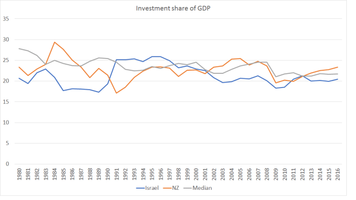
There is plenty of cyclical variation, but in both countries on average over this period, the share of investment spending in GDP has been a bit lower than advanced country median.     Given all the resources that needed to go to meeting the needs of the fast-growing populations (simply maintaining capital per person), there will have been materially less “left over” for capital deepening, or for new businesses and ideas.  It isn’t a mechanical rationing process, but just a response to the opportunities and the relative prices.

    And here is the same comparison for national savings rates.

    Israel savings

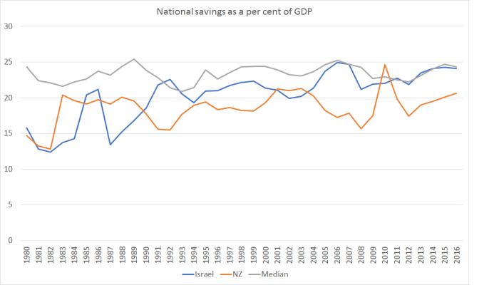
    Again, despite the much more rapid population growth rates, both countries have had lower national savings rates than the median advanced country over this period.

    I don’t know enough detail about Israel to be highly confident about quite what mix of factors is important in explaining its sustained underperformance (relative to other advanced, and key emerging, economies).  But the underperformance is pretty clear.  Israel’s productivity, like New Zealand’s, languishes towards the lower end of the OECD (and certainly of those OECD countries that were market economies a few decades ago).  Perhaps there are some specifics in the Israeli high-tech sector from which visitors can learn.   But if, to some extent, Israel’s sheer survival (so far) might be loosely termed a “miracle”, it isn’t clear that its economic performance is anything of the sort.   Very rapid population growth looks like it might have been part of the story (whatever it has done in terms of boosting the number of future IDF soldiers).