A speech from the new Secretary to the Treasury

Early last month the new Secretary to the Treasury, Caralee McLiesh, gave her first on-the-record speech in the new role.    The Treasury was a bit slow to release the text, but it is now available here.     It wasn’t a long speech, but it was to a fairly geeky audience –  the Government Economics Network’s annual conference – most of whom wouldn’t yet have seen much of the new Secretary.  With not much else to go on yet, it seems reasonable to look at what she said for any indications of whether/how The Treasury is changing for the better under new leadership.

I’ve been uneasy about the new Secretary for several reasons:

  • first, because she isn’t a New Zealander and has no background or experience in New Zealand issues or people, no domestic networks, and (most probably) little in-depth understanding of the idiosyncrasies of New Zealand, including its longrunning economic underperformance, and
  • second, because she has no work experience in a national economic agency/ministry, dealing with national economic issues (financial crises, monetary policy, exchange rates, immigration, trade, or even very much exposure to fiscal or tax policies), and yet is now the principal economic adviser to our government (itself light on economic expertise or experience).

On the other hand, she has some fairly good academic qualifications and may well be quite capable as the sort of generic public service manager favoured by the current State Services Commissioner.   Whether she can bring to the table more than that –  and New Zealand economic policy, and The Treasury (weakened over the previous 10-15 years) needs more than that –  remains to be seen.

The topic for the GEN Conference was “the role of regional and urban development in lifting living standards”. It is fair to say that my response to the title was along the lines of “there is no such role”, but it was still going to be interesting to see how the Secretary chose to respond to the topic, and perhaps to nest any specific insights on regional/urban issues in an understanding of the much bigger national productivity failings.

Of course, there are distinct limits to what serving senior public servants can and can’t say.  One could argue they mostly shouldn’t be doing public speeches –  their job is primarily to advise ministers, not to spin government PR (or to explicitly challenge it).  But successive Secretarys have chosen to give speeches.

Here is McLiesh running spin for the government

The theme of today’s conference is how well-performing regions and cities can contribute to our wellbeing and raise living standards for all. Those of you familiar with the Government’s Economic Plan will know that the Government has identified ‘strong and revitalised regions’ as one of the key economic shifts it is working towards. And work on government’s urban growth agenda and resource management reforms is well underway.  So this is a significant and substantial topic for New Zealand.

She, if no one else, I guess has to take the government seriously, at least in public, when it says it has a (30 year) Economic Plan.

But in the rest of speech there really wasn’t much substance.  There was the best part of two pages recounting the Living Standards Framework – in text that is fine, but which offers nothing fresh.  At least it ended with a reminder that economic performance matters

The Treasury always has an important role to play in advising government on how to lift economic productivity and performance, and this remains a core part of our LSF thinking. A roomful of economists doesn’t need to be told, but I will say it anyway, that high living standards depend on strong economic performance, and that markets that operate well – and I emphasise, “well” – can, and do, powerfully lift living standards. They enable people to participate in labour markets, earn higher incomes, and apply those incomes towards whatever wellbeing means for them. The story of development is basically a story about investment in the institutions and mechanisms that enable people to flourish in deep and complex markets – that is, to grow.

But really that should be “motherhood and apple pie” stuff to an audience of economists.  And sadly, there hasn’t been much sign of rigorous or systematic advice on lifting productivity and economic performance in recent years.

She moves on to highlight that there are regional differences across New Zealand.  There is quite a nice graphic drawing on OECD data, but she conveniently omits to highlight that (according to the graphic) not one New Zealand region has incomes in the top third of OECD country regions.  Productivity is a huge failing in New Zealand, and that failing just isn’t region-specific.  If anything, the gap between highest and lowest income regions within New Zealand is unusually small by OECD standards.

And thus when the speech says

Regions may contribute more to national economic development if we can tap unrealised economic potential.  A policy approach that emphasises strengthening regional comparative advantage means we may be able to lift national economic performance rather than just shifting economic activity around the country.

it has the feel of someone who is stuck with the Provincial Growth Fund, rather than someone who has thought hard about New Zealand (and what does that counteractual –  “just shifting economic activity around the country” – mean: who has been doing that?)

The next paragraph isn’t any better

There can be a role for government in helping communities to identify strengths and opportunities or strengthening local governance. There can be a role in working across agencies, local authorities, local people, and the private sector to coordinate and facilitate private investment. Or in investing in infrastructure where this directly unlocks economic opportunities. And can we do more to coordinate between social interventions and economic opportunities to ensure these approaches are complementary?

I guess bureaucrats would like to think so, but is there any evidence of governments being able to specifically catalyse regional economic development in a useful and sustainable long-term way, other than by getting the overall national policy settings right, and understanding the national failings?

There are some strange observations

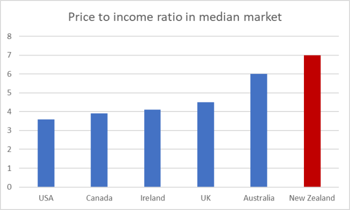
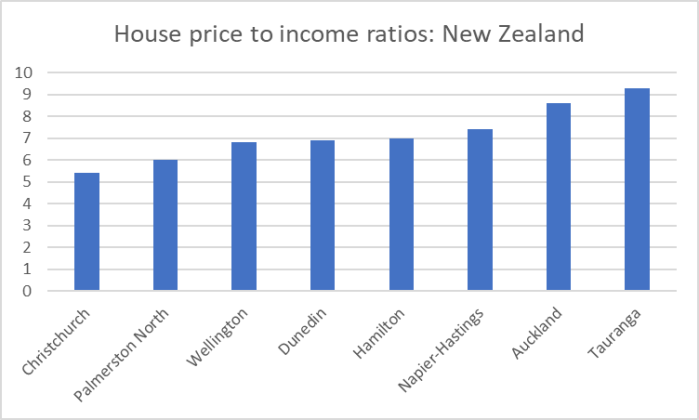
More than a third of New Zealanders live in Auckland, a city with house prices vastly in excess of the marginal cost of supply.

But house prices aren’t “vastly in excess of the marginal cost of supply”, rather national and local regulatory policies have driven the marginal cost of supply –  especially the land component –  well above where it would otherwise be, so that there is no huge gain on offer to people developing new houses.

It was encouraging to see the Secretary allude to Auckland’s longer-term economic underperformance

Between 2000 and 2018 our national population grew by 26 percent, but all of the above-average population growth has been from the Bay of Plenty northwards, with Auckland the fastest growing at 37 percent. Contrast that with population growth of 7 percent in Southland, 5 percent in Gisborne and 4 percent on the West Coast.

This population growth is despite the fact that Auckland’s GDP has grown at only 82 percent of the national average in the 2000 to 2018 period.  In contrast, GDP growth was well above the national average in every region of the South Island, while Bay of Plenty and Northland had above-average growth too.

But there isn’t much sign that she or her department have thought hard about a compelling narrative that explains what has gone on.  Instead we get this rather confused paragraph

Other cities and regions may have plenty of available land.  However, they will need to improve their quality of business and quality of life attributes too if they are to significantly ease pressure in Auckland. And worldwide we see that agglomeration into major cities continues despite congestion and high property prices. Clearly, both employers and employees often see better long-term prospects in these major cities, despite efforts to develop other regions.

In both New Zealand and Australia, we certainly see more people in major cities, but little evidence of the vaunted productivity gains from continued concentration of people in these places.  Natural-resource-based economies tend to be like that, but there is no hint of that as an issue in the Secretary’s story.

And from there the speech heads downhill again

Central government has created more capability through urban growth functions in HUD, and appointing senior regional officials to lead engagement and coordinate government across regions.

Of course lifting wellbeing across the regions is not just up to central government, which is why we see more partnering with local government and regional economic development agencies over recent years to develop action plans.

Lots of busy bureaucrats, lots of meetings for ministers and officials to open and attend, but not much sign of any understanding of quite why the overall economy has performed so poorly over so long (when almost all the tools of economic policy are controlled at the central government level).

Of the final page, I could commend her sense of humour, including this old Tom Scott cartoon (if memory serves from back in the late 80s or early 90s)

scott

But then it is straight back to the self-congratulatory stuff

In closing, I want to acknowledge that being an economist working in public policy is incredibly rewarding, but it can also be challenging. We are a community of professionals that sometimes has to be loud to be heard. When people want the comfort of policy that is simple, certain, and swift, we can find ourselves the sometimes uncomfortable voice of technical rigour, nuance, and realism.

I guess that it might have been music to the ears of some in the audience.  But we don’t –  or shouldn’t –  hire senior public servants to tell people (including ministers) what they want to hear.   Sadly, there has been little consistent sign of The Treasury offering that “uncomfortable voice of technical rigour, nuance, and realism” in recent years, especially on these big-picture economic performance failings.  They seem to have been content to just go along, to maintain access (perhaps) by not addressing the hard issues, and playing distraction with the fluffy stuff while the economic prospects – the living standards prospects –  of New Zealanders, regional or urban, drifted further behind.

It is still early days for McLiesh.   I have heard a few positive things about the new Secretary, including hints of renewed emphasis on rigour. I hope this particular speech isn’t a foretaste of the standard we can expect, but that the Treasury really does begin asking the hard questions, doing robust analysis, not simply going along with conventional political verities (eg regional development).   Perhaps there isn’t a political demand for such advice and analysis –  are there any politicians who really care? – but shouldn’t stop The Treasury being a voice, perhaps at times crying in the wilderness, pointing to how things might be such better here.  As a hint, regional economic development agencies aren’t likely to be any substantive part of the answer.


Free up housing by shaking up politics

No one much thinks that either National or Labour-led governments are going to do anything serious about freeing up land use and markedly lowering house prices (and price to income ratios).  A few individual figures in the two parties occasionally talk a good game, but their governments don’t do what is necessary to make a difference.  All indications are that the parties don’t really care that much –  sure, they seem to need to be seen to show a bit of concern from time to time, but affordable housing across the board seems to be rapidly becoming one of those things our political leaders would prefer people just forgot about.  Get used to living in expensive dog-boxes on tiny sections or in apartments – all this in a country with abundant land.

Graeme Farr isn’t willing to give up.  He’s launched House Club, a club and political party in one, designed to make affordable housing an option again.  As the website puts it, the gist is

House Club does not want to change any of the crazy number of rules and regulations that affect housing – it just wants it’s own areas where none of them apply! 

House Club creates its own “Club Zone” which is outside the RMA, the Building Act and council zoning rules and can have from 5 to 5,000+ houses.

Here is the fuller text on what a “Club Zone” is

A Club Zone is land where building does not have to comply to the RMA, the Building Act or local council zoning. This is nothing new – until the 1980’s the Government and its departments like the Post Office, Railways and Ministry of Works did not need to get building or resource consents for anything they built on Government owned land. In some US states such as Texas there are no town planning rules. This was the same in NZ until 1953 and the Town and Country Planning Act – yet houses build before this act are equally sought after and valued than later ones – often more so!

House Club decides solely on where a Club Zone is created. The land can be bought outright by House Club or it can award a group or private landowner a Club Zone – or a combination of both. Each Club Zone site can determine it’s own rules or convenants to suit its purpose, but these will need to be approved by House Club if it is not a partner or owner.

He is planning to have House Club become a registered political party –  for which he needs at least 500 members ($3 for three years’ membership) –  contesting the party vote in this year’s election, aiming for 5 per cent of the vote and the balance of power, with a single issue they’d be looking for action on.  In concrete terms,

House Club will provide houses for UNDER $300K for a 100m2 three bedroom home on a proper section within 30 minutes drive of the centre of Auckland, Wellington or Christchurch and even closer in other cities and towns. 

“Proper section”?  Well, according to a Westpac survey last year, 90 per cent of New Zealanders wanted a backyard.

More generally on the House Club model

House Club will contain many Sub-Clubs who want to do their own thing – House Club55 for low cost seniors housing, Tiny House Club for tiny house villages, Eco House Club and Co-House Club for eco and co-housing schemes and Private House Club for selected private developers who want to provide low cost housing to Club members.

When Graeme first told me about this idea a few months ago it was in the context of retirement villages

1. I am thinking large scale ones – say 200 to 2000+ houses like they build in the US. They are super cheap there and most are freehold titles. I can send examples – you would not believe the prices they can achieve using economies of scale.

2. Dairy factories and timber mills are usually permitted activities in rural zones – so a retirement village will most likely have less affects

3. Retirement villages are better than standard fringe housing as they do not need things like jobs, schools, public transport, wastewater pipes, roads etc. Residents don’t travel at peak hours – they have their own buses. The councils do not need to provide infrastructure like a standard subdivision.

As I noted then, I couldn’t imagine wanting to live in such as village, but it is clear that lots of people do.   And as the website indicates, the model generalises.

The vision is for developments of the fringes of existing cities/towns

Developing in the fringes is not only cheaper but faster too. If the density is kept low then the rural road network and infrastructure that exists around most cities will be sufficient for the intial Club Zones. Modern self contained wastewater plants can service the zones if trunk connections are not nearby. Freshwater and stormwater can be collected and disposed of on site if need be and most rural roads have a power network.  

What about building standards?

Do Club Zone houses need to comply to standards likeNZS3604?

A:   No they don’t as long as they are only one or two storeys.  There would be well over a million houses in NZ which come nowhere near to complying to standards like NZS3604 and you can legally buy these – often at very high prices.  Builders will probably choose to use some standards as a selling feature but making them not compulsory means you can import a house kit or building materials from overseas without restriction. This undermines the local materials supply cartels which contribute to the very high building prices here.

Members buying in the Club Zones will accept they are paying much less for having a house which may contain building products which are not made in New Zealand or made to a ‘special’ NZ standard. Most imported mass production materials are made to adequate or better standards than we have here anyway. At present aluminium windows made for Australia do not comply to the NZ standard NZS4211:2008 – yet they have hurricanes in Australia. The current review of the Building Act will tighten importing rules – supported of course by the NZ Building Industry Federation who represent the local suppliers and manufacturers.

In other words, seeking to address both the land and construction cost elements of our current house prices.

And in a telling, if more lighthearted, response to a suggestion that there might be 2500 rules governing building a house

It is hard to add up all the rules and regulations the Government and councils have made for building a house but it is true pleasure craft in New Zealand need to comply to no construction rules at all, irrespective of size. You can build a 100 metre boat and unless you are using it for commercial use or charters there are no regulations at all – you can build it out of blotting paper if you like. This applies to around one million boats in New Zealand and could of course equally apply to basic housing.

There is even a, perhaps tongue in cheek, plastic bag policy.

It isn’t a first-best policy option by any means, but no significant party shows any sign of championing first-best reforms, and local governments are mostly the enemy of anything that would seriously liberalise market (the mayor of Wellington – sworn enemy of the backyard – is quoted on the front page of this morning’s paper talking of “if you can squeeze twice as many houses on the same land why wouldn’t you?” –  this about privately owned land, for privately-owned houses).

But as a second-best option I think it has a lot going for it and, at very least, deserves some serious scrutiny and debate.  I don’t need a house myself, but I’ve just signed up (to support a good cause rather than deciding, at this stage, to vote for them).  I don’t suppose it is likely House Club will get to 5 per cent –  it is hard – but it would be much better, for members and for wider New Zealand, if they did manage to do so, or even if they just managed to put some more pressure on National and Labour to take seriously the plight of our younger generation – including my kids 10 years or less hence –  for whom the elite message seems to be that home ownership is for the especially fortunate, the abnormally determined etc, not a normal and everyday part of life for people across the economic spectrum.

Here, again, is the link to the website.

Pandemics and the economy

Who knows quite what will happen with the current coronavirus.  But experts in such matters seem pretty confident (resigned?) that one day there will be virus that really takes hold and causes significant infection, disruption, and probably loss of life across a wide range of countries.  The 1918 flu outbreak is the (relatively) modern best known case –  estimated to have infected 500 million people worldwide and killed anything up to 50 million people.  In New Zealand, with a population then of little more than a million, almost 9000 people died.    Rather milder flu outbreaks in 1957 and 1968 also feature in the literature, and the memories of older people.

I got interested in pandemics when there was a major ongoing whole-of-government focus on the risk last decade.  I was the Reserve Bank’s representative on various fora, including specific multi-agency working groups focused on economic issues and risks, and led our own consultations with banks (where the head of risk of one major bank memorably assured me, when we pursued the issue, that wholesale funding markets just could not dry up –  this just a year or two before they did in 2008).

The prime focus in much discussion around pandemics is (understandably) on the potential loss of life, but in a modern economy a serious pandemic could have major economic consequences, less because of the loss of life itself (although the loss of 1 per cent of the population would, all else equal, lower potential GDP semi-permanently by around 1 per cent) than because of the disruption, the fear, and the voluntary or semi-compulsory social distancing that would be put in place to try to minimise the risk of the virus spreading or of particular individuals contracting it.  In a quarter in which an outbreak was concentrated, it is quite conceivable that GDP could fall by as much as 20 per cent  (if every worker was off work for just a week –  whether sick themselves or caring for others –  and that was the only adverse effect –  it wouldn’t be –  that alone would be a loss of almost 8 per cent).   Even if the outbreak was quite concentrated in time and normal economic activity resumed in full very quickly, in such a scenario GDP in the year of the outbreak would be 5 per cent less than otherwise.

What are the sorts of disruptions I have in mind, in the event of a major pandemic (although events like 1957 were also estimated to have non-trivial economic effects)?

  • think of schools being closed to reduce risk of infection spreading, and the associated time off parents would have to take to care for even well children,
  • let alone the losses of production as successive waves of individuals (children, parents, aged parents or whoever) got sick and needed to be nursed,
  • and even if cafes, movie theatres etc remained open –  and they might be closed, either voluntarily and pre-emptively, or compulsorily – people would become reluctant to go out more than strictly necessary,
  • and if the borders weren’t closed, how many people are likely to be keen on holidaying in a New Zealand experiencing serious pandemic flu outbreaks.  Fewer New Zealanders will be interested/able to travel abroad either,
  • plenty of deliveries just won’t get made (drivers sick, production staff sick, and so on).   And perhaps the single most sobering statistic I heard in the various economic working group discussions was that big supermarkets typically hold stock equal to only about 48 hours or so of sales.   You could expect people to stock up early, and then for deliveries/sales to be patchy at best –  a real reluctance to venture into crowded places more than strictly necessary.   Unlike 1918, few people now vegetable gardens.  Unlike 1918, many businesses (including those supermarkets) now rely on just-in-time deliveries, and things working smoothly, which they are unlikely to in the presence of potentially deadly virus spreading among a lot of the population.
  • the housing market would seize up (not many would be keen on open homes, and a potential loss of population would lead to uncertain downward revisions in expected future prices),
  • and in all this a lot of people are losing their jobs (eg staff in tourism or entertainment sectors), further reinforcing the downturn in demand,
  • and also raises issues around income support (could MSD cope?) and ability of borrowers (commercial and residential mortgage) to service their debts,
  • assume this hypothetical event is pretty global in nature and one can also assume that financial markets will be adversely affected (bankers get sick too, but uncertainty and risk aversion, with tightening credit standards, would be the much bigger issue).  Investment decisions would be postponed, including because no one would know what the post-pandemic world might look like (the difference between say a 0.5 per cent and a 1.5 per cent population loss would make quite a difference to infrastructure needs over the following decade.

And in all that I haven’t even talked about potential disruption to parts of global trade that aren’t mainly about the movement of people.  But will the cows all be milked, the milk collected, foreign consumers be looking to buy as much, and so on?  Global supply chains (often crossing multiple border) for products that we import are also likely to be disrupted.

Many of these effects would wash through quite quickly on some scenarios: the outbreak comes quickly, strikes hard, and passes almost equally quickly.  But presumably there are other scenarios, in which some countries are initially affected much more severely than others, and so some countries look on for time in anxiety and unease –  bearing many of the costs of precautions/fear, even before much of the illness has struck.  Or perhaps there are resurgent waves over several quarters.  In those sorts of scenarios, the accumulated economic costs (and social dislocations) could mount rapidly.

In the years since I was involved in thinking about these issues in the public sector, some things have changed.  For example, remote working is more feasible, generally accepted, and widespread than it was in 2006/07.  More business can go even if people aren’t able to work in central city office space, in close proximity to lots of other people.   But people caring for a seriously ill or dying family member, or caring for little kids not able to be in daycare won’t be producing much (GDP).    And much of the reduction in economic activity will the result of a reluctance to go out, disruptions to tourism, perhaps closure of public places.  Netflix should do well –  and I guess Uber Eats, if restaurants have staff and there are drivers willing to deliver –  but the scale of the potential disruption, and losses that can’t be recouped, would still be huge.

To repeat, all this is a discussion of a hypothetical extreme scenario, but the sort of event highly likely to face us one day, and the sort of scenario officials took very seriously in thinking about risks and options last decade.  For anyone interested in some of the economic issues in a New Zealand context, there is a 2006 Treasury working paper here, and some advice to the Minister of Finance in 2009 at a time when there were fresh worries about emerging risks.   Other papers we wrote at the time, with contingency planning thoughts, don’t seem to have been released.  Here is a 2009 UK academic paper with some similar-sized estimates to those NZ officials were using, and here is a 2013 Reuters story looking at some related issues.  Pandemic risks were a big issue in the mid-late 00s, but I can’t see much more recent that has been written on the economic issues.

Finally, three points:

  • it isn’t easy to see huge macro effects in 1918, but that is probably because of a combination of three things; the end of the war, the paucity of high-frequency data, and a less highly-interconnected economy,
  • the standard assumption in planning in the 00s was that interest rates could be cut as much as was helpful, to at least buffer some of the adverse economic effects (not prevent most of them).  That mostly isn’t an option now for advanced countries including New Zealand, where the OCR (or equivalent) is already very low or (in some places) even negative,
  • and, the single most sobering line I heard in all the discussions in the 00s came from Geoffrey Rice the historian who wrote the book on the New Zealand experience in 1918.  In a public lecture he noted in 1918 much food had been distributed to sick families or individuals by groups like the Boy Scouts.  How many middle class parents now, he asked, would be willing to have their children delivering food to potentially highly infectious households at the height of a disease outbreak (when all public services will be stretched very thin).   It is a question I’ve never forgotten.  The institutions of civil society aren’t mostly what they used to be.


Fines

It is January, still the school holidays, and I can’t bring myself to read Reserve Bank background papers on bank capital issues (although I recommend Kate MacNamara’s piece on Stuff, drawing on some of those papers) so I thought I might do a post on an off-topic issue –  fines – that has bugged me for a long time but which I didn’t used to be free to write about (while my wife was at the Ministry of Justice).

There are two things that bother me about our system:

  • the way that maximum fines, set out in all manner of bits of legislation, are not indexed for inflation,
  • the way that fines are not systematically varied with the financial means of the offender (unlike the financial effects of a prison sentence or even community service).

As is right and proper, Parliament sets maximum fines for various offences when the legislation creating the offence is passed (or amended).    Legislation isn’t often revisited –  parliamentary sitting time is scarce –  and some legislation creating offences will have been passed very recently but some was passed decades ago. But inflation is thief of the value of money, particular as a reasonable amount of time passes.   A maximum fine set at, say, $10000 in 1990 would have to be set at about $18000 now just to be the same in real terms, and even that wouldn’t keep pace with real income gains.

For offences where there is both an imprisonment and a fine option open to the judge the problem is particularly egregious.  Take a piece of legislation passed 30 years ago that provided for a year in prison or a $5000 fine.   Parliament presumably set those two numbers with some sense of the relative value of time and money 30 years now.  But time has got more valuable and money has got less valuable.

Back in the days when I first became aware of this issue, perhaps there was an argument that in future it wouldn’t matter much: the Reserve Bank was required to target 0 to 2 per cent annual inflation, and there was a consensus that there was an upwards bias in the CPI of perhaps as much as 0.5 to 0.7 per cent per annum.   But over time any biases have been reduced as SNZ improved the index, and the inflation target was revised upwards.  As a matter of policy, we ask the Reserve Bank to reduce the purchasing power of money by around 2 per cent per annum.  In 36 years, the real value of any nominal sum (eg a pre-set maximum fine) will halve.

Inflation has been a systematic issue for decades and yet nothing has been done to index our maximum fines for inflation.     Sure, formal indexation isn’t a big thing in the private sector (although we –  sensibly enough –  index our welfare benefits), but (a) there are few nominal contracts that last anywhere near as long as the gap between Parliament reviewing and updating penalty levels, and (b) citizens have no redress or avoidance mechanisms –  the fixed nominal fines are Parliament exercising its sovereign power and we (and the judges for that matter) just have to live with it.  Offenders cannot be fined as heavily –  in real purchasing power terms –  as Parliament intended in passing the law.

This issue should be relatively easy to fix, and should not be enormously controversial if some MP or government were to pick it up.    For all new legislation/fines, the maximum fine could be set in terms of “fine points” (eg a $10000 maximum fine might be expressed as 10 fine points where a fine point is defined as equal to $1000 as at (say) 31 December 2019).     The value of those fine points in today’s dollars could be adjusted every quarter with the CPI, with the resulting nominal values readily available to anyone on a table maintained on the Ministry of Justice website.  For existing legislation (and fines) where fines have been set in nominal dollar terms,  once the date that fine came into law in known the nominal value of the fine could be adjusted each quarter (much the same table) with changes in the CPI.   If one wanted to be more far-reaching –  and I would –  one could index fines to changes in some index measure of wage rates.  That would maintain better the intended relativity between the cost to the offender of a fine vs that of a prison sentence. But just addressing the inflation indexation point would significantly improve the situation as it stands now.

The bigger issue –  and frankly the one that exercises me more –  is what appears to be a fairly deep injustice that fines are not consistently or systematically adjusted for the financial means of the offender.    Consider a sentence for a particular offence that would have someone imprisoned for a year.   Whether you are on the minimum wage or earning $250000 a year you are out of the private labour market for a year, unable to earn more than the small amount prisoners get paid for their labour.    A prison sentence costs (in dollar terms) a higher income person more than a lower income person. But a fine is a quite different matter.  For someone on the minimum wage, a $5000 fine might be almost ruinous while for the person earning $250000 they’d pay it readily enough without materially constraining any other choices.  Many cases in our court system result from unpaid fines.  Sometimes that will be pure choice by the offender, but not always by any means.

To be sure, under the Sentencing Act judges may decide not to impose a fine if they believe an offender does not, or would not, have the means to pay it.  But that is (a) a discretionary choice of a particular judge, (b) does not seem to allow (formally) a diminished fine (rather than simply not levying one at all), and (c) does not, of course, allow for a higher fine –  above the statutory maximum –  for a higher income (or wealthier person).  And as an old piece of Ministry of Justice research I found put it, drawing on a survey of judges

Lack of adequate information, particularly regarding the means of the offender, was considered to be an important factor limiting Judge’s ability to adjust the amounts of fines imposed.  About two-thirds of the Judges said they would never or only seldom ask for a written statement of means.  Time pressures were clearly one of the main reasons why this was the case.

Perhaps things have changed since then, but the basic issue hasn’t.  A nominal dollar penalty falls far more heavily on a poor person than on a wealthier person.   That probably offends most canons of justice  –  including perhaps the idea that “from whom much is given, much is expected” –  and is quite inconsistent with the way we treat imprisonment (where time is the standard unit, not dollars).

It would seem to me to be fairer –  albeit more complex to set up and administer in a fair and equitable way – if Parliament were to specify a maximum fine in terms of units of time equivalent, which would be translated into dollar terms for a particular offender by reference to the income and/or wealth of that individual (or company, where the fines apply to corporates).  One could think of a (relatively minor) offence that might have a maximum fine of seven days.     Subject to some de minimis (so having no income doesn’t enable you to escape punishment altogether, or leave prison as the only option), the specific amount an offender could be liable to face would be adjusted by income: for a student earning $100 a day (say) it would be a $700 fine, while for a highly-paid public servant earning $1000 a day, it would be a $7000 fine.

This isn’t a novel idea at all.  It is the way they do things in Finland for at least some offences (and have apparently for a long time).  This article notes various other examples, including the UK, where there is an income-adjustment formula for traffic fines.  And here a scholar looks at the possible constitutional obstacles to such a system in the US and concludes that they are not insuperable.  In our political system there are, of course, no constitutional obstacles –  Parliament can pretty much do what it wants –  but the real issues might be whether the additional administrative costs were worth it, and how severe the evasion opportunities might be.  Then again, when we sentence people to prison we have to go to a great deal of effort and expense to keep them there.

Of course, one might deal with this by having very much higher maximum fines and allow judges lots of discretion to reduce the actual fine according to the means of the offender.   Judge love discretion, and need to have some, but it isn’t obvious why a formal linked to wealth/income would not be more transparent and predictable and, frankly, fair.

Justice would be better served if potential fines were calibrated to the income/wealth of the offender, in much the way they (effectively) are for custodial or community service sentence –  where time (the common unit) is much more financially valuable to a (erstwhile) high income person than to a low income person.

Housing unaffordability

The annual Demographia report on housing affordability across a range of English-speaking advanced countries was released earlier this week.

If you are a New Zealander who cares at all about efficiency, fairness (especially to the rising generation), functioning markets it makes pretty bleak reading.   The focus of the analysis is on the ratio of median house prices to median household income.   Here is ratio for the median urban market in each of the countries they look at

demographia 2020 2

(They also look at the two city states Singapore  (which is in the middle of the pack) and Hong Kong (which is off the charts, see below).

And here is a chart focused just on fairly large cities (>1 million people).  I’ve shown the ten cities with the lowest price to income ratios, the ten with the highest ratios, and a selection (every ten or so rank places) of those in-between.

demographia 2020 1

and here are the New Zealand cities in the wider sample

demographia 2020 3

You’ll see people sometimes talk about Christchurch house prices being affordable again but it is worth keeping that claim in perspective –  and, in fact, rubbishing it lest anyone think that the Christchurch outcomes are in some sense good or acceptable.

The Demographia reports looks at just over 300 urban housing markets.  In 46 of them, mostly in the US but not exclusively, the estimated price to income ratio is three or less (what the Demographia authors regards as a normal longer-term level), and 103 have ratios of 3.5 or less.   There are large cities and small cities. Fast-growing places and stagnating ones.  A house price to income ratio of 5.4 (Christchurch at present) mightn’t be the worst in the world, but by no stretch of the imagination is it good.   We –  and people in Christchurch –  shouldn’t be settling for it.  Only 60 cities in the entire sample are worse, on this count, than Christchurch.  And Christchurch is a fairly small city with abundant land, and yet its house price to income ratio is the same as those for Miami and New York.

This particular isn’t perfect by any means. No indicator is.    Among other things, median household income is likely to be partly endogenous to house prices: more people working (particularly both parents of young children) and for longer hours to attempt to afford a house.    And if house sizes are probably fairly similar across New Zealand, Australia, Canada, and the US as a whole, the typical house in the UK is considerably smaller than in those other markets, and no attempt is made to adjust for this difference –  whether across countries or across major cities.   Auckland might be in the top 10 most unaffordable ‘major markets’ but on average you will be getting more house and land for your money in Auckland than in London (let alone Hong Kong). But while it is fair to recognise this latter point, to make very much of it is simply a cop-out.  You won’t be getting more house for your money –  and quite possibly less – in Auckland, Wellington or Tauranga than in Lincoln, Nebraska (ratio 3.3) or Louisville, Kentucky (3.2) or the dozens of other affordable cities across the United States.

One of my slight frustrations with the Demographia report is that it does only focus on English-speaking countries.  While they are often the ones we like to compare ourselves to, it would be more reassuring if there was data on a range of continental European countries and Japan/South Korea. Russia wasn’t one of the countries I had in mind  but in this year’s report, they have a snapshot on Russian cities.   Across Russia, population growth certainly isn’t a factor in driving house prices, although some individual cities (including Moscow and St Petersburg) are growing. Most of the 17 cities have price to income ratios of three or less (and while Russian houses/apartments are probably fairly small, Russian incomes are fairly low even by New Zealand standards).  But both Moscow and St Petersburg have price to income ratios of 4.2.  That’s above the Demographia threshold, but well below Christchurch, Wellington, Auckland (or Tauranga).

There was a little media coverage of the Demographia report.  But just a few months out from another election, where is the sense of scandal, of outrage, of a commitment to produce very different outcomes in the future?  No significant political party is willing to talk in terms of dramatically lowering house prices, or of making the structural changes (mostly to land use policies) that would bring it about, or about supporting in the transition people caught out by the rigged market our central and local government politicians have delivered in the last 30 years.  The scandal –  the sheer unaffordability –  that is so recent now seems to be taken for granted as something normal, inevitable etc.  It is highly abnormal. It is a disgrace.  The burden falls most heavily on the youngest and most marginal parts of the population.  It is indefensible.  And yet neither National nor Labour (nor NZ First nor the Greens) are interested in serious change making a serious and sustained difference.  Oh, they’ll tweak things at the margin, but none of them will talk about aiming for price to income ratios of three, or of rendering incredible the notion that small houses on tiny sections in Berhampore would sell for $1million.


Business investment and SNZ

The calendar says it is summer, but “summer” seems to have bypassed Wellington.  We’ve been back for 10 days and on not one of them has it been warm enough for a swim.  Right now, my phone says it is warmer in Waiouru than in Wellington.  And so, between driving lessons for my son, I’m still pottering in the national accounts data released late last year, although this will be the last such post for now.

At the end of November, I ran a post here on investment and capital stocks, drawing on the annual national accounts data released a few days earlier.  One of the central charts was this one

What about business investment?   SNZ don’t release a series for this –  but they could, and it is frustrating that they don’t –  so this chart uses a series derived by subtracting from total investment general government and residential investment spending.  It is a proxy, but a pretty common one.

bus investment to marc 19

Business investment as a share of GDP has been edging up, but it is still miles below the average for, say, 1993 to 2008, a period when, for example, population growth averaged quite a lot lower than it is now.  All else equal, more rapid population growth should tend to be associated with higher rates of business investment (more people need more machines, offices, computers, or whatever).

So common is this proxy for business investment that for a long time it was how the OECD was doing things, including in cross-country comparisons where New Zealand mostly did poorly.    Note that none of this approximation would be necessary if Statistics New Zealand routinely published a business investment series.  There is no obvious reason for them not to do so –  no individual institution confidentiality is being protected (as an example of one reason SNZ sometimes advance for non-publication).

My working assumption has long been that government-owned business operations designed to make a profit (notably SOEs) were not being included in “general government”.    I didn’t just make up that assumption; it is a standard delineation advanced by the OECD themselves.  Here is their own definition

Definition:
General government accounts are consolidated central, state and local government accounts, social security funds and non-market non-profit institutions controlled and mainly financed by government units.

In other words, “general government” would include government types of activities, including things –  even semi-commercial things –  mainly funded by government units (whether large losses, or direct subsidies or whatever).   Core government ministries would count.  State schools would count as part of “general government”, but fully private schools would not.  And nor, on the standard interpretation would the investment of New Zealand SOEs (required to aim to generate profits for the Crown) or fully market-oriented trading companies that might happen to have a majority Crown shareholding.    Such trading companies are mostly funded by their customers (and private debt markets) not by the Crown.

But it turns out that this isn’t how SNZ has actually been doing things in New Zealand, at least as regards the “sector of ownership” data I’ve used (and which the OECD has typically used for New Zealand).

I learned this because of a pro-active outreach by an SNZ analyst, to whom I’m very grateful.  This analyst emailed me noting that he had enjoyed my posts on the annual national accounts, but…

In that post you include a chart showing general government investment as a share of GDP. It appears that for your analysis you have utilised the sector of ownership and market group breakdown of our GFKF data, combining both market and non-market activities of entities with central or local government ownership. I wanted to make you aware that this includes state owned enterprises – market orientated units with government ownership. As a result your government investment figures will include, for example, Air New Zealand’s investment in aircraft and electricity units with government ownership.

I suppose it makes sense when one thinks about it (Air NZ and most of the electricity companies are majority government owned, and SNZ confirmed that they do not pro-rate).

As it happens, help was at hand.  The SNZ analyst went on

An alternative source for general government investment data is our institutional sector accounts which include GFKF for each institutional sector.  In recent years we have adopted a new sector classification – Statistical Classification for Institutional Sectors (SCIS) – to give more visibility to the roles of the various sectors in the economy. SCIS sector 3 (General government) GFKF is held under the series SNEA.S3NP5100S300C0 . We are currently expanding the range of sectoral National Accounts that we regularly compile and disseminate on both an annual and quarterly basis.

The following chart compares the sector of ownership basis with the SCIS basis for general government investment as a share of GDP.

poole 1

This then goes on to impact the presentation of business investment as you have calculated it:

poole 2

What are the implications?  “True” general government investment is lower than in the chart I’d shown (the blue line in the first SNZ chart).  But it also marks even more stark how stable the share of GDP devoted to general government investment has been (over 20+ years) despite big swings over that period in the rate of population growth).

On the other hand, business investment as a share of GDP is higher (over all of history) than I have been showing it.  But the extent of the recovery in business investment is even more muted than I had been suggesting.  Despite rapid rates of population growth, business investment in the most recent year was little higher than it was 6-8 years ago, and not that far above the lows seen in the 1991 and 2008/09 recessions.

The helpful SNZ analyst went on to note that SNZ could do things better.

I acknowledge your point that we can improve our presentation of investment data. We are looking at what we can do to improve this, particularly in giving more prominence to the government and business investment dimensions that your post highlights. We do want to support a consistent basis for the monitoring of government and business investment. Our development work to expand our sector based accounts will support this and allow us to improve both our annual and quarterly presentation. Note that the institutional sector accounts have a shorter time series available, but as we work through this we will consider extending the length of the SCIS based GFKF time series.

A quarterly “business investment” series should be treated as a matter of some priority.

The other aspect of my proxy that had bothered me a little over the years was the possibility of an overlap between residential investment and general government investment.  If the government itself was having houses built that should, in principle, show up in both.  I could, therefore, be double-counting my deductions.  I was less worried in years gone by –  the government itself wasn’t having many houses built –  but the current government has talked of large increases in the state house building programme.

SNZ’s analyst suggested I didn’t need to bother.

Apart from needing to make a choice over how to define general government investment as discussed above, the proxy you are using for business investment seems fit for purpose in the interim.

  • There is very little overlap between residential building investment and government investment, so subtracting both from the total is not doubling up on the subtraction much.
  • We represent households ownership of investment properties through separate institutional units to the households themselves. These units are classified to SCIS class 121 (non-corporate business enterprises). There is not a lot of business sector investment in residential property outside of this SCIS class, so subtracting all residential investment in your proxy is fit for purpose.

And yet I was still a little uneasy and went back to him

Thanks too for confirming that there is little overlap between residential building investment and government investment.  That had been my clear impression in the past –  and I know the OECD has done “business investment’ indicators the same way I was doing them –  but had been a little uneasy that with building of state houses ramping up again the overlap might be increasing.  If there still isn’t much overlap is that because (say) the construction only moves into Crown ownership when it is completed?

To which he responded

With regards to your question about the state housing ramp-up and whether that is causing the overlap between government (sector of ownership) investment and residential investment to be increasing… conceptually we should be capturing the state housing under government ownership. This is below our published level, and I’d want to look into the data sources and methodology used before being confident in the quality of the government residential investment data. But based on what I can see, Government residential investment does look to be a small share (typically around 1-2%) of total residential building investment, and there is not a clear trend of change in the share over the last 15 years. The values involved are not large enough to alter your interpretation of business investment in the way that you have derived it.

I was still a bit uneasy –  1-2 per cent didn’t really seem to square with talk of thousands more state houses –  but would have left it for then.  Except that the SNZ analyst came back again

A colleague has reminded me of our building consents release in February (https://www.stats.govt.nz/news/40-year-high-for-home-consents-issued-to-government) where we said:

Home consents issued to central government agencies reached a 40-year high in the year ended December 2018, Stats NZ said today.

Central government agencies, including Housing New Zealand, were granted consent for 1,999 new homes in 2018, which is the highest number since the year ended November 1978 when 2,105 were consented.

“There has been significant increases in new home consents issued to central government agencies in the last few years, with levels approaching those last seen in the 1970s,” construction statistics manager Melissa McKenzie said.

However, private owners (including developers) accounted for 94 percent of the 32,996 new homes consented in the year ended December 2018.

Partnerships between the government and private developers to build new homes may not be reflected in the central government numbers as the results depend on who was listed as the owner on the consent form.

Now, the building consents data then forms the basis for the compilation of our building activity statistics, through a combination of survey sampling and modelling. There is a lag between consent and building activity. So the timing is uncertain, but we should expect the higher consents to flow through to increased building activity. As the last paragraph notes, there are some practical aspects that may impact on the quality of the sector to which the building activity is assigned.

The building activity statistics are a key data source for our residential investment statistics in the National Accounts, but I’d want to look into the National Accounts methodology more to understand whether there are any other aspects impacting the quality of the government residential investment data.

So there seem to be a few problems to be sorted out at the SNZ end, leaving users of the overall investment data –  and particularly anyone looking for a timely business investment proxy –  somewhat at sea.   It probably isn’t a significant issue for making sense of the last decade or two, but if the state is going to be a bigger player in having houses built for it the data for the coming years will be murky indeed.

Unless, that is, Statistics New Zealand treats as a matter of priority the generation and publication of a timely “business investment” series.  They are only agency that can do so, that has access to the breakdown of which government-owned entities are investing, and what proportion of residential building activity is for government.

I guess this is just one among many areas where we see the results of SNZ not really being adequately funded, over many years, to do core business (even as they have funding for extraneous purposes, notably the collation of wellbeing indicators, some sensible, some barmy).   There aren’t many votes in properly funding such core activities, but it doesn’t make them less important.

I really do appreciate the pro-active amd helpful approach of SNZ’s analyst.  I hope his managers are receptive to the need to improve the quality of the investment data SNZ is publishing.

And the bottom line?  So far as we can tell, business investment has remained very weak, and quite inconsistent with what one might have expected in the face of the unexpected surge in the population over the last five years.  Firms, presumably, have not seen many profitable opportunities.

Decomposing the NZ economy…and Australia’s

Continuing on with updating my regular charts in light of the national accounts revisions released last month, I got to the one distinguishing (indicatively) between real growth in the tradables and non-tradables sectors of the economy.    Recall that for these purposes the primary sector (agriculture, forestry, fishing, and mining) and the manufacturing sector count as tradable, together with exports of services.  The rest of GDP is classed, loosely, as non-tradables.   As I’ve noted in an earlier post

The idea is to split out those sectors which face international competition from those that don’t.     It is no more than an indicator, and people often like to point out the components of “non-tradables” where, at least in principle, there is international competition.   But as a rough and ready indicator, it serves its purpose.   It was first developed by a visiting IMF mission about 15 years ago to help illustrate how one might think about the impact of a lift in the real exchange rate.

Here is the latest version of the chart, with both series expressed in per capita terms.

T and NT to sept 19

In per capita terms, there has been no growth at all in (this indicator of) the tradables sector since about 2002.   That is 17 years now.  The economy is increasingly concentrated in the non-tradables sector, the bits (generally) not very exposed to international competition.

One can –  people do –  quibble about adding up these components, so here is a chart of the individual components of the tradables sector measure.    It starts from mid-2002, when the tradables aggregate first got to around the current level.

T and NT components NZ to sept 19

None of these sectors has done particularly well,  The best performer –  oft-cited hope of the future –  services has averaged per capita growth of 0.6 per cent annum.  The mining sector is smaller than it was, and agriculture, forestry and fishing (taken together) has managed no per capita growth since 2012.

Perhaps there is no connection at all between this performance and developments in the real exchange rate

OECD ULC RER 2020

but I doubt many detached observers would think so.

It can get a little repetitive making the point, so this time I decided to put together –  for the first time in some years – the comparable charts for Australia.

Here is the aggregate chart for Australia

Aus T and NT to sept 19

Australia’s tradables sector had also gone more or less sideways for a while, but no longer.     Here is how the two countries’ tradables sectors look like on the same chart.

T and NT tradables

The 1990s were pretty good for the tradables sectors of both countries.  And although Australia has again been performing better in the last few years, even that growth is slower than Australia experienced in the 1990s.  As for New Zealand….well, no growth at all.

Here, for completeness, are the non-tradables sectors of the two countries.

NT components

Our non-tradables sector has been growing a bit faster than Australia’s in recent years.  That looks to be mostly because we’ve had a period of faster population growth –  rapid population growth tends to require more resources devoted to non-tradables sectors (notably construction).

nz and aus popn growth

And what about the breakdown of Australia’s tradables sector?

Aus T components

It is very different from the New Zealand picture in almost every respect.    The mining line didn’t surprise me –  it was the story I expected to be telling –  but the others did, including the continued strong growth of services exports.  Back in 2014 and 2015 it looked as though something similar was happening on both sides of the Tasman, but no longer: services exports here (per capita) have simply stagnated again.

New Zealand and Australia have both enjoyed pretty strong terms of trade in the last couple of decades (Australia’s more volatile than ours).  But over the decades, New Zealand average productivity (real GDP per hour worked) has kept dropping further behind Australia’s –  roughly 42 per cent ahead of us now, compared to about 25 per cent in 1970.   And yet OECD data suggest our real exchange rate has risen relative to Australia’s over that half-century.

aus nz RER

It isn’t that much of a rise –  around 15 per cent –  but the longer-term economic fundamentals pointed in the direction of a fall at least that large.      Policymakers here have, unwittingly (although that isn’t much of an excuse after all this time) delivered a climate –  a combination of factors –  that mean it is very difficult for the tradables sector to grow much in New Zealand.     Unless that changes it is difficult to envisage New Zealand not continuing to slip further behind, not just Australia but other advanced countries as well.

If the government were at all serious about responding to the productivity failings, these are sorts of imbalances they’d be instructing the Productivity Commission to investigate and make sense of.

Wages and the economy

Getting back to taking a look at the revisions to the national accounts data published just before Christmas, I thought it was about time to update my chart about how wages rate have been doing relative to the underlying performance of the economy.    There isn’t, and sbouldn’t, be anything mechanical about the relationship between the two series, but looking at how wage rates have moved relative to movements in GDP per hour worked at least opens the way to some further questions and analysis.

In this exercise I am looking at:

  • the analytical unadjusted series of the Labour Cost Index (available for both just the private sector and for the whole economy).   This series holds itself out as measure of changes in wage rates before any adjustment/deduction for productivity growth. and
  • nominal GDP per hour worked.  Nominal both because official wages series (including the LCI) are nominal, and because nominal GDP captures the direct effects of terms of trade changes.  In a country where the terms of trade move about quite a lot, those changes make a difference in understanding changes in returns to investment and, over time, capacity to pay labour.

There is general inflation in both series, of course.   Here are the two individual series starting from 1995q1 (when the LCI series starts).

wages 2020 1

And in this chart, I have shown the changes in the ratio of wage rates (this measure) to nominal GDP per hour worked.   A rising line indicates that, on these measures, wages have risen faster over the period in question that GDP per hour worked.   Doing so strips out the effects of general inflation (in both numerator and denominator) and enables us to better see when changes in the ratio of wages to economywide “productivity” or earnings capacity happened.  The blue line is the quarterly series, and the orange line is the four-quarter moving average of that quarterly series.

wages 2020 2.png

Over the almost 25 years of this data series, wages rates have risen about 10 percentage points more than nominal GDP per hour worked.    Even over the period since the last recession begain (the peak of the previous business cycle was 2007q4), wages rates have risen in total 4-5 percentage points more than nominal GDP per hour worked.  It isn’t the smoothest series in the world, and there are measurement challenges in quite a few of the underlying components, but the overall direction of movement –  over quite a long period now – is pretty clear.  (And it isn’t just a public sector wages story –  private sector wages have, over time, risen faster than public sector ones.)

In and of itself, this series is neither good nor bad news, regardless of whether you are “a worker” or “a capitalist”.     After all, as is well-known, New Zealand’s productivity performance has been poor for a long time.  One could readily envisage an alternative world in which there was much stronger productivity growth, and really rapid business investment growth associated with those opportunities, in which wages (real and nominal) rose materially faster than they did over history, and yet a bit slower that nominal GDP per hour worked grew.  A comparable chart for Australia (included here) suggests something like that may have happened there.   In New Zealand, however, business investment –  and, in particular, growth in the productive capital stock per hour worked –  has also been pretty weak for a long time.

But to the extent –  pretty feeble as it is –  that the New Zealand economy has grown, wage rates have grown faster.

Here are a few associated series.   Here is growth in real GDP per hour worked, where I’ve shown both the time series and the series of five-yearly averages in the growth rate of labour productivity.

wages 2020 3.png

Productivity growth over the last decade has averaged worse than at any time in the history of the series  (yes, that may partly be a global phenomenon, but (a) that is no consolation to wage earners, and (b) remember that we started so far behind leading OECD countries that we should have been looking for some convergence).

And what about the terms of trade, the other component in nominal GDP per hour worked?

TOT 2020

Our terms of trade lifted a long way in the decade from about 2003 to 2013 –  enough to lift average incomes nationwide by about 6-7 per cent.   And yet there was none of the sort of business investment boom one might otherwise expect in a country experiencing such a favourable, exogenous, shift in its external trading conditions.   As it happened, this was however the period in which wages rose fastest relative to growth in nominal GDP –  which again has a somewhat anomalous feel to it.

And here is one last chart: New Zealand’s real exchange rate, using the OECD’s relative unit labour cost measure.  I’ve also shown the average for the last 15 years, and it is easy to see how much higher that average is than the average of the previous couple of decades.

OECD ULC RER 2020.png

In many respects, the real exchange rate measure is just a variant on the earlier chart, highlighting the relationship between wages growth and growth in the underlying productivity capacity of the economy. But it is more telling, in context, precisely because it introduces an international dimension.    New Zealand has lost a lot of external competitiveness in the last couple of decades, even though the terms of trade performed strongly.

Perhaps not surprisingly, our export sector (and imports) as a share of GDP has been falling and (at best) flat.   Business investment has been pretty weak, and strongly focused inwards.  And productivity growth has been poor.

To be clear, I’m not suggested at all that these outcomes are the fault of workers as workers (as voters it might be another matter).  Wage negotiations –  employers and employees –  occur against a backdrop that neither individual firms nor individual workers (or unions) can do much about.  The overall picture is much more the responsibility of broader policy settings –  at least on my telling very rapid policy-driven population growth into an economy with few things going right for it.  That has had the effect of skewing the economy inwards.  It boosts the demand for labour, and so workers have done ok given the mediocre overall performance of the economy. But that should be no consolation for anyone given that, overall, we kept drifting further behind the leading group of advanced economies and are increasingly being overtaken by former Communist, formerly fairly poor, eastern and central European countries.

A government that was really serious about fixing the productivity failures would be asking the Productivity Commission and The Treasury to focus on these big picture issues and challenges.


Once one of our largest towns

A few years ago, in slightly whimsical post-holiday mode, I did a post highlighting a snippet I’d discovered in the Whakatane museum that until about 1950 the Whakatane port handled more shipping tonnage than Tauranga’s did.   These days, of course, Whakatane’s “port” is known only for sports fishing and White Island tours and Tauranga handles the most cargo of any port in the country.  How economies change in just a few decades.

This summer we spent our holiday at Waihi (with my in-laws) and Waihi Beach.  I’ve come to quite like Waihi, and it seems I’m not the only one.  Just a few months ago it was named the “most beautiful small town” in New Zealand, and if that surprised me a little it is certainly a pleasant place, with an air of prosperity about it – and decent French and German bakeries  – one often doesn’t find in small towns these days.     It seems to share in the same sort of insane zoning practices that hold up house prices almost everywhere (if you get on the right side of the council rules there is apparently money to be made subdividing semi-urban sections –  which in any sane world wouldn’t happen for a town set surrounded by large amounts of fairly flat rural land.)    As for the air of prosperity, probably it helps to be on the main road from Auckland to Tauranga, but Waihi has a more prosperous feel than Paeroa, 15 miles nearer Auckland, and I presume that must be down to mining –  represented by the huge open-cast pit perhaps 50 metres from the main shopping street.

What perhaps makes Waihi something of an anomaly is that it is both prosperous and well-kept and yet has fewer people than it had 100+ years ago.

Just prior to World War One, Waihi had an estimated population (31 March 1913) of 6740.  By New Zealand standards, that made it a big place.    Here were the urban area populations at the time.  Of course, then the urban population was mostly in handful of large cities (the old “four main centres”)

waihi 1.png

but Waihi was the 13th largest town/city in the entire country, not much smaller than places like Nelson and Plymouth (and ahead of those other six places I’ve shown, all now substantial cities).  Of those top 13, only Waihi and Palmerston North were not ports.

And why?   That was (gold) mining.   Waihi was by far the largest gold mining operation in New Zealand (and had been the location of the major miners’ strike the previous year –  a confrontation that at its height involved 10 per cent of all New Zealand’s police, and the death of one striker).    And mining in New Zealand wasn’t on a trivial scale.  These were the days of the Gold Standard, when many monetary systems (including our own) were backed by/convertible into gold.  In 1910, New Zealand –  mostly Waihi – accounted from just over 2 per cent of the world’s annual gold production.  Gold production was similar to that from the Australian state of Victoria.  Of the Australian states, only Western Australia produced a lot more (3 to 4 times total New Zealand production).

What about now?   There is still gold (and quite a lot of less-valuable silver) being mined in Waihi.  In fact, just recently Labour ministers overruled one of their Green Party colleagues on a decision that will facilitate mining for some years to come.

But relative to what is going on elsewhere it is a shadow of what it was (and, of course, much less labour intensive).   Total New Zealand gold exports are now about 5 per cent of those of Western Australia.  As a gold producing country, New Zealand now ranks between Ethiopia and Finland, mining about a quarter of one per cent of the world’s new gold production (did you know –  I didn’t –  that China is now, by some margin, the largest producer of gold?).     Most likely, there is a lot of gold elsewhere in the Coromandel Hills, but the political barriers to exploiting it remain formidable.

And as for Waihi, if the mine and its gold and silver production helps keep a town fairly prosperous and well-kept, the latest SNZ population estimate is only 5160, just behind Dannevirke, Carterton, and Dargaville.  Waihi’s population means it is now only our 56th= largest urban area, almost halfway down the SNZ list.  The smallest of the other places on my earlier chart –  Blenheim –  now has six times Waihi’s population.  In fact glancing down the list of 115 urban areas from 1913, Waihi’s drop in the ranking looks more precipitate than any other town in New Zealand, perhaps matched only by a handful of (then much smaller) South Island mining towns.

Natural resources really can make a difference.  Even today, they are the difference between Waihi and numerous down-at-heel rural communities scattered around New Zealand.

Financial literacy: how about schools fix maths etc and governments free up the housing market

It was anything but a slow news week globally, but here in New Zealand not much seemed to be happening (not even much summer, at least in Wellington).    Perhaps that was why the Sunday Star-Times chose to devote two full pages (with the promise of more in the next couple of weeks) to the hardy perennial cause of –   in the words of the headline – “More financial literacy needed”.   Especially (it appears) for kids, from schools.  In years gone by, there have even been public opinion polls –  paid for by people championing the cause –  suggesting that the public agree.

I’m as sceptical as ever, perhaps more so as my own kids have progressed through the education system.  What follows is mostly from a post I wrote on the issue a few years ago

I’m sceptical at a variety of levels.  First, and perhaps most practically, these surveys (and the reported views of advocates) never ask what people would prefer schools to stop teaching.  There are only so many hours in the day/year.  I’d face the same question as to what should the schools stop teaching, but given a choice, personally I’d rather that schools were required to teach a sustained course in New Zealand and British/European history than that they teach so-called financial literacy.   Kids are exposed every day to their parents’ attitudes to, and practices with, money and things.  They aren’t directly exposed, to anything like the same extent, to maths, science, history, or foreign languages.

Second, as far as I can see, the evidence is pretty mixed as to whether teaching “financial literacy” makes any difference to anything that matters.  Are countries with higher “financial literacy” scores richer as a result, more stable, happier?  And a recent report (page 32) for our own government agency that deals with this stuff actually showed that, for what it is worth, the “financial literacy” of New Zealanders scored quite well in international comparisons.  What is the nature of the problem?

financial literacy

Third, why would we expect that the government, and its representatives, would be good people to teach children about money?  …at a bigger picture level, in one way or another governments are the source of most financial crises –  Spain, Ireland, Argentina, the United States, China.   Governments are more prone than most to undertaking projects that they know provide low or negative economic rates of return.  Governments face fewer market disciplines than citizens. And governments don’t have to live with the consequences of their mistakes.  So perhaps I could support a civics programme that included a section on critically evaluating election promises and government policy announcements.

Fourth, much of the discussion in this area is quite strongly value-laden.  And no doubt it has always been so.  I recall the day when our 6th form economics class was visited by a banker, to try to promote savings etc.  He brought along a hundred dollar note –  this was 1978, and it was probably the first time any of us had seen one.  Trying to set up a discussion about the merits of bank deposits (probably with negative real interest rates at the time), he asked us all what we’d do with the $100 if we had it.  Various class mates rattled off their spending wishes, but the banker was totally flummoxed when one of my friends, a strong Christian, told him that what she’d do was to give it away.

And where, for example, in all the discussion of financial literacy is there any reference to the idea that one of the best routes to financial security is to get married and to stay married?  There are elements of both causation and correlation there, but finding the right spouse, and learning what is required to make a lifelong commitment work, is almost certainly a more (financially) valuable lesson that knowing that when interest rates fall bond prices rise.  But it is not one we are likely to hear from the powers that be –  particularly not under the current government.

And fourth, this becomes an excuse for yet more bureaucratic/political bumpf, reinforcing a sense that governments should have “strategies” about everything and anything.  I was somewhat surprised to learn that our government has a financial capability strategy.  Why?

Building the financial capability of New Zealanders is a priority for the Government.  It will help us improve the wellbeing of our families and communities, reduce hardship, increase investment, and  grow the economy.

The National Strategy for Financial Capability led by the Commission for Financial Capability provides a framework for building financial capability. It has five key streams:

  • Talk: a cultural shift where it’s easy to talk about money
  • Learn: effective financial learning throughout life
  • Plan: everyone has a current financial plan and is prepared for the unexpected
  • Debt-smart: people make smart use of debt
  • Save and invest: everyone saving and investing

On this measure, might we assume that “debt-smart” would mean taking as much interest-free student debt as possible and paying it off as slowly as possible?  Not an approach I will be encouraging in my children.

More generally, I’m not sure that any of these items represent areas where we should expect governments to bring much of value to the table.  One might marvel that human beings had got to our current state of material prosperity and security –  let alone how our pioneers built a country that was once the richest on earth – without the aid of government financial literacy/capability strategies. And since when has a traditional Anglo reticence about matters of money been something for governments to try to change?   Better perhaps might be a focus on improving the financial capability of governments.

The Commission’s own research (p 26) shows what one might expect, people develop more “financial literacy” as they need it.  So-called “literacy” is low among young people (18% of 18-24 year old males are “high knowledge”), who don’t need it much.  It rises strongly during the working (child-rearing, mortgage etc) years (53% of 55-64 males are “high knowledge”), and then looks to tail off a little in retirement.  All of which is unsurprising, and (to me) unconcerning.

I know the so-called Commission for Financial Capability doesn’t cost that much money, but as I’m sure they would point out, every little counts.  The money they fritter away on national strategies and capabilities is money that New Zealanders don’t have to spend, or save, for themselves.

As an easy way into this, consider this US-government funded online quiz, a shop window for a US project on better understanding financial literacy.  I imagine that most readers of this blog will score 6/6, while the average American scores 3.  But then stand back and ask yourself why the average American (or New Zealander) needs to know the answers to these questions, phrased rather in the manner of a school economics exam.  People who read blogs like this take for granted a knowledge of the answers, but in what way has that knowledge made your life, or mine, better?

Back to 2020.  As ever, in the Sunday Star-Times articles there is no hint of what schools might sensibly cut back on to squeeze in more financial literacy teaching (or “money mojo” as a couple of middle-aged commentators suggest calling it).     It isn’t as if our core school academic results –  maths, English, science etc-  are so impressive that the marginal time would be a zero cost resource.  There are only so many hours in the day, weeks in the years, years in a school life.  And in recent years, schools have been told to add “digital literacy” to their teaching, they are about to be required to teach New Zealand history (something I generally welcome), and seem to devote ever more time to climate change issues (“all we ever heard about in social studies”, in the words of one of my kids).    And yet you’d have thought that binding budget constraints would have been one of the ideas anyone wanting to teach financial literacy would be conscious of themselves, and take seriously.

Similarly for all the talk in the articles about how tough life is, there is no hint of any recognition that (say) average labour productivity (the underpinning of average material living standards) even in underperforming New Zealand is now more than 50 per cent higher than it was when I left school.   And equally no hint of any recognition of the role governments –  the people who would be teaching “financial literacy” –  have played in the alarming underperformance of our economy.   There is some mention of housing challenges, but none of the conscious and deliberate choices governments made, and keep on making, to render decent houses all but unaffordable to young families in our larger cities.     Fix that at source and life (financially) would be a great deal easier for many of our lower income people.  But that would involve governments making good and responsible choices, not continuing to shred the prospects of each successive generation.     Even then, there would still be no obvious role for governments doing “financial literacy” education, but at least our governments might have a little more credibility as some fount of discipline and financial wisdom.

Parents do “financial literacy” all the time –  not necessarily in the words they use (some more reticent than others) but in the choices they make, and which kids see them making.  About consumption, about debt, about giving, about choice and opportunity cost, about budget constraints (if not in quite those words), about celebration (and self-denial), about partnership –  about casts of mind (extravagant, frugal or whatever).   We model –  often inadequately perhaps –  the values we encourage our kids to live by.   It is how society works, and always has.

And I’m quite sure I don’t want Jacinda Ardern, Chris Hipkins, Simon Bridges, Nikki Kaye (or the teachers’ unions) getting in the way with their corrosive views.  Rather better that the politicians focused on fixing the stuff that governments messed up in the first place.  I was having a sad conversation yesterday with my daughter, who asked if it was really true that houses had once cost less than $100000.   I had to explain briefly the idea of general inflation, but went on to tell her that when I was first house-hunting in 1985 I’d looked at several decent places priced at around $80000.   Adjust for the CPI and that would be around $230000 today, but try looking for a house in south Wellington for $230000 –  even one with 1985 type fittings, decor etc –  and you’ll be stiff out of luck. Even at twice that price it would be almost impossible.  That is deliberate government recklessness.