Is promoting R&D New Zealand’s path to prosperity?

The Productivity Hub is a partnership of agencies which aims to improve how policy can contribute to the productivity performance of the New Zealand economy and the wellbeing of New Zealanders. The Hub Board is made up of representatives from the Productivity Commission, the Ministry of Business, Innovation and Employment, Statistics New Zealand and the Treasury

The Productivity Hub yesterday hosted a symposium in Wellington with the title “Growing more innovative and productive Kiwi firms”. “Growing” things is usually something gardeners do – people doing stuff to things. So the title perhaps carried somewhat unfortunate connotations of successful firms being the products of government action. That probably wasn’t their intention, at least not wholly, but then again it wasn’t entirely out of line with the list of attendees – 161 names, of whom at least 150 would have been bureaucrats, academics, and the like. There appeared to be only a very small handful of people from the (non-consultancy) private sector.

I had to leave early (schools finish at 3pm) and I gather I might have missed the two best papers of the day, from a couple of overseas academics. But what I did see was pretty disappointing. It confirmed a sense that our leading government agencies still have no real sense of what explains New Zealand’s persistently disappointing productivity performance, or of what – if anything – might be done to remedy that. But there is a hankering to “do stuff” in the innovation/research area.

The day didn’t start particularly convincingly when, in his introductory remarks, a senior member of the Productivity Hub remarked that they had been along to see the Minister of Statistics to tell him about the value of the research that was being undertaken under the auspices of the Hub. The Minister had, apparently, asked what was in it for the plumber from Masterton. The bureaucrats replied that research showed that good human resource management was good for productivity, so the plumber might get value from knowing that treating his staff well, and asking about their weekends on Monday morning, might be good for business.   I could only imagine the reaction of the plumber to learning that his taxes had paid for this stunning insight.

Of course, there is more to the research than that. But official agencies still don’t seem to be getting to the bottom of the issues, and are mostly identifying symptoms (perhaps understanding them in a better and richer way) rather than causes.

In some circles – perhaps especially in MBIE – there is considerable enthusiasm for additional activity encouraging businesses to do more research and development. But again it mostly seems to be tackling symptoms rather than getting to a deeper understanding of why New Zealand firms rationally make the choices they do.

Consistent with that, we heard from Sarah Holden at the quango Callaghan Innovation. Their government-mandated aim is to increase business enterprise spending on research and development (“BERD”) from around 0.6 per cent of GDP to 1 per cent of GDP.  To do so, apparently they have already spent $403 million in R&D grants in their first two years. It is early days, so I might have expected just upbeat rhetoric. But to her credit, Holden told us that the experience to date was that “big companies do fine without us – but like the grants – while small companies don’t use Callaghan’s R&D facilities as much as Callaghan would like. The grants don’t seem to be making much difference.”   It was tempting to ask “so why are we spending all this money so freely?”   No one did so, at least openly.

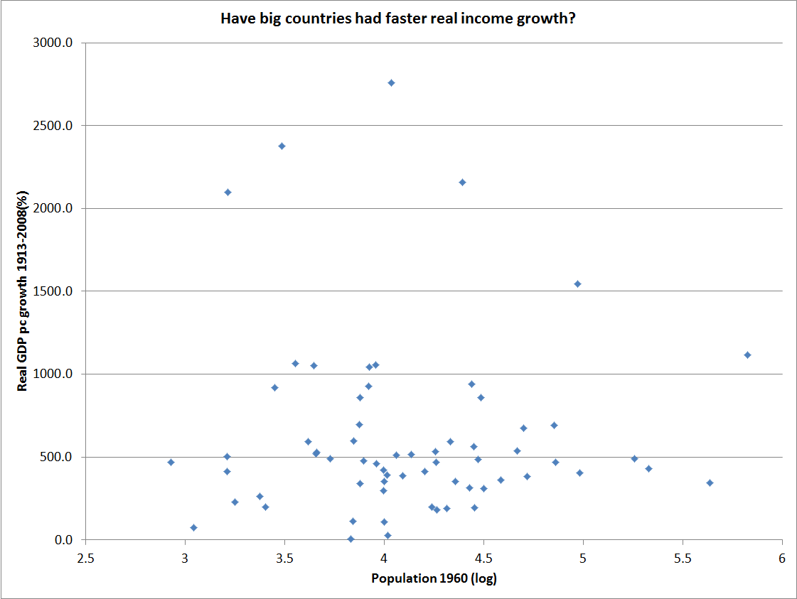
We also heard an interesting presentation from Shaun Hendy, from the University of Auckland.  He had some fascinating data on the importance of networks etc, and the way in which the number of patents per capita increases as the size of the city increases.  But it wasn’t clear that he was aware that there is no real evidence that big countries, or countries with big cities, have been achieving faster productivity growth than small countries.

Perhaps the weakest part of the day was the keynote address from Gabs Makhlouf, the Secretary to the Treasury,  headed “Innovation, diffusion, and markets”.  At such conferences, agency heads usually content themselves with some brief introductory or concluding remarks.  But this was billed as a keynote address.  Gabs apparently thought he had something enlightening to say on the issues of innovation, productivity, and economic performance.  He didn’t.  There was a lot of “all hands to the pump” rhetoric –  which seemed like a convenient substitute for hard analysis.  What evidence, for example, does the Secretary have that the private sector is responding inappropriately, given the policy framework set by successive governments?

He was, however, adamant that the answer to the disappointing productivity performance is not a lower exchange rate.  I was quite taken aback by that –  especially when he went on to assert that to believe that a lower exchange rate was important was to put oneself on “the road to doom”.   When I checked the Treasury’s most recent Briefing to the Incoming Minister, they didn’t seem to share that perspective –  although they rightly pointed out that a different monetary policy regime is not a path to a sustained lower real exchange rate.    As ever, it would be interesting to know what lies behind some of the Secretary’s assertions.

He also noted that New Zealand was not able to get the agglomeration advantages of some of the small European countries, in close proximity to large and wealthy markets.   But then he argued that we had the good fortune to be part of Asia, and the challenge was how to deepen our integration.  Perhaps he needed reminding that (a) most of Asia is still no better than middle income, and (b) all of Asia is a very long way away.  In the line Treasury often used to run, draw a circle with a 1000 km radius around Wellington and you get an awfully large number of seagulls and not much else.  Draw such a circle around Vienna, Stockholm, or Amsterdam and you capture several hundred million people in wealthy, highly productive, economies.

I also heard a presentation from an Australian academic, Beth Webster, who seemed to see a case for government spending on R&D in principle –  since the expected social returns from innovation will typically exceed the private returns.  But as her discussion of different types of support schemes proceeded, it wasn’t particularly persuasive that such support actually serves useful ends in practice.  And she seemed particularly critical of the competitive grants-based approach the current government has chosen to focus on, noting that heavy reliance on the expertise of evaluation panels (hard in a small country) and the difficulty of ensuring that the grants are actually inducing activity that would not otherwise take place.  The incentive on the part of recipients to misrepresent the situation is strong.

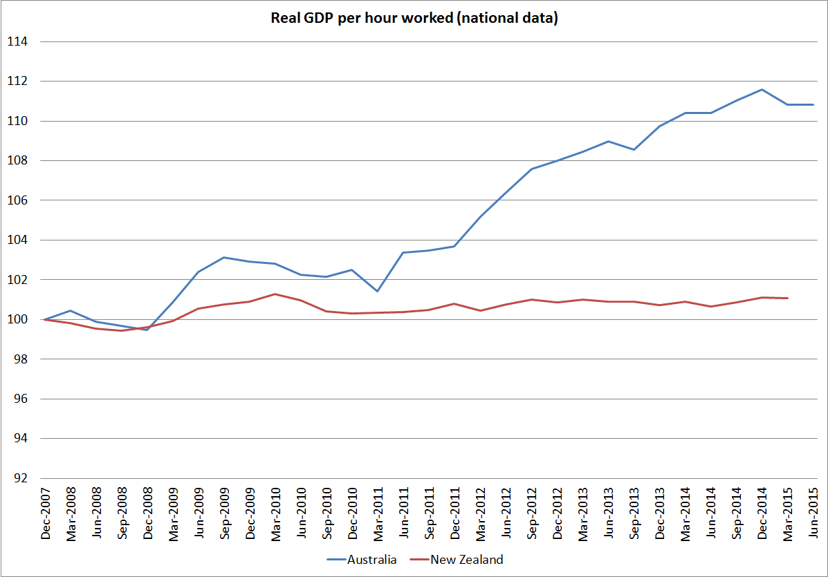
The context for all this is that not only is productivity (eg real GDP per hour worked) low in New Zealand, but so is research and development spending (as a share of GDP).  No doubt some of the difference is measurement – R&D tax incentives create an incentive to classify more spending as “research and development”, whereas in the absence of such schemes there is not the same reason to bother with isolating out every last dollar.    I suspect no one really doubts that business R&D spending in particular is quite low by international standards.  But as Adam Jaffe, from Motu, put it, the question is whether that is because the returns to R&D are low in New Zealand, or because there are obstacles to firms undertaking, or commissioning, valuable R&D.    Far too little effort seems to have gone into answering that question, even though the different possible answers might have quite different policy implications.

Enthusiasts for governments “doing something” direct on R&D tend to cite “spillover” arguments.  Many of the gains from any innovation are not captured by the innovators but by consumers.  That reduces the incentive to innovate (at least relative to some unrealistic benchmark). Webster noted we all gain from the wheel, and the descendants of the inventor do not (uniquely).  But then look around us, at the enormously sophisticated and advanced society in which we live, and wonder how it all happened, mostly without government R&D grants or tax credits.  And then ponder the quality of many, perhaps most, actual  – rather than textbook –  government expenditure programmes over the years.  I’m not persuaded of the case for government support for R&D  –  at least outside the areas of the government’s own operations (eg defence).

Here is the chart of business R&D spending as a share of GDP, for OECD countries.

BERD

New Zealand is towards the lower end, and all the countries to the right of us on the chart are also poorer than us.  But I don’t think it is that simple.  Formal research work done previously suggests that the rate of business R&D spending in New Zealand partly reflects the sort of stuff we produce.  One way to see that is to look the OECD’s commodity exporting countries, and compare them with seven economies at the heart of advanced Europe.  These are simply different types of economies.

BERD (% of GDP) BERD ( % of GDP)
Australia 1.23 Austria  2.03
Canada 0.93 Belgium  1.58
Chile 0.14 France  1.44
Mexico 0.17 Germany  1.96
New Zealand 0.57 Netherlands   1.10
Norway 0.87 Switzerland   2.05
Denmark   2.oo
Median 0.72 Median 1.96

In passing, it is also perhaps worth highlighting Israel –  an economy with very high business spending on R&D, and yet not only an economy with GDP per capita around that of New Zealand, but with a similarly poor longer-term productivity record.  They make and sell different stuff –  some of which clearly needs lots of R&D –  but not, overall, any more successfully than we do.

The 2025 Taskforce addressed some of these issues in their 2009 Report (around p 70).  They argued that more attention should be given to the possibility that high levels of business R&D spending might reflect more about where particularly economies are at (near the frontier or not, differences in product mix) rather than being some independent factor explaining the success or failure of nations.  In their view, a highly successful New Zealand was likely to be one in which more business research and development spending was taking place, but as a consequence of that transformation rather than an independent cause of it.  That still seems like a pretty plausible story to me –  although New Zealand is long likely to be primarily an exporter of commodities, and richer commodity exporters (Norway, Australia and Canada) don’t have particularly high levels of business R&D spending.

(And, at the extreme, I checked out the richer Middle Eastern oil exporting countries. Saudi Arabia, Oman, and Kuwait, for example, all have materially higher GDP per capita than New Zealand.  World Bank data for total R&D spending have the six OECD commodity exporters spending an average of 1.4 per cent of GDP on R&D, while those three wealthy Middle Eastern countries spend an average of 0.1 per cent of GDP.  The point is not that a successful New Zealand will spend at those levels, but that one needs to understand the distinctive features of our own economy.)

And that sort of perspective was largely lacking from yesterday’s Symposium.    I’ve argued for several years that if we want to remedy our economic underperformance, we need to focusing on addressing whatever aspects of policy account for our persistently high level of real interest rates.  Real risk-free interest rates are a component of the cost of capital.  Ours are higher than those almost anywhere, and that deters investment (and investment-like spending, such as R&D).  It has also helped skew our real exchange rate, holding it persistently up, on average, even as the large adverse productivity gap opened.  That skews investment (including associated R&D) away from the tradables sector, even though the rest of the world is where most the opportunities would otherwise be.  Oh, and we now have a relatively high company tax rate (and tax on capital income) –  even though plenty of good economic analysis suggests that capital income should be taxed more lightly than labour income.      And yet in the course of yesterday, we heard the Secretary to the Treasury vehemently deny the importance of the real exchange rate, and no one mentioned either the cost of capital or the tax treatment of capital income.  Address those issues, and I’m sure we would have an economy much more strongly oriented towards the tradable sector, would have a faster-growing business capital stock per person.  And I suspect that we would probably have rather more business R&D spending occurring –  the returns to doing it would probably be more attractive.

In a similar vein, I’d commend to readers Terence Kealey’s 2009 book Sex, Science and Profits.  Kealey is a professor of biochemistry, and former vice-chancellor of the (private) University of Buckingham.  This book builds on his less accessible The Economic Laws of Scientific Research  to make the case that science is not typically a public good, and governments do not need to fund scientific research (or, by, implication business R&D).  It is a very stimulating read, both on the history of innovation and on the scientific process.  I’m sure the bureaucratic tinkerers will have their quibbles with it, but it is an argument that should be engaged with much more seriously by New Zealand official agencies –  who need to shift their focus to getting broad government policy frameworks right, and then let businesses take care of themselves.  History suggests that when they do so, ingenuity flourishes and societies prosper.  Government interventions –  mostly well-intentioned, and however cleverly designed –  not so much.

The Productivity Hub was an excellent initiative, but they really need to be directing more of their efforts in the direction of the economywide/macroeconomic types of issues.  New Zealand is blessed with excellent microeconomic databases –  even if they are not always as accessible as they should be – but sometimes data availability determines the direction research takes.  I don’t think the case has been made that the real issues that are holding back New Zealand are microeconomic in nature.

These remote islands are different?

I was having a discussion the other night in the margins of the Goethe Institute event about the extent to which we should think about New Zealand’s economic advantages and opportunities as natural resource based.  I’ve been running a proposition that the only thing really going for us is the land, its attendant resources (fish, wind, geothermal, as well as pasture, forests, and –  at the low value end –  tourism opportunities), and the technologies and management skills that enable us to sustain reasonably good incomes from them.  Those resources can support really good incomes, but I’m sceptical as to how many people they can support such incomes for.

The person I was talking to posed an interesting angle which I hadn’t thought of before.  What if the North Island and South Island disappeared and New Zealand just consisted of Stewart Island (or the Chatham Islands).  What would 4.5 million people do in such a country?

As I’ve thought about it over the last few days, I’ve increasingly concluded that most of them would leave.  The opportunities would be just so much better elsewhere.

4.5 million people on an area the size of Stewart Island or the Chathams isn’t implausible.  Both are bigger than Singapore or Hong Kong –  Stewart Island (1680 sq kms) has more than twice the land area of Singapore (718 sq kms).

My nine year old daughter recently got fascinated by a book on our shelves about remote islands, so we’ve spent quite a bit of time together learning about some small, remote and very obscure places, such as.

Kerguelen                                                                                 7215 sq kms

Falkland Islands                                                                     12173 sq kms

St Helena                                                                                     420 sq kms

Seychelles                                                                                    455 sq kms

Reunion                                                                                       2512 sq kms

Azores                                                                                          2346 sq kms

And less obscure perhaps, but still relatively remote islands

Fiji                                                                                                 18270 sq kms

Hawaii                                                                                            28311 sq kms

Tasmania                                                                                      90758 sq kms

Iceland                                                                                          103001 sq kms

For reference, the South Island has 151,215 square kms of land.

But the total population of all those ten countries and territories is about 4.4 million.  Distance really seems to matter.  It is not that one can’t sustain good incomes in these places, but that not many do. History, revealed preferences, and revealed opportunities seem to have seen to that.

In the Stewart Island thought experiment my interlocutor posed, Stewart Island would be about as remote as the median of my 10 territories above.

Really smart people could choose to live there and with strong pro-market institutions perhaps they could build First World living standards there.  But it wouldn’t be Singapore or Hong Kong, even if it were populated by people from those places.  Geography doesn’t doom a country or territory to poverty, but it can make it a great deal harder.

Nothing in the global distribution of population or economic activity suggests that a Stewart Island New Zealand would have anything like 4.5 million people –  unless some social engineer, defying logic and history, kept shipping people in  (there are always some places poorer).  If, by some chance, 4.5 million people had ended up on Stewart Island, and governments didn’t interfere, I reckon many or most of them would have subsequently left –  to Australia, back to Britain if they could, perhaps even to South America.  The Falklands Islands does now support quite a high level of GDP per capita, for its 3000 people.   But the fishing and hydrocarbons wouldn’t go far across, say, three million.

Of course, New Zealand is not Stewart Island.  Our total land area puts us the middle of the list of countries of the world.  But we are still incredibly remote.  Last bus stop before Antarctica is unfair  (the Falklands and Kerguelen are closer), but not so very far wrong.  It just is not the sort of place, around the globe, that seems to be able to support First World opportunities for many people[1].

Of course, we have some advantages.  A temperate climate appeals as a place to live.  And northern European, specifically British, institutions and the rule of law have enabled people to secure pretty good livings wherever they have settled.  For perhaps 75 years, after all, New Zealanders had some of the very highest material living standards anywhere in the world.  But it was on the back of land-based industries.  And the overwhelming bulk of our exports still are, but with many more people than we once had.

So long as we don’t completely mess things up, New Zealand will never be what Uruguay is today (not much more than half New Zealand’s GDP per capita, the fruit of decades of really bad economic management last century).  But if, as a matter of policy,  New Zealand continues to  drive up its population quite rapidly, Uruguay might even have  better per capita possibilities in the very long run than New Zealand.   The same could probably be said, with even more force, of Romania (similar incomes today to those in Uruguay –  legacy of decades of even worse economic and political management last century).  They are just nearer where the people are. Locations still seem to matter.

New Zealand just isn’t a great place for many people to do terribly well.  Implicitly, New Zealanders have recognised that in the exodus to Australia that has occurred over the last 40 to 50 years.  The conventional wisdom on the right for a long time was that that was just a reflection of our mad policy regimes from the late 1930s onwards (heavy protection etc).  But it looks to have been more than that.  Decades on from the economic reforms, the average net outflow over time remains large (although it ebbs and flow with the Australian labour market), even as it has become more difficult for New Zealanders to make a smooth and secure transition to Australia.

One of my commenters is adamant that New Zealand’s immigration policy is “just” a replacement policy.  He is wrong on that .  (Over the last 15 years there has been an average annual net outflow of New Zealand citizens of around 25000 and an average net inflow of non-citizens of around 40000.  And our official target for residence approvals for non-citizens has been 45000-50000 per annum –  although not all who come stay).

But even if he were correct, there is no “just” about it.  What the government is doing is intervening to stymie a self-correcting mechanism that is going on in the private sector.   New Zealanders have seen, and responded to, the better opportunities (as they judge them) for themselves and their families in Australia.  They are moving to a place that –  with similar institutions –  is proving better able to generate high advanced-country incomes for more people.  What possible reason can the government have for interposing its own judgement, deciding that the resulting population and labour market outcomes are unacceptable, and actively seeking to bring in many more from abroad?

Perhaps as a policy approach it was more understandable in the 1950s and early 1960s.  After all, at that time our relative incomes were still high, and New Zealanders weren’t leaving in any appreciable numbers (the total outflow of New Zealand citizens in the 15 years to 1964 was 8283). And in the population discussion in New Zealand post-war, the idea of building up the population for national security reasons was also present.

But this is 2015 not 1950, and the economic signals have been pretty clear for a long time now –  and the central planners keep on ignoring the message.  Perhaps they believe the opportunities here are great.  But where is the evidence?  Remote places tend not to support very many people, and certainly not at the level of incomes New Zealanders aspire to.  Perhaps that won’t always be the case, but the onus should be on the planners to demonstrate that this island is different.

I’ve occasionally suggested that if “optimum population” meant anything,  New Zealand’s might be two million or 200 million.  With 200 million people, New Zealand would be a very different place, but it seems unlikely that in a world our size 200 million people would ever regard these remote islands as the best place possible to live and generate economic activities with an expectation of advanced country incomes. Peripheries seem, naturally, to be lightly populated places.

(To anticipate comments, I’m not arguing for a “population policy”  –  the idea seems absurd, but that is what we now have de facto –  but for leaving New Zealanders to determine these things for themselves.  In recent decades, the birth rate has been slowing and many New Zealanders see better opportunities abroad (most years), suggesting that their choices would leave us a fairly flat population.  But still one more than ten times that of Iceland –  which has 40 per cent of our land area, and is a great deal closer to prosperous population centres and markets.

[1] Australia faces somewhat similar issues, of course, but just has more natural resources.

The social democrats from the IMF

The social democrats from Washington –  the IMF –   have been in town, and today released their preliminary report.  It is quite strikingly different to the last one, released in March last year.    The so-called Concluding Statement, at the end of the team’s 10 days or so in New Zealand, isn’t very long, and can’t cover lots of things in depth, so keep that in mind as you read the rest of this post.

The mission team will have spent a lot of time with Treasury and Reserve Bank staff.  Indeed, the draft of the Concluding Statement will have been haggled over in a meeting with fairly senior officials from the two agencies, and it is pretty rare for the final product to contain anything that those agencies have much disagreement with.  Indeed, Fund missions can get so close to staff in the host countries that even when two countries, reviewed by teams led by the same mission chief, have much the same circumstances, the policy advice will at times differ –  seemingly to reflect what the authorities in the two countries want.  A great example last time round was direct regulatory interventions in the housing finance market, which the IMF has enthusiastically supported here, but had been silent on in Australia.  I’m not sure if the mission chiefs are still the same for the two countries, but checking the most recent concluding statement for Australia, I notice that the inconsistency has persisted.

Rereading the 2014 Concluding Statement the upbeat tone was unmistakeable.

“the economic expansion is becoming increasingly embedded and broad-based”

“with the economy set to continue to grow above trend in the near-term, pressures on core inflation should follow”

“we welcome the RBNZ”s shift toward a policy of withdrawing monetary stimulus, with the clear signal that it expects to increase rates steadily over the next two years”.

Oops.

(Although no doubt the Governor was pleased with the statement at the time.)

There is, of course, no hint in today’s Statement that the Fund might have misread things that badly last year.  Space constraints I suppose.

But what about this year’s Statement?

I was interested to read that “inflation is projected to rise to within the RBNZ”s target range of 1-3 per cent in 2016, as the impact of the decline in oil prices drops out, and the depreciation of the New Zealand dollar passes through”.  No mention anywhere, at least as far as I could see, of any rise in core inflation towards the mandated target midpoint.  But I guess they are running the same lines the Governor always does –  over-emphasising the one-offs (especially now that the exchange rate has rebounded) and quietly ignoring the persistent undershoot of core inflation.

But in some ways what really struck me about this year’s Statement was the wholesale leap into advocacy of a range of microeconomic and structural policies.  It is a very different emphasis from last year.  I know the Fund has changed mission chief for New Zealand, but surely there should be more continuity in the analysis and advice than this?

What do I have in mind?

Somewhat surprisingly, the Fund weighs in on immigration policy, noting that “continued high net immigration could pose challenges for short-term economic management, but in the longer run would boost growth”. Well, no one will really dispute the short-term demand pressures, but where is the IMF’s expertise in immigration?  How have they concluded that our past immigration has boosted (per capita) growth?  They might be right (or not) but how does it relate to the core macroeconomic and financial stability mandates of the IMF?

The Fund then suggests, in a paragraph on government finances, that “in addition, investment in infrastructure and housing (in high-quality projects) should be accelerated where possible to support higher housing supply in Auckland, and infrastructure improvements”.  Where is the evidence of the central government infrastructure shortfalls?  Government capital expenditure in New Zealand has been among the highest in the OECD, as a share of GDP.  And what leads the Fund to think the government should be building houses itself (only high quality ones  mind)? It all seems rather unsupported, and far from the principal mandate of the IMF.

They note too that “intensifying efforts already underway to boost higher density housing would be welcome”. What gives the IMF the basis for suggesting government policy should be skewed towards higher density housing?  And how does it all connect to macroeconomic stability anyway?

Last year, the IMF was cautious about further regulatory prudential measures –  tools should be “used sparingly and with caution”, but this year they are champing at the bit –  no doubt reflecting the Governor’s new enthusiasm.  After a perfunctory observation that “the impact of the new [prudential] measures to reduce financial stability risks will need to be evaluated”, they rush straight into “but the authorities should be prepared if further steps are needed”.   I suppose that could be seen as just contingency planning, but there is no sense here at all that these interventionist measures could conceivably have costs, or that any benefits might be small.

Last year , there was no mention of tax issues at all, but now not only are “the newly introduced measures to deter speculative investment“ welcomed (those evil  “speculators” at it again –  can’t have them in a market economy) but “and further steps in this direction should be envisaged”.   The Fund apparently favours “a more comprehensive reform to reduce the tax advantage of housing over other forms of investment“  [that would be unleveraged owner-occupiers they were targeting?] and “reducing the scope for negative gearing”.    Many people might agree with the Fund, as a matter of tax policy, but where is the evidence, including the cross-country insights that (these issues are important that) the Fund is supposed to be able to offer?  And where is the consistency from one mission to the next?  If agencies like the IMF have substantive use –  as distinct from a convenient echo of the preferences of the Reserve Bank or Treasury –  it has to be keeping a clear focus on the longer-term issues that matter to macroeconomic and financial stability.

There are some odd features to the statement.  In one place, they say that “stress tests  indicate that the sector [banks] can withstand “a sizeable shock to house prices, the terms of trade and economic activity”, but then a page or so later they observe “financial system stress tests suggest it is able to withstand –  at least in the short-term  –  adverse developments related to China spillovers, dairy prices and the housing market”.  I think the final haggling session with officials must have missed something, and will be interested to see if the “in the short-term” caveat reflects something coming out in tomorrow’s FSR.

The other odd feature is this “on the one hand, on the other hand” paragraph

Monetary policy has been focused on the primary objective of price stability. Only if financial stability risks become broad based and prudential policy is insufficient to contain them, then using monetary policy to ‘lean against the wind’ could be considered as part of a broader strategy to rein in financial stability risks. Even in this case, the benefits would need to be weighed against the output costs and the risk of policy reversals.

They would have been better simply to have left it out.  Monetary policy in New Zealand has no statutory basis for pursuing anything other than medium-term price stability, and it hasn’t even been doing that overly well.  Having already had only an anaemic recovery, partly because of an overly cautious Reserve Bank, and two policy reversals –  a record for the OECD –  the IMF might have been better advised to simply urge the Reserve Bank to do its job –  deliver inflation consistently around the middle of the target range.    When they get back to the office, perhaps the mission staff could talk to Lars Svensson, currently at the IMF, about the attractions (or otherwise) of using monetary policy to “lean against the wind”.

The Concluding Statement wraps up with a discussion of Medium-Term Policies.   Last time round, they had a balanced, but high level, discussion which noted structural imbalances between savings and investment (by definition, since the current account has long been in deficit], and noted that structural measures might be needed “to address the savings-investment gap”.    Probably reflecting the IMF’s limited expertise in the area, it went no further, and did not even attempt a diagnosis as to whether any issues might more probably be found on the savings side than the investment side.

But this time round savings is confidently identified as the problem.  We have, according to them “chronically low national saving” and “raising saving is the key to addressing this vulnerability”, “in particular household saving”.    They don’t back any of this up, they don’t suggest reasons why private savings behaviour might be inappropriate, or identify policy distortions that are creating problems.  Instead, they jump straight in to solutions

comprehensive measures to encourage private long-term financial saving should be considered, including through reform of retirement income policies. Options include changing the parameters of the Kiwisaver scheme—e.g., default settings, access to funds, and taxation—to increase coverage and contributions while containing fiscal costs, and adjustment of parameters of the public pension system. This could help deepen New Zealand’s capital markets and broaden options for retirement planning.

“Broadening options for retirement planning” fits how with the Fund’s mandate, or expertise?  Did they recognise that New Zealand already has both a low elderly poverty rate and fiscal expenditure on public pension that, while rising quite rapidly, is not high by international standards?

Did they, for that matter, even attempt to back up the claim that New Zealand has “chronically low national savings”.    If you are going to compare national savings rates, you really have to use national income as the denominator (ie savings of residents relative to the incomes of residents) .  In this chart, from the OECD database, I’ve compared New Zealand’s net national savings rate (as a percentage of net national income) to the median for the other Anglo countries (Australia, Canada, Ireland, US, and UK).

net savings

Both lines are below the median for the OECD grouping as a whole – although in the most recent year we were almost bang on the OECD median –  but over 25 years our net savings rate has simply fluctuated around the median of those countries most culturally similar to us.  Where is the “chronic” savings problem?    And given how strong our public accounts are –  better than those of any of the Anglo countries other than Australia –  how likely is that our feckless private sector is behaving as irresponsibly as the IMF mission staff suggest?   Perhaps Treasury has updated its view again, but I was involved in an exercise a couple of years ago in which Treasury made a pretty concerted effort to look for areas where policy might be driving down private savings rates (relative to those in other countries).  They looked hard, but it was a pretty unsuccessful quest.

And, finally, here is the IMF”s last paragraph

Despite the implementation of successful structural reforms in the 1980s, productivity levels have remained low compared to OECD peers. To raise productivity, the government’s business growth agenda has identified a number of policy priorities. Specifically, the Productivity Commission has highlighted the need to raise productivity in the services sector (which accounts for 70 percent of the economy). Measures include boosting competition in key sectors such as finance, real estate, retail, and business and other professional services; and leveraging ICT technology more intensively, including by enhancing skills.

I thought, and think, that most of the reforms of the late 1980s and early 1990s were in the right direction.  But a sceptic might reasonably ask what is the definition of “success” when productivity gaps have not just remained large, but widened further since then.  Perhaps more importantly, what is this paragraph doing here?  Long-term income convergence issues aren’t really in the IMF’s remit, and the IMF doesn’t seem to have anything useful to offer on the subject.  The paragraph is little more than an advertorial for the Business Growth Agenda –  itself so far signally unsuccessful in lifting exports or closing productivity gaps –  and the Productivity Commission.

We really should expect something better, and more authoritative and more focused, from the IMF.  Perhaps it will come with the full report in a couple of months time, but I’m not optimistic.

If only economic performance matched the rugby

I’m not much of a rugby fan, but even I noticed a certain amount of enthusiastic coverage of the All Blacks’ comprehensive defeat of France last weekend.

If only we could match that performance in the economic comparisons.

Over the long haul, we’ve done rather badly relative to France.  Our GDP per capita was well ahead of theirs, but is so no longer.  And if you are inclined to take some heart from the performance over the last 20 years, pause for a moment.

fr vs nz real gdp pc

A rather large chunk of that improvement in the relative GDP per capita performance has reflected the volume of labour input.

fr vs nz hours worked

Hours worked per capita have carried on falling in France, while those in New Zealand have fluctuated around a fairly stable mean since 1950.  In 1950, New Zealand’s hours worked per capita was in middle of the pack for advanced countries.  Last year, among Western European countries and the offshoots (NZ, Australia, Canada, US), only Iceland and Switzerland had longer hours worked per capita than New Zealand.  France, by contrast, has one of the lowest levels of hours worked per capita of any advanced country.   I’m not making the case for more (or less) hours, just that in New Zealand’s case it looks as though we’ve needed to work more hours  just to maintain our tenuous foothold on the GDP per capita rankings.  All sorts of distortions – but notably high taxes – help explain the low levels of labour input in France, and no doubt there is a price for those distortions, but New Zealand is not an obviously compelling alternative model.

Relative to France, labour productivity growth has also been disappointing.  And over the last few years, from 2007, neither country has recorded any material labour productivity growth.  And the average level of labour productivity in France is now estimated at just over 50 per cent higher than that in New Zealand (in 1950 ours was more than 50 per cent higher than theirs).

fr vs nz gdp per hour

And if neither country’s MFP growth has been particularly impressive, over the period for which the Conference Board has published detailed estimates (since 1989), New Zealand’s has been worse than France’s.    Indeed, France was almost the median OECD country over the full period.

fr vs nz tfp

Average real GDP per hour worked in France is among the highest in the advanced world –  not too different from that in the United States for example.  A common argument has been that the high average labour productivity is largely the mirror image of the low level of hours worked per capita, and low overall employment rate. The less productive people simply aren’t employed in France, while they are in some other OECD countries.  The employment to population ratio in France is around 41 per cent, compared with over 50 per cent in, say, New Zealand, Australia and Canada.

Perhaps there is something to this story, but I’m not convinced it can explain all of what is going on.   Over 50 years or more, labour productivity in France and Germany has tracked very closely together, the two economies produce similar things and are quite highly integrated.  And yet Germany has an employment rate almost identical to New Zealand’s.

Of course, France has things going for it that New Zealand doesn’t.  Being very close to other major rich countries means that France does not suffer any “tax” from small size and great distance.  Then again, actual French taxes remain among the highest in world, and government spending as a share of GDP still seems to be edging upwards.

fr govt spending

I’m left a little puzzled. I think I’ve worked my way to a story about why New Zealand has done as poorly (relative to the advanced world as a whole)  as it has over the last several decades, but I’m still a bit puzzled as to why France has continued to be quite as moderately successful as the statistics suggest it has been.      Perhaps the cracks are now showing?

It was a short list. I couldn’t think of any.

As a conservative, monarchist and Christian, I had been encouraged by the political success of Tony Abbott, and quite seriously underwhelmed at the idea of Malcolm Turnbull becoming Prime Minister of our closest ally, major trade and investment partner, and more generally the most similar country in the world to New Zealand.

On its own the latest round in the Italian-style revolving Prime Ministership in Australia wouldn’t have prompted a post on a blog that is mostly about economics and public policy issues.  But reading stories this morning in which the incoming Australian Prime Minister is quoted as praising John Key’s economic management was just too much.  Turnbull is quoted as saying

“John Key has been able to achieve very significant economic reforms in New Zealand by doing just that, by taking on and explaining complex issues and then making the case for them. And I, that is certainly something that I believe we should do and Julie and I are very keen to do that again.”

I grabbed a piece of paper from my bedside table and starting trying to jot down on the back of the envelope the “very significant economic reforms” in New Zealand over the last seven years.

It was a short list.  I couldn’t think of any.

Perhaps Turnbull had in mind the tax package of 2010?  Some of it might have been useful, but (a) it was pretty small in the scheme of things and (b), as the Treasury pointed out at the time, the net effect of that package was to raise the average tax rate on business income, not lower it.

From almost seven years of a Key-led government, I managed a few other small useful items for the list of reforms:

No doubt there are others, but if anyone can point me to a “very significant economic reform” undertaken in New Zealand since November 2008 I’d be grateful.  I don’t count closing the fiscal deficit.  It is welcome of course, but we’ve had persistent deficits despite record high terms of trade, and simply closing a deficit is not itself an economic reform.   Weak wage pressures across the economy have made fiscal management a lot easier than might have been expected.

And the problem with even the list above is the list of measures that could appear on a  “steps backward” list:

  • Higher effective corporate tax rates
  • The debacle of the earthquake-strengthening legislation
  • The continuing debasement of our skills-based immigration system, both in the way it is administered and in formal announced policy.
  • New overlays of financial market regulation
  • The re-establishment of direct government controls over who banks can and cannot lend to
  • The continuation of a regime of “corporate welfare”, including for example the Sky and Tiwai Point deals, and the smell that the Saudi sheep deal gives off
  • The degree of central government control of the Christchurch repair project, involving both wasteful projects (some of which may not finally go ahead), and the way central government has artificially boosted land prices and impeded the prompt redevelopment of the central city.
  • The continuing apparent decline in the rigour of public sector policy advice, and in the use of robust cost-benefit analyses in underpinning policy decisions.
  • Increased first home buyer subsidies.
  • Undermining housing affordability with mandatory insulation etc requirements for rental properties
  • Continuing increases in minimum wages, from very high levels (relative to median wages) at a time when unemployment is quite high, and policy was supposedly oriented to getting people off welfare.
  • Heavy investment in the newly state-repurchased loss-making Kiwirail

But, mostly, the story is just about the failure to do anything much.   I’ve previously quoted some quite-inspiring Key lines from a speech just before the 2008 election.

I came into politics because I believed New Zealand was underperforming economically as a country. I don’t think it’s good enough that so many New Zealanders feel forced to leave our country each year to seek higher wages in Australia. I don’t think it’s good enough that our average incomes lag so far behind the rest of the world. And I think it’s unforgivable that the Labour Party has done so little to address these fundamental challenges.

I believe that a very big step change is needed in our economic performance to ensure New Zealand can make the most of its considerable potential. Growing the economy of this country continues to be my driving ambition. I stand before you today ready to deliver on that ambition for New Zealand.

You have my personal commitment that if I am elected Prime Minister in eight days’ time I will work tirelessly over the next three years to deliver the stronger economic future our country deserves.

That commitment was made just before the Prime Minister was elected.  A year later, in its first report in late 2009, the 2025 Taskforce, established (and then abolished) by the current government included on one of its front pages another aspirational quote from John Key, now well-established as Prime Minister..  The quote the 2025 Taskforce used (from the SST of 8 Nov 2009) was “Our vision is to close the gap with Australia by 2025”

Fine words, but there has been almost no action.

Fine words, but with no tangible results.  New Zealand has made no progress in closing gaps with Australia over the seven years John  Key has been Prime Minister –  not on GDP per capita, not on national income per capita, and not on productivity either.  If anything, we’ve drifted further backwards.  I put lots of charts in this post last week, but here are just a few reminders:

Real GDP per capita for the two countries, where we’ve done a little worse than Australia.

national real GDP pc

And here is real GDP per hour worked.

national real GDP phw

Of course, our Prime Minister has won three successive elections, the last two rather narrowly, and that must sound quite appealing to the backbenchers in marginal seats in the Liberal Party’s caucus.  But if Malcolm Turnbull is serious about economic reform –  which frankly seems unlikely –  he shouldn’t be looking across the Tasman for inspiration and example.

Closing the gap with Australia: only the OECD seems to think so

A friend asked me yesterday for the latest GDP per capita numbers for New Zealand and Australia.  His interest was a point estimate, to compare current levels in the two countries.  I went back to him with the series I would normally consider best for that purpose: the OECD’s measure of current price GDP per capita, converted to a common currency (usually USD) using the estimated purchasing power parity (PPP) exchange rates.  Unlike constant price measures, current price measures take full account of changes in the terms of trade –  which aren’t things governments can do much about, but which can materially affect living standards in countries like ours (in which the terms of trade are quite variable).

To my surprise, Australian per capita GDP on that measure was only about 22 per cent higher last year than New Zealand’s (= New Zealand’s being 18 per cent below Australia’s).   And if one believed that measure, the last few years had been just great for New Zealand (at least relative to Australia).  On this measure we’d long been drifting gradually further behind Australia, only to have experienced a startling reversal in the last few years.  It was as if that once-upon-a-time goal of catching Australia by 2025 was coming into view, all without actually doing any significant economic policy reforms.

gdp pc nz vs au

Of course, it was too good to be true.  But it prompted me to have a look at a variety of other measures of how the two countries have done since 2007 (just prior to the global recession).  I started with national data, calculated in local currencies, and deflated by domestic estimates of changes in prices.

Here is real GDP per capita for the two countries, where we’ve done a little worse than Australia.

national real GDP pc

And here is real GDP per hour worked, where the differences are quite extraordinarily large (and not in New Zealand’s favour).

national real GDP phw

Australia’s terms of trade rocketed up over 2010 and 2011, but have since fallen back very sharply. Over the full period since 2007, we’ve now done a little better than them, and foreign trade is a larger share of our economy that it is of Australia’s.

terms of trade since 07q4

And here are the two countries’ respective measures of real income, which take account of the effects of the terms of trade.  We are now just slightly ahead of them over that full period.

national rgndi

And what about the international databases?  The Conference Board has measures of real GDP per capita and real GDP per hour worked, converted to a common currency using PPP exchange rates.  They have much the same picture as the national data.

Here is real GDP per capita –  we’ve lagged further behind.

conf board real gdp pc

And real GDP per hour worked, where again the New Zealand numbers have been very poor.

conf board real gdp phw

And the OECD’s real (constant price) measures also show something similar.  Here they use 2005 PPP exchange rates.

oecd real gdp pc

oecd real gdp phw

So none of these national or international measures suggest anything particularly encouraging about New Zealand’s performance in recent years.  So far, our terms of trade have held up a bit better than Australia’s, but they are outside our control, and at best all that terms of trade strength has done is offset a lamentable productivity performance.  And most observers expect our terms of trade to fall further (as, of course, may Australia’s).

Which brings us back to the OECD’s current price estimates.  Here is how we are shown as having done relative to Australia since 2007.

current price gdp pc oecd

It looks too good to be true, and it is.

The OECD generates these numbers by converting national data into a common currency using estimated PPP exchange rates.  PPP exchange rates are, broadly, the exchange rates that would equalise price levels in the respective countries.  They can’t be directly observed and have to be estimated.  For established advanced countries you would not expect the PPP exchange rates to fluctuate much, and the biggest influence over time will often be any differences in inflation rates.  Thus, Australia has a slightly higher inflation target than New Zealand does, and Australia’s inflation rate has averaged a little higher than New Zealand’s over the inflation targeting period.  That should have been reflected in a very gradual, quite modest, rise in the NZD/AUD PPP exchange rate.

ppp nzd aud

And that is exactly what we saw until 2005.  But since then the OECD estimates that the exchange rate that would equalise prices in the two countries has risen by 15 per cent.  It simply doesn’t seem plausible – there has been nothing that structural in the two countries that could explain such a change in such a short period of time.  I’ve asked the New Zealand desk at the OECD if they have any idea what is going on, but in the meantime I will be steering very clear of the OECD’s current price estimates.

There is no one “right” international comparison of income/GDP levels. But whatever the “true” difference between Australia and New Zealand – perhaps 35-40 per cent – it remains large.  On some key measures – notably productivity estimates – it has continued to widen.  But then why would we be surprised?  If we keep on with much the same policies why would we expect much different outcomes?  New Zealand has been one of the least successful Western economies in recent decades –  indeed, probably for the last 100 years.  As I’ve highlighted previously, since 2007 many European countries have done extremely badly but even in that period, when floating exchange rate commodity exporters haven’t done as badly, we’ve not managed to make any progress in closing the large gap to Australia.

We can do better, and the failure to even start doing so reflects poorly on our political leaders and their senior official advisers, neither of whom seems to have a credible alternative strategy.

Once were international traders

J.B Condliffe was one of the greater New Zealand economists of the first half (or so) of the 20th century. One evening earlier in the week I was dipping into his New Zealand in the Making, an economic history of New Zealand, the second edition of which was published in 1959. On the first page, I noted this line

“Today New Zealand claims the largest overseas trade per head of any country in the world”

Those were the days when the story was often told about about how exposed to foreign trade New Zealand was.  Protectionists wanted to reduce that exposure.  In the 1950s, global trade as a share of GDP was much lower than it is today.  Even New Zealand’s trade share  was a little lower than it is now (services exports were not material in those days, and merchandise exports were around 27 per cent of GDP).  Our export share of GDP was about that high even though New Zealand had very heavy industry protection in place,  promoting domestic manufacturing.  That acted as a tax on exports, reducing both exports and imports below what they would otherwise have been.

The late 1950s were also the days when New Zealand still had among the highest per capita incomes in the world.  In the mid- late 1950s, Maddison estimates that New Zealand incomes were behind only those in the United States and Switzerland.  Whatever the “true” number, we were still in the top tier of material living standards

How do things compare today on foreign trade?

I dug out the OECD data for total exports per capita (for 2013) and converted them into a common currency.  Here is the chart.

gross exports pc

New Zealand is in the bottom half of this chart.

Big countries tend to export less than small countries –  fewer firms need to tap the wider world when there is already a large market at home – and distant countries tend to export less than countries that are close to lots of other markets.  Firms in the United States, for example, export a lot less per capita than firms in (similarly well-off) Switzerland does.

Whatever the situation in the 1950s, it would have been a little surprising if we had been in the top tier of the 2013 chart.  One of the big changes in international trade since the 1950s has been the rise, particularly in manufacturing, of “global value chains”, where different stages of production occur in different countries.  In other words, a car finished in Germany and exported to France might include a substantial proportion of components produced in (and exported from) a range of Eastern European countries.    And some other products exported from, say, Slovakia will use lots of components imported from Germany.  The value of a country’s gross exports rises with this (typically mutually beneficial) activity, but the share of a country’s total value-added (which GDP is capturing) resulting from exports might not have risen much at all.  For New Zealand, a long way away, this sort of trade doesn’t happen in the way that it might between say Austria and the Czech Republic.

The OECD and WTO have recently done the work of trying to trace what proportion of each country’s exports are domestic value-added.   The latest data are for 2011, but the domestic value-added shares don’t fluctuate much from year to year (production patterns don’t change that fast).  Applying the 2011 data on the share of exports that reflect domestic value-added to the 2013 exports data, we get a chart of per capita exports of domestic value-added.
gross value-added exports

Here, New Zealand shows up just above the middle of the pack, but with a level of exports per capita (near the peak of a terms of trade boom) that was only a third to a quarter of the exports of domestic value-added from the Netherlands and Switzerland.

It is a far cry from the 1950s position of the largest overseas trade per head.  And, of course, today we languish in the bottom third of OECD countries for GDP per capita.

There is always a danger of seeming to come across as suggesting that exports are either good for their own sake, or are the only possible route to prosperity.  We export (or sell anything) to support present and future consumption, and for an individual or a firm it makes no particular difference whether goods or services are sold to domestic or foreign purchasers.  But at a whole economy level, the export underperformance nonetheless remains a disconcerting indicator.  We can’t remedy New Zealand’s underperformance just by exporting more –  Mao was exporting grain during the great famine, and we’ve had export subsidies in the past ourselves –  but successful economies tend to be those with increasing numbers of the products that the wider world wants to buy more of, at prices that encourage further innovation and investment.  Many individual firms have done well, but in aggregate New Zealand doesn’t seem to have been in that position.

What has gone wrong?  I’ve argued that our real exchange rate has been out of line with the productivity fundamentals for decades.  Excess domestic demand has driven up the price of non-tradables relative to tradables, skewing investment and activity away from the tradables and export sector.  Part of that story –  a significant part in my view – has been the active large scale inward migration programme, which has diverted resources away from global markets to (what successive governments have instead made) their most profitable use; meeting the physical capital (houses, road, factories, shops, offices etc) needs of a population that has continued to grow quite rapidly.  The only time since World War Two when our governments pulled back from actively pushing up the population was from the mid 1970s to the late 1980s, and in that period we messed things up in other ways – the Think Big debacle, a post-deregulation credit and property boom and bust, and of course a very weak terms of trade.

I’ve commented previously on the government’s peculiar exports target.  There is no chance of meeting that target  on any sort of sustainable basis, without changing the factors that give rise to the persistently higher real interest rates and the high real exchange rate.

Big countries don’t seem to have got richer faster

Implicit in much of the discussion around an appropriate immigration policy for New Zealand is a sense that our prospects would be better if only New Zealand had more people. Some have come out and actively argued the case – see, for example, this brief note from the NZIER last year.

I’ve long been fairly sceptical of that proposition. A casual glance around the world suggests no very obvious relationship. The United States and Iceland co-exist, and Japan and Singapore. At the other ends of the income spectrum, India and Bhutan, and Brazil and Costa Rica. There are all sorts of arguments advanced around the economics of agglomeration, and that analysis seems to work quite well in describing what happens within countries. But it does much less well in describing economic performance across countries. And as I’ve pointed out to people previously, if the real economic opportunities in big countries were so much superior to those in small countries, large countries would tend to have (more high-yielding projects and) higher real interest rates than small countries. But they don’t.

Angus Maddison put together the most widely-used longer-term estimates of GDP per capita for a wide range of countries. There are plenty of holes that can be poked in those estimates, but they are what we have.   He produced estimates for a large number of countries for 1913, just before the disruption and destruction of World War One, and as he died a few years ago his last numbers were for 2008.

This chart shows per capita real GDP growth from 1913 to 2008 for the sixty or so countries Maddison had estimates for, plotted against the level of the population of each country in 1960 (roughly half way through his period).

popn and growth 1913 to 2008

There is no relationship. And there is also no relationship if:

  • We take out the countries that had exceptionally fast growth over that 95 year period, or
  • If we restrict the sample to  a group of countries that were already fairly advanced in 1913 (Western Europe, and the Anglo offshoot countries).  The United States and Switzerland, for example, had almost identical real per capita GDP growth over that period.

What about more recent periods? The Conference Board has built on Maddison’s work and has estimates for a wider range of variables for more recent decades.  One argument – advanced in a New Zealand context by Phil McCann – is that size has become a much more important issue for advanced countries in the last few decades. If so, perhaps we might have expected to see big countries growing faster than small countries over that period.

Here are two charts that look at that relationship for 33 advanced economies.

The first shows the relationship between the (logged) level of population in 1990 and growth in real per capita GDP growth since 1990.

population and gdp pc since 1990

And the second shows the relationship between the (logged) level of total hours worked in 1990 and growth in real GDP per hour worked since 1990.
hours worked and productivity since 1990
In neither case, is there any sign of a positive relationship.

Charts of this sort are, of course, not conclusive. Lots of other things are going on in each country.  In an ideal world, one would want a much fuller and formal modelling of the determinants of growth. But equally, the absence of a positive relationship between the size of the country and its subsequent growth shouldn’t be surprising, and there have been previous formal research results suggesting a negative relationship.

Of course, perhaps New Zealand is an exception. Perhaps real per capita incomes would really be materially lifted if we had many more people here, even though there has been no such relationship across the wider range of advanced countries in history.  But in a sense we have been trying that strategy for 100 years and there is no sign that it has worked so far.   Very few relatively advanced countries have had weaker real per capita growth than New Zealand in the last 100 years (only places like Argentina and Rumania).

Perhaps the next 25 or 100 years would be different. But I think the onus is now on the advocates of policies to bring about a bigger and more populous New Zealand to demonstrate where and how the gains to New Zealanders from a much larger population are occurring?  Recall that all our population growth now is resulting from government policy choices – the level of non-citizen immigration that the New Zealand government is targeting. If population growth were being driven by the private choices of New Zealanders (higher birth rates, or a permanent reversal of the New Zealand diaspora), I wouldn’t regard it as a particular matter of policy interest. But when our governments are actively targeting a larger population the onus is surely on them to demonstrate the real economic gains to New Zealanders. 25 years on in the current strategy there is no sign of them yet.

One could make a case that New Zealand’s greatest asset is the fertile land and temperate climate.  Refrigeration and much reduced shipping costs in the late 19th century gave those natural resources real economic value.  But there has been no comparable “shock” for the last hundred years, and arguably we are simply spreading those natural resource “rents” over more and more people.  Norway would be unlikely to have the highest real GDP per capita in Europe if they had responded to the discovery of vast oil and gas resources by doubling their population.

Natural resources alone don’t make a country rich (see Iran or Zambia), and natural resources aren’t the only way to get rich (see Singapore or Taiwan) but for a very isolated country they may well, in conjunction with strong institutions and competitive markets, provide the best possible basis for re-establishing top tier living standards for a small population.  So far, adding lots more people doesn’t seem to have helped.

Talking of which, it is now 21 August and there is still no sign of an MBIE response to my 28 May request for copies of advice to ministers on the economic impact of immigration, and on the permanent residence approvals target.

Manufacturing sector employment

Having finished the last post, I flicked over to Kiwiblog and found a slightly flippant post, suggesting that Andrew Little’s comments about the dairy sector being in “crisis” could be safely discounted, in view of earlier Labour worries about the manufacturing sector having come to nothing. Indeed, on this take,

Their manufactured manufacturing crisis has seen record job growth in manufacturing.

I don’t follow sectoral employment data closely, so presumed I’d missed something.  Indeed, since much of manufacturing activity is a derived demand from construction activity (which has been very buoyant) and dairy processing makes up another component, and milk production has been growing strongly (even if agricultural value-added hasn’t), some strength in manufacturing employment sounded plausible.

But here is the chart of the Quarterly Employment Survey data, showing hours worked and number of full-time equivalent employees for the manufacturing sector as a whole.  The QES is a survey of firms, and probably quite reliable for these sorts of questions.

qes manuf

Given the strength of construction activity over the last couple of years, these seems quite remarkably weak data.

The HLFS (a survey of individuals) has a shorter series, and only for the total number of employees.  It has shown greater strength in the last few quarters, but even on this measure the numbers employed in manufacturing are still not up to pre-recessionary levels.

There is a long-running debate on the importance of manufacturing, both here and abroad.  Here was my summary take from a couple of months ago.

I’m not one of those who thinks that the relative decline of manufacturing is a tragedy, but on the other hand I also don’t think that it is a matter of total indifference.  Most likely, the relatively weak manufacturing sector performance in recent years, despite the buoyant construction sector, is a reflection of the persistently high real exchange rate.  Like Graeme Wheeler, I think the real exchange rate is out of line with medium to longer–term economic fundamentals.  A more strongly performing New Zealand economy, one making some progress in closing the gaps to the rest of the OECD, would be likely to see a stronger manufacturing sector.  It might still be shrinking as a share of a fast-growing economy, but a manufacturing sector that has seen no growth at all in almost 20 years doesn’t feel like a feature of a particularly successful economy.

The weak manufacturing sector, despite the support from construction sector demand, seems to be yet another symptom of an underperforming New Zealand economy.  If there were clear signs of rapid growth in investment and productivity in other parts of the tradables sector, we might reasonably be unbothered by the manufacturing numbers.  As it is, I don’t think we can be that relaxed.  And it isn’t a matter of targeting measures directly to boosting manufacturing, but about removing obstacles that have held up the real exchange rate (over decades), and which undermine the attractiveness of business investment across the economy as a whole.

How have we been doing in recent years relative to the US?

The US Bureau of Economic Analysis released overnight some revised GDP estimates, not just affecting the last couple of quarters (the bits that tend to attract more headlines than they are worth), but going back several years.  The overall effect was to revise lower estimates of US GDP growth over the last few years.  The previous estimates of growth had, of course, already been very low by historical standards.

I’ve been intrigued, and have posted previously, about how similar the paths of NZ and US GDP per capita have been since 2007, despite all the differences between the two countries’ experiences (financial crisis and not, terms of trade boom and not, earthquake reconstruction and not, and even quite different labour market experiences).  So I was curious to check what the chart  –  showing real GDP per capita –  looked like following the latest US revisions.

nz vs us gdp pc

Statistics New Zealand publishes separate production and expenditure GDP series, and not infrequently there are material divergences between recent years’ estimates of the two series.  SInce 2007, on current estimates, GDP(E) has grown more than 2 per cent more (in total) than GDP(P).   Analysts tend to pay more attention to the production measure (GDP(P), but that is partly for historical reasons (it used to be less volatile).  The differences will largely be revised away over time, but we have no obvious way on knowing now which will better be seen as representing history.  The final revisions, years hence, could be higher or lower than both series, or somewhere in the middle.  My hunch is that they will be a bit lower: I understand that SNZ uses PLT met migration to feed into its population estimates, but experience suggests that in periods of strong inward migration net PLT understates the actual net inflow.  The next census –  the check on the level of population  – is still a few years away.

If the GDP(E) line, as it currently stands, were to prove to be the final story, we might end up taking a little comfort that we had done a little better than the US over this period.  As it is, for now I’m sticking with emphasising the cumulative similarities in GDP per capita paths rather than the differences.  And if we had crept a little ahead in the last year or two, the chances of maintaining that lead don’t look overly good right now.

And don’t forget the employment (or productivity) picture.  We are estimated to have generated very slightly more income per capita growth since 2007, but employment here dropped from 65.9 per cent to 65.0 per cent of the population from 2007 to 2014.  In the US employment dropped from 63 to 59 per cent of the population over the same period.  For good or ill, it took them less of their population to generate much the same per capita output gains.  That represents much more productivity growth than we’ve seen here.