What should the MPC do?

There is a full Monetary Policy Statement from the Reserve Bank and its Monetary Policy Committee tomorrow. No one expects them to do anything much, but I’m less interested in what they will do than in what they should do. It is hard to be optimistic that the Committee will do the right thing at first opportunity – it mostly hasn’t for the last 3.5 years – but whatever is required will, presumably, eventually get done, perhaps after a prolonged dalliance with the alternative approach (if you think that cryptic, think $10-11bn of LSAP losses, entirely the responsibility of the MPC, and core inflation persistently some multiple of the target that had been set for them).

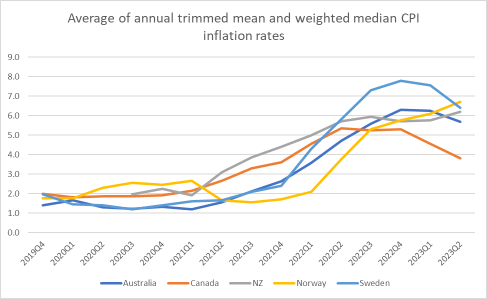
I wrote a post a couple of weeks ago looking at what had been happening to monetary policy and inflation across a bunch of advanced economies in the light of the complete suite of June inflation data. I’m not going to repeat all the analysis and discussion from there, and nothing very much has changed in the published data (for real nerds, still disconcertingly high Norwegian core inflation has come back down again after rising the previous month or two). But some key relevant points were:

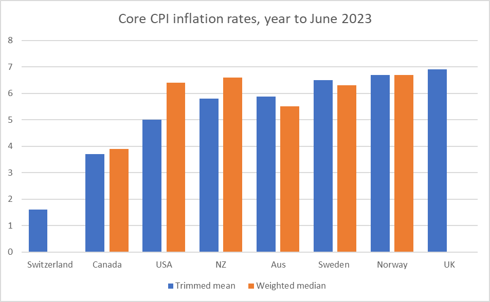
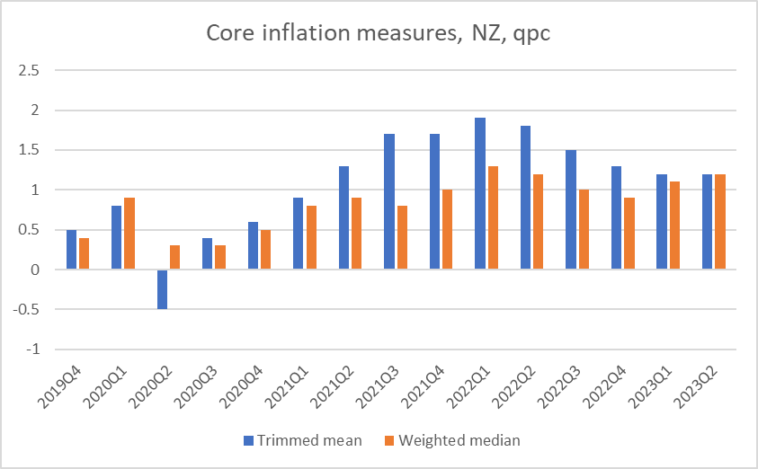
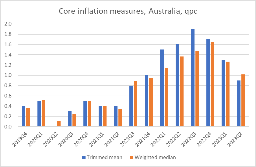
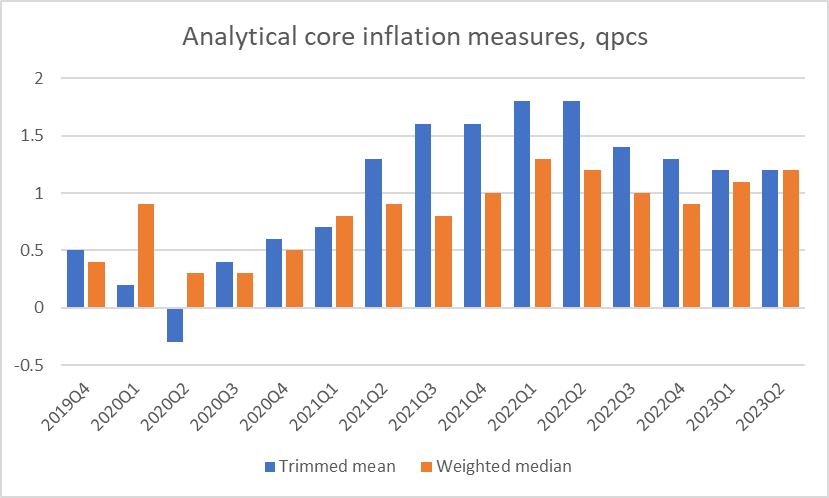
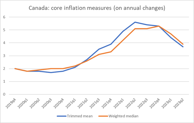
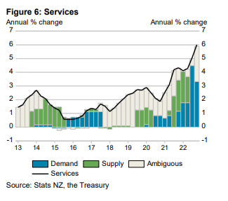
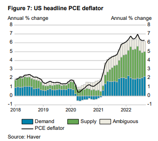
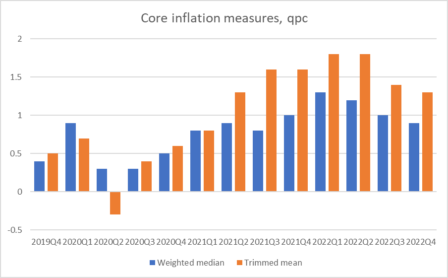
  • as yet, there is no sign that core inflation in New Zealand is falling (and even if one measure it might be lower than the early 2022 peak there is no sign it is still falling now).  That is a quite different picture from some other advanced countries (notably the US and Canada, but also Australia).
  • employment appeared to continue to be growing strongly (and even confidence measures were stabilising),
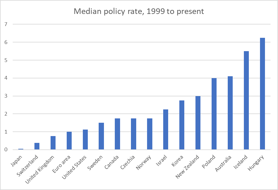
  • New Zealand is one of a small handful of advanced countries where the policy rate now (5.5 per cent) is still well below the pre-2008 peak (8.25 per cent)
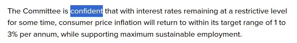
  • The MPC asserted at their last review that they were “confident” that they had done enough.  Neither those words, nor the idea, appear in the recent statements of any other central banks, and our MPC offered no reasons for their confidence.

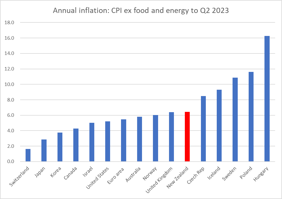
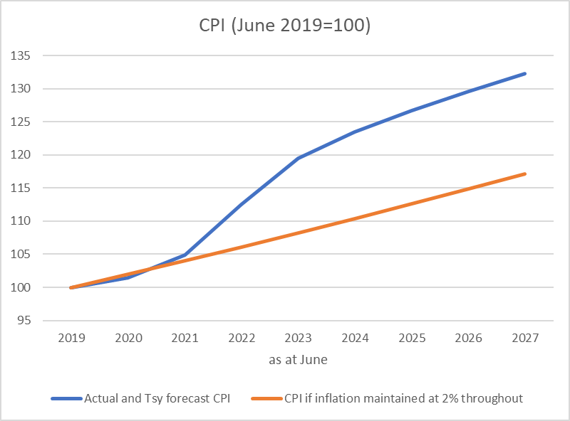
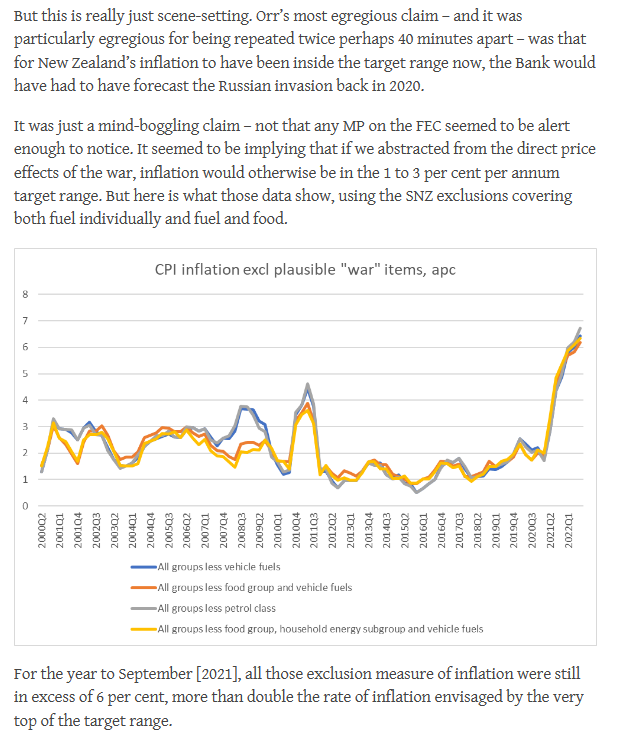
Bear in mind that with core inflation around 6 per cent and the Bank’s target requiring them to focus on the 2 per cent target midpoint, there is a very long way to go.   It isn’t a matter of getting core inflation down by 0.5 or 1 per cent, but of a four percentage point drop.

Bear in mind too that whereas past New Zealand tightening cycles have typically seen total interest rates rises similar to what we’ve seen to date (a) the scale of the required reduction in core inflation is greater than anything we’ve needed to achieve for 30+ year, and b) unlike typical New Zealand tightening cycles there has been no support from a higher exchange rate.

What local data there have been in the last couple of weeks hasn’t given us any more reason for comfort.  Late last week, there were the monthly rentals and food price data.   The food price data did look genuinely encouraging, although it was a single month’s data in a part of the CPI that had seen inflation far faster than the core measures until now.  Rents, on the other hand, appeared to be continuing to rise quite strongly, with no sign of a (seasonally adjusted) slowing at all.

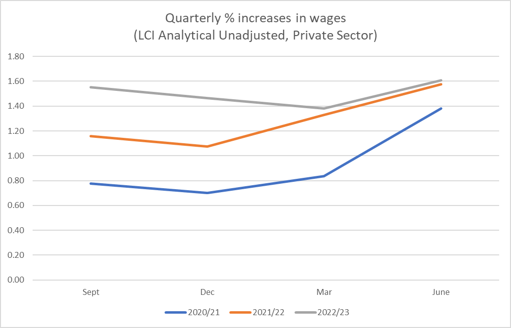
The suite of labour market data (HLFS, QES, LCI) was not really any more encouraging.  Labour market data do tend to be lagging indicators, but we have to use what we have.   4 per cent annual growth in numbers employed (comprised of four individual quarters each showing material growth) is absolutely and historically strong, by standards of past cycles the unemployment rate has barely lifted off the (extremely low) floor, and there is no sign of any slowing in wage inflation (remember that much of services inflation is, in effect, wage inflation).  There is seasonality in the wages data and SNZ don’t publish seasonally adjusted series but as this chart illustrates at best wage inflation might be levelling out, not much higher than the same quarter in the previous year.

To the extent the mortgage borrowers/refinancers tend to go for the lowest shortish-term fixed rate on offer, current two year fixed rates are barely higher than they were at the end of last year, and all the reports from the property market suggest a bottom has already been found and prices are already rising (still modestly) again.

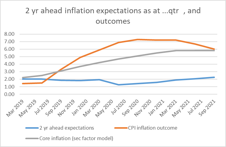
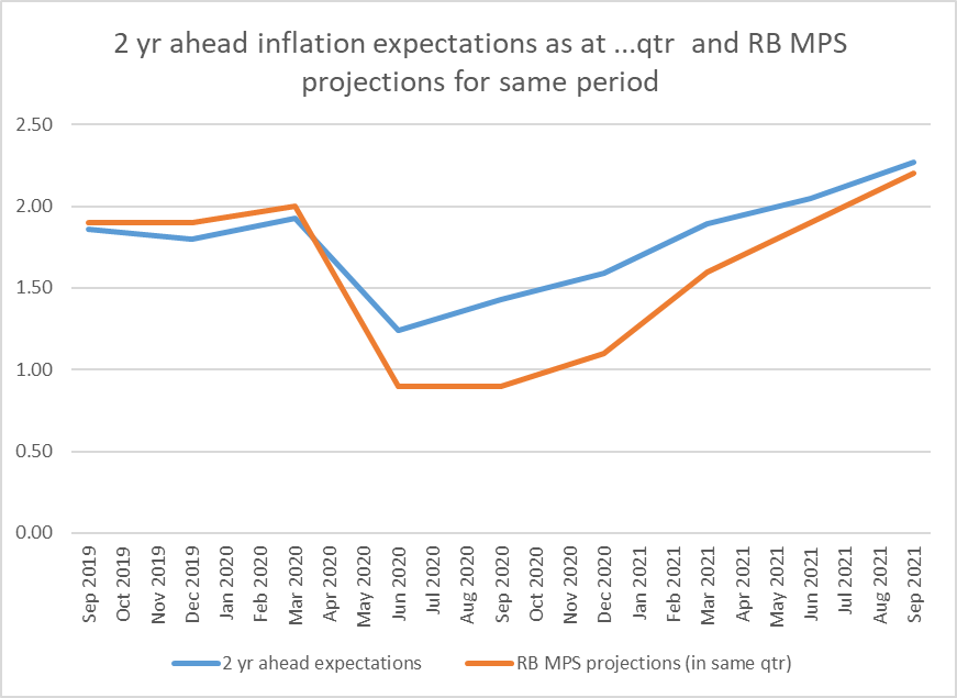
And then there was the latest RB survey of expectations. Medium-term expectations of inflation actually rose a touch (one could discount the small rise, but we should have been hoping for a fall, especially as the relevant horizon date moves out each quarter). This group of respondents has consistently and badly underestimated inflation in recent years. The Reserve Bank has too, but it has done even worse than these survey respondents.

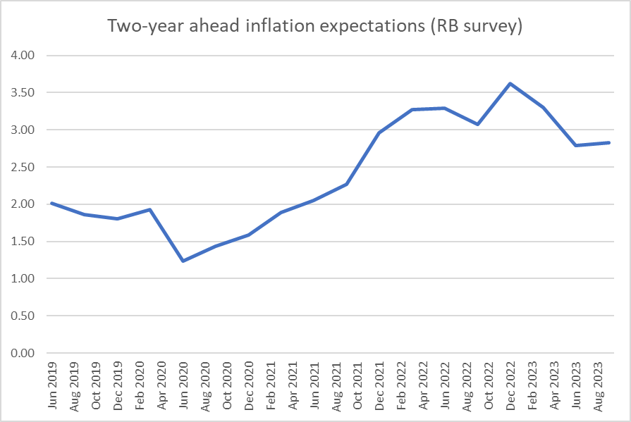
The survey responses regarding the inflation outlook don’t seem anomalous. The same respondents revised up their GDP growth forecasts, revised up their wage forecasts, revised up their house price inflation expectations, and revised down their medium-term unemployment expectations. They might be wrong – and often are – but are there good grounds for thinking the Reserve Bank is any better at present (in a period when no one really has a compelling model of what has happened with inflation – if they had, they’d have forecast it better).

You may have noticed that a couple of local banks think the Reserve Bank will raise the OCR later in the year (presumably a view that the Bank will eventually be mugged by reality). One presumes this predictions are best seen as a view that “more will need to be done”, rather than a specific confident prediction of 25 basis points being specifically what is needed. No one can be that confident (with 25 basis points). It may be that the MPC has already done enough (as they thought) or that it needs to do quite a bit more, but even in hindsight it will be very difficult to distinguish between the effects of a 5.5 vs 5.75% peak choice.

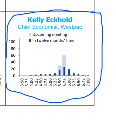
In the NZIER Shadow Board exercise, where respondents are asked what they think should be done, Westpac’s Kelly Eckhold thought that an increase in the OCR to 5.75 per cent at tomorrow’s MPS would be warranted (as does one other economist in the survey).

When I tweeted yesterday about the Shadow Board results yesterday I was still hedging my own position. I noted that I thought a least regrets approach – remember the MPC’s enthusiasm for such a model on the downside – suggested that it would have been better if the OCR had been raised more already.

That was deliberately an answer to a slightly different question than what I would do tomorrow if I were suddenly in their shoes, or (separate question again) what I think they should do. The actual MPC is somewhat boxed in by its own past choices (not just the “confident” rhetoric, but the absence of any speeches etc giving any hint of how they, individually or collectively, have seen the swathe of data that has come out since they last reviewed the OCR). To move the OCR tomorrow would bring a deluge of criticism on their heads, from markets and economists, but it would then be amplified greatly by politicians as we descend into the depressingly populist election campaign.

Since I think making the right policy adjustment (even amid all the uncertainty) is more important than communications, and since there is already reason to think the MPC has been playing party political games (its treatment of the Budget in the last MPS), I think they should raise the OCR anyway, by 25 basis points, and shift their forward-looking approach back to a totally data-dependent model, rather than trying to offer reassurances. Were I suddenly in their shoes, shaped to some extent by past choices, I would probably be wanting to indicate concern that core inflation was not yet falling, emphasising how far there was to go, and making clear that the real possibility of OCR increases would be on the table for both the October and November reviews (the latter the last before the MPC moves into its very long summer holiday).

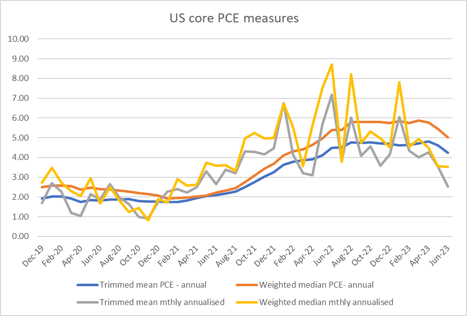
To me, the issue now is not whether core inflation is going to fall. It seems most likely that it will finally begin to (and although overseas experience in by no means general, perhaps the US, Canadian, and Australia recent experiences offer grounds for hope) but rather how far and how slow the reduction will be. We need large reductions in core inflation, not just the beginnings of a decline, and two years into the tightening cycle we need to see large reductions soon. Perhaps it will happen with what has been done already, but that seems more like a hopeful punt than a secure outlook. One thing we should be looking for tomorrow, especially if the MPC does nothing, is some serious analysis illustrating their thinking as to why it is that core inflation here has not yet fallen (whereas, for example, it has in the US, Canada, and Australia). I don’t know the answer myself, but with all the resource at their disposal we should expect the MPC to make a good fist of a compelling story.

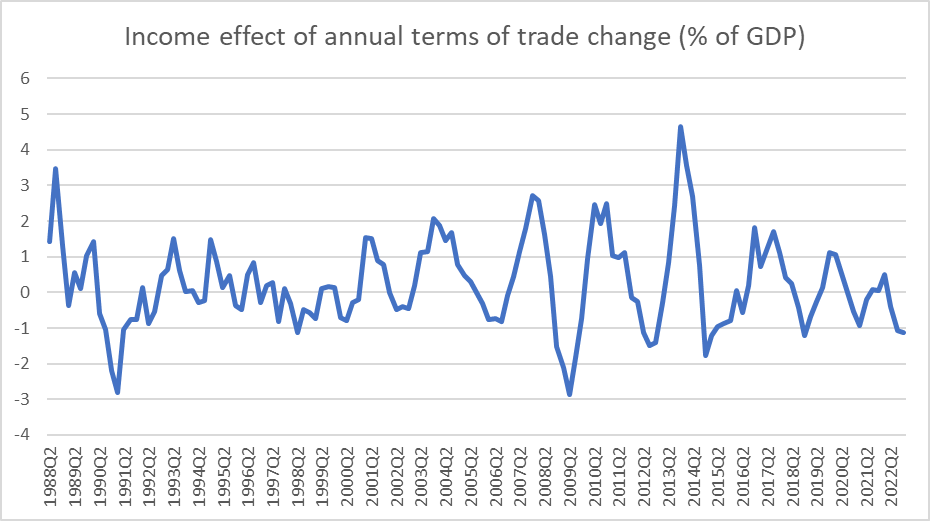
The world economy, and the travails of China, have got some attention recently. That global uncertainty will no doubt be cited by some, including around the MPC table, as reason for waiting. I’m not convinced, partly because over the decades I’ve seen too many occasions when such potential global slowdowns have been cited as an argument, only for them to come to not much. Relatedly, over the years one of the most important ways global events affect New Zealand has been through the terms of trade. A serious global slowdown might be expected to dampen the terms of trade (and thus real incomes and demand relative to the volume of domestic output) but…..

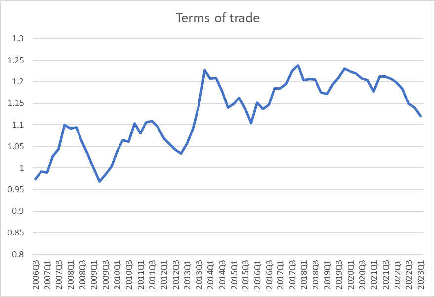
….New Zealand’s terms of trade have been trending down since Covid began, and quite sharply so since the start of last year. We’ve been grappling with an adverse terms of trade shock and have still had persistently high core inflation (and super-tight labour markets etc). There isn’t any obvious reason why the terms of trade couldn’t fall another 10 per cent (dairy prices have already weakened further in recent months, this chart only being to March), but if so it won’t be against a backdrop of recent surges of optimism (unlike the reversal in the recession in 2008/09). In short, there is plenty of time to react to really bad world events if and when they actually happen.

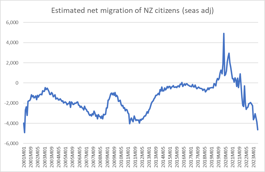
Finally, the immigration situation has materially changed the New Zealand macro position in the last year. In the June quarter last year, there was a net migration outflow of 2600 people. In the June quarter this year (June month data out only yesterday), the estimated net inflow was 20000 people (consistent with an annual rate of 80000 or so). The Reserve Bank is on record as saying it doesn’t know whether the short-term demand or supply effects are stronger (which is quite an admission from the cyclical macro managers) but all New Zealand history is pretty clear that – whatever the longer-term effects might be – in the short term demand effects, particularly from shocks to migration, outweigh supply effects. Without that effect, it might have been safe to assume enough had been done with monetary policy months ago. But not now, not against the backdrop of high and not falling wage and price inflation, strong employment growth, recovering housing market and so on.

Note too that the net inflow numbers are held down by the high and rising number of New Zealanders leaving. Outward migration of New Zealanders tends to be particularly strong when the Australian labour market is very tight (see 2011 and 2012), and if that market were to ease – as seems to be generally expected and thought to be required – the overall net inflow to New Zealand could surge again

Bottom line: I think the MPC should raise the OCR tomorrow, and certainly should flag October (once the Q2 GDP numbers are in) as live.

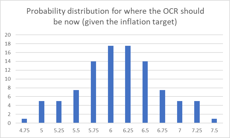
But all these views have to be held somewhat lightly. Doing that Shadow Board exercise (see above) myself, and it is something the Governor’s advisers at the RB used to have to do, I might distribute my probabilities as to what OCR is appropriate now something like this (none of those individual probabilities is higher than 20 per cent)

UPDATE:

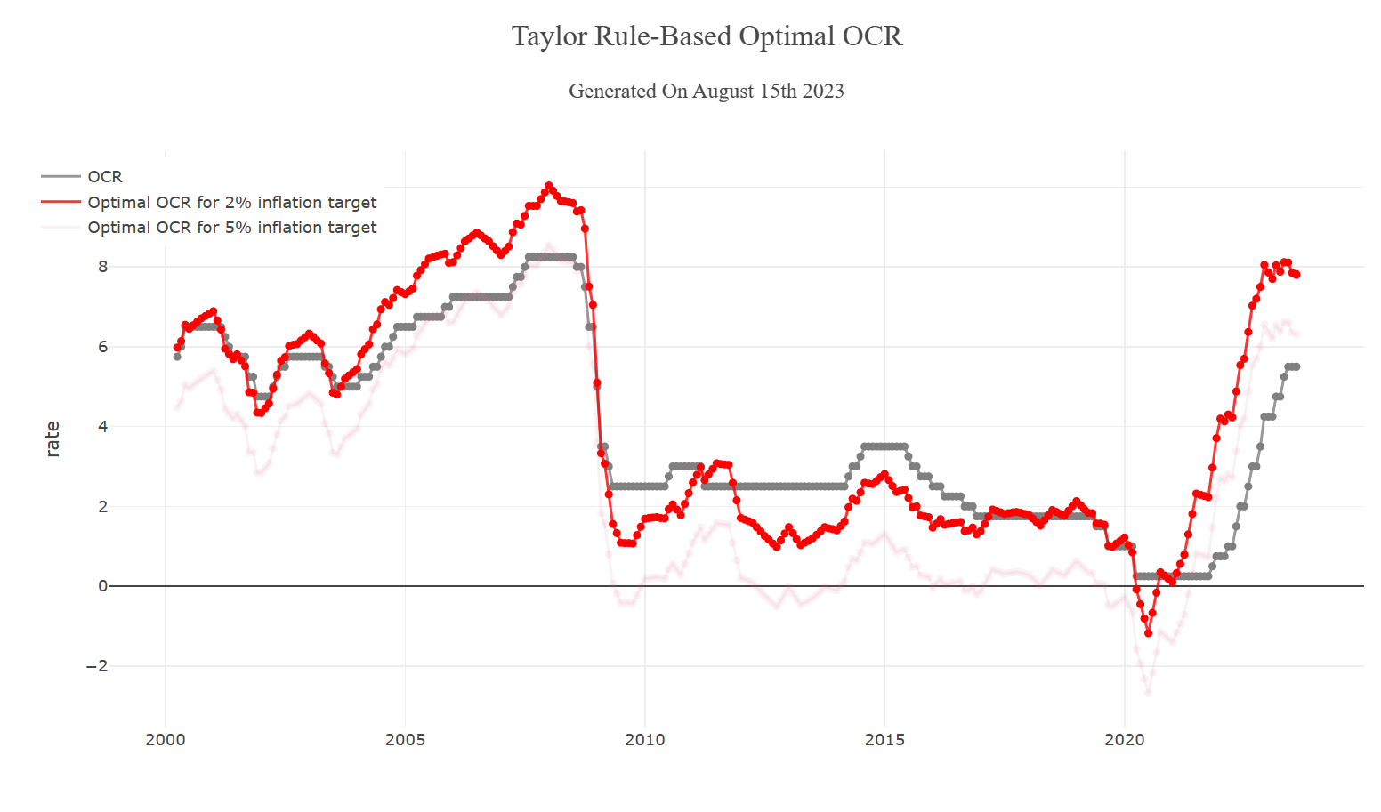
In the comments Bryce Wilkinson points us to this. Having been in the weeds in 2007 I’m not convinced that on the information we had at the time an OCR of 10% was needed in Dec 2007. That said, an OCR of 4.3% in February 2022 would have been much better than policy as actually delivered. And note that an 8% OCR now would be close to the 2007/08 actual peak (as many other countries’ policy rates now are). Food for thought.

Inflation and monetary policy: looking across countries

Time moves on. This post was going to be run late last week once the last OECD inflation data for the June quarter (that for Australia) came out, but a bad cold ran through the house and not much got done. Last night, July inflation numbers were released for the euro-area (remember that NZ only recently got mid-May’s numbers), but this post is going to focus just on the numbers to June.

This is annual CPI inflation ex food and energy (the only core measure available for a wide range of countries) as at the end of June. The sample of countries is the OECD countries/regions with their own monetary policies, excluding Turkey (with off the charts crazy monetary policy and inflation) and the OECD’s poorer Latin American diversity hire countries (but note that two of those latter countries’ central banks have already started cutting policy rates). Of two other advanced countries not in the OECD, Singapore’s (headline) inflation peaked at 7.5 per cent, and Taiwan’s at 3.6 per cent.

The diversity in outcomes across countries isn’t often recognised. Politicians and central bankers have both tended to go along with lines about “everyone is experiencing much the same thing” (which is a convenient line for avoiding specific and localised accountability). But they aren’t.

Pre-Covid, inflation rates across countries were very tightly bunched (in 2016q4 for example, the lowest core inflation rate for these countries was -0.4 and the highest was 2.9 per cent, at present the range is from 1.6 per cent to 16.2 per cent)

And here is how New Zealand has gone on this metric over the same period relative to the median of these 16 countries/regions.

Pre-Covid our core inflation rate was around the median (altho perhaps showing signs of beginning to pull away) but over recent years core inflation in New Zealand has been consistently higher than in other OECD countries (and of course now miles above target). That is on the Monetary Policy Committee. Note that at least on this measure there is no sign yet that the median country’s core inflation rate is yet falling.

There are other core inflation measures, and each country or central bank often has favoured or specific ones, sometimes ones best suited to particular idiosyncrasies at the time. But a fair number of countries or central banks have and publish either trimmed mean or weighted median measures (others have and use them – seen at times in speeches etc – but don’t seem to make the data series routinely available). It would be great if there was a consistent collection of these (generally superior to crude exclusion) measures across advanced countries, but there isn’t.

I did what I could and found trimmed mean and/or weighted median data for eight of the countries above (NZ, Australia, US, UK, Canada, Switzerland, Sweden, Norway). Even then it is complicated by things like having only a chart for one country, and inconsistencies in whether there is monthly/quarterly or just annual data available, and in whether or not seasonally adjusted data is used (NZ doesn’t). Oh, and the US has fuller data for PCE inflation – the Fed’s focus – than for CPI inflation.

Here is where the annual rates of core inflation stood for these countries at the end of June (there are no weighted medians for Switzerland and the UK)

And here is the time series for the five countries with both weighted median and trimmed mean annual rates

It is a mixed picture. Core inflation in Sweden and Canada has clearly fallen, and Australia seems to have as well, although to a lesser extent. Things are still getting worse in Norway, and in New Zealand things are probably best seen as going sideways. Of the other countries, the chart of trimmed mean inflation in the UK suggests they are still very near a very recent peak, and Swiss trimmed mean inflation is now down a little from peak.

What of the US, which gets most coverage? Focusing on the PCE measures, core inflation is clearly falling

Most countries don’t provide quarterly or monthly percentages changes, but we do have that data for New Zealand and Australia (in New Zealand’s case complicated because SNZ does not – for some inexplicable reason – use seasonally adjusted data to do the calculations. There isn’t much seasonality in the resulting series, but using raw data tends to skew downwards the quarterly changes – when, eg, there are things that reprice once a year.) Here is the NZ chart

and the Australian one

For Australia, the falling rate of quarterly core inflation is now pretty clear. Both measures now paint much the same picture. But for New Zealand while the trimmed mean suggests quarterly inflation has peaked (quite some time ago), a) there is no hint of that in the weighted median, and b) in the last couple of quarters there is no sign the trimmed mean is falling further. The fact that the two series have re-converged suggests not much grounds for comfort about New Zealand core inflation (especially when put together with the simple ex food and energy measure). On balance, perhaps we could say that the worst may have passed, but none of the series are yet suggesting anything like a quick convergence back to target (recall, the MPC is required to focus on the 2 per cent annual target midpoint).

Which brings us to monetary policy.

At their last review – incredibly, scheduled deliberately a week BEFORE New Zealand’s rare and infrequent CPI data came out – the MPC declared itself thus.

It isn’t clear to me how (a) any central bank can credibly claim to be legitimately “confident” about anything much at present (if your models got inflation so wrong over 2020-2022, why would you be confident things were working just fine now, and b) how the RBNZ MPC any particular had found any reason in the data (let alone the CPI data they chose not to avail themselves of) for their particular breed of “confidence”.

I checked the RBA and Bank of Canada statements last month: they didn’t seem confident (much more, as you might expect, data-driven). Nor did the Bank of England or the FOMC. And there was no apparent confidence that they had done what needed doing in the SNB, Norges Bank or Riksbank statements either. In fact, the Swedish Riksbank’s latest statement captured nicely what might have been expected here, on the data as it stands

This from a central bank with the same target as the RBNZ, similar current core inflation, but clearer evidence core inflation has already been falling.

It leaves a distinct sense that, as so often, the RB MPC was engaged in spin, lacking in substantive analysis.

There will some important further data out before the MPC again sets the OCR later this month (notably tomorrow’s labour market suite, and also the Bank’s Survey of Expectations – the one that so far this cycle has done a less bad job than the MPC of picking future inflation), so what they should do in August is still to some extent a question for another day (although they should, if they are at all intellectually honest, take that “confident” statement off the table). But how about where things stand now? And all bearing in mind that monetary policy works with a lag (although quite how long and variable those lags really are does seem to be up for debate).

There are central banks where you really have to wonder what is going on. For example, policy rates haven’t been raised in Hungary and Poland since September last year and both now have double-digit core inflation (still rising in Hungary). Less extreme, the Norwegian central bank has core inflation still rising, and although the central bank has raised the policy rate by 100 basis points this year, it is still only 3.75 per cent (and Norway’s latest monthly unemployment rate is still very low). Iceland also has core inflation steady at around 9 per cent.

On the other hand, when one looks at the Bank of Canada’s increase in the policy rate last month (to the highest level in more than 20 years), in conjunction with the already-falling and fairly moderate core inflation you get the sense that, if they are still too sensible to say it, that they might have good grounds for being increasingly confident of being back to target before long.

It would all be a lot easier if we had robust estimates of the neutral real and nominal rates for each country. But we don’t (neither the real rates nor the implicit inflation expectations that are actually shaping behaviour of firms and households).

And there is lots of differences across countries. For the period since 1999 (when the euro started, and the NZ OCR began) here is the median policy rate in each country (differences would be a bit smaller done in real terms, but still substantial).

All countries, except Australia, now have policy rates above those medians.

I took a look at how current policy rates compare to the peaks in each country in and around 2008. The median difference across those 16 countries is under half a percentage point (eg both the US and the euro-area now have policy rates almost exactly the same as that pre-crisis peak).

But four countries stand out, with policy rates now well below that previous cycle peak. There is Iceland. Now, the pre-2008 peak was in the context of one of the most staggering and destructive credit booms in modern times. Still core inflation is 9 per cent, and the policy rate even now is only 8.75 per cent. There is Norway: as above, core inflation is high and rising and (from a distance) it is hard to be confident things are in hand.

And then there are New Zealand and Australia, both with policy rates around 3 percentage points less than the 2007/08 peaks (and there is a pretty common view about 2008 that the RBA got lucky, not having had policy rates tight enough – in the face of a mining investment and terms of trade boom – but being “saved” by the international recession. The Australian story puzzles me: rates are well below previous cyclical peaks, the unemployment is still extremely low (including far lower than just pre Covid), but……the data (see above) show that core inflation has turned down (and while there is still a way to go, Australia’s target is a bit higher than some other countries’, including New Zealand). If I wanted to be “confident” I’d done enough, one can see a good case for higher rates (perhaps later today), but there are plausible counterarguments.

Much less so for New Zealand. We don’t have core inflation falling, we don’t have unemployment rising much (and last week’s employment indicators still looked quite strong), unlike most previous policy rate cycles there is no disinflationary support from a rising exchange rate, and the OCR is miles below the 2008 peak. (One could no doubt add in points Westpac in particular has been making about a bit of rebound in confidence, but I’m not trying to review all the data.)

Were I in the Fed’s shoes or those of the Bank of Canada I might by now be feeling somewhat more secure. Were I at the Norges Bank (as far I can see) I’d be very uncomfortable. The Australian data are perplexing but there seems nothing in the New Zealand data – considered a cross country or across time – to give any central bank decisionmakers any particular reason for comfort (let alone “confidence” at all). Macro forecasting is something of a mug’s game, and it is always possible the RB MPC may have done enough, such is the uncertainty, but it is very hard to see at this point (and the Committee has provided no analysis in support of their stated “confidence”, continuing a fundamental dereliction (no speeches, no serious research, no serious analysis) that dates back at least to the creation of the MPC). Things may be just about to break, and there are a great many uncertainties here and abroad, about how this cycle is unfolding, but the sort of “confidence” the MPC is asserting risks seeming more political (eg life seems like to be easier for Orr if Labour is re-elected) than grounded in secure economic analysis.

Tweaky tools

For the first 20 years or so of inflation targeting in New Zealand, there was a near-constant hankering for other instruments to “help out” monetary policy. In the early days of getting inflation under control, it was little more than ritual incantations (the team I ran included them every month in our papers to the Minister) that it would help, adjustment would be easier, if only there was labour market deregulation, reduced trade protection, and tougher fiscal policy. In the Brash years, his colleagues became very familiar with the Governor’s hankering for what we (or he) called “tweaky tools”, things that at the margin might make a difference, particularly perhaps in easing the exchange rate pressures that used to be such a feature of New Zealand monetary policy tightening cycles. There was even the pesky visiting US academic in the mid-90s who used his public lecture to suggest that discretionary fiscal policy should be handed over to the Reserve Bank (we winced). It wasn’t so different in the pre-2008/09 Bollard years. At the then Minister’s urging we and Treasury ran an entire Supplementary Stabilisation Instruments projects in 2005/06, culminating a year later in a scheme for a discretionary Mortgage Interest Levy, a scheme the then Minister was tantalised by, sufficient to consult the Opposition, but eventually shut down work on only when National walked away. At about the same time, yet another invited visiting academic was openly proposing a variable GST as a supplementary stabilisation instrument. In the same vein a few years later, Labour in 2014 campaigned on giving the Reserve Bank power to vary Kiwisaver contribution rates, to assist monetary policy in the cyclical (inflation) stabilisation role Parliament has assigned it.

Of course, between mid 2007 and mid 2021, there were hardly any OCR increases, and those there were were quite small and short-lived (unnecessary in the first place as it happens). And since around 2010 New Zealand real exchange rate fluctuations have been much more muted than we had become accustomed to (over the decades from 1985, they were not only highly salient in political debate but also inside the Reserve Bank).

And if big cyclical swings in the real exchange rate still haven’t resumed, big OCR increases have.

And with it talk of spreading burdens, easing loads, and finding supplementary tools seems to be back. There was an article in the Herald a couple of weeks ago sympathising with indebted households who, it was claimed, are bearing the brunt of the belated anti-inflation fight.

(I wouldn’t usually be very sympathetic with people who took big mortgages when house prices were rocketing on the back of pandemic-policy low interest rates and didn’t lock in, say, five or seven year fixed rates, except that……..the Reserve Bank itself by buying up $50+ bn on longish-term government debt at the same time did rather tend to suggest to the borrowing public that rates weren’t likely to go up much – after all, which responsible government agency would expose its stakeholders (taxpayers) to a meaningful risk of $10+bn of financial losses.)

And that prompted Don Brash to enter the conversation, reviving a call he had first made in 2008 and suggesting that the Reserve Bank be given the power to vary the petrol excise tax as an additional counter-cyclical tool to assist monetary policy and spread the burden. This is reported and discussed in this Herald piece today, which in turn draws from one of Don’s own blog posts. Don ends his post with this claim

But it would have the huge advantage of spreading the social effects of controlling the inflation rate.

I disagree, quite strongly, with Don’s proposal, for a variety of practical and principled reasons, and would do even on a best-case model (say, legislation limited the extent of the Bank’s discretion and revenues were properly and formally ring-fenced).

(In the Herald article, ANZ chief economist Sharon Zollner is also quite sceptical, adding this tantalisingly radical observation – topic for another post another day:

She said the more salient questions we should be asking were not what tools should we use to try to steer the economy, but rather, should we try to do it at all, given the limitations of economic forecasting? Might the costs outweigh the benefits?

Don is quite right that (as we saw last year), petrol excise taxes can be adjusted very quickly and the effects are also typically seen in retail prices very quickly. He suggests that as the price elasticity of demand for petrol is quite limited, any increase in petrol taxes will quite quickly dampen households’ other spending, in turn dampening inflation pressures. There are certainly plenty of households who are quite cash-flow constrained, but whether the effect exists to a material extent in aggregate would need rather more careful and formal review (reflecting on my own behaviour, I’m also a bit sceptical).

But even if we grant that the effect is real and, whatever the effect actually is, perhaps fast-working, there are lots of other problems. These include:

  • the temporary petrol excise tax cut of 2022/23 was 25 cents a litre.  As far I can see, the direct fiscal costs of that were about $1 billion over 15 months.  Even if it was $1 billion for a year, that is about 0.25 per cent of GDP.   And although many economists, including me, pointed out that the income effect of this cut (and the associated road user charge and public transport subsidies) was inflationary, I’ve not seen anyone suggest it was a decisive factor in explaining core inflation outcomes over the last year or so.  Quadruple the effect and one might be talking more serious macroeconomic impacts, but that would require giving the Reserve Bank discretion to make much larger changes in excise taxes than any Minister or Parliament has ever made before.   Sold as an explicitly temporary effect, a cyclical stabilisation adjustment of this sort would probably result in less demand effects than, say, an excise tax increase known to be permanent.
  • Don Brash argues that petrol excise taxes are easy to change. Much less so (as we saw last year in the rushed package) are road user changes for diesel-fuelled vehicles).  The Brash scheme doesn’t seem to envisage adjusting road user charges, but to do one and not the other –  as part of a new permanent stabilisation model –  would seem simply politically untenable.  He also recognises that electric vehicles are becoming more of an issue than they were when he first dreamed up the scheme, but says “Admittedly, with the growing use of electric vehicles there may come a time when varying the excise tax on petrol would have little effect on aggregate demand. But that time is still some way away.”  It seems likely that EVs will soon, as they should, face road user charges, but again the politically tone-deaf nature of the suggestion that the unelected central bank should be able to whack on huge tax imposts on one lot of drivers but not others (the “others” often stylised as being upper income anyway) is staggering.  And if you are tantalised by a thought “oh, but we can encourage people towards EVs”, remember that any such scheme would almost certainly have to be symmetrical…….
  • As Brash acknowledges, one downside of his scheme is that increasing fuel excise taxes to fight inflation will itself, at least initially, boost CPI inflation.   From a central bank accountability perspective this itself isn’t fatal (the target could be re-expressed as one for CPI inflation ex indirect taxes, and the fuel excise effect won’t show up directly in the better analytical core inflation measures), but…….one of the things we know about survey measures of inflation expectations is that they seem to be quite heavily influenced by headline CPI developments (and you can be sure media will keep highlighting headline effects).  We don’t have a very good sense of how those expectations are then reflected in behaviour (spending, borrowing, price and wage setting) but it is unlikely to be helpful –  and especially if we were talking of $1 a litre excise tax changes)
  • It is certainly true that there are plenty of cash-flow constrained households.  For better or worse, however, many of the most cash-flow constrained households also benefit from formal inflation adjustments (welfare benefit indexation), which directly undercut the cash-flow argument Brash is relying on.   The tendency of governments to at least inflation-index the minimum wage works in the same direction (and if neither adjustment is immediate, the central bank should be focused on medium-term inflation prospects, not one quarter possible effects).
  • People are rational.  The MPC meets seven times a year.   Given the prospect that seven times a year, on pre-announced dates, the fuel excise would be up for grabs, behaviour will change, with people either queuing for petrol the morning of the MPC meeting, or holding off as much as possible until just after.     Especially if the prospective excise adjustments are large enough to be economically meaningful (and the road user side is even more challenging if it were to be included).
  • It is a long-established principle of our system of government, dating back centuries, that taxes should only be imposed and adjusted by elected Parliaments (or at very least by formulae fixed by Parliament, as with indexation).   Back when the Mortgage Interest Levy (see above) was being devised (I was the key RB deviser), I recall telling Alan Bollard that I would join the marches in the streets against any notion of taxation without representation.   Same should go for petrol excise tax levies.  It is all rather redolent of Muldoon’s proposal from the 1970s (which was firmly rejected) for the minister to be able to do modest adjustments to tax rates for cyclical stabilisation purposes.  It is the sort of argument that has technocratic appeal, but no democratic appeal.  And before anyone suggests parallels, the rate at which a central bank pays interest to a bank that chooses to deposit with it is not a tax.
  • The Brash proposal seems to have no framework within which the MPC should decide whether to use a fuel excise tool, and to what extent it should use one tool rather than another.  Perhaps overall accountability for inflation – weak as that now seems to be –  would be unchanged, but we’d be opening the door to the whims of 7 unelected people, several with very little technical expertise either, to decide whether to whack up the fuel excise tax or whack up the OCR.   There are huge distributional implications from such choices, and no framework. opening the way (among other things) to extensive lobbying from vested interests preferring one rather than the other.   That seems, to put it politely, unappealing.
  • One of the elements of the Mortgage Interest Levy proposal that exercised our minds a lot was how to ring-fence the revenue.   There wasn’t much point in an additional tax, which might dampen some forms of demand, if the prospect of that money meant governments felt free to spend more.   One can devise all sorts of clever-clogs institutional arrangements, but in the end public revenue is public revenue, net public debt is net public debt, and cost of living pressures and elections are very real.   This might not be an insuperable obstacle, but money pots will tempt politicians (government and Opposition).
  • Brash justifies his proposal on the grounds of mitigating the “social effects” of controlling inflation.  That may well be a laudable goal, but it is one for governments.  This year, however, the government has chosen to run a much bigger fiscal stimulus than it had planned even at the end of last year, on a scale swamping the plausible extent of any fuel excise tax tool, at a time when inflation is still a severe issue.    Had they been at all concerned, there were options, within current legislative and governance frameworks.  The government chose not to take them (and to a detached observer there is little concrete sign National would really have done much different).

Some of the points above matter more than others, and some will matter more to some than to others. But overall, it seems an unappealing proposal. Actually, I’d be rather surprised if the Reserve Bank itself were at all keen, at least after half an hour’s thought.

In the original Herald article a couple of weeks ago, the author ended this way

Quite.

Inflation outlooks

I was filling in the latest Reserve Bank Survey of Expectations form the other day. If one ever needed to be reminded that macroeconomic forecasting is a mug’s game, or wanted a lesson in humility, all one needs do is keep a file of one’s successive entries to that survey. Coming on the back of the latest annual inflation rate of 6 per cent, it was sobering to look back at the two-year ahead expectations I’d written down in 2021 (as I happened, I missed the July 2021 survey so can’t give you my exact number, but suffice to say it would have borne no relation to 6 per cent).

I wasn’t alone. This is what two-year ahead expectations were each quarter from March 2019 (done around the end of January) to September 2021 (done around the end of July). With something of a scare in the June quarter of 2020, the average respondent generally saw medium-term inflation sticking pretty comfortably in the target range the government had set for the Reserve Bank MPC.

As the Reserve Bank often likes to point out, these expectations measures haven’t historically had a great record as forecasts. In fact, here are the outcomes for the dates at which these two year ahead expectations were sought (so the Sept 2021 quarter survey asked about inflation for the year to June 2023). I’ve shown both the headline CPI and the Bank’s sectoral factor model measure of core inflation. Although the question asks about CPI inflation, in some ways core outcomes are a better comparator since no one is going to forecast out-of-the-blue changes in government charges or taxes, or oil prices, two years hence.

The average private commentator/forecaster who completed the surveys has been pretty hopeless.

Unfortunately for us, since it is the Reserve Bank MPC that not only makes monetary policy but is, notionally at least, accountable for stewardship and outcomes, the Reserve Bank was a little worse still

The Reserve Bank’s projections were consistently lower than those of the average surveyed respondents over the period relevant to the inflation outcomes of the last couple of years, and by margins that (by the standards of surveys like this) are really quite large. But the underlying story is even worse, because the Reserve Bank runs the Survey of Expectations so as to have the data available when making their own projections. Thus, the Survey of Expectations is open to respondents from late last week until Wednesday, but the August MPS is not until 17 August, with forecasts finalised perhaps on the 12th. The Reserve Bank has consistently more information than the survey respondents, including both the survey responses themselves and the full quarterly suite of labour market data (and other bits and pieces of extra data from here and abroad). All else equal, the Reserve Bank projections should be at least a bit closer to outcomes than the average respondents’ expectations, even if both lots of people were making the same misjudgements about the underlying story. Time has value.

The picture would be more stark again if I could effectively illustrate respective OCR expectations over the period. Both the Bank and survey respondents are, in principle, providing endogenous policy forecasts (ie both allow the OCR, and any other policy levers at the MPC’s disposal, to change), but the survey respondents are only asked about the OCR out to a year ahead (and, more recently, 10 years ahead, but that is less relevant here). And during the worst of the Covid period, the Bank wasn’t publishing OCR projections, but rather an “unconstrained OCR” path, which went quite deeply negative, even though the actual OCR couldn’t go that low. But it looks as though not only were the Bank’s inflation outlooks more wrong than the private survey respondents (answering several weeks earlier), but they were probably based on looser monetary conditions than private respondents were assuming.

We don’t know where annual inflation is going from here, or when and how quickly it will get back to around the 2 per cent the MPC is supposed to have been focused on. But if we add a couple more surveys and sets of MPS projections to the chart (bringing us up to numbers done in early 2022) it seems pretty likely that the Reserve Bank MPC projections will still have been more wrong than the private survey respondents were (after all two of the four quarterly numbers that will make up December 2023’s annual inflation have already been published). All this in the period of the biggest inflation outbreak, and monetary policy error, in decades.

I was on record last year as opposing the reappointment of the Governor (and, for what it is worth, the external MPC members). In a post back in November I included a list of 20+ reasons why Orr should not have been reappointed. None of them were the actual inflation outcomes.

I’ve tended to emphasise that both central banks (here and abroad), and markets and private forecasters, to a greater or lesser extent really badly misjudged inflation. And that is true. But central banks, and specifically their monetary policy committees, were charged with the job of keeping inflation near target, and given a lot of resource to do the supporting analysis and research. If they had done only as badly as the average private sector person over that critical period, perhaps there might be reason to make allowance (but these people voluntarily put themselves forward as best placed to do the price stability job, and are amply rewarded for it (financially and in terms of prestige). And in New Zealand at least, they did worse.

What is more, and this gets me closer to my list of reasons why none of the decisionmakers should have been reappointed, not once have we had from them (individually or collectively) an apology – for the massive economic dislocations and redistributions their mistakes led to (unwittingly no doubt, but they purport to be experts) – or even a serious attempt at robust self-examination and review, with signs that they now understand why they got things so wrong. Not a serious speech, not a serious research paper (or whole series), really not much at all (yes, there was their five-year self review late last year, but as I noted at the time there really wasn’t much openness there either). Not even an acknowledgement that they – the experts who took on the job – did worse than the respondents to their own surveys through an utterly critical period.

Inflation, monetary policy, and central bank spin

The CPI data out yesterday were not good news.

Annual headline inflation was, more or less as expected, down, but at around 6 per cent is miles from the 2 per cent target midpoint the Reserve Bank’s MPC has been required to focus on delivering. Much more importantly, core inflation measures show little or no sign of any reduction.

Six months ago I had been intrigued by this chart

It looked as though a reasonable case could then be made that core inflation had peaked a year earlier and was now falling (albeit still far too high).

But jump forward to today and the chart now looks like this

If it still suggests a peak at the start of last year (at least on one of the measures), it is no longer a picture of (core) inflation falling now. (NB: You cannot put much weight on the absolute level of the numbers shown here because for some, unknown, reason SNZ persists in doing the calculations on not seasonally adjusted data, which can materially affect the level of quarterly estimates.)

If you look at a range of exclusion measures (CPI ex this, that or the other), the quarterly picture for Q2 looks a little more promising (but analytical measures such as those above are increasingly used for a reason).

On an annual basis, a whole bunch of measures centre on core inflation of perhaps just over 6 per cent.

Focusing on just two big individual price movements, the CPI ex petrol is up 7.1 per cent for the year, and the CPI ex international airfares is up 5.7 per cent.

The contrast between New Zealand

and Canada (where the central bank has the same target as ours) is striking

Rightly or wrongly, the Canadian central bank last week still judged it appropriate and necessary to raise its policy interest rate.

Over the period since the OCR was introduced, the New Zealand policy rate has typically been a lot higher than Canada’s (for the same inflation target since 2002): the median difference has been 1.5 percentage points. At present, the difference is unusually small even though our inflation numbers look quite a bit worse than Canada’s

If you think Canada is an obscure comparator, the story is, if anything, a bit more stark relative to the US where core inflation measures have also been falling.

And yet having chosen – and it is pure discretionary choice by the MPC – to review the OCR last week, just a few days BEFORE the infrequent New Zealand inflation data was released, the MPC then declared itself “confident” things were on track to get inflation back to target with policy rates at current levels.

Given how wrong they (and most other central banks) have been over the last three years, it is difficult to know how any bunch of monetary policymakers, with any self-knowledge and introspection at all, can declare themselves “confident” of anything about inflation outlooks. But what could possibly have led our lot to such a conclusion a week BEFORE the (quarterly only) inflation data? Once again, it isn’t looking great for them……and I guess it will be fingers crossed at the RB that the quarterly labour market data out early next month are much weaker. But the best official monthly data we have don’t seem that promising.

(As a reminder, it is not too late to apply to become a member of the Monetary Policy Committee although it is unclear that genuinely able people would be that keen to join a body led by underqualified uninterested people and where any genuine insight or challenge is unlikely, on the evidence to date, to be welcomed.)

I’ve always been reluctant to suggest that the MPC, or even Orr, were partisan. Mostly, they just seem not very good, something shown up more starkly in challenging times, and prone to questionable self-serving spin (even in front of Parliament). But since the May MPS I have started to wonder, and the nagging doubt was reinforced last week.

The Minister of Finance brought down the government’s annual Budget on Thursday 18 May. The Reserve Bank’s Monetary Policy Statement was a few days later, on Wednesday 24 May. I was travelling so most of my scattered comments were on Twitter.

On a current affairs show on 20 May, the Minister of Finance claimed that the Budget would not add to pressures on inflation or monetary policy.

This was utterly at odds with the material published by The Treasury. Treasury estimates and publishes a series for the “fiscal impulse”. This measure was designed specifically for the Reserve Bank to give a sense of how, particularly over the forecast period, fiscal policy choices were going to be affecting demand and inflation pressures.

All else equal a falling deficit or rising surplus act as a bit of a drag on inflation, and vice versa for rising deficits or falling surpluses.

This chart was from the Treasury HYEFU published last December and incorporating the government’s then fiscal plans, as formally advised to the Treasury. As you can see, for each of the forecast years, the estimated impulse was negative (the overall accounts were still expected to be in deficit for most of the period, but the projected deficit was shrinking). At the time, most monetary policy interest would have been on the (highlighted) 23/24 year – showing a moderate negative impulse – since it was the period that monetary policy choices would most affect (and anything beyond 23/24 was little more than vapourware anyway, with an election in the middle).

This is how the same chart looked in the May Budget documents (Treasury’s BEFU)

For the key year – the one for which this Budget directly related – the estimated fiscal impulse had shifted from something moderately negative to something reasonably materially positive. The difference is exactly 2.5 percentage points of GDP. That is a big shift in an important influence on the inflation outlook – which in turn should influence the monetary policy outlook – concentrated right in the policy window.

My point is not to debate the merits of the Budget (political parties will differ on that) but to highlight the macro implications of aggregate fiscal choices as estimated by The Treasury, and how utterly at odds with the Treasury’s analysis the Minister’s spin was.

Ministers – and perhaps campaigning ones – will say whatever suits them, whatever relationship (or otherwise) what suits bears to hard analysis and advice.

But one of the key reasons why societies have chosen to delegate the operation of monetary policy to autonomous central bankers is that the central bankers are thought more likely to operate without fear or favour, calling the data and events as they calmly and professionally see it. So, you’d have thought, with a Monetary Policy Statement a few days after the Budget one might have expected some serious detached analysis of the updated Budget fiscal numbers, as they affected demand and inflation. Either citing the Treasury’s estimates or perhaps presenting analysis explaining why the Bank thought the fiscal influence might be different than the Treasury did (the latter using a framework designed specifically for monetary policy purposes). After all, in their previous MPS, MPC minutes had explicitly noted that “members viewed the risks to inflation pressure from fiscal policy as skewed to the upside”.

Central bankers, including particularly at our Reserve Bank, have long avoided taking a stance on government spending and revenue choices. Mostly, they also avoid taking a stance of deficits and surpluses. Those are political choices, and particularly in modestly-indebted countries (like New Zealand) it doesn’t greatly matter to monetary policy whether the budget is in deficit or surplus. It matters way less whether one has a high spending and high taxing government or a low spending or low taxing government, and so it is rare – and appropriately so – for the Reserve Bank to be commenting on either spending or revenue choices. What matters (about fiscal policy) in updating the inflation outlook is changes in the discretionary component of the fiscal deficit/surplus (basically, what the fiscal impulse is trying to capture). This snippet (from a Bollard-years MPS) captures the general approach.

But how did the MPC treat things in the May 2023 MPS, coming just a few days after that very big increase in the expected fiscal impulse for the immediately approaching year, at a time when inflation (core and headline) was way outside the target range and the OCR had had to be raised aggressively?

The only uses of the terms “fiscal” or “fiscal policy” (“fiscal impulse” doesn’t appear at all) are in this paragraph from the minutes. Even here – even that final sentence – it is consistent minimisation.

But these are the only references. In the one page policy statement, there is no link drawn from fiscal choices to the inflation outlook, and only this rather odd (for a central bank) detached observation: “Broader government spending is anticipated to decline in inflation-adjusted terms and in proportion to GDP.” So what, one was left wondering…..unless the Governor and his colleagues had taken to playing politics, perhaps to help out a Minister and his colleagues who seem more disposed to the Governor’s way of doing/saying things than, say, the Opposition parties (who openly opposed his reappointment) might be.

Perhaps it wouldn’t even be worth highlighting if this were the only such reference. But it isn’t, by any means. Recall, there are no references in the body of the document to fiscal policy, fiscal impulses, fiscal deficits, OBEGAL, or changes in any of these. But there is a whole section devoted specifically to government spending, on top of the couple of references I’ve already quoted. And the focus there is not on the horizon relevant to May’s monetary policy choices, or the inflation outlook over the next 12-18 months but over the “medium term”, when who knows which government will be in charge and what their spending preferences and priorities will be.

It is quite right that their projections – which simply use Treasury numbers as a base – have real government consumption and investment spending (the bits they publish numbers for) flat for the next several years.

That might raise some interesting issues, including for supporters of the current government who favour lots of government spending (is it really consistent with your values that per capita spending is going to fall quite sharply?, would it prove politically sustainable? and so on).

But it is of almost no relevance to monetary policy. And omits really major bits of the fiscal story (on the spending side, all of transfers and finance costs, and all of the revenue side). Central banks should be mostly interested in shocks to the deficit/surplus outlook. But not, this year, it appears the RBNZ.

The Bank and the MPC seemed to minimise any story about the fiscal contribution to the outlook for inflation and monetary policy (you know, things like inflation still being outside the target range, even with a high OCR, for protracted periods. Those fiscal impulse charts/numbers don’t get a mention. But neither do simple stats like the fact that in December’s HYEFU, on then government plans, Treasury thought the OBEGAL deficit for 2023/24 would be 0.1% of GDP. By May’s Budget, government plans meant a forecast deficit that year of 1.8% of GDP. These are really big changes, playing down to near-invisibility by our supposedly non-partisan independent MPC.

It was all brought back to the front of mind last week when, out of the blue, this observation appeared in the OCR statement

Broader government spending is anticipated to decline in inflation-adjusted terms and in proportion to GDP. 

If you relied on Reserve Bank commentary, you’d just never know that, in the period current monetary policy choices are directly affecting, discretionary fiscal policy choices (overall balance and all that) had added, quite considerably, to inflation pressures in this year’s Budget. It doesn’t take much to guess which line the Minister of Finance will have preferred – and it isn’t the one that actually aligns with the Bank’s own responsibilities.

I am really reluctant to believe that partisan positioning is at work, even if (if it is happening) “just” for institutional self-protection reasons. But I find it difficult to see a compelling alternative explanation for the MPC’s approach to fiscal analysis and fiscal impulses in the last couple of months.

Perhaps the Opposition parties will view the Reserve Bank more charitably. But on what has been put before us, there is no reason for them to do so.

Two sets of fiscal deficits

In the government’s Budget, the Treasury projects that on current policies the government will be running an operating deficit for six straight years (while in the 7th the surplus is so tiny that even if it were not for Eric Crampton’s point about tobacco excise revenue we might as well just call it a coin toss as to whether, if the economy played out as Treasury projects we’d see a surplus or a deficit that year).

People have from time to time pointed out that under the previous National government there was also a spell of six straight years of deficits. In fact, here is a chart. The blue lines shows actual fiscal balances from the last surplus (year to June 2008) to the first surplus again (year to June 2015), while the orange line shows actual and Treasury forecasts from the year to June 2019 (last surplus) to the first (tiny) projected surplus (year to June 2026)

In each period, there was one really really large deficit year. In the earlier period that was the year to June 2011, which captured much of the cost to the Crown resulting from the Canterbury earthquakes. In the more recent period, the peak deficit was the year to June 2020, the period encompassing the first and longest Covid lockdown (huge wage subsidy outlays and all).

If these forecasts come to pass we”ll have had an operating surplus (or balance) in five of the last seventeen years.

What about context? In both periods there was a very big exogenous event: earthquakes in the one period and Covid (lockdowns) in the other. Both were, almost necessarily, very expensive for the government. Few people have much problem with meeting many of the direct costs as fiscal obligations.

But….there was a really important difference between the two periods. In the first, the economy headed straight into a fairly deep recession (partly domestically-sourced – our inflation rate had got above the top of the target band – and partly the global downturn associated with the 2008 financial crisis. It was all aggravated by the fact that the 2008 Budget was very expansionary – and yes, that was extravagant and it was election year, but the Treasury advised them that such an approach would not push the budget into deficit over the forecast horizon. It wasn’t one of Treasury’s better calls.

By contrast, at the end of 2019, the unemployment rate was low and, notwithstanding the brief but severe interruption to output around the lockdowns, has mostly remained very low since. When there isn’t excess capacity in the economy, tax revenue tends to come flooding in.

Here is a comparative chart of the unemployment rates in the two periods.

That difference in the unemployment rates makes quite a big difference to the fiscal outcomes, for any set of spending choices. You might criticise the previous government for doing nothing about a Reserve Bank that let unemployment linger well above the NAIRU for so long, as you might criticise the current government for doing nothing about a Reserve Bank that had the economy so overheated for so long. But the economic backdrops to those paths of fiscal deficits were simply very different: with an overheated economy and lots (and lots) of fiscal drag, the revenue was flooding into Treasury over recent years. There was simply no good macroeconomic reason for having operating fiscal deficits at all in an overheated economy, especially once the big direct Covid spending had come to an end (which it had a year ago). By contrast, the earlier government presided over a very sluggish recovery – and so weak, relative to target, was inflation that there was barely any fiscal drag. Even if the Budget was structurally balanced, cyclical factors would have left a small deficit (on Treasury and Reserve Bank numbers there was a negative output gap every year through to 2016).

If the unemployment rates and output gaps give a sense of the cyclical slack (or overheating), labour force participation rates are also valuable context

A materially larger share of the population is now in the labour force now than in the period of that previous run of deficits (and given that unemployment rates have been lower this time, the difference in employment rates is even larger. Revenue has been abundant.

I’m not really convinced there was an overly strong case for the previous government having continued to run operating deficits in the last couple of years of their stretch of six. Had the Reserve Bank been doing its job better, perhaps they wouldn’t have (the economy would have been more fully employed and inflation would have been nearer the target).

But I’m quite convinced there has been no good economic case at all for operating deficits in 22/23. 23/24, or 24/25. Take 22/23 (the year just ending) as an example: on Treasury estimates there has been a positive output gap, and the unemployment will have averaged about 3.5 per cent (well below anyone’s estimate of NAIRU). And with 6-7% inflation, fiscal drag has been a big revenue raiser. And if there has been any residual direct Covid spending (a few vaccinations?), the amounts involved must have been vestigial indeed. So cyclically the revenue was flooding in, but they still ran a deficit: it was pure choice to undertake routine operational spending without the honesty to go to the electorate and raise the taxes to pay for that spending.

The cyclical position is less favourable over the next couple of years – the recesssion (as indicated by the 2 percentage point rise in the unemployment rate) required to get inflation back down again – but the government has chosen to adopt discretionary new giveaways with borrowed money.

It isn’t just some idiosyncratic Reddell view that operating budgets should be balanced (none of this is about capital spending or arguments about infrastructure). It is there in the Public Finance Act

Now, if I was writing the Public Finance Act, I wouldn’t word things quite that way. But……the Public Finance Act is something both main parties have signed up to. It may make sense to borrow to fund useful longer-term investment, but it makes no sense to be borrowing to pay the groceries, especially in times when income has been more abundant than usual.

Just two more Budget charts. The first is one I showed on Twitter yesterday

Now, there is plenty of scope for political argument about the appropriate size of government spending, and left-wing parties will typically be keener on higher numbers than right-wing parties. My own interest here is more about fiscal balances, but it is worth being conscious of just how much larger a share of the economy is now represented by Crown operating spending than was the case even five or six years ago. Those were the days of the pre-election Labour/Greens budget responsibility rules

Next year’s spending at 33 per cent of GDP is not quite at the previous peaks (Covid and the earthquake years) but nor might one really have expected it to be. But there is an election to win I guess.

And finally, inflation. Treasury doesn’t run monetary policy but (a) the Secretary sits as a non-voting MPC member, and (b) Treasury are the Minister’s advisers on the Bank’s performance, so they aren’t just any forecaster. On the Treasury numbers, it isn’t until the year to June 2027 that CPI inflation gets back to the middle of the target range (the 2 per cent midpoint the MPC is supposed to focus on).

This chart uses Treasury’s annual numbers to illustrate what a difference the monetary policy mistake has made, and is making, to the price level

The blue line is the actual (annual) data and the Treasury forecasts. The orange line is what the price level would have looked like in a stylised scenario in which the MPC had delivered 2 per cent inflation each year over this period. The difference is substantial: the price level in the blue line is almost 13 per cent higher than in the orange line by the end of the period. The Minister of Finance appears to be quite happy for the current gap (about 10 per cent) to keep widening for the next five years. He shouldn’t be.

We do not run a price level targeting regime. That means bygones are treated as bygones and we don’t attempt to pull the actual inflation rate back down to the orange line having once made the policy mistake that pushed it so far above. It does not – or should not – mean indifference to the arbitrary redistributions that big unexpected changes in the price level impose, strongly favouring borrowers (especially those with nominal debt and long-term fixed interest rates) and heavily penalising financial savers (holders of real assets can be largely indifferent over time). Inflation – and especially unexpected inflation – is deeply damaging, and there were good reasons for reorienting monetary policy to deliver medium-term price stability. But now the powers that be appear unbothered by 7 years in succession of inflation above the target midpoint. It seems about on a par with being happy to set out to deliver six successive years of operating deficits. Poor fiscal policy, poor monetary policy, poor performance from both the Governor and MPC and the Minister of Finance (the latter not only having direct responsibility for fiscal policy, but overall responsibility for monetary policy and the people he appoints to conduct it). It will be interesting to compare the Reserve Bank (considerably more up to date) forecasts next week.

I’m going to be away for the next couple of weeks so there won’t be any new posts here until after King’s Birthday.

Sources of inflation

I was on Newstalk ZB this morning to talk about the ASB recession forecasts and this article on the Herald reporting some recent statistical analysis from Treasury staff that attempted to provide another perspective on what has caused New Zealand’s high inflation rate.

I don’t want to add anything on the ASB forecasts other than to say that (a) their story and numbers seem quite plausible, but (b) macroeconomic forecasting is a mug’s game with huge margins of uncertainty and error, so not much weight should be put on anyone’s specific forecast ever (with the possible exception of a central bank’s forecast, which may be no more accurate than anyone else’s but on which they may nonetheless act, with consequences for the rest of us).

The Treasury staff analysis was published a couple of weeks ago as a 2.5 pages Special Topic in their latest Fortnightly Economic Update. You can tell from the Herald headline why one of their political journalists might have latched onto this really rather geeky piece

But there is less to the analysis than the headline suggests. The term “government spending” doesn’t appear in the Treasury note at all (I think “fiscal policy” gets one mention). The focus of the paper is an attempt to better understand the relative contributions of demand and supply factors to explaining inflation, and while fiscal policy is one (at times significant) source of demand shocks and pressures, there is no effort in the paper to distinguish the relative roles of fiscal and monetary policy (or indeed, to distinguish either of those policy influences from other sources of demand pressures). That isn’t a criticism of the paper. The technique staff used, introduced for those purposes a few months ago by a Fed researcher (his paper is here), isn’t designed for that purpose.

Loosely speaking, the technique uses time series modelling techniques to look at both prices and volumes for (most of) the items included in the CPI. When there are surprises with the same sign for both a price and the corresponding volume that is (in their words) suggestive of a demand shock (increased demand tends to lift prices and volumes) and when the surprises have opposite signs this is taken as suggesting a supply shocks (disruptions in supply tend to see lower volumes and higher prices go together). It is a neat argument in principle.

But it doesn’t look to be a very good model in practice. Here is The Treasury’s summary chart. the source of the line that (on this analysis) demand and supply shocks may have contributed roughly equal amounts to inflation over the last year, and that demand shocks were more important back in the early stages of the surge).

Not only is a large chunk of recent inflation not able to be ascribed to either demand or supply shocks, but there have been periods even in the quite short span shown here when the identified demand and supply shocks don’t explain any of the then-current inflation at all (eg 2019).

This is even more evident with some of the sub-groups they show results for. Thus, home ownership (which in the CPI is mostly construction costs)

For most of the decade, neither (identified) demand or supply shocks explain the inflation, and that is so again in the most recent data. And if the model suggests that sharp rises in construction cost inflation in recent times have little to do with demand at a time when house-building has been running at the highest share of GDP in decades, so much the worse for the model.

Services make up a large chunk of the economy, and a fair chunk of the CPI too. Here is the chart for that group

Not only are there periods when neither demand or supply shocks (as identified by the model) explain any of services inflation, but how much common-sense intuition is there is the idea (which the chart suggests) that for most of the period what services inflation can be explained is all either supply shocks or demand shocks and not some combination.

The Treasury paper notes some overseas comparisons, in particular that for the US

The results for New Zealand show lower supply-side contributions to inflation than estimates for the US and Australia. In the US, supply-side drivers account for about 60% of the annual change of the PCE deflator that the model can explain (Figure 7).4

(the footnote is to the original Fed paper)

and they show this US chart which I assume comes from the same model

Note, first, that the PCE deflator has a materially different treatment of home ownership – using imputed rents – than either the NZ or US CPIs.

But perhaps more importantly, in the original Fed paper there is this line

And here is a relevant chart from the same paper (grey-ed periods are NBER recessions)

Not only does it show the entire period since 1990 (one of my uneases about the New Zealand work by Treasury is showing only the last 10 years), but it also illustrates that, as defined for the purposes of these models, both supply and demand factors are large influences, almost always positive, over the entire 30+ years. In other words, if there is anything unusual about the current situation it is not the relative contributions of supply and demand influences but simply that inflation is high (both demand and supply influence). It simply doesn’t seem to add much value in making sense of why things unfolded as they did over the last couple of years. (Although it is interesting how different the last 10 years of the chart look for the US, as opposed to New Zealand in the first chart above.)

What these US charts also illustrate is that supply and demand shocks/drivers here don’t mean the same as they typically do when thinking about monetary policy. Monetary policymakers will (rightly) talk in terms of generally wanting to “look through” supply shocks – the classic example being spikes in world oil prices, which not only flow through to the CPI almost instantly (faster than monetary policy could react) but also make us poorer. The focus instead is on whether these headline effects flow through into generalised inflation expectations and price-setting more broadly. Climate-induced temporary food price shocks (from storms or droughts) are seen in the same vein.

Those sorts of shocks are generally thought of as being as likely to be negative influences on headline inflation as positive ones. Oil prices go all over the place, up and down. Much the same goes for fruit and vegetable prices. These are the two main things excluded in that simplest of core inflation measures, ex food and energy. Some of the Covid-related disruptions are probably more one-sided: there aren’t really obvious favourable counterpoints to severe supply disruptions (even if such disruptions themselves generally unwind over time). But even taken altogether they aren’t the sorts of things that will produce positive influence on core inflation over single year for over 30 years (as in the US core inflation chart immediately above).

When macroeconomists think of inflation they often do so with a mental model in their heads in which this period’s inflation is a function of inflation expectations, some influence from the output/employment gap, and then any residual (supply shock) types of items. Those supply shocks can run in one direction for a couple of years in succession (and probably did in the last couple) but the expected value over long periods of time is generally thought to be pretty close to zero. Monetary policy determines core inflation – monetary policy shapes expectations and influences and responds to developments in the output (or employment) gap. Of course, monetary policy takes account of trend supply developments – adverse shocks may not only raise headline inflation, and risk raising inflation expectations, but can lower both actual and potential output (many positive supply shocks work in the opposite manner).

I don’t want to be particularly critical of The Treasury. We should welcome the fact that their analysts are trying out interesting different approaches and keeping an eye on emerging literature, and even that they are making available some of that work in generally low-profile publications. That said, Treasury is not some political babe in the woods, and I’d have thought there should have been some onus on them to have provided a bit more context and interpretation in their write-up. For example, whereas the US is often treated as a closed economy, New Zealand clearly isn’t. I don’t have a good sense as to how general imported inflation – or that reflecting exchange rate changes – is going to affect this sort of decomposition. If, as I believe, a wide range of central banks made very similar policy mistakes, we’ll be seeing more inflation from abroad (if our Reserve Bank takes no steps to counter it) not tied to demand pressures in particular domestic sectors. I’m also not really clear how the lift in inflation expectations that we observe in multiple surveys fits into this sort of decomposition exercise.

Oh, and it was perhaps convenient that of the CPI groups Treasury showed, motor fuels was not one of them. Headline inflation currently is held down quite a bit by the NZ Cabinet shock – holding down petrol excise taxes etc.

My own approach to the question of where the responsibility lies for core inflation (and note that Treasury focuses on headline not core) tends to be simpler. When this century the unemployment rate has dropped below about 4 per cent core inflation has tended to become quite a serious problem (mid-late 00s and now). The Reserve Bank itself has been quite clear in its view that employment is running above the “maximum sustainable employment” (itself determined by other government policies), and thus, by implication, the unemployment rate – at near-record lows is below sustainable levels. That is a function of excess demand relative to the ability of the economy to supply. Core inflation – the bits we should most worry about, because we could usefully do something about them – is an excess demand story, risking spilling over into embedded higher inflation expectations.

And when ZB’s interviewer asked me this morning whether Mr Robertson or Mr Orr was to blame (fiscal or monetary policy), I was quite clear that the answer was monetary policy (Orr and the MPC). That isn’t because monetary policy loosenings in 2020 were necessarily the biggest source of stimulus to demand, but because the model is one in which (a) fiscal policy is transparent, and (b) monetary policy moves last, with the responsibility to keep core inflation at/near target. You might think (I certainly do) that less should have been done with fiscal policy, but it isn’t up to the MPC to take a view on that, it is their job simply to have a good understanding of how the whole economy, and the inflation process in particular, works, and to adjust monetary policy accordingly. In extremis, fiscal policy can overwhelm the best efforts of central banks, but that wasn’t an issue or a risk here, or most other countries, in recent years. Central banks simply got things wrong. (They had company in their mistake, but they were/are paid to get these things right.)

RB chief economist on inflation

It was something of a (perhaps minor) landmark event last Thursday when the Reserve Bank’s chief economist Paul Conway gave an on-the-record speech on inflation. It was only Conway’s second on-the-record speech (the first was on housing, something the Bank has little or no responsibility for) and thus only the second speech from a Reserve Bank chief economist for almost five years. Five years in which chief economists have become statutory decisionmakers (members of the MPC), in which monetary policymakers have dealt with a huge and expensive shock, and in which inflation – prime focus of central bank monetary policy – has been let run amok in ways never seen previously (arguably never envisaged) in the first 30 years of inflation targeting. And when (a) external MPC members are barred from research/analysis, and (b) barred from speaking or disinclined to do so, and (c) the chief economist’s own boss has no qualifications/background in economics or monetary policy, we should be able to look to the Bank’s chief economist for incisive and insightful analysis and perspectives on the macroeconomic dimensions of the Bank’s responsibilities. If not him then who?

Sadly, the answer to that seems to be no one at all.

There have been worse things from the Reserve Bank on monetary policy in recent years. The most egregious have been the (apparently) unscripted one-liners from the Governor. One could think of his claims – never backed by any analysis at all – that the economic gains from the LSAP programme were “multiples” of the $10.5bn (Treasury estimate) direct fiscal loss from the LSAP, or the preposterous spin he tried on Parliament’s Finance and Expenditure Committee just a few months ago

Not even arguable, just false.

There is nothing quite so egregious in Conway, mercifully (he is a more earnest, less flamboyant – or worse – character).

But what is there in his speech is far from the sort of standard we should expect from a senior policymaker addressing the biggest monetary policy failure in decades. And it is not as if his speech was delivered to a bunch of high schoolers or the Gisborne U3A (no offence to either) but to an (at least) expert-adjacent group at the ANZ-KangaNews New Zealand Capital Markets Forum.

The Bank’s PR people billed the speech this way

Item 3 is easy. The only thing the Bank can do is raise the OCR and hold it higher for long enough. Although Conway never acknowledges this, it is hard to be very confident in their view (or anyone else’s) on how high or how long might be required, not just because there are always new shocks, but because neither the MPC nor others really yet have a compelling story for why core inflation went so high so quickly.

So much of the speech is made up of plaintive pleas to the public to believe the MPC when they say they are serious, and to act accordingly, without giving us any basis to believe the MPC really knows what it is doing. After all, not much more than 18 months ago Conway’s predecessor was telling the Reserve Bank’s Board there was no hurry and no real need to worry, and their published forecasts were telling us they expected inflation would be almost bang in the middle of the target range by now. It would have been a bad (and costly) idea for people to have based their plans on those forecasts and the contemporaneous rhetoric. You might have hoped that if he really wanted to jawbone us, and have people take seriously his rhetoric, that the Bank’s chief economist (of all people) would be presenting persuasive analysis that they understand what they got wrong and reasons to think they are better now. But there is none of that in the speech, and it refers us to no serious supporting analysis or research either.

Instead there is lots of spin.

One of the most striking things in the speech was something that wasn’t there. Central bankers often, and rightly, pay a lot of attention to measures of core inflation. But in a major (rare) speech about inflation, there is but one (passing) mention of the term (or cognate terms), simply noting in the final few sentences that core inflation is about middle of the pack among OECD countries/economies.

Instead, we get a great deal about “the pandemic, the war, and floods”, which seems to be a slightly more sophisticated attempt at distraction than his boss’s claims quoted above.

No doubt, as Conway notes, the floods will put some pressure on resources over the next few years (particularly to the extent losses are covered by offshore reinsurers, as distinct from being net NZ wealth losses), as the 2010/11 and 2016 events did, and may result in some direct price pressures (some fruit and vegetable prices) in the next couple of quarters. But, thanks to New Zealand’s infrequent and badly lagging CPI, none of that is in the published inflation numbers yet.

What of the pandemic? It is clear that here Conway is not talking about the (with hindsight) gross macroeconomic mismanagement (the RB MPC being the last mover, and thus primarily responsible) that delivered us, several years on, really high core inflation, but the direct price effects of pandemic-driven supply chain disruptions several years ago. Some of those effects may have been material contributors to headline inflation back in 2020 and 2021, but it is now 2023, and if we could do a good decomposition (a good topic for some RB analysis) it seems likely that if anything the unwinding of those disruptions is probably holding headline inflation down a little now (eg global freight costs have fallen a lot). Perhaps he has in mind airfares – where capacity has been slow to return – but that is a good reason to look at, and cite, analytical core inflation measures.

And then there is “the war”. At the Reserve Bank, they are very keen on “the war” as distraction and cover.

We all know world oil prices shot up quite a bit in the immediate wake of Russian’s invasion last February. But not only are world oil prices now lower than they were (real and nominal terms) prior to the invasion, but New Zealand headline annual CPI inflation is still held down artificially at present by the kneejerk petrol excise “temporary” remission put on last March and still in place (strangely, Conway never mentions this). Where else might we find these “war” effects in New Zealand inflation? Wheat prices also rocketed upwards initially, but again they are lower now than they were at the start of last year. I guess fertiliser prices are still higher than they were, but it hardly seems likely to add up to much in NZ CPI inflation. Especially when we know – although Conway never mentions – that core inflation had already risen a lot, to quite unacceptably high levels, well before the invasion.

Conway does acknowledge that monetary policy should have started to tighten earlier (and doesn’t even fall back on the silly line he and Orr have previously used, that a slight difference in timing would have made only a slight difference to inflation – well of course, but the real problem, with hindsight, was not “slight” differences in timing), but engages in a fairly sustained effort to leave readers thinking there really was not an evident problem in 2021, just a few “one-offs”. But this is where analytical measures of core inflation come in. Trimmed mean and weighted median measures are pretty standard parts of many monetary policy analysts’ toolkits.

The big increase in quarterly core inflation took place in 2021.

The sectoral core factor model, like all models of its class, has end-point issues and estimates prone to revision, but the best guess now is that core inflation had already doubled (to in excess of 4 per cent) by the end of 2021.

But none of this mentioned at all in the speech. Nor is the fact that by late 2021 the unemployment rate – best simple measure of changes in excess capacity – was dropping rapidly to below levels anyone regarded as sustainable.

Many of these events took the Reserve Bank (and others by surprise), but they are the ones paid to get these things right. We live with the consequences when they don’t. But nowhere in the speech is there any acceptance of responsibility.

We also get attempts to suggest there is nothing the MPC can do about inflation sourced from abroad…….in a speech where the exchange rate gets no substantive (and only one formal) mention at all.

There is a chart in the speech which purports to illustrate the problem, showing tradables inflation as a share of headline inflation, without any acknowledgement that if tradables tend to average 0% and non-tradables 2.5 per cent (loosely the case pre-Covid) and then tradables average 2% and non-tradables 4.5% tradables would make up a larger share of headline inflation even though nothing about the relationship between tradables and non-tradables had changed at all. Yes, tradables inflation has increased relative to non-tradables but if we look at the core components of each the recent change isn’t unprecedented, tradables didn’t lead non-tradables, and (in any case) the Reserve Bank’s own past analysis has tradables as a typically fairly small component in the overall sectoral core inflation measure.

If – as happened – other countries run high inflation, the job of the Reserve Bank of New Zealand is to tighten monetary policy here to lean against importing that inflation. That will generally occur through a higher-than-otherwise nominal exchange rate.

I’m not going to spend any more time on the jawboning rhetoric. No doubt it feels good inside a central bank – I’ve run plenty of it in my time, in writing and in speeches – but it is really a distraction from the core issues (MPC responsibilities) and less persuasive now – when, with the best will in the world, the central bank has just messed up badly – than perhaps it might have been decades ago when we first trying to transition from high inflation to low inflation, with a newly-independent central bank.

Conway’s speech was made just a month on from the latest Monetary Policy Statement. In that flagship MPC document, there was a substantial four page section on “The International Dimension of Non-Tradables Inflation”. No doubt, the analysis in that section came from Conway’s own Economics Department. But in a flagship speech on inflation just a few weeks later there is no mention, not even a reference, to that analysis at all. In my MPS commentary (last few paras) I briefly identified a number of apparent weaknesses in the analysis. Perhaps on reflection Conway accepted the issues I had raised, but whatever the explanation it seems odd to have such analysis feature prominently one month and simply disappear from consideration the next.

These were two of the last three paragraphs of the speech (emphasis added)

At one level, it is hard to argue. It all sounds good. Except….where is the substance to back up the words? The Bank’s own published research output has slowed to a trickle, there is no serious analysis or insight in the speech, and we know that the Minister of Finance has reaffirmed only last year his commitment (in league with Orr and Quigley) to ban anyone with an active or even future interest in serious research or analysis from serving as external MPC members. Oh, and the Reserve Bank has the least-qualified deputy chief executive responsible for macroeconomic and monetary policy of any advanced country central bank (and probably most emerging and many developing countries as well). Nothing we’ve seen so far suggests any particular reason to treat these words as anything other than spin.

I was mildly hopeful (prone to naive optimism perhaps) when Conway was appointed. Perhaps things are about to change. There is, after all, a position on the MPC that comes vacant next week, currently held by someone who has no relevant subject expertise, who has never explained her views on monetary policy in four years in the job, and who was (so the papers confirm) pretty clearly appointed mostly because she was a woman. Replacing her with a more serious appointee, and overhauling the protocols in a way that encouraged or compelled externals to be individually accountable, would be a small start in the right direction. If Orr, Robertson, and Quigley were serious. I am not, however, holding my breath.

The contrast between Conway’s speech and those of his peers in other advanced central banks once again leaves the New Zealand institution looking well off the pace. Just the slides published for an ECB Board member’s talk yesterday have considerably more substance than Conway’s full speech (and she speaks often). I’ll leave you with this chart, inspired by one of Schnabel’s slides

Terms of trade fluctuations – “direct price effects of the war and the pandemic” – just aren’t a big macroeconomic issue in New Zealand.

A couple of MPS thoughts

I don’t have very much I want to say about yesterday’s Reserve Bank Monetary Policy Statement – although “welcome back from the long holiday” might be in order. Oh, and I noticed a nice photo from my own neighbourhood on page 6 of the pdf.

As so often, I continue to be a bit surprised by the fairly superficial analysis of inflation itself. Thus, they include a chart of various core inflation measures, but all as annual rates. Surely, surely, surely, a central bank Monetary Policy Committee, ostensibly forward looking, would want to be focused as much as possible on the very latest quarterly data. For example, this chart from my own post last month on inflation data.

It isn’t impossible that the “true” story is less encouraging than this quarterly series might appear to suggest, but I’d have hoped to hear/see the analysis why or why not from the Bank. As just one example, the data aren’t seasonally adjusted, but the RB is big enough and has enough clout with SNZ that they could either redo the series using seasonally adjusted data or get it done for them (or having looked into it concluded any difference was small enough it didn’t matter). As it is, even if there are some seasonality issues the Q4 numbers for both series were lower than for Q4 in 2021. It looks to be a somewhat encouraging story – still some way to go to get back to annual rates around 2 per cent – but better than it was, better than it might have been.

There is still no sign either – in the MPS or any of the other material the Bank has published in recent months – that the Bank has thought any deeper about what and why they (like many other people) got the inflation (and, thus, monetary policy) story so badly wrong over 2020 to 2022. The Governor was reported this morning as telling MPC that he didn’t think the inflation outcomes represented a “failure”. With hindsight, things might be partly understandable, perhaps even somewhat excusable, but against (a) the targets the government set for the Bank, and (b) the promises of central bankers over recent decades as to what they could deliver, it does not help the advancement of knowledge or understanding (although perhaps it helps MPC members sleep at night) to pretend what has happened has been anything other than a failure. I

I’m not taking a strong view on what the inflation outlook is, or even how much additional monetary policy restraint may (or may not) be needed, but the second point from the MPS that struck me was around their own story and how well it held together.

On their numbers, the output gap was estimated to have been 2.1 per cent of (potential) GDP in the June quarter last year, rising to a new peak of 3.2 per cent in the September quarter. Here are the estimates and forecasts

Their forecasts show that they expect the output gap to have averaged 2.7 per cent of (potential) GDP for the Dec and March quarters too. In other words, the period of maximum pressure on resources and of upward pressure on core domestic inflation includes right now (around the middle of the March quarter).

If so, core inflation (quarterly) should have been continuing to rise, something there is no sign of in the data. And a great deal turns on the June quarter, when they expect a sharp fall in the output gap as GDP growth itself turns negative. That is a fairly big call in itself (and of course, actual events will be messed up by post-cyclone repair activity).

But what of inflation? The Bank forecasts that by the December quarter of this year, headline quarterly CPI inflation will be down to only 0.6 per cent. There is some seasonality in the headline CPI numbers, and December inflation tends to be a bit lower as a result. But the difference looks fairly consistently to be only about 0.1 per cent, so that a seasonally adjusted forecast for the December quarter (measured as at mid November, nine months from now) is probably 0.7 per cent. That would be the least bad outcome since 2020, and in annualised terms back inside the target range. (And the December quarter numbers won’t have been thrown around by the end of the petrol excise tax cut or temporary fruit and veg effects of the cyclone). If they deliver that it will be a good, and welcome, outcome. If we apply the eyeballed seasonal factors to their remaining CPI forecasts, by the September quarter of next year, quarterly seasonally adjusted inflation is right back down to 0.5 per cent – slap bang in the middle of the target range.

But I’m left puzzled about two things. The first is that the Bank usually tells us that monetary policy takes 12-24 months to have its full effects on inflation. If so, then why on their story do we need further OCR increases from here when inflation 18 months hence is already back at target midpoint. And then, given that inflation is at the target midpoint 18 months from now, why is policy projected to be set in ways that deliver deeply negative output gaps (not narrowing rapidly at all) all the way out to March 2026? Perhaps there is a good and coherent story, but I can’t see what it is (and I don’t see it articulated in the document). Entrenched inflation expectations can’t really be the story, because as the Bank has often noticed medium to long term expectations have stayed reasonably subdued and shorter term surveys of inflation always tend to move a lot with headline inflation which is expected to be rapidly falling by this time next year.

(My own story would probably put more emphasis on the unemployment rate as an indicator of resource pressures. On the Bank’s (and SNZ”s) numbers, the unemployment rate troughed a year ago.)

The final aspect of the MPS I wanted to comment on was the brief section (4 pages from p30) on “The international dimension of non-tradables inflation”. It is good that they are attempting to include some background analysis in the document, although sometimes one can’t help thinking it might better have been put out first in an Analytical Note where all the i’s could dotted and t’s crossed, and the argumentation tested. We might reasonably wonder what the non-expert members of the MPC make of chapters like this, which they nonetheless own.

The centrepiece of the discussion is this chart, which looks quite eye-catching.

Count me a bit sceptical for three reasons. The first is that I am wary of a picture that starts at the absolute depth of a severe recession and would be interested to know what it would have looked like taken back another three or five years. Perhaps they didn’t do so because the treatment of housing changed (very materially) in 1999, when the dataset they used starts from, but one is left wondering. Second, end-point revisions are a significant issue with the techniques used to derive the global CPI component, and might be particularly so over the last year when headline inflation has been thrown around so differentially depending on (a) exposure to European wholesale gas prices and mitigating government measures. And then there is the question of the countries in the sample. Of the 24, 12 are part of the euro-area (or in Denmark’s case, tightly pegged to the euro) for which there is a single monetary policy. For these purposes, it is like using as half your sample individual US states or Japanese prefectures. I don’t understand why they chose those countries, or why (for example) Hungary is in but the Czech Republic and Poland (all with their own monetary policies) are out. Or why you’d include Luxumbourg – which has the euro as its currency – and not (similar-sized) Iceland with its own monetary policy. And since this is just using headline CPI inflation data why you’d use only these countries anyway and not a range of non-OECD countries with market economies and their own monetary policies. Perhaps it would make little difference, but we don’t know, and the Bank makes no effort to tell us or to explain their choices.

Now, to be honest, if you had asked me before seeing this section I would probably have said ‘yes, well given that a whole bunch of advanced economy central banks made similar mistakes I might expect to see a stronger than usual correlation between New Zealand non-tradables inflation and some sense of “advanced world core inflation”. And thus I wasn’t overly surprised by the right hand side of the chart above.

The Bank attempts to address that question, summarised in this chart, using the same period and same 24 countries as in the earlier one.

But count me a little sceptical. Almost every OECD country – including their 24 (with all the same issues around selection of countries) – had unemployment rates late last year at or very close to cyclical lows. As New Zealand did as well. But whereas the Reserve Bank estimates our output gap late last year was +2.7 per cent of potential GDP (and, by deduction, the Bank must be using their own estimate in this calculation) OECD output gap estimates have 12 of the Bank’s 24 countries running negative output gaps last year (they don’t even think New Zealand’s output gap was positive last year, despite abundant evidence of resource stresses here). Given the choice between fairly hard unemployment rate indicators and output gap estimates which are notorous for revisions, personally I’d be putting a lot more weight on the labour market indicators where (as the Governor himself has emphasised in the past) all his peers say they have the same issue of “labour shortages”. (The OECD no longer publishes “unemployment gap” estimates but they do publish “employment gap” estimates, and of the Bank’s 24 countries only a handful had (small) estimated negative employment gaps in 2022).

They end the special section with a paragraph “What does this mean for monetary policy?”. I didn’t find their story persuasive – that it would mean monetary policy was harder – but given how little confidence we can have in the charts, it isn’t worth spending more time on that discussion.

A mixed bag

Quite a bit later than almost all other advanced countries we finally got an update on December quarter inflation yesterday. Even then, our quarterly CPI is mostly a measure of the change from mid-August to mid-November, while almost all other OECD countries have data for the month of December.

From the government we heard more of the same old spin, about how low New Zealand’s inflation is relative to that in other countries. At a headline CPI level there is, of course, some truth to that, but (a) we have an independent (of other countries) monetary policy to ensure that we can control our own inflation rate, and (b) New Zealand, mercifully, has not faced the gas price shock most of the European countries have. I presume not even the government is claiming credit for that – it is almost entirely just good luck, a rare advantage of our extreme remoteness.

For international comparisons across a wide range of countries that focus on the inflation central banks and governments can sensibly be held accountable for, really the only available data are for the respective CPIs ex food and energy. It isn’t a perfect measure by any means – and differences in the ways countries put together their CPIs, notably the treatment of housing, also matter – but it is what we have. Here are the latest annual CPI ex food and energy inflation rates for the OECD countries (euro-area shown as a single number, reflecting the single monetary policy). (The OECD has not yet updated their table for yesterday’s Australian CPI, so I use here the very similar RBA series CPI ex volatile items (ie fruit and vegetables and motor fuel).

New Zealand and Australia are both at 6.7 per cent, just a touch above the median country. But note that if there are countries that have done worse than us, all the main advanced countries or country groupings (Japan, euro-area, Canada, UK, US – something close to the G7) are now less bad. Most haven’t done very well – 5 per cent core inflation is nothing to be complacent about or comfortable with – but less bad than us, or more specifically our central bank.

On a quarterly basis, the New Zealand exclusion measures of core inflation also don’t look particularly good – the latest annualised rates are around 8 per cent.

Once one gets away from international comparisons, it is often better to focus on the so-called analytical measures of core inflation. In New Zealand’s case these still aren’t ideal as (unlike the ABS) SNZ does not report these on a seasonally adjusted basis, but eyeballing the series seasonality does not appear to be particularly strong.

These measures either exclude or de-emphasise particularly large price changes and try to get to something more like a central tendency (the Reserve Bank’s sectoral core inflation series also aims to do something like this, but it uses annual data only and is prone to big revisions when the inflation rate is moving around a lot).

This chart seems to me the most favourable story one can currently tell about New Zealand inflation. There is an unusually large gap between the rates of increase in the two series – which should be a little troubling – but both series suggest that the peak has passed, that quarterly inflation was at its worst in perhaps the March quarter of last year (by when the OCR was still below pre-Covid levels). Given that the unemployment rate stayed at/near record lows all last year – and on all forecasts is expected to increase from here – one could take a reasonable amount of comfort from this chart. (Core) inflation should never have been allowed to get away – that it was is a generational failure by the new MPC – and is still, in annualised terms, a long way from 2 per cent, but things seem to be heading in the right direction.

One of the wild cards in the entire story is the price of air travel, and particularly international air travel (the latter currently 83 per cent more expensive than just prior to Covid)

You would have to suppose that in time (real) prices will fall back, and it is in some sense a Covid phenomenon. On the other hand, it is also a classic case at present where excess demand (relative to available capacity) is an issue, and excess demand often shows up more in some places than others (a few quarters back it was domestic construction costs that were increasing at annualised rates of around 20 per cent). High air travel prices aren’t now a direct consequence of current government interventions – and the New Zealand government is actually still in the last few months of subsidising international air freight capacity, having kept air travel capacity higher than otherwise. But you wouldn’t want central bankers aggressively targeting a measure that currently gives a significant weight to air transport prices.

For now, things look to be moving in the right direction in New Zealand. They would need to be, after such a signal policy failure. The forward indicators are for much weaker economic growth quite soon which, all else equal, will continue to pull the inflation rate back towards target – although the question forecasters will need to grapple with is “how rapidly?”. The coming suite of labour market data will be the next piece in the New Zealand puzzle.

Whether or not things are yet on track in New Zealand, this is one of those times when one would much rather be sitting in the New Zealand central bank than at the RBA. Here are the analytical measures of quarterly core inflation for Australia

Not only are they now higher than those for New Zealand, but there is no sign they have necessarily yet peaked. It is perhaps not too surprising when the RBA was so late to start raising the policy rate – against a very similar Covid and economic backdrop to New Zealand (and a stronger terms of trade).