In the press release (and in the full text) for Reserve Bank Assistant Governor, John McDermott’s speech the other day we were told that
the economy is populated with thousands of households and businesses responding to their own particular circumstances and opportunities,
In fact, there are well over 1.5 million households, and many hundreds of thousands of businesses. There are plenty of uncertainties the Reserve Bank has to grapple with, but that shouldn’t be one of them.
It is often not entirely clear why the Reserve Bank chooses to make some of the on-the-record speeches it does. Sometimes there is a specific and important message they want to get across. But often, at least when I was still there, it seemed that the Governor was keen to give his senior managers a bit more public profile, and so they gave speeches (and published them) even when there wasn’t very much to say.
McDermott’s speech on forecasting seems to be in that category. There seem to be a couple of substantive points: a brief attempt to defend how well the current monetary policy decisionmaking process works (even as both major parties are considering the possibility of change), and an even briefer bid for a monthly CPI. I happen to agree with them that a monthly CPI would be welcome (so would monthly unemployment data, a gap that also stands out in cross-country comparisons). It is, thus, a shame that 15 years ago the Bank pushed back against Lars Svensson’s recommendation, in his inquiry conducted for the then Minister of Finance, that New Zealand should have a monthly CPI. Having said that, I think the Bank’s chief economist is fooling himself if he really believes, as he claims in his speech, that “this is likely to be a fruitful avenue for future improvement that would greatly improve the Bank’s forecasting ability”. Incrementally useful is probably a more accurate summary.
As for the rest of the speech, it would have been better not delivered at all. It is a curious mix of bits and pieces from a couple of popular recent books on forecasting, and a convoluted attempt to defend what the Reserve Bank does as, it would seem, the very best it can do, and just the right approach to adopt.
When speaking abstractly, McDermott is happy to talk about the importance of acknowledging mistakes. Thus, and for example
To learn from our errors, we need to recognise that they are errors.
Hard to disagree with that. But in the entire course of the speech, McDermott never once describes any stance the Bank has taken, or forecast it has made, simply as an “error”. He devotes almost two pages of the speech to 2014 increases in the OCR which had subsequently to be more than fully reversed. But the only evaluative word used in the entire two pages is “correct” – that to describe the point where they realised that it didn’t make sense to keep on increasing the OCR as much as they had previously been suggesting they would. But human beings make mistakes. We all do. It doesn’t speak well of the Bank’s senior management that they are still so reluctant to even use the words, applied to themselves.
As McDermott notes, to some extent, forecasting is an inevitable part of much of what we do in life. There are the mundane things. If I put a tin full of cake mixture in the oven at 180 degrees, I do so implicitly forecasting that in an hour or so it will be cooked. Those sort of examples could be multiplied endlessly.
But monetary policy is today’s topic. Forecasting isn’t an inevitable part of monetary policy. One could, for example, simply peg the exchange rate (as we did for many years) or fix the money base. I don’t recommend either approach, but neither requires much in the way of forecasting.
Much more conventional approaches also needn’t require much forecasting. Decades ago, US economist John Taylor illustrated that a simple rule, in which monetary policy responds to changes in the current inflation rate (deviation from target) and to changes in the output gap (or, similarly, to changes in an unemployment gap) pretty well described how the Federal Reserve had actually run monetary policy. Estimating a Taylor rule might take quite a lot of ongoing analysis (you need estimates of the neutral interest rate and of the output gap) but it needn’t involve any active forecasting at all. Because monetary policy works with lags, there is an implicit forecast involved in using a Taylor rule, but it is very different from the sort of forecasting McDermott is talking about.
Our Reserve Bank goes beyond that in two ways:
- it publishes numerical forecasts for a range of key macroeconomic variables (including inflation) for about three years ahead, and
- it publishes forecasts of what it itself will do with monetary policy over that same period ahead.
The first leg of that is quite common. Most advanced country central banks now publish economic forecasts in some form or another.
The second leg is quite uncommon. The Reserve Bank of New Zealand was the first central bank to do so 20 years ago (without a great deal of debate at the time) and not many have followed us. The OCR forecasts are, of course, subject to change (and we often preferred to call them “projections”) but at the time they were published they were really close to the best unconditional forecast by the Bank (or more specifically the Governor) of its own future actions.
And when you read, as we do in the Bank’s press release for McDermott’s speech, that forecasting is “helping the Bank plan for the future” and that “forecasts also help people form expectations of the future and therefore guide current actions” you might suppose that the Bank thinks it knows something about the future. If so, silly you. Because we are also told that
Forecasting is not supposed to be prophecy
Setting aside the quasi-religous connotations of the word “prophecy”, the OED suggests I should take it as meaning a prediction of the future.
If you can’t predict the future, your predictions can’t help you plan, and they can’t help anyone else plan either. The Reserve Bank really can’t have it both ways. Of course, forecasts don’t have to be 100 per cent accurate to help you or others plan, but if they have no information at all about the future they are also no use at all. Indeed, if your forecasts end up biased one way or another, and you actually think they are telling you something about the future, they can lead you (and anyone else who took them seriously) quite badly astray.
(As it happens, it is less than a year since the Reserve Bank was out touting evidence of the accuracy of its forecasts. I wrote about that work here.)
There is none of this is McDermott’s speech. And while he claims that through the Reserve Bank’s particular approach
the predictability of monetary policy decisions is enhanced and policy uncertainty is reduced.
he offers no evidence of this. Is there, for example, evidence of less monetary policy uncertainty in New Zealand than in other countries? I’d have thought not, but the Bank doesn’t even try to back its claims. As we are the only advanced country to have initiated two tightening cycles since the 2008/09 recessions, only to have to reverse them both, a detached observer might reasonably be sceptical.
There isn’t even an attempt to distinguish between the various possible forecast horizons. As I understand it, for example, the Reserve Bank isn’t bad at forecasting inflation and GDP one quarter ahead (although even these claims are relative – on the eve of the GDP release we were often reminded that the actual number could easily be +/- 0.5 percentage points different than our forecast).
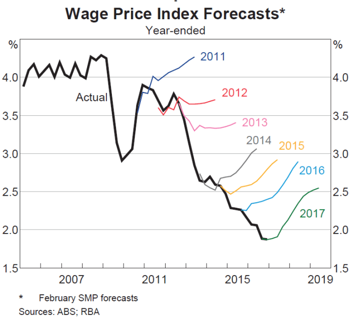
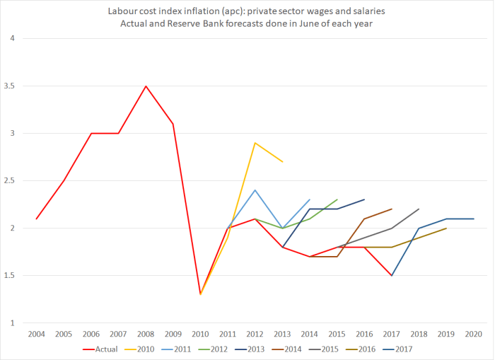
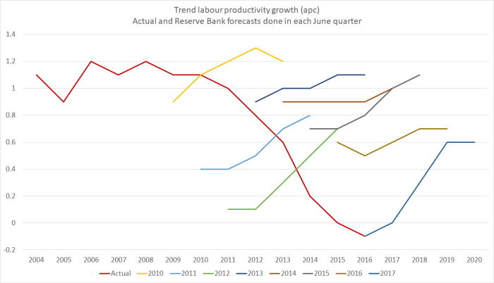
At the other extreme, when (as they did last week) they forecast the OCR itself for the June 2020 quarter, there is no information value at all about the future. The right OCR for June 2020 will, in their way of thinking and allowing for the lags, depend on inflation pressures in 2021 and 2022. No one has the foggiest idea what those pressures will look like. The Reserve Bank’s forecast accuracy work (linked to earlier) highlighted both the huge errors and the biased nature of those errors, for periods even two years ahead, let alone four to five years ahead.
And then there are the in-between periods. Perhaps very good forecasters might be able to add a little value in forecasting inflation and GDP a year ahead, But even then, that value might be quite small, and subject to huge error bounds.
But there is none of that sort of differentiation in McDermott’s speech either.
To be clear, my criticism is not (mostly) that the Reserve Bank is bad at forecasting. Everyone is. My concern is that they show little sign of even recognising the limitations of what they are doing (and not much ability to even maintain a consistent story about the role of forecasts from one year to the next).
The fallback line is that even if forecasts tell one nothing about the future, they help guide people (presumably especially financial markets) on how the Bank might change policy if the data come out differently than the Bank expected. By publishing forecasts, one could better understand the mental “model” the Bank had in mind, and one could get a sense of the “reaction function” (ie how the Bank responds to a particular inflation outlook, and changes in that outlook). But even this point is vastly overstated, for a variety of reasons:
- it doesn’t apply at all to, say, the Bank’s current forecasts of the OCR in 2020. By then, there will have been another dozen or so sets of forecasts out.
- it doesn’t even really apply to forecasts of inflation or GDP a year hence. By the time we discover whether those forecasts are correct, there will have been another three or four sets of forecasts published.
There is a case that published forecasts of the very next round of quarterly data might be helpful. If the Bank thinks the next quarter’s GDP data will show an increase of 0.4 per cent, and the actual outcome is 0.9 per cent, then (all else equal) markets are likely to think the Bank is a bit more likely than previously to tighten a bit sooner than previously. But even then, it is never that simple. After all, there is noise in the actual data. But that is where McDermott’s case is strongest, which has nothing to do with the medium-term forecasts.
The line, which pervades the speech, that it really doesn’t matter if forecasts are right, because they still have useful information, would probably be true in one very specific set of circumstances.
If the Reserve Bank had, through hard work, divine insight or whatever, uniquely acquired the perfect “model” of how the economy works, but simply didn’t know what new shocks might hit the economy, then the model – and the associated forecasts – would have some use. If a shock hits out of the blue, everyone can be clear how much that shock will affect the forecasts and, hence, how the Reserve Bank will optimally react.
But to write that down is to expose just how unlike the real world that is. Typically forecasters have only at best only a vague approximation to the correct “model”, and when data come out that surprise them, it often isn’t a genuine shock – a new event arising outside the system – but rather something that challenges the “model” of the economy the forecasters (or central bank) have been using. To a considerable extent, that has been the story of the last decade – not just for the Reserve Bank of New Zealand, but for all of us here and abroad. It also isn’t a criticism (of the Bank or anyone else), just a description of the limitations of our knowledge. What is worth criticising is the pretence that the forecasts are offering more.
A common benchmark is whether a forecast (whether by judgement or a formal model, or some combination) can beat a random walk – a simple model in which the best prediction of the next period is the actual outcome for the last period. If not, there really is no point in doing forecasts, since the forecasts are just adding noise. Over the last eight years, the Reserve Bank’s medium-term OCR forecasts have clearly been worse than a random walk forecast, and they’ve been biased too. It is harder to do on the other variables (since, for example, they don’t publish core inflation forecasts), but there is little in the evidence to suggest that the medium-term forecasts in particular are adding any value at all. And yet, as McDermott notes, they take a lot of resources to produce.
To be clear, I’m not denying that markets and commentators pay some attention to the Reserve Bank’s OCR track all the way out to 2020. But they do so not because that track has any substantive information about what the OCR will actually be in 2020 – their guess is probably as good as the RB’s, and both are typically terrible – but simply because it has become a communications device. If the Reserve Bank wants to communicate a more hawkish stance, it will typically choose to revise up that forward OCR track (and I’ve sat in many meetings where Governors didn’t want to communicate a hawkish stance and forecasters were told to go away and flatten out the track). But from a substantive perspective, it is unlikely that there is any more useful information than was contained in this simple sentence from the front page of last week’s MPS.
Developments since the February Monetary Policy Statement on balance are considered to be neutral for the stance of monetary policy.
Agree with them or not, there really wasn’t much more to the document – for all its pages – than that.
There is a great deal in McDermott’s speech about how helpful the Bank finds its forecasting – indeed, it must surely be a first for the word “precise” to appear twice in a Reserve Bank press release. But if (a) you know almost nothing about the future, and (b) you can reasonably confident you don’t even have the right model, it is really all sound and fury, signifying nothing, akin to the ritual incantations of some ancient tribe.
Almost all the value in the economic analysis the Bank does is in understanding the past and the present. That is no small challenge in itself. Making sense of what the output gap (or unemployment gap) is right now, making sense of what explains current inflation or unemployment, is plenty enough to keep lots of smart analysts occupied (after all, look at the revisions to the historical estimates). There may well be a useful role for some short-term forecasting – the next quarter’s GDP or CPI outcomes – and even perhaps for scenario analysis, but anything else should be of almost no value to policymakers – who will mostly update their OCR decision on the next set of actual outcomes – or to anyone else. When we say that we can meaningful forecast medium-term economic developments, we deceive ourselves, and the truth is not in us.
Finally, McDermott is at pains to try to stress how open to scrutiny and challenge the Bank is – and repeats the claim that the Reserve Bank is one of the most transparent central banks in the world. Again, you can’t really have it both ways. If the forecasts don’t tell the future (as the Bank today wants to claim), there isn’t really any information in them. It is akin to being transparent about a set of random numbers. As I’ve noted before, the Bank ranks well on transparency about things it knows almost nothing about – the future – while being highly secretive about the stuff it does know about. We don’t see the background papers the Governor considers in coming to his published forecasts, we don’t see even summaries of the advice the Governor receives on the OCR, we see nothing of the minutes of the Monetary Policy Committee or the Governing Committee and so on. And it is not as if the Bank could really justify secrecy on the basis of the old line “trust us, we know what we are doing”. Demonstrably, they haven’t convincingly passed that test for some time. Instead, they hide behind all this talk of “precise” thinking, detailed processes, alleged openness to new ideas, encapsulated in ongoing updates to the forecasts. The unnerving thing is that McDermott at least appears to believe it.
I popped into the Wellington Public Library’s annual book sale yesterday and came away with an interesting little book by a Princeton academic, The Road to Delphi: The Life and Afterlife of Oracles. Flicking through it, I couldn’t find a good quote that was both apt and fair to apply to the Bank, but it isn’t hard to think that the Bank’s forecasts may play more of quasi-oracular role, with all the actual forecasting capability of the oracles of Delphi or modern astrologers (for which there is clearly a revealed demand), than a substantive economic one.
And since readers often respond with “so what would you do?”, I would
- stop publishing OCR forecasts at all,
- restrict published economic forecasts to the year ahead, and
- re-orient the analytical (and particularly) the communications effort much more squarely on making sense of where we are now. That is quite hard enough, and without a good fix on that, everything else is largely sailing blind.


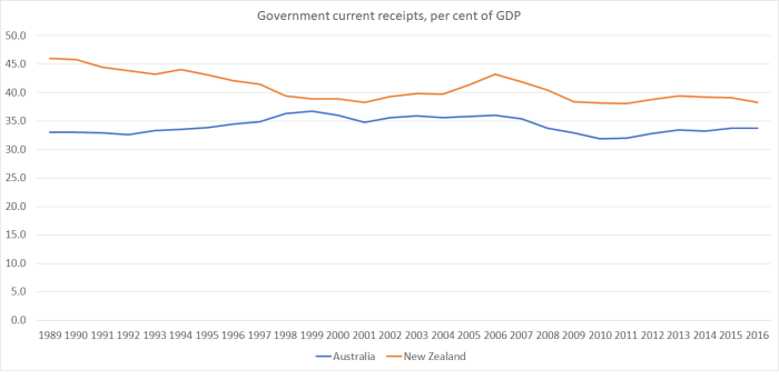


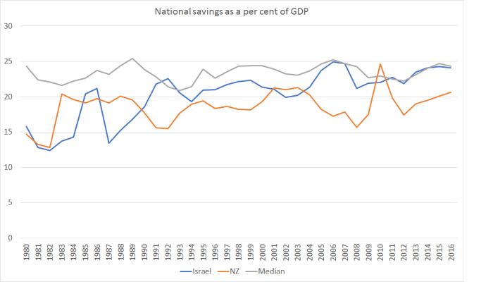
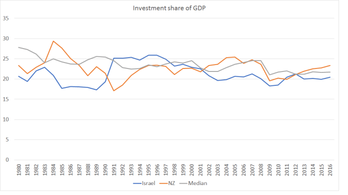 There is plenty of cyclical variation, but in both countries on average over this period, the share of investment spending in GDP has been a bit lower than advanced country median. Given all the resources that needed to go to meeting the needs of the fast-growing populations (simply maintaining capital per person), there will have been materially less “left over” for capital deepening, or for new businesses and ideas. It isn’t a mechanical rationing process, but just a response to the opportunities and the relative prices.
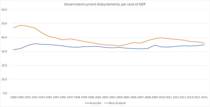