I was always a bit ambivalent on the idea of a public holiday to mark the death (and life) of Her Late Majesty: there were (and are) better, cheaper, and more enduring things that could (have) been done. And the more so when the day chosen seems less to do with Queen Elizabeth (whose funeral and burial were a week ago) and more to do with the Prime Minister’s schedule. But here we are.
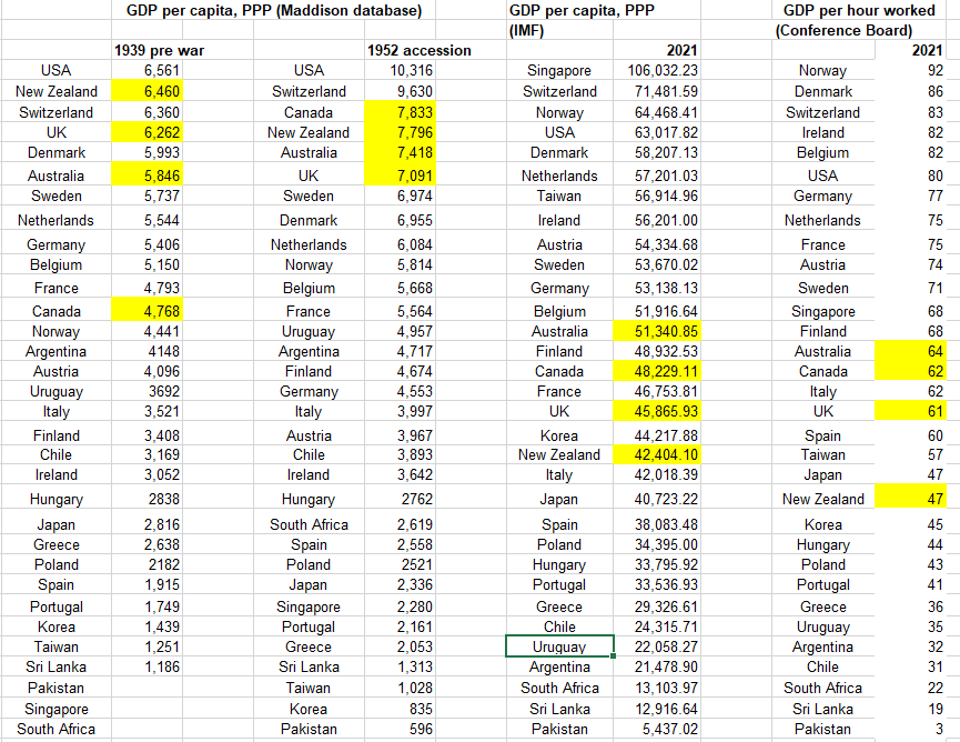
It seemed like a good day to potter in the old data and see how things went, in terms of relative economic performance, for the independent countries of which the Queen was monarch throughout her reign – the United Kingdom, Canada, Australia and New Zealand. Back in 1952 there were a few others – South Africa, Pakistan, and (as it then was) Ceylon. The other current realms (PNG, the Solomons, Belize, and so on) were not independent until later.
In the table below I started with Angus Maddison’s collation of historical GDP and GDP per capita (in purchasing power parity terms) estimates. I used the Western Europe and “offshoots” (NZ, Australia, Canada and the US), the east Asian countries that are now very prosperous (Singapore, Taiwan, Japan, and (South) Korea), included a few representative central European and South American countries, and included the other 1952 realms (South Africa, Pakistan, and Ceylon).
My main interest was comparing rankings from 1952 to those now. But if one starts from 1952, some people will make (not entirely unreasonable) objections about it being just after the war, and so the numbers may flatter countries that had little or destruction in World War Two, so I’ve also included 1939 numbers where (most cases) Maddison had them available. And for the most recent period I’ve included rankings for both GDP per capita and (my preferred focus) GDP per hour worked.
(UPDATE: This table replaces the original one in which I had inadvertently given Uruguay’s the US’s 2021 GDP and vice versa)
There are all sorts of extended essays one could write about relative growth performance over the decades/centuries for different groups of countries, but here my main interest is just in the four Anglo countries of which the Queen was monarch from 1952 until a couple of weeks ago. That picture is not a pretty one. 70 years ago all four countries were in the very top grouping, and these days not one of them is. Not in any way the fault of Her Late Majesty of course: she and her Governors-General act only on the advice of respective sets of ministers in each country, but a poor reflection on the countries concerned, and their successive respective governments nonetheless. New Zealand, sadly, has been by some margin the worst of them.
If I were inclined to be particularly gloomy – okay, I am – one could even note that the extent of the drop down the league tables for these stable democratic rule-of-law countries, isn’t materially different to the drop experienced by Uruguay, Argentina, and Chile, none of which enjoyed uninterrupted democratic governance over those decades. South Africa has had a similar drop down the league tables too.
I have my own stories about why most of the seven countries (Anglo and South American) have done poorly, but I don’t claim to have any particularly compelling tale about the UK and the extent of its continuing relative decline.
A few weeks ago there was the debacle of the government introducing one afternoon a bill that would have imposed GST on investment management fees, ministers defending that bill the next morning, but then by lunchtime the policy was gone.
The proposed law change seemed on the face of it perfectly sensible in principle. I even read the Regulatory Impact Statement that was published with the bill, and most of the reasoning and argumentation made sense there too.
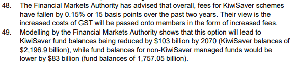
But it contained this little section
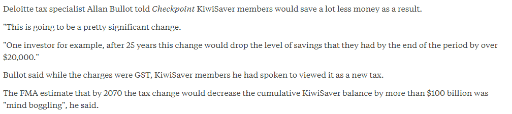
Perhaps unsurprisingly, those big numbers got a fair amount of media and political attention. As an example, here was an RNZ story
I was a bit curious about this “modelling”, which was not published at the time the bill was introduced. It wasn’t described in the RIS, the numbers weren’t put in any sort of context, they were just baldly stated. Quite probably ministers don’t read RISs, but perhaps you might think that the political advisers in their offices would (looking for fishhooks and headlines if nothing else). And you might have hoped that officials (Treasury/IRD) might have done a bit more than drop big numbers into the RIS – numbers that might reasonably be seen as creating problems for a sensible rational tax reform – rather than just stick the numbers out there waiting for the first curious journalist or Opposition MP to find them.
My suspicion was that something very simple, and potentially quite misleading, had been done. After all, one wouldn’t normally look to the FMA to undertake any serious modelling (it is a regulatory implementation agency). So I lodged a request for the modelling, and got a reply back this afternoon.
It is a helpful reply. They have set out their assumptions clearly, and even offered that I could talk to the responsible senior manager if I wanted to discuss matters further.
And it was pretty much as I had expected. They had assumed (probably reasonably enough [UPDATE; but see below]) that all of any GST burden would be passed on to customers/investors, and thus that overall returns would be a bit lower. But then they simply assumed that all the additional tax went to the government, which sat on it, and neither the government nor the savers made any subsequent changes in behaviour……..over the subsequent 50 years. And thus, mechanically, future managed fund balances would be lower than otherwise (about 4.5 per cent lower)
It might be a reasonable approximate assumption for a first year effect. Just possibly it might even be valid for the KiwiSaver component, since KiwiSaver contributions are largely salary-linked. But it makes no sense over a 50 year horizon, across all managed funds (let alone all private savings) and especially as the only macro-like number to appear in the entire document.
Over a 50 year view surely it would be reasonable to assume that one modest tax change makes no difference to the fiscal outlook, and thus that what is raised with this tax won’t be raised by some other tax. Household income won’t really be changed, and since most of the evidence tends to be that household savings rates in aggregate aren’t very sensitive to rates of return (partly because there are conflicting effects – low rates of return on their own might discourage saving, but on the other hand people with a target level of accumulated savings in mind for retirement will need to save a bit more when returns are lower than they had previously assumed) neither will the overall rate of household saving. There is more sensitivity (to return) on the particular instrument people choose to put their savings in, so that if returns on investment management products are a little lower than otherwise, people might prefer, at the margin, to hold a bit more of some other assets. But what of it? Supporting investment management firms’ businesses is no part of a sensible government’s set of goals.
Surely the best assessment would have been that over anything like a 50 year view, a small tax change like this, affecting returns on one form of savings product, simply would not be expected to make any material difference to accumulated household wealth in 2070, with perhaps some slight change in the composition of household asset portfolios: a little less Kiwisaver, not much change in other investment management products, and a little more in other instruments.
The FMA were at pains to point out that they “had limited time to feedback to IRD as part of IRD’s policy consultation”, although it isn’t clear whether IRD/Treasury requested these numbers or the FMA took it upon themselves to do it. And thus in a way I don’t much blame the FMA. They tend to be enthusiasts for and champions of KiwiSaver, and simply do not have a whole-economy remit or set of expertise.
What disconcerts me is that neither IRD nor Treasury (the latter especially) seem to have been bothered by FMA’s numbers, and neither seems to have made any effort to provide any context or interpretation. There wasn’t any obvious reason why those FMA numbers had to be in the RIS, but if they had put them in with a rider “On the (unlikely) assumption that governments simply accumulate the additional tax revenue for 50 years and neither they nor households make any other changes in behaviour, then FMA ‘modelling’ suggests……”, it might have done materially less damage, through highlighting the sheer implausibility of the assumptions over a 50 year horizon.
Of course, you might also have hoped that ministers and their political staff would have noticed that something seemed odd.
What was proposed still seems as though it would have been a sensible tax change. Perhaps it will even happen one day. Perhaps it would have been derailed anyway, even if those FMA numbers – unqualified – had never made it into the document. But neither ministers nor officials really seem to have helped themselves.
UPDATE
A reader got in touch and suggested I might have been too generous in accepting the FMA view that all the GST would have been passed on to customers. With that reader’s permission, here are his comments
“Having owned a fund manager as part of a wider business, the GST exemption was a pain. We could not recover GST on certain inputs and so therefore had to charge more – about 7.5% more because of this. Plus we had an extra employee in the finance area that we could have got rid of. It is not obvious to me that the fees would have gone up for this reason at all, except that the industry would probably have used it as an excuse to raise fees as it means that at some future point they could cut them and get a pat on the back from the FMA.”
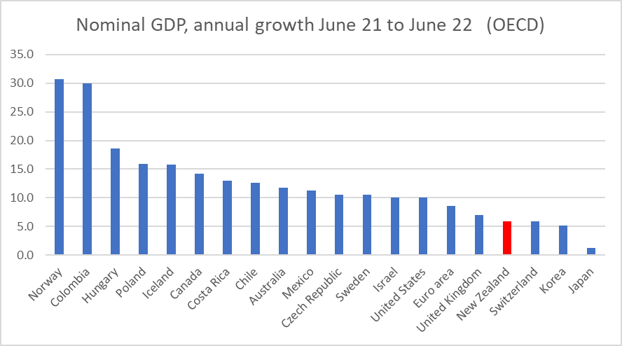
A couple of days ago, I put this chart and brief comment on Twitter
I added “I do not think nom GDP targeting is generally superior to inflation targeting for NZ, but recent outcomes (latest annual 5.9%) are at least one reason for a little caution about further aggressive OCR increases”.
There is a long history of people writing about nominal GDP targeting (it was being championed in some of the literature before inflation targeting was even a thing). I’ve written about it a few times (including here and here) and just this morning I noticed a new commentary from Don Kohn, former vice-chair of the Federal Reserve looking (sceptically) at some of the issues. No central bank has shifted to nominal GDP targeting (whether in levels or growth rates) but a fair number of people (including Kohn) will suggest that there may still be useful information in developments in nominal GDP – something to keep at least one eye on.
Almost every piece of economic data has been made harder to interpret over the last couple of years by Covid. In my chart, the eye immediately tends to go to the unprecedented fall (in 2020) and unprecedented rebound following that. But my eye next went to what wasn’t there: the most recent rate of increase (nominal GDP in the June 2022 quarter is estimated to have been 5.9 per cent higher than that in the June 2021 quarter) wasn’t at all out of line with typical experience in the last few decades. It is quite a different picture than we see with headline and core inflation measures. And although Covid has continued to affect economic numbers, last June quarter seemed relatively little affected by Covid here (the Delta outbreak was mid-August), and by the June quarter we were through the worst of the restrictions. Perhaps as importantly for what follows, the June quarter was pretty normal for most other countries too (and the June 2020 quarter was pre-Omicron disruptions).
One upside of New Zealand’s slow publication of macroeconomic data is that when our GDP numbers are finally published, pretty much everyone else’s are available for comparison. And although people often note (fairly) that nominal GDP numbers are published with a longer lag than inflation numbers, we are also now in the long New Zealand hiatus where it is two months since we last saw an inflation number, and another month until we get another one. The MPC makes its next OCR decision before that.
So how did New Zealand’s estimated nominal GDP growth for the year from the June quarter last year to the June quarter compare with the experience of other OECD economies? Here I’m focused on places having their own monetary policies, and so show the euro-area rather than the individual countries in that area. I’m also going to leave Turkey off my charts – mostly to keep them more readable, in a context where they are running a crazy monetary experiment and have recorded nominal GDP growth of 115 per cent in the last year.
Nominal GDP growth in (fairly low inflation) Norway went sky-high because the invasion of Ukraine etc has sent oil and (especially) gas prices very high.
But look at New Zealand: we had the fourth lowest rate of nominal GDP growth in that year among all the OECD countries (monetary areas). And two of those below us – Switzerland and Japan – had not only not eased monetary policy in 2020, but had spent years grappling with such low inflation they’d needed persistently negative policy interest rates.
Absolute comparisons like this can mislead a bit. Some countries have higher inflation targets than others – Chile, Costa Rica, Mexico, and Colombia for example target 3 per cent inflation, and have historically had somewhat higher nominal GDP growth rates consistent with those higher targets. But I could take the Latin American countries (poor enough that they are really OECD diversity hires) off the chart and it wouldn’t much change the picture as it affects New Zealand and the countries we often compare ourselves to. In Australia, for example, nominal GDP increased by almost 12 per cent in the year to June.
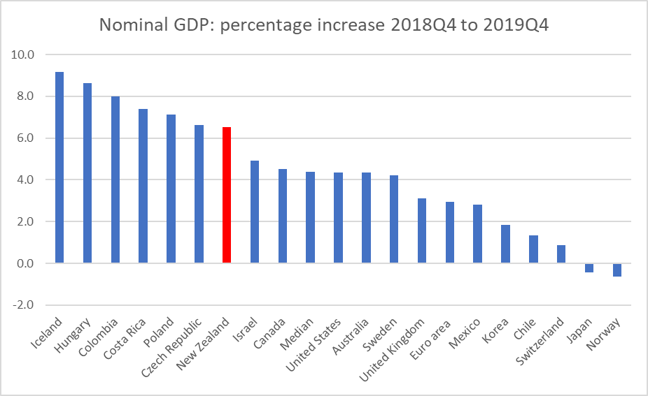
The last quarter before Covid was December 2019. Across the OECD as a whole (and in New Zealand) core inflation at the time was generally a bit under the respective (core) inflation targets, and many central banks had been cutting policy rates that year.
Here is nominal GDP growth (as now recorded – GDP revisions are a thing) for the same group of countries for the last pre-Covid year.
New Zealand’s rate of nominal GDP growth then was a bit higher than the median OECD country, perhaps consistent with the fact that our population growth rate was faster than those for most advanced countries. But our nominal GDP growth rate that year was also a bit higher than the average rate New Zealand had experienced in the previous decade or more. (Note Norway again; not even the staunchest advocates of nominal GDP targeting recommend it for countries with terms of trade shocks on that scale.)
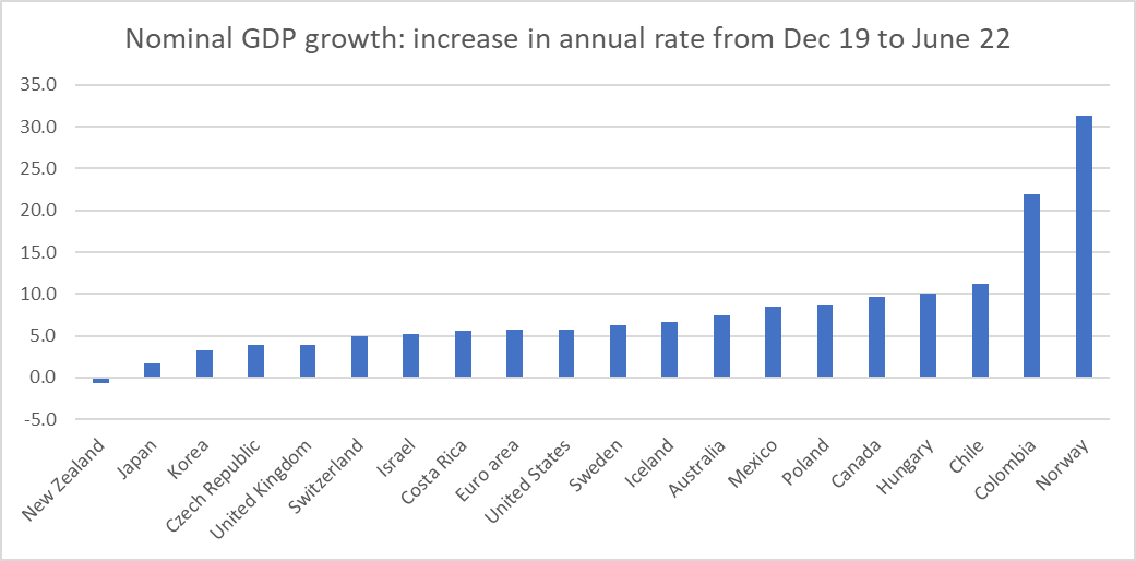
The next chart shows annual growth in nominal GDP for the latest period less annual growth to the end of 2019. The idea is to see how much acceleration there has been (with the sort of lift in core inflation we’ve seen across most of the world all else equal one might expect to have seen quite a lift in nominal GDP growth).
Fair to say that New Zealand stands out somewhat. In the year to June 2022 New Zealand was the only OECD country to have had nominal GDP growth lower than in the immediate pre-Covid period. And if our terms of trade have fallen a bit in the last year, that was still in a context where (NZD) export prices were up 17 per cent in the most recent year, with import prices up even more.
I am genuinely not sure what to make of these pictures and the New Zealand comparisons specifically. If you look across that last chart you would have little hesitation in suggesting that a lot of monetary policy tightening (interest rate rises) has been warranted in the advanced economy world. For the median country, nominal GDP growth has accelerated by 6 percentage points. But in New Zealand, nominal GDP growth has slowed.
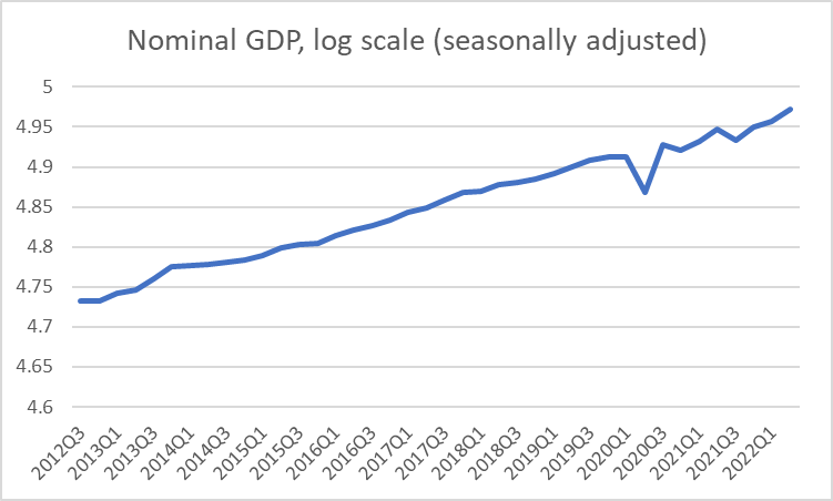
And if one were a champion of nominal GDP levels targeting, here is New Zealand’s nominal GDP over the last decade
Things have (inevitably) been bumpier in the Covid period, but there is nothing there suggesting things have gone off track in recent times (although the mix has changed, with less population growth and more inflation).
The usual fallback position when anyone invokes nominal GDP numbers is to note (entirely fairly) that revisions to GDP are very much to be expected. Perhaps we will find, five years hence, that nominal GDP growth in the year to June 2022 was really a couple of percentage points higher than SNZ currently estimate. That would be a pretty large change for a single year (as distinct from historical levels revisions as data collections and methodologies change). But – if every other country’s estimates didn’t change – one could revise up New Zealand’s rate of nominal GDP growth by 2 percentage points and we would still be equal lowest (with Japan – where they are still running avowedly expansionary monetary policy) on that chart showing the acceleration in the rate of nominal GDP growth.
Two other considerations are worth noting. It isn’t true that our Reserve Bank was particularly early in raising the OCR again – about six of these countries were ahead of them – but market interest rates had already risen quite a bit last year in anticipation and we had had one of the frothiest housing market during the Covid period, and are now somewhat ahead of the pack in seeing house prices and house turnover falling away. Even if – as I am – one is sceptical of house price wealth effects, housing turnover itself is one (modest) component of GDP. Either way, our subdued nominal GDP growth may be foreshadowing what could be about to happen elsewhere.
Monetary policy is avowedly run on forecasts – that would be true (or the rhetoric) even if one were targeting nominal GDP growth rather than inflation – and I guess it is always possible that we might see an acceleration of nominal GDP growth from here, that might support further Reserve Bank tightening from here. Perhaps, but it is difficult to see quite where this acceleration might come from.
I have been a little more sceptical than some in recent months of quite how much further the OCR is really likely to need to be raised, but I am not drawing strong policy conclusions from these data just yet. But they do seem like a straw in the wind that (a) warrants further investigation and (b) might make one somewhat cautious about championing further tightenings, especially in the absence of timely fresh inflation data. Subdued growth in nominal GDP is more or less exactly what one might expect to see if, with a lag, core inflation was already on track to slow, perhaps quite a bit.
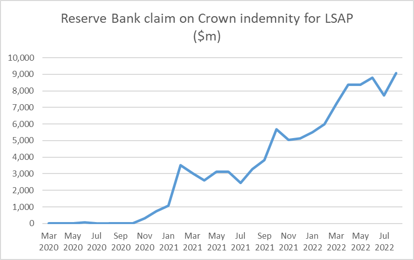
One good thing about the Reserve Bank is that they do report their balance sheet in some detail every month, and yesterday they released the numbers for the end of August. August was not a good month for the government bond market: yields rose further and the market value of anyone’s bond holdings fell. And thus the Reserve Bank’s claim on the government, under the indemnity the Minister of Finance provided them in respect of the LSAP programme, mounted.
This is the line item from the balance sheet
A new record high at just over $9bn.
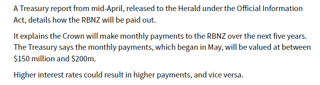
And that doesn’t seem to be quite the full extent of the losses the Governor and the MPC have caused. A while ago the Heraldreported on an OIAed document from The Treasury.
I wasn’t sure quite what to make of that, but we know that from July the Bank has begun selling its bonds back to The Treasury. Over July and August they had sold back $830m of the longest-dated bonds (ie the ones on which the losses will have been largest) and presumably collected on the indemnity when the Bank realised the losses on those bonds at point of sale.
Presumably all the numbers will eventually turn up in the Crown accounts, but for now it seems safe to assume that Orr and his colleagues (facilitated by the Minister of Finance) have cost taxpayers around $9.5 billion dollars – getting on for 2.5% of New Zealand’s annual GDP (or about 7 per cent of this year’s government spending).
These are really huge losses, and to now the Governor’s defence seems to amount to little more than “trust us, we knew what we were doing”, accompanied by vague claims that he is confident that the economic benefits were “multiples” of the costs. But there is no contemporary documentation in support of the former claim (eg a proper risk analysis rigorously examined and reviewed before they launched into this huge punt with our money), and nothing at all yet in support of the latter claim.
Central banks should be (modest) profit centres for the Crown. Between their positions as monopoly issuers of zero-interest notes and coins and as residual liquidity supplier to the financial system there is never a good excuse for a central bank to lose money, and certainly not on the scale we’ve seen here (and in other countries) in the last couple of years – punting massively on an implicit view that bond yields would never go up much or for long (as they hadn’t much in the previous decade when other central banks were engaging in QE).
There are plenty of things governments waste money on, and plenty of big programmes that (rightly) command widespread support (through Covid you could think of the wage subsidy scheme). But this was just little more than a coin toss – low expected value, but with at least as high a chance of big losses as of any substantial gains. And seemingly with no accountability whatever. Orr has not apologised for the losses, nor have the other MPC members. No one has lost their job – but then this is the New Zealand public sector where hardly anyone ever does – and not a word has been heard from those charged with holding the Bank to account (the Board or the Minister of Finance).
Back when I was young the Bank ran up big (indemnified) foreign exchange losses in the 1984 devaluation episode. Searching through old papers I can’t find the precise number the Crown had to pay out, but between what I could find and my memory it may well have been of a similar order (share of GDP) as the LSAP losses. But the responsibility then rested directly with the Minister of Finance – the Bank was not operationally independent, and defending the fixed exchange rate under pressure was government policy. It was a rash policy – the Bank advised the government not to do it – and the large losses added to the obloquy heaped on Muldoon for his stewardship in his last couple of years on office. But the public got to vote Muldoon out, while there still appears to be a serious possibility that Orr – having cost New Zealanders perhaps $1800 each – will be reappointed (with just six months of his term to go if he is not going to be reappointed it will need to be announced soon to enable a proper search process for a replacement to occur). The LSAP losses may not even be the Governor’s worst failing, but no one directly responsible for that scale of taxpayer losses – on risks he simply did not have to take – should even be considered for reappointment, at least if accountability is to mean anything ever.
Of course, there have been bigger losses in New Zealand government history. I’ve just been reading John Boshier’s Power Surge on the Think Big debacle of the 1980s. As a share of GDP, total economic losses to the taxpayer from that series of projects were far greater than the LSAP losses, but I’m not sure that losing less in one punt than the worst series of discretionary public sector projects ever in New Zealand history should be any consolation or mitigation. And, for what it is worth, Boshier’s book suggests there was typically more advance risk analysis undertaken for the Think Big projects than we have yet seen evidence of for the LSAP.
I’m sure gambling appeals to some people, and I wouldn’t want to stop those minded punting on the bond market, the fx market, Bitcoin, equities or whatever. But if that is the sort of thing that takes Orr’s fancy – and it probably isn’t judging by his past financial disclosures – he could at least do it with his own money, not ours. And having rashly done it with our money, and lost heavily, have the decency to apologise.
Ever since I’ve been writing about house prices – more or less the life of this blog – one of the things that has struck (and sobered) me is that I do not know of (and no one has ever been able to point me to) an example of a country or even a region that having once messed up its housing and urban land regulation, generating absurdly high house price to income ratios has undone things and returned to sustainably low price to income ratios (perhaps fluctuating around three times). There are, of course, many places in the United States where price to income ratios never went crazy. But never having dug a deep hole is a different matter than getting out of one once dug. One reads occasionally – even briefly on this blog – of how easy it is to build in Tokyo (and a culture of frequent demolition and rebuild), but no one ever suggests that Tokyo price to income ratios are low (just much lower than they were a few decades ago at the peak of the 1980s boom).
A month or two back I saw reference somewhere to Arbitrary Lines: How Zoning Broke the American City and How to Fix It, a new book by an American “professional city planner” Nolan Gray. Last week it turned up in the mail, and being neither very long nor very technical I’ve now read it.
Gray offers a pretty useful introduction to how zoning came to be in the United States (complete, as usual, with various Supreme Court cases), and if much of that isn’t very directly relevant to New Zealand I found it interesting nonetheless. And, of course, some of the best-known restrictions in many areas of the United States – single family dwelling zoning, to the complete exclusion of any other uses for the land (whether two single-storey townhouses, or a corner dairy, or a hairdresser’s), isn’t (and hasn’t really been) a widespread thing in urban New Zealand.
And there is some useful material on some of the potential wider costs to restrictive land use, although on my reading of the relevant papers Grey often jumps too readily to assert causal relationships. But then his background is planning (and is currently studying for a PhD in urban planning) and in some respects the book is best seen as an evangelistic tract (they have their place). No doubt it would appeal quite strongly to that small but vocal group of New Zealand reformers who dream of demolishing whole suburbs, long for light rail systems, and really dislike the idea of backyards (and increasing physical footprints of cities). They often dislike cars too. And often don’t seem too keen on – quite derisive of – people not like them.
And thus as the book went on I was finding it more than a little annoying in places. Gray makes many good points about the inadequacies (and worse) of US zoning systems. But it was pretty clear that he had one particular urban form in mind, and whole agenda of other issues he (and his publisher – explicitly focused on “solving environmental problems”) cared about. And, perhaps reflecting that, there was very little in the book about house prices themselves or the likelihood that his solutions would materially lower them. But there was quite a lot on emissions and energy use (which could simply be priced, as they now largely are in New Zealand), and a dislike of turning farmland (or any other undeveloped land) into suburbs (where, again, any externalities can and should be priced). He seems to have been living in Washington DC when he wrote the book, and enjoying that: we enjoyed our time living in a DC apartment too.
It was also getting frustrating that despite writing about a country that has quite diverse systems, for a long time there was almost no mention of the vast swathes of the United States with (a) population growth, and (b) low and fairly stable house prices.
Until, three-quarters of the way through the book, I came to the chapter headed “The Great Unzoned City”, about Houston. I wouldn’t be bothering with this post if Gray had simply been making the point that real house prices are pretty low, and fluctuate around a fairly stable trend, in Houston. There are, after all, many cities in the annual Demographia tables that are cheaper still. There isn’t that much zoning in Houston, and people have written previously about Municipal Urban Districts (MUDs) which enable land – outside established urban local government boundaries – to be readily developed by private developers, including dealing directly with (internalising) the associated infrastructure costs of development. It was nice to see his, perhaps grudging, recognition that (a) everyone drives in Houston, and b) people are moving to places such as it with cheaper housing. It works. And there has been considerable intensification in Houston over the years.
But the real thing I learned about – and the point of the post – was about the Houston system of Deed Restrictions.
Again, as long as I’ve been writing about housing and possible reform options for New Zealand, I have been intrigued (starting here I think) by the idea of allowing small groups of landowners in existing urban areas (perhaps at the scale of a city block or a small neighbourhood) to set collectively their own land-use rules for their own group of properties. They are an established market mechanisms in new developments in New Zealand, in the form of private covenants, and one could mount an argument that zoning was really an attempt to do much the same thing (collectively manage shared interests, where there are real externalities).
In a report some years ago, the Productivity Commission took a very dim view of private covenants, even suggesting that the government should legislate to restrict their use. But they’ve always seemed to me to be a way through the endless battles (eg the Christchurch City Council stories this morning) around land use, at least among those willing to operate in good faith (and it is never clear how many are). Why not, for example, remove all government restrictions on land use for housing (height, setback, site coverage, “character”, parking or whatever) in existing urban areas AND on undeveloped land, while allowing neighbourhoods/blocks (groups of existing property owners) to adopt by super-majority (and be able to amend by the same super-majority) previous restrictions as applicable to their land, and their land only?
Over the years, I’ve seen a few other people make similar suggestions (eg there was a UK think tank piece a year or two back) but it had about it perhaps an obscure textbook-y feel. It wasn’t clear that anyone had tried it ever, and I myself am inclined to invoke revealed preference arguments at times (if something doesn’t exist anywhere, it is worth at least thinking about whether there is a good – well-grounded, not just political – reason for that).
But it seems that in Houston they have done something very like what I’ve suggested, and it has been in place long enough to see how it works. It is a big, growing, city with pretty-affordable house prices (I’ve been looking recently at small modern units in Christchurch recently – NZ’s least unaffordable city of any size – and it is simply depressing (although also a reminder of what we could do) to check in from time to time and see what one gets for the same money, in a higher wage country, in Houston).
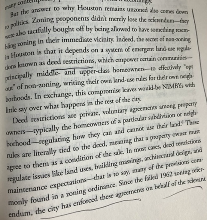
There have been attempts over the years to put in place more extensive zoning systems in Houston. They have failed, at several referenda. But here is Grey:
It is easy to develop on the margins of Houston, it is fairly easy to develop in much of the existing city, but those individual groups of landowners who want to have collective rules for their own properties can do so, and the local authority will enforce those rules on those properties. Deed restrictions are not set in stone for ever, but appear to be often time-limited and requiring a further (super-majority) vote of the then owners (a different group than 25 years earlier typically) at expiry to renew them.
It seems like a model that has a lot to offer here, and which should be looked at more closely by (a) officials, and (b) political parties exploring the best durable way ahead for New Zealand.
Those not operating in good faith – or at least much more interested in other agendas than a) widely affordable housing, and b) property rights (individual and collective) – would no doubt hate it. And, for the moment, they have the momentum – National and Labour last year rushed through legislation that stripped away many existing restrictions, and as a technical matter the government can if it likes force individual city councils to do as it insists. But governments can lose elections too, and if we are serious about much lower sustainable real house prices – and it isn’t clear how many central or local government figures are – we need durable models. The Houston model has proved to work, both in managing the politics and in delivering a city with widely affordable housing, and a wide range of available housing types. And if greenfields development is once again made easy – as distinct from say Wellington where the regional council is currently trying to make it even harder – urban and suburban land prices would fall a lot, and stay down.
One of the arguments some mount for over-riding local community preferences is that “people have to live somewhere”, suggesting that it is unacceptable (even “selfish”) for existing landowners (acting collectively) to protect their own interests and preferences for their own land. But that argument rests only on then unspoken earlier clause “because we will make it increasingly difficult to increase the physical footprint on cities”. Allow easy development, of all types (internalising relevant costs), and there is just no reason to ride roughshod over the collective interests of existing groups of landowners, providing they can restrict things only for their own group of properties.
Some might push back and argue that there is nothing to stop groups of landowners forming private covenants now on existing properties, and I gather that is legally so. But coordination issues and transactions costs are likely to be very high, and people seek to use political channels instead. How much better if we provided a tailor-made readily enforceable collective action model, and then got politicians right out of the business of deciding what sort of houses can be built where.
And, to be clear, as someone living at the end of a hillside cul-de-sac I would have no interest in a Deed Restriction for our property. My interest is ending the evil that is Wellington price to income ratios of 8x or more, and enabling ready affordability for the next generation.