After writing yesterday’s post, I noticed another somewhat-confused article on the “low wage” question. The author of that piece seemed to want to look at after-tax wages, without then looking at the services those taxes might deliver. Taxes are (much) higher in France or Denmark, but so is the range of government services.
One way of looking at the material standard of living question is to look at per capita consumption, again converted using PPP exchange rates. Just looking at private consumption – the things you and I purchase directly – will also skew comparisons. Take two hypothetical countries with the same real GDP per capita. One has much lower taxes than the other, but health and education in that country are totally private responsibilities, whereas in the higher tax country many of those services are delivered by the government, largely free to the user at the point of use. Private consumption in the low-tax country will be much higher than in the high-tax country, but the overall actual consumption of goods and services may not be much different (depending on incentive effects etc, a topic for another day).
For cross-country comparisons, the way to handle these differences is to use estimate of actual individual consumption: private consumption plus the bits of government consumption spending consumed directly by households (eg health and education). Separate again is “collective consumption” – things like defence spending, or the cost of central government policy advice, which have no direct or immediate consumption benefit to households.
Here is the data for the OECD countries for 2016, where the average across the whole of the OECD is 100.
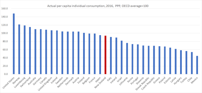
New Zealand does a little less badly on this measure than on the various income or productivity measures. That is consistent with the fact that our savings rates tend to be lower than those in many other OECD countries and (relative to productivity measures) to high average working hours per capita. On this measure in all the former communist countries now in the OECD the average person still consumes much less than the average New Zealander does. Unlike many advanced economies, we have consistently run current account deficits. Large current account surpluses – Netherlands for example has surpluses of around 10 per cent of GDP – open up the possibility of rather higher future consumption.
Having dug into the data this far, I decided to have a look at investment spending per capita. I mostly focus on investment as a share of GDP, and have repeatedly highlighted here the OECD comparisons that show business investment as a share of GDP has been relatively low in New Zealand for decades, even though we’ve had relatively rapid population growth (and thus, all else equal, needed more investment just to maintain the existing capital stock per worker). Here is the OECD data, for total gross fixed capital formation (“investment” in national accounts terms) and ex-housing (where there are a few gaps in the data).

You can probably ignore the numbers for Ireland (distorted by various international tax issues) and Luxembourg (lots of investment supports workers who commute from neighbouring countries). But however you look at it, New Zealand shows up in the middle of the pack. That mightn’t look too bad – and, actually, was a bit higher than I expected to find – but when considering investment one always needs to take account of population growth rates. Average investment spending per capita might be similar to that in France, Finland, or Germany, but over the most recent five years, the populations of those countries increased by around 2 per cent, while New Zealand’s population increased by 9 per cent. Just to keep up, all else equal, we’d have needed much more investment spending (average per capita) than in those other countries.
Over the most recent five years, only two OECD countries had faster rates of population growth than New Zealand. One was Luxembourg – where, as far as we can tell, things look fine (lots of investment, lots of consumption, high wages, high productivity) – and the other was Israel. In Israel, average investment spending (total or ex-housing) was even lower than in New Zealand. And as I highlighted in a post a few months ago, Israel’s productivity record has been strikingly poor.
But how has Israel done by comparison? This chart just shows the ratio of real GDP per hour worked for New Zealand and Israel relative to that of the United States (as a representative high productivity OECD economy), starting from 1981 because that is when the Israel data starts.
We’ve done badly, and they’ve done even worse.

If productivity growth is the basis for sustained growth in material living standards – and employee compensation – how have wages been doing recently in New Zealand?
One way of looking at the question is to compare the growth in GDP per hour worked with the growth in wages. If we look at nominal GDP per hour worked, we capture terms of trade effects (which can boost living standards without real productivity gains) and avoid the need to choose a deflator. From the wages side, I still like to use the SNZ analytical unadjusted labour cost index series. Perhaps there are serious flaws in it – if so, SNZ should tell us – but, on paper, it looks like the best wage rates series we have.
Here is the resulting chart, with everything indexed to 1 in 1998q3, when the private sector LCI analytical unadjusted series begins.

When the series is rising, wages (as measured by this series) have risen faster than the average hourly value of what is produced in New Zealand. A chart like this says nothing about the absolute level of wages (or indeed of GDP per hour worked), but it does suggests that over the last 15 years or so, wage rates in New Zealand have been rising faster than the value of what is produced in New Zealand. That is broadly consistent with the rebound in the labour share of total GDP over that period. There is some noise in the data, so not much should be made of any specific shorter-term comparisons, but even over the last five years – when there has been so much public angst about wages – it looks as though wage inflation has outstripped hourly growth in nominal GDP (even amid a strong terms of trade). All of which is consistent with my story of a persistently (and, so I argue, unsustainably) out-of-line real exchange rate, notably over the last 15 years or so.
New Zealand is a low wage, low productivty (advanced) country. We don’t seem to do quite as badly when it comes to consumption, but investment remains quite low (relative to the needs of rapidly growing population) and wage earners have been seeing their earnings increase faster than the (pretty poor) growth in GDP per hour worked. None of that is a good basis for optimism about future economic prospects, unless politicians and officials finally embrace an alternative approach, under which we might see faster (per capita) capital stock growth and stronger productivity growth, in turn laying the foundations for sustainably higher earnings (and higher consumption). Most likely, a key component of any such approach would involve finally abandoning the “big(ger) New Zealand” mythology that has (mis)guided our leaders – and misled our people – for decades.
