The Reserve Bank on immigration and the labour market

Four months ago, in the December Monetary Policy Statement the Reserve Bank indicated that they believed that the surge in immigration over the last few years had eased capacity pressures and contributed to a reduction in inflation.  That was a view quite contrary to their own past research, or to the historical consensus of New Zealand economists that – whatever the long-term economic effects of immigration –  in the short-term the demand effects outweighed the supply effects.

The Bank might be right, but they provided no analysis or background material in support of their change of view.  So I asked for the background material. Almost two months ago they refused to release any of that material.  I have appealed that decision to the Ombudsman, and was pleased have an indication from the Ombudsman’s office yesterday that they are about to investigate it (less than two months after the complaint was lodged, suggesting that the new Ombudsman really is making progress).   At the time, the Bank indicated that it had other material that might shed light on the Bank’s view on immigration that was being worked on with a view to later publication.

Two such papers were released finally yesterday, accompanying an on-the-record speech by the Bank’s Deputy Governor, Geoff Bascand, “Inflation pressures through the lens of the labour market”.  It was a little curious to have a speech on such a major economic topic given by someone who is, in effect, the Bank’s chief operating officer.  Bascand has responsibility for things like notes and coins, property and security, HR, IT,  and NZ Clear (and chairs the Bank’s ill-governed and troubled superannuation scheme).  But, of course, he does have a background in economics and, having taken a step downwards in becoming Deputy Governor, is generally assumed to see himself in the running to be the next Governor, perhaps as early as next September.

It was a curious speech. The accompanying press release –  designed no doubt to highlight the key messages – begins with the claim that “rapid growth in the workforce…has helped create strong economic growth over the past four years”.   GDP growth in the last four year has averaged 2.85 per cent per annum.  I know it is an age of diminished expectations, but if that is “strong”, I think my dictionary needs updating.

strong growth

Despite the (alleged) biggest immigration surge in 100 years, neither average nor peak growth got anywhere near the levels reached in the previous couple of cycles.

Between the speech, press release, and the Analytical Notes, the Bank is clearly going to great efforts to stress the line that this is “the largest recorded surge in migration in 100 years”.  In particular, they want to have us believe that this event is bigger than the surge of immigration over 2002/03.  But they know that is simply not true.  In some places they are more careful, and only claim that it is the largest net inflow of (self-recorded) permanent and long-term migrants, but even then they know that those numbers do not always represent very well the actual net inflow of people (total, or even just those who stay for more than a year –  the PLT vs visitor threshold).

Why do I make this point so strongly? Because when I was at the Bank, and with the full knowledge of senior Bank managers, in 2014 I prompted Statistics New Zealand to produce Alternative methods for measuring permanent and long-term migration.  The issue arose from something like this chart

movements-migration

It illustrates that over 2002 and 2003 in particular there had been a huge divergence between the self-reported PLT numbers and the (accurate) count of the overall net flow of people into New Zealand.  Many more people (net) came in –  all needing a roof over their head –  than had said they were intending to stay for a year or more.

Statistics New Zealand had done nice work, using several different methods, to estimate what actually happened  (eg did the person actually leave the country again, or come back, within 12 months, even though they said they were PLT).  And they produced this chart.

plt-methods

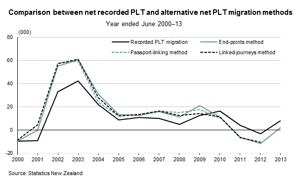
Net PLT inflows in  2002 and 2003 proved, using these techniques, to be 50 per cent higher than the initial monthly data had suggested.  New Zealand’s population was around 4 million in 2003, and is around 4.6 million now.  Even just focusing on PLT numbers, the population surge resulting from immigration was just as large then as it has been over the last year or two.

And yet there is not a single mention of this work, or this issue, in any of the material that the Reserve Bank put out yesterday.  It is unfortunate that (a) the estimates go back only to 2000, (b) they are only annual (c) that SNZ has no money to do this work on an ongoing basis, and (d) that inevitably these better estimates have a 12 month lag on them.  But it is simply materially better information about immigration over the last 15 years, produced by our national statistical agency, than is in the monthly data the Bank makes so much of.

The total (net) arrivals data are noisy –  eg changing timing of school holidays, and/or major events such as Lions tours or the Rugby World Cup can add a lot of noise –  but here are the PLT and total net arrivals series (rolling annual totals) for the last 20 years or so.

plt vs total

There isn’t a lot of noise around 2002/03, or in fact around the current period.  And the  patterns over time are not necessarily typically different.  But there were simply somewhat more people coming into New Zealand (net) in 2002/03 than there have been in the last couple of years, and as percentage of the population the difference is even larger.  The immigration surge in the last couple of years has been big, but 2002/03 was simply a bigger event.    Here is the same chart shown as percentages of the population.

plt vs total per cent of popn

The Reserve Bank knows all about this. It is strange, almost inexcusable, that it is not even mentioned.  Not explicitly recognizing the issue undermines the confidence we might have in the rest of their analysis and interpretation.

What of their two Analytical Notes?  The first, by Tugrul Vehbi, a recent recruit from Treasury (his bio says he joined in Dec 2015, so clearly this wasn’t analysis that fed into the December MPS view) tries to look at “The macroeconomic impact of the age composition of migration”.  Using data for only the period since 1994 (so in effect only about 2.5 cycles) he constructs a small model to look at how several key economic variables respond to net migration by, on the one hand, those aged 17 to 29, and on the other hand those aged 30 to 49.  It isn’t entirely clear why he divides the groups where he does (or, hence, whether any results are sensitive to slightly different classifications). Loosely, I suppose he is distinguishing between the “young” (but independent) and the “not young”.  For the same sized shock, he produces results which –  with wide error bounds – suggest that the net demand effects of increase in immigration of 17 to 29 year olds are less than those for the 30 to 49 year olds.  In the current cycle, there has been a disproportionately large increase in the net inflow of 17 to 29 year olds.

I have several problems with the analysis.

The first point relates to the earlier discussion, and the apparent material underestimation of the PLT inflow (in the monthly data the Bank uses) over 2002/03.  It is generally recognized that much of that issue related to students (typically in Vehbi’s younger age group).  As this chart shows, drawing from MBIE visa approvals data, there was a huge increase in the student visa numbers granted over that period.  Since his estimation effectively uses only a fairly short run of data, only 2.5 of so cycles, mis-measurement in the biggest of those cycles is a potentially severe problem.

student visas

Related to the small sample problem, the (one standard deviation) error bounds on his estimates are sufficiently large (see Figure 3 in the paper) that we can’t say with any confidence that the effects are different between the two age groups, even if all the immigration data are correctly measured.   Moreover, Vehbi runs an useful alternative estimation leaving out the last couple of years data, and although he describes the effects as “qualitatively similar” in the two runs (and no error bounds are shown for the alternative), for at least some of his series (residential investment and consumption) the quantitative effects are quite materially different.

But perhaps a more important effect still is that he simply looks at the two ages ranges 17 to 29, and 30 to 49.  In most cases, we can probably think of the actions of 17-29 year olds as being independent of other age groups (eg they won’t be coming with children –  or parents for that matter).  The same can’t be said of people in the 30 to 49 age group, many of whom will be bringing children with them.   You can see that in this chart, going all the way back to the 1970s, and simply using the PLT data (with all its weaknesses, as discussed above)

net plt by age

All the main age range groups cycle together to some extent, but the 17-29 year old group behaves materially different from the 0 to 16 and 30 to 49 age group in particular. In the early decades, most of the net migration outflow was young people, and right now much of the net inflow is.   But the key point is that when the 30-40 age group numbers increases there is almost always a very similar sort of increase in the inflow of 0 to 16 year olds (as one would expect, children mostly come with parents).  But if you test how the economy responded when 17-29 year old inflows increases and compare that with a same sized shock to the 30 to 49 age group, of course you should see large net pressures on resources from the older age group, because you are ignoring the fact that these people bring with them a lot more people (the kids).  Kids don’t add anything much to labour supply, but they need housing, schooling and the other basic necessities of life.  The model might be better rerun comparing, say, the impact of a shock in the 17 to 29 year old inflows with the impact of a shock to the other age groups taken together (or even just the 0 to 16, and 30 to 49 age groups together.

It is (always) good to have the Analytical Note out.  But the measurement problems around PLT numbers (which SNZ themselves recognize), the short sample, and the failure to allow for kids who accompany the older people means we can’t really have much confidence in the results at all.

Is it credible that the young (17 to 29, say) migrants could have a materially different impact on net capacity pressures than other age groups?  In principle, it is possible.  Take a scenario in which all the young were working 60 hours a work, living in extremely cramped conditions, and remitting most of their earnings home. In that scenario one would certainly expect quite weak pressures (perhaps even negative) on inflation. Perhaps that describes illegal Latin Americans in the US, or even the stereotyped Polish plumber in the UK?

But about as many of our young PLT migrants arrive as students, as come on work or residence visas (and many more shorter-term arrivals, all consuming and not able to work legally, are students).    The Reserve Bank makes quite a bit of the change in policy allowing students limited work rights in New Zealand, but even under that policy most students only have a legal right to work 20 hours a week, and then only under certain conditions.   But even if all the students could work, it is still only 20 hours week –  roughly half what a typical full-time worker will do (or the same as a couple raising kids, in which one parent works fulltime and another is at home).  And the students still have to live, pay tuition etc, all of which puts pressure on New Zealand resources (export earnings, so generally welcome, but demand nonetheless).

Perhaps the fact that our current migrants are disproportionately quite young does result in less net demand pressure per migrant. (And it is quite plausible that students put a bit less pressure on resources than they once did.)   But on the information presented so far, at best it is “case not proven”.

The other new  Analytical Note is “Why drivers of migration matter for the labour market”. One of the authors is Chris McDonald, author of a 2013 piece illustrating the way the net migration inflows to New Zealand have typically added materially to inflation pressure.

In the new paper, the authors set up a very small model in which they try to distinguish between net migration flows that result from fluctuations in the strength of the Australian labour market from those arising from other factors (eg changes in New Zealand immigration policy).  In their model, the latter sorts of flows have the conventional expected effect on domestic demand and inflation pressures – higher migration inflows, for example, lower the unemployment rate.  But

a higher Australian unemployment rate that generates positive net immigration [to New Zealand] typically coincides with a higher New Zealand unemployment rate.

But –  as the authors acknowledge as a possibility in their final paragraph –  mostly what this is telling us is that New Zealand and Australian economic cycles have tended to be quite correlated and that Australia affects New Zealand through a variety of channels.  Australia is our largest trading partner (and largest source of FDI) so that when the Australian economy is weak (proxied in this model by an “unemployment gap”) economic activity here is also, to some extent, adversely affected.   As I’ve noted here previously, it has never been clear what the net effects of an Australian slowdown on New Zealand are: we face some losses of demand in our direct trade (and probably investment, if Australian firms rein in their investment spending), but on the other hand when Australia slows we get fewer New Zealanders (net) going to Australia.  That adds to demand here.  The net effect is clearly different from, say, the net effect of an exogenous immigration policy change (say targeting 20000 more permanent residents from other countries), but it isn’t necessarily that the effects of the migrants themselves is any different. When they get here, they still need houses, schools, shops, roads, factories, and they can supply some labour. Capital stock requirements are typically more than a year’s labour, so generally short-term demand effects  from the migration choice typically exceed supply effects.  It isn’t clear to me that McDonald and Armstrong have really (even attempted) to show that those effects are different across the two classes of migrants.  Of course, if all they are saying is that there are offsetting shocks –  weakness in Australia’s economy offsets the demand effects of the resulting migration choices, then I can happily agree.

In the end there is little reason still to depart from the longstanding consensus of New Zealand economists, going back many decades, and of the Reserve Bank’s own past analysis (formal and otherwise) over more recent decades, that net migration inflows put more pressure on demand than on supply in the short-term.    But if major trading partners are weak at the same time, an upsurge in net immigration won’t typically be a basis for tightening monetary policy and worrying about inflation.

There is a more material on other topics in Bascand’s speech, and another whole Analytical Note on other labour market issues which I haven’t read yet. I might come back to them next week.


Uruguay: one more angle on our dire long-term economic performance

I’d never given much thought to Uruguay until some time around the turn of the century when Struan Little, then at Treasury and now Deputy Commissioner at IRD, came over to the Reserve Bank and gave us a presentation on his thoughts on comparisons between New Zealand’s economic performance and that of two other small and relatively remote countries, Uruguay and Iceland.  At the time, Iceland counted as a success story, and Uruguay not.     Since then, I’ve used Uruguay as a bit of a benchmark of what could happen to us if our continued relative decline wasn’t reversed. It was, after all, an agriculture-dependent colony of European settlement.

100 years ago, New Zealand had some of the very highest material living standards in the world.  Uruguay look reasonably good too, with GDP per capita estimated to have been above those in many countries in Western Europe.  The historical estimates move around a bit from year to year, but over the couple of decades from 1890 to World War One, the relationships between incomes in the United States, Uruguay, and New Zealand were reasonably stable.  Here are the averages, drawing on Angus Maddison’s collection of data:

uruguay nz 1

We were level-pegging with the United States, and Uruguay had incomes around 60 per cent of those of the United States and New Zealand.  Both Uruguay and New Zealand had around one million people back then.

Here is much the same chart for the last five year, this time using the estimates reported in the IMF WEO database.

uruguay nz 2

The Uruguay/New Zealand relationship hasn’t changed much, but both countries have fallen a long way relative to the US.  Relative to the United States, New Zealand is now about where Uruguay was prior to World War One.  Very few advanced or semi-advanced countries have done worse over that period: Argentina and Venezuela are the two I’m aware of.

Unfortunately, even this comparison still flatters us.   For every 100 hours the average Uruguayan worked over the last five years, the average New Zealander worked 116 hours (the US is in the middle).  Our relative productivity performance (GDP per hour worked) is rather worse than our GDP per capita performance.

We don’t have GDP per hour worked data going back to the decades prior to World War One.    In fact, in Uruguay’s case I could find that data only back to 1990.   Here are the Conference Board estimates.

uruguay nz 3

Despite all those reforms we did, we’ve continued to lose a little ground relative to the United States.  And Uruguay, wedged between two troubled countries (Brazil and Argentina) and having got into so much difficulty fifteen years ago that they needed an IMF support programme, has been improving significantly, against us most dramatically, but even relative to the United States.  They have a long way to go to get incomes or productivity anywhere near 60 per cent of those in the United States –  where they were 100 years ago – but GDP per hour worked is already up to almost 70 per cent of New Zealand.

uruguay nz 4

It isn’t just a labour productivity story either.   Here is total factor productivity growth since 1989, again from the Conference Board.   The improvement in Uruguay has been staggering, even allowing for the fact that the starting point had been a pretty badly distorted economy (and some decades of serious political turmoil).

From what one reads of Uruguay, there is still a long way to go –  consistent with the fact that it is still materially poorer than poorly-performing New Zealand.   But they’ve begun to catch-up, while we seem to just work longer hours (per capita) –  and add more people to the mix.  As late as 1970, New Zealand and Uruguay had much the same sized populations, but now their population is only around three quarters of ours.

Contrary to the wisdom of Treasury and MBIE –  accepted by the political elite –  all that infusion of new people doesn’t seem to have done us much good.

Of course, continuing the slow path of relative decline doesn’t prevent New Zealand being a pleasant place to live for many. The sun shines, the beaches and mountains call, and so on. But Montevideo’s beaches look attractive too.    What the continuing slow relative decline tends to mean is a continuing loss of our people –  our children, siblings, friends, grandchildren –  and for those who stay, the struggle to sustain good quality health systems, cancer drugs etc.

Perhaps our leaders might focus on these basic issues instead of pursuing seats on the Security Council, the Secretary-Generalship of the United Nations or whatever.  It isn’t just a National government failure after all.  Perhaps in the 1990s there was a reasonable “the cheque is in the mail” argument, but for the last 15 years –  under both National and Labour governments –  it has been increasingly apparent that economic policy just wasn’t working, and New Zealand was continuing its relative decline.  And nothing serious has been done to address that failure.   We are no better now –  relative to the leading countries – than Uruguay was 100 years ago.  What is stop us drifting further back, towards where Uruguay is today?

An anniversary post

In his weekly column in the Herald yesterday, Brian Fallow pointed out how unimpressive New Zealand’s recent economic growth performance has been.  His article was headed “Froth disguises the facts” , and highlighted again how overall activity levels are mostly sustained by high levels of immigration, and that per capita GDP growth has been weak (and recent per capita income growth even worse).

That column prompted me to dig out the latest data to update a chart I ran (with caveats) a few months ago, showing trends in per capita tradables and non-tradables components of GDP.  Here, the tradables sector is the primary sector (agriculture, forestry, fishing and mining)  and the manufacturing sector from the GDP production measure, and exports of services from the GDP expenditure measure.  The non-tradables sector is the rest of GDP.

T and NT components of real GDP

It is a pretty depressing chart.  Per capita GDP in the tradables sector at the end of last year was still a touch lower than the level first reached in December 2000, 15 years previously.  Across the terms of two governments, both of which constantly talked of “international connections”, aiming for big increases in export shares of GDP etc etc, there has been simply no growth at all in the per capita volume of the stuff we produce in competition with the rest of the world.  As I’ve noted previously, the Christchurch repair process has inevitably skewed things a little, but it doesn’t do much to explain such a dire underperformance over 15 years.

Instead, with almost equal abandon the Clark-Cullen and Key-English governments have pulled ever more people into New Zealand, an economy that appears unable to compete sufficiently strongly internationally to see any growth at all in per capita tradables sector production.  All economies have, and need, both tradables and non-tradables production, and there is nothing inherently bad about non-tradables production, but if we were to have any hope of catching up again with the rest of the advanced world’s productivity and per capita incomes it almost inevitably has to come from firms finding New Zealand an attractive place to produce stuff (goods, services, or whatever) that takes on and beats producers in the rest of the world.  No matter how good our other regulatory settings are –  and if they aren’t typically great they mostly aren’t that bad – that simply isn’t likely with the sort of real exchange rate we’ve had over the last decade, itself the result of the persistently high real interest rates (relative to the rest of the world) and the pressure on resources that the policy-fuelled population growth creates.    Policy simply needs to change direction.

On a happier note, it is a year today since I left the Reserve Bank and was thus able to give this blog some publicity.  In effect, it is the anniversary of the blog.  I’ve really enjoyed almost everything about the intervening year –  best of all has been the more time with my kids, whether that has been baking, blackberrying, watching US political debates together, or just ensuring that the piano practice is done, and not inflicting on them nannies or after-school care.

The blog itself has found more readers than I had ever thought likely, which in turn probably prompted me to put more into it than I originally envisaged.  Somehow, I’ve read fewer books in the last year than I did in years when I was working fulltime.  I wanted to say thanks to all the readers, regular and occasional,  and to those who have commented. One of the best ways to refine one’s own thinking is to write, and be open to comment.  I’ve learned a lot in the last year, and (yes, it happens) have even altered my views on some issues.  Apart from anything else, one sees the world a bit differently once outside public sector bureaucracies.

Readership statistics aren’t always easy to interpret.  Many readers just get posts by email, and most other just drop by the home page, not explicitly clicking on any particular post.   But looking back over the last year, these are the 10 posts that have had the most people explicitly clicking on them, sometimes because they have been linked in other blogs.

  1.  A post on how New Zealand has done, relative to other advanced economies since 2007
  2. A post on the proposal to extend the Wellington airport runway, using large amount of ratepayer’s money.
  3. A post on the June 2015 CPI numbers, which I saw as a severe commentary on the Reserve Bank’s conduct of monetary policy in recent years.
  4. A post looking at the occupational breakdown of our permanent and long-term migrants.
  5. A post prompted by Malcolm Turnbull’s declaration, on deposing Tony Abbott, that he wanted to emulate “the very significant economic reforms in New Zealand”.  I noted that it was short list: I couldn’t think of any.
  6. A post on an unconvincing speech on housing by Reserve Bank Deputy Governor, Grant Spencer
  7. A post on financial crises around the advanced world since 2007.
  8. Another post on the occupational classification of our “skilled” immigrants.
  9. A post prompted by Wellington City Council meeting with local residents on plans to allow more medium-density housing
  10. A post on the continuing fall in dairy prices last year, with some longer-term perspectives.

Somewhat surprisingly, my post earlier this week about John Key’s apparent vision to turn New Zealand into a Switzerland of the South Pacific based on some mix of Saudi students, Chinese tourists, and wealthy people fleeing terrorism, is next on the list.

I’ve spent more time writing about the Reserve Bank itself than I ever intended.  Mostly that was because of the Bank’s unexpectedly obstructive attitude to OIA requests, and the unexpected slowness with which they have recognized just how weak inflation has been (and is) in New Zealand.   I hope to write less about the Bank in the coming year.  My main concern in matters economic is the continued long-term underperformance of the New Zealand economy, and (relatedly) the disappointingly poor quality of the policy analysis and advice of the leading official policy agencies in New Zealand.  The Reserve Bank is an important, (too) powerful, institution, but in the grand scheme of things central banks just don’t make that much difference, for good or ill.  That was a message I spent decades trying to spread while I was inside the institution, although I’m not sure we were ever very successful in persuading outsiders.  So I expect I’ll continue to make the point here.  People looking for the answers for New Zealand’s economic problems shouldn’t be focused on 2 The Terrace, but instead should be looking to the other corners (here and here)  of that Terrace/Bowen St intersection.


Universities,export education and immigration

I’ve made a few passing comments in recent weeks about New Zealand universities, mostly in the context of discussions and debates around immigration.  Export education is one of the key emphases of the current government’s economic strategy; they and their MBIE advisers appear to believe that somehow we boost the incomes of New Zealanders by making it relative easy for people who come to study here to gain residence.

I’ve been a bit skeptical about this argument.  If there are economic benefits to New Zealanders from immigration to New Zealand, they probably arise mostly if we are able to attract particularly high-skilled, able and innovative people.  In a US context, people often talk of the benefits of having a top tier university system, which attracts top-flight students to do PhDs in the US and can help encourage some of those people to settle in the US, with possible spillover benefits to the wider economy.  It all sounds good in principle, and there is some evidence of those sorts of gains for the United States.

But what about New Zealand?  Well, I noticed that one set of international rankings of universities (the QS rankings) had been released earlier this month, and I started digging round in their data.  There are a number of different rankings systems, and they all produce slightly different results, emphasizing slightly different things.

On the QS rankings, here are the top 10 world universities

1 MIT
2 Harvard
3= Cambridge
3= Stanford
5 Caltech
6 Oxford
7 University College, London
8 Imperial College. London
9 Swiss Federal Institute of Technology
10 Chicago

New Zealand universities just aren’t in the same league as these sorts of places.  But how do our universities compare with those of other small advanced economies?

I painstakingly went through both the QS rankings and the Times Higher Education rankings for New Zealand and all the smaller OECD and EU countries, plus Singapore.  “Small” in this context meant fewer than 11 million people (Greece, Belgium and the Czech Republic are all just below that population).  There is quite a gap to the next smallest country, the Netherlands, with almost 17 million people.  New Zealand’s population is around that of the median country.

I took the average ranking for each of the universities in each of these countries, for both the QS and Times rankings.  Across the two sets of rankings, New Zealand’s universities turn out to be right on the median among these small advanced economies. The really lowly ranked systems are those of the former Eastern bloc Communist countries (notably Bulgaria, Croatia, Hungary, Latvia, Lithuania and Slovakia).

But New Zealand’s economic performance is also less impressive than most of these advanced economies.    There is a reasonable correlation between the two.  Here I’ve shown the average university ranking for each of these small advanced countries against real GDP per hour worked for 2014, taken from the Conference Board’s database.  New Zealand is highlighted in red.

universities.png

New Zealand doesn’t seem to do too badly, but we don’t stand out.  (The outliers on the right are Luxembourg and Norway).

If we don’t stand out, it is a little hard to see why top-tier foreign students would be keen to come and do PhD (and subsequent post-doc) study in New Zealand.   We will always attract some people –  and being an English language country helps us attract more foreign students than one might expect given our size and distance –  but not many of them will be from the top tier of potential students. It is those top tier students from whom the strongest contributions are later made –  and usually only from a relative handful of them.  And for almost all of those people, the top universities in the US or the UK (and a handful of others, in Switzerland, Singapore, or perhaps even Australia) will overwhelmingly be the destination of choice.

Perhaps for some these sorts of numbers suggest a strategy: “lets make our universities great, and then we’ll attract top tier students, who in turn might stay and help lift New Zealand’s economic performance”.  I suspect that if there are any causal relationships here, they are mostly the other way round.   Top universities are as much consumption goods as production ones, and luxury products tend to be found in the richest and most successful countries.  The United Kingdom and the United States have long been the richest and most successful countries and they have university systems that reflect that (the UK isn’t that large a country but has around 15 universities in the top 100).  Among the smaller countries, Switzerland and the Netherlands  have  also long been among the most prosperous countries, and also stand out with relatively high-performing universities.

No doubt, causation runs both ways –  top universities are a magnet for talent and in some cases that talent can be part of the process of innovation and economic advancement –  but it seems most unlikely that one can first  create the top tier university and then see the prosperity follow. That is perhaps especially so in somewhere as small and remote as New Zealand.   What would make top tier foreign academics, in large numbers, want to come and stay in New Zealand?  Perhaps money might do it for some, but even if governments were to make the money available, backing this as some new “growth strategy”, I rather doubt it could be a sustainable strategy.  Distance is simply too formidable an obstacle.

As I was playing around with this material, I was thinking of the New Zealanders who had worked at the Reserve Bank in my time there who had gained PhDs.  A few have pursued them at New Zealand universities –  several are at present – because it enables part-time study and fits with family commitments etc.  But I jotted down a list of 14 people I could recall who had done PhDs overseas, mostly after leaving the Bank.  Most went to the US or UK, and all of those went to top tier universities (LSE, Cambridge, Berkeley, Stanford, Chicago, Yale, Princeton, Harvard, NYU).  Even the two who did PhD study in Australia did so at universities rated materially higher (overall, and in economics) than any of New Zealand’s universities.  These were all very able people, and the revealed preference in their choices suggests that universities of the quality of those in New Zealand (middling by international standards) are most unlikely ever to attract any material number of the sort of exceptionally talented creative people from abroad around whom one might reasonable begin to build an immigration policy.

PhDs aren’t everything, and lots of highly creative people have no interest in that particular sort of field of endeavor, but it just helps illustrate the point about how difficult it is more generally for a small remote country, with mediocre incomes, to attract the world’s best.  In my view, we are much better focusing on building a prosperous and successful society around our own people, as capable and hardworking as any in the world.

But, by all means, put in place a facility akin to the US one for people of ” extraordinary ability”. Here are the requirements for one set of fields:

Proving extraordinary ability in science, education, business or athletics:

The applicant can submit evidence of receipt of a major international award such as the Nobel Prize, Olympic Gold Medal or at least 3 of the following:

  • Receipt of nationally or internationally recognized award
  • Membership in organization that requires outstanding achievement
  • Published materials about the applicant in professional or major trade publication
  • Judgment of the work of others
  • Original scientific or scholarly work of major significance in the applicant’s field
  • Evidence of authorship of scholarly work
  • Evidence that he or she has been employed in a critical or essential capacity at an organization with a distinguished reputation
  • Has commanded or will command a high salary in relation to others in the field
  • Other comparable evidence

If we can attract these sorts of people, New Zealanders might well benefit.  We probably wouldn’t get many, but who knows.  And large numbers aren’t really the path to prosperity; mass moderately-skilled immigration hasn’t been any sort of successful economic lever in New Zealand in the last 25 (or 70 ) years.


Inquiry into possible leak: for the record

It came to my attention that the weekly political newsletter Trans Tasman has commented on the Reserve Bank’s inquiry into the possible leak of the OCR decision.

They noted “the markets didn’t move until after the cut….so no harm was done and Reddell now says it may not have been a leak”.  The “now” in that sentence is what bothers me, with a suggestion that I have walked back from some earlier position.

So, to be clear:

At 8.04 am on 10 March I received an email from a person in a media organisation saying

We have just heard that the Reserve Bank is cutting by 25 basis points.

At 9.08 am I sent the following email to Reserve Bank Assistant Governor John McDermott and to Head of Communications, Mike Hannah

For what it is worth, I received an email an hour ago from someone telling me that they had just heard that the Bank was going to cut by 25bps this morning.  I have no idea whether it was a well-sourced “leak” or just speculation, but I have no reason to doubt the person who told me, who in turn (as far as I’m aware) has no reason to pass on simple speculation.

There were a couple of brief follow-up emails in which I told them the exact time of the email I’d received and made clear that it had not come from anyone inside the Bank.

Later that day, in my post about the Monetary Policy Statement, I included this brief concluding paragraph

And finally, as I have noted to them, the Reserve Bank might want look to the security of its systems.  I had an email out of the blue at around 8 this morning-  most definitely not from someone in the Bank –  telling me that the sender had just heard that the OCR was to be cut by 25 basis points.  I have no way of knowing if it was the fruit of a leak, or just inspired speculation, and was relieved to see the foreign exchange markets weren’t moving, but it wasn’t a good look.

A week or so later I wrote a post about possible improvements in the way the Reserve Bank handles and releases information about the OCR.

In that post I noted

I went into town this morning to talk to the Reserve Bank’s inquiry looking into the possible leak of last week’s OCR announcement (see last paragraph here).  I still have no idea whether there really was a leak, but it seems likely, and if so it seems likely to have come from one or other of the lock-ups the Bank runs, for analysts and for the media.

It “seems likely” to me mostly because if there was another explanation for the email I received, it would have been easy for the sender to have got in touch, either with me or with the Bank, to explain.  Perhaps someone had misunderstood something they’d been told.  Perhaps they were just testing me.  Or whatever.  Perhaps the sender has approached the Reserve Bank directly, but they certainly haven’t approached me.

The whole episode got a surprising amount of media coverage last week, on the back of this story by Hamish Rutherford.   That story quoted a Reserve Bank spokesman as saying

“We are aware of an allegation that information may have been leaked ahead of the OCR announcement on 10 March,” a spokesman of the bank said.

In a clarifying post, I noted that I had made no “allegations” (see paper trail above), but had simply passed on, unprompted and as a concerned citizen and former employee, the information (the email) I had received. I noted:

I have been consistently clear that the email in its own right is not confirmation that a leak occurred,  but it is troubling nonetheless, and raises the serious possibility of a leak.  When I drew the matter to the attention of the Reserve Bank, they also expressed immediate concern and appropriately moved to initiate an inquiry.

and

I still fervently hope that the investigation is able firmly to conclude that no leak occurred.

And that is the last thing I have said on the matter.  As readers will recognize, there has been no change in my account/arguments, and no allegations.  There is one piece of evidence from me, and the Bank is inquiring into what, if anything, they can conclude from that, and from anything else they can gather.  If there was in fact a leak of some sort, it may be a little like looking for a needle in a haystack  (and it is hard to prove a negative, even if no leak occurred) and so it may be difficult from them to conclude anything very confidently one way or another.

I presume that, in due course, the Reserve Bank will release the results of its inquiry.  Whatever it concludes about the specific event, the focus really should move quickly to reforming the procedures to materially reduce the risks of any leaks occurring.


Surrounded by Rongotai conservatives?

When you are both a social and institutional conservative, and someone who believes in the central role of private markets in generating prosperity and supporting freedom, and yet live in one of most left-liberal electorates in the country you get used to being in a rather small and embattled minority.

In 2014 Rongotai had the fifth highest Labour+Greens share of the party vote (56.9 per cent, in an election in which those two parties together managed only 35.8 per cent across the whole country).  And it was the second-best electorate for the Greens, typically rather more radical and subversive of society’s established institutions and symbols (“progressive”) than Labour:  they polled 26.4 per cent of vote here (no wonder we got a dreadful cycleway), only a little behind their vote in neighbouring Wellington Central.

Out of curiosity, I went onto the Electoral Commission’s website yesterday to check out the Rongotai results in the flag referendum.  Somewhat naively, I think I was assuming that perhaps 60 per cent of people here would have voted for the alternative flag.   In fact, 62.6 per cent of people in Rongotai had voted to retain the current flag.   The left-liberals must, in quite large numbers, have joined with the residue of conservatives to support retaining a flag that has been a symbol of our nation since 1902 (a time when we were governed by Dick Seddon, who deferred to no one in his assertion of our nationhood).

Or perhaps it was mostly just party politics.

Here are the 15 constituencies with the highest percentage vote for retaining the current flag

69 – Te Tai Tokerau 78.5%
67 – Tāmaki Makaurau 77.5%
66 – Ikaroa-Rāwhiti 76.9%
71 – Waiariki 75.8%
65 – Hauraki-Waikato 74.2%
68 – Te Tai Hauāuru 73.6%
23 – Māngere 70.8%
70 – Te Tai Tonga 67.8%
24 – Manukau East 67.4%
25 – Manurewa 65.4%
21 – Kelston 64.8%
8 – Dunedin North 64.1%
46 – Rongotai 62.6%
53 – Te Atatū 61.9%
9 – Dunedin South 61.4%

Not a single one is held by the National Party, or would even by marginal between National and Labour.

And here are the 15 constituencies with the highest percentage vote for the alternative design.

49 – Tāmaki 51.9%
48 – Selwyn 51.7%
2 – Bay of Plenty 51.4%
11 – East Coast Bays 51.1%
18 – Ilam 50.8%
6 – Clutha-Southland 50.4%
12 – Epsom 49.8%
52 – Tauranga 49.7%
33 – North Shore 49.4%
59 – Waitaki 49.4%
32 – New Plymouth 49.1%
57 – Waimakariri 48.9%
3 – Botany 48.3%
42 – Rangitata 48.2%
50 – Taranaki-King Country 48.0%

And not one of those seats is held by Labour, or would have been particularly marginal between National and Labour.   (In case you are wondering, in John Key’s seat of Helensville, the vote for the alternative design was virtually right on the national average at 43.3 per cent).

Somehow the image of the voters of Selwyn or Clutha-Southland as radicals, keen to ditch symbols of nationhood, seems about as implausible as that of my Rongotai neighbours (or the students of Dunedin North) as conservatives.

Here is a scatter plot showing the Labour+Greens vote share in 2014 against the support for retaining the current flag, by electorate.

flag 1

The outliers are the Maori seats, where (a) opposition to changing the flag was particularly strong, and (b)  where the Maori Party vote matters.

But I was also fascinated by the turnout patterns.  This chart shows turnout in the referendum and percentage support for retaining the current flag, again by individual electorate.

flag 2

I was struck by how strong the downward relationship was.  Electorates where people favoured the current flag were also those where people did not participate to anywhere near the extent they did in the electorates voting for change.

Some of that is no doubt just established voting patterns.  Older richer whiter electorates tend to have higher turnout rates than younger, poorer, browner ones, and on this occasion this correlated with the pattern of votes on the flag.    If the people who didn’t vote had much the same characteristics as those who did (and we have no way of knowing that on this occasion), then if the turnout had been similar across all electorates the margin for the current flag would have been larger (perhaps more in line with the handful of published opinion polls).

All in all, it ends up rather unsatisfactory.  Decisions on symbols of nationhood –  once in a hundred, or five hundred, year decisions –  shouldn’t really split along party lines.  Party votes shares come and go, but flags are pretty permanent.

On this occasion I’m fairly sure an underlying majority wasn’t in favour of changing the flag in the first place, and even among those who did really favour change many didn’t like the alternative design.  So the final decision probably reflected underlying preferences, even if the actual debate/process did end up all too party-politicised.

I guess we have to blame the politicians for the politicisation.  David Cunliffe first promised a referendum, and then John Key copied him, and went on to make the process as much about him as about us, New Zealand.   He lost, despite having turned the conservatives radical and the radicals conservative.  Very odd.

Perhaps now he could turn his attention to serious issues which really do require a lead from politicians, such as turning around our decades of relative economic decline.

“Alice laughed. ‘There’s no use trying,’ she said. ‘One can’t believe impossible things.’


A not very straightforward reversal by the Reserve Bank

Back on 27 August 2015, I wrote about the Reserve Bank’s refusal (having taken almost two months to consider the matter) to release anything material from the extensive work it had been doing on possible reforms to the governance of the Reserve Bank.

Somewhat frustrated by the obstructionism, I commented then

If the Official Information Act really provides protection for every single one of the papers covered by my request, including the titles of those papers, the Act is even more toothless than most had realised.  In fact, I suspect that this is a case of instititutional arrogance and over-reach by the Governor, who doesn’t really seem to regard himself as accountable to the public.  Perhaps the Governor is embarrassed, or frustrated, that the Minister of Finance or Treasury were not convinced by his particular arguments?  Perhaps he had staff simply look at one option, and ruled out of court any serious consideration of the wide range of options used internationally and elsewhere in the New Zealand public sector to govern powerful public agencies?  Whatever the explanation, he doesn’t want us to know.

And

As I’ve said previously, the Reserve Bank is much less transparent than it likes to make out.  This is just another example.  We’ll see whether the Ombudsman agrees with their interpretation of the Act.  Whether or not she does, this decision by the Governor is not the hallmark of an open and accountable public institution, committed to scrutiny and debate and to improving policy and institutions through the contest of ideas.

I had also requested information on any work on Reserve Bank governance from The Treasury.  With their accustomed more positive approach to the Official Information Act, they released a reasonable amount of material, which I wrote about here.  A paper dated 5 June 2015 confirmed (what I already knew) that the Reserve Bank work programme had ceased, and Treasury’s advice to the Minister (in a note on the Reserve Bank’s draft Statement of Intent) that work should be continued apparently went nowhere.

Several times since then, I have highlighted the Reserve Bank’s refusal to release any of the material on governance, despite it being a completed project.  I had lived in hope that one day the Ombudsman’s office would get to my complaint, and that the Bank might be compelled to release at least some of the material.

And then, out of the blue this afternoon, an email arrived from the Bank (apparently released simultaneously, and before I had even had a chance to read it, on the Bank’s website).  Here is the heart of their letter

At the time we responded to you in August 2015, we withheld information under section 9(2)(f)(iv) of the Act, on the basis that advice was being considered by the Minister and had been tendered to him.  In September, Associate Minister of Finance Steven Joyce told Parliament that the government had no plans to reform the governance structure of the Reserve Bank – meaning the advice to the Minister was no longer under active consideration. This is a change in circumstances that provides an opportunity for the Reserve Bank to revisit its decisions on your request. The Reserve Bank considers it now appropriate to release to you the following documents:

The Reserve Bank holds other information within the scope of your original request that we are continuing to withhold, as provided by the following sections of the Act, for the reasons described:

  • 9(2)(g)(i), to maintain the effective conduct of public affairs through the free and frank expression of opinions by or between or to members of an organisation or officers and employees of any department or organisation in the course of their duty;
  • 9(2)(h), to maintain legal professional privilege; and
  • 8(d) – the information is publicly available here – www.rbnz.govt.nz/research-and-publications/reserve-bank-bulletin/2014/rbb2014-77-01-02.

Back in September I had written about those comments from Steven Joyce, answering questions for the Minister of Finance from Greens spokesperson Julie Anne Genter.

I welcome the Bank’s change of heart.  But I doubt it is entirely sincere.  After all, it is now March, and the Associate Minister’s comments were made in September. I know the Reserve Bank is busy, but really…..   Moreover, they are not being straightforward in claiming that the matter had been under active consideration by ministers up to that point.  As the Treasury document, from June, already showed, the Bank had already ceased work on governance, and we can be pretty confident that cessation had occurred when the Minister of Finance had told them some time earlier still that he did not want to do anything about Reserve Bank governance. To reinforce the point, when they originally withheld all this material, back in August last year, they did not seek to invoke the argument that the material was under active consideration by the Minister (even though they included a laundry list of reasons for withholding).

I suspect the Ombudsman may finally have gotten round to investigating my complaint, and the Reserve Bank has decided to try to minimize its reputational losses by releasing this material now (and just prior to a long weekend etc), rather than wait for the Ombudsman to compel them to do so.  Even having done so, the Ombudsman will still have to decide on the other material which they have withheld.

I haven’t had a chance to read the papers the Bank has released.  They are all available at the link above.  I will probably write about the contents at some stage next week.

Meanwhile, Reserve Bank governance still needs reform, and  it is disappointing that the  current government has been so reluctant for the Treasury and the Reserve Bank to continue work on reforming an outdated model, that doesn’t align well with (a) the current functions of the Bank, (b) international practice in the governance of monetary policy and financial regulation, or (c) the governance of other entities in the New Zealand public sector.


A dairy stress test

I’ve been a bit slow to get around to writing about the material the Reserve Bank released last week about the dairy stress test it conducted with the five largest dairy-sector lenders late last year.

I’ve long been of the view (and on record here) that, almost no matter how severe the dairy situation becomes, dairy loans would not represent a threat to the soundness of the New Zealand financial system.  That is a top-down analysis based on

  • the size of capital of the New Zealand banking system (around $36bn),
  • the overseas ownership of all the main dairy-lending banks, and the absence of correlated exposures in most of them (dairy loans aren’t a big part of the Australian parents’ books),
  • the fact that any losses on the dairy book will crystallise gradually, allowing other retained earnings, or outside injections of new capital, to buttress the overall position of the New Zealand banks, and
  • that while dairy losses could in time be a part of a wider set of banking system losses (eg if severe losses also mounted on the housing portfolio), it is almost inconceivable that in such a scenario New Zealand’s exchange rate would not fall a lot further.  A NZD/USD exchange rate of, say, .39 (where it got to in 2000) covers over quite a lot of weakness in the international prices of whole milk powder (in turn mitigating the severity of the dairy losses themselves).

There are counters to each of these points, but in the end I think they come down to this: if the Australasian banks ever face really large losses on their housing loans, the banks could be in trouble.  I think that is very unlikely: house prices are held up by a combination of regulatory land use restrictions and population pressures, and vanilla housing lending has rarely if ever collapsed a banking system (as the Reserve Bank itself has acknowledged).  You might disagree, but my real point is that dairy loans themselves aren’t going to threaten the soundness of the system. Much wealth will be lost.  And many of the individual loans may have been ill-judged (by borrower and lender) but that is a different issue, and almost in the nature of a market economy operating under (the real world) conditions of uncertainty.

That is all top-down perspectives. But the stress test was useful precisely because it aims to be a bottom-up approach: working with the banks on how their actual dairy portfolios would behave under two pre-specified scenarios.  Note what the exercise wasn’t: it didn’t look at the implications for loans to dairy companies themselves, or to suppliers to the dairy industry (companies or farmer), and also didn’t look at the impact on loan losses elsewhere in the portfolio resulting from the stresses on the dairy sector itself (eg retailers or builders or residential mortgages or… in dairy-dependent towns).  Note that it was also only a rather provisional exercise, indicative more than definitive, and a basis for ongoing discussions between the Reserve Bank and individual banks.

stress test extract

That does tend to suggest we should use the higher loss estimates rather than the lower ones (since banks have fewer incentives to overstate the loss implications than to understate them).

Here are the scenarios the Reserve Bank specified.

stress test scenarios
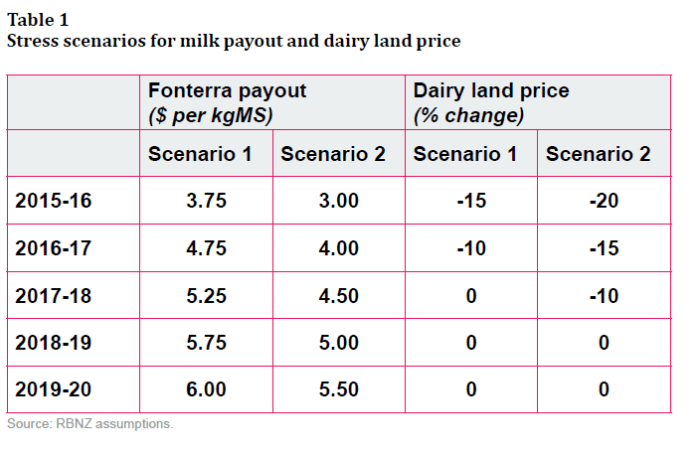
I’m largely going to ignore Scenario 1 from here on.  As the long-term average real milk price is probably only around the assumed 2017/18 level, Scenario 1 doesn’t represent much of a stress test at all.  The banks and the industry would have to be have been very rickety for a scenario like that to have presented a banking system problem.  I think the Reserve Bank should also have discounted these results, rather than highlighting them in their press release.

Scenario 2 does look much more like a real stress-test.  But even if one thought the series of payout assumptions might be reasonable (2015/16 won’t have been that low, but some of the out years could still be lower than assumed here), I was surprised by the dairy land price assumptions.  Despite a really severe adjustment in the payout path (absolutely, and probably relative to farmer expectations), dairy land prices are assumed to fall by just under 40 per cent (the cumulative effect of those three annual falls).

That might sound like a lot, but:

  • when the Reserve Bank did its housing stress test, it assumed a 50 per cent fall in Auckland house prices.  People still need to live somewhere, while they don’t need to farm cows.
  • we’ve already a dairy land price scare not long ago.  Here is a chart of the (“hedonic”)dairy land price index the Reserve Bank developed for REINZ (despite which, we don’t have general access to the series).

dairy farm pricesIn a single year, dairy land prices fell by more than 30 per cent –  and that was a severe, but very short-lived, fall in milk prices, and a rise in dairy non-performing loans that was still moderate compared to what we see in Scenario 2 in the current stress test.   Perhaps deliberately, the Reserve Bank’s stress test does not seem to have taken account of a second round of selling (forced or voluntary), and the potential for that to drive land prices well below what might be a longer-term equilibrium level.  Overshoots routinely happen in such markets, where liquidity is thin to non-existent, uncertainty is rampant, and potential buyers are few.  As Eric Crampton’s discussion highlights, one difference between now and 2009 will be that potential buyers are probably much more aware of how significant the barriers are to any offshore buyers (who might otherwise be a stabilizing force in the market).

Loan losses evaluated on total dairy land prices falls of perhaps 60 per cent might be a more realistic stress test –  recall, that stress tests aren’t central predictions, they are a scenario to test robustness against.  Loan losses went up by 5 percentage points on the move from the (not very stressful) Scenario 1 to Scenario 2.   The pattern of losses on loans should rise non-linearly as the test gets more stressful, and moving from a 40 per cent land price fall scenario to a 60 per cent scenario is a bit more of a land price adjustment than moving from Scenarios 1 to 2.

There are lots of other points of detail I could question (some things in the article just aren’t made as clear as they could be), but will just highlight one.

The Reserve Bank has long emphasized the desirability of having a capital framework for banks in which risk weights (whether imposed by the Bank, or flowing from the internal models of the major banks) do not have the effect of making capital requirements pro-cyclical.  If capital requirements fall in asset booms and rise in shakeouts, the capital requirements will tend to amplify credit and asset price cycles (an existing stock of capital will go ever further as the boom proceeds, and ever less far – encouraging banks to rein in lending even more –  as the bust proceeds).  And yet the stress-testing article suggests that pro-cyclicality is deeply embedded in the modelling, at least for the dairy portfolio –  itself the largest single chunk of banks’ commercial lending.

Here is what I mean.

risk weights dairy

This chart shows the average risk weight for the banks’ dairy portfolios under Scenario 1.  Recall that Scenario 1 was not very demanding at all, and yet the average risk weight on dairy loans increases by 60 per cent  (eg, from, say, 70 per cent to 112 per cent).  No doubt deliberately, the Bank does not reveal how much further risk weights increase in the much more onerous Scenario 2.     Even if it is not that much further, this sort of highly pro-cyclical pattern of risk weights looks like a bug that needs some serious attention.

To recap, in Scenario 2, bad debt expenses average 8 per cent of dairy exposures.

dairy bad debts

But, as the Bank noted (see extract above), not all banks were as conservative as others.  If we take the pessimistic end of the Scenario 2 range, we would have bad debt expenses of perhaps 11.5 per cent of dairy exposures.  But, as noted above, the near-40 per cent fall in land prices  in Scenario 2 still looks too shallow for such a fully-worked-through scenario.  If land prices were to fall 60 per cent would it be implausible that in such an scenario, with all the second round effects accounted for and allowing for the non-linear loss profiles, the banks could face losses not of the “3 to 8 per cent of their total dairy exposures”  that the Reserve Bank highlighted, but something more like 20 to 25 per cent of their total loans to dairy farmers?    I deliberately pose it as a question, rather than a confident assertion, and it is –  deliberately – the result of a stressed scenario, but it is probably a question people should be posing to the Reserve Bank.

No, Prime Minister

The Prime Minister was also on TV3’s The Nation last weekend.  Most of the interview was about immigration.

Late last year, I wrote about some earlier, probably rather off-the-cuff, remarks that Key had made about immigration, in which he described the recent high net migration inflows as a “time of great celebration”.

The TV3 interview was a rather more substantial occasion (The Nation isn’t exactly a mass market programme), and it was about the issues, not just an opportunity to attack his political opponents.  The Prime Minister will no doubt have been briefed for it by his own DPMC officials, and perhaps also by MBIE, the government department responsible for immigration (administration and policy).  And yet I was surprised just how insubstantial his answers were, and a little alarmed at the central planner’s mentality that they evinced.  On Radio New Zealand yesterday, Matthew Hooton described the current government as the most interventionist since the 1970s.  That mentality was fully on display in John Key’s interview.  I had to watch the interview again to be sure that I had correctly heard a Prime Minister from an avowedly centre-right party declare that there was an optimum number of (immigrant) truck drivers.

I was pleased to see that the interviewer kept the focus on the flows of non-New Zealand citizens.  New Zealand can’t, and shouldn’t try to, control the comings and goings of New Zealand citizens.  We can’t even, and shouldn’t try to, control the outflows of non-New Zealand citizens –  the people who come and, after a time, find that New Zealand isn’t quite right for them, or just find an even better opportunity somewhere else.    But every inflow of a non New Zealand citizen requires the approval of the New Zealand government  –  that is what immigration policy is about. (As a matter of policy, we allow any Australian citizens to move here without advance approval but (a) that is still a New Zealand policy choice, and (b) the numbers involved are pretty modest (over the last 40 years the annual net inflow of Australians has fluctuated between 0 and 3500)).

The Prime Minister, of course, was keen to emphasise the fall in the net outflow of New Zealanders.   In the data released yesterday, there was still a net outflow of 3890 New Zealanders to Australia over the last year.  That is, by the standards of recent decades, a small net outflow, but the people who know New Zealand best  –  New Zealanders –  are still choosing to leave rather than to return (and to a country where real per capita income has been falling for the last couple of years, and hasn’t grown in seven years).  That should be telling the Prime Minister something.

The interviewer kept trying to push the Prime Minister to name an “optimal number” for the inflow of non New Zealanders.  He consistently refused to do so, asserting that there was no limit to number of arrivals he would be happy with “so long as they add value to New Zealand”.  Oddly, neither he nor the interviewer mentioned that actual government policy is rather different.  After all, there is a target level for the number of residence approvals granted (45000 to 5000o per annum), that target is approved by Cabinet, and the target has not changed for quite a long time.   Despite all the fluctuations in the number of foreign students, or short-term workers, the residence approvals programme is the main way in which immigration policy boosts the population over time. Broadly speaking, I think it is a sensible way to run immigration policy –  we shouldn’t be playing around with the target each year in the light of immediate pressure, but setting some medium-term targets and reviewing them from time to time.    But there was simply no discussion as to whether 45000 to 50000 is the best target, or how we might know.  Why not, for example, 30000 per annum more?  Or fewer?

In fairness to the Prime Minister, there was also nothing explicit along the lines often found in MBIE documents, lauding New Zealand’s immigration policy as a “critical economic enabler” or a “key lever” in economic strategy.  But he didn’t seem far from that either, but with equally little evidence.  He asserts that immigration is a source of growth, without ever being quite clear what he had in mind.

Everyone recognizes that increases in immigration boost demand, and tend to boost total GDP.  Bur our real interest should be in per capita or per hour worked measures, whether of GDP or of national income –  and, to be even more specific, in what, if any, gains there are to those who were already here.  From an economic policy perspective, immigration makes sense if it makes those of us who were already here better off.  But despite running one of the largest immigration programmes in the advanced world, neither the Prime Minister, nor his advisers in MBIE and Treasury, have been able to produce any evidence that New Zealanders as a whole have been made better off.  In his interview, the Prime Minister didn’t even try to make the case, to (for example) outline the channels by which he believes New Zealanders are being made better off.  (And, in fairness, the interviewer didn’t push him to do so.)

Instead, the Prime Minister seemed reduced to assertions that the high rate of immigration is a “sign of success” or even “a badge of honour”, asserting that people don’t want to come to countries that aren’t doing well.

It is surprising that anyone takes that line of argument seriously.  At the grim extreme, Turkey, Lebanon and Jordan –  none of them terribly well-performing – have been very attractive places to non-natives in the last few years.   They are simply (much) less bad than Syria.  But more generally, immigrants tend to move from poorer countries to richer countries, and for all its disappointing performance over 60 years or more, New Zealand still offers higher incomes than most of the countries of the world.  That people want to come here simply reflects what we already know, that New Zealand is better off than most places.  It sheds no light at all on whether New Zealanders are benefiting from the large scale immigration programme run by successive governments.  And that should be the question we constantly ask.

It is not as if this is some unimportant question: if New Zealand’s productivity growth or per capita income growth was outstripping that of all its peers there might still be an interesting question as to what contribution immigration was making to that outperformance.  But only a handful of people would care much –  there would be plenty of prosperity to go round.  But we’ve kept on underperforming for decades, despite the allegedly productivity-enhancing immigration programme.

And yet the Prime Minister is adamant that “we need these people”.

I’m not entirely sure why.  There are plenty of people around to offer cynical explanations of anything and everything John Key does.  Perhaps there is merit to that –  as for most politicians –  when it comes to tactical choices.  But the large-scale immigration programme seems to be one of those things which he genuinely believes in.

No doubt it helps that his official advisers (Treasury and MBIE) keep telling him we benefit from the immigration programme, even if they don’t offer –  or even really try to offer – any evidence of those benefits.  That inclination is probably reinforced by the fact that the global elites among whom he moves treat the benefits of immigration as almost axiomatic.

And I don’t suppose he has ever seriously engaged with the fact that, despite its poor productivity record, New Zealand has had some of the highest real interest rates in the advanced world for at least the last 25 years, or the possible connection from that (and the associated high real exchange rate) to the weakness of business investment in New Zealand, and the failure to make any progress towards his own government’s (well-motivated but questionable) goal of markedly increasing the export share of GDP.

But I suspect that a significant part of why Key supports such a large immigration programme is because he buys into the skill shortages story.  It was the only story that he used in the TV3 interview.  Employers tell MBIE, and those taking surveys, that they can’t find staff locally, and that if they can’t find staff it will impede their ability to grow their business.  MBIE certainly believes the story –  as I wrote about a while ago, it suffuses their annual report on migration trends.

What I find remarkable in this document, as in other MBIE immigration work I’ve seen, is the absence of any sense of market processes, and how the market might sort these things out.  For example, if there are excellent opportunities here which New Zealanders are simply ignoring in their rush to get to Australia, surely we’d expect real wages to increase here?    If that happened, some of the opportunities might disappear.  Some New Zealanders might change their minds about going to Australia.  Some people might regard more training as worthwhile, to better equip themselves for those higher-paying opportunities.  Some will switch jobs from less rewarding ones, to the ones where the returns are now higher.  Some people might work harder or stay in the workforce longer.  But not one of these market mechanisms is even discussed.  And this from a key economic agency, implementing the policy of a vaguely centre-right government?  Does it not occur to them that “shortages” don’t happen in most markets, and when they do they are usually just a sign that the price has not adjusted.  Why does MBIE think that labour is different?

Although MBIE and the government seem to see immigration largely as a labour market phenomenon (“a critical economic enabler”), the price of labour  “wages”  appears only once in the entire document (purely descriptively).  “Price” does not appear at all.  In fact, “productivity” and “competition” each appear only once, in neither case in the context of an analytical sentence.  “Labour market” does appear repeatedly, but almost always only descriptively.  There is simply no sense, anywhere in the document, of a competitive market process at work.  If one were being unkind, one might think MBIE saw the role of government as being to ensure that the right pegs were in the right holes.

And that seemed to be how the Prime Minister saw it, as he talked of the need to juggle which occupations were on, and off, the approved list, and never once talking about market adjustments, changes in wages etc.  In fact, it was where the comment about the optimal number of immigrant truck drivers came in –  apparently truck drivers have recently been removed from the list.

From an individual employer level it all makes some sense. Importing a foreign worker really can relieve an individual firm’s shortages.  But it simply doesn’t do so economywide, and isn’t necessary anyway.  Markets and price/wage adjustments take care of reconciling supply and demand, in and across markets. One might have hoped that the Prime Minister of a centre-right government might, just once, have made that point.

When I make the point about market adjustment, I often get some sceptical comments –  higher wages, I’m told, would price producers out of the market.  But if we decided to have a much lower level of immigration a lot of things would change.  Some industries would shrink markedly.  We’d have a fairly flat population, so we’d probably have a much smaller construction sector, freeing up a lot of labour.  We’d have lower interest rates, and a lower real exchange rate.  Resources would, over time, shift from the non-tradables sector to the tradables sector, as more offshore opportunities became viable for smart New Zealand firms.  In some sub-sectors which have been favoured by immigration policy  –  dairy workers for examples –  wages might be expected to rise somewhat, to attract more New Zealanders into the industry.  But remember that the real exchange rate would be lower.    We simply don’t need government officials deciding which particular skills to import this year.

These arguments aren’t remotely new even in a New Zealand context.  In a chapter in the Oxford History of New Zealand in 1981, Victoria University economic historian Professor Gary Hawke wrote

“Ironically, the success with which full employment was pursued until the late 1960s led to frequent claims that labour was in short supply so that more immigrants were desirable. The output of an individual industrialist might indeed have been constrained by the unavailability of labour so that more migrants would have been beneficial to the firm, especially if the costs of migration could be shifted to taxpayers generally through government subsidies. But migrants also demanded goods and services, especially if they arrived in family groups or formed households soon after arrival and so required housing and social services such as schools and health services. The economy as a whole then remained just as “short of labour” after their arrival.”

But 35 years on Radio New Zealand was still leading its news bulletins last night with a story along the lines of “despite record net migration flows, employers claim skill shortages are as severe as ever”.  We simply shouldn’t be surprised.  Immigration simply does not ease skill shortages in the economy as a whole or, typically, ease pressure on resources. Across a range of colonies of settlement, Prof James Belich illustrated that point quite effectively in his 2009 book Replenishing the Earth.

If there are real gains to New Zealanders from large scale immigration –  and the onus really should be on the Prime Minister and other advocates to demonstrate those gains –  they simply don’t come that way.

Finally, Auckland. The Prime Minister was astonishingly upbeat in his story about Auckland, and dismissive of the implications for house prices.  Now, we can all accept that high immigration does not cause housing market problems, and serious affordability issues, when housing and land supply are only lightly regulated.  But that isn’t the New Zealand situation.  The government has been unwilling or unable to legislate to facilitate the sort of physical growth of Auckland that would have kept urban land (and house) prices in check.  Given that, it is quite reasonable to ascribe much of the rise in Auckland house prices to the immigration policy that the government can, but won’t, change.

But the Prime Minister simply falls back on “global city” arguments. He asserts that Auckland has “reinvented itself”, and now competes on a global stage with cities like Sydney, Dubai, London and so on.  According to the Prime Minister, young Aucklanders simply cannot expect house prices to come down again –  this is, we are told, the price of being a “global city”.

This is really nonsense on two counts.  The first, of course, is that there are plenty of successful fast-growing cities in the United States where real house prices have not risen materially at all, and where price to income ratios remain about as low as they were in New Zealand for decades.  As just two examples, Houston and Atlanta are both materially larger, fast-growing, by most counts more successful, and home to much more international business than Auckland is.   Yes, real house prices in Sydney and London and Auckland might not ever come down, but if so in each of them that is a direct result of government choices –  constraining the supply of urban land in the face of population pressure (in the New Zealand case, the population pressure itself mostly resulting from immigration policy choices).

But perhaps more concerning is that there is just no evidence of this Auckland economic success.  Auckland’s population has grown much faster than that of the rest of the country, and Auckland is much bigger than any other place in New Zealand.  According to the champions of the immigration programme, and of the application of agglomerationist ideas more generally, this should have seen Auckland’s economic performance pulling away from that of the rest of the country.  If anything, the data suggest that the opposite is happening.  I ran this chart, from the regional GDP data, a couple of weeks ago.

nom gdp pc akld vs rest

If Auckland has “reinvented itself” anywhere other than in the heads of the Auckland Council and government officials, it doesn’t look to have been for the better.

The regional GDP data aren’t an ideal measure by any means –  and they can be a bit cyclical, as in the short-term Auckland benefits from the initial boost to spending from high immigration flows, and suffers when immigration slows –  but once again there is just no sign of the gains (incremental or transformational) that the advocates of the immigration programme, as a key economic lever, would have been looking for.    International trade isn’t growing (share of GDP), productivity growth remains disappointing, our biggest and fast growing city is slipping relatively.  All we are left with is some large distributional effects: firms in the non-tradables sector do okay, but those in the tradables sector suffer (and others never even get started); those who own land in Auckland do well, while those who ever want to buy into that market suffer.  And so on.

There are plenty of year to year fluctuations in overall net migration numbers. They shouldn’t really be the focus, and even if they were there are distinct limits to what governments can do about them.  But we deserve a much more compelling case for how the large scale medium-term immigration programme is benefiting New Zealanders as a whole than the Prime Minister (or his officials and ministers) has given us.


The inquiry into the possible OCR leak

I see that Stuff has an article up about the Reserve Bank’s inquiry into the possible leak of the OCR decision.

Michael Reddell, a former senior economist at the Reserve Bank, who now runs a blog which has been sharply critical of the central bank, claims he was told that the official cash rate (OCR) would be cut an hour before the decision was announced.

The Reserve Bank has confirmed that following an allegation, it had launched an investigation.

“We are aware of an allegation that information may have been leaked ahead of the OCR announcement on 10 March,” a spokesman of the bank said.

There is no “claims” about it. I have given a copy of the email (minus the name of the sender) I received at 8:04am on the OCR release day to the Reserve Bank’s inquiry.  That email read as follows:

We have just heard that the Reserve Bank is cutting by 25 basis points.

I have been consistently clear that the email in its own right is not confirmation that a leak occurred,  but it is troubling nonetheless, and raises the serious possibility of a leak.  When I drew the matter to the attention of the Reserve Bank, they also expressed immediate concern and appropriately moved to initiate an inquiry.

When I first received the email, I was not sure what to make of it.  I checked the exchange rate pages and was relieved to find there had been no movement.  I also wasn’t sure whether to believe the report  –  after all, a cut was not widely expected that day.  Seeing no movement in the exchange rate, not being sure if the report was accurate (and not wanting to be scoffed at by the Bank if they weren’t in fact cutting), and knowing that the key Reserve Bank people would in any case  be in lock-ups, I did not pass on the information to the Reserve Bank (John McDermott and Mike Hannah) until shortly after 9am on MPS day.

I still fervently hope that the investigation is able firmly to conclude that no leak occurred.  Regardless of whether it did or not, the risk of leaks remains and the Bank would be wise to tighten up its procedures and further reduce the risks.