A tale of two economies

I’ve never known much about Romania.  There was Olivia Manning’s Balkan TrilogyRichard Wurmbrand was one of the Christian heroes of my youth, and there were the bleak last years of Ceaucescu culminating in a firing squad on Christmas Day 1989.  But that was about it. I had occasionally used it as an example of a rare country that had managed less growth in per capita income than New Zealand over the 20th century.   The rule of law, private property, strong institutions and freedom have quite a lot to be said for them.

And then the other day, an eastern European immigrant to New Zealand was commenting here.  I was curious why an east European had chosen New Zealand, as several of the eastern European economies seemed to have pretty good prospects, perhaps even better than those of New Zealand.  I had in mind especially the Czech Republic, Slovenia and Slovakia (each now with GDP per hour worked very similar to that in New Zealand).  In our subsequent exchange, it turned out that he was Romanian.

And that prompted me to go and check out some data on Romania.  It was a pretty sobering story, for a New Zealander.

Romania had its ups and downs in the 20th century.   Just prior to World War One (when we were one of handful of richest countries in the world) Romania was doing well.   GDP per capita is estimated to have been 75 per cent of that of, say, Norway.   They did really badly for the following 30 years, and then –  on these measures –  quite well economically for the first few communist decades (large scale industrialisation etc).  As with many of the eastern bloc countries, things worsened again for them in the 1980s. Older readers may remember accounts of the “austerity policy” in which everything –  particularly citizen living standards –  was subordinated to repaying the government’s foreign debt.

Things actually got quite a lot worse for Romania (at least in bottom line economic numbers, even if they were free), as for many of the former eastern bloc countries, in the years immediately after end of communist rule (so many distortions to unwind, so many governance problems etc).  In Romania’s case things finally bottomed out –  at least relative to New Zealand – in 2000.

Absolute levels comparisons between Romania and New Zealand are a bit fraught.  Romania isn’t in the OECD, and while they are in the EU we aren’t.  Here are ratios of Romania’s GDP per capita, in purchasing power parity terms, relative to New Zealand since 1990 from (a) the IMF World Economic Outlook database, and (b) the Conference Board Total Economy database.

Romania 2

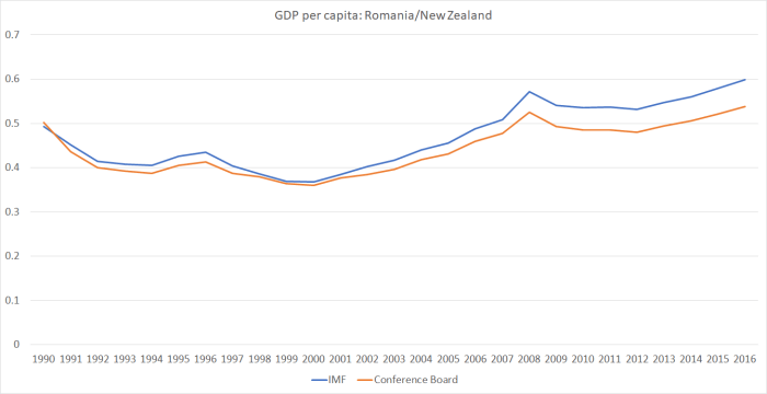
Those of you who want to be relatively more upbeat on the New Zealand story might choose to emphasise the Conference Board number, and to note that – even after ending decades of communism – on that measure Romania now isn’t much higher relative to New Zealand than it was in 1990.  Personally from all the accounts I’ve seen, I’m more than a little sceptical that Romania’s real living standards in 1990 were in fact half those of New Zealand.   Things are better measured now.

But here is the Conference Board’s real GDP per hour worked series (Romania relative to New Zealand).  The Romanian data only go back to 1995, and these days Romanian statistics are part of Eurostat (ie they won’t be perfect, but I’m not sure there is more reason to doubt statistics for them than for us).

romania 3

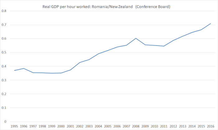
In absolute terms it isn’t such a stunning achievement –  since New Zealand productivity growth has lagged that of most other advanced countries over this period –  but………..one of the once-richest countries of the world is on course for having Romania, almost a byword in instability, repression etc for so many decades, catch us up.  It would take a while if current trends continue.  But not that long.  Simply extrapolating the relative performance of just the last decade (and they had a very nasty recession in 2008/09 during that time) about another 20 years.

So how we do maintain a big lead in GDP per capita?  Simply by having more people work more hours.  Here is hours worked per capita (ie per man, woman, and child of all ages).

romania 4

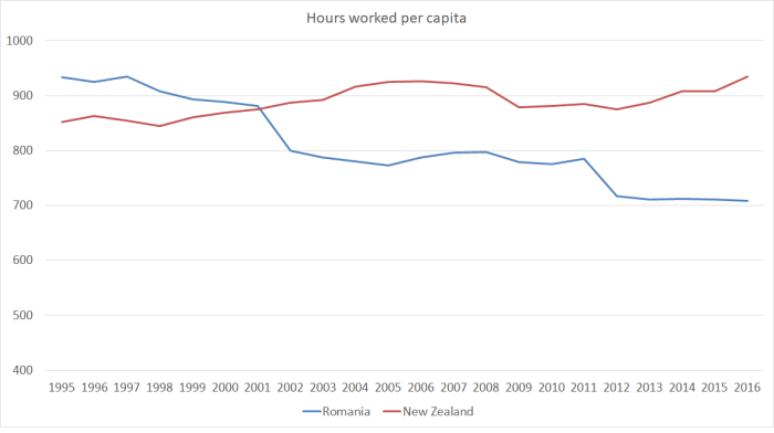
The next time you hear Steven Joyce, or some other minister or business cheerleader, boast that we have more people working than most countries, do try to remember that labour is a cost (to individuals, who would often do other stuff instead if they could) and that the Stakhanovite cult –  extolling the virtues of tireless labour –  was a feature of the communist system, not ours.

Of course, if people do want to work and can’t, then there is a problem.  We measure that through the unemployment statistics.  Romania’s unemployment rate is a bit higher than New Zealand, but at 5.5 per cent the difference is pretty small.  We still do a lot things better than Romania:  we score top of the Transparency International rankings, while Romania is 57th.  We top the World Bank’s ease of doing business index, and they are 36th (not bad at all given where they came from, but a long way off us).   But look at the bottom line growth and productivity performances.

Of course, sometimes what you find in countries with a run of impressive-looking fast growth is that:

  • it is built on big government deficits, or
  • big ill-founded private credit booms, reflected in
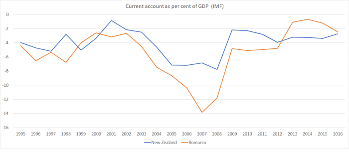
  • big current account deficits, and
  • appreciating real exchange rates, with an economy increasingly skewed towards construction and domestic demand.

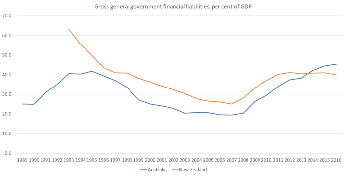
Our government finances are in better shape than theirs.  The Romanian government (on IMF numbers) has a deficit of about 2 per cent of GDP, while we have a small surplus.  Gross government debt in New Zealand is about 30 per cent of GDP, and in Romania it is about 40 per cent.  But even that is pretty low by advanced country standards.   And for my friends who like to emphasise size of government, (still on IMF numbers) both revenue and expenditure as a share of GDP are a bit smaller in Romania than in New Zealand.

Romanian private credit was very rapid, and looked rather risky, in the years leading up to 2008.  But not now.  There is a chart at the link, and overall domestic credit growth has been running at under 5 per cent per annum for the last few years.

Reflecting the pre-crisis boom in private credit, the Romanian current account deficit widened sharply.    But these days, deficits in Romania are similar to the modest ones we currently have in New Zealand.

romania 5

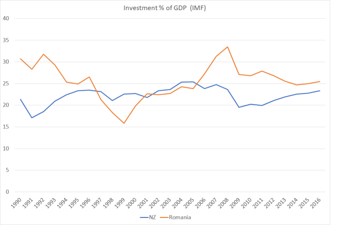
Romanian investment has fallen back from what they experienced in the credit boom period.  Then again, it is still higher, as a share of GDP, than that in New Zealand.

romania 6

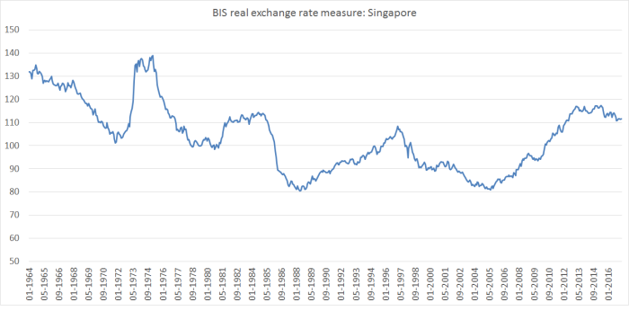
In fact, they had exactly the sort of worrying real exchange rate appreciation one might have expected in the credit-boom years.

romania 7

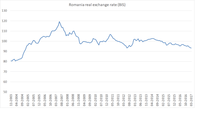
But after that credit boom ended, the real exchange rate fell back.

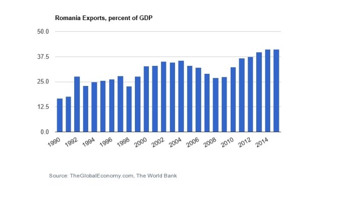
Perhaps consistent with that, firms based in Romania seem to have been doing rather well in international markets.  Exports look as though they were squeezed out during the credit boom, but the subsequent recovery and trend growth is pretty impressive.  For a country with a population of about 20 million people, it is a reasonably high foreign trade share (this is exports, but imports are equally important).  Australia, for example, is around 20 per cent of GDP.

romania 8(You will recall that New Zealand has been going backwards on this metric.)

And there was one other interesting comparison.

romania 9

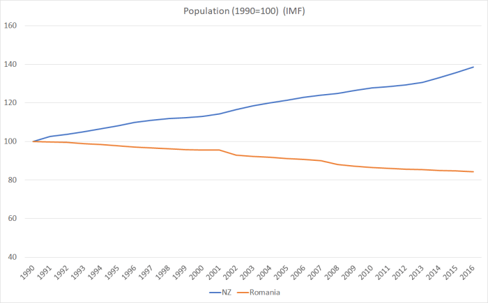
Since 1990, Romania’s population has fallen by 16 per cent, and ours has risen by 40 per cent.   There are several differences.  As I showed a few weeks ago, New Zealand’s total fertility rate over recent decades has been averaging below replacement.  Romania’s has been materially lower still, currently around 1.4.   And both countries have had material outflows of their own citizens: we had a net outflow of New Zealand citizens of around half a million people since 1990.    Romania has also had big outflows but (as far as I can tell) smaller cumulatively than those from New Zealand (there is a reference here to about 2.3 million Romanians living abroad long-term).

But, of course, the other difference is non-citizen immigration.  We’ve for a long time aimed to grant residence approvals equal to around 1 per cent of the population each year.  Since 1990, those policies have given us a net inflow of around one million non-citizens.

The OECD’s International Migration Outlook recorded in 2015 that

Romania sets annual quotas for work authorisations to be issued, although historically demand has been lower than the quotas.  For both 2014 and 2015, the quotas were set at 5500, including 900 intra-corporate transfers and 900 highly-skilled migrants.

In a country of 20 million people.   Not necessarily a policy I’d recommend, but……

Subdued population growth (well, falling population actually) doesn’t seem to have been inconsistent with a pretty impressive period of productivity growth, export growth, strong investment etc etc, all in a country still with its share of governance and regulatory problems.  And that investment isn’t largely having to keep up with a rapidly rising population, it is presumably responding the incentives and opportunities firms are finding).  Perhaps the Romanians, in aggregate and in some sense, wish their population wasn’t falling –  there is still anguishing about the outflow of skilled people – but probably their best hope of reversing that (perhaps slim given the low birth rate) is to keep right on with what they’ve been doing for the last 10 years.  In time, perhaps many of the diaspora might even return –  as they started to in Ireland after they finally got their act together.

30 years ago, Bob Jones toured the country lamenting that the New Zealand economy had come to resemble a Polish shipyard, a byword for inefficiency and industrial disruption.  I do hope in 30 years time there aren’t reforming Romanian politicians campaigning, warning their fellow citizens to avoid the decline and fall of New Zealand.  Yes, for now they are still poorer and, on average, less productive than we are. But those gaps have started closing fast, and the foundations of the growth don’t look that bad at all.

UPDATE: I forgot to mention Romania’s 16 per cent company tax rate.  Not sure (whether as Baptist or economist) I quite approve of the separate regime for nightclubs and gambling operations.

(On another topic, I discovered that my name was being bandied around in Parliament’s question time the other day   –  question 2 here. Winston Peters was quoting me, and Steven Joyce was batting him away.  All good fun no doubt.     But I did notice this comment from the Minister “I appreciate that the member has been talking to Mr Reddell a bit”.  In fact, I have never met Mr Peters, I have never talked to him, never emailed him or had any contact with him whatsoever.  If he or his office appear to read my stuff at times well, of course, I welcome that, as I welcome any readers.   Specific policy proposals, that might actually make a difference, would be even more welcome.)


A cathedral and property rights

The fate of Christchurch’s Anglican Cathedral has been hitting the national media this week.  It was all over John Campbell’s Checkpoint on Radio New Zealand, and this morning Martin van Beynen’s column on the subject is even run in the Dominion-Post, newspaper of what is surely the New Zealand capital of secularism.

It is an extraordinary column.  There is, we are told, only one way ahead.  His way.  The rights and interests of Christchurch Anglicans are simply irrelevant, and the church should simply “bow to the will of intelligent people”.  Like him presumably.

Why am I writing about it here?  Partly because it cuts across two of my interests: economics and public policy on the one hand, and Christianity on the other.   And also because I’m Christchurch born, most of my family still lives in Christchurch (they lost homes, a business and more).  It remains my favourite place (“home” in some sense).  Family tradition in fact claims –  I’ve never been sure how credibly – that one set of my earliest New Zealand ancestors were offered farm land in or around what is now Cathedral Square, but turned it down on the grounds the land was too swampy.  And I’m torn between Anglican and Baptist traditions, which also seems to reflect family history: a document in box of old family papers I have records that one of my 19th century ancestors was a worshipper at the Christchurch’s Anglican cathedral, but one morning was running late for church, so went in to the (closer) Baptist church service instead, was invited home for lunch, and in time met and married another of my ancestors and the rest is history.  I’ve worshipped in the Cathedral –  the last time was a wonderful, if long, Midnight Service on the last Christmas Eve the building was open.

So I will be a little sad if the old cathedral is no longer there.  My own tastes run in the direction of the older style of building.  The building was a symbol of the city, and of its English, and Anglican, heritage.   Choral worship, of the sort undertaken in cathedrals great and small, has been one of the glories of our English heritage.  And great cathedrals have typically cost astonishing amounts of money.  A place of great beauty in which to worship is a privilege, and one of ancient lineage in our Judeo-Christian traditions (read the accounts of the temple King Solomon built).

None of this is relevant to van Beynen, who claims

The church might be the registered proprietor of the land but the city owns the building in everything but the documentation.

and

We need to arrest the fiction the church has any real say in the matter.

In fact, the city doesn’t own the cathedral at all.  Unless, as seems to be proposed by van Beynen, and people like the mayor of Christchurch (who says she would favour the Crown seizing the property if the Anglican church doesn’t do what she wants), the church is to be given no say at all in the future of its own property.   Built and paid for by the Anglicans of Christchurch.   Do property rights mean nothing in van Beynen’s world?


He goes on

we shouldn’t forget the cathedral is a national asset and has a call on national taxpayer funds. It’s not only a Christchurch icon but, like the Church of the Good Shepherd at Lake Tekapo, a national one.

I imagine the parishoners of the Mackenzie Cooperating Parish might have something to say about that.

I have little sympathy when people buy an existing heritage building, and then have to fall into line with the pre-existing restrictions on what they can do with the building.  They bought it knowing the rules, and the purchase price will have been lower than otherwise to reflect the opportunities that the new owner can’t pursue.   But that simply isn’t the case here.   The old cathedral was always owned by the Anglican church in Christchurch.  The building’s purpose was, as it has always been, as the seat of the bishop, the chief church of the diocese, and as a centre for Christian worship.That makes it very different from the other “heritage buildings” (in public ownership anyway) that are being restored in Christchurch, the Arts Centre and the Provincial Council buildings.  The latter lost their original purpose in 1876, and the former –  originally the university –  in the 1970s.    They are monuments, put (at least in the case of the Arts Centre) to some modern use.
Van Beynen seems to want to appropriate the Anglican cathedral as another monument.  It isn’t clear what he would do with it once he got hold of it.  Another concert venue I suppose.   But the Christchurch ratepayer is already spending vast amounts of money restoring the severely damaged Christchurch Town Hall and associated concert facilities.In truth, van Beynen clearly has no time for churches generally.  He is really just interested in monuments, and perhaps reshaping Cathedral Square.  He compares the Anglican cathedral in Christchurch –  home to a living breathing (if depleted) community, both the local congregation and the diocese –  to the Parthenon, a building not used for the cult for which it was erected (that of the goddess Athena) for around 1500 years now.  Does the difference mean nothing to van Beynen?
I might have some sympathy for van Beynen’s perspective had the diocese proposed to demolish an undamaged Cathedral.  Less suited as the building might be to today’s concepts of worship than it was when first built, it nonetheless seems unlikely that scenario would ever have occurred.  Churches exist amid communities –  even if, in biblical terms, as aliens and stranger to the non-believing communities surrounding them.     But this is a building that has already largely been destroyed by nature, in a city where so many buildings –  beautiful and ugly –  have also been destroyed.  For the Anglicans. it is an oppportunity to start again, and on a realistic footing that takes account of the limited financial resources of the Anglican church (and Cathedral parishoners) to meet not just construction costs –  the figures often bandied around –  but the ongoing heavy maintenance costs that a reconstructed traditional stone building would entail.  And which takes account of modern Anglican conceptions of worship spaces and ministry.
Again, perhaps the views of people like van Beynen might warrant more weight if Christchurch was teeming with Anglicans, and the church was growing stronger and larger by the year.  It isn’t.  For the time being at least –  Christians long for and pray for revival –  Christian congregations in the West, and in New Zealand, are in decline.  And although there are thriving Anglican congregations in Christchurch, overall the Anglican denomination is in decline.    And –  never mentioned in any of these debates –  it is a denomination that could yet tear itself apart in the next few years over theological differences that manifest in issues like disputes over same-sex “marriage”.  How responsible would be it for the diocese to take on a massive restoration project, for which it doesn’t have the money –  either to build the building, or to maintain it in future?It is all very well to talk of fundraising, and even coerced contributions from ratepayers and taxpayers.  Perhaps it would even be enough to meet the construction costs.  But it is unlikely to meet the ongoing costs, and even if (perchance) central or local government agencies were willing to provide ongoing support, it would most likely involve pressure on the Anglican church not to upset the funders.  The Christian gospel, by contrast, is supposed to be a radical counter-culture, standing against sin whereever it is found (including among the powers that be).

Perhaps in the end, the Anglican diocese will decide to take the repair and restoration route.  That –  or the alternative –  should be their choice.   If they decided –  without coercion –  to repair and restore, in some ways I’d be as delighted as anyone, at an act of breathtaking faith.   But that is very different from being coerced – whether by mayors threatening to withhold demolition permits, or other grandstanding politicians and advocates many of whom never darken the door of a church between weddings and funerals.   It is the Anglican church’s land.  It is the Anglican church’s money.   It is a building, first and foremost, for the worship and ministry of the Anglican church of Christchurch.

Cities and cityscapes change.  Sometimes in tragic ways –  and the earthquakes in Christchurch was one of those.  But it isn’t the first, and won’t be the last, cityscape to change.  Greater cathedral buildings, by far, than that of Christchurch have been destroyed by war, and fire and so on.    In time, new buildings, sight lines, and streetscapes that seem jarring and new today will, in some cases, be hallowed features.  Will a new Cathedral fit that bill?  Who knows.  Perhaps not, given the budgetary limitations.  Then again, the Anglicans of Christchurch probably hope and pray for a revival of faith and worship.  If so, in 100 years –  short in the history of the church –  perhaps an even finer Cathedral might one day be built, to the glory of God, and as a centrepiece of the city of Christchurch.

In the meantime, we shouldn’t let the Anglicans be coercively deprived of their rights, no matter how much Martin Van Beynen may dislike them and their bishop.

UPDATE: I have a few more ecclesiastical/theological perspectives, prompted by reading the bishop’s Press column and listening to her radio interview, on my other blog here.

Emissions again

After my post the other day, I pricked up my ears when I heard on the radio this morning that new data on greenhouse gas emissions had been released, and at the same time heard various industry lobby groups calling for more government support (money or regulation”) for this, that or the other mitigating measure.  It is the costs of meeting the New Zealand government’s emissions reduction target that worries me.

(As it happens, I was emitting carbon at the time, driving home from the supermarket in a petrol-fuelled car.  But I had already walked up the (rather steep) hill carrying several kilos of groceries home earlier in the morning.)

Today’s release consists primarily of a 542 page report from the Ministry for the Environment (MfE).  But they also had a convenient eight page summary document.

In my post the other day, I included this chart of GDP per capita for OECD countries, in the most recent year for which there is data, 2014.

emissions per GDP

New Zealand was second only to Estonia in the level of emissions per unit of GDP.

I was interested to see that MfE made reference to this measure in their snapshot report.  Under the heading “New Zealand’s economy is growing faster than our emissions”, they included this chart.

MFE emissions

That looks quite good on first glance.

But how, I wondered, did New Zealand compare to other OECD countries?  You’ll notice that on that chart emissions per unit of GDP fell in 2015.  Since the OECD databases aren’t yet updated for 2015, and we don’t know what happened to other countries in 2015, the following charts use the data only for 1990 to 2014.    (MfE also report a rebasing of the entire series, slightly lowering New Zealand’s estimated emissions over the whole 25 year period.  But relative to the charts below this rebasing would worsen  New Zealand’s relative performance, since the revision downwards for 1990 was a little greater than the revision downwards for the more recent years.)

Here is emissions per unit of GDP for those OECD countries (all but one) for which there is 1990 data.

emissions 1990

In 1990 we were only sixth highest in the OECD.   And by 2014 we were second highest.  I guess the Ministry for the Environment (and their Minister) weren’t too keen on highlighting that point.

Here is the percentage changes in emissions per unit of GDP to 2014 (for a small number of countries only 2013 data is available).  MfE highlighted that New Zealand’s emissions fell by 35.9 per cent from 1990 to 2015.

change in emissions

Only 10 OECD countries had smaller reductions in emissions per unit of GDP than New Zealand over this period.  Of them, one might reasonably think that severe economic stresses (falls in GDP) in recent years might help explain Italy, Spain, Greece and Portugal.  And as Japan’s emissions rose a lot in 2011,  the year of the earthquake/tsunami, the enforced shift away from nuclear power at the time probably explains what is going on there.

Of the five countries that were to the right of New Zealand in 1990, four had among the largest percentage reductions among OECD countries.  Even Australia’s reduction was around the median.  It does leave New Zealand rather standing out.

(Perhaps some of this is covered in more depth the 542 page report.  I went through the Executive Summary and the table of contents and couldn’t see any likely references, but I may have missed them.)

In the snapshot document, straight after the emissions per unit of GDP chart, MfE does have a brief section on

Some of the challenges New Zealand faces when reducing emissions include:

  • a growing population
  • almost half our emissions are from agriculture where there are fewer economically viable options currently available to reduce emissions
  • an electricity sector that is already 80.8 per cent renewable (meaning that we have fewer ‘easy wins’ available to us compared to other countries who can more easily make significant emissions reductions  by switching to renewable sources of electricity).

I was very pleasantly surprised to find the “growing population” as the first item on the list (it isn’t particularly relevant to emissions per unit of GDP, but is very relevant to total emissions –  the variable in terms of which our government’s target is expressed).

It is hard to disagree with them  But it does leave one wondering what advice or research/analysis they have done, and provided to Ministers –  including when the target was being adopted –  about the implications of New Zealand’s immigration policy.  Our non-citizen immigration policy pushes up the population by almost 1 per cent per annum (against an, admittedly unrealistic, benchmark of zero inward migration of non-citizens).  Have they analysed the potential costs and benefits from lowering the non-citizen immigration target relative to other possible abatement (or compensation) mechanisms?  Perhaps there is credible modelling that suggests the overall abatement costs to New Zealanders would be lower through other plausible mechanisms.  But given that population increases appear first, and without further commentary, on their lists of “challenges” it would be good to know if they have done the work.

On reflection, I think I will lodge an Official Information Act request to find out.

(And it still leave me mystified why, when even the government’s own Ministry for the Environment is citing continuing population increases as a constraint on meeting the emissions reduction target, the Green Party continues to support large non-citizen migration inflows.  Migration might only transfer people from one country to another but given (a) the issues around agriculture, and (b) the reasonable notion that New Zealand members of Parliament should be looking out first for the interests of New Zealanders, it shouldn’t be a consideration they can simply ignore in thinking about New Zealand’s ability (and at what cost) to meet the emissions reduction target.)

Budgets, journalists, Switzerland and all that

Last week I wrote about the New Zealand Initiative’s study tour to Switzerland, where (so we were told) a large and high-powered group of CEOs and chairs were seeking to learn from Switzerland’s success.  As I noted, it seemed odd to look for inspiration from the one OECD country that has managed to achieve less productivity growth than New Zealand since 1970.   Even since 1990, Swiss productivity growth has underperformed New Zealand’s own poor record.

I learned about this tour in an article in the Herald, written by veteran journalist (and apparently “Head of Business at NZME”) Fran O’Sullivan.  It was presented as a straight news story, with no suggestion of any Herald involvement with the trip.

But in today’s Herald O’Sullivan devotes her column to Five elements of a good first Budget.  I’ll come back to the substance of the column in a moment.  But in the middle of the column was this

From a distance (in Switzerland travelling with the NZ Initiative to look at how New Zealand can once again become a “rich country”) it is easy to overlook that for some nations – like the Swiss – posting surpluses is mandatory.

So a leading journalist writes about a business lobby-group’s study tour to Switzerland without disclosing that she herself is participating in the tour?   One presumes NZME is paying for her to undertake the tour, but even so.   Wouldn’t it normally be elementary to let readers know of your involvement when you write up the story?  Isn’t it just possible that, in what looked like a straight news story, the fact that the author herself was participating in the tour might colour the angles put on trip, and reports of what it might reasonably hope to achieve?      It will be interesting to hear, in due course, what O’Sullivan makes of the Swiss experience, but how likely is that we will get a balanced and rigorous account when she has gone in with the New Zealand Initiative to do this trip, running their advance lines about “lessons to be learned” etc  (and presumably NZI organised everything, arranged the programme of meetings etc)?      Presumably at a distance, she still hadn’t noticed that while Switzerland is pretty rich, its productivity performance has been shocking, and it has slowly but steadily been dropping down the league tables.

That quote come from item 2 in O’Sullivan’s list of five elements she wants to see in Steven Joyce’s Budget tomorrow.     And yes, the Swiss have changed their constitutional rules to require budget surpluses, but as the chart in my post this morning showed, on net government debt (as a share of GDP), they are virtually identical to New Zealand, and both of us have a bit more debt than Australia.     Perhaps a formal binding surplus rule might make some sense –  although when you don’t have a formal constitution it would be hard – but the case doesn’t seem that compelling in a country that successfully maintains low public debt itself, and yet is exposed to very nasty (and very costly) natural disasters.

What are the five items O’Sullivan looks for?

First –  for G*d’s sake, be bold

Second: Post a surplus?

Third: Budget is the plan

Fourth:  Get economic growth up on a per capita income level

Fifth:  Strip out the smoke and mirrors

Item 1 is the sort of item that helps reinforce conservatives in their conservatism.  Being bold might sound good, but her lead proposal is simultaneously bold and daft.

A bold Budget would unveil a significant long-term investment in the country’s infrastructure. For example, a high-speed railway network to service Auckland from elsewhere in the Golden Triangle (Hamilton, Whangarei, Tauranga).

This generation’s Think Big, if I hadn’t already applied that label to our immigration policy.

The British government is envisaging spending 55 billion pounds –  stop and take in the number –  on their HS2 high speed rail route.   There is plenty of scepticism about that proposal –  and this is country with many many more people, at either end of the proposed routes, than anything we are ever (or even just in our lifetimes) likely to have in northern New Zealand.    If the costs in New Zealand were similar, that would be $100 billion (or around 40 per cent of current GDP).     We do lots of government capital spending badly in this country –  check out the Transmission Gully project –  but an HS2 equivalent would surely take the cake?

Urging boldness on politicians is fine, if there is a strong and well-grounded agreement on what they should be bold about.  Otherwise, it feels a lot like random action because “something must be done” and anything is something.

She poses a question mark around the second item –  post a surplus.  This seems to be because she is tantalised by the idea of using surpluses to fund “major infrastructure to support growth”.  As I noted this morning, government infrastructure may involve ongoing maintenance and depreciation costs, but straight government capital expenditure doesn’t show up in the operating balance.

What of the third item –  the plan.

Does the Government have a plan? New Zealand is at a choke point. There needs to be a credible five-year plan to capitalise on the major influx of immigrants. Ensure New Zealanders can be housed; clean up our waterways … the list goes on.

Joyce has had a lengthy eight-year period as English’s understudy.

That’s more than enough time to come up with a plan.

Hard to disagree that a credible plan would be nice.  After eight years it doesn’t seem likely that one will suddenly be granted us.   And, given the Minister’s penchant for interventions all over the place (universities, student visas, tech schemes etc), it isn’t likely that any such plan now would offer us a credible way forward.  He was, after all, the Minister primarily responsible for the exports target.    Over recent years, we’ve been moving away from that target rather than towards it.

The fourth item –  lifting per capita growth –  is really the same as the third.  It would be nice –  rather more than that actually.    But there isn’t much sign of doing differently things that have given us such weak per capita GDP and productivity growth for the last eight years.

On the fifth item –  smoke and mirrors –  one can only agree.

Joyce – like previous Finance Ministers – will be a fail on this score. He is unlikely to strip out the “smoke and mirrors” which politicians use to overstate government expenditure; particularly on social programmes such as housing.

He’s already been caught out by Labour’s Grant Robertson when it comes to massaging the numbers on an $11 billion investment in infrastructure.

Robertson labelled the $11b figure as “just playing with numbers”.

“When you peel it all back, what you have is National only promising to spend an extra $300 million a year from the promise made in the half-year Budget update.”

Finance Ministers really shouldn’t play this game and Treasury should issue tables which keep a running track of “re-announcements” of spending promises.

It is the sort of reason why Treasury forecasts and fiscal reporting are supposed to be done at arms-length from the Minister of Finance.  Each time ministers do this stuff it erodes, just a little further, what remaining confidence the public might have in our elected leaders.  A cheap (brief) win, and a long-term cost.

In the end, it is a pretty bleak column.  Plenty of stuff to wish for –  much of it quite sensible, provided you forget about the high speed train –  and little prospect of any of it happening.

But I still can’t help thinking that we deserve a lot better from a leading journalist in the country’s largest circulation newspaper than a story writing up and promoting the activities of a lobby group, only to find out 10 days later that the journalist in question is herself a participant in that same (apparently rather misguided) study tour.


New Zealand and Australian public finances

It is the time of year when both New Zealand and Australian governments hand down their budgets.  And these days it seems it is an opportunity for an annual comparison, in which New Zealanders feel rather virtuous about fiscal management here, and many Australians –  perhaps especially people on the right – take a turn breast-beating, regretting that they are not, in this regard, as well-governed as New Zealand.    Particularly florid Australian commentators are prone to invoking comparisons with Greece and other fiscal disasters.

I don’t find the story particularly persuasive.  Both countries had their fiscal blowouts late last decade –  in Australia, much of it was initially intended as active counter-cyclical use of fiscal policy under Kevin Rudd, while here it was discretionary choices to increase spending in the late years of the last boom.  In different ways, both the Australian Federal Treasury and the New Zealand Treasury were culpable to some extent; the former for enthusiastically embracing fiscal stimulus, when there was still plenty of monetary policy capacity left, and the latter for getting the forecasts wrong (they had told the government that big increases in spending would still leave the budget roughly balanced).    In some ways, New Zealand had a rougher time of it: the Canterbury earthquakes were a much bigger adverse hit to New Zealand government finances (a few years back) than anything in Australia.  Then again, Australia had to deal with much bigger volatility in –  and uncertainty about –  the terms of trade.

But what do the numbers show?  For history, I turned to the OECD’s database, where they have lots of fiscal series going back typically to around 1989.   While much of the attention focuses on the Australian federal government finances, it is important for New Zealanders to recognise that state governments are a large part of the overall government mix in Australia.  The OECD numbers are for “general government”, encompassing federal, state, and local government (or, specifically, national and local government in New Zealand).

It is also worth remembering that the size of government is smaller in Australia than it is in New Zealand.  That is so whether we look at revenue.

aus nz receipts

Or expenditure

aus nz disbursements

And government spending as a share of GDP has also been more stable in Australian than in New Zealand.  In fact, last time I checked government spending as a share of GDP had been more stable in Australia, over decades, than in almost any other OECD country.

What about fiscal balances, adjusted for the state of the respective economic cycles.  Here is the OECD’s measure.

aus nz deficits

A remarkably similar pattern really.    Our surpluses have averaged a little larger (and our deficits a little smaller) than those of Australia in the last 15 years, but there really isn’t much in it.  And do note that on this cyclically-adjusted measure, New Zealand is estimated to have been in slight deficit in 2016.

And what of debt?  This chart shows gross general government financial liabilities as a per cent of GDP.

aus nz gross debt

That is certainly a less favourable picture for Australia –  gross debt as a per cent of GDP higher than at any time for decades.   But here is the  –  superior for most purposes –  net debt picture.

aus nz net debt

Australian governments have had less debt than New Zealand through the whole period, and if the gap has closed just a little in the last decade, the change is pretty slight.    From a public debt perspective, Australia doesn’t seem to have much to worry about, with net financial assets (across all tiers of government) of around 10 per cent of GDP.

We won’t see the New Zealand government’s projections for the next few years until the Budget is released tomorrow.  But plenty of commentary focuses on the prospect of rising surpluses for years to come in New Zealand (as if this is somehow a good thing, when debt is already low), in contrast to the projections of deficits in the federal government books in Australia.

But one problem with those comparisons is that they aren’t apples for apples comparisons.  Thus, our government accounts for a long time have focused on the operating balance.  Relative to more traditional fiscal measures –  of the sort typically given prominence in Australia –  our deficit/surplus measure excludes capital expenditure but includes depreciation.  In a country with (a) a positive inflation rate, and (b) a rising population and rising living standards, government capital expenditure will typically exceed depreciation.   That isn’t a problem in itself, but it can make cross-country comparisons harder (the OECD historical numbers in the earlier charts are done consistently).

But here –  taken from the Australian official documents – are the federal government deficit measures done the Australian way (“underlying cash balance”) and something very like the New Zealand way (“net operating balance”).

Underlying cash balance Net operating balance
Per cent of GDP
2015/16      -2.4 -2.0
2016/17      -2.1 -2.2
2017/18      -1.6 -1.1
2018/19      -1.1 -0.6
2019/20      -0.1 0.4
2020/21       0.4 0.8

As they note in the Australian Budget documents

The net operating balance has been adopted for some time by the States and Territories (the States) and some key international counterparts as the principal focus for budget reporting. All the States report against the net operating balance as the primary fiscal aggregate. New Zealand and Canada also focus on similar measures.

One might feel slightly queasy about how the Australian government is raising additional revenue –  that populist bank tax seems to have more to do with utu (the Australian Bankers’ Association appointed a former Labor premier as their Executive Director, much to the annoyance of the Treasurer), and undermining Opposition calls for a Royal Commission into banking, as with principles of sound taxation –  but operating deficits of 1 per cent of GDP simply shouldn’t be a matter of concern, in a growing economy with low levels of public debt and relatively modest (by international standards) overall tax burdens.

But wait, as they say in the TV ads, there’s more.     The Australian Federal Treasury’s background Budget papers point out that

the Commonwealth provides grants to others (primarily the States) for capital purposes (that is, to acquire their own assets). This spending appears as a grant and detracts from the underlying cash balance and the net operating balance.

In 2017/18, the amounts involved are around 3.5 per cent of federal government spending.

Make that adjustment, and this is what the federal government’s operating balance would look like.

Underlying cash balance Net operating balance Adjusted net operating balance
                           Per cent of GDP
2015/16 -2.4 -2.0 -1.5
2016/17 -2.1 -2.2 -1.5
2017/18 -1.6 -1.1 -0.4
2018/19 -1.1 -0.6 0.0
2019/20 -0.1 0.4 0.8
2020/21 0.4 0.4 1.2

The adjustment doesn’t change anything about overall public sector finance in Australia.  The states will, presumably, in future have to account for the depreciation on these federally-funded capital projects.   But if one is looking just at the federal level, it seems like a reasonable adjustment.  On that adjusted measure, the federal operating budget in 2017/18 is projected to be very close to balance.  Of course, unlike the situation in New Zealand, Australian governments can’t count on getting all their budget measures through Parliament, but on the face of it, the endless angst in some quarters about Australian government finances does seem rather overdone.

The other thing that muddies the water in short-term comparisons is differences in rates of population growth.  A few years ago, Australia’s population was growing faster than New Zealand’s –  helped by all the New Zealanders going to Australia.  For now, New Zealand’s population is growing quite a lot faster than Australia’s –  not so many New Zealanders are going to Australia (and we have slightly larger controlled immigration programme per capita than Australia does).   In the short-term, unexpected population growth tends to boost demand more than supply, and specifically tends to flatter the government operating balance measures.   Consumption tax and income tax revenue both rise quite quickly, and operating expenditure tends to lag behind.   Even government capital expenditure tends to lag –  notice the recent announcement of more infrastructure spending here, much of which is to catch up with the unexpectedly fast population growth –  and you don’t have to maintain, and can’t depreciate (depreciation is in the operating balance), an asset that doesn’t yet exist.  That spending pressure will come.

This post isn’t intended as a criticism of New Zealand governments (there are plenty of other grounds for that), or as praise for Australian governments.  It is mostly just about making the point that, when considering overall fiscal management, if one stands back a little the similarities are much more apparent than the differences.  And that is to the credit of a succession of governments on both sides of the Tasman.

Standing back, here is how the OECD countries ranked last year on net general government liabilities as a per cent of GDP.

NZ and Aus net debt

O to be Norway one might reasonably conclude.  But given the choice, I’d take New Zealand or Australia’s cumulative (and current) fiscal management over those of almost every other country in the OECD.  And unlike many of these countries, neither country has huge off-balance sheet (ie not in these numbers) public pension liabilities either.

Productivity (or lack of it) is another story of course.


Densification: not much happening in the US

The government’s housing plans –  and, I presume, the Labour Party’s –  seem to make great play of squashing more people, and more dwellings, into much the same space.    And it is certainly true that many of the older state houses seemed to sit on ridiculously large sections, (especially incongruous when the sections themselves are in otherwise very valuable locations).

Increased density appeals to planners, and perhaps even to people in certain demographics.  I wouldn’t want to stand in the way of people who prefer to live more densely. But that is rarely enough for the enthusiasts.  Instead, much rhetoric is aimed at so-called NIMBYs, people who might be reluctant to see a change in the character of their neighbourhood pushed through by bureaucratic fiat.  There was an article in today’s Herald along exactly those lines.

As I’ve noted here previously, over history, as cities have been richer they have tended to become less dense, not more so.     Space seems to be a normal good.

And so I was interested to stumble this afternoon on an article in the New York Times, with a couple of interesting graphics on changes in density in 51 metropolitan areas (population in excess of one million) in the United States over the last few years.  2010 to 2016 is quite a short period, but –  given history –  the results shouldn’t really be surprising.  I can’t cut and paste the graphics (click through to have a look), but what they highlight is two things:

  • only a fairly small number (10) of US cities saw increased density during that period, and the increases in density were typically small (although Seattle stands out with by far the largest increases)
  • the remaining 41 cities (metropolitan areas) saw a shift towards less density over that period, and many of those falls were quite substantial.

In  the chart, there is also some suggestion that areas with faster population growth were more likely to have become less dense over this period (Dallas, Raleigh, Houston, Nashville, San Antonio and Austin stand out).

It looks a lot like a case where cities spread –  people want more space –  when land use restrictions don’t stop them doing so.   It isn’t obvious why New Zealanders’ preferences would be that much different from those of Americans.   And it is hardly as if New Zealand is short of land either.

Land use restrictions may actually stop cities’ populations growing much –  at least in the US where there are many big cities to chose from (some with tight restrictions, others without).  That would seem to be the message in the latest Hsieh and Moretti paper , which highlights how little population growth there has been in the US cities with some of the tightest land use restrictions (San Francisco, San Jose, and New York) relative to other cities.   By doing so, those restrictions may have imposed substantial real economic costs (lost opportunities to take advantage of high productivity opportunities in those cities).   The case that such restrictions might have had a large real cost here is less strong –  numbers in Auckland has grown very fast even with the restrictions.  Perhaps here the cost is “simply” the shockingly high cost of purchasing house+land, a systematic redistribution against the young, the poor and the credit constrained.

UPDATE: For anyone interested, John Cochrane has a nice post explaining clearly, and in more detail, what is going on the the Hsieh and Moretti paper, and commenting on a couple of other papers in a similar vein.

Some puzzles about the Monetary Policy Statement

After the last OCR review I noted that if I was going to go on agreeing with the Governor, there might not be much point in writing about the OCR decisions.  I agree with him again today.

Writing earlier in the week about what the Bank should do I concluded

So where does it all leave me?  Mostly content that an OCR around 1.75 per cent now is broadly consistent with core inflation not falling further, and perhaps continuing to settle back where it should be –  around 2 per cent.   Of course, there is a huge range of imponderables, domestic and foreign, so no one should be very confident of anything much beyond that.

And I was pleased to see how much emphasis the Governor placed today on the inevitable uncertainties around the (any) forecasts and projections.   Trying to project where the OCR might appropriately be a year or two from now is mostly a mug’s game.  Getting the current decision roughly right is towards the limit of what the Bank can actually usefully do.  I think they have today, although only time will tell.

I also liked the continuing emphasis on how low core inflation is globally.  This is my chart making that point, taking the median of the core inflation rates of the places in the OECD with their own monetary policy (so that the euro-area counts as one observation, and individual euro-area countries don’t count at all).

OECD core inflation

But there were some puzzles and some unsatisfactory aspects in both the statement itself and in the press conference the Governor and his chief economist just hosted.

First, it is quite remarkable that there is no mention at all in the document of the forthcoming hiatus.  After 25 September, we’ll only have an acting Governor for six months (itself a questionably lawful appointment), and we won’t have a permanent Governor until next March.   The Policy Targets Agreement expires with the Governor, and there won’t be a formal Policy Targets Agreement in place during the interregnum.   The Reserve Bank Act requires that the Monetary Policy Statement address how the Bank will conduct monetary policy over the following five years.  Given that we also have an election approaching in which most of the opposition parties are promising some changes to monetary policy, there is more than usual uncertainty about the path ahead –  the people and the law/PTA to which they will be working.    It isn’t the Bank’s place to take partisan stances, but it would be only reasonable –  in a genuinely transparent organisation, complying with the law –  to touch on these issues, if only briefly.     At a trivial level, the PTA has been reproduced in the MPS for decades, reflecting the central role PTAs have in New Zealand short-term macroeconomic management.  What will be done in the November and February MPSs?   

Rather more importantly, although I agree with the Governor’s current stance, I’m not sure I’d be taking the same view as him about the outlook for monetary policy if I shared his economic forecasts.

Here is my puzzle.   This is the Reserve Bank’s chart of their estimate of the output gap.

output gap may 2017

They now reckon it has been pretty flat around zero for the last two to three years.  I’d be surprised if there has been quite so little excess capacity –  and in fairness, they do explicitly highlight the quite wide range of estimates they have  –  but it is their current central view.   But then look what happens starting now.  They expect quite a material positive output gap to emerge.     And they think that will translate into quite a lift in wage inflation.

wage inflation may 17

Now, it is quite true that they need to see a lift in wage inflation if core inflation, across the economy, is to settle near 2 per cent, the target the Governor has committed to.    But if I really believed that things in the wage-setting markets were likely to turn around that much that quickly, I’m not sure I’d be running with such an “aggressively neutral” (ANZ’s words) stance right now.  Perhaps it doesn’t really matter to the Governor –  the sole decisionmaker –  because he won’t be there?

I’m a bit puzzled as to why they expect such a material increase in capacity, and wage, pressures.   They expect to see real GDP growth accelerate a bit.  Over the 18 months to the middle of next year, they expect quarterly growth to average 0.9 per cent.  By contrast, in the last couple of years, on their preferred production measure, real GDP has grown by only 0.6 per cent a quarter on average.

It isn’t that clear why they expect such an acceleration (which we’ve seen forecast before).  Perhaps it is partly the lagged effect of last year’s fall in the OCR?  But then, as they note, bank lending standards appear to have tightening, and funding margins risen, which will offset some of the effects of the OCR cut.   Dairy prices have certainly increased, which will provide some support to spending.  The exchange rate has come down a bit recently (more so this morning) but the level the Bank assumes –  a TWI above 75 for the next year or so – isn’t much below the average for the last couple of years.

And then there is immigration.    Here are the Bank’s projections.

immigration may 17

They expect the net immigration numbers to start falling over very sharply, starting now.    As the Governor noted, they (and other people) always get their immigration forecasts wrong.   But any significant reduction in immigration –  and this is a halving in the next couple of years –  is a material reduction in both demand and supply for the whole economy.   It is more than a little surprising that the Bank believes we will see both an acceleration in total real GDP growth and a sharp slowdown in net immigration.

The Bank appears to still believe the story that, at least this time round, high net immigration has eased overall capacity pressures.  If they are sticking to that story –  and they appeared to in the press conference –  then perhaps that is why they think we should be expecting a sharp pick-up in wage inflation starting now.    It doesn’t ring true to me –  and it has never been how New Zealand immigration cycles have worked in the past –  but if that is part of their story, something they genuinely believe, then –  as I already noted – I’m a bit surprised by the “aggressively neutral” policy stance.  On my own reading of course, any material slowdown in net immigration (unless it is accompanied by a big Australian economic rebound) will weaken near-term demand more than supply, as it has typically done in the past.

Two other points that came up in the press conference seemed worth commenting on.

Bernard Hickey asked the Governor what the Bank’s definition of full employment was.  The Governor was quite open, if a little tentative, in suggesting something around 4.5 per cent.  That is lower than the actual unemployment rate has been since the first quarter of 2009 –  eight years ago.     But, as Hickey noted, it is still above the Treasury’s published estimate of near 4 per cent.     The actual unemployment rate now still stands at 4.9 per cent.

The Bank’s chief economist and Assistant Governor, John McDermott, then picked up the question.   The gist of his response was that it was a silly question.   At some length he tried to explain how the Bank relies on the output gap for its assessment of overall capacity pressures in the economy.  He went to argue that labour market variables were so slow to respond that if one waited to evidence from them before moving it would almost certainly be “too late”.    Doubling down, he argued that in a New Zealand context it was “almost impossible” to estimate any sort of NAIRU, and that any attempt to do so was just ‘guessing”.

In a way, I wasn’t surprised by these arguments.  He used to run the same lines to me when I worked for him.   But familiarity doesn’t make the arguments any more convincing.  For a start, everyone recognises that inflation targeting is supposed to work by focusing on the forecast outlook, perhaps 12-24 months ahead.  Monetary policy works with a lag.  In principle, waiting to see actual outcomes –  on whatever measures –  will typically mean acting too late.

But, on the one hand, this is the very same central bank which set a new world record this cycle, by twice beginning to increase interest rates (in 2010 and 2014) only to have to quickly reverse themselves.  It is quite a while since they were too late to tighten (and McDermott was the Bank’s chief economist in both instances).

And what of the output gap the Bank wants us to put our faith in?  Here was one of the leading international experts  (and a former practitioner) on inflation targeting, Prof Lars Svensson writing on measures of excess capacity (LSRU is the long-term sustainable rate of unemployment, the bit not influenced by monetary policy)

What does economic analysis say about the output gap as a measure of resource utilization? Estimates of potential output actually have severe problems. Estimates of potential output requires estimates or assumptions not only of the potential labor force but also of potential worked hours, potential total factor productivity, and the potential capital stock. Furthermore, potential output is not stationary but grows over time, whereas the LSRU is stationary and changes slowly. Output data is measured less frequently, is subject to substantial revisions, and has larger measurement errors compared to employment and unemployment data. This makes estimates of potential output not only very uncertain and unreliable but more or less impossible to verify and also possible to manipulate for various purposes, for instance, to give better target achievement and rationalizing a particular policy choice. This problem is clearly larger for potential output than for the LSRU.

He summed it up recently even more succinctly

My experience of practical policymaking made me very suspicious of potential output, essentially an unverifiable black box, and consequently of output gaps. Instead, it made me emphasize the (minimum) long-run sustainable unemployment rate and consequently the unemployment gap.

And it is not even as if McDermott’s point about lagging labour market data has much obvious validity relative to measures of the output gap.  I had a look at the peak of the last (pre 2008) boom.

The unemployment rate troughed in the September and December quarters of 2007.

The output gap –  as estimated today – peaked in the September quarter of 2007.

But that caveat (“as estimated today”) matters hugely.  At the time, there was huge uncertainty about, and significant revisions to, estimates of the level of the output gap.   In the December 2007 MPS, for example, there isn’t a chart of the quarterly estimated output gap.  But the estimate for the average output gap for the year to March 2008 was 0.6 per cent.  At the time, they (we) thought the output gap had peaked in 2005.    The Bank’s current estimate is that the output gap in late 2007 was around 2.5 per cent.    Those aren’t small differences.   And they are pretty inevitable.      By contrast, there has never been any doubt that the labour market was at its tightest in late 2007.

No one is going to disagree that it is hard to estimate a NAIRU –  or Svensson’s LSRU – with hugely great confidence.  But much the same –  typically only more so –  can be said of almost any of the concepts the Bank uses in its modelling, forecasting and policy assessments (eg neutral interest rates, potential output, and equilibrium exchange rate).  And, relative to output gap measures, the unemployment rate is a directly observable measure of excess capacity, easily comprehended and prone to few revisions.   And unemployment is something that citizens care directly about.

In McDermott’s shoes, I’d have said something like “we really don’t know, but we are pretty confident it is lower than the current 4.9 per cent unemployment rate.  Treasury’s estimate of around 4 per cent might not be far from the mark, but we won’t really know until we get nearer.  The fact that the unemployment rate is, with quite a high degree of confidence, above the NAIRU is consistent with wage and price inflation having been pretty subdued for a long time, and is consistent with the Bank’s stance, of keeping interest rates below our estimates of neutral for the time being”.    It wouldn’t have been hard to have run that line.

Perhaps people (eg FEC) might like to ask the Bank why it appears to put so much less weight on direct measures of unemployment than, say, their peers in the United States (or most other central banks) appear to.  None takes a mechanical approach, none assumes the NAIRU never changes, none assumes they know it with certainty.  But they seem to think it matters –  and might matter to citizens and politicians to whom they are responsible –  in a way that simply eludes the Reserve Bank.  It is partly why I’ve come to the conclusion that some form of what the Labour Party is promising –  a more explicit statutory focus on unemployment in the documents governing the Reserve Bank and monetary policy –  is the right way ahead for New Zealand.   Concretely, I’ve suggested that the Bank be required by law to publish periodic answers to Bernard Hickey’s question –  what is full employment, what is the (estimate) NAIRU?

Finally, I was interested in the Governor’s evasiveness when asked about possible statutory changes to the provisions in the Reserve Bank Act that currently make the Governor the sole legal decisionmaker.    It is fine to emphasise that in practice monetary policy decisions have always been made in a collective environment –  whether the Official Cash Rate Advisory Group in the past, or the current mix of the Governing Committee and the Monetary Policy Committee.   But we don’t have rules and laws for good times and when things are working well.   And, as it happens the Bank and Governor haven’t covered themselves with glory in the last seven or eight years.

The Governor simply avoided answering the question of whether the law should be changed, even if only to cement in the collegial practice.  Since (a) the Governor is leaving shortly, and (b) the Minister of Finance has commissioned advice on the issue and Labour (and the Greens) are campaigning for change in this area, it is hardly as if letting us know his views would tread on taboo territory.   Perhaps to do so would have been to acknowledge that in no other central bank does one unelected person –  a person selected other unelected people –  have so much power, not just in monetary policy but in financial regulatory matters.  It is something where change is well overdue.

Challenged as to whether legislative reform in this area might not enhance transparency (eg publication of minutes, or even the airing of alternative views), the Governor fell back on his old claim that the Reserve Bank is one of the most transparent central banks in the world.  That simply isn’t so. It scores well, as I’ve put it previously, when it publishes material on stuff which it knows little or nothing about (the outlook for the next few years, where its guess is as good as mine, and none of the guesses are very good).  But it is highly non-transparent when it comes to the stuff they do know about.  Thus, we don’t see any of the background papers that go into the OCR deliberations (although I did once use the OIA to get them to release 10 year old papers), we see no minutes of the deliberations, no record of the balance of the advice the Governor receives.  And competing views (on the inevitably uncertain outlook, and the right policy stance) are not aired at all.    That is a quite different situation from what prevails in many other advanced country central banks (although of course there is a spectrum, but we are at one end of it).

As another telling example of how untransparent thiings are in New Zealand, I was reading the other day a piece by John Williams, the very able head of the San Francisco Fed, and a member of the FOMC.    In the US system he is a pretty senior guy –  not Janet Yellen, but not just a Reserve Bank chief economist ever.   His widely-distributed article was devoted to advocate a material change in how US monetary policy is done –  abandoning inflation targeting in favour of price-level targeting –  to provide greater policy resilience in the next serious downturn.   I’m not persuaded by Williams’ case, but what struck me is how open the system is when such a senior figure can openly make such a case.  The markets didn’t melt down. The political system didn’t grind to a halt.  Rather an able senior official made his case, and people individually assessed the argument on its merits.

The other bit of the paper that struck me was this

Now that we’ve gotten the monkey of the recession off our backs, we have the luxury of being able to look to the future. This presents us with the opportunity to ask ourselves whether the monetary policy framework and strategy that worked well in the past remains well suited for the road ahead.

Such introspection is healthy and constitutes best practice for any organization. In fact, the Bank of Canada has already shown us the way. Every five years, they conduct a thorough review of whether their policy framework remains most appropriate in a changing world. This is an exercise all central banks should undertake, including the Fed.

I’ve made this point myself previously.  The Bank of Canada is very open about these reviews they conduct.   By contrast, in New Zealand, it is still a struggle to get from the Reserve Bank and Treasury papers relating to the lead-up to the 2012 PTA, and all the (limited) deliberations then took place behind closed doors.   We will have a new PTA early next year, and we know –  from other documents Treasury has released –  that Treasury had some sort of review underway and almost completed before the Minister decided to delay the appointment of a permanent Governor. But given that PTA is the guide to the management of the key instrument in New Zealand short to medium term macro policy, it would be both appropriate, and more truly transparent, for much of the background thinking and research to occur openly.  It is too near the election now, but a jointly hosted conference every five years reviewing the experience with the PTA and looking at alternative options (even if none ends up adopted) would be one feature, in our system, of meaningful transparency.  We have very little of that at present.

(And, sadly, we’ve never seen anything from our Reserve Bank on the possible challenges if the practical limits of conventional monetary policy are exhausted in a future severe downturn).

It will be a challenge for the new government to lift the performance of the Reserve Bank in future.  It would be easier to make a strong start in that direction by legislating first to make the appointment of the Governor a matter for the Minister of Finance (and Cabinet)  –  as it is in most other places –  not something largely in the hands of the unelected faceless Reserve Bank Board (which doesn’t even seem to manage well basic record keeping).

The IMF opines on the economy

The International Monetary Fund (IMF) was out yesterday with two major reports on New Zealand.    One was the Financial System Stability Assessment, the conclusion of the quite infrequent (the last one for New Zealand was in 2004) FSAP programme of reviews of the regulation of countries’ financial systems.  I haven’t read that document yet, but from media accounts there are some recommendation I’d agree with (eg deposit insurance, as second-best) and a great deal (mostly derived from the “nanny knows best” starting point) that I’ll have more problems with.

But this post is about the Article IV report –  the (typically) annual review and assessment of a member country’s macro economy.

Once upon a time, these reports were simply confidential advice to the government.  These days, at least for countries like ours, it is all out in the open.  And, partly in consequence, there often isn’t that much to see.  The IMF might be a prestigious organisation full of rather highly-paid economists, but it is striking how weak their surveillance reports often are.   Perhaps there just isn’t a gap in the market that can usefully be filled by a handful of Washington-based economists looking at our economy for a couple of months a year.

The challenge is compounded by the fact that no one much cares about New Zealand.  We are small, in an age when the IMF is heavily-focused on systemic risk, global spillovers etc.    We aren’t in Europe –  still over-represented at the Fund –  or from one of those Asian countries where governments are hyper-sensitive about anything the Fund says.    It is decades since we had an IMF (borrowing) programme ourselves.  And, whether this is cause or effect I’m not sure, but for decades no one here has paid much attention to the Fund.  As an example, our capital city newspaper this morning has some coverage of the FSSA, but really nothing at all about the Article IV report.  If a tree falls in the forest, and no one is around to hear it, does it make a sound?    (By contrast, when I was at the Board of the IMF, my Australian boss was very exercised about each year’s Australian Article IV report.  He’d get phone calls direct from the Treasurer about it, and the serious Australian media gave the reports a lot of coverage.)

Oh, and of course, the other challenge for those reviewing New Zealand is the features that stand out, and which haven’t readily and convincingly been explained.  Thus, we have a lot of reasonably good micro policies, we have pretty good government finances, a floating exchange rate, low and stable inflation, sound banks, high levels of transparency, and low levels of corruption.     And yet……having once been among the very highest income countries in the world, we now languish.  International agencies find Venezuela’s decline easy to explain.  New Zealand’s not so much.

But with all the resources at their command, including the benefit of being an organisation with data and perspectives on all the countries in the world, none of it really excuses the mediocre quality of what gets dished up each year.  Or the inconsistency from one year to the next.   Last year, for example, we were told that raising national savings rates was “critical” –  and it was reported that the NZ authorities agreed –  but this year there is barely even any mention of the issue.

This year we are served up some mix of regurgitated PR spin about how well New Zealand is doing, and when it comes to policy suggestions we get a grab-bag of bits of conventional wisdom, or favoured centre-left policy positions, without any discernible sign that the authors (or their reviewers in Washington, or the Fund’s Board) had any sort of robust framework (or ‘model’) for thinking about the New Zealand economy.

It isn’t easy to excerpt a fairly lengthy report, and often it is the omissions that are more striking than what is in the report itself.      Thus, the release opens with this

Since early 2011, New Zealand has enjoyed an economic expansion that has gained further broad-based momentum in 2016, with GDP growth accelerating to 4 percent, and the output gap roughly closing. Reconstruction spending after the 2011 Canterbury earthquake was an important catalyst, but the expansion has also been supported by accommodative monetary policy, a net migration wave, improving services exports, and strong terms of trade.

On its face, that all sounds quite good.  But countries don’t get rich by rebuilding themselves after disasters –  that reconstruction process mostly displaces resources from other, typically more productive and prosperous uses.   They don’t get rich through monetary policy either, valuable a role as it has in short-term stabilisation.  And although services exports grew quite strongly for a while (a) little or none of it was high value products (lots of tourism, and students pursuing immigration access at PTEs), and (b) in a world in which services exports are becoming steadily more important (as illustrated in eg this recent IMF working paper), for New Zealand services exports as a share of GDP are materially lower than they were 15 years ago.

In fact, you could read the entire Article IV report and not find any mention of the fact that, with total population growing at around 2 per cent annum and working age population growing at around 2.7 per cent annum, per capita income growth in the last few years has been pretty unimpressive.  And you’d find no mention –  explicit or by allusion – to the almost five years that have now passed since we saw any labour productivity growth in New Zealand.   I guess that would have undermined the relentless good news story the Fund staff seemed determined to tell.

Perhaps more surprising is the treatment of the external sector of the economy, typically a subject of considerable interest to the IMF.  Readers of the Article IV report in isolation would have no idea that exports (and imports) as a share of GDP have been falling –  not just this year, but for some time on average.  Nor would they appreciate that per capita real GDP of the tradables sector has shown no growth at all for more than 15 years.     The report does note that an overvalued real exchange rate is probably an obstacle to faster growth in the tradables sector, but again there is no hint of any sort of integrated understanding of what is going on with the real exchange rate, and what might make some difference in future.

The complacency, and weak analysis, carries over to the labour market.

The unemployment rate fluctuated around the natural rate of unemployment of 5 percent in 2016

But there is not a shred of analysis presented to suggest that the NAIRU for New Zealand is now anywhere near as high as 5 per cent.  It would be very surprising if it were that high, whether in view of continuing very weak wage inflation, the history of the last cycle (in which unemployment got to 5 per cent fairly early in the recovery), and changing demographics which are appearing to lower the NAIRU.  Oh, and not forgetting that our Treasury has published its own estimate of the NAIRU, at something close to 4 per cent.

The Fund isn’t really much better on the housing market.   They are all very interested in the various tweaky tools the government and its agencies have applied in the last couple of years (LVR limits, tax changes etc) and – contrary to many of the pro-immigration people in New Zealand –  they are at least quite clear that rapid increases in population are contributing directly to high house price inflation.    But there is no simple and straightforward observation that, at heart, the house price issue is a matter of regulatory failure, and that the current government (like its predecessors) has done little or nothing to fix the problems. Instead, we get banalities along these lines

Tighter macroprudential policies, higher interest rates, lower rates of net
migration, and increasing housing supply should help moderate house price inflation and stabilize household debt vulnerabilities in the medium term.

If you don’t change the fundamental structural distortions that gave rise to the problem in the first place, it is a little hard to take seriously the idea that things will come right even “in the medium term”.  You would not know, reading this report, that almost nothing substantive has been done to free up the market in urban land.    An organisation with the benefit of cross-country perspectives and databases might usefully have pointed out that this is an obstacle not just in New Zealand but in Australia, the UK, much of the east and west coasts of the US, and other places besides.  The silence might suit the current government, but it also makes the Fund complicit in the failure.  The Fund’s Board considered the material in the Article IV report on housing. They observed, in conclusion, that

Recognizing the steps being taken by the authorities to address the demand-supply imbalance in housing markets, Directors generally highlighted that further tax measures related to housing could be considered to reduce incentives for leveraged real estate investments by households. Such measures could help redirect savings to other, potentially more productive, investments and, thereby, support deeper capital markets.

Except that very little has actually been done on the supply side, and not much has been done to change the medium-term “demand-supply imbalances”.      Perhaps there is a place for tax changes (I’m sceptical, including that any changes would make much difference –  where else have they?) but the Board didn’t even seem to recognise that inconsistency in their own advice.  Do we have too many houses in New Zealand or too few?  Most people, rightly, would say “too few”  (a good indicator of that is the ridiculously high prices).    And yet the Fund Board thinks that a greater share of investment should go into other things, and a smaller share into housing?????   (As it happens, I agree with that, but only on the basis that we have much slower population growth, something there is no hint of in this report).

Buried deep in the report, is a recognition of some of the longer-term challenges facing New Zealand.

New Zealand’s structural policy settings are close to or mark best practice among
OECD economies, but persistent per capita income and productivity gaps remain. Income is lower than predicted by these policy settings, by an estimated 20 percent. Growth in labor productivity has declined, with multifactor productivity growth slowing from the early 2000s, and capital intensity has stagnated recently.

One could question even those details.  I wrote a bit about our structural policies a few weeks ago, as illustrated by the OECD’s Going for Growth publication.  There are plenty of areas in which we are well away from best practice, and overall at best you could probably say that our structural policies aren’t bad by OECD standards.  But there is no doubt that productivity levels are far lower than most would have expected based on those policies.

What does the IMF propose in response?   They reckon remoteness is a problem and for some reason, despite that, still seem very keen on lots of immigration.  But here is the rest of their list:

  • Targeting housing supply bottlenecks more broadly would safeguard the
    attractiveness for high-skilled immigration and business.
  • More central government property taxes, the proceeds of which would be distributed to local authorities.
  • Trade liberalization could help to strengthen competition and productivity, including in the services sectors.
  • Tax incentives for private R&D spending
  • As discussed during the last Article IV mission, there is also scope for tax reform to raise incentives for private saving and discourage real estate investment as a saving vehicle

And that is it.

I’d certainly support fixing up the land supply market and foreign trade liberalisation.  I’m a lot more sceptical of the other items.  And what about, for example, our high compayn tax rates?  But my real challenge to them is twofold:

  • first, where is the model or framework that explains how the absence of these policies is at the heart of New Zealand’s disappointing long-term economic performance (because it feels more like a grab bag of ideas they picked from one person or another), and
  • second, how large a difference do they really believe these measures, even if they were all implemented flawlessly, would make?     Without much more supporting analysis, they have the feel of playing at the margins, as if they felt obliged to offer up some suggestions, any suggestions.

A year ago, the Fund seemed quite taken with the idea that the persistent gap between our interest rates and those abroad was an important issue (they even cited approving my own paper on this issue), but that flavour seems to have disappeared this year.  And when they allude briefly to our high interest rates it is to fall back on the discredited risk premium hypothesis.

Of course, the government is just as much at sea.   The NZ authorities get to include some responses in the Article IV report.  In this section, they begin thus

The government’s ongoing Business Growth Agenda (BGA) aims to help overcome the disadvantages of distance and small market size, in particular by deepening international connections, with a focus on increasing the share of exports in GDP to 40 percent by 2025, and diversifying the export base.

Just a shame that, if anything, things have been going backwards on that count, and show no signs still of progress.

And, finally, from the final paragraph of the Executive Board’s assessment

Directors agreed that measures to lift potential growth should focus on leveraging the benefits from high net migration and interconnectedness.

But there is nothing in the report to show what these benefits might be (recall that the focus here is on potential growth, not the short-run demand effects), let alone what “leveraging the benefits” might involve (generally, I thought the IMF was uneasy about leverage).   I guess it is just an article of faith.

It is pretty depressing all round.  Supposed international experts fall for the spin, and can offer nothing very profound on even the longer-term challenges.  Our own government agencies seem to be at sea, or just happy to go along.   Our representative on the Board of the IMF  – no longer a public servant, but now the (able) former chief (political) policy adviser to John Key – was happy to go along.  In his statement to the Board, published as part of the package of papers, he observed

As staff observe, New Zealand’s structural policy settings are close to, or mark, best practice. Lifting productivity, in the face of New Zealand’s small size and isolation, therefore requires incremental reforms across a broad range of areas. Recognizing this, the Government has established the Business Growth Agenda as an ongoing program of work to build a more productive and competitive economy,

When various major OECD countries have productivity levels 60 per cent above ours, who are they trying to fool in pretending that we have policy broadly right, and just need to keep tinkering (“incremental reform”) at the margin?

As part of the package of material released with the Article IV report, there is an interesting empirical annex on immigration.  It isn’t well-integrated with the report itself, and I will cover it in a separate post.  The annex probably should have had some publicity in the local media, given the salience of the issue in New Zealand debate at present.

Is there a Singaporean idyll?

Winston Peters was interviewed on the weekend TV current affairs shows.  Any sense of specifics on his party’s immigration policy seemed lacking – perhaps apart from something on work rights for foreign students.  But I rather liked his line that while ministers and officials have been telling us for years that we have a highly-skilled immigration policy, all we hear now is all manner of industries employing mostly quite low-skilled people telling us how difficult any cut back in non-citizen immigration would be.

But what really caught my attention was when, in his TVNZ interview, Peters reiterated his view that what New Zealand really needs, in reforming monetary policy and the Reserve Bank, is a Singapore-style system of exchange rate management.    It was also highlighted in his speech on economic policy last week.  It is clear, specific, unmistakeable….and deeply flawed.   It seems to be a response to an intuition that there is something wrong about the New Zealand exchange rate.    In that, he is in good company.   The IMF and OECD have raised concerns over the years.  And so have successive Reserve Bank Governors.   I share the concern, and I devoted an entire paper to the issue at a conference on exchange rate issues that was hosted by the Reserve Bank and Treasury a few years ago, and which was pitched at the level of the intelligent layperson interested in these issues.   Another paper looked at a variety of alternative possible regimes, including (briefly, from p 45) that of Singapore.

What is the Singaporean system?  In addition to the brief summary in the RBNZ paper I linked to in the previous paragraph, there is a good and quite recent summary of the system in a paper published by the BIS written by the Deputy Managing Director of the Monetary Authority of Singapore MAS).

The key feature of the system is the MAS does not set an official interest rate (something like the OCR).  Rather, they set a target path (with bands) for the trade-weighted value of the Singaporean dollar, and intervene directly in the foreign exchange market to manage fluctuations around that path.   There is a degree of ambiguity about the precise parameters, but the system is pretty well understood by market participants.    Interest rates of Singapore dollar instruments are then set in the market, in response to domestic demand and supply forces, and market expectations of the future path of the Singapore dollar.    It has some loose similarities with the sort of approach to monetary policy operations the Reserve Bank of New Zealand adopted for almost 10 years in the late 1980s and early 1990s, and which we finally abandoned in 1997 (actually while Winston Peters was Treasurer).   It is also not dissimilar to the approach –  the crawling peg –  used in New Zealand from 1979 to 1982 (at a time when international capital flows were much more restricted).

There is no particular reason why a country cannot peg its exchange rate, provided it is willing to subordinate all other instruments of macro policy (and short-term outcomes) to the maintenance of the peg.  It is what Denmark does, pegging to the euro.  Singapore’s isn’t a fixed peg, but the macroeconomics around the choice are much the same.

It is a model that can work just fine when the economies whose currencies one is pegging to are very similar to one’s own.  Denmark probably qualifies. In fact, Denmark could usually be thought of as, in effect, having the euro, but without a seat around the decisionmakers’ table.

It doesn’t work well at all when the interest rates you own economy needs are materially higher than those needed in the economies one is pegging too.    Ireland and Spain, in the years up to 2007, are my favourite example.  Both countries probably needed interest rates more like those New Zealand had.  In fact, what they got was the much lower German interest rates.  That had some advantages for some firms.  But the bigger story was a massive asset and credit boom, materially higher inflation than in the core countries, and eventually a very very nasty and costly bust.  Oh, in the process of the boom the real exchange rates of Spain and Ireland rose substantially anyway.    Because although nominal exchange rate choices –  the things that involve central banks –  can affect the real exchange rate in the short-term, the real exchange rate is normally much more heavily influenced by things that central banks have no control over at all.

One can, in part, understand the allure of Singapore. It is, in many respects, one of the most successful economic development stories of the post-war era.   Productivity levels (real GDP per hour worked) are now similar to those of the United States, and places like France, Germany and the Netherlands, and real GDP per capita is higher still.   You might value democracy and freedom of speech (I certainly do), but if Singapore’s achievement is a flawed one, it is still a quite considerable one.  And if Singapore is todaya big lender to the rest of the world, it wasn’t always so. Like New Zealand (or Australia or the US) net foreign capital inflows played a big part for a long time.  As recently as the early 1980s, Singapore was running annual current account deficits of around 10 per cent of GDP.

And the Singaporean model is not one of an absolutely fixed exchange rate.  It is a managed regime (historically, “managed” in all sorts of ways, including direct controls and strong moral suasion).  It produces a fairly high degree of short-term stability in the basket measure of the Singapore dollar.      But it works, to the extent it does, mostly because the SGD interest rates consistent with domestic medium-term price stability in Singapore are typically a bit lower than those in other advanced countries (in turn a reflection of the large current account surpluses Singapore now runs –  national savings rates far outstripping desired domestic investment).  As the Reserve Bank paper I linked to earlier noted

From 1990 to 2011, the average short term Singapore government borrowing rate was 1.8 percent p.a. below returns on the US Treasury bill.

Those are big differences (materially larger than the difference between the two countries’ average inflation rates).  And they mean that Singapore dollar fixed income assets are not particularly attractive to foreign investment funds.  By contrast, New Zealand’s short-term real and nominal interest rates are almost always materially higher than those in other advanced countries.   Partly as a result, even though Singapore’s economy is now materially larger than New Zealand’s, there is less international trade in the Singapore dollar than in the New Zealand dollar.

Winston Peters has talked about wanting a lower and less volatile exchange rate.  He has given no numbers, but lets do a thought experiment with some illustrative numbers.  The Reserve Bank’s TWI this afternoon is just above 75.  Suppose one thought that was, in some sense, 20 per cent too high, and so wanted to target the TWI in a band centred on 60, allowing fluctuations perhaps 5 per cent either side of the midpoint (so a range of 57 to 63).    What would happen?

The Minister of Finance might instruct the Reserve Bank to stand in the market to cap the exchange rate (TWI) at 63.   If our interest rates didn’t change, the Reserve Bank would be overwhelmed with sellers (of foreign exchange) wanting to buy the cheap New Zealand dollar.  After all, you could now earn New Zealand interest rates –  much higher than those abroad –  with very little downside risk (certainly much less than there is now).  In the jargon, people talk about “cheap entry levels”.   There is no technical obstacle to all this.  The Reserve Bank has a limitless supply of New Zealand dollars, but in exchange would receive a huge pool of foreign exchange reserves (it is quite conceivable that that pool could be several multiples of the size of New Zealand’s GDP, so large are the markets and so small is New Zealand).

Ah, but the Singaporean option doesn’t involve interest rates remaining at current levels.  Rather, they are now set in the market.  And so, presumably, our interest rates would fall, probably very considerably.  In the current environment, they might even go a little negative.   That would deal with the short-term funding cost problem associated with the huge pool of reserves.  But what would happen in New Zealand with (a) a much lower exchange rate, (b) much lower interest rates, and (c) all other characteristics of the economy unchanged?   The answer isn’t that different to what we saw in Spain and Ireland.  Asset prices would soar, credit growth would soar, general goods and services inflation would pick up quite considerably.  Of course, there would be more real business investment and more exports, at least in the short term.  And that would look appealing, but as time went by –  and it wouldn’t take many years –  the real exchange rate would be rising quite quickly and substantially (as domestic inflation exceeded that abroad).  Export firms would be squeezed again.   If anything, the higher domestic inflation would lower domestic real interest rates even more, so the credit and asset boom would continue.  And before too long it would end very badly.

That might sound over-dramatic.  And if the ambition was simply to stabilise the exchange rate around current levels, things probably wouldn’t go too badly for a while.  But Peters has been pretty clear that his aim is a lower exchange rate, not just a less volatile one.

The lesson?  You simply cannot ignore the structural features of the economy that give rise to persistently high real interest rates, and a high real exchange rate.  And those features have nothing whatever to do with the Reserve Bank or monetary policy.    They are about forces, incentives etc that influence the supply of national savings, and the demand for domestic investment (at any given interest rate).   All that ground is covered in my earlier paper linked to above.

Of course, the Singaporeans also increasingly can’t ignore those forces.  Decades ago, global financial markets weren’t that well-integrated, and the Singaporean web of controls was pretty extensive.  For some decades, even as Singaporean productivity growth far-outstripped that of other advanced countries, Singapore’s real exchange rate was not only pretty stable, it was falling.  Here is a chart of the BIS measure of Singapore’s real exchange rate all the way back to 1964.   The current system of exchange rate management didn’t start until about 1980.

Sing RER

It was, in many ways, an extraordinary transfer from Singaporean consumers to Singapore-operating exporters.  The international purchasing power the economic success should have afforded consumers and citizens kept getting pushed into the future.

But even in Singapore, these things don’t last forever.  Look at that last 10 years or so, when the real exchange rate has appreciated by around 35 per cent.   The real value of the SGD is still miles lower than where long-term economic fundamentals suggest they should be –  consistent that, the current surplus is still around 18 per cent of GDP –  but there has been a lot of change in its value over that time.  For many firms even in Singapore that must have been a challenge.  With US interest rates near-zero for much of that time, historically low Singaporean rates will have afforded the authorites fewer degrees of freedom than they had had previously.

(The Singapore authorities impose all sorts of other controls, including their compulsory private savings scheme and increasingly onerous direct controls on private credit.  I’m not going there in this post, partly because it will already be long enough, and partly because what I’ve heard from NZ First is about the exchange rate system in isolation).

Singapore is a (hugely-distorted) economic success story in many respects.  Some mix of the people, the policies and institutions, and the favourable geographical location all helped.   Nonetheless, it some ways it is an odd example for New Zealand First to favour.

For example, Singapore has had an extremely rapid population growth, mostly immigration-fuelled, in recent decades.  Here is a chart of Singapore’s population growth and that of Australia and New Zealand.

sing popn

(On my telling, Singapore has had opportunities, and lots of savings, and thus rapid population growth made sense, enabling more of those opportunities to be captured, even while real interest rates stayed lower than elsewhere –  although not, presumably, as low as they would otherwise have been.)

And Singapore’s economy is pretty volatile.  Sadly, the IMF doesn’t publish output gap estimates for Singapore, but the MAS estimates (in that document I linked to earlier) suggest much more volatility than we see in New Zealand or most other advanced economies.  And here is annual growth in real per capita GDP for New Zealand, Australia and Singapore.

sing real gdp

Hugely more volatile than anything we are accustomed to (and in recent years, interestingly, not even materially higher).

And for all that the MAS likes to emphasise the close connection between the exchange rate and inflation, here are the inflation rates of the three countries.

sing inflation

On average, the differences aren’t that large, but even in the last 15 years or so Singapore’s inflation rate has been more volatile than those of Australia and New Zealand.

It isn’t really clear that Singapore’s system is even serving them that well these days.

But what of exchange rate comparisons?  You might have supposed that Singapore’s exchange rate was a lot less volatile than New Zealand’s.  But here, from the RB website, is the monthly data for the SGD and the NZD, in terms of the USD since 1999.

SGD

And, yes, the New Zealand dollar is more volatile in the short-term, but even there over the last seven years or so the differences are pretty small.   And if hedging isn’t always easy, particularly for firms without large physical assets, it is a lot easier to hedge those sorts of short-term fluctuations than it is the longer-term real exchange rate uncertainty.  (And, of course, given Singapore’s faster productivity growth, you might still be troubled that our exchange rate has more or less kept pace with theirs, but that is a real and structural issues, not one that can be fixed by fiddling with the exchange rate system.)

As it happens, Australia is our largest trade and investment partner.   Here is how our exchange rate, relative to the Australian dollar, compares with the Singapore dollar relative to the US dollar.

SGD and NZDAUD

It is an impressive degree of stability.  Again, in the very short term the New Zealand exchange rate is a bit more volatile, but it isn’t obvious that for longer-term planning purposes New Zealand exporters have had it tougher –  on the volatility front at least –  than those operating from Singapore.

And, as a final chart, this one uses the BIS’s broad real exchange rate indices to illustrate movements in the real exchange rates of Singapore, New Zealand, and (another export-oriented development success story) Korea.

SGD NZD and KRW

Singapore’s real exchange rate has certainly been the most stable of the three, but if anything Korea’s has been more volatile than New Zealand’s.   It would clutter the gaph to have added it, but Japan’s real exchange rate has also been more volatile than New Zealand’s.

There are real exchange rate issues for New Zealand.  The fact that our real exchange rate hasn’t fallen, even as relative productivity performance has fallen away badly, is a crucial symptom in our overall long-term disappointing economic performance.  It has meant we’ve been less open to the world (lower exports, lower imports) than one would have expected, or hoped.   But the issue isn’t primarily one of volatility –  which is mostly what the Singaporean system now tries to address –  but of longer-term average levels.   This real exchange rate symptom appears to be linked to whatever pressures (NB, not superior economic performance) have given us persistently higher real interest rates than the rest of the world.   New Zealand First, and other parties, would be much better advised to focus their analysis, and proposed policy solutions, on measures that might directly address these real (as distinct from monetary) issues.    As it happens, a much lower trend rate of immigration seems likely to be a strong contender for such a policy –  taking pressure off domestic demand for resources, and freeing up resources to compete internationally.     Singapore simply isn’t the answer.


Backdoor entry to Australia?

In the various articles in the last few days on Australia’s decision to increase university fees for, among others, New Zealanders studying at Australian universities, there have been a few references to the fear sometimes expressed by Australian officials and politicians that New Zealand’s relatively liberal immigration policy might be being used by some material number of our migrants as a backdoor entry to Australia. Come to New Zealand, stay a few years and get citizenship, and then move on to Australia and the better-paid jobs that a more productive economy can offer.

It had some plausibility as an argument 20 years or so ago, when New Zealand’s immigration policy was much more open than Australia’s.  Any difference between the two countries’ immigration policies is much less marked now (they liberalised late in the Howard years).

It also hasn’t been an issue that I’ve paid much attention to –  it is, after all, mostly a matter for Australian policymakers.   But I thought I would take a quick look at the data SNZ has available on Infoshare.

Using the PLT data (with all its limitations) one can find numbers on the gross and net flows of New Zealand citizens between New Zealand and Australia, and also on the birthplaces (by country) of those making the move.  So one can easily work out what share of the New Zealand citizens moving to Australia (and coming back) were born in Australia and New Zealand, and what share were born elsewhere.  The data seem to be available only for the last 15 years.

Note that birthplaces don’t necessarily tie up closely with migration status.   I suspect that the bulk of Australian-born New Zealand citizens in these charts are the kids of New Zealanders who went to Australia for a few years, had a family there, and then came home.   And some portion of those born outside Australia and New Zealand will also be the children of New Zealanders, with citizenship by descent.   But the bulk of the movement of New Zealand citizens who were born outside Australia and New Zealand is likely to be people who were first given entry to New Zealand under our immigration policy.   Of course, some of the New Zealand born might be children born shortly after their parents arrived as immigrants, and thus in some sense also a phenomenon of the immigration policy.

Here is the chart for the net flow.

net flow to Aus

The Australia-born flow is small, and pretty stable, but has increased a bit in the last few years.   But the bulk of the action is in the New Zealand born line.

What of the non-Australasian born (our proxy for people who were policy-permitted immigrants to New Zealand?   That line looks like a very muted version of the NZ-born line –  many of the same fluctuations but on a much less pronounced scale.  Curiously, right at the moment more non-Australasian born New Zealanders are (net) leaving for Australia than NZ born NZ citizens.    Perhaps that might suggest there was something to the reported Australian concern.  But these are small net numbers of two quite large sets of gross flows.   So lets go directly to the gross flows.

This chart show PLT arrivals of NZ citizens from Australia (the much-vaunted people “coming home”).

arrivals from Aus

All three lines have increased in the last few years, with the largest percentage increase in the (small number) of Australian-born NZ citizens.   Non-Australasian NZ citizens coming back from Australia make up around 11 per cent of the total, and have done throughout the period we have data for.

non aus share

Of course, 11 per cent is a lot less than the foreign-born share of the population (around 25 per cent),  but that foreign-born population share has been increasing quite a lot in the last 15 years or so.

There is probably a lot more interest in the outflows to Australia.  Here is the same breakdown of NZ citizens by birthplace for departures.

departures to Aus

The numbers of Australian-born NZ citizens leaving for Australia has increased, but the numbers are very small.   And by far the largest absolute change has been in the NZ-born series –  outflows in the latest year to March are the lowest for any year in the data set.  But what of the non-Australasian born (the people who mostly initially came to New Zealand as immigrants?)

non aus share of departures

Somewhat to my surprise,  there has been quite a step up in the share of that group in the total outflows to Australia of NZ citizens.  In the most recent year, that share was 24 per cent, up from the around 17 per cent it had fluctuated around for some time.

Of course, as I noted foreign-born people make up around 25 per cent of the total population (that share may be higher again by next year’s Census).  So it shouldn’t surprise us that in the normal course of life, quite a few non-New Zealand born citizens will move to the better opportunities in Australia.  Some will be, for example, people who came as 2 year olds 40 years ago, and whose behaviour and motives are likely to be very similar to those of the NZ born.  The cold truth is that, typically, economic opportunities are better in Australia than they are in New Zealand.

And on the other hand, it is also likely that anyone who was sufficiently motivated to leave some foreign home and come to the ends of the earth (New Zealand) might, on average, be less settled, and more ready to move again,  than someone who had spent their whole life here.  That is an almost inescapable feature (not bug) of immigration, and doesn’t suggest any deliberate gaming of the system.

It is also worth pointing out that even if there is some gaming going on, the lags aren’t short.  The outflow of non-NZ born citizens in the last few years has nothing to do with NZ immigration policy in the last few years, because you have to have been here for five years to become a New Zealand citizen in the first place.  And, as I understand, when you apply for citizenship you have to sign a declaration stating that you intend to stay.  So, if there is the sort of issue Australians apparently worry about, it is quite a slow-burning story.

I don’t want to reach any strong conclusions (and I keep reminding people of the limitations of the self-reported intentions PLT data), but the twin facts:

(a) the foreign-born share of NZ citizens coming back from Australia is so much less than the share going to Australia, and

(b) the significant increase in the foreign-born share of NZ citizen departures in recent years

might suggest there is a little more of that sort of “backdoor entry” going on than I might previously have supposed.

If so, of course, it is totally rational behaviour on the part of the immigrants.  As I’ve repeatedly noted, and as I’ve even heard pro-immigration academics acknowledge, New Zealand isn’t a first choice for lots of migrants.  If they could get into Australia most would probably choose it over New Zealand (a bigger, higher income, country/market).  And they’d probably prefer the US, the UK, Ireland, and probably even Canada over New Zealand.   You take what you can get, and make the most of the opportunities that arise.  For those who become New Zealand citizens, access to the Australian labour market is one of those opportunities.

If we were genuinely attracting really highly-skilled migrants, that would be our loss and Australia’s gain, when they do move on.  But of course MBIE’s own data confirms that all too many aren’t that highly-skilled at all.  We don’t know what the skill mix looks like for those who later move on to Australia, but since the overall NZ outflow to Australia is often described as “looking like NZ” (in terms of skills/qualifications), perhaps it isn’t very different for once-immigrants who also move on.

I was planning to go on and write about how we should think about the option to move to Australia, and gradual changes that have made things tougher for New Zealanders doing so, but perhaps I’ll save that for another day.

And I won’t devote a post to the latest PR on Stuff from the MBIE-funded Professor Paul Spoonley.  Suffice to say that, relative to his piece in the Herald earlier in the week, he appears to have doubled down.    In that piece, even he thought some reforms were needed. But now…

Record immigration levels are not a bad thing for New Zealand, provided the current high standards for entry remain, an immigration expert says.

It was MBIE’s own data that showed that more than half of skilled migrant applicants couldn’t command more than $49000 per annum in the New Zealand labour market.

And while this time he avoids direct use of  the “xenophobia” slur, his case still seems to rest mostly on slurs and assertions.

But heading into elections, Spoonley said, it is important to call out prejudice in our leaders to avoid anti-immigration policies similar to the US.

“Let’s continue to debate immigration,” he said. “But let’s not stereotype or see one group or another as a problem.”

Instead of “xenophobia” now it is “prejudice” he claims to worry about.  Of course, he adduces no evidence, or examples, of such “prejudices”, or of how they are somehow driving the debate.  And as for US immigration policy, the immigration policy run under Barack Obama’s administration had its pros and cons (it wasn’t very skills focused), but the overall number of green cards issued per capita was around one third of the number of residence approvals we currently grant.

And, of course, the issue is hardly ever the migrants.  They are just people trying to make the best for themselves and their families.  The issue is, and should be, immigration policy choices made by our politicians, and by us as a society.