Earlier in the week I saw somewhere some charts drawn from the OECD’s Social Expenditure database, so I went to have a look. In this database, and an associated report, the OECD attempts to gather reasonably consistent cross-country estimates of (what they describe as) social expenditure. In this case, the numbers exclude spending on education (other than early childhood spending).
This is the first chart,
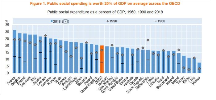
This is direct government spending on such things (health, unemployment and disability benefits, active labour market policies, age pensions and the like). There probably isn’t much very surprising in the 2018 ranking themselves, although a few things caught my eye:
- in among the European countries with above-median spending Japan now appears. Not that long ago Japan had relatively low rates of government spending (share of GDP) but now it is higher than all the English-speaking countries,
- among those English-speaking countries the Irish numbers are very misleadingly low because of the way features of the corporate tax regime have led measured GDP in Ireland to far outstrip the “true” level of economic activity occurring in Ireland, let alone the income accruing to Irish residents.
- New Zealand was very close to being the median country in 2018.
- and, whether or not one approves of such high levels of social spending (and I’m pretty uneasy) it should not be overlooked that among the nine largest spenders (share of GDP), seven are in the top-tier OECD group for average labour productivity (exceptions being Finland and Italy). I’m not offering any thoughts about causation (and other very high productivity countries – US, Ireland, and the Netherlands – below the median), but it remains a data point one has to take seriously.
And, of course, the other thing that is striking is how much social spending as a share of GDP has increased. Perhaps 20 per cent of OECD countries have such spending a bit lower or much the same as in 1990 (New Zealand is one of them – in 1990 the NZS eligibility age was still 60 and the unemployment rate was rising rapidly in the midst of our disinflation and restructuring), but in most countries there has been an increase even since 1990. For the countries for which 1960 data were available, the increases have been very large in every single country – although Japan (still pretty poor in 1960) stands out.
Interesting as these charts of direct public outlays are, they can be only part of the picture. If the government compels you to save, or compels you to buy medical insurance, or offers tax treatments that incentivise such private spending, the differences between public and private spending can quickly get rather blurry. Switzerland, for example, has a low share of public social spending but requires everyone to take out medical insurance. That might, or might not, be a better system, but it means that low-ish direct public spending numbers don’t always tell a simple small-government (or self-reliant) story. This isn’t a big issue for New Zealand, but here is the OECD’s attempt to reflect some of these different institutional arrangements and produce some bottom line estimates of net social expenditures (apologies that it is a little hard to read – you can click here for a more legible version). The orange dots are the ones to focus on.

On this measure, the Netherlands and the US move a long way to the left (on the chart), only just behind France. Switzerland (and Australia) also move a long way to the left. Of the English-speaking countries, only Ireland now ranks below New Zealand, and that is just because of the tax-system distortion to the GDP numbers (done as a share of net national income, Ireland would spend more on social expenditure than New Zealand).
There are all sorts of quibbles possible about these numbers, including how safe it is to simply add them up (to what extent are the components really apples and oranges?), but it is probably salutary to note that there is now a stronger alignment between income/productivity levels and net social expenditure as a share of GDP than was evident in the first chart. Countries towards the right of the chart are (almost entirely) the poorer and less productive OECD countries, and countries to the left of the chart tend to be the richer/more productive OECD countries (the outliers being Greece and Portugal). Whether or not one approves of high rates of social spending, it is at least consistent with the story that much higher productivity gives countries, and individuals, options (practical and political) that poorer and less productive countries don’t have. That might be something for our political officeholders – increasingly indifferent to New Zealand’s productivity failure – to reflect on.
And don’t think you can put the cart before the horse – in general, raising social expenditure won’t do anything much to raise (and may even lower) medium-term average economywide productivity.
