A commenter on yesterday’s Brexit post raised the question of how Europe (EU, euro area or whatever) had done overall relative to the rest of the advanced world. The question sparked my interest, not just about the last 20 years or so (since the euro was created, and the comparison in yesterday’s post) but about somewhat longer spans of history.
At around the turn of the 20th century no one would have doubted that Europe dominated the world geopolitically, and it no longer does that. That geopolitical rise was built on technology and associated economics, but just because the geopolitical moment has passed doesn’t necessarily mean the economic one has.
But who to compare Europe with? Relative to the situation 100 years ago, some east Asian countries (in particular) have caught up considerably. In most respects that is to be welcomed, and doesn’t tell one anything particularly enlightening about the performance of western Europe. And some (most?) of the European countries that aren’t in the EU are nonetheless in agreements with the EU that mean that in many respects the policy regimes are similar.
And so here I’ve focused on a comparison with the European “offshoots”, notably the Anglo-shaped ones (the United States, Australia, Canada, and New Zealand), but with some reference also to Argentina, Chile and Uruguay. Prior to World War One, Europe may have been the geopolitical centre of the world, but individuals in the typical offshoot countries enjoyed a better material standard of living than their peers in western Europe.
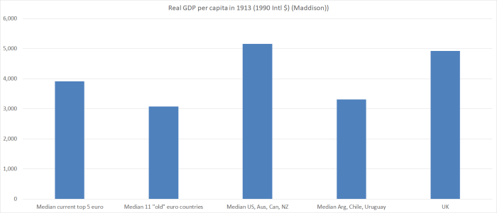
The first two columns are the group of 11 western European “established” euro area member countries in yesterday’s post, and a subset of those that I’ve got interested recently (France, Germany, Belgium, Netherlands, and Denmark) which today have much the same level of average labour productivity as the United States.
In 1913, the Anglo countries were top of this particular economic heap, and the western European countries weren’t much different than average living standards in Argentina, Chile and Uruguay. In 1929 and again in 1955 (allowing some time for recovery from the war) the picture still wasn’t so different. The five top European countries were doing better and the UK a bit worse, but average GDP per capita in the 11 European countries group was only about 10 per cent higher than those in the Uruguay, Argentina or Chile group.
And here is the same chart for 2017, using Conference Board data.
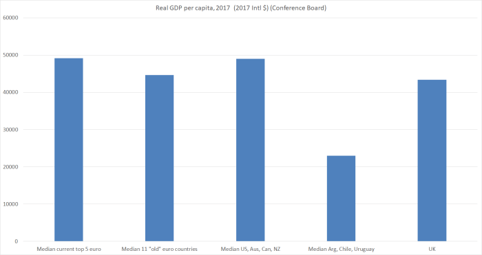
It doesn’t take too much study to see where the (relative) decline has been centred: the European offshoots and the UK. The picture is most vivid for the southern cone countries in Latin America, but isn’t less real for the Anglo countries. It isn’t that, as a group, they’ve been surpassed by continental western Europe, but that western Europe has caught up. (Since this isn’t a New Zealand-centred post, we will quickly pass over the way those countries now outstrip New Zealand.)
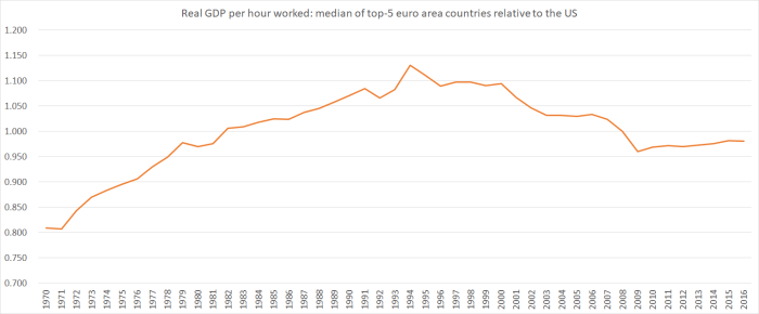
But what about some time series charts for more recent periods? In this chart I’ve shown the same two European groupings relative to the median for the Anglo offshoot countries (US, Australia, Canada, and NZ) using OECD data which start in 1970.
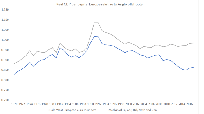
(I don’t quite know what was going on around 1990, although I guess it is probably about the recession in many of the Anglo countries).
Over the full period since 1970, Europe has gained ground relative to the Anglo offshoots, on both groupings. But there is, of course, a big divergence in the two series in the last decade or so. For the top-5 north European countries, performance has remained pretty strong. The median of those five countries now has average per capita incomes almost equal to those of median Anglo offshoot country (and, as it happens, the Europeans work fewer hours per capita to achieve that outcome). But for the wider group, things have gone badly into reverse – the influence of the poorly performing tail (Greece and Italy in particular, but also Spain and Portugal).
What about a similar chart for productivity? The OECD doesn’t have labour productivity data for the whole period for Austria and Greece, so in this chart those two countries drop out of the comparison.
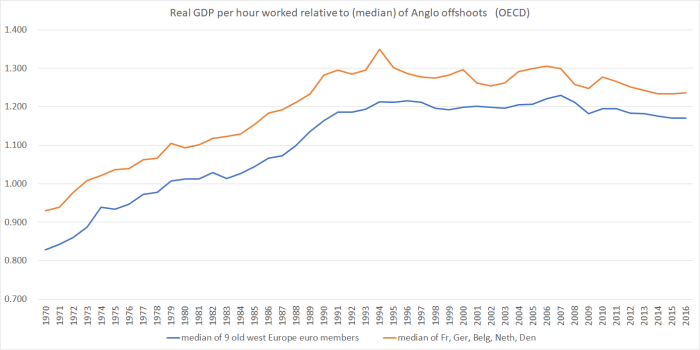
It is a somewhat different picture. The cylical effects large drop away, but (not unrelatedly) so does the marked difference between the two groups of euro-area countries over the last decade. On this measure, Europe’s labour productivty growth has fallen behind that of the Anglo offshoots grouping over the last decade (although not in the first few years of the euro). But perhaps the bigger story remains just how much average productivity in Europe has improved relative to that in the Anglo offshoots world over the whole period since 1970. It is a huge relative gain for (western) Europe.
And what of a simple comparison between the leading group of European industrial countries and the US? After all, if Europe has its laggard, the Anglo world has New Zealand (and Canada). Here’s that chart.
It is interestingly different. Relative to the US, these leading European countries did poorly last decade. But the underperformance hasn’t continued into this decade, despite the euro-area crises, even if little of the ground has been made up again. But again, taking the longer view, surely the bigger story is one of the improvement in Europe’s relative performance since 1970.
And of course, amid all of this there has been no mention of the rest of Europe, the bits that spent decades in the Soviet orbit, and weren’t beacons of prosperity prior to that. Many of those countries have been making progress in catching up with the Western European leaders even as, over longer runs of time, western Europe has been catching up with the (former) Anglo leaders.
And as one final chart here is snapshot of Conference Board estimates of the levels of labour productivity last year.
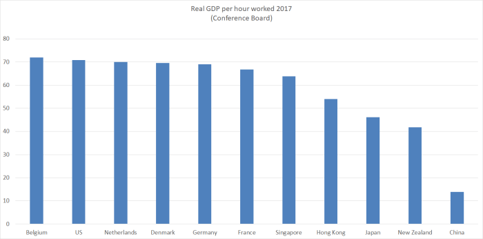
Five of the top six are European, even if Singapore is almost at the heels of the European leaders. (Ireland, Luxembourg, and Norway have higher numbers again, each with their own idiosyncrasies.) Below Singapore, I’ve just put in a few countries out of interest – China as much because on my walk this morning I listened to a podcast interview with a former European politician convinced that by 2038 China will dominate the world, and that this will mostly be a good thing.
Europe has had its good and its (very) bad times in the last 100 years or so, but when one looks at the data as a whole it is hard not to think that in economic terms Europe’s performance (and especially that of the northern European top tier) relative to the rest of the advanced world has increasingly been as good as it has been at any time since the New World was really opened up to trade and settlement. By contrast, over the last 100 years or so, of the New World countries only the US has more or less managed to hold its own matching or exceeding the leading group (per capita income and productivity) of European countries.
For New Zealand, Uruguay, Chile and Argentina – and even Australia – (the Antarctic Rim countries) it all seems to have proved just too hard.

Belgium is the leader for labour productivity. What can we learn fom that? A massive pan-national bureaucracy in our capital city? Two languages and flavours of christianity – maybe make the North Island speak Te Reo (a unique language) and the South Island English (a lingua-franca) with Catholics to the North and Protestants to the South. None of these ideas are convincing me. However my French son drives to Belgium regularly to buy beer and judging by what he offers me that must be the solution to labour productivity: the best and most diverse beer in the world.
Seeing the figure for China’s labour productivity I really ought to have that bet about China being top dog in twenty years time.
To spell it out your top five EU (France, Germany, Belgium, Netherlands, and Denmark) are all in close proximity; you repeatedly claim location is NZ’s economic downfall. However Denmark is somewhat an outlier and surely much of France and Germany economic activity is in the South of those large countries.
The comparison of the top five EU with Argentina, Uruguay & Chile from 1913 to today is remarkable. The first five endured two very destructive wars that South America avoided.
LikeLike
To clarify, China already has the largest economy in the world (in ppp terms) so my comment early this morning was no intended as a bold prediction.
Re Denmark, Copenhagen is closer to Hamburg than Wellington is to christchurch or Hamilton.
LikeLike
I was thinking of the time it took to get from Toulouse to Lille and from Brussels/Charlesroi to Bavaria. Either drive all day or fly. I ought to say you are slowly persuading me.
When I first started work economic forecasters were talking of Japan about to be no1. China’s advantage is its large desperate population and its harsh government. The children of its new middle class may be less motivated. If population is what matters then India is a good bet to overtake China eventually but if robotics take off then any country could become no1. England was clear No1 about 150 years ago with a small population and factories magnifying the productivity of its work force. You adjusted your certainty about China in 2038 to a mere 99% – but I’d accept odds of fifty to one.
LikeLiked by 1 person
During my Shanghai holiday in October 2018, you have to register your face and your entire left hand and right hand palm and finger/thumb prints. After that, entry and exit out of China is as easy as just a hand scan and facial recognition. Wechat digital payments at even the smallest street shop made the use of cash and credit cards redundant.
LikeLike
I think the top 5 have a lot in common, including a strong public service; a pretty serious commitment to science and technology over a long period; a strong national savings framework; a workable exchange rate regime (even though the euro is a disaster it works for these countries vs rest of Europe); a capacity for very effective public spending on infrastructure etc; a number of national export champions with strong brand and distribution networks; capacity to get needed reforms through the political process (with the possible exception of France).
LikeLiked by 2 people
$173 billion in cash savings deposits plus $67 billion in listed equities together with Kiwisaver and Universal Super contribution by the government does suggest quite a strong savings framework already for only 4.5 million people? What alternatives do you suggest as a better framework?
LikeLike
Imperfect memories
Prior to UK joining the European Union, NZ enjoyed a privileged position with the UK exporting much of its Butter, Cheese and Lamb. To the extent the UK represented “the market” for NZ. At the same time, prior to UK’s entrance, small lot farmers in France with 5 acres and 5 cows made a satisfactory living based on the subsidies they received under the Common Agricultural Policy or CAP. On entry to the EU, NZ lost that privilege. Today the CAP subsidies are still going, amounting to 35% of the total budget spend
It could and should be that on exit (Brexit) the UK will undertake new FTA’s with AU,NZ, and CA
Maybe NZ could become wealthy again
LikeLike
$1.5 trillion net wealth for 4.5 million people is not wealthy enough?
LikeLike
Don’t know about “privileged” – there weren’t many other exporters of such products around and there was plenty of UK demand.
But I wouldn’t get too hopeful about Brexit making much helpful difference for us. No doubt we will end up with a preferential trade agreement with the UK at some point, but (a) there is still the UK’s own farm lobby (and their political clout) to consider, and (b) it isn’t as if there is much scope for significant increases in total volumes of pastoral products exported from NZ, so the gain now would only be if say UK buyers were willing to pay materially more than, say, Chinese ones.
Our real problem – at a very very simplified level – remains too many people relative to the opportunities our natural resources at present (and in the realistic future – where we won’t say be mining the Kermadec Trench) seem to provide. We can be as smart and well-governed as we like about the rest of policy and that – and distance – will just remain a formidable barrier.
LikeLike
Distance does not seem a problem for imports to be sold into NZ even with our small market. Therefore distance is not the formidable barrier. It has more to do with the size of our domestic market that discourages investment in infrastructure.
LikeLike
When calculating cross country comparisons of GDP it would be meaningful to compare the marginal productivity per capita by taking the increase in GDP for a defined period divided by the increase in population for the same period
It would go some distance to demonstrating the benefit of mass migration, both in isolation and across jurisdictions
LikeLike