It is another glorious day in Wellington – I always reckoned a 2 degrees warmer Wellington would be a good thing – and there is Christmas shopping to do, but I couldn’t let the latest speech from the Reserve Bank go by without comment.
It is presented as a speech by “Reserve Bank Governor Grant Spencer”. Fortunately, most of the media haven’t fallen for that line – which they’ve tried on in a number of recent documents. If Spencer is anything, he is “acting Governor”, and no more.
How do I know? Because Parliament was quite clear that
The Governor shall be appointed for a term of 5 years
And when he appointed Spencer, Steven Joyce was quite clear that the appointment was for six months only. He only ever claimed to be appointing an “acting Governor” – who can, under certain conditions, be appointed for only up to six months.
As it happens, even that appointment is almost certainly unlawful. The Act is also pretty clear that an acting Governor can only be appointed when a Governor leaves office before his or her term has expired. That wasn’t the case here. In other circumstances, the Minister and the Board are simply expected to get on and make a permanent appointment, so that a new permanent appointee can take office when the previous appointee’s term expires (a date known, in this case, for the previous five years). It might not be ideal phrasing, but it is the law, and if there was a problem – as there was in the case, around the election – either the law needs to be worked within, or to be changed by Parliament.
But we now have the strange situation where the Minister who appointed him thought Spencer was acting Governor, while Spencer himself now seems to purport to be – not just have the powers of – Governor. As I’ve been doing for the last couple of months, I will continue to describe him only as “acting Governor”, or “the economist purporting to be acting Governor”.
Whatever his label, there is a bit of sense of relief that Graeme Wheeler is gone and that Spencer – someone well-liked and generally more open – is minding the store. But his speech earlier this week, on monetary policy and the challenges of low inflation, still left a great deal to be desired. I suspect it wasn’t intended this way, but in practice it amounts to not much more than excuses for not keeping inflation near target for the last five years, partly by attempting to obscure a New Zealand debate with the (somewhat different) issues some other advanced countries face. And, of course, whatever the merits of Spencer’s views, he’ll be gone in little over three months and as yet we have no idea who the new single decisionmaker will be (let alone who will eventually serve on the new statutory monetary policy committee to be put in place next year).
There is some interesting stuff in the speech though. Most notable perhaps was the number of references to unemployment. Often enough Reserve Bank monetary policy documents mention it barely at all – the Bank even tried to displace it with a new (but sadly ill-fated) labour market capacity indicator of its own devising. For decades, the capacity variable in the Bank’s inflation models was (its estimate of) the output gap, and there were typically lots of references to it in speeches or Monetary Policy Statements.
But in Spencer’s speech – his first as “acting Governor”, and the first under the new government – there is but one reference to the output gap (and then only in abstract terms) and 17 references to “unemployment”. And to think that some people reckon it doesn’t make much difference who is appointed Governor.
But the odd thing is that much of the speech is devoted to making the case that the unemployment rate (itself) hasn’t been much help in explaining inflation in recent years. Which might be true, to some extent, but so what (at least when considering events of the last decade)? After all, for years the Bank told us they didn’t put much weight on the unemployment rate, didn’t think they could fix on a NAIRU etc etc, and that we really should be focusing – as they did – on the output gap and a broader suite of high-tech capacity indicators. It might even – if valid – be an argument for not putting too much specific focus on a specific or precise unemployment rate in the new monetary policy regime the government envisages – but that isn’t the case Spencer makes, and weirdly he suggests that the Bank is already (since when?) putting more weight than previously on employment indicators. It isn’t very coherent, in a New Zealand context.
This chart ran in the recent Monetary Policy Statement (when I didn’t get round to commenting on it) and it appears again in Spencer’s speech.
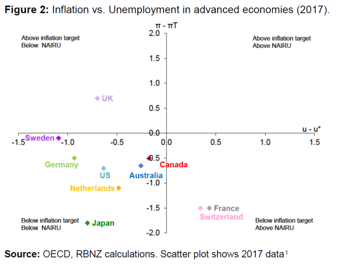
It is the sort of chart the word “chutzpah” might have been invented for. They use it to try to suggest that much of the advanced world is “stuck” in a situation in which the unemployment rate is below the sustainable rate (a NAIRU) and yet inflation is also below target.
There are a number of odd things about the chart. For example, they include three separate observations for Germany, the Netherlands, and France, even though all three are in a common currency (and thus common monetary policy) area. And surely it would have been more enlightening to include the other advanced countries with independent monetary policies (eg Norway, South Korea, Israel, Iceland? There is also no place at all for inflation expectations in the story the Bank is trying to tell in the chart.
But the biggest, most obvious, omission is New Zealand. And where would New Zealand fit on the chart? Well, core inflation is about half a per cent below target and on most estimates – even on the most recently quarterly unemployment observation (4.6 per cent) – the unemployment rate is still above an estimate of the NAIRU. If these relationships hold at all, there are lags, and the average unemployment rate for the last four quarters was 4.9 per cent. By contrast, before the major revision downwards to the HLFS unemployment rate last year, the Reserve Bank had a NAIRU estimate of 4.5 per cent in its models (a part of that model that had no implications for the inflation forecasts), and after those revisions, Treasury published estimates suggesting they thought the NAIRU was now nearer 4 per cent. In other words, for now at least, New Zealand still belongs in the bottom right quadrant of the Reserve Bank chart, the one in which there isn’t much of a mystery or puzzle at all: with inflation below target and unemployment above a NAIRU, a typical response – in an inflation-targeting framework – would be to cut the OCR. Switzerland and France can’t do that – Swiss interest rates are already negative, and France can’t control interest rates – but New Zealand could. It is just that the Reserve Bank chose not to.
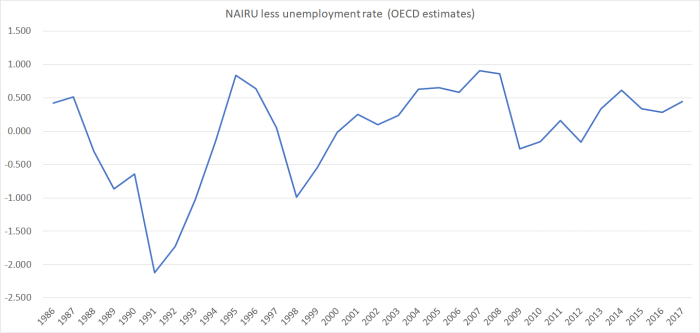
In the chart the Bank uses OECD estimates of the NAIRU. That is understandable – they are the only consistent cross-country estimates I’m aware of – but not one without its problems. For example, somewhat unusually, the OECD thinks the New Zealand NAIRU this year is still in excess of 5 per cent. Then again, if you believe the OECD’s estimates, unemployment in New Zealand has been below the NAIRU for almost the entire 21st century so far (rising just very slightly above only in 2009, 2010, and 2012). It simply doesn’t ring true.
The Reserve Bank’s next chart in this area is this one

The suggestion is that there was a relationship between unemployment and inflation in the 2000s (when they also didn’t use the relationship), but that it has disappeared (for now at least) in the last few years.
Given that the relationship (even in the previous decade) wasn’t tight by any means, and many of the higher inflation numbers related to things – eg oil shocks and short-term exchange rate movements – that didn’t have much to do with New Zealand unemployment rates, I didn’t find the chart overly persuasive. Moreover, since everyone recognises that the NAIRU changes over time – with things like demographics, labour market regulation, some hysteresis etc – even the theoretical relationship shouldn’t be with the unemployment rate itself, but with the gap between the NAIRU and unemployment rate. I suspect the Bank is currently feverishly working on a suite of time-varying NAIRU estimates – to reflect the new government’s interest – but there is no hint of those in this speech.
Ideally, one might want to look at something more like an unemployment gap estimate against deviations of core inflation from target (what the Bank was trying to do, in a snapshot) for other countries in the first chart). As I’ve already said, I don’t have any confidence in the OECD’s levels estimates of the New Zealand NAIRU, although the changes in the associated gap from year to year might not be too bad. For now, it is all I have.
So in this chart, using annual data (all we have for the unemployment gap) I’ve shown the deviations of sectoral core factor model inflation from the midpoint of the inflation target and the OECD estimate of the unemployment gap from 1993 (when the core inflation data start) to 2016 (each dot is one year’s data).

Even including the most recent years (the furthest left observations) there is still a relationship there, albeit not a very tight one. Then again, it wasn’t very tight – although a bit more upward sloping – when I deleted those most recent years. No doubt the Bank could – and perhaps is doing so privately – do this sort of analysis in a more sophisticated way.
I’m not suggesting there are no puzzles about New Zealand’s inflation performance in the last few years. But simply plotting the raw unemployment rate (and not even looking at, say, the underutilisation rate or the gap) against headline inflation isn’t going to tell you much – we aren’t in 1958 now (when Phillips wrote) and, apart from anything else, inflation expectations matter.
For the last couple of years, the Bank has consistently tried to tell a story of how inflation expectations are firmly anchored at the 2 per cent midpoint of the inflation target. That has always been a questionable proposition, especially as regards the sorts of expectations that might affect wage and price setting behaviour. Their favoured two-year ahead measure of inflation expectations is now around 2 per cent, but a decade ago it was averaging almost 3 per cent. Household inflation expectations are also lower than they were. Again, that isn’t very surprising because a decade ago the Reserve Bank wasn’t seriously aiming to deliver inflation at 2 per cent (the target midpoint): we might have been happy enough to take it if inflation had got there of its own accord, but our projections (the Governor’s choice) rarely showed inflation dropping below 2.5 per cent any time soon. Actual core inflation was up around 3 per cent.
And these days? Well, core inflation hasn’t been anywhere near 2 per cent for years now – persistently below. And although the Bank consistently talks of getting inflation back to 2 per cent, it hasn’t done so, and for several years consistently erred on the hawkish side, with constant talk of wanting to “normalise” interest rates, and actually following through on an unnecessary and ill-judged tightening cycle. Even now, “normalisation” got a lot of attention in last week’s FSR (although mercifully absent from the speech), and the Bank constantly talks about not wanting to act aggressively to get inflation back to target. Any rational observer would not only assume inflation will be materially lower than it was, but that the Bank is quite relaxed about that (it more or less says so). The practical target isn’t really 2 per cent – any more than it was, on the other side, 10 years ago – but something a bit lower.
The Bank must hate data from the inflation-indexed bond market (because it never engages with it in any of its publications), but the gap between indexed and conventional bonds is not inconsistent with my story. Interpreting that data in fine detail isn’t easy. For a long time, we had only a single indexed bond (matured in Feb 2016), and by late in its life headline inflation (eg the GST change in 2010) mattered much more than the medium to long-term outlook). These days there are several indexed bonds, but they have fixed maturity dates while the Reserve Bank’s published “10 year bond rate” has, in effect, a maturity date that moves through time.
But consider this chart, showing the gap between yields on successive indexed bonds and the conventional 10 year bond rate.
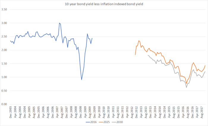
In the years prior to 2008 (when the indexed bond still had 10 years to run), the implied inflation expectation was around 2.5 per cent. As noted earlier, that wasn’t too far from how we were running things in practice. What of now? It is late 2017, so 10 years from now is roughly half way between 2025 and 2030, the two indexed bond maturity dates either side of 2027. In November, the average gap between orange and grey lines was 1.3 per cent, and for the year to date the average gap has been 1.2 per cent.
No doubt, there are all sorts of idiosnycratic things going on, so these breakeven inflation rates may not be “true” inflation expectations (as, for example, they weren’t in the midst of the crisis in 2008). There are, for example, a lot of inflation bonds on the market, and it is possible that Treasury has somewhat glutted the market. My point simply is that if one wants to make sense of relationships between unemployment (or other capacity measures) and core inflation over the Wheeler years, it is wilfully blind to simply ignore a story about changing inflation norms.
The next chart is just a rough and ready thought experiment. What if, when Graeme Wheeler took office in September 2012, inflation expectations were genuinely about 2 per cent, and people really thought that was what the Reserve Bank was serious about. The indexed bond yields – rough and ready as they are – suggest that isn’t wildly implausible. And, say, now people really think the target (for sectoral core inflation) is more like 1.3 per cent – the most recent actuals are 1.4 per cent. Then the chart just shows the relationship (using quarterly data) between the unemployment rate and the gap between actual core inflation and an implied target taken by interpolating from 2 per cent in 2012 to 1.3 per cent now.

I”m not suggesting that is the “true” relationship, but it looks like an idea worth taking more seriously than the Bank has thus far been willing to do in public. After all, expectations adjust gradually in most circumstances. It seems negligent, or deliberately obtuse, not even to engage with the possibility.
After all, the “acting Governor” – I almost slipped there and initially typed it as Governor – ends his speech with the suggestion that
To the extent that the leverage of monetary policy over domestic inflation may have reduced, this suggests a cautious approach when responding to inflation deviations from target and careful attention to our assessment of economic slack. It may be appropriate for monetary policy to put relatively more weight on output, employment and financial stability relative to inflation.
Why wouldn’t a reasonable observer conclude that the Bank isn’t really targeting 2 per cent (although it might be happy enough to get there by accident) and continue to adjust their expectations and behaviour accordingly.
With a new government planning to revise the Bank’s mandate to increase the Bank’s focus on employment/unemployment, Spencer’s line would almost be some sort of sick joke if it weren’t so serious. When the unemployment rate has been above New Zealand estimates of a NAIRU for nine years, and when the economic recovery (average growth in real per capita GDP) has been so muted, you might reasonably suppose that the government would have been expecting the Bank to do its job more energetically – which would involve getting inflation back to target, and in the process finally delivering an unemployment rate around the (unobservable NAIRU) and even a bit faster real GDP growth. But Spencer – with no mandate whatever, but presumably with the support of his colleagues, Bascand and McDermott – wants to tell us that their idea of putting more focus on “employment and output” than in the past has been to deliberately deliver such weak cyclical outcomes – ie deliberately accept higher unemployment/lower employment than is strictly necessary. And the implicit promise is more of the same to come, at least if people like them are left in charge. I hope the Minister of Finance is paying attention, and that his recent talk of possibly removing the midpoint reference from the PTA wasn’t a sign that he has begun to buy into this Wheelerish mentality (even if given a glossed up public face by his colleagues now that they are minding the store).
