Late last week I was scrolling through a story about the IMF’s latest comments on the US economic outlook, short-term and more medium-term. As the story reminded readers
The Trump administration says its economic platform — including cutting corporate and income taxes, boosting infrastructure spending and reducing regulations — will push growth up to a sustained rate of 3-4 per cent a year and cut unhealthy government debt levels.
At present, the Federal Reserve’s FOMC members collectively think potential GDP growth rates in the US are a touch under 2 per cent per annum.
The IMF has just finished its Article IV “mission” to the US (the US Treasury and the Fed being each a few blocks’ walk from the IMF), and released the team’s Concluding Remarks. The Fund is, understandably, (more than) a bit sceptical about prospects for such an acceleration in the rate of growth of potential output. But they are international public servants, and the US has a lot of clout on the Fund’s Board – and, what is more, the Administration is currently looking to cut back US funding of various international organisations.
So the IMF can’t just come out and talk about the unlikelihood of any sort of large-scale acceleration of potential economic growth because of (a) a fundamentally unserious President, with little interest in policy and no apparent ability to deliver on an agenda anyway, or (b) a US Congress which has, if anything, (and on a bipartisan basis) lower approval ratings than the President, or (c) the corrupting influence of vested interests. Instead, the Fund has to fall back on fairly bloodless technocratic arguments and illustrations. But one thing they should be able to bring to the table is authoritative use of perspectives from other countries – the Fund, after all, undertakes monitoring and surveillance of virtually every country’s economy, other than North Korea.
And whereas I’ve never seen a chart in the IMF’s Concluding Remarks for New Zealand, there were five in last week’s US document, four of which looked quite useful. A couple even found their way into the Wall St Journal, and given how little attention the IMF’s view on the US usually get in the US, that probably counts as success.
Little old New Zealand was even singled out in one of the charts.
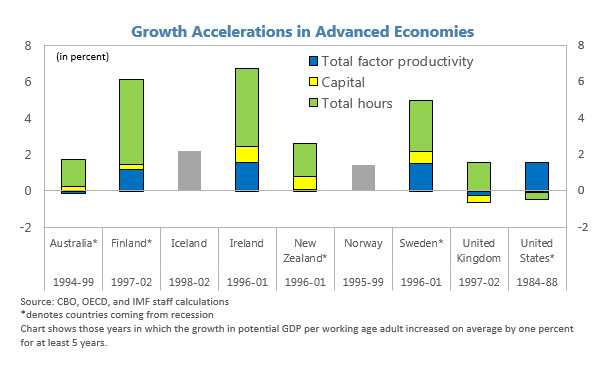
Looking at advanced countries since 1980, the IMF found this smallish sample of cases where countries had achieved at least a one percentage point lift in potential output growth (per working age adult) that lasted at least five years. On this chart, New Zealand’s experience over 1996 to 2001 looked pretty impressive – fourth best seen among IMF advanced countries in the last 35 years.
But it was a bit puzzling. I sat around the Reserve Bank’s Monetary Policy Committee table right through that period, and “startingly impressive economic performance” wasn’t one of the descriptions that came easily to mind. Even though the Fund’s asterisk describes us as “coming from recession” during that period, it was actually one that began at the end of a (pretty strong) four or five year recovery, encompassed another mild recession, as well as some chaotic monetary policy, an odd mix of fiscal policy, and towards the end of the period, increased marginal tax rates and a considerable slump in business confidence. Through quite a bit of volatility, interest rates and the exchange rate fell a long way.
But perhaps I’d missed something, through getting too close to the short-term ups and downs. So I dug out the data and had a look.
Perhaps if the IMF had had a quick look at this chart first, they’d just have left New Zealand off the chart (I’ve used the average of our two GDP measures, and the official HLFS working age population data).
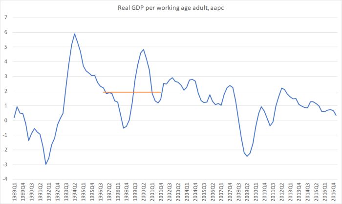
Nothing stands out about that 1996-2001 period (average growth for which is highlighted in orange). By our standards. it wasn’t a bad period, but it wasn’t obviously one I’d be wanting to send other countries’ officials and ministers to learn from. There was no acceleration in real growth, let alone a sustained one.
But I had read carefully the labels on the IMF chart, and they were using “potential output growth” (per working age adult). The problem with “potential output” growth is that it isn’t directly observable, and even years later it often hard to get a reliable handle on.
The OECD publishes estimates of potential output growth for its member countries including New Zealand. And one can back out IMF estimates of potential output growth because they publish output gap estimates (actual growth adjusted for the change in the output gap is potential output growth). Adjusting both for growth in the working age population produced this chart.
 There isn’t anything startling about 1996 itself, but at least on these measures potential output growth in the late 1990s was estimated to have been stronger than before or since.
So over the period the IMF highlights, actual real GDP growth (per working age person)wasn’t anything out of the ordinary, but the international agencies think that potential growth (per working age adult) was pretty impressive – more of an acceleration than seen almost anywhere in the advanced world in modern times.
One possible reconciliation could be that New Zealand went into a severe recession during this period, leaving lots of excess capacity (but lots of underlying potential growth, as trend productivity grows rapidly). It does happen – it was part of the story of the US in the 1930s for example.
But that certainly doesn’t look to have been the story here.

The unemployment rate was a bit lower in 2001 than it had been in 2006, and the labour force participation rate was a bit higher.
Another way to try to make sense of what was going on is to look at:
- growth in the capital stock (per working age person)
- growth in multi-factor productivity,
- growth in hours worked per working age person, and
- growth in labour productivity (real GDP per hour worked).
Here is the growth of the real capital stock per working age person, shown in two different ways – the total capital stock, and the capital stock excluding residential dwellings.

The period from 1996 to 2001 certainly saw stronger growth in the capital stock (per person) than in the previous period, and thus there is something to the IMF point about growth in potential during this period being somewhat influenced by the previous recession. But even on this measure, nothing really stood out about the period. Growth in the capital stock was no faster than it had been at the end of the previous boom, and was lower than we experienced in the last few years prior to the 2008/09 recession.
What about multi-factor productivity growth? Measured properly, this is stuff everyone is after – more outputs for the same inputs. This is annual growth in the OECD’s measure of MFP.
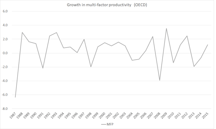
Nothing stands out about the 1996 to 2001 period (consistent with the IMF chart itself, in which the contribution of MFP growth is all but invisible).
Here is (HLFS) hours worked per working age person.

Again, nothing stands out about the 1996 to 2001 period. There had been a big contribution in the previous few years, as demand recovered, drawing more labour back into employment, but by the period the IMF is focusing on there is nothing notable.
And, finally, what about labour productivity (growth in real GDP per hour worked)? Here, at last, perhaps there is something to the IMF story.
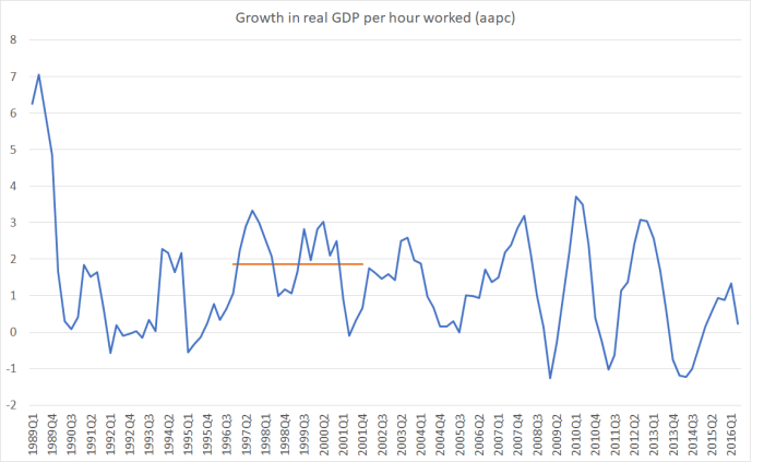
Using the average of the two real GDP measures, labour productivity growth actually was a bit faster in this period than in, say, the five year windows either side. Even by New Zealand standards (among the weakest productivity growth in the OECD over 45 years) it is not that strong a performance, but the recovery in investment growth (see capital stock chart above) must have made a helpful difference for a time.
I got to the end of all this reassured that I hadn’t in fact missed any great lift in New Zealand’s economic performance over 1996 to 2001. People are simply better to look at our actual experience, rather than the IMF or OECD estimates of unobserved “potential”. Perhaps the other country examples the IMF cited work better?
I don’t suppose Donald Trump will be taking any notice of the IMF’s analysis or advice, but if any minions do pay some attention to the IMF piece, the Fund’s use of the New Zealand case won’t do anything to lift anyone’s confidence that the IMF really has anything very compelling to offer. Sadly, they didn’t have much useful to offer us either (here and here).
