I was up early this morning to talk to the breakfast meeting of a Rotary club about immigration and economic performance in a New Zealand context (similar points to my LEANZ address last week, but shorter and a bit simpler). I hadn’t been to a Rotary meeting for decades, since going to the odd one as a teenager as my father’s guest, and somewhat alien as it was (altogether too extrovert for me, especially at 7am), it was also rather inspiring – people working together to make a difference in their community; some of George H W Bush’s “thousand points of light”.
In the course of my talk, I’d made my standard point that in New Zealand rapid population growth seems to have contributed to crowding out business investment. Whatever the reason, over the decades business investment as a share of GDP in New Zealand has averaged around the lower quartile of what has happened in OECD countries as a group. Driving home I remembered that a couple of months ago I’d downloaded all the data to help illustrate some of the stylised facts that bothered me, but had never gotten round to using the resulting charts.
All else equal – and it never is – a country that has faster population growth would normally be expected to devote a higher share of current output to investment than countries with slower population growth. That observation isn’t exactly rocket science. More people need more houses, and roads, and shops, and offices, and schools, and hospital, and factories. A country with no population growth at all could simply maintain its capital stock per person by devoting enough of current output to capital expenditure to cover depreciation. (To be clear, in all this I am using national accounts measure of investment (“gross fixed capital formation”), which (largely) measures resources devoting to building new stuff.)
Houses make up the largest single component of the reproducible capital stock (and almost half the total in New Zealand at present – note that this is houses, not the land under them). And since everyone needs a roof over their head, and almost everyone does, you would expect to find a materially larger share of current output devoted to house-building in countries with faster population growth rates. There is lots of short-term cyclical volatility in house-building activity, so it makes sense to look at average over a long enough period to look through cycles.
In this chart, I’m looking at the period from 1995 to 2014 and looking across OECD countries. I chose the period because quite a few OECD countries – especially former eastern bloc ones – don’t have data before then, and when I downloaded the data a couple of months ago a few countries didn’t yet have 2015 data. One year won’t materially alter the picture.
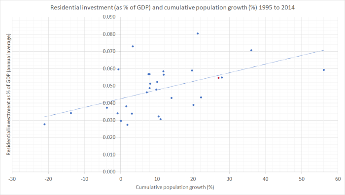
New Zealand is the red dot close to the line (above population growth of about 27 per cent).
The slope has the direction you’d expect – faster population growth has meant a larger share of current GDP devoted to housebuilding – and New Zealand’s experience, given our population growth, is about average. But note how relatively flat the slope is. On average, a country with zero population growth devoted about 4.2 per cent of GDP to housebuilding over this period, and one averaging 1.5 per cent population growth per annum would have devoted about 6 per cent GDP to housebuilding. But building a typical house costs a lot more than a year’s average GDP (for the 2.7 people in an average dwelling). In well-functioning house and urban land markets you’d expect a more steeply upward-sloping line – and less upward pressure on house/land prices. But that isn’t today’s point, which was simply that more people has indeed meant more residential investment.
But what about the business investment picture? In the data, business investment is a residual – calculated by taking total investment and subtracting housing investment and general government investment. Again, all else equal, you would expect a country with a faster population growth rate to have devoted a larger share of current output to business investment. Workers need “tools”, and if economies are going to maintain their trajectory of growth in income per capita, then the growth in the capital stock needs to at least keep pace with the number of workers.
(You might wonder why I look across countries, rather than just across time within individual countries. There are two reasons. First, in many countries there isn’t much variation in population growth rates. And second, to the extent there is, reverse causation may well be at work – a booming economy will tend to draw in more people. )
But here is what the cross-country chart looks like.
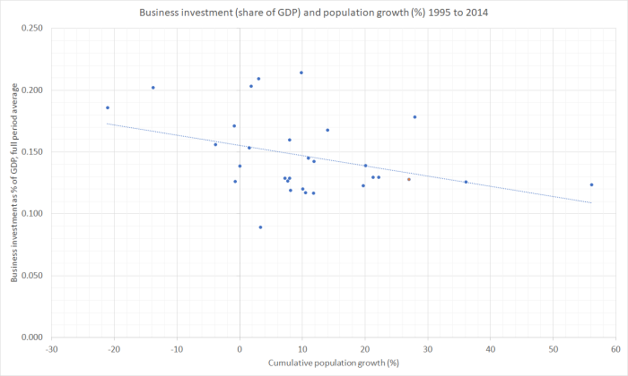
Again, New Zealand is the red dot near the line.
There is plenty of variation – not every observation is close to the line – but there is no sign at all of the expected upward slope. If anything, the regression line is downwards – the faster population growth was across these countries in this period, the smaller the average share of current output devoted to business investment. The (non-housing) capital stock per person will have been growing materially more slowly in the average high populaton growth country than in the low population growth countries. The countries with material falls in population were all former eastern-bloc countries, who might be thought to have lots of convergence (and investment) opportunities anyway. But even if one deleted them from the chart entirely – and recall that we too were supposed to have lots of convergence opportunities – the regression line is still very slightly downward sloping (basically dead flat).
It is a chart that should be pretty troubling. Even a modestly upward-sloping line would still be weaker than ones prior might lead one to expect.
Some readers with more of a background in formal economic research don’t like these scatter plots at all. They rightly note that it captures just a relationship between two variables, and there is a lot of other stuff inevitably missing. The relationship may be causal, but it might not be. One protection against that risk is the use of long period averages for 30+ countries. But, as importantly, scatter plots of this sort have to be taken together with the wider context – other stuff we know.
For example, is there a plausible mechanism that might account for such a relationship? Well, the notion of “crowding out” is a pretty well-established one in the economics literature. When the government increases its expenditure, the typical result (in a reasonably fully employed economy) is for private sector spending to fall. Higher interest rates and a higher exchange rate are part of the mechanism by which that happens. Whether or not there is a full offset is debated, but no one seriously doubts the mechanism or the direction of the effect. Investment spending tends to be more sensitive than consumption spending, with the exchange rate channel making tradables sector activity (sales and investment) particularly likely to respond.
Increased demands associated with faster population growth may well work in much the same way. The summary, scatter plot, data certainly isn’t inconsistent with such a story. In the New Zealand context, one of the stylised facts we have to grapple with is that our real interest rates have been persistently higher than those in other advanced countries, and our real exchange rate has fluctuated around persistently high levels. (And when I restrict the business investment chart only to countries with floating exchange rates, the downward slope is still apparent.)
So I don’t find the scatter plot in isolation conclusive, but it is troubling nonetheless – and should be for those who like to invoke the empirical estimates of large per capita income gains from immigration, again in a cross-country context. How likely are such gains, if countries with relative fast population growth rates (almost all, on account of high immigration inflows) are also the countries that, on average, have relatively modest levels of business investment? Firms invest to take advantage of the new opportunities that arise.
I’ve asserted that high levels of planned immigration have a disproportionate effect on investment in the tradables sector. These aggregate data don’t shed any light on that split – they are just total business investment. But, at least in a New Zealand context, it makes sense that things will have worked that way. Higher real interest rates than in other countries – unmatched by faster productivity growth – will deter all long-lived investment here, regardless of sector. But when the exchange rate is also boosted, firms considering new investment in the tradables sector are exposed to a double-whammy: highest cost of capital, and a less competitive position relative to foreign firms. Domestic demand tends to be strong in countries with fast population growth, while international demand is something New Zealand firms just have to take as given. As our export share of GDP hasn’t been growing – if anything shrinking – while those in most other OECD countries have, it seems reasonably likely that investment in theNew Zealand tradables sector has been much weaker than otherwise, and weaker than that in the non-tradables sectors. That weakness in tradables investment is likely to affect both our natural resource based industries (deterring more capital intensive modes of production) and in the struggling (where unsubsidised) other parts of the tradables sector.
For many countries, population growth isn’t that materially influenced by national policy. In the former eastern bloc countries, the fall in population is about natives leaving. In some other countries, illegal immigration can be a big issue. But in New Zealand – and Australia – policy makes a big difference. We have full control over our borders, and let in lots of legal non-citizen migrants. In New Zealand, in particular, it looks as though discretionary policy choices have worsened the business environment, and in particular skewing things against the prospects for strong investment by firms that could successfully take on the rest of the world.
(In case anyone is interested, somewhat to my surprise I discovered that there is also a downward-sloping regression line when one plots general government investment and population growth. I’d expected to find that the government investment just happened anyway – governments not being subject to market tests. But over these countries in this period it didn’t. If, optimistically, you think that government investment is a complement to private investment in improving economic performance, that should be particularly worrying. Even if the lagging government investment is just about keeping up with the numbers of schools and hospitals (say) a higher population requires, it doesn’t exactly look like a mark of success – whether in New Zealand, or across the OECD.)
