Case not made: investor housing consultation

The Reserve Bank has been out consulting, I think for the third time, on proposals to differentiate clearly, in bank capital requirements, between loans for investment properties, and loans to owner-occupiers.   I made a fairly short high-level submission on their consultation document.  It is here:

housing consultation document 13 April 2015

The thrust of my argument is “case not proven”.  The Bank argues that, for otherwise similar borrower/loan characteristics, loans for investment properties are materially more risky than those on owner-occupied properties.  But they present surprisingly little data –  none from New Zealand, since we’ve had no material housing loan losses since the 1930s –  and what data are presented are largely taken as is, with no attempt to think seriously about how the New Zealand investor property market might be similar to, or different from, those in other countries.  In particular, the longstanding prevalence of small investors  –  which arises because our tax system treats them fairly neutrally with other potential holders –  is different from countries that often have large corporate holders of residential properties, and perhaps a rush into buy-to-let by individuals very late in the boom.

The Bank is quite open about the fact that its proposals would facilitate the imposition of eg a investor-specific LVR speed limit.  That is presented as an advantage, but as they have not consulted on the benefits and pitfalls of such a further intervention –  on top of the avowedly temporary initial LVR limit –  it cannot be considered as a public benefit at this stage.  The latest iteration of the proposals has the feel of something more focused on making an investor speed limit work, than on remedying material deficiencies in the New Zealand bank regulatory capital framework.  New Zealand already has among the very highest risk weights on housing loans of any advanced countries and, as the Reserve Bank has recently acknowledged, international experience is that housing mortgages are rarely central to even very serious financial crises.
2014 vs 1936

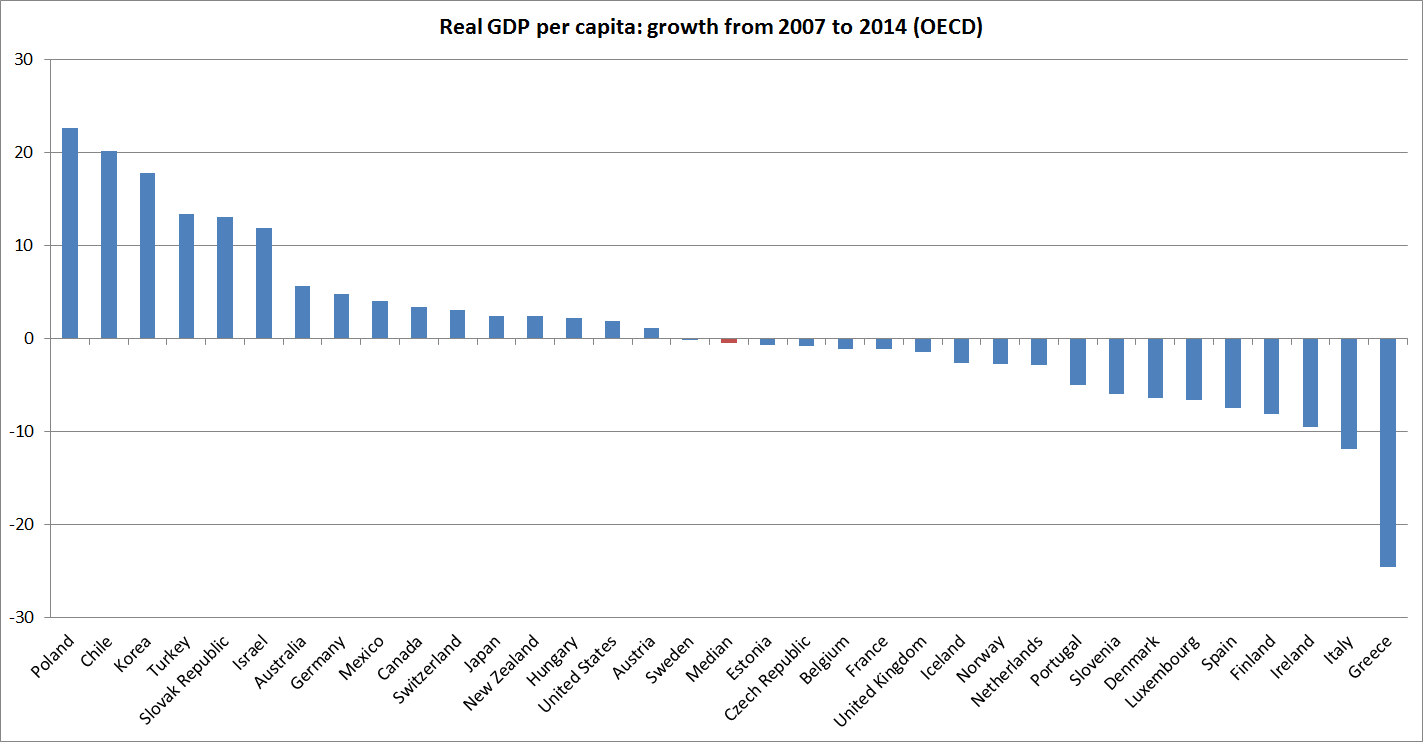
I noted in passing the other day that real economic performance across the advanced world had been so bad recently that comparing 2014 against 2007 would not look so different from 1936 vs 1929 comparisons.

Data, of course, are a problem.  But I went to the OECD databases and got their PPP estimates for annual per capita real GDP.  They have 2014 numbers for only around 60% of the member countries, and for the others I simply updated the 2013  numbers with some plausible guesses.  Here is total growth in per capita GDP for each of these countries since 2007.

2007 to 2014

The median OECD country has had no per capita growth over those seven years.

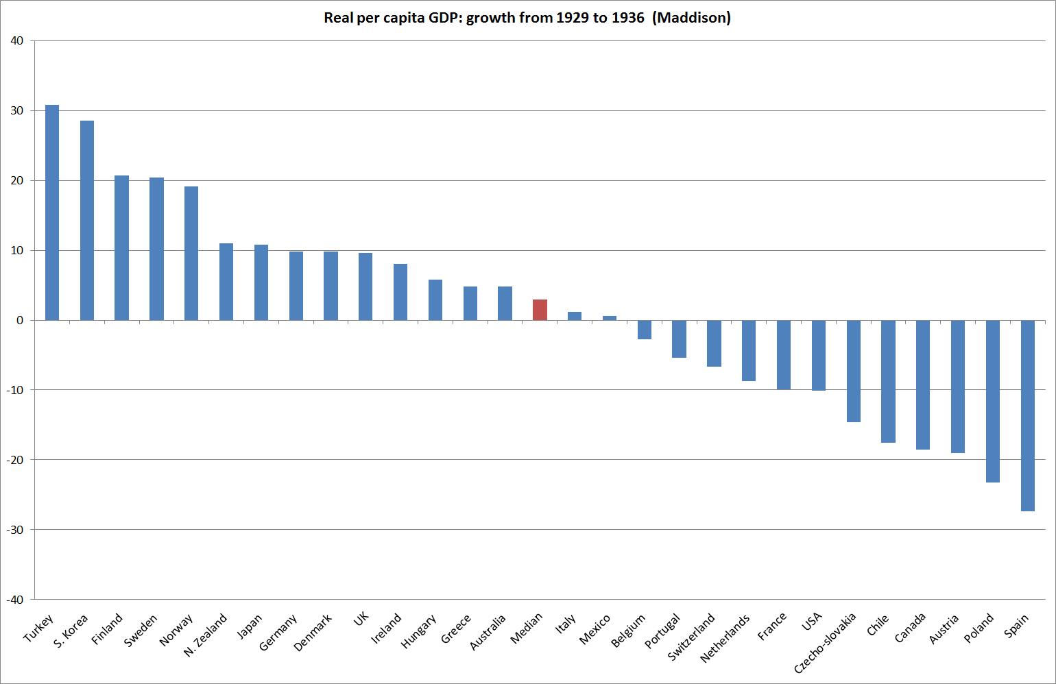
Angus Maddison’s estimates are the standard resource for looking at earlier periods.  He has estimates for most of the current OECD countries, and the chart below shows total growth in real per capita GDP from 1929 to 1936 ( also a seven year period).

1929 to 1936b

I wouldn’t want to make too much of these comparisons.  Data for the early period are unofficial, but careful, scholarly estimates, and data for the more recent period are still subject to considerable revisions.  Maddison used 1990 prices –  far distant in time from the 1930s, and even the OECD numbers use 2005 prices.  For individual countries prone to terms of trade fluctuations, those choices around prices can matter.  But we can only use the data we have.

The point isn’t to say that the most recent period has been as bad as the Great Depression – in most countries, the slump in the early 1930s was much deeper,  both in output and in employment (although the recoveries were also faster).   But  recent outcomes have been very bad  – across a group of 30 or so advanced countries, to have little or no growth over seven years has no peacetime precedent outside the Great Depression.  The Great Depression was, with hindsight, a failure of demand – TFP growth in the US, for example, was very strong during those years.  Perhaps it is different this time, and the limits of innovation were reached some time ago.    But I’d be reluctant to bet on it, when inflation is so low and the near-zero bound on nominal interest rates appears to have become an increasingly binding constraint.

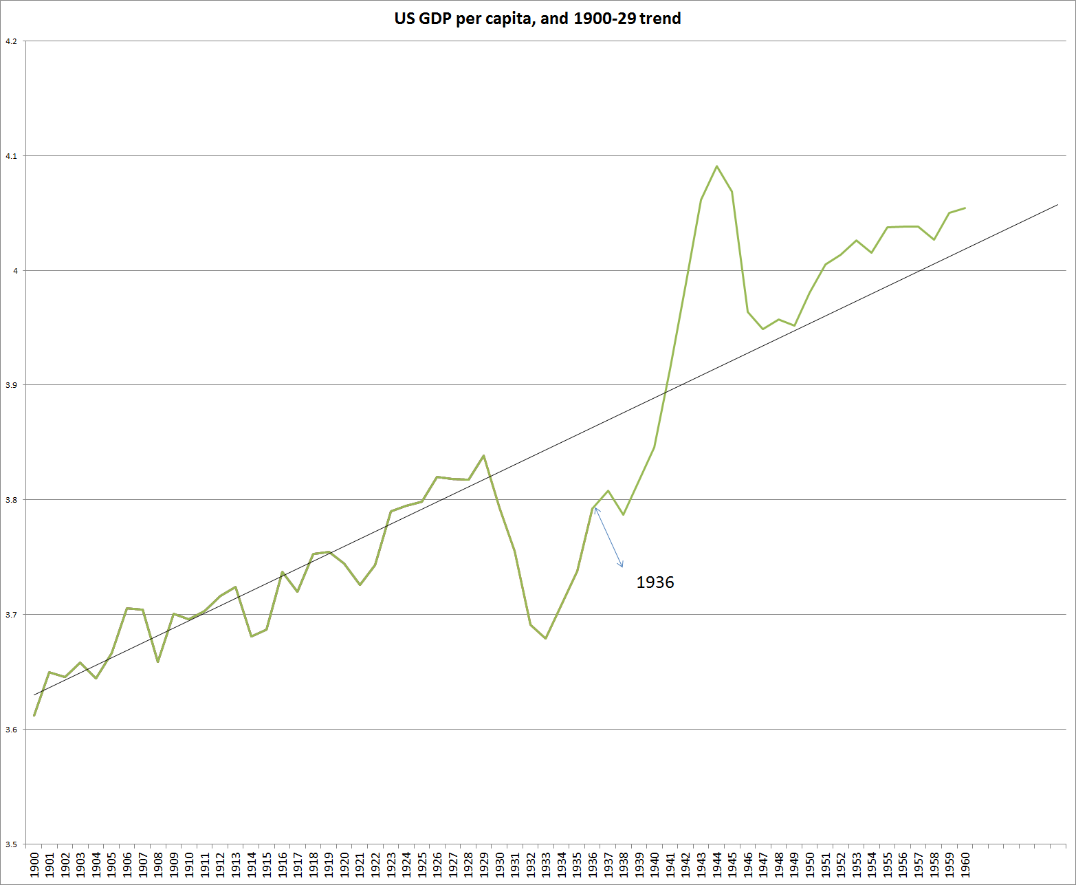
It is well-known that real GDP per capita in almost every advanced country is now well below the pre-recession trend.    Perhaps it will stay permanently lower.  But it is worth reminding ourselves of the US experience.  Estimates of real GDP per capita have stayed pretty close to a fairly constant trend for 150 years.  Two episodes looked like they might foreshadow material deviations: the last few years, and the 1930s.

1936

By 1936 US real incomes had been recovering strongly for a couple of years, but were still well below pre-Depression trends.  Many probably judged those to be permanent losses, and by 1936/37 the authorities were comfortable with tightenings in both fiscal and monetary policy.  But, in time, real per capita GDP came right back to something around the pre-Depression trend.  Tighter macro policies probably only slowed the rate at which people got back to work.

Why Government Fails So Often

Why Government Fails So Often: And how it can do better is the title of Yale emeritus law professor (and former public servant) Peter Schuck’s recent book.  Schuck’s focus is on the domestic activities of the US Federal government.  That limitation matters, as it excludes foreign and defence policies altogether (natural activities for the state) and state and local government, which in the US context employ far more people and do many of the basics of modern government (police, prisons, education) that in New Zealand are provided centrally.

But what Schuck does cover is quite enough to be going on with, and a fairly depressing catalogue of case studies and reports of other systematic research on the activities of the US federal government.     And he isn’t coming at the issues from with the perspective (and inevitable biases) of a small government champion.  He describes himself as “militant moderate who has always voted for Democrats for president”.    Perhaps partly as a result, his ideas for “how it can do better” are much less persuasive, and realistic, than his description and analysis of what has gone wrong.  This is an author who wants to believe in the possibilities of government.

Early in the book, he reports the “metallic laws” of programme effectiveness, identified by sociologist Peter Rossi, “writing in 1987 after many years of experience in evaluating government programs”:

  • The Iron Law of Evaluation.  The expected value of any net impact assessment of any large scale social program is zero.
  • The Stainless Steel Law of Evaluation.  The better designed the impact assessment of a social program, the more likely the resulting net impact is to be zero.
  • The Brass Law of Evaluation.  The more social programs are designed to change individuals, the more likely the net impact of the program will be zero.
  • The Zinc Law of Evaluation.  Only those programs that are likely to fail are evaluated.  As he notes, this has the most optimistic slant, pointing to a possible selection bias in the programs chosen for ex post evaluation.

Schuck’s catalogue of US government failures might easily lead New Zealand readers to dismiss it as of no relevance here.  The details of our political, constitutional, budgetary, and administrative systems are so different, and for many of the specifics we can only shake our heads in wonder that such a rich and successful country tolerates, and survives, such egregious examples of government failure.

But since human nature is….human….and the US draws much of its political and institutional traditions from the same Anglo roots as countries like New Zealand and Australia do (and, frankly, since the US has been far more successful economically than New Zealand through the big government century), I think it at least behoves New Zealand readers to think through what lessons there might be for New Zealand.  Can we be confident that the metallic laws –  as strong tendencies –  would have much different in New Zealand over the years?

Two features that strike me about New Zealand, in contrast to the United States in particular, are:

  • Geoffrey Palmer’s characterisation of law-making in single chamber New Zealand as the “fastest legislature in the West”.  That can be for good, and for ill, but how confident can we be that the balance is with the good?   Of course, sometimes even the US can rush things through, and here MMP (not a model I favoured) has tended to slow things down at times, but the sheer speed with which, for example, property rights in central Christchurch could be abrogated following the earthquakes was pretty sobering.
  • The relative lack of informed scrutiny, challenge, and evaluation.  The political process is the US, while fascinating, is not pretty.  But it is a system with all sorts of lobbyists, think tanks, well-resourced congressional committees, policy academics, scope for judicial challenge and review, Inspectors-General in many/most government agencies, the CBO etc.    By contrast, consider New Zealand.  Some of it is a perhaps inescapable small country problem, but even if the problem is inescapable doesn’t mean it isn’t real.  We’ve had good quality policy in many areas at times in the last 100 years – but in many areas have been at both one extreme and the other in that time.  How do we know, at any point in time, that government is adding value?

I probably incline towards scepticism about how much government can usefully, and reliably, accomplish, and have been struck in recent years by how many of the obstacles governments are trying to grapple with (and are often present as heroic for their efforts in doing so) are largely of government’s own making in the first place.  In the macro area, one could think of the current euro crisis, the zero lower bound, or (arguably) the US financial crisis.

But it also does to remind ourselves what would not be without governments having gone beyond a narrow conception of their role.  I think of modern New Zealand, as an example, and –  as Daniel Hannan has highlighted – the Anglosphere more generally.  It will not have benefited everyone (nothing does), and we can be rightly uneasy about some of what was done, but modern New Zealand, with all its strengths and weaknesses, would not exist, as one of the more stable and prosperous countries around, without the active involvement of 19th century British governments and taxpayers.  How do we evaluate government failure in areas like that?

On negative nominal 10 year rates

The news yesterday  (or here) that Switzerland had become the first country to sell new issue benchmark 10 year bonds at a negative yield, is just the latest headline in the extraordinary sequence of events that has unfolded over the last half dozen years.  The story isn’t primarily about Switzerland, but about a global collapse in nominal yields.  Even such allegedly robust economies as the United States and New Zealand have very low interest rates, not that much above the lows –  and, as various commentators have highlighted, these aren’t just multi-decade lows, they are multi-century lows.  In European countries for which there is data, during centuries when there was no trend in the price level (and hence presumably no expected inflation), nominal government yields still seem to have averaged around 3-4 per cent.

Market commentators in the FT story I linked to talk a lot about government policies ( as one says “Bond markets are heavily distorted by government policies. They won’t return to normal until central banks start raising interest rates again.”) but the bigger question is not about specific measures that individual governments/central banks are taking, but about why policy rates have needed to be at zero (probably ideally lower) for so long, and what makes a 10 year bond yield near-zero a better prospective bet than the alternatives.  ECB QE probably is lowering yields in many countries, but that QE (for example) is both being done for a reason, and is unlikely to be some quick panacea

Economic outcomes around much of the world have been staggeringly bad.  In the advanced world, taken together,  per capita GDP has shown little or no growth since 2007 (just before the recession began).  Best estimates suggest that a 2014 vs 2007 comparison for advanced countries isn’t that different than a 1936 vs 1929 comparison (although in most cases the Great Depression slumps were deeper and the recoveries stronger).    When I was working for the NZ Treasury in 2010 I wrote a discussion note suggesting that in many respects that world was less well-positioned then that it had been in 1930, but I’m not sure I quite believed it myself, and it is still sobering to realise just how badly things have gone.

Markets don’t expect much policy tightening in the advanced world in the next few years.  The exception is the US, and even there I suspect they and the Fed will once again have to revise down their expectations.

But what if bond yields are foreshadowing more weak growth and a sustained period of deflation?  We know that equilibrium real interest rates can’t go negative (consumption today will always beat consumption tomorrow, and nature continues to produce positive yields –  think untended fruit trees), but the obstacles to negative nominal rates are (a) for short-term assets only, and (b) reflect statutory/regulatory restrictions not fundamental economics.   If the near-zero bound on short-term interest rates were removed, prospects for higher medium-term nominal yields would increase.  But if it can’t be (or policymakers won’t) removed quickly, near-zero long-term bond yields could make a lot of  sense if, say, a decade of -2% annual inflation loomed.

Nothing guarantees such an adverse outcome, and if it happens it will take conventional wisdom very much by surprise (breakevens on long-term inflation-indexed bonds certainly aren’t negative).  But so has a lot else about the last 7-8 years.  Demographics increasingly don’t support investment demand. Advanced country fiscal and monetary space is all but exhausted, and much of the emerging world also appears to have  run the course of their own credit booms.  Most of those countries still have some policy leverage left but the world looks increasingly as though it is one shock from something very nasty.  Perhaps bond markets are telling as something, and implicitly reflect just such a nasty prospect.

How many mortgages are being approved?

Some years ago the Reserve Bank started collecting weekly data on housing mortgage approvals by the main lenders.  It is a great resource, partly because it is so timely –  the data released yesterday were for approvals granted last week.

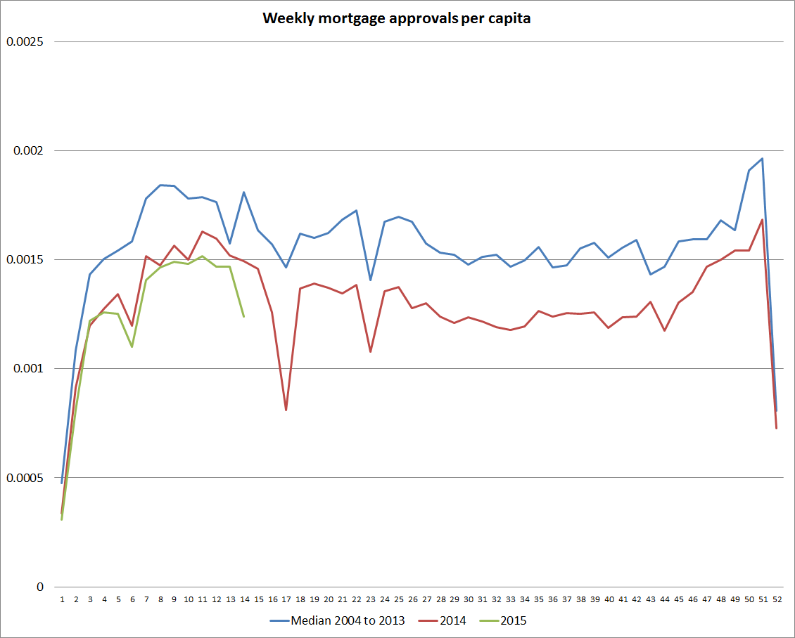
The data aren’t seasonally adjusted, and so for a while I’ve been keeping an eye on a version of this chart, tracking the number of mortgage approvals per capita in each of the 52 weeks of the year.  New Zealand’s population is steadily growing, and so I’ve used an annual population estimate to produce an approximate series of housing mortgage approvals per capita.  You can see the holiday periods clearly –  not just the great Christmas/New Year dip, but also those for other public holidays (Easter accounts for last week’s dip). It is easy to see how mortgage approvals are running relative to the same period in earlier years.

The chart shows three lines.  The first is the median for the first 10 years of the series, 2004 to 2013, which encompassed the last few years of the boom, and the very weak few years after 2007.    The second and third are the series for 2014 and 2015 to date.  The number of mortgage loan approvals last year ran consistently well below the median for the previous decade.  And this year, the number of approvals per capita has been tracking a little lower again.   So far only 2010 and 2011 have been lower than this year.

Consistent with that, the total stock of loans to households has been growing at a touch under 5 per cent per annum –  barely above a plausible trend rate of growth in nominal GDP (say 2 per cent inflation, and 2.5 per cent potential real GDP growth).

mortgage approvals

The value of mortgage approvals is quite close to an all-time high. That largely reflects the high level of house prices. But activity in the nationwide house finance market remains very subdued.

A final thought:  it is very rare indeed for serious financial stability risks to develop, in a system with nationwide lenders, when overall lending activity is subdued, and when there is such modest credit growth.  The burden of proof should be on any institution pondering (further) regulatory interventions in the housing finance market, given the inefficiencies such restrictions encourage, and distributional consequences of such measures.

Labour force participation rates

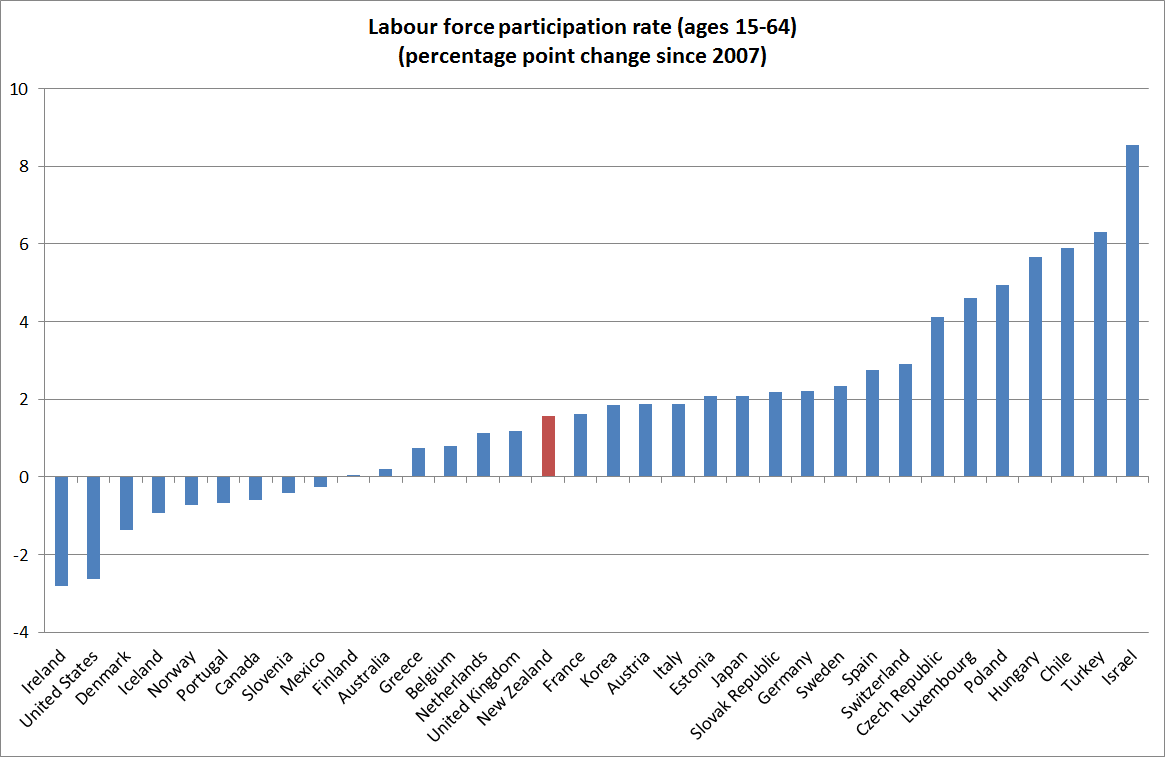
Thanks to Eric Crampton for his coverage. Eric suggested that my slightly gloomy take on New Zealand’s 5.7% unemployment rate needs to be tempered by recognising that the labour force participation rate is rising.

Participation rates have been rising here, and in most of the OECD. New Zealand doesn’t really stand out (from memory, the increase in our unemployment rate is also middle of the pack).  One caveat is that the chart shows the 15-64 participation rate.  I couldn’t quickly find the quarterly OECD data for the whole 15+ population, but when I looked at it a few weeks ago New Zealand was a little further up the rankings.

participation rate

Two other things struck about the data in this chart:

  • the continuing very weak US participation rate.  It is just one among many indicators that makes me sceptical of the Fed’s case for seriously contemplating near-term increases in the Fed funds rate.
  • the participation rates for Spain and Greece.  Participation rates are usually cyclically weak when unemployment is particularly high.  Spain and Greece have had huge increases in their unemployment rates, so my hypothesis is that families are finding times so tough that every possible is searching for any job, however short-term or short hours, possible.

On China’s disappointing economic performance

The latest New Yorker was in the mail yesterday.  An article by Evan Osnos on Xi Jinping, subtitled “How Xi Jinping, an unremarkable provincial administrator, became China’s most authoritarian leader since Mao”, is fascinating reading, and recommended for anyone with an interest in China.  It is unflattering picture of China’s new(ish) leader, who is widely seen as primarily focused on consolidating power for himself and for the Party – a Party regime that drove his own sister to suicide. That he is no Gorbachev would no doubt be seen by colleagues as perhaps the key point in his favour.

The article doesn’t deal much with economic developments.  Xi Jinping came to power at the end of one of the bigger credit booms in history.  Not all credit booms end disastrously, but few end well.  And China’s since 2008 was far more state-led, with fewer market disciplines, than most.  Credit booms often go hand in hand with a marked appreciation in the real exchange rate, and China has had that too.    Quite where China goes from here is hard to tell.  Macro policy is being eased, as in other countries last decade, but even very deep cuts in interest rates in other countries haven’t been enough to produce robust recoveries in most.  And in China real interest rates appear to be rising not falling, and the real exchange rate is still rising.  What happens in China matters a lot for the world economy, especially when most other countries have so little “policy space” left, and growth in other emerging economies is also slowing.

But the article got me thinking about China’s longer-term economic performance.  What has happened over the last 35 years has been remarkable, but mostly because of its global implications.  I’m struck, however, by how underwhelming China’s performance has been in some key respects.

My benchmark is the other Chinese countries/territories – Hong Kong, Singapore, Taiwan – with a quick glance as well at the two non-Chinese rich democracies of Asia, Japan and South Korea.  I’m drawing data from the Conference Board’s Total Economy Database, spliced where necessary with the (common origin) Angus Maddison data.

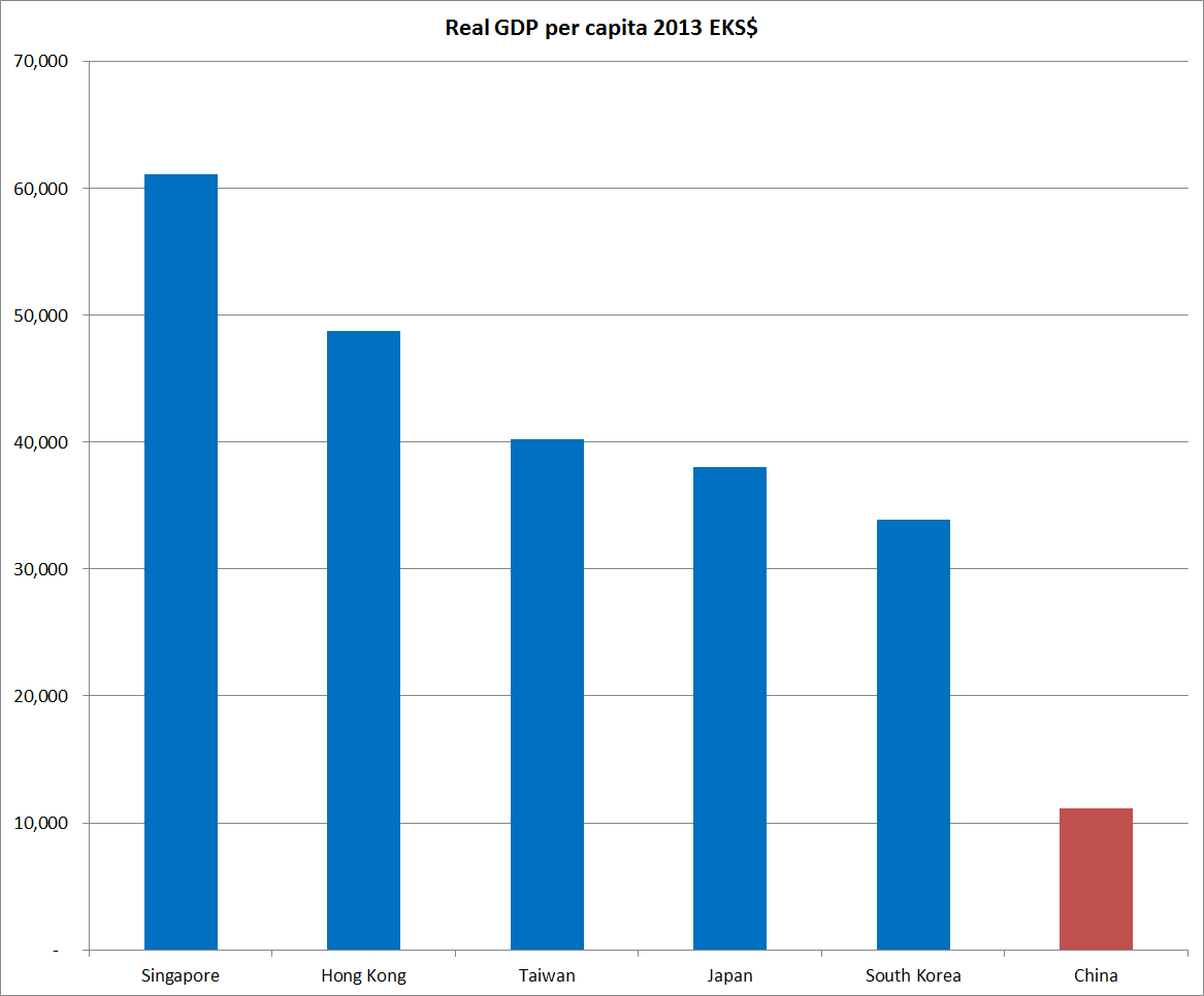
China is a middle-income country, with real GDP per capita in 2013 not that different from those in Jamaica, Brazil, and Iraq.  The other Chinese countries/territories aren’t.

chinalevels

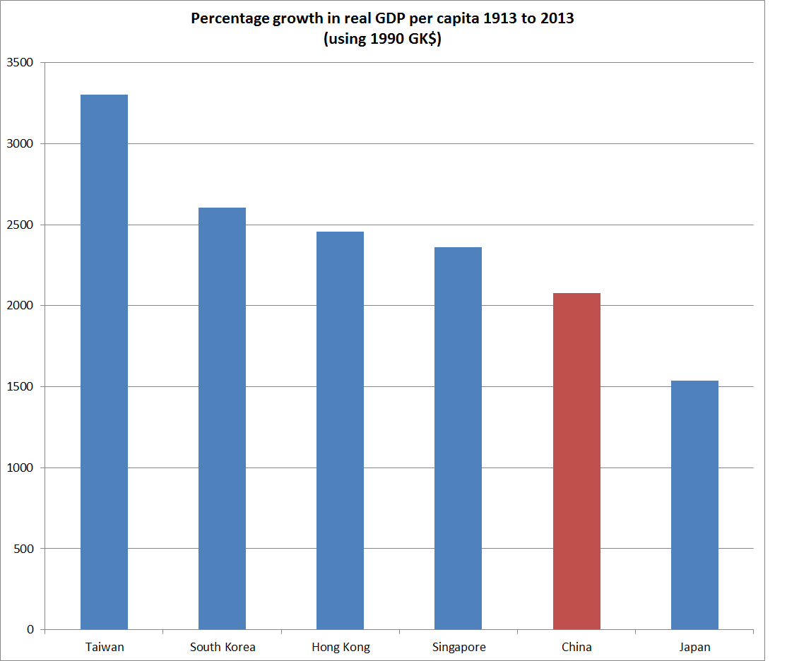
Things start getting a bit heroic with long-term growth rate comparisons, but China’s growth in per capita income over the last 100 years (1913 is one of Maddison’s benchmark dates) doesn’t look particularly impressive either.  China is estimated to have been the poorest of these countries/territories in 1913, and so had the most room for catch-up/convergence growth.

chinalevel

And if one other measure of success is how many people can share in the prosperity, China’s population has also grown much less rapidly than those of the other Chinese countries/territories over the last 100 years.

% increase in population 1913-2013

China                  211

Taiwan                 567

Hong Kong          1402

Singapore            1590

All these comparisons are somewhat fraught.  The historical data aren’t great, but they are what we have.  Americans often argue, when faced with success stories in small European countries, that these things may not be replicable on continental scale, but equally New Zealanders are familiar with arguments about the potential costs from small size.  And China has done it before –  they were at the forefront of innovation, with the highest living standards, perhaps 1000 years ago.

If there has been some catch-up in the last 35 years, over the last 100 years taken together growth in living standards in China appears not to have kept pace with growth in other places with populations of similar ethnic and cultural backgrounds –  but which have allowed a greater role for markets, and the rule of law.    And the people of China have had to put up with much greater political repression, much higher levels of corruption, persecution for religious beliefs, and the evils of the one-child policy, not to speak of the disaster of Mao’s Great Famine.  It seems a lot like a lose-lose for most of the Chinese –  but not perhaps for the Party bosses.

A favourite troubling chart

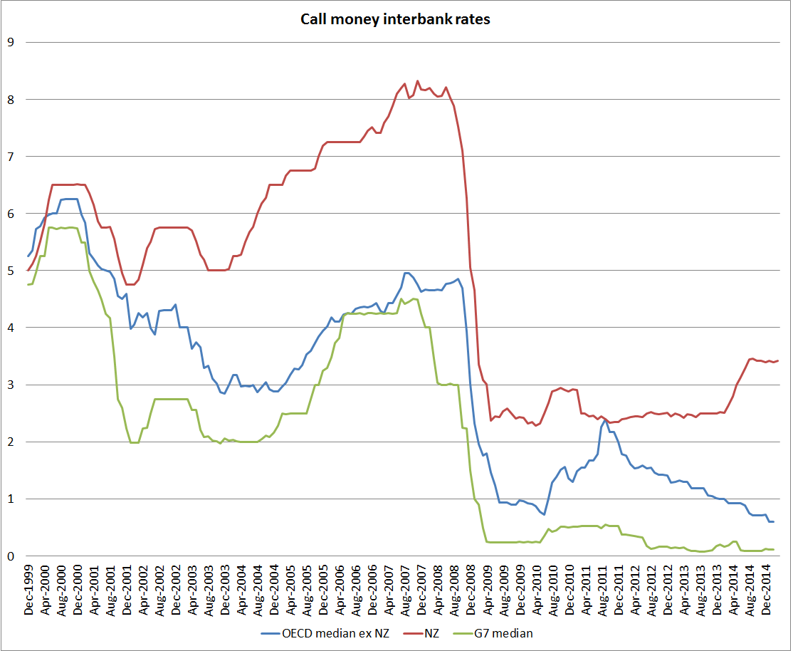
This is one of my favourite troubling charts of the last year or two.  It uses OECD data to proxy policy interest rates (they describe them as “call money interbank rates”.    I’ve shown three lines: New Zealand, a median for the G7 countries (in this case the US, the UK, the euro area (for Germany, Italy, and France), Japan, and Canada) and a median for all 20 countries/regions in the OECD with the ability to set their own policy rates.  I’ve gone back 15 years, to the end of 1999 –  a point where the gap between NZ and foreign rates was unusually low.

call rates

Two things have troubled me about the chart:

  • the growing divergence between New Zealand and foreign rates over the last couple of years.  New Zealand and foreign short-term interest rates won’t always move together, but when they diverge we should be able to identify specific developments in inflation (as almost all these countries are now inflation targeters) to warrant the divergence.  Forecasts of inflation may have diverged in ways that suggested higher New Zealand interest rates, but actual inflation (headline or core) has been at least as weak, relative to target, as we’ve seen in the typical advanced economy.
  • perhaps more important, is that near-flat line for the G7 countries (and one could add several others to that list of countries) for now six years or so.  It would be some sort of miracle if appropriate interest rates had been so stable for so long.  In fact, what we have seen is countries reacting to the perception of a lower bound on nominal interest rates at or very near zero.

The idea of the zero lower bound has been around for a long time,  When Japan got there most of us still treated it as an idiosyncratic curiosity.  And no country has yet taken policy interest rates as low as they can effectively go.  We know this because in no country has there been a large scale switch into physical cash holdings (the option that makes the near-zero bound troublesome).    But when policy rates have been at or very near the practical bound for so long, it suggests they would appropriately have gone materially lower had that been possible.  Combined with lingering high unemployment (or low participation in the US case) and weak inflation, they continue to point to a shortage of demand as a problem in most advanced countries.

As concerning is that, six years on, it appears that no central bank (of finance ministry) has taken a lead to reduce the risk that the zero bound will be an even more major problem in the next recession.  We don’t know when that will be, and hope it will be years away, but that can’t be guaranteed, especially as emerging market growth slows and recessionary risks rise in those countries.  And next time, most advanced countries might go into a recession from a cyclical high in policy rates of perhaps 0.25 per cent.  And New Zealand, which cut by 575 points last time, could well peak this cycle at a 3.5 per cent OCR.

One problem has been the constant belief –  in markets and central banks – that a sustained upturn is just around the corner, and with it the basis for higher policy rates.    Both markets and central banks have been repeatedly wrong.  But we should hope that in the backrooms of major central banks serious practical work is underway to alleviate the (actual or felt) constraint of the ZLB before the next significant downturn.

I have a few ideas, and will discuss some of them in a future post.

Government spending: a trans-Tasman comparison

I’ve noted a couple of times how the notion keeps popping up that somehow New Zealand, and the New Zealand government, has been doing better than Australia in recent years.

Real per capita GDP growth in New Zealand has lagged behind that in Australia since 2007, and productivity growth has also been weaker.  Our unemployment rate is now a bit lower than Australia’s, but that was normal prior to the recession – it is good, but hardly a reflection of post-crisis policy reforms.

But what about something that is more directly under the control of governments?   Good timely comparable data on total government spending is not easy to come by.  But in the quarterly national accounts both countries have data on public consumption spending.  Government consumption here is goods and services directly purchased by governments, whether the government itself “consumes” them –  eg core administration functions – or delivers them to households (eg public provision of health and education services)).

The chart below shows public consumption as a share of GDP for the two countries.   These are general government numbers, not central government, but in New Zealand local government spending is quite a small share of the total (less than 20 per cent).  The two series are slightly different – Australia reports seasonally adjusted data, and NZ doesn’t so the NZ numbers are rolling four-quarter totals – but that shouldn’t materially affect comparisons.

govt c nz au

The chart highlights again the huge increase in public consumption as a share of GDP that occurred in the last few years of the previous government.  Many of those initiatives continued to boost spending into the early years of the current government.    Government consumption spending as a share of GDP tends to rise in recessions, not generally because of discretionary fiscal stimulus but simply because GDP falls.  Both New Zealand and Australia had significant recessions in 1991, and it is easy to see how the government spending share of GDP rose then.  So some of the New Zealand increase to the peak in mid-2009 was simply the change in the denominator.  But then again, so must some of the fall in the ratio since then.  There has been a considerable squeeze on some bits of government spending, but the overall picture is hardly one of austerity.

The contrast with Australia is quite striking.  For all the talk about Australia’s fiscal deficits, government consumption spending now is barely higher (% of GDP) than it was in the 20 years pre 2008.  By contrast, New Zealand’s government consumption is still barely below the early 1990s peaks.

Don’t get me wrong.  Government spending as a share of GDP is quite low, by OECD standards anyway, in both Australia and New Zealand.  And reasonable people, and differing political ideologies, will have different perspectives on the role of government.  But two thoughts:

  • For anyone at all concerned about the exchange rate, the increase in the government spending share should be worrying.  Increased government consumption spending adds directly to pressure on the real exchange rate, bidding up the cost/price of non-tradables relative to (internationally set) tradables prices.
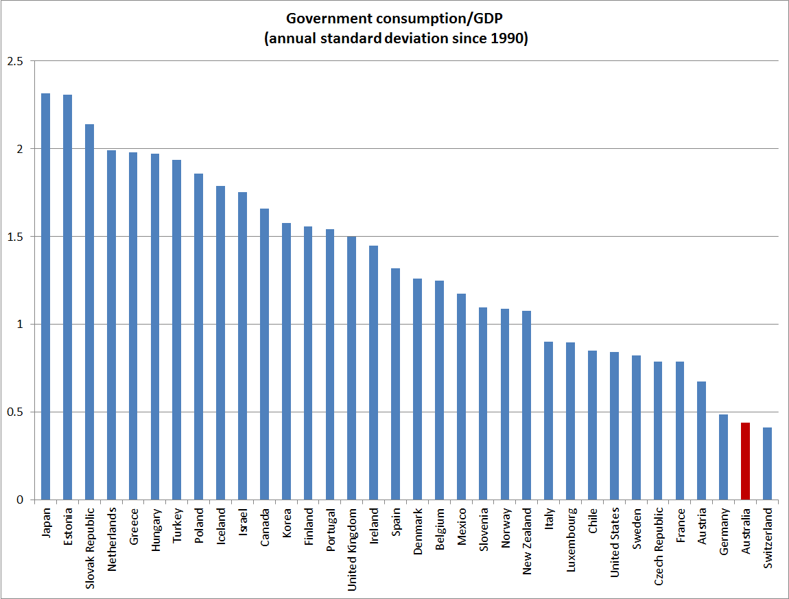
  • In the last 25 years Australia has been remarkably successful in limiting variability in government spending as a share of GDP (both on this measure, and on broader OECD measures of total government outlays).  That has been so through various changes of government.  Stable government spending shares provide a better basis for stable tax rates, and stable tax rates help provide a climate in which businesses and households can make best choices about investment and labour supply.  New Zealand has not done that badly by international standards, but is a long way from matching Australia.

govt c oecd

Add in the failure to achieve an operating surplus yet, despite the best terms of trade in 40 years, and the very low quality of a lot of the government capital expenditure (those unattractive benefit-cost ratios for Transmission Gully, Kiwirail, and ultra-fast broadband for example) , and once again we have a picture in which New Zealand has not helped itself.

Parity parties

The Prime Minister is reported as reckoning we should celebrate parity with the Australian dollar.  It hasn’t happened quite yet, there has been a bit of a pullback today, and market positioning means there are probably still a few obstacles to getting there.  But at current exchange rates one would be brave to bet much against parity happening sometime soon.

But is it something to celebrate?  I don’t think so.  A high (real) exchange rate lowers the relative price of consumption.  And since consumption is often thought of as the point of economic life, the cheaper consumption is, the more of it we can have.  But, over time, one can consume only from what one earns, and – all else equal – an exchange rate that skews things towards consumption tends to reduce the ability of firms and individuals to earn more in future.  That issue doesn’t arise if the exchange rate rises because (and to the extent that) the terms of trade rise, or because New Zealand firms have found new or better products, or smarter ways of organising themselves.  As Krugman put, it in the longer-term if productivity isn’t everything, it is almost everything.

So let’s stand back and consider near-parity against the AUD.   Our terms of trade have been falling more slowly than Australia’s, so relatively speaking that is a positive for us.  But this morning’s papers contain reports of record grain gluts.  The combination of very weak oil prices, abundant grain stocks, and falling grain prices doesn’t bode well for dairy prices (nor does China’s drive for self-sufficiency, or the removal of European quotas).  Exports are a larger share of the New Zealand economy than they are of the Australian economy.  And whereas the New Zealand export sector is largely locally owned, so that all the income losses are borne by New Zealanders, much of Australia’s export sector is foreign-owned, so funds managers around the world will be sharing the pain as iron ore prices keep falling.  I’ve shown before that there has been no sign in recent years that productivity growth in New Zealand is improving relative to that in Australia.

The exchange rate is not strong just against the Australian dollar.  At around 79 on the TWI  – an index that probably puts too much weight on the Australian dollar –  the exchange rate is less than 5 per cent below its post-float peak.

So what does support the NZD, against the AUD and more generally.   Over the last year, the Reserve Bank of New Zealand raised its policy interest rate by 100 basis points, while Australia (and most other advanced country central banks) were cutting policy rates and easing monetary policy.  (I’m deliberately posting this before 4:30: whether, as everyone assumes, the RBA cuts again today or leaves it another month or so isn’t really the point here.)

OCR increases would have made sense if inflation was picking up, but it has stayed low (headline has collapsed, but core measures have remained persistently weak despite the allegedly robust recovery).  The Reserve Bank Governor, who talked confidently a year ago about 200 basis points of OCR increases, has slowly had to walk back his rhetoric and then his actions, but we are still left with a policy rate quite out of line with those elsewhere in the advanced world, when core inflation is consistently below the target midpoint, wage inflation is weak, inflation expectations  are falling, credit growth is quiescent, and the unemployment rate  –  real people, losing real skills –  remains uncomfortably high.

If it comes, parity is nothing to celebrate – any more than the previous peaks were things to celebrate.  Rather, taking together all the information, those peaks have typically been markers of some unsustainable imbalances building up.  This time, that looks like the gap between our OCR and policy interest rates abroad.  And probably a misplaced confidence (in official circles and among private commentators) in the ability of the New Zealand economy to remain relatively resilient as the commodity slump goes on, the economies of our two largest trading partners weaken, and as Christchurch no longer represents much, if any, of a source of new growth in demand.