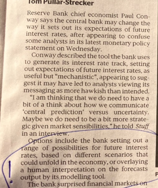
An article in this morning’s Post, reporting comments from Paul Conway, chief economist of the Reserve Bank, prompted me to go and listen to the Governor’s MPS press conference. I’d largely given up watching them.
This was the most interesting bit of the article
although it was followed with more comments trying to reframe what the Bank had published in the MPS only a couple of days ago.
The Bank has been publishing a so-called endogenous track for short-term interest rates, as a central indication of what it believes to be required to deliver inflation at or near target 1 to 2 years ahead, for more than 25 years now. If the current crop of MPC members doesn’t yet understand how their numbers will be interpreted, that is more of a reflection on the MPC, and their chief economics adviser, than on the tool. (I’m not a big fan of publishing medium-term interest rate projections – never have been – but it is hardly a new or unfamiliar tool).
So when you published an OCR track that is revised up and out
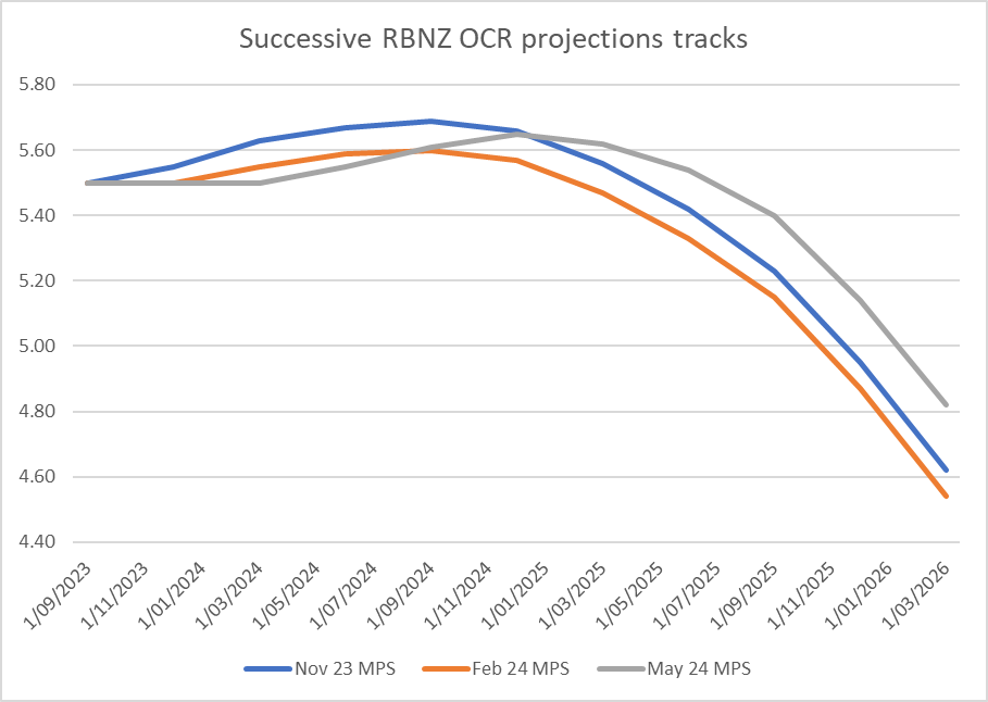
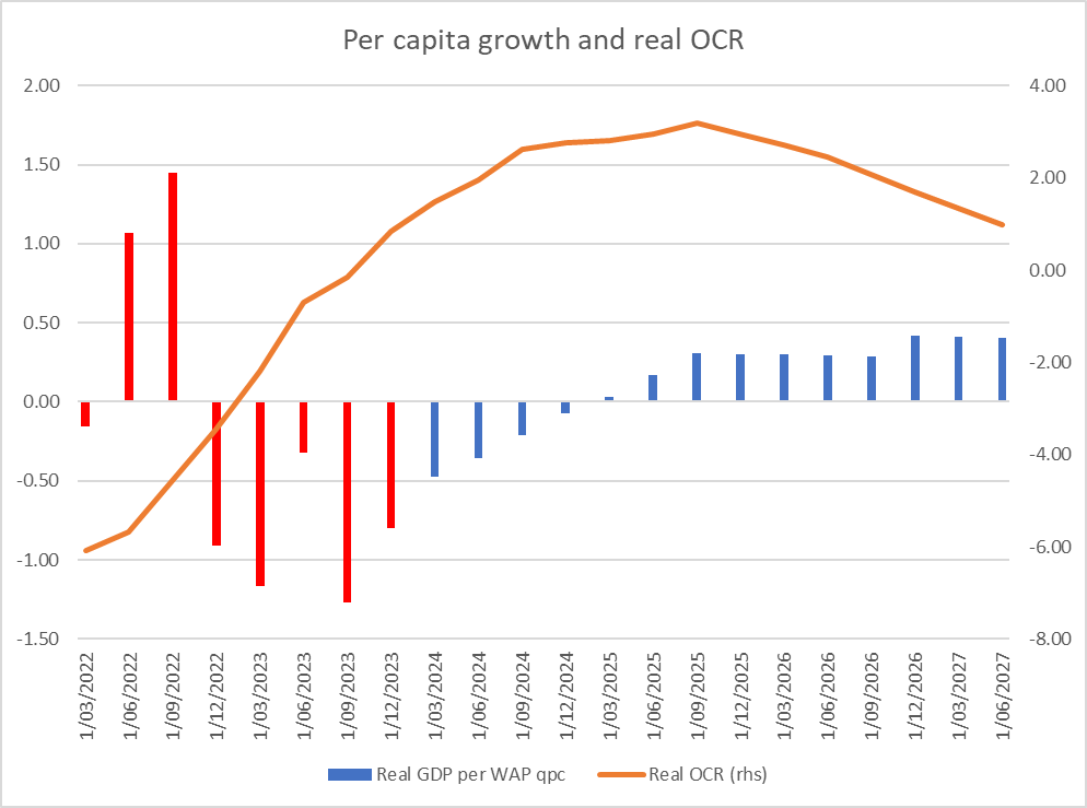
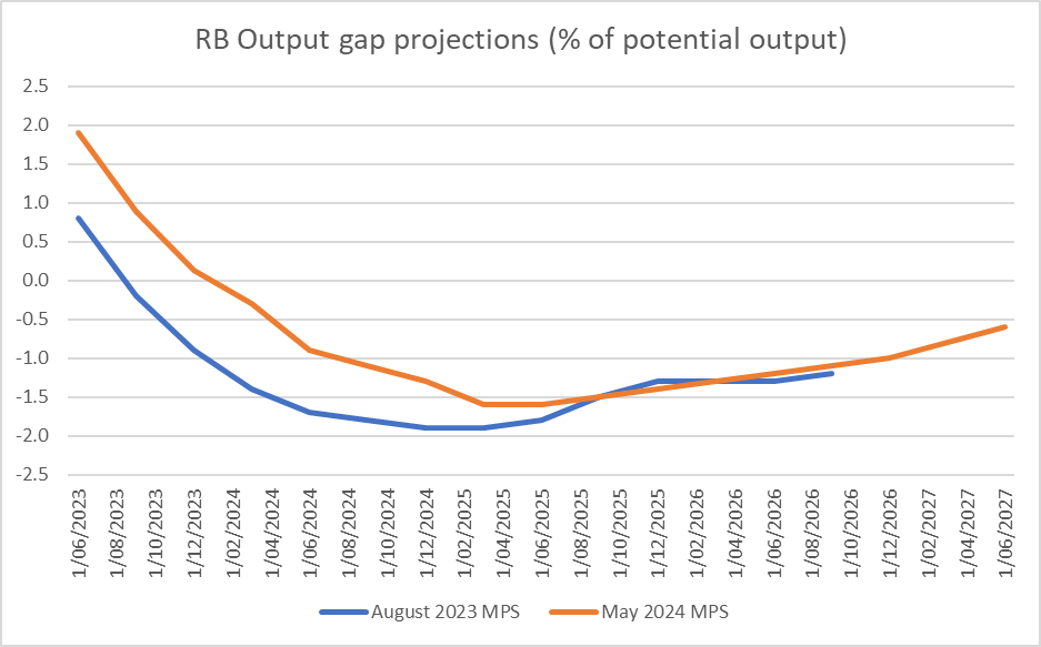
you know the likely reaction, likely questions etc. And when you complement that numerical track by explicitly stating that the MPC actively considered raising the OCR at this very meeting, you shouldn’t be surprised you are going to be challenged. On a central track, where the OCR is averaging 5.65 per cent in the December quarter, that is consistent with a high probability of an OCR increase later this year.
If the Bank didn’t want people to take that interpretation (and both Conway’s comments in this article, and his and Orr’s comments at the press conference suggest they didn’t), they should have published different numbers. The comments from Conway in the Post article suggest that somehow the OCR projection track was outside their control – product of “its modelling tool” – when it has always been clear that the projections are the MPC’s, not some staff model (which itself has considerable human interventions pretty routinely). Perhaps it is different now, but in the many many years when I sat on the equivalent of the MPC, we used to spending huge amounts of time (arguably at times inordinate) on those last tweaks to the interest rate track, bearing in mind how any numbers would be read by outsiders. There was never a time when any published forecasts – and particularly for the interest rate track – were just some sort of machine-generated product.
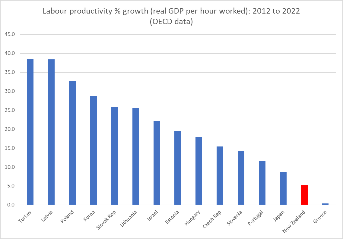
Listening to the press conference for the first time in a while just confirmed a sense of how inadequate the MPC, and its chair, are for the job they’ve been charged with. They didn’t have a straight story to tell, and they were trying to back away from the clear implication of numbers they’d chosen to publish. To which one could add yet another appearance saying nothing of substance from the deputy chief executive responsible for macroeconomics and monetary policy at the Bank, or a Governor who chose to opine on productivity growth or the lack of it, suggesting that things were different (better) in Australia, even though recent productivity growth there has been just as weak as in New Zealand. Why are these people – having delivered us the inflationary mess in the first place – still in office? New Zealanders deserve better from officials – supposedly expert ones – delegated so much power. Apart from anything else they deserve real expertise and real accountability.
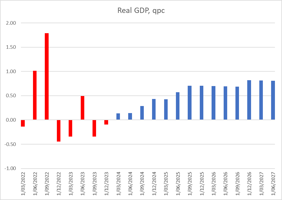
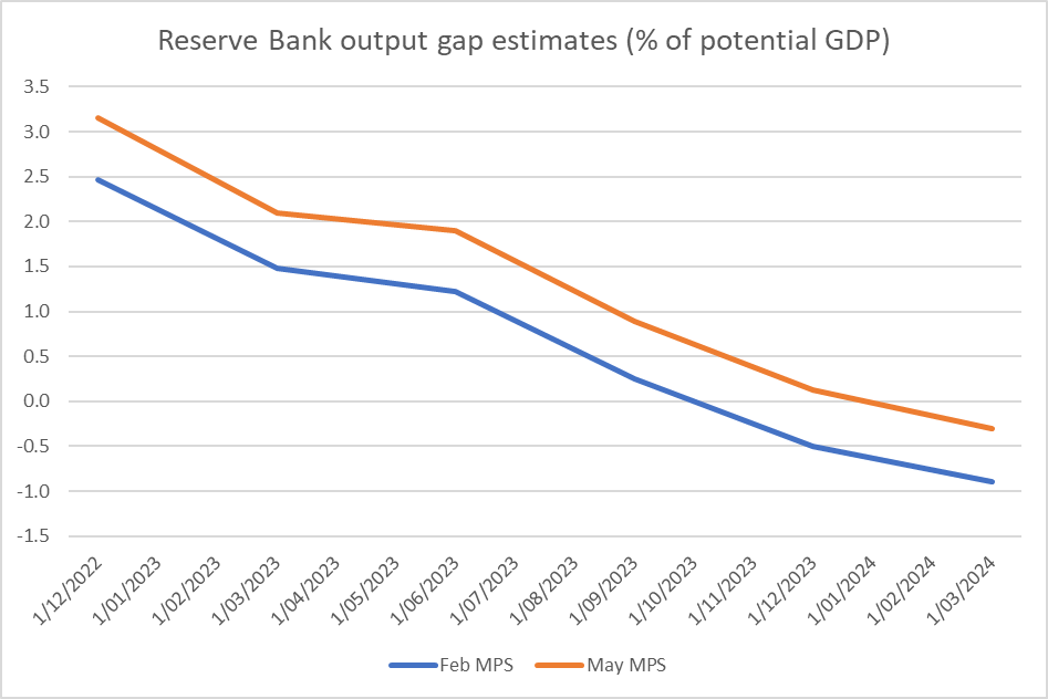
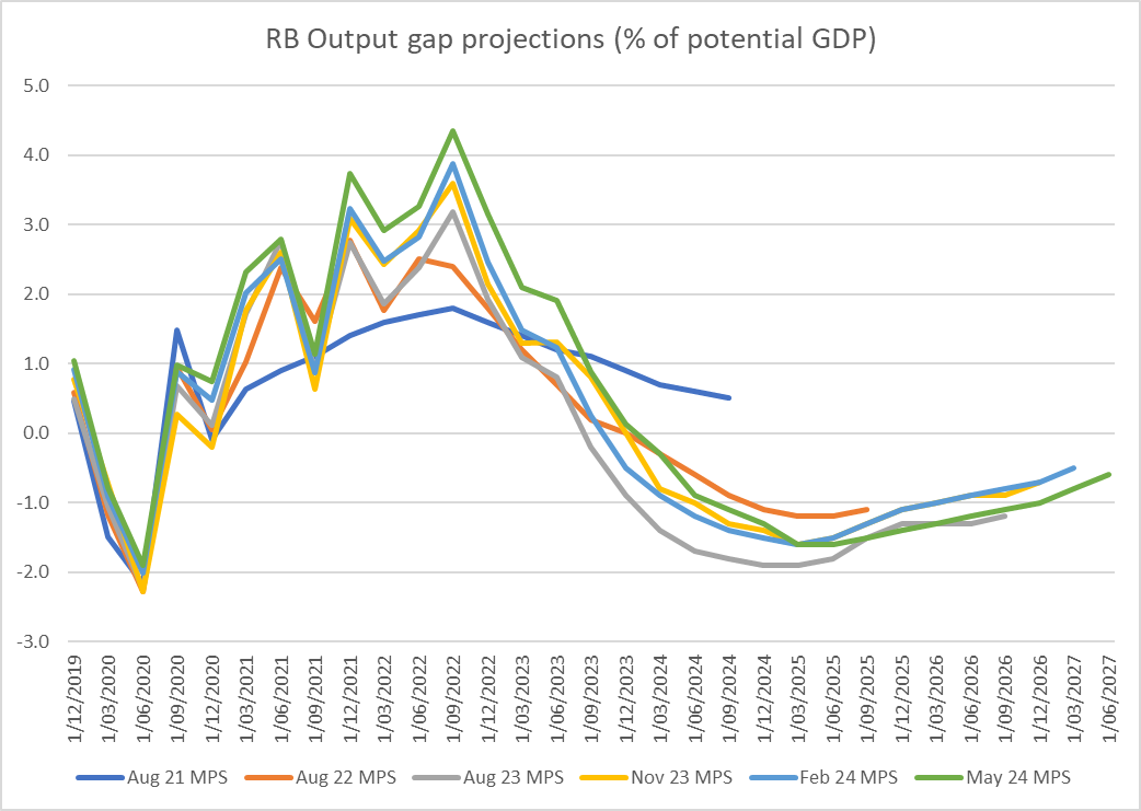
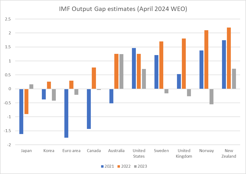
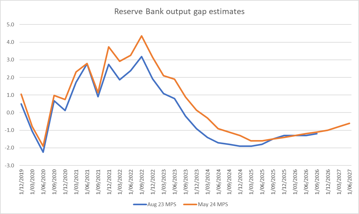
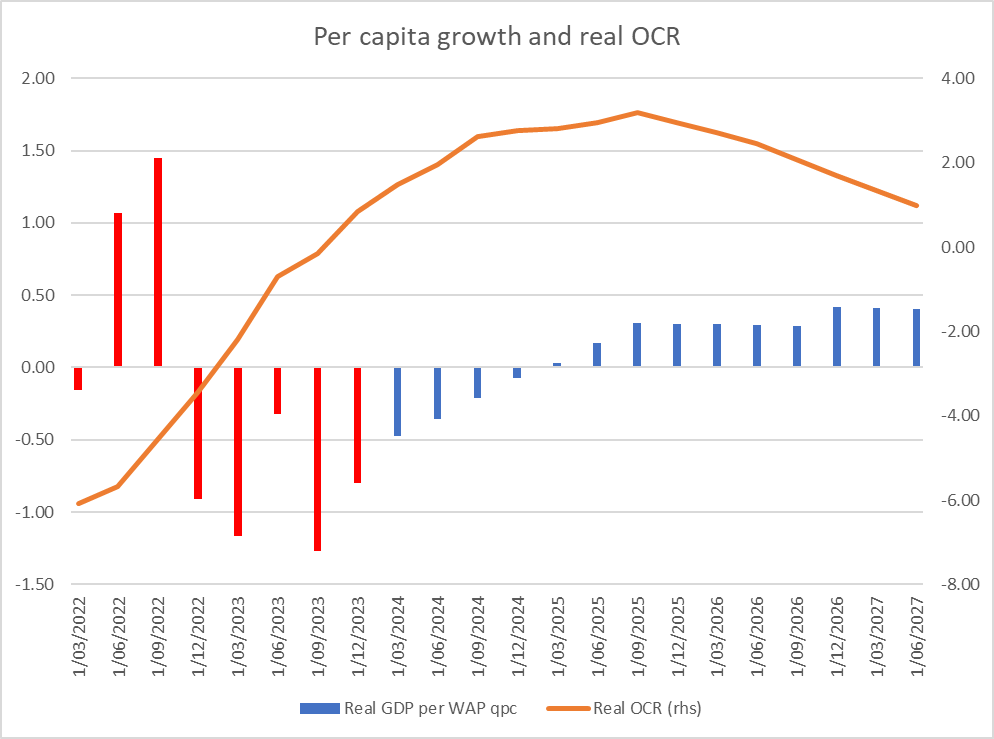
But then there was also a sense of how weak the media scrutiny was. Was it really the case that no journalist had wondered quite how economic growth was supposed to rebound, on these projections, with real interest rates already restrictive and set to rise further, fiscal policy restrictive, no help from the world economy, and with an expected further downturn in the net immigration impulse? In any case, none asked. None asked why if the OCR had helped lower the output gap by almost 5 percentage points so far, a continuing high OCR, rising further in real terms (as inflation and expectations fall but the OCR doesn’t), was only going to lower the output gap by a little more than 1 percentage point.
And remarkably no journalist asked, and no central banker mentioned, the very real lags in monetary policy. If the real OCR keeps rising to at least the middle of next year, won’t that be acting as a material drag on economic activity and inflation for a couple of years after that? And yet, on the Bank’s projections – the ones the Governor was presenting and journalists were supposedly questioning – quarterly inflation is back at target midpoint by the middle of next year, and – on the Bank’s telling – goes no lower from there.
The puzzles are real.