Which countries have been seeing export growth?

No one really doubts that over the longer term a better performing New Zealand economy –  absolutely or relative to the rest of the advanced world  –  would be likely to involve faster growth in exports.  It isn’t that exports are a special or unique type of product, or that tax breaks or other regulatory distortions should be put in place specifically to target exports.  It is simply that the rest of the world is a big place, and New Zealand is a small one.  The best prospects for high living standards here, at least for any given size of population, involves successfully selling more stuff to the rest of the world (which enables us to consume lots of stuff produced efficiently in other places).  The idea is implicit in the government’s own target to see exports as a share of GDP rise from around 30 per cent to around 40 per cent over the next decade or so.  But the general notion isn’t original to this government –  it has been a feature of New Zealand economic debate, and aspirations, for decades.

New Zealand hasn’t done particularly well on that score – nominal exports as a share of nominal share have barely changed over the last 25 years.

exports to gdp

Nominal export values are, of course, thrown around by fluctuations in export prices –  a particularly important consideration for a commodity exporting country.

But what about export volumes?  I dug out the OECD’s quarterly data on real export volumes.  I had a look at what had happened to export volumes for OECD countries (plus Latvia and Lithuania) since the end of 2007.    There is no ideal starting date, but the end of 2007 is just prior to the widespread recession of 2008/09, and in many countries export volumes slumped during the recession and subsequently recovered and I wanted to avoid those short-term fluctuations..

If we look at total export volume growth since the end of 2007, New Zealand doesn’t look too bad.  Total export volume growth was a little faster than for the G7 countries taken together, although a little slower than the EU countries or the euro area.  When one allows for the rising role of global value chains, which have boosted gross cross-border trade in many European countries (and which aren’t a feature of commodity trade), perhaps New Zealand’s performance doesn’t look too bad.

real exporrt vol growth

But, of course, New Zealand has had much faster population growth than most OECD countries – in some sense then we’ve needed more export growth than, say, a country with no population growth might have needed.  The OECD doesn’t have quarterly per capita data, and tracking down quarterly population estimates for many countries would take more effort than I have time for at present.

Instead, this chart simply subtracts the growth rate of real GDP since 2007 from the growth rate of real exports over the same period.   On this indicator, we are right back towards the bottom of the OECD.

gap between X and GDP growth

It isn’t necessarily a surprising result.  On the one hand, we’ve had to divert real resources from other activities to undertake the repairs and rebuilding in Christchurch. And on the other hand we have chosen –  as a matter of active policy –  to increase the population quite rapidly, which meant that resources that might otherwise have been able to be used to grow export businesses (at a probable lower real exchange rate) have had to be used to build the domestic capital stock (public and private) a higher population needs.

But if it shouldn’t be a surprising result –  just a logical outcome of shocks and choices –   it certainly isn’t one suggesting we’ve made any progress towards positioning New Zealand to begin to close the gap between our productivity and material living standards and those in the rest of the advanced world.

Do citizens always (net) leave their own countries?

In my post the other day on New Zealanders continuing to leave New Zealand, one thing I didn’t touch on is that in normal circumstances one should expect more citizens to leave their own country than arrive.

People mostly acquire citizenship by first living in a country.  For most people, it is a matter of being born somewhere (although not everyone born in a particular place is entitled to citizenship of that country).   Others acquire citizenship through immigration, sustained residence and naturalization.  And there is a, typically much smaller, group who acquire citizenship outside the country –  eg the children born abroad of New Zealanders.

In other words, most citizens of a country are in that country to start with.  However successful the country is, it is likely then that over time more citizens will leave the country than will arrive in it.  There typically isn’t a large stock of citizens abroad, and some citizens will, for example, marry someone from another country and move to settle in that country.   Others will find an exceptional job abroad, or simply like something about the lifestyle or values that another country offers.  The United States, for example, has had among the very highest material living standards for a long time, but the best estimates seem to be that there are a couple of million American-born US citizens living abroad.  More Americans have left the United States than have arrived.

But two million Americans is less than 1 per cent of the US population.  In New Zealand’s case, by contrast, Australian statistics say that there are around 600000 New Zealand born people (almost all of whom will have been New Zealand citizens –  many still are) in Australia alone.    There are only around 3.5 million New Zealand born people in New Zealand.   Diasporas make a difference.

Once there is a large stock of citizens living abroad, there is no reason to think that the net migration flow of citizens will continue to be outward, no matter what the economic conditions are.  If New Zealand’s economy starts performing better than those abroad, which group of people finds it easiest to move here and take advantage of those opportunities?  Surely those who are already our own citizens –  they have the legal right to move here, full access to our welfare supports, and few cultural adjustment issues  (Australians can come here too, but the flows are typically small.)  By contrast, people from other countries face  all sorts of additional hurdles.  They need legal permission to come (and we don’t allow just anyone in, as soon as they want to come),  and they typically won’t know the culture that well or find it easy to immediately see their skills fully recognized in the labour market.    With 600000 New Zealanders in  Australia alone, if there was any convergence going on between living standards in New Zealand and Australia (or New Zealand and the UK, where the next largest group of New Zealanders live) that could quite quickly and readily been accompanied by a reversal of the net outflow of citizens.  Many would still be leaving  –  some permanently, some just for a few years –  but more could be returning.

What happens in other countries?    Do we ever see net inflows to a country of citizens of citizens of that country, or is this just a theoretical curiosity?  In fact, we do see, and have seen, such flows.

I went to the Eurostat database, which collects and reports data from a huge number of European countries (mostly those inside the EU, but not only them).   Somewhat to my surprise, I actually found what I was looking for: in this case, 10 years of annual data for the migration inflows and outflows of citizens of each reporting country.  I’m not sure how they compile the data in most countries (in New Zealand, we use arrival and departure cards), but in Europe the use of identity cards and the need to register in a locality probably support data collection.  In any case, however they manage to calculate it, this is what I found.   I downloaded the data for 32 countries for the years 2004 to 2013 (the most recent Eurostat had).  Bear in mind that New Zealand has not had an annual net inflow of its own citizens for more than 30 years.  But over the last decade, 11 of these European countries had had such inflows in at least one year (in fact, all of those 11 had had at least two years of net inflows of their own citizens).

These were the countries that had experienced inflows: Denmark, Ireland, Greece, Spain, France, Croatia, Cyprus, Slovakia, Hungary, Malta, Finland

It is a diverse group: some of the richer EU countries (France, Denmark and Finland) as well as some of the poorer.  Unsurprisingly, most of the inflow years seem to have been when the home economies were doing well.  Over time, for example, Ireland has huge net outflows, akin to New Zealand’s experience (and hence a very large diaspora), but they had a net inflow of their own citizens of around 12000 people a year from 2006 (when the Irish data start) to 2008.  Cyprus –  a much smaller country –  was attracting back a net 1000 or so of its own citizens each year right up until their crisis hit in 2013.  And so on.

As I noted, even very rich countries will tend to see a modest outflow of their own citizens over time.  Norway, for example, has an extremely high GDP per capita (and even higher GNI per capita), and about the same population as New Zealand.  It was losing about 1000 Norwegians per annum over 2004 to 2013 –  a period when New Zealand lost an average of 28000 people per annum.

And how do to the average net outflows over time compare across countries?  This chart shows data for the Eurostat countries discussed above, supplemented with national data for New Zealand and Australia.

own citizens inflow

A handful of countries actually had a net inflow of their own citizens over this full period.  But only two of the countries had a larger average annual outflow (as a per cent of population) than New Zealand.  If New Zealand had really been doing well our diaspora is large enough that the flow could easily have reversed.  It simply hasn’t.  It fluctuates, and the net outflow in the last year has been modest by our own historical standards (recent decades), but even last year’s net outflow would have put us towards the right of this chart.

Still a country New Zealanders leave

In one of his weekly columns over the holiday period the Herald’s John Roughan, a touch sentimental perhaps that his grandchildren were just returning home again to Singapore, made the case that the post 1984 economic reforms have made New Zealand “a place worth returning to”,  “a place that can hold its own in the world”, and so on.

It is a nice story.  It is certainly one that I hoped would come true.  It is just a shame that the facts don’t really support it.

What have New Zealanders been doing?  Well, the last time there was any sort of sustained net inflow of New Zealand citizens to New Zealand was when Sir Robert Muldoon governed:  seven consecutive months in 1983.  It probably wasn’t greatly to Muldoon’s credit, since by mid 1983 Australia’s unemployment rate had risen sharply to just over 10 per cent.    There were also two months in early 1991 when there was an inflow of 90 people:  and again Australia’s unemployment rate was rising rapidly.    Even in the last 12 months a net 4800 New Zealand citizens have left.  Sure, plenty of individuals leave and come back, but in net terms the data tell us the flow is outwards.  It is a volatile series, and the outflow at present is less than it has often been, but we’ll need several years more data before there would be any reason to think the pattern of net outflows –  in place since the mid 70s – is ending.  There has been a net outflow of New Zealand citizens of 680000 since the reforms began.

net plt flow of citizens

And even if the outflows were to slow, it isn’t necessarily a mark of our own success.  Australia has long been the natural place for New Zealanders to seek better opportunities for themselves and their families.  For a long time, access to Australia was largely unrestricted –  it was easy to go, pretty easy to adapt, and if things went wrong the social safety net buffers in Australia were there for the immigrants.  New Zealanders can still easily go to Australia, but they now have a much tougher time of it –  for new arrivals, access to the Australian welfare system is available only for those arriving on permanent residence visas (typically not New Zealanders).  And their children can find themselves in a legal limbo.   In boom times, only the most risk averse pay much attention to factors like that  –  and those who choose to migrate aren’t generally the most risk averse –  but tougher times in Australia, and just the passage of time and the reporting of more stories of the difficulties some have faced, is reducing the attractiveness of Australia, even as the income and productivity gaps between the two countries have continued to gradually widen.  It is too early to tell how large any structural change in the willingness of New Zealanders to go to Australia has been –  the cycle dominates –  but if it has happened it is neither a benefit to New Zealanders or a reflection of any success on our part.

Roughan glides between the talk of New Zealanders coming home and celebrating the overall net immigration statistics.  But again, large net inflows of non New Zealanders aren’t a sign of economic success, just a sign of one strand in economic policy.    A relatively rich country never has too much difficulty getting migrants if it wants them –  there are always many countries that are worse off.  Indeed, a violent middle income country like South Africa attracts lots of (mostly illegal) migrants –  most of Africa is even poorer.  This isn’t the place to resume debates about whether New Zealanders will benefit from our immigration policy over the long haul, just that inflows –  however large – are not themselves a sign of our economic success.

I’m one who thought –  and thinks –  that most of the reforms of the 1984 to 1993 period were in the right direction, and generally needed to be done.  But we need to face the fact that even if many of those reforms were beneficial –  and I think they probably were –  New Zealand’s productivity performance has remained pretty woefully bad.  And absent huge new natural resource discoveries, productivity is the basis of sustained prosperity.

Roughan talks of finishing school at the end of the 1960s and having then been pessimistic about New Zealand’s prospects.  And New Zealand did very badly in the fifteen or so year after that.  Between some of the bad choices we made ourselves (Think Big for example), oil shocks, slumping commodity prices and the UK entry into the EEC, it perhaps wasn’t surprising that between 1970 and 1984 we had the lowest growth in real labour productivity (real GDP per hour worked) of any OECD country for which the data are available.  I was one of young (and probably naïve) who looked at that record and thought that there was no real reason why it couldn’t be reversed with a couple of decades of decent economic management.

real gdp phw 70 to 84

But it just hasn’t happened.  Here are the same data (growth in real GDP per hour worked) for the 30 years since 1984.

real gdp phw 84 to 14

We’ve managed to match growth in Spain and Canada –  both countries that in 1984 had higher levels of productivity than we did –  and we’ve done better than Greece, Switzerland, and Italy.   Better than in the earlier period, but thin pickings really, especially when one contemplates how bad things in Italy and Greece have been in recent years.

Our story isn’t all bad, of course.  We reversed a really bad track record of high inflation, and government’s accounts look pretty good by most (but not all) advanced country standards).  The rapid accumulation of overseas debt (as a share of GDP) also came to an end.  Without those improvements, perhaps the productivity picture would have been even worse.

Individuals generally don’t make choices based on macroeconomic data, but on their perceptions of the opportunities for themselves and their families.  But in this area, the flow of people and the macro data seem pretty well aligned.  New Zealanders just keep on leaving –  in smaller numbers right at the moment, but with little sign of any structural reversal of the flow –  and our productivity performance continues to languish. Yes, to pick up Roughan’s words, New Zealand is a “lovely” place and I enjoy the “temperate warmth of our summer”, “the deep blue sky” and the “beaches and bays” as much as anyone, but…..the beaches look pretty good in Uruguay too, one of the few (then) advanced countries to have done even worse than New Zealand over the last 100 years.

Living in an age of diminished expectations

The latest quarterly national accounts data were out yesterday.  These December releases are particularly helpful because they take full account of the new annual national accounts data released a few weeks ago.

Understandably, there is a lot of focus on what the quarterly data might, or might not, mean for monetary policy.  I’d have thought the answer was not much –  the September quarter was a bit stronger than many had expected, and only time will tell whether that is more than a one-off, or whether (as I suspect is more likely) the economy will settle back to something more like the very weak growth (per capita) recorded in the first half of the year.

What about a slightly longer-term perspective?  Here is annual growth in real per capita GDP, for as long as Stats NZ has the quarterly data for.  I’ve used a series that averages the expenditure and production measures.

real gdp pc dec 15

Look how weak the recoveries since 2009 have been.  Peak growth was back in 2011, just after the double-dip recession.  Despite the record terms of trade, real per capita GDP growth got only briefly above 2 per cent at the end of last year –  even then only just reaching the average growth rate for the 17 years up to 2008.  For the year to September, per capita growth has fallen back to the average seen after 2008 –  and it would take another quarter at least as strong as September to stop that growth rate dropping even further in December.   (And as many commentators have highlighted, the more variable income measures have been falling in per capita terms, as real growth has slowed and the terms of trade have fallen.)

The second chart is similar to one I ran a few weeks ago.  It just puts a trend line through per capita real GDP for 1991 to 2008, and then compares how actual real per capita GDP has compared with that 1991-2008 trend.  The gap now is something like 15 per cent.

real gdp pc trend dec 15

Reasonable people might differ on where trend lines should be drawn – here I simply started at the start of the series, and choose the end of 2008 as the end since most people would reckon the output gap had closed by then.  But using almost any trend measure, the economic performance has been pretty disappointing.  Of course, it has been disappointing in most countries, but we’ve had the benefit of a record terms of trade and didn’t face the costs/distortions of a serious domestic financial crisis.

One of the striking aspects of the recent quarterly data has been the increase in the volume of services exports –  up by more than 20 per cent since the start of last year.  This seems to reflect both an increase in tourism volumes and in the number of foreign students.  Any exports increase resource pressures right now, and in an underemployed economy should generally be welcomed.  Nonetheless, it is worth keeping a longer-term perspective in mind.

services exports

Even after the dramatic increases of the last few quarters, real exports of services per capita have not even quite got back to the peaks reached more than ten years ago.

And one wonders just how much more good quality growth we can expect in this sector.   International guest nights data seem to have been going more or less sideways over the last few months, and it is difficult not to think that much of the growth in education exports (almost all at the bottom end of the market –  polytechs and PTEs) is resulting from the “export incentive” of the right to work in New Zealand and the desire to secure a residence visa –  the total number of which is more or less capped.


Immigration, convergence and history

Browsing on some blogs this morning, I stumbled on a nice brief article by Kevin O’Rourke, an Irish economic historian and professor at Oxford, about the role emigration from Europe in the 19th century may have played in enabling European populations to capture the benefits of the Industrial Revolution, and overcome the Malthusian limits, sooner than they might otherwise have done.

The article is worth reading, but my eye lighted on a single paragraph that summarized some results that I’d been meaning to write about for some time:

…emigration proved an invaluable safety valve. It was highest where wages were lowest relative to the New World, and where population growth was fastest, although poverty traps at first impeded migration from the poorest regions of Southern and Eastern Europe. And the beneficial effects on European labour markets and living standards were often very large. According to one estimate, between 1870 and 1910 emigration lowered the Swedish labour force by 20 per cent, and increased real wages by 7.5 per cent; the equivalent figures were 24 per cent and 10 per cent for Norway, 39 per cent and 28 per cent for Italy, and no less than 45 per cent and 32 per cent for Ireland.

These estimates aren’t by just anyone. They are the results of work done by  two leading academics, Alan Taylor and Jeffrey Williamson, both of whom have spent decades looking at these and related issues.

In other words, emigration from (in these cases) Sweden, Norway, Italy and Ireland left the people who stayed behind better off –  it contributed, in the jargon, to a process of factor price equalization, tending to narrow the gaps between wages in emerging Europe and places like the United States, Australia or New Zealand.  Looked at through the perspective of history, it should not be a remotely surprising result to anyone.  Wage differentials between New Zealand and the United Kingdom, for example, are estimated to have converged in the run-up to World War One, in response to the very large inward migration here.

But for some reason people get hesitant about applying the same logic to New Zealand’s experience over the last 40 years or so.  Over that period, a large gap has opened up between wages and material living standards between New Zealand and the rest of the advanced world.  But the gap has been particularly obvious in respect of Australia –  obvious both because the two countries had had fairly similar incomes throughout their modern history, and because of the relatively free labour mobility between the two countries.

The cumulative net outflow of New Zealand citizens since 1960 is estimated to have exceeded 900000 people.

cumulative plt since 1960

If the average population over that period was around 3.5 million, the outflow is roughly equal to a quarter of our population –  so it has been on a scale similar to the countries in the extract above.  All else equal, we might have expected quite a degree of factor price equalization to have occurred as a result, just as those European countries experienced in the 19th century.    One wouldn’t have expected the process to be complete by any means –  after all, incomes in (former ) East Germany are still below those in the West, and not everyone has left the East.  But if economies were left to work normally, we’d have expected quite a lot of convergence.

But what really marked modern New Zealand out from 19th century Italy, Ireland, Sweden or Norway was immigration policy.   As returns abroad improved relative to those at home, authorities in none of those four countries/regions (Ireland was still part of the United Kingdom) had an active policy to bring in even more migrants from elsewhere than were leaving.

For many, the emigration must have been heart-rending –  breaking up families and depleting villages and regions.  But it was a process of responding to changing opportunities that, on average, improved living standards for those who went to the New World and those who stayed behind.  But the governments weren’t activist enough, or foolish enough, to prevent the adjustment working, or try to reverse it as a matter of policy.  You can’t expect to see factor price equalization occurring, working in ways that help the poorer country/region, when (net) there isn’t an outflow of factors from the poorer region.    If only New Zealand policymakers would recognize this rather basic, historically well-documented, point.


Why New Zealand languishes

Back in February when no one was aware of this blog, and I was just trying to work out how to use the software, I posted the entry below.

Why New Zealand languishes

More people need more capital

The government’s Budget Policy Statement and the Treasury’s updated forecasts were released yesterday.  I’m not going to comment on the Treasury forecasts in any detail –  it doesn’t help that Treasury produces the only PDFs I’ve encountered anywhere that somehow my computer won’t open – although I’d happily bet against their apparent view that the neutral nominal interest rate is still 4.5 per cent and that inflation is going to quickly get back to the middle of the target range.

But two policy initiatives warranted brief comment.  First, the resumption of contributions to the New Zealand Superannuation Fund (NZSF) is being deferred again.  Leveraged speculative investment funds don’t seem a natural activity for governments, and my only disappointment is that the NZSF isn’t being dissolved.  As Grant Robertson put it, the further delay will put pressure on future governments to review the age of eligibility for NZS etc.  Precisely.

The second initiative was the increase in the capital allowance by $1 billion for the coming financial year.   I’m rather sceptical of the quality of much of the government’s capital spending (Transmission Gully, Kiwirail) but this increase shouldn’t be surprising.  There are a lot more people in New Zealand than was forecast a few years ago, and people need places to live, schools, road, hospitals, shops, factories etc.  A significant chunk of the total capital stock is owned by the government (almost a sixth just by central government) and all else equal, if we have a lot more people more needs to be spent to provide the associated capital stock. That is true in the private sector –  houses, shops, factories, offices –  and in the public sector.   The latest official capital stock data show a net (of depreciation) central government capital stock of around $110 billion.  The population shock in the last few years will have been at least 1 per cent, so we shouldn’t be surprised by the need for additional public sector capital spending.  It shouldn’t be seen as some sort of discretionary fiscal stimulus or (according to the odd argument Graeme Wheeler ran last week) as a way of easing inflation pressures.  It is just something made necessary by the surprisingly strong population.  It is a concrete illustration of how demand effects from immigration surprises typically exceed supply effects in the short-run, again contrary to the new Reserve Bank view.

The net capital stock is almost three times annual GDP: each new worker needs the equivalent of three years production in additional capital (whether housing or factories or whatever)   New workers add to labour supply, of course but of themselves they don’t directly add to the capital stock.  And, as noted, the required addition to the capital stock is large relative to the additional new labour supply in the first year  –  typically several multiples of it.  And we have a new wave of migrants each year, each requiring further additions to the capital stock.    Real resources have to be devoted to putting in place that capital stock (we don’t simply import completed houses, roads, schools or office blocks).

None of this should be particularly controversial.  If a country’s population is growing faster then, all else equal, the amount (share of GDP) that has to be devoted to investment (capital stock formation) should tend to be larger than otherwise.  An acceleration of population growth should be expected to boost investment, and countries with faster population growth rates might be expected to have higher investment/GDP ratios than countries with slower population growth.  The differences should be quite stark: a country with 1 per cent per annum  population growth might be expected to devote around 3 percentage points of GDP more to investment than the average country with zero population growth.  That is just enough more so that the growth in the population would not adversely affect the capital stock per capita.    It is never going to be a precise relationship, since there is always a lot else going on.  And some countries have patterns of production that are less capital-intensive than others (eg the UK’s financial services industries are probably less capital intensive than Germany’s heavy manufacturing).

But, in fact, the relationship doesn’t look to have been there at all, either historically or more recently.

The OECD volume I had down the other day also had data for average annual population growth and gross fixed capital formation for the “old” OECD countries for the 1960 to 1967 period.  Here is the scatter plot, with a dot for each country.

gfcf and gdp old oecd 1960s

There is basically no relationship at all, and certainly nothing as strong as 3 percentage points more of GDP in investment for each 1 percentage point faster annual population growth.  It looks as though, across countries,, more rapid population growth tends to crowd out some investment growth. And since everyone needs to live somewhere, and governments have statutory command over resources and fewer market disciplines, the most likely investment to be crowded out is business investment.

The 1960s is a long time ago.  So I also downloaded the same data from the IMF WEO database for each of the advanced countries for the last 20 years (1995 to 2014).  Here is the relationship between total population growth and the investment share of GDP.  The relationship is basically non-existent, and if anything (not statistically significantly) the relationship is the wrong way round.

gfcf to gdp 95 to 14

I didn’t have the energy to track down updated non-housing investment data, but I’ve shown previously that there has been a negative relationship between non-housing investment and the rate of population growth across advanced economies.

population and non-housing investment

According to the conventional story, this just should not be happening.  After all, our population growth is now largely the result of immigration policy, and high rates of skilled immigration are supposed to spark innovation, skills transfer, and new investment not just to maintain per capita capital stock but to capture the gains to the rest of us from the influx of capable people.  In fact, across countries and –  as far as we can tell –  across time faster population growth tends to squeeze out some business investment in the productive sectors.  Why?

There are two ways of articulating the story.  Strong demand, reflecting the desire to boost the capital stock to keep pace with the  population growth, tends to puts upward pressure on domestic interest rates (relative to those elsewhere).  That crowds out some of the desired investment (it just doesn’t happen), especially the return-sensitive business investment. It also tends to raise the exchange rate, providing a double-whammy adverse effect on investment in the tradables sector.     Growing per capita exports becomes harder.

The other way of looking at it, is to look at the relative prices of tradables and non-tradables.  Tradables prices are determined in world markets, and domestic demand doesn’t really affect them. But non-tradables prices are set in the domestic economy reflecting domestic demand (and underlying productivity growth).  High domestic demand associated with rapid population growth tends to raise the prices of non-tradables, and wages, while leaving tradables prices unchanged.  That makes it relatively more attractive to produce for the non-tradables sector, all the more so since all tradables production uses (now more expensive) non-tradable inputs.  External competitiveness is eroded and investment in non-tradables replaces, to some extent, investment in tradables.

Which brings us back to yesterday’s announcement.  The additional government capital expenditure was probably necessary, but at the margin, it will tend to be to squeeze out some other capital investment elsewhere in the economy.  The cross-country perspectives suggest that fast population growth will come at the expense of maintaining the per capita capital stock, and make it harder for New Zealanders to keep up, or close the gap on, the incomes of people in other advanced countries.

None of this is new.  It was the perspective of able New Zealand economists looking back on the post-war New Zealand experience.  Here, for example, is Professor Gary Hawke, writing in the last full economic history of New Zealand in the early 1980s.

the economic consensus is strong one. In essence it simply observes that productivity was highest in agriculture whereas population growth was catered for by the relative expansion of other activities. Population growth thus fostered expansion of relatively low-productivity activities and therefore tended to reduce average per capita income. The key assumption is that sectoral productivities would not have been even more unfavourable in the absence of population growth, and discussion of later chapters shows that assumption to be reasonable….Perhaps if less importance had been attached to full employment, or if a different exchange rate had been implemented, the sectoral productivity trends could have been changed. Perhaps so, but population growth made it more rather than less difficult to effect those changes in policy, even if they had been desired, and, in terms in which it was debated, the economic case against population growth in the post-war economy was always a strong one.

It still is in 21st century New Zealand.


Thoughts prompted by an old book

It is a good rule after reading a new book, never to allow yourself another new one till you have read an old one in between.”       C S Lewis

Over the weekend I was reading the 2nd edition of Portrait of a Modern Mixed Economy: New Zealand, published in 1966.  The original Portrait, by Professor (at Canterbury) C  Westrate had been published in 1959, and the second edition was a simpler, shorter, updated version completed by Westrate’s son after his father’s early death.  I’m fascinated by anything on New Zealand and its economy from this period, because it was a time when New Zealand was widely regarded as still having some of the highest material living standards anywhere in the world.  There were already intimations of uncomfortably slow productivity growth (relative to other advanced economies) appearing in official and quasi-official reports, but no real hint of the deep decline in our relative living standards that was to follow.

To read such a book is also to be reminded just how remarkable the unemployment record was.    For all the distortions that went with it, there was something impressive about sustaining an unemployment rate at around 1 per cent or less for decades (on the Census measure, which approximates the current HLFS approach).  And they weren’t, mostly, make-work public enterprise jobs.

Of course, the distortions were numerous.  Westrate quotes data that in 1964 government consumer subsidies were equivalent to 35 per cent of the retail price for butter, 40 per cent for milk, 55 per cent for bread and  65 per cent for flour.  The subsidies were a bit lower than they’d been a decade earlier, but it was to be another couple of decades before they were completely removed.  And while I’d come across the (statutory) raspberry marketing body previously, I hadn’t known that we had a monopolistic Citrus Marketing Authority, which controlled all imports and the sale of all local production.  Odd as those measures now seem, I wonder what of the current regulatory state people in 2066 will look back on in puzzlement?  How could they, our grandchildren may wonder.

In the 1960s, the Reserve Bank –  and monetary policy –  was firmly under the control of the government of the day.  But I was reminded of the way that wage-setting was then officially delegated to unelected bureaucrats – in this case, the Arbitration Court where employer and employee representatives usually neutralised each other, leaving key decisions on basic wage structures to a single judge.  As Westrate notes, it is debatable quite how much sustained impact the Court had, since labour market fundamentals matter and the Court only set minima.  But in some respects the same could be said for the Reserve Bank: interest rates are ultimately set by fundamental forces shaping savings and investment preferences, but the administrative choices of officials matter in the shorter-term.

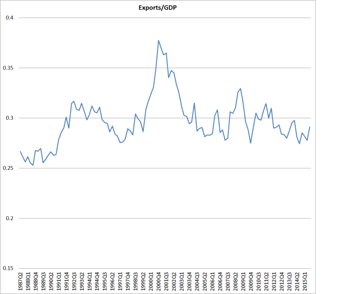
But what I really wanted to comment on today was the discussion of New Zealand’s external trade.

Westrate notes that exports accounted for a higher share of national income than in most trading countries –  “consistently near the top of the list”.  So far, so conventional –  I wrote a while ago about Condliffe’s observation a few years earlier that New Zealand in the 1950s had had among the highest per capita exports in the world.  But what caught my eye was that Westrate introduced a explicit discussion of how external trade might be even more important in New Zealand than it appeared, because of the high share of domestic value-added in New Zealand exports, mostly “agrarian commodities”.  Westrate was Dutch and had previously been a professor at one of the Dutch universities, and he notes that although the Netherlands, for example, has a higher export share of its economy than New Zealand “it is known that  exports from the Netherlands contain a good deal of foreign value.”  As he notes, the data didn’t exist to do the calculations, and indeed it is only in the last few years that the OECD and WTO have started producing good cross-country data in this area.  The story about the high domestic value-added share in New Zealand’s gross exports is now conventional wisdom, but probably wasn’t in the 1960s.

Having said that, if the story that New Zealand was one of the countries with the highest trade share in the world had once been true –  and quite possibly it was in the 1920s –  it doesn’t look as though it was in fact true by the time Westrate was writing –  which should not be too surprising given the heavy cloak of industrial protection New Zealand had put in place, that tended to reduce both the import and export shares of our economy.  Books and official reports from the period often compare New Zealand with the US, UK, Australia, Canada, France and Germany.  And for many purposes, comparisons with those countries might have been quite enlightening.  But when it comes to foreign trade, it is now well-recognised that large countries typically do less external trade as a share of GDP than the small ones do.  There are more markets, and more suppliers, at home than is likely to be the case for a small country.  When a large country has a very large trade share –  China pre 2009 and Germany now – it is often a sign of other imbalances.

Finding comparable long-term historical data is always a bit of a challenge.  But I had on my shelves a 1990 OECD compilation volume of historical statistics, with data on a wider range of variables (including exports of goods and services as a share of GDP) for 1960 for the “old” OECD countries.

For New Zealand exports as a share of GDP in 1960 were 22 per cent.

For the smaller Europeans (Netherlands and smaller), the proportions were:

Exports (good and services) as a % of GDP, 1960
Austria 24.3
Belgium 38.4
Denmark 32.2
Finland 22.5
Greece 9.1
Iceland 44.3
Ireland 31.8
Luxembourg 86.7
Netherlands 47.7
Norway 41.3
Portugal 17.5
Sweden 22.9
Switzerland 29.3

With a median of 31.8 per cent. (By contrast, for the G7 countries, the median was 14.5 per cent.)

As Westrate noted, we don’t have the data to know what the share of domestic value-added was in exports in 1960.  The first OECD date are for 1995.  But even by then, when domestic value-added of New Zealand’s exports was 83.2 per cent, the median for those smaller European countries was 76.4 per cent – lower than New Zealand, but not an order of magnitude different.  If –  heroically, and really only illustratively –  the same value-added shares had prevailed in 1960s, New Zealand’s export value-added would have been around 18 per cent of GDP in 1960, while the median European country would have been around 23 per cent of GDP

What of the present?  The latest OECD-WTO value-added data are for 2011 (I wrote about them here).  Over the intervening 16 years, the domestic value-added share of New Zealand’s exports barely changed, while the median of that same sample of smaller European countries had fallen sharply, to 67.3 per cent, as the importance of global value chains (especially within continental Europe) has increased sharply.

For the more recent period, we have much larger set of OECD countries to look at (many of them also quite small).  The data for exports as a share of GDP is available for 2014.  If we apply the 2011 domestic value-added share of exports, to the 2014 data on total exports, we get this pattern of domestic value-added in exports as a share of GDP.

domestic value add all oecd

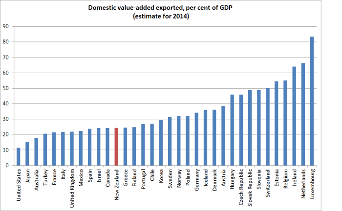
But what about “small” countries?  If we rank the OECD countries, there is a natural break between Belgium with 11 million people and the Netherlands with 17 million.  Here is the chart for the 19 OECD countries with populations of 11 million people or fewer (nothing would be altered by including the two countries with around 17 million).

domestic value added small oecd

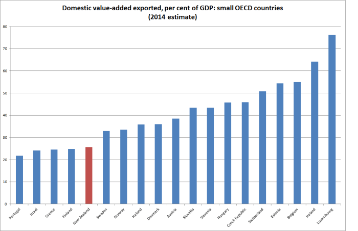
New Zealand isn’t the lowest ranking country on the chart, but those that are worse aren’t generally ones we would want to emulate.  Greece and Portugal speak for themselves –  and, indeed, the export shares for those countries are flattered by the weakness of the domestic economy at present.  Israel has had as poor a productivity record (and as modest per capita GDP) as New Zealand.  Finland had been performing well until 2008, but since then it has been one of the worst-performing economies in Europe, and its exports as a share of GDP have fallen sharply.

A customary response to the New Zealand data is to point out that remote countries tend to do less international trade that less remote ones.  By almost any measure, New Zealand is among the most remote of these countries.    But if trade with the rest of the world is a significant part of how smaller countries get and stay rich –  maximising the opportunities created by their ideas, institutions and natural resources –  shouldn’t we be more bothered about the implications of our remoteness?   New Zealand just isn’t a natural place to build lots of strong businesses, unlike – say – Belgium, Denmark, Austria or Slovakia.  That doesn’t mean such businesses can’t be built at all here, but it is an uphill battle.

And it has probably become more of an uphill battle in the last 20 to 25 years.  Gross exports have risen hugely among many of the European countries since 1995, but so has domestic value-added from exports (all as shares of GDP).  And it isn’t just the former communist countries emerging –  in Denmark export value-added as a share of GDP has risen by 7 percentage points,  and in Austria the increase has been 12 percentage goods.  In New Zealand, by contrast, there has been almost no change.  This isn’t some mercantilist story in which exports are good for their own sake –  but finding more markets for more stuff, enables people at home to import and consume more of other stuff.

As I’ve noted before, it looks as though New Zealanders have been responding – for decades now –  by moving to other countries, especially Australia, where the income prospects have been perceived as stronger.  But our governments have wrong-headedly sought to bring in lots more people, to more than replace those who are leaving.  Somewhat to my surprise, the quality of many of those people now seems questionable at best –  recall the most popular occupations for skilled migrants.  But the real issue should probably be whether continuing to aggressively pursue a larger population, as matter of policy, makes sense in a country that is so remote, and where not even the soil is that naturally fertile.  It is, in many respects, a nice place to live, but the ability to generate top-notch advanced country incomes for even the current population must be seriously questioned.  To do so, a small country needs to be able sell a lot more of it makes to the rest of the world than has New Zealand has been managing –  in the 1960s or now.

The government’s exports target rather crudely recognises the issue, but they have no credible economic strategy that might bring about such a transformation.

(And while climate change is not an issue that I pay much attention to, less rapid population growth through reduced immigration targets might also be a rather cheaper way of meeting somewhat arbitrary emissions targets.)

National savings

The annual national accounts data were released a few weeks ago by Statistics New Zealand. They got little media attention, which isn’t surprising, but I like fossicking in the spreadsheets. Apart from anything else, they provide an annual update on some of the longest official time series data we have. Australia has full national accounts data back to 1959, and the United States provides official data back to 1929, all on current methodologies. By contrast, we have real quarterly data only back to 1987, and annual nominal national accounts data back to 1972.

The (flow) national savings rate has had a lot of focus in the New Zealand debate over the years. Indeed, early in the term of the current government, there was even an official Savings Working Group. A lot of discussion focuses on household savings, but I prefer to focus on national savings (ie the savings of New Zealanders, New Zealand-owned companies, and the New Zealand government). It provides a good basis for international comparisons, and isn’t messed up by the somewhat-artificial boundaries between households, corporates, and governments.

I also prefer to use net savings data rather than gross savings (the difference is the estimate of depreciation, or “consumption of fixed capital”).  Net savings is the real resources added to wealth.  And if I’m using net savings data I need to use net national income data.

As I highlighted a few weeks ago, our national savings rate has been relatively low by the standards of the typical OECD country. And it is really quite low when compared with the net national savings rate in Australia – but it has been for decades, including the period well before Australia introduced compulsory private superannuation savings. On the other hand, our net savings rate has been strikingly similar to median of the other Anglo countries.

This is what the chart looks like, starting in the year to March 1972, and end in the year to March 2015.

net savings to nni nz
Of course, the sharp fall in the series at the start of the period really catches the eye. But the other thing that strikes me is just how stable average the savings rate has been over the subsequent 40 years, fluctuating around 5 per cent. As you’d expect, it falls quite sharply in recession (see 1991 and 2008/09) – corporate profits tend to fall in recessions, and fiscal deficits widen – but since 1975 there has been no trend in the series at all [1] .

Which creates difficulties for those looking for explanations for our relatively modest national savings rate:
• Some reckon tax incentives might help. But actually we had a very generous tax treatment of superannuation and life insurance until the late 1980s, and a rather ungenerous one (defenders would say “neutral”) since. But the difference isn’t visible in the aggregate data.
• Some reckon a liberal approach to New Zealand Superannuation might explain something. But in the years to March 1975 and 1976 we had a compulsory private scheme, then we had very liberal universal NZS at 60, then we had means-testing and a fairly rapid increase in the age of eligibility. None of it is very evident in the data.
• Some talk about “wealth effects” from rising house prices dampening savings. But the biggest house price bust in modern New Zealand history was after 1974, and the biggest boom was over 2003 to 2007. None of it is very evident in the data.
• The (non-superannuation) welfare state has got bigger over the period, while tertiary education went from being largely “free” for a small group of people, to really rather expensive for a huge number of people. None of it is very evident in the data.
• Some reckon financial liberalisation will have dampened savings, enabling people to bring forward consumption in ways they couldn’t previously. The real freeing-up of the system didn’t start until the mid 1980s. But the difference isn’t obvious in the aggregate data.

• Kiwisaver hasn’t been compulsory, but the take up was sufficiently large that if advocates had been told in advance that it would be that high most would have thought it would have boosted national savings rates. But neither in the more formal research nor in a simple chart like this is it particularly evident.

I’m not suggesting none of these factors made any difference. I’m sure in many cases they did, and (for example) the increase in the NZS eligibility age helped put the government in the position of running large surpluses in the years leading up to the 2008 recession (which was also the peak in the national savings rate). But it isn’t easy to point to a single factor, or even an identifiable set of factors, to explain New Zealanders’ savings choices. An alternative way of saying that is that it is not easy to point to what one might change if one were convinced (which I’m not) that the national savings rate is a policy problem. 40 years of a constant mean is really quite a long time.  More-formal modelling might shed some light, but I wouldn’t be optimistic.

Discussions of savings often focus on households, and then secondarily on the government’s own finances. But they tend to ignore the role of business savings. I’ve wondered whether the modest rate of national savings partly reflects the perceived lack of profitable opportunities in New Zealand. As I’ve pointed out before, business investment as a share of GDP has been quite low in New Zealand for decades, and less than one might expect in a country with quite a fast-growing population (Austria or Belgium need to devote a smaller share of their income each year to adding new shops and offices etc than, say, New Zealand or Australia do). Firms might save more if the growth prospects were better – if, say, real interest rates were nearer those in the rest of the world, and if the real exchange rate had been lower. But in that case, savings rate wouldn’t be the cause of any problems, but just another symptom.

It is one of those areas where better data might help shed a little further light. What was going on with that fall in the national savings rate in 1974/75? It looks a lot like the impact of the collapse in the terms of trade.  But the savings rate has never recovered, and we don’t even know if it was exceptionally high in the early 1970s.  Contemporary estimates suggest that business savings were almost half of private savings – from perhaps a third a decade earlier. Unfortunately, the earlier estimates aren’t compiled on the same basis as the modern national accounts. For what it is worth, here is a chart for the full period since 1954/55, using data published in the New Zealand Official Yearbooks (in this case the 1975 one). There is a hint of national savings rates rising in the late 1960s and early 1970s, but it is hard to know, and hard to know whether the average savings rate for the last 40 years is really lower than it was in the earlier post-war decades.

net savings to nni 2
Surely we should be funding Statistics New Zealand – or at a pinch some good academic researcher – to produce longer backdated series of our national accounts. Better data on its own probably wouldn’t answer all our questions about New Zealand’s longer-term economic performance, but it surely couldn’t hurt. Would it provide value to the plumber from Masterton? Hard to tell, but good data at least opens the possibility of better policy.

NB: Before anyone comments, this post is dealing entirely with the flow rates of savings from current income.  It is not dealing, at all, with stock measures of wealth, or how they might aggregate to some sort of national balance sheet.

[1]  In the years of high inflation and high public debt, the story is a little complicated because much of what is recorded as interest is in effect a principal repayment.  Grant Scobie (and co-authors) looked at that effect here.

The wealth of nations, and democracy

Yesterday I went to a fascinating guest lecture at The Treasury, by Stephen Haber, a professor at Stanford, who is currently visiting New Zealand as the Reserve Bank and Victoria University professorial fellow in monetary and financial economics.  Haber was the co-author of the very stimulating recent book Fragile by Design: The Political Origins of Banking Crises and Scarce Credit, a comparative study of banking systems. I’ve been meaning to blog about this book for months.  To the extent that Calomiris and Haber are correct (and I’m not sure how far that is) the case for intrusive banking supervision and regulatory restrictions – of the sort the Reserve Bank is increasingly adopting  – in countries like New Zealand is materially undermined.

But yesterday’s lecture was on something quite different.  His topic was “Climate, geography, and the origin of political and economic institutions”.  It is continuing work, building on the earlier observation that stable democracies –  of which there have not been many – cluster in regions of moderate rainfall.  In the words of the abstract of a 2012 working paper:

Why are some societies characterized by enduring democracy, while other societies are either persistently autocratic or experiment with democracy but then quickly fall back into autocracy?  I find that there is a systematic, non-linear relationship between rainfall levels and regime types such that such that stable democracies overwhelmingly cluster in a band of moderate rainfall (540 to 1200 mm of precipitation per year), while the world’s most persistent autocracies cluster in arid environments and rain-forests. This relationship is robust to controls for the resource curse, as well as to controls for ethno-linguistic fractionalization, the percent of the population that is Muslim, disease environment, and colonial heritage. I advance a theory to explain this relationship, focusing on differences in the biological and technological characteristics of the crops that can be grown in different precipitation environments. Variance in the biological and technological characteristics of crops generated variance in producers’ strategies to solve problems of scarcity, giving rise to variance in the distribution of human capital and institutions associated with the protection of property rights. Democracy was more likely to thrive in environments in with a high level and broad distribution of human capital, and with institutions that protected property rights. I test the theory against a unique cross-country dataset, a comparison of democracies and autocracies in antiquity, and a series of natural experiments.

The current work takes these ideas further and builds on the work of plenty of other scholars trying to better understand what accounts for the widely divergent, and apparently deeply-rooted differences in outcomes across countries.   Haber’s claim is that climate and geography explain between a third and a half of the variance across countries in GDP per capita and in where countries stand in democracy rankings.  Here geography is not the ideas of remoteness from the rest of the world I was toying with last week, but something more about the ability to grow, store, and transport (and thus trade) food.  Places with flat land and navigable rivers or coastlines score well.  Rocky valleys don’t.

In Haber’s story, certain climates and geographies pre-condition societies to developing market-based institutions and effective but limited governments that eventually lead to greater prosperity, innovation, and democracy.  In his story, for example,  England is a place where grains can be both grown and readily stored, and transported, and where there are few extreme climate shocks that might historically have threatened whole societies. Trade requires effective enforcement of private property rights.

Others places are more naturally favourable to the development of strong central governments, which can discourage innovation.  Haber here cites both Egypt and China, and argues that the propensity to flooding naturally lead to strong central governments as a risk-management device (the biblical story of Joseph, central managing grain reserves, featured as an example of the “insurance state”). Such societies discourage any innovation that might threaten the perceived self-interest of the state.  Others places again  –  think of Pacific islands –  are prone to severe adverse climatic events, but also have climatic/geographic conditions that don’t allow the production of storable foods (eg grains), and so there are no incentives to develop the institutions that protect property rights and the development of markets.  Stealing vast quantities of grain in northern Europe would have been very valuable – it lasts a long time –  but stealing bananas in Fiji would not.

I don’t lay claim to any great expertise in this area, but for what it is worth much of what Haber had to say rang true in understanding some of the differences across some countries –  England vs Egypt/China vs Vanuatu for example.  But then again, it is not so many centuries since China was the richest (per capita) economy in the world.  Plenty of scholars try to explain the subsequent great divergence.

But I was uneasy about two things.  First, democracy is really rather a new thing, at least in its current forms.  Perhaps in a  hundred years from now it will be the established and standard form of governance everywhere, in which case Haber’s work might be useful only in explaining in which countries democracy developed first.  Then again, perhaps democracy will prove to have been a short-lived fragile flower, and the pool of countries with democratic systems could look much smaller than it does today.  After all, 80 years ago many of the countries of Europe were far from democratic, and if anything democracy might have looked to be in reverse.  Who is to say it couldn’t happen again?  Perhaps it just reflects my economics training, but differences in wealth look more persistent that differences in how much democracy there is, and is probably a better focus.  Apparently, Taiwan is less prone to adverse climatic shocks than mainland China, but the contrast –  for now at least –  between a rowdy democracy on one side of the strait, and the Communist Party’s rule on the other side, cautions against too much geographical or climatic determinism.

But closer to home,, I was uneasy was about whether his story –  whether about democracy or prosperity – could usefully explain much about a country like New Zealand (or Australia, Canada, the United States, Uruguay, Chile, Argentina).   By world standards, each of these countries is pretty well-off –  the last three less so than the others.  The first four have been among the world’s most democratic countries, and even the Latin American countries haven’t exactly been China –  Uruguay and Chile had some well-established democracies, with some brief unfortunate interruptions.

The climate and geography of these countries is much the same as it was 200 years ago, or 500 years ago –  ie in Haber’s terms well-suited to the emergence of democracy and prosperity.  And yet I don’t think there is anything in the pre-history of the territories of those modern countries to suggest that the indigenous societies in any of them had the nascent qualities that were about to lead to the emergence of societies that were among the most democratic and prosperous on earth.

Of course, it isn’t that climate is irrelevant. But the channel is different than Haber seems to recognise.   British settlers were willing to settle en masse in New Zealand or Canada because the climate and geography were conducive (by contrast, when British missionaries went to west Africa in the 19th century it was not uncommon for them to take coffins with them, so high was the mortality rate).  But what would modern day New Zealand or the United States look like if, for some reason, there had been no international migration?  Haber’s hypothesis seems to suggest that they should have been rich and free.  I rather doubt it.  Unfortunately, there are no natural experiments –  countries with good geography and climate that remained largely unsettled by Europeans.  Perhaps South Africa is the nearest example, and I wouldn’t have thought it was particularly supportive of Haber’s case.

There were opportunities in New Zealand, Australia, Canada and the United States which people from rich and successful countries (mostly the UK, but not exclusively – see Quebec, or the Spanish influence in the US) forcefully took advantage of.  The riches and success provided Britain with the military and political strength to enable new societies to “invade” and largely replace the cultures and institutions that had been in those societies previously, but which had not developed technologies that enabled them either to flourish, or to fend off the influx from Europe.  There probably wasn’t too much unique about Britain –  had the Napoleonic Wars gone the other way, more of the colonies of settlement might have been French rather than British –  but the influxes at the time when lowering transport costs made mass seaborne migration feasible were inevitably Northern European. It isn’t a particularly attractive picture, but that is what it was –  those who had developed wealth and power (and the associated successful institutions) displaced those who had not utilised the potential of those climatically and geographically favoured lands themselves.

I’ve been attracted to work of Bill Easterly in this field, who has asked “Was the wealth of nations determined in 1000 BC?” He found that differences in technology levels across countries were remarkably persistent over time, even going back as far as 1000 BC (although his focus was on differences in 1500AD).  But as his work developed, he took explicit account of the role that large scale immigration played in transplanting technology and institutions from one geographical location to another.  People make a difference.

Here is his scatter plot of the relationship between the technology levels in each country and current GDP per capita.  New Zealand, Australia, Canada and the US are in the top left hand corner: poor technology in 1500, but high incomes now.

easterly1

And here is the follow-up chart, incorporating the technologies in 1500 of the peoples who now live in those countries.  Mass migration wasn’t an issue for most countries, but it certainly was for New Zealand, Australia, Canada and the United States.  If you look carefully, you’ll spot a NZL towards the top right hand corner of the chart  (the other colonies of settlement are buried in that cluster too).

easterly

I’ve often been critical of the Reserve Bank and even The Treasury on this blog. But credit should go to them for hosting a fascinating visitor such as Haber, and to The Treasury for yesterday’s open seminar.