Lessons from the losers: Reflections on (Struan) Little

As I noted a few weeks ago, about fifteen years ago Struan Little, then at The Treasury, sparked my interest in Uruguay, and comparisons between its long-run economic performance and that of New Zealand.  When I wrote that earlier post, I searched around to see if anything Struan had written on New Zealand’s economic performance was on the web.    Nothing was now, but it became clear that something had been.  Various old articles (eg here) referred to a paper released at the end of 2001 by Treasury, drawing “lessons from the losers” –  other reasonably advanced. reasonably democratic, countries, or regions, with some similarities to New Zealand, which had also done poorly.   The paper had even been cited by the IMF in one of their Article IV reviews of New Zealand.

The author no longer had a copy of the paper, but fortunately Treasury was able to track it down for me.  The OIA response should be on their website before too long, but in the meantime here is the document itself, “Growth and Policy in other countries: lessons from the losers”, dated 31 October 2001.

Lessons from the Losers by Struan Little

As Treasury is at pains to note, this was a personal thinkpiece, and although it was publicly released back in 2001 to influence debate and discussion, it was never finalized.  It isn’t a long paper (12 pages of text), so couldn’t cover everything, or document every caveat or qualification, but papers like this help us see the issues in slightly different ways.  It is to Treasury’s credit that they made space for the work to be done, and then put it out proactively for discussion.

In his stimulating paper, Little thinks about New Zealand’s experience in light of  eight comparators, four of which he saw as having had a “disappointing economic performance over a long period of time”

  • Uruguay
  • Switzerland
  • Tasmania
  • Atlantic provinces of Canada

And four of which “have gone through very difficult periods but moved on to become some of the richest economies in the OECD”

  • Denmark
  • Finland
  • Iceland
  • Ireland

The inclusion of Switzerland might surprise some, since it is –  and consistently has been –  one of richest countries in the world.  But its productivity growth had been strikingly weak over several decades.  Overall, it is a fascinating alternative lens to look at New Zealand’s experience through  – a contrast to, say, simply looking at the US or the UK, or even the OECD as a whole.

To structure his discussion, Little drew seven “broad lessons”

  1. Losers can’t be saved.    He isn’t quite as pessimistic as this sounds but observes “once you are gifted with the “loser economy” tag, there is no single policy (or even groups of policies) that can easily reverse this decline”.
  2. Don’t just blame size and distance.
  3. We spend a lot on education and training but do we get results?
  4. Technology-Driven Productivity Growth Went Out with the Tech Bubble. NZ firms don’t do much (that is classified as) R&D spending, but “the links between R&D and economic success are not clear”.
  5. You are either on the internationalization bus or plugging through the mud. NZers attitudes to internationalization weren’t very positive, and the volatility of the real exchange rate had been a problem, holding back our tradables sector/
  6. Social consensus matters
  7. Are individual interventions effective?
    • Size of government doesn’t matter
    • Centralisation isn’t all bad
    • FDI can help
    • Public infrastructure investment can be a waste of money

His own view, in conclusion, was that three policy areas were paramount for New Zealand, if it was to sustain a higher growth rate in future

  • Sound and stable macro policies, with a particular emphasis on a less volatile real exchange rate.
  • A shared social vision as to New Zealand’s future
  • Greater internationalization (changing attitudes, more emphasis on trade agreements, and “perhaps greater assistance to exporters”.

Any 15 year old paper on a topic of this sort is going to read a bit oddly in places –  at the time, for example, Italy was cited as an example of a notably successful economy (unfortunately it has had no per capita growth at all since then).  And although all of his four success stories remain much richer than New Zealand, each has had a new very rocky time in the last decade or so.

And whatever any author writes on a topic like this is going to be partly a product of his/her experiences and context.  2001 was two years into the first term of the Labour government, and I suspect Michael Cullen would not have been unreceptive to many of the sorts of messages in this note (which is perhaps why Treasury was able to publish it).

But I wanted to comment on one of the strands of policy Struan emphasizes, and then highlight a few that I was interested to find no mention of (perhaps partly reflecting the fact that today’s context is different to his).  And then offer a few thoughts on whether “losers’ can be saved.

The first is the volatility of the real exchange rate.  Little notes the materially greater volatility of New Zealand’s real exchange rate than those of Denmark, Iceland, Finland, and Ireland and observes:

“I see this as one of the key reasons why our export performance has been relatively weak compared to more successful economies.  While more extreme than New Zealand, the experience of Uruguay and the Southern Cone countries shows than an upward appreciation of the real exchange rate can undermine a reform programme and prevent a country from getting out of a low growth trap……..I would hope that improvements in our monetary framework may resolve the real exchange rate issue.”

What was the context?  We had had a relatively volatile real exchange rate in fifteen years since the exchange rate had been floated.  In 2001 the real exchange rate was actually very low –  only just off its all-time lows –  but there had been a lot of recent focus on the conduct of monetary policy.  In fact, Struan and I had been the bulk of the secretariat to Lars Svensson’s review of New Zealand’s monetary policy arrangements, which had been commissioned by the incoming Labour government –  concerned about the exchange rate, and disconcerted by things like the Bank’s unfortunate Monetary Conditions Index experiment.  That inquiry had reported earlier in 2001.

The Reserve Bank has always cautioned against emphasizing the volatility of the real exchange rate as a factor in New Zealand’s economic underperformance. As various people have noted, our real exchange rate is not extraordinarily volatile by advanced country standards –  which sample you compare it with matters a lot –  and much of the volatility reflects the real and financial external shocks the country faces. I largely agree with the Bank’s perspective on this issue –  and it isn’t obvious that much could be done to attenuate the big cycles in the real exchange rate anyway –  but we need to be open to the possibility that the impact is greater than we realise (if, eg, fluctuations in commodity prices contribute directly to exchange rate fluctuations, making it very difficult for other industries to successfully emerge and compete internationally).  But changing the details of the monetary policy framework isn’t likely to make much difference –  we’ve been through a wide variety of regimes over the decades, and had quite big real exchange rate fluctuations in each of them.

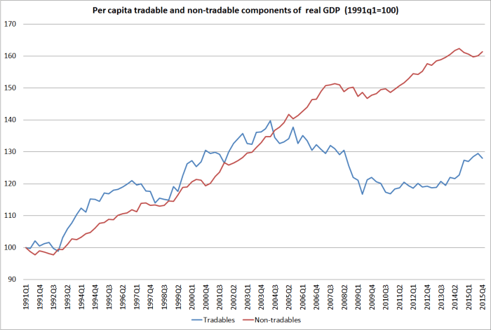
I’ve been more concerned about the average level of the real exchange rate.  Right from the early days of the reforms, experts (themselves supportive of the reform programme) have emphasized the importance of a lower real exchange rate as part of a path towards rebalancing the economy and establishing a stronger growth trajectory.  It was the Reserve Bank and Treasury view as far back as 1985.  Leading international scholars like Anne Krueger and Sebastian Edwards re-emphasized it –  partly in reference to the Latin American experience Little alludes to in the quote above.   It isn’t a line that is so widely heard in the mainstream these days, but the failure to achieve any per capita growth in New Zealand’s tradables sector in the 15 years since Little was writing suggests that the issue has not gone away.  Our persistently high (relative to other advanced countries) real interest rates look to be related to the failure of the exchange rate to adjust –  but that gap wouldn’t have been so evident in 2001.

T and NT components of real GDP

Reading through Little’s paper yesterday, three omissions struck me:

  • first, there was no specific mention of Auckland whatever.  I’m not critical of that  –  as I’ve made clear, I think the policy focus on growing Auckland is seriously misguided –  but one could not imagine a similar paper today not touching on the Auckland (and agglomeration) issues.
  • second, there was no mention of taxation and particular not the taxation of capital.  Perhaps it isn’t a material explanatory factor, or a tool that might make much difference, but the Irish experience with a very low company tax rate, and the Nordic experience with setting tax rates on capital income much lower than those of labour income look as though they should be candidates for inclusion in a list of explanatory factors.
  • third, there was no mention of immigration (policy) at all.  Emigration –  from all the “losers”  – got a mention, but not the role of policy-facilitated immigration of non-citizens.  Perhaps it just reflected the times – overall net immigration was quite modest around the turn of the century –  but the scale of our non-citizen immigration programme, unparalleled in the other countries and explicitly seen as an economic growth lever, looks as though it probably should have rated a mention of some sort.  (Of course, the paper was written just before the New Zealand house price boom started, so not even immediate house price effects of immigration were salient then).

Perhaps relatedly, in his final section Little talks of the contrast between fixed and mobile factors of production, emphasizing labour (“at least to an extent”) and social institutions as fixed factors.  It was a surprise that, in an economy whose exports are overwhelmingly natural resource based, our land wasn’t considered as an important fixed factor –  an opportunity and, perhaps, a constraint.

I’m explicitly not writing to criticize Little’s paper.  There is so little good material on these issues, and his note offers a lens that helps stimulate one’s thoughst even when not fully agreeing with it.  But there is perhaps one area where experience might suggest he was a little too pessimistic.  Even his “losers” can, it seems, turn themselves around, at least to some extent.

Of course, even in 2000 we knew that in some cases –  the better countries of Eastern Europe were already rebounding from the dark decades of Communist rule.  But it seems to have been true of some of Little’s losers too.

Switzerland’s productivity growth still isn’t stellar, but the Swiss have very large net foreign assets. I checked the net national income per capita data from the OECD this morning, and over the last 15 years, Switzerland –  already richer than most –  has outstripped growth in the OECD as a whole, and in the United States in particular.

For Uruguay, I showed this chart a few weeks ago, of TFP growth over the last couple of decades.

uruguay nz 4

Uruguay has a long way to go, but they’ve made an impressive start.

And what about Tasmania?  The Australian state GDP data start from 1990, and Little writing in late 2001 discusses the record in the 1990s.  Here is how NSW and Victoria, on the one hand, and Tasmania on the other have done over the subperiods 1990 to 2001 and 2001 to 2015.

real gspQuite a rebound in relative performance.

New Zealand, meanwhile, has shown no signs of even beginning to close any of the big gaps in productivity  –  if anything, on many measures they are still widening.

In terms of my narrative of New Zealand’s policy problems, one thing that marks out territories, states or regions from countries is that the former do not have an immigration policy.  Population growth in Tasmania may be very slightly influenced by Australia’s overall immigration programme, but largely people move to Tasmania only if the relative opportunities within Australia are better in Tasmania than they are elsewhere in Australia.    Tasmania looks like the sort of place –  like my story of New Zealand –  that can generate good incomes for a small number of people.  And in the last 25 years, Tasmania’s population has increased by around 12 per cent, while the populations of New South Wales and Victoria have increased by more than 30 per cent.   By contrast, in New Zealand’s case, the central government’s immigration policy directly boosts the population of the entire country.  Unlike Tasmania, we’ve had more than 35 per cent population growth since 1990, mostly concentrated in Auckland.  In such an unpropitious location for economic activity, it has just made it that much harder to even begin to close the income gaps.

Old papers aren’t to everyone’s taste, but the issues Little’s paper treats (or those treated in my own speculative entry to the field from a few years ago) haven’t gone away.  Unfortunately there is little sign of our political leaders –  government or opposition –  really doing much to reverse the decline of this “loser”.


Regional GDP revisited: has Auckland really been that weak?

In a couple of posts earlier last week, I used the regional (nominal) GDP data, showing how weak Auckland’s per capita GDP growth appears to have been over the last 15 years (the period for which the data exist).   And it didn’t appear that terms of trade changes could explain the regional patterns, since most of the gains in New Zealand’s terms of trade has reached our shores in the form of lower import prices, the effects of which should have been quite pervasive across the economy.

But as I got to the end of the second of those posts, I started to get a bit uneasy about the data.  I had noted that over the 15 years, Auckland’s population had increased by 30 per cent, and that of the rest of the country by only 13 per cent.  And yet, over the years (to 2013, for which we have detailed industry breakdowns), construction had been a smaller segment of Auckland’s GDP than in most other regions in the country. This was the chart:

construction share of gdp

I started digging into the data a bit further, and also got in touch with Statistics New Zealand (who provided me with some prompt, very helpful, assistance, including suggesting that some readers might be interested in how they put the numbers together).  My digging didn’t resolve any puzzles, but it didn’t highlight any very obvious errors either.

In a city with a rapidly growing population one would normally see a larger share of GDP devoted to construction (than at other times, or other places).  Construction isn’t just about houses, but the whole panoply of structures that a growing population needs over time.

Over the 15 years to 2015, Auckland accounted for 50 per cent of all the population growth in New Zealand.  And yet here is the Auckland share of the value of all building consents, and the Auckland share of the construction component of GDP (for which we only have regional data to 2013).

akld consents

One wouldn’t expect an exact mapping, since the two series are measuring quite different things (quite a bit of construction won’t need a building consent), but both are a long way below Auckland’s share of population growth  (and Auckland’s share of population growth was highest in 2001 and 2002).

The regional GDP data also have two components that should normally have a strong relationship with housing, and also with population growth.  These are:

Rental, hiring, and real estate services
Owner-occupied property operation

The latter series is straightforward –  in effect, the rental value of living in an owner-occupied house, which is proxied using market rental data.

The “rental, hiring, and real estate services” is more complex.  It includes various sub-categories, for which the data are not provided separately.  Here is what is included, from a table SNZ sent me:

reg gdp categories

Ideally, I would like to look at only the LL12 and LL2 components, and thus exclude the non real estate leasing services (eg cars, machinery etc), but the data aren’t publicly available.

Surely, I thought, if Auckland’s population has been growing so much faster than the population in the rest of the country, this should be reflected in faster growth in these components of GDP.  I didn’t really expect it in respect of owner-occupied dwellings, because although Auckland rents have risen a bit faster than those in the rest of the country, rates of owner-occupation have been falling faster.  But everyone needs to live somewhere, renting if not owning, so I thought the effect should still show up if I combined the two components.  After all, the rental component also includes non-residential property, and more people generally implies more offices and shops too.

But this scatter plot is what I came up with (population growth on the x axis and growth in the sum of the two GDP components on the y axis):

housing scatter plot

I’d expected to see an upward-sloping relationship (recall, these aren’t GDP per capita components, but total GDP).  As I put it to SNZ, isn’t it a bit puzzling that growth in these two nominal GDP components over 13 years was greater in Southland than in Auckland?  Given where all the other regions sit, in a well-functioning housing market surely one might have expected the growth in these GDP components for Auckland to be up in the 140 to 160 range?

SNZ were able to tell me that there was a large growth, from a low base, in non-financial non real estate asset leasing in Southland.  That might help explain why these GDP components together grew surprisingly fast in Southland.  But it doesn’t explain why Auckland has been so weak relative to almost all the other regions (given the extent of its population growth).

Here is a chart showing Auckland’s share of total nominal GDP for each of these two components.

akld shares

And yet over this period Auckland’s share of the total population increased from 31 per cent to 33.5 per cent.

I guess that, overall, this is not wholly inconsistent with the divergence that has opened up in the population per dwelling numbers: trending down in the rest of the country but not in Auckland as house prices become increasingly unaffordable.

Out of curiosity, I redid the per capita regional GDP numbers excluding these two real estate related components.  In my original chart, Auckland had the third slowest growth in nominal per capita GDP from 200 to 2015.   In this alternative chart, we have the data only to 2013.    Over that period, Auckland had the slowest per capita total nominal GDP growth of any region.

What about on this adjusted, non-real estate, measure?

adjusted regional GDP growth

It doesn’t improve the picture.

I’m still not quite sure what to make of all this.  Ideally, we would have regional real GDP  data, but unfortunately that does not appear likely any time soon.  But on the basis of what we have, Auckland seems to have done particularly poorly over the last 15 years, despite (or partly because?) all the policy-induced population growth.  Some of that seems to relate to the poorly functioning housing supply market.  But even abstracting from the direct effects of that, it has to be seen as a pretty disappointing outcome, leaving many questions on the table.

(It also leaves me with some new questions, which I have not yet attempted to work through in my own mind, about my explanation for New Zealand’s persistently high (relative to other countries) real interest rates.  A topic for another day.)


An underperforming taxpayer subsidised industry

Getting diverted again on Saturday, because of yet another road closure to assist the film industry, reminded me that I had been intending to write briefly about the screen industry data Statistics New Zealand released last week.

Perhaps I missed the coverage in the local papers, but the only media story I’ve seen on these data was in the Wall Street Journal, in a story headed “With no hobbits, New Zealand movie industry is hobbled”. The author quotes a US industry figure observing that “New Zealand is a global hub for filmmaking with an exceptional reputation”. Perhaps, but the numbers don’t seem to be moving in the right direction.

Gross revenue of screen industry businesses was $3221 million last year, slightly up for the year, but still 2 per cent lower (in nominal terms) than in 2012.

Gross revenue from production and post-production of feature films was (down a lot last year and) less than half of that in 2012.

There are almost 10 per cent fewer jobs in the screen industry than there were in 2005 (and while I promise not to keep mentioning it, New Zealand’s population is a lot larger than it was in 2005).

And this in an industry where 40 per cent of the revenue for “production” comes from the New Zealand government: it makes the export incentives in places a few decades ago to encourage non-conventional exports look niggardly.

Statistics New Zealand also recently released a detailed breakdown of exports of servces for 2015.  Here is how exports of “motion picture production services” have gone over the last few years.

movie exports

There has been some growth in “Radio, TV, and other artistic services” but nowhere near enough to offset the fall in the movie side of things.

SNZ also reports some industry value-added estimates, but the most recent data relate to 2014 financial years.

screen industry VA

Presumably the 2015 numbers will be lower.

And although much the hype is around Wellington –  still important on the movie side of things – what is striking is the decline in the industry in Wellington.

screen gross revenue wgtn

Another way of seeing this over a longer period is to turn to the regional GDP numbers.

The published numbers don’t identify film or screen industry activities separately.  But they do have a category called “Information media, telecommunications and other services”.  Much of the screen business activity must be included in that industry segment.   But here is how the share of this industry segment in GDP has behaved for Wellington on the one hand, and for the median New Zealand region on the other.

film share of gdp

As I’ve noted in earlier posts, the industry breakdowns of the GDP data are only available to 2013.   When it is available, the relative picture for Wellington is likely to be even worse by 2015.

The Wall Street Journal article summed up the subsidies.

New Zealand, along with the UK, Canada, and several US states, offers incentives for businesses producing films here.  A cash grant was increased to 20%, from 15%, from 2014 –  partly to clinch the “Avatar” deal.  This allows international productions to claim back 20% of the money they spend in the country.  Some productions receive an additional 5% rebate.  And local ones receive a 40% grant.

Even MBIE was opposed to the increased subsidies.   The industry has the feel of a sinkhole, into which public money is poured with little very evident payoff.  At least when we subsidized manufacturing exports in the bad old days, we got more of them.  But screen industry exports have been falling.

The head of the government’s Film Commission is quoted as saying “we need to keep growing.  We want those jobs here”.   But do we?  If so, why?  And at what cost to the rest of us.  (And as the SNZ data show, most of these jobs aren’t even particularly well remunerated.)

Ah, but “industry experts say that the movie business’s economic contribution cannot be measured by revenue alone”.  Tourism spinoffs are apparently the thing.  WSJ readers are told of tourists spotted along “Miramar’s main retail strip”, but perhaps won’t appreciate that Park Road isn’t exactly Hollywood Boulevard.  More importantly, perhaps, as I highlighted last week, although tourism had a good year last year (and export education as well), New Zealand’s overall services exports remain weak by international standards (especially for small countries) and have been some of worst-performing among advanced economies over recent decades.

services X change since 2005

We massively subsidise the film industry with direct subsidies.  We also subsidise the tourism industry with the rapid expansion in working holiday programmes –  this time, the subsidy isn’t direct from taxpayers, but from lower-end New Zealand workers facing greater competition from temporary foreign workers.     Much the same could now be said for export education.

And yet we have so little to show for it all.  A better class of cafes in Miramar perhaps, but not much beyond that.  Sadly, it is all too typical of the disappointing New Zealand story –  although perhaps made worse by the direct government hand in these industries.


Tourism & services exports: more underperformance

Somewhere the other day I noticed a job advert (no, I wasn’t looking) for a role in tourism policy at MBIE.  I guess one has to do a bit of a hard sell to get good policy analysts to work in such a minor area of government, but the rather over the top claims (‘high profile portfolio’, ‘make a difference to New Zealand’s economy’)  irked me a bit, so I dug out a bit of data.

The World Bank has collated data on international tourist arrivals for a huge range of countries and territories.   For these purposes, “tourist” includes most business visitors (anyone not visiting for a purpose directly remunerated from within the country visited).  The World Bank data comes with quite a few health warnings –  countries collect data in different ways, some only capture those staying in hotels for example, and I presume in the Schengen area there is no real way of capturing day trippers.   Being an island, and with our good international arrivals cards, New Zealand’s data are pretty comprehensive, with little risk of undercounting.  On the other hand, no one comes to New Zealand for an afternoon’s shopping.

In 2014, France had around 83 million visitors.  New Zealand was the 66th most visited country in the world with 2.8 million visitors, wedged between Qatar and Uruguay (I’ve noted previously that the beaches looked nice in Uruguay).  Remarkably, although I know almost nothing about the country, the Kyrgyz Republic comes in just ahead of Qatar.

What about the number of visitors per capita?  I only bothered looking at the places with at least one million visitors a year.  Even so, some tiny places top the list – Andorra, reportedly has 32 visitors per capita each year, and Macao (less surprisingly with all those casinos) 25.    Here is a chart (lopping off the tiny places at the top).

international visitor arrivals

We do considerably better than Australia, of course, but we are still a long way down the chart.    And that isn’t really that surprising.  After all, we are long way from almost anywhere, which means it is really expensive (time and money) to get here.    The upside is that the median visitor here probably spends more than they do in most of the other places –  having spent so much to get here, you tend to stay a bit longer –  but it doesn’t have the feel of an industry with massive growth potential (and that is setting aside the point various other commentators make, that tourism is neither a high productivity sector, nor one with huge apparent productivity growth opportunities.  Which is not to decry tourism.  Most of us like holidays.

I also dug out the data for OECD countries on exports of services.  International tourism is classified as a services export, and for New Zealand it is a very large component of our services exports.  But that isn’t so everywhere.

Here is the share of services exports in GDP last year.

services exports oecd
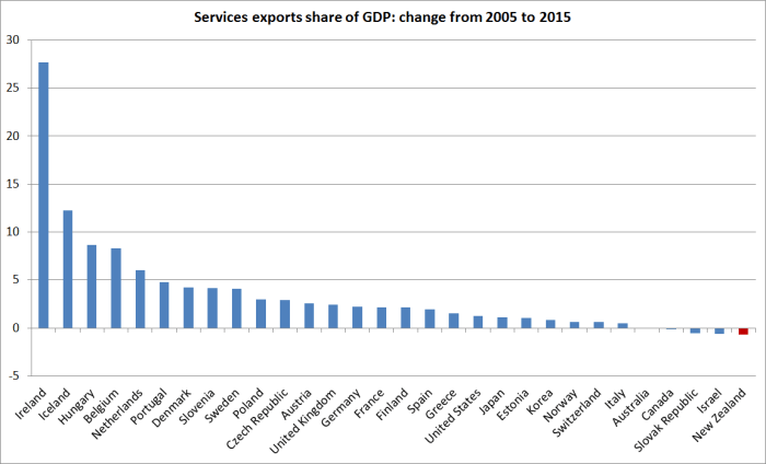
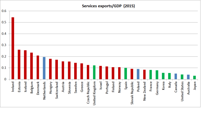
Large countries don’t tend to do as much international trade as small countries –  they don’t need to, there are plenty of opportunities and markets at home.  I’ve highlighted the large countries (more than 40m people) in green, and the small countries (under 11m, where there is a natural break) in red.  New Zealand has the lowest services export share of any of the small countries (and, by the look of it, the lowest real dollar value of services exports as well) .  Of course, we are much more remote than the other small countries, but it just highlights the difficulty of generating really high incomes for lots of people in a place so distant.

(I don’t purport to understand the Irish numbers, although I assume much of it has to do with tax.)

And it isn’t as if the picture has been getting better.  Here is the change in the services exports share of GDP (in percentage points) over the last decade.

services X change since 2005

If one looks at a 20 year history rather than just 10 years there are fewer countries to compare with, and New Zealand’s relative performance isn’t quite so bad.  Over that period we were only 4th worst.


Can the terms of trade explain Auckland’s apparent underperformance?

My post follow-up post yesterday on Auckland’s surprising weak performance in the regional nominal GDP data over the last 15 years prompted a reader to get in touch suggesting that changes in the terms of trade over the period were sufficient to explain why the provincial areas generally seemed to have done well, and Auckland and Wellington had not.

I had been conscious of the possible role for terms of trade changes in explaining the patterns –  these, after all, were nominal GDP data, and ideally we would have liked real series – but hadn’t gone much beyond that.

To see the issue, I’ve set up a very simple stylized version of New Zealand.  This New Zealand has just two, highly stylized, regions.  One produces all the foreign exports of the country (Region A), and the other (Region B) generates lots of domestic services, many of which are supplied to Region A.  You could think of these services as being banking, electricity generation, advertising or whatever.  And each region produces lots of stuff that is consumed within its own region, and each also assumes the same amount of foreign imports.  Both regions have GDP of 500, and Consumption of 500.  (For this little illustrative exercise, I’m just assuming away investment, and any current account deficits/surpluses.)

Region A Region B NZ
Consumption 500 500 1000
Exports 200 0 200
Services trade within country -100 100 0
Imports -100 -100 -200
Nominal GDP 500 500 1000

Now what happens if the terms of trade double?

It depends greatly on whether import or export prices change.

Export prices double:  Region A  Region B  NZ
Nominal GDP 700 500 1200

If foreign export prices double, then the value of region A’s exports will jump from 200 to 400, and the value of nominal GDP in region A will increase to 700.   Region B’s nominal GDP is unaffected (it doesn’t export anything internationally).  Over time, if the higher prices are sustained, it is likely that there will be other consequential changes: consumption in A will tend to rise, and with it both foreign imports and purchases from region B.  But the shock has clearly favoured region A, raising its nominal GDP relative to that of region B.

But what if the terms of trade double through a halving of import prices?

Import prices halve  Region A  Region B  NZ
GDP –  zero pass-through 550 550 1100
GDP – full pass-through 500 500 1200

The immediate impact depends in part on what happens to domestic prices.  If import prices halve, and none of that is passed through to consumers, nominal GDP in both regions will rise by 50 (the size of the reduction in the import spend).  If the lower import prices are fully passed through to consumers, nominal GDP won’t change at all  in either region (lower consumption prices will offset the lower import spend).  Again, over time the gain in the terms of trade will affect behavior (presumably there would be more consumption, and perhaps a higher volume of imports), but for these purposes all that matters is that the shock has hit the two regions equally.

This is all deliberately highly stylized, and says nothing about actual New Zealand (although you might be thinking that somewhere like Auckland might resemble region B and Southland or Taranaki might resemble region A: in the most recent year for which we have detailed industry breakdowns, 13 per cent of Auckland’s GDP was from primary sectors and manufacturing, while 56 per cent of Taranaki’s was).

The terms of trade increased very substantially in New Zealand from 2000 to 2015 (March years), the period covered by the regional GDP data.  The increase over that period was 31.7 per cent.

But most of the gain has been realised in the form of lower import prices.  Export prices have increased, in New Zealand dollar terms (and the nominal GDP series are NZD series), by only about as much as the consumption and investment deflators.  What stands out is that import prices have fallen by 4 per cent over 15 years.  What has been going on?

national acs deflators

First, the real international prices of a lot of imports have been falling –  a beneficial effect of the rise of China and other emerging manufacturing centres.   And, second, the exchange rate has risen very substantially over that period (up 33 per cent on the Reserve Bank’s TWI measure).  Global prices of many of New Zealand’s exports certainly rose over that period, and New Zealand as a whole was better off as a result, but the higher exchange rate meant that, on average, export-focused regions didn’t get the gains of the higher terms of trade (nominal GDP in those regions wouldn’t have risen systematically faster than that in less export-oriented regions).  If we take the six components of the ANZ Commodity Price Index over the 2000 to 2015 period, meat and dairy prices rose modestly in real NZD terms, while the other components (horticulture, seafood, aluminium and forestry) saw falls in their real NZD prices over the full 2000 to 2015 period.    Much of this process is discussed at greater length in an Analytical Note published by the Reserve Bank a couple of years ago.

Instead, the terms of trade gains came mostly in the form of cheaper real import prices, benefiting people in all regions (including Auckland).

Ideally, we would still like to have region-specific GDP deflators.  In some regions with a heavy weight on dairy exports, the rise in the terms of trade may help explain with that particular region’s nominal GDP per capita has done quite so well relative to Auckland’s over this particular 15 year period but (a) the rises in real NZD dairy prices over the full period weren’t that large (around 15 per cent, if deflating with the private consumption deflator), and (b) even in the Waikato total agriculture is only around 10 per cent of GDP).  The differences in GDP per capita growth rates across regions (illustrated in yesterday’s post) swamp anything that can be explained largely by terms of trade effects.

Wellington-boosters (such as the dreadful Wellington City Council, its “economic development” agency, and the myriad of “booster” mayoral candidates) probably take some consolation from the fact that, according to the regional GDP data, if Wellington hasn’t been doing overly well, at least it hasn’t done much worse than Auckland.  I’m not sure they should take such comfort.  Over this 15 year period, the private consumption deflator has increased by 31 per cent, but the government consumption deflator has increased by 51 per cent.  The production of government consumption goods makes up a great deal of economic activity in Wellington  (“public administration, defence and safety”  is around 11 per cent of Wellington’s GDP and 3 per cent of Auckland’s).  If we had real per capita GDP data for the regions, Wellington might be lagging even more  –  and specifically further behind Auckland –  than the nominal data suggest.

On the other hand, I wondered if there was at least one factor overstating Auckland’s performance.  In the national accounts deflators, the deflator for residential investment increased by 85 per cent over the 15 year period, while the private consumption deflator had increased by only 31 per cent.  And it isn’t just residential construction activity that has seen large price increases: here are the construction-related components from the Capital Goods Price Index for the same period.

cgpi

Surely, I thought, Auckland’s rapid population growth over this period (see earlier posts) would have meant a larger share of Auckland’s GDP was in construction-related activities.  If so, the higher inflation rates for these sectors would tend to boost nominal GDP.

We only have detailed industry breakdowns by region to 2013, but I was a little surprised that when I calculated the average share of construction in each region’s GDP over 2000 to 2013 this is what I came up with.

construction share of gdp

Auckland has certainly had a lot more construction activity (share of GDP) than Wellington, but beyond that I have no idea what to make of the results.  They don’t seem very plausible numbers,  but then SNZ collects the data.

There is no point putting too much weight on regional nominal GDP data.  But they do throw up some results that were unexpected (at least by me), and the apparent underperformance of Auckland over this particular 15 year period doesn’t seem easily able to be explained away simply by the effects of terms of trade changes. (Even if it could, it might be troubling that so many people were gravitating to a region that  – the market was signalling –  relative price changes were not favouring.)

And, to repeat a point I made yesterday, there is no necessary reason why simply putting more people in Auckland would raise the productivity of the city.  To those who assure me that agglomeration economies are real, I respond, well, yes, of course.  The question is not, and has never been, whether many (although not all –  see natural resource extraction) high value functions/industries/activities function most productively in big cities.  The economics of agglomeration helps describe why big cities exist.  But the question –  an analytical one, but one New Zealand practical policymakers need to think seriously about –  is whether Auckland is one of the places where firms undertaking many increasingly high value activities will increasingly choose to cluster.    There is no necessary reason why it should be.  Most places aren’t.  There are reasons why there aren’t half a million people in Invercargill or Launceston –  or Helena, Montana or Kearney, Nebraska .  Wishing it were otherwise does not make it so.

There seems to be a strong element of wishful thinking (or “build it and they will come”) about the policymakers’ (and their advisers’) Auckland story.  One could mount an argument –  not necessarily a fully compelling one, but one with substantial elements of truth to it –  that Auckland’s current relative size is largely a function of two big policy interventions.  The first was the high level of manufacturing protectionism that prevailed from the 1930s to the 1980s. Manufacturing firms all over the country benefited, but if one was producing things just for the local market, being in the biggest city made a lot of sense.  The South Auckland manufacturing base grew up during that period.  And the large scale immigration programmes ended up with the same effect, boosting Auckland’s population dramatically (particularly as immigration became increasingly non-Anglo), and generating a deal of economic activity in non-tradables sectors simply to support the infrastructural needs (broadly defined) of a rising population.  But there has never been any sign that Auckland is a location that has the economic opportunities that encourage the growth of new high –productivity industries successfully taking on world markets.  New Zealand’s export base remains overwhelmingly natural resource based –  dairy, wool, meat, fish, oil and gas, gold, wine, forestry, and tourism (most of the appeal is the landscape not the great art or glorious cathedrals).

I’d really like to be wrong, but where is the evidence that incredibly strong population growth in our major city, fuelled largely by immigration policy (New Zealanders, net, have tended to be leaving Auckland, not drawn to its great opportunities), is generating the national benefits the advocates would claim for it?  At present, it looks as though this Think Big strategy is perhaps even more flawed than the 1980s energy version (fortunately called to a halt quite quickly) was.


Big agglomeration gains in a growing Auckland? Or not.

A few weeks ago, when the annual regional GDP data were released, I used them as the basis for a post casting some doubt on whether we were seeing the widely-touted economic gains from the large and rapidly growing population in Auckland.

The data aren’t ideal by any means.  Among the other issues, they are only nominal, they only go back to 2000, and there are no regional hours worked data.  But they are what we have.  Since 2000, Auckland’s population –  already far and away the largest in New Zealand –  had grown rapidly, up 30 per cent, while the population in the rest of the country had increased by 13 per cent.

And yet, allowing for all the limitations of the data, GDP growth per capita in Auckland over that period had been among the lowest in any of the regional council areas in New Zealand.  Average GDP per capita in Auckland was still higher than in much of the rest of the country, but the gap had been narrowing.

nom gdp pc by region

On the face of it, it wasn’t a great advert for the success of immigration and other domestic policies centred on the belief that the growth of Auckland was the foundation of our future prosperity.

In the last few days, Peter Nunns, an Auckland transport economist, writing on the widely-read, and often stimulating, centre-left Transportblog, also used the regional GDP data, but in a post, “The contribution of agglomeration to economic growth in Auckland”, that drew quite the opposite conclusion.  His focus is on job density which, on the measure he uses, had also increased by 30 per cent since 2000.  Applying some estimates developed previously by Dave Mare and Daniel Graham (references in the Nunns post), he estimates that just over a tenth of all the (real) productivity growth in Auckland since 2000 is down to increased job density.

Nunns derives that share by estimating a real GDP per employee series for Auckland.  As he notes, the precise numbers are purely illustrative, since we don’t have regional GDP deflators.  And we also don’t regional hours worked data, and GDP per hour worked is typically a better measure of productivity.

Nunns doesn’t give any attention to how Auckland has done relative to the rest of the country of the period since 2000.  The chart above shows that nominal GDP per capita has grown less rapidly in Auckland than in most places.  Nunns focuses on GDP per employee.  Unfortunately, the HLFS employment data groupings are slightly different from those used for the regional GDP data, leaving us a smaller number of regions to compare with.

nominal gdp per employee growth

The hard to read label is Nelson/Tasman/Marlborough/West Coast combined.

Once again, Auckland has been among the more poorly-performing regions.  There may have been real and material gains from greater job density in Auckland –  as Nunns suggests –  but, if so, they must have had to offset really really weak other influences on economic performance in Auckland.

One of the commenters on Nunns’s article asked him how he responded to my earlier post, including the chart above.  This was his response (omitting the gratuitous slur on my motives etc)

Reddell’s confusing the signal with the noise. The signal is that agglomeration economies do enhance productivity. That’s an empirical fact, backed by lots of research from many places.

However, the “noise” is everything else that’s going on in the economy. That can make it hard to read the signal by looking at statistical aggregates like regional GDP. As I point out in the post, agglomeration economies account for perhaps 11-12% of Auckland’s recent economic growth – roughly one-tenth of a percentage point a year. While small gains compounded over long time periods add up to large numbers, they are often difficult to observe in the short term.

Finally, Reddell knows very well that productivity gains happen at the margin. Enabling agglomeration economies is one such “margin”, but there are a myriad of other “margins” that we should pursue. For example, New Zealand’s poor management practices inhibit productivity, as do its weak international connections and low investment in knowledge-based capital and R&D.

I don’t find that remotely persuasive.    This isn’t a single year’s data we are both looking at, but 15 years of data.  It would be great if we had a longer run of data but we don’t.  The more recent years data will no doubt be revised, but again for now this is what we have.  Over that period, in some years Auckland has done better than other places in New Zealand, and in others worse, but over 15 years there has been a non-trivial worsening in Auckland’s relative position (whether GDP per capita or per employee), despite that rapid growth in population and job density.    Frankly, his response seems (perhaps unfairly?) to amount to “agglomeration effects are real and important,  so it doesn’t really matter what the bottom line is, or how the top-down data look, I believe my model”.

And, of course, I agree with him that wealthier places tend to be denser  (but equally, as cities get wealthier they have tended to become less dense).  The issue isn’t whether the phenomenon of agglomeration economies is real, but whether those economic gains have existed in the specific instance of Auckland over the last 15 years.  There is simply no necessary reason why they should.  Density is typically an outcome of market processes (people finding it worthwhile to bunch together), but that doesn’t mean that simply pulling more people into an area by policy (which is effectively what our immigration policy does) , and then regulatorily constraining its physical footprint, will make the people in that area more productive.  If the longer-term economic opportunities in Auckland aren’t particularly good –  if, say, New Zealand impaired by distance can really only hope to compete strongly on natural resource based exports –  simply attracting more people into the confined space of Auckland could quite easily result in underperformance.  A couple of observations over 15 years isn’t remotely enough to prove the case one way or the other, but given Auckland’s underperformance over that period I think there is some responsibility on the champions of actively pursuing fast population growth and higher job density (central governments, MBIE officials, local councils, economists) to offer a good explanation for Auckland’s underperformance, not simply assert that “my model says the agglomeration effects matter in general, and hence they must have mattered here specifically”.  Perhaps there is such a good alternative story.  I would be very interested to look at it.

And, of course, there is no dispute that lots of good policies (or, typically, avoiding lots of bad policies) go into making a successful prosperous economy.  I wouldn’t agree with the Nunns list, but that is a debate for another day.

NB:  The rise in the terms of trade over the previous 15 years will explain part of the regional GDP differences, with more heavily export-oriented regions having benefited at the expense of the other regions, although much of the trend improvement in the terms of trade has been a result of falling world import prices, the effects of which should have been fairly evenly spread across the country.  Whether differential terms of trade effects are enough to reverse the rankings is another question.


A question for Steven Joyce

A reader pointed me to an article on the NBR website in which Science and Innovation Minister [isn’t there something wrong when we even have a government “innovation minister?]  was quoted as telling a business audience yesterday that:

more migration is the only way to bridge the current skills gap for ICT companies in New Zealand.

and

“That’s one of the reasons I’m leery of calls to halt immigration – apart from the fact there’s not much reason to because of the economic gains,” he said.

In the last fifteen years, we have had huge waves of immigration,  under both governments, and yet there is not the slightest evidence of economic gains accruing to the New Zealand population as a whole.  Tradables sector production per capita has gone nowhere in fifteen years, productivity growth has been lousy, and there is no sign of any progress at all towards meeting Mr Joyce’s own government’s (well-intentioned but flawed) exports target.

And yet the Minister’s answer is even more immigration.

My simple question to Mr Joyce would be along the lines of “what evidence can the Minister point to suggesting that the very high rates of immigration to New Zealand in recent decades have done anything to lift productivity in New Zealand, or lift the average per capita incomes of New Zealanders?”.

MBIE officials and Ministers of Immigration talk of immigration as a “critical economic enabler”, but in the papers they released last year, there was nothing remotely akin to evidence that the programme has enabled anything very much –  we have a bigger New Zealand as a result, but no evidence that it is a richer or more economically successful one.  Mr Joyce and the other MBIE ministers have huge resources, staff and budgets, at their disposal.  Surely they should be able to point to clear demonstrated economic gains for New Zealanders as a whole from such a large government intervention.  Our non-citizen immigration programme is already one of the largest (per capita) in the world.  Citizens might reasonably ask for evidence that such an outlier programme has benefited them before considering calls from Ministers for “even more immigration”.

In the last 100 years of New Zealand economic policy history there has been a weird disinclination to trust New Zealanders and their ability to take on the world and succeed themselves.  The Labour Party from 1938 put in place huge protective barriers, as if we could only prosper by turning inwards and producing everything from tennis racquets, TVs, and cars here just for the domestic market.  It took decades to unwind that policy.  And for the last 25 years, National and Labour governments have seemed discontented with the New Zealand population, and the skills, energies and expertise of our own people, turning instead to large scale immigration programmes as some sort of enabler/transformer.  25 years on, there is no more evidence that this unfortunate experiment has been much more beneficial to New Zealand than the protective barriers of earlier decades (or for that matter the Think Big programme of an earlier rather-too-interventionist National government).

But perhaps Mr Joyce can point us to the evidence that guides his interventions?

Productivity: where do we now stand?

This post is mostly a brief follow-up to yesterday’s, with its comparisons between the performances of Uruguay and New Zealand.  I concluded that post noting that it wasn’t obvious what would prevent our continued slow relative decline.

Comparisons of material living standards across time and across countries are fraught with measurement problems.  No one seriously questions that 100 years ago we had some of the very highest material living standards, and equally no one really questions that we are long way off that mark now (some want to focus instead on wellbeing indicators: that is a topic for another day, but a country that has as many of its own people leaving as New Zealand has had shouldn’t be seeking to rest on any sorts of laurels).

Historical estimates are fairly imprecise, and only available for a small number of variables (typically GDP per capita). For more recent periods, we have much more, and better-measured, data –  although always less than researchers and analysts might want – but even then we face problems in comparing outcomes from country to country.  All of which suggests one shouldn’t put much weight on small differences – they might just represent imprecise measurement and translation.

The most common comparative metric is still GDP per capita.  It has all sorts of problems, but one in particular is that there is huge variation across countries in how many hours the population works on average.  If people in one country on average work twice as many hours as those in another country then, all else equal, the people in the first country will have higher incomes.  That provides greater consumption opportunities, but isn’t much of a reflection of the productivity levels being achieved by firms in the countries concerned.  For that, the best indicator that is reasonably widely available is GDP per hour worked. It is also much less affected by business cycles than GDP per capita.  For international comparisons, one needs to convert the various estimates into a common currency, not at market exchange rates but at (estimated) purchasing power parity exchange rates.

For many countries there are no worthwhile estimates of GDP per hour worked.  But the OECD has data for all its member countries (and a few others) and the Conference Board produces estimates for a wider range of countries, going back a little further in history. For the most recent years, they now have estimates for 68 countries.   Here is a (long) chart of the 2014 estimates.

real gdp phw 2014 levels

I’ve highlighted New Zealand and the countries estimated to have had GDP per hour worked 10 per cent either side of us.  That range both recognizes the inevitable measurement imprecision, but also highlights the countries that have a broadly similar level of labour productivity to our own.   It is a mixed bag: Cyprus, Japan, Slovenia, Slovakia, Malta, Israel, Greece.  But none were ever –  well, perhaps not for a couple thousand years in Greece’s case –  world leaders.  (I haven’t shown the OECD version but the rankings are similar –  and Cyprus and Malta aren’t in the OECD).

If the New Zealand numbers are not perhaps quite “middle income” country levels yet, they seem uncomfortably close to them.  And they are a huge distance behind those (mostly Northern European) top-tier countries,  from Belgium to Switzerland.

If it had always been so, that might be one thing.  Many of the middling countries have always been middling countries.  But we weren’t.  GDP per capita isn’t GDP per hour worked, but it is fairly safe to assume that our productivity levels 100 years ago would have been among the highest in the world.  And much more recently than that, the Conference Board has estimates for a reasonable range of advanced and emerging countries going back decades.

real gdp phw 1960

By 1960, New Zealand experts were already writing serious reports on our disappointing productivity growth performance.   But then only United States and Venezuela (all that oil) were estimated to have had GDP per hour worked more than 10 per cent higher than New Zealand.  In the space of less than one lifetime –  and this is more or less my lifetime –  our productivity levels have gone from still among the best in world, to lost among the rest.  These sorts of declines aren’t normal phenomena.   They typically happen when countries mess themselves up badly –  think of Venezuela or Argentina, or even Zimbabwe.  And, critical as I am of economic policymaking in New Zealand over 50 years, we’ve been a moderately well-functioning country (stable democracy, rule of law etc).

It isn’t that nothing has been done in response to our decline.  We stopped doing a lot of what a commenter yesterday aptly called “dumb stuff” –  the protection and subsidies that shaped our economy from the late 1930s to the 1980s.  But we’ve done our share of other dumb stuff –  all well-intentioned.  The Think Big energy projects of the 1980s were an example.  I class throwing open the immigration doors again 25 years ago in that same category –  a new Think Big.  A catastrophic decline in relative productivity here was, surely, a signal for resources to go elsewhere –  and New Zealanders responded to that signal en masse (as, within New Zealand, people have moved away from places –  perfectly pleasant places – like Invercargill, Wanganui, or Taihape as the relative returns have changed).    So what possesses our bureaucratic and political elites to think that a path back to prosperity and higher productivity involved searching out and bringing lots and lots more people?  If it was perhaps a pardonable error 25 years ago, it is an inexcusable policy failure now.

And then there are the totally flaky ideas that never actually amount to much: turning New Zealand into a financial services hub, R&D subsidies, becoming rich on back of wealthy Europeans fleeing terrorism, and so on.  And if that looks like a criticism of the current Prime Minister, he isn’t obviously worse – more practically indifferent to the real issues –  than his predecessors, or his potential successors.  I watched Q&A interviews with James Shaw and Andrew Little at the weekend, and there was nothing there which gave me any hope that our political leaders even care much any more about our precipitous decline.  Bank-bashing seemed easier no doubt.

We can’t, and shouldn’t try, to turn back the clock to 1910, or even (worse) 1960.   But we shouldn’t lose sight of what we once had here, or give up believing that we can produce incomes for our people once again as good as those almost anywhere in the world.  Governments don’t make countries rich –  firms and individuals, ideas and opportunities do that –  but governments can stand in the way.    I’ve been asked a few times in the last few days what policy remedies I’d suggest.  There are lots of smaller issues, but here are my big three:

  • Stop bringing in anywhere near as many non-New Zealand migrants.  At a third of our current target for residence approvals, we’d still have about the same rate of legal migration as the United States.
  • Stop taxing business income anywhere near so heavily.  We need more business investment to have any hope of reversing our decline, and heavy taxes on returns to investment aren’t the way to get more of it.  The tax system should rely more on consumption taxes.
  • Stop stopping people using their own land to build (low rise) houses, pretty much as and where they like.

It is a mix that would produce lower real interest rates (relative to the rest of the world), a lower real exchange rate, a lower cost of capital, lower population growth, and lower house prices.  Plenty more innovative outward-oriented New Zealand firms –  I heard Steven Joyce talking about them on the radio this morning –  would find that a rewarding climate to invest and export, supporting better productivity and income prospects for all of us.  Will we match Belgium, the US, and Ireland (see first chart)?  Well, perhaps not, but who knows –  for all our locational disadvantages, we do plenty of things better than those countries.  But we certainly really  should be able to do much better than Cyprus, Malta, Slovenia and Greece, if we are willing to take the issue, and challenge, seriously.


Uruguay: one more angle on our dire long-term economic performance

I’d never given much thought to Uruguay until some time around the turn of the century when Struan Little, then at Treasury and now Deputy Commissioner at IRD, came over to the Reserve Bank and gave us a presentation on his thoughts on comparisons between New Zealand’s economic performance and that of two other small and relatively remote countries, Uruguay and Iceland.  At the time, Iceland counted as a success story, and Uruguay not.     Since then, I’ve used Uruguay as a bit of a benchmark of what could happen to us if our continued relative decline wasn’t reversed. It was, after all, an agriculture-dependent colony of European settlement.

100 years ago, New Zealand had some of the very highest material living standards in the world.  Uruguay look reasonably good too, with GDP per capita estimated to have been above those in many countries in Western Europe.  The historical estimates move around a bit from year to year, but over the couple of decades from 1890 to World War One, the relationships between incomes in the United States, Uruguay, and New Zealand were reasonably stable.  Here are the averages, drawing on Angus Maddison’s collection of data:

uruguay nz 1

We were level-pegging with the United States, and Uruguay had incomes around 60 per cent of those of the United States and New Zealand.  Both Uruguay and New Zealand had around one million people back then.

Here is much the same chart for the last five year, this time using the estimates reported in the IMF WEO database.

uruguay nz 2

The Uruguay/New Zealand relationship hasn’t changed much, but both countries have fallen a long way relative to the US.  Relative to the United States, New Zealand is now about where Uruguay was prior to World War One.  Very few advanced or semi-advanced countries have done worse over that period: Argentina and Venezuela are the two I’m aware of.

Unfortunately, even this comparison still flatters us.   For every 100 hours the average Uruguayan worked over the last five years, the average New Zealander worked 116 hours (the US is in the middle).  Our relative productivity performance (GDP per hour worked) is rather worse than our GDP per capita performance.

We don’t have GDP per hour worked data going back to the decades prior to World War One.    In fact, in Uruguay’s case I could find that data only back to 1990.   Here are the Conference Board estimates.

uruguay nz 3

Despite all those reforms we did, we’ve continued to lose a little ground relative to the United States.  And Uruguay, wedged between two troubled countries (Brazil and Argentina) and having got into so much difficulty fifteen years ago that they needed an IMF support programme, has been improving significantly, against us most dramatically, but even relative to the United States.  They have a long way to go to get incomes or productivity anywhere near 60 per cent of those in the United States –  where they were 100 years ago – but GDP per hour worked is already up to almost 70 per cent of New Zealand.

uruguay nz 4

It isn’t just a labour productivity story either.   Here is total factor productivity growth since 1989, again from the Conference Board.   The improvement in Uruguay has been staggering, even allowing for the fact that the starting point had been a pretty badly distorted economy (and some decades of serious political turmoil).

From what one reads of Uruguay, there is still a long way to go –  consistent with the fact that it is still materially poorer than poorly-performing New Zealand.   But they’ve begun to catch-up, while we seem to just work longer hours (per capita) –  and add more people to the mix.  As late as 1970, New Zealand and Uruguay had much the same sized populations, but now their population is only around three quarters of ours.

Contrary to the wisdom of Treasury and MBIE –  accepted by the political elite –  all that infusion of new people doesn’t seem to have done us much good.

Of course, continuing the slow path of relative decline doesn’t prevent New Zealand being a pleasant place to live for many. The sun shines, the beaches and mountains call, and so on. But Montevideo’s beaches look attractive too.    What the continuing slow relative decline tends to mean is a continuing loss of our people –  our children, siblings, friends, grandchildren –  and for those who stay, the struggle to sustain good quality health systems, cancer drugs etc.

Perhaps our leaders might focus on these basic issues instead of pursuing seats on the Security Council, the Secretary-Generalship of the United Nations or whatever.  It isn’t just a National government failure after all.  Perhaps in the 1990s there was a reasonable “the cheque is in the mail” argument, but for the last 15 years –  under both National and Labour governments –  it has been increasingly apparent that economic policy just wasn’t working, and New Zealand was continuing its relative decline.  And nothing serious has been done to address that failure.   We are no better now –  relative to the leading countries – than Uruguay was 100 years ago.  What is stop us drifting further back, towards where Uruguay is today?

An anniversary post

In his weekly column in the Herald yesterday, Brian Fallow pointed out how unimpressive New Zealand’s recent economic growth performance has been.  His article was headed “Froth disguises the facts” , and highlighted again how overall activity levels are mostly sustained by high levels of immigration, and that per capita GDP growth has been weak (and recent per capita income growth even worse).

That column prompted me to dig out the latest data to update a chart I ran (with caveats) a few months ago, showing trends in per capita tradables and non-tradables components of GDP.  Here, the tradables sector is the primary sector (agriculture, forestry, fishing and mining)  and the manufacturing sector from the GDP production measure, and exports of services from the GDP expenditure measure.  The non-tradables sector is the rest of GDP.

T and NT components of real GDP

It is a pretty depressing chart.  Per capita GDP in the tradables sector at the end of last year was still a touch lower than the level first reached in December 2000, 15 years previously.  Across the terms of two governments, both of which constantly talked of “international connections”, aiming for big increases in export shares of GDP etc etc, there has been simply no growth at all in the per capita volume of the stuff we produce in competition with the rest of the world.  As I’ve noted previously, the Christchurch repair process has inevitably skewed things a little, but it doesn’t do much to explain such a dire underperformance over 15 years.

Instead, with almost equal abandon the Clark-Cullen and Key-English governments have pulled ever more people into New Zealand, an economy that appears unable to compete sufficiently strongly internationally to see any growth at all in per capita tradables sector production.  All economies have, and need, both tradables and non-tradables production, and there is nothing inherently bad about non-tradables production, but if we were to have any hope of catching up again with the rest of the advanced world’s productivity and per capita incomes it almost inevitably has to come from firms finding New Zealand an attractive place to produce stuff (goods, services, or whatever) that takes on and beats producers in the rest of the world.  No matter how good our other regulatory settings are –  and if they aren’t typically great they mostly aren’t that bad – that simply isn’t likely with the sort of real exchange rate we’ve had over the last decade, itself the result of the persistently high real interest rates (relative to the rest of the world) and the pressure on resources that the policy-fuelled population growth creates.    Policy simply needs to change direction.

On a happier note, it is a year today since I left the Reserve Bank and was thus able to give this blog some publicity.  In effect, it is the anniversary of the blog.  I’ve really enjoyed almost everything about the intervening year –  best of all has been the more time with my kids, whether that has been baking, blackberrying, watching US political debates together, or just ensuring that the piano practice is done, and not inflicting on them nannies or after-school care.

The blog itself has found more readers than I had ever thought likely, which in turn probably prompted me to put more into it than I originally envisaged.  Somehow, I’ve read fewer books in the last year than I did in years when I was working fulltime.  I wanted to say thanks to all the readers, regular and occasional,  and to those who have commented. One of the best ways to refine one’s own thinking is to write, and be open to comment.  I’ve learned a lot in the last year, and (yes, it happens) have even altered my views on some issues.  Apart from anything else, one sees the world a bit differently once outside public sector bureaucracies.

Readership statistics aren’t always easy to interpret.  Many readers just get posts by email, and most other just drop by the home page, not explicitly clicking on any particular post.   But looking back over the last year, these are the 10 posts that have had the most people explicitly clicking on them, sometimes because they have been linked in other blogs.

  1.  A post on how New Zealand has done, relative to other advanced economies since 2007
  2. A post on the proposal to extend the Wellington airport runway, using large amount of ratepayer’s money.
  3. A post on the June 2015 CPI numbers, which I saw as a severe commentary on the Reserve Bank’s conduct of monetary policy in recent years.
  4. A post looking at the occupational breakdown of our permanent and long-term migrants.
  5. A post prompted by Malcolm Turnbull’s declaration, on deposing Tony Abbott, that he wanted to emulate “the very significant economic reforms in New Zealand”.  I noted that it was short list: I couldn’t think of any.
  6. A post on an unconvincing speech on housing by Reserve Bank Deputy Governor, Grant Spencer
  7. A post on financial crises around the advanced world since 2007.
  8. Another post on the occupational classification of our “skilled” immigrants.
  9. A post prompted by Wellington City Council meeting with local residents on plans to allow more medium-density housing
  10. A post on the continuing fall in dairy prices last year, with some longer-term perspectives.

Somewhat surprisingly, my post earlier this week about John Key’s apparent vision to turn New Zealand into a Switzerland of the South Pacific based on some mix of Saudi students, Chinese tourists, and wealthy people fleeing terrorism, is next on the list.

I’ve spent more time writing about the Reserve Bank itself than I ever intended.  Mostly that was because of the Bank’s unexpectedly obstructive attitude to OIA requests, and the unexpected slowness with which they have recognized just how weak inflation has been (and is) in New Zealand.   I hope to write less about the Bank in the coming year.  My main concern in matters economic is the continued long-term underperformance of the New Zealand economy, and (relatedly) the disappointingly poor quality of the policy analysis and advice of the leading official policy agencies in New Zealand.  The Reserve Bank is an important, (too) powerful, institution, but in the grand scheme of things central banks just don’t make that much difference, for good or ill.  That was a message I spent decades trying to spread while I was inside the institution, although I’m not sure we were ever very successful in persuading outsiders.  So I expect I’ll continue to make the point here.  People looking for the answers for New Zealand’s economic problems shouldn’t be focused on 2 The Terrace, but instead should be looking to the other corners (here and here)  of that Terrace/Bowen St intersection.